
Chapter 19: Navigation and Layout Design Patterns
Navigation and layout design patterns help you display information on-screen in a way that’s intuitive, familiar, and easy for users to learn and use. These patterns help you arrange information based on how it’s related to other information. The layout design patterns discussed in this chapter include the following:
• Stacked galleries
• Dashboards
• Workspaces
• Split view
• The Expand-in-Context pattern
• Side navigation
Using Stacked Galleries
A stacked gallery provides you with a way to present multiple sources of independent information on the same screen while giving users an easy way to navigate through any one of them.
Problems addressed
Apps that aggregate data from multiple sources or apps that contain multiple categories of information often require that users navigate between views to get an overview of the content in each category or source. If the content is separated on different screens, it takes users much longer to navigate through them.
Solution
By presenting stream or category content in independently scrolling gallery components, an app can offer users a compromise between the amount of information shown from each stream and an overview of all the content. The Pulse app is a good example of using stacked galleries to show user streams. Figure 19-1 illustrates how the categories can be separately scrolled with a horizontal drag gesture. Only one of the categories scrolls horizontally a time. This allows users to get a good overview of all the items in one category. Figure 19-2 shows how all the categories can be scrolled up and down by dragging vertically. This allows users to get a good overview of the latest items in all categories.

Figure 19-1: The Pulse app uses stacked galleries. Users can scroll each category separately by dragging.
Source: ALPHONSO LABS

Figure 19-2: Users can scroll the whole interface up and down by dragging and exposing more categories.
Source: ALPHONSO LABS
Consequences
Providing users with an easy way to navigate and browse through categories as well as within a category can be very powerful simple user interface when this kind of navigation is needed. All the interactions are easily understandable and don’t need explanations. Dragging on a touch screen device is one of the best gestures to use due to its intuitiveness.
Additional features
Each of the categories can be combined with the pull-to-refresh design pattern introduced in Chapter 18. Pulling a category to the left can be used to expose a pull-to-refresh indicator and trigger an individual category refresh.
Large screen adaptation
Stacked categories scale up very well to larger devices. This is because the component expands in both directions, fully utilizing the extra screen real estate horizontally and vertically. Figure 19-3 shows the Pulse app on a tablet screen.

Figure 19-3: The Pulse app utilizes a larger tablet screen without having to add new components to the screen.
Source: ALPHONSO LABS
Technical implementation
You can implement a stacked gallery user interface easily by using the Android standard components. To build it you should create a scroll view that holds a linear layout with the gallery components for each category. The scroll view will take care of vertical scrolling and each gallery component is independently scrollable horizontally.
Tip: If, while implementing this, you run into problems of components locking into scroll modes—for example the scroll view preventing the galleries from scrolling—you might want to try a non-locking implementation of the scroll view. You can find an example implementation from here: https://github.com/CyanogenMod/android_packages_apps_Email/blob/ics/src/com/android/email/view/NonLockingScrollView.java.
Using the Dashboard
The dashboard is one of Android’s oldest user interface design patterns. At some point this design pattern was one of the official recommendations from Google, but that is no longer the case. The dashboard is a landing screen that contains large icons leading to the app’s functionality.
Problems addressed
Mobile apps can be overwhelming, especially to first-time users. Users are sometimes confused by information on the first screen and can easily miss functionality that isn’t clearly presented. Competition in the mobile app market is fierce and a confusing or overwhelming first experience can lead users to abandon your app and search for alternatives.
Solution
A dashboard screen is the app’s landing screen. This screen is designed to be simple. This screen does not have much information on it but instead has links to the app’s functionality. The functions have traditionally been presented as large icons fitting up to six of them on the screen. The number of functions presented on this screen is very important. Any number beyond six is very likely to add to confusion instead of solving it. Of course, not all apps have that many functions, and it is not necessary to use that many icons on the screen. Think of the dashboard screen as a showcase for your app’s hero functionality. Each of the icons on the dashboard screen should take users directly to a logical part of the app.
Although the original guideline for dashboard was very simple, it has evolved to be something more. For example, the Aldiko reader app added a secondary part to the dashboard, providing the user with a direct link to the books in addition to the four icon links (see Figure 19-4). The Songkick app, on the other hand, is using the dashboard design patterns but fully redesigned the visuals to match the Android 4.0 guidelines (see Figure 19-5).
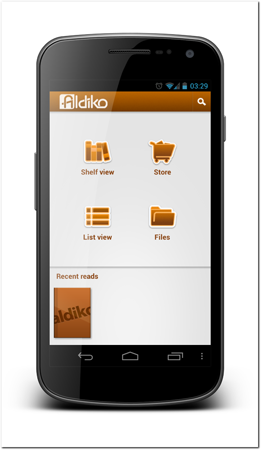
Figure 19-4: The Aldiko reader app uses a dashboard that is pretty close to the old style dashboard with small modifications.
Source: Aldiko
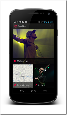
Figure 19-5: The Songkick app uses a dashboard that has a modern look.
Source: Songkick
Consequences
A dashboard makes the app’s first user experience friendlier. The user gets a good overview of the app’s functionality as well as an easy navigation approach.
Tip: A dashboard can also serve as a place for displaying updated information and notifications to the users. Many apps that use a dashboard have used an information bar on the bottom of the screen to display such information. You might display, for example, sync status or the latest updates to the app.
Large screen adaptation
The dashboard design pattern does not scale up to a larger screen that well. If you want to use the same concept on larger screens, you must be creative with it and think about ways you can bring part of the app’s content to the landing screen. Don’t ever simply stretch out your dashboard to a larger tablet screen size!
The Aldiko reader app (see Figure 19-6) uses a dashboard on its tablet design as well. Aldiko utilizes the added screen real estate by making the bookshelf larger and showing more content on it. The screen is still very welcoming, without wasting space.

Figure 19-6: The Aldiko reader app’s dashboard is part of its tablet-landing screen.
Source: Aldiko
Considerations and criticism
The dashboard design pattern has recently been removed from multiple high-profile apps. The main reason is that it makes it slower for users to access the app’s actual content. Many apps that have a clear main function make the main function the app’s home screen.
The side navigation pattern, which is introduced later in this chapter, is slowly replacing the use of the dashboard in many apps. It solves a very similar problem.
Variations
You’ve already seen two very different variations of this design pattern in the figures shown in this section. This design pattern is visually very weakly defined. Customizing the idea and creating visually pleasing dashboards require good visual design skill. A dashboard can be a hero screen of an app and provide a great brand experience. If you choose to implement this design pattern in your app, I recommend that you experiment with it and not settle for the simplest alternative.
Technical implementation
You can manually build the layout or use the standard Android layouts. Grid layout, for example, can be a very good solution, but it is available only on newer Android versions. It requires you to create two layouts—portrait and landscape versions. There are layout classes available that take care of the work for you. One of them is available with the 2011 Google I/O app. Dashboard was used in the Google I/O 2011 app, but was removed in the 2012 app. The dashboard layout class is included in the book’s companion app source code. If you include the layout class in your project, you can then simply define the dashboard layout as part of any layout in your app. See the following layout XML as an example:
 Scan the QR code with your Android phone to open the companion app and try out a functional example.
<com.google.android.apps.iosched.ui.widget.DashboardLayout
android:layout_width=”fill_parent”
android:layout_height=”fill_parent” >
<Button
android:id=”@+id/button_examples”
android:layout_width=”wrap_content”
android:layout_height=”wrap_content”
android:drawableTop=”@drawable/section_icon”
android:text=”Examples” />
<!-- … more buttons here … -->
<Button
android:id=”@+id/button_more_functions”
android:layout_width=”wrap_content”
android:layout_height=”wrap_content”
android:drawableTop=”@drawable/ic_launcher”
android:text=”One more function” />
</com.google.android.apps.iosched.ui.widget.DashboardLayout>
Tip: The dashboard layout has a known bug that might affect you and cause layout issues. You might want to get a patch to that issue from http://code.google.com/p/iosched/issues/detail?id=19.
Using Workspaces
Workspaces are screens that are linked to make navigating between them very easy. This is one of the most important and widely used design patterns on the Android platform.
Problems addressed
Apps often have much more content, functionality, and data than that can fit on a single screen. Allowing users to view all of that information can be difficult, especially when users are forced to navigate up and down in screen hierarchy to move from one set of functionality or data to another. To make your apps useful and intuitive, your users must be able to directly move between screens.
Solution
Tabs have been a solution to this problem even before there were cell phones. Although it is possible to use simple tabs on the Android platform, you should take your tabbed user interface one step further. The exact solution depends on the number of screens in the construct. If you have only a few screens (such as three or fewer), tabs are a good solution. Tabs don’t work as well with a larger number of screens.
The following solutions are similar but visually slightly different. This is due to the fact that the tabbed user interface can be used only with a limited amount of tabs. The title strip, on the other hand, can be used with a much larger amount of content. Both solutions enable users to navigate between tabs or views using the swipe gesture. The use of the swipe gesture eliminates the need for users to reach the Tab bar. Users can control the tab selection from any point of the user interface when using the swipe gesture.
Tip: It is important to think of workspaces as part of the same screen and not as separate screens. Users do the same. They do not expect the Back button to move them to the previous workspace.
Workspaces are referred to as swipe views in the Android design guidelines; see http://developer.android.com/design/patterns/swipe-views.html.
Tabbed User Interface
Tabs are a very familiar concept. The tabs on the Android platform have additional features not seen on other platforms. Android tabs are always located at the top of the screen. Bottom tabs are not used on Android. The reason for this is that top tabs adapt much more flexibly to different screen sizes. On other platforms like the iOS, bottom tabs are often used to make it easier for users to operate them. On the Android platform, tabs can be changed by using the swipe gesture, so top tabs are as easy to use as bottom tabs.
The tab’s visual presentation is unique on the Android platform. You should follow its common theme in your apps. Black square tabs with gray icons feel and look wrong on Android and should not be used. The tabs used in Android apps usually do not have icons on them, but they can have, and they use a solid background color and a line at the bottom part of the tab to highlight the selected tab. Figure 19-7 shows a simple tabbed user interface—this Google I/O 2012 app uses tabs to separate two different categories of information. Users can move between the two by tapping on the non-active tab or swiping.

Figure 19-7: The Google I/O app uses tabs on this screen to separate Android sessions and sandbox presentations in the event.
Source: Google
Tabbed user interfaces play well with the Action Bar design pattern. Figure 19-8 shows an example of tabs being merged into the Action Bar as space allows. This saves a lot of space on-screen, especially in landscape mode.
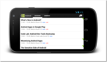
Figure 19-8: The same screen presented in Figure 19-7, but this time in landscape mode, where the tabs are merged into the Action Bar.
Source: Google
Title Strip
Using the title strip provides a way to implement a very similar interface as the tabbed interface, but without a limitation on tabs. With this approach, the tabs are replaced with a title strip. This title strip always shows the current selection and available selections to the left and right. The Google Play app shows a good implementation of a title strip (see Figure 19-9).
Consequences
Easily accessible content with a consistent swipe gesture support can make apps feel light and easy to use. The swipe gesture is a very natural and pleasant gesture on touch screens and fits to this pattern perfectly. Workspaces are present on Android in many places, from home screens to application launchers. Apps that use the same approach to present content are intuitive to users.
Large screen adaptation
Tabs are as much present on large screens as on small screens. They are very often merged into the Action Bar. Title strips also work on large screens and often do not need to be modified. However, on a large screen, using a title strip might look bad as it only shows three titles and therefore leaves a lot of empty space. It’s probably best to consider prioritizing tabs over title strips on case-by-case basis.
Considerations and criticism
Swiping between content is a very good gesture, but once it is used in that context it is reserved for it and cannot be used in any other function. That is why workspaces containing horizontally scrolling components can cause problems. Is the swipe gesture meant to scroll the content or move to the next tab or view? In situations where content must be horizontally scrollable, using the workspaces design pattern might not be the best option.

Figure 19-9: The Google Play app uses a title strip to provide users with very easy access among app categories.
Source: Google
Technical implementation
Technical implementation of this pattern is very straightforward using the Android SDK or available third-party libraries. The Android ADT (the Eclipse plug-in) helps you create your activity to support both tabs and a view pager. When creating a new activity using the new activity wizard, you can select from templates. View pager is the technical concept that is used to provide a container for swipable containers. The view pager is also part of the support package so you can use it even when targeting older Android versions.
To fully support the tabs in older versions, you can use ActionBarSherlock, which supports embedding tabs in the Action Bar when in landscape mode.
 Scan the QR code with your Android phone to open the companion app and try out a functional example.
View Pager
You can find the ViewPager class from the support package, which implements the workspaces as well as the swipe gesture support. You can combine it with PagerTitleStrip class or PagerTabStrip, which you can find from the support package as well, depending on if you are implementing tabs or a title strip. There are also good third-party implementations like the ViewPagerIndicator project, which you can find from http://viewpagerindicator.com/.
Using Split view
Split view is a layout design pattern for showing information side by side. This pattern is often used as the cornerstone of responsive design when moving from smaller smartphone displays to larger tablet displays.
Problems addressed
Forcing users to navigate to another screen to show more information can make the app seem slow and awkward. This is especially true with larger screens, where there’s enough room to show more details about selected items.
Solution
A user interface design pattern called “overview besides details” has been used on desktop apps as well as on the web to make it easier for users to see more information about selected items. This is commonly used with lists of items. The additional details are shown on the same screen. Users understand the relationship between the two parts of the screen easily as long as the right part of the user interface, the details part, is extending the details shown in the left part of the user interface, the overview part.
Smartphone screens are often too small to utilize this pattern, but it is a very good approach for tablet user interface design. For example, the Google RSS Reader app utilizes this pattern in its tablet design (see Figure 19-10).
Split view is referred to as multi-pane layouts in the Android design guidelines; see http://developer.android.com/design/patterns/multi-pane-layouts.html.
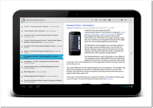
Figure 19-10: The Google RSS Reader app on the tablet uses split view to show a list of the user’s reader items as well as the details of the selected item.
Source: Google
Consequences
A screen that utilizes the split view design pattern allows user to navigate between items and their details effortlessly. This design pattern provides a massive benefit over having to navigate to another screen for such details. It’s also been in use for years and is familiar to users.
Small screen adaptation
This pattern is very rarely used on smartphone screens. To accommodate the same information on smaller devices, you most likely need to create two separate screens. This principle was explained in more detail in Chapter 15.
Variations
Split screen designs can vary a lot. They should always maintain the same relationship between the selected item and the details content. A great example of a very different visual approach is the Google I/O 2012 app (see Figure 19-11).

Figure 19-11: The Google I/O 2012 app uses a split view on the tablet to show the conference sessions and their details. The visual implementation is different from the normal split view, but the concept is the same.
Source: Google
Technical implementation
For technical implementation of this pattern you should use the Android layouts and fragments. See Chapter 16 for technical implementation details.
Note that the Android Eclipse plug-in allows you to create an Android project from a template using the new Android project wizard. The wizard builds a framework for the template. This construct is called the master-detail template in the wizard.
Using the Expand-in-context pattern
Expand-in-context is a simple yet powerful design pattern that can make your user interfaces less overwhelming as well as save screen real estate. The idea of this design pattern is to show only a smaller portion of the selected content and allow users to easily expand the section to see the rest.
Problems addressed
Sometimes one screen is too small to fit the information you want, without making the user interface feel cluttered, overwhelming, or forcing users to scroll almost endlessly to reach the bottom of the screen.
In many cases, the content is dynamic or user-provided and its length isn’t known beforehand. If a single screen contains this type of content, it can be difficult to design the page structure in a consistent way.
Solution
The solution to this problem is to show the content only partially and hide the rest. The Google Play app uses this pattern to make it easier for users to see all the information about an app without having to scroll through the very long scroll views. In the app details screen, each app in Google Play has multiple information fields with user content, like description and what’s new. There’s no way of knowing how long an app description will be, for example. It could be possible to solve this issue by using some kind of pop-up windows containing the data, but pop-up windows are usually interruptive and irritating.
A much better solution is to make the content sections a fixed size by default and allow users to tap to expand them to full size without leaving the screen. Figure 19-12 shows a single app’s information page opened in the Google Play client. The description section is visible and so is the Reviews section. In the bottom-right corner of the description section, you can see a small indicator arrow pointing down. It tells the users that there is more content in this section than what is currently visible.
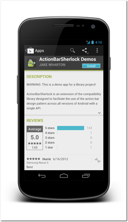
Figure 19-12: The Google Play app showing one app’s details screen. The description section is a fixed size no matter how long the app’s description is.
Source: Google
When the user taps anywhere in the description, the section extends and the entire content is shown (see Figure 19-13). Note that the user is still on the same screen.
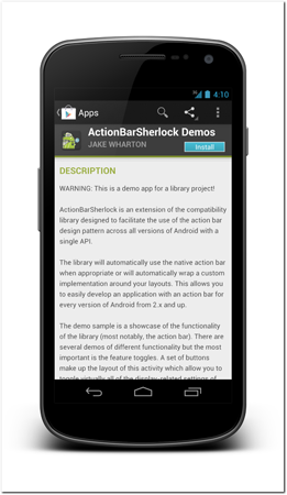
Figure 19-13: The same screen as in Figure 19-12, but the user has tapped the description section to open it.
Source: Google
Consequences
When you build your user interface using sections that expand in context, the interface will be a constant size even when you’re displaying dynamic and user generated content. You can design your interface without worrying about extremes.
Making the content expand in context instead of forcing users to open another screen or a pop-up helps the user interface feel easy to use. Users don’t lose their sense of location when data expands in context like this.
Additional features
In some cases it makes sense to allow users to collapse the expanded content. They should be able to do this by tapping the container again. The indicator arrow should rotate around and point upwards if collapsing the section is possible.
It is also worth noting that this pattern is being used in the Android 4.1 Jelly Bean notification to allow users to expand notifications. As tapping on notifications is already reserved for activating them, Google has decided to use a two-finger swipe as the primary gesture to expand and collapse the notification content (although other gestures work as well). This two-finger swipe gesture might become popular in the future, but it isn’t there yet.
Large screen adaptation
Large screens have more space so this design pattern isn’t that useful on them. You can automatically expand such sections on large screen devices. If showing the content fully on a tablet display is not possible, however, you might utilize this design pattern there, too.
Technical implementation
To implement an expandable section, you must make sure that the content in the session is dynamically laid out and that you can change the parent container’s size without causing problems. The implementation requires hard-coding the section size when it is closed and listening for the tap event to expand.
 Scan the QR code with your Android phone to open the companion app and try out a functional example.
Using Side navigation
Side navigation is replacing the use of the dashboard design pattern on many Android apps. It provides more direct access to different sections of the app than a dashboard does. This design pattern is shown as a side navigation panel that can be pulled out from the left side of the screen.
Problems addressed
In larger apps, there often are multiple logical sections of the app where users navigate deeper into the screen hierarchy. Accessing other parts of the application can be difficult if users must first navigate all the way to the top level of the dashboard to dive into another section.
Solution
The side navigation approach has very similar functionality to the dashboard. In fact, many apps have recently replaced their dashboard implementation with a side navigation. The side navigation is a sliding panel that can be opened from the left side of the screen without leaving the current screen. Opening the side navigation doesn’t alter the user’s back stack. To indicate that fact, a small portion of the screen is still visible on the right side of the side navigation panel.
Perhaps the best implementation example available is the Prixing app. The app implements both the side navigation and gestures to open it very well. The app allows users to open the side navigation from any screen. It is always available to users by tapping the Action Bar’s left button. The app also provides a secondary way to open the side navigation—using the bezel swipe (see Figure 19-14).
Consequences
Without having to launch the app to the dashboard screen, users can access the content directly. The app’s landing screen can be the most used content screen instead. Users also get a good understanding of the app’s functionality by viewing the side navigation.
In-app navigation also becomes easier, as users no longer have to navigate all the way to the dashboard to access other parts of the app. The side navigation provides consistent and easy-to-understand direct navigation.
Figure 19-14: The Prixing app is a great example of a well-implemented side navigation design pattern. Users can access the side navigation from any screen by using the Action Bar’s top-left button or by using the bezel swipe gesture.
Source: Prixing
Additional features
Some apps, like Evernote, take the side navigation one step further by providing more than just navigation in the side panel (see Figure 19-15). However, you should be careful not to overwhelm users with additional features in the side navigation panel. The panel must remain clean and easy to use.
Large screen adaptation
Side navigation can be used on larger screens, but sometimes it is not necessary. You might be better off designing the screens to show the same information your side navigation shows constantly, without hiding it.
Considerations and criticism
The side navigation pattern is still changing, and there are many different implementations of it. One big difference, particularly in Google’s apps, is that the side navigation is accessible only from the root screen of each app section. Google uses the Up button in its design to navigate up from all other screens. It also uses the same Up button to open the side navigation once the section’s root screen is reached.
Although I’m not a fan of the approach Google has taken due to the lost direct navigation, it is something you might consider for platform consistency. At the time of this writing, the side navigation pattern has not yet appeared in the official design guidelines, but Google has hinted that it might be added soon. If that is the case by the time you’re reading this, you should definitely take into account what the design guidelines advise.
Variations
In addition to Google’s Up button approach mentioned previously, different implementation use different ways to open the side navigation. Many apps use the top-left Action Bar icon, whereas others use different forms of swipe gestures. Note that a gesture should never be the only way to open the side navigation! In my opinion, the bezel swipe is the best gesture to be used here. It will not break other swipe gestures used in the app, and it is intuitive due to the way that side navigation is presented.
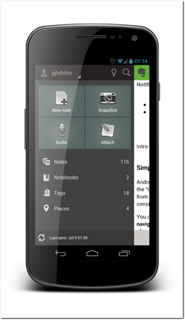
Figure 19-15: The Evernote app includes actions like creating new notes as well as some status information in the side navigation panel.
Source: Evernote Corporation
Technical implementation
As the design pattern itself is still evolving so are the libraries implementing it. At the time of this writing, there are multiple Open Source libraries that have started to implement this design pattern, but none of them is fully complete. Take a look at the SlidingMenu project, which you can find in github at https://github.com/jfeinstein10/SlidingMenu.
Summary
Navigation and layout design patterns help you find good ways to layout and organize your app’s user interface on both smartphones and tablets. Navigation design patterns like the side navigation bring user interface consistency to apps running on the Android platform. This helps Android users intuitively understand your user interface and know how to navigate between screens and sets of related data.