Adding text to images
Formatting text
Applying layer styles to text
Applying text to a path
Controlling text flow
Applying textual effects
Text can be an extremely important element to images, not only to add information but to contribute to the overall appearance. Photoshop provides the ability to add text to images as vector objects. This chapter discusses the tools used to add and edit text, as well as applying textual elements to images in some creative ways. Photoshop's tools allow you to configure and control the format and flow of the text and provide a way to edit the text right down to the character shapes.
Before jumping into adding text to images, let's look at what text really means inside Photoshop. When you initially consider text, you probably think about letters, words, and paragraphs.
Then as you apply the term text to a computer application, you start to include the concept of fonts or typefaces. Although the terms font and typeface are used synonymously, they are actually a bit different. A font consists of a set of letters, numbers, and/or symbols that have the same weight and style. A typeface is a collection or family of fonts that have the same overall appearance but different weights or styles. For example, many typefaces include regular, bold, and italic font versions.
The following is a list of the different font types that you can work with in Photoshop:
PostScript: PostScript or Type 1 fonts were designed long ago by Adobe to be used with PostScript printers. These fonts have mostly been replaced by OpenType fonts, but you may run into them if you need to use an older font to match older material.
TrueType: TrueType fonts were developed by Apple as a competitor to PostScript fonts. TrueType fonts are actually made up of vector paths and allow the text to appear crisp, even when it is resized. TrueType fonts also allow special characters or symbols to be included with the font as "glyphs." TrueType fonts are still widely used, but they are being replaced by OpenType fonts.
OpenType: OpenType fonts were developed by Adobe to replace both PostScript and TrueType fonts. OpenType fonts also are made up of vector paths and allow some additional glyph capability, including glyphs that are created by applying two letters together (such as ff), fractions, and superscripting suffixes, like the st in 1st.
When working in Photoshop, you should adjust your thinking about text a little bit. In reality, Photoshop treats text as a group of vector shapes that represent letters, words, and paragraphs. Selecting a font simply means that you are changing the set of shapes that are used to represent the letters. Thinking about text in this way helps as you start to use some of the more advanced features and apply artistic effects with text.
Photoshop provides several tools that give you lots of flexibility and control when adding text to images. This section discusses setting up preferences for these tools and using them to add and edit text in your images.
Before you get started working with text, you may want to set the preferences for text in Photoshop. To set the text preferences, use Ctrl/
Use Smart Quotes: When this option is selected, Photoshop detects the open and close quote characters in the text and treats them differently so they point in the direction that they apply.
Show Asian Text Options: When this option is selected, additional options for the Chinese, Japanese, and Korean text symbols are visible in the Character and Paragraph panels. If you are not working with these language sets, you should leave this option unselected.
Enable Missing Glyph Protection: If you open a file in Photoshop that contains a font that is not included on the system, you see an alert and the font is substituted by one that is on the system. When this option is selected, Photoshop automatically selects an appropriate font if you enter text that results in incorrect or unreadable characters.
Show Font Names in English: When this option is selected, the font names appear in English, even if the font is for another language such as Chinese or Japanese. This is useful if you need to add characters from another language font but do not actually read the language.
Font Preview Size: When this option is set, an example text in the actual font style is displayed next to the font name when you are selecting fonts from the lists in the Type tools or the Character menu. You have the option of having the example text appear small, medium, large, extra large, or huge. Enabling this option costs some additional processing time, so you may not need to enable it, and even if you do, you should keep the preview size as small as possible for your needs.

Photoshop provides the four tools shown in the Toolbox in Figure 18.2 that allow you to add text to your document. The two Type tools add text as a vector text layer either horizontally or vertically. The great part about adding text as a layer is that you can go back at any time and edit or apply effects to the layer. The two Type Mask tools create a selection mask using the text you type that can be converted to a vector or pixel mask or used as a simple selection.
Note
If you add text to a document that does not support layers, such as bitmap, the text is applied as raster pixels and not as a vector layer.
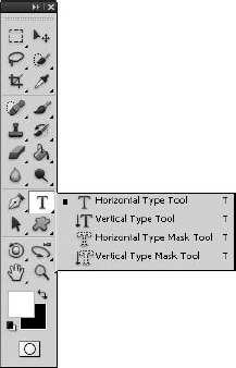
Figure 18.2. The Type tools allow you to add text to your documents as a vector text layer and to create selections from the text you type.
When you select one of the Type tools, a Type tool options bar similar to the one in Figure 18.3 is available. The options in the Type tool options menu are applied to any text that is currently selected or to new text being typed into the document. From the Type options menu, you can set the following options:
Orientation: Allows you to toggle the text between vertical and horizontal orientation.
Font Family: Allows you to select the font family from a drop-down menu.
Style: Allows you to select a typeface style such as italic, bold, hard, light, strong, and so on. The available options depend on the font that is selected.
Font Size: Allows you to set the size of the font used when displaying the text.
Anti-aliasing: Allows you to set the anti-aliasing method that Photoshop uses to render the edges of the font onscreen. Anti-aliasing tries to smooth the square edge effect by filling in the sharp edges and blending the text with the background. The more anti-aliasing you do, the smoother the transition, although anti-aliasing that's too aggressive can produce artifacts around the edges of the text. You can select the following anti-aliasing options:
None: Applies no anti-aliasing.
Sharp: Displays type in the sharpest fashion.
Crisp: Displays type somewhat sharp.
Strong: Displays type with a heavier appearance.
Smooth: Adds the most amount of smoothing around the edges.
Alignment: Allows you to set the alignment of the text to left, center, or right for horizontal text and top, center, and bottom for vertical text.
Color: Launches the Select Text Color dialog box, which allows you to set the color used to fill in the text.
Warp: Allows you to apply Warp effects to distort the text.
Toggle Paragraph/Character Panels: Allows you to quickly open and close the Character and Paragraph panels. You use these panels frequently when working with text, so this is a great option.

Figure 18.3. The Type tool options bar allows you to set options for selected text or text you are typing into the document.
Text can be added to using the Type tools either as point type or as paragraph type. Each of these options provides different advantages that are discussed in the following sections.
Note
While you are adding text, Photoshop is in Text Edit mode, so many of the menu options are not available. To exit Text Edit mode, press Ctrl/
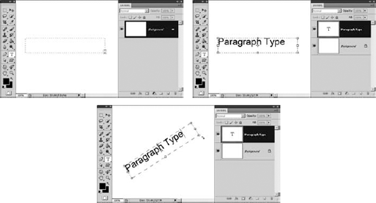
When you add text as a point type, the text flows from a point that you place on the screen. The text flows from the point based on the alignment setting in the Type options menu. For example, if the text is aligned left, the text flows to the right; if the text is centered, the text flows in both directions away from the point. This option is useful if you want to create unbounded text in the image, but it does not provide as many features as paragraph type.
To add text to an image as point type, simply select either the Horizontal Type or Vertical Type tool from the Toolbox and click the document. A point is displayed, and you can type text from that point, as shown in Figure 18.4. Notice that a new vector text layer has been added to the Layers panel.

After you have added text as a point type, you can use the Move tool to select and change the position in the newly created layer.
When you add text as a paragraph type, the text is placed inside a bounding box. The bounding box limits the flow of text. This has the advantage of forcing the text to fit into a specified area. As text hits the side of the bounding box, it is wrapped down to the next line.
However, you do need to be careful. If the flow of the text exceeds the bounding box dimensions, some of the characters are hidden below the bottom of the box. This can result in missing text in the image if you do not increase the size of the bounding box or decrease the font size. When text is hidden below the bottom of the bounding box, the bottom-right control handle displays a plus sign.
To add text to an image as paragraph type, select either the Horizontal Type or Vertical Type tool from the Toolbox and drag the mouse diagonally to create a bounding box, as shown in Figure 18.5. A bounding box is created, and you can type text into the box as shown in Figure 18.5. Notice that a new vector text layer has been added to the Layers panel.
Tip
If you hold down the Alt/Option key while dragging to create the paragraph type bounding box, a dialog box is displayed that allows you to set the height and width of the box. The values in the box are in pixel/point units denoted by pt. However, you can specify the size in inches by using inches as the unit—for example, "3 inches."
You can change the size of the bounding box by dragging with the mouse the control handles at the corners and sides. The bounding box provides another useful feature when working with text in that you can use the rotation controls in the corner to rotate the text, as shown in Figure 18.5.
After text has been added to your document as a vector text layer, you can still edit it at any time by selecting one of the Type tools and clicking the text in the document window. With the text object selected, you can use the mouse to select a portion of the text by dragging over it just as you would in any text editor.
Note
If you have vector text layers that overlap each other, clicking them selects the top layer. You may need to change the order of layers in the Layers panel to select text in a vector text layer that is underneath another one.
It is important to keep in mind that while you are editing text, some of the changes, such as font size and color, apply only to the selected text, while other changes, such as alignment or kerning, apply to the entire paragraph, regardless of the what text is selected. Each time you press Enter in a paragraph type text box, a new paragraph is started. That means you can make different format changes for each paragraph in the same paragraph type bounding box.
Tip
When you are in Edit mode, Photoshop displays selection guidelines and other editing aids. This can make it difficult to follow the text. While you are in Edit mode, you can use the Ctrl/
Photoshop provides a number of options to format and edit the text and to format and affect vector text layers. Some of these options are located in the Type tool options menu we discussed earlier. Some of them are found in the Character and Paragraph panels, which are discussed later in this chapter.
Several options are available by using one of the Type tools to right-click the text to bring up the Text Edit pop-up menu, shown in Figure 18.6. If the text is already selected when right-clicking, a slightly different menu will be displayed with options for the selected text. The following sections cover the options available in this menu.
Note
You should be aware that when in Edit mode, not all these options are available. For example, you cannot rasterize the text or convert between point type and paragraph type. Also, many of these options are available from the Layers panel menu when the vector text layer is selected.
The Edit Type option puts Photoshop in Text Edit mode in the vector text layer that was clicked. While in Edit mode, you can adjust the settings in the Type tool options menu or in the Character and Paragraph panels to edit and format the text.

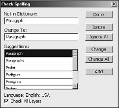
The Check Spelling option launches a Check Spelling dialog box similar to the one in Figure 18.7 if there are any misspellings in the text. The Check Spelling dialog box displays misspelled words, offers suggestions, and allows you to apply changes, ignore the misspelling, or add the word to Photoshop's dictionary. If the Check All Layers option is selected, all vector text layers are spell-checked.
The Find and Replace Text option can be useful if you need to quickly find text in your document or if you have been misspelling a word and need to change the spelling in several different places. For the most part, you likely are not adding lots of text to your images, so you may never need this feature. However, if you ever do, it can save lots of time.
The Rasterize Type option converts the vector data in the vector text layer into pixel data. You can no longer edit it as text; instead, the layer is treated as a raster layer just as if you had used the paint tools to create the text. Converting the text to a raster image can be useful if you want to apply effects to the text as a pixel image—for example, applying a filter to soften edges.
The Create Work Path option uses the vector anchor and line data from the selected text to generate the working vector path. The new working path is displayed around the text and is available in the Paths panel, as shown in Figure 18.8. The vector text layer remains unchanged, and you can still edit and use it as you normally would.

Figure 18.8. You can use the vector text layer to create a working path from the vector data in the text.
Note
For more information about how to edit and use vector paths, see Chapter 17.
The Convert to Shape option converts the selected vector text layer into a vector shape layer. The new vector shape layer replaces the vector text layer in the Layers panel, as shown in Figure 18.9. The vector text layer is no longer available for text editing; instead, you need to treat the layer as a vector shape layer.
Converting text to a vector shape opens a variety of possibilities for editing. For example, Figure 18.9 shows how we used the Direct Selection tool to drag some of the anchors and adjust the direction lines to completely alter the look of the character.

The Horizontal and Vertical options allow you to toggle the text arrangement from a horizontal flow to a vertical flow.
The Anti-Alias options allow you to quickly set the type of anti-alias adjustment to apply to the selected vector text layer.
The Faux Bold and Faux Italics options allow you to apply a fake bold or italic style to the selected text. If you have selected a potion of the text, this option applies only to the selected text and not to the entire paragraph. If you have not selected any text, this applies to the entire paragraph. Typically, you should avoid using the Faux text options because they don't look nearly as good as if the font family has a supported bold or italics font.
The Convert to Point Text and Convert to Paragraph Text options allow you to toggle the text between the point type and paragraph type styles. This can be useful if you want to add a bounding box to a point type text layer or if you want to remove the restrictions of the bounding box from a paragraph type text layer.
The Warp Text option allows you to apply a warp effect to the selected text. A dialog box similar to the one in Figure 18.10 is displayed that allows you to apply one of a number of warps such as arcs, bells, and waves.
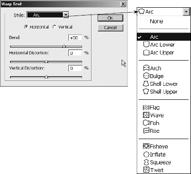
Figure 18.10. The Warp Text option allows you to apply several warping effects to text. You can control the amount of warp, direction, and distribution of the distortion that is applied.
The Warp Text dialog box allows you to set the following options:
Style: Allows you to select from one of the available warping options. The options are grouped together in groups for arc, bell, wave, and radial distortions.
Horizontal: Applies the warp in a horizontal fashion from top to bottom.
Vertical: Applies the warp in a vertical fashion from left to right.
Bend: Specifies the percentage of bend from −100% to +100%. The amount of bend determines the extent of the distortion applied to the text.
Horizontal Distortion: Defines how the warp is distributed horizontally across the text. Using negative horizontal distortion has the effect of increasing the height on the left side, making the text look as though it is getting farther away from right to left. Using positive horizontal distortion has the effect of increasing the height on the right side and decreasing the height of the text on the left side, making the text look as though it is getting closer from right to left.
Vertical Distortion: Defines how the warp is distributed vertically across the text. Using negative vertical distortion has the effect of increasing the width of the top of the text while decreasing the width of the bottom, making the text look as though it is tipping forward. Using positive vertical distortion has the effect of decreasing the width of the top of the text while increasing the width of the bottom, making the text look as though it is tipping backward.
Using the available options in the Warp Text dialog box, you can create an amazing number of warping effects. Figure 18.11 shows a few of the different effects that warping can have on the text.

One of the great features of applying text as a layer is that you can apply layer styles to create some great effects that completely change the appearance. Because the effect is applied as a layer style to a vector text layer, you can still edit the text as you normally would and the layer style is applied to the edited text.
When you select the Layer Style option, the Layer Style dialog box is displayed. You can then make the layer style adjustments and apply them to the vector text layer. After you have applied the layer style, the applied effects are added to the vector text layer in the Layers panel, where you can edit them. For example, Figure 18.12 shows applying the Inner Shadow, Inner Glow, Bevel and Emboss, Gradient Overlay, and Stroke effects to a vector text layer.
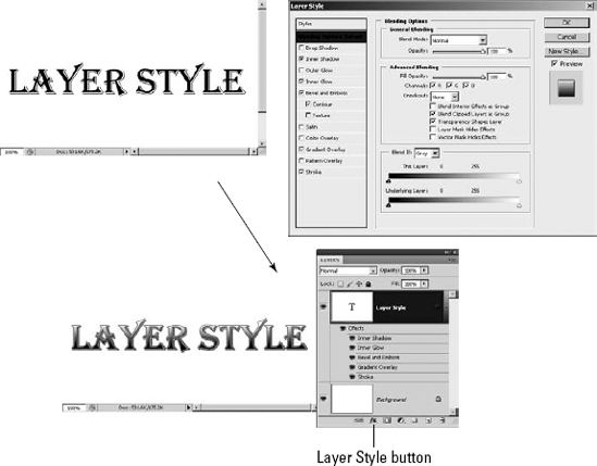
Figure 18.12. Because vector text is applied as a layer, you can use the Layer Style option to apply a variety of layer styles to your text.
Note
You can do lots of different things when applying layer styles to vector text layers. For more information about layer styles and how to apply them, see Chapter 10.
Most of the settings that you apply to text can be done from the Character panel shown in Figure 18.13. The Character panel provides most of the options found in the Type tool options menu and several additional ones that help you define the behavior and appearance of the text.

From the Character panel, you can set the following attributes of the text:
Font Family: This option allows you to select the font family from a drop-down menu. You can use the Type preferences settings discussed earlier in this chapter to have Photoshop display a sample of the font next to the font name that makes it easier for you to select an appropriate font because you can see how it looks in the sample.
Font Style: This option allows you to select a typeface font such as italic, bold, hard, light, strong, and so on. The available options depend on the fonts contained in the typeface that is selected.
Font Size: This option allows you to set the size of the font used when displaying the text. You can select the font size from the drop-down list, type the size into the text field, or hover the mouse over the Font Size option until the icon changes to a bidirectional arrow, which you then drag left or right to decrease or increase the value. By default, font size is specified in point units; however, you can change that by adjusting the Type setting in the Units and Rulers settings of the general preferences panel in Photoshop.
Tip
The actual size varies between different fonts. You should first select the font family and font style before deciding on a font size.
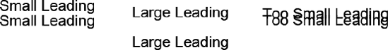
Leading: This option specifies the amount of space between the bottom of one line and the bottom of the next when there are multiple lines in the text. You can set this option to the default of Auto, which is 120 percent of the font size, or you can specify a specific value to provide more or less space between the lines. Because the leading measures distance between the bottoms of the lines, if the leading is smaller than the font size, the two lines run into each other.
If you have lines of text selected when you adjust the leading value, only those lines are changed. If you have no text selected when adjusting the leading, all the lines in the text are adjusted. Figure 18.14 shows an example of different leading values.
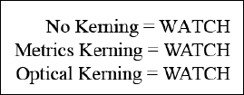
Kerning: This option specifies the amount of space between the individual characters in a word. The purpose of kerning is to solve the problem that occurs when two letters—for example, WA—look awkward when they are positioned next to each other, as shown in Figure 18.15. Using the Kerning option, you can set the kerning using one of three methods:
Metrics: This option uses metric information directly from the font to apply kerning to letters that require it when they are placed next to each other. This is by far the best option to use because the metric information is put into the font by the designer and usually is the most accurate. To apply metric kerning to text, select the vector text layer and then select Metrics from the Kerning pop-up menu.
Optical: This option uses a Photoshop algorithm that scans the text, calculates the space between letters, and adjusts the spacing accordingly. This is the next best algorithm to use because Photoshop is usually pretty accurate at gauging the amount of kerning necessary. To apply optical kerning to a word, select the word and then select Optical from the Kerning pop-up menu. To apply optical kerning to the entire vector text layer, select the layer and then select Optical from the Kerning pop-up menu.
Manual: If neither of these methods works for you, you can always manually adjust the kerning by setting a specific value in the Kerning option. To set the kerning value manually, position the cursor between the two letters in Text Edit mode and set the value in the kerning option. You also can use the Alt/Option+ left or right arrow keys on the keyboard to adjust the kerning between the two letters in increments of 20.
Tracking: This option specifies the amount of space between the leading edge of one character and the leading edge of the next. Tracking is measured in positive and negative values. Adjusting the tracking negatively, called tight tracking, makes letters close together. Adjusting the tracking positively, called loose tracking, makes the letters spread out. To adjust the amount of tracking in a vector text layer, select the vector text layer and set the value in the Tracking option. To adjust the tracking of a specific word or set of words, select the text you want to adjust the tracking for and then adjust the value in the Tracking option.
Vertical Scale: This option adjusts the vertical height of characters in relation to the current font size setting. The scaling is based on percentages, so 100 percent uses the normal font height, but 200 percent uses double the normal font height. The width is not changed by this setting. You can use this setting to adjust the entire vector text layer or just the selected text.
Horizontal Scale: This option adjusts the horizontal width of characters in relation to the current font size setting. The scaling is based on percentages, so 100 percent uses the normal font width, but 200 percent uses double the normal font width. The height is not changed by this setting. You can use this setting to adjust the entire vector text layer or just the selected text.
Baseline Shift: This setting specifies the position of the bottom of the selected text in relation to the baseline. This option is measured in the same units that font size is measured in, which is points by default. This option accepts both positive and negative values. Positive values raise the characters above the baseline, while negative values lower the characters below the baseline. The baseline shift gives you much more control than simply applying a subscript or superscript format to the text.
Color: This option launches the Select Text Color dialog box, which allows you to set the color used to fill in the text. You can use this setting to adjust the color for the entire vector text layer by selecting the vector text layer in the Layers panel or just the selected text.
Text Format: The following text formatting options allow you to apply the standard text style options to the selected text while you are in Edit mode or to the entire vector text layer if you have selected only the vector text layer in the Layers panel: Faux Bold, Faux Italics, All Caps, Small Caps, Superscript, Subscript, Underline, and Strikethrough.
Language: This option specifies the language option to use for the text when applying hyphenation, spell checking, and other language-specific text options.
Anti-aliasing: This option allows you to set the anti-aliasing method that Photoshop uses to render the edges of the font on the screen. Anti-aliasing tries to smooth the square edge effect by filling in the sharp edges and blend the text with the background. The more anti-aliasing you do, the smoother the transition, although being too aggressive with anti-aliasing can produce artifacts around the edges of the text. You can select the following anti-aliasing options:
None: This option applies no anti-aliasing to the text.
Sharp: Text appears sharpest.
Crisp: Text appears somewhat sharp.
Strong: Type appears heavier.
Smooth: This option adds the most amount of smoothing around the edges.
Tip
Too much anti-aliasing can result in some color artifacts around the edges of the font and may produce inconsistent results when producing low-resolution images such as those used on the Web. To reduce the inconsistency, deselect the Fractal Width option in the Character panel menu.
The Character panel menu allows you to set the following additional options:
Change Text Orientation: This option allows you to toggle the text between vertical and horizontal orientation. This option applies to all the text in the vector text layer.
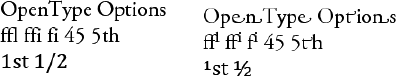
OpenType: The OpenType options menu allows you to toggle on and off the OpenType features that are available for the selected font. You can use this setting to adjust the features for an entire vector text layer by selecting the vector text layer in the Layers panel or just the selected text. Figure 18.16 shows some examples of the changes in text when you apply some of the OpenType features. The following is a list of the features that Photoshop supports:
Standard Ligatures: Typographic replacements for certain pairs of characters, such as fi, fl, ff, ffi, and ffl.
Contextual Alternates: Alternative characters included in some typefaces that provide better joining behavior.
Discretionary Ligatures: Typographic replacement characters for additional character pairs, such as ct, st, and ft.
Swash: Substitutes swash glyphs for certain characters. Swash glyphs are stylized letter-forms with extended strokes or exaggerated flourishes.
Old Style: Replaces numerals with numerals that are shorter than regular numerals. Some old style numerals are placed with their bottoms below the type baseline.
Stylistic Alternates: Replaces certain characters with stylized forms for a more pleasing aesthetic effect.
Titling Alternatives: Formats characters, typically in all capitals, for use in large type settings, such as titles.
Ornaments: Adds a personal signature to the type family. These special characters can be used as title page decoration, paragraph markers, dividers for blocks of text, or as repeated bands and borders.
Ordinals: Automatically formats ordinal numbers such as 1st and 2nd with superscript characters.
Fractions: Automatically converts fractions separated by a slash to a shilling fraction.
Fractional Widths: When this option is selected, the tracking applied to the text can use values that do not exactly conform to the pixel width on the screen. Enabling fractional widths allows the text to be very clear and readable. You should leave it enabled most of the time. The only time that you may need to disable it is if you are using very small fonts in images that will be displayed on a computer screen—for example, Web graphics.
System Layout: When you set this option, Fractional Widths is turned off and Anti-Aliasing is set to None. This option is typically used only when you are preparing images to only be used on a small computer screen—for example, a cell phone or PDA.
No Break: When this option is selected, the selected words are not hyphenated by Photoshop.
Reset Character: This option resets the selected text to the Photoshop defaults. This is useful if you end up making so many changes to the text that you can't figure out why it doesn't look right.
Many of the layout settings that you apply to text can be done from the Paragraph panel shown in Figure 18.17. The Paragraph panel provides the same alignment options found in the Type tool options menu and several additional ones that help you define layout of the text paragraphs.
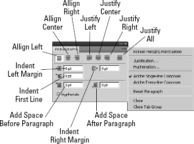
From the Paragraph panel, you can set the following attributes of the text:
Align Left: This aligns the text to the left margin, with no justification.
Align Center: This aligns the text to the center, with no justification.
Align Right: This aligns the text to the right margin, with no justification.
Justify Left: This aligns the last line to the left margin, with justification in the rest.
Justify Center: This aligns the last line to the center, with justification in the rest.
Justify Right: This aligns the last line to the right margin, with justification in the rest.
Justify All: This fully justifies the paragraph including the last line.
Indent Left Margin: This specifies the amount to indent the paragraph relative to the left margin. Only the selected paragraph is affected by this setting.
Indent Right Margin: This specifies the amount to indent the paragraph relative to the right margin. Only the selected paragraph is affected by this setting.
Indent First Line: This specifies the amount to indent the first line of each paragraph.
Add Space Before Paragraph: This specifies the amount of space to add before the paragraph. This setting is in addition to the leading setting that can be set in the Character panel.
Add Space After Paragraph: This specifies the amount of space to add after the paragraph. This setting is in addition to the leading setting that can be set in the Character panel.
Hyphenate: When this option is selected, Photoshop tries to hyphenate words that fall beyond the right edge of the bounding box.
The Paragraph panel menu allows you to set the following additional options:
Roman Hanging Punctuation: When this option is enabled, punctuation such as single quotes, double quotes, apostrophes, commas, periods, hyphens, em dashes, colons, and semicolons appear outside of the margin. This allows justified text to flow evenly down the right margin with the punctuation hanging over the edge.
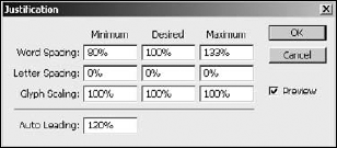
Justification: This loads the Justification dialog box, shown in Figure 18.18, where you can set options to control how Photoshop performs justification on the paragraph. From this dialog box, you can set the ranges that Photoshop uses for the word, letter, and glyph and the amount of leading to automatically apply to the paragraph when performing justification.
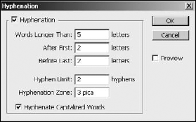
Hyphenation: This loads the Hyphenation dialog box, shown in Figure 18.19, where you can set options to control how Photoshop hyphenates words in the paragraph. From this dialog box, you can set the minimum word size, the minimum characters required on both sides of the hyphen, maximum hyphen limit, and whether to hyphenate capitalized words.
Reset Paragraph: This resets the paragraph options to the Adobe default values. This is useful if you make too many changes and simply want to start over.
Photoshop CS5 adds two new panels that can save you lots of time and effort when utilizing text in your images. The Character and Paragraph Styles panels available in the Window menu of Photoshop allow you to create character and paragraph presets that you can save, load, and quickly select during your editing workflow. Using presets allows you to organize text formatting and quickly format text.
Note
The Character and Paragraph Styles presets apply to the selected text in a text box when in text edit mode or the entirety of text in the box when not in text edit mode.
The Character Styles Panel, shown in Figure 18.20, allows you to create and manage the character style presets using the following options from the buttons on the bottom and panel menu:
Clear Override/Clear Modification: If you make any adjustments to the text using the Type tool options or the Character panel, those changes revert to the values defined for the preset.
Redefine Style: Any adjustments to the text using the Type tool options or the Type panel are applied to the preset and the preset is saved.
New Character Style: Creates a new character style preset.
Delete Style: Deletes the currently selected character style preset.
Style Options: Launches a dialog box, shown in Figure 18.20, that allows you to define the values used in the preset that are be applied to the text when the character style is selected. The Character Style Options dialog box contains the following three panels that allow you to define the character settings discussed earlier in this chapter:
Basic Character Formats: Specifies the style name, font family, style, size, color, and other basic text features.
Advanced Character Formats: Specifies the vertical and horizontal scale as well as the baseline shift and language settings.
OpenType Features: Allows you to enable/disable OpenType features such as fractions, ligatures, and ordinals.

The Paragraph Styles panel, shown in Figure 18.21, allows you to create and manage the paragraph style presets using the following options from the buttons on the bottom and panel menu:
Clear Override/Clear Modification: If you make any adjustments to the paragraph using the Paragraph tool options or the Paragraph panel, those changes revert to the values defined for the preset.
Redefine Style: Any adjustments to the paragraph using the Paragraph panel are applied to the preset and the preset is saved.
New Paragraph Style: Creates a new paragraph style preset.
Delete Style: Deletes the currently selected paragraph style preset.
Style Options: Launches a dialog box, shown in Figure 18.21, that allows you to define the values used in the preset that are applied to the paragraph when the paragraph style is selected. The Paragraph Style Options dialog box contains the same three panels as described in the previous section as well as the following four that allow you to define the paragraph settings discussed earlier in this chapter:
Indents and Spacing: Specifies the paragraph alignment as well as the left and right indents.
Composition: Specifies the composer as well as allowing you to enable/disable roman hanging punctuation.
Justification: Specifies the word spacing, letter spacing, glyph scaling, and auto leading percentages.
Hyphenation: Allows you to enable/disable auto-hyphenation in the paragraph and configure the settings used to define where hyphens occur.

The previous sections have discussed the tools used to add and edit text when working in Photoshop. In this section, we discuss applying those tools to adding textual elements to images in some different ways. The following sections take you through some examples the help illustrate some of the techniques that you can use to apply text as visual elements to images.
A great feature of Photoshop is the ability to attach text directly to a vector path. The text flows along the line segments of the path. When you attach text to a path, a couple of new anchors are added to the path to support the text: the begin text anchor and the end text anchor. The begin text anchor controls where the text begins to flow on the path. The end text anchor controls where the text stops flowing on the path, similar to the edge of a bounding box.
The text anchors provide some useful features. They are controlled by the Direct Selection tool just as other anchors. You can reposition both begin and end text anchors as needed on the path. If text flows past the end anchor, the end anchor displays a plus sign to indicate that there is additional text. Text can flow either direction on the path by dragging the begin anchor across to the other side of the path line.
In this example, we add text to an image by tying it to a curved path. Using this technique opens a variety of possibilities when adding text to images. Use the following steps to create a path and apply text onto it:
Use the P hotkey to select the Pen tool from the Toolbox.
Use the Pen tool to create a path, as shown in Figure 18.22.
Use the T hotkey to select the Horizontal Type tool from the Toolbox.
Use the Type tool to click the path you created in Step 2.
This adds a begin text anchor to the path, and Photoshop goes into Text Edit mode with the cursor attached to the path.
Type the text you want to apply to the line.
The text flows with the path, as shown in Figure 18.22. Notice the circle at the end of the path. That is the end anchor for the text. Also notice that the text cursor moves as you type in the text.
Press Ctrl/


In this next example, we use the text applied in the previous example, but move the starting point to illustrate some of the features available when working with text on a path following these steps:
Select the Direct Selection tool from the Toolbox.
Hover the Direct Selection tool over the first character in the text until the cursor changes to an I-beam with an arrow pointing to the right.
This is the begin text anchor.
Drag the text to the right.
Notice that the text moves with the mouse, as shown in Figure 18.23. You can position the text to begin at any location on the path. Notice that the circle at the end of the line now contains a plus, indicating that there is additional text that is not visible.
Drag the mouse down across the path line to move the text to the bottom of the line, as shown in Figure 18.23.
Dragging the mouse below the line forces the text to the bottom side of the path. Notice that the begin text anchor is now at the end of the path and the end text anchor is at the beginning.
Hover the mouse over the line until the cursor changes back to the open arrow, and click the line to reveal the normal path anchor points.
Use the Direct Selection tool to adjust the position of the anchors and the direction points to adjust the path.
Notice that the text still flows with the path, as shown in Figure 18.23.
Use the T hotkey to select the Type tool from the Toolbox.
Click the text with the Type tool.
Photoshop enters Text Edit mode.
Add more text.

A great way to add a textual element to an image is to have the text flow inside of an object containing the image. This allows the text to become more of a part of the image rather than just sitting on top of it.
In this example, we create a vector shape from a silhouette in the image and then use that vector shape to constrain the text to flow within the silhouette following these steps:
Open the image in Photoshop.
Use the Quick Selection tool to select an object in the image.
In this case, we selected the silhouette.
Right-click the selection, and select Make Work Path from the pop-up menu. Set the tolerance to the necessary level.
In this case, we kept the tolerance at 2.0. A new path is added to the image, as shown in Figure 18.24.
Select Save Path from the Paths panel menu to save the working path.
Press P to select the Pen tool from the Toolbox.
Right-click the newly saved path in the image, and select Define Custom Shape from the pop-up menu.
Name the shape, and the shape is added to the Shapes list. You can use the shape just as any other custom shape.
Press T to select the Type tool from the Toolbox.
Use the Type tool to pick a point inside the newly created shape.
As you move the cursor into the newly created shape, the I-beam cursor displays a circle around it indicating that it will use the shape as a bounding box. A new vector text layer is added to the Layers panel, and another path to support the bounding box for the vector text layer is added to the Paths panel, as shown in Figure 18.24.
Add the text to the image.
The text flows inside the newly created shape, shown in Figure 18.24, and you can edit it as you normally would.

Note
For more information about creating vector shapes, see Chapter 17.
Note
In case you are wondering, the text placed inside the image is Lorem Ipsum, which is just dummy text that is frequently used by graphics designers as filler text when demonstrating their work. Using the dummy text keeps viewers from being distracted by the content of the text and not focusing on the overall design elements.
Working with vector layers can be a big problem when you're adding text to images. Several layer options are not available for vector layers, including vector text layers. The solution to this problem is to convert the vector text layer to a Smart Layer. Because the content of a Smart Object is rasterized before applying it to the image, you can use all the raster editing functionality associated with layers.
Tip
Remember that the content of the Smart Object is rasterized when applied to the image. If you create your text larger than it is used in the actual document, Photoshop doesn't need to increase the size of the rasterized text, which reduces the amount of pixelization that occurs. There is still pixelization, but it is minimized.
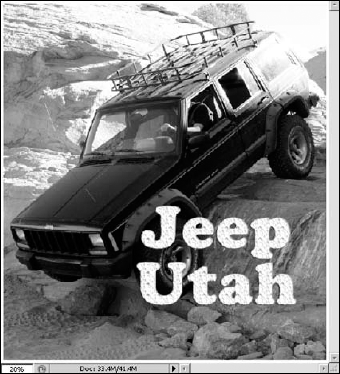
In this example, we convert a text layer to a Smart Object so we can use the warp to apply the text to a surface in the image. Following these steps:
Open the image in Photoshop.
Add text to the image, as shown in Figure 18.25.
Notice that the text sits flatly on the surface of the image and really sticks out. We are about to change that.
Right-click the vector text layer in the Layers panel, and select Convert to Smart Object from the pop-up menu.
This converts the vector text layer to a Smart Object layer.
Select the new Smart Object layer in the Layers panel if it is not already selected.
Press Ctrl/
Use the Free Transform tool to position the text, now encased in a Smart Object layer, on the hood of the Jeep.
Ctrl-drag the corner handles of the Free Transform tool to match the general shape of the hood.
Right-click the text and select Warp from the pop-up menu to bring up the Warp tool.
Then use the Warp tool to warp the text to the surface of the Jeep, as shown in Figure 18.26.
Press Ctrl/
The results are shown in Figure 18.27. Notice that the text is much less intrusive to the picture and almost appears as though it was originally part of the image.
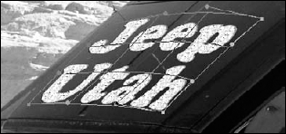
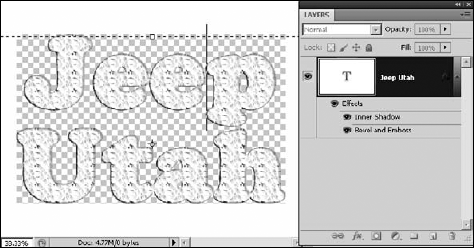
Double-click the new Smart Object layer in the Layers panel to bring up the document for the Smart Object.
Notice in Figure 18.28 that the Layers panel for the Smart Object document contains the vector text layer, and you can still edit it just as you would any other vector text layer. Saving the document applies the changes to the original image.

Note
You can find the project used in this example on the book's Web site as Figure 18-28.psd. You can open the file in Photoshop and play around with the Smart Object layer.
You can use the Type Mask tools to create a selection that looks exactly like text. The selection you create can be used just like any other selection to create as many different effects as you can think of.
There are two Type Mask tools: the Horizontal Type Mask tool and the Vertical Type Mask tool. These tools work in exactly the same way that the Type tools work; after you have created text on your screen, you can change the font, resize it, warp it, change the direction, or any one of the other options that are available to you with the regular Text tool—as long as it is selected. After you accept the type by clicking the check mark in the Options bar or choose any other layer or tool, the text becomes a selection and can be altered at that point only by the selection tools and menus.
Let me show you an example of how it works. Create a selection mask with the Type Mask tools by following these steps:
Click either Type Mask tool in the Toolbox nested with the other Type tools, or press T repeatedly until the tool you want is activated.
Click your image (preferably on a second, duplicated layer) in the area where you want to begin typing.
Highlight your text, and adjust the font, size, text warp, and so on until you are satisfied with the results.
You can move the text by grabbing outside of the selection highlight and dragging, as shown in Figure 18.29.
Press Ctrl/
Your text transforms into a selection, as shown in Figure 18.30.

From here you have several options: You can invert the selection, so everything but the text is selected; you can apply a fill or adjustment layer or a filter; or you can turn the selection into a layer mask by clicking the Add Vector Mask button in the Layers panel. In short, you can do anything to this selection that you can do with any other selection you make. Figure 18.31 shows the result of my selection after I clicked the Add Vector Mask button.
Figure 18.31. The selection created with your text can be edited just like any other selection. In this case, I created a mask with it.
Note
You can create a clipping mask with text that achieves the exact same results demonstrated in Figure 18.31. Review clipping masks in Chapter 10.
This chapter discussed using the Type tools to add text to images, the Character panel to format the text, and the Paragraph panel to control the flow of paragraphs. We also discussed some of the advanced features available in Photoshop that allow you to make text visual elements as well as just textual elements.
In this chapter, you learned these concepts:
How to add text in a bounding box.
You can constrain text to fit inside a vector shape.
How to apply layer styles to text.
Putting a vector text layer inside a Smart Object allows you to use raster tools such as the Warp tool.
You can apply text to a vector path, and the text flow follows the path even if you edit the anchor points.
Using the Warp option, you can create some creative textual elements.
Using text as a mask allows you to apply text as a visual element.