
Chapter 9
Color

Photograph by Derrick Clark, www.derrickrayclark.com
Introduction
The visual experience of perceiving color does not depend upon language or numbers, but the communication of information about the experience does. It is important that we use an agreed-upon and established vocabulary to talk about color. In the past, various disciplines including photography, art, and graphic arts have had difficulty communicating with each other due to the absence of an agreed-upon common color language. The Munsell Color System and the Standard CIE System of Color Specification have emerged as two of the more successful attempts to organize the variables of color into a universally accepted system. In addition, the Inter-Society Color Council has brought together representatives of the various disciplines in an effort to lower the barriers to communication. The stated aims and purpose of the organization are “to stimulate and coordinate the work being done by various societies and associations leading to the standardization, description and specification of color and to promote the practical application of these results to the color problems arising in science, art and industry.”
A red object illuminated with blue light appears black.
Before examining color systems, however, it is necessary to establish a definition of color. Strictly speaking, color is a visual experience. It is a perception, and therefore the word color refers to human physiological and psychological responses to light. In everyday language, color is associated with words such as red, green, blue, and yellow. Actually, these words refer to only one of three attributes of color— namely hue. The other two attributes are brightness (or lightness) and saturation. To perceive a color, three things are necessary: an object, a light source, and the eye or visual system. See Figure 9-1.

Figure 9-1 Color is a perception that occurs when a light source, an object, and the visual system interact.
Clarity of language is achieved when we distinguish between using color terms to refer to the visual perception of an object and the physical characteristics of the object. For example, it can be argued that we should not refer to a “red” apple as being red. We see it as red because the surface of the apple has physical properties that reflect certain wavelengths and absorb other wavelengths of the white light that illuminates it. If a “red” object is illuminated with “blue” light, most of the light will be absorbed and the object will be perceived as being black. Thus, when we identify an object as being red, we really mean that persons with normal color vision will generally perceive it as being red when it is illuminated with white light and viewed under normal viewing conditions.
Colorant is a general name for colored substances, including pigments and dyes used to alter the color of objects or other materials. The colors we see in color photographs result from mixing three colorants in the photographs: cyan, magenta, and yellow dyes. The purpose of the three dyes, which are present in different proportions in various areas of the photographs, usually is to create the same perception of color as when the original scene is viewed directly—even though a wavelength-by-wavelength comparison of the light entering the eye from the scene and from the photographic reproduction might reveal entirely different compositions. In other words, the photograph is intended to create the illusion that it has faithfully reproduced the reflection characteristics of the original scene, without actually doing so. In a sense we live in two different worlds, the physical world and the psychological world. The physical world lends itself rather easily to measurement. We use instruments such as thermometers, clocks, and rulers to measure temperature, time, and distance.
Spectrophotometers
The most fundamental physical instrument for measuring color is a spectrophotometer. It is a specialized photometer (light meter), as the name suggests—spectro refers to the fact that the instrument is capable of measuring light of different hues or wavelengths in the color spectrum from blue to red (measurements can also be made of radiation in the infrared and ultraviolet parts of the electromagnetic spectrum with some spectrophotometers). One can think of a color densitometer that measures red, green, and blue densities as a limited spectrophotometer capable of measuring only three broad parts of the color spectrum according to the particular type of red, green, and blue filters used.
A spectrophotometer is a much more sophisticated instrument capable of measuring the density (or transmittance or reflectance) of a given sample at very precise and narrow intervals of color (wavelengths). The intervals are specified in terms of bandwidth. Light, for example, covers a bandwidth of about 300 nm (400 nm to 700 nm). Red, green, and blue light can be thought of as covering a bandwidth of roughly 100 nm each. A spectrophotometer has a dispersing element (prism or diffraction grating) that can separate white light into a full color spectrum. Then, through the arrangement of an optical network of lenses and slits, narrow bandwidths of color 10 nm or less can be isolated and measured after they pass through or are reflected from a sample (see Figure 9-2). This is done at 10-nm intervals over the entire spectrum of colors to be measured.
Spectrophotometers also are used to measure the spectral quality of light emitted by various sources.
Spectrophotometers measure the reflectance or transmittance of color samples wavelength by wavelength throughout the spectrum.
The word "spectrum" resulted from the belief in early times that this phenomenon was a phantom of light or a specter.
Spectrophotometric Curves
Spectrophotometric curves, such as those shown in Figure 9-3, can then be plotted from the data. The curves provide a contour or envelope that describes the reflection or transmission characteristics of a sample, such
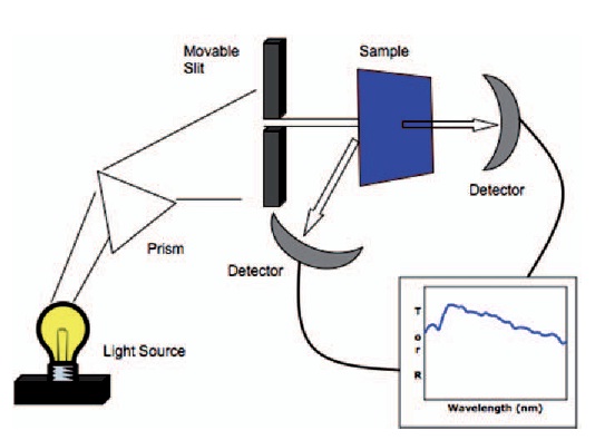
Figure 9-2 A simplified illustration of a spectrophotometer in transmission and reflection modes.
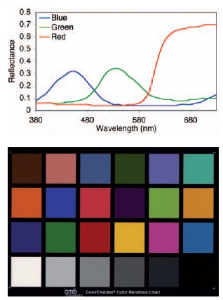
Figure 9-3 Spectral reflectance curves for the red, green, and blue patches of the Gretag MacBeth Color ColorChecker (first three patches in the third row.)
as an image area in a color print. It is important to understand that such curves describe the physical characteristics of the colored samples, not the colors that would be perceived by a person viewing the samples.
The curves of the three-color patches from the Gretag MacBeth
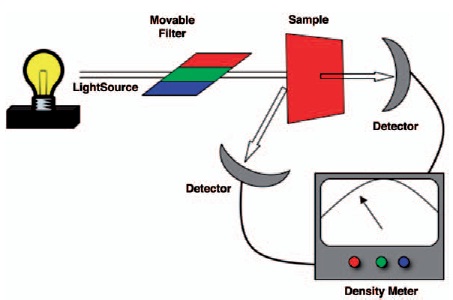
Figure 9-4 A simplified illustration of a color densitometer in transmission and reflection modes.
ColorChecker show that the red sample has the highest reflectance of the three samples at approximately 0.7. The blue and the green samples have approximately the same peak reflectance around 0.33. Examining the three patches on the ColorChecker, there does not appear to be a great difference in the reflectance or brightness of these three patches. Depending upon how the spectral response is specified, spectrophotometric curves can be referred to as spectral transmittance, spectral reflectance, or spectral density curves.
Color Densitometers
An essential difference between a color densitometer and a spectrophotometer is in the bandwidth of light being used to measure reflectance or transmittance of a color sample. Whereas a spectrophotometer uses a prism or diffraction grating to spread the light and a slit to isolate narrow spectral bands of light ranging between 1 nm and 20 nm, a densitometer uses red, green, and blue filters to isolate broad bands of light of about 50 nm (see Figure 9-4). The result is not a curve showing the spectral transmittance or reflectance of a color sample at each wavelength, such as in Figure 9-3 but simply three numbers, expressed as density (the log of the reciprocal of the transmittance or reflectance). The recommended red, green, and blue filters for use in measuring most color transparencies and prints are the Wratten 92, 93, and 94 filters, with bandwidths of approximately 60 nm, 30 nm, and 35 nm, as shown in Figure 9-5.
Color densitometers can be classified as either visual, if the human eye serves as the receiver, or physical, if some other light-sensitive device such as a photodiode is used. Densitometers can be further classified as direct reading, if the receiver output indicates the density, or null type, if the receiver indicates when two beams of light are balanced or equal. Visual densitometers are always of the null type based on the equality of light passing through the sample being measured and light passing through an area of known density.
Color Densities
Color densitometers measure the density of a colored layer to broad spectral bands of light as determined by the choice of filters. In photography, color densitometers are used to measure the density of cyan, magenta, and yellow dye layers to red, green, and blue light. Ideally, cyan dye would absorb only red light and transmit blue and green light freely. In practice, cyan dyes also absorb some blue and green light. Therefore, the combined density of the three dye layers in a color transparency would be different if the layers were peeled apart and measured than when they are measured in the normal superimposed position. If all three layers are measured as one unit, the results are called integral color densities. When each layer is measured separately, the results are called analytical color densities.
Integral density measurements are typically used for the control of photographic color processes and to determine the printing times required for color negatives. Analytical densities are used primarily for research and development to improve existing color products and to develop new products. Figure 9-6 shows a spectrophotomet-ric curve (expressed as spectral density) for a typical color film. The three lower curves represent the spectral analytical densities for each layer separately, while the upper curve represents the spectral integral densities of
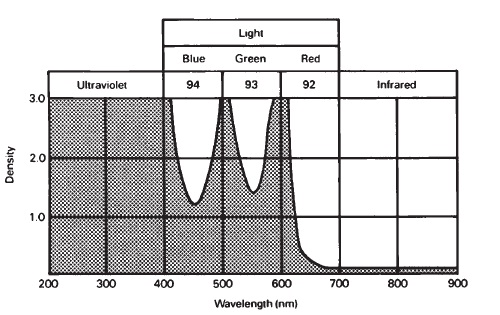
Figure 9-5 Wratten 92, 93, and 94 filters are recommended for color-density measurements of photographic color transparencies and prints. (All gelatin filters absorb UV but transmit IR.)
the cyan, magenta, and yellow layers combined to form a neutral.
Integral densities made with a color densitometer would give three separate values—density to red light (Dr), density to green light (Dg), and density to blue light (Db). If the bandwidth of the three filters in the densitometer coincided with the three peaks of the upper curve in Figure 9-6,

Figure 9-6 Spectrophotometric curves for a visually neutral sample of color reversal film.
one could speculate that Dr would be a little less than 1.0, while Dg and Db would be higher. The difference between the peak analytical densities and the integral densities at the same wavelengths represents unwanted absorption of blue and green light by the cyan dye, unwanted absorption of red and blue light by the magenta dye, and unwanted absorption of red and green light by the yellow dye.
Color density measurements highly depend upon the choice of red, green, and blue filters used to make the measurements and the spectral sensitivity of the photocell. Even when the same filters and photocell are used, one should not be surprised to discover differences. It is good practice to maintain control charts for color densitometers.
Physical, Psychophysical, and Psychological Measurements
Spectrophotometric curves describe the physical reflection or transmission characteristics of a colored object. We use our own perceptual systems, however, to make psychological measurements of hue, saturation, and brightness. Because psychological measurements are personal and subject to great variability, specialized instruments have been developed that provide, under rigidly specified conditions, physical measurements that correlate well with psychological visual perceptions. Such measurements are called psychophysical because they combine both worlds.
Hue is the name given to a color, such as red or green.
Saturation is the degree that a hue differs from white.
Brightness is how much light an object appears to reflect or emit.
Color analyzers used in color printing darkrooms are essentially color densitometers that indicate the filtration that should produce an appropriate color balance in the print.
Figure 9-7 provides a comparative listing of terms to describe the attributes of light when the measurements made are physical, psychophysical, or psychological. Thoughtful description of these attributes will distinguish the intended meaning and facilitate clarity. For example, a spectrophotometer will measure the spectral distribution of light reflected from an object or transmitted by an object. This is strictly a physical measurement. An instrument called a colorimeter (to be discussed later) has a response characteristic similar to the human eye and specifies the chromaticity of the spectral distribution. This is a psychophysical measure that describes the quality of color relative to a neutral color in terms of dominant wavelength (hue) and purity (saturation), and allows it to be positioned on a color map (CIE diagram to be discussed later). How that particular chromaticity is sensed by a human observer falls into the realm of psychological measurement and is called chromaticness (or chrominance). Chromaticity and chromaticness represent only two of the three attributes of color; the other is luminance (brightness/ lightness).
Color, like time and space, is a distinctive property of our daily experiences. The concern of different individuals with color will depend to a large extent upon their chosen professions. A chemist may be concerned with the molecular dye structure of the colorants—a colorimetrist with precise psychophysical measurements and spec-ification—a psychologist with repeatable and predictable psychological measure-ment—a painter with the esthetics; and a photographer with the esthetics, accuracy of reproduction, archival qualities, and communication of color.
Color Chain
The perception or measurement of color follows a chain of events. There are four major links in the chain. The characteristics and interactions of the first three—light source,
color stimulus, and receiver—deter-mine the response, which can be described in psychological, physical, or psychophysical terms. Some of the terms used to describe the characteristics of the various links are:

Figure 9-7 Adapted from the system of nomenclature as given by the Committee on Colorimetry of the Optical Society of America 1943. (Sheppard, J., 1958, p. 11.)
- Light source: illuminant, color temperature, correlated color temperature, spectral energy distribution, tungsten, sunlight, and daylight.
- Color stimulus: colorant, dye, ink, pigment, color object, spectral reflectance or transmittance.
- Receiver: human eye, photocell, photographic film.
- Response: Munsell system (psychological), spectrograph (physical), CIE system (psychophysical).
Although instruments can measure the physical characteristics of light, the measurements cannot accurately predict the color perceptions that will be produced by the light.
Color Mode
The characteristics of the color stimuli can be further expanded to include the particular mode of appearance or context in which colors are experienced. There are five such modes generally recognized, which influence the response to the color stimuli—surface, volume, aperture, illumination, and illuminant. When photographing color, it helps to recognize and distinguish between these various modes (see Figure 9-8).

Figure 9-8 Five modes of color perception, (A) surface, (B) volume, (C) aperture, (D) illumination color, and (E) illuminant color.
Computers can generate and display over one million physically different colors.
The most common is the surface mode or surface color, which refers to light reflected from and modified by a surface. It is seen as belonging to a surface. Examples are painted walls, color photographs, fruits, vegetables, human skin, and all such objects that present reflecting surfaces.
One of the problems in making water and sky look natural in a color print is that the print can only represent volume color and aperture color as surface color.
Volume color refers to color perceived when looking into or through a uniformly transparent substance such as a liquid. Examples would be the bluish color of water in a swimming pool, yellowish color of cooking oil in a bottle, and yellowish color of lemonade. A liquid filter used to change color temperature is yet another example. The strength of the volume color is determined by the concentration of the liquid and the thickness or depth.
Aperture color refers to color perceived in space and not recognizable as an object. Examples include the bluish color of the sky and the reddish color of a sunset or sunrise, which seem to fill the “emptiness" above us. Light seen in an opening, such as the color lights projected into an aperture of a colorimeter for color matching, is a prime example of an aperture color mode. (Aperture color is sometimes referred to as film color, which can be confusing to a photographer.)
Illumination color refers to the perceived color of light falling on an object. A familiar example in color photography occurs when we are taking photographs outdoors under sunlight conditions and we find that the shadows in the white snow (or on light sand or concrete) tend to have a bluish cast. This results from fill light from the blue sky, which casts a diffuse blue light over the entire landscape. Such bluish shadows are recorded objectively by light sensitive material as illumination color, but rarely by the eyes, which tend to compensate.
We may not perceive them as such, but the colors we see reflected from a movie screen can be thought of as illumination colors. A projector has a white light source that is modified by the color film in the projector. The various colors of light passing through the film fall on a white screen surface and are reflected. We could, but generally do not, see them as illumination colors. In a studio setting, we usually use white lights to obtain surface colors. If we used a warm (reddish) light to represent light from a fireplace, however, the colors would be modified. We would then attribute the altered appearance of the color objects to illumination color.
Illuminant color is distinguished from illumination color in that it is the color of the light source viewed directly. Instead of looking at the illumination color on the movie screen, we could turn around and look directly at the projector and the colors of light passing through the lens. More common experiences of illuminant colors are red, green, and yellow traffic lights, Christmas tree lights, and neon lights. Another example of illuminant color is the viewing of a television picture computer display. The television screen consists of thousands of dots of red, green, and blue phosphors that emit light as they are energized. When we view color pictures or color graphics on a television screen, we are looking directly at the light source. This system of color reproduction is uniquely different from a photographic system. (When working with video color systems it is important to realize that there is a decided difference between displaying pictures of three-dimensional objects on a television screen and using a computer to generate pictures and graphics on a television screen. Important to our perception of color are texture and line, which are often inadequate with computer-generated graphics.)
Primary Colors
Surprisingly enough, the minimum number of colors needed to form most other colors, by additive mixing, is three. They must be independent of each other—that is, two of the three colors when mixed must not form the third color. For subtractive systems of color, such as photography and printing, the primaries are called cyan (blue-green), magenta (blue-red), and yellow (red-green) colorants (inks, pigments, dyes). See Figure 9-9.
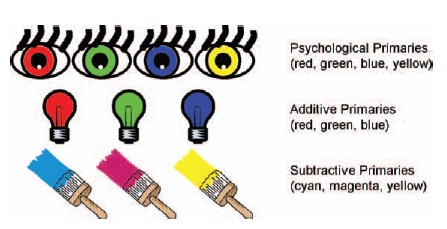
Figure 9-9 The psychological primaries are perceived as distinct from any other colors. The additive primaries of light can be added together to create any other color and the subtractive primaries are colorants that must be superimposed on each other to form most colors.
In additive systems of color, the primaries are red, green, and blue (Figure 9-9). Television is an additive system, which uses small dots of red, green, and blue phosphors that are too small to resolve as separate dots, although they can be seen with a magnifier. (Avoid doing this for any length of time since television tubes emit some potentially harmful radiation.) An early example of an additive system used to produce photographic color transparencies is Dufaycolor, which used a mosaic of minute red, green, and blue filters and was introduced in 1934.
Although all color films contain cyan, magenta, and yellow dyes, they will not produce identical color images.
Since the subtractive color primaries—cyan, magenta, and yellow— are complementary to the additive color primaries—red, green and blue— they are sometimes referred to as minus-red, minus-green, minus-blue. In color printing, it is especially helpful to think of cyan, magenta, and yellow filters in this way. It is also helpful to remember that a neutral can be formed by combining complementary colors (see Figure 9-10).
Neutrals are sometimes called achromatic colors. This expression is an oxymoron—a contradiction of terms. White, gray, and black are colors that have lightness but no hue or saturation.
"Color possesses me. I don't have to pursue it. It will possess me always . . . Color and I are one." — Paul Klee
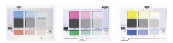
Figure 9-10 When mixed in proper proportions, complementary colors form neutral or near neutrals.
Although the selection of the three primary colors for the subtractive as well as additive systems is somewhat arbitrary, the choice is usually based on a number of factors—ability to produce the colorants, ability of the colorants to reproduce the greatest number of secondary colors, stability, availability, cost, and convenience.
Color Attributes
When describing the colors we experience, we use such familiar words as red, green, yellow, orange, and blue. Often though just the color name blue is not enough to describe what we are seeing. We will add to that, for example, using terms such as darker or lighter, stronger or weaker, or we will go one step further adding other descriptors such as sky blue, royal blue, or navy blue to further describe a color. This is because colors have three distinct attributes: hue, saturation, and brightness (or lightness). When we say lipstick is red, we are referring to hue. Saturation describes how strong or intense the red hue is, and brightness or lightness how light or dark the red hue is (see Figure 9-11). We will see later that the specific terms used to describe these attributes distinguish the different systems for specifying color.
Neutrals
When mixed in the proper proportions, complementary colors produce neutral colors. Colors such as cyan and red, magenta and green, yellow and blue will, when mixed, form neutrals having various levels of lightness or brightness (see Figure 9-10). Neutrals are distinguished from other colors in that they have no hue or saturation, so they are sometimes referred to as achromatic colors. A scale of such neutrals ranges from black to white and is called a gray scale. It is wrong, as many of us have been taught in early schooling, to think of black or grays as the absence of color. Grays appear neutral because they do not alter the color balance of the incident white light illumination. They appear dark or black when little light reaches the eye, and they appear light or white when much light reaches the eye.
One of the most critical tests of a photographic color material or a digital sensor is its ability to reproduce a
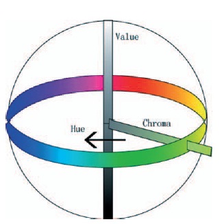
Figure 9-11 The three attributes of color: hue, saturation (chroma), and brightness (lightness or value).
scale of neutral colors. Small variations in color balance can be detected more easily with neutral colors than with saturated colors. To the eye, a neutral color is either neutral or not, whereas a color such as red can be modified considerably by the addition of blue (magenta-red) or yellow (orange-red) and still be accepted as red.
In testing the ability of a color film or paper to reproduce neutrals note that the results often depend more upon the user than the manufacturer. Regardless of how good the product is, if it is improperly stored, exposed to the wrong color temperature light or to mixed lighting, improperly processed, or viewed under poor lighting conditions, the photographer cannot expect quality results.
Color-Vision Theory
As early as 1666, a 23-year-old instructor at Cambridge University, Sir Isaac Newton, demonstrated that white sunlight is made up of all colors of light. He did this by passing sunlight through a prism to create a spectrum of colors. This demonstration gave visual evidence of how light can be separated into different colors. It was not until 1704, however, that Newton put forth a hypothesis to explain the process by which we see colors. He speculated that the retina contains innumerable light receptors, each of which responds to a specific color stimulus. Thomas Young rejected this nearly a hundred years later, in 1801. In a terse 300-word statement, Young hypothesized that there are only three different kinds of light receptors in the retina, each responding to one color of light—red, green, or blue. His theory was in turn rejected and ignored by his contemporaries. Some fifty years later, in 1850, Young's theory of red, green, and blue color receptors in the retina was rediscovered by James Clerk Maxwell and Herman von Helmholtz.
Although many theories attempt to explain our response to color, many unanswered questions remain. Some theories, however, are more useful than others. The oldest, most efficient, and most persistent theory of color vision is the Young-Helmholtz three-component theory. This theory postulates that there are three kinds of receptors in the retina that react selectively. One can think of these as red or long-wave, green or mid-wave, and blue or short-wave receptors that somehow combine in our visual system and produce the perception of other colors.
Some unanswerable questions have been raised regarding this three-color theory for human vision. For example, the eye will distinguish not three but four fundamental or primary colors— colors that are distinct and have no trace of other colors. The colors are red, yellow, green, and blue and are called the psychological primaries. The Young-Helmholtz three-color theory does not account for the psychological primaries, where as the Hering theory of color vision, referred to as the opponent color theory, does.
The Hering opponent colors theory is a more complex. Whereas the Young-Helmholtz theory is based on three-color stimuli, the Hering theory is based on the response to pairs of color stimuli. It assumes that there are six basic independent colors (red, yellow, green, blue, white, and black). Rather than postulating special and separate receptors for the six colors, Hering proposed that the light absorbed by the red, green, and blue sensitive receptors in the retina starts a flow of activity in the visual system. Somehow this flow is channeled into three pairs of processes with the two components of each opposing one another (opponents). The opposing pairs are blue-yellow, green-red, and white-black. For example, a color may look bluish or yellowish but never both at the same time. Blue would oppose and cancel yellow, and vice versa.
A variation on the Hering theory that provides for quantification is the Hurvich-Jameson quantitative opponent-colors theory. This theory assumes a two-stage process. The first stage is the excitation stage, located in the cones of the retina and consisting of four light-receiving cells that contain combinations of three photo chemicals. The second stage is an associated response stage located beyond the retina in the visual nerve center. It has three paired-opponent processes: blue-yellow, green-red, and white-black. This opponent-response theory represents differences in the neural response to the stimulation that originated when the cones in the retina were excited. A single nerve transmits two different messages by one of the pairs of opponent colors raising the neural firing rate above the normal rate (excitation) and the other lowering the firing rate below the normal rate (inhibition).
Color Specification Systems
When making color prints, photographers sometimes use color matching to determine the correct filtration and exposure.
Five different modes of perceiving color were mentioned earlier. The most common mode is object color or surface color, since it is the light reflected from the surfaces of objects that we normally see—a red tomato, green grass, blue shirt, skin colors, and so on. Three are basically three types of systems or methods for describing or specifying a color.
Viewing color television pictures, composed of red, green, and blue primary colors, is an example of spatial color integration.
The first method is defined by color mixing. The Pantone Matching System®1 is an example of this type of specification system. In this type of system, the observer is provided with a discrete set of color sample chips to choose from. When a selection is made, information from that chip is used to create that color. That information would include information on the percentages of different ink, pigments, or paints needed to produce that color chip.
The second method for object-color specification is a color-order system and is defined by perceptions. The Munsell Color System, which consists of hundreds of samples, is a color-order system. The color chips are spaced so that they appear to have uniform intervals of hue, saturation, and lightness. This requires judgment by a standard observer under a standard set of viewing conditions. The Munsell Color System is very useful to practicing photographers, artists, and designers.
The last system is defined by matching perceptions to a standardized set of lights. An example here is the CIE Color System, that specifies color in terms of three parameters, Y,x,y and which are calculated based on the visual response of a standard observer, the spectral power distribution of the light source and the spectral reflectance of the sample. The CIE system is used extensively in color management systems and will be discuss in detail later in this chapter.
Munsell System of Color Specification
Albert Henry Munsell was a painter and an art teacher (Figure 9-12). He found that communicating with his students about color was frustrating at times.

Figure 9-12 Albert Henry Munsell.
In 1905 Munsell published his first edition of A Color Notation, and in 1915 he published the Atlas of the Munsell Color System. The Munsell System for color identification was one of the earliest attempts to create an accurate system to describe color numerically. One of the Munsell system's strengths is that it provides a common international notation for color in which a person first identifies a color visually (non-verbally) and then uses language to describe it and communicate it. In order to accomplish this, Munsell had to first prepare a large variety (gamut) of painted color chips. Imagine hundreds of such chips having different hues, which Munsell described as the “name of the color"; different values, which he described as “the lightness of color . . . that quality by which we distinguish a light color from a dark one"; and chroma, which is “the strength of a color . . . that quality by which we distinguish a strong color from a weak one; the degree of departure of a color sensation from that of a white or gray; the intensity of a distinctive hue; color intensity.”
In sorting out the gamut of color chips, they are first grouped by hue (red, yellow, green, blue, and purple and the in between hues). Then for each grouping of hue they would be arranged according to their values of lightness to darkness. A red hue grouping, for example, would be arranged so that all the red chips increased in lightness from light to dark. The final and more difficult arrangement would be to group all of the chips having the same hue and lightness according to their color intensity or chroma. On one end would be red chips that are near neutral, on the opposite end would be a red chip that would be described as intense or vibrant red or one that was a highly saturated red.
The Munsell System was developed so the difference between adjoining chips would be visually equal in hue, value and chroma.
This type of ordering is essentially what Munsell did, with some refinement—the most important refinement being that he ordered the colored chips so that the interval between adjoining chips would be visually equal in hue, value, and chroma, quite a monumental task. Once this visual structuring was completed, he had to communicate it to others so they could also visualize the arrangement and use a common language to describe the colors. Since color has three attributes (hue, value, chroma), it occupies a three-dimensional space or volume. Munsell described this concretely in terms of a color tree. “The Munsell color tree has a vertical trunk that represents a scale of values, branches that represent different hues, and leaves extending along the branches that represent chromas. The hues change as one walks around the tree, the values increase as one climbs up the tree, and the chromas increase as one moves out along the branches” (see Figure 9-13).
"Music is equipped with a system by which it defines sound in terms of its pitch, intensity, and duration, without allusion to the endless varying sounds of nature. So should color be supplied with an appropriate system." —Albert Munsell
A more abstract representation of this color system is shown in Figure 9-14. The trunk of the tree, representing

Figure 9-13 The Munsell color tree. (From Munsell, A Grammar of Color, edited by Faber Birren, ©1969 by Litton Educational Publishing, Inc. Reprinted by permission of Van Nostrand-Reinhold Co.)
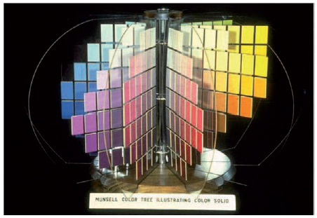
Figure 9-14 The Munsell color tree contains 10 hue charts on clear plastic leaves.
values from black to white, is now the center post of a color sphere; the branches representing the hues are now vertical sheets, each holding chips of a different hue, attached to the center post; and the leaves across each branch now become chips of the same

Figure 9-15 Hue symbols and their placement in the Munsell system.
hue and value but different chromas, extending from the center post outward. Hue changes as one circles the Munsell color sphere, value increases vertically, and chroma increases from the center post outward.
The three attributes of color (hue, value, and chroma) are visually represented in the Munsell tree as a color space or volume. The overall shape of the color space is not symmetrical. This is because the range of chromas is not the same for all hues. In the extreme it is possible to have a yellow hue of high value and high chroma but not one of low value and high chroma. Similarly, a blue hue of high value and high chroma is not attainable. The three-dimensional asymmetrical color solid represents colorants now available, not including fluorescent colors. The Munsell space is expanded as new colorant become available.
Of the one hundred hues that can be represented in the Munsell system, a select sample of ten are actually shown. The others would fall in between, and all one hundred hues would be equally spaced in terms of visual differences as illustrated in Figure 9-15. The five basic hues are red, yellow, green, blue, and purple.
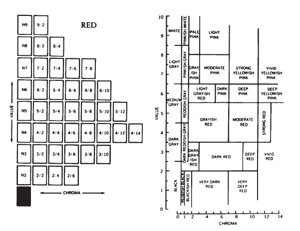
Figure 9-16 Method for converting Munsell notations to color names using the ISCC-NBS (Inter-Society Color Council and National Bureau of Standards) Method of Designating Colors, and a Dictionary of Color Names. (Available as circular 553 from the Superintendent of Documents, U.S. Government Printing Office, Washington, D.C. 20402.)
"Hue is the name of a color. Value is the lightness of a color. Chroma is the strength of a color" —Albert Munsell
In other systems, chroma is called saturation, and value is called lightness or brightness.
Figure 9-15 shows how the ten major hue names can be used for qualitative notation. The one hundred numbers in the outer circle provide more precise notation. The numbers make it easy to use the Munsell system for statistical work, cataloging, and computer programming. The combination of numerals with hue initials is considered the most descriptive form of designation. This combination is shown in the inner circle: 5R, 7.5R, 10R, 2.5YR, 5YR, 7.5YR, 10YR, etc. The Munsell Book of Color shows the actual colors of these forty constant hues.
"Viewing of color in a particular situation is, at best, a peculiar mixture of attention, intention, and memory." — Ralph Evans
For a particular hue, say one of the ten major hues represented in the Munsell tree, there are a number of different values and chromas, and therefore different colors, of that hue. Imagine the 5 Red hue segment removed from the tree. The 5R notation designates that this hue is midway between a 5RP and a 5YR on the hue circle. The 5R by itself designates only the particular hue, not the color. As indicated in Figure 9-16, the 5R hue can be further specified in terms of value and chroma numbers or described in terms agreed upon by the Inter-Society Color Council and the National Bureau of Standards (the ISCC-NBS).
Although the spectrum is commonly divided into regions having seven different hue names (red, orange, yellow, green, cyan, blue, and violet), the Munsell system identifies 10 major hues and 100 distinguishable hues.
In the Munsell system, color is specified in the alphanumeric sequence Hue Value/ Chroma (H V/C). For example, a 5R hue with a value of 8 and a chroma of 4 would be called a Light Pink and designated 5R 8/4 or simply R 8/4 (for hues having positions other than 5 on the hue circle the position must be indicated—for example, 3R 8/4). R 5/12 translates to a strong red having a value of 5 and a chroma of 12. At the extreme left of the diagrams (center of the Munsell tree), the colors are neutral and are so represented. The notation for a neutral (achromatic) color is written NV/; for a middle gray (18% gray) the notation is N5/. Since the chroma is zero, it is usually omitted but could be included (N 5/0). (For those interested in Zone System notation a black, Zone 0, would be about N1/; a Zone V gray, N 5/; and a Zone IX white, N 9/.)
Near neutrals having chromas less than /0.3 are usually treated as neutrals. If more precision is needed, the form N V/(H,C) is used (H would be represented by one of the 10 select hues). For example, a light gray that is slightly yellowish might be noted as N 8/Y,0.2 or, using the regular H V/C form, Y 8/0.2. The form N V/0 can be reserved for absolute neutrals.
Pantone® System of Color Specification
The Pantone Matching System® (Figure 9-17) is an object-color system widely used in the graphic arts industry. It differs from the Munsell system in that it is not based on equal visual differences in color, and in that the colorants used are inks common to graphic arts printing. Using colorants similar to those used for printing provides a closer match between the colors selected and specified by the client and the colors produced by the printer. The system comprises more than 500 standard Pantone® colors by blending various proportions of eight basic chromatic colors, plus black and transparent white. To produce a Pantone® 292 color similar to a Munsell 5PB 5/10, for example, would require 2 parts Pantone® Reflex Blue, 2 parts Pantone® Process Blue, and 12 parts transparent white. The reproduction of a gray card can be specified by matching it first to a Pantone® color such as Pantone® 424 and then giving that information to the printer. The printer knows that the gray card color can be reproduced with an ink mixture of 3 parts Pantone® Black, 1 part Pantone® Reflex Blue, and 12 parts transparent white.
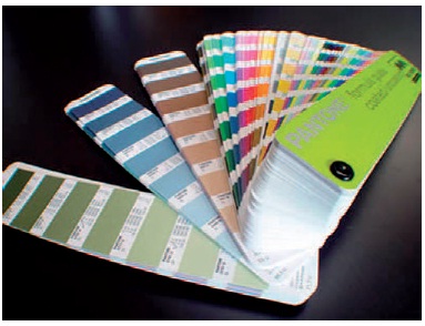
Figure 9-17 Pantone Matching System.
The colors used in Figure 9-17 were chosen by the authors from the Pantone® Color Formula Guide. The Pantone numerical designation for each color specified was communicated to the book's graphic designer, who in turn used the same notation to communicate the desired colors to the printer. In this way, author, designer, and printer shared a common color language, which facilitated communication and reduced error. Any standard system of color notation provides this. In communicating colors to others, however, it is essential to know which system they are using. One shortfall of the Pantone system is not all colors are available. Only those in Pantone Sample book can be used. When converting a photographic image to a Pantone image, the resulting image will not be an exact color match for this reason. (For more information on Pantone® Matching System write to Pantone, Inc., 55 Knickerbocker Road, Moonachie, NJ 07074.)
CIE System of Color Specification
The letters CIE stand for Commission Internationale de l'Eclairage (The International Commission on Illumination).
In 1931 the CIE system of color specification became an international standard for colorimetry.
Color specification with the CIE system differs from that of the Munsell in that a mixture of red, green, and blue light is used to match a given sample rather than the selection of a color chip. The Munsell system is based on appearance, whereas the CIE system is based on stimulus-synthesis (the additive mixture of three color primaries). Both systems have advantages, and specifying a color sample with one system allows conversion and notation to the other. The obvious advantage of the Munsell system is its simplicity and its directness. The selection of one of the color chips provides a color and color notation directly in terms of hue, value, and chroma (H V/C). It is a physical match easily made and easily understood. The CIE system is somewhat abstract and is based on mathematical conventions. It requires instrumentation but has the advantage that any color can be matched, numerically specified, and positioned on a CIE diagram or map. The CIE system provides psychophysical measurements of color, whereas the Munsell system, based on color appearance, provides psychological or perceptual measures. However, the CIE color specification system is used in color management exclusively.
The CIE color system specifies colors in terms of three parameters, Y which is the luminance term, and x and y which are chromaticity coordinates. The x and y terms are derived from tristimulus value (XYZ) of the sample in question. Tristimulus values are determined by integrating the spectral power distribution of the light source the color sample will be viewed under, the spectral reflectance of the color sample and the response of the standard observer. (The CIE has determined the response of the standard observer through well documented experiments). Once the tristimulus values are obtained, the chromicity coordinates can be calculated. (See Appendix D for these calculations). One advantage of this system is that any color can be quantified. A drawback is that it is not a visual system, meaning that given a set of coordinates it is not easy to determine the exact color.
CIE Chromaticity Map
Munsell notations can be converted to CIE notations and vice versa.
Chromaticity describes two attributes of color—hue and chroma. These two qualities, called dominant wavelength and purity in the CIE system, are plotted on a horseshoe-shaped map, shown in Figure 9-18. Around the periphery of the curved section are wavelengths of light scaled from 380 to 770 nm. The x and y axes are used to plot the position of the chrominance of a particular color. The color is always plotted relative to a specific light source. In this example, the daylight source is located in the lower middle of the map, where it serves as a neutral reference point. A green filter is identified by the coordinates x = 0.22 and y = 0.52. Not shown is the luminance (brightness) of the green. This value is obtained separately from the data used to calculate the x and y coordinates. The farther a color plots from the reference neutral, the greater the purity (chroma). The dominant wavelength (hue) is determined by drawing a line from the reference point through the plotted point to the curved wavelength line. This green filter has a dominant wavelength of 520 nm.
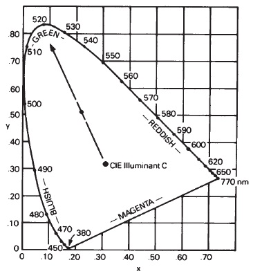
Figure 9-18 Chromaticity plot for a green filter relative to a daylight source.
Non-Uniform Color Space
Whereas the CIE 1931 chromaticity diagram in Figure 9-18 provides a convenient mapping space for displaying x,y chromaticity coordinates, color differences displayed by these coordinates unfortunately are not distributed uniformly. Similar color differences between two samples of a reddish or bluish color would be compressed, whereas the same visual difference greenish colors would be expanded in the diagram.
This non-uniformity of plotted color differences was reported in the research done by David MacAdam in 1942. He used a large number of color difference pairs to determine how much of a color change, in any direction, could be made before an observer would perceive a just noticeable difference (JND). In doing so, he found that the variabilities in JNDs were different for each color and that plots of these variability boundaries formed similar elliptical shapes, but were of significantly different sizes. These experimental results helped describe the perceptual nonuniformity of the 1931 CIEXYZ chromaticity diagram, and are known as the MacAdam ellipses.
Uniform Color Space (CIELAB)
In 1976, the CIE recommended the use of a more uniform color difference formula and related color space. They designated CIE L*a*b* (CIELAB) to provide better correlation between visual and measured color differences. The use of CIELAB provided a significant improvement over the nonuniformity of CIE tristimulus space by deriving metrics that correlate to perceptions of color. CIELAB, based on a simple color vision model, can adjust for changes in the color and amount of illumination, signal compression, and opponent signal processing. The CIELAB color space does not have a chromaticity diagram associated with it because of its exponential non-linear derivation from CIE tristimulus space, but a three-dimensional color space can be constructed with L* as the vertical axis, and a* and b* occupying horizontal planes.
The L* value represents luminance and can range from 0 (black) to 100 (white). The a* value represents the redness-greenness of the sample. The b* value represents the yellowness-blueness of the sample. There is not a numerical limit on either the a* or b* value and they can be either positive or negative in value. It is customary to plot only the a* and b* values which results in a two dimensional graph. Color gamut comparisons are easily constructed using the ±a*(redness-green-ness), and ±b*(yellowness-blueness) horizontal opponent measurement planes (see Figure 9-19).
Specifying color in terms of CIELAB provides a means for various color specification systems being used in digital photography to “speak" to one another across media components. Regardless of what platform (type of computer) being used—monitor, scanner, printer, etc.—and how the colors are being specified, all can feed into a CIELAB-based device-independent reference color space, which allows conversions to be compatible across all existing components of a digital color reproduction system. CIELAB's L* and a*,b* component performance as a simple color appearance model makes it useful in color management systems; however, due to its still not-perfect uniformity, some software vendors prefer to implement their own color space configurations based around CIEXYZ tristimulus values.
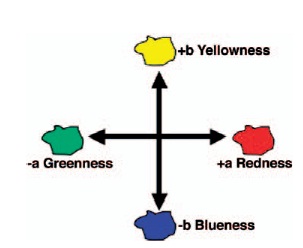
Figure 9-19 a* versus b* plot in CIALAB space.
Further research in color appearance models are providing experimental and application opportunities in areas such as colorant interactions, sample surface properties, and correlation between physical measurements and visual assessments of color differences both in the fields of color image reproduction and the manufacture of all colored products.1
REVIEW QUESTIONS
- The most appropriate definition of color from the following choices is that color . . .
- is the wavelength attribute of light
- is the attribute of light associated with names such as red, green, and blue
- is the quality of all light that is not white
- is a perceptual response to light
- With respect to the relationship of pigments, dyes, and colorants, all . . .
- colorants are dyes
- pigments are colorants
- dyes are pigments
- colorants are pigments
- Of the light response systems listed, the one that is most similar to a spectrophotometer in principle is . . .
- an exposure meter
- the human eye
- a color densitometer
- black-and-white p anchromatic film
- color film
- In addition to the color of light that cyan dyes are supposed to absorb, they also absorb considerable . . .
- red light and green light
- red light and blue light
- blue light and green light
- The mode of the blue seen in blue sky on a clear day is classified as . . .
- surface mode
- volume mode
- aperture mode
- illumination mo de
- illuminant mode
- White, gray, and black are . . .
- chromatic colors
- subtractive primary colors
- not colors
- neutral colors
- The Munsell term value corresponds to the more general term . . .
- color
- lightness
- saturation
- harmony
- darkness
- The five principal hues in the Munsell system are . . .
- red, green, blue, yellow, and gray
- cyan, magenta, yellow, white, and black
- yellow, red, green, blue, and cyan
- red, green, blue, yellow, and purple
- A color designated as 5R 8/2 is a . . .
- light red
- dark red
- medium value red
1 Pantone® is Pantone, Inc.’s check-standard trademark for color reproduction and color reproduction material.
1 The Focal Encyclopedia of Photography, 3rd ed., s.v. “colorimetry.” Giorgianni, E. and T. Madden. Digital Color Management: Encoding Solutions, Reading, MA: 1977; “COLOR Research and Application,” The Journal of Color Science, John Wiley &Sons, New York, www interscience.wiley.com; The Munsell Color Science Laboratory at Rochester Institute of Technology, Rochester, New York, 14623, http://www.cis.rit.edu:80/people/faculty/fair-child/ CAM.html