6. Adding Tables and Charts to Documents
What You’ll Do
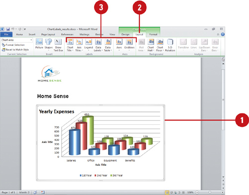
Change a Chart Layout and Style
Introduction
There are times when typing a paragraph will not do your text justice. Creating a bulleted or numbered list might better show your information. Another way to organize items in a document is with a table. A table is an object that is inserted into the Word document that displays text in rows and columns. You can set up your table with existing text, or create the table, even draw it out, and enter in new text. Once created, you can adjust the cells (where the text is contained in the rows and columns). You can also adjust the table to insert or delete rows, columns or individual cells, change the alignment of text, sort the text, or even apply a border or shading to the table.
Instead of adding a table of data, you can also insert a chart. Charts add visual interest and useful information represented by lines, bars, pie slices, or other markers. When you insert and create a chart in a document, the chart is an embedded object from Microsoft Excel 2010. Word uses Microsoft Excel to embed and display the information in a chart instead of Microsoft Graph. You can resize or move the embedded chart just as you would any graphic object. Your chart is what your reader sees, so make sure to take advantage of the pre-built chart layouts and styles to make the chart appealing and visually informative. There are a wide variety of chart types, available in 2-D and 3-D formats, from which to choose. For each chart type, you can select a predefined chart layout and style to apply the formatting you want.
After you finish creating a chart, you can save it as a chart template. A chart template file saves all the customization you made to a chart for use in other documents. You can save any chart in a document as a chart template file and use it to form the basis of your next document chart, which is useful for standard company financial reporting.
Creating a Table
A table organizes information neatly into rows and columns. The intersection of a row and a column is called a cell. You can insert tables by specifying a size, or drawing rows and columns to create a custom table, or you can create a table from existing text separated by paragraphs, tabs, or commas. In addition, you can create nested tables (a table created within a table cell), floating tables (tables with text wrapped around them), or side-by-side tables (separate but adjacent tables). If you decide not to use a table, you can convert it to text.
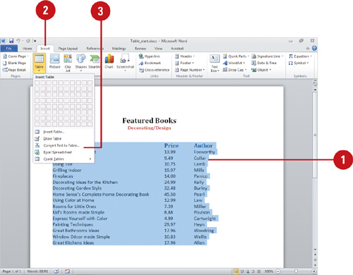
Create a Table from Existing Text
![]() Select the text for the table.
Select the text for the table.
![]() Click the Insert tab.
Click the Insert tab.
![]() Click the Table button, and then click Convert Text to Table.
Click the Table button, and then click Convert Text to Table.
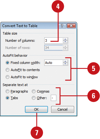
![]() Enter the number of columns.
Enter the number of columns.
![]() Select an AutoFit column width option.
Select an AutoFit column width option.
![]() Click a symbol to separate text into cells.
Click a symbol to separate text into cells.
![]() Click OK.
Click OK.
Did You Know?
You can convert a table back to text.
Select the table, click the Layout tab under Table Tools, click the Convert To Text button, select the Separate text with option (typically Tabs), and then click OK.
You can insert a Quick Table. If you need a calendar, or a specific table layout, such as double table, matrix, tabular list, you can use the Quick Tables command to select the one you want. The tables come with predefined data or information, which you can delete.
![]() Click to place the insertion point where you want to insert a table.
Click to place the insertion point where you want to insert a table.
![]() Click the Insert tab.
Click the Insert tab.
![]() Click the Table button, and then drag to select the number of rows and columns you want, or click Insert Table, enter the number of columns and rows you want, and then click OK.
Click the Table button, and then drag to select the number of rows and columns you want, or click Insert Table, enter the number of columns and rows you want, and then click OK.
![]() Release the mouse button to insert a blank grid in the document.
Release the mouse button to insert a blank grid in the document.
![]() When you’re done, click outside of the table.
When you’re done, click outside of the table.

Draw a Custom Table
![]() Click the Insert tab.
Click the Insert tab.
![]() Click the Table button, and then click Draw Table.
Click the Table button, and then click Draw Table.
![]() Draw the table.
Draw the table.
![]() A rectangle creates individual cells or the table boundaries.
A rectangle creates individual cells or the table boundaries.
![]() Horizontal lines create rows.
Horizontal lines create rows.
![]() Vertical lines create columns.
Vertical lines create columns.
![]() Diagonal lines split cells.
Diagonal lines split cells.
![]() If necessary, press and hold Shift, and then click one or more lines to erase them.
If necessary, press and hold Shift, and then click one or more lines to erase them.
![]() When you’re done, click outside of the table.
When you’re done, click outside of the table.

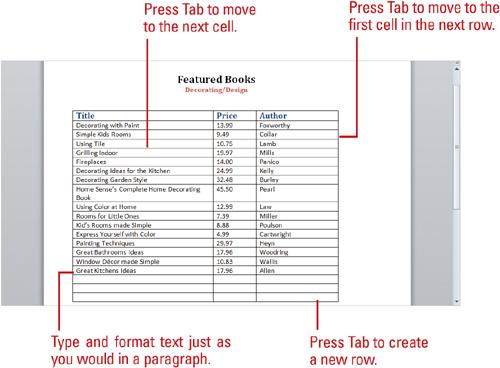
Entering Text in a Table
Once you create your table, you enter text into cells just as you would in a paragraph, except pressing Tab moves you from cell to cell. As you type in a cell, text wraps to the next line, and the height of a row expands as you enter text that extends beyond the column width. The first row in the table is good for column headings, whereas the leftmost column is good for row labels. Before you can modify a table, you need to know how to select the rows and columns of a table.
Enter Text and Move Around a Table
![]() The insertion point shows where text that you type will appear in a table. After you type text in a cell:
The insertion point shows where text that you type will appear in a table. After you type text in a cell:
![]() Press Enter to start a new paragraph within that cell.
Press Enter to start a new paragraph within that cell.
![]() Press Tab to move the insertion point to the next cell to the right (or to the first cell in the next row).
Press Tab to move the insertion point to the next cell to the right (or to the first cell in the next row).
![]() Press the arrow keys or click in a cell to move the insertion point to a new location.
Press the arrow keys or click in a cell to move the insertion point to a new location.
Select Table Elements
Refer to this table for methods of selecting table elements, including:
![]() The entire table
The entire table
![]() One or more rows and columns
One or more rows and columns
![]() One or more cells
One or more cells
Did You Know?
You can delete contents within a cell.
Select the cells whose contents you want to delete, and then press Backspace or Delete.
Selecting Table Elements

Sorting Table Contents or Lists
After you enter contents in a table or create a bulleted or numbered list, you can reorganize the information by sorting the information. For example, you might want to sort information in a client list alphabetically by last name or numerically by their last invoice date. Ascending order lists information from A to Z, earliest to latest, or lowest to highest. Descending order lists information from Z to A, latest to earliest, or highest to lowest. You can sort a table columns based on one or more adjacent columns. A sort, for example, might be the telephone directory numerically by area code and then alphabetically by last name.
Sort Table Contents or Lists
![]() Select the table column, adjacent columns, or list you want to sort.
Select the table column, adjacent columns, or list you want to sort.
![]() Click the Home tab or the Layout tab under Table Tools.
Click the Home tab or the Layout tab under Table Tools.
![]() Click the Sort button.
Click the Sort button.
![]() If necessary, click the Sort by list arrow, and then select a column name.
If necessary, click the Sort by list arrow, and then select a column name.
![]() Click the Type list arrow, and then click table cell content type.
Click the Type list arrow, and then click table cell content type.
![]() Click the Ascending or Descending option.
Click the Ascending or Descending option.
![]() If necessary, click the second Sort by list arrow, select another column name, and then select the related sorting options you want.
If necessary, click the second Sort by list arrow, select another column name, and then select the related sorting options you want.
![]() Click the Header row or No header row option as it applies to the table.
Click the Header row or No header row option as it applies to the table.
![]() Click OK.
Click OK.

Modifying a Table
As you begin to work on a table, you might need to modify its structure by adding more rows, columns, or cells to accommodate new text, graphics, or other tables. The table realigns as needed to accommodate the new structure. When you insert rows, columns, or cells, the existing rows shift down, the existing columns shift right, and you choose what direction the existing cells shift. Similarly, when you delete unneeded rows, columns, or cells from a table, the table realigns itself.
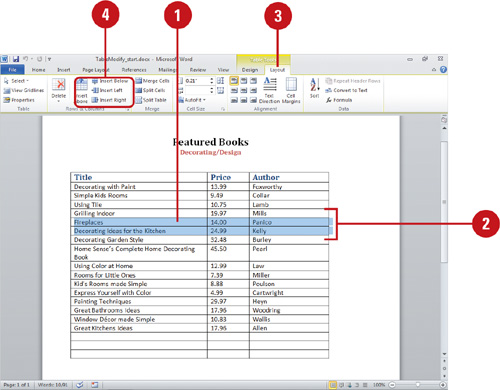
Insert Additional Rows or Columns
![]() Select the row above which you want the new rows to appear, or select the column to the left of which you want the new columns to appear.
Select the row above which you want the new rows to appear, or select the column to the left of which you want the new columns to appear.
![]() Drag to select the number of rows or columns you want to insert.
Drag to select the number of rows or columns you want to insert.
![]() Click the Layout tab under Table Tools.
Click the Layout tab under Table Tools.
![]() Click the Row & Column buttons you want:
Click the Row & Column buttons you want:
![]() Insert Above.
Insert Above.
![]() Insert Below.
Insert Below.
![]() Insert Left.
Insert Left.
![]() Insert Right.
Insert Right.
Did You Know?
You can show or hide gridlines in a table. Select the table you want to change, click the Layout tab under Table Tools, and then click View Gridlines to toggle it on and off.
You can resize a table. Drag a corner or middle resize handle to resize the table manually.
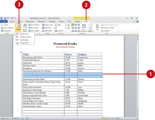
Delete Table, Rows, Columns, or Cells
![]() Select the rows, columns, or cells you want to delete.
Select the rows, columns, or cells you want to delete.
![]() Click the Layout tab under Table Tools.
Click the Layout tab under Table Tools.
![]() Click the Delete button, and then click the delete option you want:
Click the Delete button, and then click the delete option you want:
![]() Delete Cells. Select the direction in which you want the remaining cells to shift to fill the space, and then click OK.
Delete Cells. Select the direction in which you want the remaining cells to shift to fill the space, and then click OK.
![]() Delete Columns.
Delete Columns.
![]() Delete Rows.
Delete Rows.
![]() Delete Table.
Delete Table.
Did You Know?
You can set column widths to fit text.
Word can set the column widths to fit the cells’ contents or to fill the space between the document’s margins. Click in the table, click the Layout tab under Table Tools, click the AutoFit button in the Cell Size group, and then click AutoFit To Contents or AutoFit To Window.
You can evenly distribute columns and rows. Select the columns or rows you want to distribute evenly in a table, click the Layout tab under Table Tools, and then click the Distribute Vertically or Distribute Horizontally button in the Cells Size group.
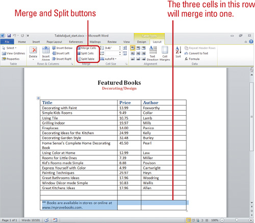
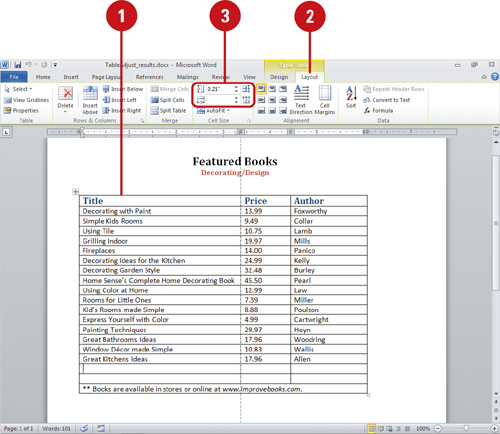
Adjusting Table Cells
Often there is more to modifying a table than adding or deleting rows or columns; you need to make cells just the right size to accommodate the text you are entering in the table. For example, a title in the first row of a table might be longer than the first cell in that row. To spread the title across the top of the table, you can merge (combine) the cells to form one long cell. Sometimes, to indicate a division in a topic, you need to split (or divide) a cell into two. You can also split one table into two at any row. Moreover, you can modify the width of any column and height of any row to better present your data.
Merge and Split Table Cells and Tables
![]() To merge two or more cells into a single cell, select the cells you want to merge, click the Layout tab under Table Tools, and then click the Merge Cells button.
To merge two or more cells into a single cell, select the cells you want to merge, click the Layout tab under Table Tools, and then click the Merge Cells button.
![]() To split a cell into multiple cells, click the cell you want to split, click the Layout tab under Table Tools, and then click the Split Cells button. Enter the number of rows or columns (or both) you want to split the selected cell into, clear the Merge cells before split check box, and then click OK.
To split a cell into multiple cells, click the cell you want to split, click the Layout tab under Table Tools, and then click the Split Cells button. Enter the number of rows or columns (or both) you want to split the selected cell into, clear the Merge cells before split check box, and then click OK.
![]() To split a table into two tables separated by a paragraph, click in the row that you want as the top row in the second table, click the Layout tab under Table Tools, and then click the Split Table button.
To split a table into two tables separated by a paragraph, click in the row that you want as the top row in the second table, click the Layout tab under Table Tools, and then click the Split Table button.
![]() To merge two tables into one, delete the paragraph between them.
To merge two tables into one, delete the paragraph between them.
Did You Know?
You can quickly adjust columns and rows. Position the pointer over the boundary of the column or row you want to adjust until it becomes a resize pointer. Drag the boundary to a new location.

Adjust Column Widths and Row Heights
![]() Select the columns or rows you want to change.
Select the columns or rows you want to change.
![]() Click the Layout tab under Table Tools.
Click the Layout tab under Table Tools.
![]() Change the Height and Width boxes in the Cell Size group:
Change the Height and Width boxes in the Cell Size group:
![]() Height. To change the row height, enter a height in the Height box and then press Enter, or use the Up and Down arrows.
Height. To change the row height, enter a height in the Height box and then press Enter, or use the Up and Down arrows.
![]() Width. To change the column width, enter a width in the Width box and then press Enter, or use the Up and Down arrows.
Width. To change the column width, enter a width in the Width box and then press Enter, or use the Up and Down arrows.
Change Table Properties
![]() Click in the table you want to change.
Click in the table you want to change.
![]() Click the Layout tab under Table Tools.
Click the Layout tab under Table Tools.
![]() Click the Properties button.
Click the Properties button.
![]() On the Table tab, click an alignment option, and then specify an indent from the left (when you select the Left alignment option).
On the Table tab, click an alignment option, and then specify an indent from the left (when you select the Left alignment option).
![]() Click a text wrapping option.
Click a text wrapping option.
![]() Click OK.
Click OK.

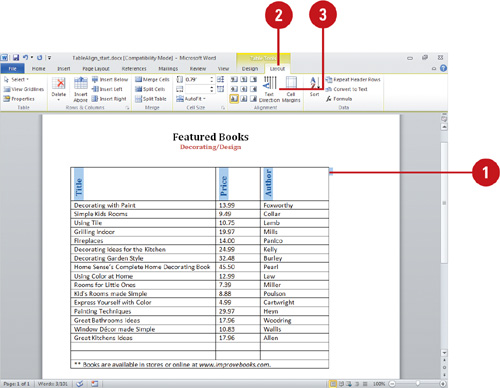
Aligning Table Cells
Tables distinguish text from paragraphs. In turn, formatting, alignment, and text direction distinguish text in table cells. You can customize your table by realigning the cells’ contents both horizontally and vertically, changing the direction of text within selected cells, such as the column headings, and resizing the entire table. You can also modify the appearance and size of the cells and the table.
Change Text Direction Within Cells
![]() Select the cells you want to change.
Select the cells you want to change.
![]() Click the Layout tab under Table Tools.
Click the Layout tab under Table Tools.
![]() Click the Text Direction button until the text is the direction you want.
Click the Text Direction button until the text is the direction you want.
Align Text Within Cells
![]() Select the cells, rows, or columns you want to align.
Select the cells, rows, or columns you want to align.
![]() Click the Layout tab under Table Tools.
Click the Layout tab under Table Tools.
![]() To align text in a cell, row or column, click one of the alignment buttons in the Alignment group.
To align text in a cell, row or column, click one of the alignment buttons in the Alignment group.
![]() To evenly distribute the height and width of the selected row and columns, select the row or column, and then click Distribute Rows or Distribute Columns.
To evenly distribute the height and width of the selected row and columns, select the row or column, and then click Distribute Rows or Distribute Columns.

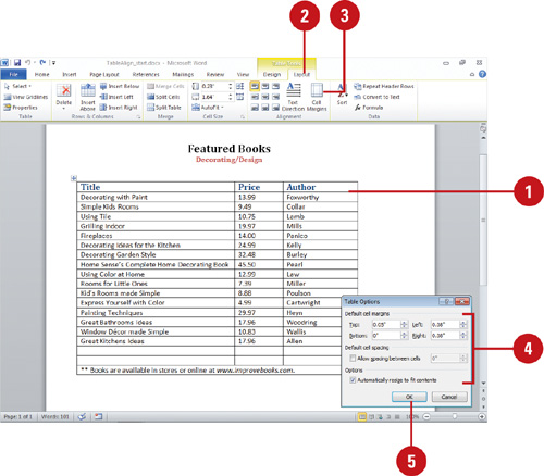
![]() Select a cell in the table you want to change.
Select a cell in the table you want to change.
![]() Click the Layout tab under Table Tools.
Click the Layout tab under Table Tools.
![]() Click the Cell Margins button.
Click the Cell Margins button.
![]() Specify cell margin sizes you want for the table.
Specify cell margin sizes you want for the table.
![]() Click OK.
Click OK.
Did You Know?
You can create nested tables. Select the table or cells, click the Home tab, click the Cut or Copy button, right-click the table cell, and then click Paste As Nested Table.
Change Cell Sizes
![]() Select the cells in the table you want to change.
Select the cells in the table you want to change.
![]() Click the Layout tab under Table Tools.
Click the Layout tab under Table Tools.
![]() Click the Up and Down arrows for the Table Row Height and Table Column Width.
Click the Up and Down arrows for the Table Row Height and Table Column Width.
![]() To automatically adjust the column width based on the size of the text, click the AutoFit button, and then click AutoFit Contents, AutoFit Window, or Fixed Column Width.
To automatically adjust the column width based on the size of the text, click the AutoFit button, and then click AutoFit Contents, AutoFit Window, or Fixed Column Width.

Adding a Quick Style to a Table
Instead of changing individual attributes of a table, such as shape, border, and effects, you can quickly add them all at once with the Table Quick Style gallery. The Table Quick Style gallery provides a variety of different formatting combinations. To quickly see if you like a Table Quick Style, point to a thumbnail in the gallery to display a live preview of it in the selected shape. If you like the style, you can apply it. In addition to applying one of the preformatted tables from the Table Quick Style gallery, you can also create your own style by shaping your text into a variety of shapes, curves, styles, and color patterns.
Add a Quick Style to a Table
![]() Click the table you want to change, or select the cells you want to modify.
Click the table you want to change, or select the cells you want to modify.
![]() Click the Design tab under Table Tools.
Click the Design tab under Table Tools.
![]() Click the scroll up or down arrow, or click the More list arrow in the Table Styles group to see additional styles.
Click the scroll up or down arrow, or click the More list arrow in the Table Styles group to see additional styles.
The current style appears highlighted in the gallery.
TIMESAVER Click the gallery title bar arrow to narrow down the list of styles: All, Document Matching, Light, Medium, or Dark.
![]() Point to a style.
Point to a style.
A live preview of the style appears in the current shape.
![]() Click the style you want from the gallery to apply it to the selected table.
Click the style you want from the gallery to apply it to the selected table.
Did You Know?
You can clear table formatting. Select the table you want to change, click the Design tab under Table Tools, click the More list arrow in the Table Styles group, and then click Clear Table.

![]() Click the table you want to change, or select the cells you want to modify.
Click the table you want to change, or select the cells you want to modify.
![]() Click the Design tab under Table Tools.
Click the Design tab under Table Tools.
![]() Click the Shading button, and then click or point to one of the following:
Click the Shading button, and then click or point to one of the following:
![]() Color to select a theme or standard color.
Color to select a theme or standard color.
![]() No Color to remove a color fill.
No Color to remove a color fill.
![]() More Colors to select a standard or custom color (using the RGB or HSL model).
More Colors to select a standard or custom color (using the RGB or HSL model).

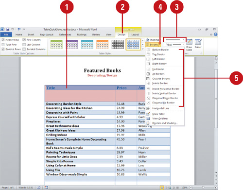
Apply an Outline to a Table
![]() Click the table you want to change, or select the cells you want to modify.
Click the table you want to change, or select the cells you want to modify.
![]() Click the Design tab under Table Tools.
Click the Design tab under Table Tools.
![]() Use the Line Width, Line Style, and Pen Color buttons to select the border attributes you want.
Use the Line Width, Line Style, and Pen Color buttons to select the border attributes you want.
![]() Click the Border button.
Click the Border button.
![]() Click a border option, such as No Border, All Borders, Outside Borders, Inside Horizontal Border, Inside Vertical Border, Diagonal Down Border, or Diagonal Up Border.
Click a border option, such as No Border, All Borders, Outside Borders, Inside Horizontal Border, Inside Vertical Border, Diagonal Down Border, or Diagonal Up Border.
Changing Table Style Options
When you create a table, you typically include a header row or first column to create horizontal or vertical headings for your table information. You can use Quick Style options, such as a header or total row, first or last column, or banded rows and columns, to show or hide a special row and column formatting. The Total Row option displays a row at the end of the table for column totals. The Banded Row or Banded Column option formats even rows or columns differently from odd rows or columns to make a table easier to view.
Change Table Columns Options
![]() Click the table you want to change.
Click the table you want to change.
![]() Click the Design tab under Table Tools.
Click the Design tab under Table Tools.
![]() Select any of the following row and column check box options:
Select any of the following row and column check box options:
![]() First Column to format the first column of the table as special.
First Column to format the first column of the table as special.
![]() Last Column to format the last column of the table as special.
Last Column to format the last column of the table as special.
![]() Banded Columns to format even columns differently than odd columns.
Banded Columns to format even columns differently than odd columns.
Change Table Rows Options
![]() Click the table you want to change.
Click the table you want to change.
![]() Click the Design tab under Table Tools.
Click the Design tab under Table Tools.
![]() Select any of the following row and column check box options:
Select any of the following row and column check box options:
![]() Header Row to format the top row of the table as special.
Header Row to format the top row of the table as special.
![]() Total Row to format the bottom row of the table for column totals.
Total Row to format the bottom row of the table for column totals.
![]() Banded Rows to format even rows differently than odd rows.
Banded Rows to format even rows differently than odd rows.

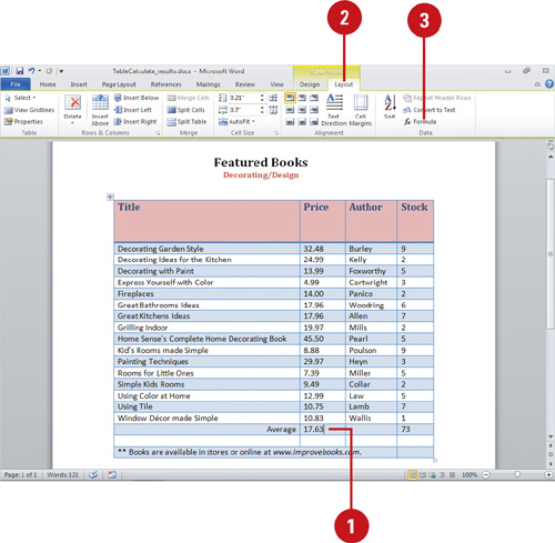
Summing Table Rows and Columns
The fastest way to total the rows or columns of a table is by clicking the Formulas button on the Layout tab under Table Tools. The disadvantage of using this method is that if you subsequently edit the values in the rows and columns of the table, the sums will not automatically update. You would need to remember to click Formula again for each row and column that was updated. To ensure sum totals are automatically calculated anytime the data in a table changes, use the equation functions of Word.
Add the Contents of Rows and Columns
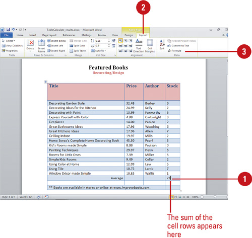
![]() Click the cell in which you want the sum to appear.
Click the cell in which you want the sum to appear.
![]() Click the Layout tab under Table Tools.
Click the Layout tab under Table Tools.
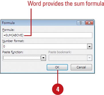
![]() Click the Formula button. If Word proposes a formula that you do not want to use, delete it from the Formula box.
Click the Formula button. If Word proposes a formula that you do not want to use, delete it from the Formula box.
![]() If the cell you selected is at the bottom of a column of numbers, Microsoft Word proposes the formula =SUM(ABOVE).
If the cell you selected is at the bottom of a column of numbers, Microsoft Word proposes the formula =SUM(ABOVE).
![]() If the cell you selected is at the right end of a row of numbers, Word proposes the formula =SUM(LEFT).
If the cell you selected is at the right end of a row of numbers, Word proposes the formula =SUM(LEFT).
![]() Click OK.
Click OK.
Calculating a Value in a Table
Sometimes the simple equations proposed by Word do not adequately cover what you are trying to calculate in the table. When that is the case, you need to create a custom equation to do the work. The Formula dialog box gives you a choice of 18 paste functions to help you create your formula. Should you need help, you can activate Help to see examples of how to use each paste function, or for more complex formulas, try Microsoft’s Online Community to look for advice from other users.
Calculate a Value
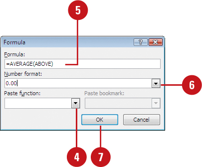
![]() Click the cell in which you want the result to appear.
Click the cell in which you want the result to appear.
![]() Click the Layout tab under Table Tools.
Click the Layout tab under Table Tools.
![]() Click the Formula button. If Word proposes a formula that you do not want to use, delete it from the Formula box.
Click the Formula button. If Word proposes a formula that you do not want to use, delete it from the Formula box.
![]() Click the Paste Function list arrow, and then select a function.
Click the Paste Function list arrow, and then select a function.
![]() To reference the contents of a table cell, type the cell references in the parentheses in the formula. For instance, to average the values in cells a1 through a4, the formula would read =Average(a1, a4). If you are doing the average of a row in the last column of the row, simplify this to =Average(left).
To reference the contents of a table cell, type the cell references in the parentheses in the formula. For instance, to average the values in cells a1 through a4, the formula would read =Average(a1, a4). If you are doing the average of a row in the last column of the row, simplify this to =Average(left).
![]() In the Number format box, enter a format for the numbers. For example, to display the numbers as a decimal percentage, click 0.00%. For now, enter 0 to display the average as the nearest whole number. To display a true average, enter 0.00 in the Number Format box.
In the Number format box, enter a format for the numbers. For example, to display the numbers as a decimal percentage, click 0.00%. For now, enter 0 to display the average as the nearest whole number. To display a true average, enter 0.00 in the Number Format box.
![]() Click OK.
Click OK.
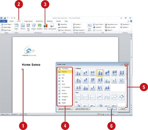
Inserting and Creating a Chart
A chart provides a visual, graphical representation of numerical data. Charts add visual interest and useful information represented by lines, bars, pie slices, or other markers. A group of data values from a work-sheet row or column of data makes up a data series. Each data series has a unique color or pattern on the chart. Titles on the chart, horizontal (x-axis), and vertical (y-axis) identify the data. Gridlines are horizontal and vertical lines to help the reader determine data values in a chart. When you insert and create a chart in a document, the chart is an embedded object from Microsoft Excel 2010. You can then resize or move it just as you would any graphic object.
Insert and Create a Chart
![]() Click to place the insertion point where you want to insert a Chart.
Click to place the insertion point where you want to insert a Chart.
![]() Click the Insert tab.
Click the Insert tab.
![]() Click the Insert Chart button.
Click the Insert Chart button.
![]() Click a category in the left pane.
Click a category in the left pane.
![]() Click the chart type you want.
Click the chart type you want.
![]() Click OK.
Click OK.
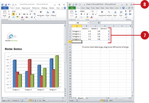
A Microsoft Excel worksheet opens and tiles next to your Word document, displaying a sample chart.
![]() To create a chart, change the sample data in the Excel worksheet. You can enter, paste, or import data.
To create a chart, change the sample data in the Excel worksheet. You can enter, paste, or import data.
![]() To close the worksheet and view the chart, click the Close button on the Excel worksheet and return to Word.
To close the worksheet and view the chart, click the Close button on the Excel worksheet and return to Word.
Did You Know?
Word uses Microsoft Excel 2010 to embed a chart. Office programs (including Word) use Microsoft Excel to embed and display a chart instead of Microsoft Graph.
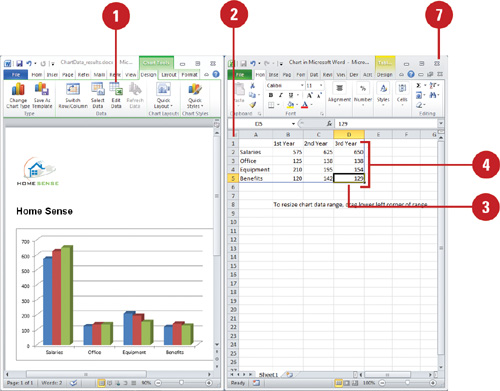
Working with Chart Data
You can enter chart data in the Excel worksheet either by typing it or by inserting it from a different source. The worksheet is designed to make data entry easy, so direct typing is best when you’re entering brief, simple data. For more complex or longer data, and when you’re concerned about accuracy, insert and link your data to the chart. When you first insert a chart, the worksheet contains sample labels and numbers.
Open and View Chart Data
![]() Click the chart you want to modify.
Click the chart you want to modify.
A chart consists of the following elements.
![]() Data markers. A graphical representation of a data point in a single cell in the datasheet. Typical data markers include bars, dots, or pie slices.
Data markers. A graphical representation of a data point in a single cell in the datasheet. Typical data markers include bars, dots, or pie slices.
![]() Legend. A pattern or color that identifies each data series.
Legend. A pattern or color that identifies each data series.
![]() X-axis. A reference line for the horizontal data values.
X-axis. A reference line for the horizontal data values.
![]() Y-axis. A reference line for the vertical data values.
Y-axis. A reference line for the vertical data values.
![]() Tick marks. Marks that identify data increments.
Tick marks. Marks that identify data increments.
![]() Click the Design tab under Chart Tools.
Click the Design tab under Chart Tools.
![]() Click the Edit Data button.
Click the Edit Data button.
A Microsoft Excel worksheet opens and tiles next to your Word document.
![]() To close the worksheet and view the chart, click the Close button on the Excel worksheet and return to Word.
To close the worksheet and view the chart, click the Close button on the Excel worksheet and return to Word.


![]() Click the chart you want to modify, and then click the Edit Data button on the Design tab under Chart Tools.
Click the chart you want to modify, and then click the Edit Data button on the Design tab under Chart Tools.
![]() To delete the sample data, click the upper-left heading button to select all the cells, and then press Delete.
To delete the sample data, click the upper-left heading button to select all the cells, and then press Delete.
![]() Use one of the following to select a cell, row, column, or datasheet.
Use one of the following to select a cell, row, column, or datasheet.
![]() To select a cell, click it.
To select a cell, click it.
![]() To select an entire row or column, click the row heading or column heading button.
To select an entire row or column, click the row heading or column heading button.
![]() To select a range of cells, drag the pointer over the cells you want to select, or click the upper-left cell of the range, press and hold Shift, and then click the lower-right cell. When you select a range of cells, the active cell is white, and all other selected cells are outlined in black.
To select a range of cells, drag the pointer over the cells you want to select, or click the upper-left cell of the range, press and hold Shift, and then click the lower-right cell. When you select a range of cells, the active cell is white, and all other selected cells are outlined in black.
![]() Type the data you want to enter in the cell.
Type the data you want to enter in the cell.
![]() Press Enter to move the insertion point down one row or press Tab to move the insertion point right to the next cell.
Press Enter to move the insertion point down one row or press Tab to move the insertion point right to the next cell.
![]() If necessary, select the data you want for the chart, click the Design tab, click the Resize Table button, and then click OK.
If necessary, select the data you want for the chart, click the Design tab, click the Resize Table button, and then click OK.
![]() To close the worksheet and view the chart, click the Close button on the Excel worksheet and return to Word.
To close the worksheet and view the chart, click the Close button on the Excel worksheet and return to Word.

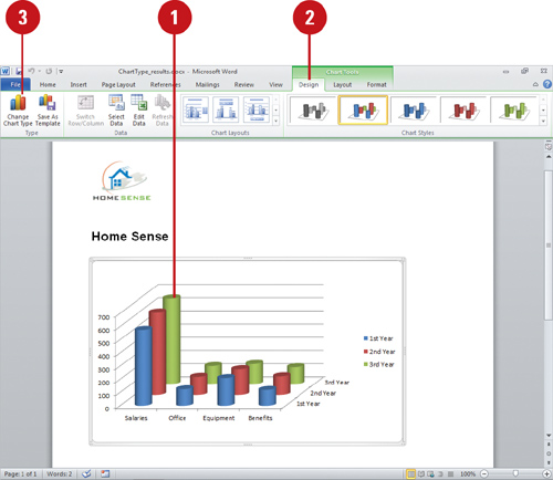
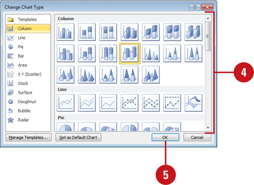
Changing a Chart Type
Your chart is what your reader sees, so make sure to take advantage of the pre-built chart layouts and styles to make the chart appealing and visually informative. Start by choosing the chart type that is best suited for presenting your data. There are a wide variety of chart types, available in 2-D and 3-D formats, from which to choose. For each chart type, you can select a predefined chart layout and style to apply the formatting you want. If you want to format your chart beyond the provided formats, you can customize a chart. Save your customized settings so that you can apply that chart formatting to any chart you create. You can change the chart type for the entire chart, or you can change the chart type for a selected data series to create a combination chart.
Change a Chart Type for an Entire Chart
![]() Select the chart you want to change.
Select the chart you want to change.
![]() Click the Design tab under Chart Tools.
Click the Design tab under Chart Tools.
![]() Click the Change Chart Type button.
Click the Change Chart Type button.
![]() Click the chart type you want.
Click the chart type you want.
![]() Click OK.
Click OK.
Did You Know?
You can reset chart formatting. Click the chart you want to reset, click the Format tab under Chart Tools, and then click the Reset To Match Style button.
You can delete a chart. Click the chart object, and then press Delete.
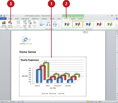
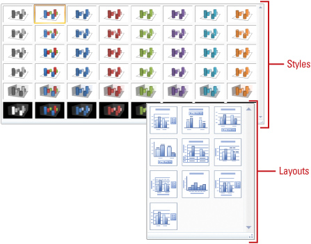
Changing a Chart Layout and Style
Office’s pre-built chart layouts and styles can make your chart more appealing and visually informative. Start by choosing the chart type that is best suited for presenting your data. There are a wide variety of chart types, available in 2-D and 3-D formats, from which to choose. For each chart type, you can select a predefined chart layout and style to apply the formatting you want. If you want to format your chart beyond the provided formats, you can customize a chart. Save your customized settings so that you can apply that chart formatting to any chart you create.
Change a Chart Layout or Style
![]() Select the chart you want to change.
Select the chart you want to change.
![]() Click the Design tab under Chart Tools.
Click the Design tab under Chart Tools.
![]() To change the chart layout, click the scroll up or down arrow, or click the More list arrow in the Chart Layouts group, and then click the layout you want.
To change the chart layout, click the scroll up or down arrow, or click the More list arrow in the Chart Layouts group, and then click the layout you want.
![]() To change the chart style, click the scroll up or down arrow, or click the More list arrow in the Chart Styles group, and then click the chart style you want.
To change the chart style, click the scroll up or down arrow, or click the More list arrow in the Chart Styles group, and then click the chart style you want.
Did You Know?
You can record macros with chart elements. When you use the macro recorder with charts, it now records formatting changes to charts and other objects (New!).

Changing Chart Titles
The layout of a chart typically comes with a chart title, axis titles, and a legend. However, you can also include other elements, such as data labels, and a data table. You can show, hide, or change the positions of these elements to achieve the look you want. The chart title typically appears at the top of the chart. However, you can change the title position to appear as an overlap text object on top of the chart. When you position the chart title as an overlay, the chart is resized to the maximum allowable size. In the same way, you can also reposition horizontal and vertical axis titles to achieve the best fit in a chart. If you want a more custom look, you can set individual options using the Format dialog box.
Change Chart Title
![]() Select the chart you want to modify.
Select the chart you want to modify.
![]() Click the Layout tab under Chart Tools.
Click the Layout tab under Chart Tools.
![]() Click the Chart Titles button, and then click one of the following:
Click the Chart Titles button, and then click one of the following:
![]() None to hide the chart title.
None to hide the chart title.
![]() Centered Overlay Title to insert a title on the chart without resizing it.
Centered Overlay Title to insert a title on the chart without resizing it.
![]() Above Chart to position the chart title at the top of the chart and resize it.
Above Chart to position the chart title at the top of the chart and resize it.
![]() More Title Options to set custom chart title options.
More Title Options to set custom chart title options.
![]() Double-click the text box to place the insertion point, and then modify the text.
Double-click the text box to place the insertion point, and then modify the text.
Did You Know?
You can link a chart or axis title to a worksheet cell. On the chart, click the chart or axis title you want to link, click in the formula bar, type equal sign (=), select the worksheet cell that contains the data or text you want to display in the chart, and then press Enter.

Changing Chart Labels
A legend is a set of text labels that helps the reader connect the colors and patterns in a chart with the data they represent. Legend text is derived from the data series plotted within a chart. You can rename an item within a legend by changing the text in the data series. If the legend chart location doesn’t work with the chart type, you can reposition the legend at the right, left, top or bottom of the chart or overlay the legend on top of the chart on the right or left side. Data labels show data values in the chart to make it easier for the reader to see, while a Data table shows the data values in an associated table next to the chart. If you want a customized look, you can set individual options using the Format dialog box. In addition, you can change the label display for axes and show or hide major or minor gridlines.
Change the Chart Legend, Data Labels, and Axis Titles
![]() Select the chart you want to modify.
Select the chart you want to modify.
![]() Click the Layout tab under Chart Tools.
Click the Layout tab under Chart Tools.
![]() Click any of the following label buttons:
Click any of the following label buttons:
![]() Chart Title. Click to add, remove, or position a chart title.
Chart Title. Click to add, remove, or position a chart title.
![]() Axis Titles. Click to add or remove an axis title on the chart.
Axis Titles. Click to add or remove an axis title on the chart.
![]() Legend. Click to select a legend position on the chart.
Legend. Click to select a legend position on the chart.
![]() Data Labels. Click to show or hide data labels on the chart for each data series.
Data Labels. Click to show or hide data labels on the chart for each data series.
![]() Data Table. Click to show or hide a table next to the chart with the chart data.
Data Table. Click to show or hide a table next to the chart with the chart data.
![]() Axes. Click to show, hide, or position axis labels or tick marks.
Axes. Click to show, hide, or position axis labels or tick marks.
![]() Gridlines. Click to show or hide major or minor gridlines.
Gridlines. Click to show or hide major or minor gridlines.
Formatting Line and Bar Charts
If you’re using a line or bar chart, you can add trendlines, series lines, drop lines, high-low lines, up/down bars, or error bars with different options to make the chart easier to read. Trendlines are graphical representations of trends in data that you can use to analyze problems of prediction. For example, you can add a trendline to forecast a trend toward rising revenue. Series lines connect data series in 2-D stacked bar and column charts. Drop lines extend a data point to a category in a line or area chart, which makes it easy to see where data markers begin and end. High-low lines display the highest to the lowest value in each category in 2-D charts. Stock charts are examples of high-low lines and up/down bars. Error bars show potential error amounts graphically relative to each data marker in a data series. Error bars are usually used in statistical or scientific data.
Format Line and Bar Charts
![]() Select the line or bar chart you want to modify.
Select the line or bar chart you want to modify.
![]() Click the Layout tab under Chart Tools.
Click the Layout tab under Chart Tools.
![]() In the Analysis group, click any of the following:
In the Analysis group, click any of the following:
![]() Trendline to remove or add different types of trendlines: Linear, Exponential, Linear Forecast, and Two Period Moving Average.
Trendline to remove or add different types of trendlines: Linear, Exponential, Linear Forecast, and Two Period Moving Average.
![]() Lines to hide Drop Lines, High-Low Lines or Series Lines, or show series lines on a 2-D stacked Bar/Column Pie or Pie or Bar of Pie chart.
Lines to hide Drop Lines, High-Low Lines or Series Lines, or show series lines on a 2-D stacked Bar/Column Pie or Pie or Bar of Pie chart.
![]() Up/Down Bars to hide Up/Down Bars, or show Up/Down Bars on a line chart.
Up/Down Bars to hide Up/Down Bars, or show Up/Down Bars on a line chart.
![]() Error Bars to hide error bars or show error bars with using Standard Error, Percentage, or Standard Deviation.
Error Bars to hide error bars or show error bars with using Standard Error, Percentage, or Standard Deviation.

Editing Chart Data
You can edit chart data in a worksheet one cell at a time, or you can manipulate a range of data. If you’re not sure what data to change to get the results you want, use the Edit Data Source dialog box to help you. In previous versions, you were limited to 32,000 data points in a data series for 2-D charts. Now you can have as much as your memory to store (New!). You can work with data ranges by series, either Legend or Horizontal. The Legend series is the data range displayed on the axis with the legend, while the Horizontal series is the data range displayed on the other axis. Use the Collapse Dialog button to temporarily minimize the dialog to select the data range you want. After you select your data, click the Expand Dialog button to return back to the dialog box.
Edit the Data Source
![]() Click the chart you want to modify.
Click the chart you want to modify.
![]() Click the Design tab under Chart Tools.
Click the Design tab under Chart Tools.
![]() Click the Select Data button on the Design tab under Chart Tools.
Click the Select Data button on the Design tab under Chart Tools.
![]() In the Select Data Source dialog box, use any of the following:
In the Select Data Source dialog box, use any of the following:
![]() Chart data range. Displays the data range of the plotted chart.
Chart data range. Displays the data range of the plotted chart.
![]() Switch Row/Column. Click to switch plotting the data series from rows or columns.
Switch Row/Column. Click to switch plotting the data series from rows or columns.
![]() Add. Click to add a new Legend data series to the chart.
Add. Click to add a new Legend data series to the chart.
![]() Edit. Click to make changes to a Legend or Horizontal series.
Edit. Click to make changes to a Legend or Horizontal series.
![]() Remove. Click to remove the selected Legend data series.
Remove. Click to remove the selected Legend data series.
![]() Move Up and Move Down. Click to move a Legend data series up or down in the list.
Move Up and Move Down. Click to move a Legend data series up or down in the list.
![]() Hidden and Empty Cells. Click to plot hidden data and determine what to do with empty cells.
Hidden and Empty Cells. Click to plot hidden data and determine what to do with empty cells.
![]() Click OK.
Click OK.


Saving a Chart Template
A chart template file (.crtx) saves all the customization you made to a chart for use in other documents. You can save any chart in a document as a chart template file and use it to form the basis of your next document chart, which is useful for standard company financial reporting. Although you can store your template anywhere you want, you may find it handy to store it in the Templates/Charts folder that Microsoft Office uses to store its templates. If you store your design templates in the Templates/Charts folder, those templates appear as options when you insert or change a chart type using My Templates. When you create a new chart or want to change the chart type of an existing chart, you can apply a chart template instead of re-creating it.
Create a Custom Chart Template
![]() Click the chart you want to save as a template.
Click the chart you want to save as a template.
![]() Click the Design tab under Chart Tools.
Click the Design tab under Chart Tools.
![]() Click the Save As Template button.
Click the Save As Template button.
![]() Make sure the Charts folder appears in the Save in box.
Make sure the Charts folder appears in the Save in box.
Microsoft Office templates are typically stored in the following location:
Windows 7 or Vista. C:/Users/your name/AppData/Microsoft/Roaming/Templates/Charts
Windows XP. C:/Documents and Settings/your name/Application Data/Microsoft/Templates/Charts
![]() Type a name for the chart template.
Type a name for the chart template.
![]() Click Save.
Click Save.