11. Forms and User Interface Elements
Designing and styling forms and getting constant results across browsers and platforms can be the most difficult part of web development.
Most of this difficulty arises because of the nature of form elements. They’re built to solicit input from the user of the site, and how that input gets there can be quite different from device to device.
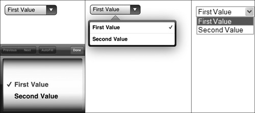
Different operating systems have different native form control behavior and appearance, and browser vendors have tried to keep the display of interface elements in line with those standards. As a result, a user will typically see familiar inputs even if they use multiple browsers on one device, but if they change devices or operating systems, the interface elements will change. Even in the same browser, the appearances may differ between Windows, Mac OS X, Linux, and mobile devices. Figure 11.1 shows the difference in appearance of a select elements on three different devices.
Figure 11.1. Interaction with select element in Safari/Apple iPhone iOS4, Safari/Apple iPad iOS3, and IE 8/Windows XP (from left to right).
You can find additional examples of CSS applied to form elements in different browsers and operating systems at Christopher Schmitt’s meticulously collected and indexed collection of screenshots at http://www.WebFormElements.com.
Something else that can be unique to form layouts is the need to juggle the myriad of positioning and placement and states of the elements of the form. Large fields, small fields, sets of fields, labels, and help or error messages all need to be placed so that it is clear to the visitor what is being requested from them. The grid that works for a standard-length text input along with its label may not work for a collection of radio buttons or a combination of inputs such as parts of a phone number or city and state.
Working with Form Controls
As different as they can be from platform to platform, form elements on the major desktop browsers tend to share the basic properties; sizing, fonts, colors, and backgrounds all can be set as they would on any other HTML element. Because some form controls are more complex than your average block of text, how those properties are applied can be a bit peculiar. There’s no hard and fast rule covering where a border is drawn or what parts of the select widget handle a color applied to it.
Tip
Safari will draw native form controls (the bubbly look on OS X) even when some styles are defined. Set a border on the element to force it out of the native mode and into one that takes other styles such as color or backgrounds.
Sizing
Form elements, like images, are inline replaced elements. For styling purposes, it is best to think of them as rectangular boxes even when they’re “round” radio buttons or made of multiple parts like file input fields. When setting the height and width of a form element, you’re setting the dimensions on the outer box. What the field inside that box does to fill the space is out of your hands.
Although elements such as textareas and buttons fill the entire rectangular box, check boxes, radio buttons (Figure 11.2 on the next page), and file input fields reserve the specified space in the layout but scale in varied ways to fill that space (or not really fill it, as shown in some of these examples).
Figure 11.2. Radio buttons in Safari 5.0.1/OS X, Firefox 3.6.8/OS X, Firefox 3.0.1.5/Windows, IE 8/Windows, and Opera 10.6.1/Windows (from left to right) with a 100-pixel width, 100-pixel height, 1-pixel red border, and 10-pixel padding.

To further complicate things, textareas, text inputs, and similar elements aren’t quite like the other elements since they follow the content-box box sizing model, whereas other elements use the border-box model. Setting the box-model property to border-box helps regain some consistency in sizing between text inputs and selects and buttons, with the drawback of making them behave less like the labels or paragraphs that surround the fields.

Colors, Backgrounds, and Borders
Like sizing, colors apply as you’d expect them to for text in elements such as submit buttons, textareas, and password fields. On the other hand, the behavior of radio buttons, check boxes, and select options will vary based on the browser and platform, so consider the color to be just a suggestion, not a rule.
This goes for the other properties as well. Where would you apply a background color to a radio button—inside the circle or outside and behind the circle in the rest of the box? Is the line between the text space and the little handle of a select element a border? How many backgrounds and borders are there in a file input field that is often represented as something that looks like a text input plus a button? What about all those new input types like sliders in HTML5?
These are the questions that give browser developers (and in turn web developers) migraines.
For the most consistent appearance, you should probably avoid borders and background colors and avoid background images for radio buttons and check boxes. (Figure 11.2 showed examples of browser differences.) On the other hand, you can do interesting things with borders, background colors, and background images for the other field types. In the next example, a background image on a text input is used to create the feeling of depth (Figure 11.3). I’ve added background color change when the element is in focus for a highlight.
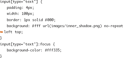
Figure 11.3. A text input with a background image.
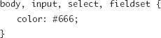
Text and Form Element Inheritance
Stemming from the desire to present native and consistent controls to users, CSS properties that are normally inherited from parent elements to child elements such as font settings and color are not inherited by form elements. Therefore, styling for form elements has to be done by selecting the input field directly. The following code will set the same text color for all the text and form elements:
Though not supported in IE7 or earlier, this is a great use case for the inherit value to explicitly tell form elements to inherit certain properties from their parents.
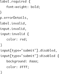
States: Disabled, Required, and Invalid
Chapter 3 introduced the :disabled, :checked, :required, :valid, and :invalid pseudo-class selectors. The browser support for these selectors might put them in the unreliable category—particularly since forms are so important to some web apps or marketing programs and thus tend to strive for more cross-browser consistency. These selectors also apply only to form elements and not to other parts of the form presentation like labels that often need to reflect the same state. To get around this limitation, it can be useful to create classes that mimic the effect of the pseudo-class selectors.
JavaScript or server-side form validation can apply these class names to help present the proper state of the elements.
Common Form Element Layouts
By default, labels and forms are inline elements. This is a useful baseline, but creating a form presentation with a clean grid requires some changes to those default behaviors and sometimes a little extra markup or careful use of fieldset elements.
Label Stacked Above the Field
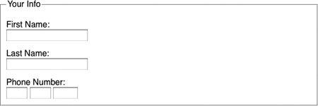
Creating a layout where the label is on a line above the form field is as easy as setting the label to display as a block element would (Figure 11.4):
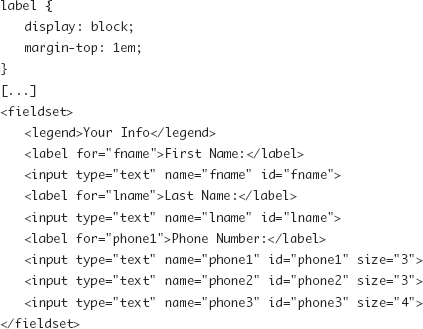
Figure 11.4. Form presentation with labels above form elements.
Basic Multicolumn Forms
In the previous example, the fields read from the top down. To change the order of elements so they appear from left to right, you can make a small alteration to the styles and markup to give you boxes for elements that float beside each other (Figure 11.5 on the next page):
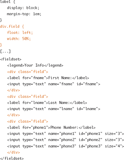
Figure 11.5. A two-column form layout.

Note
Although including the input field element inside the label tag is valid HTML and doing so might allow for easier styling in this scenario, this is considered a bad practice because of accessibility concerns.
Label Besides the Field
Using the same markup as the previous example and the following CSS, you can have a grid where labels are on the left of the input field (Figure 11.6):

Figure 11.6. Labels to left of form elements.
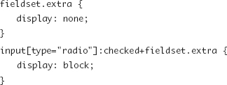
Exceptions for Radio Buttons and Check Boxes
In the example of the previous label, the form element labels for radio button sets would appear quite awkward with one little small element per line. In the label besides the field example, it may be desirable to have all options on a single line. Or sometimes a check box is associated with a long passage of text such as a legal disclaimer.
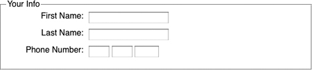
The following code builds on the previous examples and demonstrates two possible ways to deal with these exceptions (Figure 11.7):

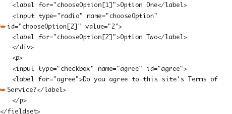
Figure 11.7. Labels for radio buttons and check boxes.
Inputting Tabular Data
Though using HTML tables for layout is outdated, taboo, and semantically incorrect, there are arrangements of forms that mimic a table. After all, where is the form data headed most often but a database table or series of tables? So if you have a series of inputs for multiple records at one time or some similar scenario where you can have a one-to-one relationship of data items to cells, marking up the elements as a series of table cells and headers can be semantically appropriate.
Conditional Fields
Sets of conditional fields—if one option is chosen to display or enable other options—typically have states managed by JavaScript, but each state is defined via classes such as the disabled class used in the next code block. The script would move the disabled class around as the form elements are changed.

Using a combination of CSS3 selectors, you can achieve similar effects without JavaScript. Using the same markup as the previous example, the CSS would look like this:
Placeholder Text
A fairly common convention with text inputs is to place a small hint into the field. Doing this with the value attribute of the element can be problematic (causing the submission of the hint text or other oddities), so HTML5 introduces the placeholder attribute. To accomplish this without either attribute, you can create a second label element using JavaScript and position it with CSS over the text input field (as deconstructed in Figure 11.8).
Figure 11.8. Deconstructing a label covering the input area of a text field.

Making Buttons
Getting users to interact with a site and share their information is the primary purpose of any form, and for web apps or web-based promotions, clicking the submit button may be the entire reason for the site’s existence. As such, submit buttons scream to be styled in ways that draw the user to them. There are 101 different methods to enhance buttons; this section offers a quick overview of the parts behind them.
A key hurdle to easy, flexible button styling is that buttons are just one HTML element, and there is only so much that can be done to one element. You can’t manufacture extra hooks for styling like you saw in the rounded corner examples and elsewhere in this book, so you’re stuck with what is there (though perhaps you could wrap the button in something or use generated content in interesting ways).
Background Images
Background images can do a lot for a button: add depth, add the look of ready to press and depressed states, and create many other effects that a mix of color and border alone cannot do.
Submit button sizes are typically flexible to allow for a wide range of text lengths or font sizes. A fixed-size button paired with a single nonrepeating background image can lead to text escaping the boundaries of the graphic. With controlled button labels or a large enough button style providing leeway for these cases, the fixed width and height is possible. Otherwise, stick with repeatable patterns and borders used to mark the sides of the element.
CSS3: text-shadow, border-radius, and Gradients
The text-shadow property described in Chapter 9 is a useful way to enhance button text styling. Background images are nice, but they come with some noted inflexibility. The border-radius property, when combined with color gradients (Chapter 14), can make creating flexible and good-looking buttons quite simple.
The CSS Tricks Button Maker (http://css-tricks.com/examples/ButtonMaker/) is a little demo app that lets you adjust all these properties visually and then shows you the CSS code behind it.
Links As Buttons
Links are often interchangeable with submit buttons in a site’s design. The call to action may sometimes be associated with a form but often not. Choose a class to use for links that should be styled similarly to button actions, and style both together in your code. And while you’re at it, don’t forget the different states for each or the other types of button elements (the button element as well as the button input type). Figure 11.9 (on the next page) shows three different clickable HTML elements styled similarly.
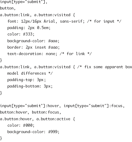

Figure 11.9. Links, input buttons, and button elements styled similarly.