
9. Typography and Web Fonts
In times past, choosing type styling for a web site meant picking from one of a handful of typefaces; setting a size, color, and a few other properties; and relinquishing the control that designers are used to when designing for other media. CSS provides more control over font styling and typesetting than many people realize, and in the last few years there have been huge advancements in tools, services, and embeddable fonts based on changes in CSS3.
This chapter explores how to choose the font used and discusses the other properties that give you control over the appearance and the readability of the text on the pages you build.
Font Basics
The typeface used for rendering text and its particular characteristics such as size and weight are defined using font and its related properties.
font-family
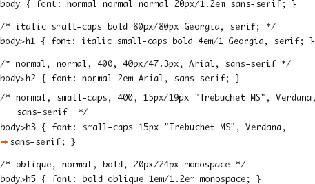
The font-family property accepts a comma-separated list of font family names. The first value in the list that is installed on the device used to read the page is the font that will be used to style the text.
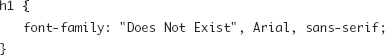
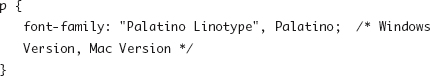
In the previous code, the font name would be checked; if the font Does Not Exist is not available, the next font Arial would be looked for, and so on, until the generic family sans-serif was matched and used. In some cases, font names vary a bit between Windows and Mac, so both names would be listed, like so:
Generic font-family keywords have been created to map to a browser- or system-defined font family for the specified category of fonts. The preference dialog boxes for each browser typically allow users to select their preferred font family for some of these categories.
• serif: A typeface style typically denoted by flourishes or flared ends on each character; typically Times New Roman
• sans-serif: A typeface design with plain or straight features; typically Arial
• cursive: A cursive or handwriting-like typeface
• monospace: A fixed-width font, commonly used for displaying code or other text where character width is important like ASCII art; typically Courier or Courier New
• fantasy: A highly stylized typeface
See “Specifying Typefaces” later in this chapter for common examples and additional discussion of choosing and defining font families.
font-size
The font-size property controls the size of the text in the element and may be defined as a fixed size or a size relative to the font size of the parent element. Browsers set a default size based on settings in the user preferences, commonly 16px.
• <length>: A length measurement
• <percentage>: A percentage value measured against the computed value of the parent element’s font-size
• xx-small | x-small | small | medium | large | x-large | xx-large: Fixed-size values along a browser-defined scale
• larger | smaller: A value relative to the parent element’s size; typically representing a step up or down the previous scale (xx-small through xx-large)
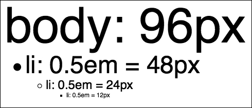
Relative and percentage font sizes are based on their parent element’s computed font size. The effect of this behavior may be compounded when nesting elements. The following sample (Figure 9.1 on the next page) demonstrates how font sizes are calculated for nested elements.
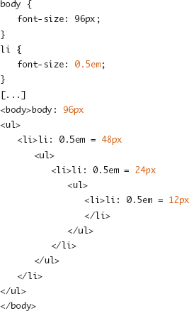
Figure 9.1. Repeated calculation of half the parent’s font size.
If this compounded calculation of the font size is not the desired behavior, it may be more useful to set the font size on some container element and avoid setting it on list items, paragraphs, or inline elements that may appear in various locations in the HTML document. For the previous example, the following would ensure that all items in the outer container element (ul) are half the body size and that this value is not reapplied for nested lists:
body > ul {
font-size: 0.5em;
}
Note
Many screen-based fonts become difficult to read at small sizes where there may not be enough pixels to distinguish the strokes of a character. Be careful when using relative sizes that make the default font size smaller because some users may have set their default font sizes to something smaller than you’re expecting already. Some browsers allow users to set a minimum font size to aid the readability of text to prevent it from becoming illegible.
font-weight
The font-weight property controls the weight, or thickness, of the characters in a font.
• normal | bold: Keywords representing normal weight type (default) and bolded type
• bolder | lighter: Sets a weight relative to the weight inherited from the parent element
• 100 to 900: A nine-step scale, in increments of 100, ranging from thin (100) to black (900)
Note
Though a nine-step scale for font weights is defined, browsers typically display only two distinct steps—normal (400) and bold (700).
font-variant
Some typefaces are designed with several variant character sets, including a set of small caps shapes. The font-variant allows selection of this alternate set of characters.
• normal: Selects the normal variant of a font face (default).
• small-caps: Selects the small caps variant of a font face. If none exists, small caps are simulated.
font-style
The style of the font is declared using the font-style property.
• normal: Normal, upright, type (default).
• italic: Italicized type.
• oblique: Oblique type. If no oblique style is provided for a typeface, italic may be used.
line-height
The line-height property defines the height of each line of text (line box). Leading, or vertical spacing between each line, is created by specifying a line-height that is larger than the content height (font-size).
• normal: A reasonable default value specified by the browser; commonly 1.2
• <number>: A numeric multiplier applied to the font size to calculate the line-height
• <length>: A specific length value
• <percentage>: A percentage of the element’s font-size
font (Shorthand)
The font shorthand property allows for assigning the individual font properties (font-style, font-variant, font-weight, font-size/line-height, font-family) in the same place. Note that although most shorthand properties allow for individual property values to be left out and assume the default or inherited value, at minimum font-size and font-family must be declared. Also, the value of the line-height property must be paired with the font-size value in the format of font-size/line-height, such as 1.2em/1.4.
vertical-align
The vertical-align property sets the alignment of text (or other inline content) in relation to the line box controlled via line-height. Because this property controls the positioning of an inline element in relation to a line box and not a block element, it is not suitable for aligning block elements in a layout grid. The default value of baseline creates an alignment where the bottom of the characters in each inline element on a line all start at the same position. The following are commonly used values for vertical-align (Figure 9.2):
• baseline: Aligns the baseline of the box with the parent element’s baseline
• sub: Creates a subscript by lowering the baseline of the box
• super: Creates a superscript by raising the baseline of the box
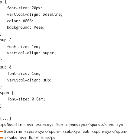
Figure 9.2. Line boxes and vertical alignment with original baseline in black and baselines for sub and super in gray.
Additional Font Styling
There’s more to typography than simply specifying a typeface. CSS provides a rich set of tools for adjusting and customizing the display of text.
text-decoration
You can set underlines, strikethrough, or other text decorations (yes, even blink) via the text-decoration property. These decorations are drawn separately from borders and are applied only to text.
• underline: Each line of text is underlined.
• overline: Each line of text has a line drawn above it.
• line-through: Each line of text has a line drawn through it.
• blink: The text blinks.
Tip
Years of conventions have established and reinforced that underlined text signals that the text is a link. Links don’t have to be underlined because they may appear as buttons or highlighted via color or background color changes, but if text is underlined, someone will try to click it. I will never say to never do something, but that being said, use text-decoration: underline with extreme care.
text-transform
The text-transform property controls the capitalization of text. This can be a useful property for reinforcing the formatting of navigation, buttons, and headers.
• capitalize: The first character of each word is forced to be uppercase.
• uppercase: All characters are forced to be uppercase.
• lowercase: All characters are forced to be lowercase.
• none: No adjustment to the capitalization found in the source HTML document is made (default).
word-spacing
You can adjust the default space between each word in a string of inline text using word-spacing.
• <length>: A fixed dimension used as an adjustment to the default amount of space between words.
• normal: No adjustment is made (equivalent to 0).
letter-spacing
The letter-spacing property controls the spacing of each character in a word. Like word-spacing, the letter-spacing property defines an adjustment to the default spacing for the font.
• <length>: A fixed dimension used as an adjustment to the default amount of space between letters.
• normal: No adjustment is made (equivalent to 0).
text-align
Horizontal alignment of text inside a containing block is defined by the text-align property.
• left: The text is left aligned (default).
• right: The text is right aligned.
• center: The lines of text are centered.
• justify: The lines of text are flush with both sides of the box, adjusting the spacing in between words as needed.
Tip
Be careful when applying text-align: justify, particularly with narrow columns. Typographic tools such as hyphenation, which help maintain even character counts per line, are not available to browsers, and they’re notoriously awful at calculating the spacing needed for justification. This often results in lines with a few words and huge gaps between them.
white-space
This property sets how the whitespace and newlines in an element are calculated.
• normal: Lines of text are wrapped to fill each successive line box with text; sequences of whitespace (multiple space, tab, or newline characters) are collapsed (default).
• pre: Text is considered to be preformatted in the source markup document and whitespace, including newline characters, remains intact (default for <pre> element).
• nowrap: Whitespace is collapsed as normal, and all text is forced to the same line.
word-wrap
In addition to setting the behavior for whitespace, with word-wrap you can allow browsers to break lines in the middle of words to prevent long strings of characters from overflowing a box.
• break-word: Allows a browser to place a break within a word to prevent a long word with no whitespace characters from overflowing the box; words are broken by character, not syllables, and are not hyphenated.
• normal: Single words cannot be broken (default).
text-indent
The text-indent property defines an indentation for the first line of text in a block.
• <length>: A fixed measurement for the indentation
• <percentage>: A percentage length relative to the width property of the containing block
text-shadow
• The text-shadow property introduced in CSS3 allows for one or more <shadow> effects to be applied to the text of an element. This shadow is drawn around the letters themselves, rather than around the outer edges of the box like with box-shadow (Chapter 14).
• none: No text shadow is applied.
• <shadow>: A description of a single shadow is <color> <offset-x> <offset-y> <blur-radius> or <offset-x> <offset-y> <blur-radius> <color>, where <blur-radius> is optional and defaults to a length of 0.
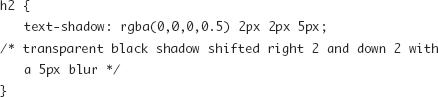
You can create the appearance of embossed text by mixing light and dark text-shadow effects, as is done in this multiple-shadow example:

Multiple shadows on the same element are drawn front (first shadow listed) to back (last shadow).
Specifying Typefaces
The choice of font and the availability of font faces can be some of the most challenging aspects of web design. There’s a reason that most sites you’ll visit appear in Times New Roman, Verdana, or Arial, and that is because there just aren’t that many quality fonts installed on enough computers to be reliable options for web designers. Some of that has changed over time, and in the following sections I’ve outlined a few ways to select typefaces for use on the Web.
System Fonts
Operating systems such as Windows, Mac OS X, Linux, iOS, and Android typically are bundled with a set of preinstalled fonts. Some extremely common applications such as Microsoft Office install additional font files. There are no truly ubiquitous fonts for the Web, because even the most common fonts can be disabled or removed by the computer’s owner, but these are some of the most commonly available fonts on desktop browsers:
• Serif typefaces: Times New Roman, Times, Georgia, Palatino Linotype (Palatino on OS X)
• Sans-serif typefaces: Verdana, Arial, Arial Narrow, Arial Black, Helvetica, Impact, Trebuchet MS, Tahoma
• Monospace typefaces: Courier New, Courier, Andale Mono, Lucida Console
To account for a font being unavailable, it is common to list a similar typeface or two before specifying the generic font family, as these examples show:

You can find more detailed information on installed fonts in the 24ways article “Increase Your Font Stacks With Font Matrix” by Richard Rutter (http://24ways.org/2007/increase-your-font-stacks-with-font-matrix) and on the Code and Style site (http://www.codestyle.org/css/font-family/index.shtml).
Font Embedding
To break free of the short list of commonly installed set of “safe” fonts, IE4 introduced font embedding in CSS via the @font-face rule. With its standardization by the W3C and more recent adoption by other browser vendors, font embedding is gaining traction, but it is not without the issues that come with early adoption of any technology.
@font-face
The @font-face rule allows for defining a custom font family and linking that family to a resource or resources where the font file data resides. Two sets of values are set with this rule:
• font-family: The family name for the custom font; used to refer to the font-family property later in the style sheet
• src: The font source URI and optional (but in practice, suggested) font format
A basic embedded font declaration looks like this:

If a browser did not support the @font-face rule (or could not find or did not understand the particular format of the font), it would ignore the first font name when it tried to follow the font-family rule for the <h1> element and render the element using the browser-defined cursive font.
A font that may appear on the system can be searched for by font name using one or more local() values before the url(). This prevents the need to download a copy of a font that might be installed on some computers, but it’s not ubiquitous enough to be relied on or considered safe for use without embedding.
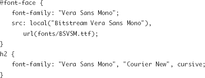
If the family name specified in the @font-face rule exists already either by a previous rule or because it is on the user’s system, the new definition will take its place.
Font Formats
Like the HTML5 video wars (http://diveintohtml5.org/video.html), those attempting to implement embeddable web fonts have to untangle a mess of file format support among the various browsers. And like the video format landscape, browser vendors have chosen to support different font formats because of a mix of licensing and protection issues, platform norms, and legacy behavior. Possible formats include the following:
• "truetype": TrueType fonts (TTF); supported in Safari 3.1+, Chrome 4+, Firefox 3.5+, Opera 10+
• "opentype": OpenType fonts (OTF); supported in Safari 3.1+, Chrome 4+, Firefox 3.5+, Opera 10+
• "embedded-opentype": Embedded Open Type (EOT) embeddable fonts; supported in IE 4+
• "svg": SVG-based font definition; supported in Opera 10+, Mobile Safari
• "woff": Web Open Font Format embeddable fonts (WOFF); supported in Firefox 3.6+, IE 9+
From IE4 to IE8, Microsoft supported only the proprietary EOT format out of concern that embedding TTF or OTF fonts required the raw font files to be posted to a web server for the world to download and because doing so would break the licensing agreements covering most fonts. The WOFF was established in 2010 as a standard format for embeddable fonts that addresses the piracy issues.
Until WOFF is widely supported, to embed custom fonts in IE and the rest of the browsers, you must provide the font in at least two formats and define them similar to the following example.

For further discussion of offering multiple font format options, see Paul Irish’s article “Bulletproof @font-face syntax” (http://paulirish.com/2009/bulletproof-font-face-implementation-syntax/).
Creating Embeddable Fonts
So, where do you get all these different font formats if all you have is a TrueType or OpenType font?
The Font Squirrel @font-face Generator (http://www.fontsquirrel.com/fontface/generator) takes any uploaded font and converts it into all the formats mentioned earlier as well as offers sample CSS embedding code. Microsoft released the Web Embedding Fonts Tool (WEFT), a Windows utility to create EOT files, and there are WOFF generators being worked on, but since Font Squirrel provides that format as well, individual tools aren’t necessary.
Font Licensing and Foundries
Even under the protection provided by the EOT or WOFF format, by distributing a web font, you may be breaking the licensing terms set by the foundry that designed and sold that font. When starting with a fresh design, it may be smarter to start with typefaces whose licensing options are known. Finding good-quality fonts with options for web embedding is getting easier by the day (as I write this, I’m looking forward to the new Fonts.com offerings), with these services among those starting to offer great fonts and tools to legally embed their fonts:
• Typekit: A subscription-based commercial service that works with popular foundries to license and host some of the most popular fonts. http://typekit.com/
• FontSpring: Offers commercial @font-face-friendly licensing options for the fonts it sells. http://www.fontspring.com/
• Font Squirrel: More than just a font file generator, the Font Squirrel site also houses a curated collection of free fonts licensed for use on the Web. http://www.fontsquirrel.com/fontface
• Google Font Directory: In conjunction with offering an embeddable API and tool that wraps the @font-face declarations as well as providing caching of fonts on its CDN, Google has collected a set of open source fonts, free to use. https://code.google.com/apis/webfonts/
• WebFonts.info Directory: As part of a broader wiki devoted to web typography, this is a list of embeddable typefaces and foundries that support embedding. http://www.webfonts.info/
Custom Fonts via Text Replacement
Designers can use certain techniques besides relying on system fonts or embedding font files to achieve the look of a custom font. These techniques have pluses and minuses—balancing maintainability, selectability, accessibility, and appearance. They also don’t have some of the licensing issues of embedded fonts since font files aren’t being shared. Type set inside an image file and placed in the document using an img tag is one way to go, but HTML content cannot be changed via a style sheet if a different font is chosen, and the image remains with the HTML source when it appears in other contexts such as RSS feeds.
The font-embedding techniques in the previous section are the new kids on the block and aren’t free from implementation issues such as browser support or font licensing, so these older and tested techniques are useful to have in your arsenal.
As with text set directly into an <img> tag, these techniques can be useful in small doses such as for article headings or navigation elements, but replacing large blocks of type on the fly provides a good deal of overhead or maintenance problems.
Image Replacement
Rather than use an image tag to display non-HTML-based text, with image replacement, you can use that same image file as a CSS-based background on a more conventional HTML element. After sizing and positioning the background image, the foreground text must be hidden from the user by shifting its position, changing its display value, or doing some similar trick. In the following example (Figure 9.3 on the next page), headers are presented with the Bitstream Vera Sans font with some embossed effects that cannot be accomplished with CSS- and HTML-based type:
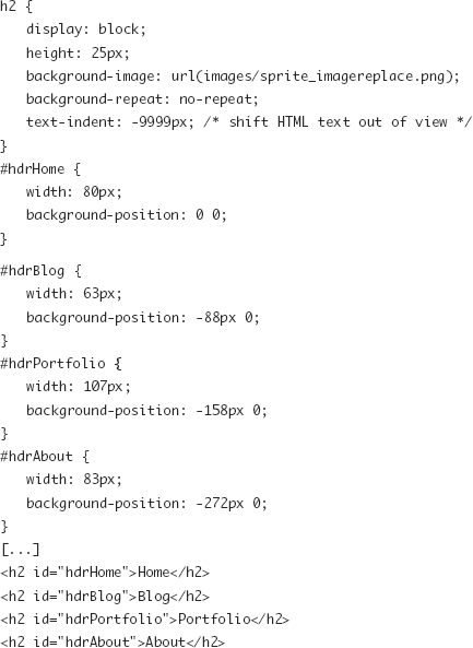
Figure 9.3. Image replacement for headings.

Image replacement is a handy tool if used sparingly and for text that will not change often. The technique’s major drawback is that it is fairly inflexible and requires images (or an image sprite as in the previous example) to be generated for each piece of text being replaced or edited.
Dave Shea has written a good overview and comparison of some of the code behind various image replacement techniques (http://mezzoblue.com/tests/revised-image-replacement/).
Flash Replacement with sIFR
The sIFR project (http://www.mikeindustries.com/blog/sifr) uses a Flash object to replace the existing text content and redraw it on the fly in the desired typeface. sIFR uses a two-step process where the browser renders the HTML content based on the styles set in CSS, and then, through JavaScript, a Flash object is created to replace the HTML content. Information on the element its content and its styling are passed to the Flash object, making the system more adaptive when compared to simple image replacement.
The major upside over the image replacement is in the maintenance. A set of images doesn’t need to be created each time content is changed, allowing easier use for content such as blog post titles. The major downside is that it does require both JavaScript and Adobe Flash Player (with a fallback to the original styled HTML content).
JavaScript Replacement with Cufón
The Cufón project (http://wiki.github.com/sorccu/cufon/) is a toolkit that was built as an alternative to the Flash plug-in sIFR. It replaces the HTML-based type with a non-plug-in-based canvas or VML content instead based on the visitor’s browser.
Like sIFR, this requires turning the font into a new format (here, an SVG-based font) and then using a JavaScript-based tool to read in the HTML page as it loads and replace the designated elements with a new rendering component.