
10. Lists and Tables
All content types fit into one of two display types—inline and block. Almost. It may be obvious after thinking about it that tables with their columns, rows, headers, and spanning can’t quite be modeled by arranging a series of block elements, but lists with numbering or bullets also need some special tools.
Lists
HTML list elements (<ul> and <ol>) are simple block elements. Individual list items (<li>), too, are sized and positioned with the same box model, with dimensions, padding, margins, and borders behaving as expected. However, each item needs some extra parts to get the markers both positioned properly and designated or incremented properly.
display: list-item
The default display value for a list item is list-item, allowing for the rendering of the box containing the list item marker in addition to the normal block behavior for the list item content.
list-style-type
You set the type of marker for a list item via the list-style-type property. You can use a plethora of keywords as types; they account for everything from the static bullet commonly used for unordered lists to numeric and alphanumeric values for different languages and counting systems. The following are some of the more commonly used types for English-language sites:
• disc | circle | square: Common glyphs; all items in the list will show the same glyph (unless changed explicitly).
• decimal | decimal-leading-zero: Decimal numbers starting with 1 or 01, respectively.
• lower-roman | upper-roman: Lowercase and uppercase roman numerals.
• lower-latin | upper-latin: Lowercase and uppercase ASCII letters starting with a or A.
• none: No marker of any kind is rendered.
Tip
When setting the list-style-type property, don’t forget to account for the behavior of nested lists. By default, browsers set different types so that bullets or numbering types change based on nesting helping readability. Set different types for the selector ul, the selector ul ul, and the selector ul ul ul.
list-style-image
The list-style-image property takes a <uri> for an image that when specified replaces the generated list marker defined by the list-style-type property.
list-style-position
The list-style-position property defines where in relation to the list item’s box the list marker is positioned. Typically a marker will be positioned outside the content area of the item out into the left gutter; however, it can also be positioned inside of the list item, behaving as an inline element at the beginning of the item would.
• outside: The list marker acts an inline element positioned outside the box generated by the item’s contents (default).
• inside: The list marker is positioned inside the list item’s box.
Figure 10.1 demonstrates the two possible list-style-position values.
Figure 10.1. Three list items with markers positioned outside, with the latter three positioned inside.

Backgrounds as list-style-image
A nonrepeating, properly positioned background image on a list item is a common method to give control over precise positioning of list marker images. The following code will achieve this behavior by combining the pattern of using padding to make space for a background image, as shown a few times in Chapter 7, with turning off the default list marker with list-style-type: none.

list-style (Shorthand)
The list-style shorthand property allows for assigning the individual list properties (list-style-type, list-style-position, list-style-image) in the same place.
li { list-style: none; }
The previous code demonstrates a simple method of disabling markers and shaves a few characters off setting the list-style-type property directly.
::marker Pseudo-element
CSS3 added a handy pseudo-element to access the list marker, both defining and providing a way to change the styles and positioning of the marker that isn’t available through shifting or padding on the list item or wrapping the content of a list item in another element, allowing independent control of properties such as color and font-size:
<li><span>list content</span></li>
Unfortunately, at the time of this writing, there isn’t a browser that supports ::marker. Combined with counters and generated content, which are discussed in the next section, this will be a powerful way to generate custom markers for content.
Generated Content
As is the case with list markers, it can sometimes be desirable to display content that doesn’t come from the HTML document. Generated content is defined with the content property and then added to the document as the content of the pseudo-elements ::before and ::after (and, eventually, ::marker).
content
The content property allows for a number of different types of content that may be added to the selected pseudo-element, including the following:
• <string>: Text content for inserting into the element
• <url>: A URI of an image
• none: No content is defined
::before and ::after
The pseudo-elements ::before and ::after represent placeholders for content before and after an element’s existing content.
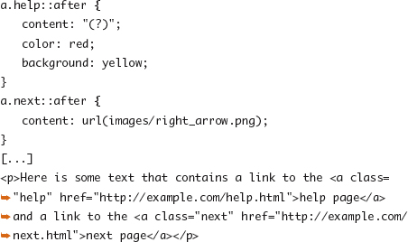
The previous code adds an arrow image after any link to a “next” document and then a question mark after any “help” link, as shown in Figure 10.2. These two hints, or similar additions using the content property, are examples of where presentational hints introduced through design would be different from content that would normally be in the HTML source.
Figure 10.2. Example of generated content added after links with different class attributes.

Note
The generated content is added to the content of the selected elements. They are styled as though they are content in the original HTML tag, and for links the added content is clickable, just like the rest of the link text is.
Counters
CSS counters provide the ability to create and use a count of elements of a selected type in a document. Though it would be most useful to aid in customizing item markers, counters aren’t limited to lists and can help with document outline style presentations or other embellishments.
counter-increment
The previous specifies that the counter with a provided text label (<identifier>) should be incremented when the element defined by the selector is encountered in the document.
• <identifier>: The counter to be incremented by 1
• <identifier> <integer>: The counter to be incremented and a value (positive or negative) for each step
counter()
Inside the content property, the current value of a given counter can be accessed with the counter() function:
• counter(<indentifier>): Returns the value of the specified counter
• counter(<identifier> <list-style-type>): Returns the value of the specified counter formatted to fit the provided list-style-type value (decimal, upper-roman, and so on)
counter-reset
• <identifier>: Resets the specified counter to 0
• <identifier> <integer>: Resets the specified counter to some integer value
The following code was used to generate Figure 10.3 and demonstrates three presentation options that cannot be accomplished with list-style-type in current browsers.
• The list item marker presentation of a number followed by a dot was customized to be a number followed by a colon.
• The text containing the counter can be independently styled from the item content in browsers without ::marker support.
• A marker and counter was added to each h4 element.

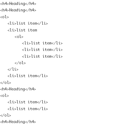
Figure 10.3. Demonstration of counters used for generated content.

Tables
Using tables for creating a layout grid is an outdated web design practice that has generated a lot bad press for the HTML table element. Even if that practice has gone the way of the dodo in most modern web development, tables for tabular data are just as important as ever. The layout of a table—with its grid of cells, myriad of borders, and the ability for cells to span rows or columns—calls for some special formatting properties not used for other elements.
The layout model for the table element calls for margins and borders on the outside of the element to behave the same as other blocks and width to be calculated similarly, but it incorporates a few additional properties to control the spacing and display of the containing cells and their padding, spacing, and borders. The following code generates the table shown in Figure 10.4:


Figure 10.4. A table’s layout with border-collapse set to separate.

table-layout
To maintain the integrity of the grid of cells, the content contained in each cell has traditionally had some impact on the height of rows and width of columns in a table, with the browser free to make adjustments to provided dimensions. Even when a cell width is provided, a large amount of text or a large image may make the cell larger. The table-layout property allows for changing the method browsers use to size and render a table.
• auto: The width of the table and table cells is established and adjusted as the content of each cell in the table is rendered, with the dimensions provided by the CSS properties and adjusted for size or amount of content (default).
• fixed: The width of the table and the table cells do not rely on the content but is determined only by the width of the table and columns, allowing a browser to start rendering the table immediately.
For small tables of data, table-layout:auto may be fine, allowing column widths to flex a bit to account for an unexpectedly large number. For much larger tables where you’d want the content to start displaying immediately or for cases where the integrity and uniformity of the cell grid is important, you should use fixed.
border-collapse
• separate: The borders of individual table cells are drawn as distinct features and separated by some border padding. No other parts of a table have borders (default).
• collapse: The borders of the table and all parts of a table share the same border on each side.
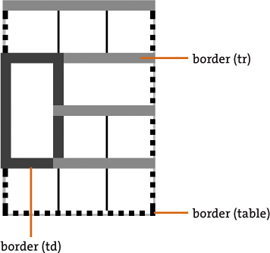
A few behaviors of separated borders can be seen in Figure 10.4 that make them behave similar to the traditional HTML table rendering:
• In the column on the left, the cells with the narrow border have been adjusted to fit the display of the element with the larger border.
• The border declared on the tr element is ignored.
• The table’s background is drawn in the spaces between the cell borders.
Figure 10.5 is an example of the previous table with border-collapse set to collapse and demonstrates the following changes that take place under the collapsing border model that make the table behave more similarly to a typical spreadsheet found in Excel, Numbers, or other software:
• One border is drawn between each cell, rather than a distinct border around each cell.
• Borders may be applied to any of the parts of a table including thead, tbody, and tr elements.
• When elements with different border-width, border-style, or border-color properties touch, they aren’t both drawn; instead, one of the styles is chosen by the browser.
• The border-spacing property is ignored.
Figure 10.5. A table’s layout with border-collapse set to collapse.
border-spacing
The border-spacing property provides the padding between borders of table cells and takes two <length> values, first for the horizontal spacing and second for vertical spacing. If only one <length> is provided, it applies to both sides.
empty-cells
In the separated borders model, cells without content (or cells set to visibility: hidden) can have their borders and background styling rendered or ignored.
• show: Displays the borders and background of an empty cell (default)
• hide: Hides the borders and background of an empty cell
vertical-align
Unlike block-level elements, the contents of cells can be vertically positioned inside of the cell.
• top: The content of the cell is top aligned.
• bottom: The content of the cell is bottom aligned.
• middle: The content of the cell is centered in the cell (default).
text-align
The text-align property behaves normally when applied to table cells (see Chapter 9).
Table display Values
Like the display values of block, inline, and others covered in Chapter 6, non-table-related HTML elements may take on the layout behavior of the various parts of a table. The three basic parts of a table’s display are the table, a row, and a cell.
• table: A block-level element that generates the outer structure of a table
• table-row: A row containing cells
• table-cell: An element that represents a table cell
To account for the cases where an element’s display property is set to a table-related value but does not have the parent elements that typically make up a complete table structure (table, table row, and table cell), the missing elements may be created virtually. What follows is a sample of the CSS2.1 rules for creating these anonymous boxes:
If the parent P of a “table-cell” box T is not a “table-row,” a box corresponding to a “table-row” will be generated between P and T. This box will span all consecutive “table-cell” sibling boxes of T.
Beyond these core three values, there are display values for all the various pieces of a table such as table body, caption, and column groups. The following code illustrates the various table-related values and their context:
table { display: table; }
tr { display: table-row; }
thead { display: table-header-group; }
tbody { display: table-row-group; }
tfoot { display: table-footer-group; }
col { display: table-column; }
colgroup { display: table-column-group; }
td, th { display: table-cell; }
caption { display: table-caption; }