
6. Positioning and Floats
Chapter 5 covered how block-level elements are given their shape and size. Before jumping headfirst into creating multicolumn layouts with these blocks, you need to learn how to position elements in your documents in relationship to the other items on a page.
The Document Flow
Reading content in an HTML document, without any JavaScript or CSS applied, is a top-down and left-to-right affair. Block elements take up the entire width of the document and follow one after another with their inline content flowing inside them. Margins and padding may alter the look or spacing some, but they alone do not change the positioning of the elements.
You have three ways to change the default positioning and interaction between elements in the top-down blob of content: You can force an element to behave like a different type of element, you can pull the item out of the flow completely, or you can pull the item to the side of its container and allow other items to wrap around it.
display
The display property is the key to the entire layout castle. I’ve already covered block elements and inline elements, but you need a number of other element types to define all the content that might display on a web page, including the following:
• inline: Creates one or more inline boxes, the familiar inline content
• block: Creates a block box
• inline-block: Creates a block box that behaves like an inline box, similar to the image (replaced element) behavior
• list-item: Creates a block box for the content and the list item marker
• table, table-row, table-caption: Creates three of the types of elements needed to present a table (Chapter 10)
• none: Removes the element from the presentation entirely, drawing no box of any kind
Alternating elements between the trio of inline, block, and none is sufficient for most design tasks, and as luck would have it, they are also the most widely supported values.
Position
The positioning of an element is based on the length of the box offset parameters: top, right, bottom, and left. Typically, top and left will be used for positioning elements since the top-left corner of the item being measured from—the beginning of a box—is easily understood in normal document flows.
static
static is the default value where an element is rendered in the normal flow and not uniquely positioned. The positioning parameters top, right, bottom, and left do not apply.
relative
In relative positioning, an element’s position is calculated as normal, and then the offset positioning is applied relative to this normal position. Relative positioning does not take the element out of the normal flow, which leaves a space behind in the element’s original position.
A relative positioned element with box offsets set to 0 (or undefined) will appear in its normal position; however, it will create a new point of origin for any of its child elements that may be positioned absolutely.
absolute
Absolute positioning takes the element out of the normal document flow—collapsing any space it may have otherwise used—and positions it in relation to the origin point created by the last-positioned containing block.
The code used for Figure 6.1 demonstrates how to use absolute positioning to place elements at the four corners of its containing element.
Figure 6.1. Elements placed into four corners with absolute positioning.
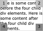


When content is pulled out of the normal document flow, the height of the parent element shrinks. It is easy to run into cases where the parent shrinks too much and the positioned element overflows its parent container. You can force the space open with height, width, or padding on the parent element, as I have done in Figure 6.1. The document, being the root container, will similarly shrink, and you could potentially overflow your document and its scrollable area.
If the containing element isn’t forced open—in this case by width on the wide side and other content keeping it open in the vertical side—then the parent container would collapse. If the content were shorter and didn’t keep the box open enough, what you might see is shown in Figure 6.2.
Figure 6.2. A container element shrinking to fit only the content in the normal document flow.
Absolute positioning is the most used method of positioning an element (besides the default value of static) and is frequently used in animation; however, it isn’t used for many methods of creating layout grids because it doesn’t hold that scrollable area open like other methods do.
fixed
Fixed positioning is based on the viewport and not the document. The origin for fixed-positioned elements is the root node (<html>). The top-left position of 0, 0 would be the top-left corner of the viewport, and similarly the bottom-right position of 0, 0 is the bottom-right corner.
As the name implies, fixed-positioned elements do not scroll with the rest of a document. Because window and viewport sizes typically vary widely (unless you’re developing for a specific device or platform such as the Apple iPhone), fixed positioning is most often used for small elements such as toolbars or banners and not for laying out an overall web page.
Tip
Fixed-positioned elements are widely supported in current browsers, but if you find you need to support older browsers as well, then you should use a bit of JavaScript code that will position the element absolutely and monitor the use of the scrollbar to change the positioning of the element to keep it in view. This solution can be a little jumpy, so it’s best to use position: fixed where it is supported.
Origins and Containing Blocks
Containing blocks and the behavior of managing multiple possible origins for measuring positioning from can be one of the more confusing, but also more powerful, aspects of CSS.
The root element of the document is the initial containing block for which absolute positioning is measured from. However, if any other element is positioned—relatively, absolutely, or fixed in the viewport—it becomes the new origin for its descendant elements. This behavior is probably best illustrated with an example (Figure 6.3).
Figure 6.3. The position of the black #innerPositionedBox is measured from its containing block.


Regardless of how deeply the element #innerPositionedBox is nested, the positioning for top and left is measured from the last positioned ancestor, #containingBlock. If you didn’t change the CSS code for this example but altered the markup structure slightly so that one of the middle <div> elements is #containingBlock, then the #innerPositionedBox element would instead use that element for its origin (Figure 6.4).
Figure 6.4. The position of the black #innerPositionedBox updated with a new containing block.


Since you cannot escape this behavior and position an element with respect to the root element once it has a different containing block defined, it is important not to overuse positioning properties, thus needlessly creating new containing blocks. Sometimes this is inescapable, and in those cases math can be your friend (either with paper and pencil or in code via JavaScript)—you can calculate the position of the containing block (and any of its containing blocks) and work your way back up to the root element.
z-index
The z-index property applies to any positioned box and can be used to control the layering of boxes from back to front. The higher the integer value, the “closer” to the viewer the element appears.
Think of this index as controlling the elements of a stage set in the theater. The background elements are at the 0 position, the actors and other elements may shuffle between 1 and 20, and the foreground set pieces and the curtain are between 21 and 25 (though there is no limit to this value). What happens if two elements in the same stack are at an index of 11 (or 0 or auto)? This isn’t a problem unless each element’s positioning properties cause them to overlap. In this case, the element specified later in the document flow will appear on top.
This index, like positioning offsets, is relative to the containing block. If one element has a z-index of 4 and another element has a z-index of 3, none of the second element’s children can ever appear “above” the content of the former element.
Note
Some plug-in content such as Adobe Flash can sometimes bleed though HTML content positioned above it and given a higher z-index. For Flash, in particular, there is a window mode parameter called wmode that when set to opaque or transparent will allow content to appear above it in the stack.
visibility
The visibility property determines whether an element renders and can be seen. Unlike setting the display property to none, an element with a visibility of hidden still affects layout and will take up space. Unlike the opacity property, individual descendants of a hidden element can be shown by setting their visibility to visible.
• visible: The element is rendered.
• hidden: The element is not rendered.
float
An element with a float value of left or right is taken out of the normal flow of a document and shifted to one side of the containing box. The content that follows it in the document wraps around the floated element’s new position.
• none: An element is not floated and behaves as normal.
• left: An element is taken out of the normal flow and is shifted to the left of where it was to otherwise appear, with content flowing around it on the right side of the element.
• right: An element is taken out of the normal flow and is shifted to the left of where it was to otherwise appear, with content flowing around it on the right side of the element.
Think of a small photo that is moved to the right and has text flowing around it; you now have the basic idea of how an element (the photo) behaves when floated (Figure 6.5 on the next page).
Figure 6.5. Two small elements floated inside text content.
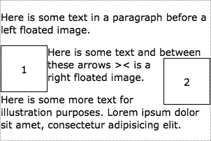
Margins and padding set on a floated element behave as they would on any box in the standard box model and can be used to create a gutter around that element. However, floating has the effect of interrupting the boxes of the wrapping elements leaving their padding, margins, or borders drawn in their normal rectangle, as shown in Figure 6.6, rather than moved or redrawn for each individual row of text. Note the way the text touches the right edge of the floated image in this example.
Figure 6.6. Text wrapped around a floated element.


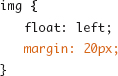
Adding a 20-pixel margin around the floated image would create a gutter between the opposite side of the floated element and the content wrapping around it (Figure 6.7). After doing this, it is also obvious how the rectangular box drawn by the paragraph including its border and background color are not “wrapping.” Only the content inside of those blocks is wrapping.
Figure 6.7. A margin placed on the floated element to create space between it and the content wrapped around it.

If multiple elements are floated and would appear along the same edge, then they are arranged horizontally with the earliest element in the source appearing closest to the containing block’s edge. If the combined width of the floated elements becomes too wide for the containing block’s content area, then the later floated elements will wrap. This behaves a bit less like the normal flow of text from line to line and more like how marbles of different sizes will settle as they are placed in a cup. Elements of various sizes are left floated in Figure 6.8 and right floated in Figure 6.9 to illustrate the wrapping and ordering behaviors.
Figure 6.8. Left-floated blocks of various sizes.

Figure 6.9. Right-floated blocks of various sizes.

Note
Floated elements cannot appear before (vertically) elements that come before them in the document, which is why box 4 does not appear next to box 2 even if there were room for it.
With modern layout techniques, floated elements are used for much more than small bits of content in elements and text wrapping. They can be the basis for placing elements on opposite sides of the same line, controlling a series of tabs, and even controlling multiple-column layout grids.
Note
If an element is positioned with absolute positioning, that positioning will take precedence over the behavior of float.
clear
Floating is often used instead of positioning or large margins because the content-wrapping effects are desired, but the wrapping of a tall floated element can often extend into later content in an undesirable way. The clear property is used to insert a break when encountering a new section of the layout or another unique record in a list or some other reason for wanting to stop the wrapping effect.
• none: The element does not clear any floats.
• left: The element will be shifted down to sufficiently clear the bottom edge of any previous left-floated elements.
• right: The element will be shifted down to sufficiently clear the bottom edge of any previous right-floated elements.
• both: The element will be shifted down to clear and begin after all floated elements.
In Figure 6.10 you can see what happens when the floated element from one list item bleeds into the following one; things really start to go haywire.
Figure 6.10. The effect of floated elements extending past its parent element into the following content.


You can set the clear property to left or both on the <li> element, as shown in Figure 6.11, to make sure that for each new item nothing from the previous item interferes.
Figure 6.11. clear:left used to stop the previous floats before each new item.


Tip
The CSS 2.1 Specification has some quite detailed and sometimes difficult-to-understand text explanations of the interaction of floated elements, margins, padding, and clear. It also has a number of easy-to-understand and useful illustrations (http://www.w3.org/TR/2009/CR-CSS2-20090908/visuren.html#floats).