12. Media: Printing and Other Devices
CSS is more than a language for describing the presentation of pages viewed on desktop browsers (in this chapter referred to as screen media). By specifying a media type associated with a style block, linked style sheet, or group of rules, you can target other media such as print, mobile devices, and screen readers.
Media Types
User agents are categorized by their features, or the features of the device they’re running on, into one of several media types. In some cases, such as a desktop browser with a print preview feature, the user agent can support multiple media types; however, only one type will be active at any given time.
List of Media Types
• all: Intended for all devices
• braille: Intended for Braille tactile feedback devices
• embossed: Intended for paged Braille printers
• handheld: Intended for small-screen handheld devices
• print: Intended for paged, printed media (or print preview)
• projection: Intended for projected media
• screen: Intended for viewing on desktop and laptop screens
• speech: Intended for screen readers
• tty: Intended for teletypewriters, terminals, or other devices with a fixed-character grid
• tv: Intended for television-based devices with lower resolution and limited scrollability compared to screen devices
• Media queries: Intended for a selection of media via expressions that describe the features of the device introduced in CSS3
In practice, your typical web project will have styles targeting the media types all, screen, print, and often handheld, while the other types will be left to manage with the styling defined in the all type or will be left to the default appearance.
You may find the other types useful in niche projects. For example, if you’re designing slides for distribution on the Web after your presentation, then you may have a presentation specifically targeting projected media (which is triggered in Opera’s full-screen mode). For more on this idea, as well as information on Opera’s support of the projection media type, read Till Halbach’s article “Creating Presentations/Slideshows with HTML & CSS” at http://dev.opera.com/articles/view/html-css-slideshows/.
Specifying Media Types
You can specify the media type associated with a block of CSS rules in three ways: through the media attribute on the HTML <style> or <link> element, as a parameter for the @import rule, or as a parameter on the @media rule.
media HTML Attribute
The HTML <link> element and the <style> element have a media attribute that accepts a comma-separated list of media types. The source file linked to or the code in that <style> block will be ignored if the device used to visit the page is of a type not listed as one of the values. In the case of the <link> element, this means that the linked file may not be downloaded, saving bandwidth.

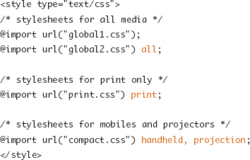
@import Rule
Like the designation of media types for link elements, external CSS files included via the @import rule can be restricted to specific media types.
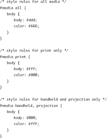
@media Rule
The @media rule is used to specify that a subset of rules in a block of CSS code should apply only to the supplied media types. As with the media attribute of the <style> element, any code where @media rules are found has already been downloaded. This rule is most useful for targeting devices with small amounts of CSS.
Although you can have an @import rule inside a linked style sheet or an @media rule inside either type of linked style sheet document, it is not legal to nest an @media rule inside another @media rule. If you were to define a media type with @media or @import inside an already restricted block of code, the new media type would further restrict the targeted media list.
Print Media
The printed page, while having many similarities to the screen, differs in many ways as well, most notably that the contents of a document are split across multiple fixed-sized pages rather than one single continuous viewport. The properties listed in this section help control the presentation of each of those pages by offering guidelines about where those page breaks occur within the document’s content.
page-break-before and page-break-after
These two properties define whether a page break should occur before or after a given piece of content, which is most useful when applied to articles, headers, tables, or other “blocks” of content.
• auto: The user-agent determines the most appropriate places for a page break (default).
• always: This tells the user agent to always break before (or after) the selected element.
• avoid: This tells the user agent to attempt to avoid breaks before (or after) the selected element.
page-break-inside
The page-break-inside property allows for the restriction of page breaks inside a given element’s content.
• auto: The user agent determines when it is appropriate to place a page break inside an element’s content (default).
• avoid: This tells the user agent to avoid page breaks within the element’s content.
For all the page break properties, the page breaks may be unavoidable, for example when a single element is larger than a single page. The value avoid will cause browsers to attempt not to generate a page break, however, and as the name avoid implies, it is just an attempt and not an absolute rule.
Browser support for the page break properties is quite mixed, and some browsers have more complete support for individual values than others. You can find a good breakdown and notes on support for the page break–related properties at the Sitepoint CSS Reference (http://reference.sitepoint.com/css/pagedmedia) or at the Mozilla Developer Center (https://developer.mozilla.org/en/CSS_Reference).
The @page Rule
The @page rule exists as a way of setting properties of the page such as margins or orientation. At the time of this writing, the features of @page from CSS2 and CSS3 are quite poorly supported (Opera being the one shining star), so it isn’t worth presenting the properties in detail.
Print Considerations
The presentation, width, color schemes, navigational elements, and other design features of many web pages may be appropriate for the screen, but not as much when printed. If someone is printing out an article, recipe, or event information from your web site, the last thing they are looking for is half the first page taken up by navigation and advertising and an extra page at the end taken up with nothing but the footer content and repeated navigation links.
To prepare pages for print, a few types of styles are often changed to provide the best printed experience (and not waste your visitor’s paper or ink).
• Hide the sidebar, navigation, or other site “meta” elements that are presented on the screen to help when interacting with the site on the screen. Branding elements, logos, and legal information are still important and typically carry through to the print version. Still, be liberal with your use of display:none.
• Adjust font sizes, line heights, and other typographic properties to maximize legibility at a typical printed page size.
• Contrast is different in print than on the Web, and backgrounds can make for difficult-to-read pages covered in ink. Hide background images, change background colors to white, and change text colors to the darker shades or even black for the best printing and reading experience.
Note
Many browsers will drop background images or similar styles when printing, either by default or by user-selected settings without you explicitly changing them.
The Print Preview option from your favorite browser will display with any style sheet targeting the print media type and is a great way to test your changes to the print presentation without wasting reams of paper.
Hyperlinks and Generated Content
Printed HTML documents do not display information that may be valuable to the user to have in that printed form. The destination of hyperlinks is one of the pieces of information lost if only viewing the text. Generated content can be used to display the contents of the href attribute beside the link text.
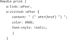
You also might want to consider printing the following: contents of title attributes, contents of tabbed boxes, and other content that is initially rendered with display:none and meant to be revealed based on user interaction.
Mobile Media
Handheld and mobile devices typically have small physical screens (even as they have increasingly higher resolutions). They also have slightly different interaction models such as touchscreens or heavily keyboard- or tab-based movement.
Mobile Considerations
The smaller screen and slower connection typical of handheld devices are key factors in mobile web development and may drive a “less is more” approach to these devices.
• The slower connection speed and cost of transferring data on some mobile plans can make it desirable to rely more on the default browser style sheet than you would in a screen context.
• The touch interface on many smartphones and tablets may drive the need for links and buttons to appear larger, and the spacing between items should be clear to avoid fumbling fingers pressing the wrong item.
• Feature phones, unlike smartphones, offer a limited subset of CSS and a limited layout capability or canvas size. Display and navigation on these devices can also be very linear (left to right, top to bottom), so the positioning and complex element layouts may be ignored.
Though some smartphones have wonderful browsers and deal well navigating conventional web sites, targeting handheld devices with CSS changes alone may not always lead to the best experience for folks because often the types of content or the tasks that mobile visitors are looking for on your site are different from the desktop browser version. Thus, having a separate mobile web site may sometimes be a better option than just feeding the same HTML content with a different set of styles to these visitors.
Media Queries
New in CSS3, media queries add a syntax for describing the characteristics and features of the device being used to view a page, allowing for more precise control or better targeting of those features that might be why you provide one set of styles over another. The following code demonstrates how to target a handheld device in landscape orientation (wider than it is tall):

The following links to an external CSS file only if the browser (viewport) width is a color device that’s wider than 600 pixels, regardless of media type:
As shown in the previous examples, you can combine media features into a more complex description using the and keyword. You can use the not keyword to negate a media description (or media type) such as in the following example of targeting any nonscreen media type:
The only keyword does not logically impact the result of the media query expression; however, it creates a value for the media attribute so that browsers that do not support media queries cannot parse into a common media type they support and thus can be used to hide styles from these browsers.
Media Features
The following is a list of media features for which you can specify in a media query expression.
Since the chances that you will have declared the precise viewport width, measured to the pixel (or ems or other <length> unit), is quite slim, you can specify the width feature as a min-width or max-width. This holds true of the other features where specified.
• width: The width of the viewport or page box; accepts min- and max- prefixes.
• height: The height of the viewport or page box; accepts min- and max- prefixes.
• device-width: The full width of the device screen or printed page; accepts min- and max- prefixes.
• device-height: The full height of the device screen or printed page; accepts min- and max- prefixes.
• orientation: Matches the keyword landscape when the width is greater than the height; portrait when the height is greater than the width.
• aspect-ratio: The aspect ratio of the viewport as described by width/height; accepts min- and max- prefixes.
• device-aspect-ratio: The aspect ratio of the device as described by device-width/device-height; accepts min- and max- prefixes.
• color: The number of bits of color; 0 for noncolor devices; accepts min- and max- prefixes.
• color-index: The number of individual colors supported by the device; 0 for noncolor devices; accepts min- and max- prefixes.
• monochrome: The number of bits used to describe the monochrome shades available; 0 for nonmonochrome devices; accepts min- and max- prefixes.
• resolution: The resolution of the output device measured in dpi (dots per inch) or dpcm (dots per centimeter); accepts min- and max- prefixes.
• scan: The scan type for television media types; values are progressive and interlace.
• grid: A grid device is a device such as a TTY terminal or a feature phone that has a single fixed-font display.
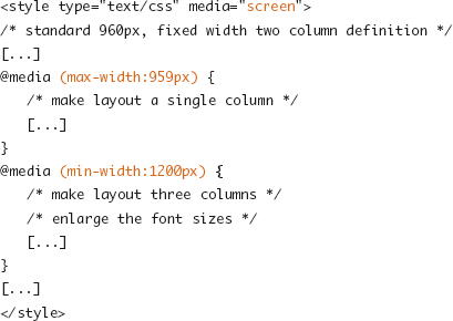
Responsive Design
In Chapter 7 you learned about building fixed and flexible layout grids as well as setting limits on flexible layouts by using the min-width and max-width properties. You can use these techniques to make adaptive layouts that find a compromise between the best presentation and readability of the content and the visitor’s browser dimensions.
But what if you could adapt the layout from the standard two-column layout into a one-column layout for narrower browsers or bring the footer up into a third column for the insanely wide screens? Or what if you could adjust the size of header type or swap background images so the design feels more proportional to the “page” as presented, while body copy remains at a standard, readable size?
This adaptation of presentation has been dubbed responsive design. It takes the standard mechanics of flexible grids, relative sizing of fonts, and other content elements and uses media queries to change the positioning of content, the sizing of elements, or the overall layout grid to respond to the viewport the device is giving you to work with.
For an in-depth review of media queries and how you can use them to design pages that adapt not just to media but also to other browser scenarios, see Ethan Marcotte’s article “Responsive Web Design” (http://www.alistapart.com/articles/responsive-web-design/).
Browser Support
Media queries are currently supported in Safari 3+, Firefox 3.5+, Opera 7+, Internet Explorer 9+, mobile WebKit, and Opera Mobile. Therefore, there is wide support for them, except for IE 6 through IE 8’s large chunk of the desktop market.
It isn’t so bad, though, because the support (or lack thereof) can be taken into consideration as just another device criteria in many instances. For mobile development, you’re most likely putting handheld device types into two or three buckets already—first specifying the most devices and then breaking smartphones by screen size or orientation. The following example shows a baseline style sheet going to all handhelds and then using media queries with more specific style sheets for those more capable devices:

You can take the same approach for sites meant for the desktop. Code the base style sheet with the appropriate baseline layout grid, font sizes, and other measurements and serve it to all screen media using the media type declaration. Then use media queries to provide enhancements to those base styles and make a richer or cleaner experience around the edge cases using responsive design patterns.