
Consistency
“If in doubt, do it consistently.”
—A. Marcus, Graphic Documents for Electronic Documents and User Interfaces, p. 43
What do we mean by consistency?
How do you learn to use an application that looks different on every page? That uses icons for actions in some places, and links for the same actions in others? Or that applies colors and fonts unreliably, emphasizing content and features without any discernible rules?
You can, but it won’t be easy. To help users—and avoid common interface design mistakes—designers and developers need to establish rules for placement and treatment of interface elements and then stick to them. Just as you can’t speak in English, French, and German and expect to be clearly understood, you can’t mix visual interface characteristics without causing confusion.
Visual language, like verbal language, requires rules applied consistently to be recognized and interpreted. You can learn to interpret inconsistent cues or you can guess, but in applications that help people get things done, guessing games aren’t fun.
Consistency may sound boring. There are no awards for “most consistent” interface. Whether you’re designing an application or cooking dinner, doing something exactly the same way over and over isn’t exciting. What is exciting is watching people use your interface to do the things they want to do. Keep in mind that consistency isn’t about pleasing yourself—it’s about pleasing others by giving them what they understand and can rely on.
Consistency and the marketplace
This book focuses on the design of digital applications that help people get things done—everything from complex tasks like online banking or software download, to simple tasks like leaving yourself a reminder on your cell phone. Even the smallest changes, such as moving the location of a button, can make a big difference in perception and usability. Creating a consistent interface that people can quickly grasp and figure out how to interact with is critical for the success of this kind of application.
Some types of applications have changed more rapidly than others. At this time, consumer interfaces are breaking new ground in terms of combining evolving technical capabilities with interaction and visual design. (Pinterest, which uses endless scroll to display a rich variety of images, is one example of this.) Still, there are a lot of people using awful-looking and awkward applications every day. Frequent users create workarounds—sequences of actions that they repeat to do what they need to despite an interface that doesn’t fit their goals or methods of working—or they simply give up, and place costly calls to tech support.
Establishing consistency
Establishing consistency means setting and maintaining expectations by using elements people are familiar with. Expectations are set by what people see onscreen, as well as what they’ve seen in the past. For example, someone filling in payment information on a checkout screen may interpret the flow of the form based on the fields and organization they see, as well as what they saw on the login screen they just left. What they expect is affected by what they’ve seen on other login and payment information screens. They’re likely to look for the “Submit” button in the same place they’ve seen it on other screens within the application, or they may look where they’ve seen it on payment forms elsewhere.
Establishing consistency depends on awareness of user expectations (Figure 1.1). Part of it is the expectation you set via visible conventions on the current screen; another part is the expectation set on other screens in the same application. A third part is beyond our control—it’s set by what users have seen on separate applications.

Figure 1.1 How people interpret what they see on a screen is affected by what they actively see, as well as what they’ve seen elsewhere in the same and in other applications.
If we’re aware of what screens users perceive as related, we can anticipate their expectations. You’re more likely to establish consistency successfully if you base design decisions on what users expect, discerning the patterns they’ve seen and incorporating what’s relevant. You can, and in some cases must, adopt patterns used on related screens or applications into your interfaces to provide what people expect. (User-centered design methods like contextual inquiry and prototype tests can help you determine this; see Chapter 3 for more information.) Understanding user expectations is part of defining interface conventions—creating rules and a rationale for how your application’s visual language will work.
Types of consistency: internal versus external
Consistency between screens within an application can be called internal consistency, while consistency between applications can be called external consistency. Put another way:
1. External consistency: Are the application’s design, content, and behavior similar to other applications used by the same audience?
2. Internal consistency: Do the application’s design, content, and behavior remain largely the same within screens and features, as well as within the boundaries of platform-specific limitations and requirements?
Internal and external consistency intersects when an application is part of a suite of related programs. In these circumstances, internally consistent elements of one application may apply to its suite-mates, or may conflict with their audience needs and requirements. You may not be able to make everything perfectly consistent, but the harder you try, the more likely it is your users will be able to painlessly switch between applications.
External consistency
External consistency can be very important. If your audience is accustomed to certain conventions—for example, faceted navigation controls to the left of search results—then you may need to adopt these same conventions to help people feel comfortable and well served. But unless you’re designing an interface that’s part of a suite or overall product line, external consistency for the sake of it is, frankly, ridiculous. Your audience may not have the same needs as the audience for the website or mobile application your CEO has fallen in love with, and the choices those designers made to help their users aren’t necessarily the best choices for your users.
Thinking about and reviewing external consistency are great ways to start defining interface conventions for a new application started from scratch. If your users have strong expectations, then part of establishing consistency needs to include reviewing and possibly adopting patterns used in other applications. You can begin by researching and asking yourself what sort of layout and interface controls the audience might be familiar with based on demographics or known user characteristics, and you can inform assumptions by conducting surveys and contextual inquiries.
New applications for organizations with an existing product set can be started this way as well. For example, imagine you’re developing an event registration application for a company that produces productivity software. The event registration application represents a new product line, will have its own name, and may be for a different set of users than the company’s other products.
It makes sense to begin the design process by comparing features and looking for commonalities. If the applications share features, you may be able to reuse the underlying code. Even if the event registration application has a completely different brand name, it could be prudent from a corporate brand consistency standpoint to use the same general layout, controls and affordances, and cascading style sheet (CSS) code (or at least font characteristics) for the new application. This will help the parent company appear consistent and organized to users, as well as in marketing materials and campaigns.
Internal consistency
Internal consistency is when the application’s design and behavior remain largely the same within screens and features. Having an internally consistent application is a big part of avoiding common mistakes and is also crucial to usability. No one wants to learn a new language on every screen. No one wants to guess whether they have to tap or swipe to see more information, and then have to guess again on the next screen. What they want is to use what they already know to get things done as quickly as possible.
Internal consistency is achieved when the visual usability tools in an application—that is, layout, type, color, imagery, treatments, and controls and affordances—are applied consistently at the screen and widget level. If the application is available across platforms (e.g., desktop/laptop, mobile phone, tablet), the tools should be applied as consistently as possible while still taking platform-specific user interface (UI) conventions into account. Internal consistency is why selecting appropriate paradigms is so important; ideally, once you decide on a convention, you can use it over and over again, and users won’t think twice. If you choose a paradigm based on one case and then find it doesn’t apply to others, it’s time to rework it.
What role does consistency play in application design?
Successful application design requires juggling business goals, audience needs, design rationale, and technical capabilities, all while keeping in mind the basic usability principle popularized by Steve Krug: “Don’t make me think.” Not making people think requires understanding your audience: who they are, when and how they use your application, and why they use it. It also includes understanding their expectations: the basic knowledge you can expect them to have, their level of comfort with technology, and what similar applications they’re using.
Assuming you have that understanding as part of a sound user-centered design process, the next step is using what you’ve learned to inform all aspects of the interface design:
• Layout: Have you positioned elements that perform the same function in the same place on every page?
• Typography: Do you treat similar elements the same way typographically?
• Color: Do you have a set of colors defined, and a system for applying color to emphasize and support your information hierarchy?
• Imagery: Do you use the same style of images to convey similar information?
• Controls and affordances: Do you use the same interface elements and design treatments to represent the same actions? Do you use the same motions for feedback and interactive controls?
Consistency in layout
In any application, you’re going to have pages or screens that show similar types of information, and they’ll include units of functionality (widgets, content blocks, etc.) that may perform similar tasks no matter where they appear. These two rules of thumb will help you create your layout:
1. Screens showing the same types of information should have all elements positioned (i.e., laid out) the same way every time.
2. Different elements that relate to one another should maintain their spatial relationship no matter where they appear. For example, in an e-commerce application, a product name should always be placed in a consistent position relative to the product image.
The best way to ensure this happens is by developing templates for your different widgets and screen types. If you’re a developer, you’re probably already very familiar with the concept of templates within the context of content management systems; if you’re a designer, you’ve probably used them in print and website layouts. The basis of a template is a grid. Like a grid, a good template is flexible enough to accommodate change, but strong enough to support consistent placement from screen to screen. (We’ll go into grids and template design more in Chapter 4.)
Let’s take a look at some real-world examples: Google applications Gmail, Google News, and Google Drive (Figure 1.2). Although their layouts are different, they share structural similarities that make them feel like part of a single family. Because they are independent but may share users, we consider them to be externally consistent. However, these applications have also become increasingly internally consistent over time, likely as part of Google’s efforts to improve cross-platform application usability and appearance. Their similarities include:
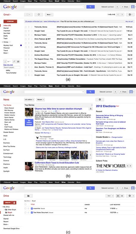
Figure 1.2  (a) Gmail, (b) Google News, (c) Google Drive have evolved to use a consistent visual language.
• Cross-application navigation bar at the top.
• Secondary bar containing logo on the left, a search feature in the center, and a user identification and sharing tool on the right.
• Left column to identify the application and provide internal navigation.
• Main content area in one or two columns to the right of the navigation bar.
• Application tools and configuration above the main content area.
If you were going to design another Google application, potentially for use by the same audience, you’d want to begin by reviewing these existing applications for similarities in content and features. You’d want to place the application name and navigation in the same position, and reuse elements as much as possible to make the new application familiar to people who use the other applications in the suite. The conventions you adopt become the starting point for the rules and rationale for the new application’s layout.
Consistent use of typography
The fonts you choose and the way you apply them are vital parts of creating a strong information hierarchy. Applying a standard set of type specifications to your headers and content helps people quickly discern what’s important; applying it inconsistently creates a muddle, where people have to scan an entire page or screen (or worse, several screens) to find what they want.
Although we’ve already discussed how Google uses a limited number of layouts across some applications to help create consistency, we can see in those same examples that their typography is consistent as well, at least for related types of data. The primary interface for Google Drive (Figure 1.2c) and Gmail (Figure 1.2a) is a tabular list of information. Both applications set this type in the same point size and font, and use a well-spaced navigation area on the left.
The two applications also use font weight and color choices to emphasize the hierarchy of information.
• Google Drive uses black, roman type for a document name, followed by the document’s sharing status—less important information—in smaller, gray type.
• Gmail puts the most important information for new messages—the sender’s name and message subject line—in bold, unmissable type, and begins to expose the message content in roman, gray type.
• Google Drive boldfaces the names of files with recent changes, indicating they’re more important than the unchanged files in roman text.
Despite some of the outward differences between the applications, their shared typographic standards help people understand what they need to pay attention to and when, no matter which application they’re using.
Consistency in color
When developing your application, you’ll need a color palette with primary, secondary, and accent colors. Your color palette is another tool to help people “read” the interface. Color helps identify what’s related by leading the brain to group elements of the same color. It also helps us know what’s more important, drawing the eye to key elements if they’re colored in a warm, saturated hue, and helping others recede into the background.
JetBlue’s mobile application is externally consistent with the corporate website’s color palette: dark blue, lighter shades of the same blue, and bright orange accents.
The application’s home screen introduces two of the main aspects of the color palette, and begins to shape the rules for how it’s applied (Figure 1.3). There’s a dark blue header area with bold, white type to identify where you are and who’s logged in to the application, as well as a slightly paler, dimensional area for settings on the right. But the most important application of the color palette appears below the large promotional area: the tabular display for key actions that alternates dark blue and light blue to make it easier to distinguish different active areas. Related areas share the same row, but because they don’t share the same color, you can quickly tell where to tap to get what you want (Figure 1.4).


JetBlue’s rules for how to apply the color palette become clearer on the secondary screens. Again, large, dark blue areas with white type guide the eye to the header and content areas, but now bright orange is introduced to indicate active selections or buttons for key actions. In form fields, paler shades of the same blue for buttons, icons, and instructional text help identify points of interaction. Unselected items, the least important information on the page, appear in shades of gray that recede into the background.
Consistency in imagery
Imagery covers anything that isn’t a typographic element or an interface control: charts, logos, video, photography, icons, background patterns, etc. Sticking to a unified style for your imagery—as well as understanding where and when to use imagery in the first place—is a crucial part of consistency.
Imagery is a strong conveyor of personality. Because of this, it’s tempting for visual designers to want to start from scratch when defining imagery. While this is appropriate for most types of imagery, it doesn’t work for icons.
Consistency in icons
Icons are like letters of the alphabet. We use them relying on the assumption that people will know what they mean—that is, how to “read” them. If you need to create a new icon, you won’t be able to depend on people knowing what it means, and you may need to accompany it with words. If an icon design is very straightforward—for example, a question mark for help—or testing shows that it is easily interpreted, you may not need to use additional text.
JavaScript frameworks, such as jQuery, provide default UI icons and form elements, as do mobile device operating service (OS) developers like Apple, Google (Figure 1.5), and Microsoft.
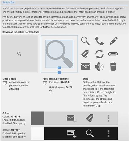
Figure 1.5 Google’s Android OS Action Bar icons defined.1
Relying on standard visual elements and UI paradigms limits the surprise factor by increasing the likelihood you’re providing what people expect.
Consistency in logos
Unlike icons, logos rely on being unique, but several aspects of consistency still apply:
• Design. The logo should always look the same throughout the application (Figure 1.6), unless brand standards allow altering it noticeably (e.g., Google’s doodles, http://www.google.com/doodles/).

Figure 1.6 Logos for Yahoo! Movies, Finance, and Travel all integrate the parent identity consistently in the website name.
• Position. The logo can appear in a different position or size on an application’s main screen, but then should be shown at a consistent size and location on all other screens.
• External consistency. If maintaining external consistency with related applications (e.g., the Google applications), the logo should be treated the same way in all applications.
Consistency in charts
Charts should be represented consistently within applications. If some charts are more important than others, they can be considered “featured” charts and one or two characteristics could be treated differently, such as size and color. Otherwise, charts should be consistent in the following ways:
• Consistent element placement. Chart elements—text head, text labels, key, the chart itself—should be placed with consistent proximity between them in each instance.
• Consistent treatment for all text used. All chart heads should be the same, all chart labels should be the same, and all chart text should be the same. A featured chart may vary one or two characteristics, such as using a larger or different color headline.
• Consistent colors, applied consistently. For example, if you make chart bars blue and shaded, all bars in similar types of charts should be blue and shaded. Again, only the featured chart could stand out by using a different color.
Consistency in treatments
We use the word treatments to refer to graphic details such as corner radii, background patterns, and shading used in buttons or other shapes. The general rule of thumb for consistency in treatments is similar to that for other image elements: treat all like elements the same. If an element is more important than others, it can be treated differently to stand out, but within boundaries. No more than two characteristics (e.g., size and color) should be changed.
Consistency in controls and affordances
Although this book focuses on the visual aspects of interface design, because we are talking about functional applications, we need to address another important aspect of consistency: ensuring controls and their affordances are discoverable and learnable. Providing consistent visual design for controls wherever they appear in your application ensures people will recognize them, and will know that what they’ve learned about using them on one screen can be applied to other screens (Figure 1.7).
There are two issues we run into when it comes to controls and consistency. One is that different platforms have different visual interface standards for controls. Adopting standard controls for an application delivered across platforms means that its controls won’t look consistent.
The second issue is that the design of standard controls may not be in keeping with the personality you want your interface to portray, or may throw off the visual hierarchy. Customizing the look of controls (discussed further in Chapters 3 and 8) can mitigate this problem.
Consistency in motion
In application design, use of motion is tied closely to control and affordance choice. At the most basic level, simple confirmation feedback, like providing rollover states for buttons and links in web applications to help users confirm their selection, should be handled the same way for similar elements. This may involve choosing the opposite state from the element’s design—for example, switching a plain link to an underlined one on hover, switching all your green buttons to another color in your palette on rollover, or simply flipping the dimensional look of a button from one side to the other to make it look like it’s been pressed.
Beyond simple buttons and links, once you’ve made the choice to include controls that feature motion, such as drag-and-drop selection, or accordions that open and shut to control information display, these items should be used consistently throughout the application. Similarly, transitions, or motions such as fades and flips that move people from screen to screen, should be applied consistently, which both teaches users what to expect and avoids overwhelming them visually.
Finally, standard platform controls may involve motion—for example, iOS’s spinning date-selection tools, Windows 8’s flipping tiles, and Android’s skinny slider bars. We’ll look at examples in Chapter 8.
Choosing the right paradigm
Sometimes, there’s more than one paradigm that may help your interface be consistent, such as multiple methods of deleting information. When that happens, a solid rationale is to pick the convention that most closely matches the model your audience has already learned for that type of data.
A good rule of thumb is to look to your own application first. If you don’t have an existing paradigm for what you need to design, use the research techniques covered in Chapter 3 to find out what applications and conventions your users are familiar with. Picking a convention and sticking to it can be really hard, especially when different parts of an application are developed by different people at different times, or when different types of data or situations of use suggest conflicting options. Your goal should be to serve your audience’s needs while trying to be as consistent as possible.
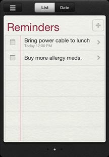
The iOS Reminders application provides a good example of how to choose from multiple options (Figure 1.8). Reminders does exactly what you’d think: it allows you to create checklists of to-do items. These items can be assigned dates, times, and even locations so that your phone or iPad can remind you when you need to complete a task.
Sometimes, you’ll need to delete a reminder, but iOS offers many different paradigms2 for deletion. How do you pick the right one to use?
There’s the voicemail deletion interface, which offers two deletion paradigms: a large red “Delete” button shown if the user selects a call, and a smaller, inline “Delete” button shown if the user swipes to the right over a call (Figure 1.9).

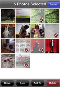
The photo deletion interface only appears after you tap a sharing icon in the top right; after that, you tap on individual photos to select them, and then tap the small red “Delete” button in the bottom right (Figure 1.10).
The calendar event deletion interface appears after you tap on an event and tap an “Edit” button. You then see a screen showing all the event details, followed by a screen-width red “Delete Event” button at the bottom (Figure 1.11).

There’s also the table-based deletion interface, shown in Figure 1.12 in the iPhone’s Messages application. Tap the “Edit” button at the top left—not right, this time!—and you’ll reveal individual deletion icons for each message. Tapping that icon displays the same small “Delete” button we saw in one of the voicemail options.

Why does iOS include five different deletion conventions? What we’re seeing is a library of paradigms for different types of information; they’re patterns for solving specific design problems, and no single solution works for every problem. These aren’t the only iOS deletion paradigms, either—for example, there’s the trashcan display on individual photos—but we’ll concentrate on these five for the purposes of this example.
Here’s how we interpret what’s going on.
• The first voicemail paradigm exists because it’s a quick way to address the most common tasks with voicemail: playing a message, then deciding whether to delete it or return the call. Putting all the controls next to each other minimizes the finger motion necessary to complete all tasks.
• The second voicemail paradigm is a hidden “power user” feature available anywhere an iOS application uses this type of table view. Once advanced users learn this shortcut, they can use it in multiple places, like Messages and Mail.
• The photo grid paradigm works by layering a selection UI on top of a dense but parseable stream of information, enabling users to swiftly and easily identify multiple elements to act on at once. This is an extension of the same interface for selecting photos to email or copy into a folder.
• The event paradigm works because even though there are multiple ways to display an event (e.g., as a list, within a weekly view), having different ways to delete an event depending on your current display would be too confusing. It’s better to drive people into the event to delete it than force them to perform the same task multiple ways within the application.
• The table view paradigm works for identifying and deleting entire rows of compactly displayed information.
So, after reviewing these paradigms, which makes the most sense? Let’s look at Reminders again (Figure 1.13).

Its type and display of information are very different from what voicemail and photos need to support, so it’s safe to eliminate those patterns from consideration. That leaves us with a tabular view of information, as well as the calendar-style list and date views—and, ultimately, it’s the latter that dictates how the Reminders application should behave.
You can get to the next detail view of an event by tapping on it from either the list or the date view, so the calendar interface’s model of a single, large “Delete” button instead of multiple approaches to deletion depending on the view makes the most sense (Figure 1.14). Besides, applying the tabular deletion convention would require overwriting Reminders’ checkboxes with an iOS “Delete” button control, potentially confusing people. Using the calendar interface’s paradigm not only makes for a cleaner display than table-style deletion, it mimics the behavior of what the audience perceives as similar types of information (events and to-dos).
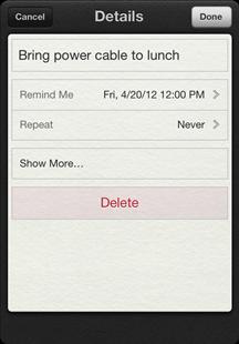
As for the pink “Delete” button instead of the calendar interface’s glossy red one? That’s because Reminders applies skeumorphic design—a design that mimics the look and feel of a physical object, here a datebook—to create its visual personality, and the standard iOS “Delete” button would be too visually prominent on the pale datebook entries. We’ll cover this approach more in Chapter 7.
Consistent aesthetics across platforms
Desktop systems, mobile phones, and tablets all have different capabilities, and creating a unified experience across a myriad of devices can be very challenging. Some of this is part of defining the overall user experience—what features and content should be available on each platform. Some of it is presenting the interface elements as consistently as possible, and having a rationale to support decisions when trade-offs are necessary (Figure 1.15).

Figure 1.15 The Epicurious applications for (a) iPhone and (b) iPad don’t look exactly alike, but they share the same elements and visual aesthetic. Consistent logo placement, navigation style, icons, and colors create a unified experience across devices.
Understanding that you probably can’t make everything look 100% the same everywhere, your primary goals for consistency should be:
• Be sure the identity is represented clearly. There should be no question about what application is being used.
• Be clear about what the user can do. If not all features are available across platforms, indicate this. One way to do this is through primary navigation. The navigation options that are visible at all times or on a start screen should provide cues about the application’s structure and main features.
• Use the same tools the same way as much as possible. While this may not be much of an option with layout/position, using the same color palette and fonts (or at least the same typographic hierarchy) in the same ways will help with consistency.
One way designers and developers are starting to address consistency issues across platforms is through responsive web design, a term coined by designer/developer Ethan Marcotte to describe applying CSS, HTML5, and JavaScript to deliver the same content in different layouts depending on platform and screen dimension. By carefully coding websites to rearrange themselves and present features in the most advantageous way for a specific device, designers can provide online experiences that consistently feel like they’re part of a single application, even if they don’t always look the same.
Other ways to provide consistent aesthetics across platforms include developing mobile-specific websites, mobile web applications, or native mobile applications. All three approaches have their pros and cons. Developing a mobile-specific website or mobile-specific CSS is probably the fastest of the three approaches, but may feel like the least rich experience; mobile web applications provide some functionality, but not the seamless OS integration of a native mobile application; and a native mobile application can require significant engineering effort, particularly if you need to develop for multiple devices. But whatever approach you choose, the three primary goals for consistency still apply.
What if you can’t be consistent?
It’s easier to design and expand your application if you have a rationale, but you can’t account for every possible circumstance. Sometimes, you may need new paradigms for new features, or you may find that being consistent makes the application harder to use.
In the case of new content or features, review your template system. For features, break down individual elements and compare them to what you’ve already designed; there are bound to be some similarities, and that’s your starting point. Similarly, with new types of text—say, detailed tables or charts when you hadn’t expected to have to show either—look to your color palette and type specifications to see how they might apply or need to be extended.
A brief aside about accessibility
Although this book won’t go into depth about accessibility issues, consistency is especially relevant to making applications usable for people with disabilities or cognitive limitations. The World Wide Web Consortium’s Web Accessibility Initiative (WAI) guidelines for web content accessibility (content, in this case, includes text, images, form elements, and any other items displayed onscreen) recommend making “web pages appear in and operate in predictable ways”3:
It is difficult for some users to form an overview of the Web page: screen readers present content as a one-dimensional stream of synthetic speech that makes it difficult to understand spatial relationships. Users with cognitive limitations may become confused if components appear in different places on different pages.
For example, people who use screen magnifiers see only part of the screen at any point in time; a consistent layout makes it easier for them to find navigation bars and other components. Placing repeated components in the same relative order within a set of Web pages allows users with reading disabilities to focus on an area of the screen rather than spending additional time decoding the text of each link. Users with limited use of their hands can more easily determine how to complete their tasks using the fewest keystrokes.4
While accessibility focuses on providing resources to ensure usable, functional websites and applications for the disabled, these principles apply just as well for all users. Everyone benefits from consistently placed navigation, form fields that behave the same way throughout, and a limited set of interaction tools that operate the way people expect. Following WAI guidelines for predictability and consistency make a better experience for every person your application serves.
Avoid common mistakes
Inconsistency introduces an element of surprise. And while surprise is a great concept when you’re trying to delight an audience with an unexpectedly pleasant and useful feature, it’s a lot less great when someone’s trying to get work done. Easter eggs are fun; “guess what I am and how I work” isn’t.
Set consistent rules for color use
• Don’t use color arbitrarily; for example, applying color to some headers but not to others at the same hierarchical level. See Chapter 6 for more on how to use color to communicate consistently.
Make informed decisions
Informed decisions require a rationale. By establishing rules that incorporate consistency as a key part of your rationale, you provide yourself with a strong basis for decision-making.
Review existing rules and conventions
• Review platform and technical interface conventions to determine which are best suited for your users and your application’s content and goals.
• Review any parent organization standards for logo, type, and color usage to understand how these influence or directly affect your application’s visual design.
• Determine whether a new application needs to feel like anything the parent brand has previously created, and if so, consider adopting one of the parent identity’s colors and/or typefaces to help things feel related.
Document decisions about consistency
• Log your decisions in a style guide that’s easily accessible to everyone on your team as well as other teams (Figure 1.16). Detail the rules for all aspects of the application’s design—screen templates, color palette, typographical specifications, and imagery—and provide a brief explanation of the rationale behind the rules. Expect to maintain the style guide; things will change. Decisions and specifications will need to be revisited as an application evolves.
Elevate the ordinary
Consistency isn’t sexy, nor does it need to be. Trained graphic designers learn about grids, but they aren’t taught about templates. Templates can feel restrictive to designers, and to a large extent they are—but you can still be creative while being consistent. Defining some content as “featured” is an opportunity to treat some elements differently than others. A featured area could change frequently, displaying a rotating set of images as shown in the email template for the Brooklyn Academy of Music in Figure 1.17.

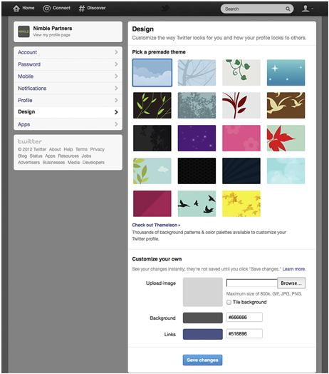
Providing customization options is another way to push beyond ordinary design while still retaining consistency. For example, Twitter uses the same layout for all its members, but every person can configure their page background and header to make it uniquely theirs (Figure 1.18).
Similarly, Gmail, Yahoo! Mail, and Mozilla Firefox all offer ways to change the look and feel of their software while retaining the same layout and tools.
1Portions of this image are reproduced from work created and shared by the Android Open Source Project and used according to terms described in the Creative Commons 2.5 Attribution License.
2Note: Screenshots in this section were taken on an iPhone. The iPad’s deletion paradigms are essentially the same, although they sometimes use popovers for an operation the phone performs inline. Also, the voicemail deletion paradigm does not exist on the iPad, which has no built-in voicemail application.
3Vanderheiden, G., Reid, L., Caldwell, B., and Henry, S. (2012, Jan. 3). How to Meet WCAG 2.0. World Wide Web Consortium. Retrieved May 24, 2012, from http://www.w3.org/WAI/WCAG20/quickref/.
4Cooper, M., Reid, L., and Vanderheiden, G. (2012, Jan. 3). Predictable: Understanding Guideline 3.2. Understanding WCAG 2.0: A Guide to Understanding and Implementing Web Content Accessibility Guidelines 2.0. World Wide Web Consortium. Retrieved May 24, 2012, from http://www.w3.org/TR/UNDERSTANDING-WCAG20/consistent-behavior.html.