
Controls and Affordances
What makes functional applications work is their use of interface controls—everything from clickable buttons to custom-designed tools—that allow people to interact with data via a screen. The visual design of a control can strongly affect whether people understand what it is, what it does, and how to use it.
In application design, affordances are the properties people perceive about interface controls—whether buttons feel clickable, sliders draggable, and icons tappable. Controls and their affordances straddle the line between user experience and visual design. This chapter focuses on making decisions about how controls look as part of designing a visually usable application.
An affordance is an implication: an interface control implies behaviors based on a person’s impressions of it. The control’s shape, symbols (e.g., a down arrow or plus sign), color, shading, position, motion, and other visual cues, along with context, affect how people interpret what they see and what they think the control will do. Is a blue “Delete” button acceptable, or will people understand its purpose more quickly if it’s red, to indicate a very serious action?
These implications form what Don Norman refers to as signals in his book The Design of Everyday Things. Signals help people know what to do, and they need to be designed.
Affordances can signal how an object can be moved, what it will support, and whether anything will fit into its crevices, over it, or under it. Where do we grab it, which parts move, and which parts are fixed? Affordances suggest the range of possibilities, constraints limit the number of alternatives. The thoughtful use of affordances and constraints together in design lets a user determine readily the proper course of action, even in a novel situation.1
Every signal users see is a clue about how to interact with an application. Sending misleading signals through inaccurate or unclear design treatments makes it that much harder for people to correctly interpret what they perceive. Half the battle to create clear affordances is choosing the correct control and actions; the other half is applying the meta-principles and visual design tools to foreshadow a control’s actions. This combination adds up to affordances that are visually usable—that signal at a glance what they do.
Using design to reveal affordances
Because controls are the means for interaction, it’s crucial that users understand what they see. Starting with familiar patterns is the best way to do this. Once you select your controls, applying them requires attention to detail, but it’s straightforward work. It requires awareness of the library of controls, discipline to use controls consistently, and flexibility if the addition of a new feature means that the library or the use of controls needs to change.
It’s more of a challenge to accurately communicate hierarchy through placement and use of controls. While other applications can be used as a reference for where to place controls, it’s likely that your control layout will need to be considered uniquely in the context of your content. If you want to elevate the ordinary, extend this consideration to evaluate familiar patterns once you have them in place. Look for opportunities to improve on the expected, informed by your personas, and visual usability principles.2
Paying attention to details will help your design stand out. Designing controls is worth the effort to infuse personality throughout an application. We’ll survey common controls to help you know what works and where to start.
Types of controls and affordances
The controls and affordances in functional applications fall into three categories:
• Navigation controls such as tabs, scrollbars, and dropdown menus that suggest movement from place to place within an application.
• Data manipulation controls, such as form fields and submission buttons that suggest ways for people to select and manage information.
• Information display controls, such as accordions and overlays that suggest revealing information on demand.
Interface controls may overlap between categories because their affordances are useful for a variety of purposes and contexts.
The following examples give a sense of how the meta-principles and tools can be applied effectively (or not!) to different types of controls, and recommend points to keep in mind as you do the same to your application.
Navigation controls
Although people understand the most basic online navigation controls, such as hyperlinks and tabbed categories of information, visual treatments, along with use of language (e.g., “next”), still make the difference between navigation that’s findable, and navigation people have to struggle to locate and use.
Navigation controls include:
• Image-based links, such as clickable/tappable icons
• Internal scrollbars or carousels to browse navigable items
Like any other visual element, these controls must be considered within the overall screen hierarchy. Placement must be balanced against location of functional controls and other screen elements so that all items accurately represent their status in the hierarchy. The best way to do this is to quickly try options and evaluate how well the different relationships work.
Links
Communicating links is about contrast and expectation. In text paragraphs, hyperlinks need to stand out from the rest of the text. They should be high contrast relative to the text color, and ideally underlined to help differentiate them.
Lists of navigation links are different, because lists stand out already. Depending on context, people expect list items to be clickable. Links in a list do not need to be underlined provided they appear in locations where users expect to find them, such as the side or top of a screen, and are differentiated from text in some way.
Alternatives to underlining links in a list include:
• Highlighting list item on rollover
• Changing link color on rollover
• Always displaying links in a different color from the main text color (Figure 8.1)
Figure 8.1 In this pagination example, color makes unavailable options recede, while the selected option is boldfaced. Underlining links here is unnecessary; they could create visual clutter in a list of numbers, and people understand a pagination control will include active links. Arrow icons reinforce the concept of moving forward to the next page. Numbers underline on rollover, and though mobile device users won’t see that additional feedback, use of well-understood paradigms makes these controls easy to interpret no matter the platform.
Internal scrollbars
Like many default controls, system scrollbars are often overdesigned. While their shading is great for suggesting depth, it can also be too visually prominent, overwhelming an interface. In the case of internal scrollbars, the goal is to help users see and interact with the contents of the scrolling area, but balancing visibility between controls and content is a challenge. How much design do you actually need to make a control and its affordances obvious?
Scrollbars used for subsections of the screen need a high-contrast, clear representation of a scrollbar with up/down arrows and a scrubber, the grabbable portion of a scrollbar (Figure 8.2). Altering the look and feel can be vital to supporting personality; if you’ve styled every other control on the screen, a browser-default scrollbar could clash with your design, like a pair of scuffed-up sneakers worn with a high-fashion gown. At the same time, you must provide enough visual cues at a large enough size for people to recognize the redesigned control for what it is and use it successfully. A small, muted scrubber that floats between two tiny, pale triangles isn’t enough information for people to perceive the affordance.
Navigational buttons and icons
Any number of visual treatments can apply to navigational buttons and icons, depending on the desired personality: rounded corners, gradients and highlights to indicate depth, shades of color, integration of icons within buttons, and so on. (See Chapter 7 for a more detailed discussion of icons.) Regardless of the approach you take, the colors of your buttons should be part of your overall palette, possibly based on tints of your primary colors, or the full-strength version of your accent colors (see Chapter 6 for more on color). Color choices should be consistent throughout your application, with a limited set of link and button colors and styles to make it easier for people to understand what’s interactive and what isn’t.
Grouping buttons will help simplify the interface, but only works if the buttons do similar things and are presented in the same way. If one button performs a very different action than the others, it may need to be differentiated to set expectations instead of providing an unwelcome surprise.

Stepped progress indicators
Stepped progress indicators should use color, typography, and other visual treatments to identify not just the active area, but also the inactive ones so that people know what steps they have completed (Figure 8.5). If users may revisit previous steps, consider highlighting them on rollover or tap so users get confirmation that their interaction expectations are correct.
Figure 8.5  RedEnvelope’s progress bar uses color, contrast, and symbols to clearly track previous, current, and next steps in the checkout process.
Data manipulation controls
For functional applications, this is a broad but critical category, since virtually every type of application, from e-commerce to banking to travel and more, relies on controls that allow users to locate information, make selections, and complete purchase, registration, and other types of transactions. Regardless of whether the transactions involved are simple or complex, the controls must be styled to effectively foreshadow their capabilities: typeahead fields need to provide visual highlights to confirm selections, sliders need bars that feel grabbable so people know what to move, and draggable elements need visible “invitations” to cue where users can drop an item.
Controls for data identification, manipulation, and transactions include:
• Checkbox- or dropdown-based search results filters
• Configurable lists allowing users to move items from one to the other
Form elements
Form elements, including buttons, are the most common controls used to manipulate data, and have a nominally well-understood set of affordances: input fields suggest typing, radio buttons and checkboxes suggest clicking, and dropdowns suggest clicking (or tapping) and pulling. Because of this, visual design of these elements should concentrate on making them match the website’s style and personality.
JetBlue’s web-based flight search interface demonstrates one good way to apply visual design to reveal controls and affordances. The flight booker’s orange highlights on the radio buttons and form submission tie into how color and type are used throughout the application. Subtle interior gradients and exterior shadows on the dropdowns provide depth to form elements and act as an invitation to click.
The flight booking tool also uses symbols and icons to emphasize form elements and their affordances (Figure 8.6). Downward-pointing arrows in the location boxes, recent search list, and dropdowns imply a selection interface will appear below once the user starts typing or clicking. Right-facing arrows imply forward motion—information visible on another screen. And calendar icons foreshadow selecting a date via a calendar widget, as well as subtly cue the concept of depart and return dates by presenting a solid blue “date” in slightly different locations for each icon.

Size and contrast are also valuable tools in making form elements and their affordances clear. If This Then That applies bright colors and oversized type to its UI controls to carry through the friendly, almost whimsical, personality. Their invitation screen consists of two fields and a giant blue submission button (Figure 8.7). Even if the button weren’t clearly marked “Invite,” it would draw attention because its size, color, and shape look inviting.
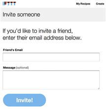
Figure 8.7 ifttt.com’s invitation form.
Android’s default picker interface shows how to effectively use contrast in formlike controls to reveal interaction points and highlight important information (Figure 8.8). Solid gray arrows stand out from their darker background, their directions clearly indicating that tapping will move content up or down. Unselected values appear in the same gray color as the arrows, but appear to recede due to their thin line weights. This helps draw attention to the selected values, which appear in high-contrast white. Finally, brightly colored rules help confirm the choice of selected values, literally blocking them off from unselected ones.

The music identification application Shazam uses size, contrast, and motion to draw attention to its primary interface element—one giant, black-and-white button on a pale blue background (Figure 8.9).

Figure 8.9 Shazam’s main screen. The symbol on the button is Shazam’s logo, a stylized S that suggests continuous motion without actually moving at all.
The glossy highlights and subtle dimensionality of the button make it feel clickable, but true confirmation of its purpose comes only from the text: “Touch to Shazam.” Ideally, explanatory text shouldn’t be necessary to clarify a UI element’s purpose, but using short, clear text on or next to buttons is a common and effective technique for ensuring people understand exactly what effect clicking or tapping something will have.
Although the instructions serve not just to confirm the button’s affordance, but also to reinforce application branding, a simple motion treatment could have made the button feel more clickable—for example, transitions on the white border that subtly expand it, adding a glowing halo that pulses into red and then returns to its original state. This transition is in fact in use on Shazam’s navigational icon (Figure 8.10), but not on the main button itself. Despite the main icon’s unmissable placement, the glow and motion below it are distracting and can draw the eye lower on the screen, away from the primary task.

Shazam uses motion more effectively once the button is pressed, shrinking it and surrounding it with a gray arc that sweeps into a circle as the application listens to a song (Figure 8.11). Turning the button into a feedback mechanism strengthens the relationship between the button and its purpose, and provides clear evidence of task progress. (The text provides additional confirmation, but the visual feedback is so unmistakable that the text is superfluous.)

One task; many controls and affordances
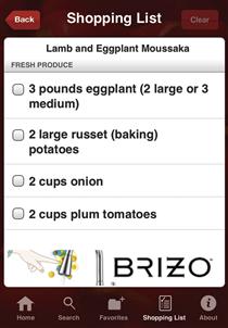
A single, straightforward flow, such as locating a recipe for eggplant and adding its ingredients to a shopping list, can involve many of these controls, as well as navigation. When sketching a sequence, consider how many controls are put in front of people. Thinking about controls abstractly can help you look at them with a different perspective, which may open up opportunities to simplify.
The Epicurious application’s search screen shown in Figure 8.12 takes familiar design patterns—a carousel, links, and a search bar—and layers custom design on top of them to create a consistent and visually quiet style that remains noticeable and clear.

The carousel at the top grabs attention with simple icons, and its directional arrows at right and left imply a scrolling action. Scrolling icons with a finger, we quickly discover eggplant doesn’t have an icon; we resort to the search bar, which suggests its purpose and affordance through a magnifying glass icon and small type reading “Enter keywords.” After typing “eggplant,” the action button below dynamically updates to indicate the number of recipe results, which encourages tapping to see more.
A “view recipe” navigational control is one of the largest items on the next screen, shown in Figure 8.13. The button’s size, shading, and size of its type make it feel as important as the recipe title and photo, and because the button looks similar to the previous screen’s results button, we expect it to be tappable. Notably, although tapping on titles or photos to see more is a common action on mobile devices, doing so here does nothing. While the design doesn’t explicitly suggest that either area is tappable, it also doesn’t take advantage of user expectations of typical platform affordances.

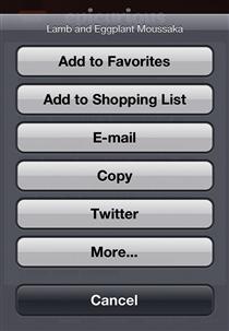
The plus-sign icon on the recipe screen, also visible in Figure 8.13, implies through its symbol that tapping it will allow us to do something more to the recipe (Figure 8.14). Unfortunately, the symbol is the only indication that the icon is an interactive control, and it’s unclear what its affordances might be other than potentially adding one thing to another.

Tapping the icon reveals an iOS action sheet with a set of clearly labeled buttons (Figure 8.15). While the action sheet’s behaviors are obvious, it’s jarring and inconsistent to suddenly present users with a generic system design instead of one that meshes with the application’s personality.
The recipe is added to the shopping list, but now we’d like to see the ingredients. Here, with the recipe name and photo the most likely potential interaction points for viewing ingredients, the application does take advantage of user expectation of platform affordances, and displays more after tapping the recipe name (Figure 8.16).
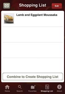
Finally, we reach the shopping list screen (Figure 8.17). Checkboxes imply we’ll be able to tap them to indicate we’ve purchased an item, and once we do, the name of the ingredient is grayed back, providing additional feedback that our purchased item is no longer a priority.
Six major sets of controls later, we’ve added our recipe to the list and viewed its list of ingredients. Could we have done it in significantly fewer steps, or with fewer interaction points? In this case, probably not, but always keep streamlining in mind when adding controls to your screens. Carefully balance feature requirements, visual design, and user expectations to ensure your final screens aren’t weighed down by too many controls, or the wrong ones entirely.
Direct data manipulation
On handheld mobile devices, where space is at a premium, directly manipulating the data itself is sometimes a better approach than providing separate UI controls. However, because removing an interface layer can make it harder for users to identify points of interaction, the visual treatment of data needs to reveal affordances as clearly as possible.
Tap
Tapping is one of the most basic interactions on a mobile device, replacing mouse scrolls and clicks with finger-based selection. It’s a simple affordance, but the interface must present items that look likely to be interactive or tappable for people to feel confident about what to do.
For example, in the iOS Photos application, after tapping a sharing icon, users are presented with a grid of their photos, a large header reading “Select photos,” and grayed-back action buttons (Figure 8.18). On a desktop interface, the user would probably select photos with a mouse, so here the obvious choice is to tap to select, and the interface reinforces this behavior with a checkmark icon to confirm each selection, as well as activated buttons.

Drag and drop
Drag and drop is another common direct data manipulation affordance. To drag and drop successfully, users must understand where their draggable items can be dropped. A drop target need not be visually complex to be successful; jQuery’s default drop feedback uses a simple color shift of text and background color (Figure 8.19).
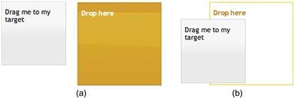
Figure 8.19 Default drag-and-drop hover behavior demonstrated on jQuery’s user interface resources website, www.ui.jquery.com.
For some applications, this straightforward treatment may be all that’s necessary. But applications with different purposes or more robust personalities may need something more visually complex to mesh with their look and feel, as well as provide the right cues to each affordance.
For example, iOS finger-painting application Inspire Pro allows users to create a palette of frequently used paint colors. Like some real-world painter’s palettes, Inspire Pro’s palette includes visible depressions where an artist would place paint colors (Figure 8.20).

How would you expect to select a new color and add it to your palette? The obvious first step is to drag the selection dot on the color wheel to find the right color (Figure 8.21). This then updates a rectangular block above the wheel to confirm the selection. Since moving the selection dot provides clear feedback about its purpose by changing the color in the rectangle, this implies the selection dot isn’t the tool for adding colors to the palette—but the rectangular block displaying the selection might be.
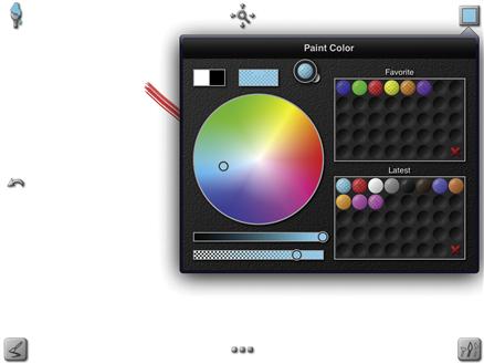
Figure 8.21 Tapping the rectangular block and dragging it toward the Favorite area creates a circle of the selected color.
Tapping the block and dragging it toward the palette creates a circle of the selected color, outlined with a solid white border (Figure 8.22). Drag the dot on top of an empty space on the palette, and the white border begins to pulse and glow, confirming that the palette is the correct place to drop the color and save it.

Sliders
Sliders allow users to narrow a range of values, and may include one or more movable grab bars to mark specific endpoints. Because they mirror real-world, physical controls, their affordances should be easily understandable, but visual design can work for or against this goal.
Flight-search tools are a common type of application making heavy use of sliders. Kayak.com’s sliders, even the ones that have only one endpoint, are clear and simple to use (Figure 8.23).

These slider handles use a thin gray border to provide the illusion of depth—of something resting on top of the bar below. They also incorporate thin vertical lines that add texture to help them feel grabbable, and pointed ends to indicate the selected range. As the user moves the handle, feedback appears directly above the slider, right where the user is looking and would expect to find confirmation of his or her choice.
By contrast, Google Flights’ sliders, while visually consistent with the look and feel of the website (as well as other Google tools), aren’t as clear, as shown in Figure 8.24.
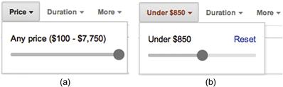
What’s wrong?
• The slider barely looks like a slider—it looks like a horizontal thermometer, a widget typically used to measure progress.
• Even if users do recognize the element as a slider, they can’t confirm they’re correct without rolling over the ball, which darkens in color and gets a cursor change to a left–right arrow.
• The slider endpoints are unmarked. Once users move the slider handle, they lose information about the low and high ends of the ranges.
• In the version of Google Flights we initially reviewed, Google provided slider feedback by updating its text to read “Under” a specific price point. However, the most important feedback, an updated list of flights, appeared elsewhere on the screen, and wasn’t always visible without making a dramatic change to the price range.
Google has since updated its Flights tool to move the updated list of flights directly below the sliders, putting feedback right where the user expects to find it. Although the other slider design flaws persist, this feedback change is a significant improvement.
Information display controls
This category is related to revealing and hiding information. The principle of progressive disclosure, discussed in Chapter 4, frequently relies on controls to manage information display. Such controls include:
• Tabs that display information in a single section rather than refreshing a screen
• Links, buttons, or icons that open or close overlays, tooltips, or dialog windows
These sorts of controls often work like switches that are flipped on to display content, and off to hide it. They reveal their binary nature through symbols, like plus/minus signs or arrowhead indicators in accordions, or through sharing the signals associated with navigation affordances—cursor shifts when passing over a help icon that will launch an overlay, or the mental mapping of screen-based tabs to file folders or book tabs that can be flipped through. Only iOS-style popovers take a different approach, relying on the user to understand that tapping on the background will dismiss them, but even that assumption is based on the most basic, learned affordance in tablet interfaces: that tapping on the screen indicates what’s important to you.
Accordions
Accordions frequently use pairs of symbols to signal their ability to show or hide information, such as plus and minus signs or triangles pointing in different directions (Figures 8.25, 8.26, and 8.27). Although an accordion need not include any symbols to be functional, or can include symbols alone, the combination of symbol and navigational text provides a stronger cue to the affordance.

Figure 8.25 Users may choose to show or hide sets of search filters. Directional arrows shown to the left of header sets suggest this affordance. The show/hide feature is not essential to use, so the subtle treatment is appropriate.
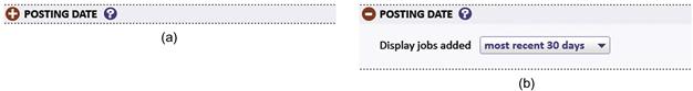
Figure 8.26 These accordions from an application’s job search form use plus and minus symbols in a contrasting color to signal their respective open/close behavior.
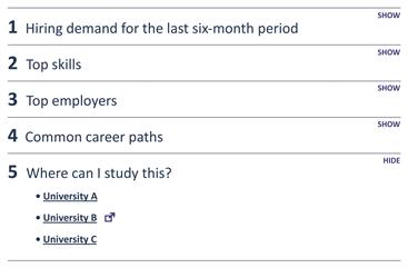
Figure 8.27 Depending on an application’s audience, a different approach to revealing an accordion’s affordance may be helpful. The audience for this application includes people with limited computer expertise. Thus, the accordions, each of which contains important information about a career, are numbered to encourage people to view each one. Rather than using an icon to control content display, accordions include “show” and “hide” text to clearly direct people.
Overlays
Because overlays involve displaying an entirely new content area on the page, foreshadowing them through visual design can be tricky; you must rely on an icon or explanatory text to cue that there’s something more to see (Figure 8.28). The good news is that certain icons, such as question marks, are such commonplace tools for signaling specific types of information that users expect something to happen when they click, tap, or roll over the icons. While the audience may not expect that an onscreen overlay will be the delivery medium, they at least won’t be surprised to see something change.
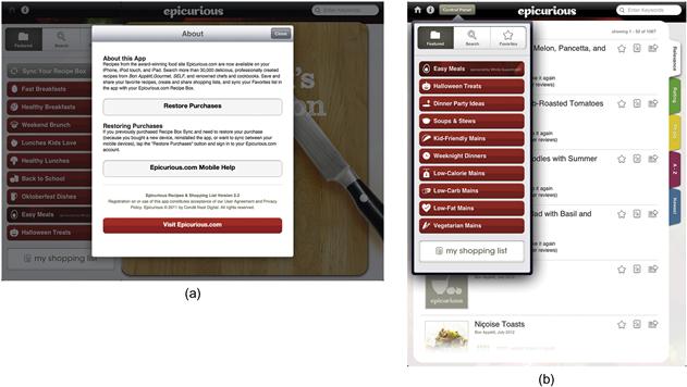
Figure 8.28 Tapping the “i” icon at the upper left of the Epicurious menu bar launches a modal dialog with information about the application. In vertical orientation, the menu bar includes a “Control Panel” button that loads an iOS popover.
User experience guidelines for the major mobile platforms discuss overlays primarily in terms of the circumstances in which designers and developers should use them, and provide little guidance about how to communicate to the user that a popover, multipane layout, or flyout—all terms for the same concept!—will appear once a certain icon, button, or screen element is tapped (Figure 8.29). Without a standard rule for how to communicate this affordance, applications don’t signal overlay capability consistently.

Figure 8.29 Twitterrific loads an account info popover when the user taps on an icon shaped like a head.
Normally, a lack of consistency in how controls communicate their purpose is a fatal flaw. However, launching an overlay is a nondestructive action—merely the display of additional information and tools not otherwise available, and ideally not disruptive to the tasks in the parent window—so what’s more important is that there be a consistent way to communicate how to dismiss the overlay. For nonmodal popovers, the solution is simply to tap elsewhere. For modal dialogs, a prominent “close” button or icon will do the trick.
For example, a job-search application we designed includes a common help feature: displaying an overlay when a user clicks on a help icon. This overlay includes a close box, symbolized by an X, to allow users to dismiss the overlay after they’ve finished reading the text (Figure 8.30).

The look and feel of the help overlay are meant to connote friendly but authoritative advice: a tinted yellow background with black type grabs attention, but the gentle curves of the arrowhead and the rounded edges of the X in the close box literally soften the message.
Although the close box is not strictly necessary—we could have designed the overlay to appear on rollover of the help icon, and disappear when the user rolls off the icon—we based our rationale for adding it on several reasons:
• On screens with many help icons, the act of moving a mouse could trigger multiple overlays quickly, causing visual confusion.
• The content in the overlays may sometimes be long or complex, and users may need time to absorb it. It shouldn’t disappear before they’re ready.
• Requiring an explicit click on the help icon is ultimately a more mobile-friendly solution, since mobile device users will need to tap the icon instead of rolling over it to view content.
These decisions were made based on our understanding of the user scenarios and context of use for the application. Different scenarios and contexts might have resulted in different decisions.
Sliding drawers
Drawers may slide vertically or horizontally, and act much like an accordion in that they open and close to reveal information. However, unlike slim, narrow accordions, which serve essentially as clickable headers, a drawer may display more information simply by virtue of its larger real estate.
Weather application Dark Sky uses a sliding drawer to show the full day’s rain forecast (Figure 8.31). A combination of content and visuals suggests the current rain forecast area is a sliding drawer: the words “Full Day” appear embossed in a depression bordered by grabbable handles. In the event users mistakenly assume they should pull the drawer downward to see the forecast, Dark Sky slows the drawer’s motion to discourage this interaction; at the same time, it displays a hint of the content below so people understand there’s something to view. Releasing the incorrectly slid drawer snaps it back into place.

Similarly, the JetBlue application uses a drawer to display its key features, and a simple but effective combination of design elements and motion to confirm affordance expectations. When the menu is in its default position (Figure 8.32a), which hides some of its options, an upward-pointing arrow with emphasis lines below it suggests that the menu bar should be grabbed and pulled up to reveal more. As the user slides the bar up, the arrow begins to shift position, rotating clockwise (Figure 8.32b) until the options are fully revealed. The arrow and its emphasis lines now point downward to indicate how to hide the menu area (Figure 8.32c).

Integrating motion to reveal affordances
Visual design incorporates not just colors, type, images, and their position and use on a screen; it also includes how interface elements move. Motion enhances use by drawing attention to elements and showing changes of state, both of which provide confirmation of success and progress through a task. Movement affects personality, and should be selected to work with the tone you are conveying; for example, in applications with playful personalities, unexpected animations can be delightful. The examples that follow, while hardly an exhaustive list of the ways motion can be applied to reveal points of interaction and their affordances, provide food for thought about integrating motion into a visual design.
Rollovers
The simplest rollovers create the sense of onscreen motion with transitions between on and off states, no different than a flipbook with two pages. Since the “flipping” happens so quickly, we perceive the state change as motion.
Rollovers are typically used to confirm a possible selection. Default link rollover behavior changes its color (Figures 8.33 and 8.34). In form dropdowns, rolling over a menu option highlights it. Similarly, rollovers have the visual effect of animating buttons and icons, confirming a user is hovering over a point of interaction.
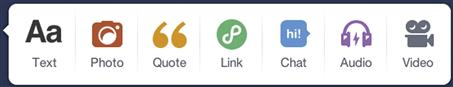
Figure 8.34 Tumblr icons subtly shift above the baseline on rollover (here shown with the “Text” option), giving the impression of bouncing up and down as the user passes a mouse across them.
CSS3 transitions allow for even more sophisticated rollovers, integrating time-based motion, border and color changes, size changes, and other effects (Figure 8.35). These effects can also be applied to elements in other states, such as when a user clicks or taps into a form element, giving it focus.
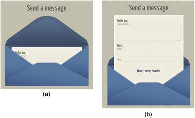
Figure 8.35 A demo contact form at http://pehaa.com/2011/07/create-a-unique-contact-form-with-css3-transitions/ uses CSS3 transitions to slide smoothly out of the envelope when a user rolls over the form.
Finally, while rollovers are one of the most common ways to provide basic feedback identifying interaction points, they unfortunately don’t work on mobile devices without a tap to enable them. Keep this in mind when designing your application—controls will have to rely on other criteria, such as color, placement, and text, to signal their interactivity.
Flipping parts of the screen
Flipping parts of the screen allows you to reveal additional information within the same real estate (Figure 8.36). Although iOS includes a screen flip as part of its basic set of UI behaviors (it’s used to display preference settings), applications on multiple platforms use the same technique to show content without fully refreshing the screen.

Figure 8.36 (a) The JetBlue application includes a triangular shape and curved arrow icon at the lower right of the flight information area to suggest there’s more to view, and that it might involve a page flip. (b) A transition rotates the entire screen until the additional information is shown (c).
Because the mechanism for a screen flip—a swipe or touch—does not in and of itself suggest that a screen flip will occur, designers and developers sometimes use icons to reveal this affordance.
In the case of the reader application Flipboard, screen-flipping is such an indelible part of the application’s fundamental behaviors that it uses explanatory text and a symbol only on its main screen; after that, it relies on the user to remember how to interact with it (figure 8.37). Animations that literally bend part of the screen as it flips reinforce the concept, and provide the satisfying sensation of paging through a printed book or magazine.

Progress indicators
While progress indicators technically have no affordances, since they allow you to do nothing other than observe them at work, they do provide critical feedback confirming that a task is running, and sometimes how long it is likely to take.
From a visual design perspective, progress indicators provide a good opportunity to introduce some personality into what can otherwise be the very boring task of sitting and waiting. Although there’s nothing wrong with a simple rotating circle or horizontal bar that slowly fills with color, particularly in an application with a businesslike purpose and visual style, even the simple application of a texture can add a little bit of pop to an otherwise staid design (Figures 8.38 and 8.39).
Figure 8.38 jQuery’s default progress bar is a simple orange fill applied to a gray background. A more dynamic option adds animated diagonal stripes.

Figure 8.39 Dark Sky takes a similar approach as it loads local weather data, moving diagonal stripes toward the upper left of the screen.
For applications that can handle a lot more personality, progress indicators can reinforce that personality through clever visuals. Hipmunk, a flight- and hotel-search website whose design features a chipmunk illustration, continues this same graphic approach in its progress indicator (Figure 8.40).
While the user waits for the content to load, the chipmunk tilts its body back and forth, as if pretending to be an airplane. A literally cartoonish approach won’t work for every application, but here it adds a sense of whimsy to the screen, and makes waiting for flight information seem less tedious.
Controls, affordances, and the meta-principles
Consistency
Once you’ve determined which controls and affordances support the primary interactions in your application, you need to use the same controls and affordances everywhere those interactions apply. A small set of controls with expected, well-understood behaviors limits what people have to learn about your application, making it easier to use. No one expects to re-order items in a list with number boxes on one screen, drag and drop on another, and arrows on a third—or worse, to be presented with several similar-looking controls that do completely different things. Sending mixed signals to your audience is as bad as sending no signals at all.
Similarly, the look and feel of controls should not shift from screen to screen. Dropdowns should appear the same everywhere. Buttons with the same purpose, or at the same hierarchy level, should be treated the same way. Icons for application actions should use the same visual style. Every point of interaction in an application is another verb within your visual language, and irregular verbs can be hard to learn.
Inconsistency
Sometimes, inconsistency is the best way to accurately represent importance and difference. For example, the “Clear All” button in SuperTracker, shown in Figure 8.41 along with “Copy Meals” and “Create a Combo,” is visually consistent with SuperTracker’s button style. However, unlike the other two buttons, “Clear All” performs a destructive action. Treating it exactly the same way as two buttons supporting features that allow users to track what they’ve eaten is potentially dangerous; it sets up a visual language in which the words for “stop” and “go” are the same. The only reason users aren’t punished for accidentally clicking a button that looks exactly the same as the one beside it is that “Clear All” triggers a dialog box asking the user to confirm the deletion.
Figure 8.41  Treating the “Clear All” button inconsistently from the other two would reinforce the difference between its purpose and that of its neighbors.
Treating the button inconsistently would improve usability. Changing one of the visual characteristics, like button or text color, and separating the “Clear All” button slightly from the group would differentiate it appropriately.
Hierarchy
For functional applications, controls and their affordances support the primary reasons people use such applications in the first place: they’re searching for information, buying clothing, tracking food intake, and so on. A visual hierarchy must reinforce the importance of these primary actions—it’s why Google’s home page is a single search box on a largely blank screen instead of a long list of instructions about how to use advanced search or sign up for a Gmail account.
As we know from Chapters 2 and 4, the size and placement of UI controls on the screen directly affect a user’s perception of not just which items are important, but also how the items relate to one another. You may know that a “Submit” button affords clicking to save your registration information, but if the screen layout doesn’t clarify which form elements the button applies to, it’s impossible to click that button with complete confidence that it will do what you expect.
Similarly, controls grouped together will be interpreted as acting on the same task or set of tasks, while onscreen placement of groups dictates which ones are perceived as most important. For example, although the “Clear All” button in Figure 8.41 was poorly designed, grouping it with “Copy Meals” and “Create a Combo” made sense, because all three items are related to managing meals. The overall placement of the group is less successful, however; cramming the buttons near large headers (see Figure 8.42 later) makes them harder to find on a densely packed screen, and gives them too much prominence.
Finally, controls with information display affordances, such as accordions, can support a hierarchy by hiding less important information and revealing it on demand. Use scenarios (described in Chapter 3) to determine what’s most important to your audience and how they expect to proceed through your application. Then make sure that the screen design—including control size, placement, grouping, and other visual treatments—reinforces what people came there to do, as well as their expectations of how they’ll be able to do it.
Personality
At times, interface controls feel like the orphan children of application visual design. Until the rise of JavaScript frameworks like jQuery that included skinned UI controls, web developers had limited control over the look and feel of HTML-based form elements, and what control they did have sometimes didn’t work reliably across browsers. Even now, with sophisticated mobile operating systems available, default UI elements can look clunky and unrefined.
It’s important that people recognize a control and what it does at a glance. Applying the visual design meta-principles and tools to an application while ignoring its functional controls is like going out half-dressed. As we showed earlier in this chapter, all aspects of a control and its affordances—from what color it is, to how it’s highlighted if there’s an error, to the smoothness of the way a screen flips over to reveal new information—must work together to support the personality.
Case Study
Defining a rationale for controls
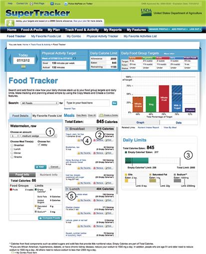
We analyzed controls on SuperTracker’s food-tracking screen to see what was working and what could be improved (Figure 8.42). We based our analysis on:
• Visual design heuristics, including our assessment of interface consistency, hierarchy, and personality
1. The food search filter dropdown doesn’t accurately represent the way most people will locate items within a database of thousands of foods. If presented at all, it should not be presented at the same size and level of importance as the search box itself.
2. Tracking food, the most important task, has so many other elements surrounding that it doesn’t feel as important as it is.
3. The food group chart and the tabs that control its display are too large relative to the food-tracking area, and feel too prominent.
4. “Copy Meals,” a valuable tool for people who eat the same food items on a regular basis, is squeezed between a header and two other buttons. Paradoxically, the entire button group’s location actually makes it feel more important than it is, simply because the buttons are so large and so closely spaced next to major headers.
5. Action buttons within each food item area (“My Favorite,” “Remove,” “Edit”) are too big relative to the information they affect.
Our redesigned SuperTracker screens address each of these issues (Figure 8.43), make the application more approachable, and give people a better idea of which controls affect which content.
1. On the web and tablet versions, treatment of “Find a food” draws attention to itself, reinforcing that locating food items to track is SuperTracker’s primary task. Putting the bar at the bottom of the phone version accomplishes the same goal, because its placement makes it easier for device users to activate it with the touch of a thumb.
2. The “Copy Meals” button, previously hidden as a small, gray button, is presented more prominently on the web and tablet versions, along with an icon that suggests duplication. On the phone version, which has less real estate available and must only present the most important features, “Copy Meals” would be available by tapping the name of a meal or a food item.
3. With “remove” and “edit” options moved to a detail screen available with a click or tap on a food item (not shown), the star icon used on the original SuperTracker’s tiny “Favorites” button can now be presented on its own next to each food item, and displayed as empty. Clicking or tapping it feels like the only possible interaction one could take with it, and filling the star with yellow provides the right feedback to help people understand they successfully identified a favorite.

Personality in SuperTracker
Keeping in mind three core personality traits relevant to each of our target users—that the application must feel informative, friendly, and motivational—we applied appropriate visual treatments to our controls.
• Dark blue, a neutral, business-like color with high contrast relative to the default black type, is used for all clickable/tappable text.
• Icons that feel playful but not humorous reinforce the concepts associated with each navigation category, and make navigation easy to find at a glance no matter which platform someone is using.
• Similarly, icons draw attention to key features, such as choosing from favorites, favoriting an item, and copying a meal. The star icon is used both on “Choose From Favorites” and as the control for favoriting an item, creating an obvious relationship between the two. The “Copy Meals” icon, designed as two circles of lightly contrasting color, provides additional foreshadowing that clicking the related text will copy information. These icons are styled simply; they draw attention because they are pictorial, and a different visual element from much of the rest of what’s on the screen. Shading or more detailed styling would be distracting.
• The color yellow helps draw attention to interactive elements: favorite icons, action buttons, and navigation.
• Round edges in a number of locations soften the application, make it feel friendlier, and contrast with the many straight lines.
• Judicious use of drop shadows on tab edges, the sliding drawer in the tablet’s vertical mode, and the top of the phone’s search interface provide depth and help separate action areas from the static ones below.
Avoid common mistakes
Interactive areas should feel interactive, and read-only ones should not
Although people are used to filling out forms online, it’s easy for them to lose track of where they are in a long form, especially if they use keyboard shortcuts to move from field to field. Providing instant visual feedback as users enters data help them quickly identify where they are and what they can do on the form.
• As people type in active fields, highlight the fields with a border, tint, or combination of both.
• Use the same graphic style for all buttons, icons, and other points of interaction in your application so that people learn that part of your visual language.
• Don’t treat read-only elements the same way as interactive ones. People will assume they can manipulate controls unless they receive clear signals that something is different. Simply hiding a form field’s border is usually enough to provide cues that a read-only field cannot be manipulated.
Provide feedback
Your visual design approach should account for system feedback—where it’s placed, how it looks, and when it appears. No matter how carefully you’ve designed a control to foreshadow its affordances, no one can be confident their interaction worked without feedback.
• Put feedback where the user is looking, ideally near the control itself. If multiple controls must be manipulated to perform a task, make the feedback part of the results display.
• Use rollovers on links, buttons, icons, and other points of interaction. On mobile devices, rely on other visual forms of feedback, such as changing a button’s color as it’s pressed.
Apply design to form controls
If you’ve applied the meta-principles and tools to the rest of your application, don’t leave UI controls undesigned, which makes the application feel half-finished. Simple treatments based on CSS, JavaScript libraries, or minimal customization of mobile device controls are often enough to integrate controls into your application’s overall visual design and personality (Figure 8.44). More complex treatments can wait until you’re ready to elevate the ordinary.
• Form field design need not be complicated; if anything, fields should be designed for readability and usability. Consider minimal treatments such as using a thin border around text inputs, or applying a splash of color to buttons in both inactive and active states.
• For the next step in design treatments, look into JavaScript frameworks, such as jQuery or extJS, that allow customization of checkboxes, radio buttons, dropdowns, and other elements difficult to style consistently with CSS alone. On mobile devices, create custom styles for your controls.
Make informed decisions
Start with expected patterns
Design patterns represent the ways people expect to interact with objects on a screen.
• Rely on common design patterns to solve most design problems, at least at first.
• If you have a problem that can’t be addressed with a design pattern, look to the most closely related patterns to see how they might be modified to serve your purposes. This provides you with a solid foundation to design from, and your audience with hints about how they might be able to interact with your application.
• Choose treatments for controls carefully, and test novel approaches to see if people understand them.
Elevate the ordinary
Improve flow and visual appeal with appropriately customized controls
Unique visuals for your controls can support your application’s personality by pushing it beyond what people expect. The Epicurious search screen (see Figure 8.12) and our redesigned food entry screens (see Figure 8.43) both include customized controls to help flow and express personality. See also Figure 8.45.
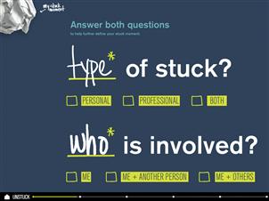
Figure 8.45 iOS application Unstuck gives its checkboxes a hand-drawn treatment, but their roughly square shape still clearly represents what they are. Form input fields that dispense with the full border in favor of an underline and handwritten help text contribute to the application’s informal personality.
Take advantage of feedback to express personality
Feedback is another opportunity to express an application’s personality, particularly if that personality includes a sense of humor.
• Seek out places to add special feedback that reinforces your application’s personality, particularly error and alert messaging. Tools such as illustration and messages that have an appropriate tone of voice can be especially effective (Figure 8.46).
1Norman, D. The Design of Everyday Things, p. 88.
2The shift we made in controls shown in Figure 4.18 of the SuperTracker case study is one example of applying familiar patterns, evaluating them, and shifting controls to improve appeal and use.