
Imagery
People expect to see different types of imagery depending on the type of application they’re using. In an analytics application, people expect to see tables and charts. When walking around looking for businesses nearby, people expect a map and hope to see photos that help them recognize their surroundings. When evaluating applications to install, people expect to see screenshots that provide a sense of using the application.
Imagery is a great tool for answering questions, such as what something looks like. Appropriate images also communicate softer messages, such as helping someone feel more engaged or decide whether an application is right for them. Use of imagery is a great opportunity to elevate the ordinary and delight people with expression that supports an application’s content.
Images are not just icing on a cake, however. They add information, such as the way an author’s comment avatar expresses something about the author himself, and are integral to using, getting information from, and enjoying applications.
Applications use many kinds of imagery: photos, illustrations, charts, icons, animation, video, maps, screenshots, infographics, logos, and patterns. Imagery is a type of content, except when used as a pattern or texture. It communicates information, not just something about the information (Figures 7.1 and 7.2).
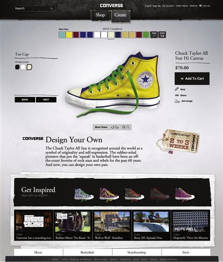
Figure 7.1 Applications can combine multiple types of imagery. Converse’s Design Your Own application combines product photos, illustrated controls, live previews, animation, patterns, and textures to help people use the application and feel inspired to make a purchase. The casual, sketchy style conveys the brand’s personality.

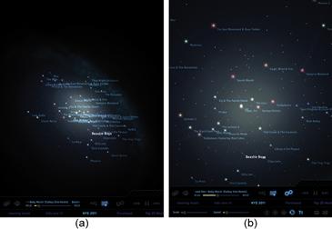
Figure 7.2 (a) Urbanspoon’s restaurant locator combines your location on a map with a list of nearby restaurants; it’s efficient, but provides only an abstract sense of place. Yelp offers a similar locator tool, but provides quick access to Monocle (b), which uses augmented reality to virtually overlay restaurant names, ratings, and directions on an image of your current location.
In consumer applications, imagery is essential to appeal, communication, and use (Figure 7.3). The question is not whether to use imagery, but rather what kinds to use, and how. In business or technical applications, the range of appropriate image types can be limited. A logo, icons, charts, and patterns may be all there is to work with. Avoiding common mistakes and making informed decisions can help business and technical applications communicate data and qualities of the brand. Icons and styled controls can help make navigation and function clear while expressing personality that differentiates your application from competitors.

Figure 7.3 Trefis’ interactive stock-trading charts use animation and a unique diagram style to convey information and differentiate the application from competitors.
As with the other visual usability tools, using imagery successfully requires knowing what people expect, and providing it in a way that makes sense and appeals to them. Understanding what roles images can play, and knowing about different types of imagery and their characteristics, allows you to make informed choices and decisions about your design.
Communicating with images
Imagery in applications communicates three ways: through its use, or its role in the interface; through the subject matter of what’s depicted; and through the qualities of representation.
Role is the reason imagery is included. All imagery should support communication by drawing attention, providing explanations, showing detail, expressing personality, inviting interaction, or reinforcing patterns. If imagery doesn’t have a role, remove it.
Subject matter is what imagery depicts. In photography, video, and maps used in functional applications, subject matter is pretty straightforward. In expressive logos or textural images, subject matter may not be clear, leaving people to rely on role to interpret imagery: an abstract logo’s meaning may be ambiguous, but if the image’s characteristics, size, and placement suggest it’s a logo, it will serve as a mark of identification. In the case of textures, people don’t need to know what texture is depicted, as long as it subtly communicates a desired quality.
An image’s qualities need not be noticeable for it to be successful. For example, if an e-commerce website’s product photos are sharp, consistently well lit, and treated with the same background, they’ll work effectively. Imagery that’s blurry, inconsistent, poorly lit, or too prominent for the subject matter is distracting, and compromises sending effective messages.
When deciding whether to use imagery, the key question is, “What do we want to convey?” Decisions about imagery, like those about layout, type, and color, need to be grounded in overall communication goals, benefits to the user, and personas or contexts of use. Matching goals to types of imagery that achieve your objectives gives the images a role to play in the interface.
Drawing attention
Images draw the eye for a variety of reasons. One is speed of understanding: we quickly derive meaning from images if what they show is easily recognizable. We’re also drawn by contrast, and images often contrast with other elements, such as text. Novelty appeals to us for similar reasons: we’re attracted to images we haven’t seen before.

Figure 7.4 These whimsical messages on Converse’s Design Your Own application take advantage of familiar symbols, novelty of execution, and animation, which draw the eye in a fun way that also expresses the brand style.
Finally, when combined with motion, imagery attracts us even if we’re not interested in the subject matter. Humans are “wired” to look at moving elements in our field of vision.
Providing explanations and showing detail
Images are great for presenting examples and details. Illustrations of processes, functions, or individual items; photos of products, people, or places; and charts of data or diagrams help make information clear (Figure 7.5).

Representing content
In some applications, charts, photos, video, animations, and so on are the content, raising questions about subject matter and qualities. You need to decide what type of imagery best communicates your messages, as well as what size, position, spacing, alignment, and overall layout support those messages (Figure 7.6).
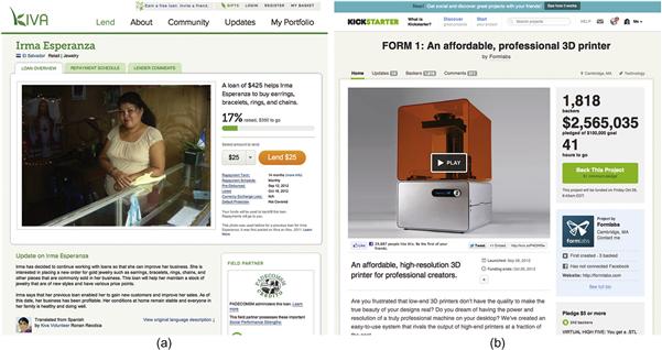
Figure 7.6 (a) Photography on Kiva versus (b) video on Kickstarter is an example of making decisions about image types. Size and presentation are similar: the photo augments the text content, and the video provides content not available otherwise. If Kiva presented its funding cases with video, would they be even more successful?
Keep in mind that each type of imagery is a subspecialty of its own, and after evaluating which to use, you may need a professional to create the imagery. In many cases, such as a product demo video or a data visualization, this specialist will be part of the decision about what to represent, and will know how best to use the medium to communicate the message.
Expressing feeling, brand, or style
Expressive qualities help us care about and enjoy what we see. Personal, emotional associations help us feel connected and engage us.
In the examples in Figures 7.7, 7.8, and 7.9, the “soft” information the images communicate is both strategic—it helps the applications differentiate themselves—and tactical—each presents a unique visual image and suggests different emotional associations. These associations help people know if the application is right for them.

Figure 7.7 This illustration in the Clothia browser application is purely expressive, yet strategic as well. It represents qualities of the brand—new, unique, fashionable, creative, exclusive—and serves to attract users who find it appealing. The illustration doesn’t try to attract everyone.
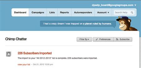
Figure 7.8 MailChimp’s cheerful mascot looks fun, but is working hard. The illustration helps make the job of creating email campaigns feel lighthearted rather than dull.

Figure 7.9 Each of these photo application logos expresses a different personality, and tells us something about the applications they represent. (a) SmugMug is simple and fun for anyone. (b) Flickr is too cool for an “e”—if you don’t get it, it’s not for you. (c) Instagram is nostalgic, both in terms of the images it helps create and its focus on sharing.
Inviting interaction
Any image’s subject matter can provoke an emotional response. Once people are emotionally engaged, they’re more receptive to persuasive messages that involve taking action (Figure 7.10).

Figure 7.10 Avatars identify friends in Slideshare. Seeing what friends like takes advantage of our desire to feel connected and makes people more likely to pay attention and possibly click.
Images may also be incorporated in controls, such as buttons and form elements that people interact with to perform tasks. (We discuss controls in more detail in Chapter 8.) The visual treatment of images as controls influences whether a control feels interactive, and communicates qualities of the brand (Figure 7.11).

Figure 7.11 Decisions about what style of control to use should be conscious and based on visual prominence and personality. Converse’s website uses image textures to create expressive, highly stylized navigation buttons. This unusual approach looks usable enough in context and helps communicate brand attributes—casual, hip, not bound by convention. The trade-off of potentially compromised usability is part of making a strategic decision. Based on the audience for the website, it’s one that almost certainly paid off.
Reinforcing similarities and differences
Use of imagery helps people detect patterns and make associations by revealing similarities. As with color, treating images consistently indicates they refer to the same type of things.
At the same time, inconsistent image use or treatment can help people see why something is different. In the project summaries in Figure 7.12, the similar shapes of the “New” and “Staff pick” flags indicate their information is related, but their unique colors and icons indicate a difference. If each flag were the same shape and color, changing the small icon alone would make it hard to determine the difference between the flags.

Types of imagery and uses
Knowing the range of image types, their characteristics, their typical uses, and dos and don’ts will help you make decisions about choosing appropriate imagery.
Photography
Primary characteristics
Realism. Photography provides detail depending on the subject matter and qualities of the photo. Everything shown in a photo communicates, so it’s important that what’s depicted (e.g., the background) is intentional. Qualities such as cropping and lighting can affect meaning and interpretation of the subject matter. Photography is the best choice if the details of a real thing matter (Figure 7.13).
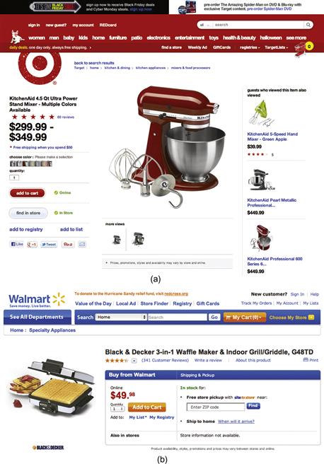
Figure 7.13 At first glance, these two product photos look similar. (a) The mixer photo on the Target website doesn’t have a drop shadow or show anything other than what comes with the product. (b) The waffle iron photo on the Walmart website adds a shadow and food. It shows less of the product, and adds context. As a rule of thumb, show the product as clearly as possible, without editorial embellishments, unless you know that users expect and want a different approach.
When to use it
Details
• Size affects impact. Photos that show detail but are too small are frustrating. Photos that are too large may distract from the content.
• Color treatment (natural or manipulated). Using a duotone effect may undermine realism, or may add an expressive quality. Interpretation of an effect depends on what people expect; that is, whether they’re relying on the photo to provide absolute detail, or just the gist of something.
• Lighting has a huge effect on mood and tone. Consider the lighting in your images, and if it’s supporting the application’s purpose and goals.
• Posed stock photos of people that don’t look realistic should be avoided.
• Settings can be just as expressive as subject matter. Martha Stewart differentiates her recipes and crafts through photography that communicates the qualities of her brand. The photos—not just their subject matter—look special because every visible aspect in the frame helps set the mood.
• The shape of a photo adds to how it communicates. Photos in a circle feel informal (and can be a pain to auto-generate). Shape can also be a tool for grouping image types; iTunes uses squares for music, rectangles for movies, and rounded-cornered rectangles for promotional graphics.
• The minimum required image resolution changes from platform to platform, and changes further when considering standard-resolution displays versus high-resolution ones, such as Apple’s Retina displays. Keeping two copies of images—one high-resolution version and one regular one—to serve based on different device types is one common solution until there’s convergence on a new display resolution standard.
• Studies show that generic images on informational websites don’t attract the eye.1 One of these studies also found that on a website with investment information, photos of people looking at the camera didn’t create an impression of trust.2 Even though both websites tested were informational rather than functional, these studies suggest that photography isn’t useful unless it’s specific in its subject matter and directly related to text content.
Video
Primary characteristics
Motion and realism. Video can help people understand complex processes, situations, and concepts more quickly than text descriptions and still images (Figure 7.14). Video can bridge distances, such as watching a video of someone presenting at a conference versus seeing slides of the presentation. Video’s capability for sound makes it a powerful tool for communicating aurally as well; a video’s content and sound quality communicate as much as what’s shown.

When to use it
• When describing details better revealed through motion; for example, Zappo’s provides videos that show how shoes look while someone is walking.
Details
• Bigger isn’t necessarily better. Video can add to understanding even when shown at a relatively small size, as it helps people get the gist of a process with more clarity than a still image.
• Quality matters. If you have an application for professional use, amateur-quality video may do more harm than good.
Illustration
Primary characteristics
Abstraction, exaggeration, simplification, imagination. Illustration can show things that are known but hard to see, such as scientific behaviors. It’s a primary tool for describing ideas and concepts, and is a great tool for persuasion.
When to use it
• When showing concepts or things that are real, an abstraction helps communicate clearly. For example, illustrations of processes we can’t easily see, like photosynthesis, or the systems of the body.
• When showing ideas, such as new product concepts.
• When expressing intangible qualities, such as the Clothia illustration (see Figure 7.7).
• When exaggeration helps communicate, such as evoking a mood that a photo or video can’t capture.
Details
• Illustration is expressive by nature. Selecting a style that appropriately represents what you want to your audience is crucial.
• As an expressive medium, illustration styles go in and out of fashion. Think about the lifespan of your illustration in advance, and select a style with lifespan and trends in mind.
Animation
Primary characteristics
There are two types of animation relevant for application imagery. One presents content and uses abstraction and motion to communicate details and personality. The other involves motion of interface elements onscreen to reveal information, provide feedback, and reinforce relationships, and is discussed in Chapter 8.
When to use it
• When reviewing concepts where the gist of a message is more important than specific details, such as the animations in the Structures application in Figure 7.15.

Figure 7.15 The Structures application uses illustration and animation to explain principles visually.
• When communicating with diverse cultures where clarity and understanding are important, but details might distract or not translate.
• When personality is important, and motion adds to conveying personality effectively.
• When an alternate communication style is needed—for example, if a still image won’t adequately show details, or when novelty is needed to grab attention, such as in Figure 7.16.
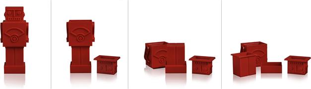
Figure 7.16 An animated GIF on thinkgeek.com shows how the “Robocup” measuring cups come apart. Without the images, buyers wouldn’t know how the robot could also be measuring cups. Four still images could do the job, but seeing them animated is both fun and in keeping with ThinkGeek’s brand and personality.
Details
• There are many styles of animation: cartoon, claymation, 3D renderings, etc. Selecting the style that expresses what you want to your audience and fits your personality is crucial.
• Because of its expressive nature, styles of animation go in and out of fashion. Think about the lifespan of your animation in advance, and select a style with lifespan and trends in mind.
• Careful use of animation can make interactions feel clear and special. Gratuitous use of animation feels gimmicky. Positive answers to these questions should help you decide if animation is a good choice:
• Would adding animation help people understand the concept you want to explain?
• Would adding animation convey personality in a nondistracting way?
• Would the animation load instantly?
• Would the animation be appreciated on the third or fourth viewing? What about the tenth viewing?
Logos
Primary characteristics
Logos are often abstract, and communicate symbolically as “flags” for an organization or product. They need to be memorable, and must work at very small and very large sizes (Figures 7.17 and 7.18).

Figure 7.17  The Amazon.com logo can be abbreviated, augmented, and abstracted without losing meaning or the successful ability to refer to the company it represents.
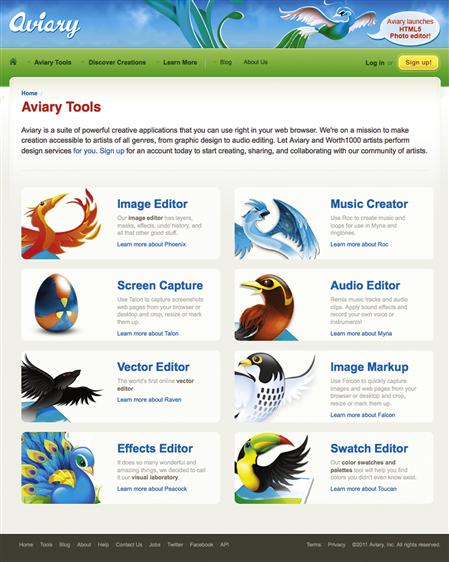
Figure 7.18  Aviary’s applications each have an illustrated logo. The logos are unique and attractive, and can be combined with the parent logotype. However, they are also visually complex, which can be distracting in an interface and make it hard to reduce them to a small area. While each logo is clearly part of a family, the individual logos don’t relate to their products in an obvious way. As such, it is hard to know at a glance which logo goes with which product.
When to use them
• On a product. Every product needs a logo (also known as a mark) that identifies the product in a simple, expressive, notable way.
• To represent a product. When shopping for applications, icons are a key part of communicating the essence of the application. They also need to stand out on a crowded mobile device screen.
• On a branded service. Applications blur the line between product and service. Both need logos to help people identify them.
• When a product or service is part of a parent organization, consider using the parent organization’s logo. Ask yourself whether the parent logo adds meaning through association, as well as whether it’s distracting or confusing.
Details
• The term logo is commonly used to refer to a symbol that represents a product, service, or organization; a name set in a typeface that refers to a product, service, or organization; or both. However, the correct term for a logo that only uses type (no symbol) is logotype.
• Logos can include letters and words.
• A logo is not a brand. It’s a symbol that communicates something about a brand.
• Logos should suggest an idea, feeling, principle, or description related to the product, service, or organization they represent.
• Like illustrations and animations, logos are expressive and communicate style. Logos should be designed for a minimum of five years of use, and ideally the lifetime of the product or service. As such, logos need to be designed to avoid trendiness. The expressive qualities of a logo should be classic, utilizing symmetry, a highly organized arrangement, and clean (simple) forms.
• Logos that lend themselves to a variety of uses are flexible and more likely to serve for a long time.
Icons
Primary characteristics
Simplicity, abstraction. An icon is a simplified picture of a thing. It needs to look enough like what it represents to be understandable and to be used in place of a word or more detailed image.
Details
• Icons can be a single color or multicolored.
• Icons are simplified pictures. Defining features may be exaggerated to help the icons communicate what they are.
• To be successful, icons need to communicate clearly to their audience. If an icon’s meaning could be ambiguous, use a word alongside it.
• Designing an icon to represent an application is very different from designing icons that appear within applications to represent tasks and concepts. Application icons should be memorable and unique; icons for use within applications should be familiar and obvious. Before designing an application icon, be sure to check device standards.
• Icons used in applications are typically created in sets or families. An icon set is two or more icons used to communicate the same type of information, such as actions a user can take, or categories of information.
• Icons in a set need similar styles. For example, if one icon uses shading or curved corners, all others in that set should be treated the same way (Figure 7.19).
Figure 7.19 Two sets of icons from the same application use different styles but have color and shape in common.
• Different icon sets in a single application can have different styling, but should have something in common so they look related.
Symbols
Primary characteristics
A symbol stands for an object, action, or idea, but unlike icons, symbols don’t need to look like what they represent. For example, flags are symbols for countries, and arrows and shapes can be symbols with contextual meanings, such as a hexagon representing “stop” and a triangle representing “yield.” Letters of the alphabet and numbers are symbols.
When to use them
• When you want to communicate something universally understood by your audience (Figure 7.20).
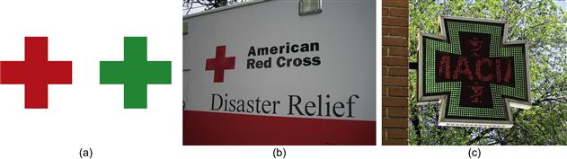
Figure 7.20 In America, a red cross is the symbol for the American Red Cross disaster relief agency. In Europe, a green cross is the symbol for a pharmacy, such as this pharmacy sign in Spain.3
• When common symbols exist for the concept you want to represent—for example, a triangle in a circle is frequently used to start playing a video.
Details
• The meaning of a symbol can be different depending on context and use. A five-pointed star is our symbol for large balls of plasma in space, but used next to an item in a list, a star can indicate preference or importance.
• The meaning of symbols is assigned by the cultures of the people who use them. As such, meanings can change; they aren’t fixed.
• Symbols work best when they communicate a single idea. Avoid combining symbols to create new meanings, unless you’re intentionally defining a new visual language that people will expect to learn.
• Color can affect the meaning and interpretation of a symbol, such as a red cross versus a green cross.
Data visualizations
Primary characteristics
Data visualizations can be dynamic—connected to databases and updated automatically—or static. Data is commonly represented in the form of charts and graphs to reveal patterns and show status. Words, numbers, symbols, shapes, lines, color, layout, and sometimes photographs combine to help people make sense of abstract representations of transactions, occurrences, or behaviors (Figure 7.21).

Figure 7.21 The variety of data presentation types—bar charts, tables, flags, and maps—makes this MailChimp email report look engaging. The familiarity of the chart types and amount of white space makes the report look approachable, while limited use of color helps blue and red accents pop out.
To design successful visualizations, you need to understand the data and its significance. Then you can decide what form it should take to express the meaning, and apply visual usability principles to help people make sense of it.
Specialists analyze data and design representations to communicate meaning. While successful data visualizations can be designed using visual usability principles and standard graphing software, some data visualizations are projects and applications in themselves, created by teams of specialists using custom software.
Details
• Using standard forms of data visualizations, such as bar charts, pie charts, and line graphs, means that people will not have to decipher unfamiliar formats.
• Representations of data in less well-known or unfamiliar formats may use a unique or unexpected visual language people will need to learn to read (Figure 7.22).
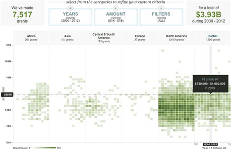
Figure 7.22 People may need a minute to figure out how to use and read this custom interactive chart on the William and Flora Hewlett Foundation website that combines bubble plot, heat matrix, and timeline formats. Once they get it, the controls are easy to use and remember, and the display of information is clear.
• Different forms show different things. Select the type of chart or graph that fits the data and purpose. Know what you need to show—for example, relationships, parts of a whole, change over time, or hierarchy—and select a format that fits.
• Design charts and graphs to have some visual characteristics in common with the visual style of your application. You’ll need to decide how much you want them to match or stand out, and select and manipulate the tools accordingly for appropriate contrast.
• Each element in a chart or graph should add to its meaning and aid interpretation. Eliminate all unnecessary elements. This may mean eliminating “standard” elements, such as rules (lines) that fall behind a graph but don’t help people see the trend.
• The principles of layout, color, and type apply to the design of charts and graphs: align content and text consistently; depending on desired visual emphasis, use colors that contrast or blend with the rest of the colors in your application; and use the same fonts as the rest of the application unless there’s a good reason for contrast (Figure 7.23).

Figure 7.23 These three finance applications communicate the same information. (a) Yahoo! Finance is clear, but generic. The arrow indicator is unnecessary, considering the use of color and plus/minus symbols to indicate status, nor does it need the “Major Indices” header. (b) Google Finance uses Google’s primary color palette to identify the three markets. Bringing in parent brand colors enhances the information and helps us know this is a Google application. The three colors in the chart give a clear picture of overall status, and icons for the sections of the application are subtly treated so as not to distract from the data. (c) FinanceCap’s chart uses the same colors as Google, but the unnecessary key, large type, and tight spacing make it harder to read, and the colorful icons draw the eye away from the data.
• Colors should be used in charts and graphs to:
• Convey meaning—be especially conscious of the use of red and green, as they imply quality of performance.
• Differentiate content types—pie chart colors should be unique, but don’t add colors just for the sake of it. If there’s no cognitive reason to differentiate with color, don’t.
• Highlight meaningful areas that people should notice.
• Continue to convey appropriate personality—don’t throw your palette out the window when choosing colors for charts and graphs. The colors you use to convey information and data must be part of the overall application palette. If applicable, they can be stronger (more saturated) versions of colors in your palette, but they shouldn’t clash.
• Be wary of visual metaphors and using illustrations in chart and graph design. Using a tachometer-style chart isn’t good design unless you’re designing data that has to do with speed or rotations per minute.
• Don’t use gradations or other treatments when a solid color or plain treatment would convey the same meaning.
• Don’t use three-dimensional graphics when two-dimensional ones will do. Keep the visual focus on the data.
• Design dynamic charts and graphs based on a representative amount and type of data to make sure styles work with live data.
• Using a variety of graphs and charts helps keep the presentation of the data interesting, as long as the forms are also effective.
Infographics
Information graphics, or infographics, are illustrations that may also include aspects of data visualizations and interactive graphics. When infographics are pure illustration, they’re static graphics designed based on someone’s interpretation of data, and often include limited content to provide context (Figure 7.24). More complex infographics incorporate dynamic visualizations based on a data set, and may include motion or interactivity (Figure 7.25).

Figure 7.24 The State of Wikipedia is a static infographic outlining Wikipedia’s growth and important milestones between 2000 and 2011.4
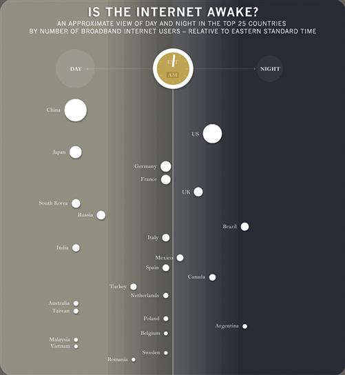
Figure 7.25 Artist Bård Edlund uses motion and simple shapes to demonstrate how worldwide Internet usage changes over the course of a day. As the clock in the center ticks forward, circles representing each country shift back and forth between day and night.
Because infographics are a form of illustration, those same characteristics, tips for use, and details apply to them. However, when introducing motion or interactivity, the tips for interactive graphics apply as well.
Interactive graphics
Primary characteristics
Interactive graphics can be applications on their own or be embedded within applications. They may contain multiple forms of images, such as photography, video, and illustration, and need to incorporate principles of successful image design as well as design and presentation of appropriate controls.
When to use
• When configuring something, like the custom Converse sneakers (see Figure 7.1).
• In teaching tools and educational games, where input and feedback are key to engagement.
• In demos and simulations, to allow people to try something out.
Details
• The trick to successful interactive graphics is balancing engaging content with necessary interaction controls. Both are important, but visually complex content can make it hard to find and use controls.
• Use standard, styled controls in interactive graphics, since the graphic itself is likely to be unfamiliar to users, and seeing familiar controls will help people know what to do.
• Highly visual feedback is crucial in interactive graphics. If people don’t see feedback, they assume the graphic isn’t working.
• Some interactive graphic interfaces present a sequence of steps, which can be a good way to help people navigate and use the graphic.
• The ability to return to the default state is crucial. Interactive graphics are an opportunity to manipulate things and see results. Users must be able to easily clear what they’ve done and try again.
Maps
Primary characteristics
Maps based on data represent real places. They can be abstract or realistic, or a combination of both. They rely on illustration, photography, text, and other symbols to communicate (Figure 7.26).
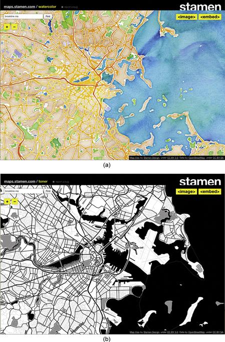
Figure 7.26 These maps use texture and contrast to push and play with what’s expected and necessary to communicate geographic data successfully. Considering role, subject matter, qualities, and context of use will help you determine if unexpected images or treatments are appropriate for your application and users.5
When to use
Details
• The design of maps, like that of data visualizations, is an area of design specialty unto itself.
• Unless your audience is familiar with or expects a particular type of map, or styling a map is important to convey brand characteristics, any map software or API will do.
• When selecting a map application, consider how the map’s default appearance will look with the rest of your interface and content. If all applications have comparable functionality, select the one that looks most aesthetically related to your interface.
• Refine the presentation of your map to visually integrate with your UI: change default fonts and colors that are not part of the actual map image to your fonts and colors. Do not change colors and fonts on the maps themselves, unless you’re making an artistic statement that’s more important than accurate use.
Patterns, textures, backgrounds, and gradations
Primary characteristics
Used successfully, these visual effects support content and brand, adding personality without upstaging content.
• Patterns are typically repeated areas of an image. Repeating patterns can have the effect of creating a texture (Figure 7.27).

Figure 7.27 The iPad Calendar application’s background mimics a leather and paper calendar. While this makes the application feel familiar, the combination of realism and computer fonts (not handwriting) is odd.
• Textures are image effects that change the surface of the screen (Figure 7.28).
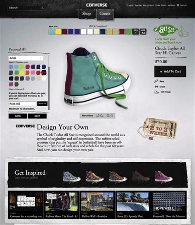
Figure 7.28 Textures used in the backgrounds and color swatches of Converse’s Design Your Own application add realism and personality that help convey the brand without being too literal.
• Gradations are fields of one or more colors that vary in shade to give the illusion of depth. Gradations are a type of texture.
• Backgrounds may be any type of image or solid color that appear behind content (Figure 7.29). They create depth as well.

When to use
• When the content of a pattern or texture adds meaning to your content.
• When you want to affect mood.
• When you want to convey a sense of space or depth.
• To differentiate sections of content.
• When the effect will help communicate personality and brand.
• When looking for ways to connect visual design across platforms and mediums.
Details
• Always test type that will appear on a background for legibility and contrast.
• The simpler the pattern or background, the less distracting it will be.
• Patterns and backgrounds are most successful when they convey conceptual rather than literal qualities. This is a subtle but important distinction. Apple uses photographic textures to make Calendar appear as a specific type of tangible calendar. Converse uses photographic textures to suggest materials, such as the cloth and cardboard textures in their Design Your Own application. These images are accents to add personality, not to make the interface look like it’s made out of cardboard and canvas.
Skeuomorphs
Visual metaphors
Skeuomorphs are decorative elements designed to reference a real object, like the flame-shape of a light bulb designed for a chandelier.6 In interface design, they’re graphic images, movements, and sounds of real, tangible things used in an application interface to make something seem realistic and familiar, such as a page curl or lines and holes suggesting a paper notebook. Early in the history of the Apple user interface, skeuomorphs were used to style some features, like the clock that could be represented with hands, and HyperCard’s text-entry area (Figure 7.30). At the time, working with a graphical interface was new, and use of skeuomorphs helped people quickly grasp how screen-based functions were similar to tangible ones.

Figure 7.30 Hypercard replicated the real-world form of address cards familiar to users at the time.
Skeuomorphs are still prevalent in interfaces, including Apple’s, but today reactions are often negative and subjective, pointing out that skeuomorphs can stifle more creative approaches to interface design.7
Simplicity versus abstraction
The aesthetic principle of simplicity often relies on distilling forms to abstract, basic visual elements to communicate quickly and universally. Skeuomorphs are literal representations of real things, and as such convey highly specific visual information, which goes against the principle of simplicity. In Primer of Visual Literacy, Dondis A. Donis states, “The more representational the visual information, the more specific its reference; the more abstract, the more general and all-encompassing it is. Abstraction, visually, is simplification toward a more intense and distilled meaning.”8
Interpretation of visual representation is contextual and subjective. In some situations, such as the introduction of a new feature or interaction, or designing for young children, using skeuomorphs may be the most meaningful way to communicate visually.
Zipcar takes this approach in its car-sharing management application, providing a skeuomorphic representation of a car’s keyless entry control to allow members to remotely lock and unlock a car (and even honk its horn!) via their mobile device (Figure 7.31). Instead of creating an overly literal personality, here the virtual keyless entry system provides absolutely clear indication of its capabilities via not just a familiar physical device, but also its obvious symbols: lock, unlock, and horn.
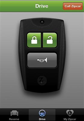
Best of all, members can play with the remote and listen to its locking sounds and horn honks at any time, regardless of whether they have a current reservation (Figure 7.32). A “voice of the system” alert tells members they can “make fun sounds anyway,” which helps people understand how the control works while reinforcing Zipcar’s playful personality.

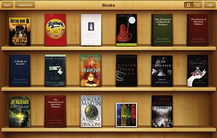
Figure 7.33 Apple’s iBooks application. This hyper-realistic image of the wood bookshelf is too visually prominent for a background image that doesn’t add meaningful information.

Figure 7.34 Pinterest allows users (“pinners”) to create “pinboards”; however, the interface doesn’t contain any visual references to tangible pinboards or corkboards. Naming is enough to put the metaphor in mind and suggest the act of using pins to attach images to a surface.
Simplicity and abstraction, when successful, are more likely to be aesthetically pleasing than the subjective, expressive nature of some skeuomorphic representations. Some of the best interfaces and images we’ve seen successfully abstract familiar characteristics, creating a distinctive and pleasing new visual language as a result (Figure 7.35). The Solar mobile weather application shown in Figure 6.38 is one example; by representing temperature with color and gradation, Solar creates visual abstractions that describe how temperature feels.

Figure 7.35 Trees, Cabs & Crime visualization by Stamen Design. By reducing objects—trees and cabs—and occurrences—crime—to color-coded dots, Stamen uses abstraction to create a new and beautiful way to see what happens in a city.9
Using images in your application
Using images in applications begins with defining what role the images will play and determining what types of images are appropriate for that role. After these broad, strategic questions have been addressed, move toward more specific, tactical questions about what to depict and how to represent the images in the application (Figure 7.36). Addressing images at both strategic and tactical levels is part of how imagery is interpreted and whether or not it’s successful.

Figure 7.36 A rationale for imagery needs to address both strategic and tactical issues. Early on, strategic questions might include whether icons will help people decide what to click on, or whether photos or video best showcase product features. Later, more tactical questions address specifics about the imagery, such as whether people understand what an icon means, or whether a video’s lighting favors a product.
To define a rationale for imagery, ask the following questions in addition to basic questions about users, context of use, and business goals.
Strategic
• What’s the purpose of the application?
• What content will it include?
• What do users expect to see depicted?
• What role will the imagery play?
• How important is it to differentiate your application with imagery?
Tactical
• How should the imagery be presented? Where should it go?
• What are the qualities of the images? Are they large, small, detailed, simple, representations, abstract, contrasting, supporting, etc.?
Case Study
Defining a rationale for images in practice
Looking at the existing SuperTracker application, we identified several ways images were being used. This simple analysis helped us know what users might expect to see in a redesign, and qualify the current use of images to determine what was successful and where opportunities existed.
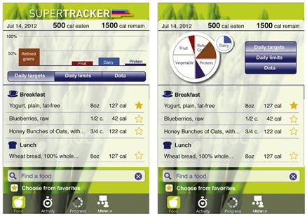
On the SuperTracker start screen (Figure 7.37), images are used to:
1. Identify the application via logotype (SuperTracker).
2. Relate the application to the MyPlate initiative.
3. Convey statistics or graphing (via a background pattern).
4. Show that the application is for families.
5. Contrast with the text (grocery bag, meal on a plate).
6. Reference measuring weight, creating and checking off goals, and gathering data for reports.

In the Food Tracker screen (Figure 7.38), images are used to:
1. Show status and progress via charts.
2. Help actions stand out by using icons in buttons.
3. Control functionality (arrows in the date selection area).
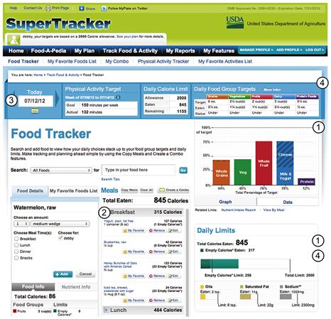
Figure 7.38
Qualifying images—moving from “what is” to “what could be”
The simple inventory and analysis showed that there were few images in the tracking areas of the application. Other than the logos, all images in those sections related directly to content and functionality, and even the visual tie to ChooseMyPlate.gov was lost once away from the start page. We found that the image types in use—gradation in the logotype and MyPlate logo, stock photos, graphic pattern in the background, and gradations in headers and buttons—didn’t work together to convey a personality.
Given this analysis, we decided:
• The stock photos were communicating more detail than necessary, and the additional detail didn’t add personality. Icons would work better.
• Based on test use, we decided that the charts were important, and if colored with hues from the SuperTracker palette, could serve as a visual tie to MyPlate programs.
• A new logo would help convey the application’s personality.
Logo exploration
Initially, as a symbol to represent the application, we wanted the redesign of the logo shown in Figure 7.39 to convey what SuperTracker is—a tool for tracking food and activity. For the first round, one direction took a literal approach with icons, while the other took a more symbolic approach, using a sneaker sole print.

Figure 7.40 The first-round logo redesigns tried to convey the essence of tracking food and activity.
We dropped the idea of using icons in the logo after this round because we anticipated using icons in the interface, and wanted the logo to contrast in terms of image style (Figure 7.41).

Figure 7.41 The second-round logo ideas focused on alternate ways to integrate food and activity with the type. While the apple in the “p” was working, the sneaker tracks looked ghostly.
The third round of logo designs started back at the drawing board (Figure 7.42). We revisited and refined the goal for the logo—to express the sophisticated and tech-savvy “Pepper” personality and tie the applications to the MyPlate identity. We realized we could use imagery in the interface rather than the logo to convey food and activity tracking.

Figure 7.42 All three third-round logos achieved the new goals in different ways. (a) This logo was stylish, but too much so; we wanted the application to feel like a resource. (b) This logo was a little too cute. (c) This logo looked sophisticated and useful with the contrast between the dark type and the bright colors.
Our final version of the logo works stacked vertically or horizontally (Figure 7.43). The logo doesn’t explicitly convey tracking food and activity, but relies on the subtle cue of the colors and shading in the chart to reference the MyPlate logo.

Icon exploration
Based on the wireframes, we knew icons could add visual interest to the list of foods eaten without taking much space. We also knew they would be more expressive than words to label meal types and amounts when adding foods. Icons styled with curves would contrast with straight lines of text, and were an opportunity to express personality.
With these goals in mind, we defined the role of icons in our redesigned SuperTracker:
After the second round of logo design, we started to explore different meal icons (Figures 7.44, 7.45, and 7.46). This exercise showed us that the food icons were the most obvious, and had more character than the others. It took several rounds to get to the final set. We tested the icons in progress with an anonymous online poll to see if people were comfortable with the icons, and in particular to see if vegetarians and vegans would be offended by the depiction of an icon that showed meat.
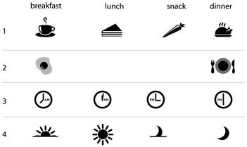
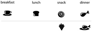

As we refined the icons, we dove into the details of subject matter. We tried fruit for the snack icon, a more appealing choice than a carrot. We also tried a leg of poultry instead of a whole bird, which seemed too special for everyday meals, and took the curl of steam off the cup to make the icons look more like a family. (We considered using one of the dinner bowl’s steam curls on the cup, but then the icons looked too similar.)
While designing the logo and food icons, we also designed icons for each section (Figure 7.47). Some icon ideas were more obvious than others—for example, the apple for “food” and the circular segments for “progress” seemed simple and clear. However, the sneaker icons for “activity” were less clear, so we instead selected the stylized stopwatch for refinement.
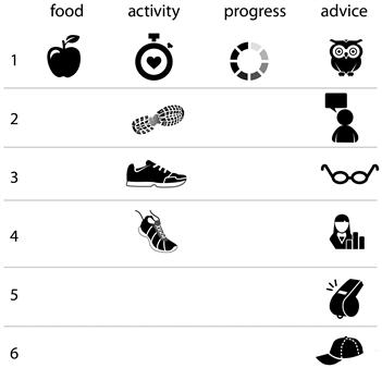
Designing an icon for “advice” was more complicated. None of the initial options both fit the personality we were looking for and communicated as simply and clearly as the apple.
Chart exploration
As discussed in Chapter 6, we started exploring design through the mobile layout. We briefly considered using a food groups chart that referenced the MyPlate logo, but weren’t sure if the guidelines allowed for this kind of approach. Even if they had, this approach looked more confusing and less straightforward than a traditional bar chart (Figure 7.48).
Based on the personas and test use, we defined these roles for the chart (Figure 7.49):
• Convey at-a-glance information about how well the user meets daily food group targets.
• Serve as a visual reference to the ChooseMyPlate.gov parent site and MyPlate initiative.

Figure 7.49 The final charts use familiar, straightforward formats. Although information design experts Edward Tufte and Stephen Few don’t recommend using gradations in chart bars, we felt that they had more benefits than drawbacks. The gradations add needed visual interest in keeping with Pepper’s personality and make a connection to related materials without detracting from chart legibility.
Images across screens
The final phone screens show icons as well as button treatments and chart design (Figure 7.50). We took particular care with icon design, an integral part of the interface’s personality and functionality. The flat, one-color design helps icons blend into the interface, yet provides enough contrast with the text to add visual interest.
Imagery and the meta-principles
Consistency
For the SuperTracker redesign, images are used as consistently as possible across platforms, but differences in screen size and conventions forced some variations. One is that the logo doesn’t appear on all screens of the phone version; it would use up too much space without adding comparable value. Another difference is the position and visual hierarchy of the navigation icons, which follow platform conventions for placement.
Some of the icons are clickable or tappable, and some are not. The meal icon is decorative on the food-tracking screen, and interactive on the food selection screen shown in Figure 7.50b. Being completely consistent in color use to indicate interactivity would compromise the visual design and create a confusing visual hierarchy (Figure 7.51). Using other interaction cues from our design, such as pairing the icons with tappable blue text, a round-cornered box, and a familiar scrolling control, allows the icons to feel interactive.
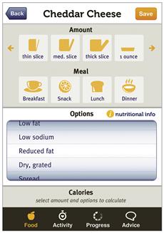
Figure 7.51 If we were completely consistent with how we treated tappable images, the icons on the screen to add a food would be yellow. While yellow icons are consistent with one of our rules—yellow icons are clickable—too many yellow items appear to shout for attention. They’re visually “loud,” which cancels out yellow’s purpose as an accent to draw the eye.
In a visual interface with a lot of screens and elements, some inconsistency may be necessary to keep all the elements and the overall design in balance—aesthetically pleasing and usable. Rather than define a rule that all clickable icons must be yellow, we defined rules for different sets of icons—for example, the icons in the navigation bar are governed by a rule that they’re white by default and yellow when highlighted. Breaking up rules for display and behavior helps in two ways: the bright yellow highlight shows users at a glance where they are in the application, and the limited use of yellow as an accent color draws appropriate attention to all yellow icons.
Hierarchy
Other than the logo, our SuperTracker redesign contains six sets of images. One is the target and limits charts, and the rest are groups of icons. On the go, the charts will often be most important, as they support the scenario of checking calorie intake status in the context of making a decision about what to eat. In all versions, position, shading, treatment, and color help communicate the charts’ priority compared to other images.
In the mobile versions, navigation icons are of equal importance with the clickable meal and quantity icons. They are all shown at similar levels of contrast to their backgrounds and at similar sizes. Because the navigation logos appear as expected, they can be smaller than the icons in the interface.
Status and action icons (favorites, copy meals) are small, but are presented in bright colors so that they’re not overlooked. Finally, icons that accompany the targets and limit headers and charts are mostly decorative. They provide contrast and draw the eye to the data in those sections while helping to add to the visual prominence of the charts.
Personality
Images must support the personality of an application. In balancing expression and use, it’s important to remember that details matter. “The details are not details. They make the product,” Charles Eames said.10 The icons, logo, and chart we designed for SuperTracker aren’t very expressive on their own; they work together with the other tools to communicate personality.
One additional way we contribute to SuperTracker’s personality is to use images to support feedback. After adding a food item, Pepper gives her feedback in a speech bubble and makes recommendations (Figure 7.52). Using the large version of the “advice” icon to convey feedback helps users feel that they’re interacting with a system that has a subtle, no-nonsense personality. Many seemingly small decisions like this one, made with all the tools, work together to convey Pepper’s personality attributes.

Avoid common mistakes
The descriptions of each image type include some common mistakes to be avoided. The following recommendations are general and apply to all image types.
Don’t use meaningless images
All images must have a purpose and play a role that you can articulate and defend.
Apply the “Goldilocks” rule to image quantity
Depending on content and context, an application without images will likely lack appeal, and may lack visual hierarchy. An application that uses too many images without enough context will send visual noise, which interferes with clear communication. An application with useful images that express personality without interference will feel “just right.”
Present images clearly
Present images so that they can be seen clearly by providing:
Present only essential information in an image
Each image should clearly communicate its message. Using only pixels that add information helps make sure image meaning is clear.
Design images of the same type consistently
If you include photography or video, shoot it all with the same visual style. Make sure all icons and symbols look like a family—that they share visual characteristics.
Present images of the same type consistently
All images sharing the same role should be presented the same way. Define rules and templates for how to present each type of image group, including rules for any necessary differentiation. For example, all product images should be the same size and displayed the same way in a layout, but featured images should be noticeably larger than nonfeatured ones.
Include a caption or supporting information unless the image’s meaning is obvious
Images have multiple meanings. If your images are explaining something or are application content, include a caption.
Make informed decisions
Be aware of cultural conventions and if they affect interpretation of your images
Informally test images with a handful of representative users before launch, or before finalizing illustration styles and shooting all of your photography and videos.
Be aware of trends in image styles and content, and their connotations
Image style communicates just as much as image content. Show people in your target audience samples of the image style you plan to use to make sure it appeals to them. Think about how long your images need to last before deciding to adopt a trendy or expressive style.
Don’t allow default chart design to overshadow content and dictate personality
When selecting a graphing or chart design toolkit, select the most plain and customizable option. Gradations on their own don’t give an application personality.
Define rules and standards for imagery
Don’t degrade your application with a hodgepodge of image types, roles, and styles. Set a rule for the appearance and use of every type of image in your application, include your rationale, and make sure everyone involved in the interface design is aware of the rules and follows them. Being a “logo cop” or having one on your team may be annoying, but it’s necessary to establish and maintain a professional interface.
Elevate the ordinary
Image as interface
Opportunities to use images as interface controls increase with technological advances, such as with the applications shown in Figures 7.53 and 7.54. We discuss direct data manipulation controls in more detail in Chapter 8.
Professional quality makes a difference
Working with a professional adds value when image quality matters to the bottom line. If you work with a professional, think through your rationale for images in advance to know what you’re looking for. Don’t assume the designer or photographer will read your mind. At a minimum, be clear about how the images will be used and what purpose they will play, and be prepared to share adjectives that convey how you want people to interpret the images in your application.
1Ruel, L., and Paul, N. (2007, Mar. 13). Eyetracking Points the Way to Effective News Article Design. Online Journalism Review | Knight Digital Media Center. Retrieved Oct. 26, 2012, from http://www.ojr.org/ojr/stories/070312ruel/; Tullis, T., Siegel, M., and Sun, E. (2009). Are People Drawn to Faces on Webpages? Paper presented at the Proceedings of the 27th International Conference on Human Factors in Computing Systems, Extended Abstracts, Boston, MA.
2Tullis, T., Siegel, M., and Sun, E. (2009). Are People Drawn to Faces on Webpages? Paper presented at the Proceedings of the 27th International Conference on Human Factors in Computing Systems, Extended Abstracts, Boston, MA.
3NOLA Red Cross photo (http://flic.kr/p/x2QrE) is © 2006 by Elaine Vigneault and made available under an Attribution 2.0 Generic (CC BY 2.0) license. Pharmacy Sign photo (http://flic.kr/p/6gRBdn) is © 2009 Andres Rueda and made available under an Attribution 2.0 Generic (CC BY 2.0) license.
4State of Wikipedia image is © 2011 JESS3 and made available under a Creative Commons Attribution-ShareAlike license.
5Map tiles by Stamen Design, under CC BY 3.0. Data by OpenStreetMap, under CC BY SA.
6Skeuomorphs. (2012, July 19). Wikipedia. Retrieved July 9, 2012, from http://en.wikipedia.org/wiki/Skeuomorph#Physical_skeuomorphs.
7Thompson, C. (2012, Feb. 7). Clive Thompson: Retro Design Is Crippling Innovation. Wired.co.uk. Retrieved July 10, 2012, from http://www.wired.co.uk/magazine/archive/2012/03/ideas-bank/clive-thompson; and Hobbs, T. (2012, May 30). Can We Please Move Past Apple’s Silly, Faux-Real UIs? Co.Design. Retrieved July 10, 2012, from http://www.fastcodesign.com/1669879/can-we-please-move-past-apples-silly-faux-real-uis.
8Donis, D. A. Primer of Visual Literacy, p. 74.
9Map tiles by Stamen Design, under CC BY 3.0. Data by OpenStreetMap, under CC BY SA.
10Caplan, R. Connections: The Work of Charles and Ray Eames. p. 15.