
Color
Color is one of the most misunderstood tools UI designers have. It’s a powerful tool to attract the eye, as well as to help people know what to do once you have their attention. Despite this power, we see it underused—blue and gray applications, anyone?—and misused—applied randomly to create impact instead of understanding.
More than the other tools of visual interface design, color provokes emotional responses. Perhaps that’s why discussions of its use are limited to brand. Used with knowledge and understanding, color is a strategic partner that helps your interface guide and direct. This chapter focuses on selecting and applying color to enhance usability and appeal.

Figure 6.1 Bright, saturated colors were part of the brand and identity of the 2012 Summer Olympic Games. The eye and the brain work together to find patterns in this events results app, such as the colors of the Olympic icons. Here, badminton, basketball, and mountain biking (“Cycling – Mountain”) are all magenta. However, these events are unrelated, so their icons seem randomly colored. Random use of color is a common mistake and a lost opportunity to elevate the ordinary. Color could have instead been used for patterns that aid understanding—for example, similar events, or events in the same location, could have shared colors.
What color can do
Color is a great tool to draw attention. Used as a highlight or accent, it helps people know where to look. Used strategically to draw the eye, it helps people know what to do (Figure 6.2). Used consistently as part of a system, it helps define a visual language so people know where they are and what to expect, and allows them to make connections between related elements, which can aid in understanding. Color can also be used to express qualities of a brand or personality to help an application stand out from competitors. The key is to know what type of attention you want to attract, what messages you want to send, and what color can do so you can use it to its full potential.
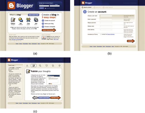
Figure 6.2 An early version of the Blogger interface used color to draw attention both to the new brand identity and to action elements on the screen. The bright orange “B” logo created visual impact. Use of orange for the primary buttons helped people know what to do.
A business application interface that breaks out of the gray and blue mold will likely stand out from its competitors. If it uses the bright, saturated colors of the Olympic application palette, it might be memorable when customers are deciding which application to buy—but those same colors could get tiresome for people who need to use the application every day. Communicating with color is a balancing act best achieved when context of use (where the application will be used and in what situation), physical user characteristics (e.g., age of audience), and understanding of audience culture (e.g., common meanings of certain colors) are part of defining a rationale for color.
Establish and convey hierarchy
Because of color’s ability to draw the eye, it’s an ideal tool to help establish and convey hierarchy (Figure 6.3). Used with layout and styling, it helps people know what to look at first, and how to make sense of what they see. This is especially important for applications with a lot of complex information. The type of color you use, amount of color, and placement of color affect hierarchy.
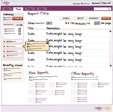
Figure 6.3 In this sketch, color is used in multiple ways to establish hierarchy, direct the eye, and help people know what they can do. Red is used as an accent to highlight important elements and controls. Pale orange helps the message to pop out from the background. Pale tints behind the sections on the left group the elements within, which provides order to the busy screen. The small, light yellow box in the bottom left is placed in a subordinate location, but its contrasting background helps draw attention to it.
Saturated colors draw the eye more than dull colors (Figure 6.4), but even dull colors draw the eye if they contrast with what’s around them (Figure 6.5). Small areas of saturated, bright color may draw the eye more than larger fields of a more muted color. We see best that which is directly in the center of our visual field, so if something is important but near the edge of an application, it might need to be in a contrasting color to help the eye notice it. While color can’t make someone do something, drawing the eye influences what’s seen onscreen. People can only click on what they notice.


Make relationships visible
Making relationships visible reassures people by presenting what they expect. What people expect is affected by their frame of reference, or the combination of their experiences. While you can’t know what’s in every user’s head, you can make some educated guesses to get the basics right. If a mobile application uses bright colors for sections of content, people will expect to see those bright colors used in a similar way on the web version as well (Figure 6.6).
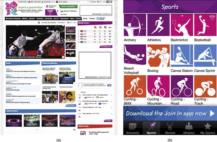
Figure 6.6 Color is a primary element that ties the London 2012 Olympic results application (b) to the website (a). The colors also relate to the logo, signage, and other communications produced for the 2012 Summer Olympic Games. The application’s visual relationship to the other materials helps put it in the right context.
System relationships
When working with related applications, giving each a predominant color and using it the same way creates a pattern that tells people the applications have something in common. This is one example of color-coding, which enhances both meaning and use in application design. The reports section in Figure 6.7 uses blue as the primary color, and the account management section uses yellow. Both sections apply their respective color palettes according to the same rules. Note that color should not be the only cue that indicates location or status, as on its own it is not effective for color-blind or visually impaired users.
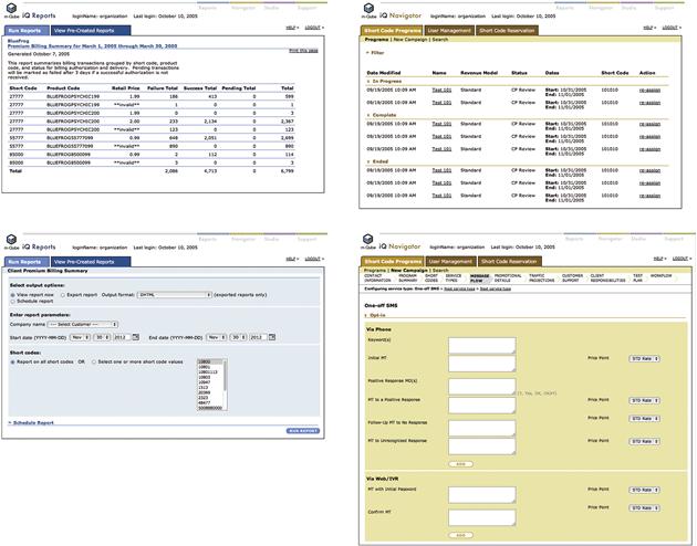
Figure 6.7 Screens from separate sections of a large application use different colors to help users know which section they are in, but each section applies colors according to the same rules.
Using the same color for elements of the same type helps people “decode” the design of a screen. For example, making the primary “Submit” button a solid color and a secondary “Cancel” button white with an outline of the primary button’s color establishes a visual hierarchy system for those two types of buttons (Figure 6.8). Used consistently wherever the buttons appear, the system indicates to the user that the buttons are related but do different things.

Symbolic relationships
Color helps people make associations symbolically, but these associations aren’t usually strong enough to communicate a single, unambiguous message in every circumstance. Color, symbols, content, context, and culture work together to evoke relationships in people’s minds. For example, black is the color that Westerners associate most with death, but use of black abounds in our digital and physical world. Similarly, Apple sells plenty of white products in China, even though it’s a color associated with mourning and death there. It would be silly to avoid either color without considering the context.
Color meaning can also shift based on circumstance. Westerners associate the color red with stop signs, mistakes, and losing money, depending on the context. But in the month of December, red means merriment and is linked to Christmas. While you need to be aware of common color associations, don’t rely on them to communicate on their own, or allow them to dictate color choices out of hand.
The meaning of pairs or groups of colors is less fluid. While red can take on a variety of meanings, it’s hard to make red and green together look like anything other than Christmas. Saturated red, blue, and yellow are so strongly associated with primary education and young children that it’s almost impossible to think of using them for other situations. When green is added, as in the suite of Google applications, the association to children is broken. To use color symbolically, you need a general awareness of color associations common in the culture you are designing for, and what associations you want people to make. Then you can use color with the other visual usability tools to communicate clearly.
Add aesthetic appeal and convey personality
Color is an excellent tool to help set tone and convey personality. Consider in Figure 6.9 how Mint.com’s use of green makes its interface feel lively and alert in comparison to any blue and gray financial application. However, while color and aesthetic interpretation are subjective and contextual, there are theories of color and personality. One widely referenced theory is by Shigenobu Kobayashi, who founded the Nippon Color & Design Research Institute.1 Kobayashi defined adjectives, such as “modern,” and three colors that represent each word.

Figure 6.9 The color green can be associated with nature, money, a green light, or “go,” depending on context. The personal finance–tracking website Mint.com uses green as its primary color. Green, combined with the purpose of the application, the dollar sign in the logo, and the application’s name, works to unambiguously associate the application interface to money and growth. All of these associations help convey the personality of the application.
While Kobayashi’s theory and others like it are worth reviewing, we do not believe that any theories of color and aesthetics should be taken and used wholesale. Tastes and interpretations change, and what’s considered “modern” or “dynamic” in terms of color is not fixed.
If informal reviews of colors you’re considering make you doubt their appeal, testing methods such as those described in Chapter 3 can help you determine if your colors are working for your audience as intended.

Figure 6.10 The application If This Then That uses pure, almost primary, colors. This choice helps make the application feel simple and its personality approachable, which is strategic given its purpose of enabling anyone to create simple programs.
Color and error messaging
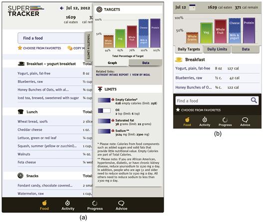
Color isn’t tied to specific interface patterns other than error messaging. Using red for errors makes sense conceptually, as an error is the right place to take advantage of contrast to attract the eye. Use of this pattern is often heavy-handed, however, and can interrupt an application’s personality if it’s too jarring. Too much contrast in a warning that isn’t life-threatening or data-erasing can feel like a “visual spanking” (Figures 6.11, 6.12, and 6.13).

Figure 6.11  “Visual spanking” in action on SuperTracker: the chart area turns into a sea of red if users exceed their daily calorie limit.
Figure 6.12  Visually polite errors and messages call appropriate attention to themselves. A small amount of red can be sufficient to draw the eye.
Figure 6.13 This message is part of an interface that uses red for accents and nonerror text. In this situation, use of a contrasting color, like orange, combined with styling and strategic placement, draws the eye.
A small amount of a contrasting hue other than red can be sufficient to draw the eye. In an urgent situation, such as a hospital setting, two levels of contrast, such as a contrasting background tint and contrasting text style, may be necessary.
Color basics
There are two common models of colors that relate to designing on the screen: one generally used for paint, and one for light. Color wheels have changed over time, yet all place colors in deliberate positions in a circle. Sir Isaac Newton’s color wheel (Figure 6.14) derived from his studies of light; despite this, it evolved into a model that is still used by some artists and painters.

Figure 6.14 Early color wheel from Newton’s Opticks (1704). Traditional primary colors red, yellow, and blue are placed at intervals with secondary colors orange, green, and violet/indigo between them.
The evolution of color theory has produced some confusion between light-based models and models based on mixing paints with pigments. There are terms for color popular with painters and terms used by physicists. Use of color for screens sits at the intersection of these worlds, which makes it hard to dismiss one set of terms or models in favor of the other. Confusion persists today, as there is no one model for color that accurately serves all purposes and mediums. All color models and color wheels have benefits and drawbacks. What you need to know to use color effectively requires understanding a small number of concepts at a limited depth. After the basics, understanding color comes through use and consideration. To gain expertise, as with all of the tools, we encourage you to try many combinations and observe and evaluate the results.
Traditional color model
People learn early in life about red, yellow, and blue (RYB), and associate these colors with the term primary. Children learn about mixing them to create secondary colors—green, orange, and purple. The model of placing these colors in circular form—primaries with secondaries between them—derived from Isaac Newton’s experiments with light.2 This RYB, or traditional, model is a subtractive color model, or model based on starting with a white surface and mixing paints, dyes, or inks to come between the eye and the light (Figure 6.15).
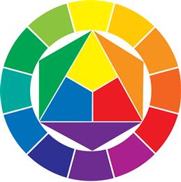
Figure 6.15 This version of a traditional color wheel based on the model by Johannes Itten (The Art of Color, 1961) is popular with designers.
This model doesn’t work for every circumstance. The notion of red, yellow, and blue as the primary colors from which all colors can be mixed does not hold up in the case of mixing colors with paints. However, the model serves as a simple, useful reference for contrasting complementary colors, which are discussed in depth later in the chapter.
Red, green, blue model
In the model for mixing colored light, red, green, and blue (RGB) are the primary colors. In this type of color system, called additive, the primaries, when mixed, create white (Figure 6.16). All discernible hues on screens are created from combinations of these primaries.

Hue and saturation
Hue refers to the property that allows something we see to be described as a distinct color. Hues are saturated colors seen in the spectrum (red, orange, yellow, green, cyan, blue, and violet) and nonspectral colors (magenta, purples).3 Saturation is the relative purity of a color compared to gray.4
Saturated colors draw the eye due to their brightness and intensity. Using colors that are different hues but similar in saturation is one way to effectively create contrast, such as the colors in the Olympics results application, or those on a traffic light (Figures 6.17 and 6.18). The light’s red, green, and yellow-orange all draw the eye but are quite different in hue. The effect when used in equal amounts is active and intense.
Value, brightness, and tone
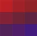
Value, used in terms of the color of objects, is relative lightness or darkness. It applies to shades of gray, hues, and tones. Value can be visualized as a scale going from white to black. Light–dark relationships are a type of contrast achieved with value, with black and white creating the greatest amount of contrast. Use of a light tint and a dark shade of the same hue (e.g., a light red and a dark red) is a subtle way to create contrast (Figure 6.19).
Figure 6.19 A saturated color with a less saturated, or muted, color also creates contrast, but is less intense.
Brightness is the relative amount of light, and is a scale without limit. We use lighter and darker to refer to the brightness of what we see on screen.
Tone refers to the color of an object that has been modified to be less saturated. Tones come in all values. Though its use in color comes from mixing pigments, we include tone here for the purpose of clarification, and to introduce some of the possible variations of a hue, as shown in Figure 6.20. The concept of creating variations of a color—by lightening (tints), darkening (shades), or otherwise muting (with gray or other colors that neutralize intensity)—is relevant. Tones can be created using the primary colors of screen display—red, green, and blue. Creating shades, tints, and tones onscreen from a hue creates monochromatic colors. It is one way to create colors that harmonize with one another; for example, all tones created from a red hue share a visual relationship.

Figure 6.20 Interpretation of painters’ colors and terminology applied to working with color on screen.5 Tints have the effect of adding white to a hue. Shades have the effect of adding black. Tones are hues that have been “broken” by adding the effect of black and white, yet still relate to a particular hue. The three colors in the center of the triangle are tones.
Contrasting colors
Contrast is the key to creating hierarchy and drawing the eye. The degree of contrast also helps establish personality and mood. There are several ways to use color to create contrast, three of which we’ve already discussed: hue, saturation, and light–dark. Color teacher Johannes Itten outlined four additional types of color contrast in his book The Art of Color, used as a guide by designers since its publication in 1961: cold–warm, complementary, simultaneous, and extension. All are timeless, and used in all mediums of art and design.
Warm–cool contrast
Warm generally refers to colors that are yellow, red, and orange in hue, while cool refers to colors that are green, blue, and violet in hue (Figure 6.22).

Half the colors in a traditional color wheel are warm, and the other half cool. The colors on the “line”—yellow-greens, red-violets, and some violets—can act as warm or cool, depending on what colors they are paired with (Figure 6.24).

Figure 6.24 The same color (left) appears warm when seen with a cooler hue (violet), and cool when seen with a warmer hue (red).
Juxtaposing warm and cool hues creates contrast. Painters and designers use color “temperature” to help suggest depth in the two-dimensional plane of a canvas or screen. Warm colors, depending on usage, can have the effect of coming forward; comparatively, cool colors can have the effect of receding. A big, saturated, red button on a pale green-blue background can feel like it’s “popping out,” or giving dimension to a flat surface.
Painters know that any color can feel warm or cool, depending on the composition of pigments that make up the color and its juxtaposition with other colors. Orange can be relatively cool if it has a hint of blue mixed in and is next to a warmer hue.
Tips for warm–cool contrast
• Warm–cool contrast works with two saturated hues such as blue and orange, with two muted tones, and with one muted tone and one saturated tone. Explore color combinations onscreen with a free color tool like http://kuler.adobe.com, or with paper and markers or pencils to find relationships that convey the personality you want.
• If you have a warm hue and a neutral color, try adding a little cool color to the neutral to shift its temperature and create warm–cool contrast, and vice versa (Figure 6.25).
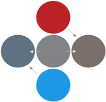
Figure 6.25 Shifting a neutral color (center) to cool (left gray) or warm (right gray) adds vibrancy to color pairs by changing how the neutral interacts with same and opposite temperature colors.
• Warm–cool contrast does not need to be obvious to the eye to have an effect. Adding blue to a gray to make it cooler will affect how that cool gray interacts with other colors.
Complementary contrast
Complementary contrast uses pairs of colors across from each other on the traditional color wheel to create vibrancy and luminosity. Complementary doesn’t mean that the colors make an attractive pair; whether they are perceived as attractive is subjective. It means that when the colors are placed next to each other and are of equal value and saturation, each will cause the other to appear their most vibrant, compared to when seen alone or paired with other colors (Figure 6.26).
Figure 6.26 Traditional complementary color pairs. Complementary doesn’t mean that the colors are pleasing, but rather that each item in the pair, when viewed together, makes the other appear at its most pure or true hue. Simultaneous contrast is an effect that makes the edge of two colors appear to vibrate where they meet. This effect is most pronounced in pairs on complementary colors. Delacroix, Van Gogh, and Monet are a few of many painters who relied on complementary pairs to add vibrancy to their paintings to great result.
This effect is true even if small amounts of complementary colors are added to other colors. This helps explain why red can be too intense when used as part of a color palette that includes greens, but can seem almost neutral when it’s the only color used in large areas of an interface, as in the Epicurious application in Figure 3.10. Impressionist painters relied on complementary colors to achieve effects of light in their work. Rather than add black to create a shadow on a yellow table, which would create a greenish hue when working with oil paint, they added violet to the yellow used for the table, which created a luminous, dark field.
We use the principles of complementary color to create the appearance of luminosity through color selection and juxtaposition, even though we work with combinations of red, green, and blue rather than red, yellow, and blue. (See the final color images of the SuperTracker application and explanation of color choices later in this chapter.) Using complementary color principles when designing for screens is not an uncommon approach; for example, use of blue and orange abounds on websites and applications, as well as in advertising and in film.
Creating contrast and luminosity with complementary colors is complicated somewhat by the different color wheels and models. Artists and designers learn the complementaries identified by Michel Chevreul (see sidebar “Complementary colors and color models” later in this chapter) and depicted by Itten. We use the traditional complementary pairs as a starting point and source for variations, relying on the contrasting property of warm–cool relationships in addition to complementary pairings to guide our color selections (Figure 6.27).

Figure 6.27 Approximation of an early version of Blogger’s color palette. The palette uses several types of contrast described in this chapter: complementary contrast, light–dark contrast, warm–cool contrast, and contrast of extension. The addition of a muted tone (indicated) that has been “broken” with a cool color contrasts with, but also complements, the orange as well as the blues.
Tips for creating complementary contrast
• Using the most saturated hues of the complements in juxtaposition creates strong contrast that makes the eye vibrate between the two colors. The effect is like drinking too much caffeine. It should only be done with awareness and caution.
• Using muted hues of complements will also produce complementary contrast.
• Using a saturated color and a muted version of its complement is a third way to create contrast with complementary pairs.
Contrast of extension
Not all colors are equal. For example, in a yellow/purple pairing, yellow is light and purple is dark. They’re also unequal in terms of saturation used straight from the wheel. To visually balance a purple hue, only a small amount of yellow is needed.
This also affects orange/blue pairings to a lesser degree; Johann von Goethe calculated that orange equaling about one-third the amount of blue is necessary to create visual equity.6 However, red and green hues are equally intense, so when using green as the lead color in an interface design, should you use an equal amount of red? Not unless you want to create maximum contrast. Contrast of extension is included here to help you be aware of the amount of each color you use and the degree of contrast that results (Figure 6.28).

Figure 6.28 Traditional color wheel with proportions of colors altered to balance the visual weight of each hue.6
Tips for balancing contrast
• Unless you are using color to create a particularly strong, expressive statement, balance the use of saturated hues with muted, neutral tones. Early Blogger interface designs (see Figure 6.2) do this well.
• If using a single saturated hue with white and black, make sure you have white space to give the eye a chance to rest, and get maximum impact from the contrast of the color.
• If using a saturated hue, apply it strategically to draw the eye to the most important element, and then use less of it (or a tint or shade of it) to draw the eye to a limited number of other elements.
Defining a rationale for color
Working first without color and images and using plain typography, as shown in the case study in Chapter 4, we can directly see, manipulate, and establish appropriate hierarchy through placement, scale, and light–dark contrast. If we’ve used patterns from internally or externally related applications, starting with black and white makes it easier to evaluate if the patterns work in harmony with the other elements. We work iteratively with color as we refine all aspects of the interface.
Working with color often starts with a requirement, like a corporate color or set of colors. With a single required color, a palette is defined to complement or contrast with the required color, depending on the application’s desired personality. With a set of required colors, roles need to be established so there is a logic for how to use them.
When no color requirements exist, one approach is to select sets of one or more colors that embody the desired application personality, assign each color a role, and try them out, refining the layout as needed. You can also start by selecting a saturated color to be the accent color, the role of which is to draw the eye, and choose other colors to help the accent color do its job. There’s no right or wrong way to begin with color, as long as your color decisions are grounded in what you know about the people using the application, and you have knowledge of what color can do and how it works to achieve the meta-principles.
Know your requirements and constraints
An application design may need to address corporate or federal requirements, or cultural or competitor conventions. (Refer to Figure 3.20 to review where you may need to look for requirements that affect color selection.) Questions to ask include:
Know what personality characteristics you want to convey
Color is an essential part of personality. Choose one or two lead colors that communicate the personality you want, and a few shades, tints, or accents to support the lead colors.
Identify the “star” of the screen
The “star” of the screen is the most important element or elements. In complex applications, there’s often more than one star, which means using color and the other tools to draw the eye to the elements, as in the Blogger screens. Use black-and-white layouts, which focus on features and their hierarchy, to identify the star or stars.
• Determine what’s essential to the purpose of the screen. Which element needs to be seen first?
• Determine which elements play supporting roles. Your personas are a source for determining sequence and flow.
• Assign a color that fits the requirements to the star element or elements as a starting point, and see how adding color affects the black-and-white layout.
• Analyze the other elements. How much contrast does there need to be between the star and other elements?
• Try variations out on a few rough screens. Experimenting, adjusting, and refining are part of an iterative design process.
Identify additional color needs
To create a useful palette, most interfaces need black, dark gray, or dark blue for text; two or three hues; and tints and shades of those hues. One lead hue should be fairly neutral, or used as a neutral, as it will be the primary color for nontext elements. This is where the question of how much contrast comes in.
• Do you need small accents of a bright, eye-catching color to draw attention to lots of small controls?
• Work with a color template, such as the one in Figure 6.29, and fill in what you know.
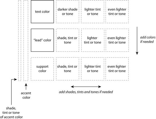
Figure 6.29 Our color palette template. At a minimum, a useful palette needs three colors: a text color, a lead color, and a shade or tint of the lead or text color. Accent colors must work with all colors in the palette, and are only used in small amounts.
• Work with a tool like kuler.adobe.com to see different color combinations based on a key color. Resist the temptation to use a “canned” palette as-is. Canned palettes are good starting points, but will likely need to be tweaked to apply to a well-thought-out layout, requirements, and rationale.
• Test assumptions. See Chapter 3 for suggested qualitative testing methods.
• Think of the palette as part of the process that will begin at launch and need to be refined throughout the life of the application.
Case Study
Defining a rationale for color in practice
The requirements, constraints, and personality characteristics are the “bones” of your color rationale. The rest of the palette grows from there. In this section, we walk through the rationale and decisions for using color in the redesign of SuperTracker.
We chose colors for SuperTracker based on three requirements:
• The need for the application to feel approachable for the users in our personas: Betty, Danny, and Sonia.
• The need to maintain a visual relationship to the MyPlate program.
From the personality standpoint, we needed to choose colors that would help express Pepper—our concept of a smart, technology-savvy assistant—in an encouraging way. We also needed to make the interface appear related to other materials within the USDA’s existing MyPlate initiative so that consumers familiar with one would feel comfortable with the other. From a brand perspective, familiarity is a desirable characteristic.
The existing SuperTracker application color-coded daily food totals based on the corresponding colors in the MyPlate palette (Figures 6.30 and 6.31). We thought this was a smart approach, and one that should continue. Used consistently, the color coding relates the application to the parent initiative and serves as a visual cue that helps users decode charts more efficiently.

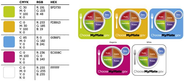
Tying the application visually to MyPlate initiatives meant either using a color from that palette to play the lead, or choosing a new lead color that would work with the MyPlate palette. Given that there are already five to seven hues in the MyPlate palette, we had limited choices for a hue that would be distinct from the others while playing well with them.
We decided to try a dark blue based on the one used in the existing SuperTracker logo (Figure 6.32). We could see from the existing website how dark blue worked with the MyPlate colors, and could be fairly certain that it would not be objectionable or unexpected for Betty, Danny, and Sonia.

Figure 6.32 Color palette template in progress, filled in with the dark blue from the existing application and the colors from the MyPlate food group palette.
The third requirement for selecting color had to do with accessibility. As a government initiative, the application must adhere to Section 508 standards for accessibility, including use of color. The dark blue would be appropriate for text as long as we maintained enough contrast between the text and the background.
With criteria and a “cast” of colors, we needed to think about what roles our cast members should play, and whether we had more roles to fill.
Working with color
We began by trying colors for the logo, because the logo sets the tone for the personality in consumer-facing applications. We took two approaches to color: the first used only blues, similar to the existing logo, and the second incorporated colors from the MyPlate palettes (Figure 6.33).
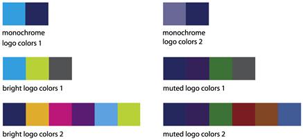
Figure 6.33 Color explorations for the logo included trying monochrome palettes intended to work with colors from the style guide, bright palettes based on the saturated hues of the MyPlate palettes, and less dramatic palettes based on the muted hues of the MyPlate food group palette. We added gray or dark blue to all palettes to have a legible, dark, neutral color for the logotype.
Rather than make a color decision based on the logo sketches and what we imagined Betty, Danny, and Sonia would prefer, we put the color decision aside until we had more data—that is, until we added the logos and palettes to a representative layout. We avoided common color mistakes and made informed decisions by trying color ideas in layouts before making a choice.
We started with the mobile layout. We tried representing our “smart, data-driven assistant” personality, Pepper, with a background image of fresh, green vegetables. Combining the image with the data and one of the logo ideas, we could see this approach wouldn’t be successful (Figure 6.34). It didn’t look smart and organized, two characteristics we were aiming for. From a color standpoint, having a strong color in the background created too much contrast of hue—there were just too many colors—used in ways that made it hard to identify patterns. This experiment made it clear that we needed to use a more neutral background (Figure 6.35).
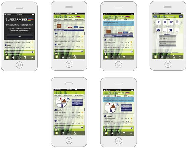
Figure 6.34 First color attempt for the mobile layout. This design showed us that there were too many hues to be able to detect color patterns. We could also see that the logo’s bright colors didn’t complement the muted colors from the palette.
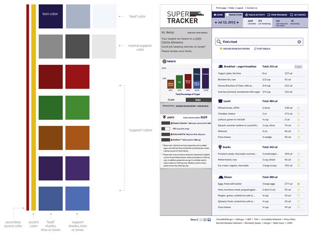
Figure 6.35 For the second round, we added a neutral gray to help define the structure of the layout. We used the muted colors from the palette for this version of the logo and the graph. While much more legible compared to the previous round, the overall effect was drab.
Adding to the effect of too much color, the sample logo’s bright colors weren’t pleasant alongside the more muted shades of the palette used in the chart. Even though the muted colors were shades of the bright ones, their relationship was neither apparent nor attractive. Mixing the palette’s bright and muted hues didn’t work in the layout, and we were fairly certain that the issues we saw in the mobile sketch would carry over to the web and tablet versions as well.
To increase our understanding of the breadth of what we were designing, we switched from applying color to the mobile layout to the web layout. We reviewed the characteristics we were looking for, and began with a solid, pale, muted background to make the food log as legible as possible while adding elements and attributes conveying personality.
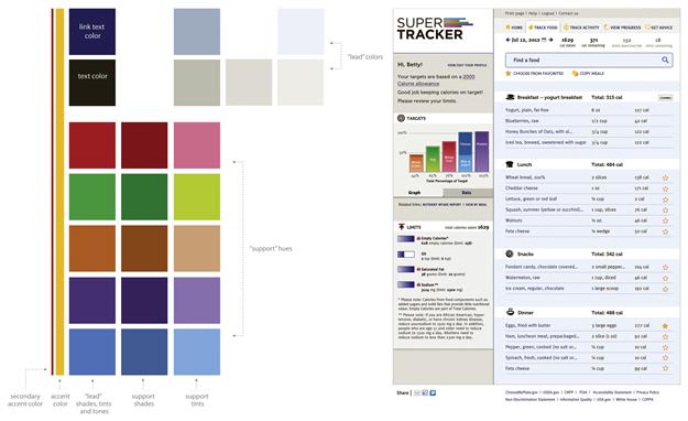
We used the brighter colors from MyPlate for the logo and chart, and brought in small amounts of the shades and tints. We shifted the neutral gray to a warm gray to take advantage of the principles of warm–cool contrast and complementary contrast (Figure 6.36). We reevaluated how we used color for type, and decided to use dark brown as the text color, shifting the link color to dark blue. Finally, we decided that the rationale for using bright yellow was to apply it to small, clickable icons and controls. The effect was more organized, brighter, and snappier, which was what we were shooting for.
Color and the meta-principles
Consistency
Color is applied consistently in each version of the redesign, with the exception of the “Find a food” area (Figure 6.37). The change in color is due to different layouts and screen sizes.
Color decisions need to be documented to answer questions about color that might arise throughout the life of the application. Include the hexadecimal or RGB color codes for your color palette, and mark up a sample layout to show where each color is used. Documenting your rationale informs people about why decisions were made, which can help when changes arise.
Here’s an example of how our rationale for color decisions could be documented:
Avoid common mistakes
Not enough contrast
Lack of contrast affects two main aspects of application design: legibility of type and lack of hierarchy. Color should be used to make it easy to read any and all text on the screen. Check legibility and contrast of text colors and background colors with Vischeck (http://www.vischeck.com) or other color accessibility tools.
Hierarchy isn’t created or communicated with color alone; however, color plays a strong role in drawing the eye and directing it. Squinting at or zooming out of an interface layout during design and testing it to find out if people know where to go and what to do help you know if you have enough contrast.
Questions to consider:
Too much contrast
If an interface has too much contrast, people will have a hard time settling their eyes on important areas and elements; such interfaces can also “vibrate.” This results from using color too similarly in too many places, as well as colors that clash and distract from the content. There should be just enough contrast to indicate differences unless color is being used to make a personality statement in which distraction or strong visual impact is the goal.
Too many colors
Using too many different hues may create too much contrast, and make it hard for users to know where to look. There are many successful designs that use a lot of hues, however, because the hues are applied in a clearly systematic way.
Not enough color
Using only one color without using tints, tones, or shades is unlikely to make an application appealing or memorable. In general, the rule of thumb is to use at least one color in addition to a text color, and at least one tint, tone, or shade of the text or supporting colors. Exceptions to this rule apply if part of the personality is conveyed through use of a one- or two-color palette.
Use of color as the only means of differentiation
Relying only on color to differentiate will not help color-blind or visually impaired users. If color is indicating a difference, make sure that difference is discernible to color-blind/visually impaired users by checking it with an accessibility tool. Always provide an additional cue if your use of color does not pass the test.
Color applied randomly, not systematically
Color is an excellent tool for helping people notice things. If it’s applied randomly—without thought to if or how it is drawing the eye—it can mislead, as users unsuccessfully or incorrectly assign meaning to a random use of color.
• Do you have a rationale for how color is used?
• Is your rationale in keeping with the characteristics of contrast and people’s natural tendency to look for patterns?
• Are rules based on your rationale applied consistently throughout the application?
Make informed decisions
Making informed decisions with color has to do with understanding, anticipating, and planning. Understanding comes from knowing how your users interpret certain colors and color combinations. Test designs with representative users to determine whether your color choices and rationale are sound. Ask questions that get at how participants interpret color in your application. Find out if the relationships you’re representing with color come across to participants and help them identify the important elements onscreen.
Anticipating means looking ahead to business factors that may affect content and features. It also applies to checking color use for contrast during the design process so that you know if users will be able to see your text.
Finally, planning involves including anticipated changes in the design process; for example, if color coding, selecting more colors than you think you need so that you’re ready to add sections, products, or categories.
• Do you know how user groups interpret your color choices and use?
• Are there changes you can anticipate that might affect the use of color in your application?
• Do you have a plan for dealing with likely changes?
• Have you tested color use with a color-checking tool (we can’t emphasize this enough!) to be sure your choices are legible?
Elevate the ordinary
Thoughtful use of color can help differentiate your application from competitors, as it does for the Solar application shown in Figure 6.38 in the crowded weather application marketplace.

Recall Mullet and Sano’s framework for principles of style, discussed in Chapter 3:
Distinctiveness needs to go hand in hand with appropriateness and integrity. We could have differentiated our redesigned SuperTracker from its competitors with a less conservative approach to color, but we felt that it was more important for this particular application to have wide appeal. Using color appropriately is one way for an interface design to demonstrate integrity.
Questions to ask to address color and style include:
• Does your color palette help your application stand out from competitive or similar applications?
• Are you using color to help people and not just to attract attention?
• Do you have enough colors, hues, and shades to address the range that color needs to communicate?
• Do your colors and your use of them help connect people to related experiences in digital, print, and the physical world?
• Do your colors and your use of them help express the desired personality characteristics in a way that your audience understands?
1Kobayashi, S. (1992). Color Image Scale. Kodansha USA. Published in New York, NY.
2Colors were arranged in a circle before Newton; however, those circles included black and white. Briggs, D. (2012, April 12). The Dimensions of Colour. Retrieved Sept. 4, 2012, from http://www.huevaluechroma.com/011.php.
3Briggs, D. (2012, April 12). The Dimensions of Colour. Retrieved Sept. 6, 2012, from http://www.huevaluechroma.com/011.php.
4Dondis, D. A. A Primer of Visual Literacy, p. 51.
5Illustration based on photograph at http://www.wetcanvas.com/forums/showthread.php?t=543997&page=2, retrieved September 12, 2012.
6Image based on Itten’s “circle of harmonious extension.” Itten, J. The Art of Color, p. 104.
7Chevreul, M. E. The Laws of Contrast of Colour, p. 8.
8Chevreul, M. E. The Laws of Contrast of Colour, p. 4.
9Chevreul, M. E. The Laws of Contrast of Colour, p. 9.
10Chevreul, M. E. The Laws of Contrast of Colour, pp. 32–33.
11The HSB/HLS Color Model—Color Models—Technical Guides (2000). Cell Biology and Anatomy—University of South Carolina School of Medicine. Retrieved Oct. 10, 2012, from http://dba.med.sc.edu/price/irf/Adobe_tg/models/hsb.html.