
Type
In 1996, we designed the first website for a Boston-area university using one of the only typefaces fledgling web designers had available at the time: Times New Roman. We typeset our headers as graphics in Stone Sans to add some visual personality to the page, and adjusted our HTML type as best we could to get the level of control we wanted.
In the years since then, online typography has evolved at such a rapid pace, it’s hard to believe there was ever a time before CSS and the plethora of web and embeddable typefaces now available. On the web and in web applications, there’s a little ways to go in providing a precise level of control on par with page layout programs, but the landscape has changed so dramatically that there’s no longer any reason to rely on typeset graphics, and native mobile applications can support typography as sophisticated as anything seen in print. Digital typography is finally a tool that can be employed to the fullest extent, but how do you take advantage of digital typefaces and put them to work in your applications?
The language of type
Typography, like the other tools we discuss, has its own language and conventions, much of which date to the earliest days of Western typography, when type was drawn by hand. The language continued to evolve with the development of the printing press, and the advent of individual metal letterforms set line-by-line.1 Understanding how to typeset text appropriately and effectively begins with an introduction to typographic vernacular.
Although the word font is sometimes used to refer to any set of visually related letterforms, a font is actually a subset of a typeface, a family of related letters, numbers, and sometimes icons and symbols created in different weights and styles. For example, the typeface Verdana includes four fonts: Verdana Regular, Verdana Italic, Verdana Bold, and Verdana Bold Italic. Other typefaces may include far more options, such as Gill Sans, which contains more than 35 different fonts that vary along different axes of weight, stroke thickness, and style, including versions with built-in shadows and additional fonts that support Greek and Cyrillic alphabets.
Letterform basics
Wonderful, in-depth studies of typography2 go into detail about everything there is to know about type. These books, focused on printed type, apply to screen-based type as well. This chapter provides a few basics to help you compare typefaces to one another and make the best choices for your applications.
Serif, slab serif, and sans serif
Figure 5.1(a) shows the word “boxy” typeset in Helvetica Regular; Figure 5.1(b) is the same word in Times New Roman Regular. Note how the edges of the Helvetica b, x, and y are squared-off and straight, while the same letters in Times New Roman have pointed edges that extend to the left and right of the letterform strokes. Typefaces with pointed edges are called serif; typefaces without them are sans serif.

Serif typefaces, which date from the earliest days of typography, are generally considered more formal than sans serif ones.3 Variations on the standard pointed serif look also exist: slab serif or Egyptian typefaces (Figure 5.2), in which the serifs are rectangular rather than pointed, as well as semi-serif and semi-sans typefaces (Figure 5.3), which blunt the serifs to yield edges midway between serif and sans serif.


Figure 5.3 (a) Rotis Semi-Sans is primarily a sans serif font, but retains a slight pointiness at letterform ends. (b) Rotis Semi-Serif is more obviously serifed, but blunts its serif ends in some locations, such as the ends of the s and the terminal (downward) stroke of the d.
Designers and typographers have argued for years about whether serif or sans serif typefaces are more legible in print or onscreen, but research is so inconclusive4 that we recommend simply using whichever typeface feels most appropriate for the application you’re designing. (We’ll cover how to choose typefaces later in this chapter.) Assuming you’ve typeset your text at a readable5 size, in readable colors, and so on, it won’t matter whether it has serifs or not.
Letterform alignment
In the version of Figure 5.1(a) shown in Figure 5.4, the line below the b, o, and x represents the baseline of the letterforms, the point upon which the main body of each letter will always rest.

The line above these letters represents the midline, the point that typically identifies where the main body of each letter begins. Letter elements that extend above the midline, such as the top part of the b, are called ascenders, while elements that extend below it, such as the tail of the y, are descenders. Ascender and descender style varies between typefaces, and depending on shape, angle, and other characteristics, contributes to a typeface’s personality. Letterforms in a layout are aligned at the baseline.
X-height
The distance between the baseline and midline is the x-height, or base size for a typeface. X-height is not standard across typefaces—for example, Helvetica’s x-height is larger than Times New Roman’s.
X-height affects the amount of space a font takes up on a page, since obviously a paragraph typeset in a font with a large x-height will end up bigger than the same paragraph in a font with a smaller x-height. It also influences a typeface’s personality: a typeface with a large x-height may be perceived as more open and friendly than a typeface with a smaller one, but the smaller x-height font may be perceived as more workmanlike and appropriate for business use.
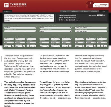
When looking for typefaces to pair together, compare x-heights; similar x-height is one criterion for a successful pairing. Testing multiple typefaces with CSS or an application like typetester.org can help you compare different fonts and their relative sizing to give you a sense of what’s right for your design (Figure 5.5).
Font weights and styles
Fonts come in different weights—levels of thickness and heaviness—as well as styles—changes in letterform angle and shape. It used to be that the best web designers could hope for was boldfacing and italicizing a small set of basic typefaces. Now, with web and mobile fonts readily available and easy to apply, designers have a much wider range of typeface, weight, and style to choose from.
Most typefaces designed for body content have fonts for a “regular” (roman or book) weight, along with bold, italic, and bold italic options. Other typefaces move well beyond that, including fonts that vary along multiple axes of light versus bold, narrow versus wide, and even italic versus oblique. (Obliqued type is angled, but retains the same basic letterform shapes used throughout the type family; italicized type uses specially designed letterforms.)
Figure 5.6 shows several examples from Helvetica Neue, a typeface that contains over 50 different fonts.

Some font families include both serif and sans serif fonts, although fonts within the same family have similar x-heights and spacing. Using fonts from a family with a wide range of styles and weights is an easy way to add contrast and visual interest.
Types of type
The breadth of fonts and granularity of typeface classification can quickly become overwhelming for nondesigners (and even for designers). Typefaces created for setting body text have far more subclassifications—old style, modern, transitional, and many more—than novice application designers need to know. While these classifications are interesting from a historical perspective, or for those who take an advanced interest in typography, for the purposes of application design, it’s more helpful to classify type at a very high level: body typefaces, display typefaces, monospaced typefaces, and ornament/icon typefaces.
Body typefaces
Body typefaces are specifically designed for typesetting body content, whether in a book, on a web page, or in content displayed in a mobile application. These typefaces promote readability—literally, ease of reading—at a wide range of sizes, and while each typeface has its own personality, they don’t generally “shout” at you the way a display typeface’s personality will.
Most standard web and mobile font families, such as Arial, Verdana, and Georgia, are body text typefaces. Your body text typeface is part of your application’s personality, and the typeface you choose reinforces that personality. Keep in mind that body text should never be bold unless you’re emphasizing a few words.
Display typefaces
Display typefaces, also known as decorative typefaces, are designed to call attention through unique design (Figure 5.7). They’re expressive, meaning they have stronger visual personalities than body typefaces. Used judiciously as an accent to contrast the body font, they’re great for limited, strong statements about an application’s personality.6 The more unique and expressive the display font, the less of it should be used (Figure 5.8).

Figure 5.7 Google Web Fonts provides filters for browsing serif, sans serif, display (pictured), and handwriting fonts.

Figure 5.8 Self-help application Unstuck uses a handwriting font as an accent to create a sense of informality and approachability.
Display typefaces are for headers and headlines, not for body text. They may be designed to only show off certain details at minimum sizes, and when used below that size, can look cramped and muddy. Not every application needs a display typeface; refer to Chapter 3 for help evaluating whether display type is appropriate to help express your application’s personality.
Monospaced typefaces
Monospaced typefaces, unlike body typefaces, use the same amount of spacing between all letterforms (Figure 5.9). (Body typefaces manipulate the amount of space between some letter pairs to improve aesthetics and readability; see the discussion on letterspacing later in this chapter.) Standardized spacing makes monospaced typefaces ideal for displaying computer code, which often contains indents for readability, and needs constant alignment with spaces or tabs to preserve those indents (Figure 5.10).

Monospaced typefaces can be used for display text, accent text (e.g., button labels), and even body copy, but are not ideal for long stretches of content unless part of your application’s aesthetic involves evoking 1980’s dot-matrix printers. Monospaced fonts can help an application be perceived as hip, clever, and geek-friendly, if used successfully in an application where that personality is appropriate.
Ornament and icon fonts
Ornament (Figure 5.11) and icon (Figure 5.12) fonts contain illustrations instead of letterforms, and like body and display fonts, they have their own unique personalities. Because icon font glyphs must be mapped to letter keys, applying fonts like this with CSS can pose accessibility challenges; screen readers will read anything coded as text, regardless of whether what’s displayed is actually a letter. However, creative, accessibility-friendly solutions for delivering icons and ornaments via CSS now exist, and are supported across many modern browsers.7
Of course, icons and ornaments can always be applied as graphics rather than text, providing ALT attributes are added where required to meet accessibility needs. But treating ornaments and icons as the fonts they are allows for on-the-fly control of color, size, and other CSS attributes, suggesting that improved browser and screen reader support could make use of icon and ornament fonts more commonplace online.
Typesetting considerations
Type size
Type is traditionally measured in points, which are generally sized at 72 per inch. CSS supports the points unit, but due to poor type resize support from some older browsers, such as IE6 and 7, best practices moved toward relative units like ems that all browsers could resize.
An em is defined based on the standard body text size used in the application. For example, if your CSS declares the standard body size as 12 pixels (px), an em will be equivalent to that, and other type sizes can be defined relative to that initial size. A header that might normally be 15 px would instead be defined as 1.25 em, while a 9 px caption would be 0.75 em.
The drawback of initially defining type in ems is that there can still be unpredictable display results in older browsers. However, with use of such browsers continuing to decline, and screen resize technology now standard on web and mobile browsers, it’s okay to use the more precise pixel or point measurements for web-based applications.
Weight
Type weight correlates directly with its level of visual impact. Book and roman weights of body text typefaces are most appropriate for reading long blocks of content, while bolder weights should be reserved for headers and other text that requires special emphasis, such as a selected link. Limit use of boldface to only where absolutely necessary: it can “shout at readers, putting them on edge and driving them away.”8
Light and ultra-light typefaces can work for body text if it’s typeset at larger-than-usual sizes. However, because the thinner strokes can make type harder to read, they’re not really suitable for long blocks of content at standard reading sizes.
Leading
Leading, pronounced to rhyme with “heading,” is the amount of space between lines of text, and is defined using the same units as text. (In CSS nomenclature, it’s line-height.) Although intuitively, single-spacing implies that text set at 12 px would require leading of 12 px, in practice, setting leading at two or three pixels higher than text size prevents ascenders and descenders from crashing into each other, and provides enough breathing room to improve readability.
Designers may sometimes specify type as number/number, for example, Arial 12 px/15 px. This notation indicates text size with the first number, and leading with the second. Comfortable leading is essential to making an interface with a lot of type feel approachable.
Column width and justification
In general, body text should be set at narrow column widths for optimum readability. At a standard body text size of 12 points or pixels, the ideal column width might range between roughly 40–90 characters per line.
Why the wide variation? To some extent, a “good” column width is determined by what looks best typographically, which can be a subjective judgment. Bringhurst suggests using a line length 30 times the point size, but acknowledges that lines of between 20 and 40 times that point size can work as well.9 The World Wide Web Consortium’s accessibility guidelines suggest not more than 80 characters per line in English text.10 And a Wichita State University study found that anything between their tested values of 35–95 characters per line was readable, but that some people strongly preferred the shortest length, because it required less eye movement to read, while others preferred the longest length, because it placed more information on the page.11
Narrower column widths also mean less reflow when text is viewed on devices with smaller viewports than desktop machines, and less text reflow allows you to maintain similar layouts across devices.
When setting body text, we recommend aligning it ragged left by default—that is, with varied line ending points within a given column width. Typically, this is a browser’s default view anyway, the reason being that it allows consistent space between words, which makes text easier to read. Justified text, which spaces out text to force straight column margins at right and left, creates neater margins (and thus is popular on layouts with highly visible grids, such as newspapers), but the varied amount of word spacing resulting from forcing text into these margins can make it harder to read. Ragged-right text, or text with varied line beginnings instead of endings, is rarely used for body text in functional applications, although its consistent right margin makes it a good choice for typesetting form field labels.
Capital letters
Setting type in capital letters calls attention to it, and not just because decades of Internet use have taught us it’s the equivalent of shouting. All-caps type feels important simply by virtue of being different from the norm, but because the lack of differentiation between letterforms relative to mixed-case type makes it harder to read, all-caps type is best suited for headers and other very short text.
Some typefaces offer small caps, capital letters specifically designed to work in conjunction with lowercase letters at the same point size. Typographically speaking, they’re meant for use as accents—for example, to typeset the “a.m.” or “p.m.” that follows time—but like regular caps, they can also serve as a header font.
Letterspacing
Not all typefaces are designed with the same attention to detail.12 Well-designed fonts account for variations in space between pairs of letterforms to improve aesthetics and readability (Figure 5.13). The spacing between letters is called kerning, and poorly kerned type can be unattractive, distracting, and unprofessional-looking. While there are lots of adequate and even good free fonts, keep an eye on their letterspacing.
Figure 5.13 The capital letters A and V can be difficult to kern properly when they appear together. (a) Poorly kerned type, and (b) the font’s default kerning.
Not every font’s default kerning will be perfect. CSS’s letter-spacing property allows you to kern individual letter pairs, but that level of fussiness is probably best left to designers.
Letterspacing can still be a valuable tool when applied to entire words and headers. Because regular capital letters aren’t usually designed to appear together in large blocks of copy—not even in headers—adding a small amount of space between each letter can help emphasize the difference between each letterform, thereby improving readability (Figure 5.14).

Figure 5.14 (a) The header “step 1 of 2” uses no letterspacing, and while readable, feels cramped relative to the larger, open letterforms of the main header. (b) This version uses a small amount of letterspacing to give the step indicator text more breathing room and improve overall header readability and visual balance.
Color
Although we’ll go into far more depth about color in Chapter 6, it’s important to address a few simple principles about applying color to type.
Your application’s color palette should include at least one type color, usually black, dark gray, or dark blue. Legibility and contrast with the background are paramount in selecting a type color. You may also need to account for how type looks when it’s reversed—displayed in white on a tinted background—or when colored type appears on a different color background.
Black type on a white background provides plenty of contrast for readability, as well as accessibility requirements. Any type color/background color combination you choose other than black and white needs to be tested for accessibility. Use software, online tools, or browser add-ons to test color contrast to meet accessibility guidelines (Figure 5.15), and bear in mind that increasing type size and weight can sometimes push a color combination that’s on the edge of acceptability to something that works.

Effects
As CSS has improved, there’s less need to use graphics editing tools to achieve effects like drop shadows on type, or type filled with gradated colors. However, these effects should be used sparingly at most anyway—they can dramatically reduce readability, particularly at small sizes, and can create visual clutter. Limit use of effects to header type that needs it to express a specific personality or aesthetic (Figures 5.16 and 5.17).


How type affects the meta-principles
Consistency
To make your application’s features easier to identify and learn, keep typographic specifications for body content, headers, and other text consistent throughout an application. The cues type provides may be interpreted consciously or subconsciously, and standardizing type helps people recognize patterns. The SuperTracker case study example reviewed later in this chapter shows consistent application of type styles across platforms, which can help make switching between different versions of applications easy.
If designing a new application to be incorporated in an existing suite, apply the suitemates’ typographic specifications to the new application to ensure users perceive it as part of a family. Rely on other tools, such as color and imagery, to set the applications apart unless use of display type is part of an individual application’s personality. For example, a suite of applications that all use Arial for body text and most heads might use a different display font on some head styles to help individual applications convey personality.
You may also need to define new specifications for your application’s unique requirements, but those specs should work harmoniously with the preexisting rules set out in your application’s design guidelines, also known as a style guide. Rely on initial style guide specs for type size, treatment, color, and so on as the foundation for new ones.
Hierarchy
An application simply won’t be successful—or at the very least, the typography won’t help people discern patterns—without a hierarchy. A functional application must be able to present its feature set and communicate how to use it, and good typography is part of this success.
Contrast is the key to creating hierarchy with type, and with many of the other tools as well. It can be successfully created with size and weight alone. You can even stick to one typeface, provided it has at least three weights or styles, such as roman, bold, and italic. (In a pinch, two weights will also suffice, as long as some headers are set in all caps.)
The following examples in Figures 5.18–5.20 illustrate three possible type hierarchies using contrast. Note how changes in size, weight, style, and contrast help indicate the relative importance of each header.


When pairing fonts from the same or different families, make sure their weights are just distinct enough to provide contrast and emphasis without distraction. For example, there may not be enough difference between a bold and a medium, and too much between a light condensed and a black extended. Two or three fonts from the same family are enough for many applications.
After establishing your type hierarchy, document it in a style guide that includes either functional code defining the different levels of type and their specs, or by providing instructions mapped to visual templates or wireframes. A visual frame of reference helps developers match type styles to the different locations and circumstances in which they appear, and allows them to apply type appropriately on every screen.
Personality
Type is a major component of an application’s personality. Serif typefaces are traditionally seen as serious and business-like; sans serif ones are usually interpreted as more modern and casual. Perception of type, like the other tools, is contextual and influenced by layout and color as well as by users’ frames of reference. Your application’s typography should reflect the purpose of the application, the characteristics you want that application to project, and if required, the brand aspects of your parent organization. Type that runs counter to an application’s purpose and personality produces an unsettling sense of disjoint; would you feel comfortable using a mobile banking application set in Comic Sans (Figure 5.21)? Trying different relationships and reviewing them with others is essential to defining a personality that communicates as intended.

Figure 5.21 Two simple menus for a mobile banking application. The one typeset in Georgia, a serif typeface, feels unexciting but reliable. The one typeset in Comic Sans feels far too casual for an application that involves managing personal finances.
Despite the range of typefaces and fonts available, it’s best to stick with two or three fonts. More fonts equals more possible visual relationships to investigate and evaluate, and leads to a complex visual language that relies more on subtlety to communicate personality than a language with one or two fonts.
Defining a rationale for type
Defining a rationale for type allows you to choose the most appropriate typefaces for your application. Begin by answering these questions:
• What’s the purpose of your application? A financial services application implies a formal look and feel; an online game portal implies an informal, visually active look and feel; and a food- and fitness-tracking application might fall somewhere in between. An application that includes lots of detailed text, such as nutritional information, will need a highly legible, readable base font; an application with little text, such as a weather application that focuses mostly on visuals, may be able to rely on a legible and clear display typeface for content.
• Is the application part of a suite, and are there brand standards it needs to adhere to? If so, the suite’s existing standards, as well as brand rules, dictate your choice of fonts so that all new applications feel connected.
• Who’s the audience for the application? An older audience (40 years old or higher) will need a larger default point size than a younger audience. Using an open typeface with a large x-height, like Verdana, may also improve readability for older audiences. For applications delivered in multiple languages, investigate fonts that offer a complete set of Unicode characters.
• What personality does the application need to convey? Bearing in mind any cultural expectations for your application based on its purpose, consider all aspects of your application’s personality (Figures 5.22 and 5.23). Should it feel cheerful and inviting? No-nonsense? Trendy? Loud, or quiet? Review fonts critically against the list of adjectives from the visual design requirements that describe desired characteristics (see Chapter 3 for a sample). Every typeface has its own personality, and you may need to experiment with a few. Font websites generally allow you to typeset sample text to get an idea of how things will look before you decide to purchase or link to a font. Interpreting characteristics of fonts can be subjective. It isn’t usually necessary to test font choices with users, but stakeholders and teammates should be in general agreement about desired font characteristics.


Figure 5.23 Unstuck’s “solution” screens mix book weight and condensed sans serif typefaces with a handwriting font to create an approachable personality that also feels authoritative.
• What platform(s) will people use to access the application? By default, Windows-based and Mac OS–based systems support 9 typefaces across platforms: Arial, Arial Black, Comic Sans MS, Courier New, Georgia, Impact, Times New Roman, Trebuchet, and Verdana. iOS’s default choices include 61 font families, while Android and Windows 8 Mobile offer far fewer. All platforms have default serif and sans serif typefaces, and website and application developers can make other typefaces available via CSS or embedding. If you’re working across platforms, you may choose to stick to typefaces you know will work everywhere, or you may determine that the risk of displaying a default typeface doesn’t dramatically affect your application’s personality. Regardless, plan on testing your application’s display across multiple devices to make sure content is readable and looks the way you expect it to look.
Case Study
Defining SuperTracker’s rationale for type
To develop a rationale for selecting and applying fonts in the redesign, we combined our answers to the rationale questions with an analysis of existing typography on the SuperTracker and ChooseMyPlate.gov websites.
Application purpose
SuperTracker is a food- and fitness-tracking application with the mission of helping people make better nutrition and wellness choices based on federal guidelines.
Related applications and brand standards
The SuperTracker web application relies on Arial as its primary body typeface, with Arial Black reserved for its main header. Logotypes for both SuperTracker and ChooseMyPlate.gov use Gotham. Headers on some of the ChooseMyPlate.gov website pages use Lato, a typeface very similar to Gotham (Figure 5.24). Using a header font that’s visually related to the logo is one way to help type look cohesive and intentional throughout an application.
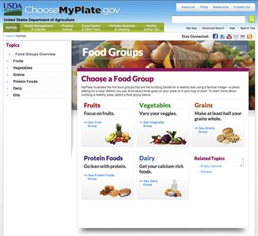
Figure 5.24 Headers for “Topics” and “Food Groups,” as well as “Choose a Food Group” and all its subheads, are typeset in Lato.
With limited ways to express personality on the small mobile phone screen, we wanted to use a more distinctive text typeface than Arial. We turned to the USDA’s style guide for MyPlate. The typeface used in the MyPlate icon was Museo, a versatile semi-slab serif. The Museo family’s breadth and modern style made it a good candidate to try in our redesign, but not a great candidate for text; slabs are exaggerated serifs, and would add too much visual weight to lines of text on a small screen.
Audience and personality
With obesity a nationwide issue, SuperTracker’s audience could vary significantly by age, locale, and other characteristics. The personas suggested SuperTracker’s personality needed to feel authoritative, but friendly. No one enjoys dieting or being told they’re eating the wrong foods, but at the same time, tracking food consumption and exercise patterns is a serious step toward improving physical health, and shouldn’t be treated informally.
Type had to be clean, legible, and readable at a standard body text size. It also had to scale smoothly for Betty, who would need a larger point size in her web browser than Danny and Sonia would on their mobile devices or laptops.
Platform considerations
While SuperTracker is currently a web-only application, our redesign also had to address mobile phones and tablets. Gotham, used in the logo, was only available for web use via sIFR, a Flash-based technology, and couldn’t be embedded in native applications without negotiating with the font foundry. However, provided the logo remained an image, using it in an application was allowed.
For body and header text, we knew our best choice would be typefaces licensed for easy web and mobile use. Museo is available as a web font, and can be licensed for mobile applications. We needed to find a text font that met the same requirements.
Choosing and applying type
We started our type explorations with logotype designs. Beginning with simple typographic approaches that relied on combinations of font choice and weight to express SuperTracker’s personality allowed us to quickly sketch out and assess multiple alternatives (Figure 5.25).

Our trial logotypes included Gotham as well as Futura and DIN, two other sans serif fonts. While we wanted to keep some of the feel of the original SuperTracker logotype, we also wanted it to convey more of Pepper’s personality: the smart, technology-savvy assistant. We decided that a lighter weight of Gotham best conveyed Pepper’s sophistication and helped the applications maintain a visual relationship to related sites and publications.
As we moved from logotype experiments to screen layout, we also explored the idea of SuperTracker as a journal or log (Figure 5.26). This exploration was done primarily through type, and used an informal typewriter font to convey the idea. Trying it allowed us to see that the font and idea of a log felt too informal and not technically savvy enough to fit the application’s personality and robust functionality.

Despite the typewriter font’s failure, trial layouts helped us narrow in on the feel we wanted for body and header type. We chose Museo 500, a semi-slab serif, for heads, and paired it with Meta, a slightly condensed sans serif, for the text (Figure 5.27). The pairing works because both have similar x-heights, a strong horizontal orientation to the letterforms, and blunted terminals, or letterform ends. Museo’s slightly heavier weight also provides enough contrast to draw attention to headers without overwhelming the slimmer, lighter Meta. Finally, Meta was designed for legibility, including use at small sizes, making it a good choice for mobile device screens (Figures 5.28, 5.29, and 5.30).

Figure 5.27 Museo and Meta, the header and text fonts we chose (top); Arial and Arial Bold used in the original application (bottom). Museo and Meta offer more personality than Arial without sacrificing readability.


Figure 5.30 Typefaces and fonts in the web layout. While position and size of type elements change across platforms, application of font and style is consistent.
Our final versions of the application use two weights of Museo (500 and 700) and three of Meta (regular, medium, and bold). Variations in size, color, and weight create a consistent type hierarchy across all three delivery platforms.
Avoid common mistakes
Use type consistently
Once people learn the particular vernacular of your application, they’re going to expect the application to “speak” to them in the same way everywhere. Inconsistent application of the hierarchy is like telling people that “save” means “save data” in one location and “cancel” in another.
Typeset for readability
Set type carefully to ensure everything is legible and readable. Provide at least two pixels more leading than the point size you’ve chosen; this will give breathing room to each line of text. Also, don’t apply every color and effect you have at your disposal, and particularly not to body content.
• Are you providing sufficient leading at all sizes of your type hierarchy?
• Have you added color to multiple levels of your type hierarchy, and if so, is it absolutely necessary to communicate different levels of importance?
• If using visual effects, are they applied sparingly, only where needed for consistency and support of the type hierarchy and overall personality?
Make informed decisions
Create a type hierarchy
Your typographic choices help guide the audience to what’s important, and without a solid hierarchy, people are left floundering. When creating the hierarchy, include variation of contrast, size, and style that clearly shows difference without distracting. We’re trained to interpret bold text as important, and as a result, you may be tempted to overuse boldfaced type, simply to ensure no one misses your key messages—but emphasize everything, and nothing stands out. Boldface works for emphasis precisely because it’s a contrast to the roman type that typically dominates a page.
• Can your audience tell at a glance—based on type size, contrast, and/or position—what the most and least important text is on the screen?
• Are you boldfacing and italicizing only the text that absolutely needs it to convey emphasis, and underlining or differentiating only hyperlinked text?
• Do sidebar heads and subheads feel subservient to the main page header, yet strong enough to attract some attention and contrast with text?
Limit fonts and typefaces
Unless you’re an experienced designer, stick to two or three fonts when creating your hierarchy, and don’t use more than two typefaces in addition to the one in the logo. As exciting as it is to have so many choices, basic typographic principles still apply. Too many fonts will create visual chaos, both if they’re too similar to each other as well as if they’re wildly different. Use the minimum number of fonts you need to communicate effectively.
There’s no harm in sticking to reliable typefaces like Helvetica and Times New Roman. These typefaces may not have a ton of personality, but they’ve survived a long time because they’re neutral and easy to read. Type is just one tool for conveying personality. Using plain fonts well with expressive imagery, for example, is a classic way to use type and one of many successful design strategies.
Consider these typefaces as part of your overall investigation into what type families will best suit your application. Review the questions we set out earlier, paying particular attention to how and if to express your application’s personality through type. For example, weather application Dark Sky could have used any bold sans serif for a casual feel, but its designers chose Proxima Nova Extra Condensed, which feels jaunty and light despite being a condensed typeface (Figure 5.31). The application would be far less engaging with Arial or Helvetica instead.
• How many fonts compose your type hierarchy? Can you use fewer while maintaining a strong visual hierarchy and an appropriate personality for your application?
• If using display type, are you using it at a readable size, and only where it provides needed visual punch to support your application’s personality?

Elevate the ordinary
Native mobile applications can support printlike type design, providing designers with complete control over headers, body type, and interactive elements. But web-based applications are catching up; although CSS still doesn’t provide the range of type tricks available in a page layout program, it’s now possible to use it to generate typographic treatments previously restricted to print, such as pull quotes and drop caps. Web browser support for OpenType font features, such as ligatures and alternate letterform versions, is increasing, and will allow designers and developers to incorporate more sophisticated type elements (Figure 5.32).13

Figure 5.32 Ligatures are connected sets of letters. For some languages, such as German with its ß character, ligatures may be required. For others, they add visual appeal and enhance legibility by creating attractive connections between letterform elements, such as the crossbars of a lowercase f and t.
1Bringhurst, R. Historical Interlude. In The Elements of Typographic Style, pp. 119–142.
2See the Resources chapter at the end of this book.
3Shaikh, A., Chaparro, B., and Fox, D. (2006, Feb.). Perception of Fonts: Perceived Personality Traits and Uses. Usability News. Retrieved June 29, 2012, from http://www.surl.org/usabilitynews/81/personalityoffonts.asp.
4Poole, A. (2008, Feb. 17). Which Are More Legible: Serif or Sans Serif Typefaces? Alexpoole.info. Retrieved June 26, 2012, from http://alexpoole.info/which-are-more-legible-serif-or-sans_serif-typefaces/.
5Legibility refers to how easy it is to distinguish letterforms from one another. Readability refers to how easy it is to read text typeset in a given font.
6A study sought to determine if fonts have personalities, and found that people do attribute personality traits to fonts. Shaikh, A. D., Chaparro, B. S., and Fox, D. (2006). Personality of ClearType Fonts. Retrieved from January 10, 2013 http://www.surl.org/usabilitynews/81/PersonalityofFonts.asp.
7Coyier, C. (2012, May 24). HTML for Icon Font Usage. CSS-Tricks. Retrieved June 27, 2012, from http://css-tricks.com/html-for-icon-font-usage/.
8Bringhurst, R. The Elements of Typographic Style, p. 56.
9Bringhurst, R. The Elements of Typographic Style, p. 27.
10Visual Presentation: Understanding SC 1.4.8. (2012). Understanding WCAG 2.0: A Guide to Understanding and Implementing WCAG 2.0. Retrieved July 3, 2012, from http://www.w3.org/TR/UNDERSTANDING-WCAG20/visual-audio-contrast-visual-presentation.html.
11Shaikh, A. (2005, July). The Effects of Line Length on Reading Online News. Usability News. Retrieved July 3, 2012, from http://psychology.wichita.edu/surl/usabilitynews/72/LineLength.asp.
12Some of our favorites are hosted on www.fontshop.com and www.typekit.com. These sites are also great to browse for learning about fonts.
13Ferreira, G. (2012, June 7). OpenType Features in Web Browsers. Typotheque. Retrieved July 31, 2012, from http://www.typotheque.com/articles/opentype_features_in_web_browsers.