
Personality
“The trick is to be practical at the same time that you are being impractical.”
—Paul Rand1
Just as people react to other people, people react to applications. First impressions happen automatically, consciously and unconsciously. Other impressions are the result of interactions over time. Personality refers to impressions formed based on appearance and behavior, a concept that applies to applications as well as people.
Appearance, behavior, and satisfaction all come into play in how people judge an application. While each interaction affects how people interpret and evaluate an application, this chapter focuses on the visual aspects of an application’s personality. What people see conveyed through layout, color, type, imagery, and controls and affordances affects not only their first impression, but also how they use and consider an application.
Don Norman provides a framework for product personality in his book Emotional Design: Why We Love (or Hate) Everyday Things, defining three aspects of design:
• Visceral design maps to appearance.
• Behavioral design represents the pleasure and effectiveness of use.
• Reflective design relates to self-image, personal satisfaction, and memories.2
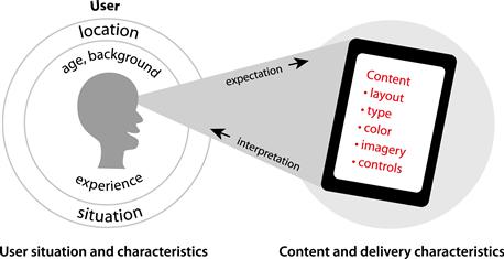
Though Norman focuses on all kinds of consumer products, his design aspects apply to the personality of application interfaces as well (Figure 3.1).

Figure 3.1 Not all aspects of an application’s personality can be determined at a glance (visceral). They are revealed through use (behavioral) and time (reflective).
Norman’s framework fits our experiences designing applications and understanding how people use them. Interpretation of how an application looks happens instantly and viscerally, as Norman states, and interpretation of the pleasure or effectiveness of use happens over time. The sum of these interactions is overall interpretation, to the point of reflection.
While this framework applies to products at the conceptual level, we need more practical frameworks for establishing appropriate and desirable impressions of personality for application interfaces. This chapter outlines the elements of application personality, and dives into how to convey desirable and appropriate characteristics of personality in an interface.
First, we need to state that you cannot “create” personality. People determine personality based on characteristics interpreted from patterns they’ve detected through perception and experience. Interpretations vary based on norms and expectations—what people expect and are used to—and can be subjective. Just as diners can have different impressions of the same meal served by the same waiter at the same restaurant on the same night, application users will interpret what they see differently. People’s frames of reference affect interpretation. Designers and developers cannot know how visual cues and attributes will be interpreted, but they can select and create visual cues and attributes that are likely to give the desired impression of personality. The likelihood that their selections and designs are successful increases with the amount of research they are part of and have access to.
Research for visual interface design
Research—watching people in situations similar to those you are designing for, learning about the culture you are designing for, and testing prototypes—helps you understand people and their expectations in context. Understanding how people use an application, their situations, and their interpretation of what they see and experience helps you select visual cues and attributes that improve ease of use and give the desired impression of an application’s personality.
Methods of research are often combined. Demographic data is merely a source of information, and doesn’t help you understand what motivates people; it needs to be combined with knowledge of how people behave in similar or proxy situations, as well as what they value, inferred from observation or testing. But all of these methods and results can be used to help inform design decisions.
Research methods
Contextual inquiry/observation
Contextual inquiry is a term coined by Hugh Breyer and Karen Holtzblatt to refer to a method of learning what people do for the purposes of designing better applications.3 It involves sitting with, observing, and questioning people in the relevant situation of use (e.g., home, office, or car) rather than a lab setting. It’s useful early on in a project, so designers can get to know the users, content, context, affinities, and behavior they will be designing or redesigning for. This method can stand alone, but is also effective for determining design goals that can be measured with other methods later on.
A/B testing
This research method, also known as split testing, shows two variations of a screen to users and assesses differences in how people respond to each option. Typically, this method is used to test a specific, desired response, such as purchase conversion or list signup. A/B testing can stand alone as a research method for determining the effectiveness of design options.
Conceptual prototype
A conceptual prototype can take many forms. For visual interface design, prototypes are concepts of screens that are flat or clickable, on paper or onscreen, black and white or full-color. They should represent some content, features, and elements that start to convey a personality, and are used to help designers and stakeholders understand user perceptions and preferences (Figure 3.2). They are for qualitative purposes only, and the context of testing must be taken into account in designing and evaluating the prototype.
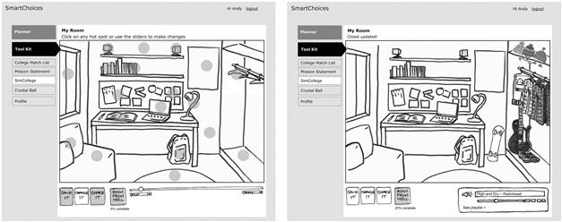
Figure 3.2 Example of two screens from a conceptual paper prototype tested with target users to determine interest and get early input.
Semantic differential
Semantic differentials involve rating via pairs of words that are opposites, such as like and dislike, with positions to select between them. Results are quantifiable, since the number of responses for each position can be counted. The scales can be used with any type of interface—conceptual, or live and functional—and are especially effective when used to compare participant perceptions with qualities stated in initial requirements or goals.
The semantic differential is especially useful for gaining insight into perceptions—how people interpret something and value it. It helps quantify subjective opinions.
The semantic differential scales shown in Figure 3.3 were used to help stakeholders choose between two logos being considered for a university’s technology services department.

Figure 3.3 Example of semantic differential scales.
These scales were sent to department employees so external stakeholders could understand how people perceived the qualities of the two logos. A final question asked which logo they preferred, and why. Paradoxically, results showed that people preferred the logo that did not have a quality employees initially said the logo should have—that it should feel “cutting-edge.” Instead, the preferred logo was perceived as “conservative.” This helped stakeholders understand that the idea of what the logo should convey was different than what people actually liked. Stakeholders ultimately chose the more cutting-edge, “forward-thinking” logo, but anticipated a negative response and managed it with messaging at launch affirming the initial desired qualities that were the goal of the redesign.
Research sources
These research sources are in addition to the results of traditional usability tests.
Demographic data
Statistical information about a population typically includes gender, age, household income, employment status, and location. Because demographics don’t include context, analyze them as part of a broader research plan instead of relying on them on their own.
Customer feedback
Records of correspondence describing user issues with a product or service are helpful, especially when trying to prioritize design work. Some feedback includes direct issues that people have, while other feedback includes situations that must be interpreted to understand the root of the problem. Reviewing customer feedback is useful on its own, and also complements other methods.
Analytics
Analytics gathered for websites or mobile applications provide concrete statistics about what parts of an application are most frequently visited, popular user pathways, how much time people spend in specific locations, and other usage data. These analytics can typically be viewed in context of visitor demographics, such as location, browser, and OS type. As with general demographic data, reviewing analytics should take place alongside qualitative methods to provide a more complete picture of audience characteristics and behavior.
Elements of interface personality
A successful interface design establishes its personality instantly and over time to help create a positive impression. For our purposes, personality is conveyed visually through the characteristics of what people see: the way in which layout, type, color, imagery, and controls and affordances are represented. This affects how people interpret what they can do with an application and how they characterize it.
How an application is accessed or delivered affects user expectations as well. A web-based application may have different visual characteristics than a mobile application, and characteristics may further change based on the nature of the specific delivery device. The elements that affect interface personality can be represented as shown in Figure 3.4. (Feedback and responsiveness are not included, since they are not visual characteristics.)
Aesthetics and interface personality
There are two ways impressions can be characterized at the visceral level: how approachable (or useful) an application appears (i.e., “Does it look like this will allow me to do what I want?”), and whether we like what we see, or find that some aspect of it resonates with us on a personal level. Researchers have tested website designs to understand how people perceive design characteristics and usability. They tested classic aesthetic qualities (organization, cleanliness, symmetry), which fit our notion of approachability, as well as expressive aesthetic qualities (harmony of design, harmony of coloring, dynamic expression)4, which correspond to likability. We know that the more appealing users find a website, the more usable they perceive it to be.5 The research showed that perception of classic aesthetic qualities has an edge over expressive qualities when it comes to measuring perceived usability. That tells us that personality matters to users and is relevant to usability as long as the classic qualities are evident and not overshadowed by expressive ones.
How much personality does an application need? Or, how important is it to be likable?
Whether a person (or in our case, an application) is likable—that is, appealing—is a key attribute of personality. In the realm of application design, we know that visual appeal affects users’ overall impressions. However, there are plenty of successful applications that aren’t attractive, as well as attractive applications that are unsuccessful. How important it is for an application to be likable depends on its purpose and situation, and how important visceral appeal is versus behavioral appeal versus reflective appeal. Here we take a closer look at a few applications and review them in terms of personality, situation, and aesthetic qualities.
Craigslist—plain, but useful and organized
Craigslist, the first website for classified advertising, is in over 700 cities and 90 countries. It has been the subject of discussions on aesthetics and several unauthorized redesign efforts.6 It exhibits a few classic qualities—symmetrical layout with gray backgrounds on each side, simple, text-only, two-color interface, organized content. Its personality is exceedingly bland, and there are no expressive qualities. The fonts are plain; the colors based on default HTML markup (Figures 3.5 and 3.6).


Figure 3.6 Lifelike Apps’ unauthorized interface design for craigslist can be purchased to change the display of craigslist content.
WIRED magazine asked several top designers to redesign craigslist, and published the results.7 Redesigns range from purely expressive (Pentagram’s design by Lisa Strausfeld and Luke Hyman that does away with categories altogether to form words into an image of founder Craig Newmark’s face), to classic (Matt Willey’s from Studio8 Design and SimpleScott’s submissions that introduce a bit of color and refined typography and layout), to focused on functionality (the submission from Khoi Vinh and the team from NYTimes.com that focuses on search and separates sales and purchase features).
Craigslist has kept a minimalist design for its entire existence, however, despite the availability of alternate interfaces for purchase and free ideas from designers. Few changes, such as links to mobile and tablet versions, have been made to the website since its launch. Clearly, the owners don’t feel the need to add personality to the website. Their position as the oldest and best-known in their space is enough to keep the website going strong, and its owners must feel that the website’s understated personality is not an impediment to profit and success. In their case, an organized website, while unattractive, is organized enough to be massively useful for people all over the world.
The craigslist example shows that there’s more than personality at play when it comes to success. Decisions about personality in interface design are just one part of what’s presented to users. Characteristics of endearment, such as familiarity and integrity, play a role. Craigslist didn’t start out in 90 countries. It started in one city. It kept the basic characteristics of its look through upgrades and expansion, which makes the website familiar whether you use it daily or every few years. The constancy of the interface plays into the perceived integrity of the service.
Just as people have a frame of reference affecting their interpretations, organizations have a frame of reference affecting how and why they represent themselves. Factors such as organization type and structure, staffing and skills, competition and position, culture, and self-image all affect how organizations present themselves in their products and services.
Craigslist.com personality summary
Labbler.com—cool, clean, and controlled
Labbler.com is a website and application designed to connect music artists with media and service providers in the music industry. The interface has classic qualities—the templates are clean and well organized, a result of generous use of space around the widgets and a controlled, pale background color palette with pops of bright color corresponding to sections of the application (Figure 3.7). The application displays detailed information such as music tracks, which are represented visually in the interface and tables of track listings.

Figure 3.7 Labbler.com home page has a scientific look. The website is “all about the music business.” Image courtesy Martin Oberhäuser, http://www.oberhaeuser.info.
Despite the need to display common data tables, the presentation does not feel generic. Expressive qualities are evident in the carefully designed typographic styles, subtle mix of flat color fields and shading, and custom, but clear, icons. Part of the expressive aesthetic is up to the user—several screens feature large profile images, and users may add custom images to tracks (Figure 3.8).
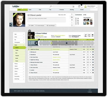
Figure 3.8 Labbler.com successfully displays table data, complex navigation, controls for listening to and editing music, social media features, and profile information in a clean and approachable interface. Image courtesy Martin Oberhäuser, http://www.oberhaeuser.info.
The home screen uses navigation as the interface, and personality is established there through the distinctive typeface and the round graphic that functions as the navigation. The element-like symbols, the monochrome colors in the palette, and the round graphic lend a scientific look to the home page. The real-time chart showing the breakdown of registered users sets the tone that the website is dynamic and helpful. The interface, other than displaying data and information relating to and about music, does not convey a sense of music in the design. The logo, however, shows abstract gears of a cassette tape in the round “bowls” of the letters “a” and “b.” Those details are lost when the logo appears smaller on subsequent screens in the application.
Much of the success of the visual design is due to careful use of color and shading to create contrast that differentiates features from background and content, as seen in the local navigation, dropdowns, and “Add or Upload Tracks” button. Beyond the home page, much of the personality of the interface is defined by the user via images and videos they upload. As a result, the interface itself does not need a strong personality, but the simplicity of the individual screens is a bit deceptive. Graphic style pages (Figure 3.9) show the extent of the interface design and the careful consideration it took to create this consistent and “simple” visual language, in addition to the design of about a dozen screen templates. Labbler.com is new, and we do not yet know if the attractive interface will help it succeed.
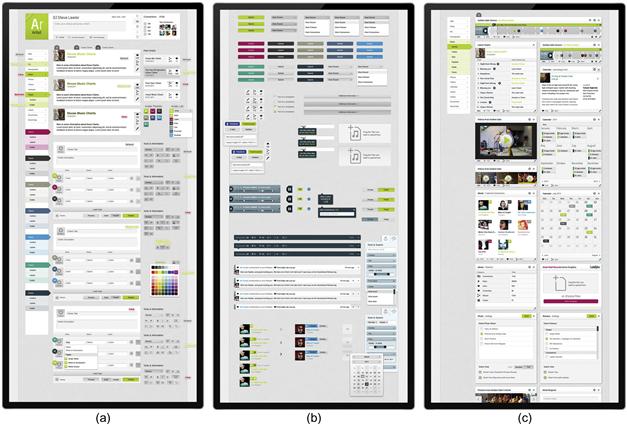
Figure 3.9 Labbler.com graphic style pages show the wide number of elements designed for this seemingly simple-looking interface. Images courtesy Martin Oberhäuser, http://www.oberhaeuser.info.
Labbler.com personality summary
• Elements of classic aesthetics—simple, some symmetry, organized; limited, controlled colors.
• User-generated expressive elements—photos and videos, bright colors coded to website sections, and a mix of flat and shaded finishes.
• Focus on industry and needs of groups of people in that industry.
• Attractive combination of expressive, classic, and useful; likable.
Epicurious—light-hearted and approachable
The Epicurious iOS application is a visual database of thirty thousand recipes from Bon Appétit, Gourmet, and other national magazines, with shopping list and recipe-sharing features. The application balances searching and browsing with expected and unexpected features that are friendly and clear. Recipes can be found with keywords or a visual faceted search. Browsing begins with over 25 dynamic categories, including the seasonal “Summer Desserts,” along with unusual categories, like “Family Reunions” and “I Can Barely Cook.” Both the search and browse features use tiny, internationally recognizable icons of foods and preparation techniques, like grilling. Rather than use the iOS picker, search categories appear in sets of horizontally scrolling rows with subcategory names and icons. The visual design of these features, including the custom picker, allows the application to express personality consistently across platforms.
The application uses the color red extensively in both the background image of red jalapeño peppers as well as in buttons (Figure 3.10). The pepper photo provides an abstract background texture that unites the application with the epicurious.com website look and feel. The distinctive, bold, semi-script logo font consistently appears in white on a colored or photographic background in the website and all application versions.
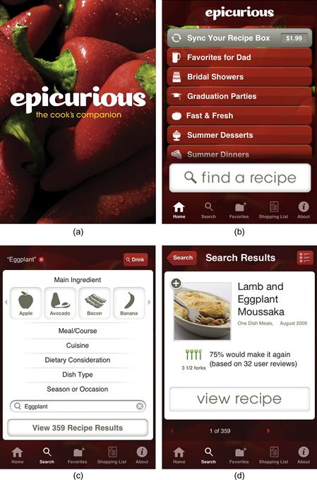
Figure 3.10 The design of the Epicurious application appeals to anyone. Visual characteristics express the brand through logo, photos, icons, and color. Use of familiar and custom controls is straightforward and clear.
The application layout is classic, using a primarily centered arrangement on the home and search screens. Other screen templates mix centered alignment with left-aligned content for lists, while recipes are primarily left-aligned. Despite the expressive background image and use of color, the application looks approachable; for example, rather than the typical “stars” rating system, Epicurious uses forks. These details, bright color, bold background image, and extensive icon system all help give the application a friendly and engaging personality, while delivering high-quality recipes and list management features.
Epicurious personality summary
• Elements of classic aesthetics—symmetry in the centered layout screens, organized in the left-aligned layout screens. White background for results and recipes make the content stand out from the background.
• Gray icons used through the application are simple visually, yet aid in use cognitively.
• Very limited color palette, which despite being strong, helps photos of food stand out.
• Expressive elements include the background photo, icon system, and heavy use of shades of red. Elements of humor are conveyed in the icons and browsing categories.
• Attractive combination of expressive, classic, and useful; likable.
Clothia—trend-setting, useful, and inspiring
Clothia is a website and application that helps inspire fashion-minded people. It looks feminine and ephemeral due to the pale pink, white space, and trendy, light-hearted illustrations, but don’t be fooled. The creators have developed an extremely functional application (Figure 3.11).

Figure 3.11 Clothia.com home page.
Clothia allows users to upload their own images, grab images from the web, and find images of fashionable clothing and accessories on the website itself. Users can create “looks” by combining these images any way they choose—effectively letting anyone do what fashion editors do (Figures 3.12, 3.13, and 3.14). Images on the website are linked to product details and purchase information, but the application feels more about practical fun than shopping. The main benefit is that users can plan wardrobes, outfits, and purchases visually with a drag-and-drop interface.

Figure 3.12 Interface to create “looks” makes it easy for anyone to try their hand at being a fashion editor.
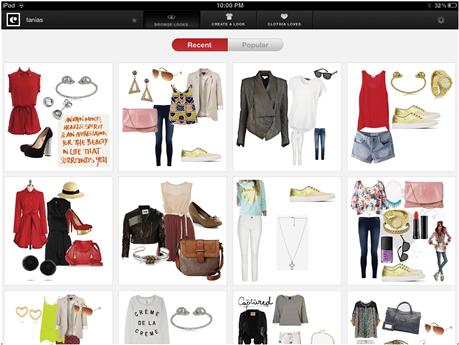
Figure 3.13 The main screen of the Clothia iPad application differs from the web version (Figure 3.11).

Figure 3.14 Creating looks in the (a) mobile version and (b) web version. Controls in the mobile version are standard for iOS, rather than the elegant custom elements in the web version. Use of custom interface elements and behaviors would allow for consistency, and more control over the personality across platforms.
All drag-and-drop functionality is in the “Create” area of the website, which uses a unique template that doesn’t look like a web page. It looks like an application, with most of the screen taken up by an empty area with instructional text that cues use with pale gray text: “Drag items here. Create your head-to-toe look by dragging items from All Items or My Items tabs.” The tabs are clearly visible to the right.
Icons of easily recognizable clothing categories help users get started. Icons are flat, yet still connote “clickability” through their position to the right of the “Create” area. Visually, elements play a game of contrast, mixing classic, minimal aesthetic characteristics like super-thin lines and simple, pale buttons that highlight on rollover with expressive and unique illustrations and fonts. The logotype is adaptable to a simple and unique application icon. The high yet controlled level of expression lends visual activity to the images of clothes and accessories without overwhelming the fashions.
An application for fashionistas, Clothia put forth a personality that said “fashion” at launch. By keeping photos focused on clothes and accessories and not models, the website can appeal to anyone interested in fashion, regardless of age, gender, or body type.
Clothia personality summary
• Elements of classic aesthetics—clean, lots of white space, some symmetry, organized, single accent color with black and white.
• User-generated and system-supplied expressive elements—photos, illustrations, and icons.
• Focus on enabling management and discovery of fashion with online capabilities.
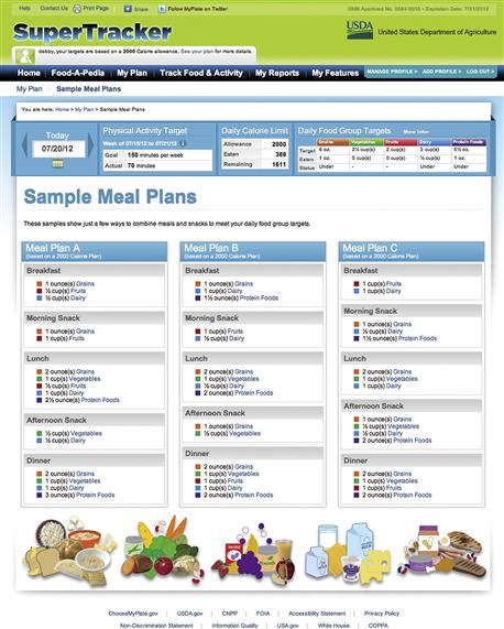
SuperTracker—useful and usable
SuperTracker is a web application by the United States Department of Agriculture designed to help people track their food intake and activity to improve health. Nutritional information is based on the federal food composition database, a standardized resource cataloging nutritional value for over 8,000 foods.8 Unlike competitor applications, SuperTracker will always be free and doesn’t contain advertising.
Aesthetically, SuperTracker has some classic qualities and some expressive qualities. There are several application templates that are organized but don’t present a strong visual hierarchy. On the most functional templates—the food and activity trackers—the appearance is cluttered, not clean, and it can be hard to tell where to click (Figure 3.15).

In terms of expression, the bright color palette feels upbeat and is coded to food groups. Color-coding is consistent across the application and enhances the readability of graphs and tables. A combination of flat and shaded areas throughout the interface—in buttons, graphs, and panel backgrounds—seems a little random. If used consistently, they would help establish personality.
On the Sample Meal Plans screen (Figure 3.16), the line art graphics of food add visual interest to an otherwise purely functional area. The particular graphics feel unsophisticated and dated, however. Fonts are appropriately plain in style, as are their sizes and weights. Similar to craigslist, SuperTracker needs to be really useful for a huge number of diverse people.
SuperTracker personality summary
• Some classic aesthetic characteristics. Personality characteristics vary depending on the template. Some symmetry, some organization.
• Could be improved by perception of approachability, and clearer organization of complex screens.
• Limited expressive color, use of shading, and use of generic line art.
Special opportunities for conveying personality
The four examples have different personalities. We know that characteristics of personality are conveyed through layout, type, color, imagery, and controls and affordances. We have introduced a language for discussing and qualifying them in terms of classic and expressive aesthetics.
There’s another opportunity to express personality that crosses these boundaries. We call this “voice of the system” messaging: system status and help messages that convey personality through tone of voice. This messaging is a type of content in response to user behavior:
VOS messaging often combines text and an icon within an element such as a lightbox or popup, all of which receive a unique visual treatment. It ranges from afterthoughts to masterful expressions of personality and is a unique opportunity for tone of voice to delight instead of scold, be personable instead of mechanical, or be just plain helpful in a way that represents your application’s personality (Figures 3.17, 3.18, and 3.19).
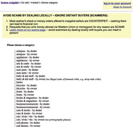

Figure 3.18 This tip from LinkedIn doesn’t have a lot of personality, but the “yellow sticky” color and treatment are appropriate for the website’s professional characteristics.

Figure 3.19 Turntable.fm, which allows people to DJ for their friends, uses appealing cartoon graphics to entice people, and on rollover, provides a standard HTML tooltip reading “please don’t click this exactly 3 times.” Clicking three times swaps in a new graphic of “assimilated” listeners, with a mock-horrified tooltip reading “what have you done?”
Establishing criteria for personality
Determining criteria for how an interface should look to appeal to users, meet their expectations, and help them use the application is essential to success. Just as applications have requirements for functionality, they may also have requirements for the visual interface. A designer needs to review supplied interface requirements critically and may need to seek out additional requirements to have a complete picture of what affects the interface.
Criteria for personality “live” in different places, some visible and some not (Figure 3.20). They live in the user’s mind in the form of experiences and expectations. They live in the organization in the form of interfaces from iterations of previous or other applications, style guides, business missions, and project goals. They live in minds of stakeholders in the form of release dates and targets to be met, preferences, and biases based on experiences; and they live in the minds of designers and developers in the form of preferences and biases. Getting a complete picture of the state of these expectations and biases involves asking questions and conducting or reviewing research that answers those questions.
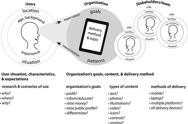
Figure 3.20 This diagram adapts and expands Figure 3.4 to show where criteria that affect interface personality “live,” as well as sample questions of which the answers help provide a complete picture of the expectations and biases that affect design.
Personality clues in personas
Composite models of users are commonly known as personas9. Personas serve interface designers by providing examples of who the application users are, where they’re likely to be accessing the application, why they’re using it, and what they’re using it for. Personas don’t hold explicit answers for personality, but contain clues that feed into personality design.
Personas supply the necessary who, where, and why. The who defines user characteristics and expectations; the where defines context and situations that might affect the user experience; and the why defines goals and expectations. From the clues, designers can imagine characteristics that will be appropriate for users. We’ll review sample personas in the case study later in this chapter.
Uncovering organizational requirements
Ideally, each interface design project comes with a well-researched and sound description that clearly states rational organizational goals at the outset: who the application is for, what it should do for the organization, and what the benefits are for users. Designers need to review whatever documentation they get in detail, and question anything unclear; designs that make sense can only come from understanding project and audience goals.
Team workshops
Team workshops are good for getting goals, bias, and expectations out in the open, and are a great way to uncover organizational requirements early on in a project. We focus part of the agenda on identifying user types, typical personas of use, and “pain points” or driving issues, and part on desired personality characteristics.
Listing team member’s adjectives about how they want the application to be perceived by users, discussing them as a group, and narrowing the list helps establish criteria for visual characteristics.
Stakeholder interviews
These interviews provide similar benefits to workshops, but are conducted one-on-one with each stakeholder. Stakeholder interviews help designers understand the why behind high-level expectations. A common mistake designers make is to accept stakeholder preferences and proclamations out of hand, without question. Answers to business questions need not be backed up with spreadsheets and financial reports; a few simple sentences of elaboration will do. Not understanding the why behind expectations leads designers to make assumptions about how to design something to address what they perceive as the stakeholder’s issue. Assumptions are problematic when getting feedback on designs, as they are often wrong.
Assessing identity requirements
Identities, typically the logo and related visual assets that help characterize a personality, can stem from different levels: the organization that made the application, the application itself, and the system if the application is part of a suite of related programs. Since personality depends on the context, goals, and personality of their parent organizations, there’s a wide range of personality characteristics that an application can portray.
In the case of Blurb, a company that provides tools for people to make their own professional-quality books, there’s Blurb the company, and there’s Blurb’s applications (Figures 3.21 and 3.22). When it comes to personality, part of the decision-making process involves asking and answering questions like these: “When people are using our software, should they perceive one personality—the application’s—or two personalities—the company’s and the application’s?” and “Which should be more prominent? Why?” Answering questions like these involves having a user experience strategy based on understanding where the user’s mental association lies—with the company or the application—and where it should lie to achieve business goals.


Dealing with bias and disagreements
Everyone has their own frame of reference that they bring to the design process; no one is completely objective, nor should they be. This is why a sound rationale is crucial. People will always have opinions, and designers cannot and should not try to control them. As we show throughout this book, grounding design decisions in a rationale based on knowledge and understanding allows teams to make and discuss design decisions with a shared vision. When whim comes up—as it does and should as part of the expressive nature of aesthetics—it should be acknowledged as such.
Cases where members of the team, stakeholders, or users have opinions about an aesthetic characteristic but cannot explain them are not unusual. When preferences are based on whim instead of rationale, they need to be acknowledged, but set aside. All options should be evaluated based on criteria. Designers who cannot explain their preferences or rationale must either define the benefits of their whim or be willing to make changes. In either case, testing design characteristics can be done via several of the research methods discussed earlier in this chapter; the semantic differential, A/B testing, and conceptual prototype testing all help teams understand how people interpret visual characteristics.
Another common issue teams face involves disagreements about how to solve a design problem. These commonly take the form of “holy wars” fueled by dogmatic adherence to or adoption of a principle, or stalemates when there is more than one possible, good solution. These issues come up in the concept/personality direction-setting phase and can arise repeatedly throughout detailed design. If a team can’t agree and is unwilling to flip a coin, getting outside feedback from users can break the deadlock. Iterating and testing several solutions that fit or are based on the principles that are at odds provide the missing criteria needed to make a decision. Online usability testing services are fast, easy, and inexpensive. If confidentiality is a concern, either have participants sign nondisclosure agreements or generalize the content to focus on the visual characteristics in question.
Content
Although this book does not address digital content in detail, an application’s content both conveys personality and influences what types of personalities are appropriate. The content you have to work with affects how you use the design tools. When designing an application for MIT’s HyperStudio to help scholars discover patterns in correspondence between the United States and Iran, we knew the vast majority of the interface would be black text (Figure 3.23). That fact, the characteristics of the subject matter, and the application’s user base and their cultural expectations, led us to design a highly classic interface. We used simple icons and bright colors without specific national or religious connotations to contrast all the text, as well as to lend some expressive quality to the interface.

Figure 3.23  Annotating records of correspondence is the primary feature of this application for scholars of U.S.–Iranian policy. The interface is text-based. As such, classic aesthetics dominate the design.
Content considerations cover imagery as well as text. In the case of iOS’s Photos interface, users need to interact with photos they’ve taken, and the less interface overhead, the more the photos come to the forefront (Figure 3.24). Using slightly transparent task bars, glossy buttons, and simple iconography—all of which fade away after a few seconds, or after the user taps the screen—lend a cool, professional feel to the application.

Type of delivery—integrating technical requirements
Many interface projects begin with a method of delivery in mind. In these situations the method of delivery becomes the overarching requirement, and it affects interface decisions. Technology-led design results in dull interface personalities, with craigslist an obvious and familiar example. Applications that rely solely on default widgets also fall into this category (Figure 3.25).

Figure 3.25  Because Grocery Gadget’s shopping list interface relies on limited customization of default iOS UI widgets, it’s useful and easy to understand, but the few completely custom elements onscreen are so overshadowed by the main UI that the application has no personality of its own.
It’s no secret that interface designs are affected by the technology used to present them. As the number of devices continues to explode, deciding what, if any, interface patterns to adopt is a huge part of establishing personality. The number-one personality mistake we see is when teams adopt design patterns wholesale to be their interface design, closely followed by when they take a hybrid approach and avoid integration, such as designing an appealing header and adding it to an otherwise generic, technology-driven interface (Figure 3.26).

Figure 3.26 The pleasing effect of the header with the cute cloud logo and palm trees fades quickly when the eye falls below to the generic dashboard UI.
Interface design patterns and default widgets exist to speed design and development and promote consistency across applications, but because they must literally be all things to all applications, they must also by definition be personality-free. At best, they convey limited characteristics of the chosen platform, such as Aqua’s rounded-corner form buttons on the OS X version of Safari, or the crisp, high-contrast form elements on Android that reflect the platform’s developer-friendly aesthetic. But pure reliance on default elements without additional personality styling results only in generic-looking applications that are functional, but emotionally unsatisfying.

Figure 3.27 The iOS picker is very strong visually and can dominate small phone screens. The iOS application StatsWidget integrates a similar control, but applies subtle treatments to it that harmonize with the application’s design, yet still clearly indicate what type of control it is and how it should work. This is a great example of visual usability—combining affordances people expect with custom characteristics that work aesthetically and convey personality.
Exploring a personality’s possibilities
Kevin Mullet and Darrell Sano define the principles of style as distinctiveness, integrity, comprehensiveness, and appropriateness. In their words,
Effective styles must be distinctive enough to be readily identifiable. They must possess an integrity that reflects the central ideas of the worldview they represent, and be comprehensive enough to generalize across a range of design problems. Finally, and most importantly, they must be appropriate for the problem, the designer and targeted consumers.15
These principles help qualify the personality of our designs. Our sample designs were done for this book. Other than getting user feedback on designs, we were able to go with our assumptions, but when we design for clients, we need to be prepared to explain and defend assumptions we make in the design process. If we were working with a team, some folks on the team might feel we nailed appropriate characteristics and wish us good luck with the design, while others would be uncomfortable with the leaps we’ve made.
Defining characteristics for personality involves educated guesses. It takes what’s known (the more the better) and uses intuition and experience to go from there. Allowing this level of creativity into the thought process enables us to explore possibilities and evaluate more than one right answer. This is true of defining potential application-level characteristics of personality, as well as defining layouts, fonts, colors, etc., at the detailed interface element level.
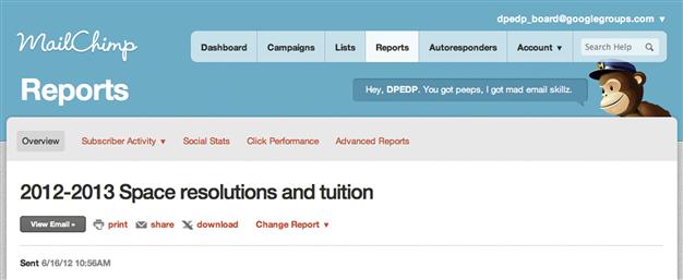
Successful personalities are imaginative. Think of the MailChimp email campaign application (Figure 3.28). MailChimp wasn’t designed based purely on fact; it was summoned from an understanding that people creating email campaigns are probably in a cubicle, may create email campaigns frequently, and would probably like a little levity in an otherwise tedious task. The interface’s design isn’t too different from others that enable management and reporting. However, the addition of the chimp, the playful logo, and messaging “transform[s] an otherwise mundane task into an experience that people look forward to, and sometimes even miss.”16
These characteristics have a big impact on the interface. The solution isn’t to add a mascot to your application; it’s to allow imagination into the design, and look for ways to let that imagination show through.
As a creative process, imagining needs to be free from criticism until it can be explored enough to be evaluated. This doesn’t mean that it takes months to define successful personalities; the design team shouldn’t be free from time constraints while everyone else codes late into the night. It does mean:
• Anyone can come up with possible characteristics of personality, as long as they’re aware of project goals and criteria.
• Some ideas will be more appropriate than others, but ideas informed by the criteria are worth exploring.
• Defining attributes for personality will be more successful if done openly, such as in a working session.
• Defining attributes for personality can and should be done as part of a schedule that applies to the overall project.
• Once ideas are recorded, formally or informally, they should be evaluated based on the criteria/requirements, and defended if needed based on rationale or the reasoned decision-making that led to them. While imagination and subjectivity are part of defining personality, a personality still needs the underpinning of a plausible rationale.
• Iterating is designing; explore more than one direction. Designing involves having an informed idea, trying it out with some kind of sketch, evaluating it for relevance to the criteria and overall emotional response (visceral reaction), and refining or trying again. Famous, seasoned designers such as Paul Rand and Paula Scher are known for admitting that hugely successful designs (the Traveler’s/Citibank logo,17 the UPS logo18) came to mind instantly after understanding the project criteria. Unless you’re that famous, and your interface that simple, you need to explore, sketch, and evaluate several ideas. Sketchboarding is a method of idea generation through structured sketching. Intended for user experience design, it’s a great way to involve the team in the design process for interface design as well.19
• You can qualify aesthetic characteristics, appropriateness, and “likability.” Results will be more accurate if you test designs with participants who are truly representative of your user base. (See our discussion of test methods earlier in this chapter.)
• Client and stakeholders’ personal opinions matter, and need to be acknowledged and understood. Always show a design that includes client and/or stakeholders’ personal opinions, if they expressed them clearly and voluntarily. Only when you’ve explored their ideas can you gently explain (relying on your sound rationale) why they aren’t appropriate, while showing what you believe is a better solution.
• Even a good rationale isn’t bulletproof. It’s a shield that deflects and protects with rationality and sensitivity.
Avoid common mistakes
A little personality applied consistently is better than designing some sections or aspects of an application and not others. Designing an appealing application and treating a “help” section or messaging with little or no attention to design undermines personality.
Consider these questions while evaluating your designs:
• Does your intended audience consider the interface approachable? Does the interface look organized? Is it represented in a way that it feels familiar to the audience?
• Does visual design distract or get in the way of the application fulfilling its role?
• Do people know what application they are using? Can they differentiate the interface from competitor products?
• Does the interface design help users know where to start? Do they have an accurate understanding of what they can do on the screens?
• Have you applied design characteristics consistently to all areas of the application?
Make informed decisions
• Do the visual characteristics appeal to your audience?
• Does the interface represent only what’s necessary for the application to perform its role successfully for users, with the addition of small elements that convey delight and/or meaning, without distractions?
• Do the visual characteristics still work if content, navigation, or features are added?
• Do the visual characteristics relate to other applications or communications that represent the organization in some way?
• Can the visual characteristics be adopted by new templates?
• If necessary, can your personality accommodate third-party customizations such as additional logos, colors, or type changes?
• Do the attributes that convey personality work across platforms and devices?
• Can the attributes that convey personality be easily changed if necessary, such as adding another color for a new section of the application? Are personality attributes maintainable? (For example, cropping round photos requires photo editing software the maintenance team may not know or have time to learn; changing out square or rectangular photos requires little to no special expertise.)
• Are the attributes that convey personality extendable to a sibling application?
Elevate the ordinary
• Does the personality add to the meaning of the application in a clever, surprising, or playful way, such as in Figure 3.29?

Figure 3.29 Icons used in a version of the Noom Weight Loss application, which was only available for Android, playfully used the Android character.
• Do users feel personally connected to the personality?
1Rand, P. (1991). Interview [video file]. Retrieved from http://www.youtube.com/watch?v=Ta4ef1xBeMA.
2Norman, D. A. Emotional Design: Why We Love (or Hate) Everyday Things, pp. 38–39.
3Beyer, H., and Holtzblatt, K. Contextual Design: Defining Customer-Centered Systems (Interactive Technologies).
4Tractinsky, N., and Lavie, T. (2004). Assessing dimensions of perceived visual aesthetics of web sites. International Journal of Human-Computer Studies 60, 269–298.
5Tractinsky, N. Aesthetic and Apparent Usability: Empirically Assessing Cultural and Methodological Issues. CHI 97 Proceedings, Atlanta, 1997, pp. 115–123.
6Honan, M. (2009, Aug. 24). Extreme Makeover: Craigslist Edition. WIRED. Retrieved July 9, 2012, from http://www.wired.com/entertainment/theweb/magazine/17-09/ff_craigslist_makeover/; LeFebvre, R. (2012, July 12). Enjoy a Better User Experience with Craigslist for iPhone and iPad. Cult of Mac. Retrieved July 24, 2012, from http://www.cultofmac.com/178770/enjoy-a-better-user-experience-with-craigslist-for-iphone-and-ipad/.
7Honan, M. (2009, Aug. 24). Extreme Makeover: Craigslist Edition. WIRED. Retrieved July 9, 2012, from http://www.wired.com/entertainment/theweb/magazine/17-09/ff_craigslist_makeover/.
8Conaboy, C. (2012, Feb. 13). Cyber Tools Foster Fitness. The Boston Globe. Retrieved July 10, 2012, from http://articles.boston.com/2012-02-13/arts/31052298_1_track-fitness-application; NDL/FNIC Food Composition Database. (2011, Dec. 7). Retrieved July 20, 2012, from http://ndb.nal.usda.gov/.
9Cooper, A., Reimann, R and Cronin, D., (2007) About Face 3: The Essentials of Interaction Design, p. 21.
10Norman, D. (2004, November 16). Ad-Hoc Personas & Empathetic Focus. Don Norman’s jnd.org website / human-centered design. Retrieved February 18, 2013, from http://www.jnd.org/dn.mss/adhoc_personas_em.html
11Image collages that show the feeling that a design could convey are called “feely boards” or “mood boards.” They are most commonly used to define visual characteristics for highly expressive brands, nondigital products, clothing lines, and interior decor, and apply to any type of design.
12Luke Wroblewski’s book Mobile First goes into more detail about the advantages of this strategy. Wroblewski, L. (2011). Mobile first. New York: A Book Apart.
13SuperTracker Backgrounder (2011, Dec.). ChooseMyPlate.gov. Retrieved July 23, 2012, from http://www.choosemyplate.gov/newsroom/ST/SuperTrackerBackgrounder.pdf.
14Many sets of usability heuristics exist. Jakob Nielsen’s list is one of the most well-known, and is available at http://www.useit.com/papers/heuristic/heuristic_list.html.
15Mullet, K., and Sano, D. Designing Visual Interfaces, p. 215.
16Walter, A. (2010, Apr. 23). Emotional Interface Design: The Gateway to Passionate Users. Think Vitamin. Retrieved July 23, 2012, from http://thinkvitamin.com/design/emotional-interface-design-the-gateway-to-passionate-users/.
17Curtis, H. Artist Series: Paula Scher. Retrieved from http://hillmancurtis.com/artist-series/paula-scher/.
18From Tania Schlatter’s discussions as a student with Paul Rand in Brissago, Switzerland, 1991.
19Schauer, B. (2007, Dec. 14). Sketchboards: Discover Better + Faster UX Solutions. Adaptive Path website. Retrieved July 27, 2012, from http://www.adaptivepath.com/ideas/sketchboards-discover-better-faster-ux-solutions.