
Layout
Our exploration of the visual usability tools begins with layout: positioning elements in a structure that people understand, and making decisions about and defining templates for what should appear onscreen. Creating layouts based on a rationale that accounts for use, behavior, and aesthetics sets the stage for screens to communicate in a helpful, appealing way, and is covered in detail in the case study later in this chapter.
The meta-principles of consistency, hierarchy, and personality affect layout, and layout in turn informs them. Successful layouts support and reinforce the meta-principles through consistent visual hierarchies that help people know where to look and when, and arrangements that communicate the application’s personality no matter what device someone is using. Unsuccessful layouts undermine the meta-principles with guessing games about where to locate information, what information is important, and what’s related in a way that runs counter to the purpose and chosen personality, ultimately sending confusing messages.
The language of layout
Basic terminology for layout—words such as alignment, proximity, grid, scale, and white space—are used in aesthetic criticism and design discourse across mediums. To these we add terms specifically for designing for screens: screen size and templates, and subterms like responsive.
Screen size
Knowing the screen sizes and behavior you are designing for (e.g., if screens rotate and need to support more than one format) is the first step in layout. The screen provides a frame in which to present content and interface elements, but relationships between elements and the frame, and elements to each other, need to be considered in all screen sizes individually (Figure 4.1). Application interface design almost always involves modules, not discrete pages. Instead of considering a layout as something completely static, consider it as a thoughtful, changeable placement of modules that matches how users expect to interact with an application and delivery platform.

Core layout principles apply no matter the screen size. The important thing is to integrate these principles with an understanding of how screen elements relate to one another, so that your layouts flex intelligently if they need to do so.
Position
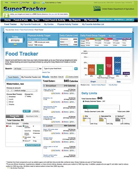
Consider Figure 4.2 from the USDA’s SuperTracker food- and exercise-tracking tool. The dots introduced in Chapter 2 illustrate the principles of positioning elements, showing how whenever there are one or more elements in a space, visual relationships between elements are created. Layout involves positioning elements to form perceptible, useful relationships. A key part is analyzing the content elements you have to work with, and thinking about how they help each other make sense.

Four SuperTracker features at the top of the screen—Day, Physical Activity Target, Daily Calorie Limit, and Daily Food Group Targets—provide a snapshot of status at a glance. They’re all positioned in a row and treated with a blue background, so we interpret their placement and treatment to indicate they’re related. Lower on the screen, position and grouping are less clear. There’s so little space between the Food Details tab, the My Favorite Foods List, and the Meals head text that it’s hard to know which of these items (if any) the Meals head relates to. In this crowded part of the screen, alignment and proximity aren’t enough to tell us what goes with what.
Balancing the relationships created by positioning elements on a screen is a puzzle. When one element is moved to solve a problem, it can create another. For example, if the Meals head were moved up to separate it from the Food Details and My Favorite Foods List tabs, it might appear to be floating, and it wouldn’t be clear what elements, if any, it related to. To create a successful layout, you’ll need to try different arrangements of elements and analyze them critically in terms of the relationships created between elements. Do they support the personas of use and feature flows? Often, there’s more than one possible arrangement. Testing layouts that meet requirements can help you choose the layout that works best for users.
White space
White space is a place for the eye to rest in a screen. The term refers to empty areas, whether spaces between columns, around elements, or bordering the screen itself. (Space surrounding the main body of the page is its margin, while spaces between columns or elements are sometimes referred to as gutters as well as margins.) White space need not be white; it merely needs to be blank, to provide resting space before moving on to the next item.
The concept of visual resting space may sound abstract, but it’s vital to creating designs that feel comfortable and pleasant to use. A characteristic of white space is that it helps screens look approachable. Part of the problem in Figure 4.2 is a lack of white space to help tell us what other elements the Meals head belongs with. Let’s take another look in Figure 4.3.
Although there are a few empty areas, most of the screen is taken up with small, densely packed type; form widgets and editing tools; and progress charts. With so much going on, and inconsistent visual hierarchy to help distinguish what’s most crucial, the layout makes what can already be an anxiety-provoking task—tracking one’s food intake in the hope of losing weight—more fraught, because there’s too much information presented to parse at once. Careful use of white space, which we’ll add as part of our sample redesign of this application, will make this screen more inviting.
The paradox of white space is that blank areas emphasize busy areas. White space between elements provides a place for the eye to rest, and draws the eye to elements isolated by the most white space. The more white space, the more attention is drawn.
The classic Google home page is a great example of using white space to draw the eye and create an appealing screen (Figure 4.4). For several years after Google’s launch, clients cited its home page as a design they loved, but it’s not appropriate for every application to have so much white space. For example, the SuperTracker screen has many central features. The fewer elements on a screen, the more expressive white space can be, but the more elements you add, the more “work” white space has to help people know what they can do and how to do it. The trick to creating dense but appealing screens is to use white space to create clear groups and establish hierarchy so that screens look approachable.
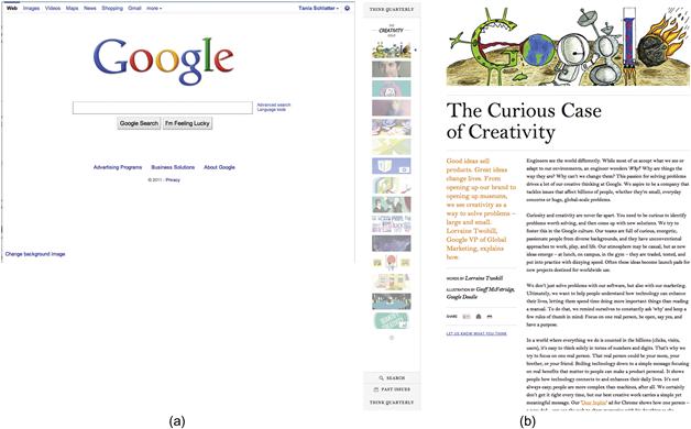
Figure 4.4 (a) The classic Google home page uses lots of white space to create an approachable design and draw the eye to a specific element. (b) Google’s publication Think Quarterly also has few elements, and uses white space and grouping for an inviting look.
Margins
Margins are a type of white space between the edges of a container and the elements within that container. They can make the difference between a comfortable layout and a crowded one (Figure 4.5). Margins aren’t just the space around the edge of a screen; anytime an element contains smaller elements, there need to be margins separating the child elements from their parent, as well as from each other.

Figure 4.5  Comfortable, deliberate positioning and use of blank space help clarify relationships and make screens approachable. Margins are too tight to the frame edges (top left), making the screen feel cramped. Margins are too tight and the gap between widget columns is too wide (top right), which feels unbalanced. Margins are comfortable and positions create clear groups in the bottom illustrations.
Determining how much space should be used for margins is part of the layout process, usually done as a refinement after determining general placement of elements. When multiple elements serve as containers on a screen, the margins for each container should be consistent.
Proximity, scale, and alignment
Proximity, scale, and alignment are the principles that cause the eye to interpret SuperTracker’s closely positioned mini-dashboard elements as related. They’re also the principles that cause confusion about what text the Meals head refers to. If shape, color, and size are the same, visual relationships are affected by proximity—how close elements are to one another.
Proximity
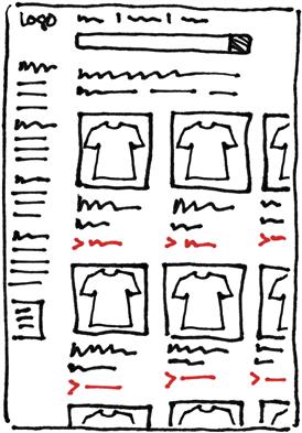
Imagine you have multiple product images presented in a grid on a screen. Each product has a photo, title, brief description, and a small “Buy” button or link to more information (Figure 4.6). It’s crucial to position the button clearly as part of the group of elements that it belongs with. In this type of situation, it’s easy to make the mistake of not providing enough space between groups of elements, but when a group isn’t defined clearly enough, it’s hard to determine which product the button goes with.
Scale
Scale—or the relative size of elements—is directly related to visual weight and the interpretation of importance. When elements are the same size, they can look related. When using scale to indicate importance and define hierarchy, size differences need to be clear, but not so different as to overpower.
Alignment
Alignment is another way to make a layout appear organized. In the SuperTracker example (Figure 4.3), the four mini-dashboard features are aligned with one another near the top of the screen. Each feature consists of several elements, all of which are also aligned to arrange information and expose its relationships. (This alignment isn’t always successful; for example, the day of the week feature title, “Thursday,” should be positioned the same way as other text heads to more clearly show it is part of the group.)
In typographers’ practice, type is typically aligned by its baseline—the invisible base the letters rest on (see Chapter 5 for details). Nontype elements may be aligned based on their center, top, or bottom. All elements may also be aligned flush left, or left-aligned; centered; or flush right, or right-aligned (Figure 4.7). The key to using alignment successfully is to pick an alignment that supports grouping and reduces visual activity and stick with it. When in doubt, align elements flush left for use in the Western world.

Grid
A grid is a set of invisible vertical and horizontal lines fixed at consistent intervals that provide a structure for layout. Grid lines supply a modular framework for placement, alignment, and the relative size of elements (Figure 4.8).
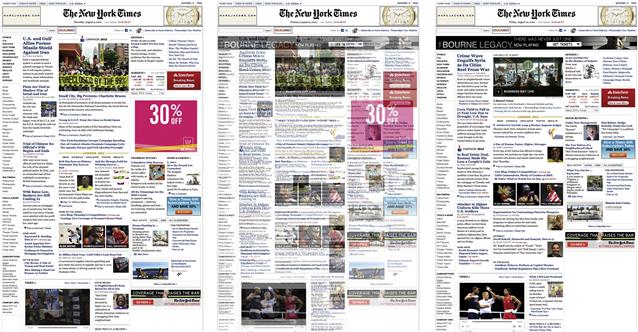
Figure 4.8 Overlaying two different days’ front pages of The New York Times’ online edition reveals evidence of the grid underpinning both layouts. The grid provides a structure that informs the placement and size of elements. Depending on the content and desired impact, image widths can run one, two, three, or more columns.
Grids are a powerful layout tool because they take some guesswork out of the design process. A grid defines rules for the width of margins, width of columns, the space between items, the size of image areas, and how everything aligns to guide the eye along specific paths on the page, as well as give the eye places to pause and rest.
The most common example of a grid in action is a newspaper, which is broken out into clear, vertical columns. Just as in newspapers, the way a grid is used in applications may vary from section to section. A paper’s local news section, meant to be businesslike and informative, may use narrower columns and pack in more content than its arts section, which may have fewer, wider columns and larger images. Ultimately, in print and onscreen, content in different sections should be based on the same grid even if its layout isn’t exactly the same.
Grids and alignment in practice
Designing a grid to support a particular layout is a project in itself.1 That effort is complicated by designing for a variety of screen sizes (Figures 4.9, 4.10, and 4.11). There are several CSS-based grid systems, such as Blueprint (http://blueprintcss.org) and 960.gs (http://960.gs), that provide designers and developers with starting points for layout. These systems often work with a large number of grid columns—from as few as 12 to as many as 24—to offer the most variety in size, placement, and alignment options. However, the risk of so many columns is that if not used judiciously along with a strong information hierarchy, you may end up with a densely packed layout that feels heavy and overwhelming despite its underlying structure.
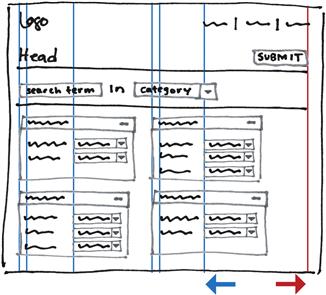
Figure 4.9 A simplified example of aligned placement on a large screen. Elements are aligned both flush left and right along the fewest possible lines. Mixing alignments works here because most elements are left-aligned, while the right-aligned items are in a different group that follows conventions for that type of content. Elements within containers should be aligned consistently, which makes the overall screen feel organized.
Figure 4.10 Yellow lines show baselines for consistent alignment. Text, buttons, and dialog boxes are all aligned to the base of the text. Red lines are “hang lines” for hanging elements down from a consistent point.
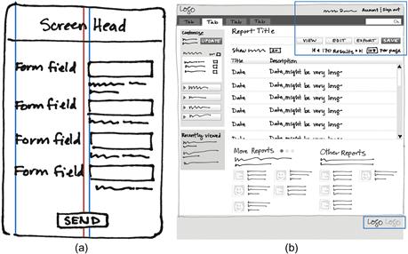
Figure 4.11 (a) A small screen with few elements may successfully use more than one type of alignment if hierarchy, groups, and structure are clear. Form elements are flush left to blue lines, and header and button elements are centered to the red line. (b) A larger screen with more elements requires more structure and consistency to look organized. Elements are flush left, with the exception of the few elements in blue boxes, which are of a different type and are flush right.
There are a variety of valid ways to approach layout. Simple applications, or those for small screens, may rely on margins rather than a grid to help define structure, as there aren’t enough positioning options for a grid to be useful. For large screens with many elements, designers create or select a grid based on known content. If starting from scratch, a designer may place elements without a grid, making decisions based on flow and what users expect, and refine alignment before design is finalized. A refined alignment places elements along the fewest number of horizontal and vertical lines, whether or not those lines are part of a formal grid.
If you have a lot of elements, the simplest way to create visual order is to align them flush left along the fewest number of vertical lines. Mixing alignment types, if necessary, works best aesthetically when areas with different alignment are set off from the main part of the screen, as in the mobile paradigm of separating the centered top text on its own background.
If an element needs unique treatment because it’s different from other items, it can be set apart by breaking either horizontal or vertical alignment, but in general, elements should not break from both. Other tools such as color can distinguish an aligned element from its neighbors.
If your layout looks messy, cleaning it up by aligning elements will make a big difference. Make sure to keep an eye on proximity and grouping so that hierarchy is still clear when refining alignment and using a grid.
Finally, designing with a grid is optional; how strictly you adhere to a grid depends on the situation at hand. However, designing using alignment is not optional for achieving visual usability. It’s a necessary part of creating an intentional, ordered layout.
Templates
Templates are sets of margins and placement rules that apply to particular types of content and features. Templates can be modular, incorporating elements that may appear only in certain circumstances, and may be based on a common grid (Figure 4.12).

Figure 4.12 This Threadless.com product template can display different product images and sets of sizes.
From a programming and consistency standpoint, templates are a boon. They enforce internal consistency—a content management system can only show content in its templates, which means that information will always be displayed the same way every time. From a designer’s perspective, templates can feel restrictive. They don’t allow for individually crafted designs that support specific content or one-off situations, and designers accustomed to fine-tuning every aspect of a handcrafted website may find themselves frustrated by template-driven systems. Nevertheless, there’s room for creativity in template design, as shown in Figure 4.18(b) later in the chapter.
Templates are defined by the similarities and differences between content elements that appear together. E-commerce offers a simple example: a retailer who sells everything from T-shirts to furniture to diamond jewelry may want to display each type of merchandise differently. If they can design one template flexible enough to show or hide content, their job will be easier.
Layout and the meta-principles
Layout and consistency
When considering how to lay out an application, you must address internal consistency—how the layout applies to all screens and widgets—as well as external consistency—how the layout of related or similar applications sets expectations for this one (Figure 4.13).

Figure 4.13 No screen stands alone. It must always be considered in context of the whole application, as well as related applications, to make informed decisions about what users expect.
Using templates ensures margins, headers, and navigation elements will be placed consistently on all screens that use the same template. When designing layout and defining templates, review the content and features that will be on all screens (or as many as possible) to find commonalities between different types of tabular data, content structure, and basic data elements, such as products for sale; these parallels allow you to begin creating a shared visual language for similar elements grounded in grids, margins, and use of white space. (See “Merging templates” later in this chapter for more about this.) Review other applications with similar features to see pluses and minuses of existing approaches, and review platform and application conventions as well. These exist to help people quickly grasp new and unfamiliar systems; don’t break from convention or expectation without a good reason.
Layout and hierarchy
Layout literally reinforces information hierarchy by creating an intentional order for reading information. Although this order changes slightly depending on the nature of the language (e.g., right-to-left versus left-to-right), the fundamental assumption that the most important content and features should stand out visually remains the same, and applies regardless of whether a layout changes across devices. The structure and rhythm of the screen influence hierarchy. Recall Figure 2.1, shown again here as Figure 4.14.

Figure 4.14 Because all four items on the left are of equal size and visual weight, the only cue to their relative importance is their perceived top-to-bottom, left-to-right order. On the right, the single large item to the left of the two smaller ones clearly indicates its priority. The contrast in size, combined with the larger element’s positioning, confirms its place in the hierarchy.
Layout and personality
Layout reinforces an application’s personality, and an application’s personality should harmonize with its purpose. White space supports websites and applications that want to be perceived as open and friendly. Layouts with many small, carefully arranged product images can promote the idea that an e-commerce website offers more merchandise than anyone else. A staid, simple design that adheres tightly to a grid can reinforce the sense that an application is the place for people to get work done, not to play.
Layout also helps personalities retain their core qualities across platforms. Compare the JetBlue application we reviewed in Chapter 1 to the JetBlue website shown in Figure 4.15. Both rely on a boxy design that literally exposes the underlying grid to chunk navigation and key functional elements, but the extensive use of white space, even between icons and their labels, makes both screens feel open and inviting. The primary difference between the two is navigation placement—in iOS, it’s near the bottom for quick access with a thumb, while on the website, it’s in a traditionally prominent location at the top.
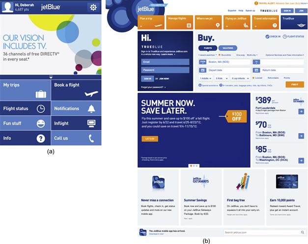
Highly similar positioning reinforces JetBlue’s personality on the “book a flight” tools on both iOS and jetblue.com (Figure 4.16). With minor exceptions, such as the different main header treatments, these could be the same screens. Widget placement is virtually the same across platforms, and the most obvious change—the form field icon shifts from left on the web to right on iOS—could exist to improve ease of use on mobile devices regardless of whether users are right- or left-handed. There’s less white space in the iOS application due to the need to maximize limited screen space, but generously sized form fields are friendly and welcoming.
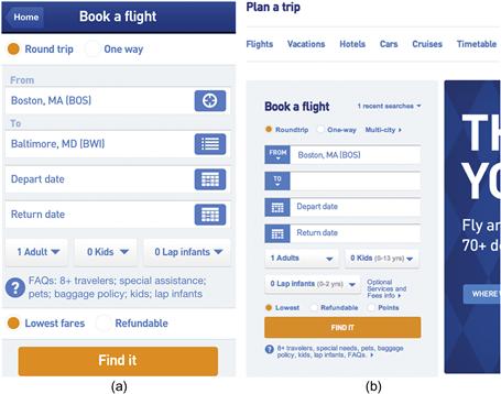
Figure 4.16 (a) The JetBlue iOS application’s flight booking tool. (b) The same tool on jetblue.com.
Case Study
Creating a layout—defining a rationale for placement
With the size of the screens being designed for in mind, and sample or actual content that needs to be presented, layout for screens begins with filtering the content, feature set, and flows through the audience’s perspective, situations of use, and expected behaviors, and grouping things so that like goes with like.
When redesigning SuperTracker’s food-tracking screen, we started with the mobile phone layout, but planned for web and tablet versions as well. We had content from the existing web application. The personas from Chapter 3 helped us think about the audience, and we used SuperTracker and other food-tracking applications for several weeks to experience them directly.
We started defining the mobile layout by asking ourselves:
• What’s the number-one feature in the application? What feature do people use more than any other? Knowing the primary reasons why people use the application allows you to make rational assumptions about necessary template types.
• What screens or widgets support the primary action(s), such as the ability to view and edit details? Because a mobile phone screen is so small, we knew we’d have to break apart features that were on a single screen in the web application, decide where to put them, and figure out how many screens we needed to support those key features.
• What’s the primary sequence of use? Secondary? Priority and sequence help dictate hierarchy, which informs the order and placement of objects on the screen.
• How does the technology affect the interface? What are the screen sizes? Are there any parts of the screen that need to be used in a particular way? Are there any widgets device manufacturers require us to use? What are the pros and cons of custom widgets versus platform-defined ones? Every device has its own interface control conventions, and those conventions—or uniquely designed ones—affect an application’s personality. Refer to each device OS developer’s guidelines for layout, navigation, and control conventions.
• How do other applications in this space approach the layout? Where was there room for improvement? We surveyed and used similar applications to get a sense of conventions for logging food and tracking exercise, and found that they were more concerned with collecting the gist of users’ food consumption and activity. Because these applications’ features were less detailed, they had simpler interfaces, meaning one challenge for SuperTracker’s redesign was to make food logging as easy as its competitors did.
• How can the layout of the original application inform design of a mobile version? Our analysis of SuperTracker’s layout, as well as our use of the application itself, helped us see relationships between elements that we wanted to keep, and opportunities for improvement.
• Are there any layout implications from related communications? We considered how SuperTracker is related to other MyPlate initiatives. The MyPlate icon has graphic standards, including a color palette and usage rules, but there are no other applications that are part of the MyPlate program. Had there been, we might have needed to use their navigation structure and the same basic template, or at least the same header, footer, and navigation location.
Feature and data considerations
SuperTracker’s most useful features relate to food and activity tracking. They’re also the most complex in terms of number of elements, functionality, and interaction. When beginning a new layout, we like to start with the most complicated set of features. Starting from the hardest point not only gives us a sense of how dense the application’s information hierarchy might be, it allows us to create conventions for managing as much of that hierarchy as possible, from different header levels to alert messages. Layout conventions established on the most complicated screen are likely to work on simpler screens as well.
Whenever possible, we work with sample data for the application, which helps determine overall content density and establish line lengths. We sometimes fill a table with lorem ipsum text, but don’t finalize the design unless we have sample text. If the real data comes in and is much, much longer, table columns may no longer be wide enough to accommodate reality.
Conversely, any application that displays results is going to have situations in which much less data is shown, or none at all. When working through initial worst-case scenario layouts, we try them with half the data to make sure layout conventions still hold, and then with no data. The layout must work in all circumstances; if not, it’s literally time to go back to the drawing board.
Mapping features to screens and layout
Our initial black-and-white layout for the mobile application’s food-tracking screen focused on the most common task of entering foods and editing and deleting entries (Figure 4.17). We knew we couldn’t show all the charts or the food and nutrition details on the same screen as the list of foods eaten; the screen was too small. So how would users get to those features?
• We mapped the web application’s navigation to a few functional areas, and used standard mobile navigation controls for access to those sections of the application on the bottom of the screen.
• We made search prominent, but placed it so it would not obscure daily status; this way, users could quickly see their status while making a decision about what to eat.
• A standard toggle control provided access to daily status charts that didn’t fit on the screen. Placing the toggle directly under the primary chart reinforced their relationship.
• Rather than replicate the four mini-dashboard features—Day, Physical Activity Target, Daily Calorie Limit, and Daily Food Group Limits—we decided that daily activity status could go in the activity section of the application, and that this screen could focus just on food.
• Since selecting a food from a list of favorites is related to finding a food, we provided favorites list access with the search feature.
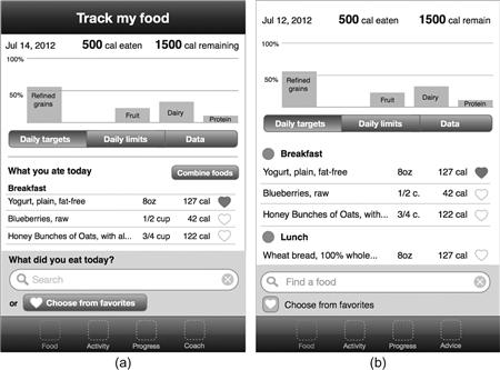
Figure 4.17 (a) After placing elements based on conventions, personas, and what our use had shown was important, we looked for elements that were redundant, unnecessary, or had too much or too little visual prominence, as well as opportunities to emphasize or express personality. (b) We then refined the layout.
After placing elements for the flow of adding a food, we took a critical look to determine whether all elements were necessary, whether their visual weight generally reflected their importance, and whether there were any opportunities to add personality. Based on our analysis, we made the following changes:
• Deleted the screen header, which felt redundant with the screen content.
• Reduced the prominence of the “combine foods” and “choose from favorites” features.
• Added icons to the meal categories to begin introducing personality.
• Removed text prompts reading “What you ate today” and “What did you eat today?”
See Figures 4.17b, 4.18, and 4.19 as examples of changes made.

Figure 4.18 Finding a food requires a different layout from food tracking. (a) Our first layout focused on mapping the food-selection interface to mobile platform conventions. Even though mobile users are accustomed to sequences involving several screens, we wanted to see if we could elevate the ordinary by streamlining data entry and making it more appealing. (b) Our second layout presents controls for entering food details and quantity on a single screen. The controls use icons, represented by circles, for selecting some details.

From screens to templates
To define the food-tracking screen as a template—a structure that could work for similar features, such as tracking activity—we assessed user goals and decided which data was most important to communicate at any given time. Having a live application helped, as it showed where overlaps existed within data types. (Without an application to work from, we would have sketched a few screens with similar content types.) We also considered business, design, and technical requirements, and factored those into our template exploration.
Even though we’d focused on redesigning just one screen of the web application—the food-tracking screen—we still had to consider how its features and flows played out across platforms. We started with a handheld mobile device in portrait mode, the smallest, narrowest screen available, and determined we’d need at least three templates: one for status and food consumed, one to enter foods, and one for nutritional details. Mobile conventions supported the idea of multiple screens to perform a single task, providing the screens flowed logically. In landscape mode, our screen could just get a little wider.
On tablets (Figure 4.20) and on the web (Figure 4.21) in landscape mode, we had far more real estate for our layout. A single template for food detail input and editing would likely be sufficient. But a tablet in portrait mode has less horizontal space available, and a responsive design should optimize itself for a screen’s aspect ratio, implying we’d need a modified version of the template in this circumstance. Again, device usage and conventions were factored into feature priority: with viewing charts slightly less important than food tracking, charts could be shown on demand.

Figure 4.20 Two options for the SuperTracker iPad application when vertically oriented. A sliding tab or popover could display charts on demand. The “Find a food” search bar could have remained on the bottom of the screen as in the mobile phone layout, but we decided to move it up so that the tablet layout would be more consistent with the web version.
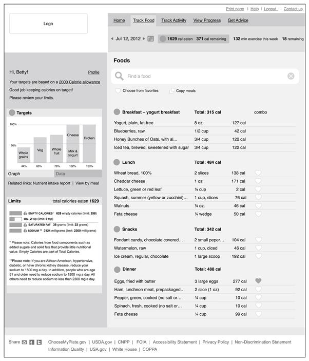
Figure 4.21 With so much real estate, the web version needed structure to organize the space. Background shading defined groups of elements. The food log and search tool got the most space, giving them primary emphasis. Daily targets and limits were placed on the left rather than the right to give them more priority.
Merging templates
From a technical perspective, the fewer the number of templates, the faster it is to develop your application, and the easier it is to maintain. However, using the same template for everything might force false relationships. A SuperTracker template that supports the complex food- and fitness-tracking data might not also work for screens where users enter weight and fitness goals or read advice on nutrition and meal planning.
Given how different data can be, how do you minimize the number of templates you need? Consider that some things that feel different on the surface may in fact share enough characteristics to use similar templates or elements.
In our initial review of SuperTracker’s food-tracking screen, we evaluated whether it made sense to continue to use the same template for tracking food and activity as the web version does (Figure 4.22). The two primary data elements in our revised SuperTracker are food and exercise, each of which needs to display different detailed information: nutritional and calorie information for food items, and calories burned for exercise. At a high level, food and exercise share no other characteristics. However, the process of learning more about what types of foods and exercise will most effectively help people meet their personal diet and weight-loss goals can be slow and tedious, so anything that helps an audience quickly grasp complex information improves the application experience. To meet in the middle, we examined the data to see what basic characteristics our food and exercise detail screens might share:
| Food | Exercise | |
| Calories ingested | Y | N |
| Calories burned | N | Y |
| Nutritional information | Y | N |
| Related items—similar foods/exercises | Y | Y |
| Imagery (photo, illustration, icon, etc.) | Y | Y |
| User interacts with screen at least once per day | Y | Y |
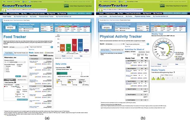
Figure 4.22 When defining templates, we compared the content and features of the food-tracking screen (a) with the activity-tracking screen (b), and determined they were similar enough to share a template.
Looking at the content and thinking about the context of use, we decided that a modular template design that planned for the most complex data scenario—that is, food—could serve for exercise as well, using similar layout styles and screen widgets to display only the relevant information. Food or exercise name, calories ingested or burned, and any incidental content, such as nutritional information or other exercises, could be displayed in exactly the same way, despite not being the exact same content; the food screen would merely show a little more information than the exercise one. Picking the worst-case scenario to start with allows you to gracefully trim content and elements unnecessary in less complex personas. Working the other way around ultimately leads to shoehorning content and features into a layout that doesn’t necessarily support it.
One big bite, or a few little ones?
Different application flows require different numbers of screens depending on audience expectations and system conventions. An application geared toward at-a-glance overviews of system status, such as website analytics, needs a dashboard where the audience can see a high-level overview of a lot of data in a single location, only drilling down when they need fine details. This audience may not care how much they have to scroll to view content, as long as that single screen displays the information they consider most relevant. By contrast, shoppers on an e-commerce application may browse multiple pathways before they find what they want to purchase, and moving them from high-level category screens to low-level detail ones allows them to continually refine their choices until they’ve narrowed in on the perfect pair of shoes.
The maturity of the Internet, as well as the trend toward “mobile-first” design, has chipped away at older conventions about never making users scroll. After more than 20 years of web use, people are accustomed to scrolling,2 and mobile users expect to do it, if only because their smaller screen size relative to desktop and laptop monitors means scrolling is practically inevitable.
With scrolling now considered routine, the old, newspaper-based concept of “the fold”—the point at which the viewport ends, and the user must begin to scroll to see more—becomes less important. Although Jakob Nielsen’s eye-tracking research3 shows most people spend more time looking at items above the fold on a 1024 × 768 screen, people still viewed content below the fold, skipping around to find other items that attracted them. This indicates that while it’s still necessary to put the most important information at the top of a screen—as one would expect in a solid hierarchy—users will scroll to find out more. Incorporating design elements to suggest there’s more to view lower down (or horizontally), such as images designed to cut off midway at likely screen breakpoints, helps encourage exploration (Figure 4.23).

Figure 4.23 The Netflix application shows partial images at the right and bottom of the screen to encourage horizontal and vertical scrolling.
If everyone knows how to scroll, why bother chunking out functionality onto multiple screens? The answer is that application flows should match audience expectations and patterns of use, and there’s literally no one-size-fits-all solution. Creating lightweight digital or paper prototypes and testing with representative users can provide invaluable information about how people expect to interact with what you’re designing.
Platform and technical considerations also come into play. For example, Apple recommends minimizing iPad screen transitions because they reduce “visual stability.” Desktop and laptop users would never expect their entire screen to flip over or move on a regular basis; such motion would be distracting, and the same principle applies to an iPad screen. To help designers and developers work within the constraints of this principle, Apple provides UI elements, such as split-pane views and popovers, to minimize the need for screen refreshes.
From a purely technical perspective, applications searching large databases of information may have resource and performance limitations based on how quickly data can be accessed and delivered, which can influence whether search results appear onscreen after a refresh or on a separate screen, as well as how pagination works. Balancing your audience’s needs against what’s possible and desired on the delivery platforms can be tricky, but is a necessary part of the design process.
Even after you’ve determined how many screens you need, you may still find you have to fit a lot of information on a single screen, not all of which may be immediately relevant to your users. This is where the user interface principle of progressive disclosure comes into play—displaying information on demand, as people need or want to view it, as opposed to simply displaying it all the time (Figures 4.24 and 4.25). Tabs, accordions, panels, and other user interface widgets that allow content to be shown as necessary support information hierarchy; hidden content is automatically a lower priority than content shown by default.

Avoid common mistakes
Too much information on a single screen
This mistake is closely related to lack of hierarchy, because it happens when people fail to prioritize content and features. To avoid it, ask yourself these questions:
• What are the primary tasks users must perform on this screen?
• Have you displayed only the information users need to perform those tasks?
• Have you provided cues that support next steps without distracting from the task at hand?
Arbitrary alignment
While you don’t have to use a grid to design your application, providing consistent margins, placement, and alignment across screens creates a sense of order and balance.
• Have you created conventions for how items are placed and aligned on the screen relative to each other?
• Are you using similar positioning and proportions for similar elements?
• If breaking horizontal or vertical alignment conventions, are you breaking only one at a time, and only for elements that need differentiation?
Arbitrary grouping
Just as putting too much content on the page confuses your audience, so does scattering related items far from one another.
Make informed decisions
Clear hierarchy
“Everything is important” is not a design rationale. An information hierarchy provides needed guidance to help people know where to look, what to do, and when to do it.
• Have you prioritized your user personas or stories so you know when to provide different types of information?
• Are the most important elements on the page placed near the top of the screen (or locked to the bottom, if on a handheld mobile device)? Are there other ways you could use positioning and contrast to draw attention to what’s important?
• Can you minimize the prominence of less important information through progressive disclosure, displaying content and features only when needed?
Design for flexibility
A flexible template structure allows you to add more features more quickly in the future or adapt existing templates to accommodate features and information you didn’t expect. If you’ve accounted for the most complicated situations, your design is more likely to be able to accommodate anything new that’s thrown at it.
• Have you designed for the worst-case personas?
• Are your templates modular, with elements that can be added or removed as necessary?
• For screens that return data to the users, how does the layout look when there’s a lot of information returned? Only some information? None at all?
• How does your application look and behave when viewed on different screen sizes, resolutions, and devices, or at different orientations?
• Does your application need to follow different conventions across platforms or shift layout with viewport size?
Elevate the ordinary
Grids can go beyond mere organization to convey personality. If appropriate, consider how exposing parts of your layout’s underlying structure could enhance an application’s personality and an audience’s engagement (Figure 4.26).
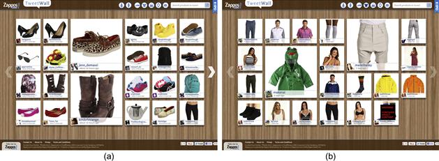
Figure 4.26 Zappos’ TweetWall provides a real-time glimpse of products people are tweeting about, randomly choosing some products to feature in larger spaces in the grid. The overall effect promotes the “thrill of the hunt”—of serendipitously finding the perfect pair of boots or frog raincoat—while simultaneously exposing what products Zappos’ customers find trendy and appealing.
Also, look for opportunities to go beyond the standard patterns and conventions that apply to controls and information display. The SuperTracker wireframes in Figures 4.18(a) and (b) demonstrate one way to push past device conventions into something equally usable that expresses a little personality.
1For more on designing and working with grid systems, see Khoi Vinh’s Ordering Disorder: Grid Principles for Web Design.
2Nielsen, J. (2010, Mar. 22). Scrolling and Attention. Jakob Nielsen’s Alertbox. Retrieved July 17, 2012, from http://www.useit.com/alertbox/scrolling-attention.html.
3Nielsen, J. (2010, Mar. 22). Scrolling and Attention. Jakob Nielsen’s Alertbox. Retrieved July 17, 2012, from http://www.useit.com/alertbox/scrolling-attention.html.