
Hierarchy
“Hierarchical organization is the simplest structure for visualizing and understanding complexity.”
—W. Lidwell, K. Holden, J. Butler, Universal Principles of Design, p. 104
Visual hierarchy is the perception and interpretation of the relative importance of objects. In application design, these objects are elements presented on a screen. After consistency, visual hierarchy is the biggest factor we see in creating effective application interfaces.
Perception of hierarchy is affected by position, size, color, interface control type (e.g., a button versus a link), and treatment of elements. It is also affected by the way individual elements and groups of elements relate to each other. Regardless of whether interface elements are deliberately “designed,” their characteristics and juxtapositions communicate information about their priority.
Hierarchy helps people know what to do, how to do it, and what to expect. A visual system based on hierarchy consists of decisions about where to place elements in an interface, what to place them with, how big to make them, what color they should be, and how to represent their behavior or interactivity based on each element’s relative importance. To increase the likelihood that the audience will interpret these decisions as intended, we need to apply them consistently, as discussed in Chapter 1.
Creating hierarchy is a balancing act, because it’s almost never the case that size, color, or placement are the only differences between objects on a screen. To create a visual hierarchy, you must develop a rationale for differentiation supported by an understanding of your audience, and then use that rationale to apply the visual usability tools effectively (Figure 2.1). The visual system that communicates hierarchy comprises the templates, images, characteristics, and rules for display, typically documented in a style guide. While most designers and developers are familiar with style guides, they’re often not aware of how important it is to incorporate hierarchy and rationale in the design process and documentation.

Figure 2.1 (a) Presenting and treating all elements equally misses an opportunity to help people focus on what’s most important. (b) Variation in relative size, placement, and treatment start to indicate a hierarchy.
What do we mean by hierarchy?
Before we go into how to create visual hierarchy, let’s look at its most basic aspects.
In practice, a lack of hierarchy exists when objects all attract the eye equally—that is, when nothing stands out more than any other thing. In concept, visual hierarchy is very similar to organizational hierarchy. It’s an order based on ranks defined as part of a system. Military organizations have a rank system, martial arts have a rank system, and traditional business organizations have a rank system. With the exception of business ranks, hierarchical systems usually have a corresponding visual system that signifies an individual’s status.

Figure 2.2 As with organizational structures in which one person or group is more important than others, rank is hierarchy’s key concept. In interface design, rank is expressed through size, color, position, and treatment.
In the military or martial arts, visual systems that indicate rank—colored belts or insignia—are meaningful for people with direct knowledge of the organization. For them, rank is the basis for all behaviors and interactions. Individuals within a rank system have roles and responsibilities based on where they stand in that system. Similarly, successful interface designs depend on a visual ranking system to help people using it identify the importance and role of the elements they interact with.
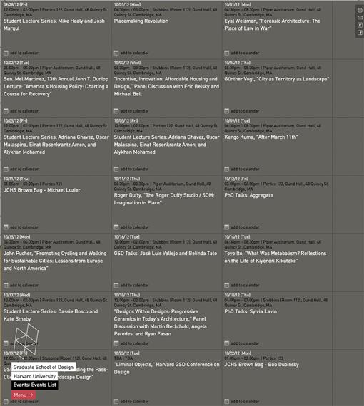
Figure 2.3  Unclear visual hierarchy. The reader must focus on and compare dates in more than one part of the screen to figure out the sequence in this dynamic display of events for Harvard University’s Graduate School of Design. An indication of order would greatly improve use, and could be an opportunity for expression.
For example, in a web-based application, type styles are usually controlled by CSS, a hierarchical system in which visual aspects of parent items “cascade” down to their children. CSS creates direct links between the hierarchy of text and interface elements and the code controlling their appearance and placement.
If you consider a table of contents, which has an inherent, implied hierarchy people are familiar with, applying CSS styles is pretty straightforward—the main table of contents headline is an H1, chapter titles might be list items, chapter subtitles might be sublist items in the main list, and so on (Figure 2.4a). As long as your visual treatments mirror that same hierarchy, you can be fairly confident your table of contents will be understood.
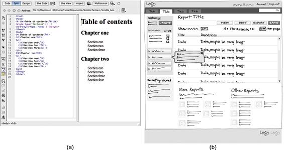
Figure 2.4 (a) Simple, hierarchical, text-based visual system and logical corresponding HTML tags. (b) Complex interface sketch with multiple levels of text and controls. There are too many element types and varying positions to apply a straightforward top-to-bottom system. Decisions about where things go and how they look should be based on a hierarchy that corresponds to what people need to do.
Hierarchy in complex application interfaces is seldom straightforward. Designers and developers manipulate the tools—layout, type, imagery, color, and controls—and their characteristics to express an application’s purpose and convey use. Making decisions about where an element should go, what elements it should appear with, and how it should appear is part of defining a strategic visual system. A sound hierarchy that accounts for user priorities helps people know where they are, what they can do, and where they can go next.
Characteristics of hierarchy
As with consistency, people interpret interfaces based on what they see and expect. The characteristics of what they see also affect interpretation. To represent a hierarchy, elements need to be presented so that more important things have more visual weight or prominence than less important things. Perceived visual weight is a key component of visual hierarchy—generally, something with more visual prominence, or weight, draws the eye, and is therefore seen as more important.
Contrast
Colin Ware says in his book Visual Thinking for Design, “If you want to make something easy to find, make it different from its surroundings….”1 Contrast is about creating visible differences between elements and is the essential ingredient in visual hierarchy. It is what makes something appear different from—and potentially more important than—other things. Contrast is created in many ways.
Position
There are several aspects of positioning elements on a screen that affect contrast and perception of hierarchy. Some of these—grouping, proximity, and similarity—are defined in gestalt psychology “laws” that apply to visual interpretation, and inform these examples.2
• Placement and proximity to frame: Basic principles about placement apply no matter what’s onscreen. Even the simplest possible placement, such as a dot in a frame (Figure 2.5), creates a relationship between the element and its background.
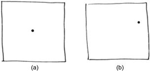
Figure 2.5 (a) Stable, static placement. (b) Unstable, active placement. The proximity of the dot to the frame affects its perceived importance.3 The stable dot in the center looks important; its position tells us the illustration is about the dot. The position of the dot in (b) is tentative: Is it coming or going? It doesn’t look as important as the centered dot. The illustration on the right is about the white space more than the dot.
• Placement and proximity of elements: Perception of hierarchy is affected by how close elements are to one another. Elements placed close together are seen as a group (Figure 2.6). If an element or group of elements is isolated from the others by having more space around it, the space will create contrast and draw the eye to the isolated element, giving it more visual prominence.

• Eye behavior: Tracking studies4 conducted on websites show that people look the most at the top left portion of a web page when reading. The “inverted pyramid” principle—presenting information in descending order of importance—supports the top location as more important as well (Figure 2.7).5
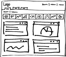
Figure 2.8 In a horizontal row of icons, all icons are seen as related if they’re rendered and presented the same way. Position can affect visibility, however. The first one or two icons on the left are likely to be seen more than others in the row.
• Nesting: Placing some elements within others makes the “parent” elements seem to exist at a higher, more important level (Figure 2.9).

• Overlap: Elements placed “on top of” other elements are more prominent. Lightboxes and popups are common examples of using overlap to draw the eye and create visual hierarchy (Figure 2.10).

Treatment
The visual style or treatment applied to elements affects their perceived importance through creation of contrast. Although Chapters 5–8 address this in more depth, following are four common ways it affects hierarchy:
• Size: Bigger elements, or large groups of elements, appear more important than similar smaller elements (Figure 2.11).

• Color: On a light background, darker elements have more visual weight than similar, lighter elements, and may be interpreted as more important. Warm colors, such as red, yellow, and orange, appear to come forward compared to blues and greens; thus, elements shown in warm colors may feel more prominent than similar cool-colored items. Finally, saturated, or purer colors, draw the eye more than dull ones.
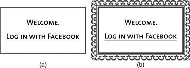
• Ornament: Think of a traditional wedding invitation: an ornate font is one cue that the invitation is special. An ornament is a type of decoration that can create contrast with plain elements and signal that something is important. Although ornament is typically used in marketing or advertising to differentiate and draw attention, it may also come into play in defining the personality of an application (Figure 2.12).
• Finish: Gradation, or the illusion of dimensional depth, is a common finish applied to buttons and bars. Finishes are textures that can be applied to interface elements. Visually complex elements draw the eye more than plain elements (Figure 2.13), increasing their perceived importance. While effective in drawing the eye, finishes can send the wrong message if the style is inappropriate for the content, such as a metallic effect in an application for processing patients. They can also be distracting if they’re too strong, and can incorrectly signal something is important when it isn’t. As such, they should be used sparingly (if at all), and only if they help communicate appropriately and successfully.
Figure 2.13 Which treatment should you choose, solid or gradation? The button with the gradation is more visually complex, and draws the eye compared to the plain button. This causes the button on the right to be perceived as more important. The answer is contextual, however, and depends on the other methods of contrast you’re using, as well as desired personality.
While treatments are effective ways to draw the eye, they should be used sparingly. When it comes to treatments, less really is more.
Interplay of characteristics
There are often several kinds of elements in complex, highly functional applications: buttons at one or more levels of importance, multiple levels and types of text, and form items like dropdown menus and text entry fields. When there are many options for what users can do on a screen, designers can’t simply manipulate one characteristic and make all the options clear. Providing one big red button doesn’t suffice when there are a half-dozen possible actions to click. While simple visual hierarchies can be established with one tool, such as text, and one characteristic, such as position, in complex interfaces, multiple characteristics need to be manipulated to communicate what the user can do.
When manipulating multiple characteristics, things get complicated fast. The simple dots in the frames in Figure 2.14 help show the effects of manipulating multiple variables, and the results on perceived importance.
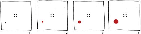
Figure 2.14 How much emphasis do we need to subvert a visual hierarchy? This illustration adds color and size to shift attention from the dots in the center in frame 1. In frame 2, the four dots still look more important than the red dot. In frame 3, the hierarchy isn’t clear. Only in frame 4 is the dot emphasized enough to look more important.
The dot and frame examples show how small differences affect perception of importance. When dissimilar elements, such as buttons, tables, dropdown menus, and icons, are presented together, it becomes more difficult to establish visual hierarchy. That’s why we first consider convention—what the user expects—and then manipulation of characteristics to establish hierarchy.
The elements presented in the Salesforce.com dashboard in Figure 2.15 are treated with some consistency—red rules and bold heads above content in equal columns. Not all content is of the same type; there are graphs, a gauge graphic, and lists.

Figure 2.15 Salesforce.com dashboard. Graphic treatments (gradation, illustrated gauge) and position appear to be used randomly, not to indicate what’s most important.
In this example, the shading behind the graphics draws the eye, but are those content items the most important? Should the number of users logged in be in the top left, the most prominent spot in the main content area? When there’s interplay between characteristics and conventions—for example, between treatment and position, or between position and expectation—presentation can work against meaning and understanding. Consider testing complex designs to determine if you’ve made valid assumptions about visual hierarchy, or if changes could help people make sense of your screens.
Defining a hierarchy
Regardless of your end product—e-commerce, productivity, mobile service application—the approach to establishing hierarchy is the same. Depending on the size of your team, you may need a formal process with documented decisions, or an informal one done in your head. Either way, decisions about hierarchy require a rationale that you can explain.
Identify the elements
After determining what conventions exist for your content and functionality, you’ll have an idea of what users expect and what paradigms to keep in mind. The next question to address is what most people need to do (or what an organization might want them to do), and the priority of those interactions; for example, “we want everyone to sign up or log in, but if they don’t want to, we at least want them to complete the checkout process.” This effort should be informed by user personas defined with as much knowledge of user behavior as possible.
List elements
List the screen elements you need based on the personas. An element is a unit of content or functionality. For a productivity application, your initial list might be something like this:
Number the items on the list from most to least important based on the use implied in the scenario. The scenario serves as your rationale for prioritizing. There can be more than one element with the same number, and they’ll need to be treated in a way that visually represents their equal importance. This prioritized list, along with knowledge of what users expect, serves as a starting point for defining visual hierarchy—making decisions about placement, size, color, and treatment that support use or flow for the devices you are designing for.
Flow
If you have an idea about what people need to do when—that is, a flow of steps—based on people’s goals and needs, you can make decisions about element characteristics and hierarchy. Understanding a scenario’s flow can help you place elements in a wireframe or directly into page code based on expected priority and sequence.
For example, imagine you’re redesigning an application that involves managing medical patient records. You know that users get requests to create a new record, or to delete, edit, or close an existing record. You also know that the most common task (about 85% of requests) is editing existing records. Users need to find a record before they can manage it. Between a search feature and a “Create New Record” button or feature, the search feature should be more visually prominent because it is used more frequently.
Next, you wonder if the “Create New Record” button should go in the global navigation at the top right or on the main screen with the search feature, but less prominent (Figure 2.16).

Figure 2.16 (a) “Create New Record” button in the main content area of the screen, versus (b) in the header area.
If you know that most users’ flow involves going to the global navigation when they’re between tasks, and that they expect to manage requests in the main part of the application, you can make an educated guess about placement: putting “Create New Record” near the search feature, but in a less prominent position, is a reasonable decision based on sound rationale, and is likely to hold up well. You can then evaluate your educated guesses by prototyping and testing your interface designs.
Patterns
UI patterns need to be taken into account when establishing hierarchy, as they may influence what users expect. Some UI patterns, such as a search feature, are integrated with hierarchy. Locating the search feature at either the top right (web application) or top center (e-commerce, mobile) is a placement-based pattern that implies hierarchy. In this pattern, content and features often appear below or nested under a search bar, implying that the search feature is important and applies to everything that falls below it.
Before applying patterns, evaluate if they apply both in terms of hierarchy and user expectations. For example, an infinite scroll, while expected in social media, might not work in the context of displaying text-based results. Depending on the scenario, users might want pagination instead of the ability to review all results. This is an example of how patterns and hierarchy can collide. Placing arrow and page number pagination controls above results, also a common pattern, may be more appropriate in terms of establishing a hierarchy based on what users need to do, as well as what is more expected in context.
Hierarchy at different application levels and across platforms
An application’s hierarchy often must be established at multiple levels: the overall application, individual screens, and screen-level widgets (Figure 2.17). Each of these areas may also have an additional layer of hierarchy based on active and inactive states.
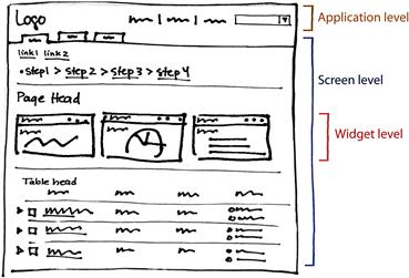
Figure 2.17 Visual hierarchy often needs to be established at different levels within a single screen of a highly functional application.
Building on the process of numbering screen elements, groups of elements need to be established and prioritized as well. After identifying as many elements as possible:
1. Define groups of elements based on level: application, screen, widget.
2. Define priority of the groups. Think about and evaluate conventions.
3. Define priority of the elements within the groups.
4. Place the groups in the screen frame based on these rankings.
The amount of design work necessary to define a visual hierarchy varies depending on the platform type. For example, if you’re designing for mobile phones, there may be fewer elements visible onscreen at the same time and fewer visual relationships to juggle. Navigation conventions dictated by the platform need to be evaluated and adopted or adapted, not created from scratch. However, because accomplishing a task may require several screens, there may be more work to do to define hierarchy in terms of getting the flow right, or the presentation order of features.
Prototyping and testing considerations
When establishing hierarchy, it’s important to move elements around and try different relationships. Whether you’re prototyping with software or sketching with a pencil, you’ll need to try different options to see which best support the goals.
When prototyping, stick to representing hierarchy with position and size, leaving all other characteristics undesigned. Simple black-and-white wireframes with a single, plain font used in varying weights are perfect for defining and evaluating content, functionality, and hierarchy. Begin by placing elements according to device conventions. Consider if and how conventions affect hierarchy, and if they conflict with your personas and flow. Try alternates and evaluate them. Interface designer Aaron Marcus said, “[S]ketches are logical abstractions of the form that indicate probable content elements, their approximate size, and their approximate location. At this stage, it is easier to manipulate broad differences in the form’s groupings and hierarchy. It is important not to be too precise or detailed early in the design process. It is more important to explore possible variations.”6
When your prototypes reflect the desired content, functionality, and hierarchy, it’s time to test them and iterate again. Assumptions you make about flow, patterns, positioning, and other characteristics need to be tested, even if they’re grounded in user observation and/or data. Testing can take many forms, from paper prototyping to releasing products and asking for feedback from users. Regardless of the method, no rationale is bulletproof. Expect to continually evolve your visual system to accommodate new information and change.
Avoid common mistakes
When it comes to hierarchy, you should think logically and critically about people, placement, and treatment of all elements.
Use contrast, including position and treatment, to define a strong hierarchy
• Present an obvious “lead” element or group of elements.
• Clearly represent active and inactive states.
• If your screen includes a lot of actions, present them in groups if possible. Place and treat the groups differently to help people know the groups are separate and which group is most important.
• Don’t overdifferentiate. Review Chapter 3, as well as the individual tools chapters, for more specific guidelines about designing to create personality and understanding without cluttering the screen and misleading users.
• Show people where they are in an application structure at all times.
Make informed decisions
• Use personas, prototypes, and testing to make decisions about what’s important based on data and known behavior, not assumptions.
• Review and analyze related applications to research conventions and patterns relevant for your situation.
• Avoid allowing the visual design of out-of-the-box patterns to dictate a confusing hierarchy.
• Apply what you know about your core user base to position elements to support their most common tasks and flows.
Elevate the ordinary
The best way to elevate the ordinary terms of hierarchy is to edit the features presented, which is easier said than done. Deep understanding of users, their behaviors, and their expectations is required to present just the right controls and affordances at the right time.
For example, in the product pages in Figure 2.18, if the system behind the application knew about the user’s preferences from past behavior, profile information, and what they’d viewed this session, fewer, more targeted options could be presented to the user. The fewer elements presented, the easier it is to define a clear and successful hierarchy.

 highlights the main product.
1Ware, C. Visual Thinking for Design, page 33.
2Gestalt psychology is a theory introduced in the first half of the 20th century that describes how people perceive visual objects. There are many sources for more about gestalt laws, one of which is Jeff Johnson’s Designing with the Mind in Mind.
3Hofmann, A. Graphic Design Manual: Principles and Practice, p. 13.
4Nielsen, J. (2006, April 17). F-Shaped Pattern for Reading Web Content, Alertbox. Retrieved from http://www.useit.com/alertbox/reading_pattern.html. Submitted date: November 19, 2012.
5Lidwell, W., Holden, K., & Butler, J. (2010). Universal Principles of Design. Beverly, MA: Rockport Publishers, p. 116.
6Marcus, A. Graphic Design for Electronic Documents and User Interfaces, p. 39.