
Chapter 10. Designing a - Portfolio Interface
Chapter 9 provided a conceptual framework for thinking about your interface and how it’s organized. This chapter is all about process—what you need to know to move from concept to implementation on a portfolio interface. What follows is critical if you’ve never made an interface before—or have only done so by the seat of your pants.
Process can sound boring, especially when you think you have a brilliant idea for the way your interface should look. In fact, a good, honest process can be the reason a brilliant idea remains sparkling when it’s finished. Without it, your interface can turn into an unattractive, haphazard, or frustrating experience.
Interface design is a specialized discipline that is still changing rapidly. Even seasoned graphic designers learn new skills and ways of thinking to master it. To build an exceptional interface, you must study user interaction, have a special talent for organizing data, and be a good visualizer. You must also know a lot about complex technology and adhere to many arcane rules so the largest possible audience can access your material.
Fortunately, your portfolio, having a very specific and limited purpose, requires a subset of interface design. You don’t have to know everything to create an interface that won’t frustrate your visitors or unknowingly cause you embarrassment.
The screen is not a book
One of the first things we learn about onscreen content is that each file or screen is a “page.” That sounds like a book or magazine, doesn’t it? There is only one tiny problem—it’s a very inaccurate metaphor. Although both physical book pages and online pages contain text and image content, the way we experience that content is completely different in each medium. In fact, the same set of content, if presented onscreen in exactly the way it would be in a book, will frequently fail to deliver its message accurately and effectively.
The most important difference is obvious, yet it’s the most frequent cause of badly designed portfolio interfaces. Except for references—like a dictionary or encyclopedia—you experience books sequentially. It is not possible to faithfully mimic that experience with digital content. If you design your interface the way you would a book, you will drive your audience berserk. We need different metaphors to think about a portfolio interface.
How is your digital portfolio “page” not a physical portfolio book page?
• Multiple entryways. Experiencing a physical book is like walking down a hallway. You start at one end, and finish at the other. Experiencing an interface is like walking into an atrium, with multiple doors around the walls, the floor, and the ceiling.
• Linear versus dimensional thinking. A book is meant to be experienced in a straight line. An interface is more like a deck of cards. You can pull out different pieces of information, randomly or with a purpose, and experience them in any order. In fact, you can jump back and forth from one deck of cards to completely different ones. As a result, the interface designer can never be sure what each visitor’s experience with their work will be.
• Visual control. When you design a book, you control all decisions that affect the reader: order, legibility, style, texture, color, position, size. When you design an interface, there are many contingencies you can’t control. You can’t know your audience’s monitor size, resolution, or brightness; their type of computer; or their browsers or plug-ins.

Some Flash sites are designed to make their windows automatically fill the screen. Unless the site is programmed to scale up when it does this, the result on an Apple Cinema Display or the like is to fill the browser window with whatever was placed in the background while the active portfolio section stays at its fixed size. The result: wasted space and an irritated viewer, who can’t see anything else on his computer while the portfolio window is active.
To avoid this, set the window to open to the exact pixel dimensions of your design. Don’t lock the screen, and provide the full-screen view as an opt-in choice.
Interface design process
How do you design around the constraints of the digital medium? For your audience to see your work in the optimal way, you need to figure out the pathways through your work that will create a positive experience. Like many other stages in the portfolio design process, planning and organization are key. As we work through the stages of interface design below, remember that these steps are not separate from the design. They are as much part of it as layout and graphics are.
Modularity
Designing a good portfolio is such a major project that it’s hard to contemplate doing it again. Eventually, you’ll have to redesign, but it would be nice to put that day off for a little while and just update. Unfortunately, many portfolio sites that simply need updating don’t get it, because doing so would be almost as much work as recreating the original.
To avoid finding yourself among the group of people whose portfolios are never current, try to approach every step of the interface design process with the word “module” at the top of your mind. It’s particularly important to think of modules when designing a Flash site. If you are not yet an expert, you can fail to group interface elements together in timeline layers, or make one-off objects instead of creating reusable symbols. Your site may look great and run fine, but it’s frozen—out of date before its time because you can’t add a new link to your main nav bar.
Process stages
Stages are modules as well. They break a long and complicated event into discrete pieces—maybe not bite-sized, but at least meal-sized. They are sequential, but they are also iterative. That means you may get through a couple of them, discover something you hadn’t realized before, and have to return to an earlier stage and rework it. That may seem awful when it happens, but in fact it’s a good thing and you should be glad you’ve caught the problem before you start production.
The interface design process can be summed up as four stages:
• Group
• Map
These stages should be approached in order, because in good design the schematic layout and the look-and-feel design are dependent on your earlier decisions. It’s impossible for a visual person to completely ignore visual considerations while working on the first two stages. (That’s like being told not to think about pink elephants.) But self-control will save you time and much reworking later.
Group
Some people skip this stage, thereby dooming their design process. Their unhappy sites list every artifact—brochure, political poster, web banner, annual report—without organization, hierarchy, or criteria. Other sites have an inappropriate grouping scheme that seems selected by dartboard—alphabetical, for example. Or the main group types are mixed. Mixing creates a haphazard experience and makes it hard for people to see the work that’s relevant to them.
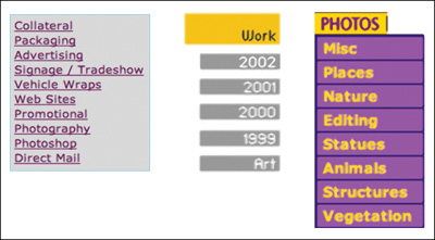
These examples of poor grouping choices have been pulled from online.
Moving left to right, the first mixes category and discipline (collateral and photography). The second mixes date with discipline, as well as automatically time stamping the website. The third equates image editing with photography topics.
But for every bad portfolio grouping scheme, there are many good alternatives. You might find yours by returning to the way you’ve organized your work after reading Chapter 5, “Organizing Your Work.” If the way you’ve organized your archive feels natural, it might be the best choice for your portfolio interface.
If your archive’s organization doesn’t feel right for the work you’ll use in the portfolio, here are a few grouping scheme ideas to get you started:
• Date/employment history
• Discipline/area (design, illustration, photo)
• Category (collateral, packaging, editorial)
• Technology (print, interactive, moving image)
• Medium (traditional, computer, 2D, 3D)
• Process (sketches, modeling, character animation)
• Client
• Client industry/market
• Difficulty/size of project
• Visual interest

WWW.SANDSTROMDESIGN.COM
Sandstrom has a very creative grouping scheme. From the “our company” nav bar, you can reach a traditional client list that indicates case studies. From the “your company” nav bar, you’ll find case studies organized around client challenges.
Look at the work you’ve chosen through each of these filters to see where it fits. Or find your own. The way you think about your work, the type of work it is, and the audience you are targeting are all considerations that should drive your grouping scheme. If you can’t come to a decision easily, make a spreadsheet with the name of the project along the left and each possible category at the top. Put checks next to a project when it fits a possible category.
Examine the spreadsheet for patterns. Is there a cluster of checks under one category and very few in others? If so, those categories are bad ones to use. The thin ones will telegraph that you don’t have enough experience. The fat ones are fat because you have not yet found a grouping scheme that is sufficiently granular.
You may look at these groups and discover that you could organize your portfolio equally well in more than one way. That’s wonderful! It means you can offer alternative paths for people to experience your work. Just remember to provide distinctly different ways of navigating to match the different types of grouping. Perhaps you’ll have a main nav bar with technology types, but also have a client list that allows people to see how you worked with the same client in multiple media.

This spreadsheet shows a pattern. This designer is strong in web projects, advertisements and posters. There is only one entry under publication design, but if it was an important project, the categories will have to shift to include it. This person might want three categories: identity, print, and web.
Map
Once you have groups, you’re ready to impose a hierarchy on them. Will you go directly from the home page to your work, or will you have a second level of pages for each group? Will all the work in a group be equally available, or will you want people to see some pieces in a specific sequence? These are big decisions. That’s why you need a site map.
A site map is a flowchart representing every page in your portfolio. This chart will enable you to recognize links within your pages, and links out to other sites. It will also help you to organize your ideas logically, so visitors to your site won’t feel lost as they explore it.
A good site map shows three things at a glance:
• Grouping: How you’ve broken out your work.
• Hierarchy: Where each page fits within the site.
• Connections: What links to and from each page.
There is no standard form for this chart, although you’ll find a flowchart in this chapter’s Portfolio Highlight on page 221 that will help you get started. A small site can start as a sketch on paper or Post-its, and then become an Illustrator file as it solidifies. Flow-charting software can make the process easier, particularly if you anticipate a complex site. On Mac OS X, I can recommend OmniGraffle (www.omnigroup.com), an inexpensive and fun tool. Many Windows users work with Microsoft Visio (office.microsoft.com), which is comprehensive but expensive if you don’t plan on doing many maps. On either platform, the best free selection is VUE (vue.tufts.edu), an excellent open source option.
No matter what physical form your site map takes, make sure that you leave enough room on it to insert items. You may discover as you work that you need to move things around, or add a major project that develops while you’re still designing your portfolio.
What will your chart contain? A home page, of course, and perhaps an opening page for each group. Every group should branch from one of these types of pages. Remember to account for single pages that aren’t part of your work groupings.
After you’ve accounted for every page, move them around to make sure that you’ve got their hierarchy correct. Pages that are only accessible from a main page should be drawn beneath that page. With your pages in position, draw lines to document your planned links. Remember to consider outside links too. For example, if you have a link to a client’s site or a secondary portfolio site like Flickr or Behance, document that.
If you have embedded any video or animations on your site, they qualify as links as well. You’ll also want to provide links to any plug-ins they require, and consider how people will see them. Will you open a new window for your clips? Will they play in a frame inside your portfolio window? Will you provide a download link to a high-resolution version?
Keep your chart on or near your computer, so you’ll be able to name your actual files and directories to match your documentation. Don’t rename files or move them. If you do, you’ll break the links you’ve made to them. Troubleshooting broken links is frustrating, and avoidable.
Schematic
You’ll have a feeling of accomplishment after you have a completed site map. Seeing the bones of your portfolio will make it feel more real. Next, step down one level and do the same kind of planning for your pages by creating a schematic.
A schematic is basically a page layout grid. You create one for each level of your site map hierarchy. On it, you determine where you’ll place repeating material, different types of navigation, and variable content. When you prepare your schematic, you’ll begin to visualize the following decisions:
Choose a page size
How big should your web page be? Consider your target audience. Will you be showing your work on a laptop, where the screen will be smaller than most desktops? If so, design conservatively, keeping your window small. It is better to allow a viewer to enlarge a window than to force a person with a smaller screen to constantly scroll back and forth, either vertically or horizontally.
Many people currently specify a portfolio screen size to fit 1024×768. This dimension will inevitably increase with technology. But no matter what size becomes the norm, you don’t have the entire screen to play with in your design. All those pesky icons and taskbars at the top and bottom of the browser window decrease the active area—sometimes considerably. To be safe, use a maximum that’s at least 60×60 pixels smaller than your target screen size. That margin will leave enough wiggle room for browser variation, and allow someone working with smaller displays to still click on the desktop if they need to.
Outline a grid
Some people deal with varying content by creating radically different page layouts for it. That’s a mistake. When you carry a traditional portfolio, you arrange everything so it fits in the case, upsizing the case or downsizing the artwork. You use the same type of matte board for mounting, and you use the same rules for positioning work on your boards or in sleeves.

WWW.PEOPLEDESIGN.COM
Looked at as a group of pages, you can see how People Design approached their page grid. Each page is designed to the same proportion, although the content of each page determines how much of the page fills up vertically.
The farthest-left column is the main navigation. It is always in the same position and fills the same width on every page.
All other pages have an underlying grid made up of many small columns. It allows for flexibility—not everything is exactly the same width on each page, because different types of content need different amounts of space.
You present a better impression if your page architecture is equally consistent. Every page should be the same size, with all major elements in exactly the same place on the page. If your page will scroll vertically, the width of the layout should not vary. If your page will scroll horizontally, the depth should be locked instead. Every page’s content should reflect an underlying grid. Images should appear in the same area, even if their dimensions vary.
After you have dimensions in mind, divide the page into equal-sized columns. Use these columns to help you position your elements, and to make sure that they all line up. Use combinations of these columns to help you determine how much space to allow for each type of thing.
Layout follows content
A portfolio site usually contains three types of material: unique page content (images, captions, explanatory text), navigation (links to main groups, secondary navigation to get you around inside a group), and global information (branding, contact info). Your portfolio might also include tutorials, news, a section for experimental work, or a portfolio highlight. You’ll want to account for all of it.
When you actually start to design, use real content instead of greeking (gibberish placeholder text). Find your largest image, your longest caption, your deepest description. Draw outline boxes representing the image dimensions and the approximate text block sizes.
Linking decisions
Before you can lay out your navigation, return to your grouping decisions. If you were able to see a method of grouping your work in more than one way, your navigation and linking will be affected. In most cases, you can’t combine the two groupings in the same nav bar area. Maybe one version should be reflected in your main nav bar and the other available as links from a separate page.
Make it easy to back up a level in your hierarchy, and jump between branches. Visitors shouldn’t have to hit their browser’s Back button to return to the beginning of a section.
Navigation menu layout
Use the same strategy for planning your navigation space as you do for your content. Account for all navigation levels so they won’t extend into the portfolio content. Roughly sketch out how your navigation will be arranged when it’s at its most expanded state. Try both vertical and horizontal orientations. You’ll discover that one will probably work better than the other.
Look and feel
By considering your content and creating quick sketches of your page and its elements, you’ve started designing the look and feel of your portfolio. Your sketches should suggest the size of your navigation elements and their placement. Now you have to think about what style or theme you’ll use, as well as how people will interact with your design decisions.
Even if you are using the wrapper as a portfolio project, it shouldn’t be fighting with your other work for attention. That doesn’t mean that your interface can’t be visually arresting. It means that it should be appropriate to who you are, who your audience is, and what your work is about.
Avoid distractions
Once you concentrate on your look and feel, it’s easy to forget the rigorous way you’ve approached your process and give way to well-known portfolio excesses. If you adhere to your basic schematics, the portfolio will still function. But you want a portfolio that is both functional and visually satisfying. In order to ensure this: remember to KISS.
KISS stands for Keep It Simple, Seriously. Simplicity is the most important virtue in portfolio design. You’ll find it easier to create a clean and simple interface by keeping these guidelines in mind:
• Look for a design idea that will be easy to create. If you will have to spend hours making your navigation elements, they are probably too eye-catching for a portfolio.
• Keep animated actions small and discreet. Even better, limit your actions to ones that happen when a mouse rolls over a button. There is nothing more distracting than buttons that flash or change color or shape when a visitor hasn’t done anything to activate them.
• Limit your color palette. Especially if you don’t have a lot of experience in design, select two colors plus black and white. Make all your interface elements variations of one color. (Start with the pure color at rest, make a brighter version on rollover, and a darker version when you click.)
• Don’t fight with your artwork. It’s the reason you’re making a portfolio, isn’t it? Keep it the focus of each page.
• Think twice about your background. A good designer can integrate a subtle texture or photograph into their presentation beautifully, but there are more wrong ways to do this than right. Do it wrong, and your background, not your work, becomes the main event. If you’re new to interface design, and particularly if you’ve had little or no formal design training, stick with a solid color, preferably black or white.
Here are two versions of a portfolio page. They contain exactly the same amount of material, but the first one feels cramped and busy, while the second one is more spacious. In the second, you can focus on the art.
• Don’t fill up the page. For a portfolio, you almost can’t have too much white space. You can have too much stuff on a page, however.
• Limit your page size. A portfolio viewer should never have to scroll to see artwork. Use a horizontal format (they’re easier to control) and keep your page size consistent.
• Arrange your navigation in groups. Keep all your navigation together. Put any captions and other text all together in one place. Always show your work in the same place on the page.
Moving to production
After you’ve finished your design, you’re ready to create your website, CD, or DVD. Although production will take time, it will fly by compared with the hours you’ve spent in preparation to this point.
Because there is no one right application to build your portfolio, and every application handles the process differently, it makes more sense for you to reference a good hands-on, step-by-step book for this next stage. In Appendix A, you’ll find resources covering each of the major software methods of producing your portfolio.
Portfolio highlight: Layla Keramat | The master plan
Like most good work, effective portfolios exist as a fait accompli. You can only imagine how they got that way. The most fascinating and difficult aspects of the interface design process are hidden from view. Wouldn’t it be exciting to sit on the shoulder of a master as she steps through her thinking about design development, organization, and process? It would indeed, and it might even influence your own ideas. Layla Keramat offers us a window into her process.
Keramat is an interaction and corporate designer who has worked for and with some of the biggest brands worldwide. And she has a potential problem to solve with her portfolio. Although she has an enormous body of work, in a world where everyone expects to find a neat package online, she can’t share. Most of her best projects were done under rigorous client agreements. She can present a digital portfolio on her laptop, but it would violate copyright and contract to distribute it online.
So how does she approach the conundrum? We follow her thinking as she creates the map for a comprehensive laptop presentation, with a unique grouping approach. Then she isolates aspects of that presentation to create “tastes” for her specific audiences. Last, she uses the power of connectivity to build an online personality that enhances the tastes. The result: a comprehensive development process that meets her unusual needs.
Content
Organizing a mature and diverse body of work is a mixed blessing. There are so many ways to group this work. Keramat could group by category of project: user interface design, e-commerce, packaging, or concept. Or she could separate the work into print versus interaction. Yet as her work changed over time, she kept coming back to simple chronology.
The more she tried different options, the more Keramat began to notice that she had made a major change in how she approached design. In her opinion, it was so striking that it was a better way to group her work than brand or chronology. Her intensely personal way of grouping her early work is by intuition—emotion, enthusiasm, gut feeling—and her more recent work by process—a holistic methodology of designing not just for a single project, but with the total brand personality in mind.

Keramat needs two related portfolios, but each needs a different grouping and map, since their goal and audience are not the same.
Her main laptop portfolio, on the left, is grouped by intuition and process, with a case study to indicate how an idea by process develops. Her web portfolio, on the right, is organized by action. Its content, and by necessity that content’s presentation, will have to be radically different.
Having determined the main way to organize her work, Keramat moved forward with her Keynote laptop presentation. Fortunately, her process and documentation made it easy to compile and sequence the work. She based her overall design on the elegant hand-bound physical portfolio, with her signature silver ink, that she had presented with for years.

Keramat’s portfolio presentation has no long bullet lists. She shows her images in their full glory and walks her audience through each of the slide builds with her narration.
But unlike its predecessor, the laptop portfolio is a living work, and a tribute to modularity. Each time she presents it, she customizes the presentation to the audience. Some are more interested in her packaging, others in the transaction websites, others in seeing a balance. As Keramat says, “Your pages must be practical, easy to update or add. I shift my focus from case to case. I change my Keynote presentation every time—no one ever gets it all.”
Her scheme also works for a critical version of the laptop portfolio. Each time a recruiter or corporate hiring manager asks for a taste of her portfolio to show around before her presentation, she sends an 11-page PDF with a cover page identifying it as “Extracts” from the portfolio. She wants to whet their appetite, not steal the show from herself.
Navigation and architecture
The online portfolio is the latest addition to Keramat’s arsenal. Although everything she designs has elements of her two grouping themes, they are not an explicit element online. This is not an omission. It is a smart acknowledgement that the online portfolio has a different purpose.
Since she can’t show most of it there, her work itself doesn’t affect the navigation directly. Instead, her site content is organized under four active verbs: read, look, network, and contact. Read provides highlights from her career: awards, client list, working process. Look provides a peephole tease of her work while identifying its scope and breadth—everything from the formality of stocks to entertainment packaging in leopard skin. Network connects her site, and interested visitors, to her assertive footprint in the virtual world. Contact is a straightforward mailto address.
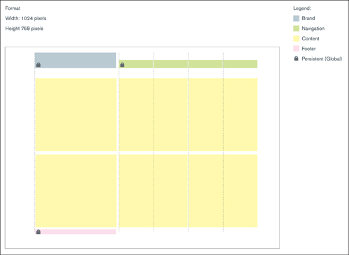
This grid is the schematic for different types of site pages. Information is color coded. Besides the content itself, in yellow, navigation areas are in green, while persistent elements—name, contact info, and footer—are globals that will appear unchanged on each page.
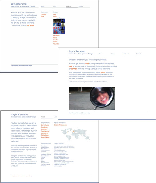
Keramat’s layout tightly follows her schematic. The bright orange text for links adds visual interest and lends a less formal touch to the pages.

Mouse over a thumbnail and its border expands to show the rest of the image, identified by type of project and client. In this way, Keramat maintains her client confidentiality and contractual obligations, while giving a hint at her broad range and high-level experience in brand devlopment.
Future plans
Keramat will maintain the look and feel she has developed for her overall package. It has become a personal brand that she can use to balance her client-focused body of work. She will keep her laptop presentation updated to spin off her customized PDF extracts for the hiring managers, recruiters, and clients who are teased by her online presence. By keeping her virtual presence active and pointing her networking tools at her online portfolio site, she will continue to generate interest in her work.