
Chapter 9. Structure and Concept
You’ve brought all your work onto the computer and transferred it to an appropriate file format. You’ve written sparkling text. You know who you want to impress, and why. Now, finally, you want to get your work into a portfolio. Should you start creating a nav bar and laying out a page?
Not so fast. In order for your interface to be appropriate and effective—and not distract badly from your wonderful work—it needs a foundation. The foundation is the skeleton that your artwork relies on to stand up to scrutiny.
A portfolio foundation requires three things: an appropriate technology, a structure, and a consistent visual concept for your interface. You need to consider all three before you make a single decision about graphics or page content. All of these elements affect one another, and should be influenced in turn by your work.
The chapter begins by exploring the types of portfolio you can design, and how much technical knowledge each one requires. It connects concept and technology, and introduces the metaphor as a development tool. By the end of this chapter, you should understand the choices that will define your portfolio, and be ready to create a site map and start brainstorming your interface design.
Choosing a delivery technology
Technology has a big effect on design, particularly at the beginning, when you are looking at how much time your project will take and figuring out how to optimize your work. (See Chapter 7, “Repurposing and Optimizing.”) It will certainly act as a constraint on your design decisions, perhaps making it difficult to implement some of them. So you’ll need to understand the limitations before you allow your creativity to go wild. The following overview moves from least- to most-technically demanding.
Everyone seems to approach digital portfolios thinking that theirs must be an interactive masterpiece. Unquestionably, a web developer must display both creative and technical knowledge, and many other design professionals are finding it advantageous to indicate their comfort with interactive technologies as well. But for people whose métier is more traditional, or whose portfolio will primarily be a DVD demo reel, too much technology and interaction can be the wrong move. In all cases, what’s most important is to show your work in a favorable light. And indeed, no matter what technology level you’re comfortable with, simple interactions are often best.
Instant portfolios
Instant portfolios are the “just add water” solution...with water, in this case, being images. They require no design decisions, just the ability to upload optimized pictures to a site. In most cases, the site provides step-by-step instructions on how to do this, and sometimes even offers a small desktop application to help you prepare and upload your files. Most social networking and group portfolio sites make it easy for you to turn your space into a gallery.
An instant portfolio can be a life-saving stopgap while you either find a partner or get comfortable with web design and production. And there is no reason to take it down once you do have a personal site, so the time you spend in the process of making an instant portfolio is never lost. In Chapter 4, “Delivery and Format,” I go over the options and their pluses and minuses in detail.
Portfolio helpers
Your only design decision in an instant portfolio is curatorial. With a portfolio helper, you do have some control over the look of your site. The simplest portfolio helpers start with a selection of templates. These usually offer a limited choice in layout, but allow you to customize colors and fonts. Some go one step further and allow users who are comfortable with HTML coding to incorporate custom code and Cascading Style Sheets (CSS). If you take advantage of these options, you can quickly create a site that displays your aesthetics. Two good examples of these options are iWeb, a free application on the Mac, and Google’s Blogger.
In both of these cases, the resulting portfolio website is housed as part of the service’s URL. If you don’t want viewers to have to drill down through a group site to get to your work, it’s easy to use simple HTML code to insert this portfolio onto an otherwise blank web page at your preferred address.

Blogger is not specifically a portfolio program, but its format and flexible tools allow you to pick a template off the shelf, or explore customization options that can make it a great way to provide a quick portfolio—and even get some useful feedback on your work.
Instead of using web tools for a disc portfolio, you can use software that creates slideshows. Web layout programs make it relatively easy to combine linear navigation with a simple uploaded player file. A video editor will also create a non-interactive slideshow. You will only need to sequence the work, determine how long each image stays on the page, and (if the software supports it) select any transition effects.
Application software
What software will you need to create a portfolio of your own, not just one on a group or social networking site?
At the very least, you’ll need a portfolio helper like Apple’s iWeb to create a simple static site. For more creative control, you’ll want a web publishing program like Adobe Dreamweaver. To design an interactive, self-contained portfolio, you’ll need Adobe Flash, or you’ll have to be clever with coding in JavaScript, CSS, and HTML.
If you’re making a CD or DVD portfolio, invest in software that creates hybrid discs—discs that are readable in both Mac OS X and in Windows. For a DVD, you’ll need DVD-creation software to make your interactive DVD menu and link your work to it. On the Mac, that means iDVD (free with OS X) or DVD Studio Pro, which is part of Apple’s Final Cut Studio suite. The premium versions of Windows Vista include Windows DVD Maker, Microsoft’s version of iDVD. Prior to Vista, or for more options, seek out a third-party program. Roxio DVDit (www.roxio.com) has many good features, and is fairly simple to learn and use.
If your portfolio is a straightforward slideshow you have hundreds of options, but you should only use applications that create a self-contained file—one that doesn’t require your viewer to own any software or to use a specific operating system. That’s crucial if you will be sending out the slideshow on disc, or making it downloadable from your site. Anything that creates files readable by one (or both!) of the standard video players—QuickTime and Windows Media Player—will work fine. If you own Acrobat Pro, you can create an interactive file that can be viewed in Adobe Reader.
Presentation programs create slideshows, but they need the application to run. So if you want to put your slideshow on a disc or on your website, you’ll need to convert the slideshow to a player. If you use PowerPoint, an inexpensive shareware program will do the trick. There is even one, Wondershare PPT2Flash Standard (www.sameshow.com), that will turn your slideshow into a Flash SWF file. If your program is Apple’s Keynote, versions 8 and below will directly output to Flash. Unfortunately, this option was removed for Keynote 9, so you’ll probably need a third-party solution as well.

To make a simple slideshow using QuickTime Pro, name all your files sequentially (see the Bulk Renaming sidebar in Chapter 5, “Organizing Your Work.”). Go to File > Open Image Sequence, select the first file, and set your frame rate. When you save the file, be sure to choose “Save as a self-contained movie.”
If your forte is design but you know nothing about preparing work for the web, your ideal portfolio helper may be an InDesign or Illustrator file, exported or saved as a PDF. Print designers sometimes own a web address that’s one page deep and functions solely as a staging space for a downloadable résumé, mailto address, and PDF.
Static page site
A static website is one that doesn’t contain any interactive coding. That doesn’t mean there’s no navigation. A static page can have text links between pages, as well as links from thumbnails to larger, higher-quality images.
Static pages are one step up from a site created with a portfolio helper, because they give you more freedom to design, and you can scale them up as you learn more about web design and development. In fact, static pages that use CSS stylesheets can often be very visually sophisticated. The inspiring CSS Zen Garden (www.csszengarden.com) can give you a taste of what you can aspire to without heavy JavaScript or any Flash.

WWW.CSSZENGARDEN.COM
Each of these designs uses the same text and basic HTML code. The widely various interfaces are the product of using CSS to specify fonts, div blocks, and other web page elements.
Simple motion or interaction
With a program like Dreamweaver, moving from a static page to one with simple interface interaction—rollovers, drop-down menus and the like—is a relatively small step. Good web layout programs write the JavaScript that runs basic interactivity for you. As a result, you can either design site navigation from scratch, or add interaction to a static website.
Complex movement and interaction
It is a big step to go from a simple layout to one that takes advantage of HTML’s power. If you want a website that includes animated elements, plays video inside the page, uses unusual or customized navigation, or simply protects your code and images from being downloaded, you’ll either have to master JavaScript, or use Adobe Flash. Mastering Flash is not trivial. It has recipes for frequently used interactive elements, but you’ll still need to learn a little ActionScript (Flash’s internal programming language). But if you’re willing to put the work in, there is almost no limit to the things you can do once you’ve mastered Flash.
Developing for web or portable
If you create your portfolio to work within a standard browser, you can maintain the same design and navigation for both a website and a portable portfolio version. Don’t just copy one to the other, though. It doesn’t make much sense to send a CD if you can send an email that points to your URL. Instead, take advantage of the many pluses of a disc portfolio (see Chapter 4) by adjusting your presentation to provide full-screen renditions of your video and animation, increase the size and quality of your still images, and provide extra material for personal presentations.
If you are dealing primarily—or exclusively—with video or animation, you’ll probably have to separate the web and disc portfolios. Although your design concepts for the two should be related, the contents for each will be optimized differently, and may even run at a different aspect ratio.
Thinking about structure
You will face technology decisions every day as you design and produce your portfolio. But once you gather your materials and whatever software you’ll need, your focus should shift. If you are creating anything beyond an instant portfolio, you’ll need to find the ideal way to sequence and group your work, and then the very best way to “wrap” it. As you’ll see in Chapter 10, “Designing a Portfolio Interface,” you should always start with grouping and arranging, because the way you create your categories can and should influence your design concept, which will in turn affect the look and feel of your site.
Selecting a metaphor
A metaphor can be a useful way of thinking about your portfolio structure. A metaphors can be a powerful tool to help you visualize your digital portfolio—a hazy, virtual collection of megabytes—as a concrete form. It provides a framework for an appropriate organization and interface. A metaphor implies that your portfolio is organized in a certain way, and is like something we know in the real world. Once your site is up, it also helps to provide the visitor with a familiar frame of reference for your navigation and mapping decisions.
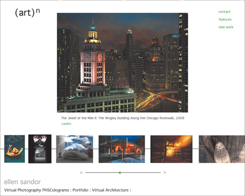
WWW.ARTN.COM
Designed by Janine Fron and Jack Ludden, Ellen Sandor’s virtual photography site uses a gallery metaphor. Each major category of work (in this case, virtual architecture) has its own “room.” The individual images are previewed from thumbnails running along the bottom, and can be selected for closer view. As with a museum or gallery in the real world, a short label identifies the work and its provenance.
Terminology for portfolio metaphors is neither standardized nor precise. At best, it’s an attempt to focus the concept process. Even so, most portfolios do adhere to at least one of the following basic metaphorical concepts:
• Gallery
• Outreach
• Diary
But it would be a mistake to believe that these are the only ways to think about structure. Nor is this list a suggestion that you exactly mimic a real-world format in an electronic one. Even if you could, you shouldn’t. Doing so would not only artificially limit you to real-world constraints, it breeds a tendency to make your site boring and literal.
Gallery
The museum or gallery is a formal space where you come to see work. When you use this metaphor, you say, “This is my work. Draw your own conclusions.”
Gallery sites can be as simple as one intimate room, or they may inhabit a number of differentiated spaces. Some explicitly mimic a museum space, with frames and captions, but there is no need to maintain any or all of these literal forms. Gallery sites are often linear, or linear within sections. In a gallery portfolio, the interface itself is very understated, to emphasize each image. Although it’s possible to make a gallery site very rich and complex, it’s not a requirement. A gallery portfolio is one that can be implemented with very little technical knowledge.
Spec sheet/brochure
Spec sheets and brochures provide business information. The brochure does so in generalities; the spec sheet provides functional details. In portfolio terms, this is a capabilities metaphor. When you use this metaphor, you say, “Here is what I can do.”

DESTROYTODAY.COM/V2
Ace programmer and web designer Jonnie Hallman emphasizes his capabilities. He has two connected sites: this one explicitly for his design work, and another for his programming projects.
The portfolio demonstrates, through work and through portfolio interface, your talents and specialties. It organizes material around work categories. Capabilities portfolios are usually web-based, and at least minimally interactive. Visually, they often contain more than one way of looking at a project, highlighting details the way a spec sheet for a product might highlight its best features.
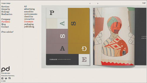
WWW.PEOPLEDESIGN.COM
People Design is very outreach focused. Their portfolio work is accessible in a variety of overlapping categories. They designed their site by asking two questions: “What do our prospective clients want from us?” and “What can we give them?”
Outreach
An outreach portfolio is client-centric. It can superficially look like a capabilities portfolio, but it differs from the spec sheet concept by offering integrated services rather than skills. It says, “This is what I can do for you.”
The client-centric portfolio is almost never sequential. Work is organized by relationships. The portfolio is usually distinguished by fairly complex navigational linking and overlapping categories of information. Client-centric portfolios reflect the target audience more than the portfolio maker, and they are frequently (though certainly not always) visually conservative and technically sophisticated. They make it as easy as possible for the viewer to navigate the space.
Diary
A diary portfolio is the opposite of an outreach metaphor. It often feels intensely personal, and may give the impression that it was created more for the portfolio maker than for any client or prospective employer. This format is good for an artist, a student, or for someone who wants to explore new ideas without necessarily waiting until a project comes around to pay for the time. These sites say, “This is my work and my work is me.”

LIONINOIL.NET
Blog-based portfolios lend themselves most explicitly to the diary metaphor. They encourage experimentation and feedback, and are deliberately less permanent, more fluid work records, as John Locke and his partner Jackie Caradonio’s diary-based portfolio blog attests.
In one respect, diaries can end up being very effective marketing tools, because they can become capabilities-oriented without the formal, programmed feel. Diary portfolios are almost by definition web-based, because they require frequent updates. As a result, they require either a strong command of technology or a lot of free time. Because of their personal nature, they are often less hierarchical and more broad than other portfolios.
Narrative
In a narrative portfolio, the portfolio tells a story through its sequence and organization. Narratives are not necessarily stories in the sense that they have a plot, but they do have a clear order. They may even have a formal beginning, middle, and end. A narrative portfolio says, “My work is about something specific.”

WWW.SKEVINLONGO.COM
Kevin Longo’s subway metaphor provides a useful reason to engage his portfolio story in his preferred order, while still allowing random exploration. It provides an engaging beginning for a journey and ensures that his viewers will visit at least one or two “stops” along the way.
Narrative portfolios usually contain a few very carefully chosen works, because it’s important that the viewer experience the entire portfolio for it to deliver its message. A large narrative portfolio only works if the narrative is contained in “chapters.” These chapters, like case studies, can be experienced as individual modules. No particular format is required for a narrative portfolio, although Flash presentations lend themselves to this metaphor because they allow more control of page access.
Experience
Experience portfolios take you for a ride. They differ from diary portfolios by their emphasis on entertainment. These portfolios are almost always visually or technologically rich, and frequently are a humorous outlet for the portfolio maker. Always interactive, they say, “Play with me.”
Although brilliantly memorable when handled with a sure hand, this is an extremely difficult portfolio metaphor to carry off successfully (see the section, “Concept versus style,” below). It can just as easily put people off as suck them in. Experience portfolios sometimes have experimental interfaces and are often complicated to create. They lend themselves to Flash presentations.
How you use a metaphor
A metaphor can be applied literally (“Welcome to my gallery”) or simply be a way to think about your portfolio site map. For example, a capabilities portfolio requires you to think about which of your projects best demonstrates your skills. Perhaps you’d highlight a project and show how you applied your knowledge through process sketches.
You are not limited to a single metaphor. These ideas are flexible enough that some can overlap. For example, large studios frequently combine the spec sheet with outreach. However, you should mix and match with care. Don’t combine metaphors with radically different objectives. Outreach and diary simply don’t mix, and will leave you ping-ponging between pleasing yourself and pleasing others—ultimately pleasing no one.
Concept
A metaphor is also useful to start you thinking about your concept—and to keep you from mixing too many ideas. But it is only a starting point—the good bones that you flesh out with a concept. The concept is the visual way you express how you think about your work.
A concept is much more than figuring out whether your buttons are green or blue. It is the reason you make that decision in the first place. At the very least, the design concept should not get in the way of the work. It is much better to create a very simple, barely noticeable interface design than to create an interface that overwhelms your projects. At best, the design concept should enhance your work, so the two engage in a pleasant visual conversation.
A good concept is easily identified by the fluid experience it offers. It works with your work, not against it. It emphasizes the things that you do best. It is consistent on all pages. Navigation is easy to find, and easy to figure out. On a site with a consistent concept, elements are related to each other visually and functionally. You should be able to tell the difference if you move from one designer’s concept to another, and you should be able to recognize the look and feel of each concept when you return.
Concept versus style
Don’t confuse concept with style. Concept is an idea that you apply consistently because it fits your work and your site’s architecture. Style, on the other hand, is a collection of attributes that create a surface look. For most people, style is what’s hot. If you find yourself thinking of your interface in terms of using a cool effect or type treatment you’ve seen in an annual, you’re letting a style dictate your concept, not the other way around.
Putting it all together
It’s not easy to develop a really brilliant portfolio design, but almost anyone can manage a decent one. Don’t be afraid to look at portfolios by other people. In fact, look at as many as you can, so you won’t be tempted to copy anything specific. Ask yourself what makes some of them really memorable and attractive to you. If you select a technology you can master, choose an organization scheme that fits your work, and design an interface that keeps the viewer interested and focused on what you do, the portfolio that results will be one you are proud of.
Portfolio highlight: CloudRaker | Experienced design
There is no formula for an unforgettable portfolio. The only common denominators among portfolios whose tastes linger are that they display exciting work, and that the structure that wraps that work is implemented perfectly.
Many of these textbook-perfect sites are polished marketing tools or beautiful client-centric outreach. In the outer limits are those that use the structural metaphors of narrative or experience. Requiring good storytelling skills and an intensely personal style, they should not be attempted lightly. They require such a fine balance in order to avoid being so self-absorbed or functionally irritating that a single false step opens them to portfolio fail. Obviously, these professional high-wire acts are rare. Montreal-based CloudRaker has brilliantly executed one of them.
CloudRaker set an ambitious goal for its current site. As Thane Calder, co-president, says, “Going forward, we wanted the site to position CloudRaker as a digital branding agency. We wanted the new website to reach potential clients and influencers. But, first and foremost, we—the CloudRaker team—had to love the site.” Simply meeting the online design standard of a sleek, clean interface would miss the mark. They needed to show their total command of the online experience—providing unique solutions that go beyond effective to memorable.
Navigation and architecture
Discussing navigation on the CloudRaker site requires several deep breaths. The site visit takes place in a snowy Canadian landscape. You use arrow keys to interact with the guide, a bearded, hygiene-challenged Sherpa who leads you around and up a forested mountain. Signposts that match the nav bar headings orient you as you travel.
CloudRaker offers multiple ways of navigating their site and all of its elements. There is an exploratory narrative for viewers with the time to accompany a Sherpa guide on a tour of the CloudRaker world. For those who can’t linger, there’s an easily accessible standard nav bar with links that jump to the main site topics. Have even less time? Select the HTML version of the site. No interactivity, but all the basic information is available in text form. Intrigued, but no time at all? Viewers can download the company PDF fact sheet and read at their leisure.

The CloudRaker splash page looks rich and potentially complicated, but in fact only the first of those impressions is true. Menu bars are in obvious places: the top of the screen and centered toward the bottom of the screen.
The animated navigation is intuitive, but doesn’t force you to guess how it works. You can simply click on the Sherpa to prompt him to move, or, as the instructions helpfully suggest, you can have more control over him by using the arrow keys.
The point is that CloudRaker thinks deeply about how visitors might need to navigate their site, and doesn’t insist on the long way home. But those people who are seduced into exploring the Sherpa interface are amply rewarded.
In fact, the more time you spend on the site, the more tidbits you’re likely to discover. For example, informational texts give new meaning to the phrase “drop-down menu.” They literally fall from the sky and hang from wires. Resize the window, and the hanging signs respond, shaking back and forth as they slowly settle back into place.
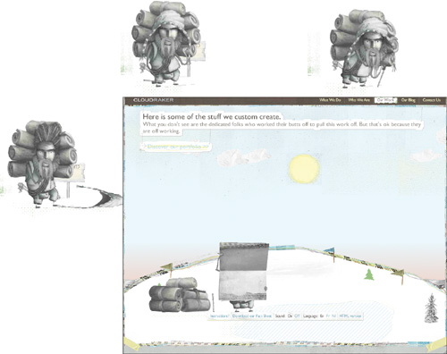
The Sherpa is a real personality, not just an animated cursor. He looks at you, interacts with the environment, and takes an active part in the portfolio presentation.

The project menu is held by two birds with frantically beating wings. Select a project and the menu closes. A case study drops from the sky on wires.

Select from three options—the challenge, what if and so what?—and the hanging text is hauled up. The selected paragraph opens and drops down to replace it.
Content
The entire site is a portfolio project, as well as a site to hold the company’s portfolio. It demonstrates all aspects of CloudRaker’s talents. The onsite text is compelling. The interface is fun to navigate, and the illustrated animation is engaging. Instead of a routine fast clickthrough, you tend to hang around. As a result, a visit to the CloudRaker site is a guilty pleasure that can easily fill up a lunch hour.

The site uses sound as well as it does sight. In this scene, the Sherpa intones each client service in an invented language, making the experience feel a bit like watching a movie with subtitles.
But the work is always the most important part of a presentation, and CloudRaker’s portfolio section emphasizes creative solutions, variety, and technical mastery. Select a client project from the menu and the foldout display screen held by the Sherpa plays a video walkthrough of each site. The video is designed to show you highlights from the client site’s navigation and decisions, not just static screen snaps. You might think that would obviate the need to see the site itself. However, one idle check on a client site shows you that the inventiveness that characterizes CloudRaker’s site is put to good use for their clients as well. Although every client’s web presence is unique in both branding and structure, all share a taste of the CloudRaker style: sleek, stylish, animated and smart. Each one is as much fun to experience as the CloudRaker site itself.
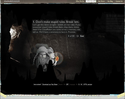
The text on signposts, on menus, and inside the “cave of beliefs,” is delightfully clever and brief, occasionally dipping into vocabulary seldom seen in promotional copy.
Future plans
The CloudRaker team is its own sharpest critic. They see elements of their site that can still be improved. Most likely they will change the presentation of their portfolio videos. As Calder says, “We’ve realized that our current presentation poses a challenge because the portfolio videos are set apart from the explanatory texts on the right-hand side. It’s pretty hard to convey both at the same time because the user is focused on one or the other. We are looking to produce case studies in video where all the text is integrated to ensure that we can convey all the importance of the project in one unified story.” Story is certainly what this expressive, experience-based site is all about, and its fans—inside and outside of the firm—look forward to its change and evolution.