
Chapter 7. Repurposing and Optimizing
Many of us who work on the computer view our finished, printed art as the final step in a long creative process. When we gather our work for a portfolio, it’s natural for us to think of that physical artifact as the work we should show. After scanning, shooting, and agonizing over lost details, it can suddenly dawn on us that sometimes the best art is the original file version.
Returning to your original file is sometimes your only option. When you freelance, or leave a company while a project is still in production, you may never receive a copy of the final, printed work. Then there are the times when you create something you’re particularly proud of, only to see the final, produced work and groan. The printer erred, or the client decided to make last-minute changes against your better judgment. Website designs, particularly those where you provide templates, are especially dangerous. After they’re out of your hands, anyone with technical competence and no taste can “improve” your best decisions.
You can return to your original file, but you can hardly ever use it exactly as it is. Working files are too big, and in the wrong file format. This chapter provides some suggestions for repurposing and optimizing your existing artwork for your portfolio.
File adaptation strategies
Designers, as well as many artists and illustrators, do more than create onscreen. They choose colors and types of ink, select paper, and specify die-cuts. Sometimes those choices are the ones that make a project great. Unfortunately, finesse can be hard to capture in a scan or photograph. Even with a large-sized image, some details are a challenge to visualize onscreen. You can accept the limited representation, and bring samples of special work to interviews. But doing that with too many pieces negates the point of a digital portfolio. And if the pieces are part of your best work, not showing them online hurts your marketability.
Repurposing is particularly attractive for oversized work, like a poster, that has no special paper stock, but it can work in lots of other situations. What follows are a few suggestions to illustrate possible solutions. If your knowledge of Adobe’s CS applications is not quite comprehensive enough to imagine how to accomplish these ideas, Appendix A has suggestions of resources that can help you.
• If you have an original file and a paper sample, scan in the latter and use it as a texture with the original file.
• If the paper sample you chose is transparent or translucent, you can mock up the finished piece and use a transparent layer to let a background slightly show through. Experiment with blend modes to avoid having the work lose saturation with the transparency.
• Using animation, you can show a piece at various stages of opacity if it was printed both front and back, or create the effect of turning pages to show a transparent overlay.
• Shooting an oversized book can leave shadows in the gutter, obscuring details. You can take a two-page spread into Photoshop, and use a displacement map to give the “book” a curve and a slight, non-destructive shadow in the center.
• A metallic ink often just looks like a flat color when scanned. Use a camera instead, and light the piece at an angle to bring out the highlights.
• Embossing is impossible to capture in a scan. It’s easier in a photograph, particularly if the embossed piece can be lit to emphasize shadow details. If that doesn’t work, bring the original file into Photoshop, select the embossed element, and then sharpen its edges. Run a light brush over the insides where the sharpening effect is too obvious.

WWW.TRIBORO.COM
Triboro employed a professional photographer to capture important details about their print projects. Here, the camera was focused very close to their self-promotion piece, where ink selection and embossing are both key. The result is featured on their website to emphasize these defining design decisions.
Repurposing with PDFs
One of the best ways to repurpose published work is to create a PDF. It can be a good way of presenting a file that was originally created in a page layout or illustration program, or to bring together multiple image files in a coherent single file.
PDFs are pretty easy to make, but they deserve just as much attention as larger, more complete presentations. They can often be the key to winning an interview. Many applications allow you to save your files directly as PDFs. However, a full version of Acrobat will allow you to create an integrated portfolio, not just a loose affiliation of files.
Automated PDF creation
Adobe Acrobat Professional 9 has a feature called Portfolio, which makes it very easy to combine different types and sizes of files, including some moving image formats, into one document. If you are not a design professional but your audience requests a PDF, this feature is a wonderful way to give them what they need. You can customize a welcome page and a header with a typeface and color scheme of your choice, and select one of four ways for your individual files to be displayed: as a grid of rectangles, as a “desktop” with a background JPG and documents represented as icons, as a 3D revolving flipbox of rectangles, and as a sliding horizontal row of icons.
For a design professional, you can use this feature to bundle a cover letter with your designed PDF portfolio, and add a SWF or other moving image file if you design both still and motion content. That way, everything in your email package will stay together.
The Portfolio function is a good start. However, it emphatically does not take the place of a professional’s portfolio file, as its customizing features are too limited. It is the equivalent of using a social-networking site as your only portfolio website. A designer, or anyone who needs their portfolio package to be a memorable representation of their skills and tastes, will still need to design their PDF themselves using a layout program, with a redesigned résumé as part of the package.
PDF creation hints
You owe it to the people who’ll receive your files to create your PDFs correctly, and in a format they’ll find easy to view. That can be a critical difference. Many people quickly print a PDF they’ve received and take it with them in paper form for review. They won’t want to fuss with settings, or multiple files.
Here are tips for creating good PDFs:
• Create a cover page. Make sure your cover page contains your contact info, then place your name and the page number as a header or footer on each subsequent page. If your work is printed, the pages will still be identifiably yours, and will remain together.

WWW.BRALEYDESIGN.COM
A well-designed cover page sets the tone for the presentation. Design one that will print equally well in color or on a standard laser printer, as Michael Braley’s does.
• Avoid scrolling. Create letter-sized pages, so viewers can view and print them out easily. Set up your PDF in landscape format to fit better onscreen.
• Shoot original files. Always return to your original file for onscreen shots of web-based material for your PDF. For example, when possible, screen shots of Flash-based websites should be shot from the FLA file, not from a browser window, to preserve higher resolution for typographic decisions.
• Use TIF files. If you’re creating screen shots, shoot them as TIF, not JPEG, files. You are certain to end up needing to scale them as you lay out your pages, and scaled JPEGs quickly lose quality.
• Watch your file sizes. Even in these days of cable modems and DSL, no PDF should exceed about 3 MB. Recipients who have fast connections still might have limited storage space on a mail server.
• Label your artwork. Just as you would on a website or disc, you should include captions with your artwork that identify it.
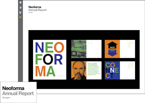
WWW.BRALEYDESIGN.COM
As Rita Armstrong points out about designer Michael Braley’s smart PDF portfolio, listing the number of pages in the heading for a project is a great idea. It lets the viewer know that this page is just a small taste of what the project was about.
• Name your PDF sensibly. Don’t call it “mywork” or “myportfolio.” Use your full name in the file label. If you must send more than one PDF, name the files similarly, so they’ll appear together when sorted.
• No headshots. Unless you’re a performing artist, don’t ever put a picture of yourself in your PDF. You’re not entering a beauty contest, nor are you a member of a corporate sales force. Creative directors and placement agencies target you as clueless as soon as they see the photo.
Optimizing image files
All your files will eventually need to be optimized—altered to fit the requirements of transmission. Websites, emailed images, and image files dropped into PDFs will need the most shrinking. CDs and DVDs have less stringent requirements, but optimized files will take less time to load.
A well-optimized file looks good onscreen, but takes up very little file space. The smaller the file space, the faster the file. With the exception of your creativity, nothing will have more bearing on how your portfolio is perceived than how much time the viewer must invest to see it.
Optimizing basics

A graphic image with a mixture of flat areas and smooth blends (upper left) should be tested as GIF, PNG, and JPEG. Here, the JPEG (upper right) is too soft, the GIF (lower right) has too many artifacts, and the PNG (lower left) does the best job of holding onto the crispness of the type while not losing the image quality.
Optimizing is a delicate balance of four elements: color, image quality, image dimensions, and file size. The ratio among these elements shifts as technology improves. Browser and platform differences still compromise color (see the sidebar “ICC color profiles and JPEG files” later in the chapter), but good image quality is readily attainable. So is a large onscreen image size. Unless you have an unusual client base, you can optimize for 16 million colors on at least a 17-inch monitor with a 1024×768 resolution.
In most urban markets, the minimum standard is a DSL or cable modem connection, often with a download speed of 6 Mbps. But that doesn’t give you the license to throw anything you’d like into a portfolio. Image sizes are cumulative on a page, and even as options have increased, viewer expectations have too. No one will wait 20 seconds to watch a portfolio page render. And during really high-traffic times, even a cable modem connection can slow to a walk. Every 10 kb saved in optimizing will still be appreciated.
You’ll optimize before you begin actual portfolio production, but you’d be wise to already have sketched out a layout grid for a typical page before you optimize. Although you can downsize art in HTML or Flash, the closer you are to optimizing your work at 100% of its onscreen size, the happier you’ll be with the results.
The optimizing process
There are some specialized optimizing tools, like DeBabelizer Pro, but the easiest and most common method is to bring files into Adobe Fireworks or Photoshop CS4 or later, which incorporates Fireworks’ optimizing windows and range of variables. In Photoshop CS3 or later, these features are found under “File > Save for Web and Devices”—in Fireworks, they are under “File > Image Preview.”
In either software, you can choose between optimizing the file as a JPEG, a PNG, or a GIF. The standard rule of thumb has been that photographic images are optimized as JPEGs, and graphic images as GIFs. Most browsers now support PNGs, which addresses many of the GIF/JPEG tradeoffs. However, the PNG format has many variations and makes larger files than GIF. For size and compatibility purposes, GIF and JPEG still often prove to be the safest routes.
Applications for optimizing provide presets as jumping off points. Many people who don’t know much about optimization select one of these presets and apply it globally to their images. That’s better than not optimizing at all, but it usually leads to files that load too slowly, or are significantly smaller onscreen than they need to be.
Skinny GIF
Why should you optimize your file visually, instead of just saving it for the web? Every second of wait time counts. On the left is part of a large file that will take 3 seconds to download on a fast cable or DSL connection. On the right, the steps for optimizing visually.

1 Minimize the number of colors. Starting with a 64-color preset, I dropped colors from the palette one by one until I reached the minimum acceptable number for the image.
2 Several colors dropped too soon. I stepped backwards, selected the most important colors to preserve, and locked them. Locked colors can’t be dropped as colors decrease.
3 This image has a lot of flat color and type. Through experimentation, I’ve found that I need much less dither at this size. In fact, the type is crisper without it.
4 It was important to hold some details in the book cover when decreasing the number of colors. I created a mask of that rectangle and saved it. Then I enabled the mask by selecting the mask button next to the palette type and protected this small detail from being posterized. This strategy is called “weighted optimization” and it works for both GIFs and JPEGs.
5 There are different methods of selecting colors for a palette. I used Diffusion here because it gave the best color fidelity and smallest file size.
6 As a result, the final optimized image will take a full second less to load. That doesn’t seem like much, but when your entire page goal is five seconds, one second is 20% of that time.

Both Fireworks and Photoshop use a 56K dialup modem as the default speed estimator in their optimizing window, giving you a “worst case scenario.” To get a sense of download time for Cable/DSL, hold down the Ctrl key in the speed/size estimation box and select one of the other options from the list that appears.
Optimizing hints
Let’s examine the best ways to approach optimizing different types of files. To begin, set a goal for each page’s download. For a standard, non-animated portfolio, a good goal is five seconds, based on DSL or cable access. If your images are detailed photographs, double this goal and use progressive JPEGs to let your audience know that more detail is on the way. Assume that your portfolio image will represent the bulk of that time, since it’s the focus of your site.
You can process files in bulk, using a standardized optimization setting and the software’s automation menu. I only recommend this shortcut for PNGs, which have very limited options and are therefore more conducive to automation. Otherwise, automation is only appropriate for steps such as bulk preprocessing the height and/or width of your image to meet the standards of your portfolio template. Fireworks offers a “Batch Process” function for these needs, while Photoshop offers more advanced scripting options. However, the time spent developing a proper batch process may be better spent working through each image; optimizing still requires a commitment to examine every image—individually.
ICC color profiles and JPEG files
A color profile holds information about the color space of an image or a device. If every device you use is calibrated and has a color profile, the computer can translate color between the devices so you will always see the same colors no matter where your file is.
Photoshop allows you to embed an ICC color profile in an image. And if the browser your viewer is using is color-managed, i.e. one that reads these profiles, what you show on screen will be what you expected.
Unfortunately, some browsers (like Microsoft Internet Explorer and most other Windows browsers) don’t read these profiles. They show all artwork with their default profile, which is sRGB. To gain an accurate assessment of what colors will look like in a browser, prepare your files in sRGB, and check them in a browser window before you create your portfolio.

These are exactly the same JPEG file, with the same ICC profile, captured on the same monitor and operating system.
The top image is color corrected. The bottom image is how it appears in a non-corrected browser.
GIFs
It’s not a problem to get acceptable-looking GIF files. The difficulty is to shave little bits of file size from them without making any dismal changes in the appearance of the finished file. The sidebar “Skinny GIF” shows the finicky yet valuable optimizing process for a GIF.
JPEGs
There are fewer elements to consider when creating JPEGs. The most important thing to remember is the difference between the general categories—Low, Medium, High, and Maximum—and the quality gradations within each category. You continue to have a high quality at any setting between 60 and 79, but the file size you generate can be radically different at these settings.
One extremely useful setting when optimizing a JPEG is the Progressive setting. Choose this, and your JPEG will begin to load immediately at low quality, improving as it goes until it’s completed. Viewers will be much more patient with an extra second of total load time if they are already able to see artwork in process.
PNGs
For PNG, be sure to export using the special optimizing windows discussed above. Don’t just bring the file into an application and save it as a PNG from the File menu. Some programs, like Fireworks, save out a more complicated version of PNG that web browsers can’t interpret correctly. This format includes scalable vector graphics (SVG) information that makes the file size significantly larger—information that is just “thrown away” by the web browser. The PNG export options “flatten” the file and put all vector information into bitmap format before optimizing.
Optimizing video
Unlike regular still images, which have well-established guidelines and types of file formats, there is no standard video format, which is a tremendous headache for portfolio creators and viewers alike. The lack of standards makes it even more important that you take the time to optimize your video files correctly, as a misstep could mean that your target audience will not be able to view your work.
After editing a video file in a non-linear editing program, you encode it: save it in a different, compressed format. Your major decision is to figure out what format or formats you should use to create your new file. From there, you select settings that determine the final quality and file size of your clip.
Each format is optimized to be viewed from within its own player (see the next section, “Encoders and players”). Some players allow you to view other formats, but the quality is often compromised. Unless you are quite certain of your target audience’s platform and technology, you’ll have to output in more than one format.
Encoders and players
To see encoded video, the viewer needs a player in your format. The “best” player format for you is one that is already installed on your viewer’s computer. Because you can’t always predict what that will be, you’ll need to create files for more than one player. The players mentioned below are the most popular ones.
If you are creating movies for both Mac and PC users, save your edited files in at least two formats—AVI (for Windows users) and MOV (for Mac users). Even though both movie types can be played on both platforms, very few Mac users have Windows Media Player. Conversely, although a reasonable number of Windows users have QuickTime, all have WMP.
• QuickTime. QuickTime is Apple’s cross-platform video software. It imports many other file formats, including AVI, and outputs to a variety of codecs. Windows users of IE5.5 and later need to download a special ActiveX file to be able to see QuickTime content. Note that not all AVI files play correctly on a Mac, while more and more Windows users have QuickTime support because of the popularity of iTunes, which requires it.
• Windows Media Player. Windows Media Player is installed on all Windows computers, making it the single-most popular player. The player is cross-platform, but Mac users must downloaded it. The Mac version does not support all formats, such as “secure” versions of Windows media.
• RealPlayer. RealNetworks is a provider of a format for streaming video. Because large corporations use RealPlayer to deliver music and video content, RealPlayer has good coverage on Windows and Mac computers alike. Products such as Adobe After Effects have built-in support for RealMedia export, but this is not as common as AVI or QuickTime export. Although limited support for the SMIL format is built into QuickTime, most RealMedia files can only be read by RealPlayer.
There are three additional ways of encoding and/or playing audio and video on the web or on a disc. Each of them relies on one of the main technologies listed previously, but requires an additional player or software on the user’s computer:
• Flash and Flash Video. Flash allows you to import video from other sources and add an interactive layer to it. You can output files as SWFs, or as a QuickTime or Windows Media file. Adobe CS3 and higher as well as many third party encoders also create files in Flash’s FLV video format. Adobe estimates that 97% of web browsers have Flash Player 8 or higher installed, so this is a well-supported video standard.
• DivX. DivX is a popular codec with 3D animators and DV enthusiasts. It offers high-quality, large window sizes, and fast performance. It uses the Windows Media Player in Windows, and QuickTime on the Mac side. If you use DivX, you will want to include instructions for your viewers on how to install the codec; however, chances are that you will still lose some viewers if this is the only option you provide.
• Vimeo, YouTube, and similar sites. Video sharing sites are increasingly popular because of their “one step” approach: upload the video and receive a link back to the web-optimized version. Although these sites are working to match the quality of the other formats mentioned (including offering HD encoding options), you still have to deal with a site watermark and possible advertising on your videos—not the best impression for your portfolio.
You can’t offer too many formats, but you absolutely can offer too few. Yes, you can include a player on a CD or ask a viewer to download one, but most people find that extra step extremely irritating—if they are willing to do it at all.
Encoding settings
After you’ve determined what format or formats best meet your needs, your next step is to select the settings that will determine the final quality and file size of your clip. Rule number one is that the more you compress, the smaller your file is and the faster it will download and play, but the worse it will look. You can maintain more quality by keeping your window playback size small.
Rule number two is that no setting is perfect for every clip. You’ll want different settings for two clips in a web-based portfolio if one is a full-motion video and another is a 2D typographic animation. Also, every person’s eye and tolerance is a little different, so what looks great to you on your computer screen may be less sharp or too fast for someone someplace else. The best course of action is to find willing guinea pigs to test your result before you finalize it.
Window size

WWW.COMFORTKYLE.COM
3D generalist Kyle Raffile offers his online demo reel in two standard formats: MOV and FLV, to make sure the maximum number of people can view it.
Everyone wants to show their work as large as possible, but unless your web portfolio will reside on a streaming server, you’ll have to compromise. Although standards are always improving, it’s safest to display motion video in a small window, usually 320×240. If you really want to upsize to take advantage of better technology, create two window sizes and allow your viewers to choose. Or make a high-resolution file that can be downloaded for viewing.
Work on CD can be somewhat larger, with 720×480 for standard or widescreen DV and 1280×720 for HD being good starting points. DVD is usually designed for a full TV screen, although you can use it to show smaller clips.
Compression type
There are too many compression types to choose from, and it can be bewildering to see the list of codecs in a typical export menu. In fact, most of them are completely useless for your portfolio. Some are for videoconferencing, for example, and others are actually almost obsolete. Even more frustrating is the list of audio codecs. Unless you have high-quality music as part of your video, you won’t want to compress audio at all. Compressed audio sounds really bad, and you don’t even get the benefit of smaller file sizes.
After you eliminate all the unnecessary complications, you’re left with one codec that solves most problems: Sorenson. The Sorenson codecs are used for Flash Video and QuickTime, and also work with various Windows formats. If you are unsure about Windows support and you don’t want to use Flash Video, Cinepak is the safest choice for creating AVI files for Window and MOV files for Macintosh.
Frame rate
A higher frame rate per second gives a smoother look to your clip, but adds size to the file. Over the web, you should probably stick with 12–15 frames per second (fps)—a good formula for a starting point is to divide your original video’s frame rate by two. Moving up to 15–20 fps on a CD should be fine. DVD compression assumes a full 29.97 fps.
Key frame rate
Encoders can determine how much a movie changes from a reference frame (called a key frame). To make movies smaller, they only send information about the things that change in the frames that follow. The more key frames, the smoother the movie will appear, but the larger it will be. Too few key frames, and the movie will be small but jerky. I recommend 5–7 key frames for a CD. Web settings should be tested, depending on how much actual movement takes place in the clip. A setting of 15 ensures an update every second if your movie is playing at 15 frames per second. The Sorenson encoding tools (both Squeeze and the Flash Video Encoder) provide named defaults that give you a sense of the intended purpose of each setting.
File naming
It is very important to name your files with the correct extensions. Be careful not to delete these extensions by mistake, or they will not be recognized properly by their players. QuickTime uses .MOV, Windows Media uses .AVI and .WMV, and RealPlayer uses .RM, .RA, and .SMIL.
After the artwork
Repurposing and optimizing are the tasks that will seem the most time-consuming and thankless in your portfolio process. Like most production work, this stage can feel like an obstacle in the way of the fun, creative part of portfolio development. But when you’re finished, you’ll be able to reuse most of your work again and again as your portfolio requires.
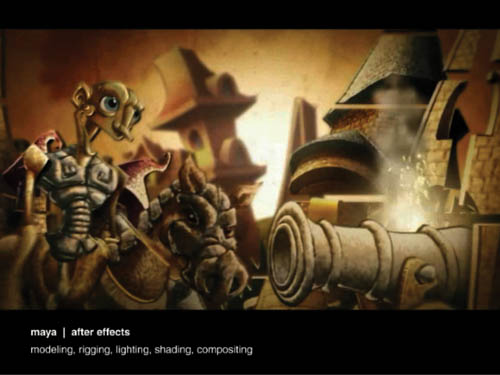
WWW.HERCFERN.COM
Optimizing a detailed animation file with composited backgrounds and foreground characters always pays off in the end, as viewers are delighted by the results.
Portfolio highlight: Thom Bennett | Optimal detail
The best technology is invisible. If you do everything right—select, repurpose, optimize—nothing will pull attention away from your work. But invisibility only goes so far. The more astute the viewer, the more they will appreciate how the things they don’t see make possible the elegant things that they do. That connection is obvious in British designer Thom Bennett’s portfolio.
Bennett’s 2006 site, which is still linked from his current one, excited the attention of the digiterati who comb the ether for exceptional websites. For some people, such attention would result in an extended run of the “don’t fix it if it ain’t broke” variety. But Bennett, although justifiably proud of the work and pleased with the attention, is a perfectionist. He executed a complete revision in visual design, image preparation, and programming development.
Bennett’s presentation may be technologically adept, but it does not draw attention to itself. In fact, his design choices are conservative—in the best sense of the word. They consider the needs of the visitor the way a good host does with a house guest. His typography plays against the prevailing look and feel, comfortably scaled and extremely legible.
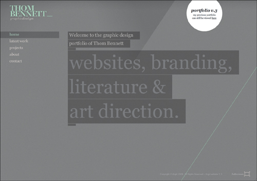
Bennett starts with a short animated build of the site from background to navigation to his center statement, which boldly states the purpose of the site. The design supports the statement with subtle colors and cool gray background. The look is a nice break from design-default white matte, while still providing a clean, understated look.

These two images are the result of resizing the window of Bennett’s site. His header and nav bar always remain in the same place on the page. Everything else floats in the window relative to the size and position of the project image.
Navigation and architecture
Technology can affect navigation choices, usually by presenting limitations to creativity. One can see Bennett’s command of his medium in the apparent ease with which he provides navigational feedback and options that most developers would avoid, or never even think of attempting.
In one of its most elegant uses of technology, Bennett’s site readily adapts itself to the viewer’s screen size. Most Flash websites are designed at an optimum aspect ratio and size. If you enlarge the browser window, you simply get a lot more of the designer’s background. If you shrink the window down, eventually you have to scroll to see the entire page. Bennett’s site scales; if you have a cinema screen, you can see his artwork at its largest size. But if you’re on a 13-inch laptop, the navigation tools adjust to the browser window, maintaining their relationship to the image window and always remaining accessible.
![]()
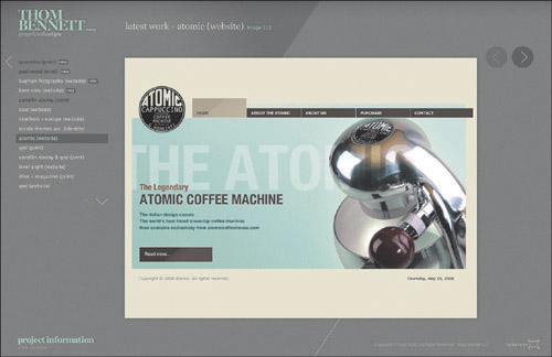
The menu and header provide a wealth of orientation information. The header reminds you of the main section you’re in, the project name and type, and how many images represent the project.

The main menu has two large arrows that point back to the main heads and down to indicate that there are more projects below the ones you can see listed. Unvisited projects are in light type, visited ones are in dark. The selected project has blue type in a dark box. Hover over another project and it highlights with a mid-value box.
The menus are full of visual feedback and clever thinking. No visitor will feel the frustration that arises when you realize that you’ve just unintentionally loaded a project you’ve seen before. Simple color changes in type and background act as breadcrumbs to help the viewer stay oriented to where they are and what they have already viewed. The menus themselves are clearly organized, with navigation that makes it easy to change levels or topics with one click.
As you might expect, all of Bennett’s project images appear with blinding speed. But even so, he provides feedback for each project group as it loads with a “percent complete” readout. The images stay in the computer’s cache for as long as you remain on the site, so if you do decide to review a project, there is no load time at all.

As a new project loads, the screen dims and a progress readout lets you know load status.
Print projects are photographed in innovative positions or lighting to emphasize the difference between them and web work, and to show the textural details that Bennett’s optimizing process maintains.

Select project information for a print project, and Bennett identifies ink and paper decisions.
Content
Bennett is a self-employed web and graphic designer, and his portfolio site is by far his main presentation form. Most potential clients base their decision to use his services on the site without a face-to-face portfolio presentation. Given its importance, he’s given a lot of thought to what brings a prospective client to his site, and what they expect to find there. As a web designer, he needs to show a range of site design projects in addition to his own site’s obvious object lesson. As a print designer, he needs to show his non-screen work in a way that indicates his sensitivity to traditional issues. And that means shots of finished print work, to avoid confusing one type of medium with the other.
Bennett never forgets that ultimately it’s all about the work. Every project image is of stunning quality and shows a different aspect of the whole, framed and cropped individually to show off the defining design elements. He shoots only high-resolution photos, and he spends the extra time in optimization to maintain the exact color levels he needs. Each image is compressed to exactly the optimum file size: big enough to hold even delicate details, but small enough to load as fast as possible. He describes the key to his process: “I will set up a document to the actual pixel size of the final image I want for my portfolio. From here I will copy and paste my hi-res project photos and images into the document. The advantage of working like this is that it allows you to play around with the images position and size so you can crop into it where you feel it looks the best.”
Future plans
Bennett created this redesign to make his site easier to update and to provide more visual impact with each image. One of Flash’s drawbacks is that it creates sites that can take constant effort to stay current, in contrast to a standard HTML site that can often be updated with minimal fuss. Like Jonnie Hallman in Chapter 1, Bennett has separated the wrapper from the content—he updates using XML and linked images. As a result, this site will likely remain present for the foreseeable future, hopefully to gain its own share of approbation from potential clients and other design professionals.