
Chapter 6. Transferring Physical Media to Digital
If all or most of your work was created (or printed) in traditional media, getting it into digital form will be a major project. Like any other task that is light on creativity and heavy on production, it can take an effort of will to begin. It’s also tempting to underestimate how important it is to digitize well. Failing at this crucial stage can make the rest of your effort a waste of time.
In the end, your portfolio is all about your work. Digitizing that work successfully is the first step to a quality portfolio. Fortunately, you probably already have the technology you need to do it right. Your skills and some patience will take you the rest of the way.
This chapter will outline the best methods for capturing different types of material for a digital portfolio, how best to move your work into a digital file, and the most frequently needed software remedies for materials that aren’t portfolio-ready.
Digital craft defined
Craft is just as important in making digital files as it is when doing everything by hand—in some ways, more so. People are far less forgiving of bad digital craft because it is so much easier to fix a digital image than it is to repair a dinged or folded corner on a sample. You owe it to yourself to keep the focus on your ideas and creativity, not your production.
Not having the original at hand, people judge images in digital portfolios by two criteria. The first is image quality—sharpness, cleanness, size, and load speed. The second is image appropriateness—whether what you’ve chosen to show actually helps them judge your work.
Unlike your physical portfolio, the appropriateness of your digital work doesn’t depend just on its style or subject. Some of your portfolio material might transfer poorly to the digital medium. Be prepared to evaluate your work twice: before you digitize it and when you see the results of your work. No matter how much you want a digital portfolio, trying to doctor a terminally ill file will just make you frustrated.
On the other hand, don’t do a detail-for-detail comparison, or you’ll never use any non-digital work in your digital portfolio! You can’t ever totally replicate the experience of a real printed piece. Evaluate the work based on how you feel about presenting this material to someone who may never see the original.
If there is an overriding theme, it’s GIGO: Garbage In=Garbage Out. Keep each stage of your digitizing process as precise as possible. Start with the cleanest original material, and remember that bad quality can be introduced inadvertently at every stage of digitizing and cleanup.
And don’t be afraid—or embarrassed—to look for help when you need it. It is better that your portfolio process be a learning process as well than to present a flawed finished product.
Getting help
If you want to learn how to use the software for digitizing your specific artwork type, I encourage you to buy the appropriate book in Peachpit Press’s Visual QuickStart Guide series and to look for local workshops for training on digitizing analog tapes and photographic film. Scanning has to be done right, but it’s drudgery, and it competes with paying work. If you have an enormous backlog of work to digitize, some money to devote to the enterprise, or feel that you can handle some parts of the process but not others, there are viable alternatives.
Photograph or scan?
Should you use a flatbed or film scanner? Or should you photograph your work? The best way to bring your work to the computer will differ based on its exact type.
Garden variety flatbed scanners are great for flat, low-contrast images. That makes them extremely useful for printed art and illustrations but less effective for images with a broad value range. If you scan to hold shadows, you’ll lose the highlights, and vice versa.
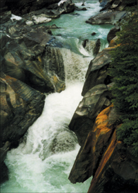
If you have strong highlights and shadows and comparatively few midtones, you may lose detail at both ends, as happened in this image. The bright foam is too bleached out (center of the image) and there is no detail in the rock shadow in the lower-right corner.
Although you can scan prints on a flatbed, if you are a professional photographer you should try to go direct from film. You should also look for a slide scanner. Flatbeds marketed as photo scanners have better dynamic ranges than standard ones, but even with transparency attachments most can’t complete with a good film scanner. Use them only if you print on special paper or make post-developing changes to the print.
What about not-quite-flat art, like books? Your ideal solution is a large-sized flatbed scanner for page spreads (an option at some service bureaus and schools). But if you can’t find one, taking photographs using a copy stand (see “Shooting 3D and oversized work”) and some non-reflective glass is usually better than trying to graft two scanned pieces together in Adobe Photoshop.
Hiring students
If you live in or near a college or art school, inexpensive help might be close at hand. Most art and design students are well-versed in software technologies, particularly scanners and Adobe Photoshop. Many schools have clearing houses or bulletin boards (or placement offices for part-time help, co-ops, interns, and so on) where you can post your needs. In some cases, you might find that hiring a creative student can help you produce a better portfolio, not just get your artwork on a flatbed.
Service bureaus
If you have negatives or slides, look for a place that advertises photo scanning. Ask them about their process and how they ensure quality for images that may need special handling to maintain color or dynamic range. Avoid service bureaus that specialize in document scanning. They make their money by putting standard-sized materials through scanners in batches.
DVD services
Most places that make video copies and transfer home movies also have facilities to convert an analog tape to DVD-R. They’re likely to charge by the hour, so you’ll get the most cost-effective result if you have them transfer your original analog demo reel first (never one of the copies!), rather than whole project tapes.
Ask other film and video people in your area to recommend a video service, or a member of the community who owns the software and equipment you’ll need. If you can’t get a recommendation, at least try to talk directly with the person at the service bureau who will do the conversion, so they’ll know what you need the film for and why its quality is important.
Shooting 3D and oversized work
Digital art is flat; 3D art isn’t. There’s no perfect way of getting around this, but it shouldn’t prevent you from showing your 3D work to good effect. Even traditional portfolios require photography to transfer dimensional art into flat containers.
In fact, short of being in the physical presence of the work, a digital portfolio can be a great way to show a 3D piece. With a little skill, you can create the illusion of three dimensions in Photoshop. Even without image editing, you can show multiple views of the same art or even just a standard product shot in glorious full-screen.
Most of what you will need to get acceptable results on a budget are time and patience. You’ll also need access to some of the standard tools of a photographer’s trade: a camera, a copy stand and/or tripod, and some professional lighting. If you don’t own all of these things, you can rent them, rent studio space, or barter.
Choosing your camera
Your camera should not be a small consumer model, because these do not have good depth of field. It must have optical (not just digital) zoom, capture images at 4 megapixels or better, and have a mounting hole in its base for a tripod. It should have white balance features and an adjustable flash.

A standard white balance screen allows you to shift how your camera “sees” colors in different ambient light settings, from full outdoor daylight to fluorescent or incandescent indoor lighting.
Ideally, use a camera that has a raw file format option, not just JPEG. Raw files contain all the visual information the camera captured, whereas JPEG files are processed in the camera, where they are sharpened and stripped of “redundant” information, which might not be redundant to you. (See the “Cleaning up digitized art” section below for some basic hints on image editing.)
One last thing—you’ll enjoy shooting more if your digital camera has a display screen that pivots like those in the Nikon COOLPIX series, particularly if you’ll be using a copy stand (See “Setting the stage” below for more on copy stands.) That way, you won’t have to crane your neck to see the display no matter how you’ve had to mount your camera.
Lighting
Lighting is very important because it will determine the range of colors you shoot. The way the lights are positioned is also critical. If you don’t have a copy stand or a room with professional lights, try to locate a bright, day-lit room, and make sure that any lights in it are turned off. If your artwork is framed under glass or reflective plastic, take the frame apart. There’s almost no good way to light a framed piece to avoid hot spots and reflections. Place your flat art so that no shadows are cast on it. (For 3D art, shadows behind or below are fine.) In general, avoid using a flash. It will create hot spots and inappropriate shadows.
Another alternative if you don’t have professional lighting available is to wait for a dry but overcast day. The light will be nicely diffuse.
Adjusting your camera
Correcting white balance ensures color fidelity—a must for any serious designer or artist. Setting the perfect white balance for a shot is a basic skill for a professional photographer, but if that doesn’t describe you it’s still possible to end up with a good color match.
In every uncontrolled lighting situation, color shifts with lighting. Our eyes adjust, but cameras do not. Fluorescents (found in offices everywhere) tint everything blue-green. Incandescent light (sometimes called tungsten) moves colors toward the yellow. Even scanners can be a problem as some shift colors toward magenta.

WWW.PEOPLEDESIGN.COM
Although some people shoot everything against a white background for stylistic consistency, sometimes individual projects beg for different color backgrounds to show them off to best effect.
Fortunately, all decent cameras have a white balance setting, although you will have to depart from the automatic settings to find it. The white balance menu offers several presets for a variety of standard lighting situations. When in doubt about the type of lighting you are shooting in, you should take sample shots of one object in each of the presets, and compare the picture in your camera display with reality. Use the preset that most closely resembles your work’s color range.
Setting the stage
For books, mid-sized prints, or pieces with accordion folds or die-cuts, your best bet is usually a copy stand. A copy stand is a flat board with a camera attached above it and lights at an angle (usually 45 degrees) on two sides. The bulbs should be the same type and brightness to eliminate shadows. Ones with double copy lights on each side and a large bed are best, but you can get a small stand, lights and all, for under $150. If you can’t buy a copy stand, ask your friends and your professional network; libraries and art departments at schools and universities often have them.
If you can’t get access to a copy stand or your artwork is flat but too big to fit on the stand’s base (like an oversized architectural sketch or an etching), mount your artwork on posterboard with a large enough margin to create a uniform background for the art. Pin the mounted art on a wall in a large room. Attach your camera to a tripod and shoot away.
If your artwork is three-dimensional, you’ll need a large, flat table as well as a wall. Photographers often shoot against smooth, pure white matte backgrounds (referred to as “seamless”) to emphasize the object’s dimensions and cast clean shadows. Seamless is also your preferred background if you plan on making the background transparent in your portfolio design. Ideally, you should use a professional fabric, but if you can’t, a stretched white sheet can be a good stand-in. On the other hand, not all objects will show to best effect with a white background. If you don’t feel comfortable masking the art in Photoshop and adding in appropriate background colors on the computer, consider having a black background available as well. The material should be non-reflective paper or fabric.
Worst-case scenario, find a clean, level floor. Again, put your artwork on a non-reflective background. Raise your tripod as high as you can, point the camera down, and shoot. Tripods that allow you to rotate the head mount so the camera points straight down will allow you to shoot flat art without angling or distortion. Try to avoid the temptation of a wide-angle lens.
The bigger your artwork, the harder it will be to shoot. Oversized printed material can be pinned and shot from a distance to capture it, but this strategy has two disadvantages. First, you can’t see details. Second, all sense of scale disappears. Murals, sculptures, and environmental design projects become indistinguishable from brochures. The ideal is to shoot the artwork in pieces, and then reassemble them into one image. To minimize distortion, shoot standing at the center of the work and use a tripod. Try not to set up too close to the work, or you will need too many “tiles” to avoid distortion.
Many digital cameras have a panorama function that makes it relatively easy to shoot your images in visual tiles of overlapping segments. Leave plenty of overlap—at least a third of each image should overlap the one before—so the software can figure out where to position each puzzle piece. However, you should use Photoshop to merge these and adjust for distortions, rather than using the stitching software that probably comes with the camera and that is optimized for landscapes, not flat artwork.
Digitizing flat art
I encourage you to use a good-quality scanner for your digital portfolio, even though the cheapest scanner on the market scans at an optical resolution better than you’ll probably need for onscreen display.
Why? Color, features, and time. A good scanner will faithfully read and reproduce more colors than a cheap one. It will have software with features that can save you lots of Photoshop work. In addition, on a cheap scanner, you’ll wait for an image preview and even longer for the scan itself. The time difference isn’t significant for one or two scans, but you’ll come to dread it for a larger batch.

Be sure to scan line art in grayscale mode, not in bitmap. Otherwise, your result will be pixelated, as this image is.
Then, adjust the Brightness/Contrast slider in Photoshop until you get the line thickness that most closely resembles your original art. Use the Sharpen Edges filter to reinforce the changes you made in your line weight and make the line edges feel crisper. When you’re done, scale down the image to your preferred size.
Line art
Line art—pen and ink illustrations, marker or pencil sketches, and etchings—looks like it would be easy work to reproduce. In fact, it’s the hardest. Because it only contains two elements (black and white), the lines break up into bitmaps. Diagonals develop stair-stepping, and crosshatching can look like jagged arrangements of dots.
Scan line art at a much higher resolution than the screen quality you ultimately need (1200 ppi is good). It’s also a plus to have an original that is much larger than the final image needs to be. Scaling down line art always makes it look better.
Flatbed scanning hints
There are several things you can do to improve the quality of your scans, some of which are very low-tech:
• Clean the scanner. Every speck will reproduce. Don’t depend on scanner software that offers to clean up dust and scratches as you scan. It does a terrific job on the obvious places but can sometimes mistake a critical detail for a speck and eliminate it.

To square up scanned art, select all, then choose File > Automate > Crop and Straighten Photos while holding down the Option (Mac OS) or Alt (Windows) key.
If Photoshop divides your scan into separate elements, step backward. Select Image > Canvas Size, make sure the canvas extension color is white, and that the artwork is anchored in the center of the grid. Increase the canvas size, then try Crop and Straighten again.
• Square up your art. It’s easy to square up a small photo on a flatbed. It’s much harder to do that with a book, or an artwork that you’ll need to scan in pieces and stitch together. Fortunately, there’s a quick and easy fix for that. Scan the art, and open it in Photoshop. Then use Crop and Straighten Photos to square your art up automatically.
• Scan tiled work twice. If you’re scanning art in two pieces, you may find that one side of the artwork is slightly brighter or darker than the other if the artwork doesn’t lie completely flat. To guard against this, scan the work twice, the second time with the halves rotated 180 degrees. Try merging the left side of the first pass with the right side of the second, or vice versa.
Digitizing slides and negatives
When you use a film scanner, you don’t have to worry about screen moiré or lost dynamic range. Yet even with a slide scanner, your image quality can vary. Most of the unpleasant changes can be avoided by keeping some simple concepts in mind.
• Clean your slides. Spray your slides with canned air before you scan them. Dust can affect film just as easily as it can a printed piece.
• Use film negatives. If you have the choice between scanning a film negative and scanning a slide, use the negative. They’re both films, but the slide is actually second generation art, just like a photo print. The negative contains more faithful color and a better quality image than the slide does.
• Scan right side up. If you scan with your slide or film wrong side up, you could end up with your image looking as if it was shot in a mirror. To avoid this, scan with the emulsion side of the film facing away from you (or down, depending on how your slide scanner is set up). To recognize which side is which, look carefully at the film. The emulsion side will look slightly textured, and often has the film logo printed on the holder. The other side will be much shinier and smoother.
• Don’t overscan. Ordinarily, you need to scan a slide in at a very high resolution (2700 ppi isn’t unusual) to use slide art for printing. (Slides are so very small—they need to go up about 900% to fill a letter-sized sheet.) But when you’re heading for a screen resolution of 72 dpi, there isn’t much point in creating a mammoth file. 400 ppi should easily give you a large enough image for the web.
Hopefully, you are only digitizing your very best work for your portfolio. But photographers with decades of analog work may find their “very best” list runs to the high double-digits and beyond. If that is the case, you will need a deeper understanding of color management and workflow to keep you sane and guarantee that you finish the process. I recommend Scanning Negatives and Slides: Digitizing Your Photographic Archives by Sascha Steinhoff as a good introductory book on the subject.
Digitizing VHS tapes
One of the most frustrating realizations to a film and video person is that there is no digital video equivalent of the flatbed scanner. The process is time-consuming and often disappointing.
If you have already edited digital video using professional software like Adobe Premiere or Apple Final Cut Studio, or if you have easy access to a digitizing studio, it may be worth your while to do your own digitizing. (Handling your own process is always preferable because you have more control over the final product.) But if you’re a digital neophyte and you need a portfolio soon, your energies would be better spent learning the ins and outs of digital video and the above-mentioned software, while you pay to have your tapes digitized for you. Then all the clips you work with will be digital when you create your DVD.
Video digitizing hints
Some of the same issues in scanning flat art arise in bringing analog video to the computer. Alas, because of the added complexity of dealing with sound, larger files, and better frame rates, they can be easy to miss until it’s too late. Like scanning errors, the only way to remedy them is to redigitize.
• Start with a good tape. If your material has been processed twice—once when you edited pieces onto a demo tape and again when you made copies of the demo tape—you won’t get a good quality digital result.
• Transfer to DVD. Moving from interlaced video at 30 frames per second (fps) to non-interlaced digital display can result in dropped frames and sound and video that don’t always sync. Always make a DVD copy of your video, no matter how you intend to use it later. You’ll need that quality. Unlike flat image files, you can’t clean up your video by simply showing it in a smaller window.
• Use the right tool. Although you can use either consumer software such as iMovie or professional software like Premiere or Final Cut Pro to digitize tape, there is a crucial difference between them. Professional tools can edit uncompressed video; consumer tools can’t. A consumer tool will compress your video every time you edit and save it. Compression throws out visual information to save space. (See Chapter 7 for more about compression.) That’s not a serious issue if you have shot digital video. But with analog, the quality will suffer, sometimes tragically.
Cleaning up digitized art
Even when you scan and photograph under optimal conditions, the result can be disappointing. The problem may be in the artwork itself. Pieces that have been damaged will be captured warts and all. Or perhaps the art is so large or complicated that you’ve scanned it in pieces and need to put the pieces together. When you can’t start over or substitute other work, it’s time to pull out your software tools.
As anyone who edits digital files daily can tell you, a compendium of all the editing techniques you could use to perfect your files already fills hundreds—perhaps thousands—of computer books. To stay focused on portfolios, this chapter highlights only the most frequently needed remedies. For more details or problems that this chapter doesn’t cover, I suggest almost any book by Katrin Eismann, but particularly Adobe Photoshop Restoration & Retouching.
Working process
Post-scanning issues occur with all types of digitally captured art, both still and motion. In fact, video-editing software packages, particularly the simplest encoders like Windows Movie Maker and Apple QuickTime Pro, have many of the same filters and tools to affect multiple frames as you can find in image-editing software like Photoshop. The best adjustments are found in professional programs, like Apple Final Cut Pro. If you understand the concepts behind issues like tone, color, resolution, and sharpness, you can apply them equally well in any digital file.
It’s critical to do your work on the right types of files, and in the right order. Follow this sequence:
1. Change your file type.
2. Adjust brightness, contrast, and color.
3. Clean up and retouch your art.
4. Save a copy of the image.
5. Adjust document size and resolution, if needed.
6. Sharpen, if needed.
7. Optimize and save in a compressed format. (This is covered in Chapter 7.)
The video-editing process steps are the same, although the size of files usually makes it necessary to edit first before applying cleanup filters and effects.
Choosing a file type
File types (formats) serve different purposes. You should select the format that best suits your purpose at each stage of your working process.
If you are using a digital camera, you will either have no choice (JPEG is the default) or you will be able to shoot and save in raw. Raw files can be opened in Photoshop, but must be translated into an editable format before you can work with them in the application or use them in a portfolio. When you create a digital file with a scanner, you usually have a choice of what file format to save the file in.
When you create a file in an application, or move it into an application for editing, you are working in a native file format—one “owned” by that application. Although some native files open in other programs, most of the time a native format is specific to the application that creates it.
When it’s time to archive a file, move it into another application, or open it in a different OS, you should save a copy of it in a universal format—one that many applications can read and edit. For photographic or continuous tone files, that format is usually TIFF. For illustration and print publications, it’s usually EPS. For onscreen moving image, AVI and MOV are the formats of choice. Good universal formats allow you to save and return to editing without quality loss.
For onscreen work that will be transmitted over the Internet or played back on a computer, your files must be compressed. Compression formats minimize file size in different ways. Two common image compression formats are PNG and JPEG. For publishing layouts, PDF is the standard. Sound and moving-image files can be compressed with many formats, such as the familiar MP3 and MP4 files. Currently, the most common video compression formats are MPEG, DV, and WAV, but there are dozens of others, some of which may well become standards over time.
Never edit a JPEG...
...or an MPEG file, for that matter. These files are efficiently compressed. They can look as good as the original files, but they have lost information in the compression process. In fact, they continue to lose more information every time you open one, make an edit (no matter how small), and resave it. That’s why some online artwork ends up so awful.
Compressed files should be the culmination of your editing process, not the working format. If you must edit a compressed file, resave it first into a non-compressed universal format. When you are finished, save a copy of the edited universal file in the compressed file format.
Editable issues
When problems with photos or scans arise or you’ve made a design decision about your portfolio after your photo shoot, you may need to correct your material. The following issues are the most likely to cause you grief.
Tonal Problems
Even when you use white balance and are careful when you scan, images can suffer from bad contrast or color shifts. As long as there is readable image information in an image’s shadows, highlights, and color channels, it’s possible to bring that information out, improving and preserving the artwork’s details.
Briefly, an image’s tonal value is its range from darkest to lightest areas. Many images that seem to have multiple problems really just need a tonal value adjustment.
Tonal problems respond best to a software program that generates histograms. Linear sliders for brightness and contrast, like those in consumer programs, will not do the trick. Professional editing programs (still and video) offer histograms and level tools, as well as brightness and contrast sliders. Some programs also offer other tools, like Photoshop’s Curves or Adobe After Effects’ Levels and Channels. You’re free to experiment with any of these options to find the ones that feel most intuitive to you.
What is a histogram?
A histogram is a chart of thin vertical lines that shows the distribution of brightness in an image, from 0 (black) to 255 (white). The taller the line, the more pixels the image has at that level of brightness. Darkest pixels are on the left, and brightest on the right.

The input sliders regulate the distribution of brightness. The output sliders regulate how much contrast the image has. There are three small eyedropper boxes on the lower right. The one on the far right sets the white point, which is the brightest place on your image—pure white. The one on the far left sets the black point, the place of deepest shadow. Used together by clicking the whitest and darkest image areas, they treat an image’s value range like a rubber band, stretching it out in both directions to use the entire value range.
Brightness and contrast
Most image-editing software has an automatic levels function that can do a decent job on an image. For a portfolio, however, decent is not always good enough. The automatic function tends to increase contrast at the expense of maintaining detail—not a good feature for a photographer’s portfolio, or for a designer whose work includes textures and subtle ink variations. Most of the time you should use the manual levels function, which gives you much more control. Curves allow even finer adjustments in color and tone, but they also require more experience and understanding of color management than levels do.
Moiré
Color printing depends on fine-screened overlays of dots to mimic continuoustone color. Unfortunately, the dots are created with screens that do not have a one-to-one correspondence to pixels. When screens and pixels collide, you get wavy, distracting patterns. Most scanners come with software that includes a “Descreen” setting, which usually does a very good job on the problem. But sometimes moiré persists, or the scanner you’re using is too old to have software that includes Descreen.
If you scan and discover that the file has moiré, the first thing to do is to rescan it. You can often eliminate or decrease moiré simply by finding a sweet spot—an angle where most of the screen dots don’t create pixel patterns. Then a few simple tweaks in Photoshop can make your printed pieces sing again.
Place your artwork slightly off-kilter on the scanner, at about a 6- to 8-degree angle, then scan at least double the final screen ppi. Avoid a number that’s evenly divisible by your final resolution, or the moiré could return when you scale your art down. For example, 150 ppi works nicely for an image that will be seen at 72 ppi.
Backgrounds
If you’ve followed the guidelines on photographing your artwork from earlier in this chapter, you may not have to worry about backgrounds at all. A well-shot object can be cropped and shown in its own background.

If the image still shows moiré after you rescan it and use the Descreen option (A), look at each color channel. You may discover that one is in much worse shape than the others, like this blue channel (B). Select this channel, and use the Gaussian Blur filter with a very small radius setting to eliminate most of its patterns. The improvement can be enormous (C).
An image background can need editing when you finalize the design of your site interface. Some people arrange several scanned objects together, adding a drop shadow to each object. Or they’ve shot a bright object against black for contrast, and then realize that they want to show the art against a different color web page. If this strikes a chord for you, you’ll need to separate the background from your image.
Because you’ve shot your work sensibly, it’s on a white or black background. That means it should be easy to select—probably much easier than trying to select the object in the picture. In Photoshop, once you’ve selected most of the object background with the Magic Wand, you can use the Polygonal Lasso tool for those places where the differences between the background and the object are too delicate for the Magic Wand to see, and to clean up areas where the Magic Wand hasn’t given you a clean line.
Resizing
The default for a digital photograph is only 72 dpi, but it has an enormous document size. Document size and resolution are two sides of a mathematical equation that describes how much information is in your file. To avoid throwing away valuable information, always uncheck the “Resample Image” check box in the Image Size dialog box before you change your document size or resolution on a newly imported photo.
To be safe, before you crop or resize any file, save the file you’ve been editing and crop a copy. You may discover that you need more resolution after it’s too late to get it back without redoing all of your adjustments and edits.
Sharpening
Only sharpen images that really need it, and then use the least amount of sharpening to get your result. Avoid the standard Sharpen filter: It’s a blunt instrument for a surgical task.
The correct image sharpening tool is the “Unsharp Mask” filter, one of the Sharpen menu’s alternatives. It only affects areas where abrupt color or value changes indicate visual edges. The filter’s strange name describes how it works. It takes a blurred copy of the image and uses it as a pixel mask, then compares each pixel with its blurred version. Pixels that aren’t at the edges are untouched, or masked out. The filter then does some complicated math to determine how much to change the edge pixels.
If you have images that develop outlines when you use Unsharp Mask, try working on each image channel separately, sharpening the noisiest channel (usually blue) the least, and the cleanest channel (usually green) the most. But be careful. Sharpening one channel much more than the others can lead to color shifts.
Make sharpening the last thing you do before you save a file in a compressed format. As with other edits, never sharpen a file that is already compressed. Return to a universal file format and make your changes there, then resave the file for the web.

Unsharp Mask’s Radius and Amount should increase with your resolution. At 72 ppi, Radius should be between .3 and 1.0 pixels, with .5 to .8 usually giving optimal results without oversharpening. For Amount, I start at a default of 75% and move up to 175%, watching for harsh lines that warn me that I’ve gone too far. Threshold should decrease as resolution increases. A Threshold of 3 to 5 is appropriate at screen resolution.
Portfolio highlight: Triboro Design | Applause in translation
Of all the creatives who need an online portfolio, graphic designers are held to the highest standards overall. They were the first design professionals to migrate their work to the web, so there is a decade-long string of trailblazers both to emulate and surpass. Those who are primarily print-based are faced with the toughest challenges. Many of the decisions that separate journeyman print designers from those who are truly gifted are very hard to convey in the flat, rectangular frame of a browser. Yet without an impressive online portfolio, a graphic designer might never get the chance to present his or her physical portfolio in person to a prospective client. This conundrum makes the online portfolio of New York City’s Triboro Design particularly notable.
Triboro Design is designer David Heasty and his wife and collaborator Stefanie Weigler. Although a relatively young design firm, they have carved a distinctive place in the competitive world of identity and publication design through their attention to the very physical details that disappear in most online portfolios. Yet their site illustrates how it is possible to transcend the limits of the medium while staying true to the things that they do best.

The Triboro splash page is a compelling introduction to the portfolio experience.
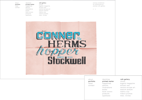
Select a category and a third column lists the relevant clients in this group, automatically displaying the first client’s work in the list with a client brief on the right. You can move backward and forward through the work with the simple arrows.
Click the portfolio link and a column of project categories appears to the right of the main list. Categories highlight in black as you roll over them in the menu. The breadcrumbs that orient you within the site architecture are also indicated by black type within the columns.
Navigation and architecture
Their novel approach is immediately obvious. Load their URL and a bold field of horizontal stripes fills the window. Click their name, and a pop-up window appears, framed perfectly by the stripes. If you close the rear window, the clean, pure design of the second window persists. However, the dimension and layering it provides is the perfect foil for the portfolio itself, and precisely the kind of design thinking that makes good print production.
As in many design portfolios, the menus are no-nonsense sans serif columns. Theirs nestle at the top of the page, building from left to right as the categories become more granular. The menus are always available but never obtrusive. The first two columns persist as you explore the portfolio, with the client list and briefs changing as necessary. Separating the copy and internal navigation of the projects prevents the text from becoming a wall of gray, and clarifies the difference between the general navigation and the project group.
Content
So far, the portfolio indicates clarity and good taste, but so do many other portfolios online. It is in how they approach their project content that Triboro stands apart. With the exception of graphic representations of logos and type designs, all of their work has been photographed and presented to emphasize its physicality. They shoot books at an angle, displaying cover and binding the way a book would actually be observed and experienced on a table. They celebrate the reflective shine of light on glossy paper and indicate thickness and scale by the expert placement of lighting to cast shadows.

It’s easy to see how Triboro approaches book design when you can experience an entire range of layouts, cleverly sequenced to emphasize spot color and visual balance.
But of course, there are other designers whose work is shot expertly. The difference is that Triboro not only shows each work as a complete object, they zoom tight into the details that define what makes each piece special. In some cases that means a shot from inches away to capture the texture of a woven label. In others, it’s a series that shows how an identity is used in different ways. In still others, varnish glistens on an extreme closeup.
Triboro makes every effort to present their printed work from the angle and distance that the work would really be seen in. This decision makes every product shot on their site pop with excitement and provides an almost 3D experience.
They manage this strategy with a consistent visual vocabulary. As Heasty says, “If the viewer sees an image in a circle, they instinctively know they are viewing a detail. If the object is floating free in the white-space of the page, then they can be sure they are seeing the piece in its entirety. By floating the pieces in a white background the space around the work becomes energized and there is an illusion of dimension. It’s as if you are in the same room with the work.”
Future plans
The website was coded by collaborator David Correll, but the partners update their site themselves. They change the portfolio section frequently as they complete new projects, with the latest project appearing as the first image in the portfolio section. The portfolio is not a historical record of their work, but a curated combination of their newest and best efforts. As David says, “A good portfolio is never finished. It grows and changes as the designer grows and changes.”

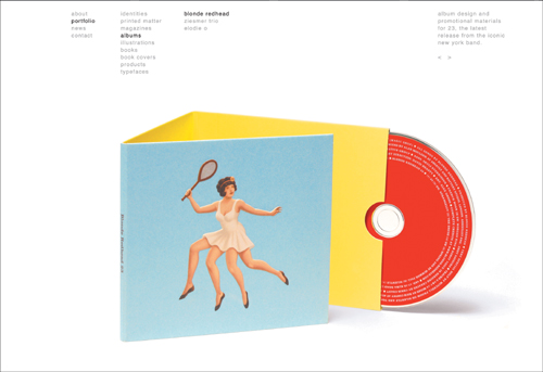
Most designers will show a category of logos or identities as graphic artwork. However, the crucial test of an identity is how well it translates in a variety of settings and materials. That’s particularly critical for fashion design. This combination of objects and closeups answers the test masterfully.

Triboro uses different strategies to show off each piece in a series to best effect. A flier is displayed on the site as it would be seen by a recipient of the physical original: with creases after folding. The People’s Liberation logo, seen as flat art on the previous page, is expressed in a variety of materials and purposes in the porthole details.