
Chapter 5
Data Authors: Skilled Designers of Data Presentations
Data product authors (or data authors, as we’ll use for shorthand) aren’t just concerned with getting data on the page. That’s like saying writers are just collecting enough words to fill a book . . . or movie directors are shooting purely to capture a few hours’ worth of film. Rather, data authors, and the presentations they craft, must have a specific, targeted purpose. And the purpose must be directed at the audiences of the data products. Data can both help explain how things are, and how they could be, but data becomes truly powerful only when it informs, instructs, and leads to smart discussions, decisions, and actions.
Skilled data authors are an essential element in our data fluency framework (Figure 5-1). Your challenge as an author of data products is to build a bridge of understanding between your data and the intended audience. This bridge requires that your audience can interpret the data as presented, understand its relevance, and consider the implications and available actions.

Figure 5-1: Data Product Authors within the Data Fluency Framework
A Rare Skillset
To bridge the gap between data and an audience, the data author has a complex job. The author must decide what data is most important to focus on to answer the questions at hand, and how to optimally harness and depict data to inform thinking and action. Effective communication with data is a rare skillset. Here are a few hats that data product authors must wear:
- Salesman—Data product authors must know their audience. To do so, they must consider how to best capture their audience’s attention, how they might perceive the data, and what it may take to gain the audience’s buy-in. An effective data product needs to be enticing, clear, and convincing to lead an audience to action.
- Therapist—Data product authors need empathy—the desire and ability to understand and share the feelings of others. By getting into the hearts and minds of the audience, they can find the questions that are most influential. What will motivate an audience to action? What is the audience afraid of? How can the data address these concerns?
- Connoisseur—The best data authors are willing to make tough distinctions between data that is interesting and data that is important and actionable. It can go against our nature to put aside data that others might want to see. But the desire to deliver everything needs to be offset by an appreciation for an audience’s limited attention span.
- Data analyst—Data authors can’t create great art if they don’t like working with their materials. Data authors need to be comfortable with core statistical concepts and comfortable with manipulating data. Getting involved with deep data analysis can reveal the important messages and accurate ways to convey them.
- Ethnographer—Data product authors should have a perspective on how the data product will fit into the way people work within their organization. How will the data product get incorporated into your audience’s workflow? How does information travel throughout the organization? What do people care about and what do they ignore?
Unfortunately, many of the people who are asked to be data product authors aren’t trained in these skills. Only now are leading academic institutions recognizing this market demand and educational gap. Although data analytics and data communications is becoming a part of leading academic public health and education programs, a commonly understood set of prerequisites doesn’t exist.
What You’ll Learn
This chapter is designed to help you build your skills for communicating—giving you the practical skills and mindset to become a better author of data products. Specifically, you will learn how to create effective data products by examining the following core concepts:
- How to know your audiences, develop purposeful products, and deliver a targeted message
- How to be discriminating with the data you choose to present
- How to define metrics that are meaningful and lead to action
- How to create a logical structure and narrative flow to your data products
- How to master basic design skills for making your data presentations attractive and easy to understand, including choosing the right form and language to present the data
- How to create data products that meet the needs of multiple constituent groups and start a dialogue about the data
Before diving into this set of skills, we first want to propose a helpful approach you can bring to designing data products.
Guided Conversations
People working in the data analytics field believe in the importance of visual data presentation and the concept of data storytelling. There are core truths in the concept of data storytelling. First, data communication has an ability to both create and resolve tension. That is, data products often pose a problem and then deliver an insight that helps address the problem. Second, the author is an active participant in the exchange of information. The author sets a path that the audience goes down.
Nonetheless, we feel that the concept of data storytelling has gotten a little overloaded. For example, consider comments like the following:
All of this data visualization is, of course, really just a new way to tell stories (or create experiences).
Garrick Schmitt, Ad Age
The author of this visualization experimented with different views and arrived on the two that told the story most completely, most effortlessly.
From Data to Story: Dissecting a Well-Made Visualization
In fact, the analogy to storytelling is limited when applied to communicating with data. Data visualization has fundamental characteristics missing from traditional storytelling. For example, interactive data visualizations let audiences explore information to find insights that resonate with them. Visualizations take shape based to a large extent on the underlying data. And as this data changes, the emphasis and message of the visualization is likely to change.
Therefore, communicating with data is less often about telling a specific story and more like starting a guided conversation. It is a dialogue with the audience rather than a monologue. While some data presentations may share the linear approach of a traditional story, other data products (analytical tools, in particular) give audiences the flexibility for exploration. In our experience, the best data products combine a little of both: a clear sense of direction defined by the author with the ability for audiences to focus on the information that is most relevant to them. The attributes of the traditional story approach combined with the self-exploration approach leads to the guided safari analogy (Figure 5-2).

Figure 5-2: Analogies for storytelling and data visualization
Communicating with data is like creating a guided safari. On a guided safari your guide (the data product author) takes you down a path in which he thinks there will be a good chance to see wildlife. If you are on a guided safari in the Serengeti, you may be searching for the big five: elephants, lions, cape buffalo, black rhinos, and leopards. The tourists are led to places where the animals are likely to congregate, near food sources or watering holes. The safari guide knows the best places to look, but the story will change every day. The data product author’s role is to create and lead an audience to a target-rich environment for finding data stories. It is up to audiences to recognize stories that are relevant to them.
Having considered your role as a data author in an environment with multiple influences, now turn to six core principles for creating an effective data product:
- Find the purpose and message of your data products and know your audience.
- Be discriminating with what data you present.
- Define metrics that are meaningful and can lead to action.
- Create a logical structure and narrative flow to your data product.
- Master basic design skills for making your data presentation attractive and easy to understand, including choosing the right form and language to present the data.
- Create data products that serve a broader audience and start a dialogue.
The following sections provide details on each of these principles.
Finding Your Purpose and Message
Data products must strive for simplicity—a capability to communicate the most important data clearly, effectively, and directly. The message of a data product is likely to change as the data changes, but finding a simple way to present the data is a constant challenge for data product authors.
In the book Simple (Twelve, 2013), authors Alan Siegel and Irene Etzkorn propose a framework for simplicity that applies as much to data products as it does to their discussion of business writing, documents, and presentations. For them, simplicity requires the author to:
- Empathize by perceiving others’ needs and expectations.
- Clarify by making the offering easier to understand, use, and benefit.
- Distill by boiling down and customizing what’s being offered to meet needs.
Like Siegel and Etzkorn, you can put the audience at the forefront of your efforts to design data products. You need to know what information is most critical to your audiences’ decision-making and the questions that they need answered to be more successful. Data products—data-rich presentations, reports, dashboards, and analytical tools—clarify by presenting data visually, using the right chart or graphic for the job, and by using clear language and thoughtful context to ensure understanding. Finally, data product authors need to be extremely discriminating in what information they choose to focus on. Only the right metrics and most actionable data should be featured to make the most of your audiences’ attention.
In this section, you learn the following:
- How to create a balance between what the data is saying and the needs of your audience
- How to understand the perspective of your audiences and consider what data will be most important to them
- How to narrow your focus to deliver the most important information
The goal is to achieve a balance between the data, audience, and objective in your data product. Your data product has a purpose—whether it is as broad as informing executives about overall organizational performance or as narrow as delivering a weekly e-mail highlighting sales activity compared to goals. With many competing demands, it isn’t always easy to clearly define this purpose and therefore the scope and message of the data you need to communicate. The purpose is a balancing act, weighing the needs of the audience against your own objectives and considering the results and insights that percolate from the data itself (Figure 5-3). Now consider some thoughts on how to perform this balancing act, starting with the data.

Figure 5-3: Finding balance between the data, audience, and author’s objective
Let the Data Speak
Whatever your personal objectives and the desires of your audience, your data product must be rooted in fair and honest analysis and summary of the data. Some data products, such as research reports and customer survey analyses, should rely first on the data to uncover a message. In these cases, there may not be a specific action that you are guiding your audience toward. The data can lead to many unexpected places and may raise more questions than it answers.
However, we caution against a blanket philosophy of “letting data tell its story.” The data may not have a story. Or the story may vary for different audiences. Or the data may point to outcomes that are entirely outside of your organization’s control. The cost of this focus on pure objectivity—and therefore discarding the inherent knowledge of the author or the needs of the audience—is often a directionless and sprawling document.
Your Objectives
Data products will, and should, bear the stamp of their author. They should reflect a goal that is important to you, as the person who is choosing what data to show and how it gets displayed. What outcome are you looking for? What do you hope to change in your organization by creating this report, dashboard, or analysis tool?
Data products can serve many purposes. The following (non-exhaustive) list includes many of the popular reasons for building data products:
- Help management define what is important.
- Educate people in the organization about the things that matter.
- Set goals and expectations for specific individuals or groups.
- Help organizational leaders sleep at night because they know what’s going on.
- Encourage specific actions in a timely manner.
- Highlight exceptions and provide alerts when problems occur.
- Communicate progress and success.
- Provide a common interface for interacting with and analyzing important organizational data.
These are general motivations. You will have specific motivations for each data product you are involved with. Before letting the data speak or simply reflecting the will of your audience, consider what is important to you.
Your Audience
Data products need to start with the audiences in mind. Who are the consumers of the information? What do they already know? What are their experiences and prejudices? As you design the data product, understanding the audiences can help you craft a product that fits their needs and is something they love to use.
The needs and perspectives of different audiences can vary wildly. Consider the needs of a marketing analyst versus a chief marketing officer. A marketing analyst wants to know the details of a specific marketing campaign. He wants to know how results are calculated and the data sources that were used in a report. His job is to understand the data deeply, and he enjoys exploring data to find his own insights. Spoon-feeding him just the top-line results is likely to frustrate this marketing analyst, causing him to disengage from the information.
In contrast, the chief marketing officer has a much narrower attention span for diving into the data. The top-line results are exactly where she will want to start. If everything meets her expectations, she may not want to know anything more. However, the CMO’s standards for the clarity and aesthetics of the data presentation are likely to be much higher than the marketing analyst. She spends her day looking at marketing campaigns that have a specific message and a polished display of information.
Often there will be multiple audiences for a data product. In fact, delivering the same report across different parts of the organization can offer the benefit of getting people on the same page. However, a diverse set of audiences complicates your efforts to communicate the data. The structure of a data product can help. For example, separating the executive summary from an appendix allows the executive and the data analysts to both get what they want. Interactive data products allow users to drill into areas where they want to find out more.
The following table shows a few of the factors to consider about your audience and the implications for a data product design.
| Audiences’ | Questions | Implication |
| Role | What decisions do they make? What questions do they need answered? | Structure the information to make it easy and direct to answer high-priority questions. |
| Workflow | In what context will they be reviewing the dashboard? What information are they using on a daily basis? How much time do they have to review the numbers? | The form and information display needs to fit into an existing workflow. For example, an on-the-road salesperson may need information delivered to her phone, not designed for an online wide-screen monitor. |
| Data comfort and skills | How sophisticated are they with using data? Do they enjoy digging into the numbers? | The dashboard’s level of detail and analytical capabilities should match the audiences’ comfort zone. |
| Industry and data expertise | How familiar are they with the key metrics? Do they understand where the data comes from? Are they familiar with internal company or industry terminology? | This determines the need for embedded explanations and use of natural language. |
Asking the Right Questions
Albert Einstein said, “If I had an hour to solve a problem I’d spend 55 minutes thinking about the problem and 5 minutes thinking about solutions.” The previous table is meant as a guide to help ask the right questions—spending 55 minutes thinking about the problem. Good questions, which are specific in nature, can help lead you to an understanding of the solution.
The website DoINeedanUmbrella.com is an example of asking the right question. It asks the first question many people have when they wonder about the weather forecast. Instead of serving up a comprehensive 10-day detailed forecast, DoINeedanUmbrella.com simply provides a direct answer to a good question, as shown in Figure 5-4.

Figure 5-4: DoINeedanUmbrella.com gets right to the point.
When looking at the data in our organization, isn’t this really what we’re trying to get to? Should we hire another developer? Are we going to meet our sales objectives? Will the product release be on time? Start with your message in mind and make sure, if you don’t do anything else, that you deliver that message.
Information Discrimination
The most common mistake in ineffective data products is an inability to make difficult decisions about what information is most important. Amanda Cox of The New York Times graphics department summed up this problem perfectly, “Data isn’t like your kids—you don’t have to pretend to love them equally.”
Often information gets included in data products for reasons that are superfluous to the purpose, audience, and message—reasons that cater the product to someone influential or use information that has been included historically. The bar should be higher. Here are a few strategies to help narrow down to the information that matters:
- Find the core problem—Your data product should be more than a lot of data on a screen or page. It should have a core theme based on the essence of the problem. For example, a sales dashboard may be designed around the question, “How can we more effectively move leads through our pipeline?” Or a marketing dashboard may strive to answer, “How can we optimize our marketing investments?” Finding this core problem can give you the logic and argument for discarding extraneous information.
- Ask a better question—Data requirements can quickly turn into a laundry list of unrelated metrics, dimensions, and half-baked analyses. The root of this problem stems from asking, “What would you like to know?” The follow-up question that narrows down the list of requirements is, “What would you do if you knew this information?” This question separates the novel and whimsical desires from the important and actionable information. The next section talks more about actionable metrics and data products.
- Push to the appendix—Sometimes, it is impossible to ignore the requests for certain information to be included in a data product. Multiple audiences demanding a multitude of metrics. In these cases, it can be helpful to create an appendix report that includes some of these requests. Doing so can help keep the focus on the most critical data.
- Separate reporting from exploration—Tools designed for reporting need to be narrowly focused with a clear topic and address a limited set of questions. Exploration or data analysis tools serve a different purpose. There are many data products designed to give the users a broad palette to explore a variety of data. It helps to understand which of these goals you are setting out to serve.
The success of many data products is determined by an ability to distinguish between useful, productive information and interesting but ultimately extraneous information. In short, we echo the sentiment expressed by French author Antoine de Saint-Exupéry, “Perfection is achieved, not when there is nothing more to add, but when there is nothing left to take away.”
Defining Meaningful and Actionable Metrics
Metrics, as you know from Chapter 4, “A Consumer’s Guide to Data,” are the values that you use to judge performance. They are also the focal point of any data product. They are the numerical reflection of the real-world behavior that your organization wants to improve, avoid, or shape. For example:
- In the credit card industry, “share of wallet” is a popular measure. The number represents the portion of a consumer’s total spending that the specific card issuer has managed to capture. For the card issuer, it can’t influence the total disposable income of its customers, but it can try to influence them to pull out their card more often at the cash register or in front of their computers.
- The No Child Left Behind legislation created an unprecedented focus on metrics in American schools. The primary measurement to receive federal funding under the Act is Annual Yearly Progress (AYP). To receive federal funding and avoid the “failing school” label, all students must meet a minimum level of proficiency on state standardized tests. Although the requirements are waived in many states, districts and schools have dramatically reshaped their behavior to focus efforts on a new “bottom line” of education—state standardized test scores.
Metrics can create focus and alignment in an organization by providing clarity about what improvement looks like. Metrics can also create behaviors that are counter-intuitive or contrary to organizational goals. Beware of the call center that measures agent performance based on average call duration!
Despite the importance of choosing the right metrics, it is common to not think deeply about what to measure. Here are a few of the most common mistakes in choosing what metrics to focus on:
- Historical conventions—History isn’t always a good guide. Many organizations blindly follow the conventional wisdom in their industry or simply follow the path of history without thinking about the implications.
- Simplistic metrics—The path of least resistance may be to take what your data gives you. Time spent on a website is easily tracked but doesn’t tell you anything about whether the users were actively engaged or running off to make a cup of coffee.
- Complex metrics—The opposite of simplistic metrics are complex, contrived metrics that combine data from many data sources. If people don’t understand how a value is created, they may react skeptically to your analyses.
- Too many metrics—Many organizations fall into a trap of trying to have a comprehensive collection of metrics that track everything that managers care about. If you work with dozens of key metrics, those metrics may not deserve to be called “key.”
- Vanity metrics—Some metrics can make you or your organization look good but don’t tie to outcomes that are important. Be careful that you don’t select metrics simply because you know they’ll make you look good.
To avoid these common pitfalls and choose the best possible metric, consider the following framework, one that balances four factors, as shown in Figure 5-5.

Figure 5-5: Choosing the right metric
Source: Juice Analytics.
A lot of metrics fail in at least one of these dimensions. Following are a few examples:
- Common interpretation—We had a client who made a distinction between “leads” and “prospects” in its marketing organization. Prospects had theoretically expressed more interest in the service through their actions. Unfortunately, the line between leads and prospects was always hard to decipher and the definitions were hard to communicate.
- Actionable—Metrics are frequently too broad for the impact that a particular group can have. Customer satisfaction is a popular dashboard staple, but it is hard for most managers to see how they can have a significant impact on the number.
- Accessible, credible data—Sometimes, the most valuable and obvious metrics are frustratingly hard to track. In the web analytics world, unique visitors is important data to know, but user deletion of cookies makes it hard to trust the data.
- Transparent, simple calculation—Top NFL agent Leigh Steinberg says of the famous football quarterback ratings metric, “Other than one attorney in our office, I am unaware of a single human being who has the capacity to figure a quarterback rating.” I don’t know what kind of art majors he hires, but all they need to do is use the simplified formula: (83.33 * Comp %) + (4.16667 * Yds per att) + (333.333 * TD pct)–(416.667 * INT pct) + 25 / 12.
Creating Structure and Flow to Your Data Products
Your job as an author of data products is multilayered. The last section discussed choosing the right metrics. Your next challenge is to bring order and structure to the way your data is visualized. What is the general structure of the content you want to communicate? How does the content connect? How does one data or visualization element flow into the next? Like an author writing a book, there should be a starting point, themes, segues between chapters, and a conclusion.
In this section you gain ideas for the different ways that data products can be structured, guiding your audience along a path of discovery, and tips for laying out a page or screen with content.
A Guided Path: Structure and Flow
Some people describe this process as data storytelling. As mentioned in the introduction, storytelling might not be the right analogy. Stories are fixed and narrow in interpretation. Data is less so because it is always changing and can tell new stories. The creator of a data product is closer to a “guide”—laying out a path for the audience to travel along, but the findings and conclusions of the audience are more fluid. The landscape may always be changing.
Where do you want to lead your audience? As an author communicating with data, your objective is to help readers travel a path through the presented data in a way that they can move their understanding forward. Unfortunately, the standard practice for laying out most dashboards and reports has been to simply fit everything on the page in a grid or a jumbled mass of information. Figure 5-6 shows a dashboard with a grid overlay.
This rigid structure tells you nothing about how different charts relate to each other. It offers no clue as to where to begin understanding the data and nothing about what information is most important. Creating a layout that helps frame the content of your data product is one of the most undervalued areas of information design. The dashboard in Figure 5-7 starts with the few high-level metrics (e.g., federal IT spend and change in spend) and then flows into the details about the agencies most responsible for these key metrics.

Figure 5-6: This common dashboard layout provides little guidance for users about how to explore the data.

Figure 5-7: A redesigned version of the Federal IT dashboard makes it easy to see where to start and where to go next.
Source: Juice Analytics
Why Structure Matters?
Stephen Few, author of Information Dashboard Design, calls structure one of the greatest challenges of dashboard design:
Dashboard content must be organized in a way that reflects the nature of the information and that supports efficient and meaningful monitoring. Information cannot be placed just anywhere on the dashboard, nor can sections of the display be sized simply to fit the available space. Items that relate to one another should usually be positioned close to one another. Important items should often appear larger, thus more visually prominent, than less important items. Items that ought to be scanned in a particular order ought to be arranged in a manner that supports that sequence of visual attention.8
Whether it is a dashboard or a data-rich presentation, the structure of your data product is an opportunity to define the logical way to look at a problem or the business. How you choose to lay out the information shapes how your audience understands the big picture and how the smaller pieces fit together. At a more practical level, structure can serve as a navigational mechanism for the user. It shows where to start and where to go next.
Structure Options
A good data product layout requires a deep understanding of how the system you are measuring works. There are many ways to break something down into manageable parts. For example, the performance of an American football game can be deconstructed in many ways: 1) by offense, defense, and special teams; 2) by down and distance; 3) by time period; 4) by drive; and 5) by running versus passing plays. Data presented around each of these organizing principles would tell a different story.
Choosing the right way to structure your data for presentation is entirely specific to the situation. However, in our experience, there are three common categories for structuring your information on the page: flow, relationships, and grouping.
Flow
A flow-based structure emphasizes a sequence of events or actions across time (Figure 5-8). Systems that fit this model include leads moving through a sales pipeline, stages of customer support, and operational processes. Notice how the dashboard in Figure 5-9 is built around the flow of information from the summary metrics to submetrics to dimensional breakouts. The commitment to the vertical flow structure makes it clear to users how to think about exploring the data.

Figure 5-8: Data products may be structured based on the flow of the underlying process.

Figure 5-9: Dashboard with a flow structure
Relationships
The structure of a data presentation can also emphasize the relationships between entities or measures (Figure 5-10). These relationships or connections may be mathematical, geographical, organizational, or functional. Figure 5-11 shows a visualization that displays scenarios for the valuation of a start-up. With the simple addition of a connective line and descriptive labels, the information in this tool helps users see the relationship between inputs on the left and projections on the right.

Figure 5-10: Data products may be structured to emphasize relationships.

Figure 5-11: Company valuation tool shows the relationship between inputs and outputs (labs.juiceanalytics.com/valuation).
Source: Juice Analytics
Grouping
The structure of last resort is to group related information into categories or a hierarchy. The simple act of putting similar things together can bring some logic and accessibility to an otherwise haphazard collection of data (Figure 5-12). Figure 5-13 groups related metrics into four categories. Based on their needs, different users will know where to start in reviewing the performance data.
Organizing the Page
The little things in designing a data product can make a big difference—such as where you place the key metrics, where you position charts, and how much information you try to fit onto a page. For example, many dashboards can do an admirable job of displaying individual charts effectively, but how the charts are arranged on the screen can create confusion. Oftentimes, the information is compressed to fit on a page in such a way that readers cannot easily determine what the most critical information is. Here are a few things to keep in mind when laying out data on the page.

Figure 5-12: Data products may group elements to make the information easier to navigate.

Figure 5-13: A dashboard with metrics grouped into categories
Source: Juice Analytics

Figure 5-14: Where people focus their attention on a page.
Source: Juice Analytics
Pay Attention to Attention
Position the most important information where people look first. Studies show that people tend to scan a page in a similar manner. Imagine that the image in Figure 5-14 is overlaid on your page of content. The research indicates that users look first for information on the top and left. Users also focus their attention down the left side. The center gets a fair bit of attention as well. But the bottom and right may not be noticed by your users at all. Therefore, as you choose how to present information, place the most critical information toward the upper left to capture your readers’ attention.
Grids
Many web designers use a grid system—a series of columns and gutters of certain widths—to ensure that key lines in their designs align. This approach brings a coherence and order to the page that puts users at ease.
We can overlay a grid on a site like TechMeme to see how this system gets applied in practice, as shown in Figure 5-15.
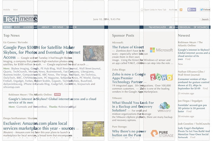
Figure 5-15: Many websites use a grid system to make the layout pleasing to the eye.
Not everything fits into one column, but it is obvious that this site has a predefined grid and sticks faithfully to it. The result is a clean, effective page layout.
White Space
You don’t just see objects themselves; you also see the space that is not there. White space in an interface design is important and too often overlooked. Maximizing real estate for data must also mean creating places for the eye to “rest” so that the nonwhite space has more impact. When you don’t have sufficient spacing, everything runs together and you can’t see what is most important, as shown in Figure 5-16.

Figure 5-16: Use whitespace to aid comprehension.
White space can be used to delineate sections or help users see groupings of content on a page. Using white space may mean sacrificing one extra chart or metric, but it can make a huge difference in user comprehension.
Organizing how you lay out content in a report or dashboard can have a direct impact on how well the information is received. By considering spacing and positioning, you can reduce distraction and focus attention on the most important elements of your message.
Designing Attractive, Easy-to-Understand Data Products
The last section discussed strategies for bringing order and structure to how data is displayed on a page. Your next challenge is to consider how the data looks, in what form it is delivered, and how words are best incorporated to facilitate understanding.
In this section you will learn:
- How the right form of data product can enhance presentation for your audience
- How functionality can enhance communication for your audience
- How attractive visual design can enhance presentation for your audience
- Core design principles for data products
Form
Data products can come in many forms. The volume of content will vary (from a single key metric to a comprehensive annual report) as will the medium used to transmit the information. A website, e-mail, animated slides, poster, glossy pamphlet, or 55-inch TV can all serve to communicate data. The challenge is in determining the right format for your audience.
The function of a data product is to communicate critical information to your audience in a way they can understand, delivered when and where they need the information. The form should capture its attention at the right time and move it to action.
Before you decide how you want to deliver your data product, consider a few factors that may influence the form:
- Timeliness—How frequently is the data updated?
- Aesthetic value—How important is it that the data presentation looks attractive, or can it be purely utilitarian?
- Mobility—Does the audience need to access the information through mobile devices?
- Connectivity—Does the dashboard need to connect to live data sources or can it be updated on a less frequent basis?
- Data detail—Will the data product offer a capability to drill down to see more context?
- Data density—How information-rich will views of the data be?
- Interactivity—Will the user benefit from interacting with the data?
- Collaboration—Is it important that your audience can easily share and collaborate with others about the data?
The following table assesses six forms of data products by their effectiveness in addressing the preceding factors. Which forms perform well for the factors your audience cares about?
| Factors | Hardcopy Report | Excel | Web App | E-mail Report | Large screen display |
| Timeliness | – | + | + | + | + |
| Aesthetic value | + | + | + | ||
| Mobility | + | + | + | – | |
| Connectivity | – | + | + | + | |
| Data detail | – | + | + | – | |
| Data density | + | – | |||
| Interactivity | – | + | – | – | |
| Collaboration | + | + | – |
“+” means the form can work well for the specific factor; “–” means the form is not effective.
Visualizing Your Data
After considering the form of your data product, you should next consider the best ways of visualizing data to convey meaning. This section considers the steps of choosing the right chart, color, and typography and also discusses wrapping your data in context.
Choosing the Right Chart
Charts are the building blocks from which reports and dashboards are constructed. Choosing what building blocks to use is a seemingly simple decision that can determine whether your data product solidly communicates your message or misleads your audience into focusing on the wrong things.
What is the right chart for your data? This is the question we hear more than any other. Unfortunately, there isn’t a simple answer or secret decoder ring. However, if you can understand how different charts address different types of questions, you’ll be well on your way to making good chart choices.
The first element in selecting charts is to understand that the purpose of a chart is to make it easy for readers to identify patterns and see how values compare to each other. The best charts maximize comprehension by playing to the strengths of visual perception. People can judge values accurately on a two-dimensional plane—the length of a line, the height of a bar, or the position of a data point. Bar charts and line charts play to these strengths. The ability to judge accurately declines when charts use other visual features to show values—width, area, color intensity, and radial distance. Therefore pie charts are generally less effective than bar charts because they require readers to compare radial distances, as shown in Figure 5-17.

Figure 5-17: Bar charts make it easier to compare values.
The second fundamental element in choosing charts is to know what you want to show. There is no good answer to what is the right chart without knowing the question you want to answer. The beauty of defining this question is that it can reveal clues as to the chart you need to use. Take the following examples:
- How do my sales break down by customer type?
- What is the change in visitors over the last 3 months?
- Which students have the best test scores and have improved the most?
Each questions tells you both what data elements are important and what you want to emphasize in your display of the data.
| Question | Metric | Dimension | Chart Category |
| How do my sales break down by customer type? | Sales | Customer type | Composition |
| What is the change in visitors over the last 3 months? | Number of visitors | Time | Trend |
| Which students have the best test scores and have improved the most? | Test scores, change in test scores | Individual students | Comparison |
Among the basic chart types that you find in most data analysis tools such as Excel, there are a limited number of categories of charts:
- Distributions—How do elements in the data break out across one or more dimensions? Examples: Bar chart and scatterplot.
- Composition—How does the whole of something break into its constituent pieces? Examples: pie chart, bar chart, and tree map.
- Trends—How are values changing across time? Examples: line chart and area chart.
- Relationship or comparison—How do elements in my data compare to each other? Examples: bubble chart and bullet chart.
Many years ago we gathered the charts associated with each of these categories into a free, simple online tool called Chart Chooser (www.chartchooser.com). Chart Chooser enables you to select the category of chart that you need, and then it displays the available chart choices, which you can download in an attractive Excel or PowerPoint template, as shown in Figure 5-18.
Numerous books, blogs, and websites discuss the design of charts for effective interpretation and deliver critiques of the many poorly designed charts and infographics. For more depth on this subject, consult the works of Stephen Few, a leader in this field with a passionate dedication to effective data communications.

Figure 5-18: Chart Chooser (www.chartchooser.com) lets you pick the right kind of chart for the job and download Excel or PowerPoint templates.
Color
Quite often, data presentations get dressed-up with color like a festive holiday costume. Color is applied indiscriminately and adds little to the meaning of the data. Color should be used with restraint, adding more only when it brings appropriate emphasis or meaning to elements on the page.
Color Brings Meaning
Color can draw your eye to what is important and tie together similar things. For example, if you increase color brightness, it can attract attention and make a point seem important. Similarly, use of the same color hue can connect related things.
At a more subtle level, the color scheme you choose can evoke an emotion or feeling about the data. Colors can be broken into high-level dichotomies, such as earthtones versus unnatural colors. We perceive earthtones as calming (Edward Tufte has said that these are the kinds of colors you want to use if you just want to use color gently on your page). In contrast, unnatural colors jump out at your audience, making them ideal for showing an alert, as shown in Figure 5-19.

Figure 5-19: The right colors can help re-enforce the meaning or message of your data.
Color to Display Data
When you use color in your graphs to represent data, consider three types of color schemes:
- Sequential—When you order values from low to high
- Divergent—When the values are ordered and there is a critical midpoint (for example, an average or zero)
- Categorical—When data falls into distinct groups (for example, countries) and therefore requires contrast between adjacent colors
Figure 5-20 provides an example of each of these color schemes.

Figure 5-20: Color schemes must fit their purpose in a chart
Typography
Typography is an obsession for some; it can include everything from choosing a typeface to picking the right point size, kerning, tracking, and leading. In the meantime, you have a data product to produce. This section provides a simple and useful framework for making decisions that ensure quality typography in your data displays.
With just few simple decisions, you can ensure that the text on the dashboard will both look good and communicate effectively. The majority of text on a page falls into four categories:
- Body text is clean, readable content.
- Headers separate and name major sections of your work.
- Notes describe additional things the reader should be aware of. For the most part these should fade into the background.
- Emphasis text is what you want your reader to pay particular attention to.
Figure 5-21 describes an approach for deciding how to display each of these text types. The highlighted areas indicate where you need to make decisions.

Figure 5-21: Our Simple Font Framework helps you use typography effectively with a few simple decisions.
You need to make only three basic decisions:
- Choose size and font of the body text.
- Decide if the header is going to flip to serif or sans-serif and whether it is going to have any style.
- Decide what to do about emphasis, such as color or bold or italic.
A few things don’t fit neatly into one of the four text categories listed, such as table headers and graph titles. You probably tend to use a combination of styles to handle these exceptions and will also want to emphasize text that is particularly important to your message.
Stick to this framework and your data product will have a more consistent, clean appearance.
Wrapping Data in Context
Context is the frame you put around your data to make it understandable to your audience. Context gives data meaning. Take the number 73, for example. This is a number, like many numbers, that means little by itself. Giving it a unit of measurement helps, such as 73 home runs. Here’s a little more context: 73 is the record number of home runs hit in Major League Baseball in a season held by Barry Bonds. And if you are a baseball fan, the number means even more (or perhaps less) when put in the context of the steroid scandals of Bonds’ era. By wrapping the number in the relevant information, it becomes meaningful and useful.
As an author of data products, you have many choices about context to help explain your data. The simplest place to start is with labeling. Any chart, data point, or visualization needs basic labeling to ensure the audience knows what it is looking at: title, axes, units of measurement, and source. Similarly, the scope of the data is critical baseline information. For example, does the key metric represent the last month or the last day of data?
These basics ensure the reader knows what you are showing. The data becomes more intriguing when values can be compared. Consider the following types of context to start to reveal insights:
- Benchmarks—Is there an industry value or average that reveals how your organization compares to others? Keep in mind that the most useful benchmarks are those that your readers consider “comparables” relative to factors such as size, industry, or region.
- Goals—Comparing a value to a goal goes a long way toward showing the audience how it might feel about the data it sees.
- Changes—How has a value changed over time? It is often more useful to consider data trends in values than the values themselves.
The key metrics shown in Figure 5-22 are a good example of providing context around some basic metrics. The values are surrounded by an indicator of change and shown relative to a quarterly goal and the quarter-to-date goal. The user of this dashboard is given much more than some key metrics; she can see whether those numbers are good or bad as compared to expectations.

Figure 5-22: Key metrics shown with relevant context
A final layer of context to consider is what broad set of information should be shown on the same page or simultaneously. One-page dashboards, like the one in Figure 5-23, make an implicit statement that it is important to show all those metrics together to create an overall context. Effectively, the user needs to see all the metrics to have a good sense of whether any one metric is a particular concern and to get the big-picture understanding that would be obscured if each metric were shown separately. However, before you try to show everything at once in the name of context, consider the limitations of your audience’s attention and ability to absorb the volume of content.

Figure 5-23: This dashboard implies that seeing the metrics together is necessary to understand the full context of the system status.
Language
Data products need more than data. The effective use of words can make the difference between understanding and confusion to your audience. When considering the language used to explain your data, the principle objective is to be understood by your target audience. In most cases, you can benefit from choosing common, natural language over complex jargon, and using fewer, simpler words. For example, within the medical world it may be understood that cephalalgia is a medical term for headache, but if you tell the average person that you have a cephalalgia, he may wonder if that’s a disease or some kind of growth. If the users of your data product need to look up terms or ask what an acronym means, you’ve distracted from the purpose of the data product.
As with everything else in authoring data products, audiences come first. Consider how language can be tailored to the way your audiences speak. What terms are they familiar with? Do they understand the meaning behind complex metrics? For internal audiences, commonly used shorthand may be perfectly accessible. But when crossing different functional areas, the familiarity with terminology may dissipate. It is better to err on the side of expressing concepts in simple and more explicit terms. CPC and PPC are well understood in marketing, but a finance executive is better served by referring to “cost-per-click” or “pay-per-click” advertising. The importance of language becomes even more pronounced when crossing organizational and international boundaries.
Many marketers, web designers, and consultants have established a “voice” in their writing that creates a balance between friendly and professional. The goal of business writing is described by Carter Daniel in his book Reader-Friendly Reports (McGraw-Hill, 2012):
Business writing isn’t a different language with a separate set of words and phrases. In receipt of, as per your request, beg to acknowledge, and please be advised are relics of the past. They aren’t used anymore, or shouldn’t be anyway.
Business writing also isn’t dull and stereotyped. Bad writing is dull; good writing is interesting. These statements are true for all writing, business or any other kind. If you are interested in the subject but find the report dull, something’s wrong with the way the report is written.
Business writing is like any other form of writing except more efficient. Think for a minute about who your audience is, and you’ll understand the reason for insisting on efficiency. Business people are intelligent, suspicious, and busy. So when you write for them you have to be factual, persuasive, and efficient: factual because they are too intelligent to be fooled by vagueness and bluffing; persuasive because you have to overcome the suspicion that always accompanies money matters; and efficient because you’ll lose your reader if you waste time.
Therefore, when you are writing the descriptions, labels, or notes that accompany your data product, focus on how the text can be easy to read for your target audience and expressed in a way that is straightforward, concise, and engaging.
Creating Dialogue with Your Data Products
Although data product authors must attend to a host of technical aspects when designing presentations, the products of your work serve a broad audience of stakeholders and are ultimately tools for creating dialogue and decision. In this section, you learn:
- The importance of serving your audiences’ audience
- How data products gain value as your audience responds to the content
- Strategies for capturing feedback and refining your data products
Your Audience’s Audience
Throughout this chapter, the importance of serving your audiences has been emphasized. This ability to understand and take action on the data is what ultimately matters. However, your data product seldom stops with your primary audiences. It will be passed on and shared from your primary audiences to their colleagues. In some cases, your audiences’ audience may be more important in the impact the data product can have.
For example, imagine a marketing analyst who has prepared a quarter-end presentation to explain the progress the group has made in attracting new customers. This presentation may be presented to the chief marketing officer (CMO) and other members of the team to evaluate where to focus energies in the coming months. However, the CMO is likely to cherry-pick a few charts from the presentation to share with the organization’s executive team. Meanwhile, another portion of the presentation may find its way to the finance group to help with budgeting and projections. The data product author may not have set out to communicate to people across the organization, but information will flow where it is needed.
Knowing that your data products or visualizations may reach a secondary audience, it is good to construct them with that in mind. You may build products that are modular in format with certain modules being deleted for certain audiences.
Data Leading to Dialogue
Data alone isn’t valuable. In fact, it can be expensive in time and resources to manage and maintain. The analysis of this data is closer to something that is valuable. A clearly communicated analysis starts to transform a reflection of the world into knowledge in the minds of people.
Even so, knowledge alone does not make your organization better. It is the decisions and actions of people—based on this data-sourced knowledge—that is the goal. But these decisions are seldom made in a vacuum. In most organizations, decisions are a collaborative, social experience. People come together to discuss options, review their knowledge of the situation, and arrive at a path to go down. Herein is one of the great powers of effective data products: They can shape and guide these discussions. Conclusions are seldom clear-cut, even when there is data to support a direction.
Your job as an author of data products isn’t necessarily to drive people directly to data-driven decisions. It is seldom about delivering carefully packaged answers. Your job is to encourage productive dialogue. You can help people focus on the right things, be informed, and ask relevant questions.
The outcome of a data fluent organization is informed discussion, better questions, and new insights about how your organization works, what your customers need, and how you can better serve them.
Design Principles
This final section includes a list of principles to consider when you design data visualizations and data products. Though every data set and situation is different, these principles offer guidelines that apply in many cases and can improve what you deliver to your audience.
Visualizations
When creating charts and tables for presenting data, the following eight design principles are worth considering before you click Print or Send.
- Reduce chart-junk and increase data-to-ink ratio. These are the first two recommendations from Edward Tufte, well-known information design expert. Reduce chart junk by removing elements that are decorative or ornamental. Three-dimensional chart effects, for example, add nothing of value to your chart. Increase data-to-ink ratio by making every pixel tell a story about your data. Watch as Figure 5-24 is gradually stripped of extraneous chart junk.

Figure 5-24: Reduce chart junk.
- Use contrast to make the data visible. If there is low contrast between the data and labels compared to surrounding elements, it can be difficult for readers to see the most important information on the page. For many years, the standard Excel default chart, for example, made it more difficult than necessary to distinguish the line from the background. A white background and de-emphasized gridlines can help, as shown in Figure 5-25.

Figure 5-25: Improved contrast makes the data easier to read.
- Readable labels. Clear labeling is often overlooked. Whenever possible, avoid rotated labels or tiny font. When the labels are a struggle to read, they distract from focusing on the numbers, as shown in Figure 5-26.

Figure 5-26: Don’t make it hard on your audience to read labels.
- Don’t repeat yourself; repetition is bad. It’s not necessary to have both a legend and a title for single series graphs. Likewise, the title of a chart may sufficiently explain what the reader is looking at, as shown in Figure 5-27.

Figure 5-27: Remove repeated elements to clean up your charts.
A useful alternative to a legend is to label individual data series directly, as shown in Figure 5-28.

Figure 5-28: Direct labeling of data series
- Avoid smoothing and 3-D. A smoothing feature added to your line gives the impression of data points that are not actually there. A smoothing feature added to your line gives the impression of data points that are not actually there (Figure 5-29). Similarly, glossy 3-D effects are a visual that was impressive in 1999 but contributes no value to your chart.

Figure 5-29: Smoothing of lines is seldom useful.
- Careful use of gradients. Use flat colors or a bare minimum gradient. Ensure that the bar endpoint is visible. When the gradient fades toward the endpoint, it reduces the ability to clearly see the length of the bar, as shown in Figure 5-30.

Figure 5-30: Bars should not fade out toward their endpoint.
- Sort for comprehension. Add structure and clarity to the chart by sorting by a metric of interest. Users want to see what values are largest or smallest. They shouldn’t have to hunt through a chart to find this basic information, as shown in Figure 5-31.

Figure 5-31: Sort columns to make it easy to find the interesting insights.
- Use color variants. If you are displaying multicolumn or stacked charts, use variants on a hue or gray to show different data series. This approach reduces the need for a wide variety of distracting colors, as shown in Figure 5-32.

Figure 5-32: Fewer colors can be better.
Also, don’t vary the colors by point like in the chart in Figure 5-33. This creates a lot of unnecessary visual noise and makes similar colors seem related.

Figure 5-33: Separating colors by column adds no value to this chart.
Design Principles for Data Products
As you get closer to putting pencil on paper to design your data product, here are a few core design principles to use as reminders of what is important. By no means should you feel compelled to follow all these principles; in fact, it is better to pick one or two high-priority principles to help stay focused.
Compactness and Modularity
Some data products become large and unwieldy in an effort to create a single comprehensive view of an entire business or process. Eric Steven Raymond, writing about good software design, provides this guidance:
Compactness is the property that a design can fit inside a human being’s head . . . Compact software tools have all the virtues of physical tools that fit well in the hand. They feel pleasant to use, they don’t obtrude themselves between your mind and your work, [and] they make you more productive.11
A data presentation should be broken into bite-sized pieces, each built around a key question, topic, or concept.
Gradual Reveal
Reveal information as the user expresses interest. In other words, don’t bombard the user with all the information at once. We frequently use levels of increasing detail from (a) key metric to (b) context around the metric to (c) full breakout detail for the metric. Figure 5-34 shows an interface for Datran Media’s Aperture online advertising dashboard that demonstrates this model:

Figure 5-34: This interface reveals more detailed information as the user selects what they are interested in.
Guide Attention
It isn’t good enough to make the information available; you need to use visual cues and functionality to draw the user to the things that matter most. A few mechanisms that can help are alerts, positioning on the page, and careful use of color and fonts. The visualization in Figure 5-35 emphasizes those metrics that need attention.
Support Casual Use
Minimize the barrier to entry for new users by avoiding feature overload, minimizing clicks for each task, and providing clear, concise descriptions of what things mean. The data interface we designed for network usage highlights only the most important metrics, uses a parallel structure to delineate between upstream and downstream data, and has a simple visual to show the largest values, as shown in Figure 5-36.

Figure 5-35: Colored alerts guide attention to the important information on the screen.

Figure 5-36: An executive-level interface to track network utilization
Lead to Action
Empower users to finish their task quickly and understand the action that should be taken based on the results. You can build in explicit guidance about what a change in a metric means or who to contact to address an issue that is highlighted in the data product. In the interface in Figure 5-37, the primary user action is to build a list of students who need help with their online coursework. The tool helps narrow down the list of all students to the select few who require action.

Figure 5-37: This data product provides guidance to suggest specific actions based on the results.
Customizable
Build in flexibility to allow the data presentation to become relevant for different users. The most common way to allow users to customize the dashboard is by defining the scope of the data by using filters. Beyond filters, other types of functionality that enable customization include the ability to save a view of the data that they’ve configured and features to tag or highlight items that are important to the user.
Explanation before Information
Users need context and explanations to understand new and unfamiliar events. Providing data without these higher-level analyses is the difference between a chef presenting a fine dinner and a fish monger throwing a fish at your head. For some situations when communicating data, there is sufficient time to interpret the results and provide a summary before presenting to your audience. Letting the data speak for itself can be a recipe for misinterpretation and confusion. The following quote about journalism offers a broader perspective on how to present complex information:
The most “basic” [journalistic] acts are reporting today’s news and providing current information, as with prices, weather reports and ball scores. We think of “analysis,” “interpretation,” and also “explanation” as higher order acts. They come after the news has been reported, building upon a base of factual information laid down by prior reports . . . . [However, there are some stories] where until I grasp the whole, I am unable to make sense of any part. Not only am I not a customer for news reports prior to that moment, but the very frequency of the updates alienates me from the providers of those updates because the news stream is adding daily to my feeling of being ill-informed, overwhelmed, out of the loop.
—Jay Rosen, NYU Journalism Institute12
These design principles are some of the fundamental guidelines that can shape your thinking about a data product and help you evaluate whether you’ve been successful.
Viva the Authors of Data Products
This chapter was about the people in organizations who do the hard work of creating reports, presentations, and dashboards that communicate data. It is a common activity, but a role that is seldom identified explicitly or described with a set of skills and objectives. This chapter explained what it is to be an author of data products, and why this role is essential to the success of a data fluent organization. It is not just that these producers facilitate the flow of information between people. They also add tremendous value to the data they are communicating by analyzing, summarizing, structuring, storytelling, visualizing, and contextualizing.
It takes many diverse skills to be good at designing data products. Although some of these skills were mentioned, they were not described in sufficient depth to make you an expert. More than teaching skills, you were provided with guidance as to what matters the most in the process by focusing on the following:
- Know what your audience wants to know and what they can act on.
- Strive to focus your message to present the right metrics and content.
- Build logic, structure, and flow into your data products so that audiences can more easily digest the information you are delivering.
- Develop your skills in the fundamentals of information display—from little things, such as good use of typography, to bigger elements, such as choosing the right chart to highlight the critical elements in your data.
People are the basis of your organization, and their skills are the basis of a data fluent organization. The past two chapters have focused on essential skills for data consumers and producers of data products. In the next chapter, we turn your attention to the structural and cultural factors that can help them flourish within the framework of your organization.