
Chapter 6
The Data Fluent Culture
The only thing of real importance that leaders do is to create and manage culture. If you do not manage culture, it manages you, and you may not even be aware of the extent to which this is happening.
Edgar Schein
MIT Sloan School of Management
The aim of this chapter is to guide organizational leaders in the formation of a data fluent culture. Although knowledgeable individuals are necessary for a meaningful exchange of ideas, the culture of an organization is the context that helps these individual efficiently support the mission of the organization. A culture of data engagement and fluency is built upon organizational leadership, shared understandings and conventions about data products, and everyday habits and processes that make data-informed communication a priority.
In this chapter, you learn about:
- How leaders can develop a data fluent organizational culture and communicate priorities
- How to establish key organizational metrics that guide individual and organizational efforts
- How to create a shared language and understanding of data in your organization
- How to incorporate data into everyday activities
It is natural that people in an organization look to their leaders to set expectations, model behaviors, and shape the culture. In fact, culture emerges from the modeled behaviors and reinforced expectations of the leaders. Initially, leadership actions drive culture. Over time, as patterns are established and the culture takes hold, the organizational substrate begins to shape and reinforce employee actions.
This chapter offers guidance to help organizational leaders purposefully shape and sustain a high-performing, data fluent culture. However, before diving into the how, start with the why. What are the benefits of data-focused organizational cultures? Why should leaders invest time in shaping the culture in the workplace?
In Shaping School Culture: The Heart of Leadership, Deal and Peterson identify research studies that highlight the powerful effects that a strong, positive, collaborative culture can have on an organization.
- Culture can foster organizational effectiveness and productivity—A culture focused on productivity, performance, and improvement helps employees overcome uncertainty in their work (Lorti, 1975) by providing focus, social motivation, and collegiality (Purkey and Smith, 1983; Levine and Lezotte, 1990; Newmann and Associates, 1996).
- Culture can nurture collaborative activities that foster communication and problem-solving—Collaborative cultures promote the exchange of ideas, the enhancement and spread of effective practices, and team-based problem solving (Little, 1982; Peterson and Brietkze, 1994).
- Culture can promote successful change and ongoing improvement efforts—Cultures that support inertia, apathy, and the status quo will be devoid of innovation, whereas a culture fostering experimentation, risk-taking, and progress will likely enjoy the benefits of continual improvement and advancement (Little, 1982; Louis and Miles, 1990; Deal and Peterson, 1990).
- Culture can build institutional commitment—People are motivated and feel committed to organizations that articulate their values and core purposes through a mission that is inspiring and valued (Shein, 1985).
- Culture can increase the focus of employee efforts on what is important and valued by an organization—Although job descriptions and policies shape employee efforts, the unstated expectations embedded in the culture have immediate and enduring influence on individual actions and organizational progress (Deal and Kennedy, 1982; Schein, 1985).
Although each of these concepts applies generally to organizational culture, they also offer a rationale and incentive for building a data fluent culture.
Leadership, Culture, and Communicating Priorities
Within every industry sector, a host of leadership skills are necessary to meet the specific needs of the organization. Yet, the essence of effective leadership has common practices regardless of the venue. Applying these practices toward the development of a data fluent organization can be summarized as follows:
- Set the stage.
- Create a clear vision—Leaders must create a clear vision for the importance of data and how it will be leveraged to increase productivity within their organization.
- Articulate clear expectations— Leaders must set and clearly communicate high expectations for data engagement and fluency within their organization.
- Train the team.
- Train and support—All employees must receive ongoing, targeted training to ensure they have the knowledge and skills to meet expectations and help the organization achieve the vision.
- Hold people accountable—Leaders hold all team members accountable for meeting goals and provide actionable feedback on their performance.
- Promote growth.
- Encourage curiosity—Although there is need for accountability for results and a rationale for the use of resources, leaders must counterbalance these demands, both directly and indirectly, through established cultural norms with a healthy promotion of inquisitiveness and innovation.
- Accelerate informed decisions—Leaders encourage decisions informed by data and develop a culture that values the process of planning, testing, analyses, and action.
The ability of your organization to use data hinges on developing a team of people who share a common vocabulary and skillset to understand data. The steps above provide a broad roadmap for developing such a team. The rest of this chapter provides insights and examples about how organizational leaders go about these important tasks.
Set and Communicate Expectations
Data fluent leaders must lead by example. They should express expectations for quality data products and then use data products to support the organization’s mission. To build a data fluent culture, leaders must communicate using data to support their decisions and organizational priorities. By doing so, they set the standard for quality data products and demonstrate their data literacy in public forums, modeling the expected behaviors of their team.
A senior executive at a global beverage brand was asked to present to the Board of Directors to explain the impact of his function—customer service—on the bottom line. Faced with a room packed full of heavy-hitters, he chose an unusual but effective approach. Rather than stand in front of the group with a series of bland PowerPoint charts—like so many of the previous presenters—he turned the tables by asking the board members to stand. He arranged them in a line and asked them to imagine they were ordering at a fast food restaurant. Then he brought the data to life by demonstrating the cost of wait times in line, the profitability of each individual fast food customer, and the impact of a poor product experience. When a customer left the line because of slow service, it might cost the company only a dollar in profit, but it wasn’t hard for people in the room to extrapolate a single data point by the many thousands of fast food locations. The Board quickly came to understand the data behind the vague concept of customer service in a way it never would have through rote presentation of data in slides.
Articulate Specific, Measureable Indicators
The language of data has nuanced dialects that vary from organization to organization and industry to industry. The dialect reflects the organization’s geography, industry, history, and circumstances. This organization-specific data language results in unique meanings associated with data fields and metrics. A concept as simple as customer satisfaction can have a wide-ranging meaning. The definition is directly linked to the organization’s approach to collecting the data, expectations of what satisfied means, required time period for data gathering, and sample size. A data fluent culture ensures everyone in the organization has a common understanding of exactly what is meant by a term like customer satisfaction.
Furthermore, the benefits of data diminish when people spend more time debating terminology, specifics of calculations, and validity of sources rather than discussing what action to take based on the results. This is not to suggest that validity and reliability and precise calculations are not important topics. Yet, when these definitional questions linger in an organization, productive discussions are derailed in meeting after meeting.
Amazon.com is well known for creating small teams that set out to solve specific business problems. Aside from the cross-functional, cross-divisional nature of these teams, the most innovative aspect of this model has been the use of a single fitness function to measure team performance. For Amazon.com, a fitness function is a performance metric that directly reflects the goals of the team and is approved by senior leadership. The choice of the fitness function—and how it is calculated—is critically important because it represents the driving objective for the team. It creates team alignment and accountability on a clear goal.
Celebrate Effective Data Use and Products
Everyone watches leaders in an organization. What is appreciated, recognized, and celebrated by leaders signals the key values of the organization. In addition, these celebrations of work products provide an opportunity to demonstrate that high standards and performance are achievable. Leaders can celebrate data products by using them as a centerpiece of communication with the organization or by putting resources behind the people and teams that create the most useful, effective data products.
We’ve worked with many executives who have come to understand that attractive presentation of data grabs attention and engages audiences. In some cases, a single visualization can serve as a focal point to understand the business or describe opportunities or issues. For a leading health insurance provider, we used a treemap visualization (Figure 6-1) as the mechanism to understand the distribution and drivers of costs. By summarizing the full picture of benefits claims in a single graphic, the leadership team had an easy way to see what was driving patient expense overall and what components were increasing over time. Moreover, the leadership team signaled to the company the value of synthesizing core business data into an easy-to-digest format.
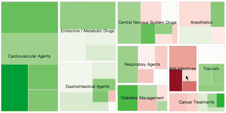
Figure 6-1: A treemap visualization allowed healthcare executives to focus on the drivers of costs.
Use Data to Inform Decisions and Actions
Leaders and employees in a data fluent culture bring well-understood key metrics into meetings, understand how to measure the performance of a new project or product, and include data fluency skills in the hiring and employee evaluation processes.
People are the heart, soul, and horsepower of an organization. If a leader fails to recruit, develop, and retain the right people for a company, the organization’s future is in jeopardy. One of the core tenants of Jim Collins’ widely cited framework in his book Good to Great is to start first with the who and then move to the what. High-performing organizations have the right people on the bus and in the right positions.
There are several ways that leaders seeking to develop a culture of data fluency can implement this goal. To begin, leaders must ensure that the organization uses data to inform the recruitment and hiring processes. Getting the right people on the bus means first knowing what types of expertise and skills the organization needs. This question can be answered through proper use and understanding of data during the selection process. Leaders can ensure that prospective employees have the aptitude and attitude aligned with the data fluency demands of the organization. In the forthcoming Feature, “The Data Fluency Inventory (DFI Supporting Materials”), we have included a sample data literacy quiz for this specific purpose. When hired, leaders must ensure employees receive the ongoing support and development needed to meet existing and emergent requirements for being skilled consumers and authors of data products. Finally, when allocating employees to specific teams or tasks, a data fluent leader can draw upon evidence to support placements and have clear metrics for assessing the quality of such decisions.
Google’s innovative use of data has served as a case study for bringing analytics to the Human Resources function. Whereas traditionally HR has been built on relationships, Google’s goal is to “bring the same level of rigor to people-decisions that we do to engineering decisions.”1 A dedicated people analytics group is tasked with gathering, analyzing, and informing decisions by identifying the measurable characteristics of outstanding leaders, improving employee retention by predicting at-risk staff, and creating data models for the factors in hiring that are most likely to lead to successful employees.
This type of advanced analytics may not be well suited to every organization, but it does offer ideas for more deeply incorporating data into the process of managing people. In addition to any direct benefits from using data to improve HR decisions, by incorporating analytics into the HR process, leaders can also set a tone and expectation for data fluency, even in areas of the organization that do not typically use data.
When you have the right people and leadership priorities in place, the next challenge is to define the right metrics to focus the organization on.
Establishing Key Metrics to Rally Around
Can you imagine a basketball game without a hoop or a tennis match without sidelines? In the absence of clear goals and a way to measure progress, organized sports would be . . . disorganized. The same is true for organizations of all types—in the absence of clearly communicated metrics of organizational success, employees have no way to know if they are on track, contributing in meaningful ways, or merely spinning their wheels. To create a culture of data fluency, leaders must establish key organizational metrics that guide individual and organization efforts. This section first discusses the characteristics of a good metric and then describes specific ways that leaders can leverage metrics to drive organizational improvement.
What Makes a Good Metric?
Misaligned goals, distorted behaviors, and a misguided sense of success . . . no, we’re not referring to college graduates or politicians. We’re describing the problems caused by using poor metrics in your organization. One common example is the customer service department that tracks calls handled without regard for the quality of the caller experience. The first step in establishing what makes a good metric is to understand what you want to achieve.
Metrics can serve two purposes: identifying problems and measuring performance. When the goal is to identify problems and pinpoint areas of operational inefficiency and ineffectiveness, defining the right metric requires a bit of detective work. It requires you to uncover the data residue of a problem and to determine what evidence can be found and how exactly it shows up. When the goal is to measure performance, the right success metrics focus on measures that can be controlled and where improvement in the metric is an unambiguously good thing.
After you have clarity on the purpose for which you will use a particular metric, the next step is to choose a good metric. Good metrics include several specific dimensions that are shown in Figure 6-2.

Figure 6-2: Effective metrics are actionable, credible, transparent, and have a shared interpretation across your organization.
- Good metrics are created from accessible, credible data that is easy to gather from a trusted source. Every metric takes time and effort to construct. Before choosing the metric, it is worth asking questions of the data source: Is the data collected in a way that accurately captures reality? Is the data difficult to gather or delayed in a way that will undermine its value? Will consumers find reason to question the data source? For the results to have validity and for a culture of data engagement to emerge within your organization, data producers must have access to credible, trusted data.
- Good metrics are transparent and generated by understandable calculations. For the metrics identified by an organization to shape individual and collective practice, they must be easily understood, affording transparency for how they were developed. Further, as Andrew Jaquith, author of Security Metrics points out, good metrics are best expressed as a number or percentage. And by number, he specifies a cardinal number—something that specifies how many of something there are—rather than an ordinal number that denotes something’s position relative to other things. He goes on to add that the numbers should also contain at least one unit of measure that characterizes the thing being counted. The units of measure enable data analysts to consistently express results of a measurement process. Using two measures can assist this process. For example, instead of just reporting “number of new sales accounts opened,” a second unit of measure such as “per 1,000 calls” enables the constructed metric to be used for benchmarking.
- Good metrics have a common interpretation and are consistently measured. It is imperative in an organization that all people in the organization recognize what the metrics mean and have assurance that the metrics are consistently generated. To facilitate this, leaders should ensure that measurement processes are clearly documented and that employees share a common set of terminology to understand the meaning of data presentations. A common issue in sales organizations is the definition of a lead. What level of interest does a lead need to have demonstrated? How ready and qualified does the person need to be in order to be labeled as a lead? These definitional issues—if not dealt with consistently in data capture and discussions—can lead to a lot of confusion about the meaning of any key metrics based on data about leads.
- Good metrics are contextually specific and actionable. Good metrics hold meaning for members of an organization and signal specific actions that can be taken. They shed light on an underperforming part of an organization, chronicle the results of continuous improvement efforts, or demonstrate the value of specific people and processes within the organization (Jaquith, 2007).
The table below provides a set of performance metrics that are representative of the four dimensions of good metrics. They are all composed of data that is often accessible and easy to gather; the calculations are transparent and easily understood; they can all be expressed in numbers and units of measurement; and they offer contextual detail that can be actionable. Having described the characteristics of a good metric, we now turn to a discussion of the ways that leaders can leverage metrics to promote organizational performance and build data fluent cultures.
| Sector | Metric |
| Freight |
|
| Warehousing |
|
| Education K-12 |
|
| Marketing |
|
| E-commerce |
|
| Cable |
|
Source: Modification and expansion of figure from Janquith, 2007
Using Metrics to Drive Organizational Improvement
Have you seen that movie scene where the weathered old cowboy tames the impossibly wild stallion? The wise frontiersman takes his time, careful not to frighten the horse, and gradually shows it what he expects. He uses a soft voice and doesn’t ask too much at first. After he has established trust, it isn’t long before he hops on the stallion and lets it do what it wants to do naturally: gallop into the sunset. There are both leadership and metric lessons in this scene.
Choose a Few Key Metrics at Any Given Level
Too many organizations end up with dozens of “key” metrics. In actuality, these organizations typically don’t know what to focus on. Like the wise cowboy, leaders must invest time and energy to socialize their organization to a small set of essential metrics. The challenge is to offer a clear definition of what is being measured and demonstrate its importance. It is not imperative to initiate discussions about goals at this point. Like the wild mustang, you will probably be dealing with a jittery cast of characters (no sudden movements or loud noises). After a set of three to five metrics have been established, incorporate the metrics in meetings and other venues. You want these metrics to become part of the organizational vernacular. Gradually, people will become accustomed to the metrics and their implications about the business.
Select Key Metrics That Align with the Mission and Vision
Like the stallion, a transformation can occur in organizations that learn what to focus on. With the awareness and understanding of a small set of key metrics, people begin to wonder what goals are associated with those metrics. It is a natural progression. In many cases, employees will ask for goals as if you as the leader had never considered the concept. Let them own the idea.
Goals associated with a few, well-understood key metrics is a powerful combination. For both internal and external stakeholders, there is a strong alignment between organization mission, vision, goals, and tracking of progress. The efforts of everyone can be directed at these measurable goals, and people will focus on the processes that can impact these metrics.
We worked with a software vendor that had a crystal clear understanding of what it took to grow its business. For the vendor, it was all about driving new leads into its efficiently designed sales machine. Therefore, measures related to product development, product usage, or customer satisfaction were all subservient to the cost per lead, volume of leads, and various conversion rate measures through their sales funnel. The company could spend on marketing campaigns and have a precise expectation for the revenues that would result.
Show Employees That Their Contributions Are Essential
Truly exceptional leaders not only articulate organizational goals and identify metrics for assessing operational progress, they also can help employees understand how their work contributions are an essential component of the broader goals and measures of progress. Metrics should have a hierarchical connection that allows the front-line staff to see how their measures link up to the key metrics for the whole organization. In nature, form follows function, and we have countless examples of alignment between physical attributes and environmental conditions. Similarly, the more individuals have a clear line of sight between their daily contributions and the organization’s priorities, the better able (and willing) they are to make smart decisions and commit their energy in ways that sustained overall organizational performance.
Reference Key Metrics and Data Analysis When Communicating Goals
Data fluent leaders lead by example. Accordingly, leaders must model reliance upon data analysis and reference key metrics when communicating goals and priorities to stakeholders. To build a data fluent culture, leaders must communicate in the language of their metrics, using data to support their decisions about organizational progress. By doing so, they reinforce the importance of the selected key metrics and demonstrate their data literacy in public forums, thus modeling wanted habits of mind.
Avoiding Metrics Pitfalls
Having spent a bit of time focused on how leaders can use metrics to benefit their organizations, this section concludes by providing a few warnings about potential pitfalls in the use of metrics.
Although selecting the right metric can foster success, the wrong metric can create unexpected, misguided, and counter-productive behaviors. The wrong metrics can create incentive structures for behaviors that actually work against company goals. For example, one school superintendent—under pressure to meet metric goals set by the No Child Left Behind Act—developed a scheme to keep low-performing students out of classrooms. By removing these students from the classroom, the schools achieved the target thresholds and received the funding and bonuses the school administrators craved.2 You get what you measure.
And then there is the example of a former VP for marketing for an airline company as she was traveling on her own airline. While rushing to catch her flight, she arrived late to the gate and found the employees were intent on closing the door to the airplane 10 minutes in advance of the flight. At this particular airline, success is measured by the percentage of flights that push-back from the gate before the scheduled time. The employees, her own colleagues, were perfectly willing to slam the door in her face to meet their success targets. Push-back time was probably considered something employees could control and reasonably correlated with on-time arrivals. In addition, push-back time is straightforward to measure—unlike the seething anger of a customer trying to get on a plane that is still sitting at the end of the jetway.
Most companies make the mistake of evaluating performance (establishing success metrics) along functional activities. This perpetuates disconnected, dysfunctional silos within an organization. Marketing becomes focused on driving revenue. Operations focus on driving down costs. Product development is a success if new features appear on time. The results of these incentives are predictable: Marketing, which is focused on new customer volume, brings in customers who have low life-time value; operations, seeking to minimize costs, squeezes customer service at the price of customer satisfaction; and product development, focused purely on the clock, doesn’t bother to deliver the features that can help marketing bring in new customers.
One alternative is to put customer experiences or processes at the forefront by defining success metrics that cut across organizational structures. No matter what industry you work in, happy and high-value customers are at the center of your businesses success—but require multiple functions to work together. Customer-centric metrics ensure you are aligning your organizational processes to this wanted goal. A commonly accepted metric with strong leadership support and real accountability can be a catalyst to get these formerly unconnected groups working together.
Along these lines, consider the following when deciding on appropriate metrics:
- Trending, distributions, and comparison—A single, lonely number often doesn’t reveal a true understanding of an organization’s performance. It is necessary to put a concept around the value to allow people to gain a more complete understanding of the relative goodness or badness. By showing trending, distribution, and comparison, you improve understanding for the audience of the metric. Trending shows whether the metric moves closer or further from a goal. Comparisons to industry benchmarks show how your organization stacks up in a larger context. Finally, break out the value by different dimensions (for example, locations, products, and customer segments) to reveal whether one factor is propping up or dragging down the metric value.
- Edge cases—There will always be edge cases, or outliers, where a metric may not mean what you think it means. These situations are worth understanding, but you shouldn’t allow the perfect to be the enemy of the good. As a leader, you need to weigh the benefits of choosing metrics that work for 90 percent, 95 percent, or 99 percent of cases with the costs of those incremental gains.
- Accountability test—Could you hold someone accountable for this metric without them offering a dozen reasons why it doesn’t make sense? If not, you may need to reconsider the validity and value of the metric. This simple thought exercise is a decent test of the value of the metric.
- Self-serving—Be careful that you don’t select metrics simply because you know they’ll make you look good. These short-term victories have a way of incrementally turning into a losing long-term strategy for organizational competitiveness and success.
- Letting go—Putting a metric out to pasture, especially within the context of a large, multilayered, complex organization, is a hard thing to do. There are a few reasons this happens:
- The metric was developed at great effort and high expense.
- After the process of collecting the data for the metric stops, it can be restarted only at great effort and high expense.
- People higher in the organization (who last paid attention to the metric when it was useful) might come looking for it if something goes awry.
Shared Understandings
A culture of data fluency needs to be built on a shared understanding of the data sources, data analysis, key metrics, and data products. It requires employees to be on the same page about how data is used and why it is important.
In general, the concept of shared understanding is a fundamental building block for organizational success. It allows everyone to be working toward the same goals, have a common set of principles, and be in alignment about the organizational vision. Creating a shared understanding allows employees to act with autonomy and creativity because they can align their actions to the established mission of the organization’s leaders, as shown in Figure 6-3.

Figure 6-3: It can be difficult to get everyone on the same page.
Within the context of data fluency, shared understanding is based on people knowing what data means and how it is used. The previous section touched on the importance of clearly defining key metrics, the challenges that arise when people have different definitions for data, and how these differences can derail progress. Following are the primary areas in which shared understanding can help foster a data fluent culture:
- Using consistent vocabulary and terminology for organization-specific data
- Demonstrating the credibility and reliability of the data sources
- Creating transparency into how data is manipulated and analyzed
- Establishing a shared set of key metrics and explaining how these metrics link to organizational goals
- Building agreement on the purpose and motivation for data products
Each of these objectives represents a step toward a data fluent organization. Leaders play a critical role in implementing these steps in building shared understanding and data fluency organization-wide.
Common Vocabulary and Terminology Relating to Organization-Specific Data
Every organization has data that is specific to its organization and industry. Describing, defining, and regularly using vocabulary and terminology over time can create a data jargon. Jargon has many purposes including legitimizing a profession, keeping nonexperts out, socializing new employees, and facilitating communication. A rich data jargon can facilitate communication. By defining the measures that decide whether success is achieved, leaders help an organization develop a common vocabulary and terminology.
Clear Definitions of Measures
As discussed in the previous section, organizations as a whole, as well as policies and procedures, should include a written, precise definition for data elements that are central to the organizational culture. One way to handle this is to craft a data dictionary that defines all measures and categories within measures. It is helpful to customize definitions to the particular circumstances of specific programs and to include examples of how to resolve ambiguities. This should result in clear definitions for all measures.
Standard Forms for Collecting Data
If a group of researchers interview different people, each researcher uses the same instrument. In this way the interview is conducted using the same vocabulary and terminology with each interviewee. Likewise, organizations should use standard forms for data collection that include all the data elements and categories that are referenced in the database system. Employees record information onto data forms following specified procedures and then key the information from these forms into the program database. Employees should not need nor be allowed to enter their own codes or variables because this causes data entry errors and hurts reliability and validity.
Develop a common understanding of data fields. Leaders should insist on a shared understanding of data fields. You can’t rally around key metrics if people have different interpretations of data fields that are keeping track of those metrics.
Understanding the origin of a word or term can help provide deeper understanding into the everyday language of an organization. The sources of data provide the etymology of data and create a deeper shared understanding among team members who understand the root words of data.
Understanding and Appreciating Credible, Reliable Data Sources
“Consider the source,” is a warning with much relevance for modern organizations. When making decisions or forming opinions, thoughtful people consider the source of information and the methods with which it was collected. Data sources carry a reputation, like people.
Outside data sources can have a reputation for credibility. The Dartmouth Atlas of Health Care is an academic source that has built a strong reputation for gathering geographically based information about the use of health resources. For measuring online audiences, comScore has emerged as the standard for advertisers and agencies when negotiating ad spend. In other sectors, government sources like the Bureau of Labor Statistics and Department of Education have established a role in delivering credible data. In part, these reputations are developed because these data sources have established protocols and processes to vet and verify sources.
Sources of internal organizational data also develop a reputation over time. Many times we’ve worked with organizations that have one database that is considered the trusted source of truth, whereas another data set seems to capture similar information but is known to be faulty. The difference between these data sources is based on how the data is collected, stored, accessed and perceived. Reputation of data sources is also influenced by employee, team, department, organization and industry biases, whether warranted or not. A data fluent organization needs to create broad awareness of these issues to guide analyses toward the data sources that are most credible.
Understand the Strengths and Weaknesses of Data Sources
Data, a piece of information in and of itself, has limited utility. First, data fluent members of an organization must understand the importance of reliable data, or what is referred to as internal validity. Next, to make inferences about the data to a larger population, we move into the terrain of generalizability, or external validity. A leader has to know whether the data collected will be generalizable to other situations. Do the processes or protocols used in one situation apply to another situation, or are the populations quite different? Leaders, over time, often develop the skill to determine if the data collected will be generalizable to other markets, regions, sectors, populations, or situations. Following are a set of conditions that impact the reliability and generalizability of data. For each condition, data fluent organizations ask themselves if there is any way that the condition can explain the story that we would otherwise think the data tells.
| Reliability | |
| Selection | Consider subject-related variables that may impact how people respond to interventions. |
| History | Consider anything during the time frame of the intervention that may impact results. |
| Maturation | Consider that people change and grow. What may look like a result of an intervention is purely participant maturation. |
| Selection-Maturation Interaction | Consider that different populations will mature at different rates. |
| Repeated testing | Consider that prior exposure to the intervention may affect results of subsequent measures. For example, people can become test-wise and are thus less affected by the intervention. |
| Instrumentation | Consider the reliability of the instrument used to gather the data or the precision of the researcher who takes the measurements. Inter-rater reliability helps with this. |
| Regression to the mean | Consider that extreme cases are likely to move in one direction over the course of the pre-post test sequence . . . always toward the average. |
| Experimenter Bias | Consider the reality that expectations and investment in a project will impact the outcome of a study. |
| Generalizability | |
|---|---|
| Pretest | Consider that a pretest is artificial when moving outside to the broader population. When we take the “treatment” to the external population, there is no pretest. Here, the pretest is part of the treatment. |
| Subject selection | Consider the impact of this sampling issue. Even if a sample of people is randomly assigned within an experiment, if they don’t represent the larger community in terms of demographics, the experiment is not generalizable. |
| Reactive effects/the Hawthorne effect | Consider that the attention the subjects receive in the experiment is impacting the outcome—this won’t happen in the larger community—therefore an implementation dip will occur. |
Provide Transparency into How Data Is Manipulated and Modeled
If you were fed the same stew every day, you’d want to know what the cook is putting in the pot. It’s the same for a data product. Knowing how source data is analyzed, manipulated, and modeled helps users trust what they see. By contrast, performing complex manipulation in a black box leads to many of the unproductive debates previously mentioned. Ultimately, trust is a core element of shared understanding.
Any presentation of data, whether a simple calculated metric or a complex predictive model, is going to have a set of assumptions and choices that the producer has made to get to the output. The more that these can be made explicit, the more the audience of the data will be open to accepting the message offered by the presenter.
One example of this issue is what has happened with a complex metric that ESPN, “the worldwide leader in sports,” developed to measure NFL quarterback performance. In 2011, ESPN created a measure called Total Quarterback Rating (QBR) that competed with the commonly accepted (though equally arcane) NFL Passer Rating. QBR represented an “improved” way to evaluate quarterbacks, in part because it attempted to evaluate how the quarterback contributes to scoring points and helping his team win. However, reception has been frosty. ESPN has been reluctant to share the precise approach for calculating QBR—opting instead to assert that it is extremely complex.3 The lack of transparency resulted in this measure not being adopted by fans. The problems faced by ESPN are explain by Michael David Smith of Profootballtalk.com:4
One of the aspects of Total QBR that could be both a strength and a drawback is that it considers data that the average fan doesn’t have access to, like how far a pass travels in the air, and whether the quarterback was under pressure when he threw it . . . it means fans can’t see for themselves exactly where Total QBR comes from—fans just have to trust that the distance the ball traveled was correctly measured, and how much pressure the quarterback felt on the play was correctly assessed . . . If ESPN is committed to this stat and is able to clearly and concisely explain it on the Worldwide Leader’s NFL broadcasts, then fans will quickly become familiar with it and it will soon become a staple of how we talk about quarterbacks. On the other hand, if the stat comes across as too convoluted—or if it doesn’t really seem like much of an improvement on the current passer rating—then this will all feel like a rather pointless exercise.
Closer to home, many organizations struggle with shared understanding when individual employees have proprietary spreadsheets for delivering important outputs. Think of the marketing analyst who has developed a complex spreadsheet for consolidating marketing campaigns or the financial analyst with the perfect product profitability model. These single-owner analyses are opaque for outsiders, and therefore hard for everyone to fully buy-in to the data that comes out. It is incumbent on the spreadsheet owner to explain the assumptions and communicate how the analytical model works to gain trust.
The same holds true for something as simple as the charts displayed in a report or dashboard. Presenting the data isn’t enough. It is imperative that the context around the data is also included. What filters have been applied to the data? What values are shown and how are they defined? This emphasis on providing transparency into the underlying data—whether in a chart, complex data model, or calculated metric—will build credibility with the consumers of data and shared understanding of the data’s meaning.
Define a Shared Set of Key Metrics
The importance of choosing a limited set of well-defined key metrics was previously discussed in this chapter. Ideally, everyone in an organization understands the critical measures that link directly to organizational success. With this kind of shared understanding, people have a common language to support productive conversations and a reference point for decision-making.
The counterpoint is the organization that has allowed key metrics to proliferate. This is a persistent problem in healthcare. There are many ways to evaluate healthcare performance—from operational to clinical to financial. In each category there are dozens of ways to measure performance across hundreds of conditions and health departments. The result is that individuals rarely have the time or capacity to wrap their minds around all the data. And the metrics themselves lose their value as decision-making tools.
Understanding the Purpose and Motivation for Data Products
The endpoint for data sources is, of course, the data products presented to a target audience. Establishing a shared understanding for data products also requires building credibility and transparency for the consumer. Essentially, people want to know why the data is shown and what they are expected to learn from the data. Cynically, data consumers may wonder whether there is an ulterior motive to how the data is presented. They want to trust the asserted results. A more open-minded person might simply want to know what the organization hopes to achieve through the data product.
For example, we have worked with several services companies who need to deliver periodic reports to their large corporate clients. In many cases, these reports are unproductive because the presenter struggles to articulate the purpose of the discussion. Without a clear sense of what the report should achieve, the client discussion becomes meandering, overbroad, and inevitably a download of disconnected facts and figures. The audience is left to wonder whether the report is simply intended to confuse them, distract from an issue, or deliver a reference document.
Similarly, you may have seen the ever-popular corporate dashboard that graces a large screen TV in the lobby of company headquarters. Numbers flash colorfully across the screen and a glossy pie chart shows revenue breakdown in the last quarter. Who is the intended audience of this dashboard and how are they supposed to be moved to action? It is unlikely the lobby dashboard has a purpose. And if it does, there is an even smaller chance the viewers will know the purpose.
It is difficult to get everyone in an organization on the same page about data. Data sources are complex, as are the analyses and data products that result. Nevertheless, leadership in a data fluent culture requires diligence to define a shared understanding about the meaning of data. Trusted data sources, transparent data analyses, and purposeful data products can lead to an organization that uses data together as a productive tool.
This next section of the chapter focuses on another critical element of a high-performing, data fluent culture—how leaders utilize a set of everyday activities to support data consumers and producers in effective data use in their organizations.
Everyday Activities
In a recent conference presentation, Jason Fried described a typical workday:
People go to work, and they’re basically trading in their work day for a series of “work moments.” That’s what happens at the office. . . . It’s like the front door of the office is like a Cuisinart, and you walk in and your day is shredded to bits, because you have 15 minutes here and 30 minutes there, and then something else happens and you’re pulled off your work and you’ve got to do something else, then you have 20 minutes, then it’s lunch. Then you have something else to do. Then you’ve got 15 minutes, and someone pulls you aside and asks you this question, and before you know it, it’s 5 pm, and you look back on the day, and you realize that you didn’t get anything done.
TED: Why Work Doesn’t Happen at Work
He later attributes these ineffective work days at the office to M&Ms—managers and meetings. Managers “whose job is to interrupt people” and meetings that breed more meetings, an incestuous cycle that has you spending your time “[talking] about things you’re supposed to be doing later,” rather than doing them. Added to the M&Ms are a never-ending stream of electronic distractions—e-mails, tweets, social media interruptions—all asking for your immediate attention.
As a leader, you are no stranger to Fried’s insights. In fact, 15 minutes here or 30 minutes there may seem like a luxury you no longer have. Nonetheless, you also know that meetings, e-mails, hallway conversations, and conference calls are everyday activities that drive organizational culture and productivity.
The last section of this chapter helps you shape these activities in the service of a data fluent organization. It describes how you can build a culture that supports effective data consumption, production, and use.
Data Consumers
A central tenet of a data fluent organization is that everyone in the organization is a thoughtful and informed consumer of data. To get there, leaders must attend to two interrelated activities. First, leaders must develop a culture in which individuals are trained to extract important insights from data products without being sidetracked by chance random occurrences or natural variation in the data. Second, leaders must ensure that meetings and discussions focus on the content of data products, rather than getting mired in discussions about data quality, sources, or calculations.
Help Individuals Evaluate Data without Distraction
R.A. Fisher, known as one of the fathers of modern statistical science, once argued that experimenters (invoking the classic image of white lab coats, thick-rimmed glasses, clipboards, randomized experimental assignment, treatment, and control groups) go to extreme lengths in the execution of their experiments to “decrease or eliminate all the causes of fortuitous variation that might obscure the evidence.”5 Though we realize that your data might seem far removed from these clinically based randomized experiments, as a leader it is vital that you help develop an organizational culture in which individuals recognize the difference between meaningful patterns and insights and those that are brought about by chance random occurrence. One important way of safeguarding against the trap of mistakenly identifying natural variation in the data as meaningful is to use evidence from multiple sources or time points. Often a single anomalous event can be identified by examining past trends or relying on other sources of information for triangulation, including intuition and personal experience.
For example, public companies are subject to the critical evaluation of industry analysts who attempt to predict the future prospects for the company. Many investors look for the consensus among analysts to try to determine the growth and risk prospects in buying shares. What happens when a lone analyst breaks from the pack to offer a contrarian—say negative—opinion? Should this outlier analyst be considered a forward-thinking “canary-in-the-coal-mine” or someone simply looking for attention? We know there will be variations in opinions, so the first reaction by the company and investors should not be to panic at an extreme viewpoint. Does this analyst have credibility as a data source? Is there a history with the analyst in providing prescient predictions, or a history of histrionics? The weight put on this analyst’s opinion should reflect this context.
Focus on the Message
Chapter 5, “Data Authors,” outlines a few of the critical elements of successful data products. An important principle highlighted was that the most effective data products tell a story. One of the reasons why stories are so effective is that they help the consumer focus on the message and content without getting distracted by other issues. Questions surrounding data sources, calculations, or interpretation can often distract from the central message of a data product.
As a leader, you have the opportunity to model this behavior, focusing your attention, questions, and insights on the meaningful information and not the ancillary details that derail meetings. More important, your success in keeping discussions on track will be largely dependent on individuals in your organization who produce the data. As such, now turn to issues surrounding data production and data products.
Data Products
The previous chapter reviewed principles for creating successful data products. As a leader, you can support the work of data producers by establishing clear guidelines for quality and effective communication between data producers and consumers. As part of data communication, you should encourage a feedback mechanism to help improve the content while celebrating examples of quality data products.
Establish Clear Guidelines for Quality Data Products
In your efforts to help producers focus on the message, it is important to establish a set of clear guidelines designed to produce quality data products. In creating these guidelines, it is helpful to draw an analogy with writing. On questions of vocabulary and style in written communication, there seems to be agreement about the pursuit of simplicity and ensuring that the message, not the words, takes center stage. Following are three common writing guidelines and what they mean for helping to guide the data communication choices your data producers will make.
- Use smaller, simpler words—C.S. Lewis once commented: “Don’t use words too big for the subject. Don’t say ‘infinitely’ when you mean ‘very’; otherwise you’ll have no word left when you want to talk about something really infinite.” The simplest visualization techniques, including bar charts, line charts, tables, and even individual numbers, are effective for the majority of data communication. Like simple words, you can be assured that when your data products use these simple forms your audience will quickly understand the message. It is better to encourage your data producers to refrain from advanced visualizations, like animated bubble charts, except in those rare occasions when the breadth and nuance of your data requires more visual sophistication. Even so, there is actual value in data producers becoming familiar with advanced data visualization techniques. Just as a large vocabulary offers an author more fodder with which to clearly communicate her message, advanced visualization techniques can offer similar benefits to a data producer.
- Remember that using too many words is a symptom of poor understanding—Albert Einstein once said, “If you can’t explain something simply, you don’t understand it well.” The quickest way to lose a meeting is to realize that the data presenter is thinking out loud. In data presentation it seems especially tempting to think out loud by showing all the data in every conceivable way. Unfortunately, we’ve all been a recipient of the exhaustive 80-page PowerPoint report with seemly infinite variations on the same data. Make sure that the expectation is that authors of data products form an opinion and get to their point immediately.
- Words are for communication, not show—The great English poet Samuel Taylor Coleridge once wrote, “Words in prose ought to express the intended meaning; if they attract attention to themselves, it is a fault; in the very best styles you read page after page without noticing the medium.” Far too many data presentations contain images that are intended to draw attention to the visualization and not the message. It’s not about the data or the visualization; it’s about the message that the data presenter is trying to communicate. This is not simply a question of efficient communication; it is also a question of perception. When data products are unnecessarily complex or showy, they draw attention to the wrong things. Figure 6-4 is an example of a chart that is more about the chart than the message:

Figure 6-4: This chart loses the message in its efforts to dazzle.
Develop a Feedback Mechanism for Data Products to Help Evolve and Improve Content.
The key to a successful data product is to ensure that there are mechanisms in place to allow for feedback to improve and evolve content. Often, users need to see results before they can ask better, more detailed questions of the data. These feedback loops provide critical learning to improve data products.
In providing feedback, there will be times when you need to retire a certain data product. In this regard, the economists’ refrain, “sunk costs are irrelevant,” is worth remembering. Despite the past time, energy, attention, and resources sunk into generating a data presentation or product, products that are no longer useful must be excised from your data ecosystem. Retaining data products that are not used makes for a cluttered system and can create confusion for future employees unfamiliar with the product’s history or former utility. From an employee perspective, it is a waste of time to have to sort through or consider an outdated data product. Key considerations with respect to retiring a data product include:
- How often is it used and by whom?
- What product or products replace it?
- What other reports or data connect to it?
Although some data products need to be retired manually (that is, someone needs to make a decision and hit the Delete key), other data products can be retired by inactivity. The next chapter discusses how your data ecosystem can be designed in such a way to efficiently and effectively manage this process.
Celebrate Examples of Quality Data Products
Finally, leaders need to celebrate the best data products through public praise. In doing so, make it clear how your organization defines “quality.” Why is this product praised? Is it because of its utility? If so, how has it been useful? Has it contributed to decision-making? What were the results? Making explicit the reasons for celebrating a specific data product will go a long way toward developing a data fluent culture.
In addition, you can celebrate quality data products by encouraging their use. As a leader, however, there is often no better way to celebrate quality data products than by using them in your own daily activities. The next section elaborates on the topic of data use.
Data Usage
Developing a data fluent culture in which individuals focus on the message of quality data products is not enough: The insights gained must be both actionable and acted upon. Leaders must encourage individuals throughout all levels of the organization to incorporate data into their decision-making processes. Just as there should be a feedback loop in the production of quality data products, so too should there be an opportunity to reflect upon previous data-driven decisions. Furthermore, you should continually evaluate the progress your organization is making in effectively using data and making data-drive decisions.
Encourage Data-Driven Decision-Making
In the words of the Scottish writer Andrew Lang, data should not be used like a “drunk man uses lamp posts, for support rather than illumination.” Data-informed decision-making must be just that—informed by the data. Arriving at a conclusion and then searching for the data to support it is tempting. As a leader, however, you should encourage individuals throughout all levels of the organization to first examine data products with the intent of then finding actionable insights.
More important, you can create a culture in which organizational teams and individuals reflect upon previous data-driven decisions to inform future decision-making. One litmus test you can use is to ask leaders to have groups think about the last three decisions that were informed by data. What were the conditions? Were there any commonalities across decisions? Building a culture of reflection is an important mechanism for establishing a data-driven culture.
Evaluating Effective Data Use within the Organization
How do you know that data is used to drive decisions in your organization? It is a subtle shift to measure. However, there are a number of indicators that can give you a directional understanding of how well your organization has adopted use of data:
- Evaluating new products or projects—Has your organization created a well-understood and accepted model for evaluating new investments? Of course, each new endeavor will have unique aspects, but the performance tracking approach should start from a common template.
- Data trumps anecdotes—Many organizations suffer from the tyranny of anecdotes. A single data point, or long-ago experience, becomes the deciding factor in decisions. These anecdotes can be instructive and provide useful color to a discussion. They should not be accepted as data.
- Data products for important processes—For each of the priorities in the organization, someone should have created a data product that sheds light on the progress toward this goal. The data product may be a quarterly summary of results or a real-time dashboard of operations. Is there an important element of what your organization does that is not transparent and could benefit from an effective data product?
- Grass roots expectations—As noted earlier, soon after key metrics are introduced, people will begin to wonder about the goals associated with these measures. This is a powerful indicator that the attention of the organization has turned to measuring performance. Likewise, employees should start to expect that meetings will be informed by data and that the executive team communicates priorities and results backed by data.
Evolution of Data Fluent Cultures
Building a data fluent culture takes time. It is a journey. We’ve worked with many companies who are committed to the process of putting data at the center of their organizational conversations. But it is rare to find an organization that has had success in all the areas described in this chapter.
In one case, we engaged with an innovative healthcare company that helps reduce the cost of employee healthcare. Its customer service-based model is a new approach in the industry. From the CEO on down, it has a deep commitment to using data to improve its processes and prove its value to customers. However, its business model did not have an established measurement approach and key metrics were elusive. As a result, the company tracks a myriad of metrics and continues to search for a shared understanding of what is the right data to focus on. This organization doesn’t lack for commitment in its pursuit of data fluency, but needs to continue to evolve.
In contrast, we worked with a leading Internet content provider who had the opposite problem. This organization had the capability to measure everything about its business and existed in an industry in which there were commonly accepted measures of success. Key metrics were tracked diligently by analysts and reporting groups throughout the organization. It even had established credible “sources of truth” in the data. The problem was with the leadership’s commitment to using data to guide decisions. We could easily tell what content was engaging audiences and returning value on the investment. But these objective and accepted measures of success were seldom prioritized over the opinions of content owners.
It is a long-term challenge to put together all the pieces of a data fluent culture. In the end, it takes three core elements:
- Leaders who value data as a core element of their approach
- Commitment to work through the many complications and investments necessary to develop credible data sources and quality data products
- Focus on the right metrics, useful data products, and communicating with a clear message