
Appendix A
Designing Data Products
The idea for this book grew out of many of the ideas we developed over the years writing our blog. In this appendix, we have edited together a collection of blog posts that discuss some important principles and concepts on designing data products.
Articles
- A Checklist for Creating Data Products—An overview for product managers of data solutions to begin the process of transforming their organization’s valuable data into customer-facing products. http://bit.ly/data-product-checklist
- Think Like a Designer—A set of design principles for creating a data dashboard, including the use of unity/harmony, proximity/hierarchy, clear space, balance, contrast, proportion, and simplicity. http://bit.ly/think-desiger
- Designed to Be Used—A short list of design principles that we use to deliver applications that are valuable and productive for users. http://bit.ly/designed-used
- Breaking Free of the One-Page Dashboard Rule—Many people believe a dashboard needs to be a one-page, single view interface. We offer a different definition of data dashboards, focusing on clarity and conciseness. http://bit.ly/one-page-rule
- Dashboard Alerts Checklist—Alerts are a common feature in data products. This article summarizes our four C’s for effective alerts: context, cogency, communication, and control. http://bit.ly/dashboard-alerts
- 8 Features of Successful Real-time Dashboards—Many operational dashboards require data that is updated in real time. We describe what it takes to make this type of dashboard work for users. http://bit.ly/real-time-dashboards
A Checklist for Creating Data Products
Data is the new oil.
—Everyone (first by Clive Humby)
Treat data like money.
—Jim Davis (SAS CMO) in The Economist
Are you sitting on a gold mine—if only you could transform your unique data into a valuable, monetizable data product?
Over the years, we’ve worked with dozens of clients to create applications that refine data and package the results in a form users will love. We often talk with product managers early in the conception phase to help define the target market and end-user needs, even before designing interfaces for presenting and visualizing the data.
In the process, we’ve learned a few lessons and gathered many useful resources. The checklist shown in Figure A-1 is divided into four sections:
- Audience—Understand the people who need your data.
- Data—Define and enhance the data for your solution.
- Design—Craft an application that solves problems.
- Delivery—Transition from application to profitable product.

Figure A-1: Data product checklist
Think Like a Designer
By Ken Hilburn
Recently, Nancy Duarte participated in an interview with Jimmy Guterman of the MIT Sloan Management Review, which resulted in the article “How to Become a Better Manager by Thinking Like a Designer.” The quote that summarizes the article follows:
Often managers . . . rely heavily on data and information to tell the story and miss the opportunity to create context and meaning . . . leaving lots of room for interpretation, which can spawn multiple cycles and limit advancement.
It’s the same with information presentation. A focus on design at the beginning expands the ability to deliver context and meaning. But before you discount design as a concept for well, you know, “those artsy types,” keep in mind, as Nancy puts it:
Design is . . . crafting communications to answer audience needs in the most effective way.
What this means is that the more you focus on design, the more you’ll “speak” to your audience—which means you’ll be more effective with your data presentation. Remember, it’s about the audience, not you.
Here are some dashboard design principles that we use (with a few enhancements from Nancy’s interview) to make sure we become better information presenters by thinking like designers:
- Unity/harmony—A sense that everything in the application belongs together, resulting in a “whole” that is greater than the sum of the parts. All the elements complement, augment, and enhance, as opposed to distract and detract from each other.
- Takeaway—Identify the problem you’re solving and make sure every element you place moves you closer to answering that question.
- Proximity/hierarchy—Things that are near each other are related. Hierarchy demonstrates relationships between items where appropriate. Proximity and hierarchy both provide tremendous contextual cues leading to better understanding.
- Takeaway—Place related things near each other and separate unrelated things. Remember, dogs and cats don’t play well together.
- Clear space—White space in information display is important and too often overlooked. Maximizing dashboard real estate means creating places for the eye to “rest” so that the nonwhite space is more effective.
- Takeaway—Use white space with proximity to help your viewers follow the story the information is telling.
- Balance—Dominant focal points either give the viewer a sense of comfort (balanced) or spur them to action (unbalanced). Nancy points out, “That does not mean all things must be in balance all the time. It is often effective to jar people and thereby effect a change in behavior or thought. Be aware, though, that once something has been thrown out of balance, it is the nature of the universe to find a new state of equilibrium.”
- Takeaway—Make sure the primary focal points in your information presentation tell the viewer either “it’s ok, move on,” or “you need to do something.”
- Contrast—Contrast creates interest to focus attention or highlight differences. Again quoting from the article “The value of contrast lies neither in the black nor the white, but in the tension between them.”
- Takeaway—Use Contrast to shift balance so the viewer focuses and acts more quickly.
- Proportion—More important elements deserve more real estate. It’s tempting to want to present an unbiased view of the data. However, as Amanda Cox of the NYT graphics department stated at the OEDC seminar “Innovative Approaches to Turn Statistics into Knowledge,” ”Data isn’t like your kids, you don’t have to pretend to love them equally.”
- Takeaway—Increase the size and emphasis of the values and decrease the size of labels and you’ll find dramatically better impact and speed of understanding.
- Simplicity—Stay focused on the specific fact on which you’re trying to shine light. This sometimes means showing less data and a simpler display. I think Garr Reynolds sums it up best: “Don’t confuse ‘simplicity,’ which is hard to achieve, with ‘simplistic,’ which is easy and usually lacking value.”
- Takeaway—Help your viewers focus on what’s actually important by pointing them to the kernels and not the chaff.
Designed to Be Used
By Ken Hilburn
I have become curiously interested in a recent blog post that talks about how it’s difficult to correctly write an application for the iPhone. The assertion is that writing software for the iPhone is harder than for a desktop, not because of the technology, but because “everything counts so much — every design choice, every line of code, everything left in and everything left out.”1
Very eloquently and precisely put. If you’ve ever used any sort of mobile computing platform, not just the iPhone, you know how much proper design can make an application really useful—or totally useless.
But then again, isn’t this the case with any application? Some applications seem to have their genesis in the charter “build an application that allows the user to perform all these actions,” whereas others are built on the charge “build an application that helps the user solve this problem”—it’s the battle of functionality versus purpose.
We put together a short list of some design principles that we use to keep the user productive:
- Solve a problem—Make sure the end product provides a specific solution to a specific problem so that users can easily understand how it helps them.
- Enable casual use—Minimize the “barrier to entry” for new users by avoiding feature overload, minimizing clicks for each task, and not letting polish become bling.
- Tell a story—Relate the data to the key questions, answering them in a logical order and revealing layers of detail as users express interest in knowing more, not before.
- Lead to action—Empower users to finish their task quickly. (The “task” is not “using software.”)
- Encourage exploration—Use the experienced guide approach to give users enough context to understand the problem and then point them in the right direction to learn about new factors that can expand their insight.
Breaking Free of the One-Page Dashboard Rule
By Zach Gemignani
Conventional wisdom says that an executive dashboard must fit on a single page or screen. The argument hinges on a pair of assertions about this constraint: It provides necessary discipline to focus on only the most critical information, and it enables the audience to see results “at a glance.”
The “discipline” argument is made forcefully by Avinash Kaushik (among others).
If your dashboard does not fit on one page, you have a report, not a dashboard. . . . This rule is important because it encourages rigorous thought to be applied in selecting the golden dashboard metric.2
I buy wholeheartedly into the value of constraints. However, defining a useful constraint as a “rule” assumes there is only one viable means to achieve the desired ends. Confining visual real estate is just one way to focus your thinking. There are others: How about limiting yourself to five key measures? How about demanding that a dashboard can be understood in 3 minutes by a new user? How about presenting only exceptions?
The argument that a one-page dashboard necessarily provides a view of your business “at a glance” is more self-deceiving. Well-known information-ista Stephen Few uses this rationale in his definition of a dashboard:
A visual display of the most important information needed to achieve one or more objectives; consolidated and arranged on a single screen so the information can be monitored at a glance.3

Figure A-2: A single dashboard metric
I check my speedometer “at a glance.” I “glanced” at a Heads-up Display (HUD) on a video game showing how much energy my character has remaining. These displays communicate a single number that is already hovering on the corner of my consciousness. If we follow this advice literally, we’d show this (Figure A-2).
Assuming one page gives you quick, easy comprehension is like assuming all red cars are fast. That’s simply not true. More often, people follow the one-page dashboard rule off a cliff, cluttering up the page with pie charts, line and bar graphs, and a series of gauges that display information from a variety of sources.
There are real problems with this definition of a dashboard, as shown in Figure A-3.

Figure A-3: The dictionary definition of “dashboard”
In reality, the one-page rule leads to jamming information into the available space. When everything must fit on a page, there isn’t room to describe the connections between information or fashion a story from the data. A good dashboard raises more questions than it can answer. Sticking to a static piece of paper limits any ability to find or present explanations.
Don’t get me wrong: A one-page dashboard is often an effective way to create “a visual display of the most important information needed to achieve one or more objectives.” But with streaming video, interactive visualizations, podcasts, Kindles, smartphones, video projectors . . . is it necessary to limit ourselves to an 8.5˝ x 11˝ piece of paper? Or might we open ourselves up to some more creative solutions to sharing the numbers: a short movie, a few slides, a short text narrative, or 140 characters.
I’d like to use this definition instead, as shown in Figure A-4.
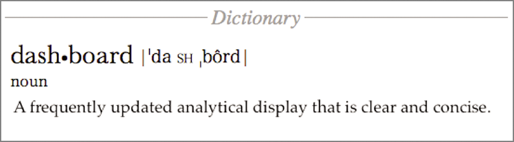
Figure A-4: A better dashboard definition
Dashboard Alerts Checklist
By Zach Gemignani
The tendency with reporting, and information dashboard design in particular, is to cram as much information on the page as possible. It is a problem that Avinash describes with typical candor:
This [is] one of the core reasons why most dashboards are “crappy,” i.e., they are data pukes that provide little in terms of context and even less in terms of actionable value.
In the past, we have offered tools to make data presentation as clear as possible (chart chooser and Excel chart cleaner). Sometimes, clean isn’t enough; a more dramatic approach is needed.
One alternative is to shift the focus from the full data to changes in the most critical data points. By pulling out the important exceptions, you can make it easier for your audience to digest what matters and take action.
Stephen Few says in his book Information Dashboard Design (O’Reilly Media, 2006):
The best way to condense a broad spectrum of information to fit onto a dashboard is in the form of summaries and exceptions . . . given the purpose of a dashboard to help people monitor what’s going on, much of the information it presents is necessary only when something unusual is happening; something that falls outside the realm of normality, into the realm of problems and opportunities. Why make someone wade through hundreds of values when only one or two require attention? We call these critical values exceptions.
Alerts are one mechanism to turn the focus to the exceptions, outliers, and data highlights. Whether embedded in the dashboard or presented separately, alerts can be the extra layer of abstraction that make a dashboard useful. Unfortunately, they are hard to get right. I’ve arrived at four C’s for effective alerts—context, cogency, communication, and control. Here’s a checklist to consider as you build alerts into a dashboard or report:
Context: Users Need to Understand How an Alert Is Defined and How It Fits into the Larger Picture
- Are the parameters well defined? An alert is commonly defined by the following factors: metric (for example, revenue), dimension (for example, time), delta (for example, month over month change), scope (for example, Northeast region, Peanut-product line), threshold (for example, increase or decrease of 10 percent).
- Is the timing of the alerts actionable? One client explained to us that fluctuations in many of its metrics make monthly alerts too frequent—it would unnecessarily alarm people when, from its perspective, no significant trend had been established.
- Is the change statistically significant? This is of particular importance when you are measuring deltas. A doubling of traffic from a referring site doesn’t mean much when it is moving from one to two visitors.
Cogency: An Alerting System Needs to Avoid Causing Unnecessary Alarm While Delivering Easy-to-Understand Information That Can Be Acted Upon
- Can the alerts be described in simple terms that even an executive can understand? Alerts should have a real-world meaning that users are familiar with. If an alert is based on a complex metric, for example, users will be confused as to the implications.
- Is the alert actionable? In the best cases, alerts should point users to both the drivers of the alert and the actions that can address the situation.
- Are the alerts so granular and/or frequently triggered that users will get alert fatigue? Excessive use of alerts can undermine their credibility. We saw this happen at one client where an IT-designed system threw off alerts like they were going out of style. The application went out of style the next year when users decided it was more distracting than useful.
Communication: Alerts Must Be Designed to Effectively Capture Attention and Inform
- Is the alert placed in context? For example, Google Finance does a nice job of putting news alerts within the stock chart.
- Is it clear what users should do next? Give users a clear path to more information so that they can understand the full context of the alert.
- Does the sophistication of your alerts match the sophistication of your audience? I’ve found that it is better to start with some simple alerts so that your audience can begin to learn what it means and how to react. Over time, these alerts can become more refined and focused to capture complex situations.
- Does the alert draw the eye without being visually overwhelming or annoying? The visual noise in a dashboard can make it difficult to see what is important.
- Is color used appropriately? Red means bad. Yellow is sorta bad. Green means good. (But “good” things don’t need to be alerts.) It isn’t particularly fair for color blind folks, but these conventions are deeply rooted.
- Have you found the best mechanism for presenting alerts? Alerts can be sent through e-mail, as an SMS message, blasted over the office intercom system, or posted to the wall in the bathroom. What is the most convenient and appropriate medium?
Control: Advanced Alert System Should Give Users the Ability to Customize and Manage Alerts
- Can users identify the important alerts and avoid the others? As hard as you may try in designing the dashboard or report, you aren’t in the shoes of the users. They will learn what they want to pay attention to and what information is extraneous.
- Can users adjust the parameters? With more sophisticated dashboards, you want to give users the ability to adjust parameters to hone in on the exceptions that require action.
- Can users analyze alert frequency and trends? I’ve never seen a system that does this, but having the ability to view and analyze alert history seems critically important to getting a holistic view of performance.
8 Features of Successful Real-time Dashboards
By Zach Gemignani
Real-time dashboards—the types that show up on a big screen in a call center—are an entirely different beast than your standard management dashboard. Their job is to support immediate decision-making. As a result, the information must be easy to interpret, alert users to problems, and make the next action obvious. In addition to key success metrics, real-time dashboards may show detailed data about the action “on the ground.” Here are eight characteristics that can make a real-time dashboard effective:
- A summary status that indicates how things stand overall. Users need to tell at a glance whether they should worry. Here’s a great example from an iPhone app called Umbrella. The app provides the most important information you need from a weather report (Figure A-5).

Figure A-5: The direct approach to weather forecasts
- Reflect a well-understood structure of the business. By the time you design a real-time dashboard, you should have a strong theory for how the pieces of the business fit together (that is, the relationships between key measures, drivers, and available actions). For example, in the call center business, there are clearly defined success measures (for example, wait time), a mathematical relationship between these measures and their underlying drivers (for example, call volume), and known levers to address problems (for example, staffing levels).
- Support quick diagnosis of problems. The data presentation should point directly to the likely source of the problem. Real-time dashboards aren’t the place for deep analysis or introspection into the drivers of the business.
- Simple data presentation. Real-time dashboards aren’t the place for complex or advanced data visualizations. Imagine you were Napoleon and you had to use a half-completed version of Minard’s graphic of the march to Russia to make a battlefield decision in the next 5 minutes.
- Granular view of the “unit of action.” Real-time dashboards are often about tracking activity. It may be useful to show the raw data around these events in the form of a ticker, scroll, or RSS feed. We use a real-time tracker for our website called Sitemeter. It does a nice job of tracking the basic unit of action—visitors (Figure A-6).

Figure A-6: A granular view of traffic on our website
- Appropriate time window. Getting time right on an operational dashboard is critical. If the measures and trends represent too long a time period, users may not react to changes quickly enough. However, small time windows encourage frantic reactions to changes that may not represent real trends. Ideally, the dashboard should offer the ability to configure this time range and “freeze” a moment in time.
- Prominent but balanced alerts. Naturally, alerting users to problems is a central mission for real-time dashboards. The challenge (as always with alerts) is to balance between “the sky is falling” hysteria and “don’t worry, be happy” apathy. One item to emphasize is the need to show a sense of relative importance. Not all problems have the same impact on the business, and finding a way to communicate this relative importance is valuable.
- Point to specific action. If real-time dashboards are about identifying and responding to issues, the tool should point users to what they can do about a problem. This can be as simple as displaying the phone number of the right person to call.
Real-time dashboards can be ignorable, create mayhem, or drive great behavior in an organization. Thinking carefully about the design and functionality will make a huge difference.