
Chapter 4
A Consumer’s Guide to Understanding Data
One muggy midsummer night in the 1960s, Andy Warhol pointed a camera at the top of the Empire State Building to record an experimental film he called Empire. For more than 6 hours, as dusk fell on New York’s most famous building, the camera's eye captured the long transition from day to night and the mundane details of lights flickering on and off its exterior (Figure 4-1).
This film is the essence of data; its unique capability to be more patient and more omniscient than you or I can be in our observations of the world. Data captures actions and characteristics of the real world and transforms them into something that can be examined and explored after the fact. And like Warhol’s film, when recording data, we must always consider perspective—where the lens is pointed and what lies outside the frame.
Today, unblinking lenses record where and when we shop, what we buy, when we travel, and what media we consume. Thousands of security cameras quietly film their own version of Empire every night. Our opinions are captured explicitly through surveys, and our interests are inferred through data that captures our behavior.

Figure 4-1: View of the Empire State Building at Night
We are capturing more, storing more, and interacting with more data than ever before. As data consumers, this unending flow of data promises to help answer questions of all sorts. It can illuminate the patterns of disease in a population, show the areas where individual students are struggling, and reveal the elements of an advertising campaign that grabbed the most attention.
As the ability to capture and store data has increased, you are presented with a new set of challenges—how do you interpret and act on the many different forms of data that are readily at your disposal? How do you make sense of it? How do you decide what you should focus on and what you should ignore? What skills do you need to easily consume data products and use them to improve your decision-making? Your data literacy skills (Figure 4-2) are the first frame in the data fluency framework.
Creating a data fluent organization doesn’t just happen. It starts with people who love using data as a tool to improve their job performance—people who have learned to converse with others in the language of data. It needs people who expect and demand better, more useful data products from themselves and others. It starts with you.

Figure 4-2: Building data literacy skills for yourself and within an organization is one of the four pillars of building a data fluent organization.
By the end of this chapter you should be able to:
- Become conscious of everyday data products.
- Develop strategies to overcome common barriers to using data products.
- Increase your data fluency.
- Dissect and find meaning in data products.
Data Products
In Empire, Andy Warhol captured data from a constant data source and created a unique data product. Twenty-four times per second, the camera captured data, an image of the New York skyline. The data source was the skyline from 8 p.m. to 2 a.m. The data product is the film.
Broadly defined, data means events that are captured and made available for analysis. A data source is a consistent record of these events. And a data product translates this record of events into something that can easily be understood.
Data products have changed rapidly with technology. Today, data products may be automated, like a website that shows you reports in real time, or they may be built by hand, like a PowerPoint presentation. They can be raw data extracts—perhaps a CSV file containing sales details, or they can be highly processed, like a complex, interactive data visualization.
Consider a large healthcare company, a client of ours. This client captures data on hospitals from around the country and often uses Center for Medicare and Medicaid Services (CMS) data to populate important hospital data fields including addresses, total Medicare expenditures per hospital, and the total number of Medicare patients served. CMS, a data source, provides a consistent record of these publicly available events. After the CMS data is uploaded into the healthcare company’s Salesforce.com database, hospital names are matched to unique CMS identification numbers so that useful reports can be generated. The sales team prioritizes its prospects based on Medicare spending—and works from a Salesforce.com report, a data product, which lists hospitals accordingly. The following table gives examples of the data source, data, and data product for the preceding film and healthcare cases.
| Data Source | Data | Data Product |
| Skyline | Photos | Empire, the film |
| CMS CSV file | Hospital address, Medicare expenditure, number of patients | Prioritized Salesforce.com Report (Hospitals by Medicare expenditure) |
Data products can be organized and characterized by a series of continuums that describe the nature of the data and how it is presented (Figure 4-3). Data can range from being raw to processed, granular to summarized, and textual to quantitative. Data presentations might be static or dynamic, small or massive, or anywhere in between (Figure 4-3).
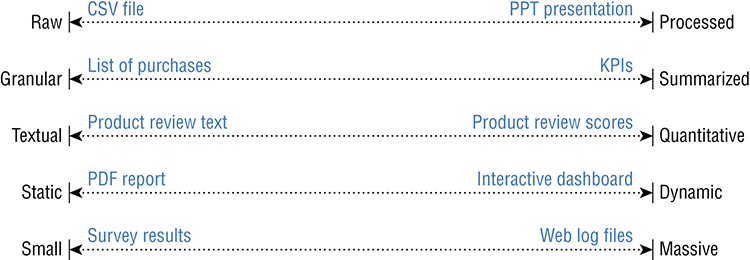
Figure 4-3: Characteristics of data products
Countless data products, varying on the different continuums presented in Figure 4-3, can be found in everyday situations.
Everyday Data Products
We use data products every day to manage and understand our world, often without being conscious of their impact on our daily routines. For example, when you were getting ready to leave home this morning, you may have checked the weather to see what to wear (Figure 4-4).

Figure 4-4: Online weather forecast
Data reminds us to wear a jacket.
Later, on your way into work, you worried about traffic (Figure 4-5).
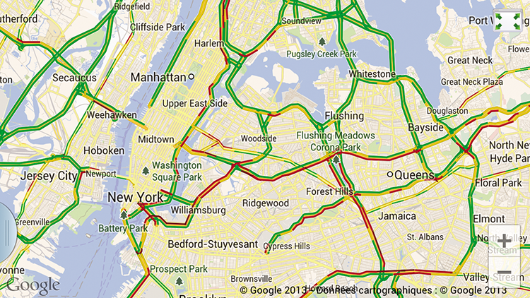
Figure 4-5: Online driving directions with real-time traffic updates
Data keeps us on time.
You stop to grab breakfast and read a menu that visually conveys the price list (Figure 4-6).

Figure 4-6: Breakfast menu
At work, you no doubt interacted with a number of data products, some more obvious than others (Figure 4-7).

Figure 4-7: Laptop battery strength indicator
This laptop’s battery says “don’t worry, you’ve got time.”
Finally, after a long day, you sit down for a nice dinner and a bottle of wine (Figure 4-8).

Figure 4-8: Descriptive wine label
A wine bottle label helps you find the right food.
These examples show a few ways in which you can interact with data products on a regular basis. Everyday objects, signs, and communication often come with subtle and simple data products attached. Like those represented here, these objects can be expertly designed to convey a clear message for the viewer.
As consumers, you are exposed to sophisticated data products every day. If designed well, like the work by professional information design teams at publications like the New York Times, The Guardian, or ProPublica, they are powerful tools for engaging curiosity, interactive storytelling, and understanding our world.
One good example comes from Nathan Yau of FlowingData.com who published this beautiful graphic based on data security breaches. For a casual reader, it consolidates information about this increasingly common problem, and makes it easy to compare the breadth of impact and type of breach. The color helps us see that data lost through hacking (green) far outweighs breaches through stolen, lost, or fraudulent activities (Figure 4-9).

Figure 4-9: The largest data loss incidents on record
Source: http://flowingdata.com/2011/06/13/largest-data-breaches-of-all-time/
Sadly, this graphic is the exception. Most data products are created by people without the experience demonstrated here. (Hopefully Chapter 5 rectifies this problem.) More often, data products have arbitrary visualization choices, an unclear message, and data presentation without thoughtful design or concern about the users’ priorities. They leave the burden of understanding to the audience. The remainder of this chapter is intended to give you guidance and tools to find your way through the data as it is shared in many organizations. You explore some barriers to using data products and then experience some practical challenges that help you increase your data fluency.
Barriers to Using Data Products
Learning the language of a new industry can be difficult. Likewise, you often encounter barriers to engaging with data products. These barriers include jargon, not knowing where to start and what to focus on, and inconsistency.
Jargon
Unleveling. Fitnessgram testing. Scaffolding text-to-text connections. Dahlia Lithwick, who was keenly interested in learning what her second grader was doing in school so that she could provide support at home, described going to a parent-teacher conference at her child’s public school only to encounter all these terms. The teachers didn’t take time to explain the terms but assumed that all the parents knew what they meant. When she looked around, all the other parents were smiling and nodding in agreement, and she certainly didn’t want to appear to be uneducated or uninvested in her child’s success.
Jargon can make a speaker sound smart and listeners feel dumb. As a consumer of data, it is important to remember that most jargon represents simple and often familiar concepts.
When learning a new language, it can be intimidating to encounter a native speaker. ¿Dónde está la biblioteca? may uncork a fountain of Spanish that you cannot begin to comprehend. It is the same in learning to speak data. The following table presents a common jargon list used by experienced data analysts, with an explanation of the relatively simple and familiar concepts they represent.
| Terminology | What It Means |
| Correlation and causation | Even though there may be a relationship between two things (correlation), there isn’t evidence that one thing directly causes the other thing to happen (causation). Suntan lotion sales and ice cream sales both go up at the same time. It doesn’t mean that suntan lotion causes you to crave ice cream. They’re both related to temperature, the common factor driving sales of both. |
| Statistical significance | You want to know if you can be certain that the results are not due to chance—that they really are a result of an intervention, action, or explanation. Statistical significance means that a finding or value is reliable. That is, the result isn’t likely explained by random chance. |
| Over-indexing, under-indexing | It is often helpful to view values through the lens of an index, where the index may be an average, benchmark, or standard value. In some cases, the index is set to 100, so it is easy to compare an over-indexing value (greater than 100) or under-indexing values (less than 100). For example, a Pew survey showed that 26 percent of African-American Internet users surveyed said they used Twitter, compared to 14 percent of Caucasian users and 19 percent of Hispanics.1 In this example, African-American users over-index on Twitter. |
| Regression model | A statistical approach to determine the relationship between variables. Typically many independent variables are included in the regression model in an effort to explain movements in a dependent variable. For example, many descriptive factors about customers may be used in a model to try to predict the likelihood of a customer leaving. |
| Generalizable | A determination of whether the results from the study/survey may be applied to a broader population than was included in the group who actually participated in the study/survey. |
| Regression to the mean | Are the results influenced by the tendency for things to move back toward the average? For example, initial results may be impacted by a unique performance instead of a person’s average performance over time, and what we are now seeing is a person’s typical performance. |
| Confounding factors | A situation in which a variable that helps explain a relationship has been left out of a statistical model. For example, a perceived relationship between two factors (suntan location sales and ice cream sales) may be misunderstood for lack of including a confounding factor (temperature). |
Not Knowing Where to Start or What to Focus On
Books, movies, and music all have a beginning. Data products often do not. When you see a dashboard littered with a dozen competing graphics, it’s easy to disengage. Tables of raw data can be even worse. Data products are often designed to deliver everything and the kitchen sink.
Good data products start with a high-level summary and then let users progressively and logically drill into more complex details. They are also simple and uncluttered. They use white space and have a clear visual hierarchy (Figure 4-10).

Figure 4-10: Railroad analytics dashboard
When data products lack a clear starting point, you as the reader must find your own path through the information. Later in this chapter, you will read some pointers on how to extract meaning from charts and tables, and ideas of where to start your investigation.
Inconsistency
Often you'll get conflicting stories as you look at data products. Try not to get caught up in trying to stamp out these inconsistencies. Different data products were developed for different needs and have different histories.
Returning to the healthcare client that uses CMS data (referenced in the section titled “Data Products” in this chapter), you might consider the prioritized list provided to the sales team. The top hospitals by government Medicare expenditure isn’t a bad list to use when trying to determine which institutions are the biggest and deserve the most attention for future sales calls. However, when a sales person compared this government list (via the SalesForce data product) to a popular website listing the top 50 healthcare institutions—there was inconsistency. Why? Because large hospital systems may have a different CMS identification number for each of their facilities. The SalesForce data product had facility level data. The popular website found by the sales person included health systems that were not broken down into their respective facilities. Regardless, either list would have been a good place to start from with respect to client prospecting! If you spend the majority of your time stamping out such inconsistencies, you might have perfectly synchronized lists; however, you’ll never get around to making any sales call. Data needs to be good enough to help you make a better decision about something you face right now. Tomorrow there will be new (and hopefully better) sources of data.
Data products aren’t synchronized swimming (Figure 4-11)—perfect harmony isn’t required.
Water polo is a better analogy (Figure 4-12)—move the ball forward and stay in your position.

Figure 4-11: Synchronized swimming

Figure 4-12: Water polo
Learning the Language of Data
Understanding statistical concepts like those described above is an important skill. Clive Thompson emphasizes this point in a Wired magazine article entitled Why We Should Learn the Language of Data.2 He frets that a collective inability to understand statistics leads to misguided conclusions. “Gamblers think their number is more likely to come up this time because it didn’t come up last time. Political polls are touted by the media even when their samples are laughably skewed.” He concludes: “We often say, rightly, that literacy is crucial to public life: If you can’t write, you can’t think. The same is now true in math. Statistics is the new grammar.”
As you engage with data products, you’ll find it equally important to understand the raw materials of the information you are looking at. By knowing the language of data and how to quickly read it, you’ll have a step up in interpreting what you see and where to find insights.
This section offers practical guidance on how to engage with data products and extract meaning. It tackles the problem in four parts:
- Learn the components of data to understand how data products are constructed.
- Explore data tables to start to get a sense of the shape and insights in the data.
- Look for the unexpected in data products.
- Find a starting point within a complex data product.
Before you begin to explore data tables and data products, look at the underlying structure of data. Understanding the building blocks of data can help you be more efficient in reading tables, charts, and other data products.
Atomic Data
Each row in raw data represents an element, a person, place, or object doing something. The data that is captured includes dimensions, which describe characteristics of the elements involved, and metrics answer the question “how much?” or “how many?” Metrics can be added up, averaged, or otherwise manipulated with arithmetic or statistics. Now consider this nonsense sentence.
The quick brown fox jumped over the lazy dog.
If you were representing this as data, maybe for an important study on the jumping ability of animals, your observation of Mr. Fox would look like this:
- Jump date: July 1, 2013, 10:13 a.m.
- Jumper species: Vulpes vulpes
- Jumper color: #826548
- Jumper height at shoulder: 0.42 m
- Jump height: 0.78 m
- Number of jumps: 1
- Target species: Canis lupus familiaris
- Target color: #454244
- Target height at shoulder: 0.71 m
For both the jumper and the jumpee, we’ve captured the dimensions of species and color. These are characteristics of the fox and dog.
We’ve also described with numerical metrics other characteristics of the actors as well as the action that was taken (one jump of 0.78 meters). We could create calculated metrics. How high can the fox jump relative to his height? In this case it’s 0.78m / 0.42m. That’s almost twice his height—bravo, Mr. Fox.
Summarized Data
When you summarize data, you group data with the same dimensions together and do something sensible with the metrics. Now imagine you’ve gone to a zoo with the intent to observe animal bounciness. You’ve observed for days and captured the leap of the tiger and the spring of the gazelle. You want to summarize this data, so you group the animals by their dimensions and sum up the metrics.
Some metrics are additive, like the total number of jumps. For others it makes more sense to calculate averages or rates. It’s more common to see data summarized than raw.
These three concepts (elements, dimensions, and metrics) begin to explain how data tables and charts are constructed and can be analyzed. A straightforward way to understand most data is to:
- Filter elements by dimensions to create a scope that is relevant. For example, limit results for data collected in the last 30 days.
- Summarize the metrics by adding or averaging all the values of the elements. For example, average jump height.
- Break out the metrics by dimensions to see the characteristics where that value is unexpectedly high or low. For example, average jump height broken out by species.
Most analyses are that simple: Filter by relevant dimensions; summarize metrics; and breakout by dimensions. Web analytics tools such as Google Analytics may seem complex (Figure 4-13), but they are basically giving you ways to choose metrics and break them out by dimensions.

Figure 4-13: Dashboard from Google Analytics
Exploring Data Tables
In some cases, you may encounter data products that are raw or summarized data presented in tables. Even if you are not an experienced analyst, there is much you can do to gain an appreciation for the structure and insights to be found in the data. Rather than trying to absorb the full data table, start with understanding rows, and then move on to summarizing columns, as shown in Figure 4-14.
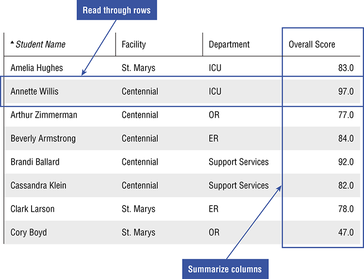
Figure 4-14: Understanding how to use rows and columns
Rows Tell Stories
Each row in raw data represents an element—an individual, atomic thing from the real world. It may be an event, like a customer transaction at a specific location and time, or an advertisement of a specific size, position, and location (refer to Figure 4-14). A row could represent a person, place, or object.
To begin to absorb the data, read across the table to understand what this element is and how the columns describe it. A picture emerges of what the data is about. Take your one row and compare it to others with the same dimension. Perhaps it is a student, who is performing well in some classes but struggling in others, or a customer service call that took too long and resulted in some unhappy comments. You’ll find that as you read each row, a small character study emerges.
Columns Give the Bigger Picture
If the rows are the trees, the columns help you understand the forest. Start by removing columns that aren’t helpful. Data tables straight from a data source are often littered with fields that are empty, redundant, or hold no useful information. Find those columns that you can relate to your experience in the real world. Separate the interesting columns into two buckets: dimensions (the who, what, where, and when of the elements) and metrics (how much).
To understand dimensions, ask these questions:
- How many unique values are there?
- What are the most common values?
- What proportion of all the elements are represented by the top few dimensional values?
- Analyzing the metrics in your data will focus more on summarizing values:
- What is the average value?
- What are the minimum and maximum values?
- What causes the outliers?
- What is the distribution of values?
Answering these types of questions can build a familiarity with the data and reveal insights about the real world behind that data.
Understanding Charts and Visualizations
We have an inbuilt ability to manipulate visual metaphors in ways we cannot do with the things and concepts they stand for—to use them as malleable, conceptual Tetris blocks or modeling clay that we can more easily squeeze, stack, and reorder. And then—whammo!—a pattern emerges, and we’ve arrived someplace we would never have gotten by any other means.
David Byrne, from the introduction to The Best American Infographics3
Charts and visualizations let you use your eyes to find patterns. If they’re designed well, they represent characteristics and quantities in your data in a consistent, clear way.
When we say consistent, we mean that if we’re comparing values and one value is twice as big, then the bar, pie piece, or line that represents it should be twice as large onscreen. When you look at the consistent chart, you’re getting an accurate picture of how numbers compare.
To be clear, charts should display data without distracting decoration. Unneeded details are what Edward Tufte—the godfather of modern data visualization—calls chart junk. They include shadings that reduce contrast, 3D views that make it hard to see where a bar starts and ends, and gradients and colors that are purely decorative. Clarity also requires using the right type of chart. The following table gives the benefits and limitations for common chart types.
| Chart type | Great for showing . . . | Limitations |
| Pie | How a whole breaks up into constituent parts | Becomes hard to read and label when there are more than a few slices in the pie |
| Line | Changes in values over time | Too many data series makes it hard to distinguish trends; lines often overlap and collide. |
| Column/bar (single series) | Comparing of values for a list of items | A bar chart is typically superior to columns because it affords more room for readable labels. |
| Histogram | Distribution of values across a continuous variable | Different “bucket” sizes can impact what results are visible. |
| Scatterplot/Bubble | Finding outliers across multiple dimensions; seeing patters as items cluster | Difficult to label many items; outliers can make it difficult to see the rest of the data. |
Choosing the right chart type given your data is covered in more detail in Chapter 5 as we explore the role of the author of data products.
Comprehensibility
Do you understand what it is saying? Do you know enough about the information being shown to know what it is saying? There are many data products that simply fail to convey information in ways that serve their users. For the worst of these, we’ve used the phrase “in-chart encryption.” Pie charts with dozens of different colored values, 3-D bar charts with illegible labels, and tables with microfonts can make it almost impossible to recover the original data. Figure 4-15 is just one of many confusing charts available for public consumption.
Figure 4-15: A confusing call center chart
This call center chart does a great job of blocking any data understanding. To avoid confusion, or to understand confusing data products, the following section suggests three guiding questions to dissect data products.
Dissecting Data Products
You experience data products in everyday life—labels on food, traffic maps, and weather sites. The reports, presentations, and dashboards you see at work are seldom so expertly designed and easy to understand. To become a data fluent consumer, you’ll need to build on your understanding of data and charts to explore the meaning in complex data products. This section provides a description of three key questions:
- Where does the data product come from?
- What can you learn from it?
- What can you do with it?
Where Does It Come From?
“Where are you from?” is one of the first questions we ask when meeting a new person. Historically, people were named after their birthplace (Joseph of Arimathea, Robin of Loxley, and so on) or by their profession, which went a long way toward understanding their background.
Data is no different. Understanding where data comes from means understanding how the data was collected and how it was processed before it came into your hands. It also means exploring the goals and motivations of the data product author. Try asking the following questions:
1. What real life behavior does it reflect? Data is a lens, a perspective on real life that is grounded in something tangible. Consider, for instance, the fantasy football example mentioned in the first chapter. Fantasy football scoring does not always directly correlate with actual game scoring, but it does tie to common events on the field. The more your players are involved in the action—catching passes, gaining yards—the more you can expect to score.
2. What are the strengths or weaknesses of the data sources? In examining any data product, a good place to start is to consider the source. Who recorded the information? Consider the motivation behind those providing the data product. Does the source have a financial incentive to provide accurate information?
A client of ours, for instance, discovered that the office locations of a large percentage of its national customers had been entered as the headquarters of its own company. When the company began to investigate, it found that those entering the data chose to set the address to the quickest thing that came to mind. There weren’t any incentives to enter the data accurately. The Data Journalism Handbook notes:
The easiest way to show off with spectacular data is to fabricate it. It sounds obvious, but data as commonly commented upon as GDP figures can very well be phony. Former British ambassador Craig Murray reports in his book, Murder in Samarkand, that growth rates in Uzbekistan are subject to intense negotiations between the local government and international bodies. In other words, it has nothing to do with the local economy.4
3. What information is emphasized? Though data may be objective, subjective people author data products. There is often a message that has been baked into the data presentation. The choice of metrics often indicates what is important to the author, and the visual decisions can emphasize one conclusion over another. For example, an executive dashboard that highlights quarterly sales and new customers is authored by someone who celebrates growth. Implicitly, the same dashboard minimizes the importance of customer retention and cost control. You might be growing revenue, but at what cost? Priorities will shine through.
4. What are the relationships between the different elements of data shown? Much of data analysis and visualization is aimed at revealing the connections and relationships in data. A trend chart shows the relationship between a metric and time. A scatterplot chart shows how two metrics relate to each other. Some of the relationships may already be obvious to you from your experience; others may surprise you with new insights into how the world works. View the data product as a tool for uncovering these relationships.
5. At what level of granularity is the data shown? There are different types of insights that can be gleaned from data depending on whether it is summarized or granular. Summarized data can show the big picture but glosses over important relationships and drivers of results. For example, the average height of a basketball team may be 6 foot, 4 inches, but this hides the fact that there is a 7-foot center and two guards under 6 feet. Granular data exposes individual correlations, outliers, and exceptions at the risk of believing a small pattern applies broadly.
6. What is the scope of the data? To draw accurate conclusions from a data product, you need to understand how the data has been filtered or narrowed. Time range is a good place to start because data for the last week may tell a different story from a year of history. A good data product often tries to cut out data that isn’t relevant to the discussion—perhaps there are discontinued products, non-standard transactions, or categories of customers that would skew your results.
7. Do you have a shared understanding of the meaning of all the data fields? As you examine the data product, are there terms, calculations, or labels that require more explanation? Discussions about data are often derailed by different understandings of how a metric is calculated or what a dimension represents.
What Can I Learn from It?
To become a savvy data consumer, you need to transition from understanding “what it is” to “what it means.” This section considers how to find insights from raw data and examines some common charts to help you begin to find meaning. In doing so, you see the importance of recognizing the “unexpected” and contextualizing data through comparison.
Data visualization helps you see results and easily compare those results to your expectations. Data that matches your expectations can help you understand that they are on the right path and encourage you to do more of the same. Results that are unexpected, however, will spur people to action. You want to know: Does the world work the way you think it does? Or does the data show you something that challenges assumptions of expected results?
Data visualizations are designed to emphasize patterns and deviations in data. In fact, each specific chart type is well suited to highlighting particular forms of insight.
A skilled author of data products will choose the right visualization to emphasize a message. The data, chart, and supporting descriptions should work in harmony to point out what is interesting. The reader simply goes along for the ride.
Unfortunately, many data products end up a muddled mess of chart choices, obscure labeling, and arbitrary layout. The producer has passed responsibility to the audience to find the meaning. Chapter 5, “Data Authors: Skilled Designers of Data Presentations,” discusses the responsibilities of the data product author to build a “guided safari” for readers.
Here is a quick tour of common charts to show you how they help you spot the unexpected and use comparisons to find insights.
Unexpected Distributions
Pie charts are designed to show how something breaks into its constituent pieces. The slices add up to the whole, and the volume of each slice indicates its piece of the pie. (The obvious and tasty real-world analogy helps account for the popularity of pie charts in the face of withering criticism by data visualization experts.) The primary insight offered in a pie chart comes from slices that are smaller or larger than you would expect. Readers must imagine what they would expect the pie chart to look like and then find the differences.
In this pie chart (Figure 4-16), readers might be surprised to find that confections are nearly one-half their diet by volume. That’s not healthy eating.
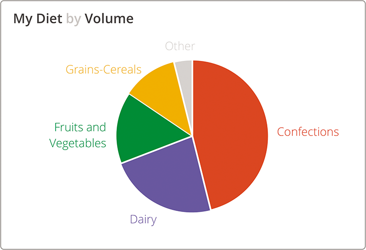
Figure 4-16: My diet by volume
Unexpected Patterns or Relationships
Plotting data in a scatterplot or bubble chart is a way to show relationships between two or more variables. The pattern of the points may express a correlation that is either expected or surprising. Furthermore, outliers from this pattern are interesting because they break the mold.
This scatterplot (Figure 4-17) shows animal size versus weight. The data indicates a positive relationship between the size of the animal and its top speed. Bigger is faster, but with a lot of variation. The cheetah is an outlier with an unusually high ratio of speed to body mass. It’s good to see that humans are faster than bears. Unfortunately, a detailed reading of the data behind this chart reveals that the human data point is Usain Bolt, world record holder in the 100 meter sprint.5
Unexpected Trends
Trends across time are another common place to look for insights. Line charts can make obvious deviations apparent when compared to expected patterns or trends. Like the pie chart, readers need to overlay their assumptions on the shape of the lines. Do you expect there to be an upward trend? Should the values remain steady over time, or is it normal to see substantial fluctuations?
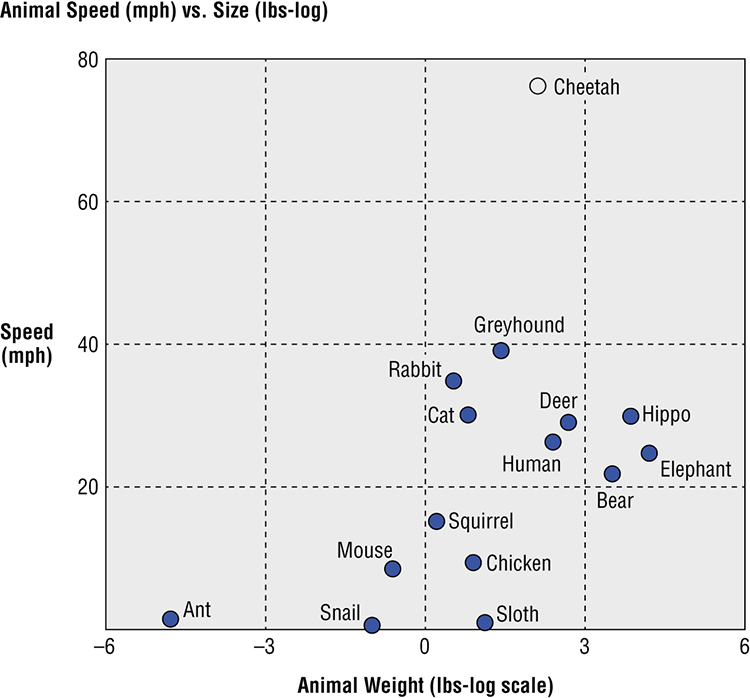
Figure 4-17: Animal speed versus size
Source: Data from Natural History Magazine, March 1974
An astute clinician could interpret this EKG tracing (Figure 4-18) to identify a patient at high risk for malignant heart arrhythmias.

Figure 4-18: EKG rhythms and data
Cardiologists use electrocardiograms (aka EKGs) to trace the electrical activity from the heart. A healthy heart demonstrates familiar patterns in the lines; changes to these patterns indicate problems. An experienced cardiologist can see abnormal heart rhythms, chamber enlargement, and signs of impaired blood flow through changes in the shape of the lines.
Comparisons
Data without context may offer little meaning. But adding a comparison value—whether an industry benchmark, an organizational goal, or a regulatory standard—brings values into focus. Comparisons across time periods can communicate improvement or regression. Direct comparisons can show how two or more entities rank compared to each other. Numerous specialized data visualizations have been designed to enable quick comparison, including bullet charts, “stop-lighting,” and leaderboards.
This dashboard (Figure 4-19) compares bank brands by a series of survey questions. Rankings and side-by-side comparison make it obvious who is performing better for each brand performance measure.
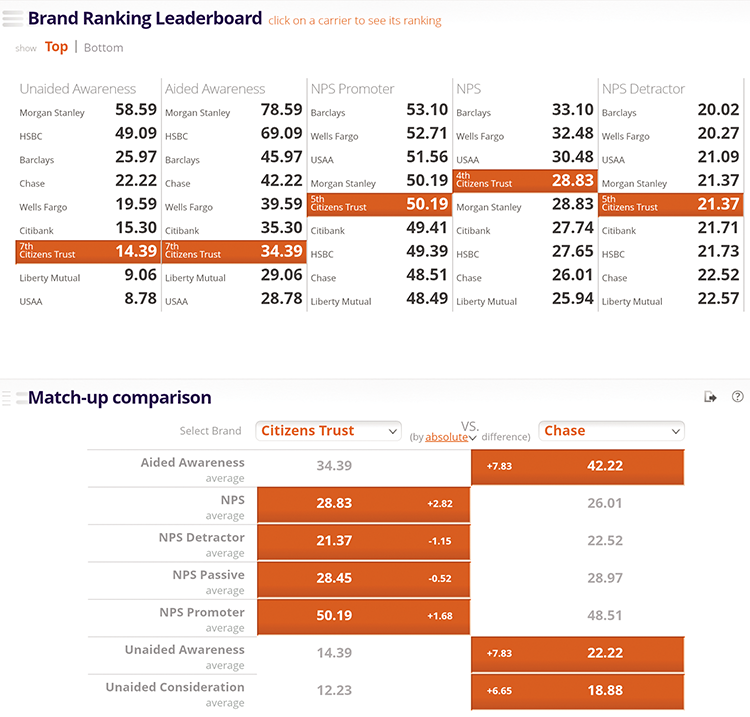
Figure 4-19: Brand ranking leaderboard
Find a Starting Point
A dashboard, report, or data visualization can feel like an ocean of information competing for your attention—like a Where’s Waldo puzzle. Rather than trying to take in the whole picture at once, it’s a good idea to focus your attention on a small piece of the picture. Focusing on a single element can help you grasp the nature of the data, the dimensions and metrics displayed, and eventually how a small piece fits into the whole. Take the following data visualization comparing hospitals by patient experience as an example (Figure 4-20).

Figure 4-20: Hospitals and patient experience
There is a lot going on here. The bubble chart shows three separate metrics about each hospital. The meaning, size, and positioning of the bubbles requires new readers to carefully review the axes and legend to get their bearings. The connection between the bubbles and the bar chart on the right is not immediately obvious.
It’s a lot easier to tell the story of a single bubble as illustrated in Figure 4-21.
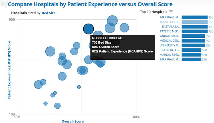
Figure 4-21: Hospitals and patient experience with emphasized bubble
The highlighted bubble represents a hospital, and the three metrics used to size and position the bubble are shown in the tooltip. The connection to the bar chart becomes obvious as Russell Hospital is identified as one of the largest hospitals by bed size. This particular data point may not be the most interesting or unexpected in this chart, yet now you have a much better sense of what the data product is trying to convey about hospitals.
It is often said that you know you have become fluent in a foreign language when you dream in the language. Novice language learners often translate their new language back into their mother’s tongue word for word. Translating back to one’s native tongue, while a crutch, is often needed for a time until one increases in fluency. Gaining data fluency is like developing language fluency. Without instant recognition of the meaning of a data visual, it can be useful to convert the information into a language in which you are familiar. In time, translating back isn’t necessary.
Referring to Figure 4-21 to understand the message in the data, you might translate a highlighted data point into a descriptive sentence such as “Russell Hospital has 730 beds, tied with three other hospitals” or “Russell Hospital’s patience experience score is near the top of all hospitals shown.” This is a way of capturing and testing your understanding of the data depicted.
By breaking a complex data product into its smallest pieces and finding something comprehensible, you can start to understand both what the author is trying to show and how to read the content.
What Can You Do with It?
You are left with the job of sorting the good from the bad. Distinguishing between a data product that is useful and one that is distracting—one must understand whether it is reliable and/or valid. With reliability and validity determined, data products must be actionable.
Reliability and Validity
When considering whether you should use data, you first need to determine if it is reliable and valid. Reliability refers to the extent to which a measurement procedure yields consistent results; that is, if a particular technique, applied repeatedly to the same object or phenomenon, produces the same result each time.6 For example, you could think of using a scale to weigh yourself. If you stepped on the scale 10 times in a row and recorded your weight each time, a reliable scale would give you the same result. If, however, the recorded weight fluctuated each time, and nothing changed about you between weighings (that is, you’re not munching on Twinkies after each round!), you would conclude that the scale is unreliable.
Validity, however, refers to whether the measure accurately reflects the object or phenomenon that you are trying to measure.7 Your scale may tell you each time that you are 185 pounds; however, in reality you may be pushing 225. In this case, your scale would not be valid.
In Figure 4-22, Target A shows a reliable measure that is not valid—notice how the blue dots consistently arrive at a similar point, but they are not accurate and miss the bull’s eye. Target B shows a valid measure in that the blue dots, on average, will arrive at a measure that is at or near the bull’s eye; however, the accuracy is poor, making it unreliable. Target C, however, lacks accuracy and precision—the dots do not produce a valid result on average, nor do they consistently arrive at the same point. Finally, Target D shows a valid and reliable measure, one that arrives at a precise and consistent location, and one centered on the bull’s eye.

Figure 4-22: Understanding reliability and validity
Source: Juice
In assessing the reliability and validity of the data, it is important to consider a few threats to each. For reliability, think about the instrument of measurement. Is it a person? A computer? A tool or machine? Or is it a process that might include each of these? Although there are a number of formal statistical tests to measure reliability, these questions can be an important first step in questioning a data’s reliability. In addition, processes that repeatedly measure the object or phenomenon of interest can also help determine the data’s reliability. For example, you can never find out if your scale is unreliable based on a single measurement. Stepping onto the scale repeatedly in a short time will quickly help you determine if it produces a reliable measure of weight. The same is true for other forms of measurement, especially those that involve multiple steps or components. A good place to start is learning more about the origin of the data and the process for collecting it.
When formal statistical evidence of reliability is not presented, we are left to use our own judgment and intuition about the reliability of the data and the process for gathering it.
There are also a number of ways to determine the data’s validity. The most important and easiest of these is to ask whether the data has face validity. Do the numbers make sense? Are they consistent with past trends? If I weigh myself each day on the same reliable scale and it says 185, and then I weigh myself on a different scale and it says 225, does this mean I’ve suddenly gained 40 pounds? Of course not. Because the first scale is reliable, I know that the new scale is not valid. In education, if a student that consistently scores high on standardized exams designed to measure intelligence and academic ability fails the final test, I would think that the last test is not a valid measure of the student’s ability. Perhaps she was sick that day or had just found out that her parents were getting a divorce.
Another consideration is to think about the data in relation to other measures. And although these relationships can be formally tested with statistics, it is important to do quick, informal checks for the validity of relationships between the data that you might expect to see. For instance, does an increase in the number of hours logged by a sales team also correspond to an increase in the number of sales? Does the retirement of a number of teachers in a school (without their replacement) lead to a higher student-teacher ratio? Does the multimillion dollar advertising campaign spotlighting a revamped website lead to increased search and visits to that site? Often these predictable relationships can help establish validity.
Finally, one must consider the selection process in determining the validity of data. Again, a number of questions are helpful:
- Who does the data represent?
- Is it a sample or does it include everyone?
- If it is a sample, how were they chosen? Why? Are the numbers “cherry-picked” to tell a specific story or sell a certain idea? Or was it random?
- Is the sample representative of the target population of interest? That is, if it is a sample of U.S. hospitals, for example, were only hospitals in major urban cities on the east coast chosen, or was the information drawn from a range of urban and rural hospitals from across the country?
With all these questions, the goal is to find out if there is any bias in the data, that is, is the information misrepresented in a particular direction. Bias can range from the accidental to the purposive, from poor procedures to corrupt processes. As with reliability, data fluent consumers are often left to use their own judgment about the validity of results. Face validity, examining the relationship between data elements, and considering bias are three important tools to help you determine what you can do with the data.
Actionable
If your data is reliable and valid, now what? What can you do with it? Does it offer information that informs decisions you can take?
Actionable data draws a direct and obvious line between the implications of the data and specific actions the reader can take. In our work with clients, we often help define key performance indicators, or KPIs. To test whether a KPI is worthwhile, we like to ask, “What would you do if that number changed?” Sometimes there is an obvious next step. A person can make an adjustment or react to the change. An activity is ramped up or a process is changed. But when the response is, “It sure would be interesting information to know,” then the KPI is probably more of a distraction than of value.
For a commonplace example, take goingtorain.com, the late, lamented website that was pure actionable simplicity. It asks the most important question many people want to know from their weather forecast—do I need to bring an umbrella to work today—and answers it in the most direct possible way (Figure 4-23).

Figure 4-23: Saying it directly
Source: goingtorain.com
In contrast, many weather sites are overloaded with news stories about dramatic weather in far off locations. These stories are more interesting than actionable. In our age of information overload, it is important to sift through information to the most relevant and actionable. In asking what you can do with data, it is critical that you begin to focus on using data that produces actions—shapes and changes the way you behave—because that data will be of most value.
Wrapping Up
It surrounds us and penetrates us; it binds the galaxy together.
Yoda
Data products surround you. They are stories, often summarized, sometimes raw. As a user of these data products, you want to be educated about what you are consuming. You need to answer questions like:
- Is the information trustworthy?
- What data is most important and relevant for you?
- How do you interpret and evaluate the message being delivered by the data product author?
- What information is actionable?
Data consumers are the foundation of data fluent organizations. They are on the front lines of decision-making—making the thousands of large and small decisions that will determine organizational success. Data consumers need more than the tools to make smart decisions; they need the skills to properly use these tools.