
PITFALLS OF PRESETS AND CREATING CUSTOM STYLES
There's no fixed formula for creating a cinematic look, but there are widely agreed-on parameters that should be considered. As you saw in the previous chapters, there are tools cinematographers use to create the mood they want the audience to feel in a particular scene of a story. When shooting with video, the first consideration revolves around how to offset the video look. If filmmakers are not shooting with film but using high-definition video, then they need to know the differences between the two. Indeed, many young cinematographers may have never shot on film and, consequently, may not know why video looks different than film. There are reasons why many cinematographers and directors of photography have avoided the use of video in the past, despite video being available for decades, and much cheaper than the film. If film is considered soft, creamy, as well as smooth and sharp (mainly created by a good-quality lens), and sometimes grainy, then video usually feels harsh, sharp, noisy, and sometimes juddery (when it's captured wrong).1 The video look mainly revolves around overly sharp resolution (as well as how the signal is processed for television).2
The attempt to control your image in-camera is one of the important tools in removing the video look and beginning to achieve a cinematic look. In this chapter, you'll learn how to engage a cinematic style with Canon DSLRs by utilizing picture-style and color balance tools.
There's no fixed formula for creating a cinematic look, but there are widely agreed-on parameters that should be considered.
SHOOTING THE IMAGE FLAT
What precise picture style to recommend—as well as what presets to use (such as monochrome, faithful, neutral, landscape, portrait, and standard, found in Canon DSLRs) or whether or not to create your own picture style—is highly subjective. Yet, few cinematographers would disagree that shooting in anything but a modified Neutral setting may take away the cinematic look you're trying to attain.
Some cinematographers will even take the image to the extreme and shoot in “flat” or “SuperFlat” modes—especially if they're engaging in a high amount of postproduction color grading. Indeed, Technicolor scientists, consulting with Canon engineers, spent a year developing a flat picture style, Technicolor CineStyle—designed to be the best flat look for Canon DSLRs (see “Grand Canyon Winter” case study later in the chapter). Jeremy Ian Thomas, a colorist and editor at Hdi RAWworks in Hollywood, discusses the possibilities in shooting in a flat mode:
I can actually show you some of the SuperFlat and how much information I'm pulling out of it. It's incredible. There's at least two stops in the shadows, at least. And the thing about these cameras I discovered when talking to Rodney Charters, ASC, is to expose for your highlights, because if you lose the highlights in this camera, they're gone forever. They go into the abyss of pixels and they never come back. Now, the low end I can get back. Especially if you're shooting in a flat, neutral profile. If you expose and get a beautiful sky and you want this guy's legs or his torso, I can get that back out of the shadows, but I can't get it out of the highlights.
(Interview with author, March 9, 2010)
Some people warn against shooting SuperFlat because it destroys the skin tones in post, but others argue just the opposite.3
Thomas feels you can get a good look with Canon DSLRs without playing with picture styles: “Skin tones, overall color saturation, and color separation with these cameras [are] pretty incredible right outta the box. It's really amazing.” But he also feels that as a colorist “these cameras” are great when using “the flat profiles.”
By shooting the image flat, “saturated colors blossom” when properly graded in post.
So despite the concerns of some DSLR shooters when using SuperFlat, Thomas feels that it provides the most latitude in getting the image to look good if you're going to do a lot of manipulation in post. “It'll look like milk and honey in post,” he says, and by shooting it flat, “saturated colors blossom” when properly graded in post. He also prefers that the camera be set in the Adobe RGB color space, because “there's a lot of info there” for postproduction work. If you're not going to shoot SuperFlat (a parameter only recommended if you're not going to do a large amount of color grading), then Philip Bloom recommends shooting it flat—which means setting the camera's picture style to Neutral and dialing everything back (setting sharpness to 0, contrast to 0, color tone to 0, and saturation to –2).
You may also just simply choose the Neutral picture style and use the histogram and shoot flat with that—making sure there's data in all the ranges of the tonal scale. The RED One camera shoots flat because that camera is designed to go through a heavy post-process
Choose the Neutral picture style and use the histogram and shoot flat with that—making sure there's data in all the ranges of the tonal scale.
Due to the subjective nature of color grading and getting the look of your shoot, your first step always should be to test before shooting a real project. Test it all the way through the postproduction phase to make sure you're getting what you want. Jeremy Abrams, who runs WideOpenCamera.com, agrees that testing is crucial. Just as cinematographers shooting on film “test lenses for color temperature [and] test the film stock for latitude,” you need to do a similar thing with DSLRs. “You can't just run out and shoot. Preview before you shoot—shoot an image or a series of images and go back and look at [it] on the big monitor to see if you like what you see” (interview with author, March 2010).
Your first step always should be to test before shooting a real project.
And if you're going to be transferring to film, it is even more important to test. What does the film processing company recommend for the settings of the camera you're using? Can you shoot test shots in all your locations with similar lighting setups and have the film processed and projected? This kind of testing may be crucial for a professional film shoot, especially on a large-budget project.
CINEMATOGRAPHER TIP
Shane Hurlbut, ASC, recommends setting the contrast and color tone at Neutral zero but knocking the sharpness to 0, saturation down one notch to –1 (and keeping the contrast and color tone at 0) when shooting with the Canon 5D Mark II (see Figure 4.1; http://hurlbutvisuals.com/blog/category/cinematography/).
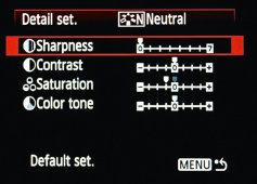
FIGURE 4.1
Shane Hurlbut, ASC, recommends setting Canon 5D Mark Il's sharpness to 0 and saturation at –1 (with contrast and color tone at 0). Keep the contrast and color tone at neutral 0.
(Image courtesy of Hurlbut Visuals.)
Figures 4.2 through 4.9 show examples of Canon's picture styles. Figures 4.2 through 4.5 show the pictures you should never use when trying to shape the cinematic look with Canon DSLRs: standard, portrait, landscape, and faithful. Rather, starting with the Neutral setting (as in Figure 4.6) and adjusting the sharpness, contrast, saturation, and color tone, you can begin to shape a more cinematic image (see Figure 4.7). Be aware that when you're looking at the small screen of the camera, the image will look better than when it's on a large screen.
CINEMATOGRAPHER TIP
Philip Bloom recommends the following settings for the Canon 5D Mark II and 7D (as well as the Canon Rebel T2i and 60D):
![]() Sharpness: 0 (all the way to the left)
Sharpness: 0 (all the way to the left)
![]() Contrast: 0 (middle)
Contrast: 0 (middle)
![]() Saturation: –2
Saturation: –2
![]() Color tone: 0 (middle)
Color tone: 0 (middle)
Figures 4.8 and 4.9 are examples of SuperFlat and ExtraFiat settings (before any postproduction color grading). Be aware that the SuperFlat and ExtraFiat are designed to be adjusted in postproduction; using Magic Bullet plugins, for example, provides a lot of latitude in adjusting flat styles. If you're working with color correction tools, be sure to practice before committing to a particular picture style. Do test shots and take them through post!
Picture Style: Standard (see Figure 4.2)
![]() Sharpness: +3
Sharpness: +3
![]() Contrast: 0 (middle)
Contrast: 0 (middle)
![]() Saturation: 0 (middle)
Saturation: 0 (middle)
![]() Color tone: 0 (middle)
Color tone: 0 (middle)
Notes: This picture style is too sharp and oversaturated; not good for attaining the cinematic look.
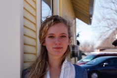
FIGURE 4.2
Standard. Zeiss 100 mm, f/3.5.
(Photo by Kurt Lancaster.)
Picture Style: Portrait (see Figure 4.3)
![]() Sharpness: +2
Sharpness: +2
![]() Contrast: 0 (middle)
Contrast: 0 (middle)
![]() Saturation: 0 (middle)
Saturation: 0 (middle)
![]() Color tone: 0 (middle)
Color tone: 0 (middle)
Notes: The sharpness makes the image look worse and will move your image away from the cinematic look and maintain a video feel.
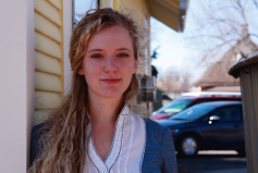
FIGURE 4.3
Portrait. Zeiss 100 mm, f/3.5.
(Photo by Kurt Lancaster.)
Picture Style: Landscape (see Figure 4.4)
![]() Sharpness: +4
Sharpness: +4
![]() Contrast: 0 (middle)
Contrast: 0 (middle)
![]() Saturation: 0 (middle)
Saturation: 0 (middle)
![]() Color tone: 0 (middle)
Color tone: 0 (middle)
Notes: As sharpness increases, the image tends to look worse for cinema projects. This picture style is designed to provide color accuracy, especially for the subject, but it'll likely look too much like video.
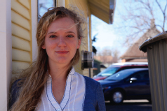
FIGURE 4.4
Landscape. Zeiss 100 mm, f/3.5.
(Photo by Kurt Lancaster.)
Picture Style: Faithful (see Figure 4.5)
![]() Sharpness: 0 (all the way to the left)
Sharpness: 0 (all the way to the left)
![]() Contrast: 0 (middle)
Contrast: 0 (middle)
![]() Saturation: 0 (middle)
Saturation: 0 (middle)
![]() Color tone: 0 (middle)
Color tone: 0 (middle)
Notes: This picture style is designed to provide color accuracy, especially for the subject. But when you shoot Neutral or flat, you'll be able to pull these colors out in post.
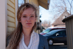
FIGURE 4.5
Faithful. Zeiss 100 mm, f/3.5.
(Photo by Kurt Lancaster.)
Picture Style: Neutral (see Figure 4.6)
![]() Sharpness: 0 (all the way to the left)
Sharpness: 0 (all the way to the left)
![]() Contrast: 0 (middle)
Contrast: 0 (middle)
![]() Saturation: 0 (middle)
Saturation: 0 (middle)
![]() Color tone: 0 (middle)
Color tone: 0 (middle)
Notes: This picture style is designed for the most leeway in postproduction color grading. It provides you with room to play in post without burning in the video look as most of the other picture styles tend to do. You should begin with this setting and then adjust and test the settings you need for your look.
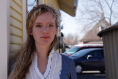
FIGURE 4.6
Neutral. Zeiss 100 mm, f/3.5.
(Photo by Kurt Lancaster.)
Picture Style: Hurlbut (User-Defined)
see Figure 4.7)
![]() Sharpness: 0 (all the way to the left)
Sharpness: 0 (all the way to the left)
![]() Contrast: 0 (middle)
Contrast: 0 (middle)
![]() Saturation: –1 (one click to the left)
Saturation: –1 (one click to the left)
![]() Color tone: 0 (middle)
Color tone: 0 (middle)

FIGURE 4.7
User-Defined: Hurlbut. Zeiss 100 mm, f/3.5.
(Photo by Kurt Lancaster.)
Notes: This is probably one of the best picture styles you can play with. Use it as a basis and experiment. This is the setting Shane Hurlbut, ASC, recommends on his blog. In The Last 3 Minutes, he bumped the Contrast to –4 and Saturation to –2—the basic settings for shooting your image flat, which reinforces the point that you need to test and adjust until you have the look you want.
Picture Style: SuperFiat (User-Defined) (see Figure 4.8)
![]() Sharpness: 0
Sharpness: 0
![]() Contrast: –4 (all the way to the left)
Contrast: –4 (all the way to the left)
![]() Saturation: –2 (two clicks to the left)
Saturation: –2 (two clicks to the left)
![]() Color tone: 0 (middle)
Color tone: 0 (middle)
Notes: This is the setting Jeremy Ian Thomas recommends for those experienced in postproduction color grading, but others argue you may lose natural skin tones, so be sure to test before committing to a particular picture style.
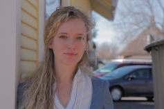
FIGURE 4.8
User-Defined: SuperFlat. Zeiss 100 mm, f/3.5.
(Photo by Kurt Lancaster.)
Picture Style: ExtraFlat (see Figure 4.9)
![]() Sharpness: 2 (two clicks from the left)
Sharpness: 2 (two clicks from the left)
![]() Contrast: –4 (all the way to the left)
Contrast: –4 (all the way to the left)
![]() Saturation: –4 (all the way to the left)
Saturation: –4 (all the way to the left)
![]() Color tone: +2 (two clicks from the right)
Color tone: +2 (two clicks from the right)
Notes: As you can see, the image is washed out, but some colorists say that using these kinds of settings is the best way to do serious color grading. If you compare both the SuperFlat and ExtraFlat images to the one in Neutral, you can see the black in the car and the pupils of the model's eyes crushed, but the flat settings lower the contrast (blacks not crushed) and provide two stops of latitude out of the shadows.
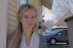
FIGURE 4.9
Use-Defined: ExtraFlat. Zeiss 100 mm, f/3.5.
(Photo by Kurt Lancaster.)
ExtraFlat was designed by Eugenia Loli when she wasn't fully satisfied with the SuperFlat setting, claiming that it was too saturated. She took the Neutral setting as her base, and “it's a tiny bit less contrasty, but a lot less saturated, and it doesn't have the ‘red face’ attribute of the video look” (Loli, E. (2010, January 25). Flatting the flat look. Eugenia.gnomefiles.org. <http://eugenia.gnomefiles.org/2010/01/25/flatting-the-flat-look/>, accessed May 19, 2010).
The ExtraFlat file can be downloaded from <http://eugenia.gnomefiles.org/images2/ExtraFlat.zip>. Steps to install downloaded custom picture styles are covered on page 77; see steps 1–5 and 11–15 of “Picture Styles—Step by Step.”
As can be seen in all the picture style photos of the model, Lillie Laraque, the Canon 5D Mark II biases the reds. ExtraFlat is least impacted by this bias. This issue can be corrected in postproduction or altered in the camera's color correction setup feature, which is covered later in the chapter.
Embracing 8-Bit Color Compression
Shane Hurlbut, ASC
With the 5D Mark II, I embrace the compression and that adds to my cocktail of making it look like film.4 So with 8-bit compressed color, treat it like reversal film stock5—you have to get it close [to make it work right]. You cannot take an image that you forgot to adjust your color temp, and it comes in blue and want to turn it white. Well, you can get it there, but it's going to feel unnatural. Treat the image like you are putting the latent image that will have no color correction possibilities onto that CF card. And that has been my recipe. … I take the camera and turn it into a digital imaging technician. The camera becomes the DIT. So in my picture styles, I have a picture style that I match to my lighting. That's the look of the movie. So if we put the picture style up and if it's day exteriors, we roll with that picture style and we see where it is and then I slide over to what we call SEAL raw [shooting in a flatter mode]. And SEAL raw was a picture style that I basically went into the computer and bent the [color and contrast] curves so that I could suppress the highlights a little bit so they didn't blow so much, and give me a little more latitude in the blacks. So we dial in our exposure and match lighting with the picture style that will be the latent image of the movie, then … right before we rolled, we slid it down and punched the select button and rolled on SEAL raw. It would give
me a little more color correction ability in the under- and the over-exposed areas. Since the film, Act of Valor (2012), I have altered this approach as I navigate without an owner's manual. I use an HP 2480 Dreamcolor ZX Lighting monitor with a rec. 709 function LUT [Lookup Table]. Now, I keep a flat picture style on the camera and don't have to switch back and forth. (Red center #056. <http://media.fxguide.com/redcentre/redcentre-056.mp3>, accessed 24 March, 2010)
Adjusting the RED Camera (Scarlet, Epic) with Mysterium-X Sensor
Jim Mathers, a cinematographer and president of the Digital Cinema Society, discusses what he does when adjusting the settings on his RED camera with the Mysterium-X sensor. RED is a camera designed to be shot in a flat mode with the assumption that all the shots will be color-graded in post (and therefore needs to be color-graded in post before you can tell what it looks like):
The in-camera metering has been steadily improving with each firmware update, but with the new sensor and the latest firmware build, which supports “FLUT™”, (Floating-Point Lookup Table,) and REDcolor, the new Color Science for Mysterium-X, it is very well dialed in. There are really more exposure guides than anyone should ever need including False Color, Stop Lights, Zebras, Histogram, Goal Posts, Barber Pole, RAW Check, and. I honestly don't use these in-camera tools too much, or even know what they all do.
What I like to do instead is to record a shot, then quickly load it into REDCINE-X™. This is a free application, downloadable to those registered at RED.com. It provides very sophisticated color analysis software allowing you to view the image in a variety of color spaces and several Gamma Spaces, even custom. As with RED Alert, you can adjust color, contrast, saturation, and adjust the gamma curve with a number of different interfaces, readjusting the settings you had loaded in as Metadata when you shot. You can even White Balance in post by dragging the cursor to whatever you might want to reference as white in your picture on the viewer. To top it off, you can download these settings back into the camera for better on-set calibration, which should be a great help in matching multiple cameras.
There's a lot to play within the new REDCINE-X™, and I found just going through it to be a very educational exercise in color management. Not that I would think myself competent to grade a movie, but it gives me a glimpse into the kinds of tools available to the trained Colorist, and I think it will help
me communicate the next time I'm supervising a color timing session. In this case, it is all about giving me the confidence to make quick decisions on the set as the sun is going down, in and out of clouds, or for whatever reason I am, as usual, rushed.
(Digital Cinema Society Newsletter, March 26, 2010 #6.2)
Note: For those not using a RED and needing a sophisticated production tool to communicate with postproduction, take a look at Gamma and Density's DcP software at <http://3cp.gammadensity.com/index-2-prod-3cPhtml>. You can download a demo version and test it to see if it meets your needs.
USING TECHNICOLOR'S CINESTYLE IN GRAND CANYON WINTER
Video at: http://vimeo.com/33850967 working in collaboration with Canon, Technicolor scientists spent 12 months developing a picture style designed for filmmakers planning to engage in postproduction color correction—the process of not only fixing color in post—but for digging out the widest possible exposure range in Canon DSLR cameras. According to Technicolor, CineStyle “optimizes the dynamic range in the image by leveraging the capabilities of the Canon imaging chipset” (<http://www.technicolor.com/en/hi/cinema/filmmaking/digital-printer-lights/cinestyle>). It does this by using a log color space rather than linear. Linear provides for an equal distribution of data bit information; logarithmic information allows for bits to be distributed into the darks and highlights in order to provide more detail in these areas. Qvo-Labs claims that the log 8-bit color space (found in Canon DSLR's video mode) can reach a “close equivalent” of 12 bits! (See Qvo-Labs detailed explanation: <http://www.qvolabs.com/Digital_Images_ColorSpace_Log_vs_Linear.html>).
Shane Hurlbut agrees. With the new “color science behind” the CineStyle, Hurlbut says he is “finding much cleaner results in the post color correction process.” (<http://www.hurlbutvisuals.com/blog/2011/05/08/technicolors-new-picture-style-cine-style/>).
I tested Technicolor's CineStyle in the Grand Canyon during the winter—the snow and canyon walls providing a high contrast range. By shooting after a snowstorm, I attempted to overcome the limitations of the DSLR exposure range by pushing the CineStyle picture style to its limits. I used Light Craft Workshop's ND variable fader, mounted on my Zeiss Contax 50 mm f/1.4 lens. As discussed in the previous chapter, when you want shallow depth of field and want to maintain an open aperture, then the ND filter is the best tool to use when shooting in daylight. However, I initially realized I may have shot too dark, but I knew with CineStyle I could fix it in post!

FIGURE 4.10
Setting up a push-in shot at the Grand Canyon with the Canon 5D Mark II and the Kessler Crane Pocket Dolly, Manfrotto 501HDV head, and Cullman tripod.
(Photo by Stephanie Petrie. Used with permission.)
What was used (see Figure 4.10):
Camera: Canon 5D Mark II
ISO: 160
Shutter: 1/40
Lens: Zeiss Contax 50 mm f/1.4
Aperture: f/8
Filter: Tiffen HT Ultra Clear (55 mm)
ND filter: Light Craft Workshop ND fader (55 mm)
Support: Tripod, Zacuto Z-Finder Pro, Kessler Crane Pocket Dolly Traveler
Picture Style: Technicolor's CineStyle (<http://www.technicolor.com/en/hi/cinema/filmmaking/digital-printer-lights/cinestyle>)
Editing, color grading, and sound:
Final Cut Pro X Music: <http://incompetech.com/>
In either case, instead of burning in color and exposure (such as with Canon's Faithful picture style, for example), the CineStyle does the opposite—it flattens the look, allowing for the widest possible exposure range during post. It looks gray.
For this project, I also wanted to bring motion to the shots. Cinematic motion is like poetry in the film world, so I used my Kessler Crane Pocket Dolly Traveler mounted to a Manfrotto 501HDV head (and Cullman carbon fiber sticks).
Once the footage was shot, I dumped the footage onto my MacBook Pro (quad core with 8 GB of RAM) and external G-Tech mini hard drive (FireWire 800, 7200 rpm, 750 GB).
However, unlike shooting with one of Canon's Picture Styles, where you do not need to do any work in post, the CineStyle requires you to do postproduction work, otherwise the image looks washed out and flat. It holds extra data in the bit-space, but you won't see it until you go into postproduction. (See Figure 4.11.)
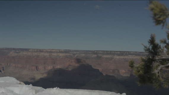
FIGURE 4.11
A view of the Grand Canyon using Technicolor's CineStyle. Notice how flat, washed out, and grey the image looks. CineStyle requires that you dig out the color and exposure information in postproduction.
(Still from Grand Canyon Winter by Kurt Lancaster.)
After applying exposure correction in Final Cut Pro X, the image reveals rich reds and blues as well as details in the highlight area of the snow (see Figure 4.12).
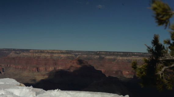
FIGURE 4.12
After post, the Grand Canyon is revealed with bold colors and a large dynamic range (notice the details captured in the snow).
(Still from Grand Canyon Winter by Kurt Lancaster.)
I attained this look by adjusting the highlights, midtones, and shadow levels using the color correction tools in Final Cut Pro X. (See Figure 4.13.) Above the line increases the value, while moving the circle below the line decreases values. I adjust the midtones down to help remove the wash in the CineStyle image, making the overall image darker, and increased the highlights to make the image brighter.
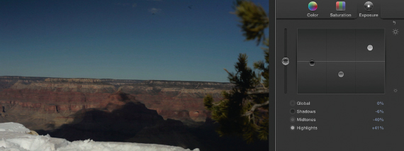
FIGURE 4.13
The adjustment tools in Final Cut X provide the tools needed to remove the flat washout look of CineStyle. It digs out the data for the high dynamic range of the image.
(Still from Grand Canyon Winter by Kurt Lancaster.)
If you do not want to adjust the correction manually, Pomfort (<http://pomfort.com/plugins/dslrlog2video-tryandbuy.html>) sells an S-curve look up table (LUT), a plugin for Final Cut Pro (7 and X), which allows you to drag and drop the plugin on your footage, applying the correction automatically. (See Figure 4.14.) (It currently retails at $29, so it may be worth the investment.) I noticed with some tests that you still may want to tweak the image, even after applying the effect.
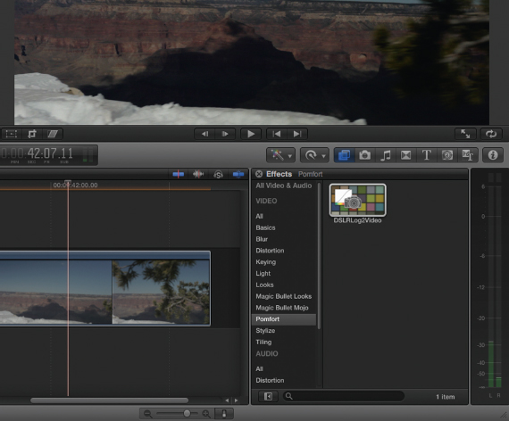
FIGURE 4.14
The DSLRLog2Video plugin for Final Cut Pro X from Pomfort. Just drag and drop the icon onto the image and the effect is applied instantaneously. Notice the shadows are dark, so additional tweaking may still be required after applying the effect.
(Still from Grand Canyon Winter by Kurt Lancaster.)
Technicolor's CineStyle may be the strongest tool Canon DSLR shooters have at their disposal when attempting to shape a cinematic look to their films. It helps set up a large dynamic range and when used with a filmic sense of color grading in post, it provides a lot of potential in crafting a film-like look.
PRODUCTION COLOR CORRECTION
Shane Hurlbut, ASC, quickly embraced the Canon 5D Mark II as a cinema camera—but with limitations. He discovered that the 8-bit color space did not give him the postproduction latitude he was accustomed to in film:
Our solution was to go back to the un-compressed Cineform or Adobe CS5 4:4:4 files and start anew.6 This worked very well and it seemed to give us much more range. I also realized too late that this camera needs light. If you don't feed it enough light, the 8-bit compressed color space quickly goes to 4- and then to 2-bit color space.7 You can always create contrast by stretching the image by pushing the whites and pulling your blacks down. Underexposure is a powerful tool with this camera, but the whole image cannot be underexposed. It will result in noise, fall apart quickly in color correction and just look muddy.
(Hurlbut, S. (March 30, 2010,). Color Correction: Put Your Best Foot
Forward. Hurlblog <http://hurlbutvisuals.com/blog/2010/03/30/color-correction-put-your-best-foot-forward>)
Essentially, Hurlbut realized that the H.264 codec Canon uses doesn't have much wiggle room in post with color correction. Although it can be edited natively with some software (including Final Cut Pro), it is not the way to go because it's being used as an origination codec, not a postproduction one. DSLR footage must be up-rezzed to a 4:4:4 or 4:2:2 color space. One of the ways to work around the codec in-camera, Hurlbut suggests, is to try to attain the look with Canon's Picture Style Editor, modifying a RAW still image and then save it as a look you can upload into the camera (see Figure 4.15).
In addition to engaging such user-defined picture styles as SuperFlat, ExtraFlat, or Technicolor's CineStyle, one of the key features of the Canon DSLR revolves around the custom picture style, which allows you to take a RAW photo and set that as your user-defined picture style. Only use this process if you have a strong technical mastery over crafting your image and you have a calibrated monitor. I recommend that you shoot with Technicolor's PictureStyle for projects using postproduction color correction. But for those of you wanting to experiment with the look of your film projects, follow these steps:
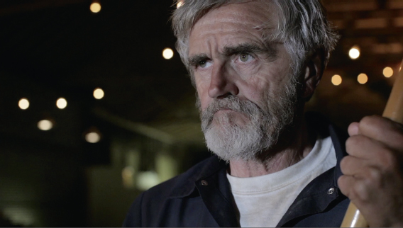
FIGURE 4.15
The picture style for The Last 3 Minutes was shot in modified neutral with a –4 on Contrast and –2 on Saturation.
(Still from The Last 3 Minutes ©2010 Hurlbut Visuals. Used with permission.)
PICTURE STYLE—STEP BY STEP
| 1. | Take a RAW picture.8 |
| 2. | Plug the camera into the computer and turn it on. |
| 3. | Open up EOS Utility (install from the provided EOS Digital Solution Disk that comes with the camera); it looks like the image in Figure 4.16. |
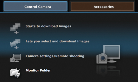
FIGURE 4.16
Canon's software for computer control of the camera.
| 4. | Click on the Accessories button (there are two: Control Camera and Accessories), which takes you to the window shown in Figure 4.17. |
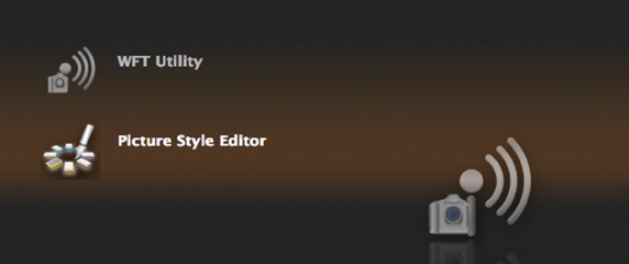
FIGURE 4.17
Window to the Picture Style Editor.
| 5. | Open the Picture Style Editor. If you're installing a picture style you've downloaded, such as ExtraFlat, go to step 11. |
| 6. | Open the folder containing the RAW image you want to reference and drag and drop it to the window shown in Figure 4.18. |
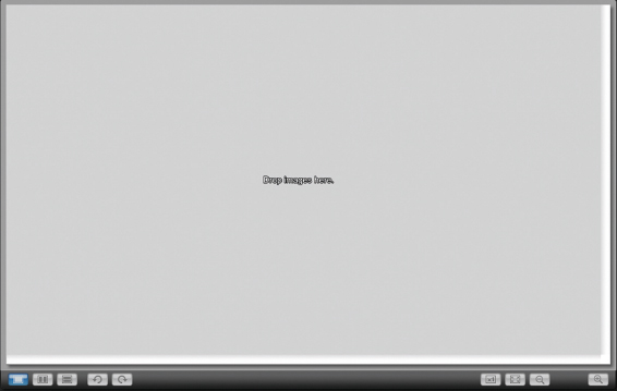
FIGURE 4.18
The empty screen where you can drag an image for picture style manipulation.
| 7. | Click on the second button from the bottom left (the image with two little windows), and you get two images: one is the original, and the second is the one you'll manipulate (see Figure 4.19). |
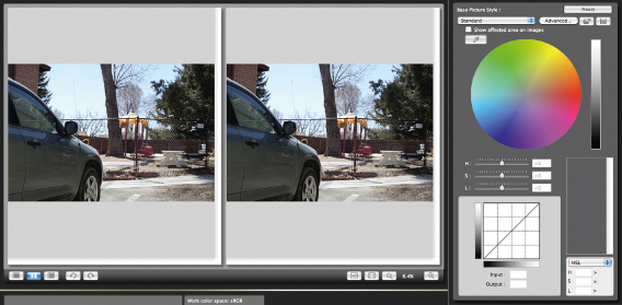
FIGURE 4.19
A two-up image for picture style manipulation. On the left is the untouched RAW image, while the right image shows the changes you can make in the far-right window.
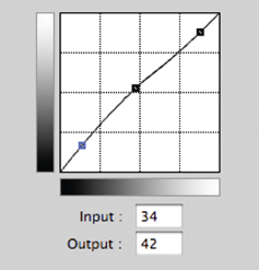
FIGURE 4.20
Click on the gamma curve line to make changes to the image in the picture style window.
| 8. | The diagonal line in the lower-right grid represents a gamma curve. Adjusting this allows you to shape the look of your picture style. Click on the line and drag the mouse to adjust the image. |
| 9. | Dragging a point on the lower part of the line to the left will expand the space in the blacks, providing a bit more dynamic range (see Figure 4.20). Dragging it to the right will crush the blacks. Shane Hurlbut, ASC, recommends just a slight curve to the left to open up the blacks a bit. As you adjust the setting, the input/output will receive a number value. High values—the brights—should be lessened; you can do so by creating a node near the top of the line and then dragging it slightly to the right. |
| 10. | The middle of the line allows you to adjust the midrange values. The more you bend the curves, the more extreme the image, so slight adjustments are recommended. Essentially, you're stretching the blacks and whites and making them flat, which is the opposite of the goal in post—where you want to deepen the blacks and slowly roll off the whites. Experimentation is the best school, when it comes to shaping picture profiles! Test it out before going into production. |
| 11. | After you've made the adjustment to your taste, getting the look as close as possible to the final look you desire, save the file. If you're doing a professional-style shoot, you'll want two files: one reflecting the final look you want as a lookup table, and the other you'll want to create as a flat look, which is the best way to engage color grading in post. If you're not planning to do much post work, such as when you're shooting a journalism piece needing a fast turnaround, get the look you want as close as possible. This is the new picture style that you'll upload to the camera. |
| 12. | Go to EOS Utilities and click on the Camera settings/Remote shooting menu (see Figure 4.21). The camera must be plugged into the computer and turned on for these menu items to appear. |
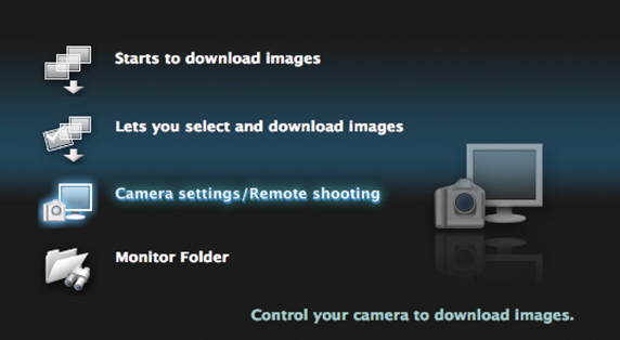
FIGURE 4.21
Main menu.
| 13. | You should see a window with a control panel to your camera, which includes battery life, f-stop settings, color temperature, shutter speed, and what picture style you're currently on, among other features (see Figure 4.22). Look at the Picture Style section and click on User Def. 1 (there are three, and you can choose any one of them). |
| 14. | You can click on the picture style and adjust the detail settings, white balance shift, and so forth (see Figure 4.23). Click on Register User Defined style.9 |
| 15. | This will take you to a window where you can select from a drop-down menu or open a folder. In this case, open the folder and select the picture file you created from the adjusted RAW image in Picture Style Editor (see Figure 4.24). Note: This is the step you use if you're downloading an existing picture style, such as ExtraFlat. |
| 16. | After you've selected your picture style file, your window will show the file. It includes the adjustments made in the picture detail shown in Figure 4.25. |
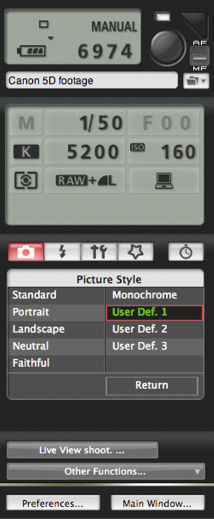
FIGURE 4.22
The control panel to the 5D Mark II camera. It not only provides the current settings of the camera, but allows you to import picture styles.

FIGURE 4.23
The data for the picture style as shown in the control panel window.
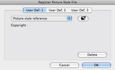
FIGURE 4.24
Three user-defined styles can be assigned. Click the folder button to upload your particular picture style for each.
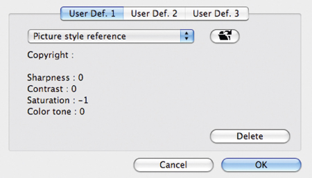
FIGURE 4.25
After you upload the picture style, the window will provide an overview of the settings in-camera.
The picture style has been set and saved into your camera. Anytime you choose this user-defined style, you'll be shooting in the mode you shaped through the Picture Style Editor. Just as a cinematographer will test film stock before shooting, you should test it and experiment with others before shooting. Use a flat mode when shooting if you're planning to do any color grading in post, and use the lookup table as your film look reference point. The best test is to put it through the decompression and editing workflow and export it onto a large screen and view it. You should be making these picture style edits only with a calibrated monitor in order to ensure accuracy, which is imperative if you're transferring the footage to film. And taking the advice of the film-out company you're using is a must when you're planning to screen the end result on film.
COLOR BALANCE
Having used 15 different 5D Mark IIs on the shoot of the Navy SEALS movie, Act of Valor (2012), Hurlbut says he noticed different biases in the sensors; some have a slight cast of yellow or magenta. Bernardo Uzeda, the director and postproduction person on the Brazilian short Casulo (featured in Chapter 8), notes how the 5D Mark II used on the shoot was “very sensitive to the color red” and he removed “red from almost 100% of the shots” in postproduction.
I teach students to shoot a white or gray card image in the lighting conditions they're shooting under (making sure to dial in the proper color temperature) and be sure the image is truly white (or grey). If there's a slight color cast, then the color balance of the camera may be adjusted manually by clicking on the Menu button on the camera and going into the white balance shift/white balance bracketing (WB SHIFT/BKT) menu located under tab 2 (Shooting 2 submenu of the main menu; see Figure 4.26).
After you select the WB SHIFT/BKT submenu, you will be taken to the color correction window (see Figure 4.27).
By making adjustments with the toggle, you can remove the color cast. Use the opposite color for the one you want to alter. If it's reddish, move the point toward the green, for example. You can also use this tool to add color to a scene if you are trying to attain that look. Again, test it first in the field.
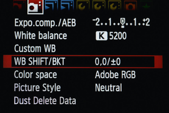
FIGURE 4.26
The list of submenu items under tab 2 of the main menu in the Canon 5D Mark II.
(Image courtesy of Canon.)
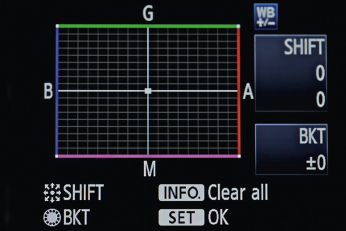
FIGURE 4.27
The white balance shift window. B = blue, G = green, A = amber, M = magenta. Move the camera's toggle switch to adjust the parameters.
(Image courtesy of Canon.)
The most important point revolves around the fact that an 8-bit color depth is “thin,” to use the words of Hdi RAWworks colorist Jeremy Ian Thomas, especially in a Canon 5D Mark II. And as Hurlbut explains, the compressed H.264 codec doesn't help because there's very little room to stretch the look of the image in post. Therefore, attain your look as close as possible to the final product. An additional note, Thomas explains that, as a colorist, he prefers the Canon 7D because the pixels are more dense—not stretched as thin as the 5D—and it gives him a little bit more play in post. Shooting a color-true chart might also be useful when wanting to get your color temperature right (look up “DSC color chart” on the Web), but they can be pricey, around $200.
To sum up, Jared Abrams of WideOpenCamera.com, discusses the importance of planning the look of the film before you shoot:
You are building a race car, you are priming it and these guys get to paint it and boy wouldn't it be a bummer if they painted it day glow orange on you? Neil Smith at Hdi RAWworks is really passionate about—and I agree with him totally—talking to your colorist; talk to your post people first before you ever shoot with the camera. Talk to someone about the post processing and the color so when you shoot you can favor what they need to make the best product.
This chapter gave you an overview of what picture styles look like and how to engage picture styles to shape the look of your film before shooting it; it also covered the ability to shape the color correction of Canon DSLRs incamera. The next chapter covers one of the most important tools in attaining a film look—recording quality audio—because no matter how good your look is, if the audio is bad, the audience will not be able to see how good it looks. Therefore, a clean audio recording is essential in achieving the potential cinematic quality of your project. Without it, you have less than half a film. Audio is not an afterthought, because good audio can make your film shine more than any other tool.
1 If video is captured wrong, motion-blur will need to be added to attain the 1/48 look.
2 Television broadcasts utilize interlaced scan lines, such as 60i in a camera. If not corrected in post, websites will show these horizontal lines as video artifacts, which ruins the image.
3 See Why Shoot Flat? My Definitive Answer: <http://www.elskid.com/blog/?p=981&cpage=1>; Flatten your 5D: <http://prolost.com/blog/2009/8/3/flatten-your-5d.html>; They Shoot Horses JPEGs Don't They?: <http://photocinenews.com/2010/04/26/they-shoot-horses-jpegs-dont-they/>;
Shoot flat or not?: <http://www.canon5dtips.com/2010/04/shoot-flat-or-not/>;
4 Hurlbut knows that film is closer to a 20-bit compression. However, he feels if he embraces the limitations of the 8-bit color space of the Canon DSLRs—instead of forcing it to do what it can't—he can work around those limitations and attain a film look that works for him.
5 In other words, worry about blowing out the highlights, so be sure to expose for the highlights.
6 Chapter 6, on postproduction, covers the Cineform codec for decompressing the movie files.
7 This occurs when a poor lighting and/or wrong ISO setting is used.
8 One DSLR shooter notes how he takes a different picture for each ISO and color temperature setting; he created three picture profiles taking into consideration different color temps: Tungsten (indoor), daylight shade, and normal daylight (Tico 2010). <http://hurlbutvisuals.com/blog/2010/03/30/color-correction-put-your-best-foot-forward/>.
9 Notice the Live View shoot … button. Clicking on it will allow you to see your camera's image through your laptop. If you're in the field and want to use your laptop as a field monitor, this feature allows you to do so.