
Chapter 10
Photocopier Meets Photoshop
Photoshop, to many, represents perfection. But while we strive to achieve perfection, let us not overlook the beauty of imperfection. If you’re an urban dweller, pay attention to what is surrounding you as you wander the streets. You’ll notice photocopied flyers and posters plastered all over the place. You’d be hard pressed to find a better example of imperfect, yet beautiful, artwork. This is the art of the underground scene. Local bands and underground artists do what they can with what they have. There is an evident do-it-yourself aesthetic inherent in the majority of urban poster art.
This low-fidelity appearance is more a result of available tools and failing monetary resources rather than a conscious attempt at style. Regardless of intent, a certain style prevails. Poor registration, inferior image quality, and cut-and-paste typography all contribute to the urban underground look. However, the most prominent element is the look achieved by using a poor-quality photocopier to put it all together. Generally these collages are photocopied on machines in desperate need of servicing or even dangerously low on toner. Not the sort of thing found at a professional copy shop, but rather like something you’ll find in a local convenience store.
Remember, just because Photoshop has an arsenal of tools that lend themselves to achieving perfection, it doesn’t mean that you cannot turn the tables and create convincing imperfection. The limit to what you can achieve with Photoshop’s tools and functions is dictated by your own willingness to explore less-than-obvious methods. To create tactile and distressed underground poster art effects, all you need is access to a good old-fashioned photocopier, an enthusiasm for Photoshop, and a willingness to experiment.
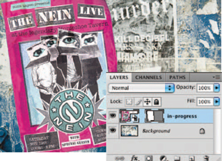
![]() Although this chapter is a simple montage, you’ll need to know how to create text layers and change fonts. You’ll also need to know how to use simple selection tools and some very basic experience with the Free-Transform command will be helpful. A bit of experience drawing simple paths is beneficial toward the end as well.
Although this chapter is a simple montage, you’ll need to know how to create text layers and change fonts. You’ll also need to know how to use simple selection tools and some very basic experience with the Free-Transform command will be helpful. A bit of experience drawing simple paths is beneficial toward the end as well.
What you’ll learn in this chapter
Creative Techniques and Working Methods
Virtual scissors and glue
In order to get that authentic cut-and-paste look, you have to take a very simplistic approach to isolating elements and compositing in Photoshop. When isolating different bits and pieces, you’ll learn that rough selections are more believable than precise ones. A bit of white space around a dark rectangle or an accidentally angled cut will help the finished composition look convincing. When you piece things together, you’ll quickly see the merit in this sort of hasty montage technique. This is no place for precise selection tools or grids to assist in perfect alignment. This is intended to look like a real photocopied do-it-yourself gig poster. If you’re used to creating slick, photographic compositions in Photoshop, this chapter will definitely open your eyes to new possibilities.
Deterioration tactics
When you run artwork through a photocopier, there is always some deterioration in quality. In general, this is the type of thing we are conditioned to avoid. However, this chapter will get you thinking about the beauty within the result of that deterioration and have you searching for ways to emulate and enhance the effect. After you create copies for a number of generations, it is almost impossible to ignore the unique quality of the deterioration and you can’t help but notice the potential in the random distress that occurs.
Photoshop Tools, Features, and Functions
Brightness/Contrast

With infinitely better tonal adjustment tools like curves and levels available, it isn’t very often we reach for something as simple as the brightness/contrast adjustment. However, this time, it is a simplistic result that we’re after. Here, the goal of the image is an inferior, not superior, appearance. Enabling this feature’s legacy format deteriorates the quality even further.
Smart objects

Placing the finished poster file into the large background image allows you to create a flexible final composition quite easily. Keeping the poster as a smart object allows you to tweak the poster design at any point, even long after you think you’re finished.
Blending and opacity

Authentic results are not always the result of complicated procedures. Creating the effect of the poster being glued to a surface can be as simple as overlaying the image with a texture layer. The secret to success is combining just the right layer blending mode with the perfect opacity setting.
PART ONE: Prepare, print, and photocopy
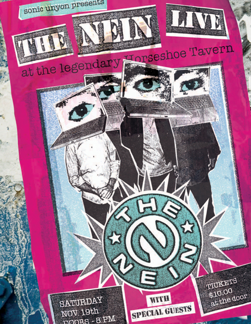
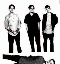
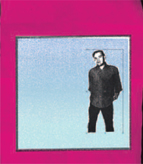
1 Open up the neinphoto.jpg file. This is a press photo used by an American band known as The Nein. The Nein will act as the subject for the urban poster art you’ll be creating here. To simulate the appearance of cutting with scissors, use the Polygonal Lasso tool to draw a very rough polygonal selection around the outside of a single band member in the image. Now, create a new file. Specify a white background and grayscale color mode. Set the canvas size to something that is similar in size to the paper you’ll be printing everything out on.

 Project files
All of the files needed to follow along with this chapter and create the featured image are available for download on the accompanying Web site in the project files section. Visit www.creativephotoshopthebook.com.
You can follow along from the beginning, creating and printing out your own grayscale files. Or, if you don’t want to seek out a photocopier on your own, you can access the already photocopied and scanned files in the same archive. These supplied files will be referred to by name throughout the tutorial. Feel free to use them or substitute files of your own as you work.
2 Return to the neinphoto.jpg file. Hold down the Control(PC)/Command(Mac) key. Click inside the selection border and drag the contents of the selection into your new grayscale file as a new layer. Continue to hold down the Control(PC)/Command(Mac) key and position the layer on the canvas to allow space for the band members. Use this method to add each band member to the grayscale file. To fit them on the canvas, you’ll likely have to rotate one band member. To do so, target the appropriate layer in the Layers palette and then choose a 90° rotation option from the Edit>Transform menu.

Source : Nein press photo courtesy of Casey Burns/The Nein.
 Editing text
When you have a type layer targeted in the Layers palette and the Type tool selected, you can edit any of the type options in the Tool Options bar. This will affect the entire contents of the type layer. However, if you click on an area of type on the canvas, which activates the type layer, it becomes necessary to select type in order to edit it. Either click and drag to select a portion of the text or double-click to select it. Once your text is selected, it can then be edited.
3 Next, choose Layer>Flatten Image from the menu to flatten the layers. Choose Image>Adjustments>Brightness/Contrast from the menu. Enable the Use Legacy option offered in the Brightness/Contrast dialog box so that you are removing shadow and highlight detail when adjusting. Adjust the brightness and contrast sliders to increase the contrast and decrease the range of grays within the image. This is the first step in image deterioration that is necessary to produce a convincing effect. When you’ve completed the adjustment, print the image in black and white on an ink jet or laser printer.
Creating text
Very simple typography set against black, white, or gray backgrounds will help to lend a sense of authenticity to your design.
1 Create a new grayscale file identical to your previous file. Select the Horizontal Type tool. Click on the canvas to add a type insertion point. Enter some text and press the Enter key to create a new, editable type layer.

2 While the Type tool is selected, you can alter the font, size, color, and other attributes of your type layer in the Tool Options bar. Choose an appropriate font like American typewriter. Now, create another type insertion point and add some different text using a different font.

3 Target your background layer and use the Rectangular Marquee to create a selection beneath a line of type. Use Edit>Fill from the menu to fill the selection. Then target the overlaying type layer, ensure that you’ve selected the Type tool and change the color of the type to white.
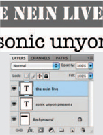
4 Use the aforementioned techniques to add all of the necessary text to your page on a series of layers. Try different shades of gray, as well as black, behind white text. Try duplicating type layers by dragging them onto the Create a New Layer button at the bottom of the Layers palette. Move the duplicated type around the canvas with the Move tool. In addition to experimenting with different grays in the background, try changing some of your black type to gray as well. Fill your page with options until you’re satisfied, and then flatten the image. Print this page in black and white as well.
Create some basic shapes
Again, simplicity is the key to a design like this, especially when creating backgrounds and borders.
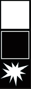
1 Create another new grayscale file. Select the Rectangular Marquee tool. Hold down the Shift key while clicking and dragging to draw a square selection. Press "d" to set the foreground color to black, and type Alt(PC)/Option(Mac)-Delete to fill the selection with it.

2 Click inside the selection border with the Marquee tool and drag the active selection border down on the canvas beneath the square. Choose Edit>Stroke from the menu. Select " inside " as the location and " black " as the color. Enter a width value and click OK.

3 Use the Polygonal Lasso tool to create a primitive starburst shaped selection on an empty area of the canvas. Use the same methods you used previously with the first square to fill your starburst with black. Print this file in black and white as well.
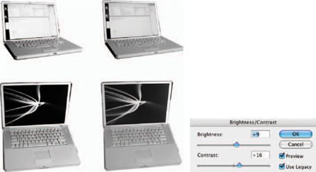
5 Open up the computers.jpg file from the CD. This grayscale file has already had the computer images placed in it and has been flattened. All that you need to do here is snap up the contrast a little. Choose Image>Adjustments>Brightness/Contrast from the menu. Again, enable the Legacy option to deteriorate the image and adjust the sliders to increase the contrast overall. Print this final file in black and white and then gather up all of your printouts.
Making copies
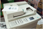
The best way to get that rough, photocopied look is to gather up your printouts and find a neglected copier.
1 Convenience stores are the best places to find copiers that are rarely maintained. The lack of maintenance often results in a grittier result, which is exactly what we’re after. Get out your printouts and make at least one photocopy of each.
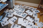
2 Try copying the copies a few times. With each generation, the quality deteriorates and the signature look of the copier becomes more apparent. Crumple some copies, flatten them, and then copy them again. Incorporating this crumple technique will distress your copies even more.

3 When you’re finished, gather up the copies and head home. There is a good chance that you’ll have a lot to choose from. Lay everything out on the floor to have a good look. Choose the best of the bunch and scan them.
PART TWO: Prepare the background
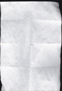
6 Again, all of the photocopied and scanned files that were used to create this poster are included on the CD. They will be referred to by name for the rest of this chapter. However, feel free to substitute photocopies of your own if you like. To begin creating the poster, open up the paper.jpg file from the CD. This desktop scan of a folded piece of paper will act as the background in the multilayered file you’ll create. Something as simple as starting with an authentic background can be very powerful in helping to achieve a convincing result. Every little bit helps.
 Choosing fonts
For your poster art to look authentic, it should definitely look like a computer was not involved in its creation whatsoever. This especially rings true when it comes to choosing fonts. American Typewriter and Stencil are both fonts that are available when typesetting with traditional tools. As a result of this, it is entirely believable that the typesetting on the poster could’ve been accomplished by traditional means. Adding the photocopied look to a slick modern font will display the technique we’re describing, but at the same time it will ruin the authenticity of the final poster design by displaying something that is clearly impossible.
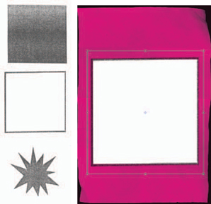
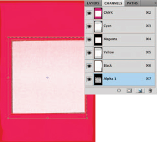
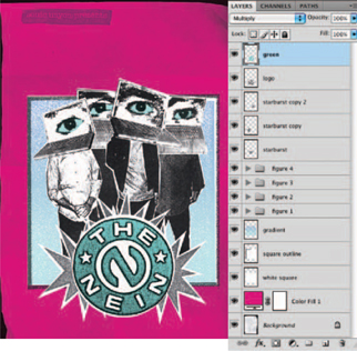
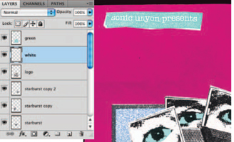
7 Choose Layer>New Fill Layer>Solid Color from the menu. When the New Layer dialog box opens, set the blending mode to multiply and click OK. When the picker opens, choose a dark pink color and click OK to create your new solid pink layer. Next, click on the Create a New Layer button at the bottom of the Layers palette. With the new layer targeted, use the Rectangular Marquee tool to draw a square selection. Press the “ d ” key to set the current background color to white. Type Control(PC)/Command(Mac)-Delete on the keyboard to fill the new selection with white.

8 Type Control(PC)/Command(Mac)-d on the keyboard to deactivate the current selection. Open up the shape. jpg file and use the Rectangular Marquee tool to draw a selection around the square that has the stroke around it. Hold down the Control(PC)/Command(Mac) key, click inside the selection border and, while holding the mouse button down, drag the contents of the selection into your working file as a new layer. Change the layer blending mode to multiply and then choose Edit>Free-Transform from the menu. Hold down the Shift key while dragging a corner handle outward to increase the size proportionately.
 Lighten then darken
Almost every photocopier has a setting that allows you to lighten or darken the copied image. When you’re copying the original, try using a very light setting so that a lot of the detail and tonal range disappear. Then, try copying this initial copy with a darker setting, enhancing the contrast while copying the image of reduced detail and tonal range.
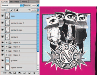
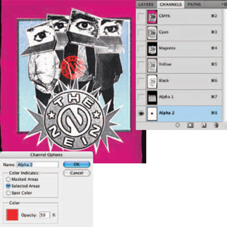
9 Click and drag within the bounding box to position the layer contents. When it frames the white box on the layer below, press the Enter key to apply the transformation. Return to the shapes.jpg file and deactivate the selection. Choose Image>Adjustments>Invert from the menu to invert the color of the shapes image. Now, use the Rectangular Marquee tool to draw a selection around the inverted square shape. Choose Edit>Copy from the menu. Return to your working file. In the Channels palette, click on the Create New Channel button at the bottom of the palette to create a new alpha channel.
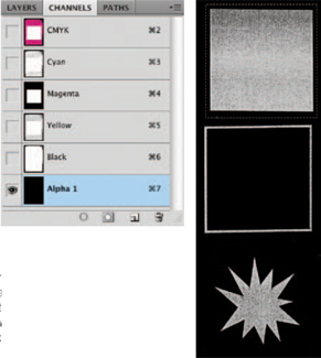
10 Click in the column to the left of the CMYK composite channel in the Channels palette to make it visible at the same time as your alpha channel. Your alpha channel will preview against the background as a red overlay. Ensure that the alpha channel is targeted in the Channels palette and then choose Edit>Paste from the menu to paste the copied rectangle into the channel. Use Free-Transform to increase the size and position the square so that it overlaps the large white square, exactly like you did with the outlined square earlier. Press Enter to apply the transformation.
 The Nein
I often listen to music when I spend countless hours in my studio and every once in a while I come across a band like The Nein that sparks an idea. I thought this band was the ideal subject to display such an anti-technology technique. They hail from the USA and their album Wrath of Circuits has an inherent fear of technology about it. This disc was released by Sonic Unyon Records in Canada. If you’d like to hear their music you can find out more from http://www.sonicunyon.com.
11 Control(PC)/Command(Mac)-click on the alpha channel thumbnail to generate a selection from its contents. In the Layers palette, with the current selection active, click the Create a New Layer button. Target your new layer at the top of the Layers palette and select the Gradient tool. In the Tool Options bar, choose the linear gradient method and then click on the Gradient preset thumbnail to edit the gradient. Choose any two-color Gradient preset as a starting point, then click on the Color Stop at the left, below the gradient. Click on the Color swatch to launch the picker and select a light blue color.
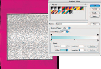
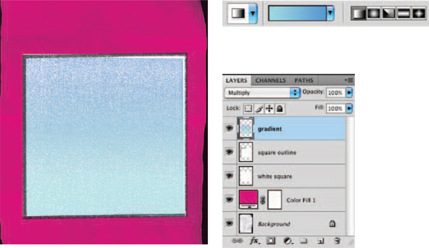
12 Use this same method to change the color stop beneath the gradient at the right to a different, darker blue. Drag the gradient midpoint to the right slightly and click OK. Your new gradient will be selected as the preset when you exit the Gradient Editor. Click and drag, from the bottom up, within the current selection on your new layer. This will add your new gradient into the selection. Deactivate the selection and change the blending mode of the layer to multiply.
PART THREE: Add the main components
Adding a figure
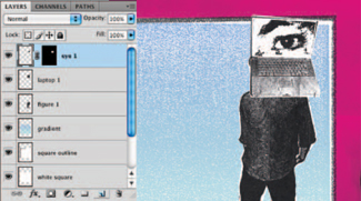
Follow this process to create a figure, complete with a giant laptop on his head.
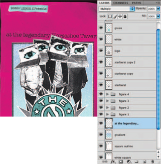
1 Open up the band.jpg file and use the Polygonal Lasso tool to draw a polygonal selection around one of the band members. Control(PC)/Command(Mac)-click inside the selection and drag the contents into your working file as a new layer.

2 With the new layer targeted, choose Edit>Free-Transform from the menu. To rotate, move the mouse pointer outside the bounding box, then click and drag. Shift-drag the corner of the box to increase the size proportionately. Press the Enter key to apply the transformation.
3 Open up the computers.jpg file. Select a laptop with the Polygonal Lasso and drag it into your working file as a new layer. Use the Free-Transform function to rotate, resize, and position the laptop so that it overlaps the figure’s head.

13 Use the Polygonal Lasso tool to draw a selection that surrounds only the screen of the laptop in your working file. Open up the eyes.jpg file. In the eyes.jpg file, draw a polygonal selection around one of the eyes in the image. Copy the selected area and return to your working file. With your current selection active, choose Edit>Paste Into from the menu to paste the eye into the image as a masked layer. Target the new layer thumbnail in the Layers palette (not the mask) and use Free-Transform to resize and position the eye.
 Linking the unlinked
When you have a selection active and you choose the Paste Into option from the Edit menu, your copied artwork is pasted into the file as a new layer. This layer is automatically masked and the active selection determines which areas of the new layer will remain visible. When you create a masked layer this way, the mask and the layer are not linked in the Layers palette. If you want to move both the layer and the mask together, it is necessary to link them by clicking in the space between the two thumbnails in the Layers palette. You’ll see a link icon appear in this area. Masks are linked to layers here because if the groups containing the layers are moved, we want the masks to move with them.
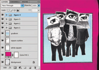
14 Click in the area between your new layer thumbnail and the mask thumbnail in the Layers palette to link them. Now, target the current layer and then Control(PC)/Command(Mac)-click on the laptop layer and the figure layer in the Layers palette so that all three layers are targeted. Choose Layer>New>Group From Layers from the menu to add these layers to a group. Now, repeat this procedure three times to add the three remaining figures, add laptops on their heads, put eyes on the laptop screens, link any unlinked masks, resize and rotate as required, and then add each set of layers to a group until you have a separate group for each figure.
 Another duplication method
When you are using the Polygonal Lasso tool, try right-clicking(PC)/Control-clicking(Mac) on the contents of your layer on the canvas. You will see a pop-up menu appear offering you several functions to choose from. Included on the list is the option to duplicate the layer. Try using this method, you may find it even quicker than dragging layers onto the Create a New Layer button at the bottom of the Layers palette. This method works with any selection tool.
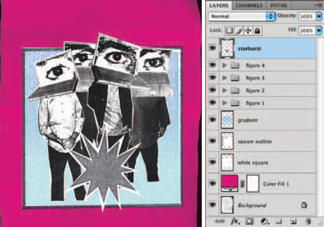
15 Return to your shapes.jpg file. If you have left the file open, there is a chance that it is still inverted. Choose File>Revert from the menu to revert it back to the original positive state. If it isn’t currently open, reopen the shapes.jpg file. Use the Polygonal Lasso tool to draw a selection border around the starburst shape. Hold down the Control(PC)/Command(Mac) key, and then click inside the selection border and drag it into your working file as a new layer. Use Free-Transform to increase the size and position the layer on the canvas as shown here.
16 Drag your starburst layer onto the Create a New Layer button at the bottom of the Layers palette to duplicate it. Use the Move tool to drag it over to the left and then down slightly on the canvas. Duplicate this layer too, and then move it to the right. Open up the logos.jpg file. Click and drag with the Elliptical Marquee tool to select the logo at the upper right. Hold down the Shift key to create a circular selection as you drag. Control(PC)/Command(Mac)-drag the selected logo into the working file as a new layer. Use Free-Transform to adjust the size and position.
17 Return to your logo.jpg file. This time use the Elliptical Marquee tool to draw a selection around the black logo at the lower right of the canvas. Copy it and return to your working file. Click on the Create New Channel button at the bottom of the Channels palette to create an alpha channel. Double-click the new channel thumbnail and when the Channel Options appear choose Selected Areas in the Color Indicates options and click OK. Paste the copied art into your new channel and then enable the visibility of the CMYK composite channel by clicking in the column to the left of it in the Channels palette.
PART FOUR: Typographic elements
 Constrained rotations
When you are rotating the contents of a layer or selection with Free-Transform, try holding down the Shift key while you click and drag outside of the bounding box. When you do this, your rotations will be constrained to 45 ° increments.
18 Use Free-Transform to increase the size of your pasted selection and position it within the channel so that it overlaps the logo in the composite channel. Press Enter to apply the transformation and then open up the type. jpg file. Use the Polygonal Lasso tool to draw a selection around the “ sonic unyon presents ” that is set against a dark background. Copy it and return to your working file. Paste it into your targeted alpha channel and then use Free-Transform to adjust the size and position it at the upper left within the channel. Load the channel as a selection.
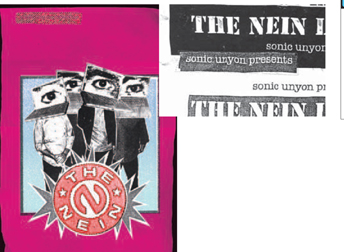
19 With the new channel-based selection active, return to the Layers palette and create a new layer. Click on the Foreground Color swatch to choose a light green foreground color from the picker. Type Alt/Option-Delete to fill the active selection with the foreground color on the new layer and then deselect. Set the blending mode of the layer to multiply in the Layers palette and select the Polygonal Lasso tool. Use the Polygonal Lasso to draw selections that cover each large eye. Then fill these selections with the same color on the current layer and deselect.
 Lighten via blending
If you double-click a layer thumbnail in the Layers palette, you will access the layer style box which, in addition to a plethora of other options, allows you to control the blending of the layer. In this case, simply direct your attention to the top slider in the “ blend if ” section. Drag the left slider underneath the “ this layer ” bar to the right. This will lighten all of the shadow areas on the layer. This is a handy way to lighten all of the black components of your photocopied art on a layer. The advantage of doing this versus a color adjustment is that you can always go back to this dialog box and edit or reset your adjustment.
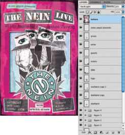
20 Create a new layer and drag it below the top layer in the Layers palette. Use the Polygonal Lasso to draw a shape that roughly surrounds the “ sonic unyon presents ” box on the top layer. Ensure that the new layer is targeted and then press “ d ” on the keyboard to set the background color to white. Type Control(PC)/Command(Mac)-Delete to fill the selection with the background color and then deselect. Return to the type.jpg file, reopen it if necessary.
21 Use the Rectangular Marquee to draw a selection around the black against white “ sonic unyon presents ” type. Copy it, return to your working file, and paste it in as a new layer. Drag the layer to the top of the Layers palette and change the blending mode to multiply. Use Free-Transform to adjust the size and angle of the layer contents as well as position it over the other “ sonic unyon presents ” artwork on the canvas. Repeat this method to add the “ live at the horseshoe ” text on a new layer. Drag the new layer beneath the figure groups in the Layers palette.
 Distorting
Each piece of photocopied text that is brought into this image as a new layer is resized and rotated by using the Free-Transform function. However, if you look at the word “ live ” you’ll notice that it has been distorted. To distort, rather than scale, while using Free-Transform, hold down the Control(PC)/Command(Mac) key while you drag a corner handle of the bounding box.
22 Now, return to the type.jpg file. Use the Polygonal Lasso to select a section of type, copy it, and then paste it into the working file as a new layer. Use Free-Transform to size, rotate, and position it. Repeat this method over and over again until you’ve added all of the necessary text elements to the poster. Leave the blending modes for all of these new layers set to normal as you add them. Move the layers up and down within the palette as you see fit.

23 The poster design is complete, but it doesn’t look weathered or distressed enough on the surface. To remedy this, we’ll incorporate a photo of the real thing. Open up the texture.jpg file. This is a photo of extremely weather-beaten poster art. Select all and copy. Paste it into your working file as a new layer and drag the new layer to the top of the stack in the Layers palette. Change the blending mode of the layer to hard light and reduce the opacity to 26%. Save and close your poster file with all of the channels and layers intact.
PART FIVE: Application methods
Put your poster up on the wall
Add your poster to a background image as an editable smart object, carefully tracing it with the Pen tool.
1 Open up the wall.jpg file. Then, choose File>Place from the menu. Navigate to your layered poster file on your hard drive and open it. This will place your poster file into the wall image file as a smart object.

2 The smart object is placed into your file surrounded by a Free-Transform bounding box. Resize and rotate the smart object while placing it to the left of the canvas. Press Enter key to commit the transformation.

3 Use the Pen tool to draw a closed path around the pink edge of the rotated poster. The smart object’s black background should lie outside of your finished path. Ensure that the Pen tool is set to create paths and the Add to Path Area option is enabled.
24 With your new path selected and your smart object targeted in the Layers palette, choose Layer>Vector Mask>Current Path from the menu to clip your smart object with the path. You will see a vector mask added to your smart object in the Layers palette. If you wish to edit your poster at any point, all that you need to do is double-click on the smart object in the Layers palette. This will open a new document containing a layered version of the poster. You can make any changes you like to the poster file. Once you save the changes, the smart object will automatically update within this file, reflecting the changes you made.
Examining the poster you’ve created
A successful urban poster art effect is the culmination of a number of essential ingredients.
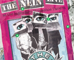
a Converting your images to grayscale and then enhancing the contrast is an excellent way to get started. It allows you to create simple, high-contrast images that lend themselves nicely to real-world photocopier degradation without losing any essential detail.
b Scanning the photocopied results and then using the Polygonal Lasso tool allows you to create an imperfect and choppy composition. Because most real-world underground posters are put together by manually cutting and pasting, a choppy Photoshop selection technique is necessary to ensure an authentic look.
c Creating areas of color that overlap the imagery on a layer with a multiply blending mode simulates authentic silkscreen-printing effects. Usually, urban posters that are silkscreened are hastily created with poor registration and as a result, colors overlap and tend to look sloppy.
d Now, even though we started with a folded piece of paper in the background, the results were still a little too crisp looking. Adding a photo of actual torn-up posters on the top layer helps to provide a gritty, textured effect.
Try varying your color scheme
Because this style of urban artwork is comprised of flat, solid colors, it lends itself nicely to hue/saturation adjustments. As is evident in these poster designs for The Weekend, a hue adjustment, after all is said and done, can open the door to a plethora of new color combinations. Sometimes you’ll be taken by surprise to see how well a color combination that you’d never think to try will work out.
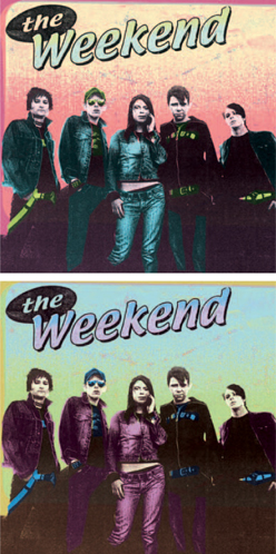
Source : Original Weekend press photo courtesy of Teenage USA Recordings.
Other inferior devices
Although we explored the thermal qualities of old fax machines in the previous chapter, they can also be used to deteriorate, just like an old photocopier is used in this chapter. The central figure in this composition is the result of copying and re-copying black-and-white printouts with a fax machine instead of a photocopier. With fax machines, you’re likely to see line patterns form rather than the random noise patterns caused by photocopying. In any case, it still helps to create a wonderfully distressed result.
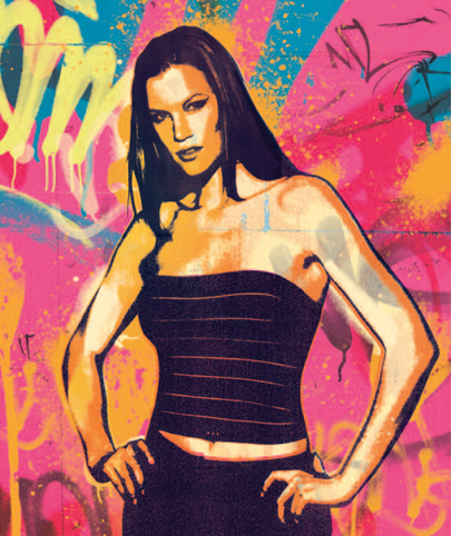
Source : Model photo courtesy of Paul O’Connor: www.paulandpaul.co.uk.