
Chapter 5
Tracing Photographs
Creating striking illustrations in Photoshop is easier than you think when you use photography as your starting point. You don’t really need any traditional drawing skills; you simply need to understand which tools are right for the task at hand and how to use them to your advantage. All of the details and divisions of color necessary to create a stunning illustration exist in your photography; you just need to recognize the potential within the image and make use of it.
The technique of illustrating over photography revealed in this chapter does involve tracing, but not exact replication. As you define areas with paths, you can simplify, embellish, or sharpen areas of detail as you see fit. However, simplifying and exercising creative license when rendering detail is only part of what makes this image so striking. This style of illustration also owes a lot of its success to the use of color.
Before you begin, try to change your mental framework a little from the norm. This is not an auto trace effect we’re creating here. It is an illustration based on a photo. When tracing, do not trace exactly; try to embellish and introduce a nice sharp style to the image. When adding color, make bold decisions. Think about what you’d like to see rather than what you actually see in the existing photograph. Bearing these factors in mind as you work will ensure that your finished illustrations surpass your source photos each and every time.
![]() The creation of the file and the tools and features used are explained clearly enough for beginners to make their way through this chapter. However, what will present a challenge is the use of tools that require a bit of experience to perfect; mainly the Pen tool and the act of drawing smooth and precise paths.
The creation of the file and the tools and features used are explained clearly enough for beginners to make their way through this chapter. However, what will present a challenge is the use of tools that require a bit of experience to perfect; mainly the Pen tool and the act of drawing smooth and precise paths.
What you’ll learn in this chapter
Creative Techniques and Working Methods
Simplify and stylize
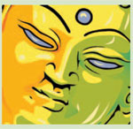
By taking some creative license while creating the outlines of the clouds, I was able to give them a sharp, stylized effect. And it was this effect that dictated the overall style of the finished illustration. In general, the curves are smoother than those in the original photograph, and the detail is minimal in comparison. In this chapter, you’ll learn to use only the necessary details provided by the original image, thus simplifying it. As you work in this manner, you’ll begin to notice that the result of this is a much more striking image than the original, especially when viewing it from a distance.

Make bold color decisions
In this illustration, the colors are bright and the divisions are bold. Highlights and shadows are intense and far from realistic. And perhaps the most important of all, colors are chosen not by what is indicated in the original image, but by what works best within the finished illustration. As you work your way through, you’ll gain an understanding of how powerful the use of color can be, and how to employ this strong use of color in future works.
Photoshop Tools, Features, and Functions
Path area strategies
Drawing with the Pen tool can prove challenging for some. However, taking your time and working methodically can pay off in the long run. In this chapter, I’ll show you a strategy for creating black outline art. You’ll create the exterior with a solid fill. Then you’ll subtract an area from that to create an outline. Then you’ll add in fine details. All of this is achieved via the strategic use of path area operations.
![]()
Quick Mask and beyond
Often thought of as a tool for simply refining selections, you’ll be amazed at what you can do to expedite the creation of selections with Quick Mask. Strategic planning when generating selections, combined with underappreciated paint tools, will have you making complex selections from existing resources with ease.

PART ONE: Create a stylized background
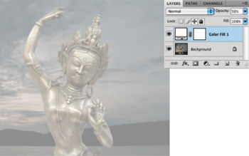
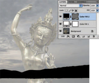
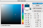
1 Open up the starter.jpg file. This is the image we’re going to use as the template for our illustration. Generally, it is easier to see what you’re doing when tracing, if the image is less intense. Create a new solid color layer by choosing the Solid Color option from the Create New Fill or Adjustment Layer pop-up menu at the bottom of the Layers palette. When the picker opens, select white as your color and click OK. Reduce the opacity of your new solid color layer to 50% in the Layers palette.
 Project files
All of the files needed to follow along with this chapter and create the featured image are available for download on the accompanying Web site in the project files section. Visit www.creativephotoshopthebook.com.
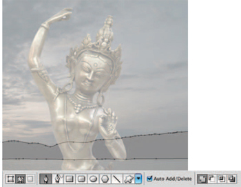
2 Using a white layer as a translucent overlay is very similar to tracing in the real world by placing onionskin or tracing paper over the top of your picture. It is a nice way to work without the background image becoming visually distracting. Select the Pen tool and ensure that it is set to create paths, not shape layers, in the Tool Options bar. Enable the Add to Path Area function and then draw a closed path component around the island masses in the background.
3 Do not trace every bump that is indicated by the image on the background layer. Create a smooth path that is indicative of the landmasses but simpler. With the path visible, create another solid color layer. Choose black from the picker. Here you can see that by having the path active as we create the solid color layer, the path is converted to a vector mask, which is automatically applied to the solid color layer. After this operation, you’ll notice that the Pen tool is now set to create shape layers in the Tool Options bar.
 Creating solid color layers
In addition to using the pop-up menu at the bottom of the Layers palette to create a solid color layer, you can use the main menu if that is what you prefer. Simply choose Layer>New Fill Layer>Solid Color from the menu. This is just one example of the numerous features within Photoshop that can be accessed in more than one place within the workspace.
4 In the Tool Options bar, select the Rectangle tool. Ensure that the Create New Shape Layer option is enabled and unclick the Link button so that the existing shape layer is unaffected by what we do next. Then, click on the Color swatch in the Tool Options bar and choose a rather dark blue color from the picker. If you did not deactivate the Link button, the color of the current layer, which contains the landmasses, would’ve altered. Click and drag at the bottom of the canvas to create a blue shape layer over the water area.
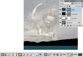
5 Select the Pen tool and, once again, ensure that it is set to create paths and not shape layers in the Tool Options bar. Enable the Add to Path Area function and then take a good look at the sky in the photograph on the background layer. Try to look past all of the rippling cloud details and visually pick out the darkest cloud-covered areas of the sky. Use the Pen tool to draw a series of path components surrounding these areas. But simplify what you see as you create your paths. Make the components look smooth and stylized. Have some fun with it.
6 Control(PC)/Command(Mac)-click on the new path thumbnail in the Paths palette to load it as a selection. Return to the Layers palette and click on the Create a New Layer button at the bottom of the palette to create a new, empty layer. Select the Gradient tool. Choose the Foreground to Transparent preset and the linear gradient method in the Tool Options bar. Click on the Foreground Color swatch in the toolbox to select a dark gray foreground color from the picker. Click and drag from the top of the canvas downward to create a gradient within the selection on the new layer.
 Adding a mask later
You can add a vector mask to any unmasked solid color layer after the fact; you don’t necessarily need to create a path before you create your layer. Simply go ahead and create a solid color layer, like we did previously with the white overlay layer. Then create a new path or target an existing path in the Paths palette. With your desired path visible on the canvas and your solid color layer targeted in the Layers palette, choose Layer>Vector Mask>Current Path from the menu.
7 Type Control(PC)/Command(Mac)-d to deactivate the current selection. Temporarily disable the visibility of your white solid color layer by clicking on the eye in the column at the left of the Layers palette. Use the Eyedropper to click on an area at the lower left of the sky to choose an orange-brown color as the current foreground color. Press the “ x ” key to invert the foreground and background colors, sending the new color to the background. Then click on a dark blue-gray region on the canvas to sample it as the current foreground color.
Create a gradient layer
Similar to solid color layers, gradient layers can provide the basis for a simple, graduated sky background.
1 Choose the Gradient option from the Fill and Adjustment Layer menu at the bottom of the Layers palette. This will open the Gradient Fill dialog box. Because the last gradient we created used the Foreground to Transparent preset, that is what is selected.
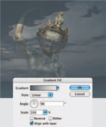
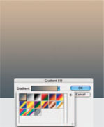
2 Click on the Arrow button to the right of the gradient preview to open the Gradient Preset picker. Choose the option from the upper left within the list of presets. This is the Foreground to Background option and makes use of your previously sampled colors.
3 Now change the angle of the gradient to −90°, flipping it horizontally. You can either enter a numeric value in the angle field or click and drag on the angle control thumbnail to the left of it. Press OK when finished.
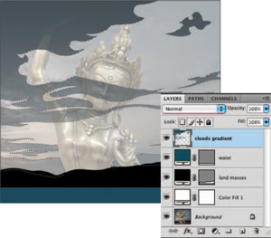
8 Drag the gradient layer down in the Layers palette so that it resides directly above the white overlay layer that we created earlier. Select the Gradient tool and choose the Foreground to Transparent Gradient preset in the Tool Options bar. Set your current foreground color to white and ensure that the gradient method is set to radial in the Tool Options bar. Create a new layer in the Layers palette. With your new layer targeted, click and drag to create a white radial gradient where the sun would be on the horizon. Reduce the layer opacity to 65% to soften the effect.
Alter the gradient layer
Although we’ve chosen colors from the background photo as our starting point, there is no reason why the sky can’t be much more intense than the original.
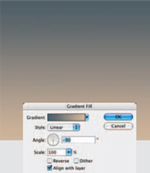
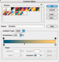
1 Target the gradient layer in the Layers palette. Choose Layer>Layer Content Options from the menu. In the Gradient Fill dialog box, click on the gradient’s thumbnail preview to open the Gradient editor. Click on the Color Stop at the left below the horizontal gradient.

2 Click on the Color swatch in the Stops section at the bottom of the Gradient Editor dialog box. This will launch the picker, allowing you to choose a new color for the gradient stop you selected. Choose a more saturated blue and click OK.
3 Now select the Color Stop in the bottom right and follow the same procedure to choose a brighter, more saturated orange. Click OK to close the picker and then drag the midpoint slider under the gradient to the left, until the location reads about 40%.
 Beware of banding
When you are making hue/saturation adjustments that affect the underlying gradient fill layers, proceed with caution. Extreme adjustments that vastly alter hue and/or saturation will increase the visible banding in the underlying gradient layer. So try to make gentle adjustments and if you want to drastically alter the colors within the gradient, it is best to edit the fill content of the gradient layer itself rather than using an adjustment layer on top of it.
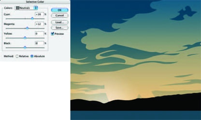
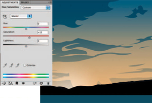
9 Click OK when you’re finished and take a look at the illustration now. The gray clouds now look a little out of place. To remedy this, first target the layer with the clouds on it and then choose Image>Adjustments>Selective Color from the menu. In the Selective Color options, choose Neutrals from the Color menu. Use the sliders to increase the amount of cyan and magenta in the neutral components of this layer (which is more or less the entire layer). The ability to adjust image components separately is a fine example of the benefits of building your file as separate layers.
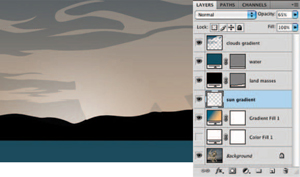
10 Now, to saturate the colors within the entire background a little more, create a new hue/saturation adjustment layer by clicking the Hue/Saturation button in the Adjustments palette. Simply increase the saturation by 15 and click OK. This little adjustment helps quite a bit without being so drastic that it has adverse effects within the gradient. With your new adjustment layer targeted in the Layers palette, Shift-click on the gradient layer to target all of the layers that make up the background. Choose>Layer>New>Group From Layers from the menu to group them.
PART TWO: Create the figure outlines
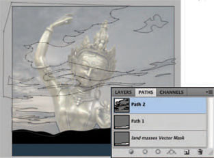
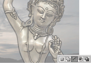
11 Temporarily disable the visibility of your new group and enable the visibility of the white overlay layer once again by clicking in the column to the left of each layer in the Layers palette. We’ll enable the visibility of the background group again later on, but for now it will simply get in the way of creating the figure. Select the Pen tool. In the Tool Options bar, set it to create paths instead of shape layers, and enable the Add to Path Area option. Use the Pen tool to carefully create a large, closed path component that surrounds the figure in the underlying photograph.
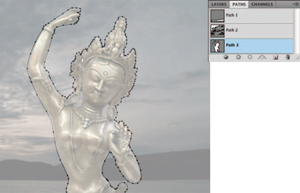
12 When you have closed the path component, begin to draw another path component on the inside of the first one. The space between these two components will eventually be filled with black to create a black outline to define the figure; keep this in mind as you carefully create your path components. When you’ve completed the inside component, ensure that it is still selected and then choose the Subtract from Path Area function in the Tool Options bar. Control(PC)/Command(Mac)-click on an area of the canvas that contains no path to ensure that no single path component is selected.
 Editing layer content
A quick way to edit the content of a solid color, gradient, or adjustment layer is to simply double-click on the layer thumbnail in the Layers palette. This will open up the Layer Content options specific to the type of layer you clicked on. For instance, double-clicking on a solid color layer opens the picker and on a gradient layer opens the Gradient Fill options.
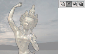
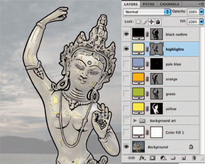
13 With your path visible (yet no single component selected) on the canvas, create a new, solid color layer from the menu at the bottom of the Layers palette. Choose a black color from the picker and click OK. This creates a new solid color layer that is masked by your path, essentially a shape layer. You’ll notice, once again, that the Pen tool is now set to create shape layers in the Tool Options bar; leave it like this. Enable the Add to Shape Area option in the Tool Options bar.

 Changing fill color
The quickest method for changing the fill color of a solid color layer begins by targeting it in the Layers palette. Once the layer is targeted, you can type Alt(PC)/Option(Mac)-Delete on the keyboard to change the fill color of the layer to your current foreground color. To change it to your current background color, type Control(PC)/Command(Mac)-Delete instead.
14 Reduce the opacity of the layer to 25% in the Layers palette. The logic for doing this will reveal itself very soon. Use the Pen tool to draw additional closed path components within the solid color layer’s vector mask where you want black to appear. These components will reveal the black of the solid color layer. The reason why the opacity of the layer is reduced is because, as you draw within a vector mask on a layer like this, the components effects become visible as you go, even before they’re closed, and it can become visually distracting as you work.
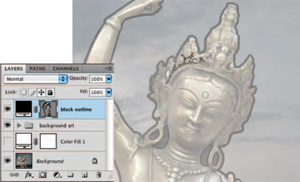
15 With the Pen tool set to Add to Shape Area, continue to carefully draw closed path components that trace all of the dark details of the statue. Remember to simplify and stylize details as you see fit. Zoom in and out as necessary while you work. Some areas like her chest, ear holes, and the space between her neck and shoulders will require a two-step process. The first step is to create path components that cover the entire areas. There is a logic to this as well, as we’ll be performing a careful subtraction operation next.

 Repairing banding
If you find that banding persists in your gradient fill layer, convert the fill layer to pixels by rasterizing it first. Choose Layer>Rasterize>Fill Content from the menu. After you’ve rasterized the layer ensure that it is targeted in the Layers palette and then add a bit of noise to it. Choose Filter>Noise>Add Noise from the menu. You’ll notice that adding noise breaks up the banding. Try to add as little noise as possible or your gradient will start to appear grainy.
16 The process is much the same as the one you used to create the outline for the figure, except we’re working with shape layers right now instead of path components; so the results are immediately visible. Ensure that no path component is currently selected and then choose the Subtract from Shape Area function in the Tool Options bar. With this function enabled, trace the areas inside your black shapes that you want to subtract from the black areas. Remember to create these closed “ subtractive ” components a fair distance inside the larger “ additive ” components so that the result is an outline, similar to your original figure outline.
17 Return the opacity of your layer to 100% now that you’ve finished creating all of the outline art. Ensure that no single path component is selected, but the paths that make up the vector mask on the canvas are all visible. If you can’t see the paths, simply target the vector mask and they will become visible. Control(PC)/Command(Mac)-click on the vector mask thumbnail in the Layers palette to load it as a selection. Type Control(PC)/Command(Mac)-Shift-I on the keyboard to invert the selection and press the “ q ” key on the keyboard to enter Quick Mask mode. In Quick Mask mode, areas that lie outside of your selection are indicated by a red overlay.

 Hiding the vector mask
If you find that the presence of your vector mask is visually distracting, the quickest way to hide it is to use the keyboard shortcut. Type Control(PC)/Command(Mac)-h on the keyboard to hide the vector mask from view. If you want to show it, just type the same keyboard command. When the mask is hidden, this keyboard command reveals it and vice versa.
18 Select the Paint Bucket tool and set your foreground color to black. Click in the background area of the image to fill it with red. This masks the area, thus removing it from your selection. Now, click in the areas between her neck and ears as well as the holes in her ears and crown to fill them with the red overlay, masking them as well. By masking everything except the inside regions of her body, we are ensuring that when we exit Quick Mask mode, we will have a selection that contains only that. Everything else that is masked, indicated by the red overlay, will fall outside of the selection border.
PART THREE: Add regions of color
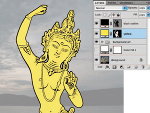
19 Press the “ q ” key to exit Quick Mask mode. Your mask is now converted to a selection border that surrounds only the inside areas of the figure. Choose Select>Modify>Expand from the menu to expand your currently active selection by only one or two pixels. Do not expand the selection too much or it will stray beyond the outline. Now, with the currently modified selection active, create a new solid color fill layer in the Layers palette. Choose a bright yellow color from the picker and then drag your new, masked, solid color layer beneath the black outline layer in the Layers palette.
 Expanding selections
The reason why selections are expanded before using them to create masked solid color layers is to safeguard against thin, hairline spaces between colors. Think of expanding your selections as a form of trapping, by creating an area of slight overlap; there is no risk of the background showing through in-between colors.
20 Select the Magic Wand tool. Ensure that the Contiguous and Use All Layers options are enabled in the Tool Options bar. Click on the yellow area inside her eye outline to select it. Shift-click on the same area in her other eye and the inside of the circle on her forehead too, adding these areas to the active selection. Expand the selection like you did previously and then, with the current selection active, create a new solid color layer. Choose a pale blue color from the picker.

21 Temporarily disable the visibility of your yellow solid color layer. We need to get it out of the way to define different areas of shading which are visible in the underlying statue image. Using the regions on the photograph as a starting point, we’re going to create the effect of lights with different colored gels. Select the Pen tool. Ensure that it is set to create paths and that the Add to Path Area function is enabled. Create a series of path components that trace some of the shaded regions on the right of the statue.
 Using both masks
In addition to your vector masks, you can add layer masks to your fill layers as well. Simply target a fill layer that already has a vector mask applied to it and click on the Add Layer Mask button at the bottom of the Layers palette. This will add a layer mask to your layer as well. Using a layer mask will allow you to use paint tools to mask your layer, creating blending effects that can’t be achieved via vector masks. In CS4 it is possible to target a vector mask and apply feathering effects to it in the Masks palette. However, if you want to edit your mask intuitively with a brush, you’ll need to use a layer mask.
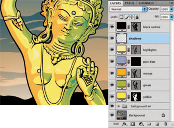
22 Ensure that no single path component is selected, yet the path is still visible on the canvas. Create a new solid color layer and choose a green color from the picker. Drag this layer beneath the blue layer that fills her eyes and forehead circle with color. Switch the pen mode to create paths in the Tool Options bar because it will have automatically switched to shape layers mode. Now draw a series of similar path components, tracing similar areas on the left side. Again, with no single component selected, create a new solid color layer. This time choose an orange color.

23 Disable the visibility of all of your solid color layers except for the black outline layer. Again, set the Pen tool to create paths and enable the Add to Path Area option. This time, use the underlying photo as a guide for creating another series of closed paths that trace the very bright specular highlights on the surface of the statue. Ensure that no single path component is selected and then create a new solid color layer. This time, choose a very light yellow color from the picker. Drag this layer up in the Layers palette so that it resides directly beneath the black outlines layer.
24 Drag your white overlay into the trash in the Layers palette to delete it. It is no longer required. Enable the visibility of any fill color layers that weren’t visible and take a good look at your illustration now. It is almost complete, but it needs some interesting shading to finish it off. Again, set the Pen tool to create paths and ensure that the Add to Path Area function is enabled. Take a good look at the green areas of the figure and try to visualize where some darker green shades would help to add a sense of depth.

 Rasterizing vector masks
If you wish to edit a layer mask with a paint tool, you’ll need to rasterize it. This will convert it to a regular layer mask. Simply target the layer in the Layers palette and then choose Layer>Rasterize>Vector Mask from the menu. Once the mask is converted, you can target it and use any paint tools to edit it, allowing you to achieve effects that simply cannot be performed within a vector mask, like softly blending or blurring the contents of the mask.
PART FOUR: Shading via gradients
25 Use the Pen tool to create a series of closed path components where you want your shaded areas to go. Load the path as a selection and create a new layer in the Layers palette. Select the Gradient tool. Choose the Foreground to Transparent Gradient preset and select the radial method in the Tool Options bar. Select a darker green foreground color from the picker. With the current selection active and the new layer targeted, create a series of gradients by clicking and dragging. If things are looking too dark, reduce the opacity of the gradient in the Tool Options bar.
 Vary the color scheme
When you’ve completed the illustration, nothing is carved in stone. Have a look at the Layers palette and you’ll see that the file is built in a methodically separated, highly editable way. Go ahead and double-click some of the fill layers. Change the solid colors and alter the gradient layer. Layers that are actual pixels will require direct edits via the Image>Adjustments menu. But have some fun and try different color combinations. You may even hit upon something you like better than the original.
26 Use the Pen tool, with the same settings as before, to create a series of closed path components to indicate areas of shadow within the orange areas on the other side of the statue. Load the entire path as a selection and choose a dark orange foreground color from the picker. Use the Gradient tool now, with the same settings as before, to complete your illustration by adding a series of gradients within the selection on the current layer. Use the same logic and procedure as you did while creating your dark green shaded areas. Feel free to edit any vector or layer masks, tweak colors, and add or remove any path components as you see fit, embellishing the illustration further.
Capturing subject matter and combining styles

When you are photographing subjects for the purpose of illustrating over later, it is important to think differently than you would if you were shooting for traditional purposes. You need to light the scene, adjust the aperture, and pose your model in a way that allows you to see differentiation between regions of highlight and shadow as well as keep as much of the subject in sharp focus as possible. The resulting images do not have to be technically perfect with regards to photography as long as the aforementioned criteria are met.
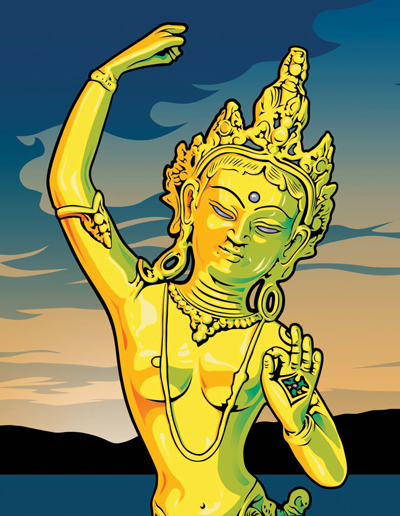
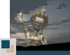
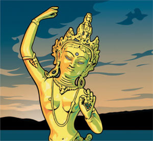
Here you can see how the photograph was used as the basis for the illustration, incorporating the techniques explained in this chapter. As exemplified here, you aren’t limited to one particular style only. This piece combines a variety of styles and methods, while using the techniques described in this chapter to illustrate the main visual element within the composition.
Source : Original model photo: Orlando Marques; Hair and makeup stylist: Carla Marques; Model: Josie Lee.