
Chapter 8
Keeping Your Markup Slim Using CSS Selectors
In order to style an element with CSS, we need to be able to target it. Enter CSS selectors, which allow us to target specific elements in the DOM.
Using CSS3 selectors, we can target elements at an even more granular level than we’ve been able to previously. This means that your markup can be super slim, semantic, and flexible. What’s more, the new element states pseudo-classes allow for additional highlighting of dynamic state changes.
You had a refresher on the cascade, inheritance, and CSS specificity in the previous chapter. In this chapter, we’re going to remind ourselves of selector basics. We’ll then look at CSS3 attribute selectors, followed by the structural element states, :target, and negation pseudo-classes. We’ll then take a brief detour into CSS 2.1’s generated-content pseudo-elements :before and :after to see how they play nicely with parts of HTML5 and we’ll introduce the new double-colon syntax in CSS3. We’ll also look at current browser support for CSS selectors and what’s around the corner for CSS selectors. Finally, we’ll discuss briefly the Selectivzr polyfill described in Chapter 7 that allows you to use these new selectors across all browsers.
Selectors rundown
The W3C Selectors Level 3 (http://j.mp/w3cselectors1) module became a recommendation in September 2011. It lists all selectors (in total just fewer than 40), not only those in CSS3. This is because, as you’ve already learned, CSS3 isn’t a totally new specification but instead builds on CSS1 and CSS 2.1. If you think 40 selectors is a lot to learn, don’t worry—you probably know quite a few already.
The following selectors were introduced in CSS1:
- Type (e.g.,
p {...},blockquote {...}) - Descendant combinator (e.g.,
blockquote p {...}) - ID (e.g.,
#content {...}on<article id="content">) - Class (e.g.,
.hentry {...}on< article class="hentry">) - Link pseudo-class (e.g.,
a:link {...}ora:visited {...}) - User action pseudo-class (e.g.,
a:active {...}) :first-linepseudo-element (e.g.,p:first-line {...}):first-letterpseudo-element (e.g.,p:first-letter {...})
If any of those don’t look familiar to you (we’ll excuse the last two), then we suggest you look them up. The SitePoint CSS Reference is as good a place as any to start, http://j.mp/sitepointref.2
Another 11 selectors were added in CSS 2.1.
- Universal (e.g.,
* {...}) - User action pseudo-class (e.g.,
a:hover {...}anda:focus {...}) - The
:lang()pseudo-class (e.g.,article:lang(fr) {...}) - Structural pseudo-class (e.g.,
p:first-child {...}) - The
:beforeand:afterpseudo-elements (e.g.,blockquote:before {...}ora:after {...}) - Child combinator (e.g.,
h2 > p {...}) - Adjacent sibling combinator (e.g.,
h2 + p {...}) - Attribute selectors (e.g.,
input [required] {...}) - Attribute selectors; exactly equal (e.g.,
input [type="checkbox"] {...}) - Substring attribute selectors; one equal to string (e.g.,
input [class~="long-field"] {...}) - Substring attribute selectors; hyphen separated beginning with string (e.g.,
input [lang|="en"] {...})
__________
Some of these you probably know. But don’t worry if you haven’t seen them all before because the CSS3 Selectors Level 3 module builds on these and adds functionality.
The selectors added in CSS3 that we’ll be looking at in this chapter are as follows:
- General sibling combinator (e.g.,
h1 ~ pre {...}) - Substring attribute selectors; string starts with (e.g.,
a[href^="http://"] {...}) - Substring attribute selectors; string ends with (e.g.,
a[href$=".pdf"] {...}) - Substring attribute selectors; string contains (e.g.,
a[href*="twitter"] {...}) - The
:target()pseudo-class (e.g.,section:target {...}) - Structural pseudo-classes; :
nth-child(e.g.,tr:nth-child(even) td {...}) - Structural pseudo-classes; :
nth—last-child(e.g.,tr:nth—last-child(-n+5) td {...}) - Structural pseudo-classes; :
last-child(e.g.,ul li:last-child {...}) - Structural pseudo-classes; :
only-child(e.g.,ul li:only-child {...}) - Structural pseudo-classes; :
first-of-type(e.g.,p:first-of-type {...}) - Structural pseudo-classes; :
last-of-type(e.g.,p:last-of-type {...}) - Structural pseudo-classes; :
nth-of-type(e.g.,li:nth-of-type(3n) {...}) - Structural pseudo-classes; :
nth-last-of-type(e.g.,li:nth-last-of-type(1) {...}) - Structural pseudo-classes; :
only-of-type(e.g.,article img:only-of-type {...}) - Structural pseudo-classes; :
empty(e.g.,aside:empty {...}) - Structural pseudo-classes; :
root(e.g.,:root {...}) - UI element states pseudo-classes;
:disabledand:enabled(e.g.,input:disabled {...}) - UI element states pseudo-classes;
:checked(e.g.,input[type="checkbox"]:checked {...}) - Negation pseudo-classes;
:not(e.g.,abbr:not([title]} {...})
We can conclude from looking at these three lists that the same number of CSS selectors has been introduced in CSS3 as were introduced in CSS 1 and CSS 2.1 combined. That’s a lot for us to get through, so let’s dive straight in.
CSS3 selectors
We’ve reached the juicy part—CSS3 selectors. With a range of different selectors available to us, it can be difficult to determine which type of selector to use. As the new CSS3 selectors are introduced, we’ll provide real-world use cases for them, which you can use in your projects starting today. First up are the combinators.
Combinators
Assuming you’ve worked with CSS before, you’ve almost certainly come across combinators. You’re no doubt aware of descendant selectors, so called because they target children, grandchildren, or later of a given element in the document tree. At their simplest, descendant combinators allow you to target all instances of a single element type that lie within another, such as article p {...}.
Child combinators, in contrast, target only those elements that are immediate children of the parent. They use the greater than (>) operator. Therefore, article > p {...} targets those paragraphs that are children of the article, but not the paragraphs nested in sections beneath the article, as highlighted in the following code example:
article > p {

font-size:125%;

}
The next combinator, adjacent sibling, targets elements that are next to each other in the document tree and have the same parent. Using the preceding example again, we could style just the opening paragraph in each section (assuming they all use a h2 heading) using the + operator by writing h2 + p {...}:
h2 + p {

font-weight:bold;

}
The following code shows which selector targets which paragraph:
<article>

  <h1>Article Title</h1>

  <p>...</p><!-- Child combinator targets this paragraph -->

  <section>

    <h2>Section Title</h2>

    <p>...</p><!-- Adjacent sibling combinator targets this paragraph -->

    <p>...</p>

  </section>

  <p>...</p><!-- Child combinator targets this paragraph -->

</article>
The examples we’ve seen so far are combinators included in CSS 2.1, so what about CSS3?
CSS3 adds the general sibling combinator, which uses the tilde (~) operator. When using the general sibling combinator, the second selector doesn’t have to immediately follow the first; however, both parts of the selector must still share the same parent. Extending the example, we can target the ul within the deeply nested section using the general sibling combinatory like so:
h3 ~ ul {

list-style-type:binary;

}


<article>

  <h1>Article Title</h1>

  <p>...</p><!-- Child combinator targets this paragraph -->

<section>

  <h2>Section Title</h2>

  <p>...</p><!-- Adjacent sibling combinator targets this paragraph -->

  <p>...</p>

  <ul>

      <li>...</li>

      <li>...</li>

      <li>...</li>

  </ul>

  <section>

    <h3>Section Title</h3>

    <p>...</p>

    <p>...</p>

    <ul><!-- General sibling combinator targets this list -->

      <li>...</li>

      <li>...</li>

      <li>...</li>

    </ul>

  </section>

</section>

  <p>...</p><!-- Child combinator targets this paragraph -->

</article>
This shows the power of combinators in CSS and specifically how CSS3 gives us more control over the element(s) we’re targeting.
Attribute and substring selectors
In the introduction to this chapter you learned that CSS 2.1 introduced attribute selectors. CSS3 has extended the list of attribute selectors we can use by increasing the number of substring selectors in our toolkit. This means we can now target a rule and apply CSS styling to an element based on part of an attribute’s value. Shortly, we’ll see how these can be put to use for styling document download links or e-mail addresses, but first let’s briefly recap CSS 2.1’s attribute and substring selectors.
The most basic of attribute selectors allows you to style an element if a given attribute exists. For example, we can style any abbreviation elements that have a title attribute by using the following:
abbr[title] {

  border-bottom:1px dotted #000;

}
Or we can indicate those fields that are required by using the required attribute you met in Chapter 6.
Using the equals (=) operator, our attribute selector can match specific values for a given attribute, such as a check box.
input[type="checkbox"] {
width:20px;
height:20px;
}
Nothing too crazy so far. Next we can use the tilde (~) operator to target a specific attribute value from a list of whitespace-separated values. This is often useful for content marked up with microformats or microdata, which often use multiple attribute values.
<a ... rel="external license">...</a>
The CSS to target the license value of the rel attribute would be:
a[rel~="license"] {
background:url(img/copyright.png) 100% 50% no-repeat;
  padding-right:20px;

}
The final CSS 2.1 attribute selector isn’t used very often but can be useful if you’re working on sites with multiple languages. The vertical bar ( | ) operator allows you to target elements that are contained in a hyphenated list, starting with specific values. Let’s say you want to target anchors with an English language specified, regardless of whether it is British (en-GB) or American (en-US) English (because they both contain “en”).
a[hreflang|="en"] {

        border-bottom:3px double #000;

}
The last two examples introduced two operators that we can use for substring matching parts of an attribute's value. CSS3 goes a step further and provides three additional substring selectors using the ^, $, and * operators. They are extremely useful and can be used to ensure that your markup remains super clean, with no unnecessary classes, while enhancing a user’s experience at the same time.
“Starts with” substring attribute selector
The caret (^) operator, when related to the substring selector, means “starts with.” We can use this, for example, to target all external links in our content and to add a small icon indicating that they are external links. The following code adds a background image and padding to all links that start with http:// by using the ^ attribute substring selector:
a[href^="http://"] {

        background:url(img/external.png) 100% 50% no-repeat;

        padding-right:15px;

}
In Figure 8-1 you can see that the external link is styled with a small icon at the end of the anchor. The icon, a box with an arrow pointing out of it, has become a widely recognized symbol for external links.
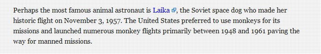
Figure 8-1. External link styled using the ^ attribute substring selector
This is a great way to quickly add an icon to your external links, but you may have some links that begin with http:// that aren’t external links, such as those to your own website. In this case you don’t want the icon to appear. We can work around this exception by adding another rule beneath our initial one (because they have the same specificity) to nullify the properties set for external links for our domain. The ^ operator is retained because the link(s) may be going to various pages within the site.
a[href^="http://"] {

        background:url(img/external.png) 100% 50% no-repeat;

        padding-right:15px;

}


a[href^="http://thewebevolved.com"] {

        background:none;

        padding-right:0;

}
Figure 8-2 shows this in action. There are two external links indicated with icons and one internal link (“numerous monkeys”) where the icon is removed.

Figure 8-2. External links styled using the ^ attribute substring selector and an internal link beginning with http:// without the styling
Another use for the ^ operator might be to target e-mail links starting with the mailto: string and add an icon and padding.
a[href^="mailto:"] {

        background:url(img/email.png) 100% 50% no-repeat;

        padding-right:15px;

}
“Ends with” substring attribute selector
We’ve dealt with “starts with,” so now let’s look at “ends with.” The operator for this is the dollar symbol, $, and the syntax is exactly the same as the ^ syntax. Common uses include adding icons to represent different files types for document downloads or to indicate different feed types.
To indicate that a link goes to a PDF document, you can use
a[href$=".pdf"] {

        background:url(img/pdf.png) 100% 50% no-repeat;

        padding-right:18px;

}
In Figure 8-3, the text “Life magazine” links to a PDF document. Using the preceding code, we’ve added a small PDF icon to the link to indicate this.

Figure 8-3. PDF link styled using the $ attribute substring selector
You can use this method to target any file type, such as .doc, .jpg, or .xml.
“Contains” substring attribute selector
The final substring selector for us to look at uses the star or asterisk (*) operator, which stands for “contains.” It allows you to target elements that have more than one class applied. It can also be used to target specific domains within an anchor. It’s used it in the following example to highlight those anchors that are linking to a person’s Twitter account (see Figure 8-4 for the results):
a[href*="twitter"] {

        background:url(img/twitter.png) 100% 50% no-repeat;

        padding-right:20px;

}
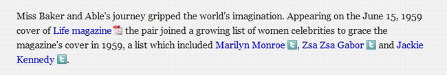
Figure 8-4. Twitter account links styled using the * attribute substring selector
The same effect could have been achieved using the ^ operator and the value http://twitter.com, but using the * operator helps us save a few bytes. The real power of the * substring selector comes when we want to style one of the Twitter links differently based on the Twitter handle (e.g., http://twitter.com/ZsaZsa). To clarify, all the links contain “twitter,” as in the preceding example, but only one contains “ZsaZsa.”
a[href*="ZsaZsa"] {

        background:url(img/twitter.png) 100% 50% no-repeat;

        padding-right:20px;

        color:#ff0;

}
We could also use the * operator to indicate our relationship status with friends, families, and others by using XFN microformats, as introduced in Chapter 4. For example, if we wanted to indicate that Marilyn Monroe is our sweetheart, our markup might look something like this:
<a href="http://twitter.com/marilynmonroe" rel="met sweetheart friend">Marilyn Monroe</a>
Because there are three values for the rel attribute, it becomes difficult to target using the ^ or $ operator, so * (contains) becomes an option, as does the CSS 2.1 tilde (~), which could also be used in this instance as the values are whitespace separated. For this example, we’ll use the new CSS3 substring selector *:
a[rel*="sweetheart"] {

        background:url(img/sweetheart.png) 100% 50% no-repeat;

        padding-right:20px;

}
There you have it! Marilyn Monroe is our sweetheart (see Figure 8-5).

Figure 8-5. Sweetheart relationship styled using the * attribute substring selector
You may have spotted a problem, though: the Twitter icon for Marilyn has disappeared. This is because both style rules have the same specificity and the a[rel*="sweetheart"] {...} rule appears further down the style sheet. We can get around this by adding some additional padding to our sweetheart rule and using multiple background images (for more detail, see Chapter 11) to add both icons placed in different positions.
a[rel*="sweetheart"] {

        background:

          url(img/sweetheart.png) 100% 50% no-repeat,

          url(img/twitter.png) 85% 50% no-repeat;

        padding-right:40px;

}
UI element states pseudo-classes
Most form elements have the potential to be enabled, disabled, or checked. By using UI element states pseudo-classes, we can target these elements when they are in a specific state, such as a check box being checked. Let’s look at a basic login form and see how we can implement these element states pseudo-classes. Figure 8-6 shows the form as it would look normally.
Figure 8-6. A login form with normal styling
Now imagine that the username and password fields and the login button have been disabled. The HTML for this is shown next, with the disabled attribute applied where required.
<form action="">

<fieldset>

<legend>Login</legend>


<label for="uname">Username

<input type="text" id="uname" placeholder="e.g. [email protected]" disabled />

</label>


<label for="password">Password

<input type="password" id="password" disabled />

</label>


<input type="checkbox" id="rememberme" checked disabled />

<label for="rememberme">Remember me</label>


<input type="submit" value="Login" id="login" disabled />


</fieldset>

</form>
We now need to style the fields appropriately to show that they are disabled. We can style these states using the :disabled pseudo-class on those elements that require it (in this case all inputs).
We’ve made the background color of the disabled fields and button gray so that they don’t look “active” or clickable. This is shown on the right of Figure 8-7.

Figure 8-7. Two instances of a login form using the :disabled, :enabled, and :checked UI element states
The :checked and :enabled pseudo-classes work in exactly the same way. As you can see in the form on the left of Figure 8-7, we’ve highlighted the “Remember me” label (using an adjacent sibling combinator) next to the checked check box. We’ve also highlighted the enabled fields with a different border color (the attribute selector is used to ensure a higher specificity).
input[type="checkbox"]:checked + label {

        display:inline;

        background: #F9FDA2;

}


input[type="text"]:enabled, input[type="password"]:enabled {

        border:1px solid #75aadb;

}
These UI element state pseudo-classes are toggled (checked/unchecked) and applied when the state is active. Using them provides users with helpful visual feedback and improves the experience of your sites without much effort on your part.
The CSS Basic User Interface Module Level 3
Target pseudo-class
CSS3 introduces a new :target pseudo-class. :target is designed to work when the selected element becomes the active target of a link (a fragment identifier in the URL that points to it). Although you may not have come across the term fragment identifier before, you will have used them. Fragment identifiers are named anchors or IDs on a specific element (e.g., #flight) within a page. When you click a link that ends with a fragment identifier, the element to which the link refers becomes the :target.
We can style :target in just the same way as :hover or :focus. The use cases are wide ranging, from a simple list of FAQs to directory pages, in-page navigation, and footnotes.
Here’s an example that highlights the section of the page you’ve linked to from the in-page navigation. This is the page’s basic markup:
<article>

<hgroup>

<h1>Miss Baker</h1>

<h2>First Lady of Space</h2>

</hgroup>


<nav>

<ol>

  <li><a href="#introduction">Introduction</a></li>

  <li><a href="#flight">Flight</a></li>
  <li><a href="#mission">Mission</a></li>

  <li><a href="#retirement">Retirement</a></li>

</ol>

</nav>


<div id="introduction">

  <p>...</p>

</div>


<section id="flight">

  <h1>Miss Baker's Historic Flight</h1>

  ...

</section>


<section id="mission">

  <h1>The Mission</h1>

  ...

</section>


<aside>

  <h1>The US Space Program</h1>

  ...

</aside>


<section id="retirement">

  <h1>Life in Retirement</h1>

  ...

</section>


<footer>

  ...

</footer>

</article>
__________
Notice how each section and div has been given its own ID. We’ve then added corresponding anchors to those IDs in the nav. This provides us the fragment identifiers (IDs) we need to work with :target.
We’ll add a rule to highlight the appropriate section when it’s clicked from the navigation. The :target pseudo-class is added to the element with the ID (fragment identifier), not the anchor. Because we’ve got two types of elements with fragment identifiers, we’ll add the rule to both the section and div elements by grouping the selectors.
section:target, div:target {

background: #F9FDA2;

}
Figure 8-8 shows the highlighted section after the anchor has been clicked. To take this a step further, you could animate the change in background color using CSS animations, which are introduced in Chapter 12.

Figure 8-8. A highlighted section is achieved by using the :target pseudo-class.
Of course, applying :target for all types of elements could get rather messy, but we can get around that by using the universal selector (*), as shown in the following code. However, using the * selector can have a negative impact on site performance, so use it with care.
*:target {

background: #F9FDA2;

}
Lovely! A simple rule you can add to your CSS to help users easily see where they are within a document when navigating via in-page links.
As an additional example, we’re now going to create a basic CSS-only tabbed interface similar to the ones you’re used to creating with JavaScript using :target. Here’s our simplified markup for the tabbed panels and associated navigation:
<article>

<h1>Features</h1>

<a href="#s-one">One</a> | <a href="#s-two">Two</a> | <a href="#s-three">Three</a> | <a href="#s-four">Four</a>


<div>

<section id="s-one">

  <h1>Section One</h1>

  <p>Lorem ipsum dolor set amet.</p>

</section>

<section id="s-two">

  <h1>Section Two</h1>

  <p>Lorem ipsum dolor set amet.</p>

</section>

<section id="s-three">

  <h1>Section Three</h1>

  <p>Lorem ipsum dolor set amet.</p>

</section>

<section id="s-four">

  <h1>Section Four</h1>

  <p>Lorem ipsum dolor set amet.</p>

</section>

</div>


</article>
We’ve wrapped our tabbed area in an <article> and then included the navigation links. This is followed by a <div> (for styling) and several <section>s, each with a unique ID that each of the anchors will link to. Note that we’ve not used the <nav> tag or placed our navigation items in a list, for reasons that will be explained shortly.
We’ll now apply some basic styles to the article, div, and sections to position them absolutely and act as tabbed content areas.
article, div {

        position:relative;

}


section {

        display:block;

        position:absolute;

        top:10px;

        left:0;

        background:#333;

        color:#fff;

        width:100%;

        min-height:400px;

}
The next step is to activate the :target pseudo-class. We want to apply it to each section, and we’ll change the z-index property to make that section appear above the others. Remember, we apply :target to the element(s) with the fragment identifier, not the anchor. Because of the simplicity of the example, we can create a rule that targets all sections in the document.
section:target {

        z-index:2;

}
To ensure that the first tab is visible on initial page load, we’ll use the :first-of-type selector (more on that later in the chapter) to change its z-index, too.
section:target,

section:first-of-type {

        z-index:2;

}
That gives us a basic CSS-only tab switcher. The next step is to get the active tab to highlight in some way. To do this we need to be able to target the anchors that are above the sections in our markup. In our example, the sections are children of the surrounding div, which is in turn a sibling of the anchors. This presents you with a problem; using only CSS, you are unable to target parent elements (CSS by nature is “cascading,” after all), which is required to highlight the active tab. To get around the issue, we need to add an ID to each of the anchors, like so:
<a href="#one" id="one">One</a> | <a href="#two" id="two">Two</a> | <a href="#three"

id="three">Three</a> | <a href="#four" id="four">Four</a>
We then apply the :target to our anchors to set the active state.
a:target {

        background:#f5f5f5;

        font-weight:bold;

}
This solves the active tab problem but breaks the tabbed panels, which no longer switch. To get around this issue, use the child and adjacent sibling combinators (introduced earlier in the chapter) to target each section.
#one:target ~ div > section#s-one,

#two:target ~ div > section#s-two,

#three:target ~ div > section#s-three,

#four:target ~ div > section#s-four,

section:first-of-type {

        z-index:2;

}
The rule is set to target each section element that is a child (using the > operator) of the div that is adjacent (~ operator) to an anchor in the markup. Also included is the default section:first-of-type rule to ensure that the first section is highlighted on page load. Because, as mentioned earlier, you can’t select a parent element using CSS, this is the reason for not placing your anchors within a ul or nav element. If we had written our markup in that way, it would mean that the preceding rule couldn’t be implemented. So there we have it: a simple tabbed interface built using CSS3’s :target pseudo-class (see Figure 8-9).

Figure 8-9. Tabbed interface built using CSS3’s :target pseudo-class
While this technique isn’t completely foolproof, there are other techniques for creating CSS tabs that you can investigate further, as described by Corey Mwamba on Dev.Opera (http://j.mp/operatargettabs5) and Chris Coyier on CSS-Tricks (http://j.mp/targettabs6).
If you’re feeling even more adventurous, you can reduce the need for JavaScript in your page by using :target to create image galleries (http://j.mp/targetgallery7), slideshows, and accordions (http://j.mp/targetaccordion8). To push the boundaries even further, you can combine :target with CSS transitions or transformations, which you’ll be learning about in Chapter 12, to add those subtle sprinkles to improve a user’s experience.
Structural pseudo-classes
We’ve already seen several pseudo-classes: :target and the UI element state pseudo-classes. Now it’s time to look at the super-powerful structural pseudo-classes. These selectors allow us to style elements or parts of elements that are in the DOM but can’t be targeted via the use of other selectors without adding IDs or classes. They are starting to be used to minimize the addition of extraneous classes in your markup, either those in the source code or those added dynamically using a JavaScript library such as jQuery.
__________
All but one of the structural pseudo-classes have been introduced in CSS3, but because we’re good to you, we’ll even give you a little bonus and explain :first-child, which was introduced in CSS 2.1. Plus, it seems as good a place as any to start our foray into structural pseudo-classes.
:first-child
Hands up if you’ve ever added a class of first to the first item in a list or to the first paragraph in a post. Guilty? Rest assured our hands are up, too. Don’t worry—we won’t tell anyone, but we will show you how to avoid it. As the name suggests, :first-child allows you to target the first child of a given element in the document tree.
Taking the sample page from earlier in the chapter, let’s say we want to increase the font size and weight of the first paragraph in the introduction. We can do this by using the :first-child pseudo-class on paragraph in a div with an ID of “introduction.”
div#introduction p:first-child {

        font-size:18px;

        font-weight:bold;

}
Figure 8-10 shows this in action.
Figure 8-10. First paragraph font size increased using the :first-child pseudo-class
As you can see, this is a simple but effective method to help you avoid getting a nasty bout of classitis.
Note: There is a very strange bug in Internet Explorer 7 with :first-child, discovered by Robert Nyman. If you place a comment before the first element (that you are trying to target), IE 7 will treat the comment as the first child and therefore not apply the rule to the element you’re attempting to target. The solution? Move your comment if you can. Robert has written this up on his blog (http://j.mp/ie7firstchild9).
:last-child
No prizes for guessing what this selector might help you target. It’s also the first of the CSS3 pseudo-selectors. Figure 8-11 shows an example navigation menu in which each item has a right border.
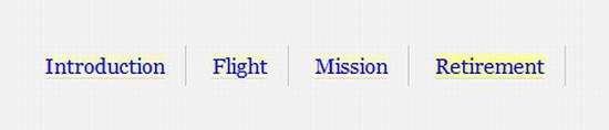
Figure 8-11. Navigation menu with each item with a right border
We can use :last-child to remove the border from the last list item, like so:
nav li:last-child {

        border-right:0;

}
You can see in Figure 8-12 that the border has been removed from the last list item. Brilliantly simple, don’t you think?
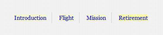
Figure 8-12. Navigation menu using :last-child to remove the right border from the last menu item
:nth-child
The :nth-child pseudo-class is where things start to get a little tricky because we need to start using math. We’re sure you’re all thrilled at that prospect, but trust us, it’s not that hard.
__________
:nth-child allows you to target one or more specific children of a given parent element. It can take the form of a number (integer), keywords (odd or even), or a calculation (expression). It can really come in handy when you want to style data tables like the one shown in Figure 8-13.

Figure 8-13. HTML data table with simple styling
We’ll start by using the keyword value even and adding a background color to create a zebra-striping effect on alternate table rows to improve readability.
tr:nth-child(even) td {

        background-color:#eee;

}
Figure 8-14 shows our table complete with zebra stripes.
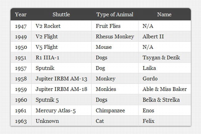
Figure 8-14. HTML data table with zebra-striped table using :nth-child
Now, as the saying goes, “there’s more than one way to skin a cat.” For the previous example we could achieve the same effect using the expression 2n or 2n+0, which means “style every second row.”
tr:nth-child(2n) td {

        background-color:#eee;

}
If we wanted to reverse the rows and have the background color applied to the odd rows, we could use either the odd keyword or the expression 2n+1, which means “every second row starting from the first.” The following examples have exactly the same effect:
tr:nth-child(odd) td {

        background-color:#eee;

}


tr:nth-child(2n+1) td {

        background-color:#eee;

}
Following along OK so far? Good, because we’re going to increase the complexity ever so slightly. Using expressions similar to those we’ve seen before, let’s assume we want to target every fourth line of the table. We would simply use
tr:nth-child(4n) td {

        background-color:#eee;

}
How about every fourth item starting from the second row?
tr:nth-child(4n+2) td {

        background-color:#eee;

}
You can see a pattern emerging here. Now let’s deal with that smart kid in class who wants to count backward. Imagine you want to style the first five rows in your table. You can do this by using a negative value for n.
tr:nth-child(-n+5) td {

        background-color:#eee;

}
:nth-last-child
Another option available to us in our quest for ultimate styling with minimal markup is the :nth-last-child pseudo-class, which is essentially the same as :nth-child but starts counting from the last element. Using the same expression as the previous example highlights the last five (note the difference from the first five rows in the previous example) rows in the table.
tr:nth-last-child(-n+5) td {

        background-color:#eee;

}
Also, just like :nth-child, :nth-last-child accepts the odd and even arguments and doesn’t have to use a negative value for n.
:only-child
There’s one more “child” pseudo-class to look at before we move on, and that is :only-child. It works like you’d expect, by targeting any element that is the only child of its parent. This might come in handy should you have a dynamically generated list that contains only one item, in which case you might wish to decrease the margins.
ul li:only-child {

          margin-bottom:2em;

}
:first-of-type
The “type” pseudo-classes tend to work in the same way as the “child” selectors, the key difference being that the “type” pseudo-classes only target those elements that are the same as the element to which the selector is applied. They are most useful when you can’t guarantee that there won’t be any different child elements in place. For example, if an hr was placed between each paragraph, by using :first-of-type, we can ensure that we target only the paragraphs.
Taking our :first-child example from earlier, we can use the <div id="introduction"> as a styling hook. Using :first-of-type, we would write
div#introduction p:first-of-type {

        font-size:18px;

        font-weight:bold;

}
For added fun, we can combine :first-of-type with the ::first-letter pseudo-element from CSS1 (yes, 1) to style the first letter of the first paragraph in the introduction (shown in Figure 8-15). CSS3 introduced a new double-colon (::) syntax for pseudo-elements to distinguish between them and pseudo-classes such as :hover. Here’s the double-colon syntax in an example:
div#introduction p:first-of-type::first-letter {

        font-size:60px;

        float:left;

        width:auto;

        height:50px;

        line-height:1;

        margin-right:5px;

}

Figure 8-15. The first letter of the first paragraph styled using CSS pseudo-selectors
:last-of-type
As with :first-of-type, you can achieve the same effects as :last-child using :last-of-type. To remove the right border from the last menu item, you can use
nav li:last-of-type {

        border-right:0;

}
:nth-of-type
:nth-of-type works in the same way as :nth-child and uses the same syntax. However, it can be more useful than :nth-child should there be elements between those you are targeting. Let’s take a look at the following example, a section with a heading followed by a list of animals in space pictures:
<section id="animals">

<h1>Animals in Space</h1>

<ul>

  <li><img src="img/fly.png" alt="Fruit Flies" /></li>

  <li><img src="img/albert.png" alt="Albert II" /></li>

  <li><img src="img/mouse.png" alt="Mouse" /></li>

  <li><img src="img/tsygan.png" alt="Tsygan" /></li>

  <li><img src="img/laika.png" alt="Laika" /></li>

  <li><img src="img/gordo.png" alt="Gordo" /></li>

  <li><img src="img/baker.png" alt="Miss Baker" /></li>

  <li><img src="img/belka.png" alt="Belka & Strelka" /></li>

  <li><img src="img/enos.png" alt="Enos" /></li>

  <li><img src="img/felix.png" alt="Felix" /></li>

</ul>

</section>
Now, remove the bullet points created by the list, float each of the lis, and add some margins.
#animals ul {

        list-style-type:none;

}


#animals li {

        float:left;

        width:200px;

        text-align:center;

        margin-right:2em;

        margin-bottom:2em;

}
Figure 8-16 shows what you have so far; you can see that the margins have caused the third list item to drop onto a new row. The trouble is that your design dictates that there should be three images per row.

Figure 8-16. A list of animals in space
Now use :nth-of-type to target every third list item (3n) and remove the right margin to ensure they don’t drop onto a new line.
#animals li:nth-of-type(3n) {

        margin-right:0;

}
The results are shown in Figure 8-17.

Figure 8-17. A list of animals in space with three items on each row
As with :nth-child, you can also use expressions (2n+1) or keywords (odd or even) to target specific elements.
You can also use :nth-of-type to target the first item in a group using the expression li:nth-of-type(1) {...}, which has the same effect as using :first-of-type.
:nth-last-of-type
Using :nth-last-of-type(1) {...} is the same as using :last-of-type but, combined with expressions, allows you to count backwards starting from the last item, just like :nth-last-child. Using the nth-of-type example, move the last lonely animal to the center by adding a large left margin (see Figure 8-18).

Figure 8-18. A list of animals in space with the last item centered
:only-of-type
:only-of-type targets elements whose parent elements have no other children of the same type. Imagine you have an article that might contain several images; however, if there is only one image, you want to treat it differently, such as making it full width, for instance. This is where :only-of-type comes into its own.
article img:only-of-type {

  width:100%;

}
:empty
:empty can be an extremely useful pseudo-class. It represents an element with no content. Imagine we’ve got a dynamically generated aside in our page that has no contents; we can hide it using :empty.
aside:empty {

        display:none;

}
Before you start jumping for joy, a word of warning: If a browser finds a single character, or even whitespace, the element will be rendered because it no longer correctly matches the :empty selector. Rubbish. You’re safe to add HTML comments to the markup, but ensure there’s no whitespace.
:root
One structural pseudo-class that we can’t ignore is the :root class. The root of the document in HTML is generally always the html element and that’s precisely what :root targets. Should you manage to think up a use case for this selector (we’re sure someone must have), be sure to let us know. For completeness, it works like so:
:root {

          background-color:red;

}
Pseudo-elements
We briefly discussed the ::first-letter pseudo-element earlier in the chapter and how CSS3 introduced a new double-colon (::) syntax for pseudo-elements to distinguish between them and pseudo-classes. This new syntax applies to the following pseudo-elements found in CSS1 and CSS2:
::first-letter::first-line::before::after
Although these pseudo-elements can be found in previous versions of CSS, they haven’t had wide-ranging browser support until recently. Because of this, we’re going to take a brief look at how to use the ::before and ::after pseudo-elements.
::before and ::after
The ::before and ::after pseudo-elements are used to generate content either before or after an element’s content (or another pseudo-element). The “after an element’s content” phrase is important here. This means that you can’t use ::before and ::after on elements that have an empty content model such as <img> or <input>. This is unfortunate, as there are several possible use cases for ::before and ::after, such as with input type="range" to show the minimum and maximum values. A change in the spec is required to allow this. Opera currently allows this but goes against the spec by doing so.
While generating content that doesn’t exist in your markup can be frowned upon, there are a number of legitimate use cases, as we’ll see. The generated content for these pseudo-elements is provided by the content property, which can take one or more of the following values:
- A string: Text content
- A URI: The URI of an external resource such as an image
- A counter: For generating automatic numbering of elements
- An attribute value: A string with the value of the specified attribute
- Opening or closing quotes: Values are replaced by a string specified in the quotes property.
- No opening or closing quotes: No content is introduced but increments are added to the level of nesting.
First, we’ll look at adding a string. To insert the word “Figure” before every <figcaption> element, we would write
figcaption::before {

    content:"Figure:";

}
The string must be surrounded by quotes. You can also include unicode characters, which need to be escaped with a backslash (). Consider the following example, in which we want to append an up-arrow symbol (Unicode 2191) to the end of links that go to the top of the page. The HTML snippet is as follows:
<p><a href="#top">Back to top</a></p>
The CSS rule using the ::after pseudo-element to add the arrow is next (see Figure 8-19). It uses an attribute selector to only target anchors with the #top href.
a[href="#top"]::after {

        content:" 2191";

}

Figure 8-19. An anchor using generated content to add an arrow symbol after the element’s content
Let’s now look at appending an attributes value using the content property. This example shows the URL of a link when an anchor has focus (or hover). We only want this to occur for links that are external, so we’ll use the “starts with” (^) substring selector described earlier in the chapter.
a[href^="http://"]:hover::after, a[href^="http://"]:focus::after {

        content:attr(href);

        position:absolute;

        width:auto;

        bottom:-22px;
        left:0;

        padding:0 5px;

        color:#fff;

}
You used the content property with the attr value accompanied by the href argument. You then positioned the content to appear under the link.
Finally, to show how to combine several values, we’ve added a string (“External link”) followed by the href attribute.
a[href^="http://"]:hover::after, a[href^="http://"]:focus::after {

        content:"External Link " attr(href);

        position:absolute;

        width:auto;

        bottom:-22px;

        left:0;

        padding:0 5px;

        color:#fff;

}
Exploring pseudo-elements further
The potential for pseudo-elements is far and wide ranging, from page curls to autonumbering for sections or chapters. You can even include URLs in print style sheets. Now that browser support for pseudo-elements is improving (even though it’s been around since CSS 2.1), it’s helping to remove unnecessary divs that have been used for styling purposes as well.
If you wish to investigate further and see how to implement counters, quotes, and more, we suggest reading the appropriate parts of both the CSS 2.1 (http://j.mp/css2gencontent10) and CSS3 specifications (http://j.mp/css3content11).
For a number of other uses that utilize some of the properties you’ll meet in Chapter 11, take a look at Nicolas Gallagher’s personal website (http://j.mp/necolas12) where he details several experiments using pseudo-elements. Finally, Jon Hicks wrote a detailed article for 24ways on how to combine HTML5 data-* attributes, @font-face (see Chapter 10), and generated content to display icons without using images (http://j.mp/hicksfonts13). It’s an extremely innovative and intelligent technique indeed.
Negation pseudo-class
The final selector that we’ll be looking at is the negation pseudo-class, :not(). In many ways, it works in reverse to other selectors because it allows you to target elements that do not match the selector’s argument. Strange, we know, but it’s very practical all the same—and something that you’ll find yourself using more and more.
__________
A prime example is styling all form inputs that are not Submit buttons.
input:not([type="submit"]) {

        width:250px;

        border:1px solid #333;

}
This saves you from having to add an extraneous class to a Submit button simply for styling purposes. Or looking from the other way, it saves you from having to add a class to every other input. That markup is looking leaner already, right?
You can also use the negation pseudo-class during testing to catch those things that validation won’t. For example, if you want to see all abbreviations that don’t have a title attribute specified, just use
abbr:not([title]) {

        outline:2px dotted red;

}
Figure 8-20 shows the dotted outline that has shown up through the use of the :not() pseudo-class.

Figure 8-20. An abbr with no title attribute gets styled using the negation pseudo-class.
You could use the same technique to highlight images that don’t have an alt attribute specified.
img:not([alt]) {

        outline:2px dotted red;

}
This is a technique Eric Meyer uses in his diagnostic style sheet (http://j.mp/diagnosticss14). You can add the diagnostic CSS when testing to catch all these errors and fix them. Simply remove the file when you’re ready to deploy to the site.
Browser support
CSS3 selectors are fully supported in IE9+, Firefox 3.5+, Chrome 4+, Safari 4+, and Opera 10+ (albeit with three minor exceptions).
__________
Support in IE6, IE7, and IE8 is virtually non-existent (IE7 and IE8 support the general sibling combinatory, :first-child, and all the attribute selectors), but you can get around this by polyfilling with native JavaScript or a jQuery library.
One additional caveat with Internet Explorer is that if you are grouping selectors and IE comes across a selector it doesn’t understand, it will ignore the whole rule. For example, if you have
ul li:nth-child(3n), ul li.last {

  margin-right: 0;

}
IE will not recognize the rule, so you need to split them into their own rules, like so:
ul li:nth-child(3n) {

  margin-right: 0;

}


ul li.last {

  margin-right: 0;

}
One useful polyfill you can use is Selectivzr (http://j.mp/selectivzr15), introduced in the last chapter. The library simulates the pseudo-class selectors in versions of IE from 5.5 through 8. Unfortunately, at present, it doesn’t simulate all the attribute selectors or combinators covered in this chapter when used with certain JavaScript libraries.
Alternatively, you could decide that if some of these sprinkles are only added as enhancements and aren’t crucial for the site’s functionality, then it’s fine for them not to show in less-capable browsers. The choice is yours.
Selectors of the future
Although this book focuses on CSS3, we’d like to let you in on a little secret. CSS4 is around the corner. Well, it is in terms of selectors. The Selectors Level 4 Module is currently in “working draft” and being updated regularly. Although in its early stages (and expect significant revisions), some selectors have been moved out of the selectors spec and some have been added. Those out include the pseudo-elements, due to be re-housed elsewhere. In contrast, the UI state pseudo-classes currently in the Basic User Interface spec have been incorporated into the Selectors Level 4 Module. There are many other changes currently ongoing, such as the widening scope for the negation (:not) pseudo-class.
In terms of new selectors, there are currently many, including those to match similar selector strings (:matches), a linguistic pseudo-class (:dir), time dimensional pseudo-classes (:current, :past and :future), grid structure selectors (:column, :nth-column, :nth-last-column) and finally, with much excitement, a parent selector (syntax to be defined). For more detail than we can provide here you can, of course, read the spec (http://j.mp/css4selectors16). Alternatively, David Storey has written an excellent summary on his blog (http://j.mp/storeycss417) but bear in mind this may be out of date by the time you read it.
__________
Summary
In this chapter you learned that by using powerful CSS3 selectors, we don’t need to add unnecessary classes and IDs to our markup, ensuring that we can truly separate our content and presentation from one another. You saw how to target the first, last, odd, or even item in a group. We’ve also shown how to target groups of elements using expressions and elements on their own.
You saw how to use negative pseudo-classes to help with your testing and diagnostics. We introduced the idea of adding generated content where appropriate. We also showed you how to improve a user’s experience by giving better feedback using :target and the UI element states pseudo-classes. Finally, we gave you a glimpse into the future with a brief look at CSS4 Selectors and (as Mr Storey describes) that magic unicorn parent selector.
Now that you’re armed with a means of targeting the various elements in your pages, the next chapter will show you how to use your new-found selector powers to create beautiful CSS-based layouts that work seamlessly across devices.
__________
Homework
For your homework, start by creating your own diagnostic style sheet and then testing it against your site to pick up any empty attributes or missing values.
Continue by looking at the site you’re developing and deciding where you can make use of these new powerful selectors to save you from having to add classes or IDs to your markup. You should be able to include a number of the selectors that we’ve used throughout this chapter. Follow this by integrating some generated content using the ::before and ::after pseudo-elements.
Finally, build a CSS-only image gallery using only the :target selector.
Appendix
Table 8-1 is a table of CSS selectors, their meaning, the part of the spec they’re described in, and in which version of CSS they were added. This table is based on the W3C table at www.w3.org/TR/css3-selectors/#selectors.


