Chapter 7
CSS3, Here and Now
Congratulations! You’ve reached the second part of the book. The first half focused on the importance of building a solid, structural foundation in HTML, creating a semantic layer upon which to build. We’ve introduced you to HTML5, the next generation of markup for the Web, and we’ve highlighted the benefits HTML5 has to offer, including some of the great new APIs and a large number of new, semantic elements that will ensure your web pages are just that extra bit future-friendly.
It’s been a roller coaster ride and we’ve covered a great deal. If you’ve been following along with the homework, you’ve built a solid HTML5 site built that’s now ready for the addition of a little—some may say, long overdue—style. The second half of this book is where we add that style by introducing CSS3, the next evolution of the Cascading Style Sheets specification. Along the way, we’ll show you a number of methods you can use to create beautifully designed web sites that, amongst other things, deliver beautiful experiences to contemporary browsers, degrade gracefully for less capable browsers, and are easy to maintain, accessible, and as future-proofed as possible.
This chapter provides a little contextual awareness on the current state of CSS. We’ll outline some of the history and development of CSS, and we’ll provide an indication of where CSS3 is heading. That might sound a little like a history lesson and you may be tempted to skip this chapter, but we urge you not to. We’ll be covering some basic tenets—principles we urge you to adhere to—and we’ll also look at how CSS has evolved, highlighting the fact that we can do a lot with CSS 2.1 already and that CSS3 builds upon what is already a powerful, if under-used, specification.
We’ll revisit some CSS basics such as the definition of a declaration, how you calculate specificity, and the cascade. We’ll also look at some best practices such as progressive enhancement—ways of writing code to ensure your style sheets are easy to maintain and play nice in a team context where more than one person might be involved in maintaining a style sheet.
So, without further ado, let’s get started.
A Refresher on the importance of web standards
By now you should be well aware of the benefits of web standards. We made the case for web standards throughout the first half of the book. You should now be equipped with a comprehensive toolbox to create HTML5 markup that allows you to easily handle any semantic situation. You should also be proudly POSH (writing Plain Old Semantic HTML) with a solid semantic foundation of structured markup on which to build beautifully crafted web sites.
So now it’s time to create a presentational layer of valid, standards-compliant CSS with all the tastiness that brings. This is what we’ll cover in the second half of the book.
One important way to ensure our CSS layer is easy to maintain is to ensure our style sheets are DRY. What do we mean by DRY? Simple: Don’t Repeat Yourself (http://j.mp/drywiki1). The “cascade,” as we’ll see later, allows us to set styles at the top level and have these styles cascade down the elements we establish subsequently, enabling us to set generic styles at a global level and only override them when we need to.
Before we get down to business, let’s take a look at a little history by recapping the CSS timeline. The Cascading Style Sheets specification has evolved incrementally to address new challenges as the web has evolved. We’ll briefly recap on a little of that history in the next section.
CSS 1, CSS 2.1, CSS3 ...
The W3C’s Cascading Style Sheets (CSS) specification has evolved over the last decade and a half, moving from the CSS 1 specification, which became a W3C Recommendation on December 17, 1996, to the CSS 2 specification, which finally became a recommendation on June 7, 2011 (although the creation of CSS3 began long before). A lot has changed in that evolution, though—let’s not forget—a lot remains the same. That’s how standards evolve, after all.
Note: In passing, and lest you think we’ve been clumsy with our writing, it’s worth noting how the naming of the different CSS specifications has changed. Note how CSS3, unlike its predecessors CSS 1 and CSS 2 (and CSS 2.1) isn’t “CSS 3” but “CSS3” (no space). Most people miss these nuances, but you (we hope) won’t. (Don’t ask us who decided to abandon the all-important space, but be aware that it’s gone.)
__________
Though the evolution of the CSS specification has been slow, browser vendors have increasingly driven the pace in recent years. The age-old chicken and egg problem of which comes first, specifications or implementations, has moved on. Specifications (established and outlined by standards-setting bodies like the W3C) and implementations (proposals by browser vendors, innovating around specifications) have come slowly together. It’s a good thing, as you’ll see shortly.
We might not have solved the chicken and egg conundrum, but the separation that used to exist between specifications, established by standards-setting bodies often accused of being slow to innovate, and implementations proposed by browser vendors, often accused of innovating too quickly and thus breaking specifications, is less pronounced than it once was. More importantly, there’s a growing sense that neither the chicken nor the egg comes first; in fact, both are equally important.
But enough of this metaphorical meandering around chickens and eggs. The burning question is simple: Is CSS3 ready?
Good news! We answer that question in the next section.
Is CSS3 ready?
It’s worth noting as we embark on the second half of this book that CSS3 has been a W3C Working Draft since May 23, 2001. That’s—unbelievably—more than a decade, at the time of writing! So, for everyone that claims to be waiting for CSS3 to be “finished” before they embrace it, it might at first glance appear that there’s a lot to still be waiting for…
Thankfully, the W3C maintains “a rough schedule of what the CSS WG is working on,” so if you want to follow the development of CSS3, this allegedly is the place to start. To get an overview of “CSS current work and how to participate,” see the schedule at http://j.mp/currentcss2.
So, where are we now? Well, CSS Level 2 Revision 1 (that’s the CSS 2.1 you’re probably more familiar with) is finally complete. (Happy news, since you’ve no doubt been using it in your everyday work for years.) But what of CSS3?
CSS3 is evolving at an equally rapid rate and, as we’ll see shortly, is ready to be embraced right here, right now. Just as you’ve already embraced CSS 2.1 and use it as a part of your web designer workflow, we and many others encourage you to take the plunge with CSS3. The specification is evolving, yes, but there’s no better time to dip your toe in the water and avail yourself of the opportunities it offers.
Context
Let’s put the CSS adventure in context. As Håkon Wium Lie and Bert Bos said in their book Cascading Style Sheets: Designing for the Web (published way back in 1997), the saga of CSS began in 1994 and it’s been a roller-coaster ride ever since.
__________
If you don’t believe us that as far back as 1994, CSS was a proposal, we urge you to read Håkon Wium Lie’s proposal (published on October 10, 1994). Back then Lie referred to Cascading Style Sheets (CSS) as “Cascading HTML Style Sheets,” but if you take a few moments for historical curiosity’s sake to read the short proposal, you’ll be surprised at how it forms a fundamental building block for what we know today (http://j.mp/csshtml3).
So, we started with CSS 1, which evolved into CSS 2, which subsequently evolved into CSS 2.1, and this is evolving into CSS3.
It’s worth noting that CSS 2.1 offers a lot of often-overlooked potential. A huge amount of loveliness has been added to the CSS specification over the years that many, mistakenly, think was only first added as a part of the CSS3 specification. This includes @font-face, attribute selectors, generated content, and text shadows.
As we move towards increasingly widespread support for CSS3 amongst a landscape of ever-evolving browsers, many mistake the current style sheet landscape as something new. It isn’t.
In much the same way that we embraced CSS 2.1 before it became a W3C recommendation, as a part of your presentation layer here and now, we encourage you to embrace CSS3 right here, right now. The benefits are many; moreover, as browser support continues to roll out, the impact upon your workflow will pay itself back over and over.
CSS3 modularity
One major change to the evolution of CSS is the W3C’s decision to split CSS3 into a series of modules. As the CSS Working Group put it,
As the popularity of CSS grows, so does interest in making additions to the specification. Rather than attempting to shove dozens of updates into a single monolithic specification, it will be much easier and more efficient to be able to update individual pieces of the specification. Modules will enable CSS to be updated in a more timely and precise fashion, thus allowing for a more flexible and timely evolution of the specification as a whole.
This is good news for us craftsmen of the Web. As the CSS specification has evolved and grown in order to respond to the needs and demands of designers, the need to modularize the specification has become pressing. With so many new developments in CSS, the idea of an enormous, all-encompassing CSS3 specification had become increasingly unrealistic, resulting in the W3C’s decision to adopt a modular approach.
__________
The benefits of this are many: browser vendors are innovating rapidly within the CSS space, so by embracing a modular approach, elements of the CSS3 specification can move forward at different rates as different browser vendors implement support for given features. Of course, there is a downside to this: having different features supported at different times by different browsers can make cross browser development complicated, but there are strategies to work around this.
So how does the move towards modularity affect the development of the CSS3 specification? One important point is to note that modules run through a series of maturity levels, enabling us to see what is moving towards Recommendation status (and, therefore, reliable use).
Maturity levels
The W3C assigns each of their specifications a maturity level, which gives an indication of its current state within the development process. Modules move up a series of levels from Working Draft through Last Call to Candidate Recommendation and, finally, to Proposed Recommendation.
The process might at first appear a little unwieldy, but it allows you to see what’s supported and, equally importantly, what is likely to be supported in the near future. The W3C define the maturity levels in typically opaque language on the web site (http://j.mp/reclevels4).
Although the maturity levels aren’t necessarily indicative of browser support, generally there is a level of parity between the two (in some areas more than others). We’ll discuss browser support in greater detail later in the chapter but first let’s take a look at some of the modules in question.
The benefits of CSS3
Let’s take a little detour into the benefits of CSS3 and why embracing the next evolution of CSS now can make your life as a web designer a little easier. With browsers vendors working together to shape these new standards, major differences in the rendering of sites is slowly becoming a thing of the past. New properties (with or without vendor prefixes) defined in CSS3 arrive in browsers in flurries through silent background updates, ensuring that standards support increases at a growing rate. This means we can craft richer web experiences for our clients and users than ever before.
Note: Bear in mind that some older versions of IE—namely 6-8—still have a significant user base, which does upset the apple cart somewhat. Again, there are strategies to ensure content is still accessible and usable in non-supporting browsers, which we’ll look at later on in the book.
As CSS3 evolves, our job as designers is becoming easier and we can begin to see a number of appealing benefits. Design is streamlined, our workflows are improved, and, as we offload presentational aspects to the browser, we can benefit from less time spent in Photoshop and more writing markup or CSS.
__________
Streamlining design
Traditionally, the web design process (from a visual perspective) began by creating a new design in Photoshop and then attempting to re-create it in HTML and CSS. This is starting to change. With a plethora of devices, browsers, and therefore contexts to be catered for, more and more designers are beginning to design “in the browser.” A technique long trumpeted by Andy Clarke, the concept is that by working within the medium for which we are designing, we embrace its flaws and unpredictability much like John Allsopp described in The Dao of Web Design all those years before.
It would be unrealistic to suggest that we will never open Photoshop (or another image editor) again, but increasingly and with the help of CSS3, that need is dissipating. We can offload a great deal of the visual heavy lifting to the browser and create effects directly in the browser that previously would have required an image editor.
This not only improves our workflow and reduces the length of a project, but it makes maintenance and change requests easier to handle as well. The client asks to make a change? No problem; change the CSS. No more painstaking (and painful) round trips to the image editor.
As we’ll see in the next section, CSS3 provides a number of new ways to create effects for which we would previously had to work around or (whisper it quietly) hack.
Reduced workarounds and hacks
There are a whole host of workarounds that can be avoided with CSS3, including
- Specifying rich web fonts: No more creating type in an image editor and serving it via image replacement or using a tool like sIFR.
- Creating round corners automatically: No more reliance on images for creating boxes with rounded corners. It can all be handled automatically with
border-radius. - Opacity and alpha channels: Create transparency without images using
opacityorrgba. - Creating gradients on the fly: No more creating repeating images for gradients or patterns. Simply use CSS gradients (radial or linear).
- Reducing heavy scripting for simple animations: No need to use JavaScript to create simple transitions or transforms. It can now be handled in CSS.
- Cutting additional markup: No need to write additional markup to create columns.
- Less classitis: No need to add additional extraneous classes when elements can be targeted using new CSS3 selectors.
These changes should save you time and allow you to concentrate on other aspects of the project without having to hack around as much. We’ll come back to this idea of progressive enhancement but now let’s briefly go through CSS basics to ensure we’re speaking the same language. In the next section, we’ll look at the language and terms of CSS as well as some best practices.
CSS basics refresher
This section is all about CSS fundamentals. It’s really a refresher and most of it should be common knowledge, but we feel it’s important to run through. Don’t skip it! Though this returns to the basics of CSS, we feel it’s important to understanding the vocabulary used when writing style sheets. The second half of the book focuses on CSS3, so a poor understanding of CSS vocabulary will get in the way of developing your style sheet chops.
To help us run through the fundamentals in a timely manner, one of our authors (Divya Manian) has created an extremely helpful checklist for you that we’ve reorganized and summarized to provide a short, at-a-glance CSS reference (http://j.mp/cssvocab5).
Anatomy of a rule (or rule set)
As you’re hopefully aware, a simple CSS rule is written as follows:
selector {

        property: value;

}
Let’s break down a simple CSS rule to take a look at properties, values, declarations, and declaration blocks. Once we’ve covered these, we’ll dive a little deeper.
A property
In the following example the border is the property:
h1 {

        border: 1px;

}
A property is a style that you apply to a selector. Looking at the generic example in the previous section, a selector can be any of a number of elements, such as an h1, p, or img element.
So the border, in this case, is a property, let’s take a look at its value. It shouldn’t surprise you to discover that the value in this case is 1px.
A value
The value of the border is set at 1px.
__________
As we’ll see in the next section we can set multiple values in a single declaration.
A declaration
A property: value pair is called a declaration. Continuing with the same example, the declaration is border: 1px;, as follows:
h1 {

        border: 1px;

}
Looking at a slightly more complex declaration, again using the border property, you can set multiple values in a declaration, as follows:
h1 {
border: 1px dotted red;
}
In the previous example we’ve established multiple values - 1px, dotted, and red - to create a more complex declaration. We’ve written this using shorthand notation, but we could also write this across multiple declarations to create a series of declarations, or a declaration block.
Declaration block
A rule can have more than one declaration—and frequently does. Expanding the previous example from a single-line shorthand declaration to a multi-line declaration block, we get the following:
h1 {
border: 1px;
border-style: dotted;
border-color: red;
}Clearly, the shorthand version in the previous example is more efficient but the long-hand version can be easier to maintain. Hold that thought for now; we’ll return to it later when we look at CSS shorthand.
Keywords
In our previous example, we set the width of the border using a length unit, in this case px. The CSS specification also defines a number of keywords that can be used to define values. Our previous example showed two additional keywords in action: the border-style, set to dotted and the border-color, set to red.
You’re probably already familiar with many CSS keywords, such as different color names (red, green, blue, etc) and different border styles (dashed, dotted, solid). There are many more and you’ll pick them up as we go through the book.
CSS units
Returning to the example again,
h1 {

        border: 1px;

}
In this case, the value of the border property has been set to 1px. CSS defines a number of units that we can use to declare values. These include relative length units, absolute length units, CSS units, and color units. Mozilla provide a useful overview of these at http://j.mp/css-units6.
Looking at CSS units further, let’s explore color units. We’re used to seeing colors defined using hexadecimal, such as #FF0000 (or red as a keyword). As we’ll see in the next section, we can also express these units using what’s known as functional notation.
Functional notation
As the W3C helpfully put it, “functional notation is used to denote colors, attributes, and URIs in CSS3.” Should you wish to dig a little deeper than this small quoted fragment, feel free to do so at the following location, where numerous examples are outlined: http://j.mp/css-values7.
Rest assured, though, we’re on hand to provide a little translation. (Would we leave you at the mercy of the W3C’s somewhat dry, and often confusing, descriptions?)
Let’s take a look at the previous example using color where we considered the two equivalents, #FF0000 (written in hexadecimal) and red (written as a keyword). We can write the same color using functional notation. All three of the following examples (written in hexadecimal, using a keyword, and using functional notation) display identically.
First, using hexadecimal:
blockquote {

        background: #FF0000;

}
Second, using a keyword:
blockquote {

        background: red;

}
__________
Third, using functional notation:
blockquote {

        background: rgb(255,0,0);

}
In the functional notation example, we establish that the background value is set using the “function” rgb (red, green. blue) and define this function with an “argument” set in parenthesis (that’s brackets to you and us). This is akin to functions in JavaScript.
Written in pseudo-code, this looks like so:
blockquote {

        background: function(argument);

}
Though this might be a little confusing now, as we run through some examples over the coming chapters everything should fall into place. Other examples of functional notation include the url function, which you’re used to seeing as follows:
blockquote {

        background: url(http://www.example.com/background.png);

}
In this case, the function is the url with the argument (in brackets) being the location of the background image in question (in this case http://www.example.com/background.png).
An understanding of functional notation can offer a number of very powerful opportunities and it’s worth reading the full W3C specification (yes, all of it!) to really explore the opportunities offered. One promising aspect of functional notation is the use of the calc function, which the W3C outlines at http://j.mp/csscalc8.
As the W3C put it, “The calc(<expression>) function can be used wherever length values are allowed. The expression within the parenthesis is computed at the same time as em lengths are computed….” That might be a little confusing, but an example will hopefully cast a little light.
section {

        float: left;

        margin: 1em;

        border: solid 1px;

        width: calc(100%/3 - 2*1em - 2*1px);

}
Without getting into too much detail (as it’s covered in greater depth in Chapter 12), the calc() function allows the user of mathematical expressions as values. It can be used in place of length, frequency, angle, time, or number values. It is certainly a feature to watch as it gains more browser support in the future.
__________
Selectors
Selectors are the way to declare which elements the styles should apply to and h1, blockquote, .callout, and #lovelyweather are all selectors. There are many types of selectors and we’ll be delving deeper in the next chapter.
Combinators
The selection of an element based on its occurrence in relation to another element (chosen by the choice of combinator: whitespace, >, +, or ~). As with selectors, we’ll be focusing on the various types of combinators in Chapter 8.
At-rules
At-rules begin with the @ character, such as @import, @page, @media, and @font-face. We’ll look at some of these at-rules and how they work in Chapters 9 and 10.
Vendor-specific extensions
Vendor-specific extensions are exactly what they seem. They provide functionality specific to that particular vendor (i.e. the browser). They do not always necessarily represent a feature declared in a standard. We’ll touch on vendor prefixes later in this chapter.
We’ll be using this language frequently throughout the second half of this book, so for now let’s look at time-saving with some CSS shorthand.
CSS shorthand
One way to bloat your style sheet (although sometimes it can be useful) is to use multiple declarations when one will do. There are a number of properties that can be turned into CSS shorthand, saving both time and file size. We’ll look at margin and padding but similar rules apply to the various background, border, font, list-style, and outline properties. For more detail on those, read Efficient CSS with Shorthand Properties by Roger Johansson (http://j.mp/456css9) and CSS Shorthand Guide by Dustin Diaz (http://j.mp/diazcss10).
You can specify padding and margin in several ways. There are individual values for -top, -right, -bottom, and -left, and also a shorthand version. Here’s an example:
p {padding-top: 1.5em;}

p {padding-right: .5em;}

p {padding-bottom: 1.5em;}

p {padding-left: 3em;}
__________
These four CSS rules specify the individual properties for <p>. However, you can write the same thing in just one line by using shorthand.
p {padding: 1.5em .5em 1.5em 3em;}
The four values in the shorthand property are top, right, bottom, and left, respectively. Remember it like an analog clock: starting at 12 o’clock will keep you out of TRouBLe.
It’s common to have several values be the same, such as the top/bottom or left/right, so there are three more forms of shorthand. If there are only three values, they represent the top, left and right, and bottom values, respectively.
p {margin-top: .75em;}

p {margin-right: .5em;}

p {margin-bottom: 1.5em;}

p {margin-left: .5em;}


p {margin: .75em .5em 1.5em;}
The next form of shorthand has only two values, which stand for top/bottom and right/left, respectively.
blockquote {margin-top: .75em;}

blockquote {margin-right: 3em;}

blockquote {margin-bottom: .75em;}

blockquote {margin-left: 3em;}


blockquote {margin: .75em 3em;}
Finally, the last form of shorthand only has one value, making all four sides the same.
div {margin-top: 1.5em;}

div {margin-right: 1.5em;}

div {margin-bottom: 1.5em;}

div {margin-left: 1.5em;}


div {margin: 1.5em;}
In general, it’s best to set good default margin and padding values for elements, using the shorthand property to assign all four values. If you need to override this style, the individual properties are handy if you only want to change one or two of the values. This helps prevent problems if you later change your default values, as the new default values will still cascade down to the other properties you didn’t change.
/* Recommended example - only override what you need to */

ul {margin: .75em 1.5em;}

li ul {margin-top: 0; margin-bottom: 0;}


/* We don't recommend setting the same value in two places where possible */

ul {margin: .75em 1.5em;}

li ul {margin: 0 1.5em;}
As you go through the next five chapters, you’ll see that some of the new properties introduced in CSS3 can also use shorthand notation. We’ll introduce those as they arise. Let’s now look at another some fundamental aspects of CSS; the cascade, specificity, and inheritance.
The cascade, specificity, and inheritance
When dealing with large CSS files, we often veer blindly down a path—only to find ourselves writing incredibly long and complex rules in order to override another rule found earlier in the document. In the majority of cases, writing long rules such as these can be avoided with a clear understanding of CSS cascade, specificity, and inheritance.
CSS cascade
The cascade is very much the backbone of CSS. It works by assigning a level of importance to each rule and determining which rules and properties affect a given element. Its aim is to find the “top trump.”
Now seems an appropriate time to remind ourselves that style sheets can come from different sources, not only from us designers and developers. They can come from browsers (user agents), from a user’s styles, or from us, the authors.
The use of the !important flag becomes evident when describing the cascade. !important was created as a method to allow users with specific accessibility needs to override author styles. For example, it can be used to increase the font size or increase the contrast. Because of this, the !important flag should never be found in author style sheets, although this is rarely the case.
In ascending order (where 5 is most important), the cascade works as follows:
- User agent styles
- User styles
- Author styles
- Author styles flagged as
!important - User styles flagged as
!important
Following the cascade, rules are ordered by their specificity, and that’s what we’ll look at next.
Calculating specificity
Specificity comes into play when two or more style rules apply to the same element and set the same property, with the same importance, in the same position in the cascade. In this case, the rule with the highest specificity is the top trump.
Specificity is calculated by assigning a numerical value to each type of selector. A total is then worked out for a specific rule. Four levels are stated for numbering types of selectors, each of which has its own weight in the calculation. These break down into a, b, c, and d, where
b = the total number of ID selectors
c = the number of class and attribute selectors and pseudo-classes in the selector
d = the number of type selectors and pseudo-elements in the selector
Selectors using the negation pseudo-class (:not) are treated like any other; however, the negation itself isn’t a pseudo-class. The universal * {...} selector is ignored in the calculations.
To ensure your calculations remain simple, we’ll use base 10 to see a clear difference in results. Therefore, we’ll add 1000 for each inline style; 100 for each ID; 10 for each class, attribute, and pseudo-class; and 1 for each element and pseudo-element. Clear? Probably not, so let’s look at some examples.
Let’s say you wanted to style paragraphs, so in your style sheet you would write:
p {...}
Referencing the definitions from earlier in the chapter, we can see that p {...} is a type selector, which falls under d in the specificity levels. This means the specificity for a paragraph on its own is a=0, b=0, c=0, d=1, giving a total of 1.
If we add a class to that paragraph, p.author {...}, the scores are as follows: a=0, b=0, c=1, d=1. Using base 10 as a multiplier, we can calculate a total of 11 (10 for the class selector). Therefore, the class selector trumps the type selector and would win out in a specificity celebrity death match. Table 7-1 shows further examples of specificity totals.
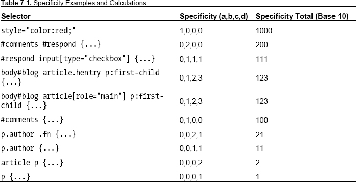
Notice that two of the selectors (rows four and five) in Table 7-1 have the same specificity. When two selectors have the same specificity, the selector that appears later in the source order takes precedence.
Note: If you want to see or think about CSS specificity in a more visual way, Andy Clarke wrote about it way back in 2005 using a Star Wars analogy (http://j.mp/starwarsspecificity) to illustrate the point. Alternatively, if poker is more your thing, Carl Camera compared specificity to poker hands in an article in 2007 (http://j.mp/pokerspecificity).
CSS specificity can be a tricky skill to master but, once you understand it, it is a powerful tool that allows you to target elements with the minimum of bother and saves you from having to go back and alter your perfectly crafted semantic markup.
CSS inheritance
The notion of inheritance in CSS is relatively straightforward but can be the cause of some confusion. In its simplest form, inheritance allows authors to only declare a property and value once, thus avoiding the need to set the same property on a number of elements. For example, we could write the following to change the site’s typeface to Georgia:
article, section, h1, h2, h3, p, ol, ul, dl {font-family:georgia, serif;}
However, it’s much easier (not to mention more maintainable) to write:
body {font-family:georgia, serif;}
The font-family property is then inherited by the body’s child elements until another style rule overrides it. When used intelligently, inheritance combined with the cascade and specificity can save you development time and keep your style sheet’s file size small and easy to maintain. And this leads us nicely on to the subject of maintenance and organization.
Note: Although not all CSS properties are automatically inherited, you can force them to be by using the inherit value. This is a good thing. Imagine if margin and padding were inherited and you then had to override these inherited styles on each declaration. A word of warning: inherit doesn’t work in versions of IE less than 8 except on the direction and visibility properties.
CSS organization and maintenance
When it comes to writing CSS, everyone has their own unique preferences, be it single line vs. multi-line, indentation with tabs or spaces, or the order in which rule sets or properties appear. In isolation, many of these points become moot, but when we factor in that many team members may work on any given style sheet or that you haven’t worked on that site for a year and now need to make some updates, it’s generally best to have some conventions in place to ease these issues. We’ll start by looking at some CSS conventions and commenting best practices before detouring into a look at CSS resets and frameworks.
CSS conventions
CSS conventions can be broadly broken down into two key areas: coding style and naming conventions. These two areas can then be sub-divided into individual debates (the kind of which designers have been arguing over for years). We’ll explain the pros and cons of each argument, but generally we’ll leave you to pick the approach that’s right for you.
Single line vs. multi-line CSS
The biggest debate usually revolves around whether a rule should be written on a single line, like:
h1 {font-family:Georgia; color: green; line-height:1.3; }
or multi-line, like:
h1 {

        font-family:Georgia;

        color: green;

        line-height:1.3;

}
Arguments for single line formatting are few and far between. The number of lines and whitespace is reduced and thus the file size is smaller, but you could always just minify your code before putting it on your live production server if you are concerned about this (a minifier is a program that removes all possible whitespace from a code file). It is also easier to scan through large numbers of selectors if you use single line rules, but it is then harder to scan individual properties and attributes.
The pros for using multi-line CSS are easier to see. First, it is a heck of a lot easier to decipher the code. When using source control, it’s easy to track which properties have been edited within a rule set (because they are on an individual line). You can also simply use Cmd+F (or Ctrl+F) to find the selector, eliminating the need to visually scan the file. The same applies when passing the file through a validator: when using multi-line, it’s easy to see which property is causing the issue but with single line, it isn’t. It is also argued that it’s easier to place comments next to individual declarations in the multi-line approach.
There is an added nuance to the multi-line approach that revolves around the placement of the closing curly bracket. Should it reside on its own line (as shown previously) or on the same line as the final declaration, as follows?
h1 {

        font-family:Georgia;

        color: green;

        line-height:1.3;}
It doesn’t make a lot of difference, to be honest. Either way works well.
A side argument in the single line vs. multi-line debate revolves around the use of tabs or spaces for indentation of declarations in the multi-line approach. This debate predates CSS and isn’t resolved easily. Some people prefer a single tab, others two spaces, others four. We recommend using tabs for indentation but feel free to arm wrestle over it.
The style you choose is up to you. Each of us authors has our preferred approach that works for us individually but by and large we’re multi-liners. Try both approaches and decide which you and any other team members prefer.
Ordering declarations
Another area that stirs debate in CSS circles is people’s preferences for the ordering of declarations within individual rule sets. Some prefer to alphabetize their declarations, others group them by type or relevance, and some have no order at all (pro tip: don’t choose this option). Here is the alphabetical approach, ordered by the first letter of the property name:
header {

        background:#f8f8f8 url(img/bg.png);

        border-bottom:1px solid #ccc;

        color:#333;

        font-family:Georgia;

        font-size:16px;

        font-weight:normal;

        height:60px;

        left:0;

        line-height:1.5;

        margin:0 auto;

        padding:5px 20px;

        position:fixed;

        top:0;

        z-index:2;

}
The next example shows the declarations grouped by type (in the following order):
- Position
- Display and box model
- Font and typography
- Color
- Background and borders
header {

        position:fixed;

        top:0;

        left:0;

        z-index:2;

        height:60px;

        margin:0 auto;

        padding:5px 20px;

        font-family:Georgia;

        font-size:16px;
        font-weight:normal;

        line-height:1.5;

        color:#333;

        background:#f8f8f8 url(img/bg.png);

        border-bottom:1px solid #ccc;

}
As with all these debates, choose the solution that best suits you. One could argue that the alphabetical approach is easier to learn and that properties are easier to scan. However, with the grouped approach it is easier to see which how the declarations (in the case of this example) form a fixed light grey bar that is 60 pixels high without resorting to looking at the result in a browser. This also makes it easier to see how the different properties affect and interact with one another.
We shan’t open the hornets’ nest of whether or not the final semi-colon on the last declaration should be included; suffice to say it’s our belief that it always should.
Ordering rule sets
In the last section we discussed the ordering of declarations within an individual rule set, but what about the order of those rule sets within the style sheets? Take the following markup:
<aside>

  <section class="history">

    <a href="history.html">

    <h2>History</h2>

    <img src="img/history.png" alt="The first space shuttle" height="75" width="100%" />

    <p>Before humans were launched into space, many animals were propelled heavenwards to pave

the way for mankind’s pioneering endeavors. These original pioneers, including numerous

monkeys, served their nations in order to investigate the biological effects of space travel.

Find out more about these pioneers that changed the face of space forever.</p>

    </a>

  </section>

<aside>
Now let’s assume we want to have distinct styles for the section, anchor, heading, image, and paragraph within that section. It would make sense to structure our CSS as follows (note we’ve used single line notation here to highlight the selectors):
.history {...}

.history a {...)

.history h2 {...}

.history img {...}

.history p {...}
This approach follows the layout of our markup (and coincidentally is in alphabetically order). For some this makes sense; others group all the heading styles (within a sheet) together like so:
h2 {...}

.history h2 {...)

.mission h2 {...}
It’s difficult to provide general guidance here (we’ll touch on it some more in the commenting best practice section) but in general the first approach, possibly with some slight re-ordering depending on your preference, makes it easier to manage specificity and inheritance.
Naming conventions
Now let’s look at naming conventions in CSS, which refers to class or ID names as opposed to the name of a file (although that can be important, too). Class names should be descriptive and semantic; they should describe your content and not the presentation. Take the following two examples and see which you think is more descriptive of the content:
.bigLeftCol {...}

.littleRightCol {...}


.primary-content {...}

.secondary-content {...}
Hopefully you can see that the second example more accurately describes the content as opposed to the presentation. Although the first example might not seem bad at first, what if you were to change your design and switch the columns around? In order to do so you would then have to edit your underlying markup, which is inefficient.
Note: The first example also highlights another naming convention bug bear of ours: CamelCase. CamelCase is used in multiple programming languages and as such is ingrained in some developers’ DNA. But here’s the thing: CSS isn’t a programming language, it’s a presentation language. So while there are some helpful conventions we can borrow from programming, CamelCase isn’t one of them. We use hyphens within our property names, so why not in our class names? After all .primary-content is much easier to read and work with than .primaryContent. If you don’t believe us, read Harry Roberts’ write up on why CamelCase Seriously Sucks at http://j.mp/camelcasesucks11 and you’ll be converted.
Remember that names should be semantic and descriptive, not structural and presentational. In the future, rather than class names such as .bigRedbox, try .warning-block.
Commenting best practices
Commenting your CSS can only be beneficial for your project. There are several reasons for this, such as reminding you why you wrote certain rules or what calculation you used for font sizing. Comments are also extremely useful to other team members working on the project. While basic comments like this are par for the course, adding metadata and a table of contents can dramatically improve the readability and maintenance of a file. Consider the following:
__________
/*-----------------------------------------------

[Master sheet]


Project:       Animals in Space

URL:           http://thewebevolved.com

Version:       1.1

Creator:       Rich Clark

Last changed:  01/02/12

Last Updated:  Oli Studholme

Primary use:   Demo site for book

-------------------------------------------------*/
By incorporating this information, everyone working on a specific project can see at a glance what the style sheet is for, who created it, and when it was last updated. The benefits of this approach become more apparent on larger projects when multiple style sheets are required with multiple team members working on the project. It isn’t complicated and is good practice to get into.
Creating a table of contents
Following the metadata, it’s also a good idea to include a table of contents for your file, which may look like the following:
/*-----------------------------------------------

Table of contents


1. Reset

2. Typography

3. Basic layout

4. Widgets

5. Media items

6. Forms

7. Media queries

8. IE specific styles

-------------------------------------------------*/
This table of contents can be as brief or as detailed as your project requires. Using this approach and splitting your file into sections like this makes it easy to maintain and add other styles to logical areas within your file. You should clearly break up each section with comments and add an additional character that isn’t likely to appear in any of your actual code (such as | or £) to use as a flag when searching through your document. The additional character acts as a differentiator from a class or ID selector that may have the same name.
/*-----------------------------------------------

£Widgets

-------------------------------------------------*/
This sets out a basic framework for the beginning of a file, but we can take it a step further by also including a reference sheet for information such as color and typography.
Color and typography reference sheet
In languages such as JavaScript we can declare variables to be reused throughout the script. This functionality doesn’t yet exist in CSS (although it can be added using a library like less.js). To combat this it, makes sense to include a brief reference sheet (or glossary) in our style sheet for things like color and typography. An example is shown below.
/*-----------------------------------------------

Color reference sheet


Background:    #f8f8f8 (off white)

Body text:     #444444 (dark grey)

Headings:      #888888 (light grey)

:link          #0090D2 (blue)

:hover,

:active,

:focus         #0063A6 (dark blue)

-------------------------------------------------*/


/*-----------------------------------------------

Typography reference sheet


Body copy:             1.2em/1.6em Georgia, serif;

Headers:               2.7em/1.3em Helvetica, Arial, "Lucida Sans Unicode", Verdana, sans-

serif;

Input, textarea:       1.1em Helvetica, Verdana, Geneva, Arial, sans-serif;

Buttons:               1.2em Georgia, serif;


Notes: reduce heading by 0.4em with every lower heading level

-------------------------------------------------*/
This provides an introduction on how to structure your style sheets and create a style guide for starting projects, ensuring that files remain well structured and are easy to maintain. To truly create a level playing field, many like to use a CSS reset.
CSS resets and normalize.css
A reset style sheet resets everything to zero across all browsers, enabling us to start building again from zero. Essentially we’re neutering all of the rules in the browser’s default style sheet. Think about this for a moment.
- Goodbye to
h1-h6visual hierarchy. - Lists no longer have bullets.
- Default padding and margin is removed.
On the one hand, this is useful (it’s like clearing the ground before rebuilding), but you’ve removed everything so you need to put it all back again (or at least consider what you choose not to put back).
Consider this as a part of your process in the same as commenting your code. A reset style sheet coupled with a solid rebuild of style equals the beginnings of a framework. You can build your own framework or use one created elsewhere such as the HTML5 Boilerplate (http://j.mp/h5boiler12) created by a team including Paul Irish and co-author Divya Manian. If you decide to use a framework created by others, be sure to understand its inner workings before getting part way through a project and getting stuck.
Using resets
Returning to resets, the most basic of resets uses the * selector to reset properties for all elements.
* {

  margin:0;

  padding:0;

}
While this method is effective, it’s not recommended because it slows your site and there are elements whose style you don’t want to remove (inputs for example).
A more common approach, popularized by Eric Meyer, is to use a custom reset style sheet, many of which are now available. With the advent of HTML5, most of these style sheets now also include a rule for setting the new elements to display:block;, as described in Chapter 2.
A search for “CSS resets” will return thousands of results but some of the more popular reset style sheets are
- Meyer’s reset reloaded (
http://meyerweb.com/eric/tools/css/reset) - HTML5 Doctor reset stylesheet (by author Richard Clark) (
http://html5doctor.com/html-5-reset-stylesheet/) - YUI Reset CSS (
http://developer.yahoo.com/yui/reset/)
A copy of Meyer’s reset reloaded (for use with HTML5) is shown next so you can see how it differs significantly from the * approach shown previously.
/* http://meyerweb.com/eric/tools/css/reset/

   v2.0 | 20110126

   License: none (public domain)

*/


html, body, div, span, applet, object, iframe,

h1, h2, h3, h4, h5, h6, p, blockquote, pre,

a, abbr, acronym, address, big, cite, code,

del, dfn, em, img, ins, kbd, q, s, samp,

small, strike, strong, sub, sup, tt, var,

b, u, i, center,

dl, dt, dd, ol, ul, li,

fieldset, form, label, legend,

table, caption, tbody, tfoot, thead, tr, th, td,

article, aside, canvas, details, embed,

figure, figcaption, footer, header, hgroup,
menu, nav, output, ruby, section, summary,

time, mark, audio, video {

        margin: 0;

        padding: 0;

        border: 0;

        font-size: 100%;

        font: inherit;

        vertical-align: baseline;

}

/* HTML5 display-role reset for older browsers */

article, aside, details, figcaption, figure,

footer, header, hgroup, menu, nav, section {

        display: block;

}

body {

        line-height: 1;

}

ol, ul {

        list-style: none;

}

blockquote, q {

        quotes: none;

}

blockquote:before, blockquote:after,

q:before, q:after {

        content: '';

        content: none;

}

table {

        border-collapse: collapse;

        border-spacing: 0;

}
Note: Think about using resets carefully—they can often be overkill for many projects, as you really do need to redefine everything yourself. In simpler projects, it’s often good enough to set margin: 0 and padding: 0 on <html>, <body> and a few more.
__________
Using normalize.css
An alternative approach is normalize.css, developed by Nicholas Gallagher and Jonathan Neal (http://j.mp/normalizecss13). In contrast to the reset stylesheets, normalize.css aims to make browsers render elements more consistently inline with modern standards. Unlike resets, the ground isn’t completely cleared. normalize.css preserves useful defaults and goes further by correcting bugs and adds subtle usability improvements. normalize.css is also packaged with the HTML5 Boilerplate project.
__________
As with the coding styles discussed earlier, which option you choose (if indeed any) is entirely dependent on the projects requirements and personal preference. It is important to note that none of these files should be taken as gospel (a common problem with Meyer’s original reset). You should go through the file line by line and edit, add, or remove rules on a project by project basis.
CSS frameworks and toolkits
CSS frameworks take your starting point a step further than CSS resets by providing styles for things such as a pre-defined grid system, typography, colors, print styles, and more. Some go even further to include HTML and JavaScript on top of the CSS.
They can be extremely useful for rapid prototyping and taking care of the heavy lifting carried out in most projects. The downside is that they add bloat to your projects by including rules you won’t need. They can also hamper the craftsmanship of the design process, making your designs look very similar and using non-semantic class names.
Our preference is to veer away from frameworks where possible, but you may find that some clients insist that you use a particular framework because it’s used throughout the organization. For this reason it’s worth familiarizing yourself with a few of the more popular frameworks.
- Blueprint, one of the early CSS frameworks (
http://blueprintcss.org/). - 960.js, a system to aid rapid prototyping that can also be used in a production environment (
http://960.gs/). - Bootstrap, a toolkit from Twitter designed to kickstart development of web apps and sites (
http://twitter.github.com/bootstrap/). - Foundation, built by Zurb as an easy-to-use, powerful, and flexible framework for building prototypes and production code on any kind of device (
http://foundation.zurb.com/). - Skeleton, a boilerplate for responsive, mobile-friendly development (
http://www.getskeleton.com/).
One thing you can learn from CSS frameworks is their flexibility and way they abstract styles for reuse on multiple elements. This leads us nicely into how to make projects easier to maintain.
Maintainable CSS
As front-end craftsmen, we occupy a crucial role in the design process. We are the glue that binds great research, user experience, information architecture, and design with server side code. Whether the starting point is from wireframes or from Photoshop comps, one thing’s for sure: we need to be superb communicators. Allied to this communication, we should create and follow a three-fold process.
- Discovery: Interrogate user experience architects to frame their vision, to understand how the system of wireframes fit together, and to get to know the system we’ll be developing.
- Implementation: Write semantic markup and flexible, maintainable CSS.
- Delivery: Communicate with server-side developers and content editors to explain how our beautifully crafted markup and CSS should be used, and which classes should be applied in which scenario in order to for our work to remain well structured for launch and beyond.
Herein lie the main principles behind maintainable CSS.
In his book Bulletproof Web Design (http://j.mp/bulletproofcss14), Dan Cederholm explains how we should always plan for the worst case scenario with both our markup and CSS. Creating a bulletproof site is more than simply testing your design with images or stylesheets turned off. It’s about asking, “What if?”
Next time you receive wireframes or Photoshop comps, before you dive head first into HTML, ask the designer some questions.
- Is this site fixed-width or responsive?
- What happens if there’s no image in that container?
- What if more text is entered there?
- What if this headline wraps?
The earlier you can find the answers to these questions, the earlier you can plan around them. Once you’ve received the answers, it pays to spend some time reviewing the designs. Print them all out, draw all over them, and look for common components used throughout. Take time to understand the underlying grid structure, look for common colors, and see how typography is treated. This may seem a time-consuming and unnecessary step in the process, but it avoids any repetition (remember DRY from earlier in the chapter) and prevents problems from arising down the line.
Creating a pattern primer or components library
Rather than diving straight into building templates when you begin a project, let us introduce you to the concept of a pattern primer (http://j.mp/patternprimer15) or components library (Figure 7-1). A pattern primer is an excellent starting point for your CSS (and markup).
Creating a pattern primer is simple: you build and style each component (identified in your earlier review) individually, thereby creating reusable chunks of code with semantic classes.
Essentially, you’re building a templating toolkit. By creating each component or module independently, you can ensure that each will fit together snugly when you come to create templates—without specificity, cascade, or inheritance-based CSS headaches being induced. You can then test the pattern primer equally independently and fix any issues knowing that your fix for one issue won’t create another. This highlights where your earlier review really pays off.
__________

Figure 7-1. Components library for the sueryder.org website created by Tim Brook.
Naming components and including notes on where each should be used is also a must. The pattern primer is then extremely useful when passed to server-side developers who, no matter how many templates are designed, will always have to implement some unforeseen eventuality for which there is no template. They will have a site-specific vocabulary from which to work. The developer then simply copies the appropriate code snippet and voilà, it’s styled to perfection.
Practical, maintainable CSS
Now that you’ve planned out your project and started creating components, what are the core coding styles you should be sticking to in order to ensure you’re writing maintainable CSS?
In two excellent presentations (CSS Systems (http://j.mp/css-systems16) and Practical, Maintainable CSS (http://j.mp/practical-css17)) Natalie Downe (go and find them now in your favourite search engine and have a read—we’ll wait) lists eight rules of thumb to remember when crafting your stylesheets, and these tie nicely into the practices we’ve described throughout the chapter:
- Think in terms of components, not pages.
- Think about types of things, not individual things.
- Prefer classes to IDs.
- Create composable classes.
- Use descendent selectors to avoid redundant classes.
- Keep your selectors as short as possible.
- Order your CSS rules loosely by specificity.
- Prefer percentages for internal layout dimensions.
A little time spent learning the fundamentals of CSS, as covered earlier in this chapter, followed by time spent putting in place systems such as these can ensure your CSS is more efficient, easier to maintain, and plays better within a team context. Generous to a fault, Natalie has provided links to both presentations as PDFs, which include speaking notes for context.
If the above principles have got you thinking about creating maintainable, sustainable, and flexible CSS, why not go that step further and learn about another method in the same vein? It’s Object Oriented CSS, devised by Nicole Sullivan.
__________
Object Oriented CSS (OOCSS)
Nicole Sullivan presented a talk on Object Oriented CSS (http://j.mp/oo-cs18) at Web Directions North in 2009 and she has very kindly written up some thoughts on the principles (http://j.mp/oocss-principles19) at her site. Answering the question, “How do you scale CSS for millions of visitors or thousands of pages?” she outlines the concept of Object Oriented CSS as
an approach for writing CSS that’s fast, maintainable, and standards-based. It adds much needed predictability to CSS so that even beginners can participate in writing beautiful websites.
Nicole Sullivan, OOCSS Github Wiki
What Nicole proposes is interesting—though you’ll need to fetch a pot of tea and set aside some serious reading time—and her ideas, especially those around drawing on traditional software engineering concepts, make for rewarding reading. (Anyone that uses Lego as a metaphor for CSS component libraries gets a thumbs up.)
There are two overriding principles of OOCSS: separating structure and skin, and separating container and content. The first involves defining common visual features such as border styles as “skins” that you can apply to components without the need for a large amount of additional code. It also leans towards adding classes to elements within your markup rather than relying solely on type selectors. The second assumes that an “an object should look the same no matter where you put it.” By applying a class to an element you can ensure that it’s not dependent on its location (within a section class="history" for example).
Many disagree with the principles of OOCSS, highlighting that a large number of classes causes code bloat and style sheets become unmanageable. When writing CSS, we tend to pick certain aspects of OOCSS and combine them with a healthy dose of our own knowledge and working practices, thereby creating our own system and workflow perfectly suited to our and our clients’ needs. We urge you to do the same.
In summary, by planning ahead and creating independently styled components devoid of any layout restrictions you can ensure that your CSS is flexible and maintainable, not only by you but also others on your team. Over the last few pages, we’ve shown you several approaches for structuring, ordering, and maintaining your CSS. Ultimately, the route you take is your call and down to individual (or company) preference. If you’re working on a team, be sure to validate the approach with your colleagues while teaching and documenting the practices for the benefit of all involved. While we’re on the subject of validation, let’s sidestep to a look at CSS validation.
__________
CSS validation
You learned about the importance of validating your HTML in Chapter 2, and now it’s time to look at CSS validation. In our experience, the validation of CSS occurs less frequently than HTML and generally speaking, that’s a good thing.
The important thing to note about any form of validation is that it’s a tool, not a goal. Validators should be used to check your work, but don’t be precious about receiving that seal of approval. Just be sure you know why your CSS isn’t validating.
The W3C have a validator for CSS (http://j.mp/css-validator20), just as they do for HTML. Note that, by default, it does not check against CSS3 properties, so you must select “CSS level 3” in the options under the Profile drop-down, as shown in Figure 7-2.
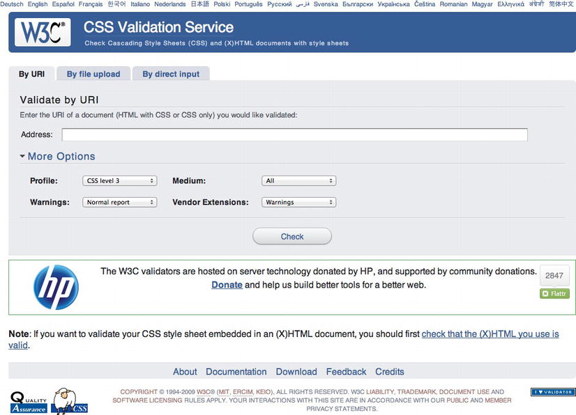
Figure 7-2. W3C CSS Validator
Because the specs aren’t finalized and are regularly changing, so is the validator. So if a property is added or changed in a spec, it won’t automatically make its way to the validator. Someone has to update it, which takes time. We’ll look at the thorny issue of vendor prefixes later in the chapter but another useful option within the validator is to change the Vendor Extensions drop-down from “default” to “warnings” (again, bear in mind all these extensions may not be up to date).
__________
If the W3C isn’t your cup of tea, you can try one of the many browser extension validators or one of the other online tools for CSS validation. A quick Google search will help you on your way.
Outside of validation, how can you check that you’re writing well-formed CSS? Well, just like for HTML, you can use a tool to help you out.
CSS lint
Launched in June 2011, CSS Lint (http://j.mp/css-lint21) caused some controversy when it arrived on the scene. Developed by Nicholas Zakas and Nicole Sullivan (of OOCSS, mentioned earlier in the chapter), it is intended to spot problems with your CSS. It was initially based on a number of rules (some wise, some perhaps foolish) that many disagreed with. Now the project is hosted on Github and as such can be customized to suit your needs (Figure 7-3).

Figure 7-3. CSS Lint
__________
Our advice is to treat CSS Lint just as you do the CSS Validator: as a tool, not a goal. If errors or warnings are flagged, understand why they were flagged.
We’ve highlighted how validation should be used as a tool rather than a goal but all this is meaningless without the most important aspect of our craft: users and their browsers. In the next section, we’ll look at browser support, vendor prefixes, polyfills, and that oft-used term, progressive enhancement.
Browser support, vendor prefixes, polyfills, and progressive enhancement
As we move into this brave new world of CSS3 and rapidly evolving design opportunities, it’s worth pausing for a moment to talk about the importance and definition of browser support allied with its relationship to progressive enhancement and graceful degradation.
It’s time we celebrated the diversity of opportunities we have at our disposal and consider a world of progressive enhancement. A world where not every web site looks or behaves exactly the same across browsers and where we accept that browser-based experiences are, as a natural by-product of our multi-platform medium, different. With that thought in mind, ask yourself the following questions:
- What is browser support?
- Do web sites need to look or behave the same in every browser?
The latter is easy to answer: when we think of the range of devices available to us, from phones to tablets to TVs and e-book readers, it’s impossible to think they could.
The former is harder for us to answer. Support could be classed as being usable or indeed support could be classed as looking, reacting. and functioning the same in every browser.
Our view is that sites should be usable, accessible, and inclusive to all no matter their browser or device. In order to achieve this, and before we look at browser support in more depth, we need to take a deeper look at progressive enhancement and graceful degradation.
Progressive enhancement
Embracing a forward-looking approach, as touched on in Chapter 1 when we discussed John Allsopp’s seminal article The Dao of Web Design, is key to the concept of progressive enhancement. The term was invented by Steve Champeon, co-founder of the Web Standards Project, in 2003. In essence, the term describes the technique of catering for the lowest common denominator and building on that to provide enhanced experiences for more capable browsers and devices. The basic principles of progressive enhancement remain very much the same today as in 2003.
- Content should be inclusive and accessible to all.
- The HTML markup should describe the content. It should be clean, semantic, and free from presentational naming or order.
- CSS should be used to cater for all aspects of presentation.
- JavaScript should be used to add behavior where required.
Dan Cederholm took this concept and modified it, describing it as “progressive enrichment” in his book Handcrafted CSS. Andy Clarke in his book Hardboiled Web Design takes the visual aspect of progressive enhancement and reverses it. He says
Instead of starting from the lowest performing browsers, hardboiled means working from the top down and designing for the best browsers first. This way we can make the most of everything that more capable browsers and emerging technologies like HTML5 and CSS3 have to offer.
Progressive enhancement in action
In the following example we’ve taken an element from your homework site. It’s a background box with some border-radius to give it rounded corners and the box-shadow property to give it some subtle shading. Looking at this markup rendered in a contemporary browser (in this case Safari) the box has rounded corners and a subtle shadow (Figure 7-4).
Figure 7-4. Button rendered in Safari with CSS rounded corners and shadow
Taking a look at the same example in a less capable browser, in this case IE8, the box has lost its rounded corners and no longer has a shadow (Figure 7-5).
Figure 7-5. Button rendered in IE8 without CSS rounded corners and shadow
The question you need to ask yourself when looking at these two versions is this: Did any cats die in the second experience? No. The rounded corners and shadow are enhancements aimed at contemporary browsers. They improve and enhance the experience, but they aren’t mission critical. Before embarking on a project, it’s worth considering what is and isn’t critical. Ask yourself (and your clients) if it’s worth the extra time, money, and effort to add rounded corners in older browsers whose market share will only drop. We tend to find the answer is nearly always a resolute no.
CSS3 browser support
If you’re embarking on your web design journey today, you are in many ways spared a great deal of the less-than-stellar browser support that marked the beginning of our journey towards web standards, the time of the browser wars. The browser landscape today is markedly different to the past, with browser vendors now iterating rapidly, innovating, and pressing forward in the support of the new and emerging standards that we’ll be describing in the following five chapters.
CSS3 support across browsers is, generally speaking, in a good state. With many browsers carrying out silent auto updates, there’s no reason for users not to be using the most current technology. This means that more of the HTML5 and CSS3 goodness you’re learning about can be used in the wild, today.
Even our old friend IE is getting in on the game and, dare we say it, leading the way with numerous innovations. Sites such as Lost World’s Fairs (http://lostworldsfairs.com/), curated by Jason Santa Maria, showcased IE 9’s support of the emerging WOFF (Web Open Font Format), allowing designers like Frank Chimero, Trent Walton, and Naz Hamid (not to mention Santa Maria himself) to explore the typographic possibilities the web now offers. Within each chapter we’ll take you through browser support in detail and we’ll return to the intricacies of web fonts in Chapter 10, so hold that thought.
For a current and wider overview of support, we recommend you check the following sites because they can be updated far more regularly than this publication.
- When can I use…, a huge resource created by Alexis Deveria that not only shows what is currently supported but also what is soon to be supported along with global browser market shares (
http://caniuse.com/). - HTML5 Please, created by one of the authors of the book (Divya Manian), Paul Irish, and a team of contributors. HTML5 Please lists HTML5 and CSS3 features and indicates whether they are ready for prime time use (with or without fallbacks), should be used with caution, or should be avoided (
http://html5please.us/). - HTML5 Readiness, another collaboration between Divya Manian and Paul Irish. HTML5 Readiness allows you to see which HTML5 and CSS3 features are ready for use today. Unlike HTML5 Please, you can also view the differences over time (
http://html5readiness.com/). - HTML5 & CSS3 Support, a very detailed list compiled and maintained by Deep Blue Sky. It lists a number of CSS3 properties against a range of browsers (
http://findmebyip.com/litmus/).
Wider support for certain properties exists if you use vendor prefixes (or extensions). In addition, it is possible to recreate some of the CSS3 effects in browsers without support by using a combination of feature detection and polyfills. That’s what we’ll look at in the next two sections.
Vendor prefixes
If you’re not familiar with the term, a vendor prefix allows browser vendors to add a prefix to a CSS property for experimentation or debugging purposes. Consider it a way of marking them “in progress.”
By embracing an approach based on vendor prefixes, browser vendors can implement support for different CSS modules, effectively sandboxing them from other browser vendors’ implementations so they can test them safe in the knowledge that they won’t affect the way the prefixes are handled in other browsers.
Be warned that using CSS with vendor prefixes can be risky. They or their underlying specifications and notation can change regularly, so use with caution. However, when those implementations become stable, vendors will stop using the prefixed version, leaving only the final implementation.
By using vendor-prefixes to test new CSS properties as the standards process iterates (remember the chicken-and-egg problem where browsers innovate incrementally, moving towards a standard that all (hopefully) adopt, which is then implemented as a standard), we can embrace evolving CSS properties, tailoring them to different browsers’ current implementations. But how do we do this? The best way is to run through an example, which we do in the next section.
Vendor prefixes have been the cause of some debate: some people are in favor of them, and some think they are harmful. They are here to stay for now, but who knows about the future? Although the topic is far too involved for us to enter here, we offer some articles for review that present a balanced view.
- Vendor Prefixes are Hurting The Web by Henri Sivonen (
http://hsivonen.iki.fi/vendor-prefixes/) - Prefix or Posthack by Eric Meyer on A List Apart (
http://alistapart.com/articles/prefix-or-posthack/) - CSS Vendor Prefixes Considered Harmful by Peter-Paul Koch (PPK) (
http://quirksmode.org/blog/archives/2010/03/css_vendor_pref.html) - Vendor Prefixes Have Failed. What’s Next? by Lea Verou (
http://lea.verou.me/2011/11/vendor-prefixes-have-failed-whats-next/) - An Argument In Favor Of Vendor Prefixes by Peter Gasston (
http://www.broken-links.com/2011/11/15/an-argument-in-favour-of-vendor-prefixes/) - Google + Discussion on Vendor Prefixes discussion started by Simurai plus (
https://plus.google.com/110156363849628236019/posts/UGQhEgxmJx5)
Vendor prefixes in action
We now understand that different browser vendors use vendor prefixes to target their specific implementation of a CSS property, so let’s take a look at this in action. We’re going to use a made-up property so as not to hurt any browser’s feelings if they haven’t implemented a feature just yet.
Assume that the makers of the Firefox browser (Mozilla) wish to develop a proprietary property called dancing-monkeys that covers your background in, you guessed it, dancing monkeys. Because this property isn’t in a CSS specification and isn’t fully tested or implemented, Firefox would prefix the property with their unique identifier (-moz-), placed before the property name like so:
body{

        -moz-dancing-monkeys: loop;

}
If that property was then added to a specification and a Firefox build shipped without needing the prefix, you could simply update your CSS to:
body{

        dancing-monkeys: loop;

}
Now let’s assume that Microsoft decides to implement this feature, so for the time being it also requires a prefix. We would add that in before the unprefixed version.
Starting with vendor-specific prefixes such as -ms-dancing-monkeys and -moz-dancing-monkeys and leaving the generic property of dancing-monkeys until last means the generic property overrides declarations that have gone before. This means that as support for implementations is standardized, the generic property will trump all, and one day in the future when all is good in the world of CSS3 and no one uses outdated browsers, you’ll be able to remove your vendor-specific prefixes and all will be good in the world. Until then, you can rest assured that the last declaration (dancing-monkeys: loop;) overrides those that have gone before.
As we close this section, our role here wouldn’t be complete without providing you with a table of common browser vendor-prefixes for reference, so without further ado and thereby fulfilling our promise, Table 7-2 provides the most widely used vendor prefixes and their associated browsers.

The Opera Effect
What do we mean by “The Opera Effect?” When it comes to adding vendor-specific CSS declarations to rules, many web designers and developers opt for the lazy option: including only -webkit- to take care of Safari and Chrome. You, however, know better than to cut such a corner. What of the other browsers?
Referring back to Table 7-2, we can see that by including all vendor prefixes we could end up with a rather large amount of code for something simple as simple as a dancing monkey background.
body{

        -khtml-dancing-monkeys: loop;

        -moz-dancing-monkeys: loop;

        -ms-dancing-monkeys: loop;

        -o-dancing-monkeys: loop;

        -webkit-dancing-monkeys: loop;

        dancing-monkeys: loop;

}
The problem with only selectively including vendor prefixes, and not considering all vendor prefixes, is the pressure it puts on, amongst others, Opera, who (as we saw in the last chapter) trailblazed support for HTML5 forms. Spare some thought for all of your potential users. Many access the web via browsers other than those catered to by -webkit- (and the generic property you’re using).
The bottom line? Build your rules to include declarations for all browsers and remember to include the generic, prefixless versions for the day (coming soon, we hope) when vendor prefixes will be A Thing of the Past™. With that thought fresh in our heads, we shall introduce to you the Good CSS Developers Pledge™.
The Good CSS Developers Pledge™
If you thought the previous example was a lot of code for one rule set, you’re right. Creating and working with style sheets using vendor prefixes can be a painful job, which is why we implore you to sign up to the Good CSS Developers Pledge™. Repeat after us:
I do solemnly swear to only use prefixed properties on the condition I include all relevant browser prefixes, and keep them up to date!
In essence this means
- You will include a separate prefixed line for all browsers that support each prefix.
- When (not if) another browser adds prefixed support, you’ll add it.
- If (and, more likely, when) the spec changes, you will update your code.
- You will remove prefixed declarations when they’re no longer needed
Now that you’ve signed up, remember to keep to your pledge because we’ll be checking.
-prefix-free
If you feel daunted by the thought of writing out declarations multiple times and can’t promise to keep to your pledge, there are tools out there to help. The best of which is –prefix-free by Lea Verou (http://j.mp/prefixfree/22), which is a small JavaScript file you can include in your site. According to the site, it
lets you use only unprefixed CSS properties everywhere. It works behind the scenes, adding the current browser’s prefix to any CSS code, only when it’s needed.
__________
-prefix-free comes with comprehensive documentation and more detail can be found on Smashing Magazine (http://j.mp/smashing-prefix-free23).
To summarize our look at vendor prefixes, personal choice is again at the front of the queue when considering whether or not to use them. So, looking at the rule that showed vendor-prefixes in action, you might be forgiven for wondering, “What about our old friends, IE pre-IE9, that have little, if any CSS3 support?” Good question! Let’s take a look at some solutions for handling IE.
IE Filters, standards, and performance
A long time ago, in a galaxy far, far away, before we’d ever heard of vendor prefixes, our old friend Microsoft introduced filters and transitions to, as they put it, “apply various multimedia-style visual effects to web pages.” Supported in IE 4 and above, Microsoft’s filters and transitions are a proprietary set of CSS extensions that offer effects similar to those that can be achieved using CSS3. It’s worth noting that IE’s filters and transitions are extensions, not standards (but hold that thought because we’ll return to it).
The easiest way to get a feel for how Microsoft’s IE filters work is to show an example. Let’s say we’d like to give an element on our page a box-shadow. For everyone but IE, we’d write the following:
.boxshadow {

        -webkit-box-shadow: 2px 2px 5px #333;

        -moz-box-shadow: 2px 2px 5px #333;

        box-shadow: 2px 2px 5px #333;

}
Note that we don’t need to add the oft forgotten -o- prefix mentioned earlier because Opera supports the box-shadow property without the use of a prefix.
The good news: IE9, thanks to its native support of box-shadow, will handle this just fine (via the generic declaration box-shadow: 2px 2px #333;). The bad news: IE8 and older won’t. The following example shows two added declarations, one for IE8 and one for versions of IE older than version 8:
.boxshadow {

        -webkit-box-shadow: 2px 2px #333;

        -moz-box-shadow: 2px 2px #333;

        -ms-filter:"progid:DXImageTransform.Microsoft.dropShadow(color=#333,offX=2,offY=2)";

        filter:progid:DXImageTransform.Microsoft.dropShadow(color=#333,offX=2,offY=2);

        box-shadow: 2px 2px #333;

}
In case you’re wondering why you need two declarations here, in essence IE<8 looks at the filter declaration and IE>=8 uses the -ms- prefixed version. If you’re so inclined, you might like to take a sojourn and read a detailed article on IE filters at http://j.mp/msfilters24.
In the code example we hope you see the heart of the problem and why IE filters differ, quite substantially, from vendor prefixes. Though IE has supported a number of CSS3-like properties for some time, this support is proprietary and non-conforming to standards. Looking at this example, the generic box-shadow declaration and the WebKit/Mozilla versions with their vendor prefixes are essentially the same. All the vendor prefixes do is sandbox WebKit and Mozilla’s particular implementations of how to handle box-shadow until the specification is reached. Both—it’s important to stress—are paving the way towards a standard. The IE filters, on the other hand, are a proprietary approach to the problem and, thankfully, will soon be a thing of the past thanks to IE9’s forward-looking nature.
__________
Finally, it’s worth noting that IE filters can have a negative impact upon performance. See where we’re heading with this? We don’t recommend you use them or, if you absolutely must, use them as a measure of last resort.
So, if IE filters and transitions aren’t the way to go, what else is out there to plug the gaps for IE and help move things forward?
Feature detection and polyfills
In the past, it was common practice for developers to use JavaScript to detect which browser a user was using. It’s an evil technique that should be buried along with IE6. Developers should be encouraged to use feature detection instead. In essence, we should ask the question (in whatever browser) “Do you support feature X?” That means we only end up with two possible answers from which we can act accordingly; yes or no. Compare this with asking “Which browser are you?” and there are hundreds if not thousands of possible answers.
You might think it a little laborious to write countless feature tests, and it is. But that’s where libraries come in—specifically Modernizr by Faruk Ateş, Paul Irish, and Alex Sexton. Modernizr is a small JavaScript library that detects the availability of native implementations for next-generation web technologies (i.e. features that stem from the HTML5 and CSS3 specifications). Modernizr (www.modernizr.com/docs/) is a breeze to use; simply link to the script in the head of your document
<script src="js/modernizr-1.0.min.js"></script>
and add a fallback class of no-js to the html element
<html class="no-js">
and you’re good to go. When the script runs, it adds a whole host of classes to the html element based on the feature support (or lack thereof) of the browser it’s running in. You can then use these classes to offer fallbacks for browsers that don’t support certain features. Consider the following: you want to apply a shadow to a box (with a class of box). You can do this using CSS3s box-shadow property (see Chapter 11) but you want to have the shadow appear in all browsers—even those without box-shadow support.
For browsers with box-shadow support you can write your CSS as normal.
.box {

        box-shadow: 3px 3px 5px #ccc;

}
For browsers without box-shadow support, Modernizr adds a class of no-boxshadow to the html element. You can then add a rule to your stylesheet to use an image that will create a similar effect to the in-browser shadow.
.no-boxshadow .box {

        background:url(img/shadow.png) repeat-x 100% 100%;

}
Modernizr tests for over 40 HTML5 and CSS3 features, making it extremely useful to today’s conscientious developers. There are some features that quite simply can’t be feature detected—the undetectables (http://j.mp/undetectables25). For those cases, you’ll have to resort to evil, underhand tactics such as browser detection. The Modernizr web site (www.modernizr.com/) has links to further documentation and tutorials.
Note: Modernizr also includes the HTML5 Shiv referred to in Chapter 2. If you decide to use Modernizr, you don’t need to include the Shiv as well.
Polyfills
So Modernizr handles the feature detection but what if you want to fill the gaps for those less capable browsers? What if you want as many browsers as possible to have the same experience? Enter stage right, polyfills.
Polyfill is a term coined by Remy Sharp (http://j.mp/polyfillwtf26); it’s been taken on board in the web community and can largely be described as a shim or shiv that mimics functionality that you would expect to find natively in your browser.
Broadly speaking, polyfills are scripts used to plug gaps in HTML5, CSS3, and other specifications until native browser implementations catch up. We’ll introduce a range of polyfills throughout the book for different eventualities. The Modernizr team maintains a list of useful cross-browser polyfills on Github (http://j.mp/h5fills27).
A word of caution regarding polyfills: before you use them or build them into your toolkit, consider the benefits vs. the drawbacks. Do you really need to load that extra script or can you handle it using graceful degradation instead? How reliable is this script? Can I rely on someone else’s work for my client projects?
If you’ve truly bought into the progressive enhancement mindset, this is the approach we recommend: build for the future. However much you polyfill, the past will never quite catch up.
__________
IE-specific polyfills
Earlier we promised some solutions for kicking our old friend IE into a CSS3 shape. Here are two possible solutions.
Selectivizr
One JavaScript solution to CSS3 support in IE is Selectivizr (http://j.mp/selectivizr28), written by Keith Clark. While it doesn’t add support for all the goodness CSS3 has to offer, it does provide support for CSS selectors (a powerful aspect of CSS that we’ll explore in full in the next chapter).
Selectivizr requires a JavaScript framework to run and it supports numerous options including jQuery, Prototype, MooTools, and more. Formerly known (in beta) as iecss3.js, Selectivizr uses JavaScript to enable IE6 through 8 to identify CSS3 pseudo-class selectors and, as a result, apply any style rules defined by them. As Andy Clarke puts it, “Selectivizr works automatically so you don’t need any JavaScript knowledge to use it – you won’t even have to modify your style sheets. Just start writing CSS3 selectors and they will work in IE.”
As we’ll see in the next chapter, CSS3 pseudo-classes and attribute selectors, when used well, can be hugely effective. Selectivizr is one way to use their power in older versions of IE.
CSS3 PIE
What is CSS3 PIE? (http://j.mp/css3pie29) Well, the acronym PIE stands for Progressive Internet Explorer. As Jason Johnston, CSS3 PIE’s creator, puts it, “PIE makes Internet Explorer 6-8 capable of rendering several of the most useful CSS3 decoration features.” These features include border-radius, box-shadow, and border-image plus gradients and multiple background images. Other features are currently under development.
Let’s take a look at an example. Here’s a class used to define an element with a defined border-radius:
.roundcorners {

        -webkit-border-radius: 5px;

        -moz-border-radius: 5px;

        border-radius: 5px;

}
This, in a contemporary browser, results in a box with nicely rounded corners. In IE 6, 7 or 8, however, the result is a square box—no rounded corners. Add the following declaration (behavior: url(PIE.htc);) to the CSS as follows and we solve the problem for IE:
.roundcorners {

        -webkit-border-radius: 5px;

        -moz-border-radius: 5px;

        behavior: url(PIE.htc);
        border-radius: 5px;

}
__________
How does this work? In the declaration we added CSS3 PIE references an HTML Component (HTC), a throwback to the good (read bad) old days of DHTML. We won’t bore you with the details but feel free to explore more at your leisure at http://j.mp/dhtml-behaviors30.
The downside of this is that the .htc behavior file that CSS3 PIE relies on is 30K (uncompressed). Even with compression, that’s still an extra hit, so ask yourself if it’s worth adding this extra weight (albeit just for IE) to your site. There are upsides and downsides to cajoling IE into submission. Let’s consider these now.
One clear upside is support for a number of lovely new CSS3 techniques in our old friend IE. One clear downside is yet more material to learn and support as the web evolves. It’s also worth remembering that all of these extra requests can add a hit to your site’s speed through the need for additional HTTP requests (this is worth considering before adding support through multiple behaviors and libraries).
So ask yourself if you need to include all of these extras to cajole IE or is it time, as we highlighted earlier, to stop worrying about trying to make every web site look the same in every browser. The answer to this question, of course, depends upon your circumstances (and the needs of your clients). As we’ve seen, a considered approach embraces a progressive enhancement philosophy—where design aspects like rounded corners are considered non-mission-critical and there is some flexibility about how pages display across browsers. So you might choose intentionally not to support these aspects among non-capable browsers.
To end this section on a positive note, IE9’s support for CSS3 is very good and IE10 looks even better. We might just make it to the Nirvana where workarounds are a thing of the past. Here’s hoping!
Summary
In this chapter we gave you a recap in CSS fundamentals—some of which you no doubt already knew, some of which you probably didn’t—including a look at the cascade, inheritance, and specificity. We looked at the development of CSS and the modularity of CSS3. We showed how using CSS3 along with standard ways of working, such as progressive enhancement, will benefit and streamline your process. The same applies to creating maintainable, flexible, easy-to-understand CSS. Finally, we talked about browser support, vendor prefixes and feature detection.
All of this will stand you in good stead for what you’ll find in the next six chapters. We will take you through the crazy maze of CSS3 where you’ll dig deep with selectors, create various layouts using new techniques, do more with amazing typography, implement a whole host of new properties, and learn to make animations using CSS. Let’s go exploring!
__________
Homework
For your homework, you need to do some reading. Start by reading the articles and presentations referred to throughout the chapter. Follow this up by going through some of your current or older projects and re-work your CSS to make it more maintainable and future-friendly. Then you’ll be all set up to tackle the next chapter.
Appendix: CSS3 Module Status

