Chapter 11
Putting CSS3 Properties to Work
So far in the second half of this book you’ve had a refresher on CSS basics; learned about new selectors; created beautiful, flexible layouts; and wandered through the wild world of web typography. Now it’s time to put some more CSS3 properties to work and add those subtle sprinkles to your site.
In this chapter we’ll look at new color models, transparency, and background properties; we’ll also show how to apply multiple backgrounds, borders, shadows, and gradients. So whether you want to create a visually stunning, cutting edge design or a crazy, loud, over-the-top Web 2.0 monstrosity, we’ve got your back.
Color and transparency
We’re used to expressing color values with either their keyword (red, blue) or hexadecimal (hex) values (#fff or #ffffff) in our style sheets. The CSS3 color module (http://j.mp/css3color1) introduces two new ways to write color values: RGBa and HSLa. Before deciding which method to use, we need to understand the difference between RGB and HSL.
__________
RGB
No doubt you’ve heard of RGB before. To clarify, it represents the red, green, and blue color model in which you create a color using three numerical values for each color. Thinking back to art school, RGB is an additive color model whereby a color is created by adding the three primary colors together. This works in the same way as a hexadecimal calculation by multiplying the three values together, the difference being that the values are represented in different ways. RGB uses a number between 0-255. Figure 11-1 shows RGB values specified in Photoshop’s color picker.
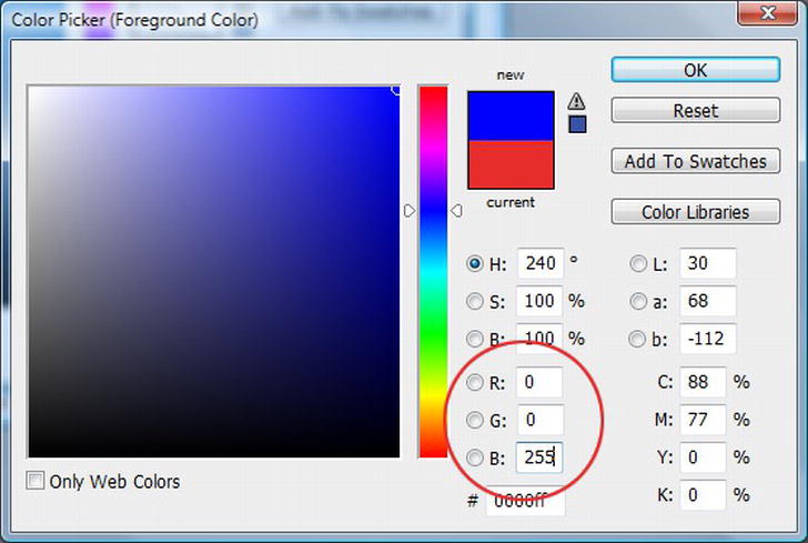
Figure 11-1. Color picker in Photoshop
We’re used to describing color, such as pure blue for example, with CSS in one of three different ways: the name, shorthand hex code, and full hex code.
color: blue;

color: #00f;

color: #0000ff;
To implement color using RGB, you use the rgb keyword followed by the RGB values in brackets. To describe pure blue using RGB, we can use numerical or percentage values for red, green, and blue. The RGB value is actually part of CSS 2.1 but hasn’t been commonly used until recently. Here are both the numerical and percentage values (note that the rest of the examples will use the numerical value).
color: rgb(0,0,255);

color: rgb(0,0,100%);

/* color: rgb(red, green, blue); */
Note: Don’t forget that rgb doesn’t just have to be used with the color property; you can use it in your CSS anywhere that you declare a color value, such as background and border-color.
You can start using RGB values in your work right away. It’s supported in all browsers from IE6, Safari 3, Firefox 3, Chrome, and Opera 10 upwards.
RGBa transparency
By adding a fourth value to your property, you can control the transparency. The fourth value, the “a” in RGBa, stands for alpha. Its function is exactly the same as changing the alpha channel in Photoshop.
To implement RGBa, you need to change your rgb keyword to rgba; this allows us to set the transparency. The ‘a’ (alpha) value is set by adding a number between 0 and 1 (where 0 is fully transparent and 1 is fully opaque). The value 0.6 is equivalent to setting the transparency at 60%.
color: rgba(0,0,255,0.6);

/* color: rgba(red, green, blue, alpha); */
Figure 11-2 shows varying values of alpha transparency from fully opaque (1) to fully transparent (0).

Figure 11-2. RGBa transparency in action
A number of high profile sites have started using RGBa. One of the best examples is 24 Ways (http://j.mp/24ways.org2) designed by Tim Van Damme (http://j.mp/timvd3) (Figure 11-3).
__________

Figure 11-3. The 24 Ways site is built with heavy use of RGBa.
Browser support for RGBa isn’t as far ranging as it is for RGB. It is supported in all the browsers stated earlier, with the exception of IE 6-8. It is supported in IE9, however. To cater for those less capable browsers, add a solid color fallback into your style rule.
a {

  color:rgb(0,0,255); /* Fallback for less capable browsers */

  color:rgba(0,0,255,0.6);

}
Browsers apply the last property they understand, so adding the RGBa keyword last ensures that more capable browsers will apply the transparency. Those that don’t understand RGBa will simply ignore it and implement the property they do understand (the first color value). In cases where you can’t make do with a solid color, you can add a fallback PNG in just the same way.
article {

  background:url(white50.png); /* Fallback for less capable browsers */

  background:rgba(255,255,255,0.6);

}
Having the ability to edit alpha transparency without the use of images means we can apply it to borders and outlines as well. Plus, editing only your CSS when changes are required is easier and quicker than returning to Photoshop to update multiple images. Finally, as a fortunate side effect, the number of server requests is reduced (because you’re not loading images), which will make your site faster.
HSLa
An alternative method for adding color using CSS3 is to use HSLa (hue, saturation, lightness, and alpha). HSL is more intuitive than RGB. You can make an informed guess at the initial color by thinking about a color wheel and then adjusting the saturation and lightness values until we find the exact shade we’re after.
The hue value is represented by a value of 0-360 degrees. Looking at the color wheel in Figure 11-4 we can see that red is represented by 0 and 360 degrees with the other two primary colors at 120 degree intervals (green = 120 and blue = 240).

Figure 11-4. HSLa color wheel from blulob.com
The second value in the HSL notation is for saturation, or the intensity of a particular color. It is a percentage value described as the colorfulness compared to grey where 0 is grayscale and 100% is full color saturation. The third value represents lightness and is specified as a percentage with 0 being dark or black, 50% as normal lightness, and 100% as white.
To achieve pure red using HSLa, we need to combine the three values for hue (0 or 360 degrees), saturation (100%, full saturation), and lightness (50%, normal lightness). In addition, the alpha channel should be set to 1 to ensure the color is fully opaque.
hsla(0,100%,50%,1)

/* hsla (hue, saturation, lightness, alpha) */
Note: HSLa color values are a mix of degrees and percentages plus an alpha channel.
Figure 11-5 shows a number of variations of the pure red example created by editing the respective values for hue, saturation, lightness, and alpha. It’s worth trying this out for yourself to get the idea; a black and white book doesn’t always convey the full effect.

Figure 11-5. Demonstration of how to achieve color variations using HSLa
As with RGBa, HSLa is supported by most major browsers (including IE 9) with the exception of IE 6-8.
Calculating RGB values can be difficult for a designer working only with CSS. In contrast, HSL allows us to choose one color for the hue (a value between 0-360) and then refine it using the saturation and lightness values. This is all with a minimum of fuss and saves having to keep skipping back into Photoshop to check that the color values are correct.
Note: The HSL Color Picker (http://hslpicker.com/) by Brandon Mathis is exactly that—a handy little tool for picking a hue and adjusting the saturation and lightness. It also provides the hex and rgb equivalents of the color you choose.
Opacity
Alpha transparency is not the only way of creating see-through elements; an alternative approach is to use the opacity property. It works in a similar way to the alpha channel in RGBa or HSLa by taking a value between 0 and 1—the difference being that it is the only value specified for the property. This means you still need to declare the color using another property such as background-color or color. To set an article’s background to be 50% opaque, we would use:
article {

  background-color:#fff;

  opacity:0.5;

}
The problem, as you can see in Figure 11-6, is that when opacity is set, it affects the transparency of all child elements contained within the parent. RGBa and HSLa, in contrast, only affect the element and property to which it is applied.

Figure 11-6. The left shows the article without opacity and the right with 50% opacity applied.
Given the choice, on most occasions you’ll want to use RGBa or HSLa for adding transparency. Opacity can be useful when you want an element to fade into the background until it’s interacted with (ads or forms for example).
Using and changing opacity values in conjunction with pseudo classes such as :hover or :focus can be effective. You can also use it for visited links and fade them into the background once visited. The same effect could be achieved using RGBa or HSLa but if links are in multiple colors on your site, using opacity will target them all without you needing to write rules for each color instance.
a:visited {

  opacity:0.5;

}
Figure 11-7 shows this in action.

Figure 11-7. An example of opacity at 50% for visited links (in this instance “many animals were propelled heavenwards”)
Note that opacity works in all browsers except for IE 6-8. There are specific filters available to get opacity working in IE but, as highlighted in Chapter 7, we would only use them as a last resort.
As we’ve seen, CSS3 provides new ways of adding and adjusting color in our designs. You’ve seen how to implement opacity, the RGB and HSL color models, and how to add alpha transparency. When and where you use RGBa, HSLa, and opacity is up to you but without a doubt all three have their place in our bag of CSS goodies.
Backgrounds
One of the most interesting CSS3 modules with a wide range of implementations is the Background and Borders module (http://j.mp/css3background4), currently a Candidate recommendation. We’ll come back to borders later in the chapter but in the meantime, let’s discuss background clipping, multiple backgrounds, and the option to set background size.
__________
background-clip
We’re used to seeing backgrounds extending into their borders (Figure 11-8). Introduced in the Background and Borders module is the background-clip property, which allows us to specify whether the background extends into the border or not.
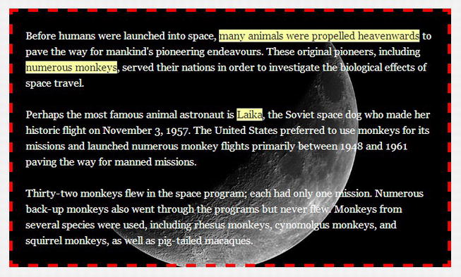
Figure 11-8. Background image extending into the border of an element
background-clip can take the following three values:
border-boxpadding-boxcontent-box
The border-box value is the default should background-clip not be declared (Figure 11-8).
Adding the padding-box value to the property clips the background to render inside the border.
#introduction {

  border:5px dashed rgb(255,0,0);

  background:rgba(255,255,255,0.7) url(img/bg-moon.jpg) 50% 50%;

  padding:0 20px;

  color:rgb(255,255,255);

  -moz-background-clip:padding;

  background-clip:padding-box;

}
Figure 11-9 shows the background rendered inside the border. Opera 10.5+, IE 9+, Safari 5+, Firefox 4+, and Chrome 5+ all implement the background-clip property without a vendor prefix.

Figure 11-9. CSS3 background-clip property with the padding-box value applied
The third value, content-box, clips the background to the box’s content area (Figure 11-10), which is the area inside the padding.
#introduction {

  border:5px dashed rgb(255,0,0);

  background:url(img/bg-moon.jpg) 50% 50%;

  padding:0 20px;

  color:rgb(255,255,255);

  background-clip:content-box;

}

Figure 11-10. CSS3 background-clip property with the content-box value applied
background-origin
background-origin allows us to specify the starting point for the background position of a given element. It can take the same values as background-clip. For example, if your background is positioned top left (0,0), the default padding-box (Figure 11-11) value positions the background to the outer edge of the padding (also the inner edge of the border).
#introduction {

  border:5px dashed rgb(255,0,0);

  background:url(img/bg-moon.jpg) 0 0;

  padding:0 20px;

  color:#fff;

  background-clip:border-box;

  background-origin:padding-box;

}

Figure 11-11. CSS3 background-origin property with the padding-box value applied
As with background-clip, background-origin is supported natively in Opera, Safari, Firefox, Chrome, and IE 9.
Note: The values for background-clip and background-origin don’t have to be the same.
The border-box value positions the background to the outer edge of the border (Figure 11-12). Depending on the width of your border, this change can be very subtle.
#introduction {

  border:5px dashed rgb(255,0,0);

  background:url(img/bg-moon.jpg) 0 0;

  padding:0 20px;

  color:#fff;

  background-clip:border-box;

  background-origin:border-box;

}

Figure 11-12. CSS3 background-origin property with the border-box value applied
The final value that background-origin can take is content-box, which sets the background starting point to the edge of the content, or the inner edge of the padding (Figure 11-13).
#introduction {

  border:5px dashed rgb(255,0,0);

  background:url(img/bg-moon.jpg) 0 0;

  padding:0 20px;

  color:#fff;

  background-clip:border-box;

  background-origin:content-box;

}

Figure 11-13. CSS3 background-origin property with the content-box value applied
Although sometimes barely noticeable, you may find background-origin to be a worthwhile alternative to using pixel positioning for your background images, depending on the effect you want to achieve.
background-size
The background-size property can be used to simplify one of those issues that web designers have been wrestling with since time (OK, maybe just the Internet) began. The problem: the need for full size background images, regardless of browser window size or screen resolution, without having to rely on Flash or JavaScript. The solution: the background-size property.
As the name suggests, it allows you to specify the size of the background image across a container in both the X (horizontal) and Y (vertical) axis. This means that if you are building a fluid design, you can use background-size to make sure that any background images you are using scale according to the size of the viewport or width of the browser.
It can take two values for width and height as well the keywords auto, contain, and cover. Width and height values can be expressed as pixels or percentages. The first value is the width, the second the height. Setting background-size to 85% gives us the effect shown in Figure 11-14.
html {

  background-image:url(img/earth1.jpg);

  background-position:50% 50%;

  background-repeat:no-repeat;

  background-attachment:fixed;

  background-size:85% 85%;
  /background-size: width height */

}

Figure 11-14. CSS3 background-size property with the width and height at 85%
You don’t have to set a height value; in fact, if no height is set, the default value is auto. In this case, this has a minimal effect.
Similar to the aforementioned background properties, Opera, Safari, Firefox, Chrome, and IE 9 all support background-size.
The contain keyword scales the background and preserves its aspect ratio. The background will take the largest size in which its width and height can fit inside the element to which it is applied (in our case the html element). This ensures that no part of the image is clipped when using contain. If your container is too large for the image, you must make sure that your image fades to a flat color that you can use as your background default (Figure 11-15). You can “contain” either the X or the Y axis using comma-separated values (e.g. contain, 250px) or both using the contain keyword on its own.
In addition, if no width and height values are set, they are both assumed to be auto and the backgrounds size takes the same effect as using contain.
html {

  background-image:url(img/earth1.jpg);

  background-position:50% 50%;

  background-repeat:no-repeat;

  background-attachment:fixed;

  background-size:contain;

}
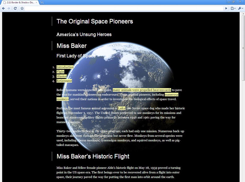
Figure 11-15. CSS3 background-size property with the contain value applied
The cover keyword, on the other hand, always takes over the whole background of the element. It will resize as the browser window changes size and shape but may clip a few edges of the image (Figure 11-16).
html {

  background-image:url(img/earth1.jpg);

  background-position:50% 50%;

  background-repeat:no-repeat;

  background-attachment:fixed;

  background-size:cover;

}

Figure 11-16. CSS3 background-size property with the cover value applied
Stephanie Rewis takes an in-depth look at background-size in an article in .net magazine (http://j.mp/bgsize5) and links to a helpful tool created by her husband Greg for testing the cover and contain keywords (http://j.mp/bgsizetool6). Using this quickly illustrates how the different keywords create different effects.
__________
In addition, in an article for A List Apart (http://j.mp/supersizebg7), Bobby van der Sluis explains how you can combine background-size and media queries (see Chapter 9) to ensure that your background doesn’t scale down too small at lower screen resolutions. Be sure to try check out the article and implement some of Bobby’s techniques.
Finally, a useful reference for all background properties, values, browser support, and more is Estelle Weyl’s in-depth guide to “Everything you could possibly want to know about CSS Background Properties: Interpreting the w3c specifications with browser support and links to examples and test cases” (http://j.mp/estellebg8). Well, perhaps it’s not quite everything as it doesn’t cover multiple backgrounds that we’ll look at next.
Multiple backgrounds
No doubt you’ve seen sites such as Clearleft’s Silverback App (http://j.mp/gorillaux9) holding page (Figure 11-17). Created by Paul Annett (http://j.mp/nicepaul10) the site layers a few divs positioned using percentages with differing PNG transparent backgrounds to create the illusion of depth. When the browser window is resized, the user sees a parallax (http://j.mp/whatisparallax11) effect as the background images move to retain their proportion inside the browser.
Effects such as this tend to create a lot of unnecessary markup that doesn’t have any meaning (due to being held in divs). What if we could do away with that extraneous markup? Well, guess what? With CSS3 multiple backgrounds, we can.
__________

Figure 11-17. The original holding page for Clearleft’s Silverback app
Specified in the CSS3 backgrounds and borders module is the ability to add multiple backgrounds to a single element. The number of comma-separated values for the background-image or shorthand background property defines the amount of backgrounds applied. We’ll show you examples using both background-image and background, so don’t worry about getting confused between the two. For these examples, we’re going to use three images (Figure 11-18) and layer them atop each other in front of a full page background.

Figure 11-18. The three individual images
Firstly, let’s look at our CSS so far. We’ve set a background image on the html element and set its background-size property to cover the entire browser window (Figure 11-19).
html {

  height:100%;

  background-image:url(img/bg-cosmos.jpg);

  background-repeat:no-repeat;

  background-attachment:fixed;

  background-size:cover;

}

Figure 11-19. Your starting point: the background applied to the html element.
Now we’re going to add the multiple backgrounds to the body element. We could add them to the html element as well but using another element provides easier maintenance and a better fallback for less capable browsers.
To add our first background image, we’ll use the standard notation that you’re used to seeing in CSS 2.1. The body’s height is set to 100% to ensure it is tall enough for our image to fit.
body {

  height:100%;

  background-image:url(img/planet1.png);

  background-repeat:no-repeat;

  background-position:50% 30%;

}
Figure 11-20 shows this first background image in position.

Figure 11-20. One background image applied to the body element
To add our second background to the body element, we add an additional value for each background property separated from the first by a comma. We then repeat the steps for the background-repeat and background-position properties.
body {

  height:100%;

  background-image:url(img/planet1.png), url(img/planet2.png);

  background-repeat:no-repeat, no-repeat;

  background-position:50% 30%, 15% 90%;

}
Notice how the second image has appeared underneath the first (Figure 11-21). This is defined in the specification:
The first image in the list is the layer closest to the user; the next is painted behind the first, and so on. The background color, if present, is painted below all of the other layers.
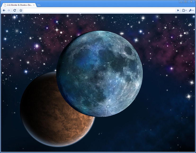
Figure 11-21. Two background images applied to the body element.
As you’ve seen, when declaring multiple values, each value within each property is separated with a comma. We can, however, simplify our example slightly by removing one of the no-repeat values for background-repeat. This is because if no multiple (second in this case) value is applied, the browser is told to repeat the first value.
body {

  height:100%;

  background-image:url(img/planet1.png), url(img/planet2.png);

  background-repeat:no-repeat;

  background-position:50% 30%, 15% 90%;

}
To contrast that, if we accidentally forgot to add our second background-image value but did include two background-position values, the browser will render another instance of our first background image repeated in both positions (Figure 11-22). This is because the browser is repeating the first value of the background-image property.
body {

  height:100%;

  background-image:url(img/planet1.png); /* Oops we've forgotten to add our second image! */

  background-repeat:no-repeat;

  background-position:50% 30%, 15% 90%;

}

Figure 11-22. Two instances of one background image
Not wanting to make that mistake again, let’s make sure that we add all our background values when adding the third image. This time we’re going to use shorthand CSS notation using the background property. It works in exactly the same way; you just separate each set of values with a comma.
body {

  height:100%;

  background:url(img/planet1.png) 50% 30% no-repeat, url(img/planet2.png) 15% 90% no-repeat,

url(img/planet3.png) 75% 20% no-repeat;

}

Figure 11-23. Three background images applied to the body element.
There you have it: three background images applied to a single element (Figure 11-23). The beauty of using percentage values is that when you resize the browser, the images will start to move around and hide behind each other (Figure 11-24), just like the parallax effect in the Silverback site.
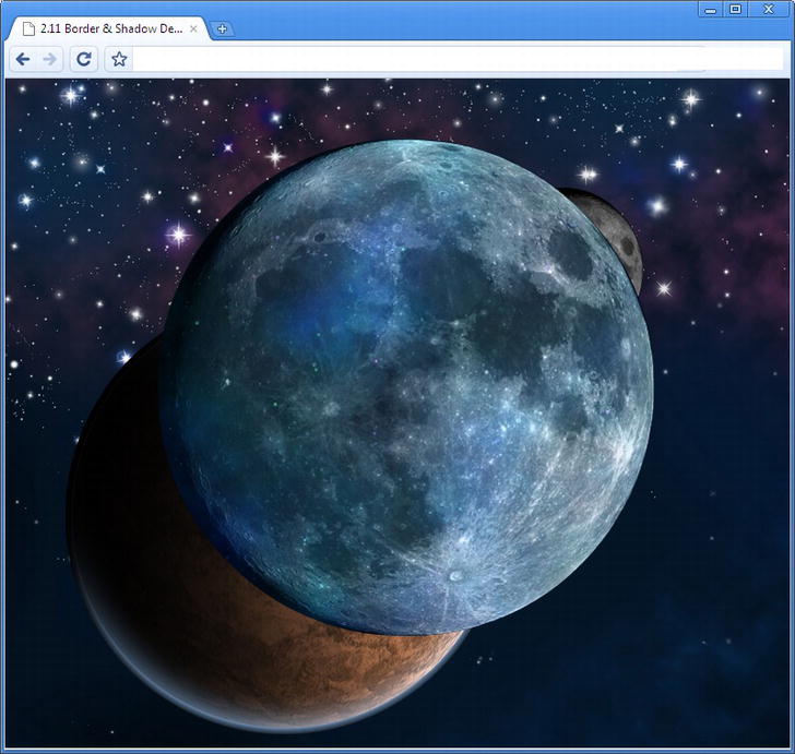
Figure 11-24. Multiple backgrounds in a small browser window
Browser support for multiple backgrounds is wide ranging. It works natively in Safari 5, Chrome 5, Opera 10.5, Internet Explorer 9, and Firefox 3.6. There is a gotcha, though (isn’t there always?). If a browser doesn’t support multiple backgrounds, it won’t render any of them. For this reason (and dependant on your design) you may want to declare the most important background image on its own line to ensure at least one of your backgrounds is rendered.
body {

  height:100%;

  background:url(img/planet1.png) 50% 30% no-repeat;

  background: url(img/planet1.png) 50% 30% no-repeat , url(img/planet2.png) 15% 90% no-repeat,

url(img/planet3.png) 75% 20% no-repeat;

}
It’s a relatively straightforward technique you can start using today. Remember that you don’t have to just use multiple background images on html or body; they can be applied to any element. Patrick Lauke has created an example of how to recreate the sliding doors effect using CSS3’s multiple backgrounds (http://j.mp/laukedoors12) (Figure 11-25). Rather than using different background images on different parts of the markup, like Douglas Bowmans 2003 original (http://j.mp/aladoors13), Patrick simply uses multiple backgrounds on the element for the left, right, and central background images.

Figure 11-25. Patrick Lauke’s multiple background sliding doors example
Of course Patrick’s example could be created a lot more easily if only we had a way to easily make round cornered boxes … oh, how convenient! The next section covers the other half of the Background and Borders module: borders.
Borders
The call of web designers around the world has been heard. No longer shall we have to battle through the monotony of adding extraneous markup or slicing extra images simply to create those little details such as a rounded corner to make our design that bit more persuasive. Behold border-radius, for it provides us with the ability to add native round corners using only the power of CSS.
The Backgrounds and Borders module simply can’t stop giving, don’t you think? It also gives us the ability to add images to our borders, as we’ll see later. First, let’s look at implementing border-radius.
border-radius
Adding rounded corners to any element can now be achieved by simply writing a few short lines of CSS. No longer do we have to add extra spans to our markup or use JavaScript to recreate what should be a quite straightforward task. The shorthand border-radius property is here, along with properties for individual corners such as border-top-left-radius.
Digging deep to remember that a radius is half the diameter of a circle (Figure 11-26), we can achieve equal round corners on an element by specifying a single value for each corner.
#introduction {

  border-top-left-radius: 20px;

  border-top-right-radius: 20px;

  border-bottom-right-radius: 20px;

  border-bottom-left-radius:20px;

}
__________
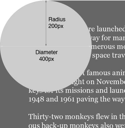
Figure 11-26. Radius is half the diameter of the circle.
This markup works without a vendor prefix in Chrome 5, Safari 5, Firefox 4, Internet Explorer 9, and Opera 10.5.
Note: If you don’t fancy writing those long-hand values for all browsers yourself, you can always automate the process using a tool like http://border-radius.com. Input your corner values and it will create the CSS for you.
Rather than always writing out four properties for each individual corner, we can use the shorthand border-radius property just like we can with margin and padding. Our simplified markup looks like this:
#introduction {

  border-radius:20px 20px 20px 20px;

}
You’ve probably now guessed that just like margin and padding can use one, two, three, or four values when writing the shorthand CSS (see Chapter 7). They affect the corners like so:
- One value: All four corners have the same radius.
- Two values: The first value is top left and bottom right, the second value is the top right and bottom left.
- Three values: The first value is top left, the second value is the top right and bottom left, and the third value is the bottom right.
- Four values: In the order of top left, top right, bottom right, bottom left.
Because the border radius for all corners in our example is the same, we can reduce our rule to the following:
#introduction {

  border-radius:20px;

}
The previous three examples all achieve the same result (Figure 11-27), we’ve just simplified the code using the shorthand property and values.

Figure 11-27. Box with equal border-radius
The border-radius values can be applied as ems, pixels, and percentages. It can also be applied with a background image present (Figure 11-28).
#introduction {

  background:rgba(0,0,0,0.3) url(img/bg-moon.jpg) 50% 50%

no-repeat;

  border-radius:2em;

}

Figure 11-28. Box with border-radius and background image
To complicate matters (but also to make the property more flexible and useful), a border radius can have two length values: one for the X axis (horizontal) and one for the Y axis (vertical). This allows us to create elliptical shapes. The horizontal and vertical values are separated by a forward slash (/) placed between them. The value(s) before the slash are for the horizontal radius and the values after the slash are for the vertical radius. Figure 11-29 shows the results.
#introduction {

  background:rgba(0,0,0,0.3) url(img/bg-moon.jpg) 50% 50%

no-repeat;

  border-radius:2em / 6em;

}

Figure 11-29. Box with border-radius and different values for horizontal and vertical radius
You can have different radii for each corner in the horizontal and vertical if you wish. This can be written using the shorthand border-radius and declaring eight values (four and four separated by a slash) or using the individual corner properties (border-top-left-radius) with two values space separated without a slash. These two examples have the exact same effect on the div (Figure 11-30).
Shorthand:
#introduction {

  background:rgba(0,0,0,0.3) url(img/bg-moon.jpg) 50% 50%

no-repeat;

  border-radius:2em 4em 6em 8em / 9em 7em 5em 3em;

}
Individual corner properties:
#introduction {

  background:rgba(0,0,0,0.3) url(img/bg-moon.jpg) 50% 50%

no-repeat;

  border-top-left-radius: 2em 9em;

  border-top-right-radius: 4em 7em;

  border-bottom-right-radius: 6em 5em;

  border-bottom-left-radius: 8em 3em;

}

Figure 11-30. Box with different border-radius values for horizontal and vertical radius on each corner
APPLYING BORDER-RADIUS DIRECTLY TO THE IMG ELEMENT
A word of caution if you want to apply border-radius directly to the img or video elements: the border radius doesn’t clip the image correctly (Figure 11-31) in any browser. The best solution is to work around it by applying the styles to the outer figure or div instead.
Figure 11-31. border-radius directly on an img element
Remember that you don’t have to just style divs, articles, or sections with border-radius; it can also be applied to anchors, inputs, or even tables. If you’re really feeling the border-radius love, there’s nothing stopping you from going whole hog and creating circles, ellipses, or more to really spice up your designs.
border-image
Border image, as you might expect, allows you to specify an image to act as an elements border. We’re going to explain the shorthand version of border-image but if you want to use the specific properties on their own, detail is provided in the Background and Borders module (http://j.mp/css3background14).
Border images are created using a single image that is then sliced and repeated or stretched along various axis with the border around the element. In other words, the image is divided (or sliced) into nine slices using four lines, just as if you were creating a naughts and crosses board, as in Figure 11-32.

Figure 11-32. Border image with nine slices overlaid
The four corner slices are then used to create the four corners of the elements border. The four remaining edge slices are used by border-image to fill in the four sides of the elements border. You then specify the width of the slice and whether you want them to repeat or stretch to span the entire length of the element’s side. The central slice, if not blank, will fill the background of the element to which the border-image is applied.
The basic border-image property syntax is
border-image: <image> <slice> <repeat>
where
imageis the URL of the image to be used a border.sliceis up to four values in either percentages or numbers for the size of a slice.repeatis the way in which the border should be treated in order to repeat. This can take two values fromround,stretch,space,andrepeat.
__________
Note: The slices don’t have to be equal and the sizes are entirely up to the author. For further detail consult the border image section of the spec (http://j.mp/borderimage15).
In Figure 11-32, each tile is 15px wide. This is the slice value that we’ll use with the border-image property. Because of this, we’ll also declare the border-width property to 15px. We want the edge tiles to repeat so we’ll use the repeat keyword.
Taking all of the above into consideration, to apply the border image shown in Figure 11-33, use the following code:
#introduction {

  border-width:15px;

  border-image:url(img/border1.png) 15 15 15 15 repeat;

}
The result is shown in Figure 11-33.

Figure 11-33. Border image applied in Opera
__________
Because of the size of our div, using repeat isn’t very effective and some of the pattern disappears behind the corner images. However, as previously mentioned, there are four stretch options available to us
round: The image repeats to fill the area. If a whole number of tiles doesn’t fit, the image is scaled accordingly.stretch: The image is stretched to fill the area.repeat: The image repeats to fill the area.space: The image repeats to fill the area. If a whole number of tiles doesn’t fit, the images are spaced to fill the area.
We can add up to two values for the repeat: the first for the horizontal borders and the second for the vertical borders. We’re now going to apply the stretch and round values to our example. Because our slices are equal, we can also reduce the number of slice values from four to one.
#introduction {

  border-width:15px;

  -moz-border-image:url(img/border1.png) 15 stretch round;

  -webkit-border-image:url(img/border1.png) 15 stretch round;

  border-image:url(img/border1.png) 15 stretch round;

}
Figure 11-34 shows how the stretch and round values have been applied to our div.

Figure 11-34. Border image applied with stretch and round keywords in Opera.
Opera, Chrome, Safari, and Firefox support the border-image property. Internet Explorer currently doesn’t support border-image and as yet support isn’t included in any of the IE 10 platform previews.
Note: Eric Meyer, a man who knows a thing or two about CSS, wrote a post in January, 2011 entitled “Border Imaging” in which he set a challenge to readers to create a border using a single 5px by 5px image. What’s interesting is that with the spec as it stands, this isn’t possible, but it is entirely plausible to think it should be. Just remember how Microsoft Publisher allowed you to add borders. Reading the comments, it doesn’t seem like the spec is going to change. However, the blog post, comments, and mailing list entry all make for interesting reading (http://j.mp/meyerborder16).
Being thoughtful, diligent craftsmen, you are no doubt wondering what happens when you combine border-image with border-radius. Well, as you can see in Figure 11-35, the border image remains in place while the radius is applied to the background. To get around this issue should your design require it, simply re-create the round corners in the four corner slices of your border image graphic.

Figure 11-35. border-image applied with border-radius
While there’s much fun to be had creating crazy border images, be sure that you don’t step back into a parallel universe made up of geocities-style designs built with CSS3.
__________
Drop shadows
Ah, drop shadows. Every designer’s “must have” when dreaming up their creative concepts. Here’s a pro tip for you about shadows: if and when a designer uses default drop shadows in their Photoshop comps, get a new designer.
Once, along with rounded corners and gradients, adding shadows to boxes was a nightmare. With the box-shadow property in CSS3’s backgrounds and borders module, this is no longer the case.
box-shadow
Adding box-shadow to an element is quite simple. It can take up to six values: a horizontal offset (X), a vertical offset (Y), a blur, a spread distance, a color, and an optional inset keyword to turn the shadow from an outer one to an inner one.
box-shadow:inset [offsetX offsetY <blur> <spread> <color>];
This sounds complicated so let’s ease into it by looking at the minimum requirements for box-shadow, which are the two offset values. If you wish, you can use negative offset values. Positive values draw the shadow to the right and down, respectively, while negative values go up and to the left. The combination you choose is up to you (and where your fake light source is coming from!).
#introduction {

  border:5px solid rgba(0,0,0,0.7);

  background:rgba(255,255,255,0.7);

  padding:0 20px;

  border-radius:20px;

  box-shadow:15px 15px;

}
By not including a color value, box-shadow will adopt a color specified by the browser, so let’s add a color to the example by using rgba.
#introduction {

  border:5px solid rgba(0,0,0,0.7);

  background:rgba(255,255,255,0.7);

  padding:0 20px;

  border-radius:20px;

  box-shadow:15px 15px rgba(0,0,0,0.4);

}
Without specifying a blur radius value, the shadow will not blur so the edge will be sharp. The blur radius is the third value in our notation (in this instance 10px). You can’t use negative values for the blur radius.
#introduction {

  border:5px solid rgba(0,0,0,0.7);

  background:rgba(255,255,255,0.7);

  padding:0 20px;

  border-radius:20px;

  box-shadow:15px 15px 10px rgba(0,0,0,0.4);

}
Note: If you’re interested in learning more about blur radius, how it works, and what it means, David Baron of Mozilla has a detailed write-up on his blog at http://j.mp/blurradius17.
The next value you’ll add is the spread radius, and the bigger the value, the more the shadow expands. Unlike the blur radius, you can use negative spread values. If no spread value is included, the shadow will not spread. We’ve set our spread radius value to 5px (Figure 11-36).
#introduction {

  border:5px solid rgba(0,0,0,0.7);

  background:rgba(255,255,255,0.7);

  padding:0 20px;

  border-radius:20px;

  box-shadow:15px 15px 10px 5px rgba(0,0,0,0.4);

}
Values can be pixels or ems for the offset, blur, and spread. Opera, Safari, Chrome, Firefox, and Internet Explorer 9 all support box-shadow.

Figure 11-36. box-shadow working without a vendor prefix in Opera 10.6.
__________
The final value to look at is the inset keyword, which places the shadow inside of the element. You can see this in action in Figure 11-37: as the shadow is now inside the element, we’ve reduced its size.
#introduction {

  border:5px solid rgba(0,0,0,0.7);

  background:rgba(255,255,255,0.7);

  padding:0 20px;

  border-radius:20px;

  box-shadow:3px 3px 3px 2px rgba(0,0,0,0.4) inset;

}
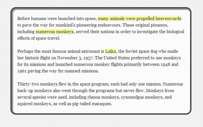
Figure 11-37. An internal box-shadow using the inset keyword in Opera 10.6.
There is a handy app (http://j.mp/thany18) created by Thany that allows you to view the differences in renderings of box shadows in different browsers. You simply check the browsers you wish to see and view the examples. Currently you can view Firefox 3.6 and 4, Internet Explorer 9, Chrome 10, Safari 5, Opera 11.10, Android 2.2, iOS 4.2, and Opera Mobile 11.
The fun with shadows doesn’t stop here. You can have multiple shadows by simply separating each shadow with a comma (see Figure 11-38).
__________
div#introduction {

  border:5px solid rgba(0,0,0,0.7);

  background:rgba(255,255,255,0.7);

  padding:0 20px;

  border-radius:20px;

  box-shadow:3px 3px 3px 2px rgba(0,0,0,0.4) inset, 15px 15px 10px 5px rgba(0,0,0,0.4);

}
Figure 11-38. Multiple box-shadows in Opera 10.6
Note: Using too many shadows can affect site performance. The issue is seen when a user scrolls: the scrolling lags. Grant Lucas has written up his findings on his blog (http://j.mp/grantlucas19). This issue seems to have been resolved in newer versions of browsers but you should test thoroughly in a range of browsers for similar types of issues. This is what Andy Edinborough found when testing a site, although this time border-radius was the culprit. To that end, Andy created a CSS Stress Test bookmarklet which allows you to identify the cause of performance issues. You can read more about CSS Stress Test on Andy’s blog (http://j.mp/cssstresstest20).
__________
Finally, as mentioned, you can also use negative offset values and invert the shadow, giving the effect of a light source coming from a different direction (Figure 11-39).
div#introduction {

  border:5px solid rgba(0,0,0,0.7);

  background:rgba(255,255,255,0.7);

  padding:0 20px;

  border-radius:20px;

  box-shadow:-3px -3px 3px 2px rgba(0,0,0,0.4) inset, -15px -15px 10px 5px rgba(0,0,0,0.4);

}

Figure 11-39. Negative box-shadows in Opera 10.6
There are myriad opportunities with CSS3’s box-shadow property. In fact, the team at Viget wrote an article entitled “39 Ridiculous things to do with CSS3 Box Shadows” (http://j.mp/39shadows21) in which they demo 39 box shadow variations, each with a unique name. Our favorites are the “Soft Focus” and naturally, the “Batman.” Nicolas Gallagher, with inspiration from author Divya Manian and Matt Hamm, looks at creating page curl effects and more in his article “CSS drop-shadows without images” (http://shadowmagic22) in which he uses the :before and :after pseudo-elements to position the shadows. Clever indeed.
__________
Ultimately, although there is some fun to be had, the key with box-shadow is not to abuse it, to use it subtly, and certainly don’t make it look like Photoshop’s default drop shadow.
text-shadow
We’ve already seen the box-shadow property; unsurprisingly text-shadow is spookily similar. It’s part of CSS 2.1; however, it appears to have attracted more attention with the rise of CSS3. You can apply one or several shadows to text using the same notation as box-shadow, namely horizontal offset, vertical axis offset, blur, and color. Note that there is no spread value or inset keyword for text-shadow.
h1 {

  color:#777;

  text-shadow: 5px 5px 10px rgba(0,0,0,0.5);

  /* text-shadow: x offset y offset blur color; */

}
You can see the example code applied in Figure 11-40.

Figure 11-40. text-shadow in Chrome
As with box-shadow, you can apply multiple shadows to your elements. There is no inset keyword to help us create internal shadows. By thinking around the problem and using multiple text-shadows, some with negative values, we can achieve the look of letterpress (or inset) typography (Figure 11-41).
h1 {

  text-shadow: -1px 0 0 rgba(0,0,0,0.5), 0 -1px 0 rgba(0,0,0,0.3), 0 1px 0

rgba(255,255,255,0.5), -1px -2px 0 rgba(0,0,0,0.3);

}

Figure 11-41. Letterpress typography created using text-shadow
Although text-shadow was introduced in CSS 2.1, Internet Explorer doesn’t support it natively just yet but it will be in IE 10. If you really have to have text shadows in IE, you can render them using proprietary Microsoft filters. More often than not, it’s likely you can live without IE users seeing a shadow or two in the name of progressive enhancement. Opera, Safari, Chrome, and Firefox all support text-shadow.
Before we finish with text-shadow, we’ll leave you with a little something to get you thinking. Why not use text-shadow to create some faux anaglyphs and make your site really “pop” in 3D (Figure 11-42. Download the example files to see this in glorious technicolor!)?
.anaglyph {

  color:rgba(0,0,0,0.8);

  text-shadow: 0.1em 0 0 rgba(0,245,244,0.5), -0.05em 0 0 rgba(244,0,0,0.9);

}

Figure 11-42. Faux 3D anaglyph using CSS3 text-shadow
The anaglyph is nice but who wears 3D glasses to view web sites? What we need is real 3D, and that’s just what Mark Otto, has done (Figure 11-43). Mark’s demo uses a total of 12 shadows on the text so it may have some performance issues in some browsers, but it does look great. Mark has written up the experiment on his blog (http://j.mp/3dshadow23), which we suggest you delve into.

Figure 11-43. 3D text by Mark Otto using CSS3 text-shadow
For our final trick with text-shadow, we’ll use it to create an outline around the text. The trick is to apply a shadow to each side of the text. In order for the effect to work, we have to declare a color value for the text that matches the background color to create the transparent effect (Figure 11-44).
.title {

  color:#ccc;

  text-shadow: -1px 0 rgba(0,0,0,0.5), 0 1px rgba(0,0,0,0.5), 1px 0 rgba(0,0,0,0.5), 0 -1px

rgba(0,0,0,0.5);

}.

Figure 11-44. WebKit browser using multiple text shadows to create an outline effect
__________
If your target audience is using only WebKit browsers (which it shouldn’t be), there is a proprietary –webkit-text-stroke property that will achieve the same effect as shown in Figure 11-44. Unlike text-shadow, there is no blur value. It works as follows but isn’t in any specification yet (there has been debate over whether the property should be named be text-outline or text-stroke):
h1 {

  color:transparent;

  -webkit-text-stroke:rgba(0,0,0,0.5);

}
Gradients
Here we are at the business end of the build it with CSS3 phenomenon: gradients. No longer will you be creating reams of single pixel-wide images to repeat through your designs. Perhaps more importantly, we won’t have to keep diving back into Photoshop or Fireworks to edit those graphics when we want to change the color or length of a gradient. We’ll simply be able to edit our CSS.
CSS Gradients reside in the CSS Image Values and Replaced Content module (http://j.mp/css3images24), which is currently in Working draft. This means that it’s another case of chicken and egg, or rather specification vs. implementation. Still, as we’ve shown so far in this book, implementation is generally the top trump, so let’s get stuck in.
Gradients
CSS-based gradients are currently supported by Firefox, Safari, Chrome, and Opera browsers and will be included in Internet Explorer 10. They can be achieved in older versions of Internet Explorer through the use of filters but, as you’ve heard from us before, this approach isn’t recommended. For browsers that don’t support CSS gradients, make sure that you specify a background color as a backup.
Gradients are available in two flavors: linear and radial. We’ll show you how to use both.
Linear gradients
We’ll start by introducing linear gradients. The linear-gradient value effectively generates an image that can be used in the same places as an image in CSS, such as background-image, border-image, or list-style-image properties. It was designed this way because people are familiar with using images for gradients; therefore a gradient can’t be used as a color value. The basic notation looks like this:
linear-gradient([ [ <angle> | to <side-or-corner> ] ,]?

        <color-stop>[, <color-stop>]+  )
__________
angle: The angle for the direction of the gradient (e.g., 90deg). You can use negative values or values greater than 360 degrees.side-or-corner: Defines the starting point of the gradient (if an angle isn’t used) and is specified by up to two keyword from the four available (top, bottom, left, right). The default value is top left and if only one value is declared the second value defaults to “center.”color-stop: In its simplest form, a color value. Optional stop position(s) along the gradient can be added as a percentage of value between 0% and 100%. The color value can be a keyword, hex code, orrgbaorhslanotation
If you think of a gradient being applied in Photoshop, CSS gradients work in just the same way with color stops being added along the gradient at varying positions from start (0%) to end (100%), as shown in Figure 11-45.

Figure 11-45. Example of color stops
To create a vertical gradient from grey to black, you would use:
#introduction {

  background:#000; /* fallback for browsers that don’t support gradients */

  background:linear-gradient(to bottom, #ccc, #000);

}
or:
#introduction {

  background:#000; /* fallback for browsers that don't support gradients */

  background:linear-gradient(90deg, #ccc, #000);

}
which is the same as writing
#introduction {

  background:#000; /* fallback for browsers that don't support gradients */

  background:linear-gradient(#ccc, #000);

}
This is because there is no need to declare an angle, side, or corner; the gradient will be vertical by default. All you need are two color values.
We must now confess that we did lie a little about it being the only markup we need to create the gradient, the reason being that none of the browsers mentioned earlier support gradients without a vendor prefix. So to create our gradient shown in Figure 11-46, we’ll add in the vendor prefixes.
#introduction {

  background:#000; /* fallback for browsers that don't support gradients */

  background:-ms-linear-gradient(#ccc, #000);

  background:-moz-linear-gradient(#ccc, #000);

  background:-o-linear-gradient(#ccc, #000);

  background:-webkit-linear-gradient(#ccc, #000);

  background:linear-gradient(#ccc, #000);

}
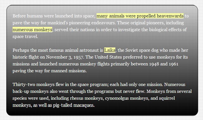
Figure 11-46. Vertical linear gradient in Firefox
You saw previously how a 90deg angle argument meant that the gradient was drawn from top to bottom. The angle value sets the angle of the gradient starting from the left where
- 0deg = left
- 90deg = bottom
- 180deg = right
- 270deg = top
- 360deg = left again, having completed a full circle
You can also use negative values for the gradient but they’ll be equivalent to a positive counterpart travelling counter clockwise (e.g., -90deg = 270deg). To create a gradient going from the bottom left to top right (as in Figure 11-47),we’ll use a 45 degree angle.
#introduction {

  background:#000;

  background:-ms-linear-gradient(45deg, #ccc, #000);

  background:-moz-linear-gradient(45deg,#ccc, #000);

  background:-o-linear-gradient(45deg, #ccc, #000);

  background:-webkit-linear-gradient(45deg, #ccc, #000);

  background:linear-gradient(45deg, #ccc, #000);

}

Figure 11-47. Diagonallinear gradient in Firefox
Color stops are added by simply adding another color value to the argument. Gradients are rendered evenly unless you specify a value to accompany the color stop. Figure 11-48 shows a color stop at 50% but you can also use pixels or ems to specify where the stop should appear.
#introduction {

  background:#000;

  background:-ms-linear-gradient(45deg, #ccc, #c8c8c8 50%, #000);

  background:-moz-linear-gradient(45deg, #ccc, #c8c8c8 50%, #000);

  background:-o-linear-gradient(45deg, #ccc, #c8c8c8 50%, #000);

  background:-webkit-linear-gradient(45deg, #ccc, #c8c8c8 50%, #000);

  background:linear-gradient(45deg, #ccc, #c8c8c8 50%, #000);

}

Figure 11-48. Diagonal linear gradient with color stop in Firefox
It’s worth spending some time creating test cases for gradients to see what affect changing the various values has in the browser.
Note: Safari 4 and Chrome from versions 3-9 used a different syntax for CSS gradients that only specified a single -webkit-gradient property. The type of gradient (linear or radial) then follows in the first parameter. The syntax is based on the canvas elements APIs notation. You can learn about this legacy syntax on the WebKit blog (http://j.mp/oldwebkitgrads25). If you have to support gradients in these older browsers, add the –webkit-gradient value before the now standardized linear-gradient values to ensure that newer WebKit browsers use the newer syntax, as shown below this note.
#introduction {

  background:#000;

  background:-webkit-gradient(linear, 0% 100%, 100% 0%, from(#ccc), to(#000), color-stop(0.5,

#c8c8c8));

  background:-ms-linear-gradient(45deg, #ccc, #c8c8c8 50%, #000);

  background:-moz-linear-gradient(45deg, #ccc, #c8c8c8 50%, #000);

  background:-o-linear-gradient(45deg, #ccc, #c8c8c8 50%, #000);

  background:-webkit-linear-gradient(45deg, #ccc, #c8c8c8 50%, #000);

  background:linear-gradient(45deg, #ccc, #c8c8c8 50%, #000);

}
__________
To stir your imagination about gradients and what’s possible, we suggest you investigate the highly creative CSS3 Patterns gallery created and curated by Lea Verou (http://j.mp/veroupatterns26). Lea also explains how to create patterns using gradients in an excellent article for 24 Ways (http://j.mp/veroupatterns227). You can also combine gradients with the multiple backgrounds that you looked at earlier in the chapter. You’ll be amazed at what you can achieve using CSS3 gradients.
Radial gradients
The syntax for radial gradients is ever so slightly more complicated than for linear gradients. Here is the standard notation:
radial-gradient(

  [ [ <shape> || <size> ] [ at <position> ]? , |

    at <position>,

  ]?

  <color-stop> [ , <color-stop> ]+

)
where:
positionis the starting point of the gradient, which can be specified in units (px, em, or percentages) or keyword (left, bottom, etc). Using a keyword works in the same way asbackground-positionand the default value is “center.”shapespecifies the gradient’s shape. It can becircle(constant-radius ellipse) orellipse(axis-aligned ellipse). The default value is ellipse. If no shape is declared, the end shape is inferred from the length units. If one length, the shape defaults to a circle; if two, an ellipse.sizeis the size of the gradient’s ending shape. If not included, the default isfarthest-side. Size can be set using units or keywords.closest-sidepositions the gradient so it touches the side or sides of the element nearest its center. If the shape is an ellipse, it meets the side in the horizontal and vertical.farthest-sideis the same asclosest-sidebut the ending shape is based on the farthest side.closest-cornerpositions the gradient so it touches the corner or corners of the element nearest its centre. If the shape is an ellipse, it meets the corner in the horizontal and vertical.farthest-corneris the same asclosest-cornerbut the ending shape is based on the farthest side.containis the same effect asclosest-side.coveris the same effect asfarthest-corner.
color-stopis in its simplest form a color value. Optional stop position(s) along the gradient can be added as a percentage of value between 0 %& 100%.
__________
This all sounds quite confusing so let’s get down to business and create some gradients. Just like with the linear gradients, you’ll need to include all your vendor prefixes.
To draw a simple circular radial gradient that stretches to the edge of your container (Figure 11-49), all you need to declare is:
#introduction {

  background:#000;

  background: -moz-radial-gradient(circle closest-side, #ccc, #000);

  background: -ms-radial-gradient(circle closest-side, #ccc, #000);

  background: -o-radial-gradient(circle closest-side, #ccc, #000);

  background: -webkit-radial-gradient(circle closest-side, #ccc, #000);

  background: radial-gradient(circle closest-side, #ccc, #000);

}

Figure 11-49. Circular radial gradient in Firefox
Try changing the shape and size values to ellipse and farthest-side to see what effect this has.
#introduction {

  background:#000;

  background: -moz-radial-gradient(ellipse farthest-side, #ccc, #000);

  background: -ms-radial-gradient(ellipse farthest-side, #ccc, #000);

  background: -o-radial-gradient(ellipse farthest-side, #ccc, #000);

  background: -webkit-radial-gradient(ellipse farthest-side, #ccc, #000);

  background: radial-gradient(ellipse farthest-side, #ccc, #000);
}
You can see this has squashed your circle into an ellipse with more reach (Figure 11-50).

Figure 11-50. Elliptical radial gradient in Firefox
By adding position values we can move the gradient off center (left top). We’ll also add an additional color stop at 200px (Figure 11-51).
#introduction {

  background:#000;

  background: -moz-radial-gradient(left top, ellipse farthest-side, #ccc, #75aadb 200px,

#000);

  background: -ms-radial-gradient(left top, ellipse farthest-side, #ccc, #75aadb 200px, #000);

  background: -o-radial-gradient(left top, ellipse farthest-side, #ccc, #75aadb 200px, #000);

  background: -webkit-radial-gradient(left top, ellipse farthest-side, #ccc, #75aadb 200px,

#000);

  background: radial-gradient(left top, ellipse farthest-side, #ccc, #75aadb 200px, #000);

}

Figure 11-51. Elliptical radial gradient in Firefox starting top left
As with linear gradients, the best way to get to a grip on the syntax is to try it. Set yourself some challenges to recreate various effects using gradients; you’ll be surprised at what you can achieve with a few lines of CSS3. However, if you’d like to get under the skin a little more, John Allsopp has written a fabulous article on radial gradients (http://j.mp/allsoppgrads28) as has the technical reviewer of this book, Chris Mills (http://j.mp/millsgrads29). We suggest you add these to your ever-increasing reading list.
Note: We include the legacy WebKit syntax for the best amount of support available but remember your Good CSS Developers PledgeTM to keep your vendor-prefixed properties up to date. Once you decide to drop support for this older browser, you’ll no longer need to include this code. Note we’ve placed the legacy WebKit syntax as the second declaration, just like we did earlier, so it gets overwritten by the up-to-date versions that support the standard syntax.
__________
#introduction {

  background:#000;

  background: -webkit-gradient(radial, 0 0, 20, 0 0, 450, from(#ccc), to(#000), color-

stop(50%, #75aadb));

  background: -moz-radial-gradient(left top, ellipse farthest-side, #ccc, #75aadb 200px,

#000);

  background: -ms-radial-gradient(left top, ellipse farthest-side, #ccc, #75aadb 200px, #000);

  background: -o-radial-gradient(left top, ellipse farthest-side, #ccc, #75aadb 200px, #000);

  background: -webkit-radial-gradient(left top, ellipse farthest-side, #ccc, #75aadb 200px,

#000);

  background: radial-gradient(left top, ellipse farthest-side, #ccc, #75aadb 200px, #000);

}
In summary, by altering values and adding additional color stops, you can create cones, light rays, and more. There are a number of tools available to help you when creating gradients (and save you from having to write out multiple lines of CSS each time). The best we’ve found is the Ultimate CSS Generator from ColorZilla (Figure 11-52) (http://j.mp/zillagrads30). Unlike other generators that list the declarations in the incorrect order or haven’t been updated to reflect WebKit’s syntax change, the Ultimate CSS Generator has everything you need in an easy-to-use interface. Go play.
__________

Figure 11-52. ColorZilla Ultimate CSS Generator
Repeating gradients
If you fancy getting a bit more creative, you can also use repeating-linear-gradient or repeating-radial-gradient, which allow us to create repeating gradients. The repeating patterns (Figure 11-53) are created using multiples in the difference between the first and second color stops values. As with the earlier gradients, you’ll need to use a vendor prefix to ensure you get good support in modern browsers.
div#introduction {

  background:#000;

  background: -ms-repeating-linear-gradient(#333, #ccc 60px, #333 55px, #ccc 30px);

  background: -moz-repeating-linear-gradient(#333, #ccc 60px, #333 55px, #ccc 30px);

  background: -o-repeating-linear-gradient(#333, #ccc 60px, #333 55px, #ccc 30px);

  background: -webkit-repeating-linear-gradient(#333, #ccc 60px, #333 55px, #ccc 30px);

  background: repeating-linear-gradient(#333, #ccc 60px, #333 55px, #ccc 30px);

}

Figure 11-53. Diagonal repeating linear gradient in Chrome
And for radial gradients we would use the following code (see Figure 11-54 for the results):
#introduction {

background:#000;

background: -ms-repeating-radial-gradient(center, 30px 30px, #ccc, #333 50%, #999);

background: -moz-repeating-radial-gradient(center, 30px 30px, #ccc, #333 50%, #999);

background: -o-repeating-radial-gradient(center, 30px 30px, #ccc, #333 50%, #999);

background: -webkit-repeating-radial-gradient(center, 30px 30px, #ccc, #333 50%, #999);

background: repeating-radial-gradient(center, 30px 30px, #ccc, #333 50%, #999);

}

Figure 11-54. Radial repeating linear gradient in Chrome
Repeating gradients in the garish examples shown here perhaps aren’t the prettiest but they do have their uses.
Detecting support and helping other browsers
Throughout the chapter, we’ve touched on browser support and what is or isn’t supported. Generally speaking, Safari, Chrome, Firefox, Opera, and Internet Explorer 9 and 10 have good, wide ranging support for these properties while Internet Explorer 6-8 don’t. So what to do about those browsers? In essence there are three main options.
- Add fallbacks to your CSS to ensure that less capable browsers receive an appropriate experience.
- Run a detection script such as Modernizr (see Chapter 7) and organize your style sheets accordingly.
- Plug the gaps with a JavaScript library such as CSS3 Pie introduced in Chapter 7.
The first option is what we’ve been doing throughout this chapter. We’re now going to briefly explain options two and three.
Using Modernizr
We briefly touched upon Modernizr (http://j.mp/modernizr31) earlier in the book; now we’re going to look at it in relation to the CSS3 properties we’ve seen in this chapter.
When a user visits your site, Modernizr runs and detects support for CSS3 and HTML5 features within a user’s browser and adds a series of classes to the html element. For example, Modernizr will add a class of no-cssgradients to Internet Explorer. This is very useful as it means you can have two rules within a single style sheet to cater for both browsers. Let’s say you have a design that requires a gradient background and it has to be there—you can’t fall back to a solid color. For Safari, Chrome, Opera, and Firefox, you would style
.cssgradients {

  background:-moz-linear-gradient( center bottom,rgb(240,120,14) 50%,rgb(250,151,3) 90%);

  background:-webkit-linear-gradient( linear, left bottom, left top, color-stop(0.5,

rgb(240,120,14)), color-stop(0.9, rgb(250,151,3)));

background: -o-linear-gradient( linear, left bottom, left top, color-stop(0.5,

rgb(240,120,14)), color-stop(0.9, rgb(250,151,3)));

background: -ms-linear-gradient( linear, left bottom, left top, color-stop(0.5,

rgb(240,120,14)), color-stop(0.9, rgb(250,151,3)));

background:linear-gradient( linear, left bottom, left top, color-stop(0.5, rgb(240,120,14)),

color-stop(0.9, rgb(250,151,3)));

}
For older versions of Internet Explorer, you could create the gradient using an image and add the property to the no-cssgradients class.
.no-cssgradients {

  background:#ccc url(img/bg-rpt.png) 0 0 repeat-x;

}
Not only does using this method mean that those browsers with excellent CSS3 support get the best experience, but those that have less support can still receive a very good experience.
CSS3 Pie
You saw CSS3 Pie (http://j.mp/css3pie32) in Chapter 7; let’s use it here to apply some border radius to IE 6, 7, and 8. Here’s our rule with no pie:
#introduction {

  background:#ccc;

  padding:20px;

  -moz-border-radius:20px;

  border-radius:20px;

}
__________
To add support for IE6, 7, and 8, you simply add the pie behavior: url(js/PIE.htc); line to your rule and ta-da, you get rounded corners in Internet Explorer.
#introduction {

  ...

  behavior: url(js/PIE.htc);

}
CSS3 Pie covers a large percentage of what we’ve learned in this chapter, so if you really can’t bear for there not to be rounded corners in Internet Explorer and can afford the performance hit, or you can’t get away with using progressive enhancement, then CSS3 PIE might just be for you.
Combining CSS3 effects
You’ve learned many new properties that are available in CSS3 but so far they’ve all been shown in isolation. Now it’s time to put them all together. We’re going to style a lovely-looking submit button using a whole host of the properties we’ve discovered in this chapter. Our button’s basic styles (Figure 11-55) are as follows:
input[type="submit"] {

  font-size:18px;

  width:auto;

  padding:0.5em 2em;

  color:#fff;

  background:orange;

}

Figure 11-55. Basic button styling
First, convert that background color to use rgb values of R = 240, G = 120, and B = 14. And remove that ugly border by using hsla for the border color (Figure 11-56).
input[type="submit"] {

  font-size:18px;

  width:auto;

  padding:0.5em 2em;

  color:#fff;

  background:rgb(240,120,14);

  border:1px solid hsla(30,100%,50%,0.8);

}

Figure 11-56. Button styled with rgb and hsla
Next, round off those sharp square corners by adding some border-radius.
input[type="submit"] {

  font-size:18px;

  width:auto;

  padding:0.5em 2em;

  color:#fff;

  background:rgb(240,120,14);

  border:1px solid hsla(20,100%,50%,0.7);

  border-radius:5px;

}
A small shadow around the button will help lift the button slightly and make it more noticeable (Figure 11-57).
input[type="submit"] {

  font-size:18px;

  width:auto;

  padding:0.5em 2em;

  color:#fff;

  background:rgb(240,120,14);

  border:1px solid hsla(20,100%,50%,0.7);

  border-radius:5px;

  box-shadow:1px 2px 3px rgba(0,0,0,0.5);

}

Figure 11-57. Button with rounded corners and outer shadow
Now, apply the inset text we created using text-shadow earlier in the chapter to make the text look as though it’s recessed into the button. For this, we add four shadows to the text, each separated by a comma.
input[type="submit"] {

  font-size:18px;

  width:auto;

  padding:0.5em 2em;
  color:#fff;

  background:rgb(240,120,14);

  border:1px solid hsla(20,100%,50%,0.7);

  border-radius:5px;

  box-shadow:1px 2px 3px rgba(0,0,0,0.5);

  text-shadow: -1px 0 0 rgba(0,0,0,0.3), 0 -1px 0 rgba(0,0,0,0.3), 0 1px 0

rgba(255,255,255,0.5), -1px -1px 0 rgba(250,151,3,0.5);

}
To soften the button slightly, we’ll use a CSS-generated gradient for the background (Figure 11-58). Remember these will only work in Firefox, Safari, Opera, and Chrome, so we’ll leave our existing background property as a fallback. There we have it: our complete CSS3-styled button! A thing of beauty!
input[type="submit"] {

  font-size:18px;

  width:auto;

  padding:0.5em 2em;

  color:#fff;

  background:rgb(240,120,14);

  border:1px solid hsla(20,100%,50%,0.7);

  border-radius:5px;

  box-shadow:1px 2px 3px rgba(0,0,0,0.5);

  text-shadow: -1px 0 0 rgba(0,0,0,0.3), 0 -1px 0 rgba(0,0,0,0.3), 0 1px 0

rgba(255,255,255,0.5), -1px -1px 0 rgba(250,151,3,0.5);

  background:-moz-linear-gradient( center bottom,rgb(240,120,14) 50%,rgb(250,151,3) 90%);

  background:-webkit-linear-gradient( linear, left bottom, left top, color-stop(0.5,

rgb(240,120,14)), color-stop(0.9, rgb(250,151,3)));

  background:-o-linear-gradient( linear, left bottom, left top, color-stop(0.5,

rgb(240,120,14)), color-stop(0.9, rgb(250,151,3)));

  background:-ms-linear-gradient( linear, left bottom, left top, color-stop(0.5,

rgb(240,120,14)), color-stop(0.9, rgb(250,151,3)));

  background:linear-gradient( linear, left bottom, left top, color-stop(0.5, rgb(240,120,14)),

color-stop(0.9, rgb(250,151,3)));

}

Figure 11-58. Button with text-shadow and CSS gradient backgrounds
Don’t stop there! Add some styles for the :hover and :focus states. Using position:relative combined with top:1px; gives the effect of a button being pressed on hover. In addition, we’ve reversed the background gradient, lessened the box shadow, and moved the text shadow to achieve the desired contrast between the two states (Figure 11-59).
input[type="submit"]:hover, input[type="submit"]:focus {

  position:relative;

  top:1px;
  cursor:pointer;

  box-shadow:1px 1px 2px rgba(0,0,0,0.5);

  text-shadow: -1px 0 0 rgba(0,0,0,0.3), 0 1px 0 rgba(0,0,0,0.3), 0 0 0 rgba(255,255,255,0.5),

-1px 1px 0 rgba(250,151,3,0.5);

  background:rgb(250,151,3);

  background:-moz-linear-gradient(center bottom, rgb(250,151,3) 50%, rgb(240,120,14) 90%,);

  background:-webkit-linear-gradient( linear, left bottom, left top, color-stop(0.5,

rgb(250,151,3)), color-stop(0.9, rgb(240,120,14)));

  background:-o-linear-gradient( linear, left bottom, left top, color-stop(0.5,

rgb(250,151,3)), color-stop(0.9, rgb(240,120,14)));

  background:-ms-linear-gradient( linear, left bottom, left top, color-stop(0.5,

rgb(250,151,3)), color-stop(0.9, rgb(240,120,14)));

  background:linear-gradient( linear, left bottom, left top, color-stop(0.5, rgb(250,151,3)),

color-stop(0.9, rgb(240,120,14)));

}

Figure 11-59. Button in normal and :hover states
The complete style rules may look in-depth but the effect is simple to achieve. When broken down into bite sized chunks and combined, you can create beautifully styled elements using CSS3 properties.
Note: If you can’t remember the syntax for a particular property or can’t remember which needs prefixes or not, there are sites to help. One such site is CSS3 Please (http://css3please.com/) by Paul Irish and Jonathan Neal. The site allows you to edit rules on the fly and automagically updates the prefixed properties for you. It’s a real time-saver that you’ll find yourself using over and over.
Hold the cheese
Here’s the thing: you’re now armed with all this new knowledge of CSS3 properties. The question is where and how are you going to apply them? The answer is up to you but the key is subtlety. We’ll say it again to make sure you remember: the key is subtlety. Nothing says lazy like a 100% black shadow or a round corner in the wrong proportions.
Unfortunately we won’t be there to guide you every time you want to add a gradient background or border image. Instead, every time you’re going to add a cool CSS3 effect, stop and ask yourself these questions:
- What purpose does this serve?
- What does it add to my design?
- Will it provide my users with a better experience?
If you’re not sure or the answer to any of the questions is no, leave it out.

Figure 11-60. colly.com, the celebrated new miscellany of Mr Simon Collison
If you’re not convinced by us, try listening to Simon Collison (who knows a thing or two about designing for the Web). He says this about using CSS3 when designing his site (Figure 11-60).
I had to be bold and do away with some of the coolest stuff I’ve done with CSS in years, but I don’t regret it really. The gimmicks were potentially cheapening the idea anyway. Use with caution, I say.
Redesigning the Undesigned, Simon Collison
To reaffirm, in case it hasn’t sunk in yet, the two main takeaways regarding CSS3 properties are
- Subtlety is the key.
- Use with caution.
Summary
Take a look around the Web and you’ll find examples of people using these techniques to create numerous icons, shapes, buttons, backgrounds, and logos using only CSS. Some use semantic HTML (Figure 11-73), others use numerous additional divs or spans to achieve something that should, in essence, be an image. If you’re reading this book, you know better. You know to only use CSS3 properties subtly and only when it’s appropriate.
Moving away from how to implement CSS3 properties or what they can achieve, it’s time we started thinking about how using them might improve our workflow or our testing practices.
- Do we as web designers need to sell this progressive enhancement to our customers?
- By using it, are we reducing the time spent worrying about cross-browser compatibility?
- Are we spending more time designing in the browser rather than creating endless Photoshop comps?
- Does this mean we’re giving our clients better value for their money?
We don’t have all the answers, but it’s time we wised up and learned how using CSS3 properties like those in this chapter might help us in more ways than we might think. We can use these techniques today and progressively enhance our work while ensuring that less capable browsers receive an acceptable experience. Our message to you is simple: go play with CSS3 properties, but remember the key is to use them subtly and appropriately.
Homework
For your homework, go through the pages you’ve been working on throughout the book and add CSS3 properties where you can. Be careful not to overdo it. Remember that most touches should barely be noticeable. You should find backgrounds that could do with some added depth, buttons that need greater affordance, sections of content that could use graphical borders, text that requires some carefully crafted shadows, and much, much more.