
Chapter 12
Transforms, Transitions, and Animation
Back in the early days of the web things weren’t really much different to now—web designers (and clients) loved shiny new things. While the goals may not have changed, we’ve come a long way from when “Make it pop!” equalled <blink>, <marquee>, or the classic “flaming logo” animated .gif.
The mid-90s saw the introduction of two new tools for adding some sizzle—Flash and JavaScript. By the dot-com boom they were both popular ways of achieving things that weren’t possible with HTML and CSS alone, such as button rollovers, the beginnings of streaming video, and those googly eyes that followed your mouse cursor around (http://j.mp/googly-eyes, http://arc.id.au/XEyes.html).
However, with abuses like distracting animating ads, pages that were unusable without JavaScript (and barely usable with it), and the infamous “Skip Intro” Flash movie, both technologies ended up with something of a bad name. JavaScript has recovered, thanks to solid coding best practices (like Hijax, (http://j.mp/js-hijax, http://domscripting.com/blog/display/41))) and a mass of libraries. Flash also went on to be used for great things, but with the <video>, <audio> and <canvas> elements in HTML5, its star is waning.
Animation and user interface effects have long been a big part of Flash’s appeal. CSS3 makes many of these abilities native in the CSS Transformations, Transitions, and Animations specifications. We’ll look at how to use these CSS3 specifications to easily add Flash-like effects in the browser. With the addition of hardware acceleration (especially in mobile devices), CSS3 is a viable option for adding some “wow!” where it wasn’t possible before. Chapter 13 rounds out this book with a look at some exciting things coming to CSS in the near future.
Now, those of you who remember the web trifle may be saying, “Hold on. This is behavior not presentation!” While this is true to a point, this ship already sailed with the :hover pseudo-class. Adding movement to CSS3 makes these popular features far more accessible than they have been in JavaScript. You may still choose JavaScript (or Canvas or SVG with SMIL or even Flash) for advanced animations, but for the basics you’ve now got some wonderfully accessible tools.
Before we delve into the delicious CSS3, let’s start with two warnings.
The browser support for the CSS in this chapter ranges from pretty good to bleeding edge. Because of this (and as usual), it’s essential to remember that some users won’t see these effects—consider the experience of people with browsers that lack support. As Lea Verou eloquently stated:
If you design a page with graceful degradation in mind, it should work and look fine even without any CSS3. If you don’t, you’ll have bigger problems than that.
— Five questions with Lea Verou, CSS Tricks (http://j.mp/lea-verou-5q, http://css-tricks.com/five-questions-with-lea-verou/)
The bookmarklets “deCSS3” (http://j.mp/decss3-bm, http://davatron5000.github.com/deCSS3/) by Dave Rupert, Alex Sexton, Paul Irish and François Robichet, “CSS3-Striptease” (http://j.mp/css3striptease, http://css-tricks.com/examples/CSS3StripTease/) by Chris Coyier, and “ToggleCSS3” (http://j.mp/togglecss3, http://intridea.com/2010/4/12/toggle-css3-bookmarklet) by Michael Bleigh can help, but ideally you’re building from the content out (or “mobile first”) anyway, and leaving adding CSS3 until the end.
Also, these specifications are all useful for adding movement. Whether it was skip intro movies or animating ads, we’ve all been annoyed by too much movement so remember that feeling when adding it yourself. Make sure it assists (rather than annoys) your users in completing their goals. Just a dash is often all you need.
So without further ado, let’s have a look at moving things with CSS3 Transforms.
Translate, rotate, scale, skew, transform: 2D and 3D CSS transforms
Transforms give us the ability to perform basic manipulations on elements in space. We can translate (move), rotate, scale and skew elements, as demonstrated in Figure 12-1. A transformed element doesn’t affect other elements and can overlap them, just like with position:absolute, but still takes space in its default (un-transformed) location. This is generally a big advantage over varying an element’s width/height/margins etc., as your layout won’t change with transforms. They’re specified in two separate specifications: CSS 2D Transforms Module Level 3 (http://j.mp/2d-transforms, http://dev.w3.org/csswg/css3-2d-transforms/) and CSS 3D Transforms Module Level 3 (http://j.mp/3d-transforms, http://dev.w3.org/csswg/css3-3d-transforms/). Combined with transitions and animations (which you’ll meet later this chapter) this provides some powerful tools for good … and (of course) evil!
.translate {transform: translate(-24px, -24px);}


.rotate {transform: rotate(-205deg);}


.scale {transform: scale(.75);}


.skew {transform: skewX(-18deg);}

Figure 12-1. Examples of the 2D transforms translate(24px, 24px), rotate(-205deg), scale(.75) and skew(-18deg). The label for each box is transformed an equal and opposite amount.
Assuming you’re on the side of good, here’s a handy overview/cheatsheet of the transform properties and functions. Before that, however, we need to briefly touch on CSS values and units.
The overview contains shorthand for allowed values and units, based on CSS Values and Units Module Level 3 (http://j.mp/css3-values, http://dev.w3.org/csswg/css3-values/).

__________
1 Check browser support carefully if you’re considering using one of the uncommon units.
transform: This property takes one or more space-separated transform functions (listed below) to apply to an element, for exampletransform: translate(3em, -24px) scale(.8);. Transform functions can take negative values, and the default isnone. The transform functions include the following:translate():Moves the element from itstransform-originalong the X, Y, and/or Z-axes. This can be written astranslate(tX),translate(tX, tY), andtranslate3D(tX, tY, tZ)(percentage except tZ, lengths). There’s also the 2DtranslateX(tX)andtranslateY(tY), and the 3DtranslateZ(tZ).2rotate():Rotates the element around itstransform-originin two-dimensional space, with0being the top of the element, and positive rotation being clockwise (angles). There are also therotateX(rX),rotateY(rY),androtateZ(rZ)3transformation properties to rotate around an individual axis. Finally, there’srotate3D(vX, vY, vZ, angle)to rotate an element in three-dimensional space around the direction vector of vX, vY, and vZ (unitless numbers) by angle (angles).scale():Changes the size of the element, withscale(1)being the default. It can be written asscale(s),scale(sX, sY), andscale3D(sX, sY, sZ)(unitless numbers). There’s also the 2D transformsscaleX(sX)andscaleY(sY), and the 3D transformscaleZ(sZ).4skew():Skews the element along the X (and, if two numbers are specified, Y) axis. It can be written asskew(tX)andskew(tX, tY)(angles). There’s alsoskewX()andskewY().5matrix():This transform property takes a transformation matrix that you know all about if you have some algebra chops.matrix()takes the form ofmatrix(a, b, c, d, e, f)(unitless numbers).matrix3D()takes a 4×4 transformation matrix in column-major order. The 2D transformmatrix()maps tomatrix3D(a, b, 0, 0, c, d, 0, 0, 0, 0, 1, 0, e, f, 0, 1)(unitless numbers). If you have the required giant brain, this lets you do (pretty much) all other 2D and 3D transforms at once.perspective():Provides perspective to 3D transforms and controls the amount of foreshadowing (lengths)—think fish-eye lenses in photography. The value must be greater than zero, with about2000pxappearing normal,1000pxbeing moderately distorted, and500pxbeing heavily distorted. The difference with theperspectiveproperty is that the transform function affects the element itself, whereas theperspectiveproperty affects the element’s children. Note thatperspective()only affects transform functions after it in thetransformrule
perspective: This works the same as theperspectivetransform function, giving 3D transformed elements a feeling of depth. It affects the element’s children, keeping them in the same 3D space.perspective-origin: This sets the origin forperspectiveliketransform-origindoes fortransform. It takes the same values and keywords astransform-origin: keywords, lengths, and percentages. By default this isperspective-origin: 50% 50%;. It affects the children of the element it’s applied to, and the default isnone.transform-origin: Sets the point on the X, Y, and/or Z-axes around which the transform(s) will be performed. This can be writtentransform-origin: X;,transform-origin: X Y;, andtransform-origin: X Y Z;. We can use the keywordsleft,center, andrightfor the X-axis, andtop,center, andbottomfor the Y-axis. We can also use lengths and percentages for X and Y, but only lengths for Z. Finally, for a 2Dtransform-originyou can use offsets by listing three or four values, which take the form of two pairs of a keyword followed by a percentage or length. For three values a missing percentage or length is treated as 0. By defaulttransform-originis the center of the element, which istransform-origin: 50% 50%;for a 2D transform andtransform-origin: 50% 50% 0;for a 3D transform.6transform-style: For 3D transforms this can beflat(the default) orpreserve-3d.flatkeeps all children of the transformed element in 2D—in the same plane.preserve-3dchild elements transform in 3D, with the distance in front of or behind the parent element controlled by the Z-axis.backface-visibility: For 3D transforms this controls whether the back side of an element isvisible(the default) orhidden.
__________
2 translate(0, 50px) is the same as translateY(50px).
3 rotate(45deg) is the same as rotateZ(45deg).
4 scale(1,2.5) is the same as scaleY(2.5).
5 skew(45deg) is the same as skewX(45deg).
6 transform-origin: 0; is equal to transform-origin: 0 50%; and transform-origin: left center;.
While we’ve used upper-case X, Y, Z, and 3D in individual function names like scaleY(), this is only to make them easier to discern. Lower-case, as in scaley(), is also fine and much more fun to write for ophiophiliacs.
Note: We can use multiple space-separated transform functions in transform, but we can’t apply different values of other transform properties (like transform-origin) to each one. Apply each group of properties to a wrapper element instead.
If you’re using any 3D transforms, you’ll need to apply perspective to the transformed element for them to appear 3D. You’ll want to use the perspective property on an ancestor element if you’re transforming more than one element to keep them in the same 3D space. You’ll probably also want to use transform-style: preserve-3d;.
Warning: Transforms apply to “block-level and atomic inline-level elements” (http://j.mp/2d-transforms,http://dev.w3.org/csswg/css3-2d-transforms/#transform-property), but these aren’t necessarily elements with display: inline;. If you want to apply transforms to inline elements, try using display: inline-block;.
Let’s see each property in action!
Using transform and the transform functions
The transform property is the basis of these transformations, and it can have one or more 2D/3D transform functions separated by spaces. If there’s more than one transform function, they are applied in order. The transform functions range from easy to mind-bending. They are based on algebraic transformation matrices, and the CSS definitions are based on the Coordinate Systems, Transformations, and Units chapter of the SVG specification (http://j.mp/svg-matrix, www.w3.org/TR/SVG/coords.html#TransformMatrixDefined).
Moving elements with transform: translate(); and transform: translate3d();
transform: translate(); is perhaps the easiest place to start, allowing us to move an element and its children along the X, Y, and/or Z-axes. It takes lengths (px, em, rem, etc) and percentages, with the default value 0.
transform: translate(tX)transform: translate(tX, tY)transform: translateX(tX)transform: translateY(tY)transform: translateZ(tZ)transform: translate3D(tX, tY, tZ)
The transform: translate(); example in Figure 12-2 contains both one and two value translations, including negative values.
div {width: 25%; height: 100px; /* by default translate: transform(0); */}

span {display: inline-block; width: 50%; height: 50px; transform: translate(-3px,47px);}

div, span {border-width: 3px; transition: all 1s; /* ease by default */}

figure:hover div {transform: translate(280%); /* same as translateX(280%); */}

figure:hover span {transform: translate(90%,-3px);}
Note that we’ve made the inner box cover the outer box’s border so we can demonstrate a translate with a negative value.

Figure 12-2. A box that animates on hover, showing transform: translate() with one value (the outer box moves from left to right) and two values (the inner box moves horizontally and vertically)
transform: translate3d(); ends up being very similar to a 2D translation. If you also use transform-style: preserve-3d; it’s like a 2D translation that also allows you to change z-index. However, once you add perspective, the Z-axis works like a 2D scale transformation, as demonstrated in Figure 12-3.
.outer-box {

  perspective: 800px;

  transform-style: preserve-3d;

}

.inner-box {transform: translate3d(-3px,47px,-50px);} /* 50px behind the div */
.outer-box, .inner-box {transition: all 1s;}

.container:hover .outer-box {transform: translate3d(280%,0,0);} /* the same as translate(280%)

*/

.container:hover .inner-box {transform: translate3d(90%,-3px,200px);} /* 200px in front of the

div */
Figure 12-3. The same box, but with transform: translate3d() on the inner box, starting with a negative value (further away from the viewer and behind the container box), and transitioning to a positive value (closer to the viewer) by the end of the animation.
The rotate() transform function takes angle values (deg, rad, grad, and turn), including negative values and values greater than one rotation, as demonstrated in Figure 12-4. For positive values, the rotation direction is clockwise; for example, transform: rotate(360deg); is one full rotation clockwise.
transform: rotate(angle)transform: rotateX(rX)transform: rotateY(rY)transform: rotateZ(rZ)transform: rotate3D(vX, vY, vZ, angle)
div {width: 100px; height: 100px;}

span {display: inline-block; width: 50px; height: 50px;}

div, span {transition: all 1s;}

figure:hover div {transform: rotate(180deg);

figure:hover span {transform: rotate(-450deg);}

Figure 12-4. A box that rotates on hover, showing transform: rotate() with a positive (clockwise) value on the outer box, and a negative (counter-clockwise) value on the inner box.
A 3D rotation allows us to rotate around the direction vector (http://j.mp/direction-vector, http://en.wikipedia.org/wiki/Direction_vector) specified by the first three values, by the angle specified in the fourth value. The direction vector values are unitless numbers, but what’s important is their ratio: rotate3d(2,1,0,90deg) is equivalent to rotate3d(10,5,0,90deg). The 2D transform: rotate(); is equivalent to rotating around the Z-axis with transform: rotate3d(0,0,1,angle);, but note that rotate3d() angle values greater than 180° behave differently to transform: rotate();. We compare rotating one axis at a time with rotate() and rotate3D() in Figure 12-5.
div {transition: all 1s;}

figure:hover .rotate3d-x {transform: rotate3d(1,0,0,180deg);}

figure:hover .rotate3d-y {transform: rotate3d(0,1,0,180deg);}

figure:hover .rotate3d-z {transform: rotate3d(0,0,1,180deg);}

figure:hover .rotatex {transform: rotateX(180deg);}

figure:hover .rotatey {transform: rotateY(180deg);}

figure:hover .rotatez {transform: rotateZ(180deg);}

figure:hover .rotate {transform: rotate(180deg);} /* for comparison */

Figure 12-5. A series of boxes showing the different 3D rotations. The first box is standard rotate(). The next three boxes use the 2D individual axis properties to rotate 180° around the X, Y, and Z-axes, respectively. The last three boxes use transform: rotate3d() to do the same. Note that rotating around the Z-axis via rotateZ(180deg) or rotate3D(0,0,1,180deg) is effectively the same as rotate(180deg). The containing element is slightly opaque, visible in X and Y-axis rotations.
Scaling elements with transform: scale(); and transform: scale3d();
The scale() transform function resizes elements, with scale(1) being the default size, taking unitless numbers as values. Smaller values make the element smaller, so scale(.5) is half size; likewise, bigger values make the element larger, so scale(2) is twice the size.
transform: scale(s)transform: scale(sX, sY)transform: scaleX(sX)transform: scaleY(sY)transform: scaleZ(sZ)transform: scale3D(sX, sY, sZ)
As shown in Figure 12-6, we can use two values to scale horizontal and vertical dimensions separately, and even negative values to invert an element (notice the inner box’s borders). The individual scaleX() and scaleY() functions are the equivalent of setting two values for scale() where one value is 1, thus scaleX(2) is the same as scale(2,1).
.one {transform: scale(.5);} /* the same as scale(.5,.5) */

.one span {transform: scale(-3);}

.two {transform: scale(.75,1);} /* the same as scaleX(.75) */

.two span {transform: scale(-3,-1.5);}
Figure 12-6. The first box uses a single value (uniform scaling) and the second uses two values, scaling the X and Y-axes separately. When these values differ the object is distorted. The inner boxes have a negative scale(), shrinking past zero and inverting.
When it comes to scale3d() and scaleZ(), we run into the problem that elements don’t have any depth. Because of this, in most cases scaling an element along the Z-axis doesn’t really change anything. Generally you’ll want to translate along the Z-axis instead with transform: translateZ();.
Skewing elements with transform: skew(); and friends
The skew() transform with one value skews the element horizontally (on the X-axis), and if there’s a second value it controls vertical skew. It takes angle units (deg, grad, rad, and turn) like rotate().
transform: skew(sX)transform: skew(sX, sY)transform: skewX(sX)transform: skewY(sY)
Figure 12-7 shows examples of each of these.
.one {transform: skew(10deg);} /* the same as skewX(10deg) */

.one span {transform: skew(-20deg);}

.two {transform: skew(0,10deg);} /* the same as skewY(10deg) */

.two span {transform: skew(0,-20deg);}

.three {transform: skew(10deg,10deg);}

.three span {transform: skew(-20deg,-20deg);}

/* CAUTION! large values animate unpredictably */

.four {transform: skewX(180);} /* the same as skew(0) */

.four span {transform: skewY(-180deg);} /* the same as skew(0,0) */

Figure 12-7. Examples of skew() with one value (equivalent to skewX()), two values with the first one 0 (equivalent to skewY()), and two identical values (skewing both X and Y-axes). At 180deg (or -180deg) the skewed element appears the same as skew(0), and at 90deg (or -90deg) the skewed element becomes infinitely long and invisible (so it looks a little crazy when animated), as demonstrated in the +-180deg example. (Screenshots at 0deg, 120deg and 180deg).
While skew() can take negative and large values, skew(90deg) makes an element vanish as its two parallel edges touch and it becomes infinitely long. Values greater than 90deg (or -90deg) appears as a mirror image up to 180deg (or -180deg), where they appear the same as 0. This means skew(10deg) will appear the same as skew(190deg), but if animated it looks a bit crazy as it passes through 90deg. Generally you’ll only need values between 45deg and -45deg. There is no 3D version of skew().
skew() is not something you’ll use a lot, but it’s there if you need it. It has its uses, as Russ Maschmeyer proves in his “Foldup” demo (http://strangenative.com/foldup/) in Figure 12-8.

Figure 12-8. Using skew() for typographic effect, via Dave Rupert’s Lettering.js
The phenomenal cosmic power of transform: matrix(); and transform3d: matrix();
We do not pretend to deeply comprehend matrix transformations. However, math geeks will be right at home with the six-value transform: matrix(); that can perform all of the 2D transformations at once (with caveats). Here is the helpful definition of transform: matrix();.
Matrix specifies a 2D transformation in the form of a transformation matrix of six values. matrix(a,b,c,d,e,f) is equivalent to applying the transformation matrix [a b c d e f].
CSS 2D Transforms Module Level 3 (http://j.mp/2d-transforms, http://dev.w3.org/csswg/css3-2d-transforms/#transform-functions)
If you’re wondering what in the world that means, the answer is algebra—the values a to f define a 3*3 transformation matrix (http://j.mp/svg-matrix, www.w3.org/TR/SVG/coords.html#TransformMatrixDefined) (using the SVG specification’s definitions), as in Figure 12-9.

Figure 12-9. Representing the definition of transform: matrix();—as a matrix. The third row (“0, 0, 1”) is the same for each transformation. It’s necessary for multiplying matrices, but we’ll leave it out below.
Let’s see how each of the 2D transformation functions can be represented using transform: matrix();.
translate(tX, tY)=transform: matrix(1, 0, 0, 1, tX, tY);, where tX and tY are the horizontal and vertical translations.rotate(a)=transform: matrix(cos(a), sin(a), -sin(a), cos(a), 0, 0);, where a is the value indeg. Swap thesin(a)and-sin(a)values to reverse the rotation. Note that the maximum rotation you can represent is 360°.scale(sX, sY)=transform: matrix(sX, 0, 0, sY, 0 ,0);, where sX and sY are the horizontal and vertical scaling values.skew(aX, aY)=transform: matrix(1, tan(aY), tan(aX), 1, 0 ,0);, where aX and aY are the horizontal and vertical values indeg.
When doing more than one transformation at once, it’s best to just use non-matrix transformations and list them in order, as in Figure 12-10.
div {transform: translate(50px, -24px) rotate(180deg) scale(.5) skew(0,

22.5deg);}

Figure 12-10. Applying multiple transforms. If animated, the rotation between rotate(0) and rotate(180deg) is clockwise.
However, if you’re familiar with multiplying matrices together, or use a conversion tool like Eric Meyer and Aaron Gustafson’s The Matrix Resolutions (http://j.mp/matrix-tool, http://meyerweb.com/eric/tools/matrix/), you could use transform: matrix(); to write that shorthand, as in Figure 12-11. Note that we’ve included vendor-prefixed CSS to show px units on translations for Firefox.
div {

  -webkit-transform: matrix(-.5,-.207,0,-.5,50,-24);

     -moz-transform: matrix(-.5,-.207,0,-.5,50px,-24px);

      -ms-transform: matrix(-.5,-.207,0,-.5,50,-24);

       -o-transform: matrix(-.5,-.207,0,-.5,50,-24);

          transform: matrix(-.5,-.207,0,-.5,50,-24);

}
Figure 12-11. Applying the same transformations via matrix(). The rotation is now anti-clockwise if animated.
The default value is matrix(1,0,0,1,tX,tY), using numbers. Currently translations in a matrix (tX and tY) only accept pixel values (with no units) in Opera, Internet Explorer, and WebKit. However, Firefox 3.5+ accepts length values but requires units, and also accepts unitless numbers from version 10. When animating rotation-based matrix transformations, transitioning from 0deg to 180deg will only rotate counter-clockwise. While transform: matrix(); is more concise for multiple transforms and is how browsers perform transforms internally, it’s generally not the best choice. It’s a lot more complex so it’s harder to grasp what will actually happen.
3D transform matrices are even more exciting, making up a “4×4 homogeneous matrix of 16 values in column-major order.” As an example of how exciting, here’s what rotate3d() looks like as a 3D matrix:
transform: matrix3d(1 + (1-cos(angle))*(x*x-1), -z*sin(angle)+(1-

cos(angle))*x*y, y*sin(angle)+(1-cos(angle))*x*z, 0, z*sin(angle)+(1-

cos(angle))*x*y, 1 + (1-cos(angle))*(y*y-1), -x*sin(angle)+(1-

cos(angle))*y*z, 0, -y*sin(angle)+(1-cos(angle))*x*z, x*sin(angle)+(1-

cos(angle))*y*z, 1 + (1-cos(angle))*(z*z-1), 0, 0, 0, 0, 1);
Unless you’re an algebra fan, we recommend using the other transformation functions.
Rather than getting further into the excitement of the matrix, we refer you to Zoltan “Du Lac” Hawryluk’s The CSS3 matrix() Transform for the Mathematically Challenged article (http://j.mp/css3-matrix, www.useragentman.com/blog/2011/01/07/css3-matrix-transform-for-the-mathematically-challenged/) and Wikipedia’s article on transformation matrices (http://j.mp/wikipedia-matrix, http://en.wikipedia.org/wiki/Transformation_matrix#Examples_in_2D_graphics). You can also use Peter Nederlof’s Playing with matrices tool (http://j.mp/play-matrix, http://peterned.home.xs4all.nl/matrices/) to manipulate a box and see the matrix output. Anyone wanting to use matrix3d() will no doubt need no assistance. ;)
There’s one more transform function, transform: perspective();. It controls the perspective and foreshadowing of 3D transforms. As there’s also a transform property perspective for the same purpose, let’s compare and contrast them.
Putting 3D things into perspective with perspective and transform:perspective()
By default, transforms happen on a flat plane. We can give an illusion of depth to 3D-transformed elements by adding the property perspective, or the transform function transform: perspective();.These work by specifying a perspective projection matrix (http://j.mp/3d-projection, http://en.wikipedia.org/wiki/3D_projection).
Note that while “transform” uses a three-dimensional coordinate system, the elements themselves are not three-dimensional objects. Instead, they exist on a two-dimensional plane (a flat surface) and have no depth.
— CSS 3D Transforms specification (http://j.mp/3d-transforms, http://dev.w3.org/csswg/css3-3d-transforms/#introduction)
If you think of perspective being a pyramid, with the scene on the base and the viewer at the apex, the perspective value is the distance between the viewer and the scene. The shorter the pyramid, the more fish-eye lens-style distortion. In both properties a length value controls this foreshortening. For example, 2000px is very subtle, 800px gives obvious foreshortening, and 250px is very distorted. The value needs to be greater than zero, and unitless values are treated as pixels. Applying perspective also makes elements with larger Z-axis values appear larger.
Note: Using perspective() only affects transform functions that follow it. For example, transform: perspective(800px) rotateY(-45deg); has perspective, but transform: rotateY(-45deg) perspective(800px); doesn’t.
.box {

  transform-origin: left center;

  transition: all 1s;

}

/* using the perspective() transform function */
.one .box {transform: perspective(2000px) rotateY(-45deg);} /* slight

perspective */

.two .box {transform: perspective(800px) rotateY(-45deg);} /* perspective */

.three .box {transform: perspective(250px) rotateY(-45deg);} /* fish-eye */

/* alternatively, using the perspective property

.four {perspective: 2000px;}

.five {perspective: 800px;}

.six {perspective: 250px;}

.four .box, .five .box, .six .box {transform: rotateY(-45deg);}

*/

.container:hover .box {transform: rotateY(-180deg);}
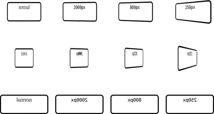
Figure 12-12. A rotated element with varying perspective() transform function values at rotateY(-45deg), rotateY(-112.5deg), and rotateY(-180deg). We can also achieve this by applying the perspective property to a container element.
The difference between the two methods is that the transform function transform: perspective(); applies perspective directly to the element, whereas the perspective property applies perspective to the element’s children. If you’re applying a 3D transform to more than one element you want perspective on a wrapper element, as then all the child elements will be in the same 3D space. The size of an element with perspective affects the amount of foreshadowing for child elements, as does using a non-default transform-origin.
Changing the origin of perspective with the perspective-origin property
This sets the origin point for perspective, which by default is the center of the element (perspective-origin: 50% 50%;). It takes lengths, percentages, and keywords (like X and Y values for transform-origin). When using two keywords, or a keyword other than center and a value, the browser can work out which value is X (= left or right) and which is Y (= top or bottom). Otherwise, the first value will be on the X-axis and the second value (if present) will be on the Y-axis. We recommend you stick with the default perspective-origin: pX pY; order even when using keywords. Returning to our pyramid, changing the perspective-origin is like moving the apex (the viewer’s location) away from the center of the scene.
perspective-origin: pX;perspective-origin: pY; /* if top or bottom */perspective-origin: pX pY;
Changing transforms via transform-origin
transform-origin allows us to set the center of a transform’s movement, which can really alter the resulting transformation. It can take one to four values:
- If there are one or two values, these can be keywords, lengths, and/or percentages. Lengths and percentages are calculated from the top left (0,0).
- A 3D transform can take three values, where the first two can be keywords, lengths, and/or percentages, but the third value must be a length.
- A 2D transform can also take three or four values, which represent offsets and must be written as two pairs of a keyword followed by a length or percentage, for example
transform-origin: top 12px right 0;. If there are only three values, the missing offset is assumed to be zero, for exampletransform-origin: top 12px right;. (Note that support for this is nascent, and current browsers only use the first two values.)
By default tX and tY are 50% and tZ is 0, so the default value is transform-origin: 50% 50%; for a 2D transform, and transform-origin: 50% 50% 0; for a 3D transform.
As with perspective-origin, when using keywords only we recommend you stick with the orthodox ordering: pX (pY(pZ)).
transform-origin: tX;transform-origin: tY; /* if top or bottom */transform-origin: tX tY;transform-origin: tX tY tZ; /* for a 3D transform */
Returning to our earlier transform: rotate(); example in Figure 12-4, let’s see the difference that transform-origin can make. The previous example didn’t specify a transform-origin, so it used the default value of the elements’ centers. In Figure 12-13 the outer boxes still do; however, the inner boxes all use a different corner via transform-origin. The origin point is indicated with a square corner.
/* Figure 12-4 code, plus... */

.top-left {

  border-top-left-radius: 0;

  transform-origin: left top; /* the same as 0 0 */

}
.bottom-left {

  border-bottom-left-radius: 0;

  transform-origin: left bottom; /* the same as 0 100% */

}

.top-right {

  border-top-right-radius: 0;

  transform-origin: right top; /* the same as 100% 0 */

}
.bottom-right {

  border-bottom-right-radius: 0;

  transform-origin: right bottom; /* the same as 100% 100% */

}
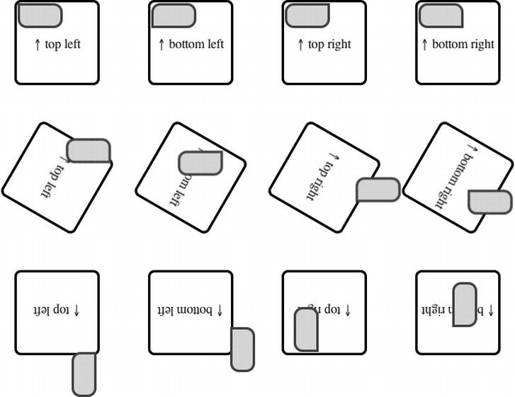
Figure 12-13. Examples of the difference transform-origin makes to transform: rotate() with a positive (clockwise) value on the outer box, and a negative (counter-clockwise) value on the inner box. (Screenshots at rotate(0deg), rotate(120deg), and rotate(180deg) for the outer box.)
While this completely changes the transforms, specifying a point further away from the element has an even greater effect.
Specifying a 3D transform-origin is just the 2D transform-origin we’ve met plus a length value for the Z-axis. Again, a larger value gives a greater effect, as shown in Figure 12-14.
.container {perspective: 800px;}

.container:hover span {transform: rotate3d(1,1,0,180deg); /* inner box */}

.top-left {transform-origin: left top 20px;}

.bottom-left {transform-origin: left bottom 40px;}

.top-right {transform-origin: right top 80px;}

.bottom-right {transform-origin: right bottom 160px;}

Figure 12-14. Examples of the difference a 3D transform-origin with successively larger Z values makes to transform: rotate(). We’ve also added perspective and transform-style: preserve-3d; to give the illusion of 3D. (Screenshots at rotate(0deg), rotate(120deg), and rotate(180deg) for the outer box.)
3D or flat transforms with transform-style
By default, elements appear in the same plane as their parent, with the stacking order dictated by the HTML source. We can change the stacking order using z-index, but we’re still dealing with a two-dimensional plane. 3D transforms give us a Z-axis, but the default transform-style is flat—again, still on the same plane. To fully see the effects of Z-axis transforms we need to use transform-style: preserve-3d;, which applies to the element’s children.
For 3D transforms you’ll probably want to use transform-style: preserve-3d; together with perspective or perspective().3D transforms can lead to elements being transformed behind others, so you might need to explicitly use transform-style: flat; on an element to override an ancestor’s preserve-3d.
Hiding and showing the back of a transformed element with backface-visibility
When an element is rotated 180° or more in 3D around the X or Y-axes, by default the element’s back side is visible. This property allows us to hide it, which for example can be useful in making a double-sided playing card from two elements aligned back-to-back. It also comes in handy when making 3D boxes or spaces. As Figure 12-15 demonstrates, without it the illusion of the card flip, transition is broken.
.card {

  transform-style: preserve-3d;

  perspective: 1000px;

}

.back, .front {

  position: absolute;

  width: 169px;

  height: 245px;

  -webkit-transition: .8s all;

}

.front {transform: rotate3d(0,1,0,180deg);}

.card:hover .back {transform: rotate3d(0,1,0,180deg);}

.card:hover .front {transform: rotate3d(0,1,0,0deg);}

.backface .back, .backface .front {backface-visibility: hidden;}


<div class="card">

  <div class="back">Back</div>

  <div class="front">Front</div>

</div>
<div class="card backface">

  <div class="back">Back</div>

  <div class="front">Front</div>

</div>
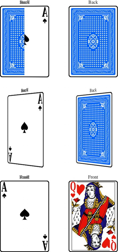
Figure 12-15. A card-flip transition, with the left card using the default backface-visibility: visible; (with the initial state showing flicker between the sides as the animation begins), and the right card using backface-visibility: hidden;. Note that without a background the “Front” and “Back” text in the left card are visible at the same time.
Browser support for CSS transforms
CSS transforms tend to involve substantial changes and can look broken without a fallback in non-supporting browsers. While 2D transforms are fairly well supported in modern browsers, the lack of support in earlier versions of Internet Explorer may give you pause in using them. The scale() transform function can easily be duplicated via Internet Explorer’s CSS zoom property, and other 2D transforms can be duplicated in IE (with a certain amount of suffering) via the MS Matrix filter.
For 3D transforms, the situation is bleaker. Limited browser support and no polyfills severely restrict where we can use them, and the performance isn’t quite up to games programming yet, either.
We generally stick with using CSS transforms for progressive enhancement only, such as nonessential styling that only supporting browsers get. For anything that isn’t just progressive enhancement you’ll need to carefully consider your audience and use fallbacks or alternative methods of achieving your goals.
Browser support for 2D transforms
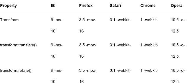
Modern browsers including Internet Explorer 9 support 2D transforms, and even better recent versions of Internet Explorer, Firefox and Opera support them without vendor prefixes, as you can see in Table 12-2.

Browser support for 3D transforms
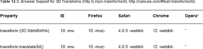
Browser support for 3D transforms doesn’t extend back nearly as far, as demonstrated in Table 12-3.

Polyfills, fallbacks, and Internet Explorer’s filter property
If you choose to, you can extend the browser support of CSS 2D transforms. One option is to use Internet Explorer’s proprietary CSS filter property, basically an ugly precursor to translate: matrix(), allowing you to support Internet Explorer 6-8.7 Enter your prefix-less transforms CSS into the Transforms Translator (http://j.mp/ie-transforms, www.useragentman.com/IETransformsTranslator/) by Zoltan Hawryluk and Zoe Mickley Gillenwater, and it will output the equivalent IE filter-based transform, along with vendor prefixed transforms for other browsers. You can then add the filter CSS to an IE-only stylesheet and include via an IE conditional comment.
__________
7 Note that IE’s filters animate … poorly — test thoroughly if you use them.
If you choose to go the polyfill8 route, here are two JavaScript polyfills that convert 2D transforms CSS to Internet Explorer filter properties on the fly. Of course, if the user has JavaScript disabled nothing happens—caveat emptor.
- Transformie (
http://transformie.com/) is a jQuery plug-in by Paul Bakaus that adds basictransformsupport to IE6-8. - cssSandpaper (
http://j.mp/csssandpaper,www.useragentman.com/blog/2010/03/09/cross-browser-css-transforms-even-in-ie/) by Zoltan “Du Lac” Hawryluk adds support for IE6-8 and Opera 10.0+, plusbox-shadow, linear gradients, and radial gradients.
Finally, transforms (and transition animations) can also be done via JavaScript, for example using jQuery’s effects (http://j.mp/jq-effects, http://api.jquery.com/category/effects/). CSS 2D and 3D transforms are detected by Modernizr, so you can set up fallback content—either extending behaviors to non-supporting browsers via a polyfill for 2D transforms or using a suitable non-transforming alternative, such as an image. At the time of writing, there are no polyfills for 3D transforms.
CSS transforms gotchas
As CSS 2D and 3D transforms have only recently been implemented, there are still quirks and bugs. Here are some tricks and tips for common issues.
- WebKit browsers don’t transform
display: inline;elements. Opera 11+ and Firefox 4+ work as expected. The workaround is to usedisplay: inline-block;. - When using
transform: rotate();in iOS, the straight edge of a rotated image can appear aliased. Thierry Koblentz found that usingbackground-clip: padding-box;solves this. - As already mentioned, in Firefox 3.5-9 the
translatevalues intransform: matrix();were implemented as lengths, not the spec’s numbers. You’ll need to addpxfor Firefox only. From Firefox 10 both types of values are supported. Seetransform: matrix();for more information. - Transformed text is not anti-aliased in Opera 11.60
- 3D transforms disable sub-pixel anti-aliasing in WebKit browsers for performance reasons. In Safari, the rendering is still ok, but it can be noticeable in Chrome. Also in Chrome, this can disable it on elements that aren’t themselves 3D transformed, and these will have rougher anti-aliasing than those that are. Dave DeSandro found that adding a background color to affected elements re-enables sub-pixel anti-aliasing in Chrome 16.
- There are some issues when transitioning or animating transforms, such as browser bugs when transitioning between transform states with different units. We’ll address these issues in the upcoming sections.
__________
8 As mentioned in Chapters 2 and 7, a polyfill adds support for something to a browser that doesn’t support it natively, typically using JavaScript.
CSS transforms in summary
While the transformations and associated properties can seem overly simple on the surface, combining them together allows us to do some impressive manipulations. For example, Dirk Weber’s CSS Warp (http://j.mp/csswarp, http://csswarp.eleqtriq.com/) in Figure 12-16 is a “text to path” tool made with CSS transforms.

Figure 12-16. CSSWarp, which uses CSS transforms to place text on a path.
However, the magic really starts when using transformations together with transitions, animation, and JavaScript. Hakim El Hattab’s 3D carousel slideshow (http://j.mp/3d-slideshow, http://hakim.se/inc/components/slideshow/) is a beautiful example of 3D transformations and transitions with a little JavaScript. It even works on the iPhone and iPad, which have 3D transform support.
Although they are still comparatively new, we think it’s time to start using 2D transforms today—where appropriate—for subtle improvements to user experience. The use of 2D transforms for more than progressive enhancement, or any use of 3D transforms, is probably premature unless you have a suitable audience. Make sure to test thoroughly, as support is relatively recent. Despite this (and the occasional browser bug), CSS transforms are great for adding some subtle flavor, and if your user stats support, it can play a more central role, for example on sites for iOS devices. If nothing else, they’re a taste of the not-yet-widely-distributed future and lots of fun to play with!
Moving right along, let’s see how we can change elements (including CSS transformed ones) over time with CSS transitions and CSS animations.
CSS transitions and CSS animations: compare and contrast
These specifications both allow us to “interpolate CSS property values” or animate the changing of an element’s property’s value over time. We’ll cover both in detail, but to understand the differences, let’s start with a quick comparison. The following is what the CSS3 Animations specification says:
CSS Transitions provide a way to interpolate CSS property values when they change as a result of underlying property changes. This provides an easy way to do simple animation, but the start and end states of the animation are controlled by the existing property values, and transitions provide little control to the author on how the animation progresses.
[CSS Animations] introduces defined animations, in which the author can specify the changes in CSS properties over time as a set of keyframes. Animations are similar to transitions in that they change the presentational value of CSS properties over time.
— CSS Animations specification (http://j.mp/css3-animations, http://dev.w3.org/csswg/css3-animations/#introduction)
While there are a lot of similarities—for example, both operate on the same “animatable” properties and use the same timing functions—for us these are the major differences:
- CSS transitions can be triggered by a CSS change in state and JavaScript. CSS animations play by default once declared, although you can also trigger them by a CSS change in state9 and JavaScript.
- CSS transitions apply a transition to an existing instant change. CSS animations add styles to an element and animate using them.
- CSS transitions occur between two intrinsic styles,10 the element’s intrinsic style before and after the transition is triggered (such as non-
:hoverand:hovervalues). CSS animations animate from the element’s intrinsic state and between (multiple) keyframes. By default, the element will return to its intrinsic state when the animation ends. - CSS transitions are simple, with wider browser support. CSS animations are more powerful and complex, with less browser support.
For future reference, Table 12-4 summarizes the differences.

__________
9 An example of a change of state is mousing over an element with :hover.
10 An element’s intrinsic style is the CSS styles it has before a transition or animation is applied.
CSS transitions are great for a simple enhancement when you need to animate between two states. CSS animations can do everything CSS transitions do plus more, but with their power comes a little more complexity and CSS to write. Let’s examine both in detail. First up, CSS transitions.
CSS transitions: bling in 4D!
We’re sure you’re all familiar with link rollovers, the basic interactivity provided by our friends the :link, :visited, :hover, :focus, and :active pseudo-classes. These changes are useful, but instant.
The CSS Transitions Module (http://j.mp/css3transitions, http://dev.w3.org/csswg/css3-transitions/) takes things up a notch, giving us the simple ability to control the change of an existing CSS property from one value to another over time. This fourth dimension opens up a world of possibilities, and we can easily apply these transitions via a CSS change in state. This includes the following pseudo-classes (see Chapter 8 for more information). It also includes using @media queries (see Chapter 9), and using JavaScript by adding a class to an element, for example.
:link:visited:hover:focus:active:disabled:enabled:checked
For more on triggering transitions, refer to Louis Lazarus’ articles “CSS3 Transitions Without Using :hover” (http://j.mp/transitions-pseudo, www.impressivewebs.com/css3-transitions-without-hover) and “Triggering CSS3 Transitions With JavaScript” (http://j.mp/transitions-js, www.impressivewebs.com/css3-transitions-javascript).
We control a transition using the following properties:
transition-property: A list of transitionable properties to apply the transition to. By default, this istransition-property: all;and there’s a table of transitionable properties coming right up.transition-duration: The length of the transition in units of time, such as seconds (.4s) or milliseconds (400ms). By default, this is the instanttransition-duration: 0s;so it’s the same as not using a transition.transition-timing-function: Controls the relative speed of the transition over thetransition-durationto make the transition start slowly and end quickly, for example. Values includelinear,ease(the default),ease-in,ease-out,ease-in-out,cubic-bezier(),step-start,step-end, andsteps().transition-delay: A delay before the transition starts (times), with the default oftransition-delay: 0s;. This can also take a negative value, making it appear to start already part-way through the transition.transition: A shorthand property that takestransition-property,transition-duration,transition-timing-function, andtransition-delay, in that order. Missing properties use default values, giving a default oftransition: all 0s ease 0s;.
Setting what to transition with transition-property
transition-property allows us to specify one or more comma-separated animatable CSS properties to transition, with a default value of all. Note that properties with vendor prefixes need to be written with the vendor prefix in transition-property, too. For example, here’s vendor-prefixed code to transition the transform property (aligned for column selection):
.postcard {

  -webkit-transition-property: -webkit-transform;

     -moz-transition-property:    -moz-transform;

      -ms-transition-property:     -ms-transform;

       -o-transition-property:      -o-transform;

          transition-property:         transform;

}

...
See Multiple Transition Values, and the transition shorthand property below for more on multiple values.
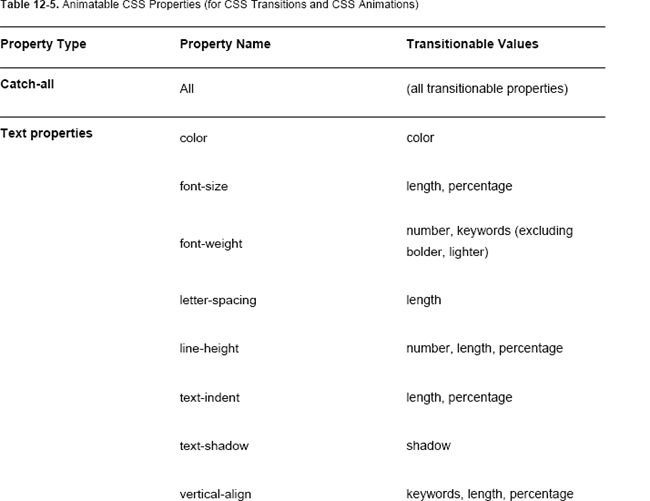
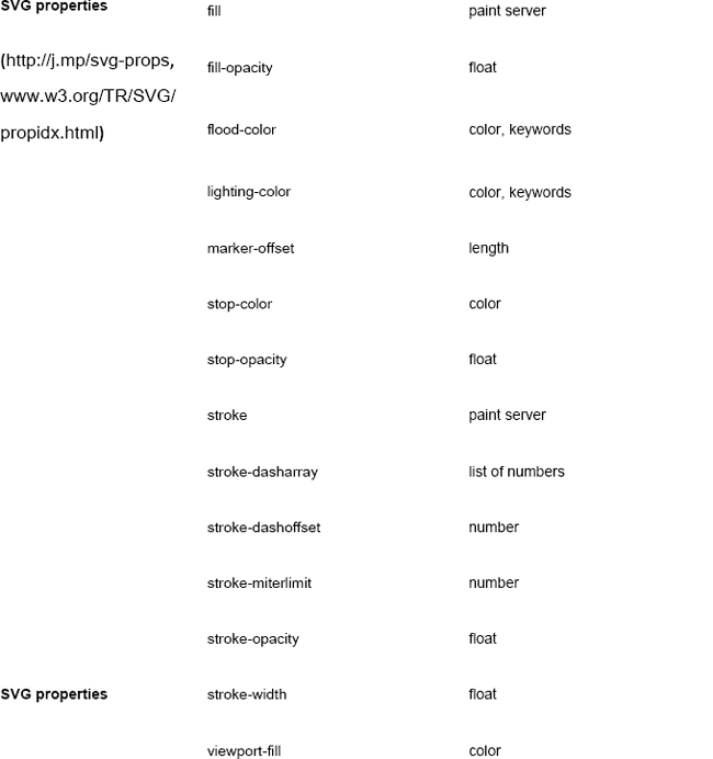
Animatable properties for CSS transitions and CSS animations
You can apply CSS transitions to many but not all CSS properties, as you can see in Table 12-5 (based on the table in the CSS3 Transitions specification11). These properties are also the ones we can animate with CSS animations, which are covered later in this chapter.


__________
11 In newer CSS specifications, animatable properties are indicated in the summary of the property’s definition.
- While the shorthand
backgroundisn’t actually in the spec, it works (at least forbackground-colorandbackground-positionvalues). - This is a little up in the air, with
background-imagein CSS Backgrounds and Borders Module Level 3 changing from “only gradients” to “Animatable: no” as the spec became a candidate recommendation. However, support has appeared in Chrome 19 Canary, and this is something that designers want. Until widespread support arrives, simple transitioning gradients can be faked with a transition onbackground-colorplus an overlaying gradient and background image transitions via image sprites andbackground-positionoropacity. - Currently the spec only defines individual properties containing
-top-,-bottom-,-left-and-right-forborder-width,border-color,margin, andpadding. WebKit browsers, Firefox and Opera 12 can also animate the shorthand properties. grid-*are properties of the Grid Positioning module, covered in Chapter 9.- Finally, note that transitioning colors occur in RGBa color space, and transitions involving
transparentor colors with alpha channel may not occur as you expect. See the “Transition gotchas” section later in this chapter for more details.
More properties will become animatable in the future, so keep this in mind when choosing whether to use all or only specific properties. While all is convenient, it’s safer to be explicit when using only one property. For example, when using JavaScript to transition elements, transition: all; will fire the transitionEnd event every time a transition ends for each property changed. Also, currently Firefox supports the following additional properties (with the -moz- prefix), which will also be transitioned with transition-property: all;. All but the three properties with asterisks will probably be added to the transitions specification in the future, and many are also supported in WebKit browsers.
-moz-background-size-moz-border-radius-moz-box-flex*-moz-box-shadow-moz-column-count-moz-column-gap-moz-column-rule-color-moz-column-rule-width-moz-column-width-moz-font-size-adjust-moz-font-stretch-moz-image-region*-moz-marker-offset-moz-outline-radius*-moz-text-decoration-color-moz-transform-moz-transform-origin
There are some properties not in the spec that you’ll want to transition. These only have partial support at the time of writing; they work in Firefox, WebKit and Opera browsers.
border-radiusbox-shadow
There are also several properties or values you’ll want to transition, but they are both unspecced and unsupported at the time of writing.
background-image, including gradientsfloat
heightorwidthusing the valueauto(currently both values must be a length or percentage)- The same applies to
top,right,bottom, andleft, but despite the spec (and probably due to a bug) WebKit browsers can animate these usingauto. displaybetweennoneand anything elsepositionbetweenstaticandabsolute
The CSS Working Group is aware of these issues and some of them will be addressed (for example, the transitioning background-image is being worked on and transitioning auto is expected in CSS4 transitions) so this list will decrease in the future.
Faking auto on width and height with max-width and max-height
Animating between auto and 0 would be really useful for things like a “sliding drawer” effect for dialogs, as demonstrated by jQuery’s slideToggle effect (http://j.mp/jq-slidetoggle, http://j.mp/jq-slidetoggle,). We can give the appearance of animating width and height to/from auto by substituting a value on max-width or max-height, respectively, that’s larger than the content it contains (http://j.mp/faking-auto, http://dabblet.com/gist/1676548), as shown in Figure 12-17.
.box {

  max-height: 5em; /* larger than your content: 200px would also work here */

  overflow: hidden; /* otherwise the text will be visible */

  padding: .5em .25em;

  transition: all 0.5s;

}

.wrapper:hover .box {

  max-height: 0;

  opacity: 0;

  padding: 0 .25em;

}

Figure 12-17. Faking transitioning from height: auto; to height: 0; via max-height, plus opacity and padding. For a short transition this is passable.
This really helps for faking animating height because actually using a fixed height (in px) is asking for trouble (people do resize!). However, a very large value introduces a delay, so we think using a value in ems for max-height is safer. In the previous example, the boxes are about 5em high, so we used max-height: 8em;.
Controlling the duration of a transition with transition-duration
The transition-duration property sets the duration of a transition and takes time values in seconds (s) or milliseconds (ms), with three durations shown in Figure 12-18.
.one {transition-duration: .2s;}

.two {transition-duration: .4s;}

.three {transition-duration: 1s;}
Figure 12-18. A comparison of three transition durations — the first one has already finished in this screenshot.
How a transition’s duration appears will be affected by how noticeable the change in state is. For obviously different states of a link’s :hover state, a transition as fast as transition-duration: .2s; (or transition-duration: 200ms;) can be used to smooth a quick change, but anything faster than this becomes indistinguishable from no transition. We find a value of .4s (or 400ms) tends to works well for a subtle transition. However, if you’re moving an element any distance, .4s could be way too short. Longer transitions tend to draw more attention to themselves, but when used sparingly can be useful for a specific effect, especially when combined with the transition-timing-function property, which is coming up next.
transition-timing-function, cubic Bézier curves, and steps()
The transition-timing-function property is the hardest part of transitions to get your head around. Luckily, it’s all pretty simple once you’ve seen some examples. The property has functions based on Bézier curves12 (moving on an arc) and steps (stop-start movement). Cubic Bézier curves have four points: the start and end locations are diagonally opposite each other in the corners of a square (0,0 and 1,1), and the other two points are the control handles that define the curve, as seen in Figure 12-19. In contrast, the stepping functions (steps(), etc.) divide the transition into equally sized intervals, dependent on the number of steps.
__________
12 Bézier curves (http://j.mp/bezier-curves, http://en.wikipedia.org/wiki/Bézier_curve) are just the curved paths with handles you’ll be familiar with from vector graphics like SVG and software like Adobe Illustrator and Inkscape.

Figure 12-19. The cubic-bezier equivalent to transition-timing-function: ease;, from Lea Verou’s excellent cubic Bézier visualiser http://cubic-bezier.com.
transition-timing-function values include cubic-bezier() and steps(), plus several common presets.
cubic-bezier()- This allows you to make a custom cubic Bézier curve by setting the X,Y handle locations for the start and end points in the pattern
cubic-bezier(X1, Y1, X2, Y2). There are also several common preset values.-
linear: The transition has a constant speed. Equivalent tocubic-bezier(0, 0, 1.0, 1.0). -
ease: The default transition, it starts quickly then tapers out, like a faster, smoother version ofease-out. Equivalent tocubic-bezier(0.25, 0.1, 0.25, 1.0)(default). -
ease-in: The transition starts slow and accelerates to the end. Equivalent tocubic-bezier(0.42, 0, 1.0, 1.0). -
ease-out: The transition starts fast then slows down. Equivalent tocubic-bezier(0, 0, 0.58, 1.0). -
ease-in-out: The transition starts and ends slowly, but transitions quickly in the middle. Equivalent tocubic-bezier(0.42, 0, 0.58, 1.0).
-
steps(): The transition jumps from one step to another, rather than transitioning smoothly like Bézier-based transitions. It has a value with the number of steps and can also take a second value—eitherstartorend—that controls how the transition proceeds.13- step-start: The transition is instant and happens immediately when triggered. This is equivalent to
steps(1,start). - step-end: The transition is instant but happens at the end of the
transition-duration. This is equivalent tosteps(1,end).
- step-start: The transition is instant and happens immediately when triggered. This is equivalent to
Figure 12-20 shows a demonstration of the preset values (we’re reordered them to make the differences more obvious).
__________
13 Peter Beverloo has made a nice demonstration of steps() transitions (plus cubic-bezier presets) (http://j.mp/css3-ttf/ http://peter.sh/experiments/css3-transition-timing-functions).

Figure 12-20. A comparison of the preset values of transition-timing-function over time, including some example steps() functions. (Screenshots approximately ¼, ½, and ¾ through the transition.)
The default ease is a good all-round choice, although linear animates more smoothly for transitions with a small movement. While the presets are generally enough, for a specific effect in a long transition you can make your own Bézier timing function using cubic-bezier(X1, Y1, X2, Y2).
Y values can exceed 0-1.0, causing the transition to “bounce,” as demonstrated in Figure 12-21.
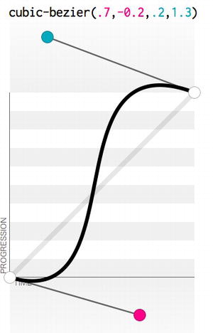
Figure 12-21. A cubic-bezier value with “bounce” (Y values less than 0 or greater than 1)
You can progressively add a cubic-bezier timing function with Y values less than 0 or greater than 1 by using a “clamped” fallback first (one with values between 0 and 1), as demonstrated in Figure 12-22. This will be closer to the timing function you want than the default ease.
.ease {transition-timing-function: cubic-bezier(.25,.1,.25,1);} /* = ease */

.clamped {transition-timing-function: cubic-bezier(.7,0,.2,1);} /* Y=0~1 */

.bounce {transition-timing-function: cubic-bezier(.7,-.2,.2,1.3);}


/* our recommended way to include a cubic-bezier with bounce: */

.bulletproof { /* including vendor prefixes to show WebKit fallback */

  -webkit-transition-timing-function: cubic-bezier(.7,0,.2,1); /* fallback */
  -webkit-transition-timing-function: cubic-bezier(.7,-.2,.2,1.3);

     -moz-transition-timing-function: cubic-bezier(.7,-.2,.2,1.3);

      -ms-transition-timing-function: cubic-bezier(.7,-.2,.2,1.3);

       -o-transition-timing-function: cubic-bezier(.7,-.2,.2,1.3);

          transition-timing-function: cubic-bezier(.7,-.2,.2,1.3);

}

Figure 12-22. In browsers that don’t support Y values outside 0-1, the default ease timing function will be used instead. By adding a “clamped” cubic-bezier fallback before one with bounce, you can get a closer approximation in these browsers.
The steps() timing functions can be used to make things happen at the start or end of a transition. They can be used for frame-based animation, as demonstrated by Lea Verou in “Pure CSS3 typing animation with steps()” (http://j.mp/typing-steps, http://lea.verou.me/2011/09/pure-css3-typing-animation-with-steps/) and “Simurai in Sprite Sheet animation” (http://j.mp/sprite-steps, http://jsfiddle.net/simurai/CGmCe/).
Finally, while these cubic Bézier and step-based timing functions are great, they don’t cover the full scope of potential timing functions. Some of the timing functions that Scripty2 has would require something else, like CSS Animations or JavaScript, for example (http://j.mp/scripty2-ttf, http://scripty2.com/doc/scripty2%20fx/s2/fx/transitions.html).
Delaying the start of a transition with transition-delay
As you might expect, transition-delay allows us to delay the start of a transition after it has been triggered. Just like transition-duration, it takes time values in seconds or milliseconds. When the value is positive, the transition is delayed by the value’s amount. When the value is negative, the animation is jump-started by the transition-delay’s value, beginning as if that time had already elapsed. Compare these to the default transition-delay: 0 in Figure 12-23.
hover .box {transition-duration: 3s;}

:hover .positive-delay {transition-delay: 1s;} /* "delay 1s" box */

/* transition-delay is 0 by default (the "no delay" box) */

:hover .negative-delay {transition-delay: -1s;} /* "delay -1s" box */

Figure 12-23. We can delay or jump-start the start of a transition using transition-delay. This figure shows 1s into a 3s linear animation.
When a transition is triggered but the trigger is removed before it completes (for example, a mouseover then mouseout of a transition triggered by :hover), the transition will then play in reverse from its current state to its initial state. If there’s a transition-delay, this will also occur when the transition reverses—for a positive delay the element will freeze, and for a negative delay the element will jump, before continuing.
Multiple transition values and the transition shorthand property
All of these properties can take more than one value, separated by commas, allowing us to transition more than one property at once with different settings. When using multiple values for each transition-* property, the order of the values is important, as the values of each property are grouped together based on this order. For example, this code block
.warning {

  transition-property:  left, opacity, color;

  transition-duration: 600ms,   300ms, 400ms;

     transition-delay:    0s,      0s, 300ms;

} /* values aligned to make their groupings clear */
is equivalent to these three comma-separated transitions
.warning {transition: left 600ms, opacity 300ms, color 400ms 300ms;}
transition shorthand property order
When using the transition property, it’s important to stick to this order for the values (or for each comma-separated group of values for multiple transitions):
transition-propertytransition-durationtransition-timing-functiontransition-delay
Any values we don’t declare will use the default value. We don’t declare transition-timing-function in the first example above, so the transition will use the default ease. In addition, while we do need to declare 0s values for transition-delay in the first example so that the last value is applied to color, we don’t when using transition in the second example, as 0s is the default.
Browser support for CSS transitions
Modern browsers, with the sad exception of Internet Explorer 9, support transitions pretty well, as you can see in Table 12-6.

- This covers support for basic cubic bézier-based timing functions.
steps()(plus the presetsstep-startandstep-end) and Y values outside 0-1 forcubic-beziervalues (“bounce”) are comparatively recent additions to the spec.- See the previous section on
transition-timing-functionfor a WebKit fallback.
Apart from older versions of Internet Explorer, browser support for transitions is good. Luckily this isn’t really a problem—transitions as typically used aren’t essential to functionality. While they will improve the user experience when used intelligently, the lack of them just means an instant change in state, which is a perfectly acceptable fallback. Because of this you should use them whenever they’re appropriate.
CSS transitions gotchas
As usual, there are some things that can catch you out, plus a few browser quirks to keep you on your toes. Here are some we’ve come across:
- When using transitions with link states like
:hover, you probably want to apply them to the default state, so that all link state changes transition. If you add the transition to the:hoverstate instead, the transition will occur on mouseover, not on mouseout. - Colors are transitioned in RGBa color-space, which may give you unexpected results if you’re using e.g. HSLa.
- Browsers that use non-premultiplied color interpolation transition colors with an alpha channel unintuitively, such as RGBa and the color
transparent. During the transition other colors may be visible; for example,transparenttoredwould show some black becausetransparentis treated asrgba(0,0,0,0). Using premultiplied colors avoids this by applying the alpha value to each channel. At the time of writing, Opera is using non-premultiplied colors, Chrome and Safari changed to using premultiplied colors in 2010 (so it affects Safari 4.0.5), and Firefox has always used premultiplied colors.14 You can generally avoid problems by convertingtransparent(and HSLa etc) into suitablergba()values. This avoids the dark shade mid-transition and also uses the cascade to support IE6-8.
.box {

  background-color: transparent; /* IE6-8 */

  background-color: rgba(255,0,0,0); /* modern browsers (transparent red) */

}
__________
14 Note that the specification is still undecided regarding premultiplied or non-premultiplied color, so both ways are currently valid.
.box:hover {

  background-color: #f00; /* IE6-8 (or #ff0000 or red) */

  background-color: rgba(255,0,0,1); /* modern browsers */

}
- For performance reasons, for transitioning or animating text browsers turn off sub-pixel anti-aliasing (WebKit) or don’t anti-alias at all (Opera), making this text look lighter. Opera 11.60 also doesn’t anti-alias transitioned
@font-facetext (fixed in Opera 12). - You can’t apply a transition by changing property values using JavaScript without triggering a reflow or using a delay before setting the second style. For more see Divya Manian’s presentation “Taking Presentation out of JavaScript One Setinterval at a Time” (http'//nimbu.in/txjs/).
Gotchas with transitioning transforms (and animations)
Combining transitions with CSS transforms is an obvious step, but again there are some browser quirks waiting for you.
- Avoid transitioning between different units, such as from
left: 12px;toleft: 50%;. Opera and Chrome transition instantly, and Safari is buggy if the transition is interrupted. Firefox works as expected. - Opera up to 11 doesn’t transition
translate()on click via a JavaScriptaddEventListenerunless you force a reflow. This is fixed in recent versions.
Fuzzy transforms, z-index, and hardware acceleration
If we apply a transition to a 2D transform, the elements become fuzzy in WebKit browsers during the transition. However, a sneaky trick via Thomas Fuchs gets around this: adding a 3D transform (even one that does nothing) makes the transform use hardware acceleration, avoiding flicker and keeping things smooth and fast (http://j.mp/hw-accel, http://mir.aculo.us/2010/08/05/html5-buzzwords-in-action/). This also works for opacity. For example, you could add the following:
-webkit-transform: translateZ(0);
You may also need to apply -webkit-transform: translateZ(0); (or some other 3D transformation) to other non-transformed elements to bring them in front of 3D-transformed ones, as Estelle Weyl notes. 3D transforms effectively have a z-index of infinity.
Note: While using hardware acceleration can improve performance, this comes at the expense of memory, as Ariya Hidayat explains in “Understanding Hardware Acceleration on Mobile Browsers” (http://j.mp/mobile-hw, www.sencha.com/blog/ understanding-hardware-acceleration-on-mobile-browsers/
Stopping transforms from flickering when transitioning (and animating)
Transitioning or animating transforms (especially 3D transforms) can be very demanding, especially on iOS and Android where the mobile’s relatively puny hardware adds to our problems. First, avoid transitioning or animating elements larger than the viewport. If you can’t, or still encounter flickering or stuttery animation, Wes Baker suggests try using backface-visibility: hidden; on animated elements (http://j.mp/anim-flicker, http://stackoverflow.com/questions/2946748/iphone-webkit-css-animations-cause-flicker), possibly in conjunction with perspective and/or a 3D transform, as mentioned previously.
-webkit-backface-visibility: hidden;

backface-visibility: hidden;

/* possibly combined with... */

-webkit-transform: translateZ(0); /* ...or any 3D transformation */

-webkit-perspective: 1000;
perspective: 1000;
Of course, if your animation is complex or you’re animating nested elements, consider if it’s possible to simplify the animation first. As the 3D transform is just a default value and for performance on mobile devices only, it’s fine to not add an unprefixed property. As always, test thoroughly. Finally, as transitions are demanding, consider restricting them to capable devices only. For more detail, refer to Matt Seeley’s “WebKit in your living room” speech (http://j.mp/anim-perf http://www.youtube.com/watch?v=xuMWhto62Eo).
CSS transitions in summary
CSS transitions allow us to control a CSS change in state over time, so without them the change will just occur instantly. In pretty much all cases this means they’re fine to use to enhance the user’s experience, and we feel it’s not worth polyfilling them for non-supporting browsers using JavaScript. Keep the the following things in mind:
- Make sure the properties you transition behave the same in different browsers.
- Check especially carefully when the transitioned property is also fairly new, such as with
transform. - Overusing transitions may have performance implications, especially in mobile browsers.
:hovertransitions won’t work on touch-based mobile devices.
As with everything in this chapter, err on the side of snappy and subtle. Large amounts of movement and slow, showy interactions may seem impressive when used the first time, but both will make your site feel overblown after a few uses.
CSS transitions provide an easy-to-use tool to spice up UI interactions, but they have their limits. Sometimes you want more control over the animation, for example the ability to loop. Next up we’ll look at CSS animations, a more powerful and involved alternative.
Keyframin’ with CSS animations
CSS animation is like elaborate icing on top of an expensive cake at a birthday party. While it may only be a very small part of the party, it has the potential to steal the show, as Figure 12-24 attests.

Figure 12-24. Mmmm, everyone loves cake…
You’ve seen how to do basic movement via CSS transitions. The CSS animations specification (http://j.mp/css3-animations, http://dev.w3.org/csswg/css3-animations/) takes things a step further with keyframe-based animations. The idea of keyframes will be familiar to anyone who’s done animation with programs like Flash or Director. We set up how we’d like things to be at certain points during the animation, then the browser handles the tweening (the in-between animation) to smoothly get us from one keyframe state to the next. There are some examples of animatable properties in Lea Verou’s Animatable (http://j.mp/css3-animatable, http://leaverou.github.com/animatable/), and how to use keyframe animations in the real world on Dan Eden’s Animate.css (http://j.mp/animate-css, http://daneden.me/animate/).
Unlike CSS transitions, properties animate from and to the element’s intrinsic style—the computed values15 the browser uses to display the element with no animation applied. This means that if the from (or to) keyframe is different to the element’s intrinsic style, when the animation starts (or ends) this change occurs instantly for a default animation.
CSS animations are added in two parts, as shown in the following code.
- A
@keyframesblock containing individual keyframes defining and naming an animation.16 animation-*properties to add a named@keyframesanimation to an element and to control the animation’s behavior.
@keyframes popup { /*  define the animation "popup" */

  from {...} /* CSS for any differences between the element's initial state and

the animation's initial state */

  to {...} /* CSS for the animation's final state */

}

.popup {animation: popup 1s;} /*  apply the animation "popup" */
__________
15 Computed values are the styles the browser uses to display the element, based on the CSS cascade of all applicable styles. When the animation is applied the computed values are a combination of intrinsic style and the animation’s styles.
16 There’s no need for a @keyframes block to be before a declaration applying it in the CSS file. We generally add them to a section towards the end of our CSS based on the principle of general to specific.
Each keyframe rule starts with a percentage or the keywords from (the same as 0%) or to (the same as 100%) acting like a selector and specifying where in the animation the keyframe occurs. Percentages represent a percentage of the animation-duration, so a 50% keyframe in a 2s animation would be 1s into an animation. The following code shows an @keyframes declaration with several keyframe rules:
@keyframes popup {

  0% {...} /* the start of the animation (the same as "from") */

  25% {...} /* a keyframe one quarter through the animation */

  66.6667% {...} /* a keyframe two thirds through the animation */

  ...

  to {...} /* the end of the animation (the same as "100%") */

}
Add the properties you want to animate to a keyframe. The browser will only use animatable properties, with the addition of the animation-timing-function property that overrides the animation’s timing function for that keyframe only. Refer to Table 12-5 for a list of these. Non-animatable properties (apart from animation-timing-function) will be ignored.
Note: Property values in each keyframe rule are only animated when tweening from and to a different value. They don’t cascade and are not inherited by later keyframes. This might mean you have to add a declaration to more than one keyframe.
After naming and defining an animation, we can apply it to an element and control how the animation occurs using the animation-* properties. These can take multiple values in a comma-separated list to define multiple animations (we’ll cover this in a later section).
animation-name: The name (or comma-separated names) of@keyframes-defined animations to apply. By default this isnone.animation-duration: The time for the animation to occur once, in seconds (s) or milliseconds (ms). By default this is0sor the same as no animation.animation-timing-function: The timing function (just like in CSS transitions) to use for the animation. Values includelinear,ease(the default),ease-in,ease-out,ease-in-out,cubic-bezier(),step-start,step-end, andsteps().This can also be added to the@keyframesdeclaration to override the animation’sanimation-timing-functionper -keyframe.animation-delay: A delay before the animation starts, in seconds (s) or milliseconds (ms). The default is0sand this can also take a negative value, appearing to start already part-way through the animation.animation-iteration-count: The number of times the animation repeats. Acceptable values are0(no animation), positive numbers (including non-integers), andinfinite. The default count is1.animation-direction: This takes the valuesnormal(the default) andalternate, and only has an effect when theanimation-iteration-countis greater than1.normalcauses the animation to play forward (from start to end) each time, where asalternatecauses the animation to play forward then reverse.animation-fill-mode: This controls if thefromkeyframe affects the animation during ananimation-delayand/or if the ending state is kept when an animation ends, via the following values:-
animation-fill-mode: none;: Appliesfromkeyframe values only when a positiveanimation-delayends and uses the element’s intrinsic style when the animation ends. This is the default state. -
animation-fill-mode: forwards;: This causes the element(s) to retain the properties defined by the final keyframe (usually the100%ortokeyframe) after the animation finishes. Theforwardsvalue (orboth) makes an animation’s end state behave the same as CSS tTransitions. -
animation-fill-mode: backwards;: This causes the element(s) to have any properties defined by the first keyframe (0%orfrom) during ananimation-delaywith a positive value. -
animation-fill-mode: both;: This is the same as bothforwardsandbackwards.
-
animation-play-state: By default this value isrunning, but when this is changed topausedthe animation pauses. The animation can be resumed from the same place by changing back torunning. This gives us an easy way to pause animations using JavaScript.animation: Theanimationshorthand property takes a space-separated list of these animation properties (all the above exceptanimation-play-state). Multiple animations are separated by commas.
The CSS animations specification is still being actively developed and is expected to change.17 Because of this we recommend leaving out un-prefixed animation-* and @keyframes declarations for now. However, for simplicity most of our example code will show the un-prefixed syntax.
A simple animation example with animation-name and animation-duration
Let’s see how much code a simple animation requires — including vendor prefixes — in Figure 12-25.
.box {position: absolute;}

:hover .box {

  -webkit-animation-name: moveit;

     -moz-animation-name: moveit;

      -ms-animation-name: moveit;

       -o-animation-name: moveit;

  -webkit-animation-duration: 1s;

     -moz-animation-duration: 1s;

      -ms-animation-duration: 1s;

       -o-animation-duration: 1s;

}

@-webkit-keyframes moveit {to {left: 100%;}}
   @-moz-keyframes moveit {to {left: 100%;}}

    @-ms-keyframes moveit {to {left: 100%;}}

     @-o-keyframes moveit {to {left: 100%;}}
__________
17 This is because the CSS Working Group plans to move Animations (http://j.mp/web-anim, www.w3.org/2012/01/13-svg-minutes.html#action02) to a combined, generalised “effects” specification, that will also be used for SVG animation.

Figure 12-25. Even a simple animation currently requires a lot of vendor-specific CSS. But hey, keyframed animations in CSS!
That seems like a lot because we’re writing declarations to define the animation (the @keyframes block) and to call it (the animation-* properties), plus we’re writing everything four times due to browser prefixes, but really it’s unusually little. Did we really just get animation in CSS with only this?18
:hover .box {

  animation-name: moveit;

  animation-duration: 1s;

}

@keyframes moveit {to {left: 100%;}}
But how? As usual, we are helped by defaults. Every animation needs an animation-name, and we suspect you’ll want an animation-duration greater than the default 0s. However, all the other animation-* properties are optional, as their default values don’t prevent an animation from happening. We, of course, need a @keyframes declaration with at least one keyframe, in this case to {left: 100%;}, the state we’d like to animate to. The animated element itself provides the animation’s starting state—for our animated property left it’s 0. While we can style the start of the animation explicitly using from {} or 0% {}, in this example there’s no need.
Note: Not all properties and not all values of animatable properties can be animated. Refer to Table 12-5 earlier in this chapter for details.
__________
18 Please note, this code is only for example — don’t use unprefixed animation-* and @keyframes declarations for now.
There’s not much else to tell about animation-name and animation-duration. If you’ve read the earlier section on CSS transitions, you’ll already know animation-duration accepts values in milliseconds (ms) and seconds (s), just like transition-duration. To be safe, we recommend you avoid using other property values as an animation-name to avoid potential browser bugs when using the animation shorthand.
- alternate
- backwards
- both
- ease
- ease-in
- ease-in-out
- ease-out
- forwards
- infinite
- linear
- none
- normal
- paused
- running
- step-end
- step-start
- steps
Controlling an animation using @keyframes
The example is simple; we could just as easily have used a transition because it’s only animating between the initial and final states. Let’s add some keyframes in Figure 12-26.
.box {position: absolute;}

:hover .box {

  animation-name: shakeit;

  animation-duration: .5s;

}

@keyframes shakeit {

  10%, 37.5%, 75% {left: -10%;}

  22.5%, 52.5% {left: 10%;}

  75% {left: -7%;}
}


/* This @keyframes declaration could also be written:

@keyframes shakeit {
  10% {left: -10%;}

  22.5% {left: 10%;}

  37.5% {left: -10%;}

  52.5% {left: 10%;}

  75% {left: -7%;}

} */

Figure 12-26. @keyframes allow us to do complex animations not possible using transition. Imagine the box shaking back and forth here.
We can use commas between keyframes properties when they share the same value, and percentage keyframe properties can contain decimal places. We made a mistake in this example by defining the value for 75% twice. If a property is defined for the same keyframe percentage selector in two different keyframes, the later value (in this case left: -7%;) will be used.
Timing functions with animation-timing-function
As long as you’ve already read the section “transition-timing-function, cubic Bézier curves, and steps()” earlier in this chapter, this property is a piece of cake. You’ll be happy to hear that animation-timing-function works exactly the same as transition-timing-function, and takes all the same values.
Figure 12-20 demonstrated these values using transitions and transition-timing-function, but we can achieve the same result using animation, as demonstrated in Figure 12-27. In addition we can use different timing functions for different parts of the animation.

Figure 12-27. A demonstration of some timing function values in an animation using animation-timing-function, with the first two working the same as they would in a transition. The “variable” box uses ease, step-start, and then ease-out.
Unlike CSS transitions, an animation can have more than one timing function, as you can change the timing function per keyframe by adding animation-timing-function to the keyframe’s ruleset. This will override the animation’s timing function for that keyframe only. We did this for the “variable” box in Figure 12-27 using the following code:
@keyframes presets {

  33% {

    transform: translate(113%,0);
    animation-timing-function: step-start;

    }

  67% {

    transform: translate(227%,0);

    animation-timing-function: ease-out;

    }

  to {transform: translate(340%,0);}

}
This uses three timing values.
- 0%-33% uses
ease(the default). - 33%-67% uses
step-start, defined in the 33% keyframe ruleset. - 67%-100% uses
ease-out, defined in the 67% keyframe ruleset.
As mentioned in the section “transition-timing-function, cubic Bézier curves, and steps()”, these timing functions don’t cover all the timing functions you might want. As Thomas Fuchs points out in “CSS animation transition-timing-functions and why they are not enough,” you may have to emulate the timing function you want using multiple keyframes (or JavaScript).
Changing how an animation starts using animation-delay
As you’d expect, animation-delay takes a time value and changes the start time of the animation. It’s also conveniently just like transition-delay. When the value is positive, the start is delayed by the value’s amount. When the value is negative, the animation is jump-started by the animation-delay’s value, beginning as if that time had already elapsed. Let’s see how animation-delay affects things in Figure 12-28.
:hover .box {animation-duration: 3s;}

:hover .positive-delay {animation-delay: 1s;} /* "delay 1s" box */
/* animation-delay is 0 by default (the "no delay" box) */

:hover .negative-delay {animation-delay: -1s;} /* "delay -1s" box */

Figure 12-28. We can delay or jump-start the start of an animation using animation-delay.
In this example, the default animation doesn’t declare animation-delay, so it has the default value 0s and the animation takes three seconds. Adding animation-delay: 1s; means the animation starts after a one second delay and takes four seconds to end. Adding animation-delay: -1s; means the animation starts immediately from where it’d be if one second had already elapsed, and the animation ends in only two seconds.
How many times? animation-iteration-count will tell you!
When an animation is triggered, by default it will play once then reset to its initial state (more on that in a moment). Using animation-iteration-count we can play the animation more than once or with the value infinite until the browser window is closed. Figure 12-29 shows this in action.
:hover .box {animation-duration: 3s;}

/* animation-iteration-count is 1 by default (the “count: 1” box) */

:hover .two-five {animation-iteration-count: 2.5;} /* non-integers are allowed

*/

:hover .infinite {animation-iteration-count: infinite;} /* use carefully! */

Figure 12-29. animation-iteration-count controls how many times an animation will play
Using a non-integer value like 2.5 will make the animation play two and a half times before ending in supporting browsers. Negative values are treated the same as 0. As animations are generally very distracting (as Flash ad makers know so well) and can be a performance hog29, so use the infinite value responsibly!
Mixing it up with animation-direction
You’ve seen how to increase the number of times an animation plays with animation-iteration-count. If the number is greater than 1, we can use animation-direction to control whether subsequent even-numbered animations also go from start to end (the value normal), or in reverse with the value alternate. As animation-direction: normal; is the default, let’s apply animation-direction: alternate; to our previous example, in Figure 12-30.
:hover .box {

  ...

  animation-direction: alternate;

}

Figure 12-30. animation-direction: alternate; changes animations with an animation-iteration-count greater than 2 to reverse their direction on even counts.
Although a simple property, you’ll find animation-direction invaluable if you ever need to make a Cylon eye using CSS.
Control how elements behave before and after an animation with animation-fill-mode
As you’ve no doubt noticed in the examples so far, unless an animation is playing it has no effect. This includes during a positive animation-delay—any from keyframe values are only applied after the delay ends. This also means that, unlike CSS transforms, animated elements will return to their intrinsic style by default when an animation ends, even if the animation trigger still applies. This is due to the animation-fill-mode property’s default value none, but the values forwards, backwards, and both let us control these things.
__________
19 Although animations will pause at the next keyframe when the browser tab (or browser) is not active.
animation-fill-mode: forwards;: Animated elements will keep the animation’s ending keyframe’s properties. Normally this is the100%ortokeyframe, but not always givenanimation-iteration-countandanimation-direction.animation-fill-mode: backwards;: Animated elements will be styled by the animationfromor0%keyframe during a positiveanimation-delay.animation-fill-mode: both;: This is a combination offorwardsandbackwardsbehavior.
Let’s see examples of each animation-fill-mode in action, including the default value of none, in Figure 12-31.
:hover .box {

  animation-duration: 3s;

  animation-delay: 1s;

}

@keyframes pushit {

  0% {background-color: #bfbfbf;} /* start gray */

  to {left: 100%;} /* end on the right */

}

/* animation-fill-mode is none by default */

  /* forwards: keep the animation’s final state when it ends */

:hover .fill-forwards {animation-fill-mode: forwards;}

  /* backwards: use the from/0% keyframe styles during animation-delay */

:hover .fill-backwards {animation-fill-mode: backwards;}

  /* both: the same as forwards and backwards */

:hover .fill-both {animation-fill-mode: both;}

Figure 12-31. Examples of the four animation-fill-mode values: none, forwards, backwards, and both.
The initial keyframe has a gray background-color, but the animation also has a one second delay. The backwards and both values apply the 0% keyframe’s style during the animation-delay. The forwards and both values keep the last keyframe’s styles, rather than reverting to the element’s intrinsic style. This animation is triggered on :hover, so in this example keeping the last keyframe’s styles (via forwards or both) will only apply while mousing over the element.
Pausing an animation using animation-play-state
This simple property has the value running by default. Changing this to paused will pause the animation, as shown in Figure 12-32. If the value is then changed to running, the animation will resume from where it left off.
:hover .box {

  animation-name: runner;

  animation-duration: 3s;

  animation-timing-function: ease-in-out;

  animation-iteration-count: infinite;

  animation-direction: alternate;

}

.box:hover {animation-play-state: paused;}

Figure 12-32. The animation will start when you hover over this figure, but if you hover over the box it will be paused.
While you can stop an element animating via JavaScript by just removing the class that applies it, this will instantly change the animated element(s) to their pre-animation state. Being able to pause the animation (with or without JavaScript), and then pick up from where we left off, opens up some nice new interactivity options.
Note: You can’t restart an animation by removing and adding the animation class using JavaScript. Chris Coyier’s article “Restart CSS Animation” (http://j.mp/restart-anim, http://css-tricks.com/restart-css-animation/) covers ways that do work (removing the element and re-adding it, or controlling animation-play-state via JavaScript), but a simple yet kludgy non-JavaScript way is to define an identical @keyframes animation with a different name.
The animation shorthand property and comma-separated animation-* values
We’ve looked at each of the animation-* properties in turn and, as with transition, we can specify several values together using the animation shorthand property. This takes the values of each of the animation-* properties (except animation-play-state).
ANIMATION SHORTHAND PROPERTY ORDER
Our last animation used individual animation-* properties.
:hover .box {

  animation-name: runner;

  animation-duration: 3s;
  animation-timing-function: ease-in-out;

  animation-iteration-count: infinite;

  animation-direction: alternate;

}
It’s equivalent to this (much shorter) animation property – remember that we don’t have to include any properties with a default value, in this case animation-delay and animation-fill-mode.:
:hover .box {animation: runner 3s ease-in-out infinite alternate;}
We can also specify more than one animation, using commas to separate values, for both individual animation-* properties and for the shorthand animation property. Both ways are demonstrated in Figure 12-33.
/* Using individual properties for multiple animations: */

:hover .box {

             animation-name: moveit,      colorstep, fade;

         animation-duration:     3s;                      /* one value? */

  animation-timing-function: linear, steps(2,start);      /* two values? */

} /* values aligned to make their groupings clear */

/* The same styles using the animation shorthand property:

:hover .box {

  animation: moveit 3s linear, colorstep 3s steps(2,start), fade 3s linear;

} */

Figure 12-33. Using two animations so we can use different timing functions for each one—linear for movement, and steps(2) for background color. The individual properties and shorthand declarations are equivalent.
Note: In the individual properties form the first value of each property will be associated with the first animation-name value. If there aren’t enough values for the number of animation names, the values that are present are repeated, as is the case in Figure 12-33 with animation-duration and animation-timing-function. By repeating the value(s), these will be treated as animation-duration: 3s, 3s 3s; and animation-timing-function: linear, steps(2,steps), linear;.
Browser support for CSS animations
As another Apple baby, CSS animations have been supported in WebKit browsers Safari and Chrome for quite a while, as Table 12-7 shows. Firefox and most recently Internet Explorer have added support, and Opera will join the party soon. However, despite three implementations, the CSS animations specification is changing, so it’s not stable enough to add an unprefixed version at the time of writing.

- This covers support for basic cubic Bézier-based timing functions.
steps()(plus the presetsstep-startandstep-end), and Y values outside0-1forcubic-beziervalues (“bounce”), are comparatively recent additions to the spec.- In Chrome
cubic-beziertiming functions with “bounce” work when animating between the same units. They don’t work in Safari 5.1.2. - WebKit browsers only support integer values and
infiniteforanimation-iteration-count; non-integer number values are treated as1. - WebKit browsers can sometimes show a flash of default-styled content when a paused animation resumes, although this appears to be fixed in recent versions.
- While it claims to support animations, Android 2.13-3 can only animate a single property. Android 4+ works as expected.
As we need to use browser prefixes for both animation-* properties and @keyframes blocks, with three rendering engines plus the unprefixed version this quickly becomes a lot of code. However, remember your Good CSS Developer pledge! If you use prefixed properties, when another browser adds prefixed support you’ll need to add it in. And if the spec changes you’ll need to update your code.
A little animation-related JavaScript detour
As with transforms, adding animations means we have to decide what to do about non-supporting browsers. For small animations that merely add visual flair, we think that no fallback is perfectly acceptable. However, if you’re making animations a central part of your experience, you’ll have to make some decisions. This includes what technology you want to use, as in addition to CSS animations, JavaScript, Canvas, SMIL plus SVG, and even Adobe Flash are all capable, each with their own pros and cons.
The easiest way (after reading this chapter) will probably be to use CSS animations where supported, with a JavaScript equivalent fallback. Happily, there are a lot of frameworks you can use, including
- jQuery’s native Effects (
http://j.mp/jq-effects,http://api.jquery.com/category/effects/) (basic) or jQuery UI (http://jqueryui.com/) - jQuery plugins like jquery.transition.js* by Louis-Rémi Babé (
http://j.mp/jq-transition,https://github.com/louisremi/jquery.transition.js/) or jQuery.animate-enhanced.js* by Ben Barnett (http://j.mp/jq-animate,https://github.com/benbarnett/jQuery-Animate-Enhanced) - YUI Transition library* (
http://j.mp/yui-transition,https://yuilibrary.com/yui/docs/transition/) - $fx() (http://fx.inetcat.com/)
- scripty2 (
http://scripty2.com/) and script.aculo.us (http://script.aculo.us/) (both based on Prototype)
Some of these (indicated with an asterisk) are polyfills and automatically convert your animation CSS to a JavaScript equivalent if the browser doesn’t support it natively. Others will require a little simple scripting, plus Modernizr to detect browser support. For more on doing this, Addy Osami has written the informative article “CSS3 Transition Animations With jQuery Fallbacks” (http://j.mp/jq-fallback, http://addyosmani.com/blog/css3transitions-jquery/).
For anything more than basic CSS3 animations, a little JavaScript generally helps; the more advanced you want to get, the more you’ll probably need. Combining CSS animations with JavaScript also broadens your horizons, allowing you to
- Expand on CSS3 Animation’s native abilities, for example Isotope by David DeSandro (
http://j.mp/jq-isotope,http://isotope.metafizzy.co/) or the iDangero.us jQuery Chop Sliders (http://j.mp/jq-cs,www.idangero.us/cs/). - Receive events for each keyframe, such as using Joe Lambert’s CSS3 Animation Keyframe Events JavaScript library (
http://j.mp/cssa-events,www.joelambert.co.uk/cssa/). - Create, access, and modify animations (
http://j.mp/anim-store,http://blog.joelambert.co.uk/2011/09/07/accessing-modifying-css3-animations-with-javascript/) using Joe Lambert’s CSS Animation Store.
Another article worth your time is Dan Mall’s “Real Animation Using JavaScript, CSS3, and HTML5 Video from 2010’s 24 Ways” (http://j.mp/24-anim, http://24ways.org/2010/real-animation-using-javascript-css3-and-html5-video). This article and “The Guide To CSS Animation: Principles and Examples” by Tom Waterhouse (http://j.mp/anim-principles, http://coding.smashingmagazine.com/2011/09/14/the-guide-to-css-animation-principles-and-examples/) cover how to make your animations feel more natural—useful advice even if you’re doing pure CSS animations.
Animation gotchas
Here are some assorted things to watch out for when using CSS animations.
- Check you’re trying to animate properties that can be animated, and check these properties can be animated on the element you’re targeting. For example, as with CSS transforms, WebKit browsers can’t animate an element with
display: inline;, although Firefox can. In this case, the workarounds are to usedisplay: inline-block;or see if it’s possible to achieve the same result with CSS transitions, which do work on inline elements. - At the time of writing only Firefox 4 and above can transition and animate CSS generated content, such as the CSS in below:
- If your animation isn’t working and doesn’t have a
from {...}/0% {...}orto {...}/100% {...}keyframe, try adding one, making sure the values are different to the element’s default styles. - You can’t apply an animation to the same element twice, such as on load and via the
:hoverstates. The workaround is to duplicate the animation’s@keyframesdeclaration with a different name. - More generally, while animation is new and exciting, it’s new enough that there are still a lot of browser bugs being found, and performance may not be what you hope. If your animation is performing badly, try dialing it back a bit and making it simpler. If it doesn’t work at all, check that your syntax is valid using the browser’s inspector or try making a simpler version to test. If you suspect a bug, search the browser bug trackers, especially if you are trying something out of the ordinary. If you find a bug, make sure to do your bit and report it (
http://j.mp/report-bugs,http://coding.smashingmagazine.com/2011/09/07/help-the-community-report-browser-bugs/)!
CSS animations in summary
We have to admit it, CSS animations are the CSS equivalent of your favourite overly rich dessert—they’re just irresistibly delicious! For example, Cameron Adams’ use of CSS animations (together with transforms and transitions) as part of his amazing title sequences for the Web Directions South 2010 (http://j.mp/wds-2010, http://themaninblue.com/writing/perspective/2010/10/18/) and 2011 conferences (http://j.mp/wds2011, http://themaninblue.com/writing/perspective/2011/10/27/) (Figure 12-35) was just spell-binding—cinematic experiences done entirely using the web stack to demonstrate what browsers can now do.

Figure 12-35. Web Directions South 2011 title sequence, done by the Man in Blue using CSS3, HTML5, and JavaScript, and projected using two computers synced using WebSockets.
However, after mentioning Cameron’s mind-blowing work, we’d be remiss not to talk about using the right tool for the job. CSS3 animations are good for enhancing content. For making animated content you’re probably better off looking at canvas, SMIL+SVG, WebGL, or Flash.
As far as using CSS animations now, as the browser support table indicates it’s premature to rely on them unless you’ve also got fallback strategies in place for other browsers. As usual, Modernizr can help you with this. However, when used like transitions as progressive enhancement to smooth the user experience and add visual flourishes, we say they’re fine to use right now.
You may be tempted to overdose on these sugary treats, but we advise restraint. Movement is very noticeable and should be used cautiously and with restraint. As with transforms and transitions, animation can be a performance hog, even in a modern browser. Our advice is you only need a sprinkle, and too much will leave your users queasy.
Putting it all together
We’ll leave you with a few amazing sites that really make use of these specs. They’re a bit intimidating to “View source…” on, but a great example of what’s possible.
Steven Wittens’ website Acko.net (Figure 12-36) uses 3D transforms plus JavaScript to animate the page in 3D as you scroll down. The 3D transforms are controlled using Mr.doob’s Three.js JavaScript library (http://j.mp/three-js, http://mrdoob.github.com/three.js/). As support for 3D transforms is limited, there’s a static image fallback for non-supporting browsers. The implementation writeup is also excellent.

Figure 12-36. 3D Transformed Acko.net on load by Steven Wittens (http://j.mp/3d-acko, http://acko.net/blog/making-love-to-webkit/)
When Apple introduced the iPhone 4S (Figure 12-37) the web page was beautifully executed, with the images and text for the six marketing points gracefully sliding on and off the screen. It worked by positioning all the elements in a <div> stage much larger than the screen (3200px × 3900px), of which we see only a fraction. Individual elements plus the stage are then moved with 2D transforms plus transitions, using the Script.aculo.us JavaScript library to control everything by adding inline styles. It also degrades nicely with a slideshow-style fade for non-supporting browsers.

Figure 12-37. Apple Inc.’s expertly produced “hero” animation for the iPhone 4S
Anthony Calzadilla explains this in “CSS3 Animation Explained: Apple’s iPhone 4S Feature Page” (http://j.mp/iphone-expl, www.anthonycalzadilla.com/2011/10/css3-animation-explained-apples-iphone-4s-feature-page/), but it’s John Hall’s explanation animation (http://j.mp/iphone-anim, http://johnbhall.com/iphone-4s/) showing the stage and frame that really reveals the animation’s secrets. While this looks like CSS animation, we suspect transitions were used for their wider browser support.
Further Reading
Transforms, transitions, and animations can be complex, so here are some links for further reading.
- “2D Transforms in CSS3” by John Allsopp (
http://j.mp/wxmbT2,www.webdirections.org/blog/2d-transforms-in-css3/) - Understanding CSS3 2D Transforms by Klemen Slavič (
http://j.mp/x7QcUR,http://msdn.microsoft.com/en-us/scriptjunkie/gg709742) - Using 2D and 3D Transforms, in Apple’s Safari Developer Library (
http://j.mp/xNNVgK,http://developer.apple.com/library/safari/#documentation/InternetWeb/Conceptual/SafariVisualEffectsProgGuide/Using2Dand3DTransforms/Using2Dand3DTransforms.html#//apple_ref/doc/uid/TP40008032-CH15-SW16) - “Intro to CSS 3D transforms” by David DeSandro (
http://j.mp/zcuGcr,http://desandro.github.com/3dtransforms/) - Understanding CSS 3D Transforms series by Dirk Weber, including parts 2 (3D matrix) and 3 (natural rotation with JavaScript) (
http://j.mp/AvL3Of,www.eleqtriq.com/2010/05/understanding-css-3d-transforms/) - “Understanding CSS3 Transitions” by Dan Cederholm (http://j.mp/AwWDCP,
www.alistapart.com/articles/understanding-css3-transitions/) - “Let the Web move you — CSS3 Animations and Transitions” by John Allsopp (
http://j.mp/AncW08,www.webdirections.org/blog/let-the-web-move-you-css3-animations-and-transitions/) - “Using CSS3 Transitions, Transforms and Animation” by Rich Bradshaw (http://j.mp/wrpwop,
http://css3.bradshawenterprises.com/) - “CSS3 Transition Animations With jQuery Fallbacks” by Addy Osmani (
http://addyosmani.com/blog/css3transitions-jquery/) - “A masterclass in CSS animations” by Estelle Weyl (
http://j.mp/y1iWsB,www.netmagazine.com/tutorials/masterclass-css-animations) - Animating With Keyframes, in Apple’s Safari Developer Library (
http://j.mp/xEl6On,http://developer.apple.com/library/safari/#documentation/InternetWeb/Conceptual/SafariVisualEffectsProgGuide/AnimatingWithKeyframes/AnimatingWithKeyframes.html#//apple_ref/doc/uid/TP40008032-CH14-SW5) - Replacing Subtle Flash Animations with CSS3 by Louis Lazaris (
http://j.mp/zFYPEh,www.impressivewebs.com/replace-flash-with-css3-animation) - “JavaScript: Controlling CSS Animations” by Duncan Crombie (
http://j.mp/wNXyJU,www.the-art-of-web.com/javascript/css-animation/) - Adding Interactive Control to Visual Effects, in Apple’s Safari Developer Library (covers making Transforms and Transitions usable on touch devices) (
http://j.mp/ygau6U,http://developer.apple.com/library/safari/#documentation/InternetWeb/Conceptual/SafariVisualEffectsProgGuide/InteractiveControl/InteractiveControl.html#//apple_ref/doc/uid/TP40008032-CH16-SW7) - Taking Presentation out of JavaScript One Setinterval at a Time, a presentation by Divya Manian (slides: http://nimbu.in/txjs/, video: http://vimeo.com/26844734).
Here are some tools that make understanding CSS transforms, transitions, and animations easier, and that help you generate the code required.
- 2D Transforms tool by John Allsopp (
http://j.mp/wvUNey,http://westciv.com/tools/transforms/) - 3D Transforms tool by John Allsopp (
http://j.mp/zIess7,http://westciv.com/tools/3Dtransforms/) - Animations tool by John Allsopp (
http://j.mp/wi3lcQ,http://westciv.com/tools/animations/) - CSS 3D Transforms Explorer by Dirk Weber (linked from Understanding CSS 3D Transforms) (
http://j.mp/ydQy2f,www.eleqtriq.com/wp-content/static/demos/2010/css3d/css3dexplorer.html) - Matrix 2D Explorer by Dirk Weber (linked from The Matrix Revolutions) (
http://j.mp/xxZSDR,www.eleqtriq.com/wp-content/static/demos/2010/css3d/matrix2dExplorer.html) - Matrix 3D Explorer by Dirk Weber (linked from The Matrix Revolutions) (
http://j.mp/yDSc7q,www.eleqtriq.com/wp-content/static/demos/2010/css3d/matrix3dexplorer.html)