Chapter 9
A Layout for Every Occasion
In this chapter you’ll learn how to use CSS to position elements, and create CSS layouts. This is something that CSS has historically been weak at—CSS 2.1-based layout techniques use properties not originally intended for page layout, and unsuited for today’s web applications. We’ll start by revisiting the basics: the CSS box model, floats, positioning and friends, and how to use them to create flexible and fixed layouts. We’ll then take a look at the hidden power of @media media queries and see how you can adapt your CSS to present a customized experience to devices based on their capabilities, under the banner of Responsive Web Design. Then we’ll end with a peek into the future of CSS3 layout specifications. But first let’s visit the past to examine some trends that have influenced CSS layouts and set the stage for why media queries have become so important recently.
The web of many devices
When writing the original proposal for the WWW in March 1989, Tim Berners-Lee mentioned “heterogeneity” as one of the requirements.
Access is required to the same data from different types of system
-Information Management: A Proposal by Sir Tim Berners-Lee
(
http://j.mp/html-proposalwww.w3.org/History/1989/proposal.html)
This was in reference to the systems at CERN where Tim Berners-Lee worked, and the systems listed as examples (VM/CMS, Macintosh, VAX/VMS, UNIX) may not all be familiar. However, this ethos has become a fundamental underpinning of the Web and lives on in HTML’s design principles as part of the core principle of universal access.
Features should, when possible, work across different platforms, devices, and media.
-HTML Design Principles, W3C
(
http://j.mp/html-principles-5-1www.w3.org/TR/html-design-principles/#media-independence)
The best summation of this idea we’ve heard is from the irrepressibly passionate Molly Holschlag, who in 2009 at the Web Standards Project (WaSP) annual meeting at South by South West (SxSW) declared:
Anybody, anywhere, any user agent, one Web.
-Molly Holschlag, speaking at the WaSP Annual Meeting, SxSW 2009 [podcast; 1:03:30]
So why is this principle so important? It’s because now, more than ever, the Web we use and build for is a Web of many devices. This trend is only accelerating, and it’s up to us to adapt with new techniques to meet the challenge.
Evolution of monitor sizes
Back in the ancient mists of the 1990s anyone viewing the Internet was probably using an 800x600 px screen. As the average monitor size increased, web designers started to target 800x600 px monitors in 2000, then 1024x768 px monitors (with the 960 px width that many fixed-width CSS frameworks use today) in about 2007. (http://j.mp/960px-width)1
However, the arguments in 2006 over whether it was time to move on from 800x600 px pale in comparison to the turbulence of recent developments. Although mobile browsing has been around since 1998, it’s only in the last few years that phones have actually been browsing the “one Web,” rather than the sickly substitute of early WAP and cHTML attempts. The current explosion of so-called smartphones and tablets has brought true mobile browsing to the masses. While many smartphones have converged on the screen size of 320x480 px, there’s lots of variety in both size and pixel density. Internationally, the most common mobile screen size at the time of writing is 240x320 px, generally at 152 ppi (pixels per inch), but there’s a large (and growing) diversity in screen dimensions and resolutions.
At the other end of the spectrum, very large screens have recently become affordable, and high resolution displays are also appearing. In addition to phones, tablets and computers, we now also have TVs, game consoles, and even cars and fridges displaying web pages, all with wildly varying display sizes, browser capabilities, and bandwidth.
It’s clear that our industry’s previous standard of fixed-width layouts is not up to the challenge. In the face of this mass of devices and capabilities, what Scott Jenson calls “a zombie apocalypse of electronics” (http://j.mp/zombie-devices designmind.frogdesign.com/blog/the-coming-zombie-apocalypse-small-cheap-devices-will-disrupt-our-old-school-ux-assumptions.htm), what are we to do?
Separate sites optimized for each device? But that’s crazy talk!
One approach is to create websites optimized for various classes of device. Currently, this generally means a standard site for desktop computers and a site optimized for smartphones. The arriving wave of tablets may add another category of devices to this list. By doing this, you can design an experience tailored to the strengths of each platform and ensure the design performs well.
In some regards this is a good solution. People often have very different content needs when accessing a website on the go than when they’re at home or work. In addition, there are often different capabilities, such as the limitation of a much smaller screen or the ability to access geolocation data on a mobile device. (http://j.mp/mobile-web-friendly)2
__________
1 Cameron Moll covers the development of the 960px grid in “Optimal width for 1024px resolution?” (www.cameronmoll.com/archives/001220.html)
However, soon even three versions may not be enough. This also means a large increase in complexity, as now you have multiple sites to test and maintain. While in an ideal world you’d have the resources to do justice to each site, unless you’re very dedicated (and well funded) this often leads to one well-maintained site, with other versions falling into neglect.
Over the years folks have tried to address the problem of different device capabilities in various ways. In the bad old days, this generally meant browser sniffing, detecting a browser based on its user agent string, and then either sending customized content from the server, or customizing the site’s display on the client. When implemented poorly, this approach was very fragile, often breaking when new browsers were released. The modern and more responsible equivalent is feature sniffing to detect a device’s capabilities and customize content based on capability, using tools like Modernizr and YepNope. This is an extension of progressive enhancement, adding extra functionality for user agents that can support it. Internet Explorer’s conditional comments have also played a part, for example together with the ever-popular IE6 universal stylesheet (http://j.mp/universal-ie6-css Universal Internet Explorer 6 stylesheet by Andy Clarke stuffandnonsense.co.uk/blog/about/universal_internet_explorer_6_css).
The ideal way would be to create a website that adapts to the device used to view it. While this may sound like something requiring black magic, in reality all we need to do is accept the innate characteristics of the medium, as adaptability is what the web does by default. John Allsopp sagely wrote about this more than ten years ago in what is perhaps the seminal article of our profession, “A Dao of Web Design.”
It is the nature of the Web to be flexible, and it should be our role as designers and developers to embrace this flexibility, and produce pages which, by being flexible, are accessible to all.
-A Dao of Web Design, by John Allsopp, 2000
__________
2 Bruce Lawson covers becoming mobile friendly in Opera’s “Mobile web optimization guide.” (dev.opera.com/articles/view/the-mobile-web-optimization-guide)
While the Web may be flexible by default, pages with default styling are also less than compelling. It’s not the perfect solution, but the easiest way to accommodate a web of many devices is to just code well and use a flexible layout. However, before we cover flexible layouts, let’s quickly review the basics of how content is displayed in a browser.
The Visual Formatting Model of CSS—it’s boxes all the way down!
The way elements are visually laid out in CSS can be complex, but at its heart is rather simple. Every element that is displayed is comprised of one or more boxes. These boxes can have different properties and can interact with each other in different ways, but the fundamental truth is everything’s a box. Naturally, CSS has a model for that, too—the Box Model.
The Box Model: content, padding, border, margin
Thinking of boxes you might think of a beautifully gift-wrapped present (perhaps a cake!). The present is in a box, possibly surrounded by some protective space or padding. Unless it’s touching other boxes, there’s probably also some margin of space around the box. A CSS Box Model box is similar and is based on the element’s content, plus its padding, border, and margin properties. You’re already familiar with content from the first half of the book, so let’s review padding, border, and margin, as these three properties affect how much space an element can take in the page.
paddingadds space to one or more sides of an element’s content. It’s transparent, so it reveals the element’s background color and/or background image(s).bordercontrols the appearance of the border on each side of the element, enclosing the content andpadding. This is generally a colored or translucent line that theborderproperty defines the width, style, and color of, but it can have rounded corners and perhaps even use a border image (see Chapter 11). The border is added between the element’spaddingandmargin, and by default it overlays the element’s background.marginalso affects the space on one or more sides of an element and is transparent, but unlikepaddingit can also take negative values and the valueauto. These let you move an element from its initial position or change how it interacts with surrounding elements. It can also be used as a part of CSS layouts, as you’ll see in the “Changing column order with negative margins” section later in the chapter.
As you’ll remember from Chapter 7’s “CSS Shorthand” section, these three shorthand properties also come in per-side varieties (such as margin-top), and in the case of border, a slew of individual properties (such as border-bottom-color).
We should also mention outline here, which is like border but doesn’t change the space a box takes. It’s added outside the element’s border, overlapping any margin, and stacked above the element’s content. Unlike border, a single outline style is applied on all sides of the element’s box. You’ll mainly see outline in browser default stylesheets (the CSS rules that browsers apply to every page by default) for indicating :focus on links and form fields for accessibility. Generally, you’ll want to leave outline alone and use the more flexible border instead.
The amount of space these properties take is defined in length units. These are:
%:A percentage of the containing block’s width as a number followed by%, e.g.33.3%
Font-relative length units, such as:
em:The height of the font (well, the computed value of the element’sfont-size).ex:The font’s x-height, which is generally the height of the character “x” (about 0.5em)ch: Character unit, which is defined as the advance width (a typography term) of the character “0”. This is useful for specifying a value equivalent to number of characters in a monospace font, including Chinese, Japanese, and Korean fonts. (http://j.mp/defining-chmeyerweb.com/eric/thoughts/2012/05/15/defining-ch/)rem: The font-size of the root unit,<html>. This avoids inheritance issues withem.
Viewport-relative length units such as:
vw: A percentage of the viewport’s width. The viewport is the visible portion of the page, bound by the browser window. This differs from normal percentages in that it’s a percentage of the initial containing block, which can be wider than an element’s current containing block.vh: A percentage of the viewport’s height.vm: The smaller value ofvwandvh.
Absolute length units, such as
px: CSS pixels; for the purpose of resolution 1px is equal to 1/96th of 1in, giving a fixed CSS resolution of 96dpi.cm: Centimetersmm: Millimetersin: Inchespt: Points; 1pt is equal to 1/72 of 1 inch.pc: Picas; 1pc is equal to 12pt.
(Note that the unit is optional for relative and absolute units if the length is 0.)
Due to browser support, we’re currently limited to %, em, and px for screen CSS, although with widespread browser support for rem in modern browsers, it’s usable now with an em or px unit fallback (more details in Chapter 10). Absolute units (with the exception of px) should only be used in print stylesheets.
Pixels in CSS also deserve a little further explanation. These are potentially different than display pixels and are defined as a visual angle, so they appear about the same size regardless of distance. The relative size of a CSS pixel on a mobile phone and on a projector should appear the same to the viewer, despite the absolute sizes being very different. This also means a high resolution display might use more than one device pixel to display a CSS pixel, and a double-resolution display would use four device pixels per CSS pixel.
The order that non-zero-width padding, borders, margins, and/or an outline are displayed in starts with the element’s margin and background color at the back, then background image(s), padding, the border, the actual content, and finally the outline on top. This is illustrated in Figure 9-1 in an exploded 3D diagram of the CSS Box Model for a block-level box.

Figure 9-1. A CSS box (including outline), with an exploded view showing how the parts of a block-level box are stacked
This figure shows how the box model works for a block-level box, one that uses the style display: block;. The display property has a range of different values, but the two fundamental ones are block and inline. Generally, block-level boxes contain blocks of content, like the <p> element containing text, whereas inline boxes are added to the content, like the <strong> element around some of the text. They also work a little differently in the CSS Box Model, so let’s look at them one at a time, starting with display: block;. But first, a brief digression on internationalization and positioning words.
One of the wonderful things about HTML and CSS is the huge amount of work that has gone into internationalization and accessibility. The “one Web” is international and multilingual, and it’s important to keep this in mind during this chapter.
While English and many European languages are written left-to-right and top-to-bottom, other languages are not, such as Arabic and Hebrew (right-to-left), and traditionally styled Chinese and Japanese (top-to-bottom, right-to-left). For simplicity, we will use English-based examples, in which text is left-to-right and content is read top-to-bottom. If you’re using a language with different norms, keep this in mind.
Block-level boxes with display: block
Block-level boxes are your structural building blocks. Elements with display: block; are by default as wide as their containing element and follow each other vertically down the page. The default height of a block-level box is the height required to contain the box’s content. These are the element’s intrinsic dimensions—the width and height it has before CSS is applied. While a paragraph’s height can change if the text size or containing element’s width changes, by default replaced content like an image will use its intrinsic width and height—even if it is cropped by the viewport. See Figure 9-2.
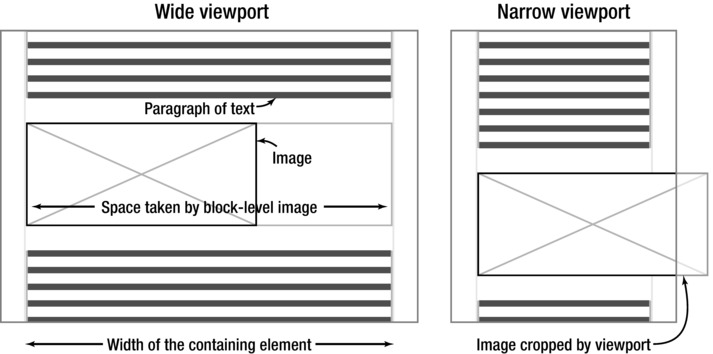
Figure 9-2. Block-level paragraphs and images. Note that the top paragraph’s height adapts to contain the text when the viewport is narrow, but by default the image is cropped.
The concept of containing elements is covered in detail in the “Block Formatting Context” section later in this chapter.
For block-level boxes you can change these intrinsic dimensions using the properties width and height. When using percentage values, these are based on the width and height of the containing element, respectively. Generally, hiding content is a bad idea, so we recommend against setting a height on an element that contains text or anything sized using font-relative units—it’s asking for trouble. If the browser’s font size is increased or the browser window is made smaller, you can easily end up with hidden content and scroll bars on the element. While you can control this behavior with the overflow property, it’s far better to just not have content hidden at all. (If you can’t avoid setting a height for a text block, use ems to adapt to text resizing, and test thoroughly.)
There are also the related properties of max-width and min-width, plus the less used max-height and min-height, which put upper and lower limits on an element’s dimensions. These are very handy if you haven’t specified a fixed width but don’t want your line length to become overly long on a very wide browser window. They don’t work in Internet Explorer 6, so it’s best to add an IE 6-targetted fixed width for that browser.
The width and height calculation algorithm
By default the width and height of a CSS box is the size of its content—defined by the edge between content and padding. However, the space that a box takes is the content box plus any padding, borders, and margins. The default calculation is
- Total width =
margin-left+border-left-width+padding-left+width+padding-right+border-right-width+margin-right - Total height =
margin-top+border-top-width+padding-top+height+padding-bottom+border-bottom-width+margin-bottom
Figure 9-3 shows an example div with a fixed width and height, plus margins, borders, and padding to demonstrate this.
.box {

  width: 240px;

  height: 160px;

  margin: 24px 48px; /* = 24px 48px 24px 48px */

  border: 1px solid #ddd;

  padding: 12px 18px 6px; /* = 12px 18px 6px 18px */
}

<div class="box">

  <h1>CSS.</h1>

  <p>It’s boxes all the way down…</p>

</div>
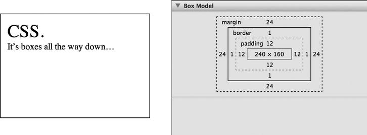
Figure 9-3. A box with padding, borders, and margins, and the same element in the Appearance tab of Safari’s Web Inspector
You might initially expect the div to take up 240x160px, but by default it will take the following:
- Total width = 48px + 1px + 18px + 240px + 18px + 1px + 48px = 374px
- Total height = 24px + 1px + 12px + 160px + 6px + 1px + 24px = 228px
You normally first encounter this when trying to float two elements that are 50% wide side-by-side (we’ll cover floats in just a moment). If you add any horizontal margin, border, or padding, the two boxes together become wider than 100%, and the second one will drop below. This also makes it difficult to use different units on margin, border, padding, and width, as the size of em and percentage units changes with the browser’s font size and browser width respectively.
This probably contradicts your expectations, as when you’re posting a present you pay for the size of the box including packaging, and not just the contents. Adding to the fun, Internet Explorer before version 6 misinterpreted the CSS Box Model, and included border and padding as part of width. If you forget to start your HTML with a doctype it still does, in what’s called quirks mode. Don’t forget the doctype!
The box-sizing property
However, everything old is new again, and using the box-sizing property you can now choose whether width and height refer to the default content-box or the more intuitive border-box (between margin and border, referred to as the border edge), which is easier for layout. Using border-box means that border and padding values will not add to the element’s width and height, as they do with content-box.
- For
content-box:width= content’s width - For
border-box:width=border-left-width+padding-left+ content’s width +padding-right+border-right-width
Going back to the previous example in Figure 9-3, let’s see how border-box has changed the math.
- Total width =
margin-left+width+margin-right= 48px + 240px + 48px = 336px - Total height =
margin-top+height+margin-bottom= 24px + 160px + 24px = 208px
Figure 9-4 shows this difference clearly — the content-box content width is the same as the border-box border edge width.
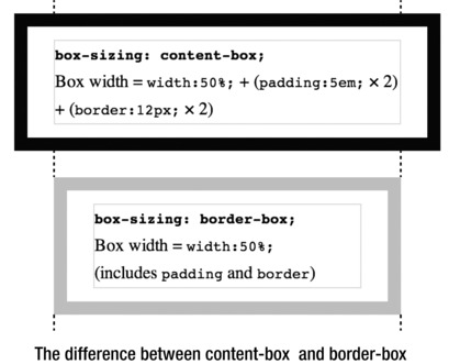
Figure 9-4. A comparison of the box-sizing property’s content-box and border-box values
Note that by default an element’s background is visible to the border edge, and the top-left corner of this is where a background image begins. If you change box-sizing, you’ll probably want to change background-clip and/or background-origin, which we cover in Chapter 11. By default the dimensions shown in your browser’s inspector tool when hovering over an element are to the border edge, so margin isn’t included. You can check margins using the inspector tool’s box model diagram we saw in Figure 9-3. (Opera’s Developer Tools and Firefox’s Firebug also include other handy information there, including the element’s box-sizing value.)
As you can see in Table 9-1, browser support for this is surprisingly good, although Firefox 13 and below can have problems when combining with min-/max-height, min-/max-width, SVG, and table cells.

However, if your audience includes Internet Explorer 7 and below, using box-sizing will require custom workarounds for those browsers to avoid breaking your layout. While Modernizr can detect this and there are polyfills, unless you support a lot of legacy browsers, just adding IE-targeted styles is probably easiest.
There are many old versions of Internet Explorer still in use. Reasons include Windows XP (which doesn’t run IE9 but is still widely used), corporate policy, and IE being the last major browser to move to auto-updating (beginning in 2012). We advocate testing occasionally in various versions of IE when creating a site, as you can normally avoid issues through good coding and progressive enhancement. However, while IE10 has finally joined the ranks of “modern browsers” sometimes you’ll encounter a quirk or bug in earlier versions (more often in IE6-7) and need to give them a little nudge.
Historically this was done using CSS filters (http://j.mp/css-filter en.wikipedia.org/wiki/CSS_filter) (like the underscore and star hacks) or by loading IE-specific stylesheets using IE’s conditional comments (http://j.mp/ies-ccdev.opera.com/articles/view/supporting-ie-with-conditional-comments/). Instead, we recommend using Paul Irish’s conditional classes on <html> (http://j.mp/html-cc paulirish.com/2008/conditional-stylesheets-vs-css-hacks-answer-neither):
<!--[if     lt       IE        7      ]>         <html     class="ie6">    <![endif]-->

<!--[if    IE      7      ]>                        <html    class="ie7">  <![endif]-->

<!--[if    IE      8      ]>                        <html    class="ie8">  <![endif]-->

<!--[if    IE      9      ]>                        <html    class="ie9">  <![endif]-->

<!--[if(gtIE9)|!(IE)]><!--> <html> <!--<![endif]-->
You can then target any IE-specific styles by prefixing with the relevant class, like so:
img                        {max-width:                           100%;}

.ie6 img {width: 100%;}
Margins on block-level boxes
Positive margin values on block-level boxes will increase the space around the box. However, negative margin values work a little differently. For block-level elements, a negative top margin will move the element (and following elements) up, potentially overlapping earlier content, and a negative bottom margin will pull following content up to potentially overlap the element, as shown in Figure 9-5.

Figure 9-5. Negative vertical margins applied to block-level boxes: the left example is for reference (no negative margins), the center example has a negative margin-top moving the element (and following content) up, and the right example shows a negative margin-bottom “pulling” following content up.
Negative left and right margins work differently depending on whether the width is auto or not. For block-level elements with a relevant width or height of auto, negative left or right margins will pull the edge of the box out, widening the element. For a block-level element with a set width (including replaced content like an image), a negative left margin will move the element to the left, and a negative right margin will pull in content to the element’s right to potentially overlap the element (although you’ll only see this when there’s content beside the block, for example when applied to the first of two floats). This is shown in Figure 9-6.

Figure 9-6. Negative horizontal margins applied to a block-level box with width: auto; on the left. The center example has a set width and negative left and top margins. The right example has a negative margin-right on image 1, which “pulls” in content to the right.
If the element’s width isn’t as wide as the parent element, using auto for left or right margins will absorb any unused space. As shown in Figure 9-7, by default an image will align with the left edge of its parent, but if the element has margin-left: auto; and margin-right: 0;, the element will touch the right side of the parent element. If both left and right margins are auto, the element will be centered in the parent element’s width, as shown in the rightmost example.

Figure 9-7. For block-level boxes narrower than their parents, adding horizontal margins set to auto will absorb any extra space, allowing you to right-align or center elements within their parent.
Collapsing vertical margins
Another interesting aspect of the box model with block-level boxes is that if two vertical margins touch, only the largest margin is used. This sounds peculiar but is actually what you want to happen most of the time. For example, without collapsing margins the CSS p {margin: 1.5em 0;} means that the margin between paragraphs is double the top the first paragraph and the bottom of the last one, as you can see in the left of Figure 9-6. We could code for this, for example by only setting margin-top. However, with collapsing vertical margins we don’t need to — the margins before and between paragraphs end up the same, as seen in the right example.
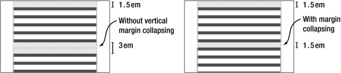
Figure 9-8. Two paragraphs, with p {margin: 1.5em 0;}. The left example demonstrates how cumulative vertical margins would work. The right example shows how collapsing vertical margins stop the space between paragraphs becoming much larger.
This seems like a minor issue, but becomes important when several nested elements all have touching top or bottom margins, such as a list (see Figure 9-9).
ul {margin: 1.5em 0 1.5em 1.5em;}

li {margin: 0.75em;}

<p>…</p>

<ul><li><p>…</p></li></ul>
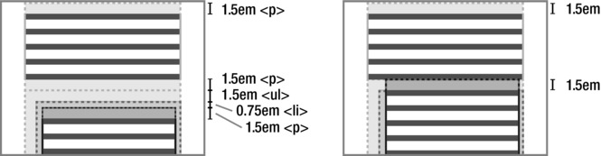
Figure 9-9. Multiple margins collapse to only the largest one if they’re touching. Without margin collapsing the nesting of elements would lead to a 5.25em gap between these two paragraphs. With margin collapsing this becomes 1.5em, the largest single value.
The top and bottom margins of an element without borders, padding, content, or clearing to separate them are also touching, and also collapse together. This is why the intuitive but bad idea of adding empty paragraphs to add vertical space doesn’t work. However, vertical margin collapsing is prevented as soon as margins are separated by padding, borders (even a transparent one), or content, as seen in Figure 9-10. The elements must also be in-flow (not floated etc), and in the same block formatting context, concepts we’ll cover soon.
p {margin: 1.5em 0;}

<p>…</p>

<!-- two empty paragraphs -->

<p></p>

<p></p>

<p>…</p>
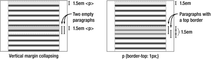
Figure 9-10. Between the bottom margin of the first paragraph and the top margin of the last paragraph, all vertical margins touch, and would be collapsed to a single 1.5em margin. However, adding p {border-top: 1px solid #000;} on the right means this border now prevents some margins from touching (and collapsing), and the empty paragraphs become visible.
Now that we’ve covered block-level boxes—elements with display: block;—let’s meet inline boxes, the other common box type.
Inline boxes with display: inline
Inline box elements generally wrap words or phrases of text content, and HTML5’s phrasing content elements are display: inline; by default. In contrast to block-level boxes, they are as long as their content, and rather than creating a rectangle, their boxes enclose the text per line (like a highlighter), wrapping over multiple lines if necessary, as seen in Figure 9-11. Inline boxes can’t contain block-level boxes.

Figure 9-11. A prargraph containing an inline box with a border that wraps (is split) over two lines.
Replaced content includes elements that are linked to and embedded, such as images and video. Non-replaced content is everything else—content that is in the HTML file. Inline replaced and non-replaced content behave a little differently, so let’s look at them one at a time.
Inline replaced content, such as an inline image, uses its intrinsic dimensions by default. It also uses the same box model as block-level content, with padding and margins affecting all sides of the element, as you can see in Figure 9-12.

Figure 9-12. An example of inline replaced content. Padding, borders, and margins affect the space taken by this image in all directions.
Inline non-replaced content (which generally means text) gets its height from font-size and line-height. Unlike the inline image in Figure 9-12, padding and margins on inline non-replaced content are applied but only affect the element and surrounding content in the direction of text flow—in Figure 9-13 this is to the left and right. A negative left margin will move the element left, and a negative right margin will pull following content in, potentially overlapping the element.
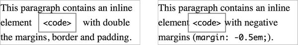
Figure 9-13. Padding and margins on inline non-replaced content, including negative margins, only affect surrounding content in the direction of the text flow, in this case to the left and right.
Browsers display inline content (text and inline elements) one line at a time in line boxes. By default a line box is tall enough to contain the boxes of each inline element in the line. For replaced content (inline images) this comes from the content’s dimensions plus vertical margins, borders and padding. This is why the image in the right example in Figure 9-12 increases the distance between lines. For non-replaced content (text) this is the content’s line-height. Inline content is vertically aligned on the baseline by default, even if the font sizes are significantly different. This can be changed with the vertical-align property, which also affects the height of inline boxes. Figure 9-14 shows how adding line-height: 0; changes the inline boxes of large text and elements with a different vertical alignment, changing the height of the line box containing this content.

Figure 9-14: By default the line box will expand to include the inline boxes of its content. For non-replaced content you can prevent this using line-height: 0; on inline elements larger than the default line box.
Refer to Eric Meyer’s Inline formatting model article (published in 2000!) for exquisite detail on how inline boxes are laid out (http://j.mp/inline-modelmeyerweb.com/eric/css/inline-format.html).
Finally, if you’re using images inline, vertical-align is something you’ll want to experiment with (vertical-align: middle; is often what you’re after). We cover the vertical-align property in more detail in Chapter 10.
Other values for display (notably inline-block and none)
While display: block; and display: inline; are the most common values, display also has a few others. The most useful of these is inline-block, which makes an element behave the same as inline replaced content, so it’s “shrink-wrapped” to its content and treated as an inline box, but we can still use width, height, margin, and padding. However it behaves as a block-level container for any elements it contains, You can see a comparison between inline and inline-block in Figure 9-15.

Figure 9-15. An element with width, padding, borders and margin as both display: inline; and display: inline-block;.For display: inline-block;, width (and height), and vertical padding and margin affect the element’s box and surrounding elements, the same as for replaced inline content.
Note that IE 6-7 only accepts inline-block on elements that are display: inline; by default (http://j.mp/ppk-display www.quirksmode.org/css/display.html). You can trick them into faking it (http://j.mp/ie-inline-block www.mindfly.com/blog/2008/12/22/the-curious-case-of-inline-block/) by applying both display: inline; and zoom: 1; via styles targeted at IE6-7 only. Note that display: inline-block; can also be used for page layout, although with some caveats such as white space in your source code, and this is something we’ll cover later in this chapter.
There’s a large group of customized table-related ones, although you won’t need to specify them for normal data tables as they’re already in the browser’s default stylesheet. However, you might use them if you use the CSS table model for layout on non-<table> elements, which we’ll also cover later.
Then there’s a few special-purpose ones that again you’ll probably only see in a browser default stylesheet, such as list-item and ruby. Finally there’s none, which prevents the element (and all children elements) from making a box at all.
Anonymous boxes
Block-level boxes can contain either block-level boxes or inline boxes. This might sound strange, as in the following code the <div> contains both text and a block-level element, and it’s perfectly valid:
<!-- warning: this div contains inline and block-level content -->

<div>

  Some inline content

  <p>An <strong>important</strong> block-level paragraph</p>

</div>
In this situation, browsers add anonymous boxes (block-level or inline) to match the Visual Formatting Model’s rules and make laying the content out easier. This also happens whenever an element’s display property contradicts the visual formatting model. Figure 9-16 shows the boxes generated by elements on the left, and on the right is a representation of the anonymous boxes a browser would use.
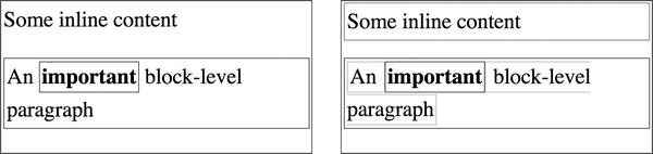
Figure 9-16. “Some inline content” would become a block-level anonymous box, because its sibling <p> is block-level. Inline content on either side of the <strong> element would become inline anonymous boxes.
It’s important to note that you cannot style anonymous boxes per se using CSS—they get inheritable styles from their parent and take default values for everything else. However, it’s good to know about anonymous boxes as sometimes this behavior can be the cause of unexpected rendering.
Not knowing the default display values for elements or their HTML5 content models can lead to unexpected rendering, so we recommend getting familiar with these so you know what can go where. It’s knowledge you’ll pick up over time, but when in doubt use a validator, and check with the specifications:
- validator.nu (
http://validator.nu/) - HTML5 elements index (http://j.mp/html5-elements-index
www.whatwg.org/specs/web-apps/current-work/multipage/section-index.html#elements-1) - HTML5 element content categories (http://j.mp/html5-element-categories
www.whatwg.org/specs/web-apps/current-work/multipage/section-index.html#element-content-categories) - CSS3 is a bit harder as it’s modular, so try individual specifications or the CSS3 2010 properties index (
http://j.mp/css-2010-propertiesdev.w3.org/csswg/css-2010/#properties) - Finally, get to know your development browser’s Inspector and work out how to check the computed value for
displayand other properties. This will tell you what the browser is actually using; if it’s different from what you expect, something like this may be the cause.
Positioning schemes and the position property
Earlier we learned that block-level boxes are as wide as their containing element and are added beneath the previous block-level element. This is called the normal flow (where boxes go by default) and is actually due to the default positioning scheme, position: static;. There are three other positioning schemes in CSS 2.1: relative, absolute, and fixed positioning. These three positioning schemes let you move an element from the scheme’s default position using the properties top, right, bottom, and left, which take length values. If you set both top and bottom, or left and right, these will also set the element’s height and width respectively,
- Relative positioning: A box with
position: relative;takes the same space it would in normal flow (if it wasposition: static;). However you can move it relative to this position usingtop,right,bottom, andleft. If the element is moved, the original space it took is preserved (content doesn’t move up), and the moved element can overlap other content.position: relative;is also useful for establishing a containing block for an absolutely positioned element. - Absolute positioning: An absolutely positioned element can also be moved (and sized) using
top,right,bottom, andleft. However, unlike a relatively positioned element, it “shrink-wraps” to the content’s width ifwidthisn’t set, and it doesn’t take any space in normal flow. An absolutely positioned element will initially appear in its static position, but if moved usingtop,right,bottom, orleftit will be positioned relative to its containing block (which will be the nearest ancestor element that doesn’t haveposition: static;), or the root element,<html>. - Fixed positioning: This is a kind of absolute positioning. While an element with
position: fixed;will also initially appear in its static position,top,right,bottom, orleftwill position it relative to the viewport (or each page for a print style sheet). Elements withposition: fixed;do not move when the page is scrolled. Like absolutely positioned elements they can still overlap other content, and also “shrink-wrap” if nowidthis set.
You can compare these positioning schemes in Figure 9-17.
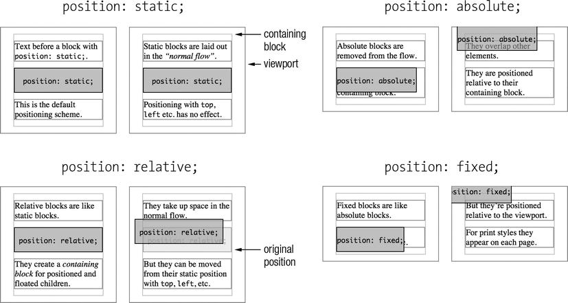
Figure 9-17. A comparison of the positioning property’s four values. The positioned box in the right example in each pair also has the styles top: -1em; left: -1em;, and is slightly transparent to more easily see what’t going on.
While positioning is a useful tool, positioned elements can easily overlap or hide content, making them unforgiving. Check that you’ve left space even when things like the font size and viewport width change.
Layers and the z-index property
When overlaps do occur, the default layering in CSS is that elements later in the HTML source will cover elements that are earlier. With the z-index property you can change this. It takes integer values, stacking elements in order from negative to positive, in addition to the default auto value. Positioned boxes (including position: relative;) with an integer value establish a stacking context, with children elements stacked based on their z-index value. Elements will need to have transparent or partially transparent backgrounds (such as opacity: 0.5;, HSLa or RGBa colors, or an image with opacity) to reveal elements they overlap.
Generally, overlapping or hidden content is not what you want, and you’ll probably want to make space for a positioned element, for example by using a margin on another element, rather than using z-index. However, sometimes it’s just the ticket. Finally, z-index integers are relative, so if you don’t get the effect you want, using a huge z-index number won’t help—look for the cause instead.
Introducing Floats
The float property was initially specified for allowing text to wrap around images. It takes the values left, right, none, and inherit. Applying float: left; to an image with the default width: auto; makes it a block-level box with the dimensions of its content (“shrink-wrapped”). Because of this, unless the content has an intrinsic width (like an image), you’ll generally want to add a specific width too. float: left; moves the element left until it touches the edge of the containing box or another float, and float: right; does the same to the right. Floating an element also removes it from the document flow so it doesn’t take up any space. This means subsequent block-level elements that aren’t floated ignore the floated element and move up to fill the gap. However, inline elements and line boxes do still make space for the floated element. For example, see Figure 9-18.
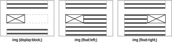
Figure 9-18. A block-level image followed by a paragraph. Applying float: left; or float: right; means the image no longer takes space in the normal flow (allowing the paragraph to move up), but the paragraph’s line boxes do make space for the image.
If more than one consecutive element is floated, they will stack up beside each other as long as there’s space. Elements with float: right; line up from right to left, as seen in the right image in Figure 9-19.
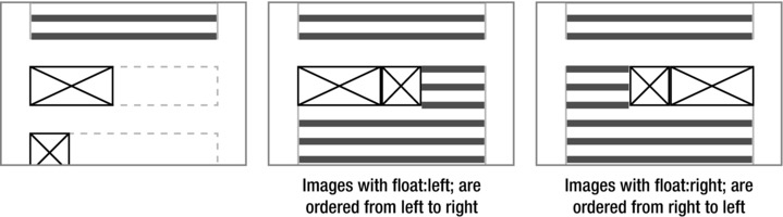
Figure 9-19. Floated elements will float beside each other if there’s space. Elements with float:right; line up from right to left.
Once there isn’t enough space, the float will “drop” beneath to the first available space. If the floats are of different heights (highly likely if text is involved) this may not be the space you hoped, as seen in Figure 9-20.
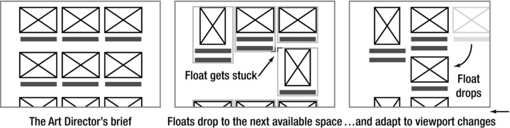
Figure 9-20. A dropped float will go to the first place with space. Unless every floated element is the same height, this won’t be the place you want.
If your grid only contains images, you can control their size or use a wrapper element to make each image the same height to prevent this. While you could set a height in ems that’s large enough to contain any content, if the objects in the Art Director’s brief contain text it will probably be easier to use a different layout technique.
Clearing Floats
Because floated elements no longer take any space in normal flow, an element containing only a float will behave as if it has no content. This is no good if the float container is meant to provide a background to the float. Also, as a float that is taller than its container sticks out the bottom by default, it can interact with subsequent content. This is probably fine for text wrapping around an image, but not so good for the next section title. To control this you need to learn about clearing floats.
There are several ways to push an element below previous floated elements, or to make an element with a floated child expand to contain it. They each have their strengths and weaknesses, so let’s look at them one at a time.
- The
clearproperty: With the valuesleft,right, orboth, applying this property to an element prevents it appearing beside any previous elements withfloat: left;,float: right;, or either float value, respectively, moving it below the floated element instead. While you can add this to an element following one or more floats to “make space” for the floats, sometimes there isn’t an element to add it to. Historically, people added<br style="clear:both;" />after a floated element to make the float container expand to contain it, but there are better ways now. - The easy clearing method (.
clearfix): Originally developed by Tony Aslett, the clearfix method (http://j.mp/easy-clearingwww.positioniseverything.net/easyclearing.html) gives the benefit of usingclear: both;without adding an extra element, by using generated content with:after. While this is a popular technique, it actually has slightly different effects in IE<8, as Thierry Koblentz details in “Everything you Know about Clearfix is Wrong” (http://j.mp/clearfix-detailswww.tjkdesign.com/articles/clearfix_block-formatting-context_and_hasLayout.asp). - Floating the container: A float automatically contains any floated elements inside it. Used alone, this has been termed the Floating Nearly Everything (FNE) method of clearing floats (
http://j.mp/fne-methodorderedlist.com/blog/articles/clearing-floats-the-fne-method/). In general, rather than floating things specifically for clearing with FNE, we recommend the following float clearing methods instead. However, knowing floats will contain floated children means you won’t need to clear a float container that is itself floated. - The
overflowproperty: This controls what happens when a block-level element’s content is too large for it, such as a long word or a<pre>block. By default, block-level elements will expand vertically, but if the element has a fixed height or width that’s too small, it will show vertical or horizontal scrollbars to give access to the content. In general, anything apart from the browser’s vertical page scroll bar should be avoided—people especially hate scrolling horizontally. Applying any value other thanvisibleto an element will also “clear” floats beside or inside it. Addingoverflow: auto;to a float-containing element is generally a good way to make it expand to contain a float, although you need to watch out for scroll bars for content that is wider or taller than the container. For images you can prevent this withmax-width: 100%; height: auto;(CSS that we’ll meet again when discussing Responsive Web Design), and for text you can useword-wrap, which we cover in Chapter 10. Note thatoverflow: hidden;can also be useful, although it should be used with great care. Finally, keep in mind that this does not work in IE6, where you’ll need to use a different technique, such as the Micro Clearfix method orzoom: 1;. - The Micro Clearfix method: Nicolas Gallagher extensively researched the problems with the traditional clearfix method and developed a new micro clearfix method (
http://j.mp/micro-clearfixnicolasgallagher.com/micro-clearfix-hack/) that is both consistent across browsers and less code. When you need to clear floats and are not able to useoverflow, we recommend using this.
/* For modern browsers */

.group:before,

.group:after {

    content: " ";

    display: table;

}

.group:after {

    clear: both;

}

/* For IE 6/7 (trigger hasLayout) */

.group {
    *zoom: 1;

}
You can see the difference float clearing makes in Figure 9-21
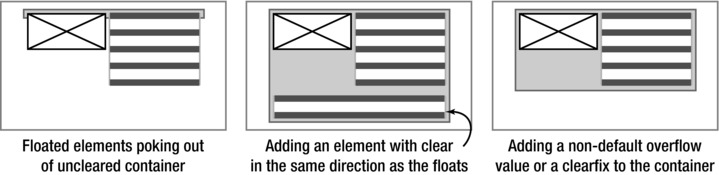
Figure 9-21. A non-floated container element won’t expand to contain floated children. A later non-floated sibling element that’s cleared, or applying a “clearfix” to the container (such as overflow: auto; or the Micro-clearfix), will expand the container to contain the floated children.
We find we generally use the micro clearfix and overflow methods, but only for elements that need it. However, the cross-browser problem with the easy clearing method gives us a good opportunity to examine why and mention one of the underpinnings of CSS layout along the way.
Block formatting context
You know that block-level boxes are laid out vertically, with their left edges touching the left edge of their containing block element (for left-to-right languages). But how does the browser know what the containing element is? An element that establishes a block formatting context becomes a containing element for its children. By default, this includes
- Floated elements
- Elements with any
positionvalue exceptstaticorrelative(for example,absoluteorfixed) - Block containers that are not block-level boxes (
displayvalues ofinline-block,table-cell, andtable-caption) - Block-level boxes with any value of
overflowother thanvisible
Establishing a block formatting context can be very handy. For example, an unfloated element beside a float will make space for the float if it becomes a block formatting context, as demonstrated in Figure 9-22.
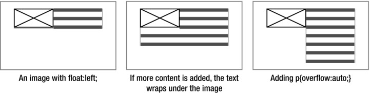
Figure 9-22. Using overflow: auto; to establish a block formatting context on a paragraph
As you’ll notice, this list includes several of the ways to clear floats we mentioned earlier—clearing floats is one of the properties of a block formatting context. In addition to clearing floats, keep in mind:
- A block formatting context acts as the container that absolutely positioned elements are positioned relative to.
- Margins don’t stick out of a block formatting context.
- Only boxes in the same block formatting context experience vertical margin collapsing.
The block formatting context is an essential part of how browsers do layout, and taking the time to understand it gives you a lot more insight into how layout works. Here’s some further reading on this advanced topic:
- “Overflow, a secret benefit” by Nicole Sullivan (
http://j.mp/overflow-benefitwww.stubbornella.org/content/2009/07/23/overflow-a-secret-benefit/) - “CSS 101: Block Formatting Contexts” by Thierry Koblentz (
http://j.mp/css-bfcwww.yuiblog.com/blog/2010/05/19/css-101-block-formatting-contexts/)
Returning to the reason that the easy clearing method had slightly different results in IE 6-7, this is because these browsers don’t support :after, and IE’s proprietary zoom property was used to clear them instead. Note that zoom: 1; causes an element to be styled with IE’s internal layout property, hasLayout: true;. Among other things, this causes the element to generate a new block formatting context and contain floats. However, the easy clearing, non-IE CSS rules don’t do this, leading to potential display differences. The micro clearfix approach causes a new block formatting context in all browsers.
As Internet Explorer 8 and higher support generated content and these versions do an increasingly good job of following the specs in general, knowing the peculiarities of hasLayout isn’t as important as it used to be. However, it’s still a good thing to know about when supporting IE6-7, so here’s some background:
“The Internet Explorer hasLayout Property” by SitePoint (http://j.mp/ie-haslayoutreference.sitepoint.com/css/haslayout)
“On having layout” by Holly Bergevin, Ingo Chao, Bruno Fassino, John Gallant, Georg Sørtun, and Philippe Wittenbergh (http://j.mp/having-layout www.satzansatz.de/cssd/onhavinglayout.html)
While we’re on the topic of old IE quirks, if you encounter IE6’s double margin bug (http://j.mp/doubled-margin www.positioniseverything.net/explorer/doubled-margin.html), you can fix it by applying display: inline; for this browser. The computed style of floats is always display: block; so this doesn’t have any negative consequences. Be aware that IE6 also expands floats if they contain content wider than the float’s width, rather than letting the content stick out. You can use overflow: hidden; targeted at IE6 to prevent this leading to floats dropping if there’s not as much space as expected.
Floats for layout
Floated layouts just use the ability of floats to line up side-by-side with floated or unfloated content without overlapping, applying this to container elements for the parts of a layout. While they were not initially intended for layout, they have become the current layout workhorse, the best of CSS 2.1’s not particularly good layout options.
So now that you know the basic floating and clearing floats, how do you actually use floats for laying out a web page? As content expands vertically, the common web design layout pattern is to have a full-width page header, followed by 1-3 columns for your content, and finally a full-width page footer appearing after the tallest column, as shown in Figure 9-23.

Figure 9-23. The common design pattern of header, footer and one to three columns of content in between. A one-column layout is the default for mobile phones in portrait mode. The gray background indicates the columns, but note that when using floats each float will only be as tall as its content.
A one-column layout is easy, as are a full-width header and footer—block-level elements are full-width by default. You can use floats to put block-level elements beside each other, such as two or more columns. However, you need to watch out for the total width of all the columns becoming larger than 100% of the containing element’s width, as if there’s not enough horizontal space the floats will adapt, meaning the last column will “drop” underneath. As mentioned earlier, mixing horizontal units (width in %, border in pixels, etc.) makes this likely unless you’re using box-sizing: border-edge;. Our buggy friend IE 6 can increase element widths by a few pixels (in addition to not supporting box-sizing), so it’s a good idea to have the columns’ combined width be a little less than the containing element in order to prevent unexpected column dropping.
Let’s have look at some options.
Two column layout methods
- Float first column left into second column’s large left margin: Adding a left margin to one column gives you a place to float another column into.
- Float first column right, second column has fixed width: By narrowing one column you can create space on the right to float another column into.
- Float both columns left: While this works, any space left over appears to the right of the last float. If you have a visual right page edge, such as a border on the right float, its right edge won’t be aligned with the container element.
- Float first column left and second column right: This makes sure the right column aligns with the right edge of the container element. Any space left over appears between the two columns—no margin required.
Layout methods for three or more columns
You can just use modified versions of the methods above to align more than two columns.
- Central column unfloated with margins either side for floated columns: By adding margins to both sides, you can create space for extra columns to float into.
- Float columns left, except float the last column right: Any space left over appears the left of the last column.
We recommend firing up your text browser (or using an online tool like Dabblet.com or CodePen.io), and recreating some of these layouts, assigning a different background color to each column element. By applying different CSS rules and seeing the results you’ll start to get a feel for how to put together a simple layout using floats.
<style scoped>
  div {

    border: 1px solid #666;

    padding: 0.5em;

    background-color: #ddd;

}

.main {…}

.secondary {…}

.tertiary {…}

</style>

<div class="main">…</div>

<div class="secondary">…</div>

<div class="tertiary">…</div>
Remember to add some text to each div, or assign a width and height, so you can see them.
Faking full height column backgrounds
If you have background colors on your columns, you can see that the floated boxes only extend as far as their content. However, you’ll probably want the column background color to extend to the footer, even for shorter columns. To get equal height columns, you can fake it using one of several techniques. Unfortunately, unless you’re using pixel-based column widths (where Dan Cederholm’s Faux Columns technique is perfect (http://j.mp/faux-columns www.alistapart.com/articles/fauxcolumns/)), there’s no basic and widely supported method, However, Chris Coyier has compiled a list of the options on CSS Tricks to help you (http://j.mp/equal-height-cols css-tricks.com/fluid-width-equal-height-columns/), and by the time you’ve finished this book Nicholas Gallagher’s clever pseudo-elements-based method should be no problem.
Changing column order with negative margins
In trying out some of these layout patterns, you will have noticed the HTML source order of the column elements dictates their placement. This is fine when that’s the order you want, but sometimes it won’t be. For example, it’s ideal to have your content ordered by importance in your HTML (based on what the user would want to see first), so if your CSS doesn’t load, the main content will be near the top. Ideally, you’ll start with a simple, one-column, mobile-friendly layout (more on this when we cover Responsive Web Design later in the chapter) before adding the CSS for columns on wider displays towards the end of writing your CSS. If so, your content source ordering will probably already be by importance. Even if you’re starting with a desktop layout, it’s useful to think about this as a good source order helps when linearizing your design—removing floats on columns to make a one-column layout more suited to mobile devices.
While there’s no property to change the order of sibling floats, when your columns use the same width units you can both keep your content in order of importance in the source, then rearrange your columns by using negative margins. For example, you can see the result of the following code in Figure 9-24.
<!-- note: using divs because we don’t know the content -->

<div class="content">…</div>

<div class="nav">…</div>

<div class="sidebar">…</div>


div {

  float: left;

  /* box-sizing for easy testing */

  -webkit-box-sizing: border-box;

  -moz-box-sizing: border-box;

  box-sizing: border-box;

  border: 1px solid #666;

  padding: 0.5em;

  background-color: #ddd;

}

.content content {width: 50%;}

.nav secondary {width: 30%;}

.sidebar {width: 20%;}
/* nav - content - sidebar */

.content {margin-left: 30%;} /* space for nav */

.nav {margin-left: -80%;} /* 50% + 30% */
/* sidebar - content - nav */

.content {margin-left: 20%;} /* space for sidebar */

.sidebar {margin-left: -100%;} /* (50% + 20%) + 30% */


/* content - nav - sidebar */

/* This is easy as it’s source order. Floating alone is enough! */


/* nav - sidebar - content

not necessarily a good layout, but to show how it’s done */

.content {margin-left: 50%;} /* space for nav + sidebar */

.nav {margin-left: -100%;} /* (50% + 50%) */

.sidebar {margin-left: -70%;} /* 50% + 20% */

Figure 9-24. Rearranging floated elements using negative margins and math
To find out more about flexible layouts, we recommend Zoe Mickley Gillenwater’s book Flexible Web Design. The following articles are also recommended:
- “In Search of the Holy Grail” by Matthew Levine (
http://j.mp/ala-holy-grailwww.alistapart.com/articles/holygrail) - “Multi-Unit Any-Order Columns” by Eric Meyer (
http://j.mp/meyerweb-columnsmeyerweb.com/eric/thoughts/2005/11/09/multi-unit-any-order-columns/)
The effects of different units for layouts
The three well-supported length units (pixels, percentages, and ems) have different properties when used for layout dimensions. Of course, you can use these layout techniques for parts of a page as well as page layouts. You can also mix various layouts techniques together as needed. Let’s briefly look at each one in turn.
Pixel layouts
There’s a long and glorious tradition of treating web design the same as print design, based on using inflexible pixel-based layouts. A pixel-based layout just uses pixel dimensions on container elements, such as <body> or <div class="wrapper">. Figure 9-25 shows an example of a pixel-based page layout.
Remember that setting a fixed height on anything containing text (or content sized using ems) is generally asking for trouble
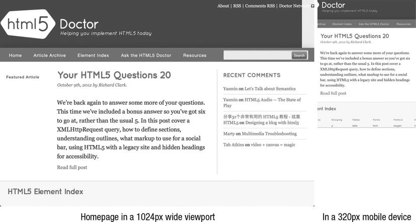
Figure 9-25. Pixel-based layouts work well at their intended viewport width, but without extra work will become far less usable at smaller sizes. Here we’ve zoomed in on the main content in the right image, so parts of the navigation are no longer visible. In a narrow viewport this would lead to horizontal scrolling. (http://html5doctor.com/)
Using pixel dimensions for layout can make sense when your content is mainly a fixed width, especially replaced content such as images or videos. It can also be useful in situations where every pixel is vital, such as a mobile site or a dense web application’s interface. Another time to consider a pixel-based layout is when your design is dependent on the relation of text with background images (although we would caution against this kind of design), or when you need to incorporate large fixed-width banner advertising.
Aside: The viewport is the window through which the user sees the web page. If the web page is larger than the viewport, by default scroll bars appear.
Pixel-based layouts do not adapt to changes in font size or viewport size. While this has been perceived as one of the strengths of pixel layouts, in truth this inflexibility makes them suitable only under ideal circumstances. Also, the window of usefulness on pixel-based layouts for mobile phones is limited, as mobile devices with screen sizes other than 320x480px explode. Because of this we find we don’t use pixel-based layouts, except when testing or prototyping.
So what about content with a fixed width, such as images? Well, image width being fixed is all in your mind, as you’ll soon see.
Flexible layouts
Flexible layouts are based on units that adapt the layout to the browser environment. While they can require a little more forethought (especially if you are used to pixel-based designs), they reward by being more bulletproof, or less likely to break under pressure.
Be like water with liquid layouts
Liquid layouts (also called fluid layouts) define horizontal measurements using percentages, adapting to the browser’s width and helping prevent the dreaded horizontal scroll. The default style for block-level elements is equivalent to a full width, single column liquid layout. The main disadvantage of percentages is that without a little care it’s easy to make unreasonably long line lengths on large displays, which hurt readability. Because of this, liquid layouts generally should be used with min-width and max-width values in ems or pixels. Figure 9-26 shows an example of a liquid page layout.
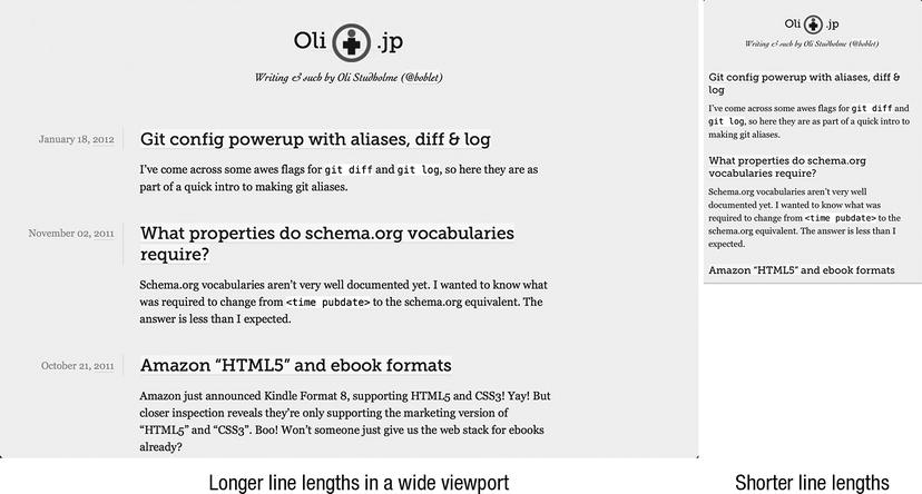
Figure 9-26. A liquid layout, where the width of elements changes to fit the space available. It uses max-width to prevent line lengths becoming unreadably long in wide viewports. (http://oli.jp/)
However, they work best with content that is also flexible. Wide or fixed-width content (such as images, tables, and blocks of code) require special care. One way to address this for replaced content like images is to use the max-width property.
<style>

img {

  max-width: 100%;

  height: auto; /* so images with a height attribute don’t scale in one dimension */

}

</style>

<img src="img/earth.jpg" width="695" height="695" alt="The blue marble of earth, as seen from

space">
By default the image will be the size of the width and height attributes (or the image’s intrinsic width and height if these are not set), letting the browser assign space and preventing a reflow in desktop browsers. However, if the image’s containing block becomes narrower than the image’s width, the max-width and height properties will scale it. This prevents intrinsic image widths breaking a layout, and browsers generally do a reasonable job of scaling down images, too. Figure 9-27 shows the result.

Figure 9-27. A flexible image (with a max-width in relative uints) that is too large will be scaled by the browser. The image on the left has max-width: 100%;, and will be scaled when wider than the containing element or viewport. As seen on the right, a default image (using intrinsic dimensions) will not be scaled, and by default will trigger horizontal scroll bars.
When creating a liquid layout, you can get your width values in several ways. In addition to just using values based on a grid, or ones that seem appropriate (like 50%, 33%, 66% etc.), you can also create a pixel-based grid for a target screen width (perhaps based on a mockup), then convert using the formula of size ÷ context = result, treating the result to a percentage. For example, a 360 px wide column for a 960 px wide design would give 360 ÷ 960 = .375, which is 37.5%. Incidentally, this “desired size ÷ context = result” formula is also used to calculate typography in ems in Chapter 10. If doing this we recommend “showing your math” in a comment beside the value, for example:
While this might seem like a lot more work than just using pixels, the percentage-based layout will adapt gracefully to larger and smaller viewport sizes, a huge benefit. You will need some extra techniques to optimize your liquid layouts for very narrow and very wide screens, as it can only adapt so far. This is something we’ll cover with media queries later in this chapter.
Liquid layout browser support issues
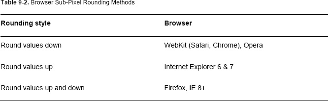
While we generally love liquid layouts, there’s an important caveat to keep in mind. As with all length values specified in something other than pixels, the browser must convert percentage values to pixels for display. As John Resig documents in “Sub-Pixel Problems in CSS,” (http://j.mp/css-sub-pixelejohn.org/blog/sub-pixel-problems-in-css/) browsers have slightly different methods of doing this (see Table 9-2), which can result in small differences between browsers.
This can lead to issues such as an element being a few pixels too narrow when rounding down, occasional 1 px gaps between elements when rounding both up and down, and causing floated elements to drop below other content when rounding up. The first two are generally minor problems, but Internet Explorer’s rounding up can break a layout based on floats. One way to avoid this is to make sure your width values total slightly less than 100%, giving a little wiggle room. Browsers are moving to using sub-pixel positioning (Firefox, IE 10, WebKit as of mid-2012…), so will more often do what you expect in the future.
Finally, there are some Internet Explorer issues to address. As mentioned, IE6 doesn’t support min-width, max-width, min-height, or max-height. For content images, you can generally maintain fluidity by replacing max-width: 100%; with width: 100%; via styles targeted specifically at IE6. Note that max-width: 100%; only affects images that would otherwise be wider than the containing block. Using width: 100%;, however, means the image will always be the width of the containing block. This is completely different and can lead to problems, so test thoroughly. There are also JavaScript-based polyfills such as Dean Edwards’ IE7.js (http://j.mp/ie7-js code.google.com/p/ie7-js/) if absolutely necessary.
The other issue is that, unlike modern browsers, IE6 scales images very poorly. If this is a concern, you can address it with the CSS -ms-interpolation-mode: bicubic; or by using Microsoft’s proprietary CSS filter AlphaImageLoader. For the details on the AlphaImageLoader technique and a handy script to automate the process, read Ethan Marcotte’s “Fluid Images” (http://j.mp/fluid-images www.alistapart.com/articles/fluid-images/). This is a portion of Chapter 3 in his book Responsive Web Design, which we highly recommend reading.
Typographic focus with elastic layouts
An elastic layout uses ems for horizontal measurements, which is based on the browser’s font size. By default 1em = 16px. This means if the user increases or decreases the font size, an em-based layout will adapt proportionally, maintaining line lengths. Figure 9-28 shows an example of an elastic page layout.
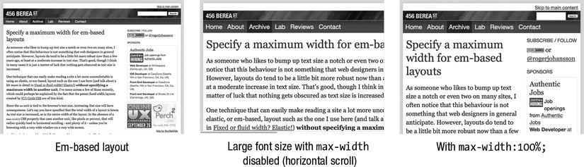
Figure 9-28. 456 Berea St. (http://www.456bereastreet.com/), the website of Roger Johansson, sporting an em-based layout. By turning off Roger’s max-width declaration we can see horizontal scrolling in the second image, where the browser’s font settings have been increased.
Historically, increasing or decreasing the size in browsers only changed the text size and didn’t affect other content or the page’s layout. By setting horizontal measurements in ems, you could make text size changes also scale the page layout, and even content like images (if they were sized in ems). Recent versions of all browsers now zoom the page by default, reducing the benefits of em-based layouts, but this is good to keep in mind for backwards compatibility.
Also, if the user sets a very large text size, this can seriously affect the layout, with horizontal scrollbars as the content becomes too wide for the viewport. As with liquid layouts, you should choose a range of text sizes to support, and use a max-width in a different unit (such as percentages or pixels) to prevent horizontal scrolling beyond this. While not commonplace, this is still a great technique to have in your toolbox, as you can combine layout techniques in a hybrid layout.
As flexible as you want with hybrid layouts
Hybrid layouts combine more than one layout method to create a layout. Generally, this is used to combine fixed-width content (a width declared in pixels) with fluid content. This can be a great choice when you have content which has a set width—such as advertising—in the sidebar, combined with a fluid main content column. Figure 9-29 shows a website using floats, elements with widths in ems, max-widths in pixels, plus some absolute positioning and use of display: inline-block; too.

Figure 9-29. The website for Prism (http://prismjs.com/), a syntax highlighter by Lea Verou, is an example of a hybrid page layout, combining various layout methods.
One of the benefits of hybrid layouts is that you can mix your layout techniques to take advantage of the strengths of each. For example, you could set the width of a page in ems then the widths of columns in percentages to make an elastic design more bulletproof. However, recently we’ve found ourselves tending to just use page layouts with all columns in percentages plus min-width and max-width values in ems or pixels, instead of hybrid layouts with a pixel-based column.
To summarize, if you’re beginning with CSS layouts, our best advice is to make some trial pages, view them using the browser’s developer tools, and experiment. Try editing the CSS rules applied and see how this changes the element’s position, computed layout styles, and interaction with other elements. After that, try seeing how different browsers display the same page, and you’ll be well on the way to familiarity with both layout using CSS, browser differences, and browser-based tools.
Other CSS 2.1 layout methods
CSS layouts generally revolve around a full width page header and footer, with one or more columns in between. The most basic things you need for this are the following:
- Positioning columns beside each other
- The ability to set the columns’ widths
It’s also good if containing elements shrink-wrap their content so you don’t need to explicitly set a width and/or height, and that columns adapt to their surroundings (in other words, they don’t cover each other). While we’ve covered floats in detail, there are two other CSS 2.1-based methods that fulfill these requirements and that you can use for layout. Unfortunately both of them are … challenging for Internet Explorer 6-7. Let’s take a quick look.
Using display: inline-block; for layout
Elements with display: inline-block; line up beside each other, and also shrink-wrap their content. Even better, you can use properties like text-align: justify; to equally space children, text-align: center; to easily center elements, and vertical-align: top; to make a grid of boxes that will line up in rows. You can also use the negative margin technique, possibly combined with padding on a container element, to rearrange columns, just as you did with floats. Figure 9-30 shows the layouts of Figure 9-24 redone using display: inline-block;

Figure 9-30. Using negative margins to reorder display: inline-block; columns. Compare this with Figure 9-24.
This seems great, but there are two browser support issues to solve. IE6 and 7 don’t support inline-block, although as mentioned earlier, you can trick them into behaving by applying both display: inline; and zoom: 1;, using styles targeted at IE6-7 only.
The second problem is potentially more difficult—elements using inline-block naturally have a small space between them due to the way CSS collapses inter-element whitespace in HTML (the spaces, tabs, and line-breaks in your HTML code). This is about 4 px, but varies based on the container element’s font and font-size, and the browser. As long as your design doesn’t depend on aligning things precisely, or knowing the exact width taken by a row of inline-block elements, this isn’t a problem. If your design does depend on this, such as navigation tabs that should touch, there are several ways to work around this. Unfortunately, none of them are ideal.
The easiest way is to remove whitespace between the elements in your HTML. You can do this by any of the following means:
- Putting everything on one line (possibly just by automatically minifying your HTML, which you might be doing anyway to improve performance).
- Putting the closing tag beside the next inline-block element’s opening tag, with no space between.
- If you’re using this technique for navigation, etc. where your inline-block elements are
<li>elements, you can leave off the closing tag, as these elements are self-closing in HTML5. This won’t work for elements such as<div>,<section>, etc. While we prefer explicit closing tags, this is perfectly valid HTML5. - You could even wrap the line-break in an HTML comment.
See the following code samples for examples:
<!-- adjacent inline-block closing and opening tags together -->

<nav class="page-nav">

  …

</nav><article class="content">

  …

</article><aside class="sidebar">

  …

</aside>
<!-- no closing </li> tags -->
<ul>

  <li>Home

  <li>Our Work

  <li>Articles

  <li>About Us

  <li>Contact

</ul>


<!-- wrapping line breaks in HTML comments -->

<nav class="page-nav">

  …

</nav><!--

--><article class="content">

  …

</article><!--

--><aside class="sidebar">

  …

</aside>
Other ways to address this are more fragile. You can try one of the following:
- Set
font-size: 0;on the container element, then reset thefont-sizeon the column elements. This stops font sizes inheriting, although you could reset it usingremin modern browsers or even usefont-size: 1%;on the container element andfont-size: 10000%;on the children. - Use a right margin of about
-0.3em. This can fail in IE6-7, and you’ll need to adjust for the font you’re using and test thoroughly. You could also set thefont-familyto Courier New, which should be exactlymargin-right: -0.6em, although you’ll then also have to reset thefont-familyon the column elements’ children.
There’s a way proposed in CSS4 to solve this using text-space-collapse: discard;, but, well, it’s CSS4 and has zero support at the time of writing. None of these options are particularly good, but as long as your design doesn’t depend on adjacent elements touching or knowing the exact width, this isn’t a problem. This is demonstrated in the HTML5 Boilerplate website (http://html5boilerplate.com/) in Figure 9-31, which uses inline-block for laying out the navigation, buttons and content columns.
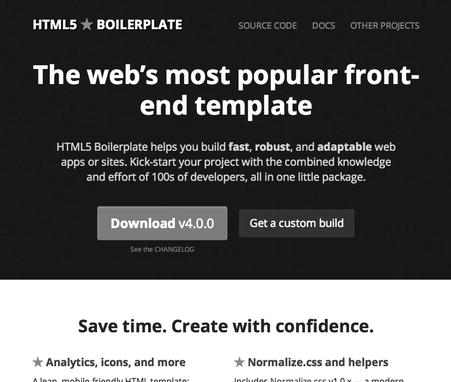
Figure 9-31. The HTML5 Boilerplate website using display: inline-block; extensively for layout.
If your design does depend on exact sizing, consider one of the “removing HTML whitespace” workarounds, or perhaps a different layout method.
Using display: table; for layout
After the web standards movement has spent the last 10 years fighting to stop the use of nested <table> elements for layout, it might seem strange to suggest tables for layout. However, the table-related display values are CSS-based presentation and are not an abuse of the semantics of the <table> element when applied to elements like <div> or <section>. By specifying display: table-cell; on the column elements, the columns will line up beside each other, and allow you to specify a width. Applying width values to both container and columns gives you a layout.
This also gives you the same benefits that made <table>-based layout so appealing. For example, border-collapse and border-spacing give you control over borders and spacing between cells, and cells on the same row will be the height of the tallest cell, so you don’t need faux columns. You don’t even need to assign display: table; or display: table-row; to container elements—for a single row the browser will add these as anonymous boxes to accommodate elements with display: table-cell;. You can also do fun things with some of the other table-related display values. For example, you can use display: table-caption; together with caption-side to rearrange the order of elements, as Jeremy Keith covers in “Re-tabulate” (http://j.mp/re-tabulate adactio.com/journal/4780/).
The bad news is that IE 6-7 don’t support display: table; and there’s no workaround other than creating a separate fallback layout for these browsers. There’s also no CSS equivalent to the HTML attributes colspan and rowspan, and duplicating them generally requires complex nested elements with display: table; or display: table-row;. Keep in mind that table cells expand to contain their content, and with replaced content like images this can break a display: table;-based layout. You can add table-layout: fixed; to the element with display: table; to force cell widths to be respected. Finally, table layout comes with all the source order dependence that made table-based layout so fragile. At the time of writing, we think these are significant problems for anything other than progressive enhancement-style improvements.
Comparing inline-block and table layouts
The main differences between using display: inline-block; and display: table; are the following:
- If there’s not enough width to contain all the columns,
inline-blockelements without a width will drop down to the next line (like floats), content ininline-blockelements with a width will stick out, anddisplay: tablewill trigger horizontal scrolling. - The other properties you can use with each vary, such as
text-align: center;fordisplay: inline-block;, andborder-collapseandborder-spacingfordisplay: table;, giving each technique a different set of strengths and weaknesses. - The complete lack of IE 6-7 support for
display: table;, requiring an alternative layout.
While display: inline-block; and display: table; are both potentially useful layout options, they both have potentially significant drawbacks. However, we think they’re worth experimenting with and keeping in mind, as occasionally they’ll be just what you’re after.
In summary, these frankly inadequate CSS 2.1-based layout tools, plus spotty support in older browsers, have made complex layout a glaring pain point in CSS. Luckily for us, layout in CSS is finally getting some love and attention from both the World Wide Web Consortium (W3C) and from browser makers. However, before we have a look at what’s coming, let’s cover some related things that are usable (and essential) now: media queries, responsive web design, and techniques for dealing with high resolution displays.
Media queries and Responsive Web Design
We touched on responsive web design earlier while describing liquid or fluid layouts—layouts that use percentages for horizontal widths. In “On Being “Responsive” (http://j.mp/being-responsive unstoppablerobotninja.com/entry/on-being-responsive/), Ethan Marcotte—who started that whole “responsive web design” thing—defines its three main requirements as:
- A flexible grid
- Flexible images (or images that work in a flexible grid)
- Using media queries to adjust these across different devices
Fundamentally, this is the elegant, modern successor of the ideas in John Allsopp’s “The Dao of Web Design” article, a “letting go of control and becoming flexible.” By designing with the fundamental philosophy of flexibility or adaptability, then using media queries to further adapt the design based on the device’s properties, you can make a design that responds gracefully on a variety of devices. We’ve already covered flexible grids (percentage and em-based layouts) and images (max-width: 100%; height: auto;), so let’s see how media queries can help us.
Introducing media queries
Media queries (http://j.mp/css3-mq dev.w3.org/csswg/css3-mediaqueries/) began as a way to provide different CSS depending on the media, such as a print stylesheet:
<link rel="stylesheet" media="screen" href="screen.css">

<link rel="stylesheet" media="print" href="print.css">
They also allow you to test against media features such as browser width, screen width, device resolution etc. This allows you to customize your CSS based on these features, for example:
@media screen and (min-width: 24em) {

  body {CSS for everything except small devices…}

  …

}

@media screen and (min-width: 42em) {

  body {CSS for tablets and larger screens…}
  …

}
In addition to including as an attribute on a stylesheet <link> element and as an @media block inside a stylesheet, you can also use media queries on an @import rule (in the same way as @media). However, for performance reasons we recommend against using @import because stylesheets included this way will only begin downloading after the first stylesheet is downloaded.
Media queries syntax
At the time of writing, media types include all (the default), braille, embossed, handheld, print, projection, screen, speech, tty, and tv. However, in most cases you’ll only need all, screen, and print.
The list of media features is longer and is added to the media query in parentheses:
width: The width of the browser’s viewport, and the most commonly used queryheight: The height of the browser’s viewportdevice-width: The width of the device’s screendevice-height: The height of the device’s screenresolution: The density of pixels in the output deviceorientation: Eitherportraitorlandscapeaspect-ratio: The ratio ofwidthtoheight(e.g. 16/9 for a widescreen TV aspect)device-aspect-ratio: The ratio ofdevice-widthtodevice-heightcolor: The number of bits per color component of the output devicecolor-index: The number of entries in the color lookup table of the output devicemonochrome: The number of bits per pixel in a monochrome frame bufferscan: The scanning process of TV output devicesgrid: To query whether the output device is grid or bitmap
Most of these also come in min- and max- variants, but the ones you’ll generally use are the following:
min-widthormax-widthmin-heightormax-heightmin-resolution(together with-wekbit-min-device-pixel-ratio)
The resolution properties are used to target devices with different pixel densities (for example Apple Retina displays) with custom CSS, and take values in dpi (dots per CSS inch), and the recently added dppx (dots per CSS pixel). However, WebKit implemented the related proprietary device-pixel-ratio property, which takes a number value. You’ve most likely seen this as -wekbit-min-device-pixel-ratio, with a normal display being 1, and a Retina display (with double the resolution) being 2. Other browsers also implemented this as -moz-min-device-pixel-ratio and -o-min-device-pixel-ratio (note the Opera variant takes a fractional value). However, these browsers also implemented resolution, and you can convert from device-pixel-ratio to dpi by multiplying by 96. This means at present to target double density displays (4 device pixels per CSS pixel), you’d use
@media screen and (-webkit-min-device-pixel-ratio: 2), screen and (min-resolution: 192dpi) {…}- In the future when
dppxsupport becomes widespread, you will be able to use @media screen and (-webkit-min-device-pixel-ratio: 2), screen and (min-resolution: 2dppx) {…}
As you’ve just seen, you can combine media query selectors using the basic logical operators “and”, or (as a comma), and “not.” Here are some examples:
screen and (min-width: 534px): Applies the following styles to all screen-based devices (e.g. not print) with a display that’s 534 px or wider.screen and (max-width: 960px), screen and (max-height: 960px): Applies styles to a device with a width that’s up to 960 px in either dimension.screen and (min-width: 20em) and (max-width: 32em): Applies the following styles to all devices with a display that’s between 20em and 32em wide, based on the rootfont-size.screenand(max-width: 480px)and(-webkit-min-device-pixel-ratio: 2), screen and (max-width: 480px)and(min-resolution: 192dpi: Applies styles to a device that’s up to 480 px wide with a double resolution display, such as a Retina display iPhone (either orientation).
Desktop-first, mobile-first, and content-first design
Websites built before the rise of mobile devices were built to a specific screen width. While this wasn’t thought of as building a “desktop-first” site, in hindsight it’s easy to see the bias. While it’s still possible to design for a desktop browser first, then overwrite some of these styles in media queries for mobile phones, we find the workflow is easier (and the CSS is simpler) by initially designing for mobile browsers, then adding media queries with extra styles for larger screens. Another benefit is a mobile layout will at least be usable on any browser that doesn’t support media queries, but a wide layout might not be on a small phone. Luke Wrobluski details the benefits of this approach in his presentation “Mobile First” (http://j.mp/mobile-first-preso www.lukew.com/presos/preso.asp?26).
However, philosophically we find content-first design, elucidated by Jeremy Keith in “Content First” (http://j.mp/content-first adactio.com/journal/4523/), is an even better fit. Before you begin thinking about a layout, you should be thinking about what content is appropriate and what the person viewing the page will want to achieve. Doing this prevents a common problem with the “desktop-first” approach: adding unnecessary content just because there’s space. Starting with the content and functionality as the focus will help you with the site’s (or app’s) architecture, and make progressing into mobile then desktop designs easier. This also means you should have much of your content before beginning the design, and while this can be tricky with some clients, we find that when it’s possible it makes a big difference to the final result by keeping your design grounded in reality.
While you can choose the widths to target with media queries by consulting browser screen size charts, we recommend taking a content-first approach here, too. Instead, stretch the content to see where it breaks (perhaps using Remy Sharp’s useful Responsive px tool (http://responsivepx.com/), then set breakpoints based on this. There’s also nothing requiring you to use pixels for your media query length units—checking for min-width etc. in ems also works well.
Finally, keep in mind you can make media queries inclusive by setting only one min- or max- feature per query, or exclusive by setting both. For example,
@media all and (min-width: 534px) {…}

@media all and (min-width: 961px) {…}
is very different from
@media all and (min-width: 534px) and (max-width: 960px) {…}

@media all and (min-width: 961px) {…}
This will affect what styles are applied and what styles may need overriding. This is one of the decisions you’ll need to make at the start of each project. For more on your various media query-related choices and their consequences, we recommend reading Zoe Mickley Gillenwater’s detailed article “Essential Considerations for Crafting Quality Media Queries” (http://j.mp/quality-mq zomigi.com/blog/essential-considerations-for-crafting-quality-media-queries/).
Browser support for media queries
There are several ways you can implement media queries. You could put all your CSS in a single stylesheet, using @media media query rules as appropriate. At the other extreme, you could split your CSS over several stylesheets, one per media query, and add them via <link>. Both of these techniques have pros and cons. For example, a single file is good because one 20KB download is faster than two 10KB downloads due to the overhead of beginning the download. Using <link> with per-query stylesheets is also good because older browsers that don’t understand media queries will ignore those <link> elements, saving them from downloading unnecessary styles.
Unfortunately, there are bigger problems than this. As with many low-end phones, Internet Explorer version 8 and below support basic media queries (like screen and print), but not queries containing media features. Ouch. This means if you start with basic mobile styles and then use media queries to supplement and override these for desktop browsers, IE 6-8 will only apply the mobile styles. There are several ways to address this issue.
- Do nothing: If your layout is flexible, you could just let IE 6-8 get the default design. If this is the desktop layout, you’re fine. However, if it’s the mobile one, this is probably not an option, because while the content will still be usable, line lengths will become unreadable.
- Minor IE-specific tweaks: You could add specific styles targeted to IE8 and below, perhaps just supplementing basic mobile styles with a fixed width on
<body>or wrapper elements (if the site is built with mobile styles as the default). Depending on how much you supplement, this can lead to “forking” your code and essentially maintaining two designs—something to avoid if possible. - Polyfilling with JavaScript: There are a couple of options here, including Scott Jehl’s excellent lightweight respond.js (http://j.mp/respond-js
https://github.com/scottjehl/Respond) polyfill. However, this means if the script doesn’t load or JavaScript is turned off, you’re back to a “do nothing” approach. - Splitting your styles into multiple files for IE: The most bulletproof approach is to make separate stylesheets for the classes of device you’re going to support: perhaps base mobile styles for everything, intermediate styles, and desktop styles. Include the base styles for all browsers, then include other styles via media queries. Finally, include desktop styles without an advanced media query in an IE conditional comment. Jeremy Keith’s article “Windows mobile media queries” (http://j.mp/windows-mq
adactio.com/journal/4494/) details how, but here’s the code:
<!-- assuming a mobile-first design: -->

<link href="/css/base.css" media="all"> <!-- mobile styles for everyone -->

<link href="/css/wide.css" media="all and (min-width: 30em)">

<!--[if (lt IE 9)&(!IEMobile 7)]>

  <link rel="stylesheet" href="wide.css" media="all">

<![endif]-->
The funky conditional comment here loads the wide.css stylesheet for versions of Internet Explorer less that IE9, but not for Internet Explorer Mobile 7, which can’t parse feature-based media queries, but should get the mobile styles. If you’re using a CSS pre-processor or similar, it should be no problem to arrange your CSS how you like—you could even create two versions of wide.css, one with customizations for intermediate devices in an @media block for modern browsers, and the other without this for older Internet Explorer. This is an issue you can avoid with a “desktop-first” approach, but if you do, you’ll have the far harder challenge of dealing with mobile issues.
Viewport on mobile phones
Speaking of which, one way many smartphones deal with desktop-centric designs on a tiny screen is to pretend to be 960 px wide. You then zoom in and out to read and move the page in the viewport to navigate. However, you can tell mobile devices to use their actual CSS pixel width by adding this meta tag to the document’s <head>:
<meta name="viewport" content="width=device-width, initial-scale=1.0">
Yes, width=device-width and initial-scale=1.0 are what you’d imagine: set the viewport’s width to the device’s width (in CSS pixels) and don’t scale the display. There are other comma-separated values you can add to content, such as minimum-scale, maximum-scale, and user-scalable. Note that minimum-scale=1.0 may be useful, but applying maximum-scale=1.0 or user-scalable=no is generally user-hostile, and we recommend against it. Setting these things in CSS is also potentially coming via the CSS Device Adaptation specification’s @viewport rule (http://j.mp/css-device-adapt dev.w3.org/csswg/css-device-adapt/#the-viewport-rule), although at the time of writing this is only supported by Opera.
The trouble with images
You’ve seen how to make fluid images and how to use media queries to apply styles based on device resolution, but those pixel-based images are still a tricky problem in a responsive design. You want to send appropriate images to different devices—small, highly compressed images to devices with small screens, and larger ones to larger screens. High resolution displays make this even harder; double resolution images have four times the pixels, making them significantly larger. You definitely don’t want to send large, high resolution images to someone out and about on their cell phone. Speaking of which, while there is a specification for bandwidth detection (the Network Information API spec http://j.mp/netinfo-api www.w3.org/TR/netinfo-api/), at the time of writing it’s only supported by a tiny fraction of current mobile devices, so we’re currently forced to guess bandwidth by correlating it with screen size, or even resorting to server-side browser sniffing. All of which makes high-resolution images a major problem.
The default behavior of browsers tends to be “DOWNLOAD ALL THE THINGS!” Browsers that understand advanced media queries will download all <link>ed stylesheets even if the media query doesn’t apply. The latest browsers will not preload images that are in media queries that don’t currently apply. However, they will begin pre-fetching all images on a page before CSS and JavaScript rules are applied. If an element has an image applied via background-image that’s subsequently overridden in the cascade, older versions of Mobile WebKit in many Android and iOS mobile devices will download both images. All browsers will also download images that are in elements hidden with display: none;. At the time of writing, there’s no official, implemented way to address this image problem (although it is being actively worked on). Collectively this means that currently there’s no easy way to send appropriate images without some people having to download two versions of the same image.
Ignoring these issues for a moment, let’s cover a basic way to add high resolution images to your page: use a suitably large image, then declare the desired dimensions using <img> element attributes or by using width and height in CSS. For example, if you want to add a double-resolution HiDPI image to be 320x240 CSS pixels and display at 640x480 device pixels on a double-resolution device, you’d create the image at 640x480 px, then use CSS or image element attributes to resize it to the desired size, like so:
<!-- resizing a 640x480px image using the HTML width and height attributes --> <img src="miss-baker.jpg" width="320" height="240" alt="Monkey Baker with a model Jupiter vehicle (NIX collection, NASA)"> /* resizing a 640x480px image using the CSS width and height properties */ .hidpi { width: 320px; height: 240px; } <img class="hidpi" src="miss-baker.jpg" alt=" Monkey Baker with a model Jupiter vehicle (NIX collection, NASA)">
Alternatively, make the image fluid (max-width: 100%;) and place it in a container that won’t grow bigger than the image’s desired width. While you won’t notice a difference on normal resolution devices, the difference will be clear on high resolution devices, as Figure 9-32 demonstrates:

Figure 9-32: An image of space monkey Miss Baker at normal resolution, and at high resolution using one of the above techniques.
So, what to do? Luckily, creative people have been dreaming up ingenious ways to solve this. While none of them are perfect, at least there are some options. These include:
- Adaptive Images by Matt Wilcox, which relies on a server-side setup (PHP, .htaccess) and a little JavaScript, then tests a browser’s viewport, and sets a cookie. Appropriate images are sent based on this cookie. It’s the easiest way to make an established site HiDPI-friendly. (
http://adaptive-images.com/) - Riloadr by Tubal Martin is all client-side, using JavaScript,
data-*, and a<noscript>fallback (for when JavaScript is disabled). It’s very configurable and also optionally provides lazy loading and bandwidth testing. (http://j.mp/riloadrhttps://github.com/tubalmartin/riloadr)
Another option is to only create a HiDPI image, and compress it heavily with JPEG compression values around 30. This produces visible artifacts when viewed at normal size, but these artifacts are masked by browser resizing for normal resolution screens, and by the tiny pixels of HiDPI ones. The only drawback is you’ll need to create the images on a HiDPI screen to get the best compression. This simplifies things wonderfully and doesn’t require JavaScript, however it won’t work for images that must use PNG or GIF, or where even after compression the images are still too large for mobile.
At the time of writing, this is an area of active development, so resources like Matt Wilcox’s comprehensive overview “Responsive images: what's the problem, and how do we fix it?” (http://j.mp/responsive-img-problem dev.opera.com/articles/view/responsive-images-problem/) and Chris Coyier’s “Which responsive images solution should you use?” (http://j.mp/responsive-img-solution css -tricks.com/which-responsive-images-solution-should-you-use/) may soon be out of date. A good place to keep up with the news is the Responsive Images Community Group (www.w3.org/community/respimg/), and This Is Responsive (http://j.mp/this-is-responsive bradfrost.github.com/this-is-responsive/), a collection of curated patterns, resources and news on responsive web design by Brad Frost.
In conclusion, while we can’t make solid recommendations on adaptive and high resolution images at the time of writing, learning how to compress the heck out of images is something that never goes out of style.
- You can compress images before upload using the following programs:
- The Mac OS X program ImageOptim by Kornel Lesiński (
imageoptim.com) - Trimage for Linux by Kilian Valkhof and Paul Chaplin (
trimage.org) - For Windows, Ardfry Imaging’s PNGOUTWin (
www.ardfry.com/pngoutwin/) or PNGGauntlet (www.pnggauntlet.com) by Benjamin Hollis - Or online with SmushIt (
www.smushit.com), TinyPNG (tinypng.org), and JPEGMini (jpegmini.com).
- The Mac OS X program ImageOptim by Kornel Lesiński (
- Convert PNG-24 images into PNG-8 with alpha transparency that works in IE6 using tools like Lesiński’s ImageAlpha (
pngmini.com) or Adobe Fireworks (www.adobe.com/products/fireworks.html). - Learn how to better compress images, for example by blurring unnecessary detail in a JPEG, reducing the number of colors used in a PNG, and just making them physically smaller.
Another way of adding high resolution images to your designs is to use vector-based images, such as Scalable Vector Graphics (SVG) and icon fonts. These will scale smoothly and are much lighter than multiple images. “Towards A Retina Web” by Reda Lemeden gives a good overview of these and other HiDPI techniques (http://j.mp/sm-retina-web coding.smashingmagazine.com/2012/08/20/towards-retina-web/).
CSS3 layouts
It’s fair to say that the CSS 2.1 tools we’re using for layout were not intended for the layouts we’re doing. Source order can constrain our layout options, horizontal alignment and vertical centering are difficult, and in general it’s much harder than it should be to create robust layouts. However, we’re hopeful this will change in the near future as several layout modules are currently under development, most with initial implementations in one or more browsers. Let’s meet our future layout overlords:
- CSS Positioned Layout Module Level 3: Additional values for the
positionproperty, including long-sought-after easy vertical centering. - CSS Fragmentation Module Level 3: This defines
break-*and related properties, which are used by several layout specifications. - Multi-column Layout Module: Adds newspaper-style columns to a block-level element and lets the content flow from one column to the next. This is more suitable for a part of a page than for page layout.
- CSS Regions Module Level 3: Creates a connected “region chain” of elements in any order, then pours content into it. Just like in desktop publishing software, the content will flow from one region to the next as necessary. You can also apply styles per region.
- CSS Exclusions and Shapes Module Level 3: Makes text flow inside or around non-rectangular shapes, making magazine techniques like text flowing around an image easy to achieve. You can also use different shapes on the inside and outside of the same element.
- CSS Paged Media Module Level 3: This describes the page model for content, which is presented in a “paged” format, such as when printing. It includes page-relevant styles, and when combined with the CSS Generated Content for Paged Media Module can also be used for a page-based interface, such as a slide deck or e-book.
- CSS Generated Content for Paged Media Module: Generated content useful for page-based layouts, including running headers and footers, leaders, cross-references, footnotes, page marks and bleed, and page-based navigation controls. Use together with the CSS Paged Media or Multi-column Layout modules.
- The Flexible Box Layout Module: A CSS box model optimized for laying out an interface. It allows you to arrange flex items horizontally or vertically, with deep control over how extra space is assigned, how boxes expand and contract when available space changes, and how boxes are aligned.
- CSS Grid Layout Module: Grid-based layout with no connection to source order. This allows us to place elements on a layout grid in a similar (but more powerful) way to table-based layout, perfect for web application layouts. It also allows aligning elements to horizontal and vertical guide lines (similar to guides found in popular graphics software), making it easy to implement traditional graphic design layouts.
We’ll only cover most of these specifications briefly, but we hope you’ll be excited by the potential and start thinking about how you could use them. OK, let’s go!
CSS Positioned Layout Module Level 3
This specification covers positioning schemes based on your old friend, the position property. The CSS3 version introduces two new values: position: center; finally provides easy horizontal and vertical centering, with the properties top, right, bottom, and left acting as offsets from this, while position: page; creates an absolutely positioned box that’s positioned relative to the initial containing block and can be paginated in paged media. There is also the offset group of properties, which act like the positioning properties top, right, etc., but language-dependently—useful for multilingual sites. Sadly, there’s no browser support for these new features at the time of writing. See the CSS Positioned Layout Module Level 3 specification at http://j.mp/css3-positioning (dev.w3.org/csswg/css3-positioning).
CSS Fragmentation Module Level 3
This “helper” specification defines properties and rules for breaking, or how an element’s content behaves when the element would be split in two due to a CSS layout. The properties are used to set or control breaks across columns in multi-column layout, regions in CSS regions, and flex containers in CSS Flexible Box Layout. They are closely related to page-break-* properties we’ll mention presently as part of CSS Paged Media Module Level 3. The properties are as follows:
break-before,break-after, andbreak-inside: Add and control column breaks in the following ways:orphansandwidows: Control the minimum number of lines of the element’s content that must appear after or before a break in the middle of an element respectively. The default is2lines.
Mainly you’ll want to trigger a break before or after a block of content, or prevent a break inside an element, like so:
article {break-after: always;}

h3 {break-before: always;}

table {break-inside: avoid;}

p {

  widows: 4;

  orphans: 3;

}
At the time of writing browser support for break-* is tied to the layout modules that use it, and there are varying levels of support as part of multi-column layout, which we’ll address next. widows and orphans are currently supported in IE 8+ and Opera 9.2+. See CSS Fragmentation Module Level 3 at http://j.mp/css3-break (dev.w3.org/csswg/css3-break/) for more information.
Multi-column Layout Module
The Multi-column Layout Module allows you to easily add newspaper-style columns to an element. The main properties of column-width and column-count (with the shorthand property columns) create equally sized column boxes for the content of the element to flow across. Because it’s CSS, you can change the number of columns using media queries.
Here are the multi-column properties:
column-width: The ideal width of each column. For example,{column-width: 15em;}adds as many 15em wide columns as the element’s width (minuscolumn-gapwidths) allows, then increases the column widths equally to fill the element’s width. Percentage values can’t be used (auto, length).column-count: The number of columns. For example,{column-width: 4;}creates four equally sized columns inside the element (auto, integer).columns: Setscolumn-widthand/orcolumn-count. When both values are given, if the element’s width is less than the width required the result will be as ifcolumn-widthwas used, and as ifcolumn-countwas used if the width is greater.. If there’s only one value the other is set to the default value ofauto.column-gap: Controls the gap between columns. The same gap is applied between each column. The defaultnormalis generally 1em (normal, length).column-rule: Adds a line between columns, taking the same values asborderandoutline. You can also set the three values individually using the propertiescolumn-rule-width,column-rule-style, andcolumn-rule-color. The rule width does not affect the width of column boxes.column-span: Allows a block-level element to span all columns with the valueall, which also acts as a column break (none, all).break-before,break-after, andbreak-inside: Add and control column breaks. While these properties are defined with the following values in the Multi-column Layout Module spec at the time of writing, we expect them to be superseded by the CSS Fragmentation Module definitions in the near future:break-beforeandbreak-after: Possible values areauto,always,avoid,left,right,page,column,avoid-page, andavoid-column.break-inside: Possible values areauto,avoid,avoid-page, andavoid-column.column-fill: Controls how content is spread across columns ifheightis greater thanauto. The defaultbalancetries to make all columns the same height, whereasautocompletely fills each column one at a time (balance, auto).
Multi-column basics
Here are some basic examples using multi-column layout. First up, column-width suggests the desired column width of each column. If there’s enough room for one column, this acts as the minimum column width. The number of columns and the column width both change with the element’s width to make sure the last column’s edge touches the element’s right edge. The width available for columns is the element’s width minus the column-gap width(s).
For example, let’s apply column-width: 10em; to a paragraph that’s 42em wide, in Figure 9-33. While this is something we can happily leave to browsers, we can calculate the number of columns by using this pseudo-algorithm:
max(1, floor((available-width + column-gap) / (column-width + column-gap)))
With the default column-gap: 1em; that’s max(1, floor((42em + 1em) / (10em + 1em))), which calculates to max(1, floor(3.90909)), or three columns. We can then work out the column widths using the pseudo-algorithm:
((available-width + column-gap) / number-of-columns) - column-gap
In this case it’s ((42em + 1em) / 3) - 1em, which gives us three 13.333em wide columns.
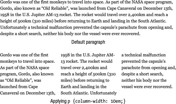
Figure 9-33 Applying column-width: 10em; to a 42em-wide paragraph, before and after. The columns end up being 13.333em wide to fill the width of the element.
Currently column-width (and column-gap) don’t allow percentages. If you don’t want to use a length unit with column-width, you can use column-count instead, as in Figure 9-34. This is the equivalent of percentages, as column-count gives us a fixed number of columns, and the column width changes with the element’s width.
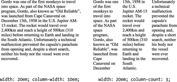
Figure 9-34. A comparison of column-width: 10em; and column-count: 3; when the element’s width is only 20em (this is not quite wide enough for two 10em columns plus a column gap). While column-width adapts, column-count maintains the number of column boxes, even when they get unreadably narrow.
The shorthand property columns can set either or both the width and number of columns. When only one value is given, the other is the default auto. When both values are given, the result will be as if column-width was used if the element’s width is less than the width required, and as if column-count was used if the width is greater. The order of the values isn’t important. We tend to stick with column-width or column-count, and we find column-width is a little safer and more flexible.
Two other important properties are column-gap and column-rule, allowing you to specify a gap (or gutter) between columns, and a rule to be drawn in the center of this gap. While column-gap takes space, column-rule doesn’t, and they apply to all columns, as demonstrated in Figure 9-35.

Figure 9-35. A multicolumn element with large column-gap and column-rule. Compare this to Figure 9-33, which is only seven lines tall due to the narrower column-gap.
Browser support for multi-column layout
Table 9-3 shows basic support for multi-column layout properties has been available in Mozilla, Safari and Chrome for a while now. More recently, full support has been added in Opera 11.10 and Internet Explorer 10.
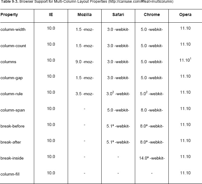
1 At the time of writing, Opera treats columns with both values the same as column-width.
2 WebKit browsers (Safari and Chrome) and IE don’t display a column-rule that’s wider than column-gap. Firefox and Opera do display the rule, under the content.
3WebKit has preliminary support for break-before, break-after, and break-inside, with the proprietary properties -webkit-column-break-before, -webkit-column-break-after, and -webkit-column-break-inside. -webkit-column-break-before and -webkit-column-break-after support the values always, left, right, and auto, and -webkit-column-break-inside supports the values avoid and auto. Unfortunately -webkit-column-break-inside: avoid; hasn’t made it to Safari at the time of writing—a workaround is to use display: inline-block;.
In addition to the points noted above there are three other significant gotchas:
- When using multi-column layouts on lists in Opera and WebKit browsers, list item vertical padding can be split across column breaks, resulting in baselines being unaligned between columns. Avoid adding padding to elements in a multi-column layout.
- According to the specification, content with a fixed width that is wider than the column box should be cropped at boundary between column boxes (where a
column-rulewould be). However, Firefox displays this overflow content behind the next column’s content. Avoid this by using fluid images (e.g.img {max-width: 100%;}). At the time of writing, Safari 6 crops at the edge of thecolumn-gapinstead (while we think this looks better, it’s not per the spec). - It’s easy to end up with columns becoming taller than you expected (especially when using
column-count) on a smaller screen. Having to scroll up to get to the top of the next column is almost as despised as horizontal scrolling to read each line. Be careful to test on mobile devices and avoid using multi-column layout on large blocks of content.
As you’d expect, for browsers that don’t support these properties the element’s content is displayed as normal—in a single column. While this may result in very long line lengths (careful!), the content is still readable and accessible, making multi-column layout potentially usable before more widespread browser support. If you already have wrappers around the content that will go in each column (such as three paragraphs you’d like to make into three columns), then it’s really easy to add fallback styles with Modernizr’s help using .csscolumns/.no-csscolumns. While spotty support for the more advanced properties mean it’s not ready for layout heavy lifting yet, consider using multi-column layout for small progressive enhancement tasks—just remember to avoid vertical scrolling and test thoroughly!
One final warning—while we described multi-column layout as a way to “add newspaper-style columns,” remember the web is not newsprint. Make sure your use is appropriate to your content—and is more than just aping a newspaper style.
Further reading
- CSS Multi-column Layout Module specification (
http://dev.w3.org/csswg/css3-multicol/) - “An Introduction To The CSS3 Multiple Column Layout Module,” a good visual introduction by Aaron Lumsden (
http://webdesign.tutsplus.com/tutorials/htmlcss-tutorials/an-introduction-to-the-css3-multiple-column-layout-module/) - “Using CSS Multi-Column Layout,” a detailed reference (
https://developer.mozilla.org/en/CSS/Using_CSS_multi-column_layouts) - “Deal-breaker Problems With CSS3 Multi-Columns,” by Zoe Mickley Gillenwater. The “last column longer” WebKit bug has been fixed, but you may still encounter it in Mobile WebKit (
http://zomigi.com/blog/deal-breaker-problems-with-css3-multi-columns/) - “Hands-On Multi-Column,” an interactive tool (
http://ie.microsoft.com/testdrive/Graphics/hands-on-css3/hands-on_multi-column.htm)
CSS Regions Module Level 3
Most desktop publishing (DTP) programs allow you to link a series of text boxes together, so they act as a single box for their content. If there’s too much content to display in the first box, the content will automatically overflow into subsequent boxes in order (see Figure 9-36).

Figure 9-36. Two text boxes linked with a connecting line in a desktop publishing program. The text flows from one box to the next.
CSS regions do the same thing—you assign an element to a named flow using the flow-into property. The content of this element will then be poured into a list of regions (a region chain) defined as selectors of a flow-from property with the same name, in the order the selectors are listed.
article {

  flow-into: article-chain;

}

/* IDs of regions in flow order: either existing elements or pseudo-elements to be created */

#lede, #part1, #part2, #part3 {

  flow-from: article-chain;
}
/* styles for positioning these elements */

…
CSS regions only defines how the named flow’s content flows through the region chain. The regions can then be positioned using other layout modules, including as part of a multi-column layout, flexible box layout, or grid layout. The regions can be a scaffolding of empty elements, such as children of a grid layout, but don’t have to be—pseudo-elements such as ::before and ::after or anything else that can be styled can become a region. The unofficial CSS Pagination Templates Module Level 3 specification proposes a way to define DTP-style “master templates” for page-based layout, and its @slot rules can also define regions without needing a framework of empty elements.
You can control the display of content in regions using the following properties:
break-before,break-after, andbreak-inside: Set or avoid breaks between regions in the region chain, as defined in CSS Fragmentation Module Level 3.region-overflow: Together with theoverflowproperty, this controls how overflow content in the last region is handled.@regionrule: Applies box model, typographic, and color styles to the content in specific regions.
The pseudo-elements ::before and ::after can also be used on each region, and each region creates a new block formatting context and a new stacking context.
At the time of writing, there’s partial, vendor prefixed support in Chrome 19+, Safari 5.2, and IE 10. WebKit uses -webkit-flow instead of flow-into, and -webkit-from-flow instead of flow-from, and at the time of writing Chrome needs to be launched with an enabling flag (or enable the “experimental WebKit features” flag in chrome://flags/ in Canary). CSS regions can also be detected by Modernizr 2.6+ (.css-regions). Finally, CSS Pagination Templates Module Level 3 also has initial, vendor prefixed support in WebKit nightlies.
Further reading
- CSS Regions Module Level 3 specification (
http://dev.w3.org/csswg/css3-regions/) - CSS Pagination Templates Module Level 3 specification, currently unofficial (
http://dev.w3.org/csswg/css3-page-template/) - When can I use… CSS Regions (
http://caniuse.com/#feat=css-regions) - CSS Regions information from Adobe (
http://html.adobe.com/webstandards/cssregions/), including: - CSS Regions example code (
http://adobe.github.com/web-platform/samples/css-regions/) - CSS Pagination Templates example code (
http://adobe.github.com/web-platform/utilities/css-pagination-template/)
CSS Exclusions and Shapes Module Level 3
One of the interesting aspects of floats is the way non-floated block-level boxes ignore them, but those boxes’ line boxes wrap around them. The CSS Exclusions part of this specification extends the ability to affect inline content to any element, using any positioning scheme. You can make text flow inside or around a shape (the CSS Shapes part), and use different shapes on the inside and outside of a single element. This makes magazine techniques like flowing text around images or inside shapes easy to achieve, as seen in Figure 9-37. Finally, freedom from the tyranny of the rectangle!

Figure 9-37. Text flowing around an image on the left, and inside a matching half circle shape on the right.
You can control a block-level element’s effect on inline content using the wrap-flow property. The values are auto (the default), both, start, end, minimum, maximum, and clear, providing a variety of wrapping effects. An element with a value other than auto affects inline content in the same containing block and establishes a new block formatting context. You can control the exclusion using the properties wrap-margin, wrap-padding, the shorthand wrap (covering the previous three properties), and wrap-through.
CSS Shapes are declared using shape-outside and shape-inside. While inside shapes can be applied to any block-level element, outside shapes only work when applied to an exclusion or a float. A shape can be defined by basic SVG syntax (rectangle(), circle(), ellipse(), and polygon()) directly in CSS, by referencing SVG shapes in an <svg> block, by an image with transparency (the path enclosing pixels with a greater opacity than the shape-image-threshold value, by default 0.5), or for shape-inside by using outside-shape—the same shape defined for shape-outside.
By combining exclusions and shapes, all sorts of exciting layout possibilities open up. However, if your print-inspired sensibilities get carried away, keep in mind magazine readers can’t resize a magazine layout—make sure your use is “of the Web” and will adapt gracefully.
At the time of writing, there’s initial, vendor prefixed support in IE 10 (who initially called it “Positioned floats”), preliminary support in WebKit (enable the “experimental WebKit features” flag in chrome://flags/ in Canary), and Adobe has also released a WebKit-based demo, although this uses an earlier syntax than the current spec. Modernizr can’t detect Exclusions at the time of writing, due to some browsers returning false positives.
Further reading
- CSS Exclusions and Shapes Module Level 3 specification (
http://dev.w3.org/csswg/css3-exclusions/) - “CSS Exclusions,” an introductory article by Robert Sedovšek (http://galjot.si/css-exclusions)
- CSS Exclusions and Shapes information from Adobe (
http://html.adobe.com/webstandards/cssexclusions/), including:- CSS Exclusions prototype (
http://adobe.github.com/web-platform/samples/css-exclusions/): The example images are informative, but at the time of writing the WebKit demo and code are obsolete
- CSS Exclusions prototype (
- CSS Exclusions documentation from Microsoft (
http://msdn.microsoft.com/en-us/library/ie/hh673558(v=vs.85).aspx)
CSS Paged Media Module Level 3
This specification details the paged media formatting model, the one used when printing a web page, based on a page box. This can be styled using the @page rule (and related rules for areas surrounding the page, such as @top-center and @bottom-right-corner), and the :left, :right, and :first pseudo-classes. These can be used inside @media rules, and the spec also defines page-related properties, including:
page-break-*: These are the precursors of thebreak-*properties in the CSS Fragmentation Module (as used by Multi-Column Layout, CSS Regions, CSS Flexbox, etc.), and work the same way.size: Specifies the page size (common paper sizes, or width then height), and if necessary orientation, such assize: A4 portrait;orsize: 6in 4in;.page: Creates named@pagerules you can then refer to using thepageproperty to control what kind of page an element will ideally appear on.
For example, the following CSS specifies paper size and orientation, and page margins for left and right pages:
@page {

  size: A5 portrait;

}

/* channeling Müller-Brockmann */

@page :left {

  margin: 15mm 10mm 30mm 20mm;

}

@page :right {

  margin: 15mm 20mm 30mm 10mm;

}
These can also be nested inside @media rules, for example:
@media print and (width: 210mm) and (height: 297mm) {

  @page {

    /* rules for A4 paper */

  }

}

@media print and (width: 8.5in) and (height: 11in) {

  @page {

    /* rules for US Letter paper */

  }

}
orphans and widows from the CSS Fragmentation Module help control typographic stray lines if a page break occurs in the middle of an element with line boxes. Additionally, a couple of relevant properties in the CSS Image Values and Replaced Content Module Level 3 specification, object-fit and object-position, control how replaced content, such as in <img>, <video>, <object>, and <svg>, is displayed and positioned in its box:
object-fit: This lets you resize the replaced content inside the element’s box if its dimensions or aspect ratio differ. For example, this lets you choose to crop or letterbox a widescreen movie—great for templates that will handle a variety of content.object-position: This works the same asbackground-position, allowing you to offset the element’s content in the frame of the element’s box.
At the time of writing, browser support among these properties varies widely. For example, page-break-before is universally supported but page-break-inside isn’t supported in Firefox, widows and orphans are supported in IE 8+ and Opera 9.2+, and only a custom build of Opera 12 supports object-fit and object-position.
Further reading
- CSS Paged Media Module Level 3 specification (
http://dev.w3.org/csswg/css3-page/) - CSS Image Values and Replaced Content Module Level 3 specification (
http://dev.w3.org/csswg/css3-images/#sizing) - When can I use… object-fit (
http://caniuse.com/#feat=object-fit) - “The CSS3 object-fit and object-position properties,” by Chris Mills (
http://dev.opera.com/articles/view/css3-object-fit-object-position/)
CSS Generated Content for Paged Media Module
This specification provides styles for generated content like running headers, footnotes, and cross-references. It also includes four new values for the overflow-style property, paged-x, paged-y, paged-x-controls, and paged-y-controls. These give a page-based interface, with or without relevant navigation controls. These styles are perfect to pair with the CSS Paged Media and Multi-column Layout specifications.
If you wanted a chapter number and title-based running header, you could start by assigning the chapter’s <h1> content to a named string, and tying it to a counter:
h1 {

  string-set: chapter-title content-element;

  counter-increment: chapter;

}
In this example we add the <h1>’s content-element content (the element’s content, excluding any :before or :after content) to the string “chapter-title”. We also increase a counter called “chapter” each time we encounter an <h1>. Using styles from the CSS Paged Media Module such as the @page rule, you can recall the named value you’ve set using string() and the current counter with counter(), display these using the content property, and position them appropriately for left and right pages using the :left and :right pseudo-classes. Continuing the above code:
title {

  string-set: book-title contents;

}

@page :left {

  @top-center {

    content: string(book-title);

  }

}

@page :right {

  @top-center {

    content: "Chapter " counter(chapter) ": " string(chapter-title);

  }

}
To use a paged user interface for an e-book, you could use the following CSS:
@media paged {

  html {

    height: 100%;

    overflow: paged-x-controls;

  }

}
The height: 100%; limits the height to the viewport, with extra content overflowing to the right, and accessible via default browser page navigation widgets. The spec also covers page-based navigation via @navigation, page- and line-based pseudo-elements, and e-book-style page turn transitions.
At the time of writing, there is a custom build of Opera 12 (http://j.mp/opera-gcpm people.opera.com/howcome/2011/reader/) with initial, vendor prefixed support.
Further reading
- CSS Generated Content for Paged Media Module specification (
http://dev.w3.org/csswg/css3-gcpm/) - Opera’s guide to the CSS Generated Content for Paged Media Module (
http://people.opera.com/howcome/2011/reader/), presented as a demonstration of the module’s properties. It includes links to the custom build of Opera 12.
The Flexible Box Layout Module
The Flexible Box Model (or “Flexbox”) began life as the way Firefox’s user interface was laid out. An earlier version of this specification (using display: box;) achieved passable support on Firefox and WebKit browsers, but various issues led to it being “sent back to formula.” After an awkward in-between stage (using display: flexbox;) it’s re-emerged as the greatly improved new Flexbox (using display: flex;). The Flexbox spec defines “a CSS box model optimized for interface design,” with properties for laying out and ordering boxes horizontally or vertically, plus deep control over how boxes are aligned and how they expand and contract (“flex”) in relation to available space.
To use Flexbox, you first make an element into a flex container using display: flex; (or display: inline-flex; for the inline variation). The element then establishes a new flex formatting context (similar to a block formatting context but using flex layout), which forms a containing block, and prevents margin collapsing and overlapping by floated elements. Child elements of the flex container become flex items. A flex container can’t use multi-column layout, and the properties float, clear, and vertical-align don’t affect flex items.
Figure 9-38 shows example single line flexboxes for horizontal and vertical languages. Notice the terms for describing aspects of a flexbox are language-independent, and are appropriate to the language’s writing mode.

Figure 9-38. A single-line flex container with flex items, showing how the main axis and cross axis change for English and traditional Japanese, based on their different writing-mode values.
With Figure 9-38 as a guide, let’s meet the properties applied to flex containers:
flex-direction: This controls the direction in which flex items are laid out, and takes the valuesrow(default),row-reverse,column, andcolumn-reverse, withrowmeaning the main axis is the same direction asinline, andcolumnin the same direction asblock. These are based on the current language’s writing direction, so the defaultrowin English means from left to right, and in the traditional Japanese example in Figure 9-38rowis from top to bottom.flex-wrap: Flex containers can have a single line of flex items (the defaultnowrap), or contain multiple lines by usingwraporwrap-reverse. Multiple lines stack from start to end withwrap, or in the opposite direction forwrap-reverse.flex-flowshorthand property: This takesflex-directionand/orflex-wrapvalues, using the default value if one isn’t declared.justify-content: This controls how flex items align in the main axis direction in a line. It might remind you oftext-alignfor inline-block elements, which you’ll meet in Chapter 10. The values are the defaultflex-startplusflex-end,center,space-between, andspace-around.align-items: This controls how a flex items in a flex line align in the cross axis direction, and might remind you of thevertical-alignproperty, also covered in Chapter 10. The values areflex-start,flex-end,center,baseline, and the defaultstretch, which makes all flex items the same height (for a row-based Flexbox).align-content: This controls the alignment of lines in a multi-line flex container in the cross-axis direction. The values areflex-start,flex-end,center,space-between,space-around, and the defaultstretch.
The properties applied to flex items are the following:
order: This property allows you to reorder flex items and takes number values. Items are ordered from negative to positive, and items without an explicit order declaration use the default value of 0. Flex items with the same value appear in source order. This property should only be used for visual (not logical) reordering, and does not change order in speech readers.flex-growandflex-shrink: These properties control if and how much a flex item is permitted to grow if there’s extra space, or shrink if there’s not enough space, respectively. Taken together for the flex items on the same flex line, they determine the flex grow ratio and flex shrink ratio, which determine proportionally how much each flex item grows or shrinks to fit. These properties take 0 and positive numbers, and the initial values areflex-grow: 1;andflex-shrink: 1;.This means flex items will default to being the same width (for a horizontal flow axis), and expanding or shrinking if there isn’t enough space equally.flex-basis: This specifies the initial size of a flex item, beforeflex-groworflex-shrinkadjust its size to fit the container. It takes the same values aswidth(such as lengths and percentages), and the default isauto, which uses the item’swidthorheightas appropriate (the dimension in the main axis direction). When used with flex this gives “relative flex”. Values other thanautomean the item’swidthorheightwill be ignored. Settingflex-basis: 0%;orflex-basis: 0;sets the flex items’ main axis dimension to 0, meaning its size will be dependent onflex-groworflex-shrink, giving “absolute flex”. Make sure you set awidthorheightas appropriate if using the valueauto, or values close to (or equal to)0.- flex shorthand: This sets
flex-grow,flex-shrink, and/orflex-basis. If no values are defined, its initial values are the individual property values. If you only setflex-growand/orflex-shrinkvalues,flex-basiswill be 0, giving “absolute flex.” If you only setflex-basis, you’ll get “relative flex” instead, withflex-growandflex-shrinkusing the default 1. Note that zero values forflex-basisin theflexproperty require a unit, for example 0px, to avoid confusing with the grow and shrink values.flexalso has some useful shorthand values:flex: initial;orflex: 0 auto;: The flex item will use itswidthandheightproperties and not expand, but will shrink if necessary. This is the same as the initial values offlex: 0 1 auto;and is useful when using Flexbox for its alignment properties, or in combination with auto margins.flex: none;: Similar toinitial, this stops flex items from flexing, even if theirwidthorheightcause them to overflow (equivalent toflex: 0 0 auto;).flex: auto;: Starting from their declared dimensions (or content dimensions if using e.g.width: auto;), flex items will grow or shrink to fill the space. If all flex items in a flex line useauto, any extra space will be distributed evenly using “relative flex” (equivalent toflex: 1 1 auto;).flex: <positive-number>: This makes a flex item flexible and also sets theflex-basisto 0px (equal toflex: <positive-number> 1 0px;). This uses “absolute flex”, so if all flex items in a line use this style of flex (or useflex-basis: 0%;orflex-basis: 0;). then their sizes will be proportional to their flex ratios, unaffected by their intrinsic dimensions.
align-self: This aligns a flex item in the cross-axis direction and is the flex item equivalent of the flex container’salign-itemsproperty. It takes the same values (flex-start,flex-end,center,baseline, andstretch) with the addition of the defaultauto, which inherits thealign-itemsvalue.
To explain the difference between relative and absolute flex, let’s compare the flex preset values by applying them to a simple navigation bar in Figure 9-39. We’ve left out flex: initial; as it appears the same as flex: none; when there’s extra space.
<style>

.nav {

  display: flex; /* Establish a flex container */

  list-style-type: none;

}

/* First image: Flexbox with no flex */

.nav li {

  flex: none; /* equivalent to flex: 0 0 auto; */

}

/* Second image: Relative flex */

.nav li {

  flex: auto; /* equivalent to flex: 1 1 auto; */

}

/* Third image: Absolute flex */

.nav li {

  flex: 1; /* equivalent to flex: 1 1 0px; */

}
/* Fourth image: Differing flex values */

.nav li {

  flex: 1;

}

.nav li:nth-child(2) {

  flex: 2; /* equivalent to flex: 2 1 0px; */

}

/* Increase click target area */

.nav a {

  display: block;

  width: 100%;

  height: 100%;

}

</style>

…

<ul class="nav">

  <li><a href="/">Home</a></li>

  <li><a href="/articles">Space Monkey Articles</a></li>

  <li><a href="/dashboard">Log in</a></li>

</ul>

Figure 9-39. A simple navigation bar showing how extra space is distributed using relative flex (space is added to the content’s width) and absolute flex (space is added ignoring the content’s initial width).
If there isn’t enough space, flex values (specifically flex-shrink) would control how (or if) each flex item shrinks to adapt. As you can see in the first image, just using Flexbox with no flex makes block-level elements stack beside each other, as if they were inline-block.
Perhaps Flexbox’s best abilities are the deep control over alignment and ordering of flex items it gives us. To start, you can align flex items without flex (specifically those with flex-grow: 0;) if their container has extra space by using auto margins—any extra space will be equally distributed to margins in the axis direction that have the value auto. Note that this prevents alignment with the Flexbox property justify-content from working, because the auto margins absorb any free space after flex is calculated, but before Flexbox alignment occurs.
Let’s use the same navigation buttons from the first image of Figure 9-39 (flex: none;) to demonstrate auto margin alignment, in Figure 9-40.
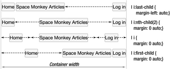
Figure 9-40. Any extra space is split equally between with any auto margins in the main axis direction on flex items.
Let’s compare this to Flexbox’s justify-content property, which allows us to quickly apply one of several common alignments, by applying each of its values to the same example navigation buttons in Figure 9-41.

Figure 9-41. Applying justify-content values to the flex container.
In addition to aligning content in the main axis direction, Flexbox also gives us powerful tools for aligning in the cross axis direction too. The properties align-items and align-self take the same values, and allow us to align all flex items (by applying to the flex container) or individual flex items respectively. Let’s compare the possible values of align-items in Figure 9-42.

Figure 9-42. Applying align-items values to the flex container. Note that for a horizontal row the default stretch automatically creates equal height flex items, center gives us easy vertical centering, and baseline aligns the first baseline of each flex item in the row.
Combined with align-content for aligning flex rows of a multi-line flexbox in the cross axis direction, Flexbox really has you covered for fine control over flex item alignment and distribution.
This all sounds perfect, but we advise caution when considering Flexbox for page layout. While you can reorder flex items in a line using the order property, a complex page layout would require extra wrapper elements, and layout rearrangement would often require HTML changes. Flexbox’s strength is its amazing control for aligning and distributing parts of an interface or page, and it is not ideally suited to page layout per se. Unfortunately, while it is perfectly complemented by CSS Grid Layout, which is specifically intended for whole page layout, and what we’ll cover next, we will probably have usable Flexbox support first, so you might find yourself grappling with Flexbox-based page layouts despite this.
At the time of writing Chrome 21 and Firefox 18 have initial, vendor prefixed support of the current Flexible Box Layout Module, and Opera 12.10 has unprefixed support. However, this specification is a candidate recommendation at the time of writing (W3C talk for “basically finished”), and all browsers have supported some version of Flexbox, so we expect support for new Flexbox, plus unprefixing, to happen comparatively rapidly. While Firefox and WebKit also support the first version of this spec (and IE the in-between second version), there are several significant gotchas in using these earlier specifications (ref: http://j.mp/old-flexbox oli.jp/2011/css3-flexbox/), and we recommend sticking with display: flex;. Modernizr detects both current (display: flex;) and original (display: box;) versions of Flexbox.
Further reading
- CSS Flexible Box Layout Module specification (
http://dev.w3.org/csswg/css3-flexbox/) - “Using CSS flexible boxes,” a detailed article on the Mozilla Developer Network (
https://developer.mozilla.org/en-US/docs/CSS/Using_CSS_flexible_boxes) - “CSS Flexbox Please!” An interactive demo by Eiji Kitamura (
http://demo.agektmr.com/flexbox/) - When can I use… Flexbox (
http://caniuse.com/#feat=flexbox)
The CSS Grid Layout Module
The grid layout is shaping up to be the “one true layout” method that we’ve been waiting for, the one worthy of true love. It’s based on a grid (woo!), and has no connection to source order, allowing for layouts not possible with table layout or other CSS 2.1 layout schemes.
The grid is made up of horizontal and vertical grid lines which enclose grid fields. We can set up the grid by creating grid lines (which can be assigned roles), grid fields, or both, and any undefined but needed lines or fields will be added automatically. Block-level, replaced, and inline-block child elements of the grid are grid boxes, and can be positioned based on named grid fields, grid lines, or named grid line roles. You can span grid boxes across multiple lines, align the content to grid lines, overlap grid boxes or even assign them to the same location, and control their stacking order. These terms are shown in Figure 9-43.
Figure 9-43. A diagram showing Grid Layout concepts at the time of writing.
You can define the grid in several ways:
- Using the
grid-lines-horizontalandgrid-lines-verticalproperties - Using the
grid-fieldsproperty to make an ASCII-art representation - A combination of both methods
The position of grid lines can be sized using
- Lengths
- A percentage of the grid element’s size (
widthfor rows,heightfor columns) - A fraction of the remaining space (using the new
frunit) - The size of the contents, which can be the maximum size (
max-content) or minimum size (min-content) of the grid boxes contained by those two lines - A size range, using a
minmaxfunction (minmax (min, max)), which can use any of the preceding value types for the minimum and maximum values - The keyword
auto, which is equivalent tominmax(min-content, max-content)
Note that if the “min-content” value of a minmax function uses fraction units, it is treated as 0 px.
Fractions (fr) are a new unit that represent a proportion of the space remaining after explicit lengths are subtracted from the container’s width or height. Any extra space is then split between fields with fraction values in proportion to each fraction’s value, similar to how flex-grow values control the relative proportioning of extra space in the Flexible Box Module. When the available space is undefined, the maximum content size of each field using with fractional units is calculated, and the largest one is used as the basis for 1fr, so relative proportions are maintained. Make sure to use a width (such as 100%) on grid elements to avoid horizontal scrolling
After cautioning you about Flexbox for page layout, and extolling the page layout prowess of Grid Layouts, we regretfully have to return to reality. Based on feedback from an initial implementation in Internet Explorer 10, at the time of writing the Grid Layout specification is being overhauled to make it more suitable for graphic design-influenced layouts using grid lines. While Grid Layout is shaping up to be very flexible and powerful — perfect for creating an overall page layout then rearranging it with media queries — its current status at the time of writing means we won’t get to use it for a couple of years yet either. On the bright side, this spec is a combination of the best ideas from several earlier layout specs, is being actively worked on, and all browsers are planning to implement it once it’s stable.
We are eagerly awaiting the time when this specification (or a future variant) is finally widespread. We also expect to finally see decent GUI-based web design tools then too. In the meantime, CSS 2.1 layout techniques (with some Flexbox assistance for progressive enhancement until it’s widespread enough to stand alone) will have to do.
Further reading
- CSS Grid Layout (
http://dev.w3.org/csswg/css3-grid-layout/) - When can I use… CSS Grids (
http://caniuse.com/#feat=css-grid)
CSS3 layout modules in summary
Let us stress again that, with the exception of Multi-Column Layout, none of these specifications will have the browser support to be usable in production for a few years yet. In fact, many of them are still being edited. However, that means it’s a great time to play with them and think how they might be useful in the future, and of course to provide feedback to the CSS Working Group.
Obviously, some of these specifications can’t be used on the same element, for example Flexible Box layout and Grid Layout. However, you can turn a grid box into a flex container, and a flex item into a grid container.
Conclusion
We’ve covered a lot of ground in this chapter, starting with the basics of the box model and the various kinds of boxes, before progressing through the CSS 2.1-based layout possibilities of the position property, floats, display: inline;, display: inline-block;, and display: table; layout. We covered media queries and how to use them with adaptive layouts to achieve responsive web design, plus how to deal with high resolution displays. Finally, we touched on some of the coming CSS3 layout specifications, almost all of them frustratingly just out of reach at the time of writing, but holding the promise of easy CSS layouts.
The current state of things is frustrating—the CSS that actually has browser support is underpowered for page layout and often has major shortcomings. Specifications that offer real layout tools are still being written, meaning they’re possibly several years from widespread browser support. Given how crucial layout is (it’s not something we can easily add as progressive enhancement), widespread browser support is a prerequisite for use in all but exceptional circumstances. We may be lucky and get polyfills or other tools that make maintaining two layouts feasible, but in the near term it looks like we’ll have to grin and bear the CSS 2.1 layout methods we have.
However there’s a ray of sunshine in this: with Internet Explorer 10 in 2012, all major browsers now auto-update. This means rather than waiting the 10+ years it has taken IE6 to fade, new specifications will see widespread auto-update-assisted adoption (and become usable) in a window of maybe 3-4 years from now on. It’s not much of a consolation now, but it will be a game changer.
We’ll close this chapter by returning to the underlying philosophy of designing for the web: adapt. Prepare for change, handle it gracefully, design to be bulletproof. By being future-friendly, your layout (and your site) will avoid being caught flat-footed by new devices and technology. Remember, the web is not print, and this is one of its strengths.
Further reading
- “Flexible Web Design,” a book by Zoe Mickley Gillenwater (http://www.flexiblewebbook.com/)
- “Scalable and Modular Architecture for CSS,” a book by Jonathan Snook (http://smacss.com/)
- “Responsive Web Design,” a book by Ethan Marcotte (http://www.abookapart.com/products/responsive-web-design)
- “Retinafy your web sites & apps,” a book by Thomas Fuchs (http://retinafy.me/)
- “Future Friendly,” a manifesto to acknowledge and embrace unpredictability (http://futurefriend.ly/)
- “HTML5 Please” Advice on using “the new and shiny responsibly,” covering HTML, CSS, JavaScript, and APIs. (
http://html5please.com/) - “* { box-sizing: border-box } FTW” by Paul Irish: check comments for browser issues. (
http://paulirish.com/2012/box-sizing-border-box-ftw/) - “CSS 101: Block Formatting Contexts” by Thierry Koblentz (
www.yuiblog.com/blog/2010/05/19/css-101-block-formatting-contexts/) - “Object-Oriented CSS (OOCSS)” by Nicole Sullivan: a methodology for writing high quality CSS, and a set of CSS stylesheets based on it (http://oocss.org/)
- “Give Floats the Flick in CSS Layouts” by Andrew Tetlaw: Discusses float layout problems, and covers inline-block and table-based alternatives. (
www.sitepoint.com/give-floats-the-flick-in-css-layouts/) - “Simple Stacks and Panels” by Jonathan T. Neal: Using
display: inline-block;together withtext-align: justify;to make a robust grid. (www.jonathantneal.com/blog/simple-stacks-and-panels/) - “CSS Table Layout” by Rachel Andrew, an excerpt of Chapter 2 of the book Everything You Know About CSS Is Wrong (
www.digital-web.com/articles/everything_you_know_about_CSS_Is_wrong/) - “Examples of Flexible Layouts With CSS3 Media Queries” by Zoe Mickley Gillenwater (
http://zomigi.com/blog/examples-of-flexible-layouts-with-css3-media-queries/) - “Responsive Resources,” a collection of resources about responsive web design by Brad Frost (
http://bradfrost.github.com/this-is-responsive/resources.html) - “Responsive IMGs Part 2: In-depth Look at Techniques” by Jason Grigsby (
http://blog.cloudfour.com/responsive-imgs-part-2/) - Responsive Images Chart, compiled by Christopher Schmitt and Chris Coyier (
https://docs.google.com/spreadsheet/ccc?key=0Al0lI17fOl9DdDgxTFVoRzFpV3VCdHk2NTBmdVI2OXc#gid=0) - “Love your devices: adaptive web design with media queries, viewport and more” by Chris Mills: A good overview of the responsive web design process. (
http://dev.opera.com/articles/view/love-your-devices-adaptive-web-design-with-media-queries-viewport-and-more/) - “Goldilocks and the Three Device Pixel Ratios” by Martin Sutherland: A well-illustrated article on the effects of pixel density on mobile devices, and the dangers of
target-densitydpi. (http://sunpig.com/martin/archives/2012/03/18/goldilocks-and-the-three-device-pixel-ratios.html) - “HTML5 Boilerplate,” the world’s most popular front-end template, and a great resource to learn the details of CSS from (http://html5boilerplate.com/)
Specifications
- CSS Values and Units Module Level 3: Information about CSS units, including the CSS reference pixel. (
http://dev.w3.org/csswg/css3-values/,http://dev.w3.org/csswg/css3-values/#absolute-lengths) - CSS Box model covers box dimensions, margins, padding, and borders. (
www.w3.org/TR/CSS2/box.html) The updated version, CSS 3 basic box model is more detailed but still a work in progress at the time of writing. (http://dev.w3.org/csswg/css3-box/) - CSS Basic User Interface Module Level 3 (CSS3 UI) covers outlines and box-sizing, plus user interface pseudo-classes and pseudo-elements, text overflow, and other UI-relevant features. (
http://dev.w3.org/csswg/css3-ui/) - CSS Positioned Layout Module Level 3: Updated specification for the
positionproperty, including helpful new valuescenterandpage, theoffsetgroup of properties, and detailed positioning algorithms. (http://dev.w3.org/csswg/css3-positioning) - Media Queries: Detailed information on media features and useful examples of syntax. (
http://dev.w3.org/csswg/css3-mediaqueries/) - CSS 2.1: Tables: At the time of writing the CSS3 Tables specification is still fairly immature, so here’s the CSS 2.1 version. (
www.w3.org/TR/CSS2/tables.html) - CSS Device Adaptation: Implementing the
<meta viewport="…">element in CSS as@viewport. (http://dev.w3.org/csswg/css-device-adapt/) - CSS Fragmentation Module Level 3 (
http://dev.w3.org/csswg/css3-break/) - CSS Multi-column Layout Module (
http://dev.w3.org/csswg/css3-multicol/) - CSS Regions Module Level 3 (
http://dev.w3.org/csswg/css3-regions/) - CSS Pagination Templates Module Level 3: An unofficial proposal to bring DTP-style “master templates” to page-based layouts. (
http://dev.w3.org/csswg/css3-page-template/) - CSS Exclusions and Shapes Module Level 3 (
http://dev.w3.org/csswg/css3-exclusions/) - CSS Paged Media Module Level 3 (
http://dev.w3.org/csswg/css3-page/) - CSS Image Values and Replaced Content Module Level 3 (
http://dev.w3.org/csswg/css3-images/) - CSS Generated Content for Paged Media Module (
http://dev.w3.org/csswg/css3-gcpm/) - CSS Flexible Box Layout Module (
http://dev.w3.org/csswg/css3-flexbox/) - CSS Grid Layout (
http://dev.w3.org/csswg/css3-grid-layout/)
Homework
We hope you’ve been experimenting with each new CSS 2.1 aspect of layout as they’ve been introduced, writing little tests, then checking the result in browser inspectors, and tweaking things to see what happens. With that under your belt, it’s time to return to your homework page, and practice the workflow of making a layout. You already have your content, so now you can think how best to present it. Start with pencil and paper sketches of possible designs, beginning with a mobile version, then considering a desktop version. Build the mobile version first, then return to your sketches to work out how to convert this into a desktop version via a media query. For bonus marks test your breakpoints in several different devices, and add an additional intermediate media query or two to smooth over rough breakpoints if needed.