
Chapter 6
Paving the Way for Web Applications
To ensure we’re all singing from the same hymn sheet, let’s start by defining a web application. Broadly speaking, a web application is an application that is accessed over a network, generally the Internet or an intranet. Web applications typically are built with a server-side technology (like .NET, PHP, Python, or Rails) and use HTML, CSS, and JavaScript to render the application in a browser.
The quantity of web applications (web apps) has risen sharply over the past few years. Undoubtedly, this is in part attributable to the introduction of Ajax. We already had JavaScript and XML, as well as Microsoft’s XMLHttpRequest (now officially part of HTML5), when Jesse James Garrett coined the phrase Ajax back in 2005. This seemed to create a tipping point with an inexorable rise in the number of web apps on the scene. Ajax isn’t restricted to applications, of course; the technology is also used in websites to make them look, feel, and act like applications.
In this chapter we’ll take you through some of the web app–related developments and APIs within and related to the HTML5 specification. We’ll start by looking at HTML5 forms and the new features they offer. This will be followed by a brief look at some of the web application–specific elements such as menu and command introduced in HTML5. We’ll finish by introducing HTML5’s APIs, plus some additional APIs that are associated with the umbrella term “HTML5.”
HTML5 forms
No doubt you interact with at least one form on the Web every day. Whether you’re searching for content or logging in to your e-mail account or Facebook page, using online forms is one of the most common tasks performed on the Web. As designers and developers, creating forms has a certain monotony about it, particularly writing validation scripts for them. HTML5 introduces a number of new attributes, input types, and other elements to our markup toolkit.
As you’ll see, these new features will go a long way toward making our lives easier while delivering a delightful user experience. The best thing about all this? You can start using them now.
A history of HTML5 forms
The forms section of HTML5 was originally a specification titled Web Forms 2.0 (http://j.mp/web-forms1) that added new types of controls for forms. Started by Opera and edited by then-Opera employee Ian Hickson, it was submitted to the W3C in early 2005 (http://j.mp/opera-forms2). The work was initially carried out under the W3C. It was then combined with the Web Applications 1.0 specification to create the basis of the breakaway Web Hypertext Application Technology Working Group (WHATWG) HTML5 specification.
Using HTML5 design principles
One of the best things about HTML5 forms is that you can use almost all of these new input types and attributes right now. They don’t even need any shivs, hacks, or workarounds. That isn’t to say they’re all “supported” right now, but they do cool things in modern browsers that do support them—and degrade gracefully in browsers that don’t understand them.
For that we have to thank HTML5’s design principles (http://j.mp/designprinciples3) that you learned about in Chapter 1. In this instance we’re specifically referring to the principle of graceful degradation. In essence, this means that there’s no excuse for not using these features right now. In fact, it means you’re ahead of the curve.
HTML5 forms attributes
This section covers several of the new attributes that we can add to our forms and start using today. Not only will they improve your users’ experience, but they’ll save you from having to write a lot of JavaScript. Ready? Then let’s get cracking.
placeholder
First up is the placeholder attribute, which allows us to set placeholder text as we would currently do in HTML4 with the value attribute. It should only be used for short descriptions. For anything longer, use the title attribute. The difference from HTML4 is that the text is only displayed when the field is empty and hasn’t received focus. Once the field receives focus (e.g., you click or tab to the field), and you begin to type, the text simply disappears. It’s very similar to the search box you see in Safari (see Figure 6-1).
__________
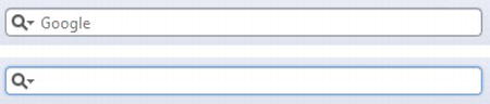
Figure 6-1. Browser search box in Safari without and with focus
Let’s have a look at how to implement the placeholder attribute.
<input type="text" name="user-name" id="user-name" placeholder="at least 3 characters">
That’s it! We can hear you thinking, “What’s so great about that? I’ve been doing it with JavaScript for years.” Yes, that’s true. However, with HTML5, it’s part of the browser, meaning less scripting is required for a more accessible, cross-browser solution (even when JavaScript is disabled). Figure 6-2 shows the placeholder attribute working in Chrome.

Figure 6-2. Placeholder attribute support in Chrome, unfocused and focused
Browsers that don’t support the placeholder attribute ignore it, so it won’t render. By including it, though, you’re providing an enhanced user experience for those users who have browser support and you’re “future proofing” your site (we talk about checking for support a little later in the chapter). All modern browsers support placeholder and it will also be supported in Internet Explorer 10.
Note: There is no official pseudo-class for styling placeholder text but both Mozilla (makers of Firefox) and WebKit offer vendor prefixed properties for styling (-moz-placeholder and –webkit-input-placeholder). This makes it safe to assume that a pseudo-class will become standard for styling placeholder text. For further detail there is a thread on the WHATWG mailing list about this topic at http://j.mppseudoplaceholder4).
autofocus
autofocus does exactly what it says on the tin. Adding it to an input automatically focuses that field when the page is rendered. As with placeholder, autofocus is something that we used JavaScript for in the past.
Traditional JavaScript methods do, though, have some serious usability problems. For example, if a user begins completing the form before the script loads, they will (jarringly) be returned to the first form field when the script is loaded. The autofocus attribute in HTML5 gets around this issue by focusing as soon as the document loads, without having to wait for the JavaScript to be loaded. However, we only recommend using it for pages whose sole purpose is the form (like Google) to prevent the usability issues.
__________
It is a Boolean attribute (except if you are writing XHTML5; see the note) and is implemented as follows:
<input type="text" name="first-name" id="first-name" autofocus>
All modern browsers support the attribute and, like placeholder, browsers that don’t support the autofocus attribute simply ignore it.
Note: Several new HTML5 form attributes are Boolean attributes. This just means they’re set if they’re present and not set if they’re absent. They can be written several ways in HTML5.
autofocus

autofocus=""

autofocus="autofocus"
However, if you are writing XHTML5, you have to use the autofocus="autofocus" style.
autocomplete
The autocomplete attribute helps users complete forms based on earlier input. The attribute has been around since IE5.5 but has finally been standardized as part of HTML5. The default state is set to on. This means that generally we won’t have to use it. However, if you want to insist that a form field be entered each time a form is completed (as opposed to the browser autofilling the field), you would implement it like so:
<input type="text" name="tracking-code" id="tracking-code" autocomplete="off">
The autocomplete state on a field overrides any autocomplete state set on the containing form element.
required
The required attribute doesn’t need much introduction; like autofocus, it does exactly what you’d expect. By adding it to a form field, the browser requires the user to enter data into that field before submitting the form. This replaces the basic form validation currently implemented with JavaScript, making things a little more usable and saving us a little more development time. required is a Boolean attribute, like autofocus. Let’s see it in action.
<input type="text" id="given-name" name="given-name" required>
required is currently implemented only in Opera 9.5+, Firefox 4+, Safari 5+, and Chrome 5+, so for the time being you need to continue writing a script to check that fields are completed on the client side in other browsers (*cough* IE!). Internet Explorer 10 will support required. Opera, Chrome, and Firefox show the user an error message (see Figure 6-3) upon form submission. In most browsers, the errors are then localized based on the declared language. Safari doesn’t show an error message on submit, but instead places focus on that field.
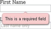
Figure 6-3. Form field with required attribute displaying a browser-generated error message in Opera
The default rendering of “required” error messages depends on the individual browser; at present the error message bubble can’t be styled with CSS in all browsers. Chrome, however, does have a proprietary property that you can use to style the error bubble. Peter Gasston has written an article about the syntax (http://j.mp/stylingformerrors5). You can also style the input using the :required pseudo-class (http://j.mp/pseudoforms6) (see Chapter 7 for more on pseudo-classes). An alternative is to override the wording and styling using the setCustomValidity() method in JavaScript. Importantly, don’t forget that this browser validation is no substitute for validating on the server as well.
pattern
The pattern attribute is likely to get a lot of developers very excited (well, as excited as you can get about form attributes). It specifies a JavaScript regular expression for the field’s value to be checked against. pattern makes it easy for us to implement specific validation for product codes, invoice numbers, and so on. The possibilities for pattern are wide-ranging, and this is just one simple example using a product number.
<label> Product Number:

<input pattern="[0-9][A-Z]{3}" name="product" type="text" title="Single digit followed by

three uppercase letters."/>

</label>
This pattern prescribes that the product number should be a single digit [0-9] followed by three uppercase letters [A-Z]{3}. For more examples, the HTML5 Pattern website (http://j.mp/html5p7) lists common regex style patterns to help get you started.
As with required, Opera 9.5+, Firefox 4+, Safari 5+, and Chrome 5+ are the only browsers with support for pattern at present. Internet Explorer 10 will support pattern. However, with the browser market moving at a fast pace, the others will soon catch up.
__________
A regular expression (regex or regexp) provides a way to match entered strings of text to particular patterns. A regex might be used to check a particular format for a product or ZIP code. They can be used with a number of programming languages, some of which (Perl, Ruby) have them built into their syntax. Regex is where the pattern attribute originates.
list and the datalist element
The list attribute enables the user to associate a list of options with a particular field. The value of the list attribute must be the same as the ID of a datalist element that resides in the same document. The datalist element is new in HTML5 and represents a predefined list of options for form controls. It works in a similar way to the in-browser search boxes that autocomplete as you type (see Figure 6-4).

Figure 6-4. Google search autosuggestions in Safari
The following example shows how list and datalist are combined (see Figure 6-5):
<label>Your favorite fruit:

<datalist id="fruits">

    <option value="Blackberry">Blackberry</option>

    <option value="Blackcurrant">Blackcurrant</option>

    <option value="Blueberry">Blueberry</option>

    <!-- … -->

  </datalist>

If other, please specify:

<input type="text" name="fruit" list="fruits">

</label>
By adding a select element inside the datalist you can provide superior graceful degradation than by simply using an option element. This is an elegant markup pattern designed by Jeremy Keith (http://j.mp/datalistpattern8) that adheres perfectly with HTML5’s principle of degrading gracefully.
<label>Your favorite fruit:

<datalist id="fruits">

  <select name="fruits">

    <option value="Blackberry">Blackberry</option>

    <option value="Blackcurrant">Blackcurrant</option>

    <option value="Blueberry">Blueberry</option>

    <!-- … -->

  </select>

If other, please specify:

</datalist>

<input type="text" name="fruit" list="fruits">

</label>
Browser support for list and datalist is currently limited to Opera 9.5+ (see Figure 6-5) and Firefox 5+. Internet Explorer 10 will support the list attribute and datalist.

Figure 6-5. The datalist element rendered in Opera
multiple
We can take our lists and datalists one step further by applying the Boolean attribute multiple to allow more than one value to be entered from the datalist. Here is an example.
<label>Your favorite fruit:

<datalist id="fruits">

  <select name="fruits">

  <option value="Blackberry">Blackberry</option>

  <option value="Blackcurrant">Blackcurrant</option>

  <option value="Blueberry">Blueberry</option>

  <!-- … -->

  </select>

If other, please specify:

</datalist>

<input type="text" name="fruit" list="fruits" multiple>

</label>
multiple isn’t exclusively for use with datalists, though. A further example for multiple might be for e-mail addresses when sending items to friend or the attachment of files, as shown here:
__________
multiple is supported in Firefox 3.6+, Safari 4+, Opera 11.5+, and Chrome 4+. It will also be supported in Internet Explorer 10.
novalidate and formnovalidate
The novalidate and formnovalidate attributes indicate that the form shouldn’t be validated when submitted. They are both Boolean attributes. formnovalidate can be applied to submit or image input types. The novalidate attribute can be set only on the form element.
An example use case for the formnovalidate attribute could be on a “save draft” button, where the form has fields that are required for submitting the draft but aren’t required for saving the draft. novalidate would be used in cases where you don’t want to validate the form but do want to take advantage of the more useful user interface enhancements that the new input types offer, which we’ll see later in the chapter.
The following example shows how to use formnovalidate:
<form action="process.php">

  <label for="email">Email:</label>

  <input type="text" name="email" value="[email protected]">

  <input type="submit" formnovalidate value="Submit">

</form>
And this example shows how to use novalidate:
<form action="process.php" novalidate>

<label for="email">Email:</label>

  <input type="text" name="email" value="[email protected]">

  <input type="submit" value="Submit">

</form>
form
The form attribute is used to associate an input, select, or textarea element with a form (known as its form owner). Using form means that the element doesn’t need to be a child of the associated form and can be moved away from it in the source. The primary use case for this is that input buttons that are placed within tables can now be associated with a form.
<input type="button" name="sort-l-h" form="sort">
formaction, formenctype, formmethod, and formtarget
The formaction, formenctype, formmethod, and formtarget attributes each have a corresponding attribute on the form element, which you’ll be familiar with from HTML4, so let’s run through each of them briefly. These new attributes have been introduced primarily because you may require alternative actions for different submit buttons, as opposed to having several forms in a document.
formaction
formaction specifies the file or application that will submit the form. It has the same effect as the action attribute on the form element and can only be used with a submit or image button (type="submit" or type="image"). When the form is submitted, the browser first checks for a formaction attribute; if that isn’t present, it proceeds to look for an action attribute on the form.
<input type="submit" value="Submit" formaction="process.php">
formenctype
formenctype details how the form data is encoded with the POST method type. It has the same effect as the enctype attribute on the form element and can only be used with a submit or image button (type="submit" or type="image"). The default value if not included is application/x-www-form-urlencoded.
<input type="submit" value="Submit" formenctype="application/x-www-form-urlencoded">
formmethod
formmethod specifies which HTTP method (GET, POST, PUT, DELETE) will be used to submit the form data. It has the same effect as the method attribute on the form element and can only be used with a submit or image button (type="submit" or type="image").
<input type="submit" value="Submit" formmethod="POST">
formtarget
formtarget specifies the target window for the form results. It has the same effect as the target attribute on the form element and can only be used with a submit or image button (type="submit" or type="image").
<input type="submit" value="Submit" formtarget="_self">
Form attributes summary
We’ve looked at several new form attributes that help improve user experience and save you development time. There are some more new attributes to discuss, but we’ll introduce them together with HTML5’s new input types in the next section.
New input types
HTML5 introduces no less than a baker’s dozen (yes, that’s 13!) new input types for forms. We’re going to take a brief look at each of them and explain why you should be using them right now. These new input types have dual benefits: using them means less development time and an improved user experience. The new input types we’ll be looking at are
search
Search seems like an appropriate place to start our foray into HTML5 input types. When we talk about search, we’re not just talking about Google, Bing, or Yahoo. We’re talking about the search field on that e-commerce site you just made a purchase from, on Wikipedia, and even on your personal blog. It’s probably the most common action performed on the Web every day, yet it’s not marked up very semantically, is it? We all tend to write something like this:
<input type="text" name="search">
Well, what if we could write something like…
<input type="search" name="search">
With HTML5 we can. Feels much better, doesn’t it? Desktop browsers will render this in a similar way to a standard text field—until you start typing, that is. At this point, a small cross appears on the right side of the field. Notice the x in Figure 6-6. This lets us quickly clear the field, just like Safari’s built-in search field.
Figure 6-6. type=“search” as displayed in Safari for Windows
On a mobile device, however, things start to get interesting. Take the example shown on an iPhone in Figure 6-7; when you focus on an input using type="search", notice the keyboard, specifically the action button on the keyboard (bottom right). Did you spot that it says “Search” rather than the regular “Go”? It’s a subtle difference that most users won’t even notice, but those who do will afford themselves a wry smile.

Figure 6-7. type=“search” on the iPhone
As we’ve seen with the new attributes, browsers that don’t understand them will simply degrade gracefully. The same applies to all of the new input types discussed here. If a browser doesn’t understand type="search", it will default to type="text". This means you’re not losing anything. In fact, you’re using progressive enhancement and helping users to have an enhanced experience. Let’s face it: filling out web forms isn’t very fun, so anything we can add to ensure a smoother experience, the better.
In rendering terms, the email input type is no different from a standard text input type and allows for one or more e-mail addresses to be entered. Combined with the required attribute, the browser is then able to look for patterns to ensure a valid e-mail address has been entered. Naturally, this checking is rudimentary, perhaps looking for an @ character or a period (.) and not allowing spaces. Opera 9.5+, Firefox 4+, and Chrome 5+ have already implemented this basic validation, with support coming in IE 10. The browser goes as far as presenting the user with an error message (see Opera in Figure 6-8) if the e-mail address entered isn’t valid. You can style the field for when an value is entered using the :valid, :invalid, or :required pseudo class (assuming you have the required attribute on the input).
<input type="email" name="email" required>
Note: For more on styling forms using pseudo-classes the “CSS Ninja”, Ryan Seddon, has put together a great demonstration on A List Apart9 at http://j.mp/alaninja.

Figure 6-8. Opera e-mail address error messaging
Note: The specification details that one or more e-mail addresses are allowed. This means that the multiple attribute could be used with type="email" too.
Pretty cool, huh? Again, this highlights how HTML5 forms help to cut down the amount of JavaScript that we have to write when carrying out form validation. There’s always a catch, though, right? At the time of writing, there is an internationalization issue with type="email". When using it with double-byte internationalized domain names, the browsers invalidate them; so this example
<input type="email" name="email" value="gordo@ .jp">
.jp">
isn’t valid in Firefox, Safari, or Chrome (there is no issue in Opera). However, a workaround has been created by Kyle Barrow (http://j.mp/emaili18n10) that uses type="text" with the pattern attribute we met earlier, as shown here:
<input type="text" name="email" value="gordo@.jp" pattern="[^ @]*@[^ @]*">
An alternative solution is to continue using type="email" with the formnovalidate attribute on the submit button, as follows. This ensures that no validation will be carried out on form submission, which may or may not be suitable for your needs.
<form action="process.php">

<label for="email">Email:</label>

<input type="email" name="email" value="gordo@.jp">

<input type="submit" formnovalidate value="Submit">
Or you could use the novalidate attribute on your form, like so:
<form action="process.php" novalidate> <label for="email">Email:</label>

<input type="email" name="email" value="gordo@.jp">

<input type="submit" value="Submit">
__________
Internationalization issues aside, remember how we said there are dual benefits to HTML5’s input types—less development time and better user experience? Let’s go back and look at the iPhone once more, as shown in Figure 6-9.

Figure 6-9. The iPhone displays a custom keyboard when using type="email".
Did you notice it this time? No? Look at the keyboard again. That’s right, the keyboard is different. There are dedicated keys for the @ and . characters to help you complete the field more efficiently. As we discussed with type="search", there is no downside to using type="email" right now. If a browser doesn’t support it, it will degrade to type="text". And in some browsers, users will get a helping hand.
url
The url input type, as you might expect, is for web addresses. You can use the multiple attribute to enter more than one URL. Like type="email", a browser will carry out simple validation on these fields and present an error message on form submission. This is likely to include looking for forward slashes, periods, and spaces, and possibly detecting a valid top-level domain (such as .com or .co.uk). Use the url input type like so:
<input type="url" name="url" required>
There is currently some debate about whether the user has to enter http:// into a field using input="url". Browser vendors are discussing the possibility of pre-pending http:// to a URL following a check upon form submission. For up-to-date information, refer to the HTML5 specification.
Again, we’ll take a look at how the iPhone renders type="url". As you can see in Figure 6-10, it has again updated the onscreen keyboard to ensure that completing the field is as simple as possible for the user by swapping the default space key for period, forward slash, and .com keys. (To access more endings like .org and .net, tap and hold the .com key.)

Figure 6-10. type="url" activates a URL-specific keyboard on the iPhone.
tel
tel differs from email and url in that no particular syntax is enforced. Phone numbers differ around the world, making it difficult to guarantee any type of specific notation except for allowing only numbers and perhaps a + symbol to be entered. It’s possible that you can validate specific phone numbers (if you can guarantee the format) using client-side validation. type="tel" is marked up as follows:
<input type="tel" name="tel" id="tel" required>
Once more, the iPhone recognizes type="tel", only this time it goes one step further and completely changes the keyboard to the standard phone keyboard, as shown on the left in Figure 6-11. In addition to the iPhone, some Android devices (such as HTC Desire, shown on the right in Figure 6-11) also display a numeric keyboard for type="tel". That’s pretty handy, don’t you think? Nice, big keys for entering a phone number help you to get that big, nasty form completed quickly.

Figure 6-11. type="tel" on the iPhone and some Android devices dynamically changes the keyboard to a numeric keypad. (Android screenshot provided by Stuart Langridge)
number
number, as you might expect, is used for specifying a numerical value. As with the majority of these new input types, Opera was the first to implement type="number". It, Safari, and Chrome render the input as a spinbox control (see Figure 6-12) whereby you can click the arrows to move up or down. Or if you prefer, you can type directly into the field. Firefox, on the other hand, renders the field like a standard text box. Support for type="number" will be in IE 10 also.
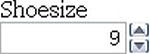
Figure 6-12. type="number" in Opera
With the additional attributes min, max, and step, we can change the default step value of this spinbox control as well as set minimum, maximum, and starting values (using the standard HTML value attribute). This example shows how these attributes work:
<input type="number" min="5" max="18" step="0.5" value="9" name="shoe-size" >
In this example , min represents the minimum value the field will accept, and max represents the maximum value. If we reach the maximum or minimum value, the appropriate arrow on the spinbox control will be greyed out so you can no longer interact with it. step is the increment that the value should adjust up or down, with the default step value being 1. This means we can include negative values or step up in increments of 0.5 or 5. value is that attribute you’re used to from previous versions of HTML. Each of the attributes are optional, with defaults being set if they aren’t used.
In contrast to Opera’s implementation, the iPhone (shown on the left in Figure 6-13) and some Android devices (such as HTC Desire, shown on the right in Figure 6-13) simply render the field as a standard text box but optimize the keyboard for easy input.
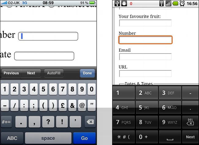
Figure 6-13. type=number on iPhone and Android HTC Desire (Android screenshot provided by Stuart Langridge)
To make the iPhone render with the standard telephone keypad as we saw for type="tel" Chris Coyier, of CSS Tricks devised a little hoax you can use. Rather than using type="number", use a standard type="text" input and add a pattern attribute that accepts only numbers, as shown below. This solution isn’t ideal but if you think it could be useful, Chris has put a short video together showing it in action (http://j.mp/numbertrick11).
<input type="text" pattern="[0-9]*" name="shoe-size">
Chris’ technique may soon become absolete though with the introduction of the inputmode attribute. The attribute, recently added to the specification will allow users to specify the type of input mechanism that is most useful for users. When implemented, you will be able to choose between numeric, latin, email, or kana input modes.
range
The range input type is similar to number but more specific. It represents a numerical value within a given range. Why the difference, I hear you cry? Because when you’re using range, the exact value isn’t important. It also allows browsers to offer a simpler control than for number. In Opera, Safari, and Chrome, type="range" renders as a slider (see Figure 6-14). Additionally, in Opera, if the CSS defines the height greater than the width, the slider control will be rendered vertically as opposed to the standard horizontal rendering.
Note: For browsers that don’t support type="range", Remy Sharp has created a JavaScript polyfill to plug the gaps. You can find out more about it on his blog (http://j.mp/rangepolyfill12).
The following code shows how we might mark up our skill level on a scale of 1 to 100 by setting the min and max attributes (see Figure 6-14). We can also set the starting point for range using the value attribute.
<input id="skill" type="range" min="1" max="100" value="0">

Figure 6-14. type=range in Chrome
Dates and times
If you’ve ever booked tickets online, you will have come across date pickers to help you quickly and easily choose the date you require. Perhaps you’ve even implemented a date picker on your own website. Generally, this is done using a JavaScript library such as jQuery, Dojo, or YUI. It can be a pain when you need to load a whole library and associated plug-ins just to implement a simple date picker. Well, with HTML5 we get that functionality baked into the browser. Not only that, but we don’t have to stop at just selecting a single date; we can select a week, month, time, date and time, and even date and time with a time zone using the different input types. The markup is pretty straightforward.
<input id="dob" name="dob" type="date">
__________
You can go a step further by using the min and max attributes to ensure the user can only choose from a specified date range.
<input id="startdate" name="startdate" min="2012-01-01" max="2013-01-01" type="date">
As with many of the other form implementations, Opera leads the way. Let’s take a look next at how browsers render these input types.
You may have noticed that there isn’t a type="year" input type defined in HTML5. The reason for this is a lack of relevant use cases. All the use cases for a year input type that have been proposed can be achieved using type="number".
date
Figure 6-15 shows Opera 10.5’s rendering of type="date".

Figure 6-15. type=date in Opera 10.5
These date pickers aren’t restricted to desktop devices; some Blackberry devices and Chrome for Android render its internal date picker when used with type="date" (see Figure 6-16).

Figure 6-16. type=date on Blackberry (screenshot provided by Terence Eden)
month
Next up, Figure 6-17 shows type="month", which might, for example, be used for a credit card expiry date.
<input id="expiry" name="expiry" type="month" required>

Figure 6-17. type=month in Opera 10.5
week
You can also drill down to type="week". Notice how Opera highlights a specific week using the same date picker control, as shown in Figure 6-18.
<input id="vacation" name="vacation" type="week">

Figure 6-18. type=week in Opera 10.5
time
You can see in Figure 6-19 that type="time" renders a spinbox similar to that used earlier for selecting the precise time.
<input id="exit-time" name="exit-time" type="time">

Figure 6-19. type=time in Opera 10.5
datetime
We can combine the date and time by using type="datetime" for specifying a precise time on a given day, as shown in Figure 6-20.
<input id="entry-day-time" name="entry-day-time" type="datetime">

Figure 6-20. type=datetime in Opera 10.5
datetime-local
Finally, Figure 6-21 shows that we can achieve slightly more granular control by selecting a precise time on a given day with a local time zone variation using type="datetime-local".
<input id="arrival-time" name="arrival-time " type="datetime-local">

Figure 6-21. type=datetime-local in Opera 10.5
color
The color input type is pretty self-explanatory: it allows the user to select a color and returns the hex value for that color. It is anticipated that users will either be able to type the value or select from a color picker, which will either be native to the operating system or a browser’s own implementation. Opera 11 has implemented type="color" with a simple color picker that offers a number of standard color choices or the option to select Other, which brings up the operating system color picker (shown on the right in Figure 6-22).
<input id="color" name="color" type="color">

Figure 6-22. type="color" in Opera on the left and the result of clicking Other shown on the right
In contrast, certain Blackberry devices have implemented the color input type that renders a color picker, as shown in Figure 6-23.

Figure 6-23. type=color on Blackberry (screenshot provided by Terence Eden)
Input types summary
By using HTML5’s new form input types right now, we can enhance the user’s experience, future-proof our site, and make our life as developers easier. Obviously, we can’t just leave the browsers that don’t support all these new features hanging, so in the next section we’ll take a look at how we can detect support for these form features using JavaScript.
Validation and how to provide fallbacks
Throughout the chapter, we’ve introduced new attributes and input types, but we haven’t discussed validation or how to provide suitable fallbacks for these additions. That’s what we’ll be concentrating on in this section.
The difference between client-side and server-side validation
Before we proceed, we need to take a quick detour to define the difference between client-side and server-side validation. These two technologies should complement each other to provide a seamless experience for the user while helping you, the developer, get high-quality form submissions that are rich with the accurate data you so desire.
Validating form fields on the client side using JavaScript can save you time and bandwidth. It also helps show the user where they may have entered a field incorrectly or in the wrong format. It’s run on form submission (or sometimes during form completion, a method known as inline validation) in the browser and allows you to guide the user through the errors made. Naturally, this makes the process quicker for the user, as it negates the need for a round trip to the server if invalid data has been entered.
Server-side validation, on the other hand, is more secure and checks the submitted data to ensure it’s correct. This helps to protect against malicious users who might bypass your client-side validation and submit potentially dangerous data to the server (for example, a custom-written script designed to hack your site). Validating on the server side also aids compatibility to ensure form errors can still be displayed to users who may not have JavaScript enabled.
To answer the question of “which type of validation should I use?” the answer is nearly always “both.” The advantage of using the HTML5 form attributes and input types in this situation is that a large portion of the client-side JavaScript that we have to write now will be native to the browser and not bypassable by turning off JavaScript. You’ll still need server-side validation, but the time you save on the front end will leave you time to concentrate on other exciting additions to your sites and applications.
Browser error handling and processing
As we’ve seen with the required attribute as well as the email and url input types, one of the major advantages of using HTML5 forms is that the browser can carry out some of the heavy lifting for us. This means the browser can carry out basic error handling and processing negating the need for lots of additional JavaScript or regular expressions to perform straightforward tasks.
We’ve also seen that some of these features won’t work in all browsers (more on support in the next section), but instead will either be skipped without impacting user experience or default back to type="text" if they’re not understood. So how can we check if a feature is supported and how do we detect that support? For that we’ll need to use JavaScript detection.
Feature detection with JavaScript
Using Mark Pilgrim’s detection techniques (http://j.mp/pilgrimdetect13) as a basis, we can use JavaScript to detect “support” for a particular feature in a few different ways.
- Check whether a property exists on a global object like
window. - Create an element and test to see if a property exists on it.
- Create an element, test to see if a method exists on that element, and then call the method to test the value it returns.
- Create an element, set a property to a value, and check the retained value.
As we’re particularly interested in which input types are supported, we would use detection technique #4 to test whether input type="email" is supported.
var input = document.createElement('input'),

input.setAttribute('type','email'),

return input.type !== 'text';
This piece of JavaScript tells the browser to create an input element and set the type attribute to the one you are detecting support for (in this case email). For browsers that support the input type, this value is retained. For those that don’t, the value we set will be ignored and the type property will default to “text”.
You could go ahead and write out the preceding function 13 times to detect each of the new HTML5 forms input types. However, to make your life easier, we suggest that you investigate a handy tool called Modernizr (http://j.mp/modernizr14), which we briefly introduced in Chapter 2 and which you’ll learn about in more detail in the next chapter. Modernizr detects support for all 13 input types and gives back a value of true or false for each. You can then use another method to provide a suitable fallback for the effect you want to achieve.
__________
   // if placeholder isn't supported:

    if (!Modernizr.input.placeholder){

      // provide a fallback with a hint script

      setInputHint(document.getElementById('user-name'),at least 3 characters'),

    }
To detect support for some of the new attributes that we’ve discussed, we’ll use detection technique #2. Here’s how it works for the placeholder attribute:
function support_placeholder () {

var input = document.createElement('input'),

return 'placeholder' in input;
If your browser doesn’t support the placeholder attribute, you can use JavaScript to write in a value that can be cleared on focus instead.
As you can see, the checks we have to run to detect support for HTML5 forms features cross browser are very straightforward. If you build these functions into your development toolkit, you’re all set to start using these new features today.
Forms polyfills
Modernizr doesn’t automatically add support for those missing features, so you need to use another technique. For browsers that don’t support certain attributes or input types (see the next section), there are a number of polyfills available to help plug those gaps. If you look in the “Web Forms” section of the HTML5 Cross Browser Polyfills page (http://j.mp/h5fills15) you’ll find a number of scripts that can help you mimic native support in non-supporting browsers.
Current browser support
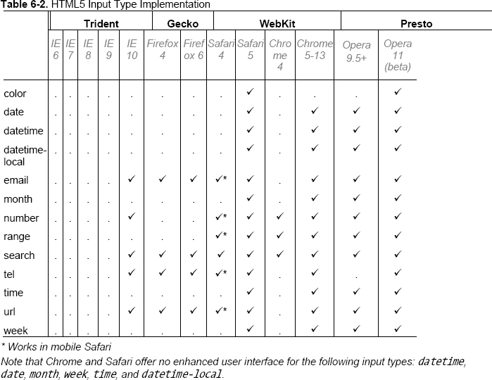
We’ve hinted throughout the chapter at which browsers have support for HTML5 forms. Table 6-1 and Table 6-2 show the current state of play for the new attributes and input types, respectively. As you can see, Opera and Chrome lead the way in terms of support. In fact, Opera has an almost complete implementation of HTML5 forms since version 9.5.
With new versions of browsers being released at an ever-increasing rate, it can be difficult to keep up with what is or isn’t supported. If you want to keep an eye on the current progress, we suggest visiting When can I use… (http://j.mp/caniuse16) or FindMeByIP (http://j.mp/findmebyip)17) or Wufoo’s HTML5 forms research (http://j.mp/wufooh518).
__________
In addition to those sites, king of compatibility tables, Peter-Paul Koch (PPK) has written an excellent article on his findings from tests carried out the new input types and attributes (http://j.mp/ppkinput19). Some of the information is now slightly out of date (because browser UIs have improved) but to see where we’ve come from to where we are will do you no harm at all.

__________
Forms in action
Now that we’ve seen the power of HTML5 forms, let’s put what we’ve learned to good use by marking up a couple of forms that are commonly found online. We’ll start by looking at a login form and then work through a blog’s comment form.
Figure 6-24 shows a login form. Take a look at the image and the following HTML 4 markup, and then see if you can mark up the form in HTML5 based on what you’ve learned.

Figure 6-24. Common login form in Safari
<form id="app-login" action="process.php">

<fieldset>

<legend>Login Details</legend>

<div>

  <label>Username:

  <input name="user-name" type="text" value="Your username is your email address" onfocus=

"if (!this.reset) { this.value = ''; this.reset = true }">

  </label>

</div>

<div>

  <label>Password:

  <input name="password" type="password" value="Your username is your email address"

 onfocus="if (!this.reset) { this.value = ''; this.reset = true }">

  </label>

</div>

<div>

  <input name="login" type="submit" value="Login">

</label>

</div>

</fieldset>

</form>
How did you do? Here’s how we’ve marked it up in HTML5, making use of the email input type as well as the placeholder, required, and autofocus attributes:
<form id="app-login" action="process.php">

<fieldset>

<legend>Login Details</legend>

<div>

  <label>Username:

  <input name="user-name" type="email" placeholder="Your username is your email address"

 required autofocus>

  </label>

</div>

<div>

  <label>Password:

  <input name="password" type="password" placeholder="6 digits, numbers & letters" required>

  </label>

</div>

<div>
  <input name="login" type="submit" value="Login">

</label>

</div>

</fieldset>

</form>
We’re now going to look at a blog’s comment form, shown in Figure 6-25. Take a look at the image and the following HTML 4 markup, and see if you can mark up the form in HTML5 based on what you read earlier in the chapter.

Figure 6-25. Basic comment form in Safari
<form id="respond" action="process.php">

<fieldset>

<legend>Leave a comment</legend>

<div>

  <label>Name:

  <input name="name" type="text" value="Your name" onfocus="if (!this.reset) { this.value =

 ''; this.reset = true }">

  </label>

</div>

<div>

  <label>Email:

  <input name="email" type="text" value="Your email address" onfocus="if (!this.reset)

 { this.value = ''; this.reset = true }">

  </label>

</div>
<div>

  <label>URL:

  <input name="url" type="text" value="Your website" onfocus="if (!this.reset)

 { this.value = ''; this.reset = true }">

  </label>

</div>

<div>

  <label>Your Comment:

  <textarea name="comment"></textarea>

  </label>

</div>

<div>

  <input name="submit" type="submit" value="Submit" formaction="comments.php">

</label>

</div>

</fieldset>

</form>
How did you do? Here’s how we’ve marked it up in HTML5, making use of the email and url input types as well as the placeholder, required, autofocus, and formaction attributes:
<form id="respond" action="process.php">

<fieldset>

<legend>Leave a comment</legend>

<div>

  <label>Name:

  <input name="name" type="text" placeholder="Your name" required autofocus>

  </label>

</div>

<div>

  <label>Email:

  <input name="email" type="email" placeholder="Your email address" required>

  </label>

</div>

<div>

  <label>URL:

  <input name="url" type="url" placeholder="Your website">

  </label>

</div>

<div>

  <label>Your Comment:

  <textarea name="comment"></textarea>

  </label>

</div>

<div>

  <input name="submit" type="submit" value="Submit" formaction="comments.php">

</label>

</div>

</fieldset></form>
HTML5 forms APIs
To complement these new input types and attributes, there are many new objects, methods, events, and functions that gel together to create a number of APIs for HTML5 forms. We can’t cover them all in this book but they include functions such as stepUp and stepDown to work with the step attribute, the valueAsNumber function that converts text to a number (see the output element later in the chapter) and the ValidtyState object. For more information about these APIs, Chapter 7 of Pro HTML5 Programming (http://j.mp/prohtml520), by Peter Lubbers, Brian Albers, and Frank Salim, is worth checking out.
HTML5 forms summary
We’ve shown you a number of new form attributes and input types and briefly discussed the related APIs. In summary, the three main benefits of using them are an improved user interface and therefore experience; restricted user input on certain fields; and automatic, in-browser validation of form fields with no additional scripting required. If that’s not enough to convince you to go and start using them, we don’t know what is.
__________
Web applications
As Internet connection speeds increase and we hurtle toward universal, ubiquitous connectivity to the Web, it’s plain to see that the Internet is no longer made up of static documents that link to one another. We now are regularly engaged in listening to music or watching video online. Services like Facebook and Twitter have sprung up, bringing with them powerful APIs that allow developers to build their own custom web applications.
Moreover, in the past few years we’ve seen increasingly rich Internet applications (“web apps”) become commonplace online. Examples such as Gmail, Google Docs, and Basecamp have enabled us to move from the desktop to carry out more and more of our work online.
As we saw in Chapter 1, Opera, Mozilla, and Apple began to document a specification termed Web Applications 1.0 in 2004. They’d foreseen this rise in web applications and introduced a number of new elements and APIs to help deal with this seismic shift from documents to applications online.
Unfortunately, covering all of the APIs in detail is not within the scope of this book. Instead, we’re going to take a brief look at some of these new application elements in HTML5 and related APIs, and show you where you can investigate further.
Introduction to elements for web applications
There are nine elements that we’ll be looking at in this section, including one that has been redefined. They are categorized in the HTML5 specification as either form elements or interactive elements.
Form elements
We’ll start with the form elements.
datalist
As we saw earlier in the chapter, the datalist element represents a predefined list of options for form controls. A code example is shown here:
<label>Your favorite fruit:

<datalist id="fruits">

    <select name="fruits">

    <option value="Blackberry">Blackberry</option>

    <option value="Blackcurrant">Blackcurrant</option>

    <option value="Blueberry">Blueberry</option>

    <!-- … -->

  </select>

If other, please specify:

</datalist>

<input type="text" name="fruit" list="fruits">

</label>
datalist has been implemented in Opera 9.5+ (as shown in Figure 6-26), Firefox 4+, and Internet Explorer 10.

Figure 6-26. The datalist element rendered in Opera
New input types aren’t the only items that have user experience enhancements on mobile devices; datalist functionality has also been implemented on some Blackberry devices, allowing the user to choose from a drop-down list of selectable items.
keygen
Invented by Netscape and re-engineered by other browser vendors (Microsoft excepted), the keygen element represents a control for generating a public-private key pair and for submitting the public key from that key pair. When a form is submitted, a public key and a private key are generated. A private key is stored on the client side and the public key is sent to the server. The public key can then be used with secure servers to generate certificates, making it more secure and preventing your site from being hacked. Here is an example of keygen in action.
<form action="process.php" method="post" enctype="multipart/form-data">

<keygen name="key">

<input type=submit value="Submit">

</form>
output
The output element is rather simple; it represents the result of a calculation or user action. Using the for attribute, a relationship is created between the result of the calculation and the value(s) that went into the calculation. The output element is supported in Opera 9.5+, Firefox 4+, Chrome, Safari 5+, and Internet Explorer 10. The following example (depicted in Figure 6-27) adds the values of two inputs together to create the output. This is triggered by the oninput event placed on the output element and handled by the browser using the new valueAsNumber function—no complex scripting required! For more information, see a detailed write up on output by author Richard Clark (http://j.mp/outputelement21).
<form onsubmit="return false" oninput="o.value = a.valueAsNumber + b.valueAsNumber">

  <input name="a" id="a" type="number" step="any"> +

  <input name="b" id="b" type="number" step="any"> =

  <output name="o" for="a b"></output>

</form>
Figure 6-27. The output element with input type="range" in Opera 10.5
__________
progress
The progress element is fairly self-explanatory. It represents the completion progress of a given task. The progress can be shown as indeterminate (if no value attribute is specified) or a number ranging from zero to maximum, based on the percentage of work that has so far been completed. Using JavaScript to update the current value, a visual representation of the progress made is shown to the user (see Figure 6-28). The progress element is supported in Opera 11+, Firefox 6+, and Chrome 7+.
Figure 6-28. The progress element at 60% complete in Chrome 7
<p>Percent Downloaded:

<progress id="p" max="100" value="0"><span id="completed">0</span>%</progress>

</p>

<script>

var progress  = document.getElementById('p'),

function updateProg(newValue) {

progress.value = newValue;

progress.getElementById('completed')[0].textContent = newValue;

}

</script>
Mounir Lamouri, a developer for Mozilla, has written a detailed article on how to use pseudo-classes (some with a vendor prefix) to style the progress element. It’s an interesting and informative article (http://j.mp/stylingprogress22).
meter
Not to be confused with progress, the meter element represents a scalar measurement within a known range, or a fractional value. Examples of this are the percentage completion of a social networking profile (see Figure 6-29) or the relevance of a particular search result. The meter element should not be used for arbitrary values such as height or weight unless there is a maximum known value. Using the high, low, max, and min attributes, the color of the element will change depending on the current value. Typically the value will be written server side prior to page load, but it may also be the case that the value is updated using JavaScript. The meter element is supported in Opera 11+ and Chrome 7+.
Figure 6-29. The meter element at 40% complete in Chrome
<p>Your profile is <span id="completed">40</span>% complete.</p>
<meter min="0" max="100" value="40"></meter>
__________
Interactive elements
Now let’s look at the interactive elements. Browser support for these elements is sparse, so we suggest that you run your own tests when you’re implementing them.
details
The details element represents a control from which the user can obtain additional information or controls on demand if required. The information inside details is hidden by default and the user can request to “open” the control. It should be noted that the details element isn’t appropriate for footnotes. details is currently implemented in Chrome and will soon be supported in Opera.
Because details is generally paired with summary, the code example is shown in the next section.
summary
The summary element represents a summary, caption, or legend for the contents of the summary element’s parent details element, if any. summary must always be the first child of details, but more than one summary element can be used per details element.
<details>

<summary>Name & Extension:</summary>

<p><input type="text" name="fn" value="Space Cadet Handbook.pdf">

<p><label><input type="checkbox" name="ext" checked> Hide extension</label>

</details>
command
The command element represents a command that the user can invoke. command is shown only when used as a child of menu, and it can be used with a choice of three type attributes: radio, checkbox, or command. If no type attribute is set, the default behavior is that of type="command". command is likely to be used in web applications in place of buttons to complete specific actions (save, publish, etc.) and is generally invoked using a JavaScript onClick event. See it in the code example in the menu section.
menu
Although menu isn’t new to HTML5, it has been redefined. It represents a list of interactive options or commands. It is to be used for web applications only. For documents, authors should use nav, which we met in Chapter 3.
<menu type="toolbar">

<command type="command" disabled label="Save" icon="icons/save.png" onclick="save()">

<command type="command" disabled label="Publish" icon="icons/pub.png" onclick="publish()">

</menu>
Introduction to HTML5-related APIs
So far in this book we’ve covered the new markup that HTML5 brings us. We’ve also seen some new rich media elements in the form of audio, video, and canvas. If you think that seems like a lot, there’s a whole lot more found under the HTML5 umbrella in the shape of APIs.
As you know, there are two versions of the HTML5 specification, one published by the W3C and another by the WHATWG. The living HTML specification maintained by the WHATWG contains additional APIs to those in the W3C HTML5 spec (although generally they are also maintained by the W3C but in separate specifications).
Alongside those in the specification are a number of related APIs that form part of the standards stack and are often grouped under the “HTML5” umbrella term. In some cases, the APIs have been around and implemented for a while, but they’ve never been documented (something that HTML5 has set out to change). Figure 6-30 gives an indication of how each of the APIs relates to HTML5 but is by no means comprehensive.

Figure 6-30. HTML5 Taxonomy and Status by Sergey Mavrody
We like to think that each of the APIs helps to form the basis of the web’s architecture and thus is important in its own right. In this section, we’re not going to look at code but instead we’ll focus on describing the APIs, their purpose, and progress. If you wish to investigate further, this book’s sister publication, Pro HTML5 Programming (http://j.mp/prohtml523), by Peter Lubbers, Brian Albers, and Frank Salim, is a great place to start.
APIs in the HTML5 specification
We’ll start by looking at the APIs in the W3C HTML5 spec (the Media and Text Track APIs introduced in Chapter 5 are also in the HTML5 specification).
Drag and Drop API
The Drag and Drop API has been the topic of much debate. Originally created by Microsoft in version 5 of Internet Explorer, it is now supported by Firefox, Safari, and Chrome. So what does it do?
Well, as the name suggests, it brings native drag-and-drop support to the browser. By adding a draggable attribute set to true, the user has the ability to move any element. You then add some event handlers on a target drop zone to tell the browser where the element can be dropped.
The API’s real muscles are flexed when you start to think outside of the browser. Using drag and drop, a user could drag an image from the desktop into the browser or you could create an icon that gets loaded with content when dragged out of the browser by the user to a new application target.
Drag and Drop is covered in depth in the following articles/specs:
- Drag and Drop API, W3C (
http://dev.w3.org/html5/spec/dnd.html#dnd) - Native Drag and Drop, HTML5 Doctor, Remy Sharp (
http://html5doctor.com/native-drag-and-drop) - Drag and Drop, MDN (
https://developer.mozilla.org/en/DragDrop/Drag_and_Drop) - The drag and drop API, HTML5 Laboratory, Ian Devlin (
www.html5laboratory.com/drag-and-drop.php)
Offline web applications/application cache
With the blurring of native apps (mobile and desktop) and web apps comes the inevitable task of wanting to take applications offline. The Offline Web Applications specification details how to do just that using application caching.
Application caching is carried out by creating a simple manifest file that lists the files required for the application to work offline. Authors can then ensure their sites function offline. The manifest causes the user’s browser to keep a copy of the files for use offline later. When a user views the document/application without network access, the browser switches to use the local copies instead. So in theory, you should be able to finish writing that important e-mail or playing the web version of Angry Birds while you’re on the underground/subway.
__________
With relatively strong browser support, particularly in the mobile arena (Firefox, Safari, Chrome, Opera, iPhone, and Android), it’s something you can start using right now. For further reading, we suggest
- Offline Web Applications, W3C (
http://dev.w3.org/html5/spec/offline.html#offline) - Let’s Take This Offline, Dive into HTML5, Mark Pilgrim (
http://diveinto.html5doctor.com/offline.html) - Running your web applications offline with HTML5 AppCache, dev.opera, Shwetank Dixit (
http://dev.opera.com/articles/view/offline-applications-html5-appcache) - Go offline with application cache, HTML5 Doctor, Mike Robinson (
http://html5doctor.com/go-offline-with-application-cache) - Offline Browsing in HTML5 with ApplicationCache, Sitepoint, Malcolm Sheridan (
www.sitepoint.com/offline-browsing-in-html5-with-applicationcache) - Get off(line), Web Directions, John Allsopp (
www.webdirections.org/blog/get-offline)
User interaction
Like offline, user interaction is part of the primary HTML5 specification. It’s worth mentioning here because some of its features, such as the contenteditable attribute, are extremely useful when you’re creating web applications. contenteditable has been around in internet Explorer since version 5.5 and works in all five major browsers. Setting the attribute to true indicates that the element is editable. Authors could then, for example, combine this with local storage to track changes to documents.
For more, look at the current spec (http://dev.w3.org/html5/spec/Overview.html#editing) but note that there are some sections that have been moved to the HTML Editing APIs (http://dvcs.w3.org/hg/editing/raw-file/tip/editing.html) work in progress.
History API
A browser’s back button is the most heavily used piece of its chrome. Ajax-y web applications break it at their peril. Using HTML5’s History API, developers have a lot more control over the history state of a user’s browser session.
The pre-HTML5 History API allowed us to send users forward or back, and check the length of the history. What HTML5 brings to the party are ways to add and remove entries in the user’s history, hold data to restore a page state, and update the URL without refreshing the page. The scripting is fairly straightforward and will help us build complex applications that don’t refresh the page from which we can continue to share URLs as we’ve always done.
For more detail on the History API, see
- History API, W3C (
http://dev.w3.org/html5/spec/history.html#history)
- Manipulating History for Fun & Profit, Dive into HTML5, Mark Pilgrim (
http://diveinto.html5doctor.com/history.html) - Introducing the HTML5 History API, dev.opera, Mike Taylor & Chris Mills (
http://dev.opera.com/articles/view/introducing-the-html5-history-api) - Manipulating the browser history, MDN (
https://developer.mozilla.org/en/DOM/Manipulating_the_browser_history) - Pushing and Popping with the History API, HTML5 Doctor, Mike Robinson (
http://html5doctor.com/history-api)
MIME type and protocol handler registration
This API allows sites to register themselves as handlers for certain schemes. By using the registerProtocolHandler method, an example use case could be an online telephone messaging service registers itself as a handler of the sms: scheme so that if the user clicks on such a link, he is given the opportunity to use that website.
Certain schemes are whitelisted (such as sms, tel, and irc). In addition, there is a registerContentHandler method that allows sites to register as handlers for content with a certain mime type. The spec (http://dev.w3.org/html5/spec/timers.html#custom-handlers) is the best place to get started when learning about MIME type and protocol handler registration.
APIs in the WHATWG specification
So far we’ve looked at specs that exist in both the W3C and WHATWG versions of HTML5. We’ll now very briefly introduce a few more APIs that are documented within WHATWG’s living standard HTML spec but have been broken out into smaller, more manageable specifications by the W3C. The purpose and the majority of the content is the same in both versions. You’ve already seen one in Chapter 5, the canvas 2D context, so we’ll ignore that.
- Cross document and channel messaging: Cross document messaging defines a way for documents to communicate with each other regardless of their source domain and without enabling cross-site attacks. In a similar vein, channel messaging uses independent pieces of code to communicate directly.
- Microdata: Adds an additional layer of semantics to your documents from which search engines, browsers, and more can extract information and provide an enhanced browsing experience.
- Web Workers: An API for running JavaScript in the background, independent of any user scripts. Allows for long running tasks to be completed without preventing the page from becoming unresponsive.
- Web Storage: A spec for storing client-side data (key value pairs), similar to cookies.
- Web Sockets: Allows pages to use the WebSocket protocol to send two-way messages between a browser and server.
- Server sent events: Allows for push notifications to be sent from a server to a browser in the form of DOM events.
The "HTML5" buzzword APIs
If I were to list all the other APIs that are closely related to HTML5, I’d be here for a while. Another time, perhaps. A few of those often incorrectly described as HTML5 are Geolocation, Indexed DB, Selectors, the Filesystem API, and even CSS3!
Mike Smith from the W3C has compiled a comprehensive list of all aspects of the web platform and browser technologies and it’s well worth bookmarking (http://j.mp/h5platform24).
We’ve merely scratched the surface of each of these detailed, useful, powerful APIs. In order to find out more and get under the skin of each, go and throw yourself knee deep in code. You’ll be surprised at what you’ll find while researching and experimenting. As for those APIs that aren’t quite fully baked yet, hopefully we’ve whetted your appetite for what will be coming to a browser near you soon.
The glorious dawn of the age of the standards-based Web, accessible to all, in a world of compliant browsers, on a variety of devices
Before you crack on through to the presentational beauty that is CSS3, let us take you on a journey.
The year is 2022 and HTML5 has just been ratified by the W3C. It is now an official, fully-fledged specification. Web designers and developers around the world rejoice in the knowledge that they can now go out and build standards-based sites and applications that are accessible to all on a range of devices.
Universally expected behavior across browsers is drawing ever closer. Web applications can cater to touch-, voice-, and gesture-driven devices. The public has learned that an application may behave differently depending on whether it’s used on a television, a computer, or a handheld device, or even depending on the user’s location. Context is king online.
The Web has exploded into a tangled maze of ubiquitous, ever-present networks. Your car is driven by Google Maps, and your personalized news is delivered instantly by citizen journalists the world over. Oh, and Great Grandma is on Twitter.
We are approaching the tipping point for a Web built on solid, fundamental, open standards. The Web is larger than any one vendor, group, corporation, government, or individual. The Web is open, and that’s the way it should stay.
If you have read the first six chapters of this book, you realize that the scenario we’ve just described is not 2022, but is in fact the state of the Web today.
__________
Homework: Mark up the “Join Gordo’s Space Cadets” form using the new markup covered
Now that you are armed with the knowledge of how to build standards-compliant HTML5 forms, it’s time to put it into practice. Don’t forget to use your knowledge of HTML 4 when writing the markup, as not all of the data will require HTML5. Here’s the data you need to capture:
- First name
- Last name
- Date of birth
- E-mail address
- URL
- Telephone number
- Shoe size
- Flying skill level
- Address (including ZIP/post code) and country
- Why they want to join the space cadets
- Register button