Chapter 5
Tables
What You Will Learn in This Chapter
- What are tables and how are they used in HTML
- Basic table elements and attributes
- How to create accessible tables
Wrox.com Code Downloads for this Chapter
You can find the wrox.com code downloads for this chapter at www.wrox.com/remtitle.cgi?isbn=9781118340189 on the Download Code tab. The code is in the Chapter 5 download and individually named according to the names throughout the chapter.
Tables display information in rows and columns; they are commonly used to display all manner of data that fits in a grid such as train schedules, television listings, financial reports, and sports results. In this chapter, you learn when to use tables and the markup that you need to create them.
To begin this chapter, you look at some examples of tables and then quickly move to the basic elements used to create them. Having learned the basics, you can then learn some of the more advanced features of tables such as adding captions and headings and achieving more complicated table layouts. The chapter ends with a discussion of accessibility issues that relate to tables, because you must understand how a screen reader would read the contents of a table for users with visual impairments.
Introducing Tables
To work with tables, you need to start thinking in grids, so start by looking at some examples of how popular websites use tables.
Figure 5-1 shows the NFL website, which has the standings for each team in a table. You can see a list of teams on the left, and for each team there are columns providing different stats, including number of games won, lost, or tied.

Figure 5-2 shows the Bloomberg website, which displays major stock markets. In this case, there are tables for different regions around the world. (You can see North and Latin America as the first region, followed by Europe, Africa, and the Middle East.) Each table contains the major indexes trading in that region down the left side, followed by columns that show the current value, fluctuations in values, and date/time of the stats.

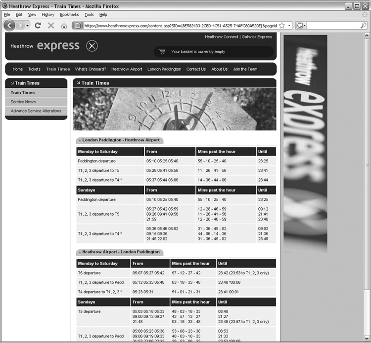
Figure 5-3 shows the website for the Heathrow Express, a train between Central London and London’s Heathrow Airport. The tables on this page show the times that the trains run.
In Figure 5-4, you can see The New York Times website. On this page, the tables provide television listings.
These examples give you a better idea of what a table is and when you might want to use one. Not every website that displays stock market data or television listings should use a table—rather you consider using a table when you need to display information that sits well in a grid of rows and columns. If you look at a web page and want to know whether that page uses a table to control how the data is laid out, you can always look at the source for that page and look for the elements you read about in this chapter.
You can think of a table as being similar to a spreadsheet because it is made up of rows and columns, as shown in Figure 5-5.
Here you can see a grid of rectangles. Each rectangle is known as a cell. A row consists of a set of cells on the same line from left to right, and a column consists of a line of cells going from top to bottom.
Now look at an example of a basic HTML table so that you can see how it is created (see Figure 5-6).

You create a table in HTML using the <table> element. Inside the <table> element, the table is written out row by row. A row is contained inside a <tr> element, which stands for table row. Each cell is then written inside the row element using a <td> element, which stands for table data.
Following is the code used to create this basic table (ch05_eg01.html):
<table border="1">
  <tr>
    <td>Row 1, Column 1</td>
    <td>Row 1, Column 2</td>
  </tr>
  <tr>
    <td>Row 2, Column 1</td>
    <td>Row 2, Column 2</td>
  </tr>
</table>

When writing code for a table in a text editor, you should start each row and cell on a new line and indent table cells inside table rows as shown. If you use a web page authoring tool such as Dreamweaver, it probably automatically indents the code for you.
Many web page authors find it particularly helpful to indent the code for a table because leaving off just one tag in a table can prevent the entire table from displaying properly. Indenting the code makes it easier to keep track of the opening and closing of each element.
Take a look at the same code again. This time, it has not been split onto separate lines or indented, which is much harder to read.
<table border="1"><tr><td>Row 1, Column 1</td><td>Row 1, Column 2</td></tr><tr>
<td>Row 2, Column 1</td><td>Row 2, Column 2</td></tr></table>
All tables follow this basic structure; although additional elements and attributes enable you to control the presentation of tables. If a row or column should contain a heading, use a <th> element in place of the <td> element for the cells that contain a heading. By default, most browsers render the content of a <th> element in bold text.
Now take a look at a slightly more complicated table (see Figure 5-7). This time the table includes headings. In this example, the table shows a financial summary for a small company.

Here is the code used to create this table (ch05_eg02.html):
<table border="1">
  <tr>
    <th></th>
    <th>Outgoings ($)</th>
   <th>Receipts ($)</th>
    <th>Profit ($)</th>
  </tr>
  <tr>
    <th>Quarter 1 (Jan-Mar)</th>
    <td>11200.00</td>
    <td>21800.00</td>
    <td><b>10600.00</b></td>
  </tr>
  <tr>
    <th>Quarter 2 (Apr-Jun)</th>
    <td>11700.00</td>
    <td>22500.00</td>
    <td><b>10800.00</b></td>
  </tr>
  <tr>
    <th>Quarter 3 (Jul - Sep)</th>
    <td>11650.00</td>
    <td>22100.00</td>
    <td><b>10450.00</b></td>
  </tr>
  <tr>
    <th>Quarter 4 (Oct - Dec)</th>
    <td>11850.00</td>
    <td>22900.00</td>
    <td><b>11050.00</b></td>
  </tr>
</table>
The first row is made entirely of headings for outgoings, receipts, and profit. The top-left cell in Figure 5-7 is empty; in the code for the table; you still need an empty <td> element to tell the browser that this cell is empty. (Otherwise it has no way to know that there is an empty cell.)
In each row, the first cell is also a table heading cell (indicated using a <th>), which states which quarter the results are for. Then the remaining three cells of each row contain table data contained inside the <td> elements.
The figures showing the profit (in the right column) are contained within a <b> element, which shows the profit figures in a bold typeface. This demonstrates how any cell can contain all manner of markup. The only constraint on placing markup inside a table is that it must nest within the table cell element (whether a <td> or a <th> element). You cannot have an opening tag for an element inside a table cell and a closing tag outside that cell—or vice versa.
When creating tables, many people do not actually bother with the <th> element and instead use the <td> element for every cell—including headers. You should, however, aim to use the <th> element whenever you have a table heading. This is especially true when you use the scope attribute (which you learn about in the next section, “Basic Table Elements and Attributes”), as it is valid only for <th> elements.
Basic Table Elements and Attributes
Now that you’ve seen how basic tables work, this section describes the elements in a little more detail, introducing the attributes they can carry. Some of the attributes enable you to create more sophisticated table layouts. Skim through this section quickly; when you know what you can do with the markup, you can always come back again and study the markup closely to see how to achieve what you want.
The <table> Element Creates a Table
The <table> element is the containing element for all tables. It can carry the following attributes:
- All the universal attributes
- Basic event attributes for scripting
The dir Attribute
The dir attribute is supposed to indicate the direction of text used in the table. Possible values are ltr for left to right text and rtl for right to left (for languages such as Hebrew and Arabic):
dir="rtl"If you use the dir attribute with a value of rtl on the <table> element, the cells appear from the right first, and each consecutive cell is placed to the left of that one.
The <tr> Element Contains Table Rows
The <tr> element contains each row in a table. Anything appearing within a <tr> element should appear on the same row.
The <td> and <th> Elements Represent Table Cells
Every cell in a table is represented by either a <td> element for cells containing table data or a <th> element for cells containing table headings.
By default, the contents of a <th> element usually display in a bold font, horizontally aligned in the center of the cell. The content of a <td> element, meanwhile, usually displays left-aligned and not in bold (unless otherwise indicated by CSS or another element).
The <td> and <th> elements can both carry the same set of attributes, and the attribute applies only to that one cell carrying it. Any effects these attributes have override settings for the table as a whole or any containing element (such as a row).
In addition to the universal attributes and the basic event attributes, the <td> and <th> elements can also carry the following attributes:
colspan headers
rowspan<th> elements can also carry the scope attribute.
The colspan Attribute
Use the colspan attribute when a cell should span across more than one column. The value of the attribute specifies how many columns of the table a cell spans across. (See the section “Spanning Columns Using the colspan Attribute.”)
colspan="2"The headers Attribute
The headers attribute indicates which headers correspond to that cell. The value of the attribute is a space-separated list of the header cells’ id attribute values:
headers="income q1"The main purpose of this attribute is to support voice browsers. When a table is read to you, it can be hard to keep track of which row and column you are on; therefore, the header attribute reminds users which row and column the current cell’s data belongs to.
The rowspan Attribute
The rowspan attribute specifies the number of rows of the table a cell spans across, the value of the attribute being the number of rows the cell stretches across. (See the example in the section “Spanning Rows Using the rowspan Attribute.”)
rowspan="2"The scope Attribute
You can use the scope attribute to indicate which cells the current header provides a label or header information for. You can use it instead of the headers attribute in basic tables, but it does not have much support.
scope="range"Table 5-1 shows the possible values of the attribute.
Table 5-1: Possible Values for the scope Attribute
| Value | Purpose |
| row | Cell contains header information for that row. |
| col | Cell contains header information for that column. |
| rowgroup | Cell contains header information for that rowgroup (a group of cells in a row created using the <thead>, <tbody>, or <tfoot> elements). |
| colgroup | Cell contains header information for that colgroup (a group of columns created using the <col> or <colgroup> element, both of which are discussed in the section “Grouping Sections of a Table”). |
Creating a Basic Table
Now that you’ve learned the basic elements and attributes of tables, you can create a table displaying information concerning the hours of operation of the Example Café.

<table>
  <tr>
    <th></th>
    <th>Monday</th>
    <th>Tuesday</th>
    <th>Wednesday</th>
    <th>Thursday</th>
    <th>Friday</th>
    <th>Saturday</th>
    <th>Sunday</th>
  </tr>
  <tr>
    <th>Breakfast</th>
    <td>7:00am - 10:00am</td>
    <td>7:00am - 10:00am</td>
    <td>7:00am - 10:00am</td>
    <td>7:00am - 10:00am</td>
    <td>7:00am - 11:00am</td>
    <td>8:00am - 11:30pm</td>
    <td>8:00am - 11:30pm</td>
  </tr>
  <tr>
    <th>Lunch</th>
    <td>11:30am - 2:30pm</td>
    <td>11:30am - 2:30pm</td>
    <td>11:30am - 2:30pm</td>
    <td>11:30am - 2:30pm</td>
    <td>11:30am - 2:30pm</td>
    <td>11:30am - 3:30pm</td>
    <td>11:30am - 3:30pm</td>
  </tr>
</table>Adding a Caption to a Table
Whether your table shows results for a scientific experiment, values of stocks in a particular market, or what is on television tonight, each table should have a caption so that visitors to your site know what the table is for.
Even if the surrounding text describes the content of the table, it is good practice to give the table a formal caption using the <caption> element. By default, most browsers display the contents of this element centered above the table, as shown in Figure 5-10 in the next section.
The <caption> element appears directly after the opening <table> tag; it should come before the first row:
<table>
  <caption> Opening hours for the Example Cafe</caption>
  <tr>
By using a <caption> element, rather than just describing the purpose of the table in a previous or subsequent paragraph, you are directly associating the content of the table with this description—and this association can be used by screen readers and by applications that process web pages (such as search engines).
Grouping Sections of a Table
In this section, you look at some techniques that enable you to group together cells, rows, and columns of a table, and learn the advantages that doing this can bring. In particular, you see how to do the following:
- Use the rowspan and colspan attributes to make cells stretch over more than one row or column.
- Split a table into three sections: a head, body, and foot.
- Group columns using the <colgroup> element.
- Share attributes between unrelated columns using the <col> element.
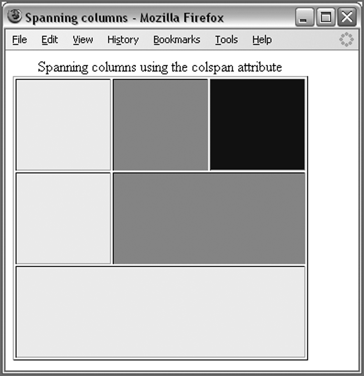
Spanning Columns Using the colspan Attribute
As you saw when looking at the <td> and <th> elements, both can carry an attribute called colspan that enables the table cell to span (or stretch) across more than one column.
Figure 5-9 shows a table that has three rows; the cells of the table are shaded to illustrate the colspan attribute in action:
- The first row has three columns of equal width, and there is one cell for each column.
- In the second row, the first cell is the width of one column, but the second cell spans the width of two columns.
- The third row has just one cell that spans all three columns.
Now take a look at the code for this example to see how the colspan attribute is used. This example also uses CSS classes (which you’ll learn how to define in Chapter 7, “Cascading Style Sheets”) to illustrate a point visually (ch05_eg03.html):
<table>
<caption>Spanning columns using the colspan attribute</caption>
  <tr>
    <td class="one"> </td>
    <td class="two"> </td>
    <td class="three"> </td>
  </tr>
  <tr>
    <td class="one"> </td>
    <td colspan="2" class="two"> </td>
  </tr>
  <tr>
    <td colspan="3" class="one"> </td>
  </tr>
</table>
In the first row, you can see that there are three <td> elements, one for each cell.
In the second row, there are only two <td> elements, and the second of these elements carries a colspan attribute. The value of the colspan attribute indicates how many columns the cell should stretch across. In this case, the second cell spans two columns; therefore, it has a value of 2.
In the final row, there is just one <td> element, and this time the colspan attribute has a value of 3, which indicates that it should take up three columns.
As mentioned at the start of this chapter, when dealing with tables you must think in terms of grids. This grid is three cells wide and three rows tall, so the middle row could not have two equal-sized cells. (Because they would not fit in the grid—you cannot have a cell spanning 1.5 columns.)
An example of where the colspan attribute might be useful is in creating a timetable or schedule where the day is divided into hours—some slots lasting 1 hour, others lasting 2 to 3 hours.
You might also have noticed the use of the nonbreaking space character ( ) in the cells, which is included so that the cell has some content; without content for a table cell, some browsers cannot display the background color.
Spanning Rows Using the rowspan Attribute
The rowspan attribute does much the same thing as the colspan attribute, but it works in the opposite direction: It enables cells to stretch vertically across cells. You can see the effect of the rowspan attribute in Figure 5-10.
When you use a rowspan attribute, the corresponding cell in the row beneath it must be left out (ch05_eg04.html):
<table>
<caption>Spanning rows using the rowspan attribute</caption>
  <tr>
    <td class="one"> </td>
    <td class="two"> </td>
    <td rowspan="3" class="three"> </td>
  </tr>
  <tr>
    <td class="one"> </td>
    <td rowspan="2" class="two"> </td>
  </tr>
  <tr>
    <td class="one"> </td>
  </tr></table>
Splitting Up Tables Using a Head, Body, and Foot
There are occasions in which you may want to distinguish between the body of a table (where most of the data is held) and the headings or maybe even the footers. For example, think of a bank statement: You may have a table where the header contains column headings, the body contains a list of transactions, and the footer contains the balance in the account.
If the table is too long to show on a screen, the header and footer might remain in view all the time, whereas the body of the table gains a scrollbar. Similarly, when printing a long table that spreads over more than one page, you might want the browser to print the head and foot of a table on each page. Unfortunately, the main browsers do not yet support these ideas, although there are options to implement this using CSS or JavaScript. However, if you add these elements to your tables, you can use CSS to attach different styles to the contents of the <thead>, <tbody>, and <tfoot> elements. It can also help those who use aural browsers, which read pages to users.
The three elements for separating the head, body, and foot of a table follow:
- <thead> to create a separate table header
- <tbody> to indicate the main body of the table
- <tfoot> to create a separate table footer
A table may also contain several <tbody> elements to indicate different “pages,” or groups of data.
Here you can see an example of a table that makes use of these elements (ch05_eg05.html):
<table>
  <thead>
    <tr>
      <th>Transaction date</th>
      <th>Payment type and details</th>
      <th>Paid out</th>
      <th>Paid in</th>
      <th>Balance</th>
    </tr>
  </thead>
  <tfoot>
    <tr>
      <td></td>
      <td></td>
      <td>$1970.27</td>
      <td>$2450.00</td>
      <td>$8940.88</td>
    </tr>
  </tfoot>
  <tbody>
    <tr>
      <td>12 Jun 12</td>
      <td>Amazon.com</td>
      <td>$49.99</td>
      <td></td>
      <td>$8411.16</td>
    </tr>
    <tr>
      <td>13 Jun 12</td>
      <td>Total</td>
      <td>$60.00</td>
      <td></td>
      <td>$8351.16</td>
    </tr>
    <tr>
      <td>14 Jun 12</td>
      <td>Whole Foods</td>
      <td>$75.28</td>
      <td></td>
      <td>$8275.88</td>
    </tr>
    <tr>
      <td>14 Jun 12</td>
      <td>Visa Payment</td>
      <td>$350.00</td>
      <td></td>
      <td>$7925.88</td>
    </tr>
    <tr>
      <td>15 Jun 12</td>
      <td>Cheque 122501</td>
      <td></td>
      <td>$1450.00</td>
      <td>$9375.88</td>
    </tr>
  </tbody>
  <tbody>
    <tr>
      <td>17 Jun 12</td>
      <td>Murco</td>
      <td>$60.00</td>
      <td></td>
      <td>$9315.88</td>
    </tr>
    <tr>
      <td>18 Jun 12</td>
      <td>Wrox Press</td>
      <td></td>
      <td>$1000.00</td>
      <td>$10315.88</td>
    </tr>
    <tr>
      <td>18 Jun 12</td>
      <td>McLellans Bakery</td>
      <td>$25.00</td>
      <td></td>
      <td>$10290.88</td>
    </tr>
    <tr>
      <td>18 Jun 12</td>
      <td>Apple Store</td>
      <td>$1350.00</td>
      <td></td>
      <td>$8940.88</td>
    </tr>
  </tbody>
</table>
Figure 5-11 shows what this example looks like in Firefox, which supports the thead, tbody, and tfoot elements. This example uses CSS to give the header and footer of the table a background shade.

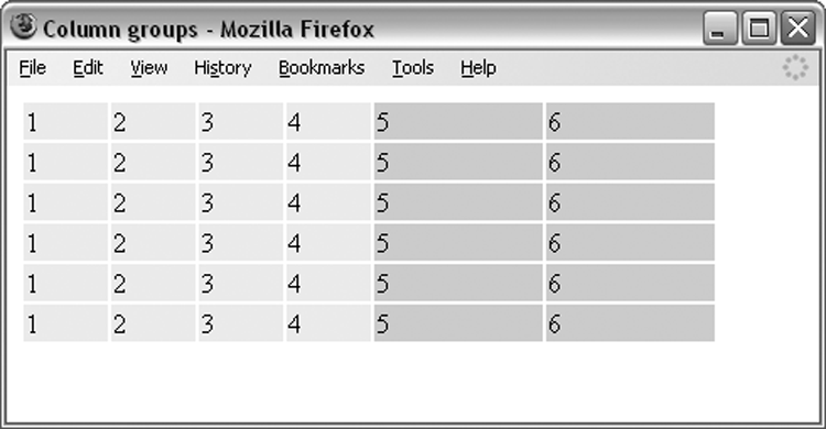
Grouping Columns Using the <colgroup> Element
If two or more columns are related, you can use the <colgroup> element to explain that those columns are grouped together.
For example, in the following table, there would be six columns. The first four columns are in the first column group, and the next two columns are in the second column group (ch05_eg06.html):
<table>
  <colgroup span="4" class="mainColumns" />
  <colgroup span="2" class="subTotalColumns" />
  <tr>
    <td>1</td>
    <td>2</td>
    <td>3</td>
    <td>4</td>
    <td>5</td>
    <td>6</td>
  </tr>
</table>
When the <colgroup> element is used, it comes directly after the opening <table> tag and carries a span attribute, which indicates how many columns the group contains.
In this example, the class attribute is used to attach CSS rules that tell the browser the width of each column in the group and the background color for each cell. You learn more about CSS in Chapter 7, but it is worth noting that some browsers support only a subset of the CSS rules for this element.
You can see what this example looks like in Figure 5-12.
Columns Sharing Styles Using the <col> Element
The <col> element was introduced to specify attributes of the columns in a <colgroup> (such as width or alignment of cells within that column). Unlike the <colgroup> element, the <col> element does not imply structural grouping and is therefore more commonly used for presentational purposes.
The <col> elements are always empty elements; they do not have any content, although they do carry attributes.
For example, the following table would have six columns, and the first five, although not a group in their own right, could be formatted differently than the last column because it belongs to a separate set (ch05_eg07.html):
<table>
  <colgroup span="6">
    <col span="5" class="mainColumns" />
    <col span="1" class="totalColumn" />
  </colgroup>
  <tr>
    <td></td>
    ...
    <td></td>
  </tr>
</table>
You can see what this looks like in Figure 5-13.

The attributes that the <col> element can carry are the same as for the <colgroup> element.
Nested Tables
As mentioned earlier in the chapter, you can include markup inside a table cell, as long as the whole element is contained within that cell. This means you can even place another entire table inside a table cell, creating what’s referred to as a nested table. Figure 5-14 shows you an example of a table that shows a schedule for a weekend of activities.

In the bottom-right cell of this table is a second table that divides up the attendees into two groups. (ch05_eg08.html):
<table>
  <tr>
    <th></th>
    <th>Morning</th>
    <th>Afternoon</th>
  </tr>
  <tr>
    <th>Saturday</th>
    <td>Cycling</td>
    <td>Fishing</td>
  </tr>
  <tr>
    <th>Sunday</th>
    <td>Rowing</td>
    <td>
          <table>
            <tr>
                 <th>Group 1</th>
                 <th>Group 2</th>
                </tr>
               <tr>
                <td>Water skiing</td>
                <td>Wake boarding</td>
               </tr>
         </table>
        </td>
  </tr>
</table>
Now that you’ve seen how to create a nested table, it is worth noting that they should be used sparingly because they are quite hard for those who rely upon screen readers to follow. You see this in the next section.
Accessible Tables
By their nature, tables can contain a lot of data and provide a helpful visual representation of this information. When looking at a table, it is easy to scan across rows and up and down columns to find a particular value or compare a range of values. If you think back to the examples you saw at the start of the chapter (the NFL sports results or the train timetable), you would not need to read all the content of the table just to find out how your team is doing this season or when a train is leaving.
However, for those who listen to pages on a voice browser or a screen reader, tables can be much harder to understand. For example, if you imagine having a table read to you, it would be much more difficult to compare entries across a row or column because you have to remember what you have heard so far. (It is not as easy to scan back and forth.)
Yet with a little thought or planning, you can make tables a lot easier for all to understand. Here are some things you can do to ensure your tables are easy to understand:
- Add captions to your tables. The <caption> element clearly associates a caption with a table, and the screen reader can read the caption to users before they see the table so that they know what to expect. If the listener knows what to expect, it is easier to understand the information.
- Always try to use the <th> element to indicate a table heading.
- Always put headings in the first row and the first column.
- Avoid using nested tables (like the one you saw in the previous section) because this can make it harder for the user of a screen reader to follow.
- Avoid using rowspan and colspan attributes, which again make it harder for the user with a screen reader to follow. If you do use them, make sure that you use the scope and headers attributes, which are discussed shortly.
- Learn how a voice browser or screen reader would read a table and the order in which the cells are read out; this can help you to understand how to structure your tables for maximum ease of use. (You see examples of this in the following section.)
- If you use the scope and headers attributes to clearly indicate which headings apply to which rows and columns, screen readers can help users retrieve headings for a particular cell. If you imagine someone having a table read to him, the screen reader often gives the user an option to hear the headers that are relevant to that cell again (without having to go up to the first row or back to the first cell in the column to hear the heading that corresponds with that cell).
You already saw how to add a caption to a table, so move on to see how tables are read to a user, or how they are linearized.
How to Linearize Tables
When a screen reader is used to read a table, it tends to perform linearization, which means that the reader starts at the first row and reads the cells in that row from left to right, one by one, before moving on to the next row, and so on until the reader has read each row in the table. Consider the following simple table (ch05_eg09.html):
<table border="1">
  <tr>
    <td>Column 1, Row 1</td>
    <td>Column 2 Row 1</td>
  </tr>
  <tr>
    <td>Column 1, Row 2</td>
    <td>Column 2, Row 2</td>
  </tr>
</table>
Figure 5-15 shows what this simple table would look like in a browser.
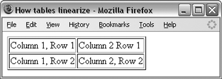
The order in which the cells in Figure 5-16 would be read is therefore
- Column 1 Row 1
- Column 2 Row 1
- Column 1 Row 2
- Column 2 Row 2
This small example is fairly easy to follow. But imagine a larger table: The headings will be read first, followed by a row of data. If the table had several more columns, it would be hard to remember which column you were in. (Even worse, if you use nested tables, it becomes far harder for users to follow where they are because one table cell can contain an entirely new table that often has different numbers of rows or columns.)
Luckily, most screen readers can remind users of the column and row they are currently in, but this works better when the table uses <th> elements for headers. And if you build a complex table, you can also enhance this information using the id, scope, and headers attributes, covered in the following section.
Using the id, scope, and headers Attributes
The id, scope, and headers attributes have already been mentioned in this chapter, when you looked at the attributes that the <td> and <th> elements can carry. Here you look at how they can be used to record the structure of a table better and make it more accessible.
When you make a cell a heading, adding the scope attribute to the <th> element helps you indicate which cells that element is the heading for. If you give it a value of row, you indicate that this element is the header for that row; given the value of column, it indicates that it is the header for that column. You can also have values for a rowgroup or columngroup, as shown in Table 5-2.
Table 5-2: Possible Values for the scope Attribute
| Value | Purpose |
| row | Cell contains header information for that row. |
| col | Cell contains header information for that column. |
| rowgroup | Cell contains header information for that rowgroup—a group of cells in a row created using the <thead>, <tbody>, or <tfoot> elements. (There is no corresponding element for columns like the <colgroup> element.) |
| colgroup | Cell contains header information for that colgroup (a group of columns created using the <col> or <colgroup> element). |
The headers attribute performs the opposite role to the scope attribute because it is used on <td> elements to indicate which headers correspond to that cell. The value of the attribute is a space-separated list of the header cells’ id attribute values, so here you can tell that the headers for this cell would have id attributes whose values are income and q1.
headers="income q1"The main purpose of this attribute is to support voice browsers. When a table is read to you, it can be hard to keep track of which row and column you are on; therefore, the header attribute reminds users which row and column the current cell’s data belongs to.
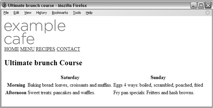
Creating an Accessible Table
You now have the tools needed to create an accessible table.
<!DOCTYPE html>
<html>
<head>
  <meta charset="utf-8" />
  <title>Ultimate brunch Course</title>
</head>
<body>
</body>
</html><body>
<table>
<tr>
<th></th>
<th>Saturday</th>
<th>Sunday</th>
</tr>
<tr>
<th>Morning</th>
<td>Baking bread: loaves, croissants and muffins.</td>
<td>Sweet treats: pancakes and waffles.</td>
</tr>
<tr>
<th>Afternoon</th>
<td>Eggs 4 ways: boiled, scrambled, poached, fried.</td>
<td>Fry pan specials: Fritters and hash browns.</td>
</tr>
</table>
</body><table>
<tr>
<th></th>
<th id="Saturday" scope="col">Saturday</th>
<th id="Sunday" scope="col">Sunday</th>
</tr>
<tr>
<th id="Morning scope="row">Morning</th>
<td headers="Saturday Morning" Baking bread: loaves,
croissants and muffins.</td>
<td headers="Sunday Morning" >Eggs 4 ways: boiled,
scrambled, poached, fried </td>
</tr>
<tr>
<th id="Afternoon" scope="row">Afternoon</th>
<td headers="Saturday Afternoon">Sweet treats:
pancakes and waffles.</td>
<td headers="Sunday Afternoon">Fry pan specials:
Fritters and hash browns.</td>
</tr>
</table>Summary
In this chapter, you have seen how tables can be a powerful tool when creating pages. You have seen how all tables are based on a grid pattern and use the four basic elements: <table>, which contains each table; <tr>, which contains the rows of a table; <td>, which contains a cell of table data; and <th>, which represents a cell that contains a heading.
You have also seen how you can add headers, footers, and captions to tables. It is particularly helpful to add a <thead> and <tfoot> element to any table that may be longer than a browser window or sheet of printed paper because these could help a reader relate between the content and the information in headers or footers.
You can now make cells span both columns and rows; although, you should avoid doing this in tables that contain data because it makes them harder for aural browsers to read to a user. You have also seen how to group columns so that you can preserve structure, and so they can share styles and attributes.
Finally, you saw some of the accessibility issues for the use of tables. You must be aware of the process of linearization, which a screen reader performs before reading a table to a user, so that your sites are accessible to users with visual impairments. You also need to know how to provide extra information that indicates the headers for each cell.
In the next chapter, you learn about using forms to collect information from visitors.
Exercises
The answers to all the exercises are in Appendix A, “Answers to Exercises.”
What You Learned in This Chapter
| Topic | Key Takeaway |
| Tables | Tables allow you to preset structured content in an easy to digest format. |
| Grouping table section | You should use all the tools available to you to properly group content in tables. |
| Accessibility | Tables are difficult for screen readers to manage, so using the tools available to enhance table accessibility is the key to ensuring the widest possible audience has access to your content. |