Chapter 4
Images, Audio, and Video
What You Will Learn in This Chapter
- How to add images to a web page
- What the different types of image formats are and where to use each
- How to add audio and video to your web pages
- All about the <video>, <audio>, and <object> elements
Wrox.com Code Downloads for this Chapter
The wrox.com code downloads for this chapter are found at www.wrox.com/remtitle.cgi?isbn=9781118340189 on the Download Code tab. The code is in the Chapter 4 download and individually named according to the names throughout the chapter.
In this chapter, you learn how to add images, animations, audio, and video to your site. This should start to breathe some life into the pages you’ve been creating so far.
You start by learning how to add images to your documents using the <img> element. You also learn how to make an image a link, and even how to divide an image into sections so that different parts of the image link to different pages, which is known as an image map. Then you look at some of the main image formats used on the web (JPEG, GIF, and PNG) and learn which image format to use for different types of images. This is important because it can greatly affect the speed with which your web pages load. (And as you know, slow websites frustrate users.)
After you finish with images, you look at how to add some more multimedia content to your site in the form of Flash and the new HTML5 <video> and <audio> elements. In doing so, you also meet the <object>, <param>, and <embed> elements. By the end of the chapter, your pages should look more exciting.
Adding Images Using the <img> Element
Images are added to a site using the <img> element, which must carry at least two attributes: the src attribute, indicating the source of the image, and an alt attribute, which provides a description of the image.
For example, the following line would add the image called logo.gif into the page (in this case, the image lives in a directory called images). You can find this code at ch04_eg01.html.
<img src="logo.gif" alt="Wrox logo" >Figure 4-1 shows what this image looks like in a browser.
In addition to carrying all the universal attributes, the <img> element can carry the following attributes:
src alt height width ismap usemap The src Attribute
The src attribute tells the browser where to find the image. The value is a URL and, just like the links you met in the previous chapter, the URL can be an absolute URL or a relative URL.
<img src="logo.gif" >Generally speaking, images for your site should always reside on your server or on another server you control. It is not good practice to link to images on other sites because if the owner of the other site decides to move that image, your users will no longer see the image.
Because the images are on your server, rather than being an absolute URL, the value is more likely to be a relative URL that uses the same shorthand notations you met in the previous chapter when relative URLs were introduced.
Most web page authors create a separate directory (or folder) in the website for images. If you have a large site, you might even create different folders for different types of images. For example, you might keep any images used in the design of the interface (such as logos or buttons) separate from images used in the content of the site.
The alt Attribute
The alt attribute should appear on every <img> element and its value should be a text description of the image.
<img src="logo.gif" alt="Wrox logo" >Often referred to as alt text, the value of this attribute should describe the image because of the following:
- If the browser cannot display the image, this text alternative is shown instead.
- Web users with visual impairments often use software called a screen reader to read a page to them, in which case the alt text describes the image they cannot see.
- Although search engines are clever, they cannot yet describe or index the contents of an image; therefore, providing a text alternative helps search engines index your pages and helps visitors find your site.
Sometimes images do not convey any information and are used only to enhance the layout of the page. (For example, you might have an image that is just a decorative element and does not add any information to the page.) In such a case, the alt attribute should still be used but given no value, as follows:
<img src="stripy_page_divider.gif" alt="" >As you’ll see in Chapter 7, “Cascading Style Sheets,” decorative elements are usually best handled with CSS. Still, there are situations in which decorative images are unavoidable. In those exceptions this is the correct pattern.
The height and width Attributes
The height and width attributes specify the height and width of the image, and the values for these attributes are almost always shown in pixels. (If you are not familiar with the concept of pixels, look at this in the section “Choosing the Right Image Format.”)
<img src="logo.gif" alt="Wrox Logo" height="120" width="180" >Technically, the values of these attributes can be a percentage of the browser screen. Or if the image is inside an element that takes up only part of the page, known as a containing element, it would be a percentage of the containing element. If you do use a percentage, the number will be followed by a percent sign, but for most web pages this is rare, and showing an image at any size other than the size at which it was created can result in a distorted or fuzzy image.
Specifying the size of the image is considered good practice, so you should try to use these attributes on any image that you put on your pages.
It also helps a page to load faster and more smoothly because the browser knows how much space to allocate to the image, and it can correctly render the rest of the page while the image is still loading.
Also, if for some reason the image doesn’t load, you’ll also have the browser draw an empty box of the given height and width with the alt text within it.
Although you can tell the browser to display images smaller or larger than they actually are (by telling the browser that the width and height are different from what they actually are), you should avoid doing this because your image will not be as clear. Rather, you should aim to create versions of images at the same size that you will use them on your web pages. Programs such as Photoshop, Photoshop Elements, Paint Shop Pro, or GIMP can help you do this.
It is also important not to use images bigger than they are shown on screen (for example, you should not use an image 800 pixels by 800 pixels if you will show it only at 100 pixels by 100 pixels on the screen) because the smaller an image, the smaller the size of the file (in terms of kilobytes). And the smaller the file size, the quicker the image loads in the browser. Also, for putting your site on the web for others to see, it might save you money because you are often charged in relation to the total size of all the files you send to the people who visit your site.
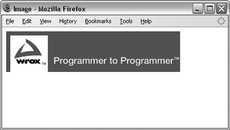
Likewise, it is important not to show images larger than they actually are. If you have a small image (say, 100 pixels by 100 pixels) and try to display it much larger (say, 300 pixels by 300 pixels) it will appear grainy (as shown in Figure 4-2).
Although it is not a good idea to do so, if you just specify the height or width attribute and leave out the other one, your browser will show the image to scale. Assume for a moment that you have an image that is 200 pixels wide by 100 pixels tall. If you just specify the width of the image as 200 pixels, it would try to show the image at its correct size: 200 pixels wide by 100 pixels tall. However, if you said that the image was 100 pixels wide and did not specify the height, the browser would try to make the image 50 pixels tall. Because it is 50 percent the width of the original image, it would display the image at 50 percent of its height. In other words, it maintains the aspect ratio of an image (its width divided by its height).
You could even distort images by providing a different width in relation to height.
Figure 4-2 shows an image at its actual size (top: 130 pixels by 130 pixels); the image magnified (middle: the width attribute is given a value of 160 pixels); and the image distorted (bottom: the width attribute is given a value of 80 pixels and the height attribute a value of 150 pixels).
Here is the code for this example (ch04_eg02.html):
<p>Fixed size: width 130 height 130</p>
<img src="images/apple.jpg" alt="Photo of red apple" width="130"
    height="130" >
<p>Enlarged: width 160 (no height specified)</p>
<img src="images/apple.jpg" alt="Photo of red apple" width="160" >
<p>Stretched: width 80 height 150</p>
<img src="images/apple.jpg" alt="Photo of red apple" width="80" height="150" >
Adding Images to a Web Page
Now that you’ve learned the basics of how images work, it’s time to roll up your sleeves and use one in a web page.
<img src="images/logo.gif" alt="example café logo" width="194" height="80" ><img src="images/scrambled_eggs.jpg" width="622" height="370" alt="Photo of
scrambled eggs on an English muffin" >
Using Images as Links
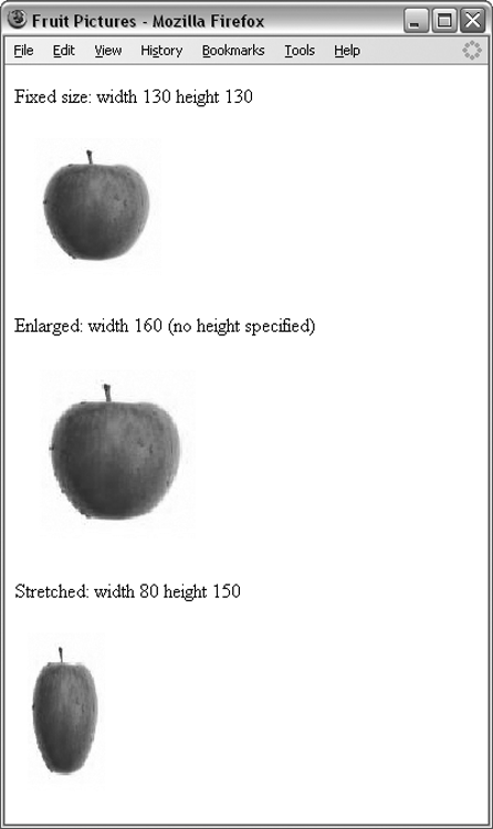
It’s easy to turn an image into a link. Rather than putting text between the opening <a> tag and the closing </a> tag (as you saw in the previous chapter), you simply place an image inside these tags. Images are often used to create graphical buttons or links to other pages, as follows (ch04_eg03.html):
<a href="http://www.wrox.com">
  <img src="images/wrox_logo.gif" alt="Wrox logo"
    width="338" height ="79" >
</a>
You can see what this looks like in Figure 4-4. This screenshot was purposely taken in IE to show you how IE draws a blue (appears grey in the black-and-white image) border around any image inside an <a> element. There is nothing in the HTML specification that says a border should be drawn around images that are links, and none of the other browsers do this.
This border doesn’t look nice, so you could use CSS to indicate that any <img> elements inside an <a> element should have no border. (You learn how to do this in Chapter 7.)
Choosing the Right Image Format
Images and graphics can bring your site to life, but you must learn how to prepare images for the web. Otherwise, they can significantly increase the time it takes for a page to load.
When writing sites on your desktop or laptop computer, you may not realize how long a page will take to load; files that are sitting on your computer will load a lot faster than they would if they were on the Internet. Therefore, choosing the right image format and saving your images correctly can ensure that your site will not load unnecessarily slow—and this should result in happier visitors.
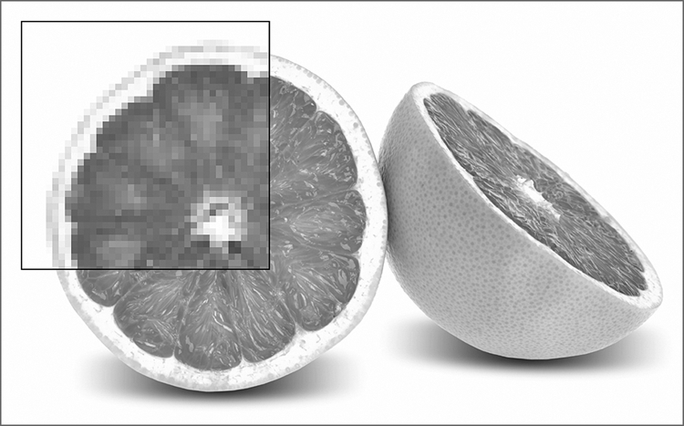
Most static images on the web are classified as bitmapped images. Bitmapped images divide a picture into a grid of pixels and specify the color of each pixel individually. If you look closely at your computer screen, you might see the pixels that make up the screen. There are several different bitmap formats; common ones include JPEG, GIF, TIFF, PNG, and the rather confusingly named bitmap or BMP.
Figure 4-5 shows a bitmap image with one section modified so that you can see how pixels make up the image.
The number of pixels in every square inch of the image is referred to as the resolution of the image. It is normal to save images that will be used on the web at a resolution of 72 pixels per inch because this corresponds with the number of pixels in a square inch on your computer screen. By contrast, images used in print are usually supplied to printers at 300 dots per inch.
The more pixels or dots per inch an image contains, the larger the size (in KB) of the file, and the larger the file, the longer it takes to transfer over the web. Therefore, any images that you use on the web should be saved at a resolution of 72 dots per inch.
Browsers tend to support three common bitmap graphics formats, and most graphics programs save images in these formats:
- GIF: Graphics Interchange Format (pronounced either “gif” or “jif”)
- JPEG: Joint Photographic Experts Group (pronounced “jay-peg”)
- PNG: Portable Network Graphics (pronounced “pee-en-gee” or “ping”)
Now take a quick look at each of these because understanding how the format works helps you choose how to save an image.
GIF Images
Graphics Interchange Format (GIF) images are created using a palette of up to 256 colors, and each pixel of the image is one of these 256 colors. Every different GIF image can have a different palette of 256 colors selected from a range of more than 16 million colors. The program that saves the image also selects the palette that best represents the images.
The GIF file stores the palette of colors in a lookup table, and each pixel references the color information in the lookup table rather than each pixel specifying its own color information. The advantage of this technique is that if many pixels use the same colors, the image does not repeat the same color information, and the result is a smaller file size. This makes GIF images more suited to graphics (where there are often areas of the same color—known as a flatcolor) and less suited to photographs (where there are often many more different colors).
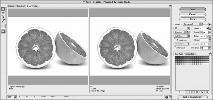
This way to store images is an indexed color format. Figure 4-6 shows a GIF file created in Adobe Photoshop. You can see the color palette for this image represented in the set of squares halfway down the image on the right.
If a GIF contains fewer than 16 colors (in which case it can be referred to as a 4-bit GIF), the image will be less than one-half the file size of a GIF using 256 colors (an 8-bit GIF). Therefore, if you create an image that uses fewer than 16 colors, it is worth checking whether your program automatically saves your image as a 4-bit GIF because this results in a smaller file that’s quicker to download than an 8-bit GIF.
If the GIF needs to use more than 256 colors, most graphics programs, when saving GIFs, use a technique called dithering to better represent the extra colors. This means that they use two or more colors in adjacent pixels to create an effect of a third color. Dithering has the following two drawbacks:
- If you place a flat color next to a dithered color, you see where the change occurs (because the dithered color consists of more than one color).
- It can result in some banding in colors. For example, when there is a smooth transition between one color and another color (referred to as a gradient), many more than 256 shades may be required to show the gradient. Therefore, dithering would be used, but the result might be that the smooth gradient now looks like a series of stripes.
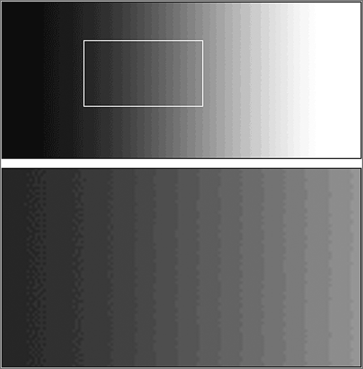
Figure 4-7 illustrates how even a simple gradient, when saved as a GIF, can result in banding because the image contains more than 256 colors. The bottom part of this image zooms into an area of the gradient where you can see that the gradient has vertical lines rather than a smooth transition from black to white.
Because GIFs support only 256 colors and must use dithering to achieve any further colors, they are not suitable for detailed photographs, which tend to contain many more than 256 colors. If you have a photograph, gradient, or any image with similar shades of the same color next to each other, you are often better off using a JPEG, which can support unlimited colors, or sometimes a PNG—both of which you’ll learn about shortly.
GIFs do have another handy feature: You can specify one or more colors in a GIF to represent a transparent background—in parts of the image that are the specified colors, the background will be allowed to show through.
This technique works best with images that have perfectly straight edges because when you have a curved edge, an image editing program often anti-aliases the edge (use several shades) to make the image look smooth, as shown in Figure 4-8.

However, in a transparent GIF each pixel is either on or off, opaque or transparent—there are no degrees of transparency. As a result, if you try to use it with curved corners, the corners may appear pixelated. To help overcome this problem, you should try to make the transparency color as close to the background color as possible. (Or if you use Photoshop, you can use the matte feature.)
Figure 4-9 shows how a pixelated effect is created when a GIF is not created on a suitable background. Notice the lighter pixels around the corners in particular.

To make GIF files smaller, you can compress them using a technique called LZW compression, which scans rows of the image looking for consecutive pixels that share the same color. When it comes across pixels that are the same color, it indicates that from this point, x number of pixels should be written using the same color.
LZW compression is known as a lossless compression technique because no data is lost; therefore, there is no loss of quality. This is contrasted with lossy compression techniques where some of the data is discarded during compression and therefore cannot be recovered from the compressed file.
Animated GIFs
GIF images can store more than one frame (or copy of the image) within a file, allowing the GIF to rotate between the versions/frames and create a simple animation. It works in a similar way to a flip-book animation, where the drawing on each page of the book changes slightly from the previous one so that when a user flips the pages it looks as if the images are moving.
This works well if your animated image contains large areas of flat color because when the image is compressed after the initial frame has been recorded, only the pixels that have changed need to be stored with each subsequent frame. It is far less suitable, however, for photographic images because many more of the pixels change, resulting in a large image.
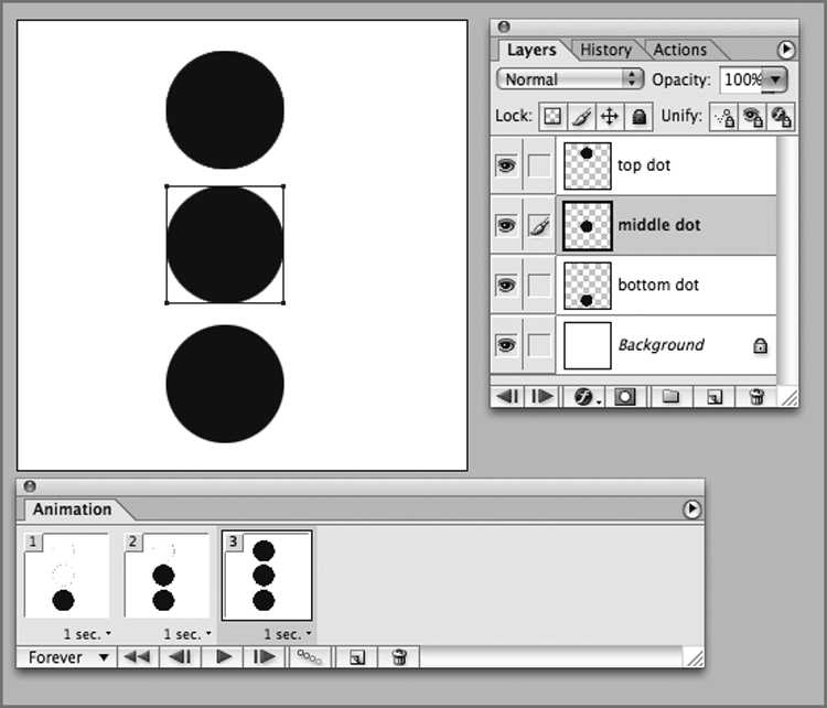
Figure 4-10 shows you an animated GIF created in Adobe Image Ready. The window on the right shows you that there are three dots on separate layers of the image. The window at the bottom shows you that in frame 1 of the animation, only the bottom dot shows; in frame two, the bottom and middle dots show; and in the third frame, all three dots show. Under each frame of the animation you can see how long each frame should appear. (In each case it is 1 second.)
JPEG Images
The JPEG image format was developed as a standard for storing and compressing images such as photographs that use a wide range of colors. When you save a JPEG, you can usually specify by how much, if at all, you want to compress the image—which depends upon the image quality you want. The process to compress a JPEG involves discarding color data that people would not normally perceive, such as small color changes. However, because the image format discards this data when the image is compressed, some of the data is lost, and the original cannot be re-created from a compressed version—hence it is known as lossy compression.
The amount of compression you apply will change from image to image, and you can judge how much to compress a JPEG only by looking at it. Hence the size of the file varies depending upon how much you compress the image. When you save the image, you are often asked for a percentage of quality to be used; 100 percent does not compress the picture at all, and for a photo you can often get down to approximately 60–70 percent (but not usually much lower). Some programs use words such as excellent, very good, good, and so on instead of percentages to describe the image quality.
A good image-editing program enables you to compare the original image side by side with the compressed version as you choose how much compression to add. Figure 4-11 shows you how Adobe Photoshop enables you to compare two versions of the image next to each other as you prepare to save the JPEG for the web. On the left, you have the original image, and on the right is the version that it saves for use on the web. Photoshop also provides an estimated download time for the graphic at that size, which can help you estimate how well it will work when it’s on the web.

Because the JPEG format was designed to work with photo-realistic images, it does not work so well with images that have large amounts of flat color or high-contrast hard edges (such as lettering and line drawings). As you increase compression in a JPEG, you may also see banding start to show in colors that are similar.
PNG Images
The Portable Network Graphics format is the most recent format on the block. It was developed in the late 1990s because the company that owns the patent for GIFs (Unisys) decided to charge companies that developed software for creating and viewing GIFs a license fee to use the technology. Although web designers and web surfers are not directly affected by this charge, the companies that make the software they use are.
The PNG format was designed for the same uses as GIF images, but while it was created, the designers decided to solve what they thought were some of the disadvantages with the GIF format. The result is two types of PNG. The 8-bit PNG has the same limitations as an 8-bit GIF—only 256 colors, and when transparency is used each pixel is either on or off. Then there is the enhanced PNG-24, a 24-bit version, which has two major advantages:
- The number of colors available for use in an image is not restricted, so any color can be included without losing any data.
- A map (like the lookup table that indicates the color of each pixel in GIFs) provides different levels of transparency for every pixel, which allows for softer, anti-aliased edges.
Furthermore, all PNGs tend to compress better than a GIF equivalent. The PNG format was adopted slowly because some older browsers did not fully support the format. Although basic support was offered in early versions of browsers, some of the more advanced features took longer to be implemented. For example, Internet Explorer was unable to deal with transparency correctly until version 7. The story now is much different, with excellent support for PNGs across all the major browsers.
Keeping File Sizes Small
You usually want to save the images for your site in the format that best compresses the image and therefore results in a smaller file size. Not only can your pages load faster, but also you can save on the charges to host your site.
Usually one or another format will be the obvious choice for you. The rule of thumb is as follows:
- Use JPEGs for photo-realistic pictures with a lot of detail or subtle shade differences you want to preserve.
- Use PNGs for images with flat color (rather than textured colors) and hard edges, such as diagrams, text, or logos.
Look at the following images (see Figure 4-12)—one is a photograph of a cat, and the other is a black-and-white cartoon.

Table 4-1 shows you the file size of each of these saved as an 8-bit PNG and as a JPEG (where the JPEG is saved at 60 percent quality).
Table 4-1: Size Comparison across Different Image Formats
| Image | JPEG | PNG |
| Cat | 72.1 k | 210 k |
| Cartoon | 39.3 k | 22.5 k |
As you can see, the cartoon has areas of flat, plain color, whereas the photo of the cat uses lots of different shades. Therefore, the cartoon is better suited to the GIF or PNG formats, whereas the photo of the cat with all its shadows is suited better to the JPEG format.
If you need to include many large, complex photographic images on your site, it’s good practice to offer users smaller versions of the images when the pages first load and then add a link to the larger version. These smaller images are often referred to as thumbnails, and you usually see them in image galleries or on pages that contain summaries of information (such as the homepages of news sites and pages that list several products, from which you link to a page with more detail and larger images). Figure 4-13 shows you an example of using thumbnails in an image gallery. (The small images at the bottom are smaller in physical size and file size than the counterparts that show at the top.)

When creating the smaller version, scale the image down in an image-editing program. Do not simply alter the width and height attributes of the <img> element because users still must download the full-sized image even though they see only a smaller version of it. (The full-sized image takes longer to download.) By creating a special thumbnail of any smaller images you use, your pages can load a lot quicker.
Adding Flash, Video, and Audio to Your Web Pages
You spent the first half of the chapter looking at adding images to your web pages, and in the second half of the chapter you look at adding video and audio to your pages. At one point this was relatively straightforward. If you learned just a little bit about Adobe Flash, you could easily embed audio and video on your pages, and that media would be available to the vast majority of Internet users.
Unfortunately, for people who make websites, this is no longer the case. With the explosive growth of mobile devices and the lack of support for Flash on iOS (the operating system for Apple products) adding audio and video to pages is a lot more complicated than it used to be.
The following section simplifies the issues as much as possible. The hope is that you can handle the most common scenarios you’ll encounter. Reading this chapter won’t make you an expert on the different ways video and audio on the Internet work, but you will have the foundation needed to get up and running.
The basic approach these days is to serve video and audio to all modern browsers (the latest versions of Chrome, Firefox, Internet Explorer, and Safari) using the new HTML5 <video> element and then use Adobe Flash to serve video to users of Internet Explorer 8 or below. You’ll learn how to do this later in this chapter. First, you learn about the most common example of embedding rich media on the web today, using a third-party service such as YouTube. These companies take the business of putting video on the web and make it as simple as possible, providing a simple interface to upload video, hosting services for video content, and easy-to-use embed code. Under the hood, they use the same techniques you’ll learn about later in the chapter; they just hide all the complexity from their end users.
Adding YouTube Movies to Your Web Pages
By far, the most common way to host and share video is with Google’s YouTube service. Whether you upload your own content or want to share content from another YouTube user, the method to embed the video is the same.
YouTube has made it easy for users to embed the YouTube Player on their pages. This is done simply by copying and pasting a line of code from the YouTube site into any web page; Figure 4-14 shows you where to find this line of code.
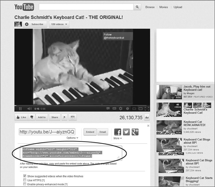
Looking at it you see that it introduces a new element, the <iframe>. The <iframe>element doesn’t, by itself, have anything to do with video. The <iframe>, or inline frame,is a special element that enables you to embed another web page within a web page using the familiar src attribute. By embedding the <iframe> from YouTube in a small corner of your site, you can always be sure to get the latest content and code that YouTube offers. All it takes is to paste that small <iframe> code snippet anywhere within the body of your page, and you have a world-class video solution.
Here’s the code for this example (ch04_eg04.html):
<iframe width="420" height="315"
  src="http://www.youtube.com/embed/J---aiyznGQ"
  frameborder="0" allowfullscreen></iframe>
If you decide to take advantage of YouTube or another similar service, this simple example is all you need to build off to handle serving video to the widest possible audience with the minimum amount of fuss.
That said, it’s not always possible or preferable to host video with a service such as YouTube. In a situation like that it helps to understand how to embed video intelligently. To do this you must learn about two new elements: <object> and <video>. In addition, to share audio files in the same way you would share <video>, you must learn about the <audio> element.
Adding Rich Media with the <audio> and <video> Elements
Any rich media solution for the modern web starts with the new <audio> and <video>elements, which work similarly, so many of the lessons you learn about one applies to the other. You focus mostly on <video> in this section, but you see an example of <audio> in action as well.
<video> is designed to work just like the <img> element you learned about earlier in this chapter. The most basic usage is a <video> element with src, height, and width attributes (ch04_eg05.html). As a note, this and the following examples in this section work only in Internet Explorer 9, Chrome, and Safari. You learn why that is in the upcoming section on containers and codecs.
<video width="720" height="480" src="central.mp4">In addition to the global attributes, <video> supports the following attributes:
poster preload autoplay mediagroup loop muted
controls crossorigin
With the exception of the crossorigin attribute that you learn about when you explore JavaScript and Ajax in Chapter 12, “jQuery: Beyond the Basics,” the following section introduces these attributes with simple examples.
Controlling Playback with the preload, autoplay, loop, and muted Attributes
These four attributes set parameters for how the video should behave without user interaction. All these are boolean attributes.
The preloadattribute indicates that the browser should begin to download the video referenced in the src attribute even before the user presses Play. The preload attribute is defined in the specification as a “hint.” This means browser vendors can decide in certain situations, for example, on a mobile device, to ignore this attribute (ch04_eg06.html).
<video width="720" height="480" src="video/central.mp4" preload>The autoplay attribute indicates whether the video should automatically play when the page is loaded. Unless you have an extremely well-thought-out reason for doing this, don’t. Let your site visitors choose when to play your video (ch04_eg07.html).
<video width="720" height="480" src=" video/central.mp4" autoplay> loop, as the name implies, indicates that the browser should start the video over when playback is complete (ch04_eg08.html).
<video width="720" height="480" src=" video/central.mp4" loop>muted indicates whether the video player should play the associated audio track (ch04_eg09.html).
<video width="720" height="480" src=" video/central.mp4" muted> Using the poster Attribute to Customize the Initial Frame
The poster attribute defines an image used as a placeholder until the video plays. If there is no poster attribute defined, the first frame of the video is used as the poster (ch04_eg10.html).
<video width="720" height="480" src=" video/central.mp4" poster="central.jpg">Adding Video Playback Controls with the controls Attribute
If you’ve ever used a stereo with physical knobs and buttons, an MP3 player, the music player on your smartphone, or a video player on your desktop, you’re familiar with playback controls. The boolean controls attribute indicates whether the browser should include playback controls. Figure 4-15 illustrates two <video> elements, one with the controls attribute and the other without (ch04_eg11.html).
<video width="720" height="480" src=" video/central.mp4" controls>
Adding Audio to Your Web Pages Using the <audio> Element
As you learned, the <audio> element works the same way as the <video> element. As the following code sample (ch04_eg12.html) shows, an <audio> element and an src attribute are enough to get audio onto your pages.
<audio src="audio/pink_noise.mp3">
<audio> also supports the following attributes that you learned about earlier in the chapter:
crossorigin preload autoplay loop muted controlsOn Containers and Codecs
There are actually two reasons video on the web is complicated these days. The first is limited Flash support on mobile devices. The other is because of the tricky case of containers and codecs. Disputes about containers and codecs are why the examples in this section work only in a subset of modern browsers.
Without going into too much detail, containers can be thought of as file formats designed to hold other stuff (in this case video or audio). Codecs are coding/decoding systems that translate the 1s and 0s of binary data into something you can hear and see. The combination of a container such as MPEG Layer 4 (the .mp4 files you’ve seen in the video examples so far in this chapter) and a codec such as h.264 defines the kind of rich media files you see on the web.
This isn’t the sort of thing the average web author should worry about. You should just create a great video and share it with the world. Unfortunately, for political, sociological, and business reasons, this isn’t the case. It’s getting better, and perhaps at some point in the future (maybe by the time you read this) it will be solved. The issue is that, for a long time, there was a divide between two different camps about which container/codec combination would be best for the future of the web. The divide was between Apple and Microsoft standing firmly behind the patent-encumbered h.264 and MPEG4, and Google, Opera, and Mozilla backing free, open, and royalty-free video formats such as WebM or OGG/Theora.
On the audio front, the story was similar with Microsoft and Apple standing behind the ubiquitous MP3 format and Firefox and Opera backing OGG/Vorbis.
In March 2012, after a long stalemate Mozilla backed down and decided to support h.264, but as of this writing that support is still unscheduled.
So, for now, Mozilla’s Firefox does support the <video> and <audio> elements, just not with the most common formats.
The next section shows you how to embed Flash movies. Although Flash isn’t nearly as important as it once was, it still comes up and is a key component to cross-browser web video, so you must have a basic understanding of how it works.
Adding Flash Movies to Your Web Pages
Flash started as a way to add animations into web pages but quickly evolved to offer a high level of interactivity and the capability to deal with images, audio, and video. The momentum that Flash enjoyed for many years may have been dulled by Apple’s refusal to add support for Flash to iOS, but it still remains a popular way to add audio and video to web pages and is a required technology to provide the broadest possible support for video in all browsers.
Most Flash files are created using the Flash authoring environment, which Adobe charges for. A lot of sites offer tools such as MP3 players, video players, slideshows, and more, all written in Flash, which you can use on your site without purchasing a copy of Flash authoring program. Although creating your own Flash files from scratch is beyond the scope of this book, you see how to include in your HTML pages Flash files that have already been written.
If you work on a project using the Flash authoring tool, your projects will be saved with the .fla file extension. (And they are commonly referred to as FLA files.) But before you can use such a file on the web, you must export it in the .swf format. When files have been exported into the .swf format, they go by one of two names, either SWF (sometimes pronounced “swiff”) files or Flash movies. (Rather confusingly, they can be called Flash movies even if they do not contain any video.)
With the exception of Chrome, which ships with Flash built directly into the browser, the major browsers don’t play SWF files by themselves; rather, they rely on a free plug-in called the Flash Player. The Flash Player is often pre-installed on computers, but it can also be downloaded from the Adobe.com website.
Now briefly recap what you have learned about Flash because there was quite a lot to take in:
- You pay for the Flash authoring environment that enables you to create and edit FLA files. These files are saved with the .fla file extension.
- When you want to use Flash files on the web, you export them to SWF files or Flash movies. These files have the .swf file extension.
- Except for Chrome, the free Flash Player plug-in needs to be installed for the browser to play the SWF files.
Now look at the code used to add Flash to a page. It uses the <object> element and several child <param> elements to indicate different characteristics of the movie to the browser (ch04_eg13.html).
  <object width="550" height="400">
  <param name="allowScriptAccess" value="always" />
  <param name="allowFullScreen" value="false" />
  <param name="movie" value="flash/this-changes-everything.swf" />
  <param name="loop" value="false" />
    <embed src="flash/this-changes-everything.swf" loop="false"
    allowScriptAccess="sameDomain"
    allowFullScreen="false" width="550" height="400" />
  </object>
On the opening <object> tag, you can see that the width and height attributes specify the size of the Flash movie. These behave just like the width and height attributes on the <img> element, indicating how much space this item needs.
Inside the <object> element, you can see four <param> elements, each of which has a name and value attribute:
- The first indicates that a movie is to be loaded, along with the URL for the movie.
- The second indicates whether the player should allow the user to view the movie in full-screen mode.
- The third is a special property, which, in this case, is used to ensure that the Flash movie can be played from different websites.
- The fourth indicates whether the movie should return to the beginning and start over when playback is completed.
These parameters are specific to this example and do not necessarily apply to all Flash movies. Other parameters may be specific to a version of Flash; for example, the ability to show full-screen Flash movies was introduced in Flash 9, which was released in 2006.
For compatibility reasons, an <object> element often contains an <embed> element, and this is no exception. You may have noticed that the <embed> element does not contain any <param> elements; rather, it uses attributes on the opening tag to provide the same information. The first attribute is an src attribute—just like the one used on the <img> element indicating where to find the Flash file. This is followed by a type attribute indicating that the file is a Flash movie. The next three attributes match the <param> elements you just met. The last two, width and height, specify the size of the Flash movie.
For several years, the standard is to use JavaScript to include Flash movies in pages, rather than the <object> and <embed> elements. This is true of both the web development community and the Adobe authoring environment.
When adopting this technique, you create the page using a <div> element to hold the Flash movie, and you should use CSS to make sure that the <div> element is the same width and height as the SWF file you want to include. (You learn how to set the size of a <div> element in Chapter 7.) This <div> element should also have an id attribute to uniquely identify that element.
Inside that <div> element you can use text and images that will be shown to users who do not have Flash installed.
A JavaScript is then added to the page; this script checks whether the browser has Flash Player installed. If it is installed, the JavaScript replaces the content of the specified element <div> with the SWF file.
The JavaScript checks not only that the user has Flash Player installed but also that it is the required version. As you might have guessed, over the years there have been several versions of Flash, and the latest versions have new and improved features. But not everyone has the latest version of the plug-in, and if a browser does not have the minimum version required to play the SWF file, the JavaScript will not attempt to load the Flash, leaving behind the content of the <div> element.
The most popular script for this is called SWFObject, which you can download from http://code.google.com/p/swfobject/. You do not need any experience with JavaScript to use this technique. Now look at an example; load exactly the same Flash movie that you saw in the previous example, but this time use SWFObject (version 2.2) to include it in the page (ch04_eg14.html):
<!DOCTYPE html>
<html >
  <head>
  <meta charset="utf-8">
    <title>Adding a flash movie with SWF Object</title>
  </head>
  <body>

    <div id="flash_movie">This element can contain content
    that search engines can index, and which is helpful to
    those who do not have Flash installed.</div>
    <script type="text/javascript" src="swfobject.js"></script>
    <script type="text/javascript">
        swfobject.embedSWF("flash/this-changes-everything.swf",
          "flash_movie", "550", "400", "8.0.0");
    </script>
  </body>
</html>
Although the code is quite different, in the browser this example looks just like the previous one. The only difference is the title of the page indicates that it has been written using SWFObject.
In this example, the <div> element carries an id attribute with a value of “flash_movie”. (The id attribute is used to uniquely identify an element within a web page.) It is this element that will be replaced with the Flash movie if the user has the appropriate version of Flash Player installed.
At the bottom of the page, you can see two <script> elements. The first includes a separate JavaScript file whose location is specified using the src attribute (just as the src attribute on an image specifies where the image can be found):
<script type="text/javascript" src="swfobject.js"></script>As you can see, it loads a file called swfobject.js, and it is this file that does most of the work. You do not need to understand the content of this file or how it works, but if you are curious, you can have a look at it in a text editor or any HTML editing tool. The second <script> element calls the script included in the previous line and tells it five things so that it can do its job:
<script type="text/javascript">
    swfobject.embedSWF("flash/this-changes-everything.swf", "flash_movie",
      "550", "400", "8.0.0");
 </script>
The five parameters passed in are shown in bold:
- “flash/this-changes-everything.swf” is the location of the Flash movie to be played.
- “flash_movie” is the value of the id attribute of the element that is to be replaced.
- “550” indicates the width of the movie in pixels.
- “400” indicates the height of the movie in pixels.
- “8.0.0” is the minimum version of Flash Player required to play the movie.
This approach has two additional advantages not mentioned yet:
- It is considered to be better for search engines. Because search engines cannot index Flash content well, they see the HTML content that would have been replaced.
- It is also considered good for accessibility purposes, because if users have disabled Flash, there is alternative content for them.
As already mentioned, there are several places where you can download Flash movies that you can use on your own sites (without necessarily using the Flash authoring tool). A good starting place is http://ActiveDen.net/, which features works by many authors.
Now that you know about both the <video> element and Flash, it’s time to put them together to create your own cross-browser video solution.
Cross-Browser Video—Using Video for Everybody
Although you should definitely look to leverage third-party services if you’re interested in serving video to the largest possible audience with the smallest amount of effort, there are times when you want to serve video on your own terms.
The simplest approach to this is with a clever markup pattern called Video for Everybody (http://camendesign.com/code/video_for_everybody). Video for Everybody defines a pattern that uses the HTML5 <video> element wrapped around a Flash movie in a way that automatically chooses the appropriate method to play the video. The basic pattern is a <video> element with one or more <source> child elements. <source> elements work like the src attribute you’re familiar with—directing the browser to a video resource. The only difference is that they can be combined with other <source> elements to give the browser multiple options for playback content. After the <source> elements, a Flash video player or Flash movie is included to handle the fallback for older versions of Internet Explorer.
An example would look like the following code (ch04_eg15.html). This version has three <source> elements, one containing an MP4 (for Internet Explorer 9+, Safari, Chrome, and Mobile Safari), webm (a higher quality option available to Firefox and Opera), and ogv (an option available for older versions of Firefox). It then falls back to a Flash movie for older versions of Internet Explorer.
<video width="720" height="480" controls>
  <source src="video/central.mp4"  type="video/mp4" />
  <source src="video/central.webm"  type="video/webm" />
  <source src="video/central.ogv"  type="video/ogg" />
  <object width="720" height="480"
    type="application/x-shockwave-flash"
    data="video/central.swf">
    <param name="movie" value="video/central.swf" />
  </object>
</video>
<p> <strong>Download Video:</strong>
 <a href="video/central.mp4">"MP4"</a>
<a href="video/central.ogv">"Ogg"</a>
</p>
It takes some effort to encode video in more than one format, and having four copies of a video adds significantly to the amount of storage needed for a site’s video assets. For these reasons and the simplicity of the code needed, it’s much easier at this time to use a third-party service. These services will take care of the different browsers and encoding and hosting the various formats. That said, if you need to host you own video, this is the pattern to use.
Cross-browser audio can be handled in a similar manner to the Video for Everybody pattern. The following code sample (ch04_eg16.html) shows an <audio> element with two separate child <source> elements pointing to an MP3 (Chrome, Internet Explorer 9+, Safari) and an OGG/Vorbis file (Firefox, Opera). In addition, a simple Flash-based MP3 player called Dewplayer is used to provide a fallback for Internet Explorer 8 and below. To use Dewplayer, you need to pass the MP3 filename as a query parameter and Dewplayer takes care of the rest, serving audio in pretty much any browser that matters.
<audio controls>
  <source src="audio/pink_noise.mp3"  type="audio/mp3" >
  <source src="audio/pink_noise.ogg"  type="audio/ogg" >
    <object data="flash/dewplayer.swf?mp3=audio/pink_noise.mp3"
      width="200" height="20" id="dewplayer">
      <param name="wmode" value="transparent">
      <param name="movie"
        value="flash/dewplayer.swf?mp3=audio/pink_noise.mp3">
    </object>
</audio>
Video Size
When showing any video, you need to be aware of the physical size at which you are showing the video. It might be nice to show the video as large as possible, but the larger the video, the larger the file size, and big files can be an issue for a couple of reasons:
- The smaller the file, the faster it downloads. Users are less likely to watch videos that take a long time to download, or keep pausing when the viewer tries to watch them.
- The bigger the file, the more bandwidth you use. (Bandwidth is the total size of files sent to visitors to your site.) Because companies that host websites often charge for bandwidth, you could end up with large bills if your video is popular. This is another reason why many people host their videos on sites such as YouTube—not only is it easy to upload video content and put it on your page, but it is also cheaper.
So there is always a balancing act between having a video big enough to show people what you want them to see and having one not so big that it will not play smoothly on the average broadband connection.
If you have a long video, you might also want to consider splitting it into sections. By doing this you are less likely to pay for viewers to download an entire video that they may not watch to the end.
A Closer Look at the <object> and <param> Elements
Now that you have seen several examples of how to add rich media to your web pages, this chapter finishes with a closer look at the <object> and <param> elements in the same way previous chapters covered the syntax of other elements.
The <object> element can carry all the universal attributes and the following attributes:
data height width
tabindex usemap
Take a look at each of these, although the ones you most commonly use are the classid attribute, the type attribute, and the id attributes (discussed in Chapter 1, “Structuring Documents for the Web”).
The data Attribute
If the object has a file to process or play, the data attribute specifies the URL for that file. For example, here is a URL to an MP3:
data="http://www.example.com/mp3s/newsong.mp3"This is similar to the src attribute used on the <img> element, and the value can be a relative URL.
The height and width Attributes
The height and width attributes specify the height and width of an object. The values should be in pixels or a percentage of the containing element. They are treated just like height and width attributes of the <img> element. The use of these attributes should make the page load faster because the browser can lay out the rest of the page without completely loading the object.
The tabindex Attribute
The tabindex attribute indicates the tab index of the object within a page. Tabbing order is discussed in Chapter 5, “Tables.”
The usemap Attribute
The usemap attribute indicates that the object is an image map containing defined areas that are hyperlinks. Its value is the map file used with the object. It can be a complete URL to an external file or a reference to the value of an inline <map> element’s name attribute.
The <param> Element
The <param> element is used to pass parameters to an object. The kinds of parameters an object requires depend upon what the object does; for example, if an object has to load a Flash MP3 player into the page, you will probably need to specify where the MP3 file can be found. Alternatively, if you add a video to a page, your object might allow you to tell it whether to automatically play the video when the page loads or whether to wait for the user to press a Play button for it to start.
In addition to the universal attributes and basic events, the <param> element can carry the following attributes:
name value The name and value attributes act as a name/value pair (rather like attributes themselves). The name attribute provides a name for the parameter you pass to the application, whereas value gives the value of the parameter.
Here are a couple of examples taken from a QuickTime movie. The first parameter indicates the source of the file loaded to play, whereas the second indicates that the movie should start playing automatically as it loads (without the user having to start it):
<param name="src" value="movieTrailer.mov" >
<param name="autoplay" value="true" >
If you work with a Java applet, you could use the name and value attributes to pass values into a method.
Summary
In this chapter, you learned how to make your pages look more exciting by adding images and other multimedia objects.
Images can add life to a page, but they can also increase the time it takes to load a page. Therefore, it pays to save any images you want to show on the web in JPEG, GIF, or PNG formats, which compress well (creating smaller files) while retaining quality.
The GIF and PNG formats are the formats of choice for images with flat colors, whereas JPEGs are better for photographic images and graphics with gradients of the same color.
When looking at images, you also learned how to make image links, and how to create an image map, which divides an image into separate parts that you can click.
Then, you saw how to add video and audio to your site. You learned that the easiest way to do this is to leverage a third-party service such as YouTube.
You also learned about Flash and how to combine <video> with Flash to serve video to a wide audience using the Video for Everybody pattern.
Now you should be well equipped to add images and rich media to your pages to make them look appealing and attract more visitors.
Exercises
<h1>Icons</h1>
<p>Here is an icon used to represent a diary.</p>
<img src="images/diary.gif" alt="Diary" width="150" height="120" >

<p>Here is an icon used to represent a picture.</p>
Camera image goes here

<p>Here is an icon used to represent a news item.</p>
Newspaper image goes here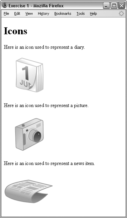

The answers to all the exercises are in Appendix A, “Answers to Exercises.”
What You Learned in This Chapter
| Topic | Key Takeaway |
| The <img> element | The img element is a replaced element that enables you to insert image files directly into your pages. |
| File formats | Use JPGs for photographs and PNGs for images with a limited number of colors. |
| The <audio> and <video> elements | Insert audio and video files into your pages with these replaced elements. |
| Flash | Flash is a proprietary technology from Adobe that enables you to embed animations and rich media in older browsers. |