Appendix C
CSS Properties
This appendix is a reference to the main CSS properties that you can use to control the appearance of your documents.
The majority of the properties covered here are from CSS2. Because the full universe of CSS3 properties is large and still changing, only the CSS3 properties covered in this book are included here, which can be found in the section “Selected CSS3 Properties.”
For each property covered, you first see a brief description of the property and then an example of its usage. This is followed by a table that shows the possible values the property can take, along with the first versions of Internet Explorer to support these values, whether the property can be inherited, what the default value for the property is, and which elements it applies to.
These tables focus on Internet Explorer support because, with a few rare exceptions, any version of Google Chrome, Safari, Firefox, or Opera that you encounter in the wild can support the full complement of CSS2 properties.
The CSS3 section contains a full set of compatibility tables.
Although browsers may support the inherit value of many properties, if the browser cannot set the property to some other value in the first place (perhaps because that value is not supported), then the inherit value is of little use.
At the end of the appendix are units of measurement.
Font Properties
The font properties enable you to change the appearance of a typeface.
font
This enables you to set several font properties at the same time, separated by spaces. You can specify font-size, line-height, font-family, font-style, font-variant, and font-weight in this one property.
font {color:#fc00f000; arial, verdana, sans-serif; 12pt;}font-family
This enables you to specify the typefaces you want to use. It can take multiple values separated by commas, starting with your first preference, then moving to your second choice, and ending with a generic font-family (serif, sans-serif, cursive, fantasy, or monospace).
p {font-family:arial, verdana, sans-serif;}font-size
This enables you to specify the size of a font. The font-size property has its own specific values:
- Absolute sizes:xx-small, x-small, small, medium, large, x-large, and xx-large
- Relative sizes:larger or smaller
- Percentage: Percentage of the parent font
- Length: A unit of measurement (as described at the end of the appendix)
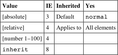
font-size-adjust
This enables you to adjust the aspect value of a font, which is the ratio between the height of a lowercase letter x in the font and the height of the font.
{font-size-adjust:0.5;}
font-stretch
This enables you to specify the width of the letters in a font (not the space between them).
- Relative values:normal, wider, or narrower
- Fixed values:ultra-condensed, extra-condensed, condensed, semi-condensed, semi-expanded, expanded, extra-expanded, or ultra-expanded
p {font-family:courier; font-stretch:semi-condensed;}
font-style
This applies styling to a font. If the specified version of the font is available, it can be used; otherwise, the browser renders it.
p {font-style:italic;}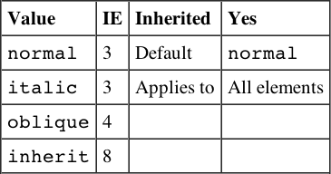
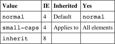
font-variant
This creates capital letters that are the same size as normal lowercase letters.
font-weight
This specifies the thickness of the text—its “boldness.”
- Absolute values:normal or bold
- Relative values:bolder or lighter
- Numeric value: Between 0 and 100
p {font-weight:bold;}
Text Properties
Text properties change the appearance and layout of text in general (as opposed to the font).
letter-spacing
This specifies the distance between letters as a unit of length.
p {letter-spacing:1em;}
text-align
This specifies whether text is aligned left, right, center, or justified.
p {text-align:center}
text-decoration
This specifies whether text should have an underline, overline, line-through, or blink appearance.
p {text-decoration:underline;}
text-indent
This specifies the indentation in length or as a percentage of the parent element’s width.
p {text-indent:3em;}
text-shadow
This creates a drop shadow for the text. It should take three lengths; the first two specify X and Y coordinates for the offset of the drop shadow, whereas the third specifies a blur effect. This is then followed by a color, which can be any valid color value.
.dropShadow {text-shadow: 0.3em 0.3em 0.5em black}| Value | Inherited | No |
| [shadow effects] | Default | none |
| none | Applies to | All elements |
| inherit |
Browser Support is as follows:
text-transform
This specifies capitalization of text in an element:
- none: Removes inherited settings.
- uppercase: All characters are uppercase.
- lowercase: All characters are lowercase.
- capitalize: First letter of each word is capitalized.
p {text-transform:uppercase;}

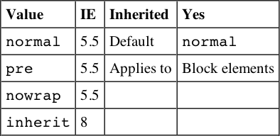
white-space
This indicates how white space should be dealt with:
- normal: White space should be collapsed.
- pre: White space should be preserved.
- nowrap: Text should not be broken to a new line except with the <br> element.
p {white-space:pre;}
word-spacing
This specifies the gap between words.
p {word-spacing:2em;}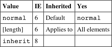
Color and Background Properties
The following properties enable you to change the colors and backgrounds of both the page and other boxes.
background
This is shorthand for specifying background properties for color, url, repeat, scroll, and position; separated by a space. By default, the background is transparent.
body {background: #efefef url("images/background.gif"); }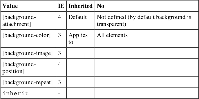
background-attachment
This specifies whether a background image should be fixed in one position or scroll along the page.
body {background-attachment:fixed;
       background-image: url("images/background.gif");}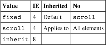
background-color
This sets the color of the background. This can be a single color or two colors blended together. Colors can be specified with any valid color value. By default the box will be transparent.
body {background-color:#efefef;}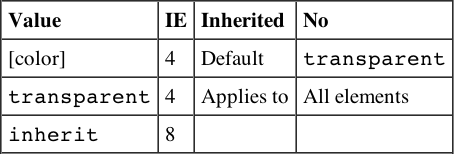
background-image
This specifies an image to be used as a background, which by default will be tiled. Value is a URL for the image.
body {background-image: url("images/background.gif");}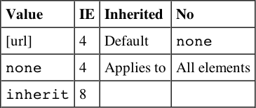
background-position
This specifies where a background image should be placed in the page, from the top-left corner. Values can be an absolute distance, a percentage, or one of the keywords. If only one value is given, it is assumed to be horizontal.
- The keywords available are top, bottom, left, right, and center.
body {background-position:center;
      background-image: url("images/background.gif");}

background-positionX
The position of a background image runs horizontally across the page. Values are the same as for background-position (default: top).
background-positionY
The position of a background image runs vertically down the page. Values are the same as for background-position (default: left).
background-repeat
This specifies if a background image should be repeated and if so in which directions. Values are repeat to repeat horizontally and vertically, repeat-x to just repeat horizontally, repeat-y to just repeat vertically, and no-repeat to prevent it from repeating.

Border Properties
The border properties enable you to control the appearance and size of a border around any box.
border (border-bottom, border-left, border-top, border-right)
This is shorthand for specifying border-style, border-width, and border-color properties.
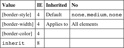
border-color (border-bottom-color, border-left-color, border-top-color, border-right-color)
This specifies the color of a border; values can be any valid color value.
table {border-color:#000000;}
border-style (border-bottom-style, border-left-style, border-top-style, border-right-style)
This specifies the style of line that should surround a block box.
div.page {border-style:solid;}
border-width (border-bottom-width, border-left-width, border-top-width, border-right-width)
This specifies the width of a border line; it can be a width or a keyword.
div.page {border-width:2px;}
Dimensions
The dimensions properties enable you to specify the size that boxes should be.
height
This specifies the vertical height of a block element.
table {height:400px;}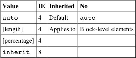
line-height
This specifies the height of a line of text. It is a way of controlling leading (space between multiple lines of text) because the line height may be more or less than the size of the font.
p {line-height:18px;}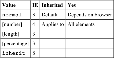
max-height
This specifies the maximum height of a block-level element (same values as for height).
td {max-height:200px;}
max-width
This specifies the maximum width of a block-level element (same values as for width).
td {max-width:400px;}
min-height
This specifies the minimum height of a block-level element (same values as for height).
td {min-height:100px;}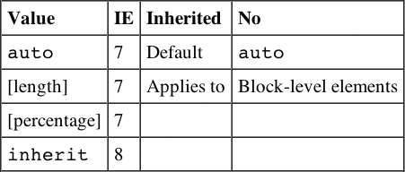
min-width
This specifies the minimum width of a block-level element (same values as for width).
td {min-width:200px;}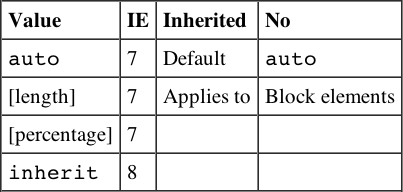
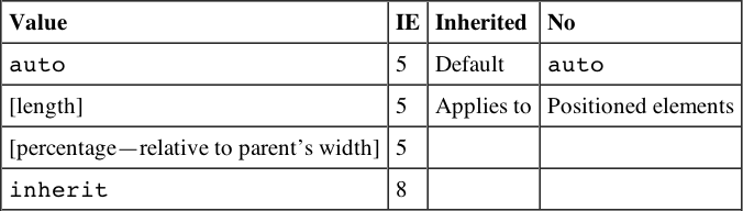
width
This specifies the horizontal width of an element.
td {width:150px;}
Margin Properties
Margin properties enable you to specify a margin around a box and therefore create a gap between elements’ borders.
margin (margin-bottom, margin-left, margin-top, margin-right)
This specifies the width of a margin around a box.
p {margin:15px;}
Padding Properties
Padding properties set the distance between the border of an element and its content. They are important for adding white space to documents (in particular table cells).
padding (padding-bottom, padding-left, padding-right, padding-top)
This specifies the distance between an element’s border and its content.
td {padding:20px;}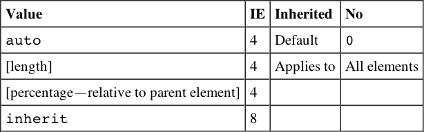
List Properties
List properties affect the presentation of bulleted, numbered, and definition lists.
list-style
This is shorthand allowing you to specify list-style-position and list-style-type.
ul {list-style: inside disc}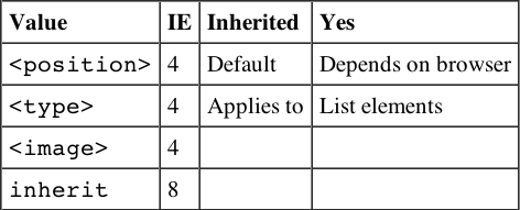
list-style-position
This specifies whether the marker should be placed inside each item of a list or to the left of them.
ul {list-style-position:inside;}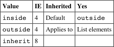
list-style-type
This indicates the type of bullet or numbering that a bullet should use.
ul {list-style-type:circle;}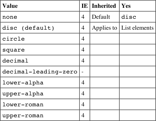
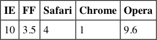
Additional numbered list styles are available in CSS, but unfortunately they are not supported in any versions of Internet Explorer. Support exists in Chrome 1+, Firefox 1+, Opera 7+, and Safari 1+.
| Hebrew | Traditional Hebrew numbering |
| Georgian | Traditional Georgian numbering (an, ban, gan, . . . , he, tan, in, in-an, . . . ) |
| Armenian | Traditional Armenian numbering |
| cjk-ideographic | Plain ideographic numbers |
| Hiragana | (a, i, u, e, o, ka, ki, . . . ) |
| Katakana | (A, I, U, E, O, KA, KI, . . . ) |
| hiragana-iroha | (i, ro, ha, ni, ho, he, to, . . . ) |
| katakana-iroha | (I, RO, HA, NI, HO, HE, TO, . . . ) |
marker-offset
This specifies the space between a list item and its marker.
ol {marker-offset:2em;}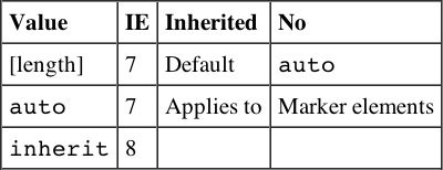
Positioning Properties
Positioning properties allow you to use CSS for positioning boxes on the page.
bottom
This sets the vertical position of an element from the bottom of the window or containing element.

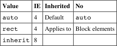
clip
This controls which part of an element is visible. Parts outside the clip are not visible. If value is rect(), it takes the following form:
- rect([top] [right] [bottom] [left])
rect(25 100 100 25)
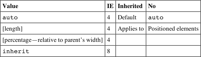
left
This sets the horizontal position of an element from the left of the window or containing element.
overflow
This specifies how a container element will display content that is too large for its containing element.
p {width:200px; height:200px; overflow:scroll;}
overflow-x
This is the same as overflow but only for the horizontal x axis. This was first supported in IE5.
overflow-y
This is the same as overflow but only for the vertical y axis. This was first supported in IE5.
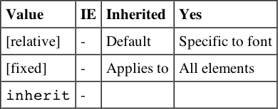
position
This specifies the positioning schema that should be used for an element. When an element is positioned, you also need to use the box-offset properties covered next (top, left, bottom, and right). Note that you should not use top and bottom or left and right together (if you do, top and left take priority).
- absolute can be fixed on the canvas in a specific position from its containing element (which is another absolutely positioned element); it will also move when the user scrolls the page.
- static will fix it on the page in the same place and keep it there even when the user scrolls.
- relative will be placed offset in relation to its normal position.
- fixed will fix it on the background of the page and not move when the user scrolls.
p.article{position:absolute; top:10px; left:20px;

right
This sets the horizontal position of an element from the right of the window or containing element.
top
This sets the vertical position of an element from the top of the window or containing element.

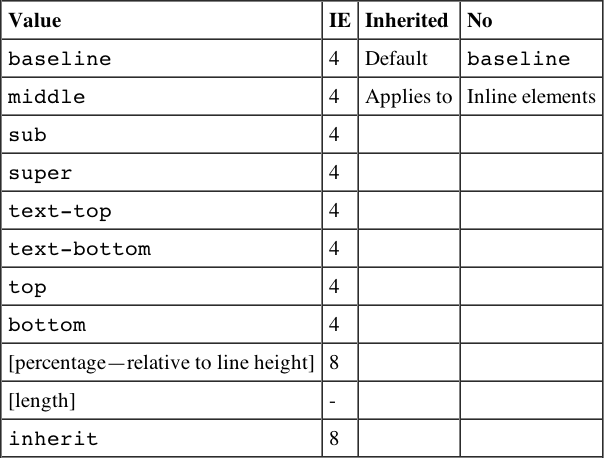
vertical-align
This sets the vertical positioning of an inline element:
- baseline aligns element with base of parent.
- middle aligns midpoint of element with half the height of parent.
- sub makes element subscript.
- super makes element superscript.
- text-top aligns element with the top of parent element’s font.
- text-bottom aligns element with the bottom of parent element’s font.
- top aligns top of element with the top of tallest element on current line.
- bottom aligns element with the bottom of lowest element on the current line.
span.superscript {vertical-align:super;}
z-index
This controls which overlapping element appears to be on top. Positive and negative numbers are permitted.
p {position:absolute; top:10px; left:20px; z-index:3;}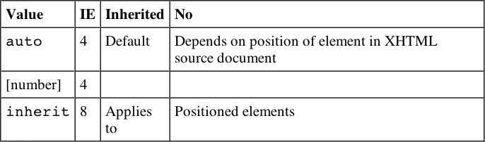
Outline Properties
Outlines act like borders, but do not take up any space—they sit on top of the canvas.
outline (outline-color, outline-style, outline-width)
This is a shortcut for the outline-color, outline-style, and outline-width properties:
outline {solid #fc00f000 2px}Note that outline-color, outline-style, and outline-width take the same values as border-color, border-style, and border-width.
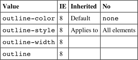
Table Properties
Table properties enable you to affect the style of tables, rows, and cells.
border-collapse
This specifies the border model that the table should use (whether adjacent borders should be collapsed into one value or kept separate).
table {border-collapse:separate;}
border-spacing
This specifies the distance between adjacent cells’ borders.
table {border-spacing:2px;}
caption-side
This indicates which side of a table a caption should be placed on.
caption {caption-side:bottom;}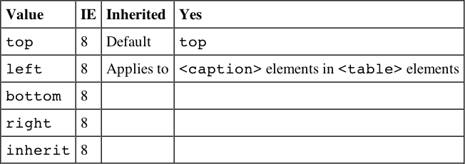
empty-cells
This specifies whether borders should be displayed if a cell is empty.
td, th {empty-cells:hide;}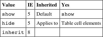
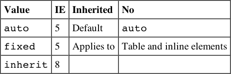
table-layout
This specifies how the browser should calculate the layout of a table; it can affect the speed of rendering a large or graphics-intensive table.
Classification Properties
Classification properties affect how the boxes in the box model are rendered.
clear
This forces elements, which would normally wrap around an aligned element, to display below it. Value indicates which side may not touch an aligned element.
p {clear:left;}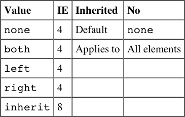
display
This specifies how an element is rendered, if at all. If set to none the element is not rendered, and it does not take up any space. This property can also force an inline element to display as a block or vice versa.
span.important {display:block;}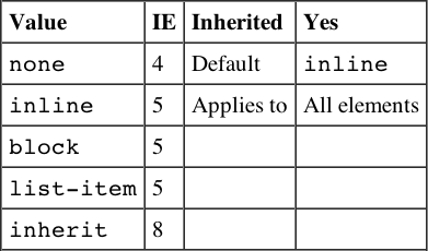
Although the default value of this property is inline, browsers tend to treat the element depending on its inherent display type. Block-level elements, such as headings and paragraphs, get treated as if the default were block, whereas inline elements such as <i>, <b>, or <span> get treated as inline.
float
Subsequent elements should be wrapped to the left or right of the element, rather than below.
img.featuredItem {float:left;}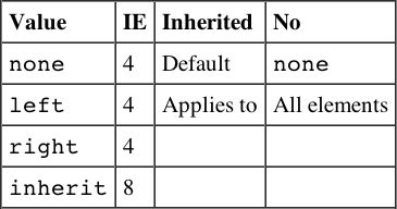
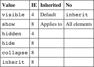
visibility
This specifies whether an element should be displayed or hidden. Even if hidden, elements take up space on the page but are transparent.
Internationalization Properties
Internationalization properties affect how text is rendered in different languages.
direction
This specifies the direction of text from left to right or right to left. This should be used in association with the unicode-bidi property.
td.word{direction:rtl; unicode-bidi:bidi-override;}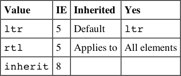
unicode-bidi
The unicode-bidi property enables you to override Unicode’s built-in directionality settings for languages.
td.word{unicode-bidi:bidi-override; direction:rtl; }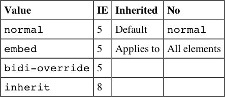
Selected CSS3 Properties
This section covers a subset of CSS3 properties, focused on the ones covered in this book. Unlike the earlier tables, a full support matrix showing Chrome, Firefox, Safari, and Opera support is included in addition to information about support in Internet Explorer.
For full support tables of all CSS3 modules, the interactive tool at http://caniuse.com/ can’t be beat.
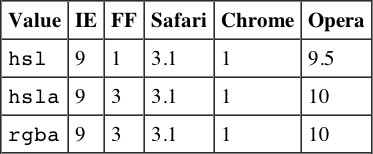
Color
The CSS3 Color module offers the ability to specify colors using the Hue Saturation and Lightness (HSL) scheme, as well as the ability to set an alpha channel to define transparency using both RGBA and HSLA notation.
.hsl {
  background-color : hsl( 333,50%,50% );
}
.hsla {
  background-color : hsla( 0, 100%, 50%, 0.5 );
}
.rgba {
  background-color : rgba( 255, 0, 0, 0.5);
}
Backgrounds and Borders
The Backgrounds and Borders module extends the border and background properties introduced in earlier versions of CSS to include rounded corners and drop shadows.
border-radius (border-top-left-radius, border-top-right-radius, border-bottom-right-radius, border-bottom-left-radius)
.rounded-corners {
  -webkit-border-radius : 12px;
  border-radius : 12px;
}| Value | Inherited | No |
| auto | Default | auto |
| [length] | Applies to | All elements |
| [percentage] | ||
| inherit |
box-shadow
The possible values for this property are
inset offset-x offset-y blur-radius spread-radius color
.drop-shadow {
// inset offset-x offset-y blur-radius spread-radius color
  -webkit-box-shadow : 0px 0px 4px 0px #000000;
  box-shadow : 0px 0px 4px 0px #000000;
}| Value | Inherited | No |
| none | Default | auto |
| [inset] | Applies to | All elements |
| [offset-x] [offset-y] | ||
| [blur-radius] | ||
| [spread-radius] | ||
| [color] |
Browser support is as follows:
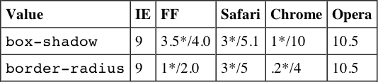
*Indicates support with browser prefix.
Multi-Column
The CSS Multi-Column layout module enables the definition of multiple columns of text.
.fixed-width {
  width:500px;
  height:200px;
  -webkit-column-count: 3;
  -webkit-column-gap: 15px;
  -moz-column-count: 3;
  -moz-column-gap: 15px;
  column-count: 3;
  column-gap: 15px;
}
.percentage-width {
  width:100%;
  height:200px;
  -webkit-column-width: 100px;
  -webkit-column-gap: 15px;
  -moz-column-width: 100px;
  -moz-column-gap: 15px;
  column-width: 100px;
  column-gap: 15px;
}
column-count
This defines the number of columns in an element.
| Value | Inherited | No |
| auto | Default | auto |
| [integer] | Applies to | Block-level elements, table cells, and inline-block elements |
column-gap
This defines the gutter between the columns of a multi-column element.
| Value | Inherited | No |
| normal | Default | 1em |
| [length] | Applies to | Multi-column elements |
column-width
This defines the width of the columns of a multi-column element.
| Value | Inherited | No |
| auto | Default | auto |
| [length] | Applies to | Multi-column elements |
Browser support is as follows:
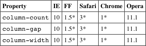
*Indicates support with browser prefix.
Media Queries
The CSS Media Queries module enables the definition of styles based on device and browser characteristics.
#container {
  width : 940px;
}
@media screen and (max-width:999px) {
  #container {
    width : 740px;
  }
}

@media screen and (max-width:480px)
{
  #container {
    width : 400px;
  }
}
The module supports the following properties:
| Properties | Description |
| width | Tests the width of the display area of the device in a browser. This is equal to the width of the browser window. |
| height | Tests the height of the display area of the device. In a browser this is equal to the height of the browser window. |
| device-width | Tests the width of the rendering surface of the device. In a browser this is equal to the full screen width. |
| device-height | Tests the height of the rendering surface of the device. In a browser this is equal to the full screen height. |
| orientation | Tests the orientation of a device. |
| aspect-ratio | Tests the aspect-ratio as measured by the width and height properties. |
| device-aspect-ratio | Tests the aspect-ratio as measured by the device-width and device-height properties. |
| color | Tests the color depth of the device. |
| color-index | Tests the number of entries in the lookup table of the device. |
| monochrome | Tests the number of bits per pixel in a monochrome frame buffer. |
| resolution | Tests the pixel density of the target device. |
| scan | Tests the scanning process of “tv” devices. |
| grid | Tests whether the device is a grid or bitmap. An example of a grid would be a text browser such as Lynx run from the terminal. |
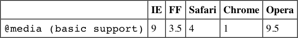
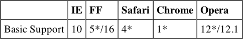
Basic support is as follows:
@font-face
The CSS Fonts Modules enable the use of custom fonts.
@font-face {
  font-family: 'InconsolataMedium';
  src: url('Inconsolata-webfont.eot'),
  src: url('Inconsolata-webfont.eot?#iefix') format('embedded-opentype'),
   url('Inconsolata-webfont.woff') format('woff'),
   url('Inconsolata-webfont.ttf') format('truetype'),
   url('Inconsolata-webfont.svg#InconsolataMedium') format('svg'),
  font-weight: normal;
  font-style: normal;
}
Basic support is as follows:

2D Transforms
The 2D Transforms module introduces a new property that enables the rotation, translation, and scaling of a box, without changing its place in the flow of the document.
#rotate {
  -webkit-transform : rotate(20deg);
  -moz-transform : rotate(20deg);
  -ms-transform : rotate(20deg);
  -o-transform : rotate(20deg);
  transform : rotate(20deg);
  background : #00ffcc;
  top : 100px;
  left : 50px;
}
#scale {
  -webkit-transform : scale(0.5);
  -moz-transform : scale(0.5);
  -ms-transform : scale(0.5);
  -o-transform : scale(0.5);
  transform : scale(0.5);
  background : #ccff00;
  top : 400px;
  left : 50px;
}
The following table lists the common functions of the transform property and gives a small example of each.
| Value | Description | Example |
| translate | Moves an element up/down or left/right without changing the element’s place in the flow of the document. | transform : translate( 10px, 10px ); |
| translateX | Moves an element left or right without changing the element’s place in the flow of the document. | transformX : translate( 10px); |
| translateY | Moves an element up or down without changing the element’s place in the flow of the document. | transformY : translate( 10px); |
| rotate | Rotates an element around an axis. The rotation can be specified in degrees or using other values like the turn keyword. | transform : rotate(180deg) |
| scale | Scales an element without changing the element’s place in the document. Scale is set as a multiple of 1, so scale(2) tells the browser to make the element twice as big. | transform : scale( 2 ) |
| scaleX | Scales an element on its x axis without changing the element’s place in the document. | transform : scale( 2 ) |
| scaleY | Scales an element on its y axis without changing the element’s place in the document. | transform : scale( 2 ) |
Basic support is as follows:
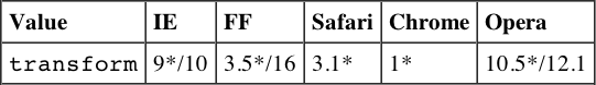
*Indicates support with browser prefix.
3D Transforms
The 3D Transforms module extends 2D Transforms with a perspective transform function.
#perspective {
  top : 200px;
  left : 200px;
  position : absolute;
  -webkit-transform : perspective(500px) rotateY(75deg);
  -moz-transform : perspective(500px) rotateY(75deg);
  -ie-transform : perspective(500px) rotateY(75deg);
  transform : perspective(500px) rotateY(75deg);
  width : 500px;
  height : 100px;
  background : #ccff00;
}
Basic support is as follows:
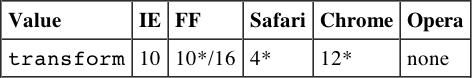
*Indicates support with browser prefix.
Animations
The Animations module enables you to assign an animation to an element. You do this by specifying the properties to animate, the timing, and the units to change during the animation.
#animated {
  position : absolute;
  width : 100px;
  height : 100px;
  left:0px;
  top:100px;
  background: #ffcc00;
  animation-name: scroll;
  animation-duration: 5s;
  animation-iteration-count: infinite;
  animation-timing-function: ease-in-out;
  animation-direction: alternate;

}
@keyframes scroll {
  to {
    left:100%;
    transform: rotate(180deg);
  }
}
The @keyframes directive defines named states that define standard CSS properties to use as animation keyframes.
The following table lists the subproperties of the animation property.
| Property | Description |
| animation-name | Defines the name of the @keyframes rule that defines the animation’s keyframes. |
| animation-duration | Defines the length of time the animation should take to run once. |
| animation-timing-function | Defines the transition of animations through keyframes using keyword-based functions. |
| animation-iteration-count | Defines the number of times the animation should run. |
| animation-direction | Defines whether the animation should reverse direction during each iteration. |
| animation-play-state | Defines the play/pause state of the animation. |
| animation-delay' | Defines the animation delay. |
| animation-fill-mode | Defines how an animation should apply target styles. |
Basic support is as follows:
*Indicates support with browser prefix.
Transitions
The Transitions module defines a property to animate the transitions between pseudo-classes, for example, when an element enters or leaves the :hover state.
#transition li{
  font:16px arial, helvetica, sans-serif;
  color:#fff;
  padding:2px 10px;
  width :  200px;
  list-style-type : none;
  height : 50px;
  background-color : #06F;
  -webkit-transition-property: background-color,width,height;
  -moz-transition-property: background-color,width,height;
  -o-transition-property:  background-color,width,height;
  transition-property:  background-color,width,height;

  -webkit-transition-duration: 1s;
  -moz-transition-duration: 1s;
  -o-transition-duration: background-color 1s;
  transition-duration: background-color 1s;

}
#transition li:hover {
  background-color: #036;
  width:225px;
  height:60px;
  -webkit-transition-duration: 1s;
  -moz-transition-duration: 1s;
  -o-transition-duration: 1s;
  transition-duration: 1s;
}
The following table lists the transition properties.
| Value | Description |
| transition-property | Defines the property or properties to transition through. |
| transition-duration | Defines the length of time the transition should take to run once. |
| transition-timing-function | Defines a keyword-based function used to shape the transition. |
| transition-delay | Defines the transition delay. |
Basic support is as follows:

*Indicates support with browser prefix.
Lengths
Following are the unit measurements for lengths that can be used in CSS.
Absolute Lengths
| Unit | IE |
| cm | 3 |
| in | 3 |
| mm | 3 |
| pc | 3 |
| pt | 3 |
Relative Lengths
| Unit | IE |
| em | 4 |
| ex | 4 |
| px | 3 |
CSS3 Relative Length Properties
