JAYSE HANSEN
The story of Lavender & Holly (written and conceived by Kim Moore and Barbara Davis) needed a mock-up show intro to excite executives and investors and enable them to have a better taste of the women’s unique vision for the show.
I used to design mock-up posters for Fox, CBS, and Fred Dryer Productions (of Hunter fame), and I always found them to be some of the most creatively freeing and challenging type of projects out there. Often, one person becomes the director, the designer and the animator. Expectations are not as high as they would be for broadcast work simply because the time allotted is scarce. However, since you usually get a lot more creative control, you might find yourself with an award-winning piece (such as I did with this one). If I haven’t sold you on the benefits of doing this kind of work, I’ll add that these clients also typically pay well—an added bonus, if you ask me.
WHAT’S ON THE DVD
׃׃ Final Animation in QuickTime
׃׃ Rough Camera Pass Quicktime
׃׃ Various After Effects project files in 6.5 to illustrate techniques
׃׃ Storyboard Template.doc
INTRODUCTION
Parameters
Watch the final animation on the DVD to see the end result. This piece began with the clients walking me through the character overviews and giving me a six-page treatment. It’s easy to get overwhelmed when all the creative control is in your hands, so I usually begin by trying to find a single heart to the piece. I started asking the clients what they had in mind. It was obvious that they were passionate about the story and had clear ideas for their characters, but didn’t have any artwork, logos, or visual ideas at all. They simply said, “Just make it very girly, with Mission Impossible-style stats for the girls; keep it high energy, and very cool.”
My tasks became clear:
![]() Come up with the logo, color scheme, look and feel of the project
Come up with the logo, color scheme, look and feel of the project
![]() Come up with rough sketches of the two main characters
Come up with rough sketches of the two main characters
![]() Design and animate a short 30 to 40-second DVD intro that will motivate investors and publishers
Design and animate a short 30 to 40-second DVD intro that will motivate investors and publishers
![]() Tie the menu to PDF and other interactive elements that would be saved on the DVD
Tie the menu to PDF and other interactive elements that would be saved on the DVD
![]() Deliver everything in four days
Deliver everything in four days
 TOOLS USED
![]() Laser Paper, Pencil and Gum Eraser (Storyboarding/Characters/Fonts)
Laser Paper, Pencil and Gum Eraser (Storyboarding/Characters/Fonts)
![]() Photoshop (Design Frames)
Photoshop (Design Frames)
![]() After Effects (Animation and Output)
After Effects (Animation and Output)
![]() Adobe Audition (Audio)
Adobe Audition (Audio)
Four days?
Four days is a bit less than I like to have for motion graphics pieces. Actually, I would have turned this job down since four days is really time only for research, a little design maybe, and not much more. The magic, the finesse, the genius is what gets lost on such short timelines. Unfortunately, that’s what we sometimes have to deal with.
These clients were easy to work with and were fine with even a rough comp. They just needed something quick and were extremely appreciative. I found the project interesting and believed in it. So how could I refuse? I called my girlfriend, asked her for advice on what ‘girly’ meant to her and then told her I’d be home late.
The Design
I got started right away by researching some of the hottest “girly” things on the market. My first stop is typically images. google.com to start pulling together imagery to inspire the design. Second stop for this project was a toy store. Looking through various Barbie dolls, Bratz dolls and Fairy Houses, my main focus was: What colors are they using? What fonts? What type of look is popular?
If I’m unfamiliar with a subject, I like to saturate myself with it for a day or two by finding everything associated with it and compiling it all into one or more “inspiration boards” that I print out and hang on my wall.
In everything I saw one thing jumped out at me. Girls in today’s culture are all about being proud to be unique. It’s about attitude and style. I chose to reflect this in the piece.
After researching I sketched out some ideas for the characters, the composition, and the design of the piece.
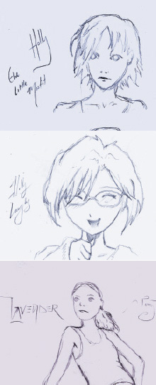
Going by the character personality sheets my clients provided, I found that Holly was the shy-yet-happy little character, and Lavender was the one at the forefront with the attitude.
On the right are the designs roughed out for the characters’ different personality traits. (SEE FIGURES 01-03.)
01-03 »

10-12 » THE DESIGN FRAMES ARE ALL ABOUT STYLE, ATTITUDE AND COMMUNICATION. JUST REMEMBER TO KEEP ALL YOUR LAYERS SEPARATE SO YOU CAN ANIMATE THEM IN AFTER EFFECTS.
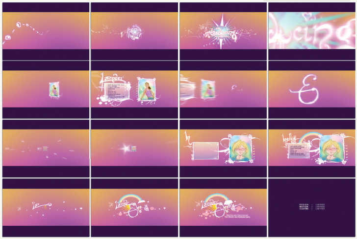
Initial character roughs always help me get a better feel for the personality of the entire piece. These first sketches would help define the final designs: Lavender’s design is bold and snappy with attitude while Holly’s design is cute, positive and pretty.Next, I began working them into a simple storyboard format.
I decided on a camera fly-through type of look where the viewer would be introduced to the two characters, presented with a few quick stats (Mission Impossible – can’t-read-it-all style), and then zoomed to the end card which would have their name and logo. Short and sweet. The storyboarding phase really helps to clarify it all. Even if you can’t draw, I highly recommend using storyboards. I even used these in my initial camera path setup. (SEE FIGURES 04-09.)
So the next step is to scan these in and work up some design frames in Photoshop. (SEE FIGURES 10-12.)
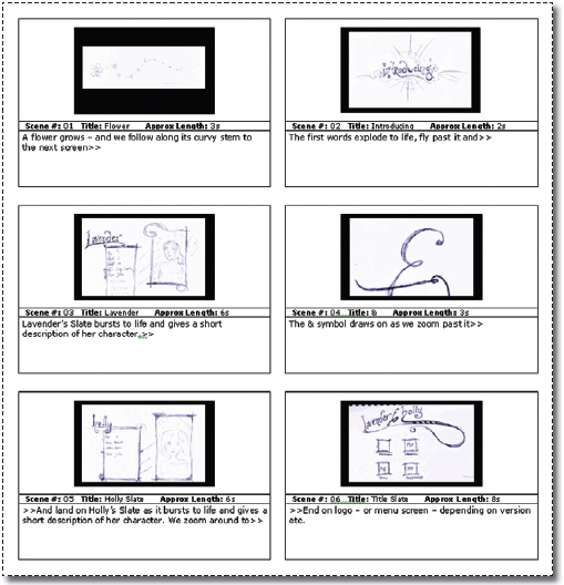
04-09 » THERE’S NOTHING LIKE A FEW STORYBOARDS TO HELP A PIECE OUT. THIS IS WHERE YOUR FIRST EDITS SHOULD BEGIN. YOU SHOULD BE ALWAYS THINKING: “WHAT CAN I CUT?”. A GOOD PIECE IS A PIECE THAT WOULD FALL APART IF ONE PART WERE REMOVED.

13-16 » THESE ARE THE SIMPLE PLACE HOLDERS I USED TO TWEAK MY CAMERA PATH.
The important thing when creating your design frames is to play as much as possible. Most of the greatest pieces of art, design, and motion graphics came as a result of the designer or artist exploring concepts. You can tell I made plenty of changes as the piece progressed, but the heart of it was always there.
For now, I just start putting stuff together. I then narrow it down to my favorites and present them to my clients. Luckily for me, they seemed to love these, and they got even more excited about the piece, which in turn, inspired me.
The Camera Path
Cameras in After Effects have always been frustrating. So are After Effects’ velocity curves. People who don’t find them frustrating are typically people who have never worked in other 3D packages and don’t know what they’re missing out on.
With this in mind, I plan my camera paths with stand-ins. The final designs will be animating and moving, but for planning my camera path I just need simple card placeholders so that I can focus on one thing: the camera.
For this I scanned in my storyboards, inverted them and added a pinkish-purple glow. For depth, the background is a simple gradient created in Photoshop. (SEE FIGURES 13-16.)
Straight camera paths are fairly straightforward (literally). Camera paths where you fly past a few cards going in a fairly straight line of motion don’t require as much thought and tweaking. But I often prefer camera paths that turn and twist and spin and race, especially when I’m on such tight deadlines. I do seem to enjoy killing myself with so much extra work.

17 » THIS IS THE ‘TOP DOWN’ VIEW OF MY CAMERA PATH AND ALL THE SHOTS I WANT IT TO FOCUS ON. THIS HELPS A LOT WHEN WORKING WITHIN AFTER EFFECTS.
Tutorial
TO CREATE ADVANCED CAMERA PATHS:
![]() Plan It
Plan It
Start by drawing the path you want your camera to take, along with the camera’s point of interest (what the camera is looking at) and the cards or screens that the camera will pass. The numbers in the drawing below correspond roughly to the scene numbers on the storyboard. (SEE FIGURE 17.)
![]() Set It Up
Set It Up
Next, create stand–in imagery of the same size and dimensions of your final designs. As I mentioned previously, I used simple storyboard drawings scanned in from my sketchbook. Switch to Top view (View>Switch 3D View>Top) in After Effects, zoom out and place these standins in roughly the same layout as your path-plan drawing. As you can see, mine follows my drawing pretty well, but I did make a few alterations. (SEE FIGURE 18.)
Here’s how the camera path ended up in After Effects. It’s pretty close to my drawing – with the main change at the end of the path where I decided a camera ‘flip-around’ would be a little more exciting than a dolly-type of push.
![]() Create a Camera and a Null
Create a Camera and a Null
You may have noticed that animating a camera inside After Effects can be quite a pain. This is typically because of the way you animate both the camera and the camera’s point of interest. They often just don’t do what you want them to.
I find it much easier to create a null object and attach the point of interest of the camera to it. This way you can animate the null and the camera independently, allowing for a better way of setting keyframes.
CREATE A CAMERA:
1. Press Home to set your Timeline indicator to the beginning of your clip.
2. Ctrl–click (right–click) on a blank area in your Timeline and choose New>Camera, change settings if you want to, and click OK. I chose a 24mm camera, since I like the exaggerated perspective that wide–angle lenses can give.

18 » HERE IS HOW THE CAMERA PATH TRANSLATES WITHIN AFTER EFFECTS. IT FOLLOWS THE PENCILED VERSION CLOSELY.
1. Press Home to set your Timeline indicator to the beginning of your clip.
2. Ctrl–click (right–click) on a blank area in your Timeline and choose New>Null Object.
3. Click on the name of this new layer (Null1) and hit Return (Enter) to rename it. Name this new null object “POI” (point of interest) or something similar. Keep in mind however that what you name it will also be referenced in the expressions that are written in the following steps.
![]() Next, parent the camera’s POI to the null object.
Next, parent the camera’s POI to the null object.
1. Twirl down the triangle for POI’s Transform function until you can see its Position property.
2. Also twirl down the triangle for your camera’s Transform function until you see Point of Interest.
3. Option-click (Alt-click) the stopwatch related to the camera’s Point of Interest function to set an expression for this property.
4. Immediately drag the pick whip related to the expression up to the Position property of the POI layer. This will write the expression: “thisComp.layer(“POI”). position.” (SEE FIGURE 19.)
Now when you animate your POI null layer your camera’s POI will follow along with it.
IMPORT THE SOUNDTRACK TO SYNC TO
This is a good time to bring in your music and start animating to it. To more accurately time the camera movements to the music, I first edited loops in Adobe Audition so that it was the right length for the clip I wanted to create. Then I brought the file in as a straight .wav file. (After Effects has problems rendering from MP3 files.)
![]() Once you’re in After Effects:
Once you’re in After Effects:
1. Drag the music file to your Timeline.
2. Make sure the audio layer is selected. RAM Preview the audio only using the period (.) key on your numeric keypad.
3. Mark each beat by pressing the * key on each beat as you listen to it. This will place markers on your layer, which you can then name (as shown in the following figure.) This also allows you to have a visual representation of the way the beats can affect the animation. (SEE FIGURE 20.)

19 » NOTICE THE EXPRESSION IS REFERENCING THE NULL OBJECT LAYER ABOVE IT. ANIMATING THE NULL IS THE BEST WAY OF ANIMATING YOUR CAMERA’S POINT OF INTEREST.

20 » THE TRIANGLES ON THE AUDIO LAYER ARE MARKS REPRESENTING THE MAJOR MUSIC BEATS. THE CAPTIONS INDICATE WHAT I WANT TO HAPPEN WHERE WITHIN THE MUSIC.
Now animate your camera, one property at a time to keep it simple. For instance, animate the camera from the Top view first, and then animate the POI layer. After you’re satisfied, switch to Camera view and tweak further. (SEE FIGURE 21.)
It pays to spend a lot of time getting your animation refined here before you start animating other elements (which will slow the rendering down.)
Making the Designs Come Alive
DRIPPING THINGS
Now on to the design part. (SEE FIGURE 22.)
For the various dripping, splattering elements, I got outside the box (meaning: the Computer) for a little bit and filmed them myself. I’ll mention that you can also get a similar look by downloading the various dripping brush sets for Photoshop on the Adobe Exchange (studio.adobe.com) and animating masks to reveal them. But I’m an artist. I think it’s a lot more fun to create this stuff myself. (And, of course, it’s fun to see the more corporate types at your workplace walk by with puzzled expressions on their faces as you’re tossing paint in front of your camera.)
![]() To do this yourself:
To do this yourself:
Outside: Grab some white butcher paper or big poster board, set your camera up outside on a tripod and go to town with whatever runny paint you can get your hands on. I prefer black. The black on white will allow me to easily make it a track matte inside After Effects for whatever composite color or gradient I want to add to it. (SEE FIGURES 23-24.)

21 » TRY TO START SIMPLY BY ANIMATING ONE PROPERTY AT A TIME. THEN REFINE.

22 » ADDING VARIOUS PAINT SPLATTERS THAT I TAPED OUTSIDE HELPS TO ADD LIFE TO OTHERWISE STAGNANT OBJECTS.
In After Effects: Capture it, bring it into After Effects, mask unwanted stuff, and add Levels to heighten the contrast. Then add a new white layer above this, and make its track matte the luminance of the dripping footage. You’ve just created your own dripping stock footage with a perfectly clean straight alpha channel. Render this out with a straight alpha channel or as a 32bit PNG sequence, and you’re set to use it wherever and however you want.
The slicker the paper the better the paint will run. Get lots of it; you’re building a stock collection here of organic stuff. You’ll run out of paper fast. Water the paint down (if it’s a water-based paint like tempera or similar) to make it more messy. Set your paper up as vertically as possible–stuff will drip better. You can always mask yourself and your paintbrush out later, but be mindful of getting yourself in the picture.
Optionally: If the neighbors don’t mind, throw paint at your canvas. Splatters and streaks and all kinds of mess will find a home in some great motion graphics piece someday.
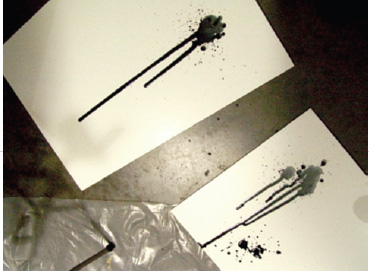
23 » RUNNY BLACK PAINT DRIPPED ONTO WHITE POSTER BOARD WAS FILMED WITH A STANDARD DV CAMERA TURNED ON ITS SIDE. THIS ALLOWS THE CAMERA TO ‘FAKE’ MORE RESOLUTION WHILE FILMING THE LONG DRIPS.

24 » IMPORTING THE FOOTAGE INTO AFTER EFFECTS, INVERTING IT AND CREATING A TRACK MATTE ALLOWS IT TO BE COMPOSITED OVER OTHER FOOTAGE.

25 »
Growing Vector Flowers, Filigree, Ornaments and Other things
Other organic elements in the promo piece are simply vector shapes created in Photoshop, brought into After Effects as masks and animated. I often like to make things appear to grow or come alive. I’ve found it’s a much better way to bring elements into a scene than simply motion-tweening or ramping their opacity. To find an extended video tutorial on this process, check out www.xeler8r.com. (SEE FIGURE 26.)
TO GROW YOUR OWN VECTOR PATHS:
1: Create numerous, randomly sized circles using the oval mask tool on a white solid inside After Effects.
2: Select all masks with the Shift key and twirl down to animate their mask expansion from a negative number back to their default setting of 100%.
3: Additionally, offset the keyframe sets for mask expansion randomly to get an organic growing effect. (SEE FIGURE 27.)

26 » OTHER ELEMENTS THAT APPEAR TO GROW ON ARE VECTOR SHAPES WITH MASK PROPERTIES ANIMATED.

27 » ANIMATING THE MASK EXPANSION PROPERTY IS A SUPER-QUICK WAY OF MAKING MASK SHAPES GROW-ON.
Optionally, to get a more bubbly or springy look, before you offset the keyframes, animate the mask expansion from a negative value to an overly positive value and then back to 100%. This makes the animation come alive by springing the animation into its final state, rather than just a straight small-to-final type of look. (SEE FIGURE 29.)
Gotcha! I’ve found that if you do this technique to too many masks on one layer (30 circle masks, for instance) you may get an “Advanced 3D Render error” when rendering out this with a complex comp. To avoid this while working, don’t use the Open GL preview features when working with multiple masks expansions. Use Adaptive Resolution instead.
Another easy fix is to make a proxy which you’ll use in the final render. To do this:
1: Ctrl click (Right click on the comp in the Project window and select Create Proxy>Movie.
2: In the Render Queue, change to Best Settings and the output to render as Quick Time with PNG compression set to Millions of Colors+ (to include the alpha channel), (Format Options>Compressor>PNG Depth>Millions of Colors +)
3: When you do your final render just make sure ‘Current Settings’ is selected from the dropdown in the “Use Proxies” setting of the Render Queue to avoid using the buggy source layer.

28 » MAKE SURE YOU’RE PREVIEWING WITH ADAPTIVE RESOLUTION TO AVOID RENDER ERRORS.

29 »
The Handwritten Effect
There are lots of elements in this piece that appear to be handwritten. For this work I created my graphics with a pencil on real paper and scanned them in. Sure, there are plenty of handwritten fonts you can buy, but those are other people’s scribbles. Why not scribble your own masterpiece? (SEE FIGURE 30.)
Regardless of whether you’ve scanned your art in or you’re using a font, the process is roughly as follows:
1. Import your artwork. In this example – it’s my scribbles, inverted in Photoshop so that they appear white.
2. In After Effects, select the layer and type Cmd Shift C (Ctrl Shift C) to Pre-comp the artwork. (Select Move all attributes to the new composition and deselect ‘Open New Composition’) You do this because you need the artwork to have the same pixel dimensions as your Comp for this trick to work.
3. Use the Pen tool to trace over it. Add as few points as possible, and add them in the order that you would draw the piece on.

30 »

31 » USING THE WRITE ON EFFECT IS ANYTHING BUT SELF-EXPLANATORY. ONCE YOU GET IT, HOWEVER, IT BECOMES A POWERFUL ADDITION TO YOUR AFTER EFFECTS ARSENAL.
4. Choose Effect>Stylize>Write-on and set its Paint Style function to Reveal Original Image. (SEE FIGURE 31.)
5. Select the Pre-comped layer, press M, and select the Mask Shape property.
6. Press Cmd-C (Ctrl-C) to copy.
7. Type ‘e’ to reveal your effects and twirl down the Write-on function and select the Brush Position property.
8. Press Cmd-V (Ctrl-V) to paste the mask position as keyframes.
9. Play the animation to see it draw on. You may need to increase the brush size to see it.
10. Increase the brush size until it covers your artwork.
11. Decrease the brush spacing to .001.
12. Drag the end keyframe to slow the animation or speed it up. You’ll notice that the inner keyframes are pasted as roving keyframes so they’ll adapt automatically. (SEE FIGURE 32.)


32 » NOTICE THAT EACH BEZIER POINT IN YOUR MASK HAS BEEN PASTED AS A KEYFRAME. THE MIDDLE KEYFRAMES ARE ROVING, ALLOWING YOU TO SELECT THE BEGINNING OR END KEYFRAME AND EASILY DRAG TO SPEED-UP OR SLOW-DOWN THE ANIMATION.
Delivery
The final project had a unique, positive, girlish look, custom fonts, a custom logo, character development, character sketches and a final animation—all within a crazy short deadline. The clients were more than pleased, and I had a fun time doing it. Which is, after all, the point, isn’t it? I hope this case study helps you with your own projects.

ABOUT THE AUTHOR
Jayse Hansen is Creative Art-Director for SMG in Las Vegas. In addition to designing print, web, and motion graphics for national clients such as Coca-Cola, MTV, HBO, and CBS, he has been featured in numerous books and articles on design and fine art. His motion art has been commissioned by night clubs and restaurants such as The Hard Rock Café and by luminaries such as Donald Trump. Recently he began sharing his knowledge and passion for good design through classes and video training on the high-end design portal called Xeler8r: www.xeler8r.com. You can also find him as a forum leader at www.creativecow.net. You can reach him at [email protected].
FURTHER READING
Type in Motion
Matt Woolman
(Rizzoli 2001)
Non-Designer’s Type Book
Robin Williams
(Peachpit 1998)
