MICHELE YAMAZAKI
Ever had to wade through stacks of facts and make them look interesting? Although practical, presentation charts can be lifeless and ho-hum. It doesn’t have to be that way. I’m working with graphs that were created in Microsoft Excel by a right-brained person. The client is my company, Postworks, and we’re a fresh and dynamic group of left-brainers. The graphs needed to match the personality of our company, so therein lies the challenge.
Only a few years ago, Postworks was a pioneer in DVD. We were the second company in Michigan to author DVDs. We made a DVD for a large company during the time that company went public. The CEO presented the financial graphics to the moneymen, who were used to Microsoft PowerPoint presentations, and they were blown away by this new technology.
This project is the same type of thing: a short opening followed by three financial graphs on DVD that are used as speaker support.
You’ll put four to five hours into this project. If you’re new to After Effects, I’ll cover masking and drawing paths, effects and animation presets, the Advanced Text Engine/Type tool and some basics of Adobe Illustrator. Before you begin, view the movies on the DVD and get familiar with the project, then skim the chapter before jumping in.
WHAT’S ON THE DVD
׃׃ Microsoft Excel document with exported PDFs
׃׃ Project files organized by folder
׃׃ Rendered final movie:: Animation Presets
 TOOLS YOU WILL NEED:
׃׃ Microsoft Excel
׃׃ Adobe Illustrator
׃׃ Adobe After Effects 6.0+ (6.5 is recommended)
׃׃ DVD-authoring software such as Adobe Encore DVD or Apple DVD Studio Pro
Getting Data from Microsoft Excel
First, print the charts. These will be good reference, and you won’t have to refer back to the Excel document all the time. Write extra information on the printouts, such as labels that do not show up on the printouts.
Extracting charts from Excel to use in another program is not exactly a simple or elegant matter. Microsoft Office software doesn’t always play nice with Adobe software—so, for example, Cut and Paste sometimes fails.
Save the Excel Documents as PDFs on a Mac
I am saving the files as PDFs for reference in After Effects. These PDFs retain vector information, so they could be used in Illustrator. That little tidbit could come in handy in a future project, so file it in your brain. (SEE FIGURE 01.)
1. Open charts.xls in Excel. Choose File>Print. Click Page Setup and set it to Landscape. If your document is too large for the page, like mine is, change the paper size from US Letter to US Legal, then click “OK.”
2. Back in the Print dialog box, click the Save as PDF button and name it linegraph.pdf. In newer versions of Excel, you must click OK, then File> Print>Save as PDF. Make sure you uncheck “Hide extension” in the lower-left corner or type “.pdf”.
3. If your version of Excel has a checkbox for printing all pages of the workbook, be aware that After Effects can import only the first page of PDF files, so you’ll need to repeat this process with each Excel workbook. Click the tabs at the bottom to toggle between them. Save them as piechart.pdf and bargraph.pdf. This is a Mac-only option, but there is a workaround in Windows (see sidebar).
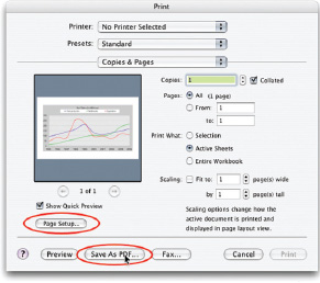
01 » CREATING A PDF ON THE MAC IS EASY USING THE PRINT DIALOG BOX.
Save the Excel Documents as PDFs in Windows
Print your Office document to PDF using the Adobe Acrobat Distiller print driver.
In Microsoft Excel:
1. Choose File>Print.
2. In the Printer Name pop-up menu at the top of the Print window, choose Acrobat PDF Writer.
3. You’ll be prompted to save your document. Give it a file name and choose a location to save it.
4. Save your document as a PDF.
See the Adobe Support Knowledgebase document #322594 for more information (http://www.adobe.com/suppor/tech-docs/322594.html).
Setting Up Your Project in After Effects
I hope you don’t get the idea that I’m really anal-retentive. I’m actually one of the messiest people you’ll ever meet. My virtual world, however, is always neat and tidy. (SEE FIGURE 2.)
1. Launch After Effects and open Charts.aep, included on the DVD.
2. Import your three PDF files by using the shortcut Cmd+I (Ctrl+I). The Import dialog box will open. Import the files as footage. These will be used as reference only.
3. Set up the same folder system in your Project window. I created a folder called “elements” and put the PDF files in it. To create a folder quickly, click the folder icon at the bottom of the Project window. A folder will appear called “Untitled 1.” Rename that folder by selecting it and pressing the Return key. You can then edit the name. Drag your PDF files into it.
4. Start some good habits early and save your project. I saved mine as “charts.aep” in the main financials folder.

02 » IMPORT MULTIPLE FILES AT ONE TIME BY CMD+CLICKING (CTRL+CLICKING) THE FILES THAT YOU WANT TO IMPORT.
TITLE SAFE
The title-safe area is the area of the screen where your type will not be cut off on the edges of television screens. Twenty percent of the screen is outside the title-safe area, and 10 percent is outside the action-safe area. One awesome feature of After Effects is that it automatically calculates the proper safe areas, whether you’re working in PAL, HD or any screen ratio. This is not as much as an issue with newer flat-panel televisions. If your project will be projected or shown on a computer monitor, you do not need to worry about the title-safe area. So, find out how the video will be shown before you start a project. You could have 20% more real estate to utilize.
Put in the PDF Guides
First on our list is the line graph. We’re going to redraw the graph instead of building it in Illustrator. You’ll be just as accurate, and it will be much less of a headache.
1. Create a new comp by using the shortcut Cmd+N (Alt+N). Use the following settings:
![]() Name: Line Graph
Name: Line Graph
![]() Size: Preset NTSC DV, 720x480 (We’re setting this up for an NTSC DVD).
Size: Preset NTSC DV, 720x480 (We’re setting this up for an NTSC DVD).
![]() Frame rate: 29.97
Frame rate: 29.97
![]() Duration: 10 seconds (00:00:10:00)
Duration: 10 seconds (00:00:10:00)
![]() Background color: anything easy on the eyes (mine is light blue)
Background color: anything easy on the eyes (mine is light blue)
![]() If you’re in the PAL world, check your documentation of your DVD authoring program to see what you’ll need.
If you’re in the PAL world, check your documentation of your DVD authoring program to see what you’ll need.
2. Drag linegraph.pdf into the comp. I scaled it to X=59% AND Y=87%. The proportions are different, but that is okay with the client. Make sure that linegraph.pdf is completely within the title-safe area. Click the checkbox below the lock icon in the A/V settings. This will ensure that you don’t accidentally move the PDF guide.
3. Go to the first frame in the Timeline by pressing the Home key. If you’re on a laptop and do not have a Home key, click the Current Time indicator on the upper left of the Timeline and go to 0. (SEE FIGURES 3 &4.)
Add the Background
Normally, I would animate a background, but for the sake of space, I’m going to use a still in this tutorial.
1. Open bkd.psd in the Elements folder.
2. Drag bkd.psd to the bottom of the stack of layers in your Line Graph comp. Make sure it fills the duration.
3. Turn off the visibility of bkd.psd.

03 » UNCHECK THE LINK NEXT TO THE SCALE PERCENTAGES SO THAT YOU CAN CHANGE THE X AND Y VALUES INDIVIDUALLY.

04 » THE PDF IS SCALED TO FIT INSIDE THE TITLE-SAFE AREA.
Add the Chart Title
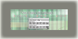
1. Click the Type tool and click in the Project window in the upper center, within the title-safe area. Type “Net Sales (in Millions).” Use the Character palette to adjust the size, tracking, and font and center it using the Paragraph palette.
2. Since this will be shown on a TV screen, it’s important to make the type large enough. I set it to 30pt Arial, with the tracking set to -30. Make the text white and position it at the top center of the screen.
3. To speed up this project, we’ll use the incredible text presets included in After Effects 6.5. (If you have version 6.0, check out the sidebar “Animating Text in After Effects 6.0” for animation instructions.)
4. Open the Effects and Presets palette Cmd+5 (Ctrl+5). Twirl down Animation Presets>Text>Animate In. Choose Characters Shuffle In. The text disappears at the first frame and animates on (so if you’re concerned that your text is gone, it’s just off-screen.)
5. We’re not going to tweak this effect in the tutorial, but if you’d like to change the speed, move the keyframes farther apart or change the position. (SEE FIGURES 5, 6 & 7.)
6. Apply a drop shadow to the text (Effect>Perspective>Drop Shadow). Change the following settings: Opacity: 100%, Distance: 0, Softness: 15.0. We’re going to use these Drop Shadow settings for each text layer that we will make, so to speed things up, we’ll save it as an Animation Preset.
7. Double-click the Drop Shadow effect in the Timeline to open the Effects Control window.
8. Pull down the Animation Presets menu and choose Save Animation Preset. The “Save Preset as” window will pop up. Save as “Charts Drop Shadow.ffx”. Navigate to your Applications (Programs) folder. Find the After Effects application folder, then the Presets folder. Create a folder called “Charts” and save your preset there.
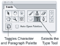
05 » WHEN THE AUTO OPEN PALETTES BOX IS CHECKED, THE CHARACTER PALETTE WILL OPEN IF THE TYPE TOOL IS CLICKED.

06 » THE CHARACTER PALETTE IS LIKE THE ONE IN PHOTOSHOP. YOU CANNOT SET KEYFRAMES FROM THE CHARACTER PALETTE SETTINGS, SO USE IT TO INITIALLY SET UP TEXT.

07 » STEP 6: AFTER EFFECTS 6.5 BROUGHT SOME USEFUL TEXT ANIMATION PRESETS TO THE PARTY. THEY’RE ADDICTIVE!
9. In After Effects 6.5, to apply a preset, drag it from the Effects and Presets window onto your layer. Alternately, go to Animation>Recent Animation Presets and find Charts Drop Shadow.
10. If you haven’t saved lately, please do it now.
Speedy Set-Up of the Pie Chart and Bar Graph
I am a big fan of getting things done quickly. The quickest way to get the other two charts going is to duplicate the Line Graph comp.
1. Select the Line Graph comp in the Project window and press Cmd+D (Ctrl+D). A new comp will appear in your Project window called Line Graph 2. Duplicate it again and you’ll get a comp called Line Graph 3.
2. Select Line Graph 2 and press Return. This makes the comp name editable. Rename it Bar Graph. Rename Line Graph 3 Pie Chart.
3. Double-click the Pie Chart comp to open the Timeline. Find the file called piechart.pdf in the Project window. Unlock it by un-checking the box below the lock icon.
4. You can easily replace a selected layer’s source footage in the Composition window with selected footage.
![]() Select the layer you want to replace in the Timeline. In this case, it’s linegraph.pdf. Use the following shortcut:
Select the layer you want to replace in the Timeline. In this case, it’s linegraph.pdf. Use the following shortcut:
![]() For Mac, use Command+Option+/
For Mac, use Command+Option+/
![]() For Windows, use Ctrl+Alt+/
For Windows, use Ctrl+Alt+/
![]() Lock the layer.
Lock the layer.
![]() Turn on the visibility of the PDF.
Turn on the visibility of the PDF.
5. As you replace the PDF file with the piechart.pdf file, you may notice that your pie chart is not round. Press the S key to bring up Scale and set the scale to 79% for both the X and Y axis. (SEE FIGURE 8.)
6. The background and PDF guide are ready to go; we just need to fix the title. Go to 3:00 in the Timeline, or anywhere in the Time-line that you can see the whole title in its final position. Press Cmd+T (Ctrl+T) to select the Horizontal Type tool. Drag it across the existing title to select it and type “2004 Expenditures” over top of the Net Sales text. Because this text is shorter than the Net Sales text we’re replacing, it will animate slower. Press the U key to bring up Offset, and drag the second keyframe to 1:20.
SAVING AND APPLYING ANIMATION PRESETS (FAVORITES) IN AFTER EFFECTS 6.0
1. Open the Effects Control Window by double-clicking Drop Shadow in your Timeline.
2. Choose Save Selection as Favorite in the Effect Favorites drop-down menu.
3. Save it in the Favorites folder in your application folder. You can save it in a subfolder called Charts, specifically for this project.
To apply a favorite in After Effects 6.0, choose Effect>Apply Favorite. If it’s a recent Favorite, choose Effect>Recent Favorite then choose from the submenu.
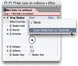
ANIMATION PRESETS WERE KNOWN AS EFFECT FAVORITES IN AFTER EFFECTS 6.0.
7. Repeat Step 7 for the Bar Graph and save your project.

08 » IS YOUR PIE CHART LOOKING A BIT BLOATED? CLICK ON THE TOGGLE PIXEL ASPECT RATIO CORRECTION BUTTON. IT’S JUST FOR REFERENCE, BUT IT MAKES YOUR IMAGES LOOK AS IF THEY’RE THE PROPER SHAPE. ELEMENTS SUCH AS TEXT MAY LOOK JAGGED WITH PIXEL ASPECT RATIO CORRECTION TURNED ON. ONCE YOU TURN IT OFF, EVERYTHING WILL BE SHARP ONCE AGAIN. TEXT ANIMATIONS WITHOUT ANIMATION PRESETS

STEP 6: THE NEW TEXT ENGINE INTRODUCED IN AFTER EFFECTS 6.0 ALLOWS YOU TO CREATE AMAZING, DYNAMIC TEXT ANIMATIONS WITH EASE.
1. Type something, then twirl down the text layer.
2. In the Switches column, use the Animate pull-down menu. Choose Position.
3. Twirl down Animator 1, which has just shown up under your text layer.
4. Set position to 1063.0, 0.0. There’s no need to set any keyframes for position.
5. Twirl down the range selector. Leave the Start at 0%, but change the End to 35%.
6. Go to the first frame and set a keyframe for Offset with a value of -35%.
7. Go to 2:15 in the Timeline. Set a keyframe for Offset with a value of 100%.
8. Twirl down Advanced.
9. Change “Based on” to Characters Excluding Spaces.
10. Set the amount to -63.
11. Change Shape to Ramp Up.
12. Save.

ANIMATING WITH THE ADVANCED TEXT ENGINE IN AFTER EFFECTS 6.0 AND LATER CAN BE A BIT DIFFICULT AT FIRST; HOWEVER, ONCE YOU GET THE HANG OF IT, YOU CAN UNLEASH YOUR CREATIVITY!

09 » TYPE THE X-AXIS LABELS WITH SINGLE SPACES BETWEEN THEM. USE AN ANIMATOR FOR TRACKING TO SPACE THEM OUT.
Add the Chart Text
1. Close both Bar Graph and Pie Chart comps and open the Line Graph comp. We’ll put the text and numbers on the Line Graph using the Type tool. Make the linegraph.pdf layer visible by clicking the eye icon in the A/V features column. Also, turn on Title Safe. Our text will be just a hair outside of the title-safe area, but it will be fine, so stop worrying.
2. Go to 1:00 in your Timeline. Press the Select the Horizontal Type tool Cmd+T (Ctrl+T) and type over the numbers on the Y-axis, pressing the Return key to create line breaks. Use the Character palette to space your lines. Do not press Return twice to make a larger space; set the leading in the Character palette instead. Use the Paragraphs palette to make your text right-aligned.
3. Apply the same Text Presets as you did in adding the chart title, instead of doing all the work manually. I’m going to show you the quick-and-dirty way to do get your text going quickly.
a. Twirl down the Net Sales text layer. Select Animator 1 and copy it.
b. Go to your Y-axis text layer. Twirl down the layer>Text>Animator >Range Selector 1>Advanced.
c. Change Based On to Lines. Change Shape to Ramp Down.
d. Press the U key to bring up the Offset keyframes. We need to reverse them. You could just drag them to swap positions, but you can click on the word Offset to highlight it. Choose Animation>Keyframe Assistant>Time Reverse Keyframes.
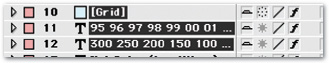
4. Go to 3:00. Click with the type tool where 1995 begins. This is the X-axis text. To save space, type them as 95, 96, 97, etc. Put only one space between each year; I have a cool trick to space them out. Left-align the paragraph and make your type fit. If you cannot see what you’re typing, turn off the visibility for the PDF, or just temporarily turn down the opacity. Remember, single spaces between your years.
5. Twirl down the arrow for the year’s text layer and add an animator for Tracking. Twirl down Animator 1. Set the tracking amount to 25. Twirl down Range Selector. Under Advanced, change the following:
![]() Based: On Characters Excluding Spaces
Based: On Characters Excluding Spaces
![]() Mode: Subtract
Mode: Subtract
6. If they don’t quite line up, change the tracking amount. The number will depend upon the font and font size used.
7. Highlight Animator 1. Press Return to make the word editable. Rename it Tracking.”
8. You should still have Animator 1 saved to your clipboard (if you don’t, go to the Net Sales Text Layer and recopy Animator 1). Paste. Under Advanced, change Based On to Words.
9. Apply the Drop Shadow preset to all of the text. Don’t make your text too small. I’d recommend going no less than 18px to be read on a TV.
10. To nudge the size of your text up or down, press Opt+Down Arrow or Opt+Up Arrow (Alt+Down Arrow or Alt+Up Arrow). (SEE FIGURE 9.)
11. After you finish your text layers, preview your animation by holding down the Shift key and clicking the RAM Preview button in the Time Control palette. Bring up the Time Control palette by pressing Cmd+3 (Ctrl+3). Drag your text layers around a bit to space them out in time to your liking. Save.
Make the Grid on the Line Graph
Let’s make our comp a little easier to work with, shall we?
1. The Shy Layer switch is the Kilroy-looking character in the Switches column. Click the Switches/Modes toggle button to bring up Switches. Select layers that you want to hide and click the Shy Layer box next to one of them. Above the layers, you’ll see a larger Shy Layer icon on a button. Click it and watch your layers disappear. Do not fret! By clicking the button again, the layers return. (SEE 10 & 11.)

10 » UTILIZING THE SHY LAYER FUNCTION CAN MAKE WORKING WITH STACKS OF LAYERS A BREEZE. YOU MUST ACTIVATE BOTH THE SWITCH AND THE BUTTON TO MAKE A LAYER SHY.
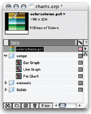
11 » A QUICK WAY TO ACCESS A PREDETERMINED COLOR PALETTE IS TO SELECT IT IN THE PROJECT WINDOW SO THAT YOU CAN SEE THE PREVIEW. WHEN YOU NEED A COLOR, JUST USE THE EYEDROPPER TOOL TO PICK THE HUE YOU NEED. I’VE SET UP A COLOR SCHEME THAT WORKS WITH THE BACKGROUND. CLICK ON COLORSCHEME.PCT IN THE PROJECT WINDOW SO THAT YOU CAN SEE IT IN THE PREVIEW WINDOW. YOU CAN GRAB COLORS FROM THERE WHEN YOU NEED IT.
NEED TO COPY VECTOR FILES FROM ILLUSTRATOR?
To cut and paste from Illustrator to After Effects, your Illustrator preferences need to be set up properly.
In Illustrator, go to Preferences>File Handling & Clipboard. Under Clipboard, check AICB and Preserve Paths.

IF THE FILES & CLIPBOARD PREFERENCES ARE NOT SET UP CORRECTLY IN ILLUSTRATOR, YOU WILL NOT BE ABLE TO CUT AND PASTE PATHS TO OTHER PROGRAMS.
2. Make linegraph.pdf visible. Go to 4:25 and create a new solid. Choose Layer>New Solid or press Cmd+Y (Ctrl+Y). Make it 535×275 and name it Grid. Use the eyedropper to pick the lightest shade of blue from colorscheme.pct. Place the solid over the grid in linegraph.pdf.
3. Apply the grid filter to the Grid layer (Effect>Render>Grid). Change the following settings for Grid:
![]() Anchor:0, 273 (lower-left corner)
Anchor:0, 273 (lower-left corner)
![]() Size From:Width and Height sliders
Size From:Width and Height sliders
![]() Width: 481.0
Width: 481.0
![]() Height 45.5
Height 45.5
![]() Border: 3
Border: 3
![]() Invert Grid: checked
Invert Grid: checked
![]() Blending Mode: Multiply
Blending Mode: Multiply
4. Go to 6:00. Set a keyframe for Width. Go back to the in-point (i) and set Width to 0. Set a keyframe for Opacity with a value of 40%. Select the keyframe and press Shift+Page Down. This moves the keyframe 10 frames ahead. Set the Opacity to 0. In the Switches/Modes column, change the mode to Screen. Save. (SEE FIGURE 12.)

12 » THE GRID EFFECT CAN GIVE YOU SOME COOL WIPE-LIKE EFFECTS WITHTHE LINES IF YOU KEYFRAME WIDH OR HEIGHT.
Animate the Lines on the Line Graph
If you want to be ultra-accurate, you could open linegraph.pdf in Illustrator, do a little surgery on the lines, and then copy and paste them onto solids in After Effects. Trust me, it’s a lot of work. We’re going to simplify things by drawing the lines with the Pen tool in After Effects.
1. Make all layers shy. Go to 6:15. Create a new solid and click the Make Comp Size button. Call it Line Postproduction. Duplicate this layer twice, naming the duplicates Line Multimedia and Line Duplication. Turn off the visibility for Line Multimedia and Line>1. Make all layers shy. Go to 6:15. Create a new solid and click the Make Comp Size button. Call it Line Postproduction. Duplicate this layer twice, naming the duplicates Line Multimedia and Line Duplication. Turn off the visibility for Line Multimedia and Line Duplication.
2. Set the opacity of the Line Postproduction layer to 0. Grab that Pen tool (G) and trace the Postproduction line. Draw the Multimedia and Duplication on their respective layers. Save. (SEE FIGURE 13.)
3. Go to 7:15 and press Opt+M to set a keyframe for the mask. Jump back to 6:29. If you don’t like the default yellow of the mask, press the M key. You’ll see a yellow box next to the words Mask 1. Click on the yellow and the color picker will pop up. Change the color.
4. Select only the Line Postproduction layer. Use the Pen tool to draw at the point where the line starts and end at the end of the graph. If you hold down the Shift key as you draw the line, the line will stay perfectly level. You want to be careful not to continue the path of the existing mask, so if the Pen tool icon suddenly has a plus sign next to it, move the pen down a few pixels before you click. When you’re finished, Option-click the line to select it and use the arrow keys to nudge it into place
5. Press the M key to bring up Mask 1 and Mask 2. Set a keyframe for Mask 2. Select and copy the keyframe. Select Mask 1’s mask shape. Make Paste, then delete Mask 2.
6. Repeat Step 10 with the Line Multiplication and Line Duplication line layers.
Add the Stroke to the Lines
1. Set the opacity back to 100% for all three line layers. Select Line Postproduction, and add a Stroke (Effect>Render> Stroke). Use the following settings:
![]() Path: Mask 1
Path: Mask 1
![]() Color: Blue
Color: Blue
![]() Brush Hardness: 100%
Brush Hardness: 100%
![]() Paint Style: On Transparent
Paint Style: On Transparent
![]() Leave the other settings as is.
Leave the other settings as is.
2. Let’s animate the line a bit more, drawing on the line from the center, into the straight line. Simply animate the Start and End settings in the Stroke effect.

13 » THE LINE WILL MORPH FROM A STRAIGHT LINE INTO THE MOUNTAINOUS LINE OF THE CHART.
GO TO TIME
If you’re on a laptop, you may not be able to use certain shortcuts, like function keys and Page Up and Page Down to move through the Timeline. You can use the Cmd+G (Ctrl+G) shortcut to bring up the Go To Time dialog box.

» WANT TO GO TO 0:00:04:00? INSTEAD OF TYPING ALL THOSE ZEROS IN THE GO TO TIME BOX, YOU CAN JUST TYPE “4.” (THAT’S 4 WITH A PERIOD AFTER IT).
3. Go to 7:13 in the Timeline and set keyframes for both Start and End. Jump back to 6:29, the in-point of the layer, and set both of the values of Start and End to 50%.
4. Preview. Pretty swell, eh!
5. This same effect will need to be applied to Duplication and Multimedia. Follow the instructions in Adding the Chart Title above to save the effect as an Animation Preset. Call it Chart Stroke and save it in the Charts folder that you created.
6. Apply the Chart Stroke preset to Line Multimedia and Line Duplication. Open up the Stroke effect and change the color of the lines. The Multimedia line needs to be green and the Duplication line blue.
7. Set the Opacity back to 100%. Stagger the times of the layers so that Line Multimedia begins at 6:29 and Line Duplication begins at 7:08. (SEE FIGURE 14.)
8. Turn off the visibility of linegraph.pdf and save.
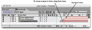
14 » STEP 7: WHEN DRAGGING LAYERS IN THE TIMELINE, HOLD DOWN YOUR MOUSE BUTTON AS YOU DRAG, GRABBING THE COLORED PORTION OF THE BAR. DO NOT GRAB THE LAYER HANDLE.
Make the Key for the Line Graph
1. Go to 5:00. Use the Type tool to add the text across the top. Type “Postproduction” in white 16px Arial, which is about the smallest that I would advise for text that you want to be read on a television screen.
2. Jump to 5:10 by holding down the Shift key and pressing Page Down. Press the T key to bring up opacity. Set a keyframe for 100 percent. Jump back to 5:00 by holding down the Shift key and pressing Page Up. Set the value of Opacity to 0 percent. Apply that good old Charts Drop shadow preset to the layer.
3. The quickest way to make the other words in the key is to duplicate Postproduction twice, move the new layers to the right, and type the words “Multimedia” and “Duplication” over it. Drag Multimedia to start at 5:10 and Duplication at 5:20.
4. Go to 5:10. To make the key, create a new solid called Key Post-production. Set the Opacity to 0%. Use the Pen tool to create a short line to the left of the word Postproduction. Apply the Stroke Animation preset. Turn the Opacity back up to 100%. (SEE FIGURE 15.)
GET ACCURATE SPACING BY USING THE ALIGN & DISTRIBUTE TOOL
Get accurate spacing by using the Align & Distribute Tool
» YOU’LL RECOGNIZE THE ALIGN PALETTE FROM ILLUSTRATOR AND PHOTOSHOP. USE IT TO ACCURATELY ALIGN YOUR TEXT OR DISTRIBUTE IT EVENLY.
5. Duplicate Key Postproduction twice. Rename the layers Key Multimedia and Key Duplication. Nudge them so that they line up with the corresponding text by holding down the Shift key and pressing the right arrow key repeatedly. Holding down the Shift key will let you move in increments of 10 pixels instead of one pixel.
6. On both layers, change the color of the stroke so that it matches the color of the corresponding line in the graph. Move Key Multimedia in the Timeline so that it starts at 5:20 and move Key Duplication to 6:00.
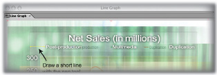
15 » STEP 4: TO MAKE THE KEY, DRAW A SHORT LINE WITH THE PEN TOOL AND USE THE CHART STROKE ANIMATION PRESET THAT YOU CREATED.
Preparing the Pie Chart in Illustrator
You could cut and paste the whole pie chart, but it’s actually easier to make a new graph in Illustrator by pasting the data. (SEE FIGURE 16.)
1. Launch Excel. Open the Pie Chart workbook tab.
2. Select the line of data in the spreadsheet. Copy.
3. In Illustrator, create a new document (640x480, landscape orientation, RGB Color). Call it Pie Chart.
4. Select the Pie Graph tool. (SEE FIGURE 17.)
5. Draw a box with the crosshairs. Your pie chart needs to be perfectly round, so hold down the Shift key as you draw your pie chart with the crosshairs to constrain proportions. The circle should fill about half of the height of the work area.
6. In the chart data area, select the top left cell and paste.
7. You’ll need to remove the percent symbol from each of the cells. Luckily, there are only a few. To delete them, choose each cell individually and delete the percent symbol from the data entry line across the top. (SEE FIGURE 18.)
8. Click the checkmark in the upper-right corner to apply your data.
9. Select the pie chart with the Selection tool. Use the Rotate tool (R) to rotate 178°, matching the angle of the original.
10. Each piece of the pie needs to be put on its own layer, so ungroup (Object>Ungroup). A pop-up message appears: “The selection contains a graph. After a graph is ungrouped you will no longer be able to access its graph style, its data or change its graph designs.” Click OK.
11. Ungroup three more times by pressing Cmd+Shift+G (Ctrl+Shift+G) until the layer is broken into paths. Twirl down the arrow next to the layer to see whether it is broken into paths. (SEE FIGURE 19.)
16 » YOU CAN EASILY RECREATE A PIE CHART IN ILLUSTRATOR BY PASTING THE DATA COPIED FROM EXCEL INTO THE ILLUSTRATOR’S GRAPH TOOL.

17 » STEP 4: IN ILLUSTRATOR, CHOOSE THE PIE GRAPH TOOL IN THE GRAPH TOOLS. THE SELECTION AND ROTATE TOOLS ARE OTHER TOOLS THAT YOU WILL USE.
12. Select Layer 1 in the Layers palette. In the fly-out menu on the upper right of the Layers palette, choose Release to Layers (Sequence).
13. The pieces of the pie are now on their own layers. Select all of the pieces of the pie. Hold down the Shift key and drag them above Layer 1 in the Layers palette. The cursor will be come a fist, grabbing your layers.
14. Label your layers by double-clicking a layer and changing the name. Call them Payroll, Rent, etc. View the original Excel document or your hard copy for reference.
15. Save it as piechart.ai. To ensure that the file displays correctly in After Effects, select the Create PDF Compatible File option in the Illustrator Native Format Options dialog box.
16. Leave it in grayscale. We’ll add the colors in After Effects. (SEE FIGURE 19.)
Make the Pie
1. Open your After Effects project file. Import piechart.ai as a composition. The original comp called Pie Chart is in the Project window, along with a comp and folder titled piechart Comp 1. The folder contains all of the pieces of the pie. The comp is the whole pie.
2. Double-click Pie Chart Comp 1 to open it. It needs to be 10 seconds long, so if it is not, change your Composition Settings by pressing Cmd+K (Ctrl+K).
3. We’ll animate the pieces in this comp and then nest this comp inside of the Pie Chart comp. Delete Layer 1 and change the background color by pressing Cmd+B (Ctrl+B) so you can see the pie pieces easily.
4. Select Payroll. Apply a Radial Wipe (Effect>Transition>Radial Wipe). Go to 0:00. Set the Start Angle to 0 x –195. Set a keyframe for Transition of 61%. Go to 0:15. Set a keyframe for Transition Complete of 0%.

18 » STEP 7: PASTE THE DATA FROM EXCEL INTO THE CHART DATA BOX. ONLY NUMERICAL DATA IS ALLOWED, SO THE PERCENT SYMBOLS WILL NEED TO BE DELETED.

19 » STEP 11: UNGROUP UNTIL LAYER 1 IS BROKEN INTO PATHS, THEN RELEASE TO LAYERS (SEQUENCE).

20 » APPLY EASY EASE IN TO YOUR ELEMENTS FOR A SMOOTHER, MORE NATURAL MOTION.

21 » PLACE THE TEXT AROUND THE PIE SO IT DOES NOT LOOK TOO CROWDED.
5. Jump to 0:25. Select all the layers except Payroll. Shift+click the layers to select multiple files. Press Cmd+[(Ctrl+[) to set a new in-point for all of the layers. Press Option+R to set a keyframe for rotation on all selected layers.
6. Go to 0:15. These layers need to hide behind the Payroll layer. Set the rotation value to 169 for each of the five layers by selecting all five and setting one of them to 169º.
7. Select all layers and press the U key. You’ll see keyframes for the Radial Wipe Transition Completion on the Payroll layer, and Rotation keyframes on the other layers. Select only the second keyframe on each layer. Press Shift+F9 to add an Easy Ease In (or choose Animation>Keyframe Assistant>Easy Ease In). This will make the motion flow better. Preview and save. (SEE FIGURE 20.)
8. Stagger out the layers so that the layers are 10 frames apart in sequence. Rent starts at 0:25, Taxes at 1:05, Equipment at 1:15, Insurance at 1:25 and Utilities at 2:05.
9. Click on Payroll and add a Fill (Effect>Render>Fill). Set the color to the spicy mustard color in the upper right of colorscheme. pct. Apply Fill to the remaining pie pieces, choosing nice shades from colorscheme.pct.
10. Apply the Charts Drop Shadow preset to all of the pie pieces. Close the Comp window by pressing Cmd+W (Ctrl+W).
Finish Up the Pie Chart
1. Open Pie Chart comp. Drag Pie Chart Comp 1 into the Pie Chart comp. Make sure it starts at 1:20. Center the pie chart in the Comp Window. If it doesn’t look round, remember the Pixel Aspect Ratio Correction button on the Comp window.
2. I scaled the pie to 77%. Your pie chart may be a different size, so scale it as you see appropriate. It should be slightly larger than the pie chart in the PDF guide.
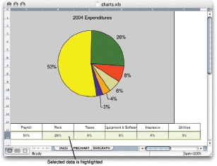
3. The pie chart has percentages but no indicators of what the numbers refer to. You can refer to the original Excel document for the information or your printout.
4. Instead of making the text shuffle on, a simple fade in over ten frames will do the trick. Go to 4:00 and type Payroll 53%. Make it white, Arial, 20px and apply the Animation Preset for Charts Drop Shadow. Position it to the left of the Payroll piece of the pie, which is the largest.
5. Jump to 4:10 and set a keyframe for Opacity. Back at 4:00, set Opacity to 0%. Select the second keyframe and apply Easy Ease In.
6. Duplicate the text layer “Payroll 53%” by pressing Cmd+D five times. Move ahead in the Timeline to see the text. Drag the copies to their positions and then type over them with the correct text. If your text looks jaggy, you’re viewing at a lower resolution or Pixel Aspect Ratio Correction is turned on. It is clean, so put your worries aside. (SEE FIGURE 21.)
7. Use Option+Shift+Page Down to nudge a layer 10 frames later.
![]() Payroll starts at 4:00
Payroll starts at 4:00
![]() Rent starts at 4:10
Rent starts at 4:10
![]() Taxes starts at 4:20
Taxes starts at 4:20
![]() Equipment starts at 5:00
Equipment starts at 5:00
![]() Insurance starts at 5:10
Insurance starts at 5:10
![]() Utilities starts at 5:20
Utilities starts at 5:20
8. At 5:20, add the lines between the pie and the type. Create a new solid. Click the Make Comp Size button and call it Lines. Set the Opacity to 0% so you can see what you’re doing. Use the Pen tool to draw short lines from the text to the corresponding pie piece for Equipment, Insurance and Utilities. They will animate in a quirky fun way, some starting at the pie and others starting at the text. (SEE FIGURE 22.)
9. Go to the in-point of the Lines layer. Set the Opacity back to 100%. Apply the Stroke Animation Preset that you made for the Line Graph. Twirl down Stroke and set All Masks to On. Stroke Sequentially should also be on. Change the color to white.

22 » USE THE PEN TOOL TO DRAW THREE SEPARATE LINES THAT RUN BETWEEN THE TEXT AND THE CORRESPONDING PIE PIECE. APPLY THE STROKE ANIMATION PRESET THAT YOU CREATED EARLIER.
10. Apply the Charts Drop Shadow preset to the lines. Turn off the visibility for piechart.pdf, save, and preview. Two down, one to go.
Speeding Your Way Through the Bar Graph
1. Open the Bar Graph comp. You should see three layers: bkd. psd, bargraph.pdf, and the title, centered across the top of the screen.
2. Open the Line Graph comp. Select and copy the X and Y axis labels and Grid.
3. Press Shift+, (comma) to tab back to the bar graph. Go to 1:00 and paste. (SEE FIGURE 23.)
4. Scale and position the Grid to fit. I scaled it to X=70%, Y=98%. Hit the i key to go to the In Point, then press the U key to bring up all keyframes. Set the Opacity to 100% so that you can see the grid.
5. Click the stopwatch next to Height and Width to delete the keyframes. Jump ahead to 6:00 and set Width to 69.0. Set a keyframe for Height to 273.0. Jump back to 4:25 and set Height to 0. Set Opacity to 0% at the first frame.
6. Nudge the position of the X and Y axis Text layers to line up with the text on the PDF guide. Use the Character palette to adjust the leading of the Y-axis text. Type over the numbers with the correct text. Instead of typing CD-ROM Graphics, just type CD-ROM.
7. Notice that Corporate Video doesn’t quite fit. Instead of making the text smaller, move everything 50px to the right. The title and background can stay where they are. Unlock bargraph.pdf. Select bargraph.pdf, Grid, and the Y-axis and Y-axis text. Press Shift+Right Arrow five times. Lock bargraph.pdf. (SEE FIGURE 24.)
8. On the X-axis, type the percentages over top of the years. Put just one space between the numbers. Remember that Tracking Animator that you added to the text on the Line Graph? You copied that too. In the Character palette, set the font size to 18px and the horizontal scale to 85%. Left-align the text with the text on bargraph.pdf. Twirl down the layer Text Tracking. Set the Tracking Amount to 11, or whatever works with your font. Twirl the layer closed.
23 » STEP 16: SELECT THE LAYERS IN THE LINE GRAPH COMP TO REPURPOSE THEM IN THE BAR GRAPH.

24 » STEP 16: NUDGING THE PDF GUIDE LAYER, THE GRID, AND THE X AND Y AXIS LABELS HELPS EVERYTHING FIT ON SCREEN.
Animate the Bars
There are about a thousand ways to animate these bars, so I’ve chosen a simple method.
1. Select colorscheme.pct in the Project window so that you can see it in the Preview window.
2. The Web bar is the longest, so let’s start there. At 6:00, create a new solid, 256x20. Call it Web. Use the color picker to pick the shade from the colorscheme.pct file in the Preview window. Press A to bring up Anchor Point. Set the Anchor Point to 0.0, 10.0. Line up the line with the Web bar on the PDF guide.
3. Jump to 8:00 and press Option+S to set a keyframe for Scale. Go to 6:00 and set Scale to 0 percent. Select the second keyframe and press Shift+F9, Easy Ease In. Set Opacity to 50 percent.
4. Go to 6:15 and duplicate Web six times. Line up the solids with the PDF guide. Open the Composition Setting and change the names and colors. Put the bars in order in the Timeline. (SEE FIGURE 25.)
5. We need to keep the bars growing at the same speed, so I’ve got a little trick. Go to 6:00. Select all six bar layers. Press the S key to bring up the Scale keyframes. Start with Film, since it’s the shortest. At 6:01, the Film bar is as long as it needs to be. Set a keyframe at 6:01. Delete the keyframe at 8:00 for Film.
6. The next shortest bar is Corporate Video. Press Page Down until the bar is the right length. At 6:05, they match up, so set a Scale keyframe for Corporate Video and delete the keyframe at 8:00.
7. Now, the Print bar. At 6:10, the length matches. Set a keyframe for Scale and delete the keyframe at 8:00.
8. Repeat the process with the remaining bars.

25 » DUPLICATE THE LONGEST BAR AND DISTRIBUTE THEM. YOU CAN USE THE ALIGN TOOL FOR ACCURACY.
9. Select all six bars and press the T key. Change the opacity of one of the layers to 100%, and they’ll all change. While the layers are still selected, apply the Charts Drop Shadow preset to help them pop.
10. Now, we’ll add the percent numbers at the end of the bars. We’re going to cheat again and copy text from the pie chart. Open the Pie Chart comp. Select and copy “Utilities 3%.”
11. Switch back to the Bar Graph comp. Go to 7:15. Paste. Drag it over the “96%” on the PDF guide layer and type “96%” over it.
12. Duplicate the 96% layer, place it where it needs to go, change the number. When you’re finished, stagger the in-points of the layers so that 96% starts at 7:15, 12% starts at 7:25, DVD Menus starts at 8:05, and so on.
13. Turn off bargraph.pdf. You’re finished with all three graphs! Save.
Building a Quick Open
1. Create a new comp that is 720x480, D1 NTSC. Make it 4:00 in duration and call it Open Animation. Drag bkd.psd into the comp.
2. Open Bar Graph and copy the title to your clipboard. Go back to the Open Animation comp and paste at the first frame. Go ahead a few seconds so that you can see the text. Type “Financials with Flair” over the title. Nudge the layer down to about the lower third of the screen.
3. Go to 2:15. Drag postworks-logo.psd, already imported for you and in the Elements folder, into the Timeline. Center it on screen. Apply Charts Drop Shadow. (SEE FIGURE 26.)

26 » THE FINISHED GRAPHS AND SHOW OPEN.
Putting It All Together
1. Render all of the movies at the best quality possible for your DVD authoring program. It is best to render to a lossless codec such as animation. you can then compress to MPEG2. Starting with a high-quality file will result in smaller compressions with better image quality.
2. Import the Open Animation and three graphs into your DVD authoring program. The idea is to put them in order—Open, Line Graph, Pie Chart, and Bar Graph. Program a Next button so that the speaker can go to the next chart when he is ready. Each movie will hold on the final frame so that the graphic or chart will remain on-screen as long as is needed.
3. Ideally, you would have a moving background and some transitions between slides, so you can do that on your own.
ABOUT THE AUTHOR

When Michele Yamazaki was a child she was a huge fan of Top 40 and always wanted to work in radio. In college, she worked on a degree in broadcast and had to take video classes. After Video Editing 1, she was hooked.
In 1995, she interned at a company called Postworks, a post-production and Communications Company. Some of the high-profile projects she has worked on are the current graphics package for the Jerry Springer Show and the animation for the big screen of the last AC/DC world tour. She spends most of her time at the company working on web site development.
In 2001, she launched the AE FreeMart with Roland Kahlenberg. In 2002, she started the West Michigan After Effects User Group with Matt Schirado, a friend and editor at a local TV station.
In 2003, her life changed. Her husband, Max, and she had a baby named Lily. It was a tough pregnancy and she had to spend 80 days in the hospital on bed rest. During that time, her priorities became refocused on her family. Lily is now a happy, healthy two-year-old.
Michele went back to work part-time at Postworks. In 2004 she was offered a teaching position at Kendall College of Art and Design, teaching After Effects and Photoshop.
Not long after that, Toolfarm asked her to join their team as web designer and content creator. She is still at Postworks and Kendall. She’s busy but is having a blast.