This chapter delves into the colorist and online editor’s toolbox and provides a comprehensive color correction resource guide.
After Effects may not be the first application that comes to mind for color correction. Actually, certain color and luminance considerations should always be weighed when compositing such elements as text, glows, and imported video. While hanging out in After Effects, why not take advantage of its color-correction resources? This chapter delves into the colorist and online editor’s toolbox and provides a comprehensive resource guide. So, roll up your sleeves, because you’re going to sort through the tools that will help you make better color decisions and build confidence in using After Effects filters such as the Shadow/Highlight effect (version 6.5 or later), Synthetic Aperture’s Color Finesse plug-in (bundled with 6.5 pro), and many more.
WHAT’S ON THE DVD
Included on the DVD are source files and corrected color files.
INTRODUCTION
Video Levels Checklist
Most non-linear editing (NLE) systems offer corrective tools and broadcast filters that can compensate for color selections made in After Effects. However, these tools combined with poor color-correction decisions can distort or compromise the quality of a composite. To avoid this, keep the following considerations in mind:
1. Be consistent. For example, some NLEs allow RGB or 601 color mapping for export and import. If the image is exported at 601 levels, re-import the final artwork at 601 levels.
2. Select video-safe luminance and chrominance for borders, gradients, and glows. This means each channel should fall between 16 and 235. And remember that red bleeds on TV.
3. Color effects influence luminance levels.
4. Perform a test render to play back in the NLE, but make necessary adjustments in After Effects.
5. Crop out vertical and horizontal blanking that falls within the action-safe area.
6. Monitor images through an external broadcast display. Computer monitors display luminance and chrominance information differently than a video display does.
7. Check levels in a waveform monitor and vectorscope. Designated hardware scopes work best because of their high resolution and real-time feedback, but software scopes work better than nothing. Synthetic Aperture’s Color Finesse, which is bundled with After Effects 6.5 Pro, is equipped with software scopes.
8. Monitor the levels for backgrounds created in After Effects or imported from third-party suppliers. Keeping levels between 16 and 235 is a good rule of thumb.
9. Be sure still images are prepared with the appropriate pixel aspect ratio.
10. Keep this checklist in mind when creating composites for high-definition projects. Most likely the program will be aired in standard definition as well
TIP // In the Output Module of the Render Settings dialog box, do not vertically stretch images. Interlacing will compromise vertical resolution.

» REPRESENTS A PERFECT CIRCLE CREATED WITH THE INCORRECT SQUARE PIXEL FRAME SIZE SETTING IN PHOTOSHOP

» REPRESENTS A PERFECT CIRCLE CREATED WITH THE CORRECT SQUARE PIXEL FRAME SIZE SETTING IN PHOTOSHOP
Pixel Aspect Ratio
To avoid image distortion, use TABLE 1 as a guide for determining frame size settings.
Color Space
Non-linear editing (NLE) systems typically capture video with either RGB or ITU-R BT.601 color levels. Consistency is key when moving images between After Effects and the NLE. RGB deals in absolute values without headroom. Black is mapped to 0 and white is mapped to 255. Levels that fall below 0 and above 255 are clipped and cause loss of detail in shadows and highlights. Banding and other distortion may also result. The 601 color space allows for headroom. Black is mapped to 16 and white is mapped to 235. Because of this headroom and foot room, levels that fall between 0 and 16 (superblack) or between 235 and 255 (super-white) have more give and won’t lose detail. After Effects works in the RGB color space natively. The following table compares RGB and 601 mapping. (SEE TABLE 2 & 3.)
Color Correction Workspace
Proper setup will make the color-correction process easier. Here are the hardware and setup considerations:
1. Properly calibrated broadcast video display
2. External waveform monitor and vector scope for monitoring the luminance and chrominance
3. For best results perform color correction in a room with neutral lighting (6500 degrees Kelvin) and a neutral gray backdrop placed behind the video display


01 » SMPTE COLOR BARS
02 » PREVIEW PREFERENCES

03 » BLUE ONLY MODE. IF THE MONITOR DOESN’T HAVE A BLUE ONLY MODE, PLACE A WRATTEN #47B FILTER IN FRONT OF THE MONITOR. THIS CAN BE PURCHASED AT A PHOTO SUPPLY STORE.
Tutorial 1: Video Display Connection and Calibration
After Effects 6.5 can send a preview to an external video display. This tutorial walks through the video display connection and calibration workflow.
1. Connect the video display.
2. Open the ColorCorrect project on the DVD.
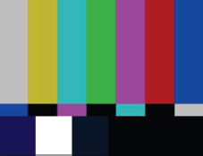
3. Load the 01_Monitor Calibration composition in the Tutorials folder. The composition contains SMPTE color bars. (SEE FIGURE 01.)
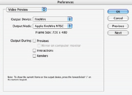
4. Select Video Preview from the After Effects menu (the Edit menu in Windows). (SEE FIGURE 02.)
The preferences have already been set for this project, but let’s take a closer look at the preference options.
Output Device: Selects how the device is connected to the computer.
Output Mode: The options displayed here depend on the Output Device setting. The resulting frame size and frame rate appear below the selection.
Output During: Sets which operations are sent to the video display, such as RAM previews and scrubbing.
The video monitor should be calibrated to ensure accurate display.
1. Press / (forward slash) to display the Timeline’s current frame on the video monitor.
2. Adjust the brightness control on the video display until the left two bars of the pluge pattern aren’t visible and the right-most strip is barely visible. (The pluge pattern is the set of three vertical strips at the lower-right portion of the monitor below the red color bar.)
3. Adjust the video display’s contrast until the white square (to the left of the pluge pattern) looks white, not gray, and doesn’t bleed over into the two neighboring color squares.
4. Enable Blue Only mode on the external monitor. (SEE FIGURE 03.)
5. Adjust the hue control (which may be labeled “tint” or “phase”) until the upper and lower strips of the middle blue bar look the same.
6. Adjust the chroma (saturation) until the upper and lower strips of the two outer blue bars look the same.
7. Hue and saturation adjustments affect each other, so additional hue adjustments may be necessary. Calibration is finished, when both hue and chroma (saturation) are even.
8. Turn off Blue Only mode.
![]() VIDEO SCOPES
VIDEO SCOPES
Because the waveform monitor and vectorscope are integral to the color-correction toolbox, it’s important to understand how they work. Following is a rundown of commonly used video scopes.
TIP // Check capture card documentation for Color space specifications.
Waveform monitor: Measures a clip’s luminance or brightness. This scope is useful when making tonal range adjustments, that is, setup (black levels), gain (white levels), and gamma (midtones). Lower levels, like shadows, appear near the bottom of the waveform display and brighter levels, like highlights, appear near the top of the display. (SEE FIGURE 04.)
Vectorscope: Measures a clip’s hue and saturation. Hue is measured as an angle around the circle of the scope. The distance from the center of the scope measures saturation. This scope is useful for adjusting skin tone and neutralizing color casts. (SEE FIGURE 05.)
RGB parade: A commonly used software scope that measures the brightness for each of the red, blue, and green components separately. This scope helps identify color casts. Shadow information for each color appears near the bottom of the display and Highlight information appears near the top. (SEE FIGURE 06.)
Histogram: Another commonly used software scope that functions similarly to the level’s histogram in After Effects. This scope shows distribution of pixels. The horizontal graph displays luma values, and the vertical display shows the portion of the images pixels present for each luma level. (SEE FIGURE 07.)
![]() ANALYZING FOOTAGE
ANALYZING FOOTAGE
Before applying color-correction to an image or adding color to a composite there are several criteria to consider. The following checklist can help with analysis:
1. Unless a special treatment is applied, images should have a black point and a white point.
2. An image should have evenly distributed luminance levels and not be heavily weighted toward the darks or lights. A washed-out, flat-looking image can be greatly enhanced by opening up its tonal range.
3. Texture is key. An image should have detail in its darkest and lightest regions.
4. Flesh tones should be accurate.
5. Color casts should be neutralized, meaning that blacks should be black, not reddish or blueish, and whites should be white.
6. Sampling regions with a color picker can help pinpoint luma and chroma issues.

04 » SYNTHETIC APERTURE’S LUMA WAVEFORM. THE SCOPE UPDATES IN REAL TIME AS ADJUSTMENTS ARE MADE.

05 » SYNTHETIC APERTURE’S VECTORSCOPE

06 » APERTURE’S RGB WAVEFORME

07 » SYNTHETIC APERTURE’S VECTORSCOP
TIP // For the artist who’s compositing with the standard version of After Effects and doesn’t have access to external scopes, there’s another software solution. Check out www.metadma.com for more information.

08 » WORKING IN 8-BIT MODE SPEEDS UP THE EFFECT DESIGN PROCESS. DURING OU PUT BE SURE TO SET BIT DEPTH TO 16-BIT MODE.
![]() WORKFLOW
WORKFLOW
The final assets found in a colorist’s toolbox are proper workflow and experience. The color-correction process becomes easier with each project. Here’s a recipe for successful workflow:
Stage 1: Enhance an image’s tonal range (luminance or brightness and contrast adjustments).
1. Set the black point.
2. Set the white point.
3. Set the gamma (gray point or balance of black to white).
Stage 2: Neutralize color casts such as white-balance issues or blue video.
1. Neutralize the blacks or shadow regions.
2. Neutralize the whites or highlights.
3. Neutralize the midtones or gamma.
4. Adjust inaccurate flesh tones (gamma adjustment).
Stage 3: Ensure shot-to-shot consistency (comparing shots with adjacent shots or blue video).
1. Select a clip or element from within the composite that is to serve as a reference shot or benchmark for matching other elements or adjacent shots.
2. Adjust other elements or adjacent shots to match or blend with this reference. A separate effect or adjustment layer can be introduced to separate this stage from stages 1 and 2.
Stage 4: Adjust the final look or style.
1. Apply an effect to an individual layer or adjustment layer and generate a stylized look.
2. Isolate a specific region and apply a secondary or spot correction effect or mask. For example create a photographer’s color grad filter by isolating a washed out sky.
Stage 5: Check broadcast levels.
1. Manually check the levels of the composite in video scopes and make adjustments.
2. Apply a broadcast color filter or utilize Color Finesse’s Level Limiting tool.
![]() STANDARD EFFECTS
STANDARD EFFECTS
The remaining sections of this chapter implement this recipe. This section highlights useful manual color correction effects found under Effect>Adjust. The effects not covered in this section tend to introduce undesirable artifacting or have been made obsolete by an effect covered here. Because Auto filters can behave unpredictably, they will be covered after exploring how to work with manual effects. Some filters achieve the same results through different techniques. Determining which effect to add to the color-correction toolbox is largely a personal preference.
![]() 16-BIT VERSUS 8-BIT:
16-BIT VERSUS 8-BIT:
High-resolution footage and high-definition (HD) footage will benefit from After Effect’s 16-bit-color mode. This mode opens up a wider color range and enhances the quality of narrow color ranges (gradients). Most operations in After Effects can be executed in 16-bit mode. A yellow warning symbol appears next to an effect in the Effect Controls window that doesn’t support 16-bit mode. Switch the setting back to 8-bit for these effects or details will be lost.
![]() TO SETUP FOR 16-BIT DEPTH:
TO SETUP FOR 16-BIT DEPTH:
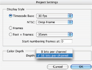
1. Choose File>Project Settings.
TIP // Tonal range should be adjusted first, even when facing blatant color casts like white-balance issues.
2. Select “16 bits per channel” from the Color Depth pop-up menu.
3. To toggle between color depths, Opt-click (Alt-click) on the color depth indicator at the bottom of the Project window. (SEE FIGURES 08 & 09.)
![]() LEVELS AND LEVELS (INDIVIDUAL CONTROLS)
LEVELS AND LEVELS (INDIVIDUAL CONTROLS)
These effects adjust a clip’s tonal range and hue offsets and is the most commonly used standard effect. It includes a histogram that displays brightness levels for each pixel in an image. This effect quickly adjusts for low or flat contrast and can neutralize a color cast. Levels (Individual Controls) displays each channel in a list and allows individual keyframing.
1. Launch After Effects and open the ColorCorrect project if it’s not currently open.
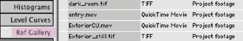
2. Load the 02_Levels composition, located in the Tutorials folder. Let’s adjust the tonal range and remove the color cast for ExteriorCU.mov.
3. In the Timeline window, select the ExteriorCU.mov layer, and choose Effect>Adjust>Levels.
4. With RGB selected in the Channel property, drag the Input Black triangle to the right, drag the Input White triangle to the left, and adjust the Gamma triangle to taste.
5. Select Green from the pop-up menu in the Channel property.
6. Drag the Green Input Black triangle to the right, drag the Green Output White triangle to the left, and drag the Green Gamma triangle to the right.
7. Select Blue from the pop-up menu in the Channel property, drag the Blue Output Black triangle to the right, and drag the Blue Input White triangle to the left.
8. Select Red from the pop-up menu in the Channel property.
09 » PROJECT SETTINGS

10 » INITIAL LEVELS

11 » ADJUSTED LEVELS
9. Drag the Red Input Black triangle to the right, and drag the Red Gamma triangle to the left.
10. Select RGB from the pop-up menu in the Channel property and adjust the black, white, and gamma points.
11. To see a final correction, refer to the 02_Levels_final composition located in the Final folder.
12. Color-correct the Exterior_still.tif image in the 02_Levels composition. Use the 02_Levels_final composition as a reference. (SEE FIGURES 12 & 13.)
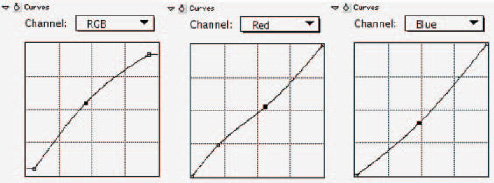
![]() CURVES
CURVES
The Curves effect makes adjustments similar to Levels, but instead of being limited to three slider controls, the Curves graph can handle up to 16 control points. These points isolate an adjustment to a more narrow range of values. The lower-left portion of the graph adjusts dark levels. The upper-right portion adjusts white levels. With practice, you can use this effect in very powerful ways, especially when correcting images with too much contrast.
1. Load the 03_Curves composition, located in the Tutorials folder.
2. In the Timeline window, select the Sunset.mov layer.
3. Choose Effect>Adjust>Curves.
4. With RGB chosen in the pop-up menu in the Curves property, raise the black point slightly and lower the white point slightly.
5. Click and drag midway down the line to add a control point and adjust the midtones.
6. Select Red from the Channel pop-up menu and add control points to adjust the hue. If necessary, click and drag a control point off the graph to delete it.
7. Select Blue from the Channel pop-up menu. Click and drag a midpoint control point to adjust the hue.
8. To see a final correction, refer to the 03_Curves_final composition located in the Final folder.

12 » LEVELS EFFECT ADJUSTMENTS MADE TO EXTERIORCU.MOV

13 » LOOK AT THE INFO WINDOW (WINDOW>INFO) TO MONITOR RGB LEVELS.
14 » CURVES ADJUSTMENT APPLIED TO LEISURE2.MOV. ALTHOUGH KEYFRAMES CAN BE ADDED, IT’S NOT RECOMMENDED BECAUSE UNDESIRABLE ARTIFACTS MAY BE INTRODUCED
9. For additional practice, color-correct leisure2.mov in the 03_Curves composition. Use the 03_Curves_final composition as a reference. (SEE FIGURE 14.)
![]() HUE/SATURATION AND COLOR BALANCE
HUE/SATURATION AND COLOR BALANCE
This effect modifies the hue, saturation, and lightness of a specified color range within an image. By checking the Colorize checkbox, this effect transforms into a tint effect. Similarly, the Color Balance effect has a simple interface for adjusting the amount of red, green, and blue. It can isolate just shadows, midtones, or highlights separately. Both effects easily adjust background textures and simple color elements.
1. Load the 04_HueSaturation composition located in the Tutorials folder. Background1.mov is over saturated.
2. Apply the Hue/Saturation effect to background1.mov.
3. Select Reds from the Channel Control pop-up menu.
4. Drag the two squares in the middle closer together to narrow the adjustment range. Drag the triangles closer together to lower feathering.

15 » BEFORE THE CURVE ADJUSTMENT.

16 » AFTER THE CURVE ADJUSTMENT.

17 » BEFORE THE HUE/SATURATION ADJUSTMENT.

18 » AFTER THE HUE/SATURATION ADJUSTMENT>

19 » HUE/SATURATION EFFECT APPLIED TO BACKGROUND1.MOV

20 » PHOTO FILTER APPLIED TO THE EXTCU_CORRECT LAYER
5. Lower the red saturation by dragging the Red Saturation slider to the left.
6. Select Blues from the Channel Control pop-up menu. Lower the saturation and raise the lightness.
7. Select Magentas from the Channel Control pop-up menu and drag the Magenta Saturation slider to the left slightly.
8. Refer to 04_HueSaturation_final to see a final correction.
9. For additional practice, add the Hue/Saturation effect to background2.mov in the 04_HueSaturation composition. Use the 04_HueSaturation_final composition as a reference. (SEE FIGURE 19.)
![]() PHOTO FILTER EFFECT
PHOTO FILTER EFFECT
Introduced in version 6.5, this effect simulates a tinted filter being placed in front of a camera’s lens for color style and balance purposes. The Photo Filter effect’s Filter menu contains a variety of hue presets. It’s possible to choose a custom color, too. The Density slider controls the amount of change.
1. Load the 05_PhotoFilter composition located in the Tutorials folder. This composition contains the clips corrected in the Levels tutorial. The photo filter effect can warm up the ExtCU_correct layer’s color temperature.
2. Select the ExtCU_correct layer and choose Effect>Photo Filter.
3. Select Warming Filter (81) from the Filter pop-up menu and adjust the density to taste.
4. Refer to the 05_PhotoFilter_final composition to view a final correction.
5. Experiment with additional filters and densities. For additional practice, apply the Photo Filter effect to the Ext_still_correct layer. (SEE FIGURE 20.)

21 » BEFORE THE PHOTO FILTER EFFECT.

22 » AFTER THE PHOTO FILTER EFFECT
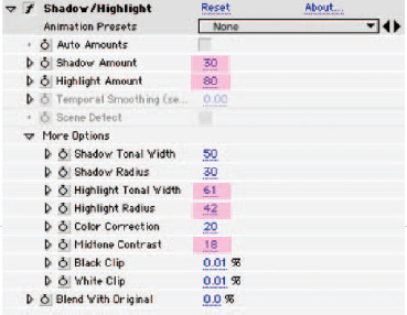
This effect is a strong addition to version 6.5, and goes beyond the controls of Levels because it lightens and darkens regions based on surrounding pixel values. The default settings automatically adjust poorly backlit footage. The manual controls bring back detail lost in dark and light regions.
1. Load the 06ShadowHighlight composition, located in the Tutorials folder.
2. In the Timeline, select the Santiago2.tif layer. The Shadow/Highlight effect can bring back the lost details of the mountains and enhance the texture of the trees.
3. Choose Effect>Adjust>Shadow/Highlight.
4. Deselect the Auto Amounts checkbox.
5. Lower Shadow Amount to about 30.
6. Raise Highlight Amount to about 80.
7. Click the More Options triangle.
8. Increase the Highlight Tonal Width, Highlight Radius, and Mid-tone Contrast to bring out the detail of the mountains without introducing undesirable artifacts.
9. Refer to 06_ShadowHighlight_final to see a final correction.
10. For additional practice, add the Shadow/Highlight effect to volcano1.tif in the 06_ShadowHighlight composition. Use the 06_ShadowHighlight_final composition as a reference. (SEE FIGURE 23.)
23 » THE SHADOW/HIGHLIGHT FILTER RESCUES SANTIAGO2.TIF.

24 » BEFORE THE SHADOW/HIGHLIGHT EFFECT.

25 » AFTER THE SHADOW/HIGHLIGHT EFFECT.

26 » SYNTHETIC APERTURE’S COLOR FINESSE USER INTERFACE. WARNING: THIS IS A POWERFUL PLUG-IN, SO REFER TO THE MANUAL FOR FURTHER GUIDANCE.
![]() PRO EFFECTS
PRO EFFECTS
The Pro edition of After Effects includes two additional corrective filters: Color Stabilizer (bundled) and Color Finesse (separate installation). Go to www.synthetic-ap.com to download a demo version of Color Finesse to try out in the standard edition of After Effects.
![]() Color Finesse
Color Finesse
Color-correction between tabs in Color Finesse is cumulative, and each parameter is processed in a specific order. Although the tutorials in this chapter use just one tab at a time, many corrections will incorporate multiple tabs. (SEE FIGURE 26.)
Here’s the processing order:
1. Levels pane, Input section
2. HSL pane, Controls pane, Master pane, Highlights pane, Midtones pane, Shadows pane
3. HSL pane, Hue Offsets pane
4. Curves pane
5. Levels pane, output section
6. Secondary pane
7. Limiting pane
[Note: Color Finesse uses a 32-bit floating-point color space, producing higher-quality output than 8-bit or 16-bit color spaces.]
![]() SETUP
SETUP
The color space of the source video’s NLE determines Color Finesse’s preference setup. The settings should match the source video’s color space (RGB or 601). To apply Color Finesse and set the preferences:

1. Select a layer, and choose Effect>Synthetic Aperture>SA Color Finesse.
2. Click the Setup button in the Effect Controls window. This launches the user interface (UI).
3. Choose SA Color Finesse UI>Preferences.
4. Activate the Video System tab. Set Video Coding levels to match color space of source footage.
5. If necessary, check the “Black has 7.5% Setup” checkbox.
6. Click OK. (SEE FIGURE 28.)
[Note: If the source footage was captured with a RGB codec, set Processing to 0-255. If footage captured with 601 color levels, for example, Avid QT codec, set Processing to 16-235.] (SEE FIGURE 29.)
![]() THE TOOLS
THE TOOLS
The following tutorials demonstrate how several tools perform the primary stages of color correction.
Example 1: Levels
This pane resembles the standard Levels effect, except with two histograms: Input on the left and Output on the right. Input adjustments define white, black, and gamma points. The Output controls work the same but display a histogram reflecting adjustments made in the other tabs, except for Secondary and Limiting. Levels is useful for expanding the tonal range of low-contrast footage. (SEE FIGURE 31.)
1. Launch After Effects and open the ColorCorrect project if it’s not currently open.
2. Load the 07_ColorFinesse_Levels composition, located in the Tutorials folder.

28 » COLOR FINESSE PREFERENCES. THE VIDEO CODING SETTINGS AFFECT HOW IMAGES APPEAR IN THE VIDEO SCOPES LOCATED IN THE ANALYSIS WINDOW.

29 » COLOR FINESSE’ ANALYSIS WINDOW, WHICH DISPLAYS SCOPES WITH REALTIME UPDATE.

30 » AFTER COLOR FINESSE LEVELS ADJUSTED.
1. In the Timeline window, select the ExteriorCU.mov layer. Let’s adjust the tonal range and remove the color cast.
2. Choose Effect>Synthetic Aperture>SA Color Finesse.
3. Click the Setup button in the Effect Controls window to launch the UI.
4. Click the Luma WFM pane in the Analysis window.
5. In the Settings window, click the Levels pane and then click the Master pane.
6. On the Input histogram, drag the black triangle (far left) to the right. Drag the White triangle (far right) to the left. Nudge the Gamma triangle (middle) slightly to the right.
7. Click the Vectorscope pane in the Analysis window. Blacks, whites, and gray should appear in the center of the vectorscope, not toward green and yellow.
8. To neutralize the greenish yellow color cast, click the Green pane in the Levels pane.
9. Drag the black triangle to the right and the gamma to the right.
10. Click the Blue pane and drag the gamma to the left.
11. Click the Red pane. Drag the white triangle to the left and nudge the gamma triangle to the right.

31 » COLOR FINESSE LEVELS PANE. MOST ADJUSTMENTS ARE MADE ON THE INPUT SIDE.
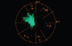
32 » VECTORSCOPE DISPLAYS A YELLOW-GREEN COLOR CAST.
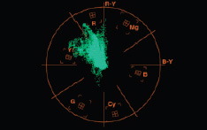
33 » VECTORSCOPE DISPLAY AFTER THE YELLOW-GREEN COLOR CAST IS NEUTRALIZED.

34 » VECTORSCOPE DISPLAYS A YELLOW-GREEN COLOR CAST.

35 » COLOR FINESSE’S COLOR INFO WINDOW
12. To see a final correction, refer to 02_Levels_final composition located in the Final folder.
13. Color-correct the Exterior_still.tif image in the 07_ColorFinesse_Levels composition. Use the 07_ColorFinesse_Levels_final composition as a reference. (SEE FIGURES 32-35.)
[Hint: To trouble shoot a color cast, use the eyedropper to sample the color value for the whites and darks.]
Example 2: Curves
Curves works similarly to the standard Curves effect, only it’s easier to control. Any one of the four graphs can use up to 16 control points to narrow the range of values being adjusted. The Match Color feature is also available as a way to establish a base correction for problematic footage. (SEE FIGURE 38.)
1. Load the 08_ColorFinesse_Curves composition located in the Tutorials folder.
2. In the Timeline window, select the leisure2.mov layer. This clip is too dark and has a red color cast.
3. Choose Effect>Synthetic Aperture>SA Color Finesse.

36 » BEFORE COLOR FINESSE CURVES ADJUSTED.

37 » AFTER COLOR FINESSE CURVES ADJUSTED.

38 » 08_COLORFINESSE_CURVES_FINAL
39 » COLOR FINESSE’S REF GALLERY IS LOCATED IN THE ANALYSIS WINDOW.
4. Click the Setup button in the Effect Controls window, and click the Luma WFM pane in the Analysis window.
5. Click the Curves pane in the Settings window.
6. Adjust the tonal range first. In the Master graph, drag the existing black white point (upper right) to the left. Add a control point by clicking the line, and drag to make a gamma adjustment.
7. Add additional control points to isolate the shadows or highlights.
8. Click the Vectorscope pane in the Analysis window.
Note: When adjusting the skin tones, the display should move so it’s positioned on the I line (the line between yellow and red).
9. To remove the red color cast, adjust the red, green, and blue graphs as shown.
10. (Optional) Use the Match Color feature to establish a base skin tone correction.
Create a reference shot by selecting a shot from the Ref Gallery pane in the Analysis window. Click the Reference tab in the Image window. In the Curves pane, click the eyedropper above the lower color swatches and sample the replacement color. Click the eyedropper above the top color swatches and sample the color to be replaced. Click the Match Color button. Tweak the graphs. (SEE FIGURES 39-41.)
Example 3: HSL
This toolset resembles a traditional color-correction tool palette. It contains two panes: Controls for tonal range adjustments and hue offsets for correcting color casts. The HSL pane works well when neutralizing skin tone color.
1. Load the 09_ColorFinesse_HSL composition located in the Tutorials folder.
2. In the Timeline window, select the Interview_MS.mov layer.

40 » COLOR FINESSE’S COLOR MATCHING CONTROL. THIS CONTROL CANNOT BE USED IN SOME PARAMETER PANES.

41 » HISTOGRAMS AND RGB WFM.
TIP // When color correcting in Color Finesse, switch to the RGB WFM pane and the Histograms pane to troubleshoot and monitor the color-correction process.
3. Choose Effect>Synthetic Aperture>SA Color Finesse.
4. Click the Setup button in the Effect Controls window, and click the Luma WFM pane in the Analysis window.
5. In the Settings window, click HSL pane, then the Controls pane, and finally the Master pane.
6. Drag the RGB Gain slider to the right.
7. Click the Shadows tab. Drag the Gamma slider to the left.
8. Click the Highlights pane. Drag the Brightness slider to the left.
9. Click the Vectorscope pane in the Analysis window.
10. In the Settings window, click the Hue Offsets pane. Adjust the shadows, highlights, and then gamma by dragging the central black square of each wheel. For better control, hold the Shift key to make smaller adjustments. (SEE FIGURE 44.)
[Note: Color Finesse has several other adjustment tabs with sliders. See the manual for more information. The Secondary and Limiter panes are covered later.]
![]() COLOR STABILIZER:
COLOR STABILIZER:
This Pro filter compensates for color variation over time due to lighting shifts or film flicker. A region is selected from a reference (pivot) frame. The remaining frames of the image are then adjusted according to the criteria assigned to the pivot frame.

42 » BEFORE COLOR FINESSE HSL ADJUSTMENTS.

43 » AFTER COLOR FINESSE HSL ADJUSTMENTS.

44 » 09_COLORFINESSE_HSL_FINA>

45 » 11_BLENDMODES_FINAL TIMELINE STRUCTURE
![]() AUTO FILTERS
AUTO FILTERS
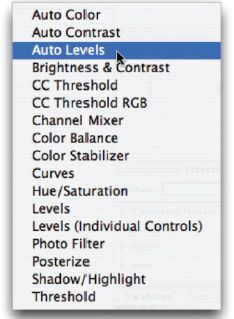
After Effects 6.5 includes three additional Photoshop adjustment filters: Auto Color, Auto Contrast, and Auto Levels. These can introduce undesirable results and may need some additional adjustments, which is why they’re covered here. The auto filters should be reserved for projects due yesterday. To apply them, choose Effect>Adjust.
Auto Color: Manipulates a clip’s contrast and color after analyzing its shadows, midtones, and highlights. Clicking the Snap Neutral Midtones checkbox attempts to neutralize a color cast.
Auto Contrast: Affects a clip’s contrast by remapping its lightest point to white and its darkest point to black, without removing or generating a color cast.
Auto Levels: Remaps an image’s lightest and darkest point for each color channel to white and black. This is similar to Auto Contrast except it may introduce or remove a color cast.
![]() BLENDING COLOR CORRECTION
BLENDING COLOR CORRECTION
Up to this point, this chapter has focused on the first stage of color correction. Once this primary correction is complete, the tools added to the toolbox can work in conjunction with other After Effects features to make further adjustments or create specific styles. The following tutorial steps through creating a soft film look to match an image shot with a camera using a diffuse filter.
1. Open the 11_BlendModes composition in the Tutorials folder.
2. Perform a primary color correction on interview2, using any of the effects discussed in this chapter. Be sure to adjust tonal range and neutralize the red color cast.
3. Click the interview2 layer in the Timeline and choose Edit>Duplicate. Rename the clips if desired.
4. Select layer 3. Choose Effect>Blur & Sharpen>Fast Blur. Raise the blur amount to about 30.
5. Click the Switches/Modes button at the bottom of the Timeline. Select Screen from the Mode menu on layer 2.
6. Adjust the blur and color filter on layer 3 until the shot matches interview 1. Alternatively, choose Layer>New>Adjustment Layer to provide greater flexibility in tweaking the effect.
7. Refer to 11_BlendModes_final to explore the completed effect. (SEE FIGURE 45.)

46 » 13_COLORFINESSE_SPOT_FINA>
![]() SHOT-TO-SHOT CONSISTENCY
SHOT-TO-SHOT CONSISTENCY
The Blend Modes tutorial is an example of shot-to-shot consistency. In this stage it’s important to select one element or clip to serve as a benchmark or reference for correcting surrounding elements. If the reference shot changes, this stage may need to be redone. Any filter covered in this chapter can be used during this stage.
![]() SECONDARY CORRECTION
SECONDARY CORRECTION
Spot correction involves isolating a specific color of a shot and altering its hue or saturation or both. This technique can be used during stage 4 (create a style) or during an earlier stage when troubleshooting particularly challenging footage. Spot correction can be achieved by combining mattes and color correction filters, or it can be achieved through Synthetic Aperture’s Color Finesse, which is explored here.
1. Open 13_ColorFinesse_Spot composition in the Tutorials folder.
2. Choose Effect>Synthetic Aperture>SA Color Finesse. Perform a primary color correction on interview1.mov using the techniques highlighted in this chapter. Be sure to adjust tonal range and neutralize the red color cast.
3. In the Settings window, click the Secondary pane.
4. Let’s lower the sweater’s saturation. Select the eyedropper next to Sample 1 in pane A and sample the woman’s red sweater. To see the selection, drag the Hue slider until a color change is visible. Use the remaining three eyedroppers to add to the selection.
5. Select Alpha from the Preview pop-up menu. Adjust the Chroma Tolerance, Luma Tolerance, and Softness sliders until the sweater is essentially the only region selected.
6. When satisfied, Select Off from the Preview pop-up menu, make necessary tweaks, and set Hue to 0.

47 » BEFORE BLEND MODE ADJUSTMENTS.

48 » AFTER BLEND MODE ADJUSTMENTS.

49 » AFTER SPOT CORRECTION.
7. Adjust the Saturation, Gain, Gamma and Hue sliders until the red in the sweater is subdued.
8. Refer to 13_ColorFinesse_Spot_final to explore the completed effect.
9. For further practice apply the Secondary pane controls to the Exterior_still.tif.
[Note: The Secondary CC tab pane sliders are organized into three sections. The left side of the effect defines the input color (the color to change), and the middle and right side defines the output color (the color to change to).]
![]() FINAL CONFORM AND FINAL WORDS
FINAL CONFORM AND FINAL WORDS
Once the footage has been corrected and stylized, it’s important to make sure it complies with broadcast specifications. These specifications should be kept in mind throughout the compositing process. To ensure that a composition complies, place an auto correct filter on an adjustment layer. Choose Effect>Video>Broadcast Colors. Or you can apply Color Finesse and make adjustments in the Limiting pane.
[Note: The Broadcast Colors effect doesn’t support 16-bit color.]
This chapter can serve as a reference and quick guide to color-correction in After Effects. Several excellent books and articles dive deeper into the process. All these resources are great guides, but in the end time spent with the tools will help seamlessly integrate this workflow into your artwork. Building on each experience makes color correction easier.
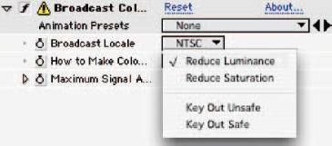
50 » BROADCAST COLORS EFFECT. USE IF THE PROJECT IS DUE YESTERDAY.
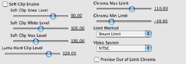
51 » COLOR FINESSE’S LIMITING PANE
ABOUT THE AUTHOR

Marianne is a freelance editor who frequently taps into After Effects’ color correction tools when constructing motion graphics. She’s also a certified instructor who teaches color correction courses. And as a speaker at such conferences as NAB’s Post Production World, she’s presented several sessions on color correction.
FURTHER READING
Photoshop CS for Nonlinear Editors
Final Cut Pro On the Spot
Photoshop Dream Team Volume One
Photoshop CS2 Killer Tips
Broadcast Graphics On the Spot
