5. Creating a Page Layout
This lesson should take 1 hour and 30 minutes to complete. Before beginning, make sure you have copied the files for Lesson 5 to your hard drive as described in the “Getting Started” section at the beginning of the book. If you are starting from scratch in this lesson, use the method described in the “Jumpstart” section of “Getting Started.”
Whether you use thumbnails and wireframes or just a vivid imagination, Dreamweaver can quickly turn design concepts into complete, standards-based CSS layouts.
Web design basics
Before you begin any web design project for yourself, or for a client, there are three important questions you need to answer first:
• What is the purpose of the website?
What is the purpose of the website?
Will the website sell or support a product or service? Is your site for entertainment or games? Will you provide information and/or news? Will you need a shopping cart or database? Do you need to accept credit card payments or electronic transfers? Knowing the purpose of the website tells you what type of content you’ll be developing and working with, and what types of technologies you’ll need to incorporate.
Who is the customer?
Are the customers adults, children, seniors, professionals, hobbyists, men, women, everyone? Knowing who your market will be is vital to overall design and functionality. A site intended for children probably needs more animation, interactivity, and bright engaging colors. Adults will want serious content and in-depth analysis. Seniors may need larger type and other accessibility enhancements.
A good first step is to check out the competition. Is there an existing website performing the same service or selling the same product? Are they successful? You don’t have to mimic others just because they’re doing the same thing. Look at Google and Yahoo. They perform the same basic service but their site designs couldn’t be more different from one another.
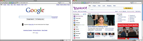
Can two sites be more different than Google and Yahoo? Yet they both perform the same service.
How do they get here?
This sounds like an odd question when speaking of the Internet. But, like a brick-and-mortar business, your online customers can come to you in a variety of different ways. For example, are they accessing your site on a desktop computer, laptop, PDA, or cell phone? Are they using high-speed Internet or dial-up service? What browser do they most like to use and what is the size and resolution of the display? These answers will tell you a lot about what kind of experience your customers will expect. Dial-up and cell phone users may not want to see a lot of graphics or video, while users with large flat panel displays and high-speed connections may demand as much bang and sizzle as you can send at them.
So, where do you get this information? Some you’ll have to get through painstaking research and demographic analysis. Some you’ll get from educated guesses based on your own tastes and understanding of your market. But, a lot of it is actually available on the Internet itself. The W3C, for one, keeps track of tons of statistics regarding access and usage, all updated regularly:
• www.w3schools.com/browsers/browsers_stats.asp: Provides more information about browser statistics.
• www.w3schools.com/browsers/browsers_os.asp: Gives the breakdown on operating systems.
• www.w3schools.com/browsers/browsers_display.asp: Lets you find out the latest information on screen resolutions.
If you are redesigning an existing site, your web hosting service itself may provide valuable statistics on historical traffic patterns and even the visitors themselves. If you host your own site, third-party tools are available, like Google Analytics and Adobe Omniture, which you can incorporate into your code to do the tracking for you for free, or for a small fee.
When you boil down all the statistics, this is what you will find: Windows (80 to 90%) dominates the Internet, with most users divided almost equally between Firefox (46%) and various versions of Internet Explorer (37%). The current average browser resolution is set at 1024 pixels by 768 pixels, or higher. If it weren’t for cell phones and PDAs, these statistics would be great news for most web designers and developers. But the truth is the scope and penetration of cell phone usage on the Internet is an unknown quantity.
Each day more people are using cell phones to access the Internet. Younger users may use them to access the Internet more frequently than they use desktop computers. This presents a nagging problem to web designers. For one thing, cell phone screens are a fraction of the size of even the smallest flat panel display. How do you cram a two- or three-column page design into meager 200 to 300 pixels? Another problem is that only the high-end smart phones can run web-based Flash content and some other client-based applications available today. Keep this in mind as you go through the process of designing your site.

Many of the concepts of print design are not applicable to the web because you are not in control of the user’s experience. A page carefully designed for a typical flat panel is basically useless on a cell phone.
Scenario
For the purposes of this book you have been working on a website for Meridien GreenStart, a fictitious community-based organization dedicated to green investment and action. This website will offer a variety of different products and services and require a broad range of web page types, including dynamic pages using server-based technologies like ASP, ColdFusion, and PHP.
Your customers come from a broad demographic including all ages and education levels. They are people who are concerned about environmental conditions and who are dedicated to conservation, recycling, and reuse of natural and human resources.
Your marketing research indicates that most of your customers use desktop computers or laptops, connecting via high-speed Internet services, but that you can expect 10 to 20 percent of your visitors via cell phone and other mobile devices.
Working with thumbnails and wireframes
The next step after you have nailed down the answers to the three questions about the website purpose, customer, and access method, is to figure out how many pages you’ll need, what those pages will do, and finally, what they will look like.
Creating thumbnails
Many web designers start by drawing thumbnails with pencil and paper. Thumbnails are a graphical shopping list of the pages you need to create for the website. Thumbnails can also help you work out the website navigation. Draw lines between the thumbnails showing how your navigation will connect them.
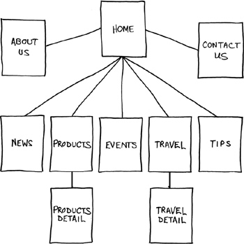
Thumbnails list the pages that need to be built and how they are connected to each other.
Most sites are divided into levels. The first level includes all the pages in your main navigation, the ones a visitor can reach directly from the home page. The second level includes pages you can only reach through specific actions or from specific locations, like a shopping cart or product detail page.
Creating a page design
Once you’ve figured out what your site needs in terms of pages, products, and services, you can then turn to what those pages will look like. Make a list of components you want on each page, such as headers and footers, navigation, and areas for the main content and sidebars, if any. Put aside any items that won’t be needed on every page. What other factors do you need to consider?

Identifying the essential components for each page helps in creating an effective page design that will meet your needs.
Do you have a company logo, business identity, graphic imagery, or color scheme you want to accent? Do you have publications, brochures, or advertising you want to emulate? It helps to gather them all together in one place so you can see everything all at once on a desk or conference table. If you’re lucky, a theme will rise organically from this collage.
Once you’ve created your checklist of the components you’ll need on each page, develop several rough layouts that work for these components. Most designers usually settle on one basic page design that compromises between flexibility and sizzle. Minimizing the number of page designs may sound like a major limitation, but it’s key to producing a professional-looking site. It’s the reason why some professionals, like doctors and airline pilots, wear uniforms. Using a consistent page design lends a sense of professionalism and confidence to your visitor.

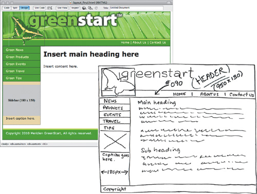
Wireframes allow you to experiment with page designs quickly and easily without wasting time with code.
While you figure out what your pages will look like, you’ll have to address the size and placement of the basic components. Where you put a component can drastically affect its impact and usefulness. In print, designers know that the upper-left corner of a layout is one of the “power positions,” a place where you want to locate important aspects of a design, such as a logo or title. This is because in western culture we read from left to right, top to bottom. The second power position is the lower-right corner because this is the last thing your eyes will see when you’re finished reading.
Unfortunately, in web design this theory doesn’t work so well because of one simple reason: You can never be certain how the user is seeing your design. Are they on a 20-inch flat panel or a 2-inch cell phone?
That means the only thing you can be certain of is that the user can see the upper-left corner of your page. Do you want to waste this position by slapping the company logo here? Or, make the site more useful by slipping in a navigation menu? This is one of the key dilemmas of the web designer. Do you go for design sizzle, workable utility, or something in between?
Creating wireframes
After you pick the winning design, wireframing is a fast way to work out the structure of each page in the site. A wireframe is like a thumbnail, but bigger, that sketches out each page and fills in more details about the components, such as actual link names and main headings. This step helps to catch or anticipate problems before you discover them when working in the code.
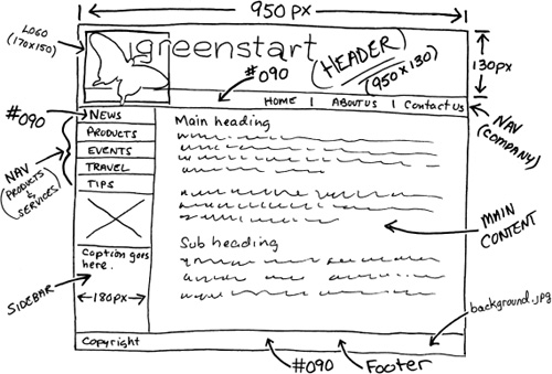
The wireframe for the final design should identify the components and feature markup for content, color, and dimensions.
Once the basic concepts are worked out, many designers take an extra step and create a full-size mockup or proof of concept using a program like Adobe Fireworks, Photoshop, or even Illustrator. It’s a handy thing to know because you’ll find that some clients just aren’t comfortable giving an approval based only on pencil sketches. The advantage here is that all these programs allow you to export the results to a full-size image (JPEG, GIF, or PNG) that can be viewed in a browser. Such mockups are as good as seeing the real thing but may take only a fraction of the time to produce.
Tip
For years designers have started the design process in Fireworks, where they can create a fully functional mockup with menus, links, and hotspots that can then be exported to a CSS-based HTML layout and edited in Dreamweaver.
In some cases, creating a mockup in Photoshop or Fireworks can save hours of tedious coding to receive a needed approval.
Previewing your completed file
To understand the layout you will work on in this lesson, preview the completed page in the browser.
1 Open Adobe Dreamweaver CS5.
2 If necessary, press F8 to open the Files panel, and select DW-CIB from the site list.
3 In the Files panel, expand the lesson05 folder.
4 Double-click layout_final.html to open it.

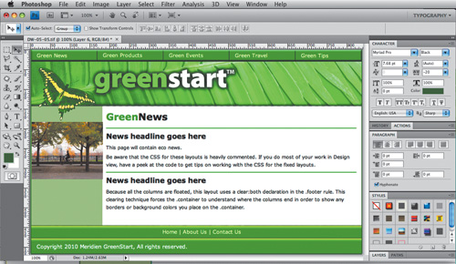
This page represents the layout you will create in this lesson. In some ways it is similar to the page you created in Lesson 4, “Getting a Quick Start,” but differs in that it has a left sidebar area and two navigation components.
5 Choose File > Close.
Modifying an existing CSS layout
The predefined CSS layouts provided by Dreamweaver are always a good starting point. They are easy to modify and adaptable to most projects. Using a Dreamweaver CSS layout, you will create a proof-of-concept page to match the final wireframe design. This page will then be used to create the main project template in subsequent lessons. Let’s find the layout that best matches the wireframe:
1 Choose File > New.
2 Choose Blank Page > HTML in the New Page dialog box. Examine each of the 16 sample CSS layouts to find the one that best fits the needs.
The layout 2 column fixed, left sidebar, header and footer has the most in common with the target design.

3 Select 2 column fixed, left sidebar, header and footer from the layout list. Click Open/Create.
4 Switch to Design view, if necessary. Click in each content area, and using the tag selector display at the bottom of the document window, note the structure of the page components. Don’t be afraid of using Code view, if you desire.

Using the skills you have learned in the last few lessons you should be able to deconstruct this CSS layout easily. The page consists of four content <div> elements (header, footer, sidebar1, and content) and one <div> that wraps around all the others (container). To understand exactly how much this design depends on CSS, it’s sometimes a good idea to shut off CSS styling.
5 Choose View > Style Rendering > Display Styles to shut off CSS styling.
Style display is typically on by default (showing a check mark in the menu). By selecting it you’ll toggle CSS styling off temporarily.
6 Note the identity and order of each page component.
Without CSS, the HTML skeleton is exposed for all to see. It’s instructive to know what the page will look like if somehow the cascading style sheet is disabled or not supported by a particular browser. Now it’s easier to identify the page components and their structure.
In fact, the order of elements is an important facet of how CSS styling and positioning works (and sometimes doesn’t work). Although it is not strictly required, items that display higher on the page, like the header, usually are inserted before other elements that appear lower; items that align to the left should be inserted before elements aligned to the right. Therefore, the order of the elements in this layout—header, sidebar1, content, and footer—conforms to CSS best practices. The div.container holds all the other elements together and helps to make them behave properly in different browsers.
One last important aspect you should notice is the navigation menu. Without the CSS styling, the navigation menu reverted back to a simple bulleted list with hyperlinks. A few years ago this menu would have been built with images and complex rollover animation. When those menus broke, for whatever reason, they usually became a jumbled unusable mess. Although the hyperlinks continued to work, without the images there were no words to tell the user what they were clicking. In this case, even without styling, these hyperlinks will always be usable.
7 Choose View > Style Rendering > Display Styles to turn on CSS styling again.
It’s a good idea to get into the habit of saving files before you modify any settings or add content. Dreamweaver doesn’t offer a backup or recovered-file feature; if it crashes before you save, all your work in any open, unsaved file will be lost.
8 Choose File > Save. In the Save As dialog box, navigate to the site root folder, if necessary. Name the file mylayout.html and click Save.
Dreamweaver normally saves HTML files to the default folder specified in the site definition, but it’s a good idea to double-check the destination to make sure your files end up in the right place. All HTML pages created for the final site will be saved in the site root folder.
Adding a background image to the header
The final design features a banner similar to the one used in the previous lesson. You could insert the banner directly into the header, but adding it as a background image has the advantage of leaving the <div> open for other content.
1 Choose Window > CSS Styles to display the CSS Styles panel, if necessary.
2 Select the image placeholder Insert_logo (180×90) in the header. Press Delete.
The empty header will collapse to a fraction of its former size after deleting the image placeholder because it has no CSS height specification.
3 Double-click the .header rule to edit it.
4 In the Background category of the “CSS Rule Definition for .header” dialog box, click the Browse button next to the Background-image field.
5 Select banner2.jpg and note the dimensions of the image. Click OK/Choose.

Note that this banner doesn’t feature the extra white space at the bottom or the butterfly as did the one used in Lesson 4. The new banner will better accommodate the horizontal navigation menu shown in the wireframe design. Eliminating the white portion also protects the overall page appearance in case something causes the header to expand in height exposing that part of the image. However, you’re not totally out of the woods; remember that background images repeat both vertically and horizontally by default. To ensure this setting doesn’t cause any undesirable effects, you’ll need to change the repeat behavior.
6 Choose no-repeat from the Background-repeat menu.
7 Click Apply to view the results.

The header is wide enough but not tall enough to display the entire background image. Since background images aren’t truly inserted in an element, they have no effect on the size of a container, good or bad. To ensure the <div> is large enough to display the entire image, you need to add a height specification to the .header rule.
8 In the Box category, type 130 in the Height field and choose px from the Unit of measurement menu. Click Apply.
There’s no point setting the width attribute here. You learned in Lesson 4 the width of the layout in that example is specified in the .container rule. Chances are the same is true in this layout, too.
Before clicking OK, let’s add some finishing touches to the header.
9 In the Background category, type #090 in the Background-color field. Click OK.
It’s important to start anticipating what would happen if things go wrong, say for example if the background image doesn’t display. The green specified is part of the site color scheme and will be used throughout the website.
10 Choose File > Save.
Inserting new <div> components
The wireframe design shows two new <div> elements added to the default layout. The first contains the butterfly image, the second the horizontal navigation bar. Did you notice how the butterfly actually overlaps both the header and the horizontal navigation bar? There are several ways to achieve this effect. In this case, an absolutely positioned <div> will work nicely.
1 Insert the cursor into the header, if necessary. Select the <div.header> tag selector. Press the Left Arrow key.

Note
To better understand how this technique works, try this step in Split view.
This procedure should insert the cursor before the opening <div> tag for the header. If you had pressed the Right Arrow key, the cursor would move outside the closing </div> tag for the header instead. Remember this technique—you’ll use it frequently in Dreamweaver when you want to insert the cursor in a specific location before or after a code element without resorting to Code view.
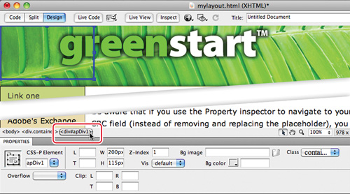
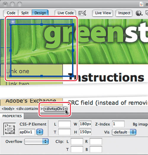
2 Choose Insert > Layout Objects > AP Div.
An AP div will appear at the top left of the header. Note the id (#1pDiv1) assigned to the new div in the tag selector. A corresponding rule has been added to the CSS Styles panel.
In previous versions of HTML, an AP div would have been assigned its size and position using inline HTML attributes. In a concession to new CSS-based web standards, these specifications are applied by CSS via a unique id created by Dreamweaver at the moment you insert the element.
Note
In previous versions of Dreamweaver, values entered in the Property inspector were added as inline HTML attributes. In CS5, most of these values will be added as custom CSS markup.
3 Click the <div#apDiv1> tag selector.
The Property inspector displays the properties for <div#apDiv1>. Note the width and height specifications displayed in the Property inspector. These values are actually stored in the #apDiv1 rule generated by Dreamweaver.
4 Insert the cursor into <div#apDiv1>.
5 Choose Insert > Image. Select butterfly-ovr.gif from the images folder. Observe the dimensions of the image: 170 pixels by 150 pixels.
6 Click OK/Choose.
The Image Tag Accessibility Attributes dialog box appears.
7 Type GreenStart Logo in the Alternate text field in the Image Tag Accessibility Attributes dialog box. Click OK.
You’ll notice that the AP div is slightly wider than the butterfly image. Although the extra space shouldn’t cause any trouble, it’s a good idea to match the dimensions of the container to the image.
Note
In most cases, an image that’s larger than its container will distort the container. Using images that are too large can destroy a carefully designed CSS layout. Pay close attention to the dimensions of images you use in your site.
8 Double-click the #apDiv1 rule in the CSS Styles panel.
The “CSS Rule definition for .container #apDiv1” dialog box appears.
9 In the Box category, type 170 in the Width field. Type 150 in the Height field.
The <div> dimensions now match the height and width of the image.
10 Deselect the Same For All checkboxes for Margins.
11 Type 15 px in the Top margin field. Type 30 px in the Left margin field. Click OK.
When the rule definition dialog box vanishes, <div#apDiv1> appears floating over the header, 15 pixels from the top and 30 pixels from the left.
An AP div acts like a free agent. It ignores the other page components and can even be positioned above or below other <div> elements and content.
The <div#apDiv1> is complete. Let’s create the <div> for the horizontal navigation bar.
12 Insert the cursor back into the header. Click the <div.header> tag selector. Press the Right Arrow key.
The cursor should now appear after the ending </div> tag of the header.
13 Choose Window > Insert, if the Insert panel is not visible. Choose Layout from the Category menu. Click Insert Div Tag.
The Insert Div Tag dialog box appears. Note that the Insert menu displays the selection “At insertion point”. The new <div> will be inserted into the code at that position and not wrap around any other elements.
14 Type h-navbar in the ID field. Click the New CSS Rule button.
The New CSS Rule dialog box appears with the ID #h-navbar automatically entered in the Selector Name field. Click OK.
15 In the Type category, type 90 in the Font-size field and select the percentage sign (%) from the pop-up list. Type #FFC in the Color field.
16 In the Background category, type #090 in the Background-color field. Click the Browse button next to the Background-image field.
17 Select background.jpg from the images folder. Click OK/Choose.
18 Choose repeat-x from the Background-repeat menu.
19 In the Block category, select Right from the Text-align field.
20 In the Box category, deselect the Same For All check box for Padding.
Type 5 px in the Top padding field.
Type 20 px in the Right padding field.
Type 5 px in the Bottom padding field.
21 In the Border category, enter the following values only in the Bottom border fields: solid, 2 px, #060. Click OK in the CSS Rule Definition dialog box. Click OK in the Insert Div Tag dialog box.
The <div#h-navbar> appears below the header fully formatted and filled with placeholder text.

Note
To enter values in the bottom field, remember to deselect the Same For All checkboxes in each section first.
22 Delete the placeholder text. Type Home | About Us | Contact Us in <div#h-navbar> as placeholders for the organizational navigation links. You will convert these to actual hyperlinks in Lesson 10, “Working with Navigation.”
23 Press Ctrl-S/Cmd-S to save the file.
Modifying the page width and background color
Before you convert this file into the project template, let’s tighten up the formatting and the placeholder content. As you did in the last lesson, the overall width has to be modified to match the banner image.
1 Double-click the .container rule in the CSS Styles panel.
2 In the Box category, change the width to 950 px. Click OK.
The <div.container> element now matches the width of the banner image, but you probably noticed there was an unintended consequence when you changed the overall width. The main content area shifted down below the sidebar. To understand what happened, you’ll have to do a quick investigation.
3 In the CSS Styles panel, click the .content rule and check its properties. Note its width: 780 pixels.
4 Click the .sidebar1 rule and check its width: 180 pixels.
Combined, the two <div> elements total 960 pixels. The elements are too wide to sit side by side in the main container. This type of error is common in web design and easily fixed.
5 Click the .content rule in the CSS Styles panel. In the Properties section of the panel, change the width to 770 px.
The <div.content> element moves back to its intended position. This was a good reminder that the size, placement, and specifications of page elements have important interactions that can affect the final design and display.
Let’s remove the page background color.
6 Double-click the body rule. In the Background category, change the Background-color to #FFF. Click OK.
Notice that the absence of the background color gives the impression that the page’s content area drifts off into the wide expanse. You could give <div.container> its own background color or simply add a border to give the page a definitive edge.
7 Double-click the .container rule. In the Border category, select the Same For All option and enter the following values for all border fields: solid, 2px, and #060. Click OK.
8 Save the file.
Modifying existing content and formatting
As you can see, the CSS layout is already equipped with a vertical navigation menu. The generic hyperlinks are simply placeholders, waiting for your final content. Let’s change the placeholder text in the menu to match the pages outlined in the thumbnails and modify the colors to match the site color scheme.
1 Select the placeholder text Link one in the first menu button.
Type Green News.
Change Link two to read Green Products.
Change Link three to read Green Events.
Change Link four to read Green Travel.
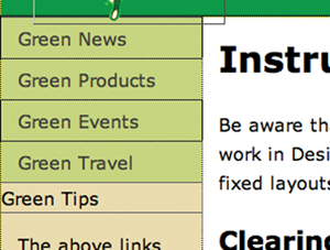
One of the advantages of using bulleted lists as navigational menus is that it’s easy to insert new links.
2 With the cursor still at the end of the words Green Travel, press Enter/Return. Type Green Tips.
The new text appears in what looks like a button structure, but the background color doesn’t match and the text isn’t aligned with other menu items. You could probably figure out what’s wrong in Design view, but in this case, the problem may be identified faster in Code view.
3 With the cursor still inserted in the menu, select Code view. Observe the menu items and compare the first four with the last. Can you see the difference?

The difference is obvious in Code view. The last item is formatted with the <li> element like the others—as part of the bulleted list—but it doesn’t feature the <a href="#"> code that’s used as a hyperlink placeholder. For Green Tips to look like the other menu items, you have to add a hyperlink, or at least a similar placeholder.
4 Select the text Green Tips. In the Link field of the HTML Property inspector, type # and press Enter/Return.
The code in all the items is identical now.
5 Select Design view.
All the menu items are identically formatted now. You’ll learn more about how to format text with CSS to create a menu in Lesson 6, “Working with Cascading Style Sheets.”
The current menu color doesn’t match the site color scheme. To change the color, you’ll have to do some investigative work to find which CSS rule controls this formatting. This is a good time to learn how to use the Code Navigator.
6 Insert the cursor into any of the menu items.
After a few seconds the Code Navigator ( ) icon will appear.
7 Click the Code Navigator icon.
A small window opens displaying a list of 11 CSS rules that affect the targeted element. The list is in order of specificity, with the most powerful rule at the bottom. In some cases, the rules listed may only affect the element in a roundabout way, as in the body rule, which affects all HTML elements on the page.
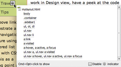
8 Move the cursor over the first CSS rule in the list. Observe the formats displayed.
Another window appears listing all the formats specified in the selected rule. You’re looking for a background color that’s applied to the menu items. Be careful. There’s probably more than one background-color in the listed rules, so if you find one, it’s important to determine whether it actually affects the menu or something else.
9 Examine each rule until you find the pertinent one.
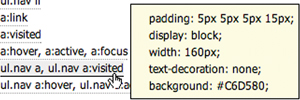
The .sidebar1 rule specifies a background-color, but it affects the <div> and not the menu. The one you’re actually looking for is applied by the rule: ul.nav a, ul.nav a:visited. This rule specifies a background-color for a <ul> (unordered list) element with a class attribute of nav that contains an <a> (hyperlink) element. Sound right?
10 Locate the rule ul.nav a, ul.nav a:visited in the CSS Styles panel and select it. In the Properties section of the panel, change the existing background-color to #090.
The color of the menu items now matches <div#h-navbar>. The black text is difficult to read in the green background color. You can use the Properties section of the CSS Styles panel to add as well as edit element properties.
11 Click the Add Property link in the Properties section of the CSS Styles panel.
A new property field appears.

12 Choose Color from the Property field menu. Enter #FFC in the Value field. Press Enter/Return to complete the new rule property.
13 Save the file.
Inserting an image placeholder
The sidebar will feature photos, captions, and short blurbs on environmental topics. Let’s insert a placeholder image and caption below the vertical menu.
1 Insert the cursor into the text directly below the vertical menu. Click the <p> tag selector.
The placeholder image should not be inserted within the <p> element. If it were, it would inherit any margins, padding, and other formatting applied to the paragraph, which could cause it to break the layout.
2 Press the Left Arrow key.
The cursor is moved to the left of the opening <p> tag.
Tip
Use Split view whenever you’re unsure where the cursor is inserted.
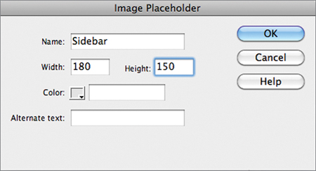
3 Choose Insert > Image Objects > Image Placeholder.
The Image Placeholder dialog box appears.
4 In the Image Placeholder dialog box, type Sidebar in the Name field.
Type 180 in the Width field.
Type 150 in the Height field.
Click OK.
An image placeholder appears in <div.sidebar1> below the vertical menu.
5 Select all the text below the image placeholder. Type Insert caption here.
The caption placeholder replaces the text.
6 Press Ctrl-S/Cmd-S to save.
Inserting placeholder text
Let’s simplify the layout by replacing the existing headings and text in the main content area.
1 Double-click to select the heading Instructions. Type Insert main heading here to replace the text.
2 Select the remaining text in <div.content>. Type Insert content here to replace the text.
3 Press Ctrl-S/Cmd-S to save.
Modifying the footer
You need to reformat the footer and insert the copyright information.
1 Double-click the .footer rule in the CSS Styles panel.
2 In the Type category, enter 90% in the Type-size field and #FFC in the Color field.
3 In the Background category, click the browse icon and insert images/background.jpg in the Background-image field.
4 Click OK/Choose.
5 Choose repeat-x from Background-repeat field menu.
6 Type #090 into the Background-color field. Click OK.
7 Select the placeholder text in the footer. Type Copyright 2010 Meridien GreenStart, All rights reserved.
8 Press Ctrl-S/Cmd-S to save.
The basic page layout is complete.
Checking browser compatibility
The CSS layouts included with Dreamweaver have been thoroughly tested to work flawlessly in all major browsers. However, during the lesson you made major modifications to the original layout. These changes could have ramifications in the compatibility of the code in certain browsers. Before you use this page as your project template, you should check its compatibility.
1 If necessary, open layout.html in Dreamweaver.
2 Choose File > Check Page > Browser Compatibility.
When the Report box opens, there should be no issues listed.
3 To close the report, double-click the Browser Compatibility tab in the Report panel or right-click the tab and choose Close Tab Group from the context menu.
Congratulations. You created a workable basic page layout for your project template and learned how to insert additional components, image placeholders, text, and headings; adjust CSS formatting; and check for browser compatibility.
Review questions
1 What three questions should you ask about any web design project?
2 What is the purpose of using thumbnails and wireframes?
3 What is the advantage of inserting the banner as a background image?
4 How can you insert the cursor before or after an element without using Code view?
5 How does the Code Navigator assist in designing your website layout?
Review answers
1 What is the purpose of the website? Who is the customer? How did they get here? These questions, and their answers, are essential in helping you develop the design, content, and strategy of your site.
2 Thumbnails and wireframes are quick techniques for roughing out the design and structure of your site without having to waste lots of time coding sample pages.
3 By inserting the banner or other large graphics as a background image, you leave the container free for other content.
4 Select an element using its tag selector and press the Left or Right Arrow key to move the cursor before or after the selected element.
5 The Code Navigator serves the role of a CSS detective. It allows you to investigate what CSS rules are formatting a selected element and how they are applied.