4. Working with Shapes and Graphics
What You’ll Do
Understand Vector and Bitmap Graphics
Examine Import Graphic Formats
Use Smart Guides with Elements
Change Element Overflow and Opacity
Change Element Position and Size
Change Shape Borders and Corners
Rotate, Skew, and Scale Elements
Introduction
Edge Animate offers several tools for creating and editing shapes. When you draw in Edge Animate, you create vector art. Vectors are mathematical descriptions of lines and points that, when connected, form shapes. Vector-defined art is not limited by resolution like bitmaps are, so they can be scaled to any size without a loss in quality or increase in file size.
Included in Edge Animate are the main vector drawing tools—Rectangle, Rounded Rectangle and Ellipse—you need to create squares, rectangles, ovals, and circles. Vector shapes are fully editable after they are created so you can continue to adjust their properties. When you select a shape or graphic image on the Stage, the Properties panel displays the attributes of that element that are modifiable, such as name, position, size, border, shadow, opacity (transparency), and color.
In addition to the vector drawing tools that allow you to create animations in Edge Animate, you can also import graphic images in other formats. Edge Animate provides support for PNG, JPG/JPEG, and GIF files—bitmapped graphics—as well as SVG files—vector graphics. Edge Animate drawing tools create and edit vector shapes, not pixels, so preparation is necessary for bitmap graphics in a paint application outside of Edge Animate, such as Adobe Photoshop or Fireworks. As for vector graphics, you can prepare them in Adobe Illustrator. An important thing to remember is that any bitmap used in your project can add considerable size to your Edge Animate animation, so it’s important to optimize and compress graphics as much as possible before importing them into Edge Animate.
Understanding Vector and Bitmap Graphics
Vector graphics—including SVG—are comprised of anchor points connected to each other by lines and curves called vectors. These anchor points and vectors describe the contour and surface of the artwork with some included information about color, opacity, and line width. Because they are general descriptions of the coordinates of a shape, they are resolution-independent; that is they can be resized without any loss to the quality of the artwork. Resolution represents the amount of information contained within a linear inch represented by a grid. The vector artwork is rendered or drawn on the screen at view time. Edge Animate’s native format is vector-based because it produces smaller file sizes.
Bitmapped, also known as raster, graphics—PNG, GIF, and JPG/JPEG files to name a few—are made up of small, colored squares called pixels that form a grid. Each pixel is given a specific color and a grid of these pixels forms a mosaic, which is your image. Because of this, bitmaps are dependent on resolution (the number of pixels in the grid). The size and quality of a bitmap depends on the number of pixels per inch. Images saved for onscreen display have a resolution of 72 pixels per inch because that’s what most monitors can handle, whereas images saved for print can require 300 pixels per inch or more. Resizing up or down forces pixels to be created or removed to accommodate the new grid size, which can result in a loss of image quality. Bitmaps must be rendered each time they change positions on the Stage, which can slow down playback; and bitmaps must store one bitmap image in each frame of an animation, which increases file size.
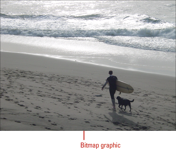

Both vectors and bitmaps have their strengths and weaknesses. Vector shapes are simple and graphic in nature. They are a good choice for creating high-contrast, geometric art or art with limited color shifts. Vectors take up less space than bitmaps. However, if you need to implement artwork with a richer surface texture, color depth, and shading, like those qualities found in a photograph, a bitmap better suits this purpose. The strength of Edge Animate as a content developer is that you can combine the
Gathering and Using Graphics
As you gather and import your files, you also need to know about some federal regulations regarding the use of graphics and accessibility issues for the public with disabilities.
Understanding Copyright Rules
U.S. copyright rules are in place to protect the creator of an image—whether it’s a photograph, illustration, drawing, painting or other type—from other people trying to profit from its use. Copyright rules cover ownership, the term the copyright applies, and how to register a copyright. A copyright is created when the image is first created, and the person who created the image or the person/organization that commissioned it in a contract places a copyright mark (©) on the image. For example, “Copyright © 2013 by Perspection, Inc.” However, it is very difficult to provide ownership unless the copyright is registered through the U.S. Copyright Office. To copyright an image, go to the electronic Copyright Office (eCO) section of the web site at www.copyright.gov.
For images that are sold but not commissioned, the person who created the image retains the copyright. A copyright expires 70 years after the death of the person who created the image, unless the image was commissioned. Public domain images are pictures for which the owner’s copyright has expired. Images created by the U.S. government are also considered public domain.
If you want to use an image, you need to get permission from the author or copyright holder. The U.S. Copyright Act provides for fines per use of a copyrighted image. If you take a photograph with people in it, you may need to get their permission to use it. If you are using their image for editorial purposes, you don’t need it. However, if you are using it to advertise, you do need it.
Understanding Section 508 Rules
You also need to be aware of accessibility issues. Section 508 refers to Section 508 of the Rehabilitation Act of 1973, as amended by the Workforce Investment Act of 1998. The law requires Federal agencies to purchase electronic and information technology that is accessible to employees and to the public with disabilities.
In response to Section 508, the World Wide Web Consortium (W3C) created Web Content Accessibility Guidelines (WCAG) that provide recommendations for making Web content more accessible. Following these guidelines will make Web content accessible to a wider range of people with disabilities, including blindness and low vision, deafness and hearing lost, speech disabilities, and combinations of these. You can view the latest guidelines at www.w3.org.
Examining Import Graphic Formats
In addition to the vector drawing tools that allow you to create shapes in Edge Animate, you can also import graphics in the following web friendly formats: PNG, GIF, JPG/JPEG, and SVG. A web friendly format is designed to help the image display well on the screen, load as quickly as possible, and be compatible with all major browsers on any operating system. PNG, GIF, and JPG/JPEG are bitmap graphic formats, while SVG is a vector graphic format.
PNG (Portable Network Graphic) is a bitmapped file format designed for use in 8-bit (like a GIF) or 24-bit (like a JPG/JPEG) images. It can store text with the image making it possible for search engines to gather information and offer subject searching. In addition, the PNG format adjusts the gamma of an image so that it appears the same on a Macintosh or Windows monitor. PNG is also the native file format in Adobe Fireworks. You can import Adobe Fireworks PNG files into Edge Animate as bitmap images. When you import a PNG file as a bitmap image, the file, including any vector data, is flattened, or rasterized, and converted to a bitmap.
GIF (Graphics Interchange Format) is a bitmapped file format designed for use with images that contain distinct colors, such as clip art, line drawings, or small text. The GIF format supports 8-bit color, and creates a graphic with a maximum of 256 colors (the fewer the colors, the smaller the file size). GIF images support transparency, where one or more colors can be set to transparent (100% opacity) to let the color on the underlying web page to show through.
JPG/JPEG (Joint Photographic Experts Group) is a bitmapped file format designed for use with images that contain a log of continuous tones, like photographs. The JPG/JPEG supports 24-bit color and creates a graphic with up to 16 million colors. JPG/JPEG images do not support transparency, and fill transparent areas of the image with a user-defined matte color.
SVG (Scalable Vector Graphics) is an XML-based file format designed for describing two-dimensional vector graphics. SVG graphics and their associated behaviors are defined in XML (Extensible Markup Language) text files. SVG can contain three types of objects: vector graphics, bitmap graphics (including PNG and JPG/JPEG), and text. You can save vector graphics in the SVG format in applications like Adobe Illustrator.
Compressing Graphics
The web can be slow to navigate and your visitors typically don’t have much patience. When you compress a graphic, you’re essentially removing information from the image to reduce its file size and speed up the loading time. The unfortunate result of that reduction is loss of image quality. Web friendly graphics are not always the best quality; however, reducing the file size is a necessary evil to keep visitors from clicking off your site and moving to another.
Some formats, such as PNG and GIF, use lossless compression, which allows the exact original data to be reconstructed from the compressed data when you open it. Other formats, such as JPG/JPEG use lossy compression, which allows for some original data to be lost and not be reconstructed, possibly affecting image quality. Therefore, it’s best when editing a JPG/JPEG image to save a copy without compression to retain the original data. The degree of compression can be adjusted, allowing for a tradeoff between size and image quality. You can specify this tradeoff in applications like Adobe Photoshop.
Importing Graphics
You can import graphics of several file types—including PNG, GIF, JPG/JPEG, and SVG—directly into Edge Animate to use in your animation. PNG, GIF, and JPG/JPEG are bitmap graphics while SVG is a vector graphic. Since vectors are based on mathematical descriptions of lines and points, file size and quality issues are typically not a problem. That’s not the case with bitmaps. If file size is an issue, it’s best to import your bitmaps in at the size you want. For example, if your bitmap image is going to be 160 pixels by 160 pixels, it’s best to import it at this size and not resize it up or down in Edge Animate; you will end up with higher-quality images and smaller files. Unlike vectors, resizing or scaling bitmaps reduces the quality of the image. If you need to scale a bitmap in Edge Animate, it’s a good idea to import the image at a slightly larger size, so when you scale it down, loss of quality is minimized. When you import a graphic, a copy is stored in a folder called images and linked to Edge Animate related-documents and added to the Library panel under Assets. In addition, the original filename of the graphic is used as the element ID, so you don’t have to rename it.
Import a Graphic
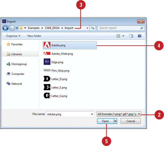
 Click the File menu, and then click Import.
Timesaver
Press Ctrl+I (Win) or  +I (Mac).
 Click the Show popup (Mac) or Files Of Types list arrow (Win), and then click All Formats or select the format of the file you want to import:
• PNG. Bitmap file format.
• GIF. Bitmap file format.
• JPG/JPEG. Bitmap file format.
• SVG. Vector file format.
 Navigate to the drive or folder where the file is located.
 Select the file you want to import.
• To import multiple files, hold down the (Mac) or Ctrl (Win) key and click additional files to select them.
 Click Open.
Edge Animate uses the original filename as the element ID.
Adding Graphics
In addition to importing graphics into a composition by using the Import command, you can also add graphics directly from your computer file system, either Windows Explorer (Win) or Finder (Mac), or the Library panel in Edge Animate to the Stage by using drag and drop. You can add graphics with the file types—including PNG, GIF, JPG/JPEG, and SVG—directly into Edge Animate to use in your animation. PNG, GIF, and JPG/JPEG are bitmap graphics while SVG is a vector graphic. When you add a graphic directly from your file system to the Stage in Edge Animate, a copy is stored in a folder called images and linked to Edge Animate related-documents and added to the Library panel under Assets. In addition, the original filename of the graphic is used as the element ID, so you don’t have to rename it.
Add a Graphic from the File System
Switch to your file system, either Windows Explorer (Win) or Finder (Mac).
Navigate to the location with the graphic file you want to add to your animation.
Adjust the folder window location so you can view the Stage in Edge Animate, and then select the graphic files you want to add.

Drag the graphic you want from the folder window in your file system to a location on the Stage.
As you drag the asset on the Stage, X and Y location values in pixels appear along with the asset name as part of the cursor.
When you release the mouse button, the asset is added to the composition, copied to the Images folder, and added to the Library panel under Assets.
Add a Graphic Asset from the Library Panel
Open the Library panel.
• Click the Window menu, and then click Library.
Click the Add button (+) on the Assets heading bar on the Library panel.
Navigate to the drive or folder where the file is located.
Select the file you want to import.
Click Open.
The graphic appears in the Library panel in the Images folder under Assets. The graphic is copied into the Images folder within your composition.

 Click the Expand arrow (down) next to Assets to expand the group, and then click the Expand arrow next to the Images folder.
 Drag the graphic you want to a location on the Stage.
As you drag the asset on the Stage, X and Y location values in pixels appear along with the asset name as part of the cursor.

Did You Know?
You can locate the file path, name, and extension of a graphic. Select the graphic you want to view file information. In the Properties panel under Image, you can view the file path (based on the location of your Edge Animate composition folder as the root) along with the filename and extension.
Drawing Shapes
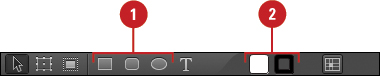
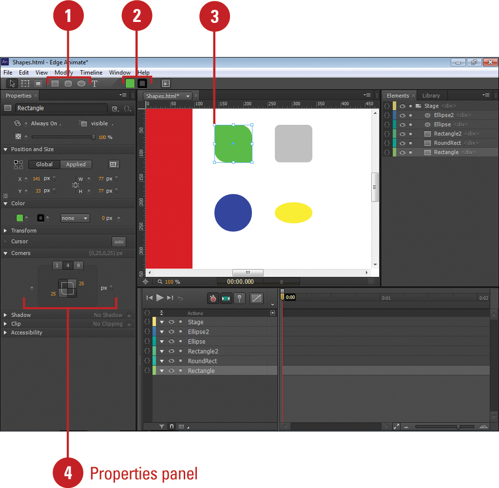
The Edge Animate Tools panel includes several tools—Rectangle, Rounded Rectangle, and Ellipse—for quickly creating vector shapes, such as rectangles, squares, circles, and ovals. They are easy to use; you just click and drag on the Stage to create the shapes. The Rectangle Tool creates rectangles with square corners, while the Rounded Rectangle Tool creates rectangles. The Ellipse Tool creates circles and ovals with rounded corners. The Rounded Rectangle Tool remembers corner radius settings for next use while the Rectangle Tool doesn’t. With any drawing tool, you can create other shapes by changing the corner radius attribute in the Properties panel, all four at once or one at a time. Shapes are composed of attributes—such as location, size, opacity, fill color, border color, border thickness, border style, corner radius, rotate, skew, scale, and shadow—that you can change in the Properties panel, in the Tools panel (background and border color), or on the Stage (in some cases) to create other looks and shapes.
Draw Shapes
Select a drawing tool (Rectangle, Rounded Rectangle, or Ellipse) on the Tools panel.
Timesaver
Press M to select the Rectangle Tool, press R to select the Rounded Rectangle Tool, or press O to select the Ellipse Tool.
Click a color box for Background Color or Border Color on the Tools panel, and then select a color.
Position the pointer on the Stage where you want to start drawing the shape with the selected tool.
The pointer becomes a crosshair that you can drag on the Stage.
To constrain the width and height to the same size (like a square or circle), press and hold the Shift key.
Drag to draw the shape.
Important
If Smart Guides are enabled on the Modify menu, alignment guides appear when working with multiple shapes.

Create Other Shapes with Properties
Select a drawing tool (Rectangle, Rounded Rectangle, or Ellipse) on the Tools panel.
Click a color box for Background Color or Border Color on the Tools panel, and then select a color.
Position the pointer on the Stage, and then drag to draw a shape close to the size you want.
Important
If Smart Guides are enabled on the Modify menu, alignment guides appear when working with multiple shapes.
Do any of the following:
• Properties Panel. Click the tab with the number of values, either 1, 4, or 8, you want to change, enter a radius value in pixels or percentages, and then press Enter (Win) or Return (Mac), or drag (scrub) a radius value to the one you want.
• Stage. Select the Transform Tool on the Tools panel, position the pointer over a black diamond handle (cursor changes to a white arrow), and then drag to adjust the corner to the size you want.
As you drag, all the corners adjust to the same size.
• Adjust Individual Corners. Hold down the Ctrl key, and then drag a black diamond handle.
As you drag, only the individual corner adjusts.
Using Smart Guides with Elements
Smart Guides are dimension markers and alignment guides that allow you to create shapes and text or resize elements to the same size as other elements on the Stage. They appear automatically as you draw a shape or text box, resize any element, or move elements and then disappear when not needed. They allow you to visually create same size elements or align one element to another with a minimum of effort. As you create or resize an element, dimension markers (double arrow guides) appear along the element’s width or height when it matches another element on the Stage. As you drag, it also displays horizontal and vertical guides when the edge or middle of the element aligns with another element on the Stage or to the center of the Stage. Smart Guides are automatically turned on by default. You can turn Smart Guides on and off by selecting the Smart Guides command on the Modify menu.
Turn Smart Guides On and Off
To turn Smart Guides on (enabled), click the View menu, and then click Smart Guides.
A check mark appears next to the menu command.
Timesaver
Press Ctrl+U (Win) or +U (Mac) to toggle Smart Guides on and off.
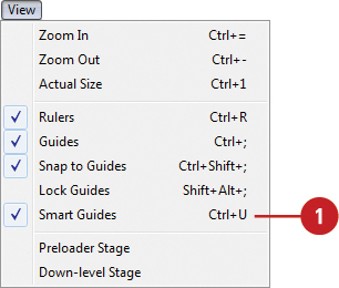
To turn Smart Guides off (disabled), click the View menu, and then click Smart Guides.
The check mark next to the menu command disappears.

See Also
See “Aligning and Distributing Elements” on page 162 for more information on aligning elements using Smart Guides.
Draw Shapes with Smart Guides
Select a drawing tool (Rectangle, Rounded Rectangle, or Ellipse) on the Tools panel.
Position the pointer on the Stage where you want to start drawing the shape with the selected tool.
The pointer becomes a crosshair that you can drag on the Stage.
Drag to draw the shape.
As you draw the shape, Smart Guides appear to help you size it with the same width or height as other elements on the Stage, or align it to the edge or middle of other elements on the Stage or to the center of the Stage.
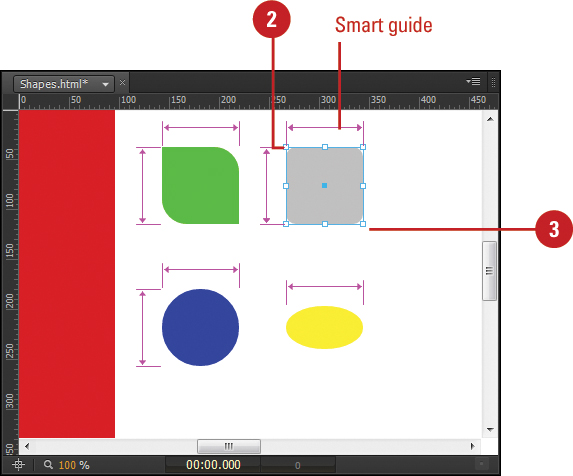
Resize Elements with Smart Guides
Click the Selection Tool on the Tools panel.
Select the element you want to resize.
Position the pointer over a resize handle (cursor changes to a black two-headed arrow), and then drag to the size you want.
As you resize the element, Smart Guides appear to help you size it with the same width or height as other elements on the Stage, or align it to the edge or middle of other elements on the Stage or to the center of the Stage.

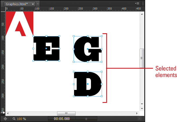
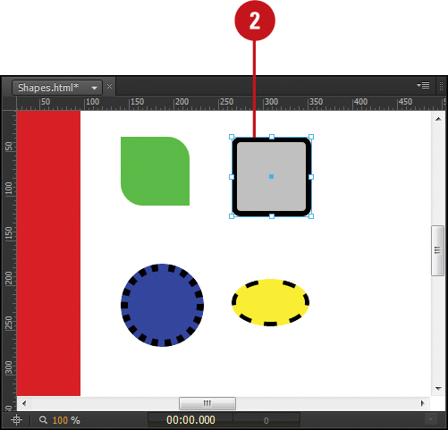
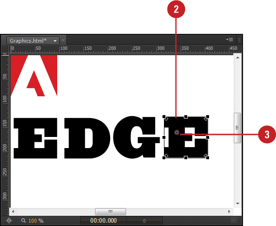
Selecting Elements
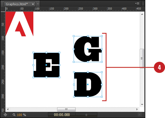
There are several ways to select elements in Edge Animate. You can select a shape using the Selection Tool on the Stage or in the Timeline or Elements panel. You can use the Selection Tool to select one or more shapes by clicking individual elements or dragging over them. When you select one or more elements, a bounding box appears around each one with resize handles (white squares) on the border edge, and a transform origin point (blue square) in the middle. The resize handles change the size of the bounding box. The transform origin changes the transformation position, the orientation where elements are transformed (rotate, skew, or scale). The Properties panel displays the attributes for what is selected—including location, size, opacity, fill color, border color, border thickness, border style, corner radius, rotate, skew, scale, and shadow. When you select multiple elements, the Properties panel displays a dash (-) where attributes are different; for operations, such as resizing, it takes effect on the group, rather than the last selected element.
Select Elements with the Selection Tool
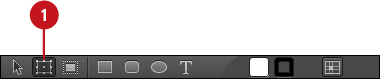
Click the Selection Tool on the Tools panel.
The pointer becomes an arrow.
Timesaver
Press V to select the Selection Tool.

Position the arrow on any part of the bounding box (cursor changes to a black four-headed arrow) for a shape on the Stage.
Click within the bounding box of the shape.
To select multiple shapes, press and hold the Shift key, and then click on any part of the shapes you want to select.
• You can also drag a selection rectangle over elements bounding box to select them.
Timesaver
Press Ctrl+A (Win) or +A (Mac) to select all.
The elements are selected on the Stage and in the Timeline and Elements panel.

Select Elements with the Timeline and Elements Panel
Click the Selection Tool on the Tools panel.
The pointer becomes an arrow.
Timesaver
Press V to select the Selection Tool.
In the Timeline or Elements panel, click the element name you want to select.
To select multiple elements, do any of the following:
• Contiguous (Sequential Order). Press and hold the Shift key, and then click the last element name you want in the list. All elements between the first and last one are selected.
• Non-Contiguous (Not in Sequential Order). Press and hold the Ctrl (Win) or (Mac) key, and then click the element name you want in the list. The elements you select are added to the selection.
The elements are selected on the Stage and in the Timeline and Elements panel.

Important
Depending on the Only Show Animated Elements button setting, not all elements appear in the Timeline.
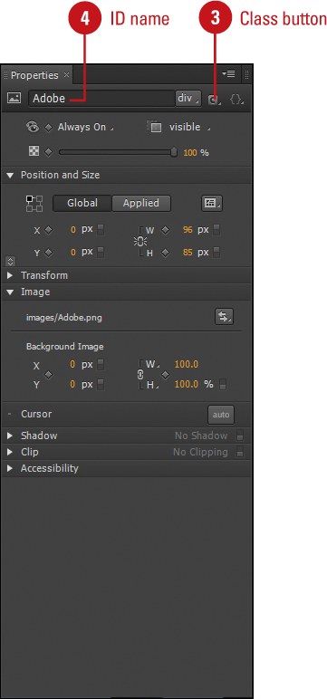
Naming Element IDs or Classes
When you create a shape, add text, or import a graphic, Edge Animate automatically provides a unique ID name based on the element type. For example, the first drawn rectangle is named Rectangle1. The second one is named Rectangle2, etc. For an imported graphic, the element is named with the original filename as the ID. For example, the imported file named Banner.jpg is named Banner. Naming an element allows you to reference it in an Action using JavaScript code to perform a function, such as changing element properties, based on an event, such as clicking an element. You can also use the ID to apply a CSS style. However, you can only apply it to the specific element, because element IDs must be unique. If you want to apply the same CSS style to multiple elements, you can specify a class. You can change an element ID or specify a class name in the Properties panel. If you try to rename an element ID with an existing name, Edge Animate disregards the change to avoid errors.
Name an Element ID or Class
Click the Selection Tool on the Tools panel.
Select the element you want to name.
In the Properties panel, select the current name in the ID box.
• ID. Select the current name in the ID box.
• Class. Click the Class button.
Type the ID or class name you want for the element, and then press Enter (Win) or Return (Mac).
• If you enter an existing element name, Edge Animate disregards the change, even though the text changes.
See Also
See “Getting to Know HTML” on page 248 and “Getting to Know CSS” on page 252 for more information on using classes.
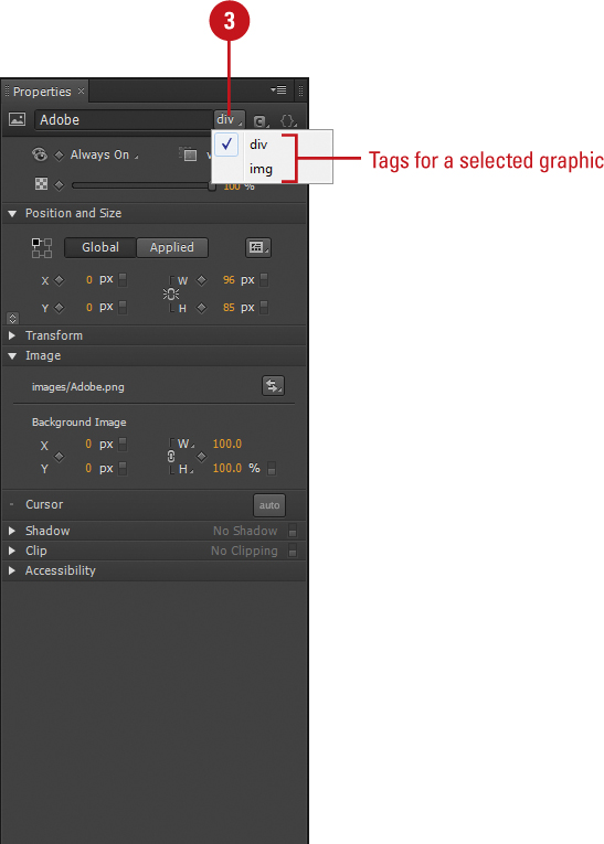
Changing Element Tags
When you create a shape, add text, or import a graphic, Edge Animate automatically assigns the element an HTML division (DIV) tag and creates CSS code based on the attributes set in the Properties panel. A tag is HTML’s basic way to identify items. A DIV tag is an HTML element that defines generic containers or sections within the content of a web page. The DIV tag is a general way to define an element in HTML; it’s not based on the content of the element. Defining an element with a content specific HTML tag provides information and predefined attributes to help your web browser more accurately display the web page content. Some content specific tags, such as the heading tags h1 thru h6, are used by search engines to index the structure and content of your web pages. When you view HTML code, tags always appear with angle brackets (< >), such as <div>. So, it’s a good idea to define HTML elements using appropriate HTML tags whenever possible.
Change Element Tags
Click the Selection Tool on the Tools panel.
Select the element you want to change.
In the Properties panel, click the Tag list arrow, and then select an element specific tag; tags vary depending on the selected element.
• Graphic.
• img. Defines an image.
• Text.
• address. Defines contact information for the author of a document/article.
• article. Defines self-contained content, like a news article or blog post; new tag in HTML5.
• blockquote. Defines a section that is quoted from another source.
• p. Defines a paragraph.
• h1 - h6. Defines HTML headings.
• pre. Defines preformatted text.
• code. Defines a piece of computer code.
Changing Element Display
With the Display property, you can control if or when an element appears on the Stage. This is useful for hiding and showing elements during an animation. The Display property can be set to Always On, On, and Off in the Properties panel. By default, all elements are set to Always On. When you set an element to On at a specified point in the animation, the element is set to Off (none) until the specified point and then set to On (visible). When an element is set to Off, it’s displayed in a crosshatch pattern to make it easier to see when it’s active.
Change Element Display
Click the Selection Tool on the Tools panel.
Select the element you want to change.
In the Properties panel, click the Element Display list arrow, and then select an option:
• Always On. Sets the element to always display (default).
• On. Sets the element to display at a specified point; the element is set to Off (none) until the specified point.
• Off. Sets the element to not display.

To reset the Display property to Always On after setting it to On or Off, click the Element Display list arrow, click Always On, and then click Continue.
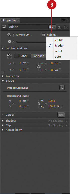
Changing Element Overflow
If an element is located off the Stage, you can specify how you want to display the area off the Stage in the overflow area. There are four values for the overflow property: visible (default), hidden, scroll, and auto. The visible option displays content that extends beyond the Stage; the content off the Stage won’t move any other content. The hidden option hides content—makes it inaccessible—that extends beyond the Stage. The scroll option hides the content off the Stage and displays horizontal and vertical scrollbars, even if you don’t need them. The auto option is similar to the scroll option, however, it only displays the scrollbars you need. You can set the Overflow option in the Properties panel.
Change Element Overflow
Click the Selection Tool on the Tools panel.
Select the element you want to change.
In the Properties panel, click the Overflow list arrow, and then select an option:
• Visible. Shows the element in the overflow area (default).
• Hidden. Hides the element in the overflow area, which is not accessible.
• Scroll. Hides the element in the overflow area and always shows horizontal and vertical scroll bars.
• Auto. Hides the element in the overflow area and shows scroll bars as needed (horizontal, vertical, or both).
Changing Element Opacity
With the Opacity property, you can change the transparency level by percentage for an element. This is useful for creating a fade animation effect for an element. The Opacity property can take a value from 0% to 100%, where a lower value makes the element more transparent. When you change the opacity for a shape element, the background fill color and border color adjust to the same set percentage. For a text element, the color for individual characters adjust to the same set percentage. For an imported graphic, the entire image adjusts to the set percentage.
Change Element Opacity
Click the Selection Tool on the Tools panel.
Select the element you want to change.
In the Properties panel, drag the Opacity slider to the transparency percentage you want, or click the Opacity value, enter a value in a percentage, and then press Enter (Win) or Return (Mac).
0% is completely transparent, while 100% is a full display.

Changing Element Position
An element’s position on the Stage is based on X and Y coordinates in pixels, denoted as px (pixel) or % (percentage). X is the horizontal axis position and Y is the vertical axis position. Together, the X and Y coordinates locate any specific pixel location on the Stage. The 0, 0 coordinates for the X and Y location is the upper-left corner of the Stage. A positive X value moves the X location to the right along the horizontal axis (even off the Stage) and a positive value moves the Y location down the vertical axis (even off the Stage). A negative X value moves the X location off the Stage to the left and a negative Y value moves the Y location off the Stage above it. The element location on the Stage is determined by the upper-left corner of an element. You can drag an element to another location on the Stage or set specific Position X and Y coordinates in the Properties panel.
Change Element Position
Click the Selection Tool on the Tools panel.
Select the element you want to change.
In the Properties panel under Position and Size, do any of the following:
• Stage. Position the pointer over the element (cursor changes to a black four-headed arrow), and then drag to the location you want.
• Properties Panel. Click the Position X or Y value, enter a value, and then press Enter (Win) or Return (Mac), or drag (scrub) the Position X or Y value to the one you want.

Changing Element Size
When you select an element in Edge Animate, a bounding box appears around each one with resize handles (white squares) on the border edge and a transform origin point (blue square) in the middle. You can change the size of an element on the Stage by dragging a resize handle or set specific W (width) and H (height) settings in the Properties panel. When you drag a middle resize handle, the size change is constrained to the left and right, or top and bottom. When you drag a corner resize handle, the size change is not constrained, unless you hold down the Shift key. As you drag to resize an element on the Stage with Smart Guides turned on (Modify menu), guides automatically appear to help you size and align the element with other elements already on the Stage. The size of an element is denoted in pixels or percentage, as shown in the Properties panel.
Change Element Size
Click the Selection Tool on the Tools panel.
Select the element you want to change.
Do any of the following:
• Stage. Position the pointer over a resize handle (cursor changes to a black two-headed arrow), and then drag to the size you want.
• Variable. Drag a corner resize handle.
• Constrain Left and Right or Top and Bottom. Drag a middle resize handle.
• Constrain Width and Height Proportionally. Hold down the Shift key, and then drag a corner resize handle.
• Properties Panel. Click the Size W or H value, enter a value in pixels or percentages, and then press Enter (Win) or Return (Mac), or drag (scrub) the Size W or H value to the one you want.
• Constrain/Unconstrain. Click the Link/Unlink icon to toggle on and off.

Changing Element Adjustability
In Edge Animate, you can create an animation that is responsive to the size of the screen. For example, when you resize your browser window, the composition resizes too. You can make the Stage and individual elements responsive by changing their units from pixels (fixed) to percentage (adjustable). In addition, you can change the relative change position to any corner of an element, either relative to the Stage (Global) or to its parent (Applied). By default, elements are positions relative to the upper-left corner of their parent. You can change the relative position to any corner in the Properties panel. Instead of changing individual values for an element, you can apply a layout preset. The presets include Scale Position (X and Y), Scale Size (W and H), Scale Background Image, Center Background Image, Clip Background Image, and Static Background Image. Instead of testing changes to your composition in your browser, you can quickly check them on the Stage by using a ruler adjustment handle (pin) in Edge Animate.
Change Element Adjustability
Click the Selection Tool on the Tools panel.
Select the element you want to change.
To use preset options, click the Layout Preset button, select a preset and view its settings, and then click Apply.
To set individual adjustable options, point to units for the position (X and Y) and size (W and H), and then drag the slider from px (pixels) to % (percentage).
To set the relative position (upper-left, upper-right, lower-left or lower-right) of the element on the screen, click the corner square in the Coordinate Space Picker, and then click Global or Applied.
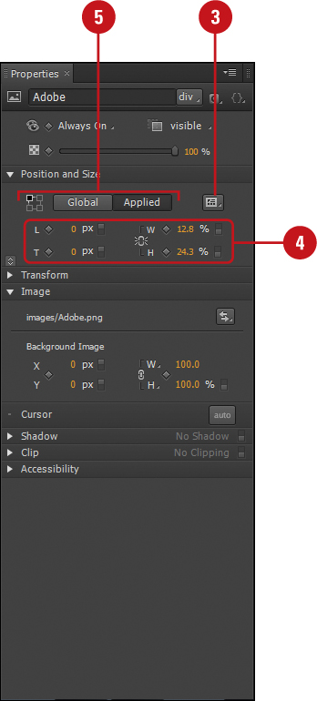
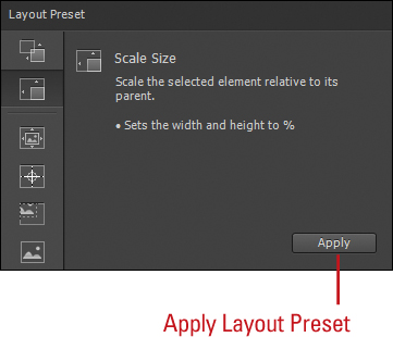
Global calculates the position relative to the Stage, while Applied calculates it relative to its parent.
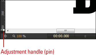
To preview the results on the Stage, move the Stage adjustment handle (pin) on a ruler back and forth, and then return it to its original position marker.
Changing Shape Corners
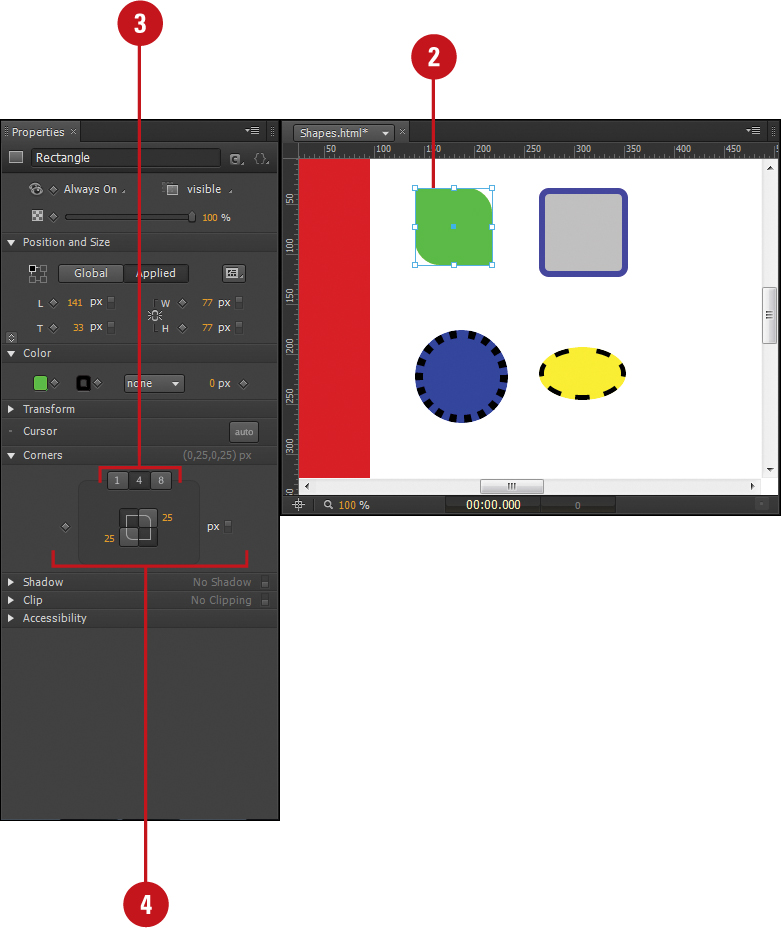
After you create or select a shape element, either a rectangle or rounded rectangle, you can adjust the corners to create different degrees of roundedness, which is known as the corner radius. You can change the corner radius of a shape element on the Stage by setting specific corner values in the Properties panel. You can make changes in pixels or percentages by the number of settings—either 1, 4, or 8—in the Properties panel. When you select the number 1 tab, the same corner radius is set for all four corners. When you select the number 4 tab, you can set individual values for each of the four corners. When you select the number 8 tab, you can set individual values for each side of the four corners.
Change Shape Corners in the Properties Panel
Click the Selection Tool on the Tools panel.
Select the shape element you want to change.
In the Properties panel under Corners, click the tab with the number of values, either 1, 4, or 8, you want to change.
For tab 1, one value appears (one for all corners). For tab 4, four values appear (one for each corner). For tab 8, eight values appear (two for each corner).
Click a Border Radius value, enter a value in pixels or percentages, and then press Enter (Win) or Return (Mac), or drag (scrub) a Border Radius value to the one you want.
To reset a rounded corner to a square corner, click a Border Radius button (corner changes from rounded to square).
To reset a square corner to a rounded corner with a zero value, click a Corner Radius (corner changes from square to rounded).
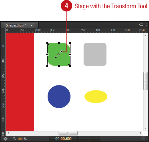
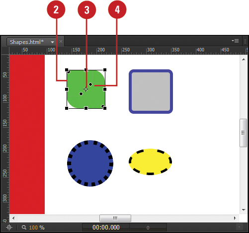
Change Element Corners with the Transform Tool
Click the Transform Tool on the Tools panel.
Select the shape or image element you want to change.
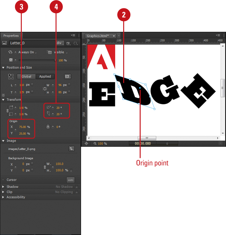
If you want to change the origin point, drag the transform origin (white circle and crosshairs) in the element on the Stage, or specify Transform Origin X or Y values by percentage in the Properties panel.
Position the pointer over a black diamond handle (cursor changes to a white arrow), and then drag to adjust the corner to the size you want.
As you drag, all the corners adjust to the same size.
• Adjust Individual Corners. Hold down the Ctrl key, and then drag a black diamond handle.
As you drag, only the individual corner adjusts.

Changing Shape Borders
When you draw a shape element, Edge Animate applies a background fill color, border color, border thickness in pixels, and border style. By default, when you draw a shape in a new composition, the background color is set to grey (RGB 192 each or #c0c0c0 in Hex), the border color is set to black, the border thickness is set to zero, and the border style is set to none. With the thickness set to zero and the style set to none, a border doesn’t appear in the shape. However, you can change the border properties at any time. You can specify a border color, border thickness in pixels, and border style—none, solid, or dashed—in the Properties panel. For added convenience, you can also specify a border color in the Tools panel.
Change Shape Border Size and Style
Click the Selection Tool on the Tools panel.
Select the shape element you want to change.
In the Properties panel under Color, click the Border Thickness value, enter a value in pixels, and then press Enter (Win) or Return (Mac), or drag (scrub) the Border Thickness value to the one you want.
• Zero. Shows no border. The Border Thickness value is 0.
Click the Border Style list arrow, and then select an option:
• None. Shows no border. The Border Thickness value is ignored.
• Solid. Shows a solid border with the specified border thickness and color.
• Dashed. Shows a dashed border with the specified border thickness and color.
• Dotted. Shows a dotted border with the specified border thickness and color.

Change Shape Border Color
Click the Selection Tool on the Tools panel.
Select the shape element you want to change.
In the Tools panel or Properties panel under Color, click the Border color box, and then select a color:
• White Color. Click the White box.
• Black Color. Click the Black box.
• Transparent. Click the Transparent box.
• Any Color. Drag the color spectrum slider, and then click and drag the white color circle.
• Specific RGB Color. Enter color values for Red, Green, and Blue.
• Specific Transparency. Enter a value (%) for Alpha. (0% is fully transparent, while 100% is completely solid).
• Specific Hex Color. Enter a six digit color value starting with a hash (#) in the Hex box, and then press Enter (Win) or Return (Mac).

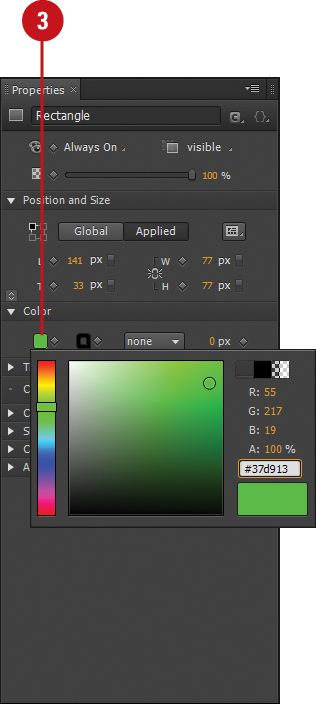
Changing Shape Background Color
When you draw a shape element, Edge Animate applies a background fill color along with other border properties. You can select a background color in the Properties or Tools panel by clicking the Background Color box and using the color palette. You can choose virtually any color you want from the color spectrum, as well as no color at all (transparent). In the color palette, you can drag to select a color or enter a specific color RGB using individual Red, Green, and Blue values or a single Hex value. The Hex value, also known as a hex triplet, is a six digit, three-byte hexadecimal number with a hash (#) in front used in HTML, CSS, SVG, and other programs to represent colors in RGB.
Change Shape Background Color
Click the Selection Tool on the Tools panel.
Select the shape element you want to change.
In the Tools panel or Properties panel under Color, click the Background color box, and then select a color:
• White Color. Click the White box.
• Black Color. Click the Black box.
• Transparent. Click the Transparent box.
• Any Color. Drag the color spectrum slider, and then click and drag the white color circle.
• Specific RGB Color. Enter color values for Red, Green, and Blue.
• Specific Transparency. Enter a value (%) for Alpha. (0% is fully transparent, while 100% is completely solid).
• Specific Hex Color. Enter a six digit color value starting with a hash (#) in the Hex box, and then press Enter (Win) or Return (Mac).
Adding Shadows to Elements
You can format any element in Edge Animate with a shadow. You can add drop shadow on the outside edge or an inset shadow on the edge of the element. After you add a shadow, you can specify the shadow X and Y position, color, blur, or feathering, and spread, or depth, of the shadow. This give you control of the overall design of the shadow. You can enable or disable the use of a shadow by dragging the slider on the Shadow header bar in the Properties panel. When you turn it on (enable) and off (disable), the shadow settings for the element remain in tact, so you don’t have to reset them.
Add Shadows to Elements in the Properties Panel
Click the Selection Tool on the Tools panel.
Select the element you want to change.

In the Properties panel under Shadow, drag the slider on the header bar to turn it on.
Click the Drop Shadow or Inset Shadow button.
Click the X or Y value, enter a value, and then press Enter (Win) or Return (Mac), or drag (scrub) the X or Y value to the one you want.
Click the Color box, and then select a color for the shadow.
Click the Blur or Spread value, enter a value, and then press Enter (Win) or Return (Mac), or drag (scrub) the Blur or Spread value to the one you want.
• Blur. The Blur value specifies the amount of shadow edge feathering.
• Spread. The Spread value specifies the depth of the shadow.

 To turn the Shadow property off, drag the slider on the header bar to turn it off.
Changing Cursors Over Elements
When you move your cursor over an element on a web page, it can change to provide an indicator of its use. For example, when you hover over a link, it changes to a pointing finger. The cursor is set to auto by default, which lets the browser set the cursor. This is typically the best option, unless you have a unique design with specific requirements. If you want to change it, you can select a cursor for any element in the Properties panel. With the Cursor button, you can select from 24 different cursors, including resizing, drawing, and busy.
Change the Cursor Over Elements in the Properties Panel
Click the Selection Tool on the Tools panel.
Select the element you want to change.
In the Properties panel under Cursor, click the Cursor button.
Click a cursor icon on the pane.
• Auto. The browser sets the cursor (default).
• Cursor. When you point to an element in your browser, the selected cursor displays.

Modifying Image Elements
The Image settings in the Properties panel allow you to adjust a graphic’s position in its bounding box using X and Y coordinates in pixels or percentages. X is the horizontal axis position and Y is the vertical axis position. The 0, 0 coordinates for the X and Y location is the normal default position in the bounding box. The graphic is positioned relative to its normal position. You can use positive or negative values to adjust the position. For example, X = 20 and Y = -20, moves the graphic position 20 pixels to the right (X) and -20 pixels up (Y). X moves the position left and right, while Y moves the position up and down. In addition to the image position in the bounding box, you can also change the width and height size of the image itself. You can specify the X and Y position and W and H values for an image in the Properties panel.
Change Image Elements in the Properties Panel
Click the Selection Tool on the Tools panel.
Select the graphic image element you want to change.
In the Properties panel under Image, click the Background X or Y value, enter a value in pixels or percentages, and then press Enter (Win) or Return (Mac), or drag (scrub) the Background X or Y value to the one you want.
To change the size of the image, click the Background W or H value, enter a value in pixels or percentages, and then press Enter (Win) or Return (Mac), or drag (scrub) the Background W or H value to the one you want.
• Constrain/Unconstrain. Click the Link/Unlink icon to toggle on and off.
To change the image element source, click the Change Image Source button, and then select the image asset you want from the Library Assets panel.

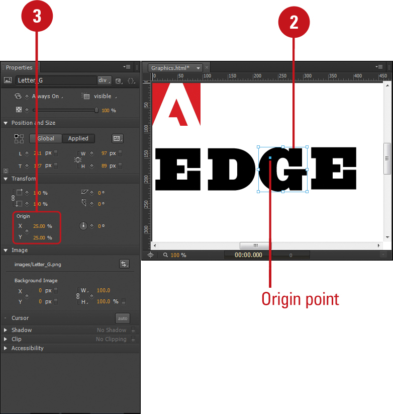
Transforming Element Origin
The transform origin point determines the center orientation position when you transform an element by changing the Rotate, Skew, or Scale properties. When you select one or more elements—either a shape, text, or imported graphic—a transform origin appears in the center of the element (X = 50% and Y = 50%) by default. You can change the transform origin of an element on the Stage by dragging the transform origin point with the Transform Tool or set specific Transform Origin X and Y settings in percentages in the Properties panel. You can set the transform origin inside or outside the boundary box of an element.
Change the Origin Point in the Properties Panel
Click the Selection Tool on the Tools panel.
Select the element you want to change.
In the Properties panel, click the Transform Origin X or Y value, enter a value in percentages, and then press Enter (Win) or Return (Mac), or drag (scrub) the Transform Origin X or Y value to the one you want.
• 50% - 50%. Sets the origin point to the center.
• 25% - 25%. Moves the origin point to the left for X and up for Y of center.
• 75% - 75%. Moves the origin point to the right for X and down for Y of center.
Change the Origin Point with the Transform Tool
Click the Transform Tool on the Tools panel.

Select the element you want to change.
Position the pointer over the origin point (cursor changes to a white pointer), and then drag to another position.
• Constrain Vertical or Horizontal. Hold down the Shift key, and then drag the origin point.
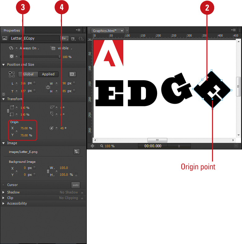
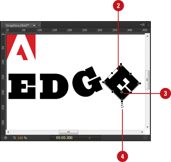
Rotating Elements
The Rotate value in the Properties panel or the Transform Tool on the Tools panel allows you to rotate an element to the right (positive) or left (negative). This is useful for creating a rotating animation effect for an element, such as a rolling ball or spinning star. You can specify a Rotate value in degrees for an element in the Properties panel or drag outside a selected corner (cursor changes to an arrow with a circle) on the Stage with the Transform Tool. An element rotates around the transform origin point, which is set to the center of an element (X = 50% and Y = 50%) by default, so if you want to adjust it, you should do it beforehand. If you want to rotate an element multiple times, you can enter an expression in the Rotate property value. For example, you can enter 360*5 to rotate an element five times (or 1800 degrees) to the right.
Rotate Elements in the Properties Panel
Click the Selection Tool on the Tools panel.
Select the element you want to change.
If you want to adjust the rotation point, specify Transform Origin X or Y values by percentage in the Properties panel under Transform.
In the Properties panel under Transform, drag the Rotate (z) slider to the degree you want, or enter or scrub (drag) a Rotate (z) value in degrees, either positive (right) or negative (left).
• Expression. In the Rotate (z) box, you can enter an expression to rotate multiple times. For example, enter 360*5 to rotate an element five times.
Rotate Elements with the Transform Tool
Click the Transform Tool on the Tools panel.

Select the element you want to change.
If you want to adjust the rotation point, drag the Transform origin point in the element on the Stage.
Position the pointer outside a corner point (cursor changes to an arrow with a circle), and then drag to rotate the element.
The element rotates around the origin point.
Skewing Elements
The Skew value in the Properties panel or the Transform Tool on the Tools panel allows you to adjust the horizontal or vertical plane of an element around the X and Y-axis. This is useful for creating a stretching animation effect for an element, such as creating a diamond from a square. For example, if you set X = 30 and Y = 20, the element skews 30 degrees around the X-axis and 20 degrees around the Y-axis. You can specify the Skew X and Y values in degrees for an element in the Properties panel or drag outside a selected horizontal or vertical edge (not a corner) (cursor changes to a double arrow in opposite directions) on the Stage with the Transform Tool. An element turns (skews) along the transform origin point, which is set to the center of an element (X = 50% and Y = 50%) by default, so if you want to adjust it, you should do it beforehand.
Skew Elements in the Properties Panel
Click the Selection Tool on the Tools panel.
Select the element you want to change.
If you want to adjust the skew point, specify Transform Origin X or Y values by percentage in the Properties panel under Transform.
In the Properties panel under Transform, click the Skew X or Y value, enter a value in degrees, and then press Enter (Win) or Return (Mac), or drag (scrub) the Skew X or Y value to the one you want.
Skew Elements with the Transform Tool
Click the Transform Tool on the Tools panel.

Select the element you want to change.
If you want to adjust the skew point, drag the Transform origin point in the element on the Stage.
Position the pointer outside a corner point (cursor changes to a double arrow in opposite directions), and then drag to rotate the element.
The element skew along the vertical or horizontal edge from the origin point.

Scaling Elements
The Scale value in the Properties panel or the Transform Tool on the Tools panel allows you to increase or decrease the scale size of an element by a specified percentage. This is useful for creating a growing or shrinking animation effect for an element. You can specify the Scale X and Y values for an element on the Stage by dragging a black handle (cursor changes to a double arrow) with the Transform tool or set specific Scale X and Y settings in percentages in the Properties panel. A percentage greater than 100% increases the scale of an element, while a percentage less than 100% decreases the scale of an element. An element scales around the transform origin, which is set to the center of an element (X = 50% and Y = 50%) by default, so if you want to adjust the Transform Origin X and Y values on the Stage or in the Properties panel, you should do it beforehand.
Scale Elements in the Properties Panel
Click the Selection Tool on the Tools panel.
Select the element you want to change.
If you want to adjust the scale point, specify Transform Origin X or Y values in percentages in the Properties panel under Transform.
In the Properties panel under Transform, click the Scale X or Y value, enter a value in percentages, and then press Enter (Win) or Return (Mac), or drag (scrub) the Scale X or Y value to the one you want.
• Proportional/Not Proportional. Click the Link/Unlink icon (left of the Scale X and Y values) to toggle on and off.

Scale Elements with the Transform Tool
Click the Transform tool on the Tools panel.
Select the element you want to change.
If you want to adjust the scale point, specify Transform Origin X or Y values by percentage in the Properties panel under Transform.
Position the pointer over a black square handle (cursor changes to a double arrow), and then drag to the scale size you want.
• Proportional. Hold down the Shift key, and then drag a black handle.
• Horizontal or Vertical. Drag a middle black handle on a horizontal or vertical edge.
Changing Element Clipping
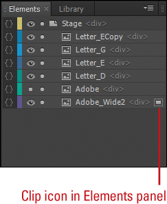
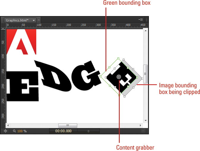
A clipping area describes the portion of an element’s bounding box that is visible. The Clip property is like a mask or cropping. It allows you to mask the content of an element in a bounding box. To clip an element, you can use the Clipping Tool on the Tools panel to resize the clipping area or the Properties panel to specify exact values—left, top, right, and bottom—in pixels relative to the element. The Clip left value indicates the length from the left edge of the bounding box to the left side of the clip area. The Clip top value does the same but from the top. Here is where things get different. The bottom value indicates the length from the top edge of the bounding box to the bottom side of the clip area. The Clip right value does the same but from the left edge to the right side. For example, a new element’s Clip values are Left = 0 px, Top = 0 px, Right = Left (0 px)+Width, and Bottom = Top (0 px)+Height. When you clip an element, a clip icon appears to the right of the name in the Element panel as an indicator of the element change.
Change Element Clipping in the Properties Panel
Click the Selection Tool on the Tools panel.
Select the element you want to change.
In the Properties panel under Clip, drag the slider on the header bar to turn it on (enabled).
Click a Clip (Left, Right, Top, or Bottom) value, enter a value in pixels, and then press Enter (Win) or Return (Mac), or drag (scrub) a Clip value to the one you want.

To turn the Clip property off and remove the clipping area, drag the slider on the header bar to turn it off (disabled).
• You can also right-click (Win) or control-click (Mac) the clipped element, and then click Remove Clip.
Change Element Clipping with the Clipping Tool
Click the Clipping Tool on the Tools panel.
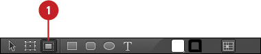
Select the element you want to change.
When you select an element, the bounding box appears in green instead of blue. A blue bounding box appears around element when it’s selected with the Selection Tool.
To change the size of the clipping area, drag the resize handle on the green bounding box to change the clipping area.
As you drag the resize handle, a black bounding box might appear for the element. The black bounding box is the size of the element. You can drag the resize handle for the black bounding box to resize the element itself.
To move the element within the clipping area, point the content grabber (a circle within a circle, the cursor changes to a hand), and then drag it.

To remove clipping from an element, right-click (Win) or control-click (Mac) the clipped element, and then click Remove Clip.
Adding Accessibility to Elements
Accessibility makes it easier for people with disabilities to use and interact with your animation. In the Properties panel under Accessibility, you can specify an accessibility title for an element and specify a numbered position in the tabbing order on the web page. The title is used by readers to help the visually impaired identify an element on the screen. The tabbing order provides a sequence to change the current focus on the screen. When you press Enter (Win) or Return (Mac), the current focus is executed, such as a button. The tab index attribute begins with the smallest value and ends with the largest value. The value can be between 0 and 32767.
Add Accessibility to Elements in the Properties Panel
Click the Selection Tool on the Tools panel.
Select the element you want to change.
In the Properties panel under Accessibility, enter a title for the selected element.
Click the Tab Index value, enter a value, and then press Enter (Win) or Return (Mac), or drag (scrub) the Tab Index value to the one you want.
To remove the Tab Index value, click the Close button.
