
Refinining HTML Clients Screens with JavaScript/CSS
With LightSwitch, you can build perfectly functioning applications without modifying the stock screens that the default screen templates generate. However, you can drastically improve the usability of your application by writing code and making presentational changes. In this chapter, I’ll show you how to do the following:
- clean up the appearance of your applications with themes, HTML, and CSS
- enhance editing capabilities by building custom HTML controls
- add extra functionality to your applications by writing JavaScript code
This chapter focuses on writing custom HTML, JavaScript, and CSS (Cascading Style Sheets). By using these techniques, you can improve the appearance of your application and make it more presentable for end users. For instance, I’ll show you how to format dates and numbers, how to customize fonts and colors, and how to hide items on small-form-factor devices.
I’ll describe how data binding works in the HTML client and demonstrate how you can use this technique to present data in a custom fashion, as well as how to build a custom editor control that users can utilize to edit HTML content.
Examining the JavaScript API
Most of this chapter (and screen customization in general) relies heavily on JavaScript. Therefore, I’ll begin by summarizing the main features of LightSwitch’s JavaScript API. You will have encountered parts of the API earlier in this book, so the aim of this section is to provide a reference of the methods that you can use.
Handling Screen Events
LightSwitch provides several “entry points” for writing JavaScript code. One way to add JavaScript code to your application is to add a button to your screen and write code that handles the click event of your button. Chapter 6 showed you how to do this, and described how to use the JavaScript promise pattern.
Another method is to click the Write Code button in the screen designer. You can use this to write code that executes during specific stages of a screen’s lifecycle.

Figure 8-1. Screen methods you can use to add custom JavaScript code
Figure 8-1 illustrates three methods you can use to add JavaScript code. Here’s a summary of these methods, and example use-case scenarios of the type of code you can add to each of them.
- <control>_postRender – For each control on your screen, the HTML client calls its postRender method after it generates the HTML for your control.
- beforeApplyChanges – This code runs just before the HTML client applies your data changes. You can use this method to add additional client-side validation to your screen.
- created – The code in this method executes when the HTML client creates your screen. It’s the ideal place to set default screen values.
An important technique I’ll show you in this chapter is how to carry out data binding. You can use this technique to run custom JavaScript code when, for example, the value of a control changes.
API Objects
When you write JavaScript code, there are four objects that you’ll most frequently use. These are:
- myapp – You can use this object to open screens, save changes, and access the current dataWorkspace object.
- screen – This object represents an HTML screen.
- contentItems – Set data values with this object.
- dataWorkspace – Use this to access data sources, tables, queries, and records.
In the section that follows, I’ll describe these objects in more detail. You can refer to Chapter 6 to find out more about the dataWorkspace object, as well as to get guidance on how to carry out data tasks asynchronously through promise objects.
myapp Object
The myapp object exposes application-level functions. It provides access to your application’s data workspace and exposes show methods you can call to open screens in your application. The API provides a show method for each screen in your application. When you call a show method, you can specify code that executes before and after the screen opens. You can use this technique to initialize a screen or to navigate to a different screen after it closes. Sample code in Chapter 10 shows you how to apply this technique. Figure 8-2 illustrates some of the methods that IntelliSense shows in the code designer. Technically, the myapp object is an alias that provides a shortcut to an object in the API called msls.application. Two useful methods in the msls object are showProgress and showMessageBox. You can use these methods to provide progress indications and messages to the user.

Figure 8-2. myApp object model
You can wrap any long-running process that returns a promise inside a call to showProgress. By doing so, LightSwitch shows a visual indication and blocks the user from interacting with your application until the promise either succeeds or fails.
Table 8-1 summarizes the members that belong to the myapp object.
Table 8-1. myapp Object Methods and Properties
|
Method |
Description |
|---|---|
|
activeDataWorkspace |
Gets the active data workspace |
|
applyChanges |
Asynchronously merges any changes in the nested change set back into the parent change set (or saves top-level changes) and keeps the user on the current screen |
|
cancelChanges |
Asynchronously cancels any changes and navigates the user back to the previous screen |
|
commitChanges |
Asynchronously merges any changes in the nested change set back into the parent change set (or saves top-level changes), and navigates the user back to the previous screen |
|
navigateBack |
Prompts the user to apply or cancel any changes. If the user applies the change, this method navigates the user back to the previous screen. Otherwise, the user will remain on the current screen |
|
navigateHome |
Navigates the user to the startup screen |
|
show<Screen> |
Navigates the user to the specified screen |
screen Object
By using the screen object, you can carry out screen-level tasks. You can use this object to manage tabs and popups, and to access the data entities on your screen. To access the screen object in code, you can write methods to handle the created or beforeApplyChanges events of a screen. The signatures of the methods allow you to access the screen object through a screen parameter.
Two important members of the screen object are the details property and the findContentItem method. The details property provides access to screen details such as the title, description, and validation properties. The findContentItem method is particularly useful because you can use it to obtain a reference to a content item.
Table 8-2. Screen Object Methods and Properties
|
Method |
Description |
|---|---|
|
closePopup |
Closes the popup that’s currently open |
|
findContentItem |
This method returns a content item by name. |
|
showPopup |
Allows you to specify a popup name and opens the popup that you supply |
|
showTab |
Allows you to specify a tab name and shows the tab that you supply |
|
<localProperty> |
You can access the local properties that you’ve defined by name via the screen object |
|
<localMethod> |
You can call the local methods that you’ve defined on your screen |
contentItem Object
A contentItem object represents a data item on your screen. By using this object, you can access most of the properties that appear through the properties sheet in the screen designer. These include sizing properties, validation results, and the content item display name.
Performing Screen Tasks with JavaScript
To demonstrate the code I’ve described so far, here are some practical examples of how to customize your screens with JavaScript.
Setting Default Screen Values
A common requirement in business applications is to initiate screens with default values. To demonstrate this feature, this section will show you how to default the Create Date field on an Issue screen to today’s date.
To create this example, open the Add Edit Issue screen from Chapter 3, or create a new Add Edit Details screen based on the Issue table. Click the Add Code button and choose the created method. At this point, Visual Studio opens the code window and adds a method stub for the created method. Modify your code as shown in Listing 8-1.
Listing 8-1. Setting default values

You can now run your application. When a user opens the screen to create a new issue record, the create date value on the screen defaults to today, as shown in Figure 8-3. Here’s how this code works. The created method includes a screen parameter  that you can use to access to the local properties on your screen. The next line of code determines if the user is creating a new record by testing for an undefined Issue ID value
  . If the user is creating a new record, the code sets the CreateDateTime property to today’s date by assigning to it a new instance of a JavaScript date object
  .
.

Figure 8-3. JavaScript code to set default values on a screen
As a side note, the code in this listing tests for a new record by checking for an undefined ID. Another way you can determine the state of a record is to use the screen.Issue.details.entityState property. You can use this to better determine the exact state of a record.
 Note Your code file includes a reference to a file called viewModel.js. Make sure not to delete this line. If you do, IntelliSense’s auto-completion will no longer work in the code editor.
Hiding Controls and Setting Screen Titles
By using the screen and content item objects, you can conditionally hide controls and set the screen title in code. This section will show you how to hide fields that are not relevant and how to set a more appropriate screen title, as shown in Figure 8-4.

Figure 8-4. Issue closure details are hidden when a user enters a new record
To create this example, open the Add Edit Issue screen and set up your screen as shown in Figure 8-5. Specifically, add a new rows layout and call it ClosureDetails. Add the controls that relate to issue closure to this group, such as the closed engineer and closed date time controls.

Figure 8-5. Layout of Add Edit Issue screen
Click the Add Code button, choose the created method, and add the code that’s shown in Listing 8-2.
Listing 8-2. Setting the screen title

Like the earlier example, this code first determines whether or not the user is creating a new record . Depending on the result, the code sets the screen title by assigning a value to the screen.details.displayName property .
In the case of a new record, the code hides the issue closure controls. It does this by obtaining a reference to a content item object for the Closure Details group through the screen’s findContentItem method . A content item is LightSwitch’s representation of the View Model for your data item. The code hides the Closure Details group by setting the content item’s isVisible property to false.
Displaying Custom Content on Screens
In most applications, you’ll likely want to add hard-coded text such as comments or help text. In this section, I’ll describe the methods you can use to build custom text and HTML, and how to display this content on your screens.
Adding Custom Text on Screens
Unlike the desktop client, you won’t find a simple right-click option to add static text to a screen. Therefore, adding custom text to an HTML client application involves a bit more work.
Let’s look at a technique you can use to add text. Figure 8-6 shows the result of this example and highlights a typical piece of text that you might want to add to your application. Like all data items on a LightSwitch screen, any text you show must bind to a data item. Consequently, the first step is to add a string property to your screen through the Add Data Item dialog, as shown in Figure 8-7.

Figure 8-6. Adding custom text to a screen

Figure 8-7. Add Data Item dialog
Once you do this, drag the property to the screen content tree and set the control type to either the text or paragraph controls. Set the label mode to None to hide the property-name label. With the text control, you can use the Font Size property to set the text size to one of three predefined values. The sizes you can choose are small, normal, and large.
To set the text value, write code to set the property value in the screen’s created method, as shown in Listing 8-3.
Listing 8-3. Adding text to a screen

The HTML client doesn’t indicate required fields. Therefore, you can use this technique to inform users of mandatory fields. To mark mandatory fields, use the properties sheet to append an asterisk character to the display name value of each mandatory field.
Adding Custom HTML to Screens
You’ve just seen how to add simple text to a screen. If you want to add complex content to your screen, you can do so by writing code in a content item’s postRender method. This example will show you how to add custom images, text, and hyperlinks to a screen, as shown in Figure 8-8.

Figure 8-8. Adding custom HTML
To create this example, open your Add Edit Issue screen in the designer and select the rows layout that contains the controls that relate to your Issue property (e.g., Details). Click on the Add Code button and choose the Details_postRender method. Now, add the code that’s shown in Listing 8-4.
Listing 8-4. Adding custom HTML to a screen

The postRender method includes a parameter called element . This represents the HTML markup that the HTML client builds. In this example, element contains the HTML markup that represents the Details group.
The code uses the helpText variable to build the new HTML content . This content includes a DIV that contains an image, help text, and a hyperlink. This HTML represents the content that’s highlighted in Figure 8-8. For the image to display correctly, you need to create an image called Info.png and add it to your HTML client’s ContentImages folder. You can do this in Solution Explorer by right-clicking your ContentImages folder in the HTML client project and choosing the “Add Existing Item” menu item.
The final part of the code adds this HTML to the top of your Details group by calling jQuery’s prependTo method.
As you can see, the helpText contains a reasonable amount of presentational data in hard-coded styles. To improve this code, you could apply your own CSS classes and include the definitions in a CSS file. The default.htm file in the HTML client project is the place where you can add links to external stylesheet files.
Tip jQuery’s prependTo and appendTo methods are very useful for adding HTML content to your screens. You can read more about these methods at http://api.jquery.com/prepend/ and http://api.jquery.com/append/.
Using Popups
In HTML client applications, you can define a control that’s known as a popup. Often, these are small modal pieces of UI that are smaller than dialog screens. A defining characteristic of a popup is that it opens near the location where the user causes it to appear. Popups are perfect for displaying small amounts of data or for enabling a simple interaction with the user.
Just like other group controls in LightSwitch, a popup is a container that can host multiple child controls. To create a popup, you use the Popups node found in the bottom section of the screen content tree. At runtime, popups are hidden by default. To make a popup visible, you can create a button and define a click action. Alternatively, you can write code that calls a method on the screen object to open a popup.
Walkthrough 8-1. Confirming Actions with Popups
To illustrate a practical use of popups, this walkthrough shows you how to prompt a user for confirmation before deleting a record. In this walkthrough, we’ll add this feature to the View Issue screen, as shown in Figure 8-9.

Figure 8-9. Using a popup to request user confirmation
Technically, this is how this feature works. The Delete Record button on the View Issue screen opens a popup. This popup includes OK and Cancel buttons. The code that performs the record deletion is attached to the OK button. The Cancel button contains code to hide the popup. The popup in this example includes a title and a confirmation question. As with any other part of a LightSwitch screen, you can’t easily add static text to a popup. Therefore, you need to use one of the techniques I showed you earlier to build the popup text.
Assuming that you’ve created a set of screens for the Issue table based on the Common Screen Set template, here are the steps to build this feature:
- Open the View Issue screen. Click the Add Data Item button and add a string property called PopupTitle. Make sure to uncheck the “Is Required” checkbox.
- Click the Add Data Item button and add another string property called PopupText. Make sure to uncheck the “Is Required” checkbox.
- Click on the Write Code button, select the created method, and enter the code that’s shown in Part 1 of Listing 8-5.
- Return to the screen designer. Use the Popups node to add a new popup. Use the properties sheet to name your popup ConfirmDelete. Drag the PopupTitle property from the screen member list onto your popup and change the control type from a text box to a text control. In the properties sheet, set Label Position to None, and set Font Style to Large.
- Drag your PopupText property from the screen member list onto your popup and change the control type from a text box to a text control. In the properties sheet, set Label Position to None, and set Font Style to Normal.
- Add a new group beneath your popup text control and change the control type to a columns layout. Add a new button to your columns layout, and when the Add Button dialog opens, select the “Write my own method” radio button and name your method DoDelete. Set the display name of your button to OK.
- Add another button to your columns layout. When the Add Button dialog opens, select the “Write my own method” radio button and name your method CancelPopup. Set the display name of your button to Cancel.
- Add a button to the Command Bar section of the first tab on your screen. When the Add Button dialog opens, select the “Choose an existing method” radio button, select the showPopup option, and select the “Confirm Delete” popup from the Popup drop-down. Use the drop-down in the Appearance section of the properties sheet to set the icon to Trash. Set the display name of your button to Delete Record.
- Right-click the CancelPopup and DoDelete methods in the screen member list, click the Edit Execute Code link, and enter the code that’s shown in Part 2 of Listing 8-5. Figure 8-10 shows how your screen should now look.

Figure 8-10. Screen layout of View Issue screen with a deletion feature
Listing 8-5. Using popups to prompt for user confirmations

Using Data-Binding Techniques
A key characteristic of LightSwitch is the concept of data binding. As you’re aware, this feature is central to LightSwitch’s underlying MVVM architecture. The HTML client API provides data-binding methods that you can use to accomplish many practical things, such as formatting data and running code when data changes.
Formatting Data
By formatting data, you can present information in a much more readable and meaningful fashion. In this section, I’ll show you how to format both numeric and date values.
Formatting Dates
To simplify writing the code that carries out the date formatting, we can use a library called moment.js. Although you can use native JavaScript to format dates, it’s much easier to use a custom date library. It saves you, for example, from having to write code to convert the month number 2 to the month name March. If you’re unfamiliar with JavaScript, this isn’t a mistake. JavaScript months are zero based, but, more confusing, day numbers are one based. Although this example uses moment.js, you can use any other JavaScript date library, and a quick search on the Internet can reveal others you can use instead.
There are two ways to add moment.js to your project. The first and simplest way is to use NuGet. To start the NuGet package manager, click the following menu item in Visual Studio: Tools  NuGet Package Manager Manage NuGet Packages for Solution. Next, search for momentjs and use the Install button to add the package to your HTML client project, as shown in Figure 8-11.

Figure 8-11. Adding a package with NuGet
The manual way to add moment.js is to download the moment.min.js file directly from the official website (http://momentjs.com/). Once you have downloaded this file, copy it to your HTML client project’s scripts folder (HTMLClientScripts).
To use moment.js, you need to add a reference to the JavaScript file in your default.htm file. This file belongs in the root of your HTML client project and plays a key role in HTML client applications. It provides the main entry point into an application and contains links to CSS and JavaScript files, as well as the code that actually starts the HTML client. The body section of this file contains links to various script files. Before the end of the body section, add a link to the moment.min.js file like so:
Once you do this, you can format dates by writing code in the postRender method of the control you want to format. Taking the Date of Birth field in the Browse Engineers screen, you can format the date value as “Monday 25th Dec 1972” by adding the code that’s shown in Listing 8-6.
Listing 8-6. Formatting dates with momentjs

The code that formats the date runs each time the value of the data item changes. This code works by calling a method on the content item called dataBind. The first argument defines the attribute you want to data bind. In this instance, the string item value refers to the value of the data item. You can see exactly what this data item is by examining the Data Binding setting in the properties sheet for the control. The second argument defines the function that runs each time the value changes. This code tests that the value is not null (a truthy test, in JavaScript terminology). If this test succeeds, the code uses the momentjs format method to format the date. The format in this example is “dddd Do MMM YYYY”; you can find out more about these format strings through the moment.js website. Notably, dddd represents the name of the day (e.g., Monday), and Do represents the day number, including suffix characters (e.g., 21st).
Note When LightSwitch displays a datetime value through the text control, it uses a short date and time format. The format it uses relies on the language setting of the browser. So, a user with his browser set to US English sees the 1st December 2015 as 12/1/2015, whereas a UK English user would see the date displayed as 1/12/2015.
Formatting Numbers
Just like the date formatting example, a simple way to format numbers is to use a JavaScript library. In this example, I’ll show you how to use a library called numeraljs. You can install this through NuGet or by downloading the library directly from http://numeraljs.com/. Once you install numeraljs, remember to reference the file in your default.htm file.
To demonstrate how to format numbers, Figure 8-12 shows the schema of a table that stores department details. This table includes a property called floor space. After you create a set of screens for this table based on the Common Screen Set template, Listing 8-7 shows the code you can apply to the View screen to format the numeric data with 1,000 comma separators.
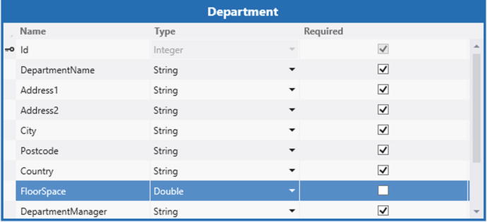
Figure 8-12. Schema of department table
Listing 8-7. Formatting numbers

To use this code, open your screen, select the data item to format, and add the code to the postRender method.
The underlying logic of this code works the same as the momentjs example, except that this code uses the numeraljs library instead.
The official Microsoft MSDN documentation includes a sample that shows how to format numbers to two decimal places by calling the native JavaScript method .toFixed. The benefit of this simple technique is that it removes the need to install numeraljs; the syntax you would use looks like this: $(element).text(value.toFixed(2));. Other built-in methods you can use include toPrecision, toExponential, and toLocaleString (this is a method you can call to format dates).
Although these native methods are simple to use, a library such as numeraljs provides more advanced functionality. For example, you can format numbers with leading zeros and format date, currency, and percentage values, and as you’ve seen you can format integers with 1,000 comma separators. With numeraljs, you can also apply ordinal suffixes after a number (for example: st, nd, rd, th), and you can also express numbers in terms of thousands with a k suffix.
You should also be aware the built-in .toFixed method doesn’t consistently round numbers across different browsers. If you want to round numbers predictably using an algorithm such as Bankers rounding, you should write code that uses the JavaScript math object to perform such calculations.
Running Code When Data Changes
By executing code when changes to data occur, you can implement powerful features to improve the usability of your application. To demonstrate such a technique, this example will show how to modify the Add Edit Issue screen so that when a user enters a new issue, it sets the target end date value to three days after the create date. Of course, the benefit of the data-binding technique is that the HTML client automatically updates the target end date as soon as the user modifies the create date (without needing a round trip to the server). Furthermore, it’ll do this every time the user subsequently modifies the create date.
To create this example, open the Add Edit Issue screen in the designer and select the rows layout that contains the controls that relate to your Issue property. By default, this group is called Details. Click the Add Code button and choose the Details_postRender method. Now, add the code that’s shown in Listing 8-8.
Listing 8-8. Running code when data changes

The first part of this code binds the CreateDateTime property to a function that calls the setTargetEndDate function . Note the binding path the method call uses here: screen.Issue.CreateDateTime. By referencing the screen object in the binding path, you can bind to other properties on your screen.
Each time the CreateDateTime property value changes, LightSwitch executes the setTargetEndDate function. This function tests whether the user is creating a new record and also checks that the user has set a create date . If this condition is true, it creates a variable called futureDate and uses JavaScript’s setDate method to set the value to three days after the create date . Finally, the code sets the TargetEndDateTime to this future date  .
.
Using Custom Controls
Just like with the Silverlight client, you’re not limited to using only LightSwitch’s built-in controls. If you’re unhappy with the way the built-in controls look or function, you can create your own custom HTML control. In this section, I’ll show you how to display data with a custom control. You’ll learn how to build a composite control that displays multiple fields, and toward the end of this section, you’ll learn how to implement two-way data binding. This will allow you to update as well as display data with a custom HTML control.
To define a custom control, use the screen designer’s drop-down to set the control for an existing data item to “Custom Control.” Alternatively, you can select the screen area where you want to add your custom control and choose the right-click “Add Custom Control” menu item. This opens the dialog that’s shown in Figure 8-13. This dialog prompts you to specify the data for your custom control. To help you enter correct syntax, Visual Studio provides IntelliSense as you type.

Figure 8-13. Setting the data binding for a custom control
Using the example of a Browse screen that contains a collection of issues, if you want to add a custom control that shows the Description field of the selected issue, the syntax you would use is Issues.selectedItem.Description. If you want your custom control to display more than just the Description field, you would use the path Issues.selectedItem. And if you want to create a custom control that shows multiple records, the syntax you would use would be simply Issues.
Once you add a custom control to a screen, an Edit Render Code link will appear in the properties sheet for your control. When you click this link, Visual Studio will open the code editor and create a method stub for your custom control’s render method. The render method allows you to define the HTML for your control by writing JavaScript. This method stub includes a ContentItem parameter that you can use to access the data that your custom control binds to.
Displaying Data with Custom Controls
To introduce the topic of custom controls, I’ll show you how to customize the tiles on a Browse Issue screen. Figure 8-14 shows the default look of this screen.

Figure 8-14. Default look of a Browse screen
By using a custom control, we can improve the appearance of each tile on this screen. Each tile shows the create date of the issue, but the formatting could be made more readable. We’ll therefore improve the formatting of the date value. The second enhancement we’ll make is to make it easier for users to identify issues that have exceeded the target end date. We’ll accomplish this by displaying a warning icon in the top-left part of the screen.
To create this custom control, open the Browse Issues screen in the screen designer. Delete all the child controls that appear beneath the tile list control and add a new custom control immediately beneath the tile list control. When the Add Custom Control dialog appears, set the data source of your custom control to Issues.selectedItem. Figure 8-15 shows how screen designer now looks.

Figure 8-15. Setting custom controls
Next, select the custom control in the designer, click the Edit Render Code link from the properties sheet, and enter the code that’s shown in Listing 8-9.
Listing 8-9. Displaying data with a custom control

The render method for any custom control includes two parameters: contentItem and element. The contentItem object represents the data that the custom control binds to—in this instance, the currently selected Issue record. The element object represents the placeholder to which you’ll add your custom HTML.
This code builds the custom control’s HTML output into a variable called customText. The first part of this code tests whether the issue’s TargetEndDateTime is greater than today. The code determines today’s date by declaring a variable and setting it to an instance of a new JavaScript Date object . Because the content item’s value is an Issue object, the syntax contentItem.value.TargetEndDateTime returns the target end date value . If the target end date is greater than today, the code creates an HTML image tag that shows a warning icon . You’ll need to create a warning image called warning.png and save it to your HTML client project’s ContentImages folder.
The next part of this code constructs the HTML for the control . It begins by adding the warning image, if necessary. Just like the earlier example, it then uses moment.js’s format method to apply a format that looks like this: Sunday 25th Dec 2016 (you’ll need to add momentjs to your project as I described earlier in this chapter). To complete the custom control, the final piece of code assigns the contents of the customText variable to the element parameter.

Figure 8-16. Appearance of the custom control
You can now run your application; Figure 8-16 shows how your screen should look. As you can see, the appearance is now much improved. The style of the Issue date is set to bold, which makes it easier to read. The tiles also show icons next to the issues that are overdue.
Accessing Navigation Properties
The custom control I just described accessed only the properties of the Issue object (CreateDateTime, TargetEndDateTime, and Subject). It’s possible to access the Issue object’s navigation properties in code, but to do this you need to configure your query so that LightSwitch loads the navigation property values. If you don’t do this, your code will fail when it tries to retrieve data that isn’t available.
You can configure the related data that the HTML client loads by clicking the Edit Query link that appears next to your query in the screen members list. When the query designer opens, click the Manage Included Data link that appears in the properties sheet in order to open the dialog that’s shown in Figure 8-17.

Figure 8-17. Making data available for custom controls
This screenshot illustrates how you can configure a query to return related data that is two levels beneath the main issue record.
Editing HTML Data with Custom Controls
Now that we’ve built a control to view data, the logical progression is to build a control that provides edit capabilities. To demonstrate such a control, I’ll describe how you can incorporate an HTML text editor into your application. This control features an open source HTML editor component called CKEditor (http://ckeditor.com/). The ability for users to edit HTML content is particularly useful for applications that connect to text data from a SharePoint data source.
In this example, we’ll use our custom control to store information about engineers in a field in the Engineer table called User Profile. The purpose of this field is to store rich text that could appear on web pages or email signatures. We’ll then create a custom control that uses CKEditor and add it to the Add Edit Engineer screen. Figure 8-18 shows what this final control looks like.

Figure 8-18. HTML editor custom control
To create this custom control, the first step is to add CKEditor to your HTML client project. The simplest way to do this is to use NuGet. Open the NuGet package manager (Tools NuGet Package Manager Manage NuGet Packages for Solution) and search for CKEditor. When you click the Install button, Visual Studio adds the CKEditor files to the following folder: Scriptsckeditor. Once you add CKEdit, open your default.htm file and add the following link to the body section, where the other script references appear:
As a side note, you can add script references to either the head or body section of your default.htm file. In most cases, it’s better to place external scripts in the body section of your file. When you put script references in the head, the browser synchronously loads and executes those scripts before it shows anything to the user. When you place script references in the body section, LightSwitch loads your external content while the splash screen is visible to the user.
For this example, you need to add a string property called UserProfile to the Engineer table. Once you do this, use the Common Screen Set template to create a set of tables for the Engineer table and then open the Add Edit screen in the designer.
Provided that your Engineer table includes a field called User Profile, here are the steps to carry out in the screen designer for the Add Edit Engineer screen: Select the user profile control and change the control type to a custom control; click the Edit Render Code link in the properties sheet; and add the code that’s shown in Listing 8-10. Once you add this code, you can run your application.
Listing 8-10. Adding the CKEditor control

To make sense of this code, let’s look at how to implement the CKEditor control on a normal web page. To use CKEditor, you would first add an HTML text area to your page. Then convert the text area into a CKEditor by calling a method called replace.
Looking at the code in Listing 8-10, the first part generates the HTML markup that represents a text area and renders it to the screen . The next section contains a safeguard against intermittent errors that can occur when you add instances of CKEditor with JavaScript. This code removes any rogue instances of CKEditor that may still be present from previous instantiations of the screen . In the next line of code, the replace method transforms the text area into an instance of CKEditor, while the setData method sets the text that the control shows .
When a user updates the data through the CKEditor control, the data change must be applied to the model. This code accomplishes this by handling the JavaScript blur event, which occurs when the focus leaves the CKEditor control. When this event occurs, the code calls CKEditor’s getData method to retrieve the content of the editor control .
The final part of this code contains the logic that updates the CKEditor content when the underlying model changes. This logic uses the familiar dataBind method  .
.
Tip You can use the code from earlier in this chapter to display the HTML content that a user enters through the CKEditor control.
Customizing the Appearance of Your Application
You’ll most likely want to modify the appearance of your application to help satisfy client requirements, or to adhere to the corporate branding of an organization. Fortunately, there are several methods you can use to accomplish this. You can use themes to apply a common look throughout your application. Or for more bespoke changes, you can apply custom CSS to the elements on your screen. You can use both of these methods to modify the icons, colors, and fonts in your application.
Theming Your Application
Let’s begin with the topic of themes. The HTML client uses jQuery mobile, and a valuable feature of this framework is the ability to apply wide-reaching presentational modifications through the use of jQuery mobile themes. A benefit of using a theme is that you can package the appearance of an application into a single file. You can easily use the same theme in multiple applications, and even share your themes with other developers. An Internet search for “jQuery mobile themes” will reveal many themes that you can download and use.
By default, LightSwitch applications use a light theme that features a white background. As an alternative, you can also apply a dark theme, which is characterized by a black background. When you build mobile applications, it’s often good practice to use a dark background because it reduces the drain on the battery.
LightSwitch stores themes in the Content folder of your HTML client project. This folder also contains additional CSS files that define the appearance of your application. These files are shown in Figure 8-19.

Figure 8-19. CSS files in the content folder
The CSS files that define the light theme are called light-theme-2.5.3.css and msls-light-2.5.3.css, and the files that define the dark theme are dark-theme-2.5.3.css and msls-dark-2.5.3.css. To change your application so that it uses the dark theme, open the default.htm file from the root folder of your HTML client project.
Near the top of this file, you’ll find two stylesheet links that refer to the light theme CSS files. To use the dark theme, modify these links to reference the dark theme CSS files instead. If you make this modification and run your application, LightSwitch applies a black background rather than a white background. If your application still shows a white background, your browser has most likely cached your default.htm file. You can fix this problem by clearing your browser cache, or by pressing <ctrl> F5 in Internet Explorer to perform a full refresh of the page.
Creating Your Own Themes
The jQuery website provides a tool for creating custom themes called ThemeRoller (Figure 8-20). To use this tool, open your web browser and navigate to http://themeroller.jquerymobile.com/.

Figure 8-20. Using ThemeRoller
You can simplify the process of creating a theme by taking the light theme as a starting point for further customization. From the ThemeRoller website, click the Import button on the top of the page. This opens a dialog you can use to enter a theme. Open your light theme.css file (by default, this is called Contentlight-theme-2.5.3.css) and copy and paste the contents into this dialog.
After you import the light theme, you can use the graphical designer to design your new theme. When you finish making your amendments, you can download your theme by clicking the Download button on the top of the page. The Download button creates a zip file that contains the CSS file for your theme. To apply your new theme, extract this CSS file into your HTML client project’s Content folder and modify your default.htm file so that it references your new theme file.
An important note about theming is that LightSwitch provides two additional CSS files: msls-light.CSS and msls-dark.CSS. The purpose of these files is to apply additional styling beyond what jQuery mobile can provide. To sum up, a theme can deliver most of the formatting you need, but to fine tune the appearance of your application, you may need to tweak the contents of the msls CSS files.
Bespoke Customization
The benefit of a theme is that it applies a consistent look and feel throughout your application. However, you can’t modify the appearance of specific elements with a theme. If you require more-bespoke customization, you can accomplish this by amending the HTML and CSS files in your application. In this section, I’ll show you how to modify the fonts, images, and positioning of items on your screen. I’ll begin by explaining how to change the icon and title of your application.
Changing the Application Icon and Title
The HTML client displays a splash screen image while your application loads. Once it loads, it shows a small icon in the top-left part of the screen and sets the browser tab or window title to “HTML Client” (Figure 8-21).

Figure 8-21. Changing the title in the default.htm file
The title tag in the default.htm file defines your page title. You can change this from “HTML Client” to something more meaningful by modifying the value of this tag. Near the top of your default.htm file, you’ll find a DIV tag that contains the name of your project (for example, “MyApp.HTML Client”). This defines the text that appears in the lower part of the screen when your application loads. You can modify this to something that better describes your application.
The HTML client stores the home page and splash screen images in the folder ContentImages. The home page image is called user-logo.png and the splash screen image user-splash-screen.png. To use different images, you can replace these two files with new images. Alternatively, you can amend the references to these images by modifying the splash screen section that appears in the file Contentuser-customization.css. The purpose of this file is to apply custom CSS modifications to your application, and you’ll typically refer to this file quite often when you customize the look of a LightSwitch application.
Applying Custom Fonts and Colors
You can modify the appearance of screen controls and elements by adding code to the postRender method, as shown in Listing 8-11. This technique allows you to modify the colors, fonts, positions, or any style that you can apply with CSS. Figure 8-22 shows the effect of this code and illustrates how you can use this technique to modify the background and foreground colors of the Target End Date field on an Issue screen.
Listing 8-11. Applying custom fonts and colors


Figure 8-22. Customizing the foreground and background colors of the Target End Date field
For simplicity, this listing applies the new colors with hard-coded CSS values. In terms of best practice, a better approach is to set a CSS class and then define a style in your user-customization CSS file. This method makes it possible to apply the same styles to multiple elements on different screens, and also improves performance by reducing the amount of markup in your application. We’ll apply techniques that incorporate CSS classes and rules throughout the remaining examples in this chapter.
To extend this sample further, you could (for example) add conditional logic to set the background color only when the target end date is overdue.
Modifying Label Styles and Adding Tooltips
By writing code in the postRender method, you can access a control’s label with jQuery syntax. This technique is useful because you can set label content that wouldn’t be possible by typing directly into the Description field of the properties pane. For example, you can italicize, underline, make bold, or colorize part of a label by using this method. Listing 8-12 shows how you can define tooltips for labels by defining a title for the label, as well as how to append a red asterisk to the end of the label text.
Listing 8-12. Modifying label data

Figure 8-23 shows the result of this example.

Figure 8-23. Modifying the label text and applying a tooltip
The syntax in this listing illustrates the jQuery syntax you can use to navigate the DOM (Document Object Model). In this example, $(element) relates to the DIV that contains the subject text box. $(element).parent() refers to the parent DIV that contains the DIV containers for the label and text box. To access the label text, the code calls the find method to locate the first label element beneath the parent DIV. Figure 8-24 shows the HTML for this screen and highlights how the jQuery syntax relates to the actual HTML.

Figure 8-24. Explanation of jQuery syntax
The ability to set the label HTML can be very useful. For example, I’ve used this technique to set the labels on scientific applications. Taking the example text Radon (Bq/m3), you can express this using the HTML Radon(Bq/m<Sup>3</Sup>). Without this technique, it can be difficult to express common superscript characters that are used in chemical formulas.
Defining Custom Button Icons
For any button you add to the footer section of a screen, you can apply one of the built-in icons using the icon drop-down in the properties sheet (Chapter 3 includes a screenshot of available icons). If you want to use a custom icon, you can do so by selecting the custom option from the icon drop-down. Once you choose this option, select the postRender method for your button and add the code that’s shown in Listing 8-13.
Listing 8-13. Defining a custom button

This code applies a CSS class called prols-mail-icon to the button. In LightSwitch, you can define custom CSS classes inside your user-customization file. This file is called user-customization.css, and you can find it in your content folder. To define the prols-mail-icon class, add the code in Listing 8-14 to your user-customization CSS file.
Listing 8-14. CSS rule for a custom button

For this CSS rule to work correctly, the placement of the prols-mail-icon identifier in the CSS query is important. With this rule, the background-image attribute specifies the path to your image. Note you must specify the !important declaration for the image to show correctly. The reason for this is that another rule exists in the msls CSS file that also declares the important rule. To complete this task, make sure to add the custom icon file to your solution. In this example, the file is called mail_icon.png, and I added it to the ContentImages folder.
Figure 8-25 shows what your screen looks like at runtime. When you create the custom image in your Paint application, there’s no need to draw a circle around your icon to make it fit in with the standard icons. LightSwitch automatically renders a circle around all button icons by applying a CSS border radius. For this reason, the CSS code in Listing 8-14 includes sizing information to help center and align the image.
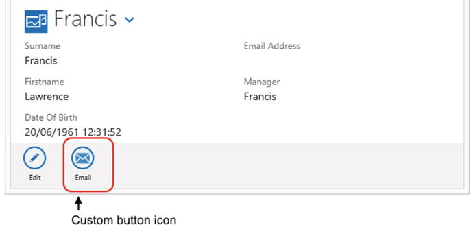
Figure 8-25. Custom button icon at runtime
Using an Image Sprite
A common practice in web development is to combine several images together. This combined image is known as an image sprite, or image stripe. To display a specific image from this sprite, you write CSS to pick out the image you want to use. This technique improves the performance of applications because it reduces the number of HTTP requests that the client needs to make. You can find a number of image sprite files in your LightSwitch project, one of which is ContentImagesmsls-blue-icons-36.png. Figure 8-26 shows the contents of this file in Microsoft Paint, and highlights the position of one of the images that we’ll use in this example. Note that this image has been resized to a height of 25px to match the height of the footer section.

Figure 8-26. Image strip
The screenshot in Figure 8-26 highlights the icon that I’ll use in this example. The icon is the cog icon, which typically denotes a feature to configure settings in an application.
Listing 8-15 shows the code that you need add to a button’s postRender method, as well as the CSS code you need to add to your user-customization CSS file.
Listing 8-15. Adding a class to apply an image from an image strip

The postRender code applies a class called prols-settings-icon to the button. The CSS style specifies the location of the cog icon by defining an X-axis offset for the background image of -249 pixels. You can determine this offset position by opening the file in a Paint-style application. You’ll notice that the status bar in Figure 8-26 shows that the X position of the selection corresponds to the X position of 249.
Note that if the icon doesn’t appear as expected, you should make sure that the image file appears in Solution Explorer. You may need to right-click the Images folder and use the add existing item option to add the msls-blue-icons-36.png file to your solution.
Positioning Menu Items to the Left
The key to bespoke customization is to apply CSS changes. The most difficult part is how to determine the elements to work with and how to work out the CSS rules that you need to specify. To demonstrate a technique that can help with this task, I’ll show you how to left align the buttons in the footer bar of a screen. By default, the HTML client right aligns these icons.
To work out the CSS rule that performs the right alignment, load your application and open the Internet Explorer Developer Tool. You can do this by pressing F12, or by clicking the cog icon and selecting the F12 Developer Tools option.
When the Developer Tools window opens, use the selection tool in the DOM Explorer to highlight the footer section of your application in the main IE window (Figure 8-27). The styles section in the Developer Tools window shows the styles that apply to the selected element. You can examine these styles to help determine the rule that performs the right alignment. By doing this, you’ll discover a CSS rule in the msls CSS file with the selector: .msls-footer .msls-buttons-row. This rule applies a float value of right to perform the alignment.

Figure 8-27. Determining the CSS class that performs the right alignment
To override this setting, you need to define a CSS rule with a greater specificity than the rule in the msls CSS file. To accomplish this, define a custom class in the body section of your default.htm file. Name your class prols, as shown in Figure 8-28.

Figure 8-28. Add a CSS class to the body of your default.htm file
Next, add the rule that’s shown in Listing 8-16 to your user-customization CSS file.
Listing 8-16. CSS rule to left align the footer items

Figure 8-29 shows how the footer looks once you reload your application.

Figure 8-29. Left aligning the footer buttons
Tip While you’re working with the F12 Developer Tool, you can modify, disable, or add new CSS rules. These changes will apply immediately and you can use this technique to try out CSS changes before you apply them for real in your source code.
Modifying Data List and Table Colors
By modifying your user-customization file and by using the F12 technique, you can modify the table and list control colors. In this section, I’ll describe the code that carries out this type of customization.
Applying Alternate Table Row Colorization to All Data Lists and Tables
Developers often apply alternating background colors to the rows in a table. Alternate row colors help users more easily parse and interpret data. In this section, I’ll describe two techniques. First, I’ll show you how to apply alternating row colorization to all the data lists and tables in your application. Second, I’ll show you how to customize specific tables by writing code in the postRender method of a table control. It’s useful to note that the light theme applies alternate row coloring by default. Curiously, the dark theme applies no alternate row coloring at all.
Let’s begin by modifying the styles for all tables in your application. In this section, I’ll show you how to customize the dark theme to add alternate row coloring. As a prerequisite, you need to amend your default.htm file to use the dark theme rather than the light theme.
Just like in the previous example, the first step is to add a class called prols to the body section of your default.htm file. Next, open your user-customization file and add the CSS code that’s shown in Listing 8-17.
Listing 8-17. Setting alternate row colors in all tables in an application

At this point you can run your application, and all tables in your application should apply the new color scheme. The code in the user-customization CSS file applies alternate shades of gray to all TR (table row) elements in your application. The code also applies a custom header color by defining a TH style.
Applying Table Row Coloration to a Specific Table
You can customize an individual table in your application by applying a CSS class in the postRender method of your table. Here’s how to apply this technique to a table on a Browse Engineers screen. In the screen designer, select your table control and add the postRender code that’s shown in the first part of Listing 8-18. Next, open your user-customization file and add the CSS that’s shown in the second part of Listing 8-18.
Listing 8-18. Setting alternate row colors for specific tables in an application

You can now run your application; Figure 8-30 shows the result. This code applies a CSS class called prols-table to your table. The CSS rules in the user-customization file apply alternate row colors to the rows that inherit this class. To assign the prols-table class, this code calls the jQuery first method and passes the argument table . The purpose of the first method is to return the first element that matches the type table.
The next line applies a CSS class called prols-table-header to all the table header cells in the table. This code demonstrates the use of the jQuery find method . The purpose of the find method is to return a set of matching elements. Another useful jQuery method you can use is children. The find and children methods are very similar. The main difference is that the children method only searches a single level down the DOM tree.
To demonstrate the appearance of a gradient style, the prols-table-header class applies a dark-to-light gray coloration to the table header.

Figure 8-30. Modifying table colors, including a gradient header style
Applying Styles to the List and Tile List Controls
You can apply custom styles to list and tile list controls by writing code that’s very similar to the code you would write for a table control. First, you can modify all list and tile list controls in your application by making the changes to your user-customization file, as shown in Listing 8-19. As with the previous example, remember to add the prols class to the body section of your default.htm file.
Listing 8-19. Setting alternate colors for all lists and tile lists in an application

The styles you define in this way will apply to all list and tile list controls in your application. In addition, LightSwitch also applies the same styles to the data lists that open from the modal picker control.
By default, a rule exists in the jQuery theme CSS file that applies a background image. To show block colors, you need to set the background-image style to none . Figure 8-31 shows the final result of this example.

Figure 8-31. Applying alternate row colors to a list control
To define a style that applies to single list or tile list control, you would apply a custom CSS class by writing code in the postRender method. Listing 8-20 shows the postRender method and corresponding CSS code you can use to customize an individual list or tile list control.
Listing 8-20. Applying alternate colors to a specific list or tile list control

The code in this section is almost identical to that in the table-customization example. The main difference is that this code applies a CSS class to a UL (unordered list) element, rather than to a table element. This accounts for the fact that the HTML client uses an HTML unordered list to render the list and tile list controls.
Conditionally Formatting Data Controls
There are certain scenarios in which you can help users by highlighting specific items in a data control. For instance, you could write conditional code that sets the background color of a list item depending on some business rule. You can accomplish this by writing code in the postRender method of a child control of a list, tile list, or table control.
Conditionally Formatting Data Tables
To demonstrate this technique, here’s how to highlight the target end date cell in a table of issues. The code in this section highlights the target end date only if the target end date is greater than today (Figure 8-32). For readers of the black and white edition of this book, the target end date cell of Issue 2 is highlighted in red.

Figure 8-32. Conditionally formatting the target end date cell in a table
To build this screen, open a Browse screen that’s based on the Issue table. Change the tile list control to a table control and add the target end date data item to the table row. Select the target end date control, click the Edit PostRender Code link in the properties sheet, and add the code that’s shown in Listing 8-21. To support this change, add the corresponding change to your user-customization CSS file, shown in the second part of Listing 8-21.
Listing 8-21. Applying conditional formatting to a table cell

At this point, you can run your application. To better understand this code, it’s useful to examine the HTML that the runtime generates. Figure 8-33 shows the HTML that represents a table control and summarizes the jQuery syntax you can use to refer to the elements in the table.

Figure 8-33. jQuery syntax you can use to refer to the items in a table
The code in Listing 8-21 contains logic to check the target end date. If the target end date is greater than today, the code uses jQuery to set the style of the table cell.
To further explain this code, let’s look at the markup that’s shown in Figure 8-33. The runtime generates an HTML table to represent a table control. An HTML table can contain one or more TR (table row) elements, and each TR element can contain one or more TD (table data) elements. When LightSwitch renders a table cell, it encloses the table cell data within a DIV inside the TD element.
Looking at the jQuery syntax, when you write postRender code for a table cell, $(element) refers to the containing DIV. The purpose of the jQuery closest("td") method is to traverse up the tree until it finds the first TD element. This enables you to work with the parent table cell and to set the background color as needed. If you want to access the table row instead, you can do so by modifying the code so that it calls closest("tr") instead.
An important note about this code is that the primary purpose is to show you how to apply CSS to a specific item in a data control. With this example, note that LightSwitch runs the conditional logic in the postRender method only when it initially shows the data. If a user edits the target end date through an Add Edit screen and returns to the Table screen, the screen will not update the table cell color. If you need to handle this situation, you can adapt the code from the “Running Code When Data Changes” section to update the color when a user changes the underlying data.
Conditionally Formatting Tile List and List Controls
By using syntax that’s similar to that in the previous example, you can conditionally format the list items in a list control, or the title in a title list control. See Figure 8-34.

Figure 8-34. Conditionally formatting list and tile list controls
To format a list item, select a child control from your list or tile list controls and add code to the postRender method. This code assumes that, in the case of a list control, you choose to write postRender code for a child summary control (as shown in Figure 8-35). Listing 8-22 summarizes the jQuery syntax you can use to access the list or tile list items.

Figure 8-35. Where to add the postRender code
Listing 8-22. Conditionally formatting the tile list and list controls

Once again, the clearest way to interpret this code is to look at the HTML that the runtime generates. Figure 8-36 illustrates the HTML for list and title list controls and shows the jQuery syntax you can use to access the elements of these controls.

Figure 8-36. Conditionally formatting list and tile list controls
In the case of a list control, $(element) refers to the DIV that contains the data item. The runtime renders this DIV inside an LI element (an HTML list item). So, to access the parent LI element, the syntax you can use is parents().eq(0). The purpose of the parents method is to return all ancestor elements. The eq method allows you to access a specific level. In this example, eq(0) refers to the parent method, whereas eq(1) would refer to the parent element that is two levels up. Alternative syntax you could use is the closest("li"), which you saw in the table control example.
In the case of a tile list control, the syntax to access the parent tile from the postRender method of a child control would be $(element).parents().eq(1). This is because the DIV that contains the tile is two levels above the element that contains the child data.
Hiding Items Based on Phones or Other Small Devices
When a user opens your application on a small device such as a phone, you may want to hide less important data to help optimize the screen space that’s available. By adding a rule to your user-customization CSS file, you can hide selected parts of your screen for mobile devices.
To create such a rule, open your user-customization CSS file. Within this file, you’ll find a phone media query section. Add a new CSS rule called prols-phone-hidden, as shown in Listing 8-23.
Listing 8-23. CSS rule to hide data on smaller devices

The CSS query in this listing specifies a display width of no greater than 400px in portrait orientation, or a width and height not greater than 640px and 400px in landscape orientation. Any CSS rules you define within this query will only apply when the dimensions of the client browser meet this condition.
To hide an element on a small device, add the class prols-phone-hidden to the control’s postRender method, as shown in Listing 8-24 . This code highlights how, on mobile devices, you can hide the help text that I showed you earlier in this chapter.
Listing 8-24. Hiding items on mobile devices

Figure 8-37 shows the end result of this example and highlights how the screen appears differently on desktop and mobile devices. Notice how the mobile device hides the help text and renders the two-column layout so that it appears in a single column instead.

Figure 8-37. Apperance of the screen on desktop and mobile devices
Note that because LightSwitch screens behave responsively, you don’t need to test this change on an actual mobile device. You can test how your application behaves on mobile devices by simply resizing your desktop browser window.
Walkthrough 8-2. Customizing the UI
In this final walkthrough, I’ll demonstrate how you can revamp the look of your application. The aim of this example is to modify an application so that it mimics the look of a typical website. The theme of this walkthrough includes bespoke navigation and customization of both buttons and UI elements. Figure 8-38 highlights the look this walkthrough attempts to achieve.

Figure 8-38. A LightSwitch application with a customized header section
As Figure 8-38 shows, this application replaces the default navigation drop-down control with a customized application header. This header contains a top-level navigation section that includes “Engineer” and “Issue” menu items. When a user clicks one of these menu items, a second-level menu containing a list of additional menu items appears in the area beneath the header.
The right part of the header includes a text box to enable users to carry out a search of issue records. I’ll explain how this fully works in Chapter 10.
To further customize the look of the application, the code in this walkthrough will show how to display the screen titles in a section underneath the navigation banner. I’ll also describe how to customize buttons to remove the rounded icon look.
Such deep changes to an application require you to modify the LightSwitch runtime. This is because CSS changes can only take you so far. It’s very difficult to hide or move entire screen sections with CSS alone.
When I wrote this chapter, I strongly considered leaving this content out of the book because it relies on a technique that both Stephen (my technical reviewer) and I would advise against. This is because any future update to LightSwitch will include revised versions of the runtime, and thus you will need to rework your changes with each update to LightSwitch. Also, this type of modification is not supported, and you can easily introduce unexpected errors by incorrectly modifying the runtime.
Despite this, I decided to include this content to help provide the type of insight into LightSwitch that most developers achieve only by working with it for an extended period of time. Therefore, I recommend that you use this walkthrough to gain familiarity with how the runtime works, and that you only apply changes to the runtime under extenuating circumstances.
Creating Custom Navigation
With these caveats in mind, I’ll start by showing you how to customize the header section of an application. The high-level overview of the steps you need to carry out are as follows:
- Make a copy of the runtime. In your new copy, modify the code that generates the header section of the application.
- Create CSS and JavaScript files to support the new page layout.
- Modify your default.htm file to support the updated changes.
The first step is to make a working copy of the runtime. LightSwitch’s runtime file is called msls-2.5.2.min.js (or msls-2.5.2.js for the non-minified version). This file exists in the scripts folder of your HTML client folder. Make a copy of the non-minified msls-2.5.2.js file and name your version msls-2.5.2.prols.js.
Once you have made a working copy of the runtime file, you can begin to make your modifications. The runtime file includes an HTML template that LightSwitch uses to build the header section of your application. To modify this template, open your msls-2.5.2.prols.js file and search for the string var msls_templateStrings. Depending on the version of the msls script you are using, this code will appear around line 15000. Modify the taskHeaderTemplate section of code, as shown in Listing 8-25. The code beneath this section that defines the template for the other screen sections remain the same.


The next step is to add the JavaScript code to support the new navigation structure. The following code implements this functionality. Create a new file in your scripts folder called prols-menu-1.0.0.0.js. Next, add the JavaScript that’s shown in Listing 8-26.
Listing 8-26. JavaScript changes

To create the styles to support the new layout, create a new CSS file in your content folder called prols-menus.css. Then, add the content that’s shown in Listing 8-27.


Finally, add references to the JavaScript and CSS files in your default.htm file. Listing 8-28 shows the snippet of code you would add to the header section to reference the CSS file, and the script link you would add to the body section.
Listing 8-28. Default.htm changes

At this point, you can run your application and interact with the updated header section. Let’s review how the template code in Listing 8-25 works. The taskHeaderTemplate section defines the template that LightSwitch uses to build the header section of an application. This template includes numerous placeholders. You can identify the placeholders because they appear in uppercase text. To give an example, the runtime shows the application logo inside the placeholder that’s named LOGO-BACK-PLACEHOLDER .
LightSwitch applications include a CSS style named msls-header-area. This class defines the header style of the main application and dialog screens. By applying a custom class called prols-header-area , you can define an appearance that applies only to the header section of the application. The top part of the header contains an <H1> heading that displays the application title .
The next section of code in the template defines the top-level navigation menu . The top-level menu is contained within a DIV. The CSS class prols-menubar defines a style for this menu. The top-level menu items are defined in a list. Each list item includes JavaScript code that toggles the visibility of a second-level menu. For example, the top-level “Engineers” menu item calls a method called toggleEngineerMenu that toggles the visibility of the second-level engineer menu . This code defines two second-level menus: one for engineer tasks  and one for issue tasks
  . By default, the visibility of these second-level menus is set to none. The on-click action of the items in the second-level menu uses the LightSwitch API to open screens. For example, the “Browse Issues” menu item calls the myapp.showBrowseIssues method to open the Browse Issues screen
  .
.
The final part of the template defines an <H2> heading that data binds to the title of the current screen. It’s important to set the class, control, and data-ls-text attributes that are shown in this listing. These are all necessary in order for LightSwitch’s data binding to work.
The JavaScript code in Listing 8-26 contains code that toggles the visibility of the second-level menu. It’s a good idea to abstract JavaScript code into function calls that you define elsewhere. Any jQuery code you add to the template string will not work at runtime, because the runtime treats the $ symbol as a special character. In Listing 8-26, the jQuery code uses class selectors to toggle the visibility of the second-level menus. jQuery ID selectors (using the $("#myControl") syntax) won’t work, because LightSwitch can dynamically change the ID of the controls during the execution of an application.
Creating Custom Buttons
The second part of this walkthrough will show you how to replace the rounded icon buttons on a screen with flat-style buttons (as illustrated in Figure 8-38). A prerequisite of this section is that you add the prols-menus.css CSS file from the previous section, and reference this file from your default.htm file. Here are the steps to apply this style to the Add Issue button on the Browse Issues screen:
- Open the Browse Issues screen. In the Command Bar section, select the Add button. In the properties sheet, set the icon to custom.
- In the properties sheet, set the display name of the button to “Add Issue.” You can set a longer, more descriptive button-text value now that the button doesn’t include an image.
- Click the Edit Post Render Code link and add the code that’s shown in Listing 8-29.
Listing 8-29. postRender code

At this point, you can run your application. When you open the Browse Issues screen, the Add Issue button will render in a style that doesn’t include an icon.
This code works by assigning a custom CSS class called prols-icon-hidden to the button. This class overrides the rule in the ui-icon class that applies the icon image. The prols-icon-hidden class applies a background color and border style to mimic the look of a button. It also includes a selector that changes the background color of the button when a user hovers over the control with a mouse.
Summary
In this chapter, I showed you how to customize HTML client applications with JavaScript, jQuery, HTML, and CSS code. By using these techniques, you can improve the look of your application and add features to improve the usability of your application.
The JavaScript API includes many objects you can use. The myApp object provides methods you can call to open screens, save changes, and access the current dataWorkspace object. The screen object provides access to local (data) properties and includes methods you can call to set the visibility of tabs and popups. The contentItem object represents a data item on your screen, and you can use this to access sizing properties, validation results, and the content item display name.
The runtime builds the HTML for each control on a screen. Before this process is complete, you can intercept the process by writing code in a method called postRender. You can use this to modify the HTML or to add additional HTML content to a control. This technique allows you, for example, to add text, images, or hyperlinks to a screen.
Popups are small modal pieces of UI. You can use these to display small amounts of data, or to enable simple interaction with the user. The lower part of the screen designer contains a node that you can use to add and define the controls that appear in a popup. Popups are hidden by default. You would call the showPopup and closePopup methods on the screen object to set the visibility of a popup. To give a practical example of how to use this control, I showed you how to use a popup to ask for user confirmation prior to the deletion of a record.
By using data-binding techniques, you can execute code when the value of a property changes. In this chapter, I showed you how to run code that updates the target end date property of an issue record whenever a user changes the create date. To data bind a property to a JavaScript function, select the control that contains the property you wish to data bind and add code to the postRender method. The postRender method exposes a contentItem object. The contentItem object exposes a method called databind. You can define code that executes when the value changes by calling the databind method and supplying a binding path of “value” and defining a JavaScript function that contains your code.
By extending the data-binding technique, you can replace LightSwitch’s default controls with custom HTML controls. There are several steps you need to carry out to do this. In the screen designer, the first step is to change the control type of your data item to “Custom Control.” Next, click the Write Code button and select the render method. The signature of the render method includes parameters called element and contentItem. The element object represents the HTML markup that appears on screen. Next, write code to build the HTML markup that defines your control. As you’re constructing your HTML markup, you can use the contentItem.value syntax to retrieve the underlying value of your item. Once you’ve constructed your HTML, set the value of the element object to the HTML that you’ve built.
While you’re still writing the render method, there are a couple more tasks to carry out. First, to configure your custom control to update the underlying property when the user updates data, you can use jQuery to add an event handler for your control. You can handle an event on your custom control, such as blur or change, and update the underlying property value by setting the contentItem.value member.
Second, to make your custom control listen to changes to the underlying data value, call the contentItem.databind method and supply a binding path of “value” and a JavaScript callback function. The signature of the JavaScript function can include a parameter, which you can use to obtain the latest property value. Within your function, you can use jQuery to update the display value of your custom control.
In the final part of this chapter, I showed you how to modify the appearance of your application through themes and the manual modification of CSS rules. The purpose of a theme is to apply consistent colors, fonts, and styles throughout your application. LightSwitch applications include two built-in themes: a dark theme and a light theme. The default.htm file defines the theme that an application uses. The easiest way to create a theme is to use a tool on the jQuery website called ThemeRoller.
For more bespoke customization, you can customize the CSS rules for your application. LightSwitch provides a user-customization CSS file that enables you to define new styles or to override existing styles. To help identify the styles that apply to various screen elements, you can use IE’s F12 Developer Tool. Once you define a CSS class in your user-customization file, you can write postRender code to append CSS classes to the elements you want to modify. The syntax you would use to do this is $(element).addClass("yourCSSClass").
In this chapter, I showed you how to apply this technique to define custom button images, modify label text, change the alignment of the footer section, define the colors used by the list and tile list controls, and hide items on small-form-factor devices, among other things.