
Creating Control Extensions
LightSwitch includes an extensibility framework that you can use to extend the capabilities of the design environment. By installing third-party extensions, you can add additional controls, screen templates, data sources, and business types to Visual Studio. I’ll begin this chapter by showing you how to install and use third-party extensions. Next, I’ll show you how to build custom control extensions. The topics that I’ll cover in this chapter include the following:
- how to install extensions that are designed for previous versions of LightSwitch
- how to build and deploy control extensions
- how to enable developers to configure your control extension by extending the property sheet that appears in Visual Studio’s screen designer
There are several control types that you can build. For viewing and editing data, you can develop controls that bind to either scalar or entity values. The remaining control types are custom layout and command type extensions. To demonstrate these, I’ll show you how to build the following control extensions: time duration, combobox, toggle layout, and button control.
I’ll begin by showing you how to use extensions that other people have created. Then, I’ll show you how to build custom control extensions. And in the next chapter, I’ll show you how build screen template, data source, and business type extensions.
Installing LightSwitch Extensions
Because LightSwitch 2015 is a recent product, few third-party extensions exist for this release. However, many great extensions exist for earlier versions of LightSwitch, and with a little bit of effort, you can make these extensions work with LightSwitch 2015.
To demonstrate this technique, I’ll show you how to install and use the many-to-many control from Microsoft. You first need to download it from the following web page:
http://code.msdn.microsoft.com/Many-to-Many-Control-for-52cd8c6c
Visual Studio extension files end with a VSIX file extension. Inside the many-to-many control download package, you will find a file called ManyToManyControls.vsix in the binaries folder. To install an extension, simply double click the VSIX file in Windows Explorer.

When you attempt to install the many-to-many control extension on a computer with only Visual Studio 2015, the installation fails. This is because the extension is designed for Visual Studio 2010.
A method you can use to overcome this problem is to modify a setting in the manifest file that specifies the compatible versions of Visual Studio. This technique works for most extensions, but you should apply it with caution, as it isn’t guaranteed to work with all extensions. To carry out this change, rename the ManyToManyControls.vsix file to ManyToManyControls.zip. You can do this because VSIX files are simply compressed zip files with a VSIX extension. Next, extract the contents of this zip file. The root folder of this archive contains a file called extension.vsixmanifest. Open this file in Notepad and add an entry for the Visual Studio (version 14) Pro Edition into the supported products section, as shown in Figure 19-2.

Figure 19-2. Modifying the manifest file
Save your changes and recompress the contents into a new zip file. When you compress your files, make sure not to add the parent folder into your archive. The extension.vsixmanifest file needs to be in the root of the archive. Finally, change the extension of your zip file to VSIX. At this point, you can install the extension by double clicking the VSIX file. After you install your extension, an entry will appear in the Visual Studio’s Extensions and Updates dialog, which you can open through the Tools menu. Figure 19-3 illustrates this dialog.

Figure 19-3. Extensions and Updates dialog
To use an extension in your LightSwitch project, you need to enable it in the properties of your project. On the Extensions tab (shown in Figure 19-4), use the checkboxes to enable the extensions that you want to use. You can also select the “Use In New Projects” checkbox to automatically enable the extension in any new projects that you create. This saves you from having to go to the Extensions tab and manually enable the extension each time you create a new project.

Figure 19-4. Enabling extensions in your LightSwitch project
Using the Many-to-Many Data Control
Once you install the many-to-many control, you can use it on your screens like any other built-in control. I’ll now demonstrate how to adapt the Engineer Details screen to enable managers to assign skills to engineers.
To set up your application, carry out the following steps:
- Create the two tables: Skills and EngineerSkills. Create the relationships between these two tables, and also create the relationship between the EngineerSkills and Engineer tables. You can refer to Chapter 2 for full details.
- Create an Editable Grid screen for the Skills table. This enables you to enter skill records at runtime.
After you create your table structure, create an Engineer Details screen. In the Add New Screen dialog, make sure to include the EngineerSkills data by selecting the “Engineer Skills” checkbox in the Additional Data section.
In the screen designer, drag the EngineerSkills collection onto your screen. By default, LightSwitch displays this data collection using a data grid. Use the drop-down box to change this data item from a data grid to checkbox list.

Figure 19-5. Using the many-to-many control
That’s all there is to using a custom control. You can now run your application. Figure 19-6 shows what the control looks like at runtime.

Figure 19-6. Many-to-many control as shown on screen at runtime
The many-to-many control is just one of many extensions available from the LightSwitch team. Let’s look at a couple of other useful extensions that you can add to your application. Just like the previous example, you would need to modify the manifest file to make these compatible with LightSwitch 2015.
- Filter Control: This control makes it really simple for you to create a custom search screen: https://code.msdn.microsoft.com/Filter-Control-for-eb947bdc
- Excel Importer: This extension allows you to add a control to your screen that allows users to import data from an Excel spreadsheet: http://code.msdn.microsoft.com/Excel-Importer-for-Visual-61dd4a90
Preparing Your Computer to Develop Extensions
The software that enables you to develop your own extensions is the LightSwitch Extensibility Toolkit. At the time of writing (October 2015), a version of this toolkit was not yet available for Visual Studio 2015. I had hoped that Microsoft would release a 2015 prior to the publication of this book. In the absence of a 2015 version, I’ll instead show you how to build extensions with the 2013 version of the toolkit.
Because of this, an unfortunate prerequisite of this chapter is that you need to install Visual Studio 2013. However, when Microsoft releases the Extensibility Toolkit for Visual Studio 2015, this step will not be necessary. After you install Visual Studio 2013, you will need to install the Visual Studio SDK. You can download this and the Extensibility Toolkit from the following web pages:
- Visual Studio SDK: https://www.microsoft.com/en-gb/download/details.aspx?id=40758
- Extensibility Toolkit: https://visualstudiogallery.msdn.microsoft.com/2d204191-90eb-4dfb-831f-cf31513cef06
To install the Extensibility Toolkit, you first need to run the Extensibility Toolkit VSIX file. To complete the installation, copy a file called Microsoft.LightSwitch.Toolkit.targets into your MSBuild folder. The Extensibility Toolkit’s readme file provides full instructions. When you complete this step, you will be able to create new Extension Library projects in C# and VB through Visual Studio’s New Project window (as shown in Figure 19-7).

Figure 19-7. Adding a new Extension Library project
When you create an Extension Library project, the template adds seven individual projects to your solution. The LSPKG project is the entry point that enables you to add new extension items to your project. To add a new item, right-click the LSPKG project and select the “Add New Item” menu item (shown in Figure 19-8). This opens the Add New Item dialog, which you can use to create one of the six extension items. You’ll use this dialog throughout this and the next chapter to create extension items.

Figure 19-8. Right-click the LSPKG project to create a new item
In addition to the LSPKG project, there are other projects in an Extension Library solution:
- Client: This contains the Silverlight custom control XAML and .NET code.
- Client.Design: This contains custom code that extends the Silverlight runtime designer.
- Common: This contains the lsml metadata that describes your extension and the common .NET code that runs on both the client and server.
- Design: This contains custom code that extends the Visual Studio design surface. This project also stores custom screen templates.
- Vsix: This contains the build output that developers can use to install your extension.
Understanding Custom Control Types
There are five custom control types that you can create, which are shown in Table 19-1. You’ll be familiar with these control types because you will have used controls that match these control types throughout your day-to-day use of LightSwitch.
Table 19-1. Custom Control Extension Types
|
Control Type |
Purpose and Example Control |
|---|---|
|
Value |
Represents a single scalar value (text box, label) |
|
Details |
Represents an entity (auto-complete box) |
|
Command |
A control that initiates an action (button, hyperlink) |
|
Collection |
Represents a collection of data (data grid) |
|
Group |
A container for other controls (rows layout) |
Let’s look at a high-level overview of how to create a control extension. The first step is to right-click your LSPKG project and select the option to add a new item. The subsequent tasks that you then need to complete are:
- Set the control type, display name, and description for your control extension.
- Specify the data types that your control supports (for collection and value types only).
- Write the XAML that defines the UI for your control.
- Set the icons for your control.
After you create a custom extension, you can extend it further by adding custom properties and property editors. An example of custom properties are the “Show As Link” and “Target Screen” properties in Visual Studio’s property sheet for the label control. You can also add read-only support, handle keyboard navigation, and allow developers to access your control in code.
Value controls enable users to view or edit a single value. In this section, I’ll show you how to wrap the duration control from Chapter 13 in a custom control extension. You’ll find out how to allow developers to access your control in code and how to optimize the performance of your control when a developer uses it on a data grid. To build the duration editor control extension, carry out the following steps:
- Start Visual Studio, create a new Extension Library project, and name it ApressExtension.
- Right-click your LSPKG project, create a new control item, and name it DurationEditor.xaml.
- Right-click your Client project, select the “Add Reference” option, and add a reference to the ApressControls.dll assembly that you created in Chapter 13.
- Modify your DurationEditor.xaml file as shown in Listing 19-1.
After you complete step one, Visual Studio opens your XAML file in the code editor window. The Add New Item dialog creates a custom control that includes a textbox control. If you want to build a very simple control, you can create a control extension that uses a textbox control rather than the duration control from the ApressControls.dll assembly.
Listing 19-1. XAML markup for a value control

The XAML in this listing defines the presentation logic for your custom control and contains the following functionality:
- Support for the duration editor control: This code includes the duration editor control, although, as I mentioned earlier, you can use a textbox control instead to shortcut this example.
- State handling: LightSwitch can hook into your control and show loading and error states. When a user enters invalid data in a screen, LightSwitch displays a red border around your control. This example includes the logic that supports this behavior.
- Data-grid optimization: If you add this control to a data grid, the control appears in read-only mode and becomes active only when the user selects the cell.
The first part of this XAML adds a namespace reference to the ApressControls.dll assembly  . This allows you to use the duration editor in your control. The second reference
  refers to a value converter that converts integer durations into their hour and minute representations. We haven’t yet created this value converter, so at this moment, Visual Studio highlights this line as an error.
The reference to the Microsoft.LightSwitch.Presentation.Framework assembly  allows LightSwitch’s state-handling mechanism to work. Note that namespace references must not contain line breaks. I added line breaks in these listings to allow the code to fit the page. For LightSwitch’s state handling to work correctly, you must enclose the contents of your control inside a StatesControl element
  .
.
The main part of this control defines a duration editor control. It uses the data-binding path of Value to set the Duration dependency property  . Value represents the data context value of your custom control (that is, the value of the data item that your custom control binds to). The code also data binds the tooltip of the duration editor control to the description of your data item.
The UserControl.Resources tag  defines the value converter that converts integer durations into a format that includes hours and minutes. At the moment, there isn’t any XAML in this control that uses this value converter. I’ll show you how to use this value converter later when we optimize this control for data-grid use. At present, you’ll also receive an error on this line, because it refers to the value converter that we’ll create very soon.
 Note The XAML examples in this book feature the VB version of the source code, and the listings refer to the namespace ApressExtensionVB. If you recreate these examples in C#, make sure to replace the references that include a VB suffix with the correct name.
Specifying Which Data Types to Support
Value custom controls work with specific data types, and, in our case, the duration editor will work only with numeric data. You define the data types that your custom control supports in an LSML file that corresponds with your control. You can find this file in the Metadata folder of your Common project.
To configure your control to work only with integer data, open the DurationEditor.lsml file and modify the SupportedDataType element as shown in Listing 19-2 .
Listing 19-2. Specifying control data types

If you want your control to support additional data types, you can specify this by adding additional SupportedDataType elements. The SupportedDataType values you can use include :String, :Boolean, and :Date. Appendix B shows a full list of valid values that you can use.
Supporting the FindControl Method
Developers expect to be able to access the underlying Silverlight control in screen code by calling the IContentItemProxy object’s FindControl method. Refer to Chapter 9 if you want to remind yourself how this works.
To add support for the FindControl method, open the code file for your control. (You can do this by opening the DurationEditor.xaml file in the editor and choosing the right-click “View Code” option.) Now, edit the code by adding the code that’s shown in Listing 19-3.
Listing 19-3. Adding support for the FindControl method

When you add a control item, the Add New Item dialog creates two classes in your custom control’s code file: a class that represents your user control, and a supporting factory class. The code in Listing 19-3 modifies your user control class to implement the IContentVisual interface . The next block of code implements the Control property. The Control property returns a reference to your Silverlight control, and, in this example, DurationControl refers to the name of the duration editor control that you defined in Listing 19-1.
With VB.NET, Visual Studio now shows a warning against the reference to DurationControl. You can safely ignore this warning. This warning occurs because the project has not been built yet, and Visual Studio therefore does not recognize DurationControl.
If you were writing a control that contains hidden UI elements (for example, an expander control), the Show method would include code to reveal the hidden content. Because this doesn’t apply to our example, this code raises an exception if a developer attempts to call the Show method.
Setting the Control Icon
By default, LightSwitch’s screen designer identifies your custom control with a green spherical icon (as shown in Figure 19-9). The Extension Toolkit’s control template generates a PNG icon file for every custom control that you create and names it after your control.

Figure 19-9. Default green icon
You can change this icon by replacing the DurationEditor.png file in your Design project in the following path: ApressExtensionVB.DesignResourcesControlImages.
Optimizing Controls for Data-Grid Use
If you add the control that you’ve built so far to a data grid, LightSwitch creates an editable instance of your control on every row (see Figure 19-10). There are three problems with this behavior. First, it doesn’t match the default behavior of the standard LightSwitch controls. In Figure 19-10, notice how the grid displays the entry date as a read-only piece of text and how the control becomes editable only when the cell has the focus. The second relates to performance—it isn’t efficient to show multiple editable controls on every row in a data grid. And the final problem relates to usability. Each editable control introduces a tab stop. If the user isn’t using a mouse and attempts to navigate your screen with the keyboard, the process can be very awkward. Let’s suppose your data grid contains 45 records (the default page size), and a user sets the focus to the first row in the grid. To get to the Save button that appears after the grid, the user would have to press the tab key 90 times!

Figure 19-10. The duration control is shown as editable for each row
Because of these problems, it’s good practice to develop custom controls that display read-only text values when they appear on a data grid. To do this, you would create a display-mode template with XAML that shows your data through read-only controls. You define this template by setting the return value of a method called GetDisplayModeDataTemplate. You can find this method in the factory class for your control.
Before you write your display-mode template, you need to create a custom Silverlight control to display the duration data with a Silverlight textblock control. In your Client project, add a new Silverlight user control in your Presentation > Controls folder and name it DurationViewer.xaml. Now, modify the contents of this control, as shown in Listing 19-4.
Listing 19-4. Creating a display mode control

The custom control in Listing 19-4 displays the duration text in a textblock control . It uses the data-binding path Value to bind the Text property to the underlying content item. The data-binding definition specifies a value converter to convert the integer duration values to a string value that consists of hours and minutes. For example, it converts the integer value 90 into the string value 1hr 30min. The code in the top section of the control defines the value converter .
To create this value converter, create a new class called SplitMinutes in the Presentation  Controls folder of your Presentation project. Make sure to add your class file to the Presentation Controls folder. If you fail to do this, your code might not compile properly. Now, add the code that’s shown in Listing 19-5.
Listing 19-5. Value converter that returns a string representation of a time duration

This code contains the standard logic that exists in a value converter. If you need help understanding how this code works, you can refer to Chapter 13 for further help.
Once you create your duration viewer control and SplitMinutes value converter, open the code file for your duration editor control. Now, add the code from Listing 19-6 to the IControlFactory Members region of your file.


The first part of this code defines a constant variable called DisplayModeControlTemplate . This variable stores the template that the control uses when it renders in display mode. The XAML in this template presents your data with the duration viewer control that you created in Listing 19-4.
In simpler scenarios, you could create a DisplayModeControlTemplate that displays your data with a textblock control and save yourself the effort of creating a custom viewer control. In this scenario, however, defining the logic in the duration viewer control keeps your code more self-contained and allows you to more easily reference value converters.
GetDisplayModeDataTemplate is the method that LightSwitch uses to retrieve the display-mode template. Your code file already includes this method, but, by default, it returns a null. The code that you add creates a DataTemplate object based on the content of the DisplayModeControlTemplate variable. To further improve performance, the code caches the DataTemplate in a variable called cachedDisplayDataTemplate.
This completes the duration editor control. Figure 19-11 shows how it looks at runtime when you add it to a data grid. The screenshot illustrates the desired outcome. Notice that if a row doesn’t have the focus, the data grid shows the duration value by using the duration viewer control. Otherwise, it uses the editable control from the DurationEditor.xaml file.

Figure 19-11. Display-mode template at runtime
Retrieving Height, Size, and Property Settings
You can configure custom controls to apply the appearance settings that a developer sets through Visual Studio’s property sheet in the screen designer. These include height, size, and alignment settings. Listing 19-4 already implements this and uses data binding to apply the settings that the developer supplies. Listing 19-7 highlights the specific code that does this.
Listing 19-7. Binding to values that the developer enters in the screen designer

This code binds the size, alignment, and text values of the control to the values that the developer enters through the properties sheet. The code uses the following syntax to retrieve the width setting: Properties[Microsoft.LightSwitch:RootControl/Width] .
RootControl refers to the control that every custom control inherits as its top-most base control. Width refers the width setting that the developer enters through the properties sheet. The remaining lines of code bind the height and alignment properties with similar syntax. The code that defines the textblock control binds the TextAlignment setting to the value that the developer enters in the properties sheet, as shown in . The full list of data-binding keys that you can use is shown in Appendix C.
Running and Deploying Your Extension
You’ve now completed all of the tasks that are necessary to create a non-trivial control extension—well done! You can now run and debug your project in the usual way by pressing F5. This starts an experimental instance of Visual Studio 2013 that you can use to create or open an existing LightSwitch application. You can then debug your extension as normal by placing break points in your extension code. If you need to modify the debug settings for this experimental instance, you can do so by opening the properties of your VSIX project and editing the details on the Debug tab.
To deploy your extension, simply distribute the VSIX file from the output of your VSIX project. For this example, you can find the output file in the following location:
ApressExtensionVBApressExtensionVB.VsixinReleaseApressExtensionVB.vsix.
You can now install your VSIX file as you would any other extension. After you install your extension, remember to enable it in the properties window of your LightSwitch project. You can then use your duration control on your screens, as shown in Figure 19-12.

Figure 19-12. Using the duration editor control
Note that if you created your duration editor control in VB, you might need to carry out an additional step before you build your project for the first time. The problem is that the duration editor and duration viewer controls depend on the SplitMinutes value-converter class. Visual Studio will refuse to build the duration editor and duration viewer controls if you don’t first build the SplitMinutes class. The way to resolve this problem is to right-click the DurationEditor.xaml and DurationViewer.xaml files in Solution Explorer and to select the “Exclude From Project” item. Once you exclude these two files, build your project. When you complete your initial build (and compile the SplitMinutes class in the process), re-enable the DurationEditor.xaml and DurationViewer.xaml files by selecting the right-click “Include In Project” item. You can now carry on as normal.
Setting Product/Installation Attributes
Custom extensions include attributes that appear during the installation of your VSIX file and also appear in Visual Studio’s Extensions and Updates dialog. These attributes include name, version, author, description, license details, icon, and a whole lot of others. You can set these values through a file called vsixmanifest that exists in the root of your VSIX project. Double-click this file to open the editor, as shown in Figure 19-13.

Figure 19-13. Setting the properties of your extension
To make your extension compatible with Visual Studio 2015, edit the entry that exists in the Install Targets tab. As Figure 19-13 shows, you can set versions 12.0 to 15.0 to be the versions of Visual Studio that are compatible with your extension. Notice how the Version Range setting begins with a square bracket and ends with a round bracket: [12.0,15.0). Although this may look strange, this is the syntax that you use to define a range, and there is therefore no mistake here.
Creating a Detail Control (ComboBox)
Now that I’ve explained how to build a simple “value” custom control, let’s move on and look at how to create a detail control. A detail control enables users to view and select entities. The built-in detail controls that ship with LightSwitch include the auto-complete box and modal window picker controls.
In this section, I’ll show you how to create a combo box control extension that’s based on the combo box example from Chapter 13. The main benefit of the combo box control is that it restricts the values that users can choose, unlike the auto-complete box control. The advantage of an extension over a custom control is simplicity. You can add an entity to your screen and simply set the control type to ComboBox. There’s no need to add DLL references and no need to add specific data-binding code to your screen. Here’s a high-level overview of the steps to build a detail control:
- Right-click your LSPKG project, create a new control item and name it ComboBox.xaml.
- Set the control type to Details in the control’s LSML file and remove the Supported Data Types setting.
- Write XAML that defines the UI for your control.
- Add the dependency properties and .NET code that supports your control.
The custom combo box control that we’ll build will allow developers to choose the screen query that populates the control. In addition, developers can also choose which property to display in each row of the combo box. Figure 19-14 shows the end result of this exercise. This screenshot shows the controls that a developer can use to enter these properties in the properties sheet.

Figure 19-14. Combo box control at design time
Setting the Control’s Metadata
After you create your combo box control item, open its corresponding LSML file (in the Common project) and make the modifications that are highlighted in Listing 19-8.
The first change is to mark the control as a details control. To do this, set the SupportedContentItemKind attribute to Details . In Value-type controls such as the duration editor control, you can use the Control.SupportedDataTypes element to specify the data types that your control supports. Because detail controls work with entities rather than simple data types, you need to delete the entire Control.SupportedDataTypes XML block .
To extend Visual Studio’s property sheet to include controls that a developer can use to set the screen query and display property values, you need to define two supporting properties. You define these properties by adding the two Control.Property elements that are shown in . Each Control.Property element includes additional attributes that you can configure. The purposes of these attributes are shown in Table 19-2.


Table 19-2. Property Attributes
|
Attribute Name |
Purpose of Attribute |
|---|---|
Name |
The name that uniquely identifies your property. |
PropertyType |
Defines the data type of your property. The list of values you can use is shown in Appendix B. |
CategoryName |
Defines the group where the property will be shown (for example, General, Appearance, Sizing). |
Attributes – DisplayName |
This defines the label text that’s shown next to the data-entry control for your property in Visual Studio’s property sheet. |
Attributes – Description |
This defines the text that appears when a developer hovers the mouse over the data entry control for your property. |
The next step is to define the user interface for your combo box control. To do this, add the XAML that’s shown in Listing 19-9 to your ComboBox.xaml file.
Listing 19-9. XAML code for the combo box control

The XAML in this listing specifies the namespace DetailRoot . The purpose of this is to simplify the data-binding code that you’ll write later on. The next line of code defines the XAML that represents a System.Windows.Controls.ComboBox control .
The next step is to write the .NET code that supports your custom control. The Extension Toolkit’s control-item template creates ComboBox and ComboBoxFactory classes in your Client project. Open your combo box control’s code file and modify the code as shown in Listing 19-10. Make sure to add the necessary Imports (VB) or using (C#) statements.


The amount of code behind this control is significant. To make sense of it, you can separate the logic into four distinct sections:
- Initialization of the control and the retrieval of property-sheet values
- The definition of dependency properties
- Code that handles changes when the property-sheet values change
- Code that sets the combo box control’s selected value and item choices
Let’s begin by examining the first two sections. This code relies on the two dependency properties: ComboDisplayItemProperty and ComboBoxQueryProperty. The purpose of these dependency properties is to enable the control to access the screen query and display item property values that the developer sets in Visual Studio’s property sheet. You’ll use the ContentItemProperty dependency property later in this chapter.
You might wonder why it’s even necessary to use dependency properties. After all, you could simply retrieve your property-sheet values without using any dependency properties and save yourself a whole load of complexity, as well as reduce the code by about a third. The reason you need to use dependency properties is to support the Silverlight runtime designer. Developers can change the property-sheet values at runtime, and dependency properties enable your control to react to the changes that a developer makes at runtime.
Let’s take a closer look at these two dependency properties.
- ComboDisplayItemProperty: This dependency property stores the Display Item property that the developer sets through Visual Studio’s property sheet. The control’s constructor data binds this dependency property with the property-sheet value . The definition of this dependency property defines a value callback method called ComboDisplayItemChanged. This method calls the SetContentDataBinding method, which builds the display data template that defines each row in the combo box. Building this data template in code rather than statically defining it in XAML enables the control to react to changes that a developer makes through the runtime designer. The next part of the code binds the selected item in the combo box to the value of the underlying data item .
- ComboBoxQueryProperty: This dependency property stores the Combo Query property that the developer sets through Visual Studio’s property sheet. This defines the name of a screen query that populates the combo box’s ItemsSource. The control’s constructor data binds this dependency property with the property-sheet value . The definition of this dependency property defines a value callback method called ComboQueryChanged. This method calls a method called SetComboContentDataBinding
 that binds the ItemsSource of the combo box to the screen query.
Tip Your combo box control will now compile and run. It’s possible to now build and install this extension, but we’ll carry on and extend the control further.
Finding the Summary Property for an Entity
With a details custom control, you might want to implement functionality that uses the summary property of the entity that binds to your control. For instance, you might want to know this so that you can show the summary property value on your control.
At present, the screen designer’s properties sheet for the combo box control allows the developer to enter the display property that’s shown in each row of the combo box. For example, the developer could enter Surname, and the combo box would display the Surname value in each row. I’ll now show you how to modify your control so that if a developer doesn’t supply a display property, the control uses the summary property instead. The purpose of this example is to teach you how to determine the summary property for an entity. Here’s an overview of the steps that you’ll carry out to add this feature to your combo box control extension:
- In your custom control code, create a dependency property that binds to the data context of your control. You will use this to determine the data type of the entity that your control binds to. The name of this dependency property in Listing 19-10 is ContentItemProperty.
- Write a method that accepts an entity type as an input and returns the summary property.
- Modify the UI on your custom control so that it uses the summary property if the developer fails to supply a display item property through the properties sheet.
Creating a Helper Class
Let’s create a helper class to help with this task. This helper class defines methods that you’ll use later in this chapter. The methods in this class include:
- GetSummaryProperty: This method returns the summary property for an entity.
- GetFirstEntityProperty: The developer may not have defined a summary property for an entity. This method returns the first property.
- IsTextProperty: This method accepts a property and returns true if you can represent it as a string. For example, if you pass in a binary property, this method returns false.
- GetBaseSystemType: This method returns the underlying data type of a business type. The purpose of this method is to support the IsTextProperty method.
- GetTextPropertiesForEntity: This method returns a list of text properties for an entity.
To create your helper class, add a new class called CustomEditorHelper to your Common project and enter the code that’s shown in Listing 19-11.


The benefit of a reusable helper class is that you can reuse it in other projects in your LightSwitch Extension library. We created the CustomEditorHelper class in the Common project. We can reuse this class in the Client project (the project that contains your Silverlight combo box control) by linking to the file.
To do this, right-click your Client project and choose the Add Existing Item option. When the File Browser dialog appears, select the CustomEditorHelper file from your Common project. Expand the drop-down list next to the Add button and choose Add As Link (as shown in Figure 19-15).

Figure 19-15. Linking to your CustomEditorHelper class
The final step is to modify the SetContentDataBinding method in your combo box control to take into account the summary property, as shown in Listing 19-12.


The changes to the SetContentDataBinding method in Listing 19-12 are as follows: The code checks whether the developer specifies a display item in Visual Studio’s property sheet . If the developer hasn’t specified a display property, the code calls the helper class’s GetSummaryProperty method to return the summary property of the entity that your custom control binds to.
Creating Custom Property Editors
Your combo box control is starting to take shape. You added a feature that developers can use to configure the display property that each row of the control shows. And if the developer doesn’t supply a display property, your control uses the summary property of the underlying entity instead. Although the control works well, there’s still room for further improvement. At the moment, developers must use a textbox to enter the display property (as shown in Figure 19-16). This method of entering a display property name is difficult, because developers have to remember and enter the exact property names. Worst of all, if the developer makes a mistake, your custom control will throw an exception at runtime and break the application.

Figure 19-16. By default, developers must use a textbox to set the display property
In this section, I’ll show you how to customize Visual Studio’s properties sheet by modifying the combo display property data entry control so that it uses a drop-down box instead of a textbox.
To fully implement this change, there are two areas to modify. The first is to customize the combo display property data entry control in Visual Studio’s property sheet. The second is to apply the same customization to the Silverlight runtime designer.
Customizing Visual Studio’s Property Editor
When Microsoft released Visual Studio 2010, it wanted to demonstrate its confidence in Windows Presentation Foundation (WPF), and as a result much of Visual Studio is built with WPF. This includes the window management system that includes the toolbars, context menus, and status bar areas of the IDE. Therefore, the method of extending Visual Studio’s properties sheet involves building a WPF user control.
As you’ve seen, the LSML file for your custom control contains the definition for your custom combo display property, along with the definition of any other custom properties that you create. The LSML file also allows you to specify the control that developers would use to edit your combo display property in the properties sheet. To use a custom editor, you’d specify the name of an editor class in your LSML file. (In the example that follows, you’ll name your editor class EntityPropertyDropdownEditor.) This is a class that implements an interface called IPropertyValueEditorProvider and provides an implementation of a method called GetEditorTemplate.
Now, imagine that you’ve installed your control extension and have added the combo box control to a screen. You’re in the screen designer, you’ve selected an instance of your combo box, and you now open your properties sheet. At this point, Visual Studio builds the property sheet by searching the combo box’s LSML file to work out what custom properties there are and what editor control it should use. By using the LSML metadata, Visual Studio finds out that your combo box’s combo display property is associated with the EntityPropertyDropdownEditor class. With this knowledge, Visual Studio calls the EntityPropertyDropdownEditor class’s GetEditorTemplate method, which returns a WPF control that plugs into Visual Studio’s property sheet.
This WPF control contains a combo box that displays a list of properties for the underlying entity. The WPF control binds to an object that represents the property value, which is an object that implements the IBindablePropertyEntry interface. Figure 19-17 illustrates the process in the form of a diagram.

Figure 19-17. Building the properties sheet
Now that you understand how this works, here’s an overview of how you’d create a custom editor for your combo box control’s combo display property:
- Add the required references to your project.
- Create a link to the CustomEditorHelper class from your Design project.
- Create the WPF user control that contains the drop-down list of properties.
- Create a supporting editor class for your control (EntityPropertyDropdownEditor).
- Add value converters to assist with data binding.
Preparing Your Project
There are two tasks to carry out before you can create a custom control editor. The first is to add a reference to the Microsoft.LightSwitch.ExportProvider.dll file from your Design project. On a 64-bit operating system, you can find this file in the following location:
C:Program Files (x86)Microsoft SDKsLightSwitchv5.0Client
If you fail to add this reference, Visual Studio produces the following compile-time error when you build your project: Cannot resolve dependency to assembly 'Microsoft.LightSwitch.ExportProvider'.
The second task is to add a link to the CustomEditorHelper class from your Design project. Right-click your Design project and select the “Add Existing Item” menu item. Select the CustomEditorHelper file from your Common project and click the Add As Link button. This step enables you to call the methods that are in the helper class.
Creating a Custom Control Editor
Let’s begin by building the WPF editor control that plugs into Visual Studio’s property sheet. To do this, create a new folder called Editors in your Design project. Create a WPF user control in this folder and name it EntityPropertyDropdown. Modify the contents of this file as shown in Listing 19-13.
In the XAML code, set the parent namespace of your control to Editors . Add an XML reference to the Editors namespace as shown in . (Make sure to replace ApressExtensionVB with the correct namespace for your extension project.)


The initial part of this code defines the font that the editor control uses. So that your editor control doesn’t look out of place, you can use fonts that match the fonts that the Visual Studio IDE uses. DesignTimeFontSize and DesignTimeFontFamily are design-time public-resource items that allow you to reference the font settings that the developer chooses in Visual Studio’s Tools Option menu.
ComboBoxLabel defines the label that shows your property name. In this example, your label would show the text “Combo Display Property.” Visual Studio binds your editor control to an IBindablePropertyEntry object. Entry.DisplayName is the binding path that retrieves the property name.
ComboBox defines the drop-down box that shows the entity’s properties The combo box’s ItemTemplate defines the content that each row of the control displays.
The code in this listing data binds the control to an IBindablePropertyEntry object with the help of the following three value converters:
- GetAllEntityPropertiesConverter: This returns a list of properties for an entity, and its purpose is to fill the combo box.
- AppendSemiColonConverter: This appends a semicolon to the end of the display name label.
- EmptyStringToSummaryConverter: This sets the display text of the empty string that appears at the top of the combo box to <Summary >.
The next step is to create the .NET code for your custom editor control, as shown in Listing 19-14.
Listing 19-14. Custom editor control code

Listing 19-14 contains the standard code that you find in any user control. The only change you need to make to this code is to change the namespace to Editors . The next step is to add the code that contains the value converters. To do this, create a new class in your Editors folder called CustomEditorValueConverters and add the code that’s shown in Listing 19-15.


The next step is to create the class that returns your WPF user control to Visual Studio. In the Editors folder of your Design project, create the EntityPropertyDropdownEditor class and add the code that’s shown in Listing 19-16.


EntityPropertyDropdownEditorProvider is the component that Visual Studio uses to create a custom property editor. Make a note of the PropertyValueEditorName attribute that you specify here. This is the unique “key” that associates this component with your custom property.
When Visual Studio builds the property sheet for your custom control, it calls the GetEditorTemplate method to generate the UI for your custom property. This method returns the contents of the ControlTemplate variable , a string constant that defines the XAML for the WPF control that you defined in Listing 19-13. If you named your WPF control differently, you’ll need to amend the contents of the ControlTemplate variable to take this into account. It’s important that you get this correct, because if you make a mistake, Visual Studio will freeze when a developer opens the property sheet for your control.
When you extend Visual Studio’s property sheet, you can use the EditorContext member on the IBindablePropertyEntry object to access an additional Context object . This allows the property editor to store and access additional data. However, the Silverlight runtime designer doesn’t support the Context object, so it remains unused in this example. If you want to find out more, Chapter 20 will show how you can use the Context object to extend the property sheet for the table designer.
Linking Your Property with the Editor
Your WPF editor control is now complete, and the final step is to associate it with your custom control’s ComboDisplayItemProperty property. To make this association, open your custom control and edit the UIEditorId attribute as shown in Listing 19-17.
Listing 19-17. Linking your property with your custom editor

The UIEditorId attribute specifies the control that Visual Studio uses to present your property. This value (EntityPropertyDropdown) matches the PropertyValueEditorName value that you define in your EntityPropertyDropdownEditorProvider class (see Listing 19-16). If you omit this attribute, Visual Studio chooses the most suitable property editor for the data type of your property.
See the following list of editors that you can use in the Microsoft.LightSwitch.Designers.PropertyPages.UI.CommonPropertyValueEditorNames class:
- BooleanEditor
- CheckBoxEditor
- CiderStringEditor
- CodeCollectionEditor
- CodeRuleLinkEditor
- CollectionEditor
- ColorEditor
- DesignerCommandLinkEditor
Customizing the Runtime Designer
Customizing Visual Studio’s property sheet is just one half of the story. Developers can also set property values by using the Silverlight runtime designer, so it’s equally important to apply the same customization to this part of your application. Fortunately, the steps to carry this out are similar to those in the previous example, and you can reuse the code that you’ve already written.
In this section, you’ll carry out your work in the ClientDesign project. The purpose of this project is to implement customizations to the Silverlight runtime designer. Here’s an overview of the steps to carry out:
- Create a link to your Common project’s CustomEditorHelper class from your ClientDesign project.
- Create a link to your Design project’s CustomEditorValueConverters file from your Design project.
- Create a Silverlight user control that contains your custom editor control.
- Create a supporting editor class that returns your Silverlight editor control to the runtime designer.
After you link the CustomEditorHelper and CustomEditorValueConverters classes from your ClientDesign project, create a new folder called Editors and add a Silverlight user control named SilverlightEntityPropertyDropdown.xaml. Now, modify the contents of this file, as shown in Listing 19-18.
Listing 19-18. Silverlight custom editor control

When you added a custom editor to Visual Studio’s property sheet in the previous section, you did so by adding a WPF user control. To customize the runtime designer, you add a custom Silverlight control instead; you’ll notice that the code in Listing 19-18 looks almost identical to the code in Listing 19-13.
Listing 19-18 defines a custom editor that includes a textblock and a combo box. Your Silverlight editor control binds to an IPropertyEntry object, and you can reuse the value converters that you created in the previous example. Because you added a link to the CustomEditorValueConverters, which belongs in your Design project, you need to add a namespace reference to this project . In the header section, make sure to prefix the SilverlightEntityPropertyDropdown class with the Editors namespace in the x:Class attribute value.
The textblock control shows the custom property’s display name and uses the AppendSemiColonConverter value converter to append a semicolon to the end of the text (for example, ComboBox Display Property:). The combo box uses the GetAllEntityPropertiesConverter to display the valid choices, and it uses the data-binding path of PropertyValue.Value to set the selected item. In the markup for your combo box, it’s very important to specify the ItemsSource property before the SelectedItem property. If you fail to do this, your control won’t correctly show the selected item.
The next step is to create the .NET code for your Silverlight editor control, as shown in Listing 19-19.
Listing 19-19. SilverlightEntityPropertyDropdown code

The code in Listing 19-19 contains the Silverlight equivalent of the code from Listing 19-14. Once again, the important point is to set the namespace of the control to Editors . Now, create a new code file in your Editors folder of your Client.Design project and add the SilverlightEntityPropertyDropdownEditor class that’s shown in Listing 19-20.


SilverlightEntityPropertyDropdownEditor is the component that the runtime designer uses to load your custom editor. Like in the WPF example, you need to set the PropertyValueEditorName value to match the UIEditor choice that you specify in your LSML file; this setting was shown in Listing 19-17.
This completes the runtime designer sample. When you install and run your extension, you’ll be able to modify your combo box control’s display property through the runtime designer, as shown in Figure 19-18.

Figure 19-18. Silverlight runtime designer
Creating a Group Control Extension
In the next example, I’ll show you how to build a group extension. The purpose of a group control is to arrange child items in a custom way. The built-in group controls that ship with LightSwitch include rows layout and columns layout controls.
As an example, I’ll show you how to create a control that includes a Show/Hide button. When the user clicks this button, the control toggles the visibility of the data items that appear inside the control. The steps to create this control are as follows:
- Right-click your LSPKG project, create a new control item, and name it ToggleControl.xaml.
- In your Client project, add a reference to the Microsoft.LightSwitch.Client.Internal assembly. The default location of this file on a 64-bit computer is C:Program Files (x86)Microsoft SDKsLightSwitchv5.0Client. You need this reference to support the content item presenter control that you’ll add to your custom control.
- Modify your ToggleControl.xaml file by adding the contents from Listing 19-21.
- Set the SupportedContentItemKind to Group in your control’s LSML file, and remove the supported data types.

This control consists of two main parts:
- Logic that defines the Show/Hide button
- Logic that arranges the child data items that the developer adds to the control
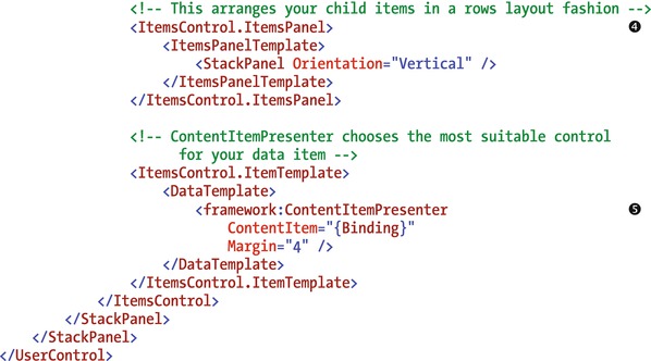
The first part of the XAML defines a textblock control that shows the display name . This allows the developer to set a title for the group control, and it can help users to identify the purpose of the controls that are shown within the control. The next line of code defines a button called ToggleButton . This button toggles the visibility of a StackPanel called ContentPanel . This panel acts as the parent container for the child items that are shown in the control.
The stack panel control contains an items control. This is a Silverlight control that binds to a data source, and it allows you to customize the appearance of each data item by defining a layout in an item template. You’ll notice that the items control defines a data source that specifies a binding string of ChildItems. This is because the underlying IContentitem object that the toggle control (and all other custom group controls) binds to exposes the child data items through a collection called ChildItems.
ItemsPanel allows you to define the parent control that contains the item template contents. The items panel template control specifies a StackPanel with its orientation set to vertical. This means that the toggle control displays the child items in rows layout style (that is, vertically stacked). If you want to lay out the child items differently, you can use a different layout control here.
The controls that I described so far define the framework for your control. One task you still need to carry out is to define the controls that render your child data items. One way not to do this is to specify a textbox control in your item template. Although this can work, a textbox control isn’t the best control to display every single data item type. For example, your users won’t be too impressed if your group control uses a textbox to display an image. A much better approach is to use a special control called a content item presenter . This control renders the most suitable UI control for the bound data item.
Note that Visual Studio may show the following error against the content item presenter control: “Cannot find a resource with the Name/Key ScreenLoadingBackgroundBrush.” Your control extension still works despite this error; therefore, you can safely ignore this warning.
The final task is to add the .NET code that toggles the visibility of ContentPanel, shown in Listing 19-22.
Listing 19-22. Group control code

Setting the Visibility of Labels
By default, LightSwitch displays a label next to any control that you add to a screen. Although this is very useful for controls such as textboxes and labels, you generally don’t want labels to appear next to group or custom controls. LightSwitch defines the label settings in the LSML file for your control, as shown in Listing 19-23.
Listing 19-23. LSML changes

Before you begin to modify the label properties, you should set the SupportedContentItemKind attribute to Group . This setting identifies your custom control as a group control.
LightSwitch determines the label and other property settings through property-value inheritance. This process means that if a developer fails to set the Attached Label Position value for a data item, LightSwitch uses the Attached Label Position value of the parent control instead.
If an attached label position isn’t set at the parent level, the resolution system carries on searching parent items until it finds a value. The default attached label position of a screen is left aligned. Unless a developer manually sets the attached label position, your group control will most likely inherit the default label position of left aligned.
To prevent LightSwitch from displaying a label next to your group control, set the AttachedLabelSupport setting to DisplayedByControl . The other valid setting you can use is DisplayedByContainer. Although the DisplayedByControl setting hides the label that appears next to your group control, you still want labels to appear next to child items that appear inside your control. To do this, the LSML defines a ControlPropertyOverride element to make certain that Visual Studio includes the attached label position control in the properties sheet for your group control. By allowing developers to set your group control’s attached label position, Silverlight’s Property Value Inheritance behavior will apply the label position to your group control’s child items.
This completes the example, and you can now build and run your extension. Figure 19-19 shows screenshots of the final control.

Figure 19-19. Toggle layout control
In Figure 19-19, notice that your custom control doesn’t left align the address labels, and because of this, the appearance of this control looks a bit jagged. If you don’t like this appearance, you can create a rows layout beneath your toggle layout control and add your data controls beneath your rows layout.
Creating a Command Control Extension
In the final section of this chapter, I’ll show you how to build a command extension. I’ll show you how to build a customized button with a green background. This control functions in the same way as the custom button that I showed you in Chapter 13. However, the big advantage of the command extension is that it provides a better implementation. The custom button in Chapter 13 contains a hard-coded reference to the screen method that the button calls. This imposes a dependency between the custom control and screen, and it results in an approach that isn’t very extensible. By creating a command extension, developers can data bind your custom button to the underlying screen method. Here are the steps to carry out this example:
- Right-click your LSPKG project, create a new Control item, and name it HighlightButton.xaml.
- Modify your HighlightButton.xaml file by adding the contents from Listing 19-24.
- Set the SupportedContentItemKind to Command in your control’s LSML file, remove the Supported Data Types settings, and modify the default label settings.
Listing 19-24. Custom button control code

The XAML in this listing defines a normal Silverlight button . This custom control enables the developer to set the dimensions of control by binding the presentation attributes such as width and height to the property-sheet values.
The button template code enables you to specify the look of your control, and it defines the gradient green background color . The next step is to add the CustomButton_Click method to your CustomButton class, as shown in Listing 19-25.
Listing 19-25. Custom button .NET code

You can access the underlying screen method through the Details member of the IContentItem object that binds to your control. This IContentItem object implements the IExecutable interface. You can simply call the ExecuteAsync method to asynchronously call the method that exists in the code file of your LightSwitch screen.
The next step is to make the necessary changes to your LSML file, as shown in Listing 19-26.
Listing 19-26. Custom button LSML file

The code in this listing sets the SupportedContentItemKind to Command in order to identify the control as a command control. Just like in the preceding group control example, you want to hide the default label that LightSwitch displays to the left of your custom button. You can accomplish this by setting the AttachedLabelSupport attribute to DisplayedByControl .
This completes the button control sample. Figure 19-20 shows screenshots of the final control.

Figure 19-20. Custom button
Summary
Extensions are installable components that extend the Visual Studio IDE and enable you to add extra capabilities to LightSwitch. Extensions are packaged into files with a VSIX extension. To install an extension, simply run the VSIX file. When the installation completes, your extension will appear in Visual Studio’s Extensions and Updates dialog. You can use this dialog to manage and uninstall extensions from Visual Studio. Before you can use an extension in a LightSwitch project, you have to enable it through the properties of your project.
Many extensions exist for older versions of LightSwitch. If you find an extension that doesn’t install under Visual Studio 2015, you can fix this by modifying the compatibility settings in the manifest of the extension. Although this technique works with most third-party extensions, it isn’t guaranteed to always work.
LightSwitch provides six extensibility types: business types, controls, data sources, screen templates, shells, and themes. In this chapter, I showed you how to create control extensions. In the next chapter (Chapter 20), I’ll show you how to create the remaining extension types.
Unlike directly using Silverlight controls, as I showed you in Chapter 13, developers can more easily work with controls that they install through extensions. This is because if a developer wants to use a control extension on a LightSwitch screen, there’s no need to select the control assembly from a separate dialog and write custom data-binding code. Developers can simply use the data item’s drop-down menu in the screen designer to select the custom control.
With extensions, you can also build controls that lay out items on a screen, just like the rows layout and columns layout controls that ship with LightSwitch. Another feature of control extensions is that you can build maintainable settings that developers can set through Visual Studio’s properties sheet.
There are five types of control extension that you can create: value, details, command, collection, and group. These control extension types match the control types that you see through day-to-day usage of LightSwitch. For instance, a value control displays a single value—just like a textbox or label. A details control displays an entity—just like an auto-complete box or modal window picker.
To create extensions, you need to install the Visual Studio SDK and the Microsoft LightSwitch Extensibility Toolkit. You can download these components free of charge from the Microsoft website. The 2015 version of the toolkit was not yet available at the time of writing. Therefore, I showed you how to build extensions with the 2013 version of the Extensibility Toolkit.
Once you set up your computer, you can add an Extension Library Project through Visual Studio’s Add New dialog. An Extension Library Project contains seven individual projects, one of which is an LSPKG project. The LSPKG project is the project that you use to add a new extension item.
To add a new extension item, right-click your LSPKG project and select the “New Item” option. This creates all the files for your new extension. To complete your control extension, you can simply flesh out these files with the functionality that you want to add. The main file in a control extension is an XAML file (a Silverlight user control) that defines the UI for your control. A custom control binds to an IContentItem object on a LightSwitch screen, which enables you to use Silverlight data-binding techniques to bind the UI elements on your custom control to the underlying screen data item. The project stores the metadata for your control in a corresponding LSML file. You can use this metadata to set the control type (for example, value, details, collection, and so forth), display name, description, and data types that your control supports.
To debug an extension, press F5 to start an experimental instance of Visual Studio. You can debug your extension project by adding breakpoints and opening a LightSwitch project through the experimental instance of Visual Studio.
To demonstrate how to create a details control, I showed you how to build a combo box control extension. With this control, developers can set the data source and the data property that the combo box shows on each row. The developer can enter these settings through the properties sheet in the Visual Studio screen designer, or through the Silverlight runtime designer. Lets review the steps to add a control to the Visual Studio property sheet.
The first step is to create a WPF user control. The reason you need to use WPF is because Visual Studio itself is built with WPF. The next step is to create an editor class that implements the IPropertyValueEditorProvider interface. This class must implement a method called GetEditorTemplate. The purpose of this method is to return the XAML markup that represents your WPF custom editor. The final step is to associate your WPF control with your custom control. You do this by configuring the UIEditorId setting in the control’s LSML file. You can customize the Silverlight runtime designer using a very similar process. The main difference is that you create a Silverlight user control rather than a WPF user control.
Another topic that I covered in this chapter is how to access the summary property value of the data item that binds to a details control. If a summary property for this data item doesn’t exist, I showed you a fallback mechanism that returns the first text property, or the first property that LightSwitch can represent as a string.
The next control type I described was the group control. The purpose of a group is to arrange child items in a custom way. To demonstrate this topic, I showed you how to build a group control that includes a Toggle button. The purpose of this button is to allow the end user to show or hide the items that appear within the control.
To build a group control, the first step is to add an ItemsControl object to the XAML for your control. The ItemsControl object is a Silverlight control that binds to a group data item from a LightSwitch screen. You can customize the appearance of each child data item in the group by defining a layout in an item template. The item template contains a content item presenter control. You use this control to generate a control that most suits the data type of each child item.
The final control type I described was the command control. This type of control binds to the LightSwitch screen method. To demonstrate this control type, I showed you how build a button that features a green background. To build a command control, you add UI elements to the XAML to enable the end user to interact with your control. To call the screen method that your control binds to, you would use the Details member of the IContentItem object that binds to your control. The Details member exposes an IExecutable object. This object provides a method called ExecuteAsync, which is the method you would call to execute the underlying screen method.
Finally, I showed you how to deploy and distribute your extension. To make your extension compatible with LightSwitch 2015, you need to amend the setting that controls the compatible version type in the manifest of your VSIX project. To deploy your extension, you can simply build your solution and run the output from your VSIX project.