
Building HTML Applications
Given the wide adoption of tablet and smartphone devices in corporate environments, a crucial part of application design is mobile support. LightSwitch can help you with this task. With LightSwitch, the HTML client applications you build are HTML5 compliant and fully optimized to operate on mobile devices. In this chapter, I’ll introduce the topic of HTML client application design and show you how to do the following:
- create screens to display lists of data and individual records
- lay out screens, use data-entry controls, and use data-picker controls
- construct menu navigation items and provide links to open records
LightSwitch provides screen templates to automate the UI creation process. In this chapter, you’ll find out how to use these templates to build a working application. Afterward, I’ll show you how to use the screen designer to further customize the screens you create. A piece of good news is that this chapter contains no code. The intention of this is to highlight how much you can accomplish by using the graphical designer alone.
This chapter extends the Help Desk application from Chapter 2. In this chapter, I’ll show you how to create a screen to enter issue records. Each issue record can be assigned to a specific engineer. In addition to learning how to create screens for data entry, the main purpose of this section is to show you how to associate a record with a “parent” record from a lookup table, and how to display lists of records on a screen.
With LightSwitch, creating these types of screens is a simple affair that involves filling in some details on a dialog and clicking an OK button. But behind the scenes, the screens that LightSwitch generates can be quite complex. So, in the subsequent part of this chapter, I’ll deconstruct the screens that LightSwitch generates to show you how all the parts tie together.
A LightSwitch screen is analogous to a web page. Screens contain content and controls that users can use to edit and view data. A typical LightSwitch application consists of many screens. Screens run on the browser and are therefore client-side objects. Therefore, within your solution, the HTML client project is the place where you develop and manage your screens.
To create a screen, right-click your HTML client project in Solution Explorer and choose the “Add Screen” menu item. When the Add New Screen dialog opens (as shown in Figure 3-1), select a screen template and choose a data source from the Screen Data section of the dialog.

Figure 3-1. Adding a new screen
LightSwitch uses the screen template and data source to build a screen that carries out a specific function. In general, the screen that LightSwitch builds serves as a starting point for further customization. The screen templates you can select are:
- Common Screen Set: this creates the three screens that are described beneath
- Browse Data Screen: this creates a screen that displays a list of records
- View Details Screen: this creates a screen that displays a single record
- Add/Edit Details: this creates a screen that users can use to add or edit a single record
The Common Screen Set is particularly helpful because it creates a set of Browse, View, and Add/Edit screens for any selected table in your application. Earlier versions of LightSwitch didn’t include this template, which meant that you needed to run the Add New Screen dialog three times to accomplish the same result.
You can use the Screen Data drop-down to set the data source for your screen; this drop-down shows a list of tables and queries. If the data source you choose includes related child data, the Screen Data section shows checkboxes you can select to add related data to your screen.
 Tip You can create an empty screen by choosing the Browse Data Screen template and leaving the Screen Data drop-down set to “none.” An empty screen provides you with a blank canvas you can use to manually build your screen.
Walkthrough 3-1. Creating an Application
The simplest way to explain how to create an application is to provide a walkthrough of the steps involved. In this walkthrough, I’ll show you how to build a set of screens for the Help Desk application by using the Common Screen Template. Afterward, I’ll describe how the application looks and behaves at runtime. This will be beneficial if you’ve never seen a working LightSwitch HTML client application before.
Using the Common Screen Template
The quickest way to create a set of screens is to use the Common Screen Template. But before we do that, we need to set up our data. Here’s a reminder of how to create the tables that I described in Chapter 2.
- Create a table called Engineer (Figure 3-2). Notice the data types and the required setting for each property in the table.

Figure 3-2. Create a table called Engineer
- Next, create a table called Issue (Figure 3-3).

Figure 3-3. Create a table called Issue
- With the Issue table open in the table designer, create a relationship between the Issue and Engineer tables. Name your navigation property AssignedEngineer (Figure 3-4).

Figure 3-4. Relationship between Issue and Engineer tables
With the table structure now set up, the next step is to generate screens for our two tables. To do this:
- Open the Add New Screen dialog and add a new screen for the Engineer table. Select the Common Screen Set template. When you choose the Engineer table, the Screen Data section shows checkboxes for related data and gives you the option to include engineer issues. Check this option to include the issue data on your screen (Figure 3-5).

Figure 3-5. Creating screens for the Engineer table
- Open the Add New Screen dialog and repeat the above process for the Issue table (Figure 3-6). Although the Additional Data to Include section includes a checkbox for Issue Details, there isn’t a checkbox to select the Engineer details. This is because LightSwitch only includes checkboxes for related child records.

Figure 3-6. Creating screens for the Issue table
Once you add these two sets of screens, LightSwitch organizes your screens into folders that are named after your tables (Figure 3-7). Beneath the Engineer folder, notice how the Common Screen Set template generates Add/Edit, Browse, and View screens for the Engineer table. These files are named AddEditEngineer.lsml, BrowseEngineer.lsml, and ViewEngineer.lsml respectively. The Issue folder also contains the same set of screens, but for the Issue table.

Figure 3-7. LightSwich organizes your screens into folders
In bigger projects with many screens, you can better organize your solution by creating new folders. The right-click menu item gives you the option to add new folders, and you can move screens between folders by dragging and dropping them.
Now that you’ve created a set of screens, you can run your application. To compile and run an application, click the green Play button in Visual Studio’s toolbar or press F5. When you do this, Visual Studio opens your application in Internet Explorer. LightSwitch displays a splash screen while your application loads, and when it’s ready, it opens the screen that you define as your “home screen.” By default, this is the first screen that you add to your application. So, in this example, the Browse Engineer screen is the first screen that appears.
Figure 3-8 shows the Browse Engineer screen once it’s been populated with records. The purpose of this illustration is to highlight the main characteristics of a screen that’s based on the Browse Data Screen template. The header of the screen displays the screen title. Next to this is a navigation drop-down that switches the view to other screens that are configured to browse data.

Figure 3-8. LightSwitch’s Browse screen
The central part of this screen features a tile list control. This is a control that renders the records from left to right, then top to bottom. When a user clicks a tile, the application opens the record in the View Details screen.
The screen’s footer contains two buttons: Add and Search. The Search button reveals a textbox at the top of the screen that users can use to enter search criteria (Figure 3-9). For search operations, LightSwitch matches the search criteria against text fields where the Is Searchable checkbox is selected in the table designer. One caveat is that this search feature doesn’t match against date fields, or text fields in related tables. If you want to provide more sophisticated search functionality, you can find out how to do this in Chapter 10.

Figure 3-9. Searching for records
The Add button opens a screen that users can use to add a new record (Figure 3-10). The LightSwitch term for this type of screen is a Dialog screen. This type of screen opens as a lightbox; this describes a panel pop-up that appears over the existing screen, with the underlying screen darkened.

Figure 3-10. Adding a new record—an example of a Dialog screen
In addition to data-entry controls, the Dialog screen includes Save and Cancel buttons in the top right section. The screen automatically applies basic validation. For instance, users can’t save records with invalid email addresses or dates of birth. Once a user successfully saves a record, the application returns to the previous screen—in this case, the Browse Engineer screen.
Let’s look at the screen that users use to enter new issue records. Just like the Add Engineer screen, this screen contains data-entry controls. To associate an issue record with an engineer, the user utilizes a details modal picker control, as shown in Figure 3-11. This control appears modally above the existing screen and shows a list of engineers that the user can choose from.

Figure 3-11. Using the modal picker Control
Once you add issue records that are assigned to an engineer, you can open the Browse Engineer screen, open an engineer record, and see the issues that are assigned to the engineer you select. The View Engineer screen that opens includes a tab control along the top of the screen. The title text on this control switches the view between the Details and Issues tabs. With the Issue tab activated, you can see a list of all issues that are assigned to the engineer (Figure 3-12). In this screenshot, notice also how LightSwitch sets the title of the screen to the name of the engineer.
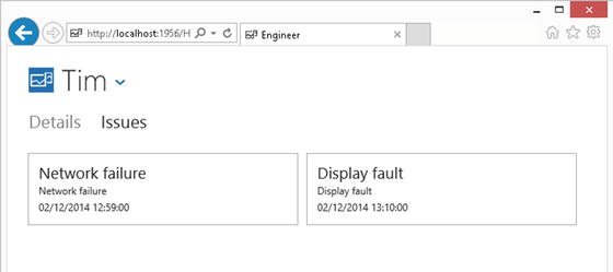
Figure 3-12. Issue tab on an engineer record that shows associated child records
This exercise has given an overview of how to create a LightSwitch application, and also highlights the ease at which you can build an application without the need to write code. The application provides add, edit, and search functionality. It also includes some non-trivial features, such as the ability to associate a parent engineer record with an issue record, and the ability to show child issues that are associated with an engineer record.
Using the Screen Designer
You’ve just seen how simple it is to create a fully functioning LightSwitch application. The Common Screen Set template carried out all the work for you, so in this section, I’ll describe the screens that were generated by the template. By the end of this section, you’ll have gained a deeper understanding of how screen design works.
Understanding Top-Level Screen Layout
The tool you use to build and customize screens is the screen designer. Let’s take a look at this by opening the Browse Issue screen. To do this, double click the Issues. lsml file, and when the screen opens, you’ll see the view that’s shown in Figure 3-13.

Figure 3-13. The screen designer in LightSwitch
The screen designer consists of nodes that resemble a tree structure—these nodes represent UI elements on your screen. If you’re more familiar with other development tools such as Microsoft Access or Windows Forms, this method of screen design might feel odd, because you don’t see a visual representation of how your screen looks at runtime. However, don’t worry. After a while, this method of screen design will become second nature.
Working from the top of Figure 3-13, the topmost item is the screen designer toolbar. Beneath this toolbar, you’ll see the root node, followed by layout of your screen as a series of nodes.
These tree nodes consist of a combination of layout controls and data controls. Layout controls are designed to add structure to your screen, whereas data controls describe controls that users can use to view or edit the fields in your tables.
The lower part of the Screen Content Tree contains a Popups node you can use to define popups. Popups are small modal UI dialogs that pop up over a screen, hence the name. Chapter 8 will cover this topic in further detail. To give an example of where to use a popup, you could use one to ask for user confirmation prior to a user deleting a record.
The left part of the screen designer contains the data items you can use on your screen. Here, you’ll find a list of tables and/or queries, as well as their constituent fields. This part of the screen designer is called the screen member list.
To display data on a screen, you would drag a data item onto the Screen Content Tree and then set the data control that you want to use to render your data. This means that every control on a screen must be bound to a data item. Unlike other development tools such as Windows Forms, you can’t just add a label or textbox to a screen and leave it unbound to data.
Note When you make changes to a screen in the designer, you can see your changes by refreshing your browser. There’s no need to recompile and restart your application in order to see screen modifications.
Using the Screen Designer Toolbar
The Screen Designer Toolbar contains buttons you use to carry out common screen design tasks. There are seven buttons, which are shown in Figure 3-14.
Figure 3-14. Screen Designer Toolbar
Working from left to right, the Edit Query button doesn’t apply when you’re building HTML applications; the button is actually grayed out. This button only becomes active when you build desktop (Silverlight) applications, and the purpose of this button is to allow you to edit the underlying screen query.
The Add Data Item button opens a dialog you can use to add additional properties, queries, and commands onto your screen.
You can use the Add Layout Item and Delete buttons to modify the items that are shown in the Screen Content Tree. When you right-click a node in the Screen Content Tree, the context menu provides the same features that are offered by these buttons.
The Reset button provides a really useful function. If you add extra fields to your table, this button resets the controls in a selected group back to their default state. It automatically adds controls for the new fields you’ve added and saves you from having to add them manually.
The Write Code button opens the code editor and allows you to write JavaScript code to handle screen events.
Finally, the Related Items button provides a shortcut you can use to open the tables in your screen in the table designer. This button saves you from having to navigate your way through Solution Explorer to get to your tables.
Tabs are UI containers that fill the entire working area of a screen. You can use Tabs to better organize your screen by grouping related controls together.
Figure 3-15 shows the Engineer View screen at both design time and runtime. Each node beneath the Tabs folder defines a separate tab. The Add Tab button adds an additional tab to your screen.

Figure 3-15. Tabs at design time and at runtime
The Engineer View Screen that we created earlier demonstrates a perfect use of tabs. The first tab contains the engineer details and the second tab contains a list control that shows the issues that are assigned to the engineer. The end user can switch tabs by clicking the tab heading that appears on the tab control.
Laying Out Your Screen with Group Controls
With LightSwitch, you can use groups to lay out the data items on your screen. Once you add a group, you can render the group using one of two controls: rows layout and columns layout.
The rows layout control lays out controls from top to bottom, whereas the columns layout displays controls horizontally from left to right (or right to left if you localize your application in a right-to-left language). To achieve a more granular layout, you can nest groups inside one another.
Figure 3-16 illustrates how these controls apply in the Engineer View screen. The highlighted section of this screenshot features a columns layout group that contains two child-rows layout groups.

Figure 3-16. Using both Rows Layout and Columns Layout groups on a screen
In the properties sheet for a group control, you’ll find a checkbox option to enable compact margins. When you set this option to true, LightSwitch renders the controls on your screen closer together, as illustrated in Figure 3-17.

Figure 3-17. Compact margins enabled/disabled
Data controls are UI elements that users can utilize to view or edit data. LightSwitch provides a variety of data controls, which are shown in Table 3-1.
Table 3-1. Data Controls
|
Name |
Description |
Supported Data Types |
|---|---|---|
|
Text |
Use this to display read-only text. |
All LightSwitch data types |
|
Paragraph |
Similar to the text control, this control displays read-only text. But unlike the text control, you can configure the height of the control. |
All LightSwitch data types |
|
TextBox |
Text boxes allow users to enter a single line of text. |
All LightSwitch data types |
|
TextArea |
Text areas allow users to enter multiple lines, including line breaks. |
All LightSwitch data types |
|
Date Time Picker |
The date time picker control allows users to enter and view dates and times. |
Date, Date Time |
|
Email Editor |
Enables users to enter email address and provides validation |
Email Address business types |
|
Email Viewer |
This displays an email address in a read-only fashion. |
Web Address/Email Address business types |
|
WebAddress Viewer |
This displays a web address in a read-only fashion. |
Web Address/Email Address business types |
|
Flip Switch |
Allows user to set Boolean true/false or yes/no values |
Boolean |
You can only select data controls that are compatible with the data type of the data item you want to display. Table 3-1 shows the data types that are supported by each data control. I’ll now describe in greater detail the controls that you can use in an application.
String data is perhaps the most common data type in most applications. In LightSwitch, you can categorize the controls that render string data into editable and non-editable controls.
To enable users to edit data, the controls you can choose from are text box and text area (Figure 3-18). The difference between these two controls is that the text box control enables single-line text entry whereas the text area control permits multi-line text entry.

Figure 3-18. Text boxes render as HTML inputs; text areas render as HTML text areas
Likewise, when you want to display data in a read-only fashion, the text control is designed to display single-line text whereas the paragraph control can display multi-line text.
In terms of the markup that LightSwitch generates at runtime, the screen uses the HTML <TextArea> tag to display the content of a text area control, and uses the markup <Input type=text> tag to render the contents of a text box control.
Returning briefly to the screen designer, there are a couple of significant settings that you’ll find in the properties sheet (Figure 3-19). The first is the Display Name setting. The value you enter here appears in the label that appears against the control. The second is the Placeholder setting. The text you enter here appears as a “watermark” when the control is empty, and you typically use this to provide help and guidance to the user. As soon as a user types into the control, the placeholder text disappears.

Figure 3-19. Properties of a data control
Some web developers often use tooltips to provide context-sensitive help. The problem with tooltips is that they don’t work on mobile devices, because the UI on mobile devices don’t include a cursor. Therefore, placeholder text is the ideal solution for providing context-sensitive help.
LightSwitch provides a flip-switch control for setting Boolean values. Figure 3-20 illustrates the appearance of this control at runtime. You can configure the text within the flip-switch control to show either on/off or yes/no. The Options setting in the properties sheet controls this setting.

Figure 3-20. The flip-switch control at runtime and design time
On the read-only View Engineer screen that we created with the Common Screen template, LightSwitch uses a text box control to display read-only versions of any Boolean properties on the table. The text box control displays Boolean values by using the text values true and false. There isn’t a simple option to change the label text to on/off or yes/no in order to make the data on the text box control consistent with the options that are shown on the flip-switch control. If you want to customize the text that describes a Boolean value, you’ll need to add a custom control, which I’ll show you how to do in Chapter 8.
The date picker control allows users to enter and edit dates and times. You can configure the date picker through the properties sheet for your data item. The date picker enables users to enter the date parts by choosing from a list of values. A useful setting is the Minute Increment setting, which defaults to 5 (Figure 3-21). This configures the minute picker to show the values 0,5,10,15,20,25,30 (and so on), rather than the values 0 through to 60.
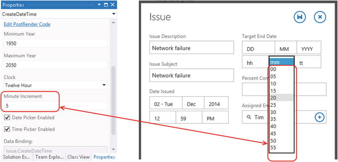
Figure 3-21. Date time picker control properties, including Minute Increment setting
You can use the text control to display dates in a read-only fashion. But similar to showing Boolean values through a text control, LightSwitch applies a default format that doesn’t look very neat. Once again, you can use a custom control to apply better formatting.
Showing/Editing Email or Web Addresses
The email address editor control enables users to enter and edit email addresses. The difference between this and the text control is that the email editor control prevents users from entering invalid addresses by including built-in validation.
The email address viewer control is designed to display email addresses. This control displays the email address as a hyperlink that opens the user’s default email client.
Similarly, the web viewer control is designed to display web addresses. It renders the web address as a hyperlink that opens the page in the browser.
There are three controls that you can use to display lists of records—the list, tile list, and table controls. The difference between the list and tile list controls is that the list control renders data items from top to bottom, whereas tile list renders data items from left to right, then top to bottom (Figure 3-22).

Figure 3-22. Tile list view versus list view
The table control organizes data into rows and columns. This control renders data using an HTML table, and uses TR and TD tags to render the table rows and cells. A feature of the table control is that it behaves reactively. On mobile devices with limited width, the table control stacks the data rather than show it in a tabular format (Figure 3-23).

Figure 3-23. Table control—illustration of reactive behavior
A feature of these data controls is infinite scroll. If a user hypothetically loads a screen that includes 1,000 records, LightSwitch doesn’t load all 1,000 records upfront. Instead, it loads the records on-demand as the user scrolls through the screen. LightSwitch loads the records in batches, and you can modify this behavior by setting the “No. of items to display per page” setting in the properties sheet (Figure 3-24).

Figure 3-24. Page list setting
For all these controls, you can set the data that’s shown for each record by modifying the child nodes. For example, the Browse Engineer screen that the template created shows the Issue Description, Assigned Engineer, and Date Issued fields. To tidy this up, you can add or remove data items from beneath the rows layout (Figure 3-25).

Figure 3-25. Changing the items that appear in a list/tile control
Alternatively, you can change the rows layout to a summary control. This control shows the summary field you define for a table. For instance, if you set the summary property on the Issue table to the Issue Subject property, the summary control will show the Issue Subject value for a record at runtime.
A benefit of using the summary control is that if you use it multiple times in your application and you later want to change the data that’s shown by the control, you only need to make a change in one place—the table designer.
The details picker control is a control that enables a user to choose one item from a list of records (Figure 3-26). Just like the list controls, you can modify the content that’s shown for each record in the list by replacing the details picker’s summary control with a rows layout, and adding data items beneath the rows layout.

Figure 3-26. Details picker control
The details picker control provides a built-in search feature. Users can carry out a search by typing search criteria into the control. LightSwitch carries a “contains”-type search against the search criteria.
To limit the items that are shown by picker control, you can set the Choices setting in the properties sheet. The Choices setting enables you to select a query that you’ve added to your screen through the Add Data Item button from the toolbar.
Earlier on, I showed you how to use the row and column layout controls to set the orientation of groups of controls. To fine-tune your layout, you can use the properties sheet to configure the sizing and positioning of each control on your screen. Figure 3-27 shows the sizing properties that you can set.

Figure 3-27. Sizing options
Most of the options in the sizing section of the properties sheet are self-explanatory. For instance, the Width and Height settings default to Auto. This means that LightSwitch chooses an optimal width and height based on the screen space that’s available. If you want to specify a definite size, the units that you can use are pixels or characters and lines.
For each data control you add to your screen, LightSwitch displays a label. If (for example) you add a surname text box to a screen, LightSwitch displays a surname label next to the text box. As I mentioned earlier, the text value for the label comes from the Display Name property that you configure in the table designer.
Figure 3-28 shows the Label Position dialog. These include Top, Left, and Right; these options are self-explanatory. But an interesting pair of options are None and Hidden. The difference between these two is that when you set the label position to Hidden, LightSwitch still shows the space that the label would have taken. By default, LightSwitch top aligns labels. One benefit of top alignment is that it simplifies the task of localization. If you localize an application by substituting English text with a foreign translation, you’ll suffer fewer layout problems with top-aligned labels if the target word in the foreign language is longer than the English equivalent.

Figure 3-28. Label Position dialog
You can also set the Text Alignment value for a control through the properties sheet; the available options are Left, Right, or Center. As an example of where you might use this setting, it’s common practice to set the text alignment to Right for numeric fields.
You can set your screen’s display name and control the visibility of the tab control through the properties of the Root Node (that is, the very first item in the Screen Content Tree). Figure 3-29 shows these settings and the effect they have on a screen at runtime.

Figure 3-29. Setting screen properties
The properties sheet contains three groups. Starting from the top, the General group contains controls to set your screen’s display name and description. The display name is the text that appears at the top of your screen. LightSwitch doesn’t show the description that you enter here to the user. Therefore, you can generally leave this field blank or use this field to enter comments for your own development purposes.
The Appearance group contains two checkboxes: Show As Dialog and Hide Tab Titles. Earlier in this chapter, you saw how LightSwitch opens the Add Engineer screen as a lightbox, with the underlying screen dimmed. The Show As Dialog checkbox is the setting that enables this behavior.
By checking the Hide Tab Titles checkbox, LightSwitch shows only the contents of the first tab and hides the tab titles. By definition, this prevents users from switching tabs, because the tab title is the control that enables users to switch tabs. You might wonder why you’d choose to hide the tab titles. One reason is that you can define multiple screen layouts in separate tabs. You can then write code that changes the tab that’s visible based on some condition.
The Behavior section includes a Screen Type drop-down. This includes two options: Browse and Edit. Screens that you set to the Browse screen type can appear in the navigation menu that shows at the top of your application. In contrast, Edit screen types cannot be added to an application’s navigation menu.
LightSwitch adds Save and Cancel buttons to screens that are defined as Edit screens. Browse screens don’t include these buttons.
Building a Navigation Structure
A crucial part of good application design is navigation. A sensible menu structure and well-thought-out navigation links help users more easily find the features they want. In this section, I’ll show you how to set the items that appear in the menu of an application, how to open a child record from a screen, and how to specify the initial screen that appears when your application first opens.
The home screen is the first screen that LightSwitch opens when your application loads. To set or change your home screen, right-click the screen you want to use in Solution Explorer and select the Set as Home Screen link (Figure 3-30). You can only select screens that are defined as Browse screens. You can’t set an Edit-type screen as your start screen.

Figure 3-30. Setting a home acreen
Configuring the Navigation Menu
To specify the items that LightSwitch shows in the navigation menu, right-click your HTML client project and click the Edit Screen Navigation button. This opens the screen that’s shown in Figure 3-31. By default, LightSwitch automatically adds all Browse-type screens you create to the navigation menu. You can rename the text that appears in the navigation menu by using right-click  rename menu item.

Figure 3-31. Configuring a home screen
The right-click menu also includes a Delete option you can use to remove a screen from the navigation menu. Note that the Delete option doesn’t delete the screen; it only removes the entry from the navigation menu. Deleting items from the navigation menu can be useful for hiding work in progress, or for hiding old versions of screens that you want to keep as a backup.
If you remove screens from the navigation menu, you can use the Include button to add those screens back into the navigation menu. Note that it’s possible to add the same screen into the menu structure multiple times.
Navigating to Different Screens
With the Browse screens in our application, users can click a record in the tile control to open the record in a View screen. The place where you control this behavior is through the properties of the tile control. The Actions group includes an Item Tap property that’s set to a method called viewSelected. To change what happens when a user clicks a record in the tile control, click the viewSelected link. This opens the Edit Item Tap Action dialog, as shown in Figure 3-32. This dialog provides a radio option you can use to write custom JavaScript code, or you can choose from a list of pre-built methods. This list is organized into two sections—a section that groups together record operations, and a section that’s titled Navigation. So, in the case of the Engineer Browse screen, the two sections in the list are Engineers and Navigation.

Figure 3-32. Edit Tap Action dialog
The Engineers section includes options to view, edit, or add and open the newly added record in the Edit screen. Once you’ve selected one of these options, you need to specify a target screen from the Navigate To drop-down.
The Command Bar section in the screen designer controls the buttons that appear in the bottom right part of a screen (Figure 3-33). Once you expand the Command Bar section, you can add additional buttons or modify the behavior of existing buttons. You can define what happens when a user clicks a button by using the Tap Action dialog. The options you can choose in this dialog include showing the search textbox, editing an existing record in a new screen, or adding a new record.

Figure 3-33. Edit Tap Action Dialog
If you want to add a button that appears in-line on your screen (rather than in the Command Bar section), you can do so by right-clicking a group control and selecting the Add Button option.
For any button you add to the Command Bar section, you can change the icon through the setting in the properties sheet. There are 32 icons that you can choose from, and these are shown in Figure 3-34.

Figure 3-34. List of available icons
If you choose the Custom option, you can define your own button image by writing custom code, which I’ll show you how to do in Chapter 8.
Summary
This chapter showed you how to create a data-centric HTML application without needing to write any code. This chapter has also introduced you to the screen designer.
When you create a screen, you can use one of the four built-in template types. Templates allow you to build screens with a prebuilt layout and function. The built-in templates include Browse Data, View Details, Add/Edit Details, and Common Screen Set.
The Browse data template creates a screen that displays a list of records. The View details screen template creates a screen that shows a single record, while the Add/Edit details screen template creates a screen to allow users to create or update records.
A really helpful screen template is the Common Screen Set template. For any given table, this template creates all three of the other screens, including all the navigation logic. This is useful because you can implement browse, add, and update functionality for any given table at a click of a button.
The screen designer in LightSwitch is made up of a tree that contains nodes that represent group or data controls. Group controls organize the controls that appear on your screen, and there are two controls you can use: rows layout and columns layout. The rows layout control lays out its child controls from top to bottom, whereas the columns layout control lays out its child controls horizontally from left to right. You can lay out your screen more precisely by nesting these group controls. Also, you can further organize a screen by using tabs to separate groups of common controls.
A crucial part of the screen designer is the Screen Members list. This item appears on the left-hand side of the screen designer and shows the queries, tables, and data items you can use on your screen. To add a data item to your screen, you can simply drag the data item from the Screen Members list onto your screen layout. At runtime, LightSwitch renders data items using data controls; these are controls that users can use to view and edit data. The controls that render scalar data include the text, paragraph, text box, text area, and date time picker controls. To display lists of multiple records, you can use the tile list, list, or table controls. Another type of control is the details picker control. This control enables users to select a record from a list, and also includes a search feature to help users more quickly locate a related record.
Through the properties sheet for a screen, you can set the screen type to one of two settings: Browse or Edit. Browse-type screens are designed to show lists of records, and can appear in your application’s navigation menu. Edit screens are designed to work with a single record and open as a panel, or lightbox, that appears above the existing screen.
LightSwitch displays a navigation menu that appears in the top left part of your application. Users can use this menu to switch screens, and you can control the screens that appear in this menu through the properties section of your HTML client project.
To build additional methods of navigation into your application, you can configure what happens when a user clicks a record in the list, tile list, or table controls. You can also implement navigation by adding buttons to your screen. In either case, you use the options that appear in the Tap Action dialog to define what happens when a user clicks a control.