
Chapter 4
Managing Data and Data Quality
Everyone knows the expression “Garbage in, garbage out.” Data quality is clearly a vital topic if you hope to get value from data. Though it seems obvious, the concept is difficult to pin down. Quality is generally taken to mean “fitness for purpose.”1 Because data can be used for so many reasons and in so many different contexts, once we get beyond a few general principles, it can be difficult to give guidance that is not specific to the case in point.
Consequently, this chapter differs from the ones that follow in that we don't give a single, end-to-end narrative. Instead we examine two small case studies that show some of the capabilities and features of JMP that are useful in addressing data quality, and which you are likely to need in other situations when addressing the quality of your own data.
The data sets used in this chapter are available at http://support.sas.com/visualsixsigma.
DATA QUALITY FOR VISUAL SIX SIGMA
There are numerous frameworks for assessing data quality. Probably one of the simplest uses the dimensions2 of:
- Accuracy
- Interpretability
- Availability
- Timeliness
In the enterprise setting, data quality is usually considered a mature topic. The investments required to build and support the large-scale IT systems that can deliver the promise of what SAS calls “The Power to Know™” necessarily imply a high degree of repetition, and the end result is often a suite of fairly simple reports or data tailored to the needs of specific users. As a consequence, the meaning of data quality for enterprise applications is well understood,3 and there is a lot of information about related areas such as master data management4 and data governance.5 Similarly, there are many well-established systems,6 usually embedded in extract, transform, and load (ETL) processes,7 that safeguard the quality of the end reports. Because the data domain is both restricted and familiar (albeit sometimes on a very large scale), such systems often rely on fairly simple rules to deliver data of high quality for the intended use, usually by considering just one variable at a time. In the world of data modeling8 and data warehousing,9 the slogan “One version of the truth” is used as an aphorism for the desired end result.
Once the purpose of using data moves beyond standard reporting into attempts to model relationships (often for the purpose of making predictions), the question of data quality becomes more subtle and interesting.10 As you will see, some modeling approaches can even find application in assessing data quality. In the enterprise setting, these discussions are facilitated because the data to be used are already within the scope of the enterprise systems mentioned earlier and because the analytical objectives are clear and known at the start of the project (for example, to make predictions using a boosted tree model about the propensity of customers with particular usage patterns to leave an Internet service provider).
However, questions about data quality in Visual Six Sigma are even more interesting, because projects are much more open-ended than those mentioned above. So in our situation, traditional approaches to data quality are necessary, but not sufficient.
Specifically, Visual Six Sigma projects often rely on the following:
- Data sources that are new in the sense that the data have not been studied before. As a result, the data domain is not well understood before the data are actually inspected.
- Ad hoc access to data from a number of sources.
- Ad hoc data manipulation to produce a single consolidated JMP data table that will be consumed by the various JMP platforms.
- The techniques in “Uncover Relationships” to make sense of the data in the given context, also generating new questions along the way.
- The interplay between “Uncover Relationships” and “Model Relationships,” often in an iterative, unfolding style as the information content in the data becomes clearer and feasible modeling objectives emerge.
So, along with the issue of extending traditional concepts of data quality to problems that may require deeper analysis, Visual Six Sigma forces us to relax the idea that all data quality issues can be addressed once, up front. Instead, and as discussed in Chapter 2 in the section “Visual Six Sigma: Strategies, Process, Roadmap and Guidelines,” it is more useful to address data quality issues as we develop our understanding both of the data and of the questions the data can reasonably be expected to answer. In other words, the techniques in this chapter are likely to be useful at any point in the Visual Six Sigma process where you are handling data.
Of course, if the Visual Six Sigma project goes well and the objectives are successfully met, there may be sufficient business value in bringing such data within the scope of enterprise systems. In fact, many large, enterprise-scale projects can use the Visual Six Sigma approach within feasibility or pilot studies to help refine the scope and objectives of larger projects.
Finally, a word about technology: JMP is a desktop product that supports Visual Six Sigma. It does this by holding data in memory to give the speed and agility that you require to make new, data-driven discoveries. However, as shown in Chapter 11, it is easily automated via the JMP Scripting Language (JSL). Although desktop computers are becoming ever more powerful, it would be wrong to think that JMP can also adequately support robust, batch-oriented processing in the enterprise setting. It can, however, easily be used as a desktop client in such situations, allowing you to work visually with data of high quality (in the traditional, enterprise sense).
THE COLLECT DATA STEP
The “Collect Data” step in Visual Six Sigma is briefly described in Chapter 2 in the section “Visual Six Sigma: Strategies, Process, Roadmap and Guidelines.” This discussion is from the viewpoint of the preceding “Frame Problem” step. However, given that it makes sense to make an initial assessment of data quality as soon as possible, we now consider this step in more detail and from a more data-oriented point of view (see Exhibit 4.1).

Exhibit 4.1 Data Management Activities in the Collect Data Step of Visual Six Sigma
Your first step is to get your data into JMP. Data access is a big topic in itself and as we will see, there can be an interaction between the way data are read into JMP and the subsequent data management activities. The JMP menu commands File > Open, File > Database, File > SAS and File > Internet Open provide different ways to import data, but there are other options, too, particularly if you are working with Microsoft Excel®, R, or MATLAB. As usual, the use of JSL opens up even more possibilities for accessing data (for example, by using dynamically linked libraries and sockets).
The examples in this chapter only use some of the simpler data access methods, and the case studies in this book start with data already in a JMP data table. For more details on other access methods, refer to Help > Books > Using JMP.
Similarly, data management has many aspects, and the title of the chapter is meant to convey that we will only directly consider those that are required by our two illustrative examples. In general, this functionality is found under JMP's Tables, Rows, and Columns menus. These menus are briefly described in Chapter 3, “Visual Displays and Analyses Featured in the Case Studies.” If you want to know more about what Tables > Split does, for example, select this option, then press Help in the launch dialog.
Exhibit 4.1 shows several different tasks within data management:
- Reshape. Get data in the correct arrangement for analysis, with rows representing observations and columns representing variables.
- Combine. Join separate tables using a common key. Input tables may first need to be appropriately summarized so that the level of data granularity is common.
- Clean. Check for obvious errors in the data and take remedial action.
- Derive. Construct useful new columns that are dependent on existing columns.
- Describe. Produce simple numerical and graphical summaries.
Note that “Describe” leads to the Uncover Relationships Visual Six Sigma step, and, in line with our comments above, there is not necessarily a clear boundary.
Bear in mind that an approach that works well with 100 rows may not work so well when you have 1,000,000 rows. Similarly, handling 10,000 columns can be very different from dealing with 10. Thankfully, JMP usually provides many ways to accomplish the required goal. You need to use methods that deal effectively with the size and structure of your own data. An appropriate approach inevitably leads to many insights.
The following two examples show how to accomplish many of these tasks in JMP and also how to address some data quality issues in the context of modeling as opposed to traditional reporting. Chapter 11 also contains a further example about missing values, a vital consideration in data quality. In these examples, we omit some of the detailed JMP steps and keystrokes that you'll see in the case studies. If you are relatively new to JMP, you may want to skip ahead to the case studies and return to these examples once you are comfortable with basic navigation, graphing, and data analysis in JMP.
EXAMPLE 1: DOMESTIC POWER CONSUMPTION
The file household_power_consumption.txt contains a subset of data downloaded from the UCI Machine Learning Repository.11 The page is http://archive.ics.uci.edu/ml/datasets/Individual+household+electric+power+consumption. This page http://archive.ics.uci.edu/ml/datasets/Individual+household+electric+power+consumption This gives some details for you to peruse before reading on. To locate this file, find the book's Journal using File Explorer (Windows) or Finder (Mac), then move to the subfolder Chapter 4—Data Quality and Management.
The page describes measurements of the power consumption of a single household in the vicinity of Paris over a period of two years. The fact that the file size is about 65 MB suggests that the usage data is very fine-grained, presumably captured by some form of automated monitoring.
Importing the Data
The file household_power_consumption.txt is located in the Chapter 4 subfolder of the supplemental materials that you downloaded. Select File > Open in JMP and browse to the location of the text file. Because of the .txt file extension, JMP provides different options for importing the file.
- On Windows, select
Data with Previewfrom theOpen as:radio button. - On Mac, select
Data (Using Preview)from theOpen Aslist.
Then click Open. Be patient; you are dealing with more than a million records.
Using this option, JMP infers the structure of the contents of the file but also allows you some control over the import process. The dialog shown in Exhibit 4.2 appears. The code 0x3b in the End of Field panel represents the semicolon, which is used as a delimiter in the text file.

Exhibit 4.2 Text Import Preview Options
After reviewing the dialog to see that it is consistent with your understanding of how the file contents should be imported, click Next to move to the next screen (Exhibit 4.3).

Exhibit 4.3 Text Import Preview Window with Column Option
The icons to the left of the column names at the top of the window indicate whether JMP will create a Numeric (“123”) or Character (“ABC”) variable from the contents of the corresponding field. You can change the data type or exclude the variable by clicking repeatedly on its icon. Variables that are designated to be Numeric will be imported using an inferred format. However, you can view and change that format by clicking on the variable's red triangle. Looking at the variable names and the values that are displayed, and recalling that JMP represents Date Time values as Numeric, it seems clear that all variables should be treated as Numeric. So, click on each “ABC” icon to change it to the icon for a Numeric data type. Then click Import.
After showing a progress bar, JMP issues the warning shown in Exhibit 4.4. You will explore the reason for the warning in the next section. For now, click OK to obtain the resulting table, which has 1,023,663 rows and 9 Columns (Exhibit 4.5). Again, be patient! (The journal link household_power_consumption.jmp gives the imported JMP table.)
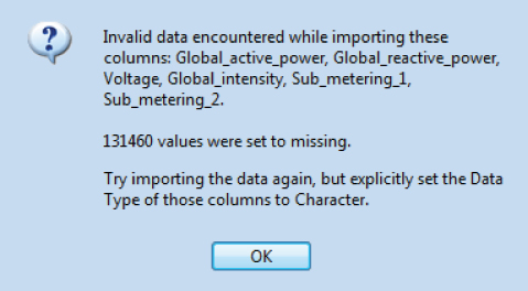
Exhibit 4.4 Warning Dialog

Exhibit 4.5 The JMP Table with Data from household_power_consumption.txt
Identifying Missing Data
But what about the warning that JMP issued? To investigate the reason for the warning, repeat the import process, simply accepting all the JMP recommendations. This produces a second JMP table in which the columns from Global_active_power to Sub_metering_2 (variables 3 to 8) are imported as character variables.
With the first table active, select Tables > Missing Data Pattern. Select all the variables, click Add Columns, and click OK. This produces Exhibit 4.6.

Exhibit 4.6 Missing Data Pattern
This table shows that most of the rows in the first table have no missing values, and that 21910 rows have an identical pattern of missing data. For these rows, the columns from Global_active_power to Sub_metering_3 (columns 3 to 9) have missing values.
The Missing Data Pattern table is linked to the original data table. Select row 2 and return to the original table. Note that 21,910 rows are selected. In the original data table, select Rows > Next Selected to see that row 6635 is the first row that has missing values.
Now close Missing Data Pattern, switch to the second table, select Rows > Row Selection > Go To Row, enter 6635, and click OK. You see that, in the original text file, a “?” character was used to indicate that a value was not recorded. It is the presence of these characters that caused JMP to recommend importing variables 3 to 8 into character columns.
Note that the missing value indicator in Sub_metering_3 is a dot, the missing data indicator for numeric data. In the original text file, the field for Sub_metering_3 was left blank. JMP inferred that the values were missing numeric values. For this reason, Sub_metering_3 was imported with a numeric data type.
Close the second table, select the heading of each column in household_power_consumption.jmp in turn, and review the contents of the Cols > Column Info dialog. Note that the first two columns, Date and Time, are formatted correctly. These columns have a Numeric data type, a Continuous modeling type, and have been given an appropriate format (the Day/Month/Year format for Date being reflective of a European locale). The remaining columns have a Numeric data type and a Continuous modeling type.
In general, JMP has done a good job in reading in the data we need in a format that makes sense.
How Often Were Measurements Made?
A casual inspection of the data table seems to indicate that measurements were made on the minute, since Time entries seem to always end in “:00”. But it's a little difficult to tell with over a million rows! To investigate this, select Cols > New Column. Select Formula from the Column Properties dropdown list and build the formula shown in Exhibit 4.7. The Second function can be found under the Date Time group under Functions (grouped). The Second function returns the number of seconds in a date-time value.

Exhibit 4.7 Formula to Find Number of Seconds
Click OK twice to make a new column (Column 10) in the table. Now we just need to identify the unique values in this new column. There are a number of ways to do this, including using the Distribution platform.
In fact, Distribution is always a good way to take a first look at any data. Select Analyze > Distribution, select all the variables, and click OK. This results in Exhibit 4.8.

Exhibit 4.8 Distribution of Columns (Partial View)
Note that the Summary Statistics table for Date is hard to interpret, and for good reason. The values result from the fact that JMP represents a date quantity as the number of seconds since midnight on January 1, 1904. By right-clicking on the column of numbers in this table, you can select the Format Column option. This allows you to change the format appropriately to make things more intelligible. Many or even most of the display boxes that compose a JMP report respond to such a right-click, offering options to change the appearance of the display.
Select Display Options > Customize Summary Statistics from the red triangle for Column 10. This allows you to add N Missing and N Unique to the report for this variable. This confirms that there are no missing values (as we knew already), and there is only one unique value, so measurements were indeed only made on the minute. (Alternatively, you might note that the minimum and maximum values, given under Quantiles, are both 0.)
Were Measurements Made Every Minute?
Now that Column 10 has served its purpose, you can select it in the data table (household_power_consumption.jmp) and then select Cols > Delete Columns. Note that JMP automatically removes this variable from the open Distribution report to maintain consistency.
To investigate whether the measurements were attempted every minute in the day, we can use Tables > Summary. Enter Time as a Group variable and click OK to obtain the table partially shown in Exhibit 4.9.

Exhibit 4.9 Were Measurements Attempted Every Minute?
You see that the summary table has 1,440 rows (the number of minutes in a day). You also see that the study apparently ran for 711 days. Close the summary table. In the Distribution report that is still open, note that the Date distribution shows that the study ran from about December 2008 to November 2010.
Were Measurements Made Continuously and on Every Day?
Let's now investigate this in more detail. Presumably the measurements were made on consecutive days, but perhaps not on weekends?
Select Graph > Graph Builder to open a window containing the list of columns in the table and various zones into which you can drag column names to build the graph you want. Right-click on Date to open a cascading context menu, and select Date Time > Month Year as in Exhibit 4.10.

Exhibit 4.10 Constructing a Virtual Column
This adds a new ordinal column, Month Year, to the bottom of the column list. This is called a virtual column, since it is only accessible from within the Graph Builder report and is not in the table itself. Drag this column to the X zone. (Be patient, as this may take a few seconds.) This produces a horizontal boxplot, which is not particularly informative. Click Undo, right-click on the green icon to the left of Month Year in the list of columns, and change the modeling type to Nominal (the icon should become red). Now drag the column back to the X zone to produce Exhibit 4.11, which is a much more useful display.

Exhibit 4.11 Number of Measurements by Month
Note that the months at both ends of the time series are not as tall (do not have as many rows) as the majority, and this is to be expected. But there is also some variation among the months in the body of the series, which might be a cause for concern. However, by looking at the horizontal scale, you can see that these just correspond to the fact that all months except February have either 30 or 31 days, and that February has 28 days since no leap years occurred in this date range.
Proceeding in a similar way, define a Day of Week virtual column by selecting Day of Week from the context menu for Date. Drag the new virtual column to the Wrap zone (in the top right corner) to produce Exhibit 4.12.

Exhibit 4.12 Number of Measurements Each Month by Day of the Week
Now you can easily see that measurements were taken on weekends (Day of Week is 1 or 7) as well as on weekdays.
Note that, in general:
- Even though the modeling type of a column may be obvious when the intention is to use it for analysis, for visualization another modeling type may be better. JMP makes it easy to switch between modeling types and to see the effect. If JMP produces a graph that is unexpected or unhelpful, try changing the modeling type.
- Virtual columns are a quick and easy way to construct derived columns without having to return to the table itself and build a new column using the Formula Editor. If a virtual column is not useful, it will not persist when the report window is closed. But if it is valuable, you can use the context menu to save that column to the table and make it available to other JMP platforms.
How Does Global_active_power
Global_active_powerNow let's look at how Global_active_power varied over time. Knowing how households typically operate, we might anticipate some seasonality, and variation through time of day and/or day of week.
Click Start Over in Graph Builder. Drag Global_active_power to the Y zone and Month Year to the X zone. Drop Day of Week next to the right of Month Year. Click Done to gain some screen area and to produce Exhibit 4.13.

Exhibit 4.13 Seasonal and Weekly Trends in Global_active_power
The variation in total power usage between months, and the expected seasonal effect, is very clear. The variation related to Day of Week is perhaps less than would be expected if there were only one or two working occupants, so perhaps the home is a family residence.
To investigate the variation throughout the day, you could group the Time column into a new virtual column Hour. However, we take another approach. Select Show Control Panel from the red triangle menu, and click Start Over in Graph Builder. Drag Global_active_power to the Y zone and Time to the X zone. Right-click in the graph area, select Smoother > Change To > Points, and then Add > Smoother. This shows all of the measured values, and also brings the smoother to the front to make it visible. (Alternatively, you can click the Points element, which is the left-most icon above the graph. Then click the Smoother element to remove the smoother, and click it again to reinstate the smoother over the points.)
Next, double-click on the horizontal axis. In the Scale panel, change the Minimum value to 00:00:00 and the Maximum value to 23:59:59. In the Tick/Bin Increment panel, set the Increment to 1 hour. Then click OK. This produces Exhibit 4.14. The smoother shows the expected decrease in total power consumption in the early morning hours, with local peaks at breakfast and in the evening.

Exhibit 4.14 Daily Trend in Global_active_power
In addition, the day of the week might account for additional structure in the data and is also worth investigating. To do this, right-click on Day of Week in the list of columns, and select Add To Data Table. Uncheck Show Control Panel in Graph Builder and click Done. Then select Script > Local Data Filter from the red triangle menu of Graph Builder, which allows you to conditionally filter the report window by values of any of the variables in the parent data table. Select Day of Week in the Add Filter Columns list, and click Add. Click on the value 7 in the local data filter, to produce Exhibit 4.15.

Exhibit 4.15 Daily Trend in Global Active Power on Day 7
Select each day in turn in the local data filter to view the daily trend for particular days of the week. It seems clear that the time variation within a day is reasonably consistent during the week, but is different on Saturday and Sunday. Additionally, the stratification in the data that was detected in Exhibit 4.14 is more readily apparent in Exhibit 4.15. You can confirm that all the days show this feature to some extent as you click through the other levels of Day of Week. (Alternatively, select Animation from the red triangle menu and click the right arrow in the Animation Controls panel.) When you are finished, close the report window.
How do Power, Current, and Voltage Vary?
Since we expect power, voltage, and current to be related, we next study them together. Select Analyze > Distribution and select Global_active_power, Global_reactive_power, Voltage, and Global_intensity. Check Histograms Only and then click OK. Next, press and hold the Control key, click the red triangle for any one of the variables and select Outlier Box Plot, then release the Control key. This broadcasts the command to all plots so that box plots appear for all four variables, producing the results shown in Exhibit 4.16. (Note that to replicate Exhibit 4.16 exactly, you also have to use the hand tool to decrease the histogram bin size so that the histograms display finer detail. With over a million rows, each bin still contains a large number of observations.)

Exhibit 4.16 Univariate Distributions of Power, Voltage, and Current
The supply voltage (Voltage) varies between about 223 and 254 Volts, which is a typical range of values in Europe. But the remaining three variables have a clear bimodal distribution, and Global_reactive_power has a significant number of zero values beyond the main distribution. Household power is distributed over a large grid of transmission lines with many consumers (both domestic and industrial). Even though the physics is simple,12 the dynamics of this system are complex.13 The power company uses reactive power (which does not produce useful energy) to try to stabilize the supply voltage as the load on the grid fluctuates, and it appears as if their operating policy is activated only when a small threshold is passed. The variable Global_intensity represents the current drawn by all the appliances of the household. Note that the information in Exhibit 4.16 was actually present in Exhibit 4.8, but at that time the focus of our investigation was different so it was easy to overlook.
Of course, the household only has a relatively small number of appliances, each of which can be on or off, according to the needs of the occupants. Even though the current drawn and the voltage supplied to a particular appliance may fluctuate depending on the dynamics of the grid, you would still expect the overall “on-off” state for the household (which will vary through the day) to produce some quantization of the power consumed, Global_active_power. Additionally, and as you have seen already, the daily usage schedule of the household will vary by month and year. Therefore, to investigate this possibility further, you will look in detail at how the power, voltage, and current vary throughout a typical day: June 23, 2009.
Close the Distribution report window and return to household_power_consumption.jmp. Select Rows > Row Selection > Select Where and complete the dialog box that appears as shown in Exhibit 4.17.

Exhibit 4.17 Selecting All Rows for June 23, 2009
Clicking OK selects the 1,440 rows corresponding to this day. Select Tables > Subset and click OK to produce a new (linked) table that contains only the 1440 rows for June 23, 2009. Note that Subset respects any row selection in the active data table.
The variables Sub_metering_1, Sub_metering_2 and Sub_metering_3 are the power consumed in particular areas of the household. Subtracting the sub-metering values from Global_active_power and taking into account the different measurement units gives the power consumption in the remainder of the household.
Select Cols > New Column, and define a new column called No_Sub_metering via the formula shown in Exhibit 4.18. (Alternatively, open the data table household_power_consumption_June23rd_2009.jmp, where the following steps have been completed.)

Exhibit 4.18 Defining No_Sub_metering with a Formula
For convenience, select the three constituent variables and the new variable in the columns panel of the table and use a right-click to group them into a single column group using Group Columns. Rename this group by double-clicking on it and entering Sub Metering.
Using Graph > Graph Builder, you can easily construct Exhibit 4.19. (Date table is household_power_consumption_June23rd_2009.jmp, script is Graph Builder.) You need to adjust the axis settings for Time as described earlier and use the red triangle options or click Done to hide the control panel and legend. The usage of various appliances throughout the day does exhibit the banding you would expect. The causes of the spike in No_Sub_metering at about 07:00:00 and the peak toward the end of the day are not clear without some background knowledge.

Exhibit 4.19 Power Drawn by Different Appliances on June 23rd 2009
Of course, the concept of a typical day is a little dubious, so on reflection, it might have been better to look at this using the full table household_power_consumption.jmp rather than just our subset table. As mentioned before, this unfolding rather than predetermined style of working with data is typical of Visual Six Sigma. Thankfully, this is easy to do by using the data filter to tame complexity.
Copy and paste the formula shown in Exhibit 4.18 from the subset table to a new column in the full table, and then close the subset table. Set the modeling type of Date to be Nominal, and use Graph Builder in conjunction with Local Data Filter to produce Exhibit 4.20. Note that you need to drag the four variables to the Y zone one at a time, placing them carefully in relation to the variables already in the Y zone.

Exhibit 4.20 Power Drawn by Different Appliances, Filtering by Day
Selecting Animation from the red triangle menu of the Local Data Filter allows you to loop quickly over every day in the study (711 of them), and to review the usage pattern on each. If your focus is on between-day variability rather than within-day variability, you can use the Lock Scales option on the red triangle menu of Graph Builder to hold the axis scale fixed.
Referring back to Exhibit 4.1, this example shows some aspects of the Clean, Derive, and Describe steps in a data table with more than a million rows and nine initial columns. The dynamic nature of the investigation, depending on what catches your attention, should be clear.
The table household_power_consumption_final.jmp contains the columns defined in this section as well as scripts that reproduce the plots.
EXAMPLE 2: BISCUIT SALES
In many Visual Six Sigma (and other) situations, the data you need for an analysis are spread among two or even more tables. There can be many causes for this situation and this example considers such a scenario. But almost all JMP platforms operate on a single data table. In keeping with the goal of this chapter, which is to provide you some familiarity with mechanics common to managing data, the example in this section shows you how to combine data from two sources.
Here is the scenario. You have purchased data about biscuit sales from a data provider. You want to combine these sales data variables with data you already have about the products themselves.
Two Data Tables
Using the book's journal, open the data table Biscuit Products.jmp using the link under the Chapter 4 > Example 2 – Biscuits outline. Exhibit 4.21 shows that this data table has 23,880 rows and seven columns, all with a Character data type and Nominal modeling type.

Exhibit 4.21 Table Biscuit Products.jmp (Partial View)
The column names are descriptive of the meaning of the variables. You see right away that some of the columns contain empty cells.
Next, open the data table Biscuit Sales.jmp using the appropriate journal link. Exhibit 4.22 shows that this table has 238,880 rows and six columns, two with a Nominal modeling type and four with a Continuous modeling type. The two Nominal columns, PRODUCT_ID and RETAILER, appear to be similar to the columns Product ID and Retailer in Biscuit Products.jmp. The meaning of Volume Purchased and Value Purchased is fairly obvious, and AT_RISK_VOLUME and AT_RISK_VALUE contain figures that the data provider calculates using a secret, but industry-respected, algorithm. In broad terms, they represent the propensity of purchasers to switch to another product.
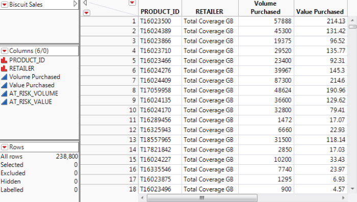
Exhibit 4.22 Table Biscuit Sales.jmp (Partial View)
Finding the Primary Key
To focus your efforts, let's suppose you want to investigate the pack sizes used to package and sell different biscuit categories, and the value at risk for the various pack sizes. This pack size information is contained in the column Number in Multipack in the Biscuit Products.jmp data table. As usual, the steps required are influenced by what you already know about the data (or what you believe you know).
First, you need to determine which column or columns to use to connect or join the two tables. In data modeling jargon, you need to decide on the primary key—that field or combination of fields that serve to uniquely define or label each row in the table.
With Biscuit Products.jmp active, select Tables > Summary, assign Product ID to the Group role, and click OK. The resulting table has 2,985 rows, telling us that Product ID has 2,985 levels or distinct values.
The values in N Rows tell us that each level occurs 8 times. You can easily check this in several ways:
- By making a second summary table.
- By selecting
Analyze > Distributionand enteringN RowsasY, Columns. - By selecting
Cols > Columns ViewerandShow Summary. - By selecting the
N Rowscolumn, thenCols > Utilities > Recodeand inspecting the result.
Close the summary table. Following the same process, you can also establish that Retailer has 8 distinct levels, each of which occurs 2,985 times.
Given that ![]() , which is the number of rows in
, which is the number of rows in Biscuit Products.jmp, you might expect that it is the combination of Product ID and Retailer that defines the primary key for Biscuit Products.jmp. You can easily check that this is indeed the case by making a summary table using both these variables in the Group role and noting that each row in the resulting table occurs once and only once.
Note that JMP provides several ways to get the number of distinct values in a column, but if you want to do this for combinations of columns, you need to use the Tables > Summary method described above.
Joining the Tables
By making Biscuit Sales.jmp active and repeating similar steps, you can confirm that each combination of PRODUCT_ID and RETAILER occurs 10 times in this table. It may or may not be reasonable to assume that each occurrence represents the sales figures for that combination for a particular time period, and that the row ordering in the table corresponds to increasing time. Given that this ordering won't be used in your subsequent analysis, it doesn't matter in this case, but this is the kind of detail that you should check with the data provider.
Make Biscuit Products.jmp the active table and select Tables > Join to inspect the options that JMP provides for joining tables together. In this case, you want to join using Match Columns (the default method). Populate the dialog as shown in Exhibit 4.23. To do this:
- Select
Biscuit Salesfrom the list in the upper left to reveal a second list of columns in the dialog. These are the columns in the table you wish to join with the active table, in this caseBiscuit Products.jmp. - Select
Product IDin the upperSource Columnslist andPRODUCT_IDin the lowerSource Columnslist. - Press the
Matchbutton. - Repeat this process with
RetailerandRETAILER. Note that you are performing the join by matching the contents of more than one column. - Under
Output Options, check theSelect columns for joined tableoption. - In the Select box, enter all columns from the
Biscuit Productslist and all except the first two columns from theBiscuit Saleslist. By including only one copy ofProduct IDandRetailer, you avoid getting two columns containing this information, one from each source table. (Rather than selecting columns in this way, you can alternatively checkMerge Same Name Columnsin the dialog.) - Click
OKto produce the tableBiscuits.jmp, which should have 238,800 rows and 11 columns (Exhibit 4.24).

Exhibit 4.23 The Join Dialog

Exhibit 4.24 Biscuits.jmp (Partial View)
Recoding Number in Multipack
Make the joined data table active. Or open the joined table, called Biscuits.jmp, from the journal file. This table also contains scripts for the analyses that you conduct later in this example.
The information about pack size is in the column Number in Multipack. Run Distribution on this column to see that the values in this column are UNIDENTIFIED, SINGLE, or of the form X PACK, where X is the number of items in the pack.
However, for the purposes of displays that you will create later on, you want to consider the number of items in a pack as numeric with an ordinal modeling type. To do this, you need to recode the values and recast the column to have a Numeric data type and an Ordinal modeling type.
The recode feature, Cols > Utilities > Recode, provides a convenient way to do this. Select the column Number in Multipack and then select Cols > Utilities > Recode. Complete the dialog as shown in Exhibit 4.25. (Script is Recode Number in Multipack in Biscuits.jmp.)

Exhibit 4.25 Recoding Number in Multipack
Note that the UNIDENTIFIED level initially appears last. But when you delete UNIDENTIFIED under New Values, indicating that you want to recode it as missing, Recode groups it with the level that is already missing. This moves the value UNIDENTIFIED to the top, as shown in the exhibit.
When you have completed the dialog, click Done > New Column. The new column, Number in Multipack 2, inherits the Character data type and the Nominal modeling type.
From the Recode dialog in Exhibit 4.25 you will notice that 66,160 rows contained the null string and 240 rows contained UNIDENTIFIED. So you should expect that the final column Number in Multipack 2 contains 66,400 missing values among the 238,800 rows in the table. You can check this using Tables > Missing Data Pattern.
Select the column Number in Multipack 2 followed by Cols > Column Info to change its data type from Character to Numeric and its modeling type from Nominal to Ordinal.
Investigating Packaging
Now that you have your data properly structured, it's easy to build the displays you need to investigate the pack sizes used for the various biscuit categories.
Select Graph > Graph Builder and drag Number in Multipack 2 to the X zone. Right-click on the display, and select Boxplot > Change To > Histogram. Double-click on the horizontal axis and change the increment to 1. Then drag Category to the Y zone. Click Done to produce Exhibit 4.26. (Script is Graph Builder in Biscuits.jmp.)

Exhibit 4.26 Pack Sizes for Different Biscuit Categories
It's clear that CHOCOLATE BISCUIT BARS are made available in many more pack sizes than the other biscuit categories.
To look at the AT_RISK_VALUE figures, use Graph Builder with AT_RISK_VALUE in the X zone and Category in the Y zone. Because of the many large values, the box plots, which represent the bulk of the data, are hard to see. Double-click on the horizontal axis and set the Minimum to 0 and the Maximum to 220,000. This gives the view shown in Exhibit 4.27. (Script is Graph Builder 2 in Biscuits.jmp.)

Exhibit 4.27 Value at Risk for Different Biscuit Categories
Perhaps, as might be suggested by the name, the value from SEASONAL ASSORTMENTS seems to be most at risk. The values from CHOCOLATE BISCUIT BARS and HEALTHIER BISCUITS are least at risk. Keep in mind that, in Exhibit 4.27, some extreme values are not shown because the upper value for the horizontal was set to make it easier to compare the body of the distributions.
Keys and Duplicate Rows
As the example shows, a common requirement for joining tables is to find unique record identifiers in the tables. As shown above, Tables > Summary allows you to do this. Assign all the columns that are considered to compose the primary key to the Group role and inspect N Rows in the resulting table for values bigger than one. It may also help to use Tables > Sort to bring the largest values to the top of the summary table.
If you want to examine your data table rows for complete duplicates, in the sense of identical rows, add all the columns in the table, irrespective of their modeling type as Group variables. The fact that the summary table is linked to the source table is also useful in selecting duplicate records in the source table.
If duplicates do exist, the next question that arises is what you should do about them. Unfortunately, there is no general answer. It might make sense to delete all but the first or last occurrence of each record. It is easy to write the required formula or a JSL script that automates such a protocol and produces a final table. Generally, doing such cleaning manually can be very tedious, even with only a moderate number of rows. As with many data issues, this is an area where even a little knowledge of JSL can really help you out. We consider this topic in more detail in Chapter 11, Beyond “Point and Click” with JMP.
Finally, if you expect to be using similar data in the future, you should determine why duplicates appeared in the first place and address that cause.
CONCLUSION
In this chapter you have seen two representative examples that give an idea of how you can use JMP to assess the quality and makeup of your data. As pointed out in the Introduction, the question of to what extent a given set of data is fit for purpose is strongly influenced by what that purpose actually is. Visual Six Sigma projects are by their nature exploratory, and often involve data that are under scrutiny for the first time. Therefore, it is natural that considerations of data quality and structure arise throughout the analysis flow, rather than being exclusively a front-end activity.
There is a real sense in which every set of data you are confronted with is unique. Teasing out the nuances of which questions that data can reasonably be expected to answer, and how well, is an essential part of a Visual Six Sigma project. In the worst case, a proper assessment of data quality will prevent you from pushing the data too far and should indicate how to collect better data in the future.
Although you might think that the topics of data quality and management are unglamorous, some facility with their mechanics is vital for anyone using Visual Six Sigma, or indeed anyone working with data more generally. As you work with JMP, you will find that the interactive and visual nature, coupled with the menu options under Cols > Utilities and Cols > Modeling Utilities that you see in later chapters, make it very well suited to these tasks.
The case studies are presented in the next six chapters. They are the essential feature of this book, and each one shows the coordinated use of the requisite techniques in the context of a real-world narrative. To help you keep track of the narrative, but also to grasp the details, we separate most of the JMP “how to” instructions from the story by placing them in a box.
We remind you that there is a tension between illustrating Visual Six Sigma as a lean process and helping you see a variety of techniques and approaches that you can use in your future work. As we have stressed, Visual Six Sigma is not, and never can be, prescriptive. One of the keys to success is familiarity with JMP, so, as noted earlier, we have sometimes deliberately compromised the purity of our Visual Six Sigma vision to show you patterns of use that will be useful as you embark on your own Visual Six Sigma journey.
Now, let's start our detective work!