
Chapter 3
A First Look at JMP
This chapter provides you with some initial familiarity with JMP, the enabling software that we use for Visual Six Sigma. The purpose of this chapter is to provide sufficient background to allow you to use JMP in the six case studies that appear in Part Two of the book. In Chapter 2, we explained the roles of statistics as detective, also known as exploratory data analysis (EDA), and statistics as lawyer, also known as confirmatory data analysis (CDA), within Visual Six Sigma. Although we emphasize the usefulness of EDA in this book, it is important to mention that JMP also has very comprehensive CDA capabilities, some of which are illustrated in our case studies.
You can download a trial copy of JMP at www.jmp.com/try. JMP instructions in this book are based on JMP 12.2.0. Although the menu structure may differ if you use a different version of JMP, the functionality described in this book is available in JMP 12.2.0 or newer versions.
JMP is a statistical package that was developed by the SAS Institute Inc. First appearing in October 1989, it was originally designed to take full advantage of a graphical user interface that at the time was only available through the Apple Macintosh. JMP has enjoyed continual development ever since those early days. Today JMP is available on the Windows and Macintosh operating systems, having a similar look and feel on each. The specifics presented in this chapter relate to the Windows version of JMP. If you are using the Mac operating system, please refer to the appropriate manual.1
From the beginning, JMP was conceived as software for Statistical Discovery (a synergistic blend of EDA and CDA, and JMP's tagline). It has a visual emphasis, and is nimble and quick owing to the fact that data tables are completely placed into local memory. This gives high-speed performance since any delays in accessing the hard disk occur only when a table is initially read or finally written. It is worth noting that, although other software packages running in a Windows environment target Six Sigma analysis, many have a DOS heritage that makes it difficult or impossible to fully support dynamic visualization and the unfolding analysis style required for EDA.2
What makes JMP visual and nimble is best illustrated with examples. We start to give examples in the next section and invite you to follow along. We remind you that the data tables used in this book are available on the book's website (http://support.sas.com/visualsixsigma).
THE ANATOMY OF JMP
This section gives you some basic background on how JMP works. We talk about the structure of data tables, modeling types, obtaining reports, visual displays and dynamic linking of displays, and window management.
Opening JMP
When you first open JMP, an initial splash screen showing the details of your version displays and then disappears. After this, two windows appear. The one in the foreground is the Tip of the Day window, which provides helpful tips and features about JMP (Exhibit 3.1 shows Tip 2). In Exhibit 3.1 these windows are tiled so that you can see the initial contents of each.

Exhibit 3.1 JMP Home Window and Tip of the Day Window
We recommend that you use the tips until you become familiar with JMP. Unchecking Show tips at startup at the bottom left of the window disables the display of the Tip of the Day window.
Behind the Tip of the Day window, you will find the JMP Home Window. The JMP Home Window has four panels, each providing links to its contents. The top right pane lists all open JMP windows. The content of the other three panes is self-explanatory, and their state persists between JMP sessions. You can resize the panes in the JMP Home Window, and hide or unhide these panes using the menu commands under View > Home Window Panes.
The Window List pane in the JMP Home Window, which you can also obtain by selecting View > Window List, gives a tree-based view of all other windows currently open in your JMP session. The tree structure shows the name of a currently open table, and the names of any open tables or report windows that depend on it. Tooltips show the contents of a window in miniature, and clicking on the name brings that window forward. Using a right mouse click gives other options for managing that window in relation to others currently open.
By default, the JMP Home Window is designated as the Initial JMP Window. You can change this by selecting File > Preferences > General and selecting from the Initial JMP Window dropdown list. The possible choices are Home Window, JMP Starter, or Window List. If you make a change, click OK to save your new preference.
The JMP Starter Window can also be made visible by selecting View > JMP Starter. It provides an alternative way to access commands that are available in the main menu and toolbars. The commands are organized in groupings that may be more intuitive to some users. You may prefer using the JMP Starter to using the menus. However, to standardize our presentation in this book, we will illustrate features using the main menu bar. At this point, if they are open, please close the JMP Starter and Tip of the Day windows.
Data Tables
Data structures in JMP are called data tables. Exhibit 3.2 shows a portion of a data table that is used in the case study in Chapter 8 and which can be opened via the link in the book's Journal under the “Chapter 8—Informing Pharmaceuticals Sales and Marketing” outline. This data table, PharmaSales.jmp, contains monthly records on the performance of pharmaceutical sales representatives. The observations are keyed to 11,833 physicians of interest. Each month, information is recorded concerning the sales representative assigned to each physician and the related activity. The data table covers an eight-month period. (A thorough description of the data is given in Chapter 8.)

Exhibit 3.2 Partial View of PharmaSales.jmp Data Table
A data table consists of a data grid and data table panels. The data grid consists of row numbers and data columns. Each row number corresponds to an observation, and the columns correspond to the variables. For observation 17, for example, the Practice Name is Clapton Park, Greater London, Visits has a value of 0, and Prescriptions has a value of 5. Note that for row 17, the entry in Visits with Samples is a dot, an indicator that the value for this numeric variable is missing for this row. For a character variable, a blank is used to represent a missing value.
There are three data table panels, shown to the left of the data grid. The Table panel is at the top left. In our example, it is labeled PharmaSales. Below this panel, you see the Columns panel and the Rows panel.
The Table panel shows a listing of scripts. These are pieces of JMP code that produce analyses. You can run a script by clicking on the red triangle to the left of the script name and choosing Run Script from the dropdown menu. As you will see, you will often want to save scripts to the data table in order to reproduce analyses. This is very easy to do.
The Columns panel, located below the Table panel, lists the columns, or variables, that are represented in the data grid. In Exhibit 3.2, we see that the data table has 16 columns. The columns list contains a grouping of variables, called IDs, which groups four variables together. Clicking on the gray disclosure icon next to IDs reveals the four columns that are grouped.
In the Columns panel, note the small icons to the left of the column names. Each icon represents the modeling type of the data in the corresponding column. JMP indicates the modeling type for each variable as shown in Exhibit 3.3.

Exhibit 3.3 Icons Representing Modeling Types
Specification of these modeling types tells JMP which graphs and analyses are appropriate for these variables. For example, JMP will construct a histogram for a variable with a continuous modeling type, but it will construct a bar graph and frequency table for a variable with a nominal modeling type. Note that our PharmaSales.jmp data table contains variables representing all three modeling types.
The Rows panel appears beneath the Columns panel. Here we learn that the data table consists of 95,224 observations. The numbers of rows that are Selected, Excluded, Hidden, and Labelled are also given in this panel. These four properties, called row states, reflect attributes that can be associated with a given row and that define how JMP utilizes that row. For example, Selected rows are highlighted in the data table and graphs, and can easily be turned into subsets. In Exhibit 3.2, row 17 is selected and a 1 appears to the right of Selected in the Rows panel. Excluded rows are not included in calculations. Hidden rows are not shown in graphs. Labelled rows are assigned persistent labels with values taken from chosen columns that can be viewed in most plots. Excluded, hidden, and labeled rows are also appropriately flagged next to the row number in the data grid.
Visual Displays and Reports
Commands can be chosen using the menu bar, the icons on the toolbar, or, as mentioned earlier, the JMP Starter window. We will use the menu bar in our discussion. Exhibit 3.4 shows the menu bar and default toolbars for a table in JMP. Note that the name of the active data table is shown as part of the window's title. Also shown are the File, Edit, and Data Table toolbars. Toolbars can be customized by selecting View > Customize > Menus and Toolbars.

Exhibit 3.4 Menu Bar and Default Data Table Toolbars
Reports can be obtained using the Analyze and Graph menus. JMP reports obtained from commands under the Analyze menu provide visual displays (graphs) along with numerical results (in text tables). Commands under the Graph menu primarily provide visual displays, some of which also provide analytical information.
The Analyze and Graph menus are shown in Exhibits 3.5 and 3.6. These high-level menus lead to submenus containing a wide array of visual and analytical tools, also displayed in Exhibits 3.5 and 3.6. Some of these tools appear later in this chapter and in the case studies.

Exhibit 3.5 Analyze Menu for JMP Pro 12.2.0

Exhibit 3.6 Graph Menu for JMP Pro 12.2.0
The menu choices under Analyze and Graph launch platforms. A platform dialog allows you to make choices about variable roles, plots, and analyses. A platform generates a report consisting of a set of related plots and tables, with which you can interact so that the relevant features of the chosen variables reveal themselves clearly. We will illustrate this idea with the Distribution platform.
Whenever you have a new data table, you should use the Distribution platform to understand each variable. At this point, please open the data table PharmaSales.jmp. With this data table active, select Analyze > Distribution to open the dialog window shown in Exhibit 3.7.

Exhibit 3.7 Distribution Dialog for PharmaSales.jmp
Suppose that you want to see distribution reports for Region Name, Visits, and Prescriptions. Select all three variable names in the Select Columns list by holding down the Control key while selecting them. Enter them in the box called Y, Columns; you can do this either by dragging and dropping the column names from the Select Columns box to the Y, Columns box, or by selecting them and clicking Y, Columns. In Exhibit 3.8, these variables have been entered and given the Y, Columns role. Note that the modeling types of the three variables are shown in the Y, Columns box.

Exhibit 3.8 Distribution Dialog with Three Variables Entered as Ys
Click OK to obtain the output shown in Exhibit 3.9. The graphs are given in a vertical layout to facilitate dynamic visualization of numerous variables at one time. This is the JMP default. However, under File > Preferences > Platforms > Distribution (use the JMP menu on the Mac) you can set a preference for a stacked horizontal view by checking the Stack command. You can also make this choice directly in the report: Click the red triangle next to Distribution and select Stack.

Exhibit 3.9 Distribution Reports for Region Name, Visits, and Prescriptions
By default, menus and toolbars for reports are set to auto-hide based on the size of the report window. You can change this preference via the Windows Specific Preference Group in File > Preferences. If menus and toolbars are hidden, you can reveal them by moving your mouse to the top of the window or by clicking the ALT key on your keyboard. Once menus and toolbars are exposed, a right mouse click will show additional toolbar selections. (These are also available via View > Toolbars.) Selecting these options allows you to control which toolbars are shown.
Note that, by default, the toolbars associated with a report are different from those associated with a table (compare the toolbars in Exhibits 3.9 and 3.4).
The report provides a visual display, as well as supporting analytic information, for the chosen variables. Note that the Distribution reports for the different modeling types are tailored to the modeling type. For Region Name, a nominal variable representing unordered categories, JMP provides a bar graph as well as frequency counts and proportions (using the default alphanumeric ordering). Visits, which is an ordinal variable, is displayed using an ordered bar graph, accompanied by a frequency tabulation of the ordered values. Finally, the graph for Prescriptions, which has a continuous modeling type, is a histogram accompanied by a box plot. The analytic results consist of sample statistics, such as quantiles, sample mean, standard deviation, and so on.
Looking at the report for Region Name, we see that some regions have relatively few observations. Northern England is the region associated with roughly 43 percent of the rows. For Visits, we see that the most frequent value is one, and that at most five visits occur in any given month. Finally, we see that Prescriptions, the number of prescriptions written by a physician in a given month, has a highly right-skewed distribution, which is to be expected.
Additional analysis and graphical options are available in the menus obtained by clicking on the red triangle icons in JMP. If we click on the red triangle next to Distributions in the report shown in Exhibit 3.9, a list of commands appears from which we can choose Stack, for example (see Exhibit 3.10). This gives us the report in a stacked horizontal layout as shown in Exhibit 3.11. (Although the red triangle icons will not appear red in this text, we will continue to refer to them in this fashion, as it helps identify them when you are working directly in JMP.)

Exhibit 3.10 Distribution Report Options

Exhibit 3.11 Stacked Layout for Three Distribution Reports
Click the red triangle next to the variable name to see a menu containing commands that are specific to the modeling type of each variable being studied. Exhibit 3.12 shows the commands that are revealed by clicking on the red triangle next to Prescriptions. These commands are specific to a variable with a continuous modeling type.

Exhibit 3.12 Variable-Specific Report Commands
The red triangles support the unfolding style of analysis required for EDA. They put context sensitive commands right where you need them, allowing you to look at your data in a graphical format before deciding which analysis might best be used to describe, further investigate, or model these data.
You also see gray triangles, called disclosure icons, in the report. These serve to conceal or reveal certain portions of the output in order to make viewing more manageable. In Exhibit 3.12, to better focus on Prescriptions, the disclosure icons for Region Name and Visits are closed to conceal their report contents. Note that the orientation of the disclosure icon changes depending on whether it is revealing or concealing contents.
When you launch a platform, the initial state of the report can be controlled with the Platforms option under File > Preferences. Here, you can specify which plots and tables you want to see, and control the form of these plots and tables. For the analyses in this book, we use the default settings unless we explicitly mention otherwise. (If you have already set platform preferences, you may need to reset your preferences to exactly reproduce the reports shown above and in the remainder of the book.)
Finally, notice the three icons and arrow in the right area on the lower border of the report window shown in Exhibit 3.12. Clicking on the first icon brings the JMP Home Window to the front. The home icon appears in all report and data table windows. Clicking on the second icon brings the data table used to create the report or table to the front. The data table icon only appears in reports or tables that are based on a parent data table (a similar icon appears on the top right border on the Mac). You will find these two icons incredibly useful when you have multiple data tables and reports open. If you have more than one report window open, selecting the check box and using the arrow widget on the far right allows you to arrange or combine the selected windows.
Dynamic Linking to Data Table
JMP dynamically links all graphs and plots that are based on the same data table. This is arguably its most valuable capability for EDA. To see what this means, consider the PharmaSales.jmp data table (Exhibit 3.2). Using Analyze > Distribution, select Salesrep Name and Region Name as Y, Columns, and click OK. In the resulting report, click the red triangle icon next to Distribution to select Stack. Also, close the disclosure icon for Frequencies next to Salesrep Name. This gives the plots shown in Exhibit 3.13.

Exhibit 3.13 Distribution Reports for Region Name and Salesrep Name
Now, in the report for Region Name, click in the bar representing Scotland. This selects the rows where Region Name = Scotland, as shown in Exhibit 3.14. Simultaneously, areas in the Salesrep Name bar graph corresponding to rows with the Region Name of Scotland are also highlighted. In other words, we have identified the sales representatives who work in Scotland. Moreover, in the Salesrep Name graph, no bars are partially highlighted, indicating that for each of the sales representatives identified, all of their activity is in Scotland. The proportion of a bar that is highlighted corresponds to the proportion of rows where the selected variable value (in this case, Scotland) is represented.

Exhibit 3.14 Bar for Region Name Scotland Selected
Click the data table icon in the bottom right of your Distribution report to bring the data table to the front. What has happened behind the scenes is that the rows in the data table corresponding to observations having Scotland as the value for Region Name have been selected in the data grid. Exhibit 3.15 shows part of the data table. Note that the Scotland rows are highlighted. Also, note that the Rows panel indicates that 11,048 rows have been selected.

Exhibit 3.15 Partial View of Data Table Showing Selection of Rows with Region Name Scotland
Since these rows are selected in the data table, points and areas on plots and graphs corresponding to these rows will be highlighted, as appropriate. This is why the bars of the graph for Salesrep Name that correspond to representatives working in Scotland are highlighted. The sales representatives whose bars are highlighted have worked in Scotland, and because no bar is partially highlighted, you can also conclude that they have not worked in any other region.
Suppose that you are interested in identifying the region where a specific sales representative works. Look at the second sales representative in the Salesrep Name graph, Adrienne Stoyanov, who has a large number of rows. You can simply click on the bar corresponding to Adrienne in the Salesrep Name bar graph to highlight it, as shown in Exhibit 3.16.

Exhibit 3.16 Distribution of Salesrep Name with Adrienne Stoyanov Selected
This has the effect of selecting the 2,440 records corresponding to Adrienne in the data table (check the Rows panel). Note that the bar corresponding to Northern England in the Region Name plot is partially highlighted. This indicates that Adrienne works in Northern England, but that she is only a small part of the Northern England sales force.
To view a data table consisting only of Adrienne's 2,440 rows, simply double-click on her bar in the Salesrep Name bar graph. A table (Exhibit 3.17) appears that contains only these 2,440 rows—note that all of these rows are selected, since the rows correspond to the selected bar of the histogram. This table is also assigned a descriptive name. If you have previously selected columns in the main data table, only those columns will appear in the new data table. Otherwise all columns will display in the new table, as shown in Exhibit 3.17.

Exhibit 3.17 Data Table Consisting of 2,440 Rows with Salesrep Name Adrienne Stoyanov
To deselect the rows in this data table, click in the blank space in the lower triangular region located in the upper left of the data grid (Exhibit 3.18). Click in the upper right triangular region to deselect columns.

Exhibit 3.18 Deselecting Rows or Columns
Note that JMP also tries to link between data tables when it is useful. For example, when using the Tables > Summary menu command (described later), reports generated from summary data can be linked to reports based on the underlying data.
By way of review, in this section you have seen the ability of JMP to dynamically link data among visual displays and to the underlying data table. You have done this in a very basic setting, but this capability carries over to many other exciting visual tools. The flexibility to identify and work with observations based on visual identification is central to the software's ability to support Visual Six Sigma. The six case studies in Chapters 5 through 10 elaborate on this theme.
Window Management
In exploring your data, you will often find yourself with many data tables and reports simultaneously open. Of course, these can be closed individually. However, it is sometimes useful to close all windows, to close only data tables, or to close only report windows. You can do this and more from the Window List pane in the JMP Home Window.
To see the current state of your JMP session, click the home window icon in the bottom right of your top-most window to bring the JMP Home Window to the front (Exhibit 3.19). To open a similar home window on the Mac, select JMP Home from the Windows menu. In the Window List panel, you see that you have five open windows—two data tables, two reports, and the journal file. The list of open windows also appears in the bottom panel of the Window menu. When running analyses on data, it is important to make sure that the appropriate data table is active—when a launch dialog is executed, commands are run on the active data table.

Exhibit 3.19 JMP Home Window with List of Open Windows
At this point, you could select Window > Close All. However, you want to continue your work with PharmaSales.jmp. Right-click on PharmaSales in the Window List and select Close All But This. Then click Save None in the window that appears. Alternatively, you can close the other three windows individually selecting them in the Window List, right-clicking, and selecting Close. Or you can close them by navigating to each window separately and clicking on the close button (X) in the top right corner of each window.
VISUAL DISPLAYS AND ANALYSES FEATURED IN THE BOOK
The visual displays and analyses that are featured in this book show many of the different menu items in JMP. Remember, though, that the effective use of Visual Six Sigma will usually require the coordinated, often linked, use of these items to accomplish something worthwhile. The linking we have shown earlier in this chapter becomes even more compelling when combined with JMP's ability to dynamically filter rows and switch out columns. We show this combination in later chapters.
Graph
Techniques that have visual displays as their primary goal are available from the Graph menu shown in Exhibit 3.6. Many of these displays allow you to view patterns and anomalies in your data in one, two, three or more dimensions. In the remaining chapters, you will see examples of the following:
Graph Builderallows highly interactive simultaneous visualization of multiple variables using a wide variety of graphical elements.Bubble Plotis a dynamic extension of a scatterplot that is capable of showing up to five dimensions (using x position, y position, size, color, and time).Scatterplot Matrixgives a matrix of scatterplots.Scatterplot 3Dgives a three-dimensional data view.Surface Plotcreates three-dimensional, rotatable displays.Profilershows traces of a function, often a prediction model, and is used in optimization and simulation.Contour Profilergives a multidimensional view of a function for use in optimization.Treemapis a two-dimensional version of a bar graph that allows better visualization of variables with many levels.
Analyze
Techniques that combine analytic results with supporting visual displays are found in the Analyze menu, shown in Exhibit 3.5. Analyze commands often include displays similar to those found under the Graph menu. For example, a Fit Model analysis allows access to the Profiler, which can also be accessed under Graph. As another example, under Multivariate Methods > Multivariate, a scatterplot matrix is presented. The selection Graph > Scatterplot Matrix also produces a scatterplot matrix. However, Multivariate Methods > Multivariate allows you to choose analyses not directly accessible from Graph > Scatterplot Matrix, such as pairwise correlations.
Each platform under Analyze performs analyses that are consistent with the modeling types of the variables involved. Consider the Fit Y by X command, which addresses the relationship between two variables. If both are continuous, then the Bivariate platform presents a scatterplot, allows you to fit a line or curve, and provides regression results. If Y is continuous and X is nominal, then Fit Y by X produces a plot of the data with comparison box plots, and allows you to choose an analysis of variance (ANOVA) report. If both X and Y are nominal, then a mosaic plot and contingency table output are presented. If X is continuous and Y is nominal, a logistic regression plot and the corresponding analytic results are given. If one or both variables are ordinal, then, again, an appropriate report is presented.
This philosophy carries over to other platforms. The Fit Model platform is used to model the relationship between one or more responses and one or more predictors. In particular, this platform performs multiple linear regression analysis. The Modeling menu includes various modeling techniques, including neural nets and partitioning, which are usually associated with data mining.
The remaining chapters will take you to the following parts of the Analyze menu:
Distributionprovides histograms and bar graphs, distributional fits, and capability analysis.Fit Y by Xgives scatterplots, linear fits, comparison box plots, mosaic plots, contingency tables, and associated statistical tests.Tabulateis an interactive approach to constructing tables of descriptive statistics and other summary tables.Fit Modelfits a large variety of models and gives access to a prediction profiler that is linked to the fitted model.Modeling > Partitionprovides recursive partitioning models, similar to classification and regression trees.Modeling > Neural Netfits flexible nonlinear models using hidden layers.Modeling > Model Comparison(JMP Pro only) compares models relative to various performance measures.Multivariate Methods > Multivariategives scatterplot matrices and various correlations.Multivariate Methods > Clusterattempts to arrange rows into groups where the variation within a group is less than the variation between groups.Multivariate Methods > Principal Componentsexploits correlations between variables to represent most of the variability in a space of reduced dimensionality.Quality and Process > Control Chart Builderprovides the interactivity ofGraph Builderand constructs a variety of control charts.Quality and Process > Measurement Systems Analysisaddresses measurement system variability and encompasses both a traditional approach and Wheeler's Evaluate the Measurement Process (EMP) approach.Quality and Process > Variability/Attribute Gauge Chartis useful for measurement system analysis and for displaying data across the levels of multiple categorical variables, especially when the focus is on displaying the variation within and between groups.Quality and Process > Process Capabilityprovides a goal plot and box plots to assess the performance of numerous responses, as well as related capability measures.Quality and Process > Pareto Plotgives a bar chart ordered by decreasing frequency of occurrence.Quality and Process > Diagramis used to create cause-and-effect diagrams.
Tables
Another menu that is used extensively in the remaining chapters is the Tables menu (Exhibit 3.20). This menu contains commands that perform operations on data tables. In the remaining chapters you will see examples of the following:
Summaryprovides summary information, such as means and standard deviations, for variables in a data table.Subsetcreates a new data table from selections of rows and columns in the current data table.Sortsorts the rows according to the values of a column or columns.Transposecreates new data tables from the data in the current data table.Joinoperates on two data tables, joining them by adding columns of data.Concatenateoperates on two or more data tables, joining them by adding rows of data.Missing Data Patternproduces a table that helps you determine if there are patterns or relationships in the structure of missing data in the active data table.

Exhibit 3.20 Tables Menu
Rows
You will also use many features that are found under the Rows menu. The Rows menu is shown in Exhibit 3.21, with the commands under Row Selection expanded. The Rows menu allows you to exclude, hide, and label observations. You can assign colors and markers to the points representing observations. Row Selection allows you to specify various criteria for selecting rows, as shown.
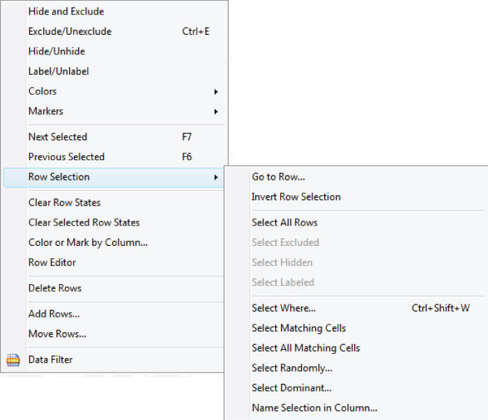
Exhibit 3.21 Rows Menu with Commands for Row Selection Shown
Recall that a row state is a property that is associated with a row. A row state consists of information on whether a specific row is selected, excluded from analysis, hidden so that it does not appear in plots, labeled, colored, or has a marker assigned to it. You often need to change row states of rows interactively based on visual displays. The Clear Row States command removes any row states that are currently in effect.
Data Filter and the Local Data Filter, which filters a specific report, are used extensively in the case studies. These options provide a flexible and interactive way to change the row states in order to identify meaningful, and possibly complex, subsets of rows. They also provide a way of animating many of the visual displays in JMP. Depending on the analysis goal, subsets that you define using Data Filter can easily be selected and placed into their own data tables for subsequent analysis or excluded from the current analysis.
Columns
The Cols menu, shown in Exhibit 3.22, provides commands dealing with column properties and roles, information stored along with columns, formulas that define column values, recoding of values, and more.

Exhibit 3.22 Cols Menu with Utilities Shown
Note that some of the commands in Exhibit 3.22 are active because columns were selected in the table.
The Column Info command opens a dialog that allows you to define properties that are saved as part of the column information. To access Column Info for a column, right-click in the column header area and choose Column Info. Exhibit 3.23 shows the Column Info dialog for Visits.

Exhibit 3.23 Column Info Dialog for Visits Showing Column Properties
A column can have column properties associated with it. You can add a note describing the column using the Note property. (The Note column property has already been added for each column in PharmaSales.jmp.) You can also have specification limits using the Spec Limits property, control limits using the Control Limit property, and so forth. To define a column using a formula, select the Formula column property to define that column.
Note that you can specify the Data Type and Modeling Type for your data in the Column Info window. The Numeric and Character data types are the most common, but you can also define a column to have a data type of Row State or Expression. The Row State data type allows you to construct a column that contains row states, providing a permanent record of row states. The Expression data type allows you, among other things, to store images in table cells. These can be displayed on certain plots, which can be very useful for providing extra context and meaning. You can specify an appropriate data format in the Column Info window as well. For more information refer to the JMP documentation.
DOE
Chapter 2 introduced the idea of experimental data, which arise when you deliberately manipulate the Xs. An experimental design is a list of trials or runs defined by specific settings for the Xs, with an order in which these runs should be performed. This design is used by an experimenter in order to obtain experimental data. JMP provides comprehensive support for generating experimental designs and modeling the results.
The DOE menu, shown in Exhibit 3.24, generates settings for a designed experiment based on your choices of experimental design type, responses, factors, number of runs, and other settings. There are five major groupings.

Exhibit 3.24 DOE Menu
The Custom Design platform allows great flexibility in design choices. In particular, Custom Design accommodates both continuous and categorical factors, provides designs that estimate user-specified interactions and polynomial terms, and allows for situations with hard-to-change and easy-to-change factors and covariates (split-plot, split-split-plot, and strip-plot designs). You can specify inequality constraints on the factors or disallowed combinations of factor settings. The Custom Design platform is featured in one of the case studies (Chapter 7) while the Full Factorial Design platform is used in another (Chapter 9).
The Evaluate Design platform allows you to assess the effectiveness of a design prior to actually running the experiment. If you construct your design using JMP's Custom Design platform, design evaluation results are presented before you construct your design table. The Augment Design platform provides options for adding runs to an existing design. The Sample Size and Power platform computes power, sample size, or effect size for a variety of situations, based on values that you set.3
SCRIPTS
As you have seen, the menus in JMP can be used to produce an incredible variety of visual displays and analyses. When you are starting out with JMP, you rarely need to look beyond these menus. However, as you use JMP more heavily, or perhaps need to start to provide insights for others, you may find the need to simplify repetitive tasks, or even to see custom analyses. These tasks can be programmed within JMP by using its scripting language, aptly named JMP Scripting Language (JSL).
A JMP script can be saved as a separate file with a .jsl extension or it can be saved as part of a data table. The data table PharmaSales.jmp contains several JMP scripts that are saved as part of the data table in the Table panel area. Consider the script Distribution Plots for Three Outcome Variables. You can run this script by clicking on the red triangle to the left of the script and choosing Run Script, as shown in Exhibit 3.25.

Exhibit 3.25 Running the Script Distribution Plots for Three Outcome Variables
When you run this script, you obtain the report shown in Exhibit 3.26. This script adds a Local Data Filter to the Distribution report. Scripts provide an easy way to document your work. When you have obtained a report that you want to reproduce, instead of saving the report, or parts of it, in a presentation file or document, you can simply save the script that produces the report to your data table. So long as the required columns are still in the table, the script will work even if the data (rows) are refreshed or changed.

Exhibit 3.26 Distribution Report Obtained by Running Distribution Plots for Three Outcome Variables
To save a script to produce this report to the data table, do the following:
- Obtain the report by completing the launch dialog (see Exhibit 3.8 for an example) and clicking
OK. - From the red triangle menu commands, select
Script > Local Data Filter. - Click on the red triangle next to
Distributionsand chooseScript > Save Script to Data Table, as shown in Exhibit 3.27. - A new script, called
Distribution, appears in the Table panel.

Exhibit 3.27 Saving a Script to the Data Table
You can rename or edit this script by clicking on its red triangle and choosing Edit or by double-clicking on the script name. When you do this, you obtain the script window shown in Exhibit 3.28. This is the code that reproduces the report. Scripts can be saved in a similar way from platforms other than Distribution.

Exhibit 3.28 Distribution Script
Scripts can be constructed from scratch or pieced together from scripts that JMP automatically produces, such as the script in Exhibit 3.28. Some of the scripts in the data table PharmaSales.jmp are of this type.
In the case studies, you will frequently save scripts to your data tables. There are two reasons for this. First, we want you to have the scripts available in case you want to rerun your analyses quickly, so as to get to a point in the case study where you might have been interrupted. Second, we want to illustrate saving scripts because they provide an excellent way of documenting your analysis, allowing you to follow and recreate it in the future.
In Chapter 1 we mentioned that, on occasion, we have deliberately compromised the lean nature of the Visual Six Sigma Roadmap to show some JMP functionality that will be useful to you in the future. The saving of scripts is an example, because at one level scripts are not necessary and are therefore not lean. However, at another level, when you have obtained the critical reports that form the basis for your conclusions, scripts take on a lean aspect, because they help document results and mistake-proof further work.
PERSONALIZING JMP
JMP provides many ways to personalize the user experience. These options range from specification of what you want to see by default in existing reports, to creating customized reports for specific analysis or reporting tasks. Many features can be customized in the Preferences menu, located under File (or under JMP on the Mac). More advanced customization may require you to write or adapt scripts. The ability to Journal and Layout, both located under Edit, also allows you to document, annotate, and save results from an analysis session.
Customization options include:
- Configuring the initial state of the report that a platform produces using
Preferences - Deleting from or adding to a report
- Combining several reports from different platforms
- Defining custom analyses and reports
- Adding to, deleting from, or rearranging menu items
- Using
Journalfiles to lay out a series of steps for users to take - Developing JMP-based applications using
Application Builder - Deploying applications via add-ins
Some of these possibilities are further developed in Chapter 11.
By allowing such a high degree of user customization, JMP enables every user to best leverage their skills and capabilities. With relatively little effort, the software can become a good fit for an individual or group of similar individuals.
VISUAL SIX SIGMA DATA ANALYSIS PROCESS AND ROADMAP
As this quick tour of functionality may suggest, JMP has a very diverse set of features for both EDA and CDA. The earlier section “Visual Displays and Analyses Featured in the Book” gave a preview of those parts of JMP that you will see again in later chapters. In this section, we put the list of techniques into context to help you see how they can be combined to support Visual Six Sigma's goal of getting value from data.
In Chapter 2, we discussed the outcome of interest to us, represented by Y, and the causes, or inputs that affect Y, represented by Xs. As you saw, Six Sigma practitioners often refer to the critical inputs, resources, or controls that determine Y as Hot Xs. Although many Xs have the potential to affect an outcome, Y, the data may show that only certain of these Xs actually have an impact on the variation in Y. In the credit card example from Chapter 2, whether a person is an only child or not may have practically no impact on whether that person responds to a credit card offer. In other words, the number of siblings is not a Hot X. However, an individual's income level may well be a Hot X.
Consider the Visual Six Sigma Data Analysis Process, illustrated in Exhibit 3.29, which was first presented in Chapter 2. In your Six Sigma projects, first you determine the Y or Ys of interest during the Frame Problem step. Usually, these are explicit in the project charter or they follow as process outputs from the process map. In Design for Six Sigma (DFSS) projects, the Ys are usually the Critical to Quality Characteristics (CTQs).

Exhibit 3.29 Visual Six Sigma Data Analysis Process
The Xs of potential interest must be identified prior to the Collect Data step. To identify Xs that are potential drivers of the Ys, a team uses process maps, contextual knowledge, brainstorming sessions, cause-and-effect diagrams, cause-and-effect matrices, and other techniques. Once the Xs have been listed, you seek data that relate these Xs to the Ys. Sometimes these observational data exist in databases. Sometimes you have to begin data collection efforts to obtain the required information.
Once the data have been obtained, you face the issue of identifying the Hot Xs. This is part of the Uncover Relationships step. Once you have identified the Hot Xs, you may or may not need to develop an empirical model of how they affect the Ys. Developing this more detailed understanding is part of the Model Relationships step, which brings us back to the signal function, described in Chapter 2. You may need to develop a model that expresses the signal function for each Y in terms of the Hot Xs. Here we illustrate with r Hot Xs:
Only by understanding this relationship at an appropriate level can you set the Xs correctly to best manage the variation in Y.
Identifying the Hot Xs and modeling their relationship to Y (for each Y) is to a large extent the crux of the Analyze phase of a DMAIC project, and a large part of the Analyze and Design phases of a DMADV project.
Exhibit 3.30 shows an expansion of the Visual Six Sigma Roadmap that was presented in Chapter 2. Recall that this Roadmap focuses on the three Visual Six Sigma Data Analysis Process steps that most benefit from dynamic visualization: Uncover Relationships, Model Relationships, and Revise Knowledge. In this expanded version, we show how a subset of the techniques listed earlier in this chapter can be used in a coordinated way to accomplish the goals of Visual Six Sigma. In our experience, this represents an excellent how-to guide for green belts who are starting the Analyze phase of a traditional Six Sigma project, or anyone who is simply faced with the need to understand the relationship between some set of inputs and some outcome measure outside a DMAIC or DMADV framework.
Exhibit 3.30 Visual Six Sigma Roadmap
| Visual Six Sigma Roadmap—What We Do |
| Uncover Relationships |
| Dynamically visualize the variables one at a time |
| Dynamically visualize the variables two at a time |
| Dynamically visualize the variables more than two at a time |
| Visually determine the Hot Xs that affect variation in the Ys |
| Model Relationships |
| For each Y, identify the Hot Xs to include in the signal function |
| Model Y as a function of the Hot Xs; check the noise function |
| If needed, revise the model |
| If required, return to the Collect Data step and use DOE |
| Revise Knowledge |
| Identify the best Hot X settings |
| Visualize the effect on the Ys should these Hot X settings vary |
| Verify improvement using a pilot study or confirmation trials |
However, remember that the EDA approach to uncovering relationships requires an unfolding style of analysis in which your next step is determined by your interpretation of the previous results. So, although it is a great starting point to guide your usage of JMP in many situations, Exhibit 3.30 should never be followed slavishly or without thought. As you gain more familiarity with your data and with JMP, you may well develop your own Visual Six Sigma style that works better for you and your business.
TECHNIQUES ILLUSTRATED IN THE REMAINING CHAPTERS
Chapters 5 through 10 contain six case studies drawn from real situations. Each illustrates a selection of techniques that support the Visual Six Sigma Roadmap. All of the case studies strongly emphasize uncovering relationships and therefore rely heavily on visualization techniques directed at discovery. The table in Exhibit 3.31 indicates which platforms and options, presented as JMP menu items, are illustrated in the remaining chapters.
Exhibit 3.31 Platforms and Options Illustrated in the Remaining Chapters
| JMP Menu | Option | Chapter 4 | Chapter 5 | Chapter 6 | Chapter 7 | Chapter 8 | Chapter 9 | Chapter 10 | Chapter 11 | ||
| Managing Data and Its Quality | Reducing Hospital Late Charges | Transforming Pricing Management | Quality of Anodized Parts | Informing Pharmaceutical Sales | Improving Polymer Manufacturing | Classification of Cells | Beyond Point and Click | ||||
| File | Open > Data with Preview | X | X | ||||||||
| Tables | Summary | X | X | X | |||||||
| Subset | X | X | X | ||||||||
| Sort | X | X | |||||||||
| Transpose | X | ||||||||||
| Join | X | ||||||||||
| Concatenate | X | ||||||||||
| Missing Data Pattern | X | X | X | X | X | ||||||
| Rows | Hide and Exclude | X | X | X | |||||||
| Exclude/Unexclude | X | ||||||||||
| Hide/Unhide | X | ||||||||||
| Label/Unlabel | |||||||||||
| Colors/Markers | X | X | |||||||||
| Next Selected | X | ||||||||||
| Row Selection | X | X | X | X | |||||||
| Clear Row States | X | X | X | ||||||||
| Color or Mark by Column | X | X | X | ||||||||
| Select Matching Cells | X | ||||||||||
| Data Filter | X | X | |||||||||
| Cols | New Column | X | X | x | |||||||
| Column Info | X | X | X | X | X | X | X | ||||
| Column Properties | X | X | X | X | X | X | X | ||||
| Preselect Role | X | ||||||||||
| Formula | X | X | X | X | X | X | |||||
| Hide/Unhide | X | X | |||||||||
| Exclude/Unexclude | X | x | |||||||||
| Columns Viewer | X | X | X | ||||||||
| Utilities | |||||||||||
| Recode | X | ||||||||||
| Modeling Utilities | x | X | |||||||||
| Explore Outliers | x | X | |||||||||
| Explore Missing Values | X | ||||||||||
| Make Validation Column | x | ||||||||||
| Group Columns | X | X | X | ||||||||
| DOE | Custom Design | X | |||||||||
| Save Factors and Responses | X | ||||||||||
| Full Factorial Design | x | ||||||||||
| Analyze | Distribution | X | X | X | X | X | X | X | |||
| Histogram | X | X | X | X | X | X | X | ||||
| Continuous Fit | X | ||||||||||
| Frequency Distribution | X | X | X | X | X | X | |||||
| Fit Y by X | X | X | X | ||||||||
| Bivariate Fit | X | X | |||||||||
| Fit Line | X | ||||||||||
| Fit Special | X | ||||||||||
| Fit Polynomial | X | ||||||||||
| Contingency | X | X | |||||||||
| Oneway | X | X | X | ||||||||
| Box Plots | X | ||||||||||
| Means Diamonds | X | ||||||||||
| Compare Means | X | X | |||||||||
| Tabulate | X | X | X | ||||||||
| Fit Model | X | X | X | X | X | ||||||
| Standard Least Squares | X | X | X | X | |||||||
| Stepwise | x | X | |||||||||
| All Possible Models | X | ||||||||||
| Generalized Regression | X | ||||||||||
| Random Effects (REML) | X | ||||||||||
| Nominal Logistic | X | ||||||||||
| Macros—Response Surface | X | ||||||||||
| Macros—Factorial to degree | X | ||||||||||
| Effect Summary | X | X | X | ||||||||
| Modeling | X | X | |||||||||
| Partition | X | ||||||||||
| Decision Tree | X | X | |||||||||
| Boosted Tree | X | ||||||||||
| Neural Net | X | ||||||||||
| Model Comparison | X | ||||||||||
| Multivariate | Multivariate | X | |||||||||
| Methods | Correlation and | ||||||||||
| Scatterplot Matrix | X | ||||||||||
| Cluster | X | ||||||||||
| Principal Components | X | ||||||||||
| Quality and | Control Chart Builder | X | X | X | x | X | |||||
| Process | Process Capability Analysis | X | x | X | |||||||
| Measurement Systems Analysis | X | ||||||||||
| Variability/Attribute Gauge Chart | X | ||||||||||
| Process Capability | X | ||||||||||
| Goal Plot | X | ||||||||||
| Pareto Plot | X | X | |||||||||
| Diagram (Ishikawa C&E) | X | ||||||||||
| Graph | Graph Builder | X | X | X | X | X | |||||
| Bubble Plot | X | ||||||||||
| Scatterplot Matrix | X | X | X | ||||||||
| Scatterplot 3D | X | ||||||||||
| Surface Plot | X | ||||||||||
| Profiler | X | X | |||||||||
| Maximize Desirability | X | X | |||||||||
| Sensitivity Indicators | X | X | |||||||||
| Simulator | X | X | |||||||||
| Contour Profiler | X | ||||||||||
| Tree Map | X | ||||||||||
| Tools | Lasso | X | |||||||||
| Other | Local Data Filter | X | X | X | X | X | |||||
| Column Switcher | X | X | X | ||||||||
| JSL—Writing Scripts | X | ||||||||||
| Application Builder | X | ||||||||||
We invite you to work through the case studies using the data tables provided. As mentioned earlier, the case studies assume that you are using the default settings in JMP (which you can reset under File > Preferences by clicking the Reset to Defaults button).
CONCLUSION
In this chapter, you have been given an initial overview of JMP as the enabling technology for Visual Six Sigma. Our goal has been to familiarize you with JMP so that you are now able to follow the JMP usage in the case studies that show Visual Six Sigma in action.
It has been said, “Quality is (or should be) in everything.” The next chapter, Chapter 4, discusses data quality and management in detail. The open-ended nature of Six Sigma projects will likely mean that you have to handle these kind of issues routinely.
Chapter 4 is followed by the six case study chapters in Part Two of the book.