
Chapter 9
Improving a Polymer Manufacturing Process
Your employer, a British company called MoldMat Ltd., manufactures granulated white plastic at a plant in Britain and supplies it to a molding plant in Italy, where it is made into white garden chairs and tables. However, the molding process goes through intermittent phases when its product quality drops, leading to yield losses at both the polymer and the molding plants. When a crisis occurs, teams are formed to tackle the problem, but the problem usually disappears for no apparent reason.
After yet another mysterious crisis occurs and resolves itself, you are selected to solve the problem once and for all. Your selection is due in large part to your recent Six Sigma black belt training. Together with a small project team, you identify two characteristics (Ys) that are of paramount importance relative to quality and yield: the polymer's melt flow index (MFI) and its color index (CI).
Together with your team, you reanalyze the most recent crisis team's data. The analysis fails to reveal suspected relationships between the two responses and eight process factors. This leads you to suspect that measurement variation may be clouding results. Consequently, you and your team conduct Measurement System Analysis (MSA) studies on the measured Ys and Xs. The problematic variables turn out to be MFI (one of the two Ys) and filler concentration (one of the Xs).
Once the repeatability and reproducibility issues for these two variables are addressed, your team gathers new data. Your analysis begins with data visualization and exploration. Then it proceeds to modeling relationships. You develop useful models for MFI and CI that include terms that might otherwise have been overlooked, had your team not done extensive data visualization.
You use the Profiler to optimize MFI and CI simultaneously. Using sound estimates of the expected variation in the Hot Xs, you simulate the expected distributions for MFI and CI at the optimal settings. The simulations indicate that the parts per million (PPM) rate should be greatly reduced. After running some successful confirmation trials, management implements the changes.
One and a half years later, not a single batch of white polymer has been rejected by the molding plant. The savings from rejected batches alone amount to about £750,000 per annum. Additionally, because there are now no processing restrictions on the molding plant, savings of £2,100,000 per annum are being realized by MoldMat's big customer. This in turn leads to increased sales for MoldMat. These savings come at very little cost, as project-related expenditures were minimal.
Your odyssey takes you and your team through all of the steps of the Visual Six Sigma Data Analysis Process. In particular, you engage in interesting work involving MSAs and modeling using stepwise regression. A list of platforms and options used is given in Exhibit 9.1. The data sets can be found at http://support.sas.com/visualsixsigma.
Exhibit 9.1 Platforms and Options Illustrated in this Case Study
| Menus | Platforms and Options |
| Tables | Concatenate |
| Rows | Exclude/Unexclude |
| Hide/Unhide | |
| Colors/Markers | |
| Row Selection | |
| Clear Row States | |
| Data Filter | |
| Cols | New Column |
| Column Info | |
| Column Properties | |
| Hide/Unhide | |
| Exclude/Unexclude | |
| DOE | Full Factorial Design |
| Analyze | Distribution |
| Histogram | |
| Continuous Fit | |
| Frequency Distribution | |
| Fit Model | |
| Standard Least Squares | |
| Stepwise | |
| All Possible Models | |
| Macros—Response Surface | |
| Macros—Factorial to Degree | |
| Effect Summary | |
| Modeling | |
| Quality and Process | Control Chart Builder |
| Process Capability Analysis | |
| Measurement Systems Analysis | |
| Graph | Graph Builder |
| Scatterplot Matrix | |
| Surface Plot | |
| Profiler | |
| Maximize Desirability | |
| Sensitivity Indicators | |
| Simulator | |
| Other | Local Data Filter |
| Column Switcher | |
| Non-normal Capability |
SETTING THE SCENE
For the past 25 years, MoldMat Ltd. has supplied the plastic that one of its major customers in Italy uses in making white garden furniture. Over the years, mysterious crises occur during which the flowability of the plastic leads to low yields for both MoldMat and their Italian customer. To date, all efforts to find the root cause of these crises have failed. After the most recent crisis, due to your training in Visual Six Sigma, you are asked to lead a new team whose mandate is to find a permanent solution to the problem.
Manufacturing Process
White garden chairs and furniture command a very good price, but they are difficult to make owing to the impact of whitening agents on plastic flowability. Getting the right balance of whiteness and flow is not easy. As the proportion of additives in the mix increases to make the plastic whiter, the flow of the plastic is impaired.
The process for making white plastic begins with the preparation of a filler mixture, or slurry. The white filler, which is an inert powder, is sourced from a number of quarries in Africa. It is mixed with unpurified river water in a stirred tank in the filler preparation section of the MoldMat polymer plant (Exhibit 9.2). The filler preparation tank is agitated and held at a target concentration. The tank is topped off each day with filler and water. Small amounts of a viscosity modifier are added to the slurry if the viscosity gets too high.

Exhibit 9.2 White Polymer Manufacturing Process
Clear plastic is made by heating and stirring a monomer in a batch reactor until it polymerizes. To make the white plastic, the filler slurry is added to the monomer in the polymerization reactor at the start of the polymerization process. When the polymerization reaction is complete, the molten polymer is granulated and packed. The MoldMat plant in England makes three batches of white plastic per day, running a 24-hour schedule every day of the week.
The polymer plant tests every batch of polymer. A sample from each completed batch is taken and tested for:
- Color (whiteness), measured on a colorimeter using a color index
- Melt flow, measured as a melt flow index in an offline laboratory test; this is an indicator of how well the polymer will process in the downstream molding plant
- Filler content of the polymer
A Typical Crisis
Crises have occurred two or three times a year ever since the new product was introduced ten years ago. Here is a typical sequence of events.
The Italian molding plant has several months of normal processing before starting to experience problems with flowability. When this happens, technicians in the molding plant check the processing parameters, and if these look reasonable, they question the quality of the polymer. The MoldMat plant engineers check that the polymer is in specification and verify that there is nothing wrong with the test equipment. This leads the processing plant engineers to suspect that the molding processing parameters have changed.
After a few more days of bad processing, the molding plant engineers ask for some different polymer to run as a trial. This requires a fresh start for molding production. The molding plant must empty the polymer silos to run the trial polymer. The purged material is sold as scrap, which is accounted for as a loss in the MoldMat plant yield.
By this time, the output of the molding plant is well behind schedule, and customers are running out of chairs. The business suffers substantial lost margin and opportunity.
Meanwhile, rapid action teams have been assembled from across Europe. A plethora of helpful theories and their associated solutions are developed, such as:
- The filler supplier is inconsistent and should be replaced.
- Last week's heavy rain has altered the pH of the water supply, which has affected the reaction chemistry.
- The MFI specification is too high, so batches of polymer at the bottom end of the specification range should be the only ones used.
- Abnormal ambient temperatures and humidity are to blame.
- The filler is not evenly distributed through the polymer, and agglomerates are blocking the flow channels in the molds.
Process changes are made, trials are run, and data are gathered. But none of the changes ever conclusively solve the problem.
Then, mysteriously, the problem goes away. The molding process gradually improves, with everyone convinced that their pet theory or solution was the one that made the difference. All is well until the next crisis.
Forming a Team
After one particularly bad crisis, the manufacturing director, Edward Constant, has finally had enough. MoldMat has started to implement Visual Six Sigma, and the black belts from the first wave of training are anxious to start driving improvement. Edward is skeptical about Visual Six Sigma, but he is prepared to give it a go—after all, nothing else has worked.
You are a bright young process engineer who has only recently moved to the polymer plant, and you were one of the first trainees. Edward has met you a few times and is impressed by your openness to new ideas and your approach to problem solving. Given the numerous false starts, Edward figures that your lack of detailed knowledge of MoldMat's operations could actually be an advantage, provided that you work with people who have the right mix of experience.
At your first meeting, Edward indicates that he will act as project sponsor and offers you all the support you need. He tells you: “Everyone has an opinion on the best solution, but I have never been satisfied that anyone has properly done any rigorous analysis, let alone identified the root cause of the problem so that it can be conclusively fixed. This problem has been around for ten years, so a few more months are not going to make that much difference. The best advice I can give you is to take your time and to trust nothing and no one, unless you have personally verified the data and have worked through it in a methodical way. I don't want any more crises. If the process can work most of the time, then it should be able to work all of the time.”
Edward knows that a change of polymer can immediately affect the processing performance of the molding plant, even if the polymer batches meet the polymer specifications. So he urges you to focus on the polymer plant first and to talk to a wide range of people in both the polymer and molding plants. But above all, he directs you to collect some data.
Edward helps you form a small project team consisting of you and the following associates:
- Henry, the polymer plant quality manager
- Bill, a polymer chemist from a technical support group
- Roberto, a process engineer from the Italian molding plant
- Tom, a master black belt
Tom's role is to ensure that the Visual Six Sigma methodology and tools are correctly applied. He is a well-seasoned and culturally savvy master black belt from MoldMat's training partner. Together with Tom, you assemble the team and review your objectives. To ensure that all team members share a common language and approach, Tom schedules and conducts an impromptu training session in Visual Six Sigma and JMP.
FRAMING THE PROBLEM
At this point, the team needs to develop a project charter, using a high-level process map and some baseline data. Also, you decide to develop a Suppliers, Inputs, Process, Outputs, and Customers (SIPOC) map and gather customer input. The result of this process is that you and the team decide to focus on two critical process characteristics: melt flow index and color index.
Developing a Project Charter
During your first team meeting, the team draws a high-level process map (Exhibit 9.3). You also decide to review yield data from both the polymer and molding plants to confirm the size and frequency of the problem.

Exhibit 9.3 High-Level Process Map of White Polymer Molding Process
There have been many arguments about white polymer quality. Although there is a polymer specification, the molding plant has long suspected that it does not fully reflect the true requirements of their process. After a long discussion, the team agrees on the following Key Performance Indicator (KPI) definitions for the project:
- Daily yield is calculated as the weight of good polymer divided by the weight of total polymer produced.
- Good polymer is polymer that can be successfully processed by the molding plant.
- Total polymer produced will include product that fails to meet the polymer plant specifications, plus any polymer that, although meeting polymer plant specifications, is subsequently scrapped or rejected in the molding plant.
The team collects some historical data on daily yield and imports it into a data table named BaselineYieldData.jmp. The data table contains two columns, Date and Yield, and has 1,125 rows covering a period of a little more than three years. (The data table also contains two scripts for later use.)
Note that Yield is designated as a Label variable, as evidenced by the yellow label icon next to Yield in the Columns panel in Exhibit 9.4. With this property, when the arrow tool hovers over a point in a graph, that point's Yield value will appear. You gave Yield the Label role by right-clicking on it in the Columns panel and selecting Label/Unlabel.

Exhibit 9.4 Partial View of BaselineYieldData.jmp
You proceed to construct an Individuals control chart to see how Yield varies over time. The distribution of Yield measurements is likely to be skewed, since there is an upper limit of 100 percent, so that control limits calculated using an individual measurement control chart may not be appropriate. Nonetheless, you decide to use the individual measurement chart in an exploratory fashion. You also decide that the Moving Range part of the IR chart is not of interest to you at this point, so you remove it. This allows you and others to focus on the Yield values.
The control chart shown in Exhibit 9.5 appears. The chart clearly shows periods of high yields, each followed by a crisis, with a total of nine crises over the period. The average Yield over this time period is about 88 percent, but the real issue is the repeated occurrence of causes that are not intrinsic to the system, called special causes.

Exhibit 9.5 Individuals Chart of Baseline Yield Data
To conveniently reproduce this analysis and to document your work, you can save a script to the data table to reproduce this chart. The script has already been saved for you with the default name Control Chart Builder. To save this script yourself, click on the red triangle next to Control Chart Builder in the report window and choose Script > Save Script to Data Table. By default, your new script is called Control Chart Builder 2, but you can click on the name to change it.
To better understand the crisis Yield values, use your cursor to hover over various points to see their values. You come to the realization that crisis periods can be loosely defined by collections of batches with Yield values below 85 percent.
You become curious about the likely yield of the process had it not been affected by these crisis periods. Just to get a sense of the noncrisis yields, you construct a control chart with crisis batches, defined as batches with yields below 85 percent, excluded. The Local Data Filter provides an easy way to filter out data values without affecting other plots or the data table.
The Local Data Filter panel and plot are shown in Exhibit 9.6. The Yield Limit Summaries report to the right of the chart, shown beneath the plot in Exhibit 9.6, indicates that the mean Yield for the noncrisis periods is about 94 percent. Close your data table without saving changes.

Exhibit 9.6 Local Data Filter Settings to Exclude Crisis Rows
With this information as background, the team reconvenes. You need to agree on the problem statement and project goal, and to define the specific scope and focus of the project.
The team drafts a project charter, shown in Exhibit 9.7. As instructed, you decide to focus on the polymer plant and set a goal of achieving an average yield of 95 percent by the end of the year. It is late August—this gives you four months. You know that if you can eliminate the crises, a 94 percent yield can be achieved. But, knowing that the team will be constructing detailed knowledge of the process, you feel that you can even do a little better.
Exhibit 9.7 Project Charter
| Project Title | Improve White Polymer Process Yield |
| Business Case | The manufacture of white polymer results in periodic flowability crises at a large Italian customer's molding plant. The molding plant sells suspect polymer at scrap prices. These crises have been going on for years and, although the crises resolve temporarily, they continue to recur, causing significant disruption and great financial loss for both MoldMat and its customer. |
| Demand for white furniture keeps increasing, and the molding plant in Italy can't afford to be down due to lack of acceptable white polymer. The molding plant has to turn orders away in crisis periods, causing a significant loss in revenue and great dissatisfaction. | |
| Problem/Opportunity Statement | It is estimated that, due to the crisis periods, the polymer plant suffers a yield loss of about £700,000 per year in scrap material. There is the opportunity to recover at least £700,000 annually in what would otherwise be scrap. |
| Also, a significant margin loss is generated by the molding plant, which has to turn orders away in crisis periods. If the problem could be fixed, the accounting department estimates that the company would realize an additional £2,000,000 of revenue annually. | |
| Project Goal Statement and KPI (Key Performance Indicator) | Increase the average yield of white polymer from 88 percent to 95 percent or higher by March 1, 2015 (four months). |
| Daily yield will be plotted using an individual measurement control chart. | |
| Project Scope | The polymer plant's part of the process. |
| Project Team | Sponsor: Edward Constant |
| Black belt and polymer process engineer: This is you! | |
Team members:
|
At this point, you check in with Edward to obtain his support for the project charter and the team's proposed direction. As it turns out, Edward is very impressed with the clarity of your work to date and likes the idea that the project goal was chosen based on sound data. He is quick to approve of the team's charter and direction.
Identifying Customer Requirements
Next, the team explores the following questions:
- What are the true requirements of the molding plant?
- Why are these requirements met at some times but not at others?
- What is changing?
To this end, during its next meeting, the team produces a SIPOC map to help gain a better understanding of the process steps and to identify where to focus within the polymer plant (Exhibit 9.8).
Exhibit 9.8 SIPOC Map for White Polymer Process
| Suppliers | Inputs | Process | Outputs | Customers |
| Umboga A | Filler | Prepare Slurry | Filler Slurry | Polymerization |
| Kuanga A | ||||
| Kuanga B | ||||
| North West Water Authority | Water | |||
| Slurry Preparation | Filler Slurry | Make Polymer | Polymer | Granulation |
| Monomers Inc. | Monomer | |||
| Granulation | Polymer | Granulate | Granules | Packing |
| Packing | Granules | Pack | Bags | Molding Plant |
The team also proceeds to collect voice of the customer (VOC) information from the immediate customers of the process, namely, the stakeholders at the molding plant. Through interviews, team members collect information from molding plant technicians and managers. There are many comments reflecting that plant's frustration, such as the following:
- “I don't want any crises caused by poor polymer.”
- “Your polymer is not consistent.”
- “I don't believe you when you say you are in spec.”
- “I need to be able to make good white molding all the time.”
- “You are killing my business.”
- “We can't continue with these scrap levels.”
But the team also collects specific information about the technical requirements of the molding process. You diagram your analysis in the form of a Critical to Quality Tree, a portion of which is shown in Exhibit 9.9. This Critical to Quality Tree flows from top to bottom. It first lists the critical customer needs, then their drivers, and finally the measurable requirements needed for improvement.

Exhibit 9.9 Partial Critical to Quality Tree for Molding Plant VOC
Two primary characteristics quickly emerge:
- The molding plant has specified that in order for the polymer to process well on their equipment, the polymer's MFI must fall between lower and upper specification limits of 192 and 198 (with a target of 195).
- The polymer's CI must meet the whiteness specification. The maximum possible CI value is 100, but the only requirement is that CI must exceed a lower specification limit of 80.
REVIEWING HISTORICAL DATA
Your team decides to review a set of data collected by a team that had been assembled to address one of the recent yield crises. This earlier team was unable to identify the root cause of the crisis. The fact that the team's data do not lead to the identification of Hot Xs leads you to suspect that one or more variables suffers from large measurement error.
Data from Prior Crisis Team
You and your team begin to review the last crisis team's data and analysis. To your surprise and delight, you find that the crisis team had used many Six Sigma tools in investigating possible causes of the problem.
In particular, the team members had developed an Input/Output process map (Exhibit 9.10) to help identify the potential Xs that might be driving variation in MFI, CI, and, consequently, Yield. They used the Xs and Ys identified in their process map to determine the data they should collect.

Exhibit 9.10 Input/Output Process Map of White Polymer Process
Reanalyzing the Historical Data
You obtain a spreadsheet of the data collected by the crisis team and import this into a JMP table, which you call CrisisTeamData.jmp. The data consist of measurements for the Xs and Ys identified in the process map for 127 batches over about a six-week period. A partial view of the data table is shown in Exhibit 9.11.

Exhibit 9.11 Partial View of Table Containing Crisis Team Data
The columns in the data table are described in Exhibit 9.12. There are three Ys and eight Xs of interest. You note that, even though the table does not have an explicit date or time column, the sequential values of Batch Number define the processing order.
Exhibit 9.12 Description of Variables in CrisisTeamData.jmp
| Variable Type | Name | Description |
| ID | Batch Number | Identifying number for slurry batch |
| Ys | MFI | Melt flow index of the polymer |
| Cl | Color index of the polymer | |
| Yield | Weight of good polymer as determined by the molding plant, divided by weight of total polymer produced | |
| Xs | SA | Amps for slurry tank stirrer |
| M% | Viscosity modifier percent measured in the filler slurry tank | |
| Xf | Percent of filler in the polymer | |
| pH | pH of the slurry | |
| Viscosity | Viscosity of the slurry | |
| Ambient Temp | Ambient temperature in the slurry tank area | |
| Quarry | Quarry of origin for filler | |
| Shift | Shift during which batch was processed |
Distribution Plots
The first thing that your team wants to know is how the process behaved, in terms of Ys, over the six-week period reviewed by the previous crisis team. But you first run a Distribution analysis for all of the variables (except Batch Number). In your training, you learned that this is an important first step in any data analysis.
You review the resulting plots. Recall that, in the VOC analysis, you learned that MFI should fall between 192 and 198, and CI should be 80 or higher. The histogram for MFI shows that it varies far beyond the desired limits (Exhibit 9.13). The histogram for CI shows a significant percentage of values below 80.

Exhibit 9.13 Partial View of Distribution Report with Crisis Yield Values Selected
Of particular interest are the Yield values that fall below 85 percent. Select these in the box plot to the right of the Yield histogram. To do this, click and drag a rectangle that includes these points as shown in Exhibit 9.13.
This action selects the corresponding rows in the data table—check to see that 14 rows have been selected. Consequently, the values corresponding to these 14 low-yielding batches are highlighted in the histograms for all of the variables. For example, you see that the 14 crisis Yield batches have very low SA values. To remove the selection of the 14 rows, select Rows > Clear Row States.
Looking at the histograms, one of the team members points out that the distribution of CI is not bell-shaped. You agree and explain that this is not unusual, given that CI has a natural upper bound of 100 percent. The team is now aware that they must keep this in mind when using certain statistical techniques, such as individual measurement control charts and capability analysis, both of which assume that measured values are normally distributed.
Control Charts
At this point, you are eager to see how the three Ys behave over time. To see this you construct control charts.
For the most part, MFI seems to be stable. On the Individuals chart for MFI, there are no points outside the control limits (results not shown). But what is troubling is that MFI averages 198.4 over this time period. The team's VOC analysis indicated that 198 is the upper specification limit for MFI!
The control chart for CI immediately shows the problem with applying a control chart based on normally distributed data to highly skewed data (Exhibit 9.14). The control limits do not reflect the skewed distribution. Nonetheless, there are indications of special causes. The plot also shows some very large and regular dips in CI. There are many excursions below the lower specification limit of 80. This leaves the team members puzzled, especially because the dips do not align with the one crisis period that is so evident in the Yield control chart (Exhibit 9.15).

Exhibit 9.14 Individuals Chart for CI, Crisis Team Data

Exhibit 9.15 Individuals Chart for Yield, Crisis Team Data
You briefly consider the idea of running capability analyses for these three responses. However, the Individuals chart clearly shows that MFI is not capable, since the process average exceeds the upper specification limit. Each of CI and Yield is affected by special causes. The corresponding points could be removed prior to running capability analyses, but it is not all that easy to tell exactly which points result from special causes. The team decides that there is not much to gain by running formal capability analyses on these data.
Now you turn your attention to the crisis team's modeling efforts. Reading through the crisis team's documentation, you see that the team analyzed the data using multiple regression. The crisis team hoped to determine which Xs had a significant effect on the three key responses. The team identified M% and Viscosity as being significantly related to MFI, but it did not find any of the Xs to be related to CI.
This last result seems especially curious. You realize that there are several reasons that such an analysis might lead to no significant factors:
- One or more key Xs are missing.
- One or more higher-order terms involving the specified Xs are missing.
- Measurement variation in the Ys or Xs is too large and is masking the systematic patterns in the Ys caused by process variation in the Xs.
With this as background, you meet with members of the crisis team to discuss the reasoning that led to their final choice of Xs and Ys. They convince you that they did not overlook any critical Xs. After this meeting, you reanalyze their data, introducing higher-order terms. This uncovers some significant relationships, but they don't seem conclusive in terms of the process, especially as they relate to CI. At this point, you have a strong suspicion that measurement variation may be clouding results.
You meet with your team to determine how to proceed. Your team members agree that it is possible that measurement variation in the Ys or Xs could be large relative to the systematic variation caused by the Xs. They fully support your proposal to assess the magnitude of the measurement variation.
MEASUREMENT SYSTEM ANALYSIS (MSA)
As a general principle, measurement systems for key variables should always be evaluated before engaging in data collection efforts. Since you suspect that previous attempts to find root causes of the polymer problems failed because of measurement uncertainty, it is all the more important to thoroughly study the measurement systems for all the variables identified by the process map.
You learn that recent routine MSAs indicate that CI, SA, M%, pH, Viscosity, and Ambient Temp are being measured with very capable instruments and methods. The same is true of polymer weight, which forms the basis for the Yield calculation. However, the measurement systems for MFI and Xf have not been evaluated in the recent past. Furthermore, given how these measurements are made, you realize that they may be prone to problems.
JMP provides two platforms to perform measurement systems analysis, both found under Analyze > Quality and Process: Measurement Systems Analysis and Variability/Attribute Gauge Chart. The Measurement Systems Analysis platform includes the EMP (Evaluate the Measurement Process) approach.1 This approach is new to you, and you are anxious to try it out for your team's MSAs.
MSA for MFI
MFI is measured using a melt flow meter during an offline laboratory test. Four instruments are available within the laboratory to perform the test, and there are three different laboratory technicians who do the testing. There is no formal calibration for the instruments. When team members interview the technicians who perform the test, they get the impression that the technicians do not necessarily use a common, standardized procedure.
Properties of a Good Measurement System
You meet with the technicians and their manager to discuss the desired consistency of the measurement process and to enlist their support for an MSA. You discuss the fact that, for characteristics with two-sided specification limits, a guideline that is often used is that the measurement system range, measured as six standard deviations, should take up at most 10 percent of the tolerance range, which is the difference between the upper and the lower specification limits. Since the upper and lower specification limits for MFI are 198 and 192, respectively, the guideline would thus require the measurement system range not to exceed 10% × (198 – 192) = 0.6 MFI units.2
You also mention that there are guidelines as to how precise the measurement system should be relative to part-to-part, or process, variation: The range of variability of a highly capable measurement system should not exceed 10 percent of the part-to-part (or, in this case, the batch-to-batch) variability.
Designing the MSA
Given these guidelines, you suggest that an MSA for MFI might be useful, and the technicians and their manager agree. You learn from the technicians that the test is destructive. MFI is reported in units of grams per ten minutes. The protocol calls for the test to run over a half-hour period, with three measurements taken on each sample at prescribed times, although due to other constraints in the laboratory the technicians may not always be available precisely at these set times. Each of these three measurements is normalized to a ten-minute interval, and the three normalized values are averaged. From preparation to finish, a test usually takes about 45 minutes to run.
Using this information, you design the structure for the MSA. Since the test is destructive, true repeatability of a measurement is not possible. However, you reason, and the technicians agree, that a well-mixed sample from a batch can be divided into smaller samples that can be considered identical. The three technicians who perform the test all want to be included in the study, and they also want to have all four instruments included. You suggest that the MSA should be conducted using samples from three randomly chosen batches of polymer and that the technicians make two repeated measurements for each batch and instrument combination.
This leads to 72 tests: 3 batches × 3 technicians × 4 instruments × 2 measurements. Since each test is destructive, a sample from a given batch of polymer will have to be divided into 24 aliquots for testing. For planning purposes, it is assumed that the MSA design will permit three tests to be run per hour, on average, using three of the four instruments. This leads to a rough estimate of 24 hours for the total MSA. With other work intervening, the technicians conclude that they can finish the MSA comfortably in four or five workdays.
Designing the MSA Experiment
You construct the designed MSA experiment using JMP's design of experiments (DOE) capabilities.
The design table, partially shown in Exhibit 9.19, appears. Most likely, your table will be different because the run order is randomized.

Exhibit 9.19 MSA Design Table
Note that the Full Factorial Design dialog remains open. This is useful in case changes need to be made to the design that has been generated. In fact, to obtain the precise run order shown in Exhibit 9.19, go back to the Full Factorial Design window. There, select Set Random Seed from the red triangle menu, enter 123, and click OK. Then select Make Table.
When JMP creates the data table, it automatically includes two data table scripts, Model and DOE Dialog. The Model script specifies a model that you can fit, while the DOE Dialog script allows you to recreate the dialog that generated the data table.
Since the purpose of the design is to collect data for a MSA, you decide that the Model script is not necessary and so you delete it. You retain the DOE Dialog script in case you want to set up another study like this one.
As mentioned earlier, the runs are randomized. You stress the importance of running the trials in this order. The technicians conduct the experiment over the course of the next week and enter their results into the data table.
Conducting the Analysis
Your team regroups to analyze the data. The table that contains the design and results is called MSA_MFI_Initial.jmp.
Interpreting the Results—The Average and Range Charts
The report displays an Average Chart and a Range Chart (Exhibit 9.21). The Average Chart plots the average of the repeated MFI measurements and displays control limits calculated from the variation within subgroups. To get a better understanding, select Show Data from the Average Chart's red triangle menu to display the individual data points. The control limits are those for an X-bar R chart using the two-measurement subgroups. This means that the limits are for repeatability variation: the variability when the same Batch is measured by the same Operator using the same Instrument.

Exhibit 9.21 MSA Average and Range Charts for MFI Initial MSA
In a good measurement process, the measurement variability is small relative to the part—in this case, Batch—variation. The measurement system allows you to distinguish different parts. For a good measurement process, almost all averages should fall outside the repeatability control limits. But this is not the case here, indicating that the repeatability variation is large compared to the Batch variation.
The Range Chart shows that the repeatability variation is stable. Although this is a positive result, the level at which the process is functioning is not acceptable. The Average Range indicates that the mean difference between two measurements of the same batch by the same operator using the same instrument is 1.1036. The UCL indicates that this could be as large as 3.6050.
Given the fact that the MFI measurement system variability should not exceed 0.6 units, this signals a big problem. A sample that falls within the specification limits can easily give a measured MFI value that falls outside the specification limits. For example, when Bob used Instrument D to measure Batch 3, one of his measurements, 196.42 (see row 9 of the data table), indicated that the batch fell within the specification limits (192 to 198). But another measurement, 199.44 (row 62), indicated that it was not within the specification limits. The variability in measurements made on the same batch by the same operator with the same instrument is too large to permit accurate assessment of whether product is acceptable.
Interpreting the Results—Parallelism Plots
For additional graphical insight, select Parallelism Plots from the Measurement Systems Analysis red triangle menu (Exhibit 9.22). The Parallelism plots show the Mean MFI values across Batch for both Operator and Instrument. These plots help you see Operator differences across batches, Instrument differences across batches, and possible interactions between Operator and Batch or Instrument and Batch. Note the following:
- The
Operatorplot suggests that Janet's measurements have higherMFIthan Bob's. The means of their measurements for the same batches differ by at least 0.5 units. - It appears that there might be an interaction between
InstrumentandBatch. By an interaction betweenInstrumentandBatch, denotedInstrument*Batch, we mean that instruments behave differently across batches. Here, Instrument C seems to give higher readings for Batch 2 and Batch 3 than would be expected based on the other instruments.

Exhibit 9.22 Parallelism Plots for MFI Initial MSA
Interpreting the Results—Variance Components
For a more complete picture of the sources of measurement variation, select EMP Gauge RR Results from the Measurement Systems Analysis red triangle menu. This report (Exhibit 9.23) shows the standard deviations and variance components associated with the components of the measurement process.

Exhibit 9.23 EMP Gauge R&R Results for MFI Initial MSA
A variance component is an estimate of a variance. The variance components listed in EMP Gauge R&R Results give estimates of the variance in MFI values due to:
- Repeatability: Repeated measurements of the same part by the same operator with the same instrument.
- Reproducibility: Repeated measurements of the same part by different operators using different instruments.
- Product Variation: Differences in the parts used in the MSA; here parts are represented by batches.
- Interaction Variation: Differences due to the interaction components. Here the interaction components are
Operator*Instrument,Operator*Batch, andInstrument*Batch.
The bar graph in the EMP Gauge R&R Results panel shows that the Gauge R&R variance component (1.81) is very large compared to the Product Variation (Part-to-Part) variance component (0.09). This suggests that the measurement system has difficulty distinguishing batches. A control chart monitoring this process is mainly monitoring measurement variation. The bar graph also indicates that the repeatability and reproducibility variances, where Instrument variation is included in the latter, are large and very close in magnitude, again pointing out that both must be addressed.
The % of Total column shows the following:
- Both Reproducibility and Repeatability variation stand out as the large contributors, accounting for 39.9 percent and 46.7 percent of the variation, respectively.
- The combined effect of Reproducibility and Repeatability variation is given by the Gauge R&R component, and is 86.5 percent of the observed variation when measuring the three batches.
- Interaction Variation accounts for 9.3 percent of the total variation.
- The
Batchvariation (Product Variation) accounts for only 4.2 percent of the total variation.
Note the following:
- The variance components for Repeatability and Reproducibility sum to the variance component for Gauge R&R, which is an estimate of the measurement process variance.
- The Total Variation variance component is the sum of the Gauge R&R, Product Variation, and Interaction Variation variance components.
- The individual interaction components are given in the
Variance Componentsreport, which you can select from the red triangle menu. - The
Std Devvalues are the square roots of the variance components. - The
% of Totalis calculated from theVariance Componentcolumn. - In an MSA, we are typically not directly interested in part-to-part variation. In fact, we often intentionally choose parts that represent a range of variability.
Recall that the measurement system range, measured as six standard deviations, should take up at most 10 percent of the tolerance range. Since the upper and lower specification limits for MFI are 198 and 192, respectively, the guideline requires that the measurement system range not exceed 10% × (198 – 192) = 0.6 MFI units.
The Std Dev column in the report indicates that the measurement system standard deviation is 1.344. Six times 1.344 is 8.064 MFI units! The measurement variation vastly exceeds the desired precision relative to the specification limits.
Also, the range of variability of a highly capable measurement system should not exceed 10 percent of the Product Variation. Here the Batch standard deviation is 0.295 and the Gauge R&R standard deviation is 1.344.
Interpreting the Results—Intraclass Correlation
Select EMP Results from the Measurement Systems Analysis red triangle menu. This gives you the report in Exhibit 9.24. The intraclass correlation (with bias and interactions) is defined as the variance component of Product Variation divided by the variance component of Total Variation. In other words, it is the part variance divided by the sum of the part variance and measurement error variance. When the measurement error is zero, the intraclass correlation is one. When the measurement error variation is large compared to the part variation, the intraclass correlation is small.

Exhibit 9.24 EMP Results Report for MFI Initial MSA
The EMP Results report indicates that the Intraclass Correlation is 0.0418, assuming that you include the reproducibility (bias) and interaction variation inherent in the measurement process. In other words, actual Batch variation (0.087) is only about 4 percent of the variation that is measured (2.088).
The EMP Results report goes on to classify this measurement system as a Fourth Class monitor.3 This means that even a large shift in the true Batch measurements is unlikely to be detected quickly by a process control chart. For example, the probability of detecting a large three-sigma shift in the true Batch values in the next ten subgroups, using the single test of a point beyond the control limits, is very low (between 0.03 and 0.40, see the Monitor Classification Legend at the bottom of Exhibit 9.24).
MSA for Xf
Next, your team enlists technicians in conducting an MSA for Xf. The test that measures Xf, called the ash test, measures the concentration of filler in the final polymer as a percent of total weight. The Xf value reported for a given batch is the mean of two or three ash measurements per batch. Adjustments are made to the next batch based on the results of a test on the previous batch. The ash measurement involves taking a sample of polymer, weighing it, heating it in an oven to remove all the organic material, then weighing the remaining inorganic content, which is virtually all filler. The ratio of the filler weight to the initial weight is the reported result and reflects the concentration of filler.
This is a relatively time-consuming test that takes about one hour per sample, so it is imperative that you take this into consideration when designing the study. Also, like the test for MFI, the ash test is a destructive test, meaning that repeated measurements will not be true replicates. However, as in the MSA for MFI, a sample will be collected from the batch and divided into aliquots. These aliquots will be considered similar enough to form a basis for repeatability estimates.
Designing the MSA
A single dedicated oven is used for the test. Three instruments are available within the laboratory to perform the weight measurements, and there are six different technicians who do the testing. An MSA involving all six technicians would be too time-consuming, so three of the technicians are randomly chosen to participate. You design a study using samples from three randomly chosen batches of polymer. These will be measured on each of the three instruments by each of the three technicians. Again, two repetitions of each measurement will be taken.
Your design results in a total of 54 tests, with each technician performing 18 tests. At an hour per test, this will take each technician about 18 hours in total; however, the technicians can complete other work while the samples are in the oven. The laboratory manager agrees that this is an acceptable amount of time. The constraint on the duration of the study is the oven, which can be used for only one sample at a time. So, a two-week period is designated for the study, with the intent that Xf samples will be worked in between other ash tests performed as part of the laboratory's regular work. To come as close to true repeated measurements as possible, a single sample is taken from each of the three batches of polymer, and the resulting sample is divided into the 18 required aliquots.
You construct the design in a fashion similar to the way you constructed the design for MFI. The Xf study is completely randomized. Run the script DOE Dialog in the data table MSA_Xf_Initial.jmp to review how you designed the study.
Conducting the Analysis
The study is conducted and the results are recorded in the data table MSA_Xf_Initial.jmp.
The Average Chart, shown in Exhibit 9.25, indicates that Batches are not distinguished by the measurement process. Individual Xf measurements range from about 12 to 18. To see this, select Show Data from the Average Chart's red triangle menu. The Range Chart shows that repeated measurements on the same batch can differ by up to 2.96 units, almost half of the range of the observed data.

Exhibit 9.25 MSA Average and Range Charts for Xf Initial MSA
The EMP Gauge R&R Results are shown in Exhibit 9.26. Repeatability variation is on a par with Product Variation, and Reproducibility variation is more than double the Product Variation.

Exhibit 9.26 EMP Gauge R&R Results for Xf Initial MSA
Your team members observe that, given the variability in readings, it is impossible to differentiate the batches. For example, a team member points out that measurements made by one of the technicians, Eduardo, using Instrument B do not distinguish among the three batches. Repeatability variation seems large as well. Consider Eduardo's two measurements of Batch 2 using Instrument C—click on the point in the Average Chart and view the selected points in the data table. (See Exhibit 9.27.) The two measurements differ by about 2.5 units. Moreover, it appears that measurements made with Instrument A are systematically lower than those made with the other two instruments.

Exhibit 9.27 Eduardo's Batch 2 Measurements with Instrument C
Since no tolerance range for Xf has ever been determined, whether Xf is being measured with enough precision is determined by whether measurements can distinguish different batches, in this case the three batches that were used for the study. (In the production setting, two or three measurements are typically taken, which increases precision. But your intent in this MSA is to estimate the precision of a single measurement.)
The EMP Gauge R&R Results indicate that the Gauge R&R variance component (1.27) is much larger than the Product Variation variance component (0.38). As was the case for MFI, this is indicative of a measurement system in trouble. The Reproducibility and Repeatability variance components are both large. The Gauge R&R standard deviation (1.1278) is almost twice the Product Variation standard deviation (0.614).
Select EMP Results from the Measurement Systems Analysis red triangle menu (Exhibit 9.28). The EMP Results report indicates that the Intraclass Correlation (with bias and interactions) is 0.2187. This means that actual Batch variation accounts for only about 22 percent of the variation that is measured.

Exhibit 9.28 EMP Results Report for Xf Initial MSA
The EMP Results report also indicates that this measurement system is a Third Class monitor. The probability of detecting a three-sigma shift in the true Batch values in the next ten subgroups, using the single test of a point beyond the control limits, is only between 0.40 and 0.88.
Note that the variance components given in the EMP Gauge R&R Results report can also be obtained using Analyze > Quality and Process > Variability / Attribute Gauge Chart or using Fit Model. In the MSA_Xf_Initial.jmp data table, the scripts Variability Chart and Var Comps Model (see the Random Effects tab) illustrate how this is done. Although variances are never negative, sometimes their estimates are negative. Note that, using the script Var Comps Model, the variance components are estimated using the bounded method so that negative components are set to zero.
Setting a New Timeline and Fixing the Measurement Systems
The findings from the MSAs for MFI and Xf deal a major blow to the project timetable. But the team can't make progress until these measurement issues are resolved. Furthermore, based on the results of the MSAs, you determine that the historical data obtained by the crisis team are largely useless. Your team needs to collect new data. You estimate that, in total, this will cause at least a three-month delay to the project—six weeks to address the measurement issues and then another six weeks to obtain enough new data to analyze.
You explain the situation to your sponsor, Edward. Despite the projected delay, Edward is very supportive. “So, that means that we have been flying blind for the last ten years. But at least it explains why we have never been able to resolve this issue. Go fix the measurement systems and get some good data and let's see what it tells us!”
With this guidance, you and the team enlist the help of the technicians and engineers who know the measurement processes for MFI and Xf. Together you begin work on improving the measurement systems.
Fixing the MFI measurement process requires that the team address the root causes of the high repeatability variation, reproducibility variation due to instrument, and variation due to the instrument and batch interaction. Observation of the measurement process reveals that, after being removed from the slurry tank, samples can sit for various lengths of time waiting to be analyzed. Also, the analysis steps can occur in various sequences and suffer different time delays. It is suspected that this is a major cause of the repeatability variation. After careful study, a standard operating procedure is developed specifying the sequence of operations and timeline to be followed in processing the samples.
The other issue, reproducibility, revolves around the four melt flow meters. Here, a quick examination of the four meters in use shows that two of them are older units, and that the dies are quite worn. This could account for the differences in how the instruments measure overall, as well as for the batch-specific differences, which are quantified in the Instrument*Batch interaction. As part of the improvement strategy, these two units are replaced with new units, and the set of four is tested and calibrated to ensure consistent readings.
Analysis of the measurement process for Xf by your team and technicians also reveals two key issues whose root causes need to be addressed. The first of these is oven control. Sometimes technicians have other tasks that make it difficult to wait until the oven has reached its target temperature or to leave the sample in for the prescribed length of time. This explains the repeatability issues that surfaced in the MSA.
A two-part solution is proposed and approved. First, an oven probe, with a portable remote monitor capable of broadcasting alerts, is purchased. In addition, work assignments are reorganized so that a technician is always in the area of the oven when a test is being run.
The second issue relates to the instrument reproducibility problem. Your team learns that the scales that were being used to weigh the filler were archaic analog scales. They are replaced by high-precision digital scales. Finally, to control other sources of variation, standardized operating procedures for testing Xf are developed and implemented with the help of the technicians.
Follow-Up MSAs for MFI and Xf
After implementing these improvements to both measurement systems, the team designs follow-up measurement analysis system studies.
Follow-Up for MFI
The follow-up MSA for MFI has the same structure as the initial study. The results are given in the table MSA_MFI_Final.jmp. The Average and Range Charts are shown in Exhibit 9.29 and the EMP Gauge R&R Results are given in Exhibit 9.30. The script is EMP Analysis.

Exhibit 9.29 MSA Average and Range Charts for MFI Final MSA
The team members and technicians look at the Average Chart and are delighted! Measurements clearly distinguish the three parts. All measurements fall beyond the control limits and, for a given batch, they are very close. The Range Chart indicates that an upper control limit on the range of measurements is 0.4083. There is very little repeatability or reproducibility variation evident.
The Gauge R&R Std Dev, given in the EMP Gauge R&R Results report, is 0.105 (Exhibit 9.30). This means that the measurement system only takes up about 6(0.105) = 0.63 units, which is almost exactly 10 percent of the tolerance range (recall that the specification limits are 192 and 198). The measurement system is now sufficiently reliable in classifying batches as good or bad relative to the specification limits on MFI.
Also, note that the Intraclass Correlation (with bias and interactions) is 0.9954 (Exhibit 9.30). This value indicates that there is very little measurement variation relative to batch variation. The EMP Results report also indicates that the current system is a First Class monitor. This means that a control chart for MFI will signal within ten subgroups with probability of at least 0.99, based on a single point beyond the control limits, if there is shift in the mean that exceeds three standard errors.

Exhibit 9.30 EMP Results for MFI Final MSA
Shift Detection Profiler
You can investigate the sensitivity of a control chart for MFI in more detail by selecting the Shift Detection Profiler from the topmost red triangle menu in the report. The Shift Detection Profiler, which estimates the probability of detecting shifts in the process mean, appears as shown in Exhibit 9.31 (MSA_MFI_Final.jmp).

Exhibit 9.31 Shift Detection Profiler—Initial View
The control limit calculations for the chart include the sources of measurement variation. For the part variation, the control limit calculations use the In Control Part Std. Dev. This is initially set to the part standard deviation as estimated from parts used in the MSA. But because parts for MSAs are often not selected at random from process output, you can set the In Control Part Std Dev to an appropriate value using a red triangle option.
The Profiler shows six cells:
- Number of Subgroups: The number of subgroups over which the probability of a warning is computed. This is set to 10 by default.
- Part Mean Shift: The shift in the part mean that you want the control chart to detect. The initial value is set to one standard deviation of the part variation estimated by the MSA analysis. (See
Product Variationin theEMP Gauge R&R Resultsreport, Exhibit 9.32.) - Part Std Dev: The value of the part standard deviation for new points. The initial value is set to one standard deviation of the part variation estimated by the MSA. (See Exhibit 9.32.) You can set the Part Std Dev value to reflect changes in the process.
- Bias Factors Std Dev: The standard deviation of factors related to reproducibility, including operator and instrument variability. (See Exhibit 9.32.)
- Test-Retest Std Dev: The standard deviation of the test-retest, or repeatability, variation in the model. The initial value is the standard deviation of the Repeatability component estimated by the MSA. (See Exhibit 9.32.)
- Subgroup Size: The sample size for each subgroup. This is set to 1 by default.

Exhibit 9.32 EMP Gauge R&R Results for MFI Final MSA
The initial settings of the Shift Detection Profiler are shown in Exhibit 9.31. These settings indicate that, given the current process, the probability of detecting a one standard deviation shift in the mean in the next 10 subgroups, using an individual measurements control chart (Subgroup Size = 1), is about 0.205 (Probability of Warning = 0.204815).
What if you were to monitor the process with an Xbar and S chart using a Subgroup Size of 5? Slide the vertical bar in the rightmost cell to 5. Then the probability of seeing a warning in the next 10 subgroups is 0.917. (See Exhibit 9.33.)

Exhibit 9.33 Shift Detection Profiler, Subgroup Size 5
You can also explore other scenarios, such as the consequences of reducing part or measurement variation. What if you were able to reduce the In-Control Part Std Dev to 1.2? Select the option to Change In-Control Part Std Dev from the red triangle menu for the Profiler. Also, click above Part Std Dev in the third cell and set that standard deviation to 1.2. Change the Subgroup Size to 4. (See Exhibit 9.34.) You learn that the probability of detecting the 1.5374 mean shift in the next 10 subgroups, using an X-bar chart based on subgroups of size 4, is about 0.981.
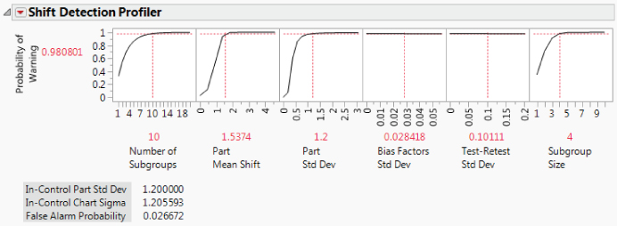
Exhibit 9.34 What-If Scenario for Shift Detection Profiler
The Shift Detection Profiler is a versatile tool, enabling you to interactively explore various scenarios relating to further changes or improvements in how MFI is measured, how the process changes, and how the chart itself is constructed. See Help > Books > Quality and Process Methods for more details.
Follow-Up for Xf
As for Xf, the follow-up MSA is conducted with the three technicians who were not part of the original study. The results are given in MSA_Xf_Final.jmp. The script is EMP Analysis.
The Average and Range Charts show that the measurement system now clearly distinguishes among the parts. The EMP Gauge R&R Results are shown in Exhibit 9.35. The bar graph shows that most of the variation is due to the product.

Exhibit 9.35 EMP Gauge R&R Results for Xf Final MSA
Once again, the team members and technicians are pleased. Compared to the variability among the three batches, there is very little repeatability or reproducibility variation.
The Gauge R&R Std Dev is 0.034, compared to the Product Variation Std Dev of 0.292. The EMP Results report indicates that the Intraclass Correlation (with bias and interactions) is 0.982, indicating that 98.2 percent of the observed variation is due to part (results not shown).
To ensure that both the MFI and Xf measurement systems continue to operate at their improved levels, measurement control systems are introduced in the form of periodic checks, monthly calibration, semiannual training, and annual MSAs.
UNCOVERING RELATIONSHIPS
With reliable measurement systems in place, your team now embarks on the task of collecting meaningful process data. The team members collect data on all batches produced during a five-week period. They measure the same variables as were measured by the crisis team, with the assurance that these new measurements have greater precision.
Your analysis plan is to do preliminary data exploration, to plot control charts for MFI and CI, to check the capability of these two responses, and then to attempt to uncover relationships between the Xs and these two Ys. You keep your Visual Six Sigma Roadmap, repeated in Exhibit 9.36, clearly in view at all times.
Exhibit 9.36 Visual Six Sigma Roadmap
| Visual Six Sigma Roadmap—What We Do |
| Uncover Relationships |
| Dynamically visualize the variables one at a time |
| Dynamically visualize the variables two at a time |
| Dynamically visualize the variables more than two at a time |
| Visually determine the Hot Xs that affect variation in the Ys |
| Model Relationships |
| For each Y, identify the Hot Xs to include in the signal function |
| Model Y as a function of the Hot Xs; check the noise function |
| If needed, revise the model |
| If required, return to the Collect Data step and use DOE |
| Revise Knowledge |
| Identify the best Hot X settings |
| Visualize the effect on the Ys should these Hot X settings vary |
| Verify improvement using a pilot study or confirmation trials |
Visualizing One Variable at a Time
The new data are presented in the data table VSSTeamData.jmp.
Distribution Plots
Your first step is to run a Distribution analysis for all of the variables except Batch Number.
The first five histograms are shown in Exhibit 9.37 (script is Distribution). You note the following:
MFIappears to have a mound-shaped distribution, except for some values of 206 and higher.CIis, as expected, left-skewed.Yieldis also left-skewed, and may exhibit some outliers in the form of low values.

Exhibit 9.37 Five of the Eleven Distribution Reports
You select those points that reflect low Yield values, specifically, those five points that fall below 60 percent, by clicking and drawing a rectangle that includes these points using the arrow tool inside the box plot area. The highlighting in the other histograms in Exhibit 9.38 indicates that these five very low Yield rows correspond to four very high MFI values, one very low CI value, and generally low SA values. This is good news, since it is consistent with knowledge that the crisis team obtained. It also suggests that crisis yields are related to Ys, such as MFI and CI, and perhaps influenced by Xs, such as SA. Interestingly, though, four of these rows have CI values that exceed the lower specification limit of 80.

Exhibit 9.38 Distribution Reports with Five Crisis Yield Values Selected
A striking aspect of the histograms for MFI and CI is the relationship of measurements to the specification limits. Recall that MFI has lower and upper specification limits of 192 and 198, respectively, and that CI has a lower specification limit of 80.
From the Quantiles panel for MFI, notice that all 110 observations exceed the lower specification limit of 192 and that about 50 percent of these exceed the upper specification of 198. From the Quantiles panel for CI, notice that about 25 percent of CI values fall below the lower specification of 80. To see how often both MFI and CI meet the specification limits, you use the Data Filter.
The completed Data Filter dialog is shown in Exhibit 9.39. The Data Filter panel indicates that only 34 rows match the conditions you have specified. This means that only 34 out of 110 batches conform to the specifications for both responses.

Exhibit 9.39 Data Filter Dialog to Select In-Specification Batches
All rows that meet both specification limits are highlighted in all of the plots obtained using the Distribution platform (Exhibit 9.40). As you review the plots, you notice that the batches that meet the joint MFI and CI specifications tend to result in Yield values of 85 percent and higher. They also tend to be in the upper part of the SA distribution and the lower part of the M% and Ambient Temp distributions. This suggests that there might be relationships between the Xs and these two Ys.

Exhibit 9.40 Points That Meet Both MFI and CI Specifications
Before you close the Data Filter dialog, you click the Clear button at the top of the dialog to remove the Select row states imposed by the Data Filter.
Control Charts
With this as background, the team proceeds to see how the three Ys behave over time. As before, you construct individual measurement charts for these three responses using the Control Chart Builder. But, this time, you start by constructing an Individuals chart for MFI and then use the Column Switcher to construct charts for CI and Yield.
These control charts are quite informative (see Exhibit 9.42). You learn that the average yield is roughly 87 percent, and that there are five batches below the lower control limit. Four of these are consecutive batches. You see that the grouping of four batches with low yields greatly exceed the upper control limit for MFI.
From the control chart for CI you learn that the fifth yield outlier, corresponding to row 14, falls below the lower control limit. However, you are reminded that the control limits for CI are suspect because of the extreme non-normality of its distribution.
You decide that it might be a good idea to assign markers to the five batches that are Yield outliers in order to identify them in subsequent analyses.
Exhibit 9.42 shows the three control charts with the markers you constructed for the five crisis batches.

Exhibit 9.42 Control Charts with Markers
Visualizing Two Variables at a Time
One of your team members observes that the MFI and Yield control charts gave advance warning of the crisis in the form of a trend that began perhaps around batch 4,070. Had MFI been monitored by a control chart, this trend might have alerted engineers to an impending crisis. You agree but observe that this assumes a strong relationship between MFI and Yield.
This is as good time as any to see if there really is a strong relationship between MFI and Yield and CI and Yield. You also want to explore other bivariate relationships.
Relationships between the Ys
MFI and Yield
To explore the relationship between MFI and Yield, you use Graph Builder.
The points and a default smoother are plotted (Exhibit 9.43). If you wish, you can deselect the smoother by clicking the second icon from the left at the top of the plot before you click Done (or, right-click on the graph and select Smoother > Remove).

Exhibit 9.43 Graph Builder Plot of Yield by MFI
The plot suggests that there is a strong nonlinear relationship between these two Ys. Four of the five outliers clearly suggest that high MFI values are associated with crisis level yields. You recognize the outlier with a Yield of about 40 as row 14, the point with the low CI value identified on the control chart for CI. (If you hover over this point, its row number, MFI, and Yield will appear.)
CI and Yield
You follow the instructions above, replacing MFI with CI, to construct a plot of Yield versus CI (see Exhibit 9.44—the script is Graph Builder—Yield and CI).

Exhibit 9.44 Graph Builder Plot of Yield by CI
The plot shows a general tendency for Yield to increase as CI increases. Four of the five outliers have high values of CI. The outlier with the low value of CI is row 14.
MFI and CI
Now you investigate the relationship between MFI and CI. You construct the plot shown in Exhibit 9.45, replacing Yield with MFI (the script is Graph Builder—MFI and CI).

Exhibit 9.45 Graph Builder Plot of Yield by CI
MFI and CI seem to have a weak positive relationship. There may be process factors that affect both of these Ys jointly. In the next section, we look at relationships between the process factors and these responses.
Relationships between Ys and Xs
As a more efficient way to view bivariate relationships, you decide to create a scatterplot matrix of all responses (Ys) with all factors (Xs), shown in Exhibit 9.46.

Exhibit 9.46 Scatterplot Matrix of Ys by Xs
The matrix shows a scatterplot for each Y and X combination, including scatterplots that involve the two nominal variables, Quarry and Shift. For the nominal values involved in these scatterplots, the points are jittered randomly within the appropriate level. Density ellipses assume a joint bivariate normal distribution, so they are not shown for the plots involving Quarry and Shift because these factors are nominal.
The five outliers appear prominently in the MFI and Yield scatterplots. In fact, they affect the scaling of the plots, making it difficult to see other relationships. To better see the other points, select the five points in one of the Yield plots, then right-click in an empty part of the plot and choose Row Hide and Exclude from the menu that appears. (Alternatively, run the script Hide and Exclude Outliers.) Notice the following:
- Excluding the points causes the ellipses to be automatically recalculated.
- Hiding the points ensures that they are not shown in any of the plots.
Check the Rows panel in the data table to verify that the five points are excluded and hidden. Rescale the vertical axes to remove whitespace and accommodate all density ellipses. The updated scatterplot matrix is shown in Exhibit 9.47 (script is Scatterplot Matrix 2).

Exhibit 9.47 Scatterplot Matrix of Ys by Xs with Five Outliers Excluded
Viewing down the columns from left to right, you see evidence of moderate-to-strong relationships between:
MFIandSAMFIandM%MFIandCI(andYield) andXfMFIandAmbient Temp
The relationship between CI and Xf appears to be highly nonlinear. To see this relationship more clearly, you again use the Graph Builder (see Exhibit 9.48—the script is Graph Builder—CI and Xf).

Exhibit 9.48 Graph Builder Plot of CI by Xf
Everyone on your team notes the highly nonlinear relationship. An engineer on your team observes that the relationship is not quadratic. She speculates that it might be cubic. You also observe that both low and high values of Xf are associated with CI values that fail to meet the lower specification limit of 80.
The engineer also states that the relationship between MFI and SA might also be nonlinear, based on the underlying science. In a similar fashion, you construct a plot for these two variables using Graph Builder (script is Graph Builder—MFI and SA). The plot is shown in Exhibit 9.49.

Exhibit 9.49 Graph Builder Plot of MFI by SA
The relationship does appear to be nonlinear. The bivariate behavior suggests that the underlying relationship might be quadratic or even cubic.
One team member starts speculating about setting a specification range on Xf, maybe requiring Xf to fall between 14.0 and 15.5. You point out that in fact the team must find operating ranges for all of the Xs. You caution that setting these operating ranges one variable at a time is not a good approach. The operating ranges have to simultaneously satisfy specification limits on two Ys, both MFI and CI. A statistical model relating the Xs to the Ys would reveal appropriate operating ranges and target settings for the Xs. This brings the team to the Model Relationships step of the Visual Six Sigma Data Analysis Process.
MODELING RELATIONSHIPS
The data exploration up to now has revealed several relationships between the two Ys of primary interest, MFI and CI, and some of the Xs. In particular, Xf is related to both MFI and CI while SA, M%, and Ambient Temp appear to be related to MFI. The relationships between CI and Xf and between MFI and SA appear to be nonlinear.
At this point, your team embarks on the task of modeling the relationships in a multivariate framework.
Dealing with the Preliminaries
Your first issue involves determining how to deal with the five MFI outliers. Your goal is to develop a model that is descriptive of the process operating under common cause conditions. Your main concern about these five points is whether they are the result of the common cause system that you want to model. If the five points are consequences of a different (special cause) failure mode, their inclusion in the modeling process could result in a less useful model for the common cause process of interest.
The most effective course of action relative to outliers of this kind is to identify and remove the special causes that may have produced them. This is usually best accomplished in real time, when the circumstances that produce an outlier are fresh in peoples' minds.
Looking back at the histograms and control charts for MFI, you see that four of these points are very much beyond the range of most of the MFI measurements. In fact, they are far beyond the specification limits for MFI. The fifth batch is potentially a CI outlier. The fact that all five points are associated with extremely low yields also suggests that they are not typical of operating conditions. This evidence seems to suggest that a different set of causes is operative for the five outliers.
Given these findings, you are concerned that the outliers might be detrimental in developing a model for the common cause system. With this as your rationale, you decide to exclude the five crisis observations from the model development process.
However, we suggest the following as an exercise for the reader. Develop models for MFI and CI that include these five rows. Check to see if the five points are influential, using visual techniques and statistical measures such as Cook's D. Determine how your conclusions would change if you had taken this modeling approach.
Excluding and Hiding the Crisis Rows
The five crisis observations have already been excluded and hidden in connection with your scatterplots for the three responses. You can check the Rows panel of the data table to make sure that five points are Excluded and Hidden. However, if you have cleared row states since then, reselect the outliers as shown in Exhibit 9.50, right-click in the plot, and select Row Hide and Exclude (the script is Hide and Exclude Outliers).

Exhibit 9.50 Selecting the Five Outliers to Hide and Exclude
Saving the Specification Limits as Column Properties
In the interests of expediency for subsequent analyses, you decide to store the specification limits for MFI and CI in the data table. You do this by entering the information in the Spec Limits column property for each column.
In the Columns panel of the data table, you see that asterisks have appeared to the right of CI and MFI. Click on one of the asterisks to see that the Spec Limits property is listed (Exhibit 9.52). If you click on Spec Limits, the Column Info window opens and displays the Spec Limit property panel.
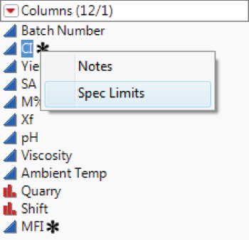
Exhibit 9.52 Asterisk Showing Spec Limits Column Property
Plan for Modeling
Now you are ready to build your model. You have seen evidence of nonlinearity between CI and Xf and between MFI and SA. How can you build this into a model?
You decide to get some advice on how to proceed from your mentor, Tom. Over lunch together, Tom suggests the following:
- Build a model for each of
MFIandCIas responses usingFit Model. - In the initial model, include response surface terms for all effects. Quadratic terms for the nominal effects do not make sense and will not be added. However, interaction terms involving the nominal terms will be added. Also include cubic terms in
XfandSA, based on the nonlinearity suggested by your bivariate analysis. - Construct the models using the
Stepwisepersonality. Tom shows you a quick example. - Construct models for
MFIandCIusing the Hot Xs that you have identified. - Use the
Profilerto simultaneously optimize these models, thereby obtaining settings of the Hot Xs that optimize bothMFIandCI. - Quantify the anticipated variability in both responses, based on the likely variation exhibited by the Hot Xs in practice.
Tom's plan makes sense to you, and you proceed to implement it.
Building the Model
Your first step is to define your initial model. It will contain main effects, two-way interactions, quadratic effects for all continuous variables, and cubic terms in Xf and SA.
Stepwise Variable Selection
The Stepwise report appears (Exhibit 9.53), showing two main outline nodes, one entitled Stepwise Fit for MFI and the other entitled Stepwise Fit for CI (the Current Estimates panels have been minimized). The Stepwise Regression Control panel in each of these reports gives you control over how stepwise selection is performed. You decide to accept the JMP default settings, which specify a Minimum BIC stopping rule, the Forward direction, and the Combine rule that combines effects in determining their significance.

Exhibit 9.53 Stepwise Fit Window with Current Estimates Outlines Closed
The Bayesian Information Criterion, or BIC, is a measure of model fit based on the likelihood function. It includes a penalty for the number of parameters in the model. A lower value of BIC indicates a better model. For details on the BIC and other selections, see www.jmp.com/support/help/Fitting_Linear_Models.shtml.
Model Specification windows for MFI and CI are shown in Exhibit 9.54.

Exhibit 9.54 Models Obtained Using Stepwise
The Hot Xs for MFI are SA, M%, and Xf. The only Hot X for CI is Xf. You observe that SA and its quadratic and cubic effects appear in the model for MFI and that Xf and its quadratic and cubic effects appear in the model for CI.
Checking and Revising Stepwise Models
Next, you run each model to check the fit, starting with the model for MFI. In the Model Specification window for MFI, you click Run. Exhibit 9.55 shows the Effect Summary report and the Actual by Predicted Plot.

Exhibit 9.55 Partial Model Fit Report for MFI
In the Actual by Predicted plot, you see a point that might be considered an outlier. Given its location, though, it doesn't appear to have high influence on the model fit. You don't see any other issues with the Actual by Predicted Plot, so you proceed to look at the effect tests.
The Stepwise Stopping Rule, Minimum BIC, can result in a model containing terms that are not active or significant. At this point, you reduce the model by removing terms that are not significant.
In the Effect Summary report, you notice that the interaction effect M%*Xf is not significant. Click on M%*Xf in the Source list to select it, as shown in Exhibit 9.56. Then click Remove. This removes the effect from the model and updates all the reports in the window. Now all remaining effects are significant.

Exhibit 9.56 Effect Summary Panel for MFI
You want to save the model you have constructed to the data table as documentation for your analysis. To do this, from the Response MFI report's red triangle menu, select Script > Relaunch Analysis. Then save the model script to the data table. (The script for the saved model is Model for MFI.)
Next, run the Stepwise model for CI. Exhibit 9.57 shows the Effect Summary report and the Actual by Predicted Plot.
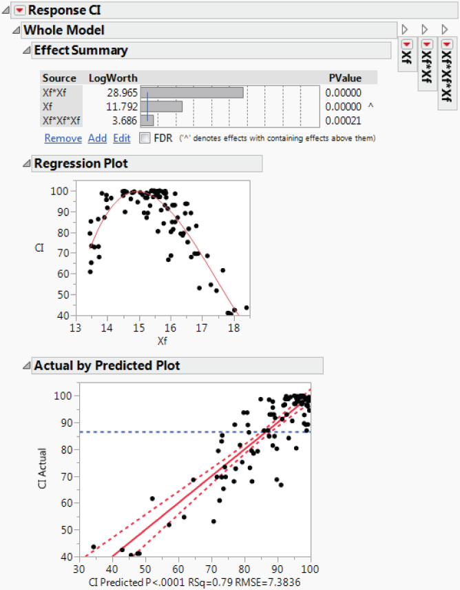
Exhibit 9.57 Partial Model Fit Report for CI
Based on the Actual by Predicted plot, the model seems to fit adequately. Because there is only one variable, namely Xf, in the model, JMP provides a Regression Plot. This shows how the model fits CI as a function of Xf and gives you an additional view of how the model fits. You see that the nonlinearity seems to be well modeled.
The Effect Summary report shows that all three effects are significant. The script for this model is saved to the data table as Model for CI.
All Possible Models
This seemed easy. You realize that your initial model has a large number of terms (70, to be exact, not counting the intercept). With that many terms, there are 2^70 possible models (with intercept). This is a huge number, on the order of 10^21. Stepwise takes a selected path through the space of possible models that is based on p-values. This can be limiting.
You're tempted to do a quick check of your newfound models against other models that could be considered, using the All Possible Models option. You know that you will have to limit the search somehow because the total number of all possible models is daunting.
For MFI, the model with the smallest BIC, in row 1, is precisely the five-term model that you derived from the Stepwise model, once you removed the insignificant M%*Xf terms. For CI, the model with the smallest BIC, in row 1, is precisely the model selected by Stepwise.
You can view the model information in the data tables produced by All Possible Models graphically by constructing a Graph Builder plot of BIC versus Number. The tables created by the scripts All Possible Models for MFI and All Possible Models for CI contain Graph Builder scripts to construct these plots. Exhibit 9.58 shows the plot for MFI, with your final model selected.

Exhibit 9.58 Plot of BIC versus Number of Terms for MFI
Your All Possible Models analysis confirms that the terms that you included in your models for MFI and CI are appropriate.
Saving the Prediction Formulas
Your plan is to obtain a prediction equation for each response and then to use the profiler to conduct multiple optimization.
A column called Pred Formula MFI is added to the data table. To view the formula, right-click in the column header area and select Formula. This opens a formula editor box that shows the prediction equation.
Alternatively, in the Columns panel, the Pred Formula MFI column is now listed. To the right of the column name, you see a plus sign. Click on the plus sign to open the formula editor window displaying the formula.
Save the prediction formula for CI in the same fashion. The saved script is Pred Formula for CI.
REVISING KNOWLEDGE
At this point, you have constructed models for MFI and CI and you have identified the relevant Hot Xs. You and your team are ready to proceed to the Revise Knowledge step of the Visual Six Sigma Data Analysis Process. You will identify optimal settings for the Hot Xs, evaluate process behavior relative to variation in the Hot Xs using simulation, and run confirmatory trials to verify improvement.
Using the Profiler for Multiple Optimization
With both prediction formulas saved to the data table, you are ready to find settings for the Xs that will simultaneously optimize MFI and CI. Use Graph > Profiler to conduct multiple optimization.
From your training, you recall that each prediction formula defines a response surface. The Profiler shows cross-sections, called traces, of both response surfaces, with the first row of panels corresponding to MFI and the second row corresponding to CI. The cross-sections are given for the designated values of SA, M%, and Xf. You can drag the vertical red dotted lines using the arrow tool to see how the two predicted responses change at various factor settings.
Consider the first row of plots, which relate to the prediction model for MFI. The three continuous factors SA, M%, and Xf define a response surface in four dimensions: There are three factor values, and these result in one predicted value. Given the settings in Exhibit 9.59, the Profiler is telling us, for example, that when M% = 1.75 and Xf = 15.75, the predicted MFI values, for various settings of SA, are those given in the panel above SA. In other words, for specific settings of any two of the continuous factors, the profiler gives the cross-section of the response surface for the third continuous factor.
Consider the second row of plots, corresponding to Pred Formula CI. The traces for SA and M% are perfectly horizontal. This is because SA and M% do not appear in the prediction formula for CI. The plot in the second row in the cell above Xf shows predicted values of CI for various values of Xf.
Understanding the Profiler Traces
It is getting late in the day, and the idea of visualizing these traces by plotting a response surface sounds like a wonderful diversion. You suspect that this will help you explain to your team members what these traces represent. You are especially interested in visualizing the interesting trace for MFI above SA in the Prediction Profiler in Exhibit 9.59.
The vertical grid cuts the surface in a curved shape. This is precisely the trace shown for SA in the profiler in Exhibit 9.59 when Xf = 15.75 and M% = 1.75.
This exercise in three dimensions provides some intuition about the Profiler traces. When you change the settings of factors in the Prediction Profiler, the traces correspond to cross-sections of the prediction equation at the new settings.
Back to Simultaneous Optimization
“Well,” you think, “that was fun! I need to show that to the team members later on. They will love it.” Now you proceed to your next task, which is to find optimal settings for the Hot Xs. To do this, you return to the profiler. But, by now, you have lost that window. So you simply double-click on one of your reports, select Window > Close All Reports, and run the Profiler script that is saved to the data table.
To find optimal settings, you use the JMP desirability functions. Click on the red triangle next to Prediction Profiler and choose Desirability Functions. The saved script is Profiler—Desirability Functions.
This adds a row and a column of cells to the profiler. Two cells are added at the right, one for each of the responses (Exhibit 9.61). These show the desirability of various values of the responses, based on the specification limits that you entered into Column Info for MFI and CI earlier (see the section “Dealing with the Preliminaries”). For example, values of MFI near 195 have desirability near 1 while values above 198 and below 192 have desirabilities near 0. Similarly, large values of CI have high desirability.

Exhibit 9.61 Profiler Showing Desirability Functions
To see the description of the desirability function for a given response, double-click in the desirability function panel for that response. For MFI, you obtain the Response Goal window shown in Exhibit 9.62. After reviewing the entries, click Cancel to exit with no changes.

Exhibit 9.62 Response Goal Dialog for MFI
A new row of cells, called Desirability, is added to the Profiler (Exhibit 9.61). This row gives traces for the joint desirability function, which, like the predicted surface, is a function of SA, M%, and Xf. For example, if SA = 65 and M% = 1.75, then low and very high values of Xf are not very desirable. Values of Xf around 16.3 are more desirable.
The goal is to find settings of the factors that maximize the desirability value. To find such settings, you select Maximize Desirability from the red triangle menu next to Prediction Profiler. The saved script is Profiler—Desirability Maximized.
You obtain the settings shown in Exhibit 9.63. The plot indicates that optimal settings for the three continuous Hot Xs are SA = 79.7, M% = 0, and Xf = 15.07. At these settings, the predicted value of MFI is 195.1857 and of CI is 99.4645. Both predicted values are well within their specification limit ranges.

Exhibit 9.63 Profiler with Desirability Functions Maximized
Note that, when you maximize desirability, you may not obtain these exact settings. This is because, in most cases, settings that produce the same maximum value are not unique.
The fact that the optimal setting for M%, the viscosity modifier, is 0 indicates that adding the modifier actually degrades MFI (M% is not involved in the model for CI). This surprises your team members. It was always believed that the modifier helped the melt flow index. The team members talk with engineers about this, and it is decided that perhaps the modifier is not required—at least they are interested in testing a few batches without it.
The plot also indicates that, for the optimal settings of SA and M%, if Xf drifts to the 16.0 or higher, then desirability drops dramatically. By dragging the vertical dashed line for Xf to 16.5 and higher while looking at the Pred Formula CI trace for Xf, you see that Pred Formula CI drops below 80 when Xf exceeds 16.55 or so. CI also drops below 80 if Xf drifts to 13.65 or lower. You conclude that CI is very sensitive to variation in Xf at the optimal settings of M% and SA.
Assessing Sensitivity to Predictor Settings
In your training, you learned about a sensitivity indicator. The sensitivity indicator helps you assess how sensitive the predicted value is to factor settings.
From the Prediction Profiler red triangle, select Sensitivity Indicator. Hollow triangles are added to the prediction traces. Notice that no triangles are added to the traces for CI and SA or CI and M%, since SA and M% are not involved in the prediction formula for CI.
You leave M% and SA at their optimal values and move the Xf setting to about 16.5 (Exhibit 9.64). The sensitivity indicator for CI in the Xf panel gets larger as you increase Xf to 16.5. The sensitivity indicator points in the direction of change for the response as the factor level increases and its size is proportional to the change. You conclude that maintaining tight control over Xf is critical. The saved script in VSSTeamData.jmp is Profiler—Sensitivity Indicators.

Exhibit 9.64 Profiler with Sensitivity Indicators and Xf near 16.5
Now you want to see how sensitive the prediction is to SA at the optimized settings of M% and Xf. To reinstate the optimal settings, rerun the data table script Profiler—Desirability Maximized and select Sensitivity Indicator from the Profiler's red triangle menu.
Move the SA setting to its left. Note that the Sensitivity Indicator for MFI becomes very small at around 64.5, much smaller than it was at the optimal setting of 79.7, which was close to the upper bound of the experimental range. In fact, there is a range of values around 64.5 for which the desirability is almost as high as when SA is set to 79.7. See Exhibit 9.65 and compare the predicted values to those in Exhibit 9.59.

Exhibit 9.65 Profiler with SA Set to 64.5
Given the possibility of a more robust operating range for values of SA around 64.5, you want to consider using 64.5 as the optimal setting for SA. You do note, however, that the sensitivity indicator for MFI shows that MFI is highly sensitive to SA excursions to 60 and below.
Your sensitivity analysis allows you to reach two conclusions:
- Optimal settings that involve
SAnear 64.5 would result in a more robust process. - The important sensitivities are those of
MFIto lowSAandCIto high and lowXf.
Determining Optimal Process Settings
You realize that there are many combinations of settings of the factors that optimize both MFI and CI. When you select Maximize Desirability, the profiler provides one such set of settings.
You have seen that setting SA to 64.5 results in essentially the same predicted values of MFI and CI as did the settings provided when you maximized the desirability function. You decide to use 64.5 as the setting for SA. But you wonder if, for this setting of SA, there might be better settings for M% and Xf.
Exhibit 9.66 shows that the optimal setting for M% is still 0 and that the optimal setting for Xf has changed only slightly, to 15.12.

Exhibit 9.66 Optimal Settings with SA Locked at 64.5
Controlling SA and Xf
Your sensitivity analysis makes it clear that both SA and Xf must be controlled tightly around the optimal settings that you have derived. Your team members get started on developing an understanding of why these two factors vary and on proposing procedures that will ensure tighter control over them. They propose a new control mechanism to monitor SA (amps for slurry tank stirrer) and to keep it on target at the optimal value of 64.5 and within narrow tolerances. They also develop procedures to ensure that filler and water will be added at regular intervals to ensure that Xf (percent of filler in the polymer) is kept at a constant level close to 15.12 percent.
The team tests these new controls and collects data from which you can estimate the variability in the SA and Xf settings in practice.
Simulating Process Outcomes
This last task takes a few weeks. But the resulting data indicate that when SA and Xf are held on target their actual settings do vary. Both factors appear to have approximately normal distributions with standard deviations of 1.9 and 0.4, respectively. Your plan is to use these estimates of variation, together with simulation, to investigate how variation in SA and Xf propagates to variation in MFI and CI. In particular, you want to obtain reliable estimates of capability for both responses of interest.
A Defect table appears below the Simulate button (Exhibit 9.68). Because the predicted values for MFI and CI are simulated, you will see different results than those shown here. If you run the script Profiler—Simulator, however, you will obtain the same results.

Exhibit 9.68 Simulator Results
Right-click in the table and select Columns > PPM. When your team members see the overall PPM value of 413.55 as given in Exhibit 9.68, they give a cheer. You click on Simulate to run the simulation a few more times, and although there is some variation in the PPM values, the PPM values rarely exceed 500.
The Defect table indicates that the majority of defective values are coming from CI. Recall that CI is highly sensitive to Xf values in the region of the optimal settings. If the standard deviation for Xf could be reduced, this might further reduce the estimated PPM rate. Nonetheless, the team has very good news to report. Everyone is anxious to meet with Edward, the manufacturing director, and to test these predictions in the plant.
Confirming the Improvement
Edward is thrilled with the team's report and gives the go-ahead to run formal confirmation trials, measuring yield through to the molding plant. In the limited experience you have had to date with running the process at the optimal settings, you have only monitored the polymer plant yield.
The team decides to perform tests on five batches using the target settings and controls for SA and Xf. The batches are followed through the molding plant so that, in line with the original definition, Yield is measured using both polymer plant and molding plant waste. The measurements for these five batches are given in the data table ConfirmationData.jmp, shown in Exhibit 9.69.

Exhibit 9.69 Confirmation Data from Five Batches
What a delight to see all MFI and CI values well within their specifications and to see 100 percent Yield on all five batches! You and your team members are ecstatic.
UTILIZING KNOWLEDGE
In spite of this very promising result, you remind your teammates to remain cautious. Even if you had made no process changes, history shows that a crisis is only expected about once every quarter. During the single crisis that occurred over the team's baseline period, MFI values were unusually high. So there is statistical evidence that keeping MFI within the specification limits will alleviate crisis periods. But it will be important to continue to monitor Yield to ensure that the new optimal settings and controls really do address the root cause of a crisis. As you gather additional data over a longer time span, you will have more assurance that keeping MFI and CI within their specification limits really does alleviate crises.
This is an interesting situation where, although success has been confirmed in the short term, the longer time horizon of the historical problem requires a heightened sense of vigilance during the control phase. So, although you are ready to see this project move to the Utilize Knowledge step of the Visual Six Sigma Data Analysis Process, that step retains some aspect of providing confirmation that the problem has been solved.
With this in mind, you and your team report your results to Edward. He is very impressed by the outcome of the confirmation runs and is extremely pleased by your team's work. He appreciates the logic and discipline you have imposed throughout the knowledge-building process. It appears that because of your diligence, the crisis periods may finally be eliminated.
Edward approves the fitting of a new control mechanism for the fill process to monitor SA and to keep it on target and within tight control. He approves of the procedures proposed by your team to maintain Xf on target with little variation. These procedures are shared with technicians and operators in a formal training session. Specification limits are defined for SA and Xf based on the standard deviations used in the simulation study.
Once these procedures are implemented, production batches are monitored closely, to ensure that nothing goes amiss, for the first month of production. Data on MFI, CI, Yield, SA, M%, and Xf for the 79 batches produced that month are given in the data table ControlPhaseData.jmp.
Verifying Process Stability
Open ControlPhaseData.jmp. The first thing that you notice is that all Yield values are 100 percent! But you are interested in the process measurements that drive Yield, namely, MFI and CI. The first thing that you check is whether MFI and CI are stable.
Use Control Chart Builder to construct Individuals and Moving Range charts for MFI and CI (script is Control Charts). Because specification limits have been entered in the columns for these two variables, JMP automatically computes normality-based capability analyses. The Individuals and Moving Range control charts are shown in Exhibit 9.70.

Exhibit 9.70 Control Charts for Control Phase Data
The MFI measurements are stable and fall well below the upper specification limit of 198. But the CI measurements appear unstable. However, note that their distribution is highly skewed, as we would expect. The individual measurement chart's control limits are valid for normally distributed data, and CI is not normally distributed. What to do?
Even in a case where the underlying data are highly non-normal, the means of samples are approximately normal, even for small samples or subgroups (this follows from the Central Limit Theorem). This means that an XBar chart can be used to assess process stability. So, for CI, you decide to construct an XBar and R chart, subgrouping the measurements into consecutive subgroups of size five.
The resulting chart is shown in Exhibit 9.71. The absence of out-of-control points and unstable patterns is evidence that the CI measurements have come from a stable process.

Exhibit 9.71 XBar and R Chart for Subgrouped CI Measurements
Now that you know that MFI and CI are stable, you are interested in assessing their capability relative to meeting the specifications.
Estimating Process Capability
You return to the report obtained when you first constructed your Individuals and Moving Range charts using the data table ControlPhaseData.jmp. The script is Control Charts.
The Process Capability Analysis for MFI is repeated in Exhibit 9.72. The MFI distribution falls within the specification limits. Both short- and long-term capability indices are over 1.0: Cpk is 1.143, based on the moving range, and Ppk is 1.165. These values are close, as expected, because the process is stable.

Exhibit 9.72 Process Capability Analysis for MFI
You right-click in the Nonconformance report and select Columns > Expected Overall PPM. This selection adds a column that shows predicted parts per million out of spec. The calculation uses the standard deviation for all values, which is reasonable, since the process is stable. The estimated defective rate is 273.6 batches per million.
Since CI is highly skewed, a capability determination based on a normal distribution is not meaningful and potentially misleading. In this case, the Cpk value, based on a normal fit, is 1.044. This seems optimistic.
A team member asks, “What do we do to assess capability?”
“Well,” you reply, “let's try a nonparametric approach!”
For a left-skewed distribution, such as this one, it makes sense to use a method that does not specify a particular functional shape or form.
The nonparametric fit is smooth but a bit bumpy. Yet, it describes the distribution quite well. The computed capability index is 0.775, and the PPM rate is 23,518, or about 2.35 percent. Based on the graph, your team is comfortable with this estimate of capability and PPM. The normality-based Cpk value of 1.044 was optimistic and incorrect.
It is also apparent to your team members that their simulation underestimated the PPM rates for both MFI and CI. Recall that the combined estimate of PPM was about 400. The actual data, especially for CI, shows a much higher estimated PPM rate. This may indicate that additional variability is coming from other sources.
The 2.35 percent out-of-specification rate for CI is clearly not acceptable. This is an area that will need further investigation. One of the team members suggests that the lower specification limit of 80 may in fact be too tight, given that all batches had a Yield of 100 percent. Certainly, if it is possible to loosen the specification without incurring any loss in quality, this is a worthwhile endeavor. You document the need for a resolution to this CI capability issue and put it on a list of future projects.
Tracking Improvement
To visualize progress over the life of the project, you want to concatenate the tables VSSTeamData.jmp, ConfirmationData.jmp, and ControlPhaseData.jmp into a single data table. You want to be able to plot your data over three phases: the phase consisting of the old process, the confirmation phase, and the control phase.
Before concatenating your tables, you engage in some housekeeping. Check your list of open windows under Window. If it shows a lot of open windows (and you're on a Windows machine), you can simply select Windows > Close All and reopen the three data tables. But the three data tables that you need may be on the dropdown list of open data. To close all but the data tables, select a report to make it active and then select Window > Close All Reports. Close the data tables that are not of interest. When you are finished, make sure that only the three data tables mentioned above are open.
You want to concatenate the three data tables, meaning that you want to append rows from one data table to another. You want your concatenated data table to contain columns showing the basic information and a column for the Phase of the study.
So you start by examining the column structure in the three data tables (Exhibit 9.74). Note that ConfirmationData.jmp and ControlPhase.jmp have the same column structure, but VSSTeamData.jmp contains columns that the previous two data tables do not.

Exhibit 9.74 Column Panels for Three Data Tables
Follow the two sets of instructions below to concatenate the three tables. Alternatively, simply open the concatenated data table, called VSSTeamFinalData.jmp.
Now that your tables are prepared, you can concatenate them.
The new table appears. You check to make sure it is what you intended. Close TempData.jmp without saving it: Select File > Close and select No when asked about saving changes.
Notice that all scripts have been carried over to the new table. Also, there is a new script called Source. This script tells you how the current data table was obtained and is useful for documentation. Some of the old scripts may not be meaningful since they were developed for portions of the data. However, you want to see control charts by Phase. You realize that the Control Chart and XBar Chart for CI scripts could be useful. To avoid confusion, you delete all the scripts other than Source, Control Charts, and XBar Chart for CI. (If you prefer, at this point, you may close your concatenated data table and open the saved data table called VSSTeamFinalData.jmp.)
In the data table VSSTeamFinalData.jmp, notice that Phase has the Row Order Levels property. Click on the asterisk to the right of Phase in the Columns panel to see this. This property ensures that the levels of Phase appear in plots in order of their occurrence in the data. When you plot control charts by Phase, the order of levels will be: Old Process, Confirmation, Control.
The MFI control chart, shown in Exhibit 9.76, shows how the measurements have changed over the three phases of the study. The MFI measurements are now less variable and within specifications.

Exhibit 9.76 Phase Control Chart for MFI
Since the distribution for CI is skewed, the control limits for the Individuals Chart for CI are not appropriate. As earlier, you construct an XBar and R chart with subgroups of size 5.
Starting with the confirmation phase, the CI process looks stable, both in terms of centering and spread. It is operating with much less variability and appears to be centered at about 95. Since this is an XBar chart, we cannot compare the control limits (based on averages) directly with the specification limits (based on individual values). But that has already been done for the Control phase in the non-normal capability analysis (Exhibit 9.73).
CONCLUSION
The original project goal was to eliminate the periods of crisis with a goal of achieving a yield rate of 95 percent. One and a half years have now passed since completing this project, and although sometimes a very few batches do fall slightly below the lower limit for color index (CI), this issue is resolved by blending these low-color index batches with high-color index batches. To date, the molding plant has not rejected a single batch of white polymer since the changes have been implemented.
The savings from rejected batches alone are slightly over £750,000 per annum. Additionally, there are now no processing restrictions on the molding plant, resulting in an additional annualized margin of £2,100,000 per annum and a very happy customer. The actual costs incurred on the project were minimal.
This was the project that convinced the skeptics, Edward included. It solved a major manufacturing problem with huge business benefits. In the final project close-out meeting, you summarized the key lessons as follows:
- Never trust a measurement system—it was only when these issues were resolved that it was possible to get meaningful results from the analysis.
- The DMAIC methodology in conjunction with the Visual Six Sigma Roadmap delivers high levels of process understanding in a simple, straightforward manner.
- Visual Six Sigma techniques enable technical and business users to apply the principles of statistical thinking to solve problems rapidly and effectively.
- Visual Six Sigma greatly facilitates the communication of results to a wide audience in a simple visual form.