
Chapter 5
Reducing Hospital Late Charge Incidents
This case study is set early in the deployment of a Lean Six Sigma initiative at a community hospital. You were hired as a master black belt to help support the Lean Six Sigma effort. Management identified the billing department, and in particular late charges, as an area that tied up millions of dollars per year, and hence an area badly in need of improvement. This case study describes how you, along with a team from the billing department, analyze billing data in order to define project opportunities for green belt teams.
The case study is almost entirely embedded in the Uncover Relationships stage of the Visual Six Sigma Data Analysis Process introduced in Chapter 2 (Exhibit 2.3). You are a detective, searching for clues that might explain the large number of late charges. Your work encompasses a number of the techniques described under Uncovering Relationships in Exhibit 2.4. Your findings will initiate the work of project teams; these teams will work through all six of the stages of the Visual Six Sigma Data Analysis Process to solve the problems you identify.
In this case study, you analyze the late charge data for January 2015. The data set consists of 2,032 records with late charges. The columns include both nominal and continuous variables, as well as dates. You visualize the data using histograms, bar graphs, Pareto plots, control charts, scatterplots, mosaic plots, and tree maps, learning about potential outliers and conducting a missing data analysis along the way.
Exhibit 5.1 lists the JMP platforms and options that you and the team use in your discovery process. The data sets are available at http://support.sas.com/visualsixsigma. Based on what you learn, you will make several important recommendations to management.
Exhibit 5.1 Platforms and Options Illustrated in This Case
| Menus | Platforms and Options |
| File | Open > Data with Preview |
| Tables | Summary |
| Sort | |
| Missing Data Pattern | |
| Rows | Hide and Exclude |
| Row Selection | |
| Select Matching Cells | |
| Data Filter | |
| Cols | New Column |
| Column Info | |
| Column Properties | |
| Formula | |
| Columns Viewer | |
| Analyze | Distribution |
| Histogram | |
| Frequency Distribution | |
| Fit Y by X | |
| Bivariate Fit | |
| Fit Special | |
| Contingency | |
| Oneway | |
| Tabulate | |
| Quality and Process | Control Chart Builder |
| Pareto Plot | |
| Graph | Tree Map |
| Tools | Lasso |
FRAMING THE PROBLEM
Niceland Community Hospital has recently initiated a Lean Six Sigma program to improve the efficiency and quality of its service, to increase patient satisfaction, and to enhance the hospital's already solid reputation within the community.
The hospital has hired you, a master black belt, to provide much needed support and momentum for the Lean Six Sigma initiative. You will be responsible for identifying and mentoring projects, providing training, and supporting and facilitating Lean Six Sigma efforts. Upper management has identified the billing department as being particularly prone to problems and inefficiencies, and directs you to work with members of the department to identify and prioritize realistic green belt projects within that area. Specifically, upper management mentions late charges as an area that ties up several million dollars per year.
In accordance with your mandate, you proceed to address late charges, which have been a huge source of customer complaints, rework, and lost revenue. You start by working with members of the department to learn as much as you can about late charges. Here is what you learn:
Late charges can apply to both inpatients and outpatients. In both cases, tests or procedures are performed on a patient. The charge for each test or procedure is ideally captured at the time that the procedure is performed. However, a charge cannot be captured until the doctor's notes are completed, because the charge must be allocated to the relevant note. Sometimes notes aren't dictated and transcribed for as much as a week after the procedure date.
Once the charge is captured, it waits for the billing activity to come around. The billing activity occurs a few days after the procedure date, allowing only a short time for all the charges related to that patient to be accumulated. However, it is never really clear what might still be outstanding or if all of these charges have rolled in. At this point, the hospital drops the bill; this is when the insurance companies or, more generally, the responsible parties, are billed for the charges as they appear at that point.
Now, once the bill is dropped, no additional charges can be billed for that work. If charges happen to roll in after this point, then a credit has to be applied for the entire billed amount, and the whole bill has to be recreated and submitted. Charges that roll in after the hospital drops the bill are called late charges. For example, an invoice of $200,000 might have to be redone for a $20 late charge, or the charge might simply be written off.
If a patient is an inpatient, namely a patient who stays at least one night in the hospital, charges are captured during the patient's stay. No bill can be issued until the patient is discharged. A few days after discharge, the bill is dropped.
By the way, the date is February 11, 2015. Now that you believe you understand what a late charge is, you plan on examining some recent late charge data. You start by looking at the January 2015 listing of late charges.
COLLECTING DATA
There are seven columns of interest (the eighth column, which is hidden and excluded, gives the row number). The seven columns are described below:
Account. The account identifier. A patient can have several account numbers associated with a single stay. An account number is generated for each group of procedures or tests.Discharge Date. The date when the patient was discharged from the hospital.Charge Date. The date when the charge was captured internally. In other words, this is the date when the charge officially makes it into the hospital's billing system.Description. The procedure description as it appears on the charge invoice.Charge Code. The originating finance group charge area. For example, RXE refers to medication ordered in an emergency.Charge Location. The physical area within the hospital where the charge originated.Amount. The dollar amount of the late charge. Credits have a negative value.
You save these descriptions for each variable in the data table as notes. The Column Info panel for Account, with the column property Notes, is shown in Exhibit 5.3.

Exhibit 5.3 Column Info Window with Note Describing the Account Column
UNCOVERING RELATIONSHIPS
Given that your goal is to identify projects, you will not need to work through all six steps in the Visual Six Sigma Data Analysis Process. You nonetheless follow the guidance that the Visual Six Sigma Roadmap provides for the Uncover Relationships step. You will use dynamic linking to explore the variables one at a time and several at a time. Given the nature of the data, you will often need to connect any anomalous behavior that you identify using plots to the records in the data table. This is made easy by dynamic linking. Your exploration will also include an analysis of missing records.
Visualizing the Variables One at a Time
Your first step in exploring the data is to gain an understanding of each of your variables. You will do this using Columns Viewer.
Columns Viewer
The Columns Viewer report in Exhibit 5.4 displays summary statistics for the seven variables. It shows the number of unique values, or categories, for each categorical variable, and high-level summary statistics for each continuous variable.
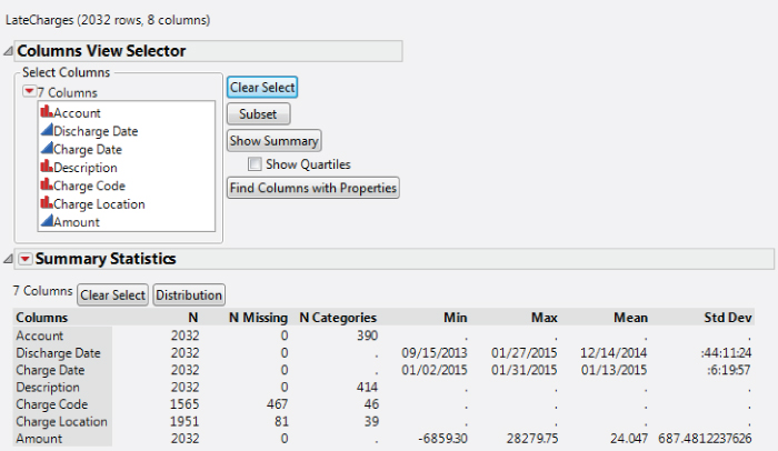
Exhibit 5.4 Columns Viewer, Seven Variables
The Columns Viewer also tells us something about the quality of our data. For example, of the 2,032 late charges in the data table, the Charge Code is missing for 467 of the late charges.
The seven variables are already selected. Click on the Distribution button in the Summary Statistics outline to obtain Distribution reports for all of the variables. The report that is partially shown in Exhibit 5.5 appears. This convenient shortcut produces the same reports that you would obtain using Analyze > Distribution.

Exhibit 5.5 Partial View of Distribution Report
You note from Exhibit 5.4 that Account and Description are nominal variables with many levels. The bar graphs in Exhibit 5.5 are not necessarily helpful in understanding such variables. So, for each of these, you click on the red triangle for each variable, choose Histogram Options, and uncheck Histogram. This leaves only the Frequencies for these two variables in the report. The saved script is Distribution in LateCharges.jmp.
Dates in JMP
Consider the results for Discharge Date and Charge Date shown in Exhibit 5.6. The data for these two variables consist of dates in a month/day/year format. The values that appear in the Quantiles report are in date format. However, the values in the Summary Statistics report are numeric.

Exhibit 5.6 Reports for Discharge Date and Charge Date
JMP dates are stored as the number of seconds since January 1, 1904. To see this, consider Discharge Date. Click on its column header in the data table and select Column Info. In the resulting dialog, you see that JMP is using m/d/y as the Format to display the dates. If you change the Format to Best, you will see the date in terms of seconds since January 1, 1904.
When Distribution is run on a column that has a date format, calculations are performed in terms of seconds. For the histogram and quantiles, the seconds are converted back to dates. However, the values that appear in the Summary Statistics report are reported in terms of seconds. This is because some of the reported statistics, such as the standard deviation, would be meaningless if they were converted back to dates.
The mean, however, would be meaningful. To convert the Summary Statistics values to a date format, double-click within the outline and select the format Date > m/d/y.
Summarizing Your Findings
By studying the graphs and results for all seven columns in the Columns Viewer and the Distribution reports, you learn the following:
Account: There are 390 account numbers involved, none of which are missing.Discharge Date: The discharge dates range from 9/15/2013 to 1/27/2015, with 50 percent of the discharge dates ranging from 12/17/2014 to 12/27/2014, a one-month period (see Exhibit 5.6). None of these are missing.Charge Date: As expected, the charge dates all fall within January 2015 (see Exhibit 5.6). Note that about 50 percent fall between 1/10 and 1/15. The rest seem evenly distributed with the month. None of these are missing.Description: There are 414 descriptions involved, none of which are missing.Charge Code: There are 46 distinct charge codes, but 467 records are missing charge codes.Charge Location: There are 39 distinct charge locations, with 81 records missing charge location.Amount: The amounts of the late charges range from −$6,859 to $28,280. None of these are missing.
Look more closely at the distribution of Amount shown in Exhibit 5.7 (to produce a horizontal layout, select Display Options > Horizontal Layout from the red triangle for Amount). The Quantiles report, together with the histogram, shows that there is a single, unusually large value of $28,280 and a single outlying credit of $6,859. Otherwise, the distribution is roughly symmetric and is centered at zero. About 50 percent of the amounts are negative, and so constitute credits.

Exhibit 5.7 Distribution Report for Amount
Understanding the Missing Data
You are concerned about the missing values in the Charge Code and Charge Location columns, as they represent a fairly large proportion of the late charge records.
Missing Data Pattern
To understand the structure of missing values across a collection of variables you use Missing Data Pattern.
The first three columns give the Count, the Number of columns missing, and the Patterns of missing values. Each row corresponds to a unique pattern of missing values. The pattern is defined by the original columns in the data table. A value of one in a column for an original variable indicates that, for that variable, there are missing values for all rows in the Count, while a value of zero indicates no missing values for those rows. You see that:
- There are 1,491 records with no missing values.
- There are 74 records with missing values only in the
Charge Locationcolumn. - There are 460 records with missing values only in the
Charge Codecolumn. - There are 7 records with missing values in both the
Charge LocationandCharge Codecolumns.
So, 534 records contain only one of Charge Location or Charge Code. Are these areas where the other piece of information is considered redundant? Or would the missing information actually be needed? These 534 records represent over 25 percent of the late charge records for January 2015.
You believe that improving or refining the process of providing this information is worthy of a project. If the information is redundant, or can be entered automatically, then this could simplify the information flow process. If the information is not input because it is difficult to do so, the project might focus on finding ways to facilitate and mistake-proof the information flow.
Locations with Most Missing Charge Codes
Just to get a little more background on the missing data, you check to see which locations have the largest numbers of missing charge codes.
With this 467-row Data View table as the active data table, you construct a Pareto Plot to see if any of the charge locations are missing a large number of charge codes. The plot in Exhibit 5.10 shows that Charge Locations LB1 and T2 have the highest occurrence of missing data for Charge Code.
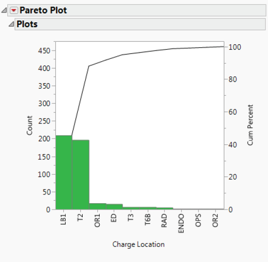
Exhibit 5.10 Pareto Plot of Charge Location
Number of Missing Charge Codes by Location
You would like to see a table that shows the number of records for each Charge Code and the number of records that are missing. You can construct such a table using Tables > Summary.
The resulting data table is automatically named LateCharges By (Charge Location). Each of the 40 Charge Location values defines a row. Note the following:
- The value of
Charge Locationin row 1 is the missing value indicator. - The
N Rowscolumn gives the number of rows inLateCharges.jmpwith the given value ofCharge Location. - The
N Missing(Charge Code)column gives the number of rows inLateCharges.jmpfor whichCharge Codeis missing. - The first row shows that 81 rows in
LateCharges.jmpare missingCharge Location. Of these, 7 are missingCharge Code.
To identify the charge locations that have the most missing charge codes, sort the table in descending order of N Missing(Charge Code). Right-click on the column header for N Missing(Charge Code) and select Sort > Descending. The first 15 rows of the resulting table are shown in Exhibit 5.12. (The script is Missing Charge Code Sorted in LateCharges.jmp.)

Exhibit 5.12 Partial Sorted Summary Data Table
The N Missing(Charge Code) column gives the frequencies shown in the Pareto Plot in Exhibit 5.10. You learn that all of the charge codes for LB1 are missing, while a smaller proportion of the charge codes for T2 are missing.
Percent of Missing Charge Codes by Location
Now you're wondering about the percentage of Charge Code entries that are missing for these areas. Is the percentage much higher than for other areas? You want to add a percentage column to your table. Use the Formula Editor to construct a new column with this information (see Exhibit 5.15).
You right-click on the Percent Missing Charge Code column in the data table and select Sort > Descending to produce the table shown in Exhibit 5.15. The Percent Missing Charge Code column indicates that, for the January 2015 data, LB1 and OR1 are always missing Charge Code for late charges, while T2 has missing Charge Code values about 25 percent of the time. This is useful information, and you decide that this will provide a good starting point for a team whose goal is to address the missing data issue.
Analyzing Amount
AmountWhen you studied the histogram for Amount (Exhibit 5.7), you identified two outliers. You would like to study these more carefully.
With LateCharges.jmp as the active data table, run a Distribution analysis for Amount. From the top red triangle menu, choose Stack to obtain the report in Exhibit 5.16 (script is Distribution of Amount). You want to examine the entire record for each outlier. You will do this by selecting the points in the plot and creating a table using Data View.

Exhibit 5.16 Distribution of Amount with Two Outliers Selected
You note that the first record is a credit (having a negative value). You examine the late charge data for several prior months and eventually find that this appears to be a credit against an earlier late charge for an amount of $6,859.30. The second record corresponds to a capital equipment item, so you make a note to discuss this with the group that has inadvertently charged it here, where it does not belong.
For now, you decide to exclude these two points from further analysis.
Run the script Distribution of Amount to rerun the Distribution report. This gives the report shown in Exhibit 5.18. Note that N is now 2,030, reflecting the fact that the two rows containing the outlying values are excluded.

Exhibit 5.18 Distribution of Amount with Two Outliers Removed
The symmetry of the histogram for Amount about zero is striking. You note that the percentiles shown in the Quantiles report are nearly balanced about zero, meaning that many late charges are in fact credits. Are these credits for charges that were billed in a timely fashion? The fact that the distribution is balanced about zero raises the possibility that this is not so, and that they are actually credits for charges that were also late. You decide that this phenomenon warrants further investigation.
Visualizing the Variables Two at a Time
Days after Discharge
Reviewing Exhibit 5.6, you are surprised that late charges are being accumulated in January 2015 for patients with discharge dates in 2014. In fact, 25 percent of the late charges are for patients with discharge dates preceding 12/17/2014, making them very late indeed.
To get a better idea of how delinquent these are, you define a new column called Days after Discharge and write the required formula. The date formats convert such a value in seconds to a readable date. For example, the value 86400, which is the number of seconds in one day, will convert to 01/02/1904 using the JMP m/d/y format.
Alternatively, you can use the Formula Editor to create a formula that takes the difference, in days, between Charge Date and Discharge Date. Charge Date – Discharge Date gives the number of seconds between these two dates. This means that to get a result in days, you need to divide by the number of seconds in a day, namely, 60 × 60 × 24, which JMP can calculate via the function In Days (1). After clicking OK, the difference in days appears in the new column.
You note that this difference is only an indicator of lateness and not a solid measure of days late. For example, a patient might be in the hospital for two weeks, and the late charge might be the cost of a procedure done on admittance or early in that patient's stay. For various reasons, including the fact that charges cannot be billed until the patient leaves the hospital, the procedure date is not tracked by the hospital billing system. Thus, Discharge Date is simply a rough surrogate for the date of the procedure, and Days after Discharge undercounts the number of days that the charge is truly late.
Obtain a Distribution report of Days after Discharge, again choosing Stack from the top red triangle menu. This report is shown in Exhibit 5.20. (The script is saved as Distribution Days after Discharge.)

Exhibit 5.20 Distribution of Days after Discharge
You see that there were some charges that were at least 480 days late. Drag a rectangle around the points corresponding to the 480 days in the box plot above the histogram to select them. In the data table, right-click on Selected in the Rows panel and select Data View. This produces the table shown in Exhibit 5.21.

Exhibit 5.21 Data View of Rows with 480 Days after Discharge
Only two Account numbers are involved, and you suspect, given that there is only one value of Discharge Date, that these might have been for the same patient. You deselect the rows. To arrange the charges by account number, you sort on Account by right-clicking on its column header and choosing Sort > Ascending (Exhibit 5.22).

Exhibit 5.22 Data View of Rows with 480 Days after Discharge Grouped by Account
You notice something striking: Every single charge to the first Account (rows 1 to 5) is credited to the second Account (rows 6 to 10)! This is very interesting. You realize that you need to learn more about how charges make it into the late charges database. Might it be that a lot of these records involve charge and credit pairs, that is, charges along with corresponding credits?
A View by Entry Order
At this point, you close this Data View table. You are curious as to whether there is any pattern to how the data are entered in the LateCharges.jmp data table. You notice that the entries are not in time order—neither Discharge Date nor Charge Date is in order. You consider constructing control charts with the time order defined by one of these two time variables, but neither would be particularly informative about the process by which late charges appear.
To quickly check if there is any clear pattern in how the entries are posted, you construct an Individual Measurement chart, plotting the Amount values as they appear in row order (see Exhibit 5.23).

Exhibit 5.23 Individual Measurement Chart for Amount by Row Number
Note that many positive charges seem to be offset by negative charges (credits) later in the data table. For example, as shown by the ellipses in Exhibit 5.23, there are several large charges that are credited in subsequent rows of the data table.
Select the points in the ellipse with positive charges using the arrow tool, dragging a rectangle around these points. This selects ten points. Then, while holding down the shift key, select the points in the ellipse with negative charges. Alternatively, you can select Tools > Lasso or go to the tool bar to get the Lasso tool, which allows you to select points by enclosing them with a freehand curve. (The script Selection of Twenty Points selects these points.)
In all, 20 points are selected, as you can see in the Rows panel of LateCharges.jmp. Right-click on Selected in the Rows panel and select Data View to obtain the table in Exhibit 5.24. The table shows that the first ten amounts were charged to a patient who was discharged on 12/17/2014 and credited to a patient who was discharged on 12/26/2014.

Exhibit 5.24 Data View of Charges That Are Later Credited
Is this just an isolated example of a billing error? Or is there more activity of this type? This finding propels you to take a deeper look at credits versus charges.
AmountAbs(Amount)
AmountTo investigate these apparent charge and credit occurrences more fully, construct a new variable representing the absolute Amount of the late charge. This new variable will help you investigate the amount of money tied up in late charges. It will also allow you to group the credits and charges.
At this point, close all open data tables except for LateCharges.jmp. To create a formula for the absolute value of Amount, you use a shortcut that allows you to create the formula directly from the data table column, rather than by constructing a new column and then using the Formula Editor.
Right-click on the header for Amount and select New Formula Column > Transform > Absolute Value, as shown in Exhibit 5.25. This applies the absolute value function to Amount and places the new column, Abs[Amount], after the last column in the data table. (This column can also be obtained by running the script Define Abs [Amount].)

Exhibit 5.25 Construction of Absolute Amount Formula
To calculate the amount of money tied up in the late charge problem, use Analyze > Tabulate (see Exhibit 5.26).

Exhibit 5.26 Tabulation Showing Sum of Amount and Abs(Amount)
The resulting tabulation shows that the total for Abs[Amount] is $186,533 while the sum of actual dollars involved, Sum(Amount), is $27,443. This means that a high dollar amount is being tied up in credits.
You want to better understand the credit and charge situation. Sorting the data table on Abs[Amount] may provide some insight into potential patterns. Close the Tabulate window, go back the LateCharges.jmp table, and construct a new data table using Tables > Sort. Enter Abs[Amount] and then Amount as By (see Exhibit 5.27). The saved script in LateCharges.jmp is Make LateCharges_Sorted.jmp.
![Snapshot of Dialog for Sort on Abs[Amount] and Amount.](http://images-20200215.ebookreading.net/17/1/1/9781118905685/9781118905685__visual-six-sigma__9781118905685__images__c05ex027.jpg)
Exhibit 5.27 Dialog for Sort on Abs[Amount] and Amount
In the sorted data table, in the Columns panel, drag Amount so that it precedes Abs[Amount], in order to juxtapose Amount and Abs[Amount] for easier viewing.
The new table reveals that 82 records have $0 listed as the late charge amount. You make note that someone needs to look into these records to figure out why they are appearing as late charges. Are they write-offs? Or are the zero values errors?
Moving beyond the zeros, you start seeing interesting charge and credit patterns. For an example, see Exhibit 5.28. There are 21 records with Abs[Amount] equal to $4.31. Seven of these have Amount equal to $4.31, while the remaining 14 records have Amount equal to −$4.31. You notice similar patterns repeatedly in this table—one account is credited, another is charged.

Exhibit 5.28 Partial View of LateCharges_Sorted.jmp Showing Charges Offset by Credits
To better understand the charge and credit issue, you decide to compare actual charges to what the revenue would be if there were no credits (that is, if all transactions produced revenue). Use Tables > Summary to produce a new table, with the sum of the Amount values for each value of Abs[Amount]. Then, in this new data table, create a new variable, Sum If No Credits, which gives the total amount of the billed charges (if all records were credits).
Save this summary table, LateCharges_Sorted By (Abs[Amount]).jmp, for future reference. A portion of the resulting table is shown in Exhibit 5.29. For example, note the net credit of $30.17 shown for the 21 records with Abs[Amount] of $4.31 in row 10 of this summary table. You can only conclude that a collection of such transactions represents a lot of non-value-added time and customer frustration.
This table by itself is interesting. There is clearly an issue with credits and charges. But you want to go one step further. You want a plot that shows how the actual charges compare to the charges if there were no credits. You decide to construct a scatterplot of Sum(Amount) by Sum if No Credits (see Exhibit 5.30).

Exhibit 5.30 Bivariate Fit of Sum(Amount) by Sum if No Credits
The scatterplot shows some linear patterns, which you surmise represent the situations where there are either no credits at all or where all instances of a given Abs[Amount] are credited. To better see what is happening, you fit three lines to the data on the plot, all with intercept 0:
- The line with slope 1 covers points where the underlying
Amountvalues are all positive. - The line with slope 0 covers points where the charges are exactly offset with credits.
- The line with slope −1 covers points where all of the underlying late charge
Amountvalues are negative (credits).
Your final plot is shown in Exhibit 5.32. The points on or near the line with slope 0 result from a balance between charges and credits, while the points on or near the line with slope −1 reflect almost all credits. The graph paints a striking picture of how few values of Abs[Amount], only those points along the line with slope 1, are not affected by credits.
As expected, the graph shows many charges being offset with credits. From inspection of the data (not shown), you realize that these often reflect credits to one account and charges to another. This is definitely an area where a green belt project would be of value.
Revisiting Days after Discharge
The team raises the question of whether there is a pattern in charges that relates to the amount of time since the patient's discharge. For example, do credits tend to appear early after discharge while overlooked charges show up later?
To address this question, you close all of your open reports and data tables, leaving only LateCharges.jmp open. Select Analyze > Fit Y by X, enter Amount as Y, Response and Days after Discharge as X, Factor. In the resulting plot, you will add a horizontal reference line at the $0 Amount to help you see potential patterns (see the scatterplot in Exhibit 5.33).

Exhibit 5.33 Scatterplot of Amount versus Days after Discharge
The resulting scatterplot shows no systematic relationship between the Amount of the late charge and Days after Discharge (see Exhibit 5.33). However, the plot does show a pattern consistent with charges and corresponding credits. It also suggests that large-dollar charges and credits are dealt with sooner after discharge, rather than later.
UNCOVERING THE HOT XS
At this point, you and your team have learned a great deal about your data. You are ready to begin exploring the drivers of late charges, to the extent possible with your limited data. You are interested in whether late charges are associated with particular accounts, charge codes, or charge locations. You suspect that there are too many distinct descriptions to address this without expert knowledge and that the Description data should be reflected in the Charge Code entries.
In the pursuit of the Hot Xs, you and the team will use Pareto plots, tree maps, and the data filter, together with dynamic linking.
Exploring Two Unusual Accounts
A Pareto Plot displays values of a variable, sorted in descending order. Pareto plots are useful in identifying the most frequently occurring values of a variable. At this point, it seems reasonable to construct a Pareto Plot for Account, Charge Code, and Charge Location. To gauge the effect of each variable on late charges, you weight each variable by Abs[Amount], as this gives a measure of the magnitude of this impact.
These barely visible bars correspond to Accounts with very small frequencies and/or Abs[Amount]. You decide to combine these into a single bar. The resulting plot is shown in Exhibit 5.36.

Exhibit 5.36 Pareto Plot of Account with Last 370 Causes Combined
The plot shows that two patient accounts represent the largest proportion of absolute dollars. In fact, they each account for $21,997, for a total of $43,994 in absolute dollars out of the total of $186,533. To see this, in each bar, click and hold the click.
You are interested in the raw values of Amount that are involved for these accounts. Select the records corresponding to these two accounts by holding down the control key while clicking on their bars in the Pareto plot. This selects 948 records. Double-click on one of the two selected bars in the Pareto chart while holding the control key to create a table containing only these 948 records (alternatively, in the LateCharges.jmp data table, you can select Data View to create this table). All rows are selected in this new data table. Save this table with the name TwoAccounts.jmp. To clear the row selection, choose Rows > Clear Row States.
You want to see if the Amount values have similar distributions for these two accounts. You will use Analyze > Fit Y by X to compare these distributions.
The plot in Exhibit 5.37 strongly suggests that amounts from the second account are being credited and charged to the first account. To investigate this, sort the 948-record table in descending order by Abs[Amount]. The pattern of charges and credits is clearly seen (Exhibit 5.38).

Exhibit 5.37 Oneway Plot for Two Accounts

Exhibit 5.38 Partial Data Table Showing Amounts for Top Two Accounts
This analysis confirms the need to charter a team to work on applying charges to the correct account. You document what you have learned and then close the table TwoAccounts.jmp.
Exploring Charge CodeCharge Location
Charge CodeYour team now turns its attention to Charge Code and Charge Location. Earlier you learned that about 25 percent of records have missing values for at least one of these variables. You consider constructing Pareto plots, but again, because of the large number of levels, you would have to combine causes. You decide to try a tree map, a plot that uses rectangles to represent categories.
Studying the Tree Map in Exhibit 5.39, you note that there are five charge codes—LBB, RAD, BO2, ND1, and ORC—that have large areas. This means that these charge codes account for the largest percentages of absolute dollars (one can show that, in total, they account for 85,839 out of a total of 186,533 absolute dollars). One of these charge codes, ND1, is colored dark gray. This means that although the total absolute dollars accounted for by ND1 is less than, say, for LBB, the mean of the absolute dollars is higher.
Click in the ND1 area in the Tree Map; this selects the seven rows with an ND1 Charge Code in the data table. In the Rows panel, right-click on Selected and select Data View to see these rows. All seven rows contain relatively large charges (see Exhibit 5.40). You note that these charges appear from seven to eighteen days after discharge. Also, none of these are credits. You and your team conclude that addressing late charges in the ND1 Charge Code is important.

Exhibit 5.40 Data View of the Seven Charge Code ND1 Rows
You apply this same procedure to select the ORC records, which are shown in Exhibit 5.41. Here, there are 14 records, and a number of these are credits. Some are charge and credit pairs. The absolute amounts are relatively large.

Exhibit 5.41 Data View of the 14 Charge Code ORC Rows
You also look at each of the remaining top five Charge Codes in turn. For example, the LBB Charge Code consists of 321 records and represents a mean absolute dollar amount of $87 and a total absolute dollar amount of $28,005. There appear to be many credits, and many charge and credit pairs. From this analysis, you and your team agree that Charge Code is a good way to stratify the late charge problem.
But how about Charge Location? You realize that Charge Location defines the area in the hospital where the charge originates and consequently identifies the staff groupings who must properly manage the information flow. You construct a tree map to investigate charge location.
The eight largest rectangles in this graph are: T2, LAB, RAD, ED, 7, LB1, NDX, and OR. These eight Charge Locations consist of 1,458 of the total 2,030 records, and represent 140,115 of the total of 186,533 absolute dollars. You wonder about location 7, and make a note to find out why this location uses an apparently odd code.
Next, you examine each of these groupings individually by selecting the appropriate rectangle and creating a table using Data View. One interesting finding is that Charge Location NDX consists of exactly the seven Charge Code ND1 records depicted in Exhibit 5.40. So it may be that the NDX location only deals with the ND1 code, suggesting that the late charge problem in this area might be easier to solve than in other areas.
But this raises an interesting question. You are wondering how many late charge Charge Code values are associated with each Charge Location. The team suggests that the more charge codes involved, the higher the complexity of information flow, and the higher the likelihood of errors, particularly of the charge and credit variety.
To address this question in a manageable way, you select all records corresponding to the eight largest Charge Location rectangles and use Fit Y by X to create a mosaic plot (see Exhibit 5.43).
![Illustration of Mosaic Plot of Charge Code by Charge Location, Weighted by Abs[Amount].](http://images-20200215.ebookreading.net/17/1/1/9781118905685/9781118905685__visual-six-sigma__9781118905685__images__c05ex043.jpg)
Exhibit 5.43 Mosaic Plot of Charge Code by Charge Location, Weighted by Abs[Amount]
You find it noteworthy that Charge Location T2 deals with a relatively large number of Charge Code values. This is precisely the location that had 25 percent of its Charge Code values missing, so the sheer volume of codes associated with T2 could be a factor. The remaining areas tend to deal with small numbers of Charge Code values. In particular, NDX and RAD only have one Charge Code represented in the late charge data. NDX and RAD may deal with other codes, but the January 2015 late charges for each of these two areas are only associated with a single code.
You note that, except perhaps for T2, these charge locations tend to have charge codes that appear to be unique to the locations. Viewing the colored version of the mosaic plot on your monitor, you easily see that there is very little redundancy, if any, in the colors within the vertical bars for the various charge locations.
You note something interesting. The LB1 Charge Location does not appear in the mosaic plot—only seven locations are shown. The team reminds you that Charge Code is entirely missing for the LB1 Charge Location, as you learned in the earlier analysis of the relationship between Charge Code and Charge Location.
With that mystery solved, you turn your attention back to the mosaic plot in Exhibit 5.43. You decide to use distribution plots to better see how Charge Code varies by Charge Location and to use the Data Filter to explore the distribution of charge codes in the different locations (see Exhibits 5.44 and 5.45).

Exhibit 5.44 Partial View of Stacked Distributions for Charge Locations

Exhibit 5.45 Data Filter and Distribution Display Showing Charge Code RXA
Click on each of the Charge Code values in turn in the Data Filter's Charge Code list and scroll through the Distribution reports to see which bar graphs reflect records with that Charge Code. You find that almost all of the Charge Code values only appear in one of the locations. RXA is one exception, appearing both for ED and T2 (see Exhibit 5.45).
Next, you conduct a small study of the Description information, using tree maps and other methods. You conclude that the Description information could be useful to a team addressing late charges, given appropriate contextual knowledge. But you believe that Charge Location might provide a better starting point for defining a team's charter.
Given all you and the team have learned to this point, you decide that a team should be assembled to address late charges, with a focus on the eight Charge Location areas. For some of these areas, late charges seem to be associated with specific Charge Codes that are identified as prevalent by the tree map in Exhibit 5.42, and that would give the team a starting point in focusing their efforts.
IDENTIFYING PROJECTS
You and the team are ready to make recommendations to management relative to areas that should be addressed by green belt project teams. Recall that the January data showed that the late charge problem involves 186,533 absolute dollars. Here are the recommendations that you make to management, along with your rationale:
- First and foremost, a team should be assembled and chartered with developing a value-stream map of the billing process. This will provide future teams with a basis for understanding and simplifying the process. The non-value-added time, or wait times, will indicate where cycle time improvement efforts should be focused. Meanwhile, teams can be chartered to address the problems below. These teams and the value-stream mapping team need to stay in close contact.
- There is a pervasive pattern of charges being offset by credits. A team should be organized to determine what drives this phenomenon and to find a way to eliminate this rework.
- There are 85,839 absolute dollars tied up in six charge codes, and 140,115 absolute dollars tied up in eight charge locations. Since the codes used in the locations seem proprietary to the locations, your recommendation is that a green belt project team should be given the task of reducing the level of late charges, and that the initial focus be these eight areas. Note that one of these areas, T2, deals with many charge codes, which may entail using a different approach in that area.
- Two complex accounts were found that contributed greatly to the late charges in January. In fact, 984 of the 2,030 records of late charges in January involved transactions for these two accounts. The absolute dollars involved were $43,995. A green belt team should investigate whether this was the result of a special cause or whether such occurrences are seen regularly. In either case, the team should suggest appropriate ways to keep the problem from recurring.
- There is also a tendency to not report the
Charge Code. For example, one of the locations, LB1, is always missingCharge Code. A team should be formed to address this issue. Is the information redundant and hence unnecessary? Is the information not useful? Is it just too difficult to input this information? The team should address this information flow, and make appropriate recommendations.
CONCLUSION
As mentioned at the start of this chapter, this case study is almost entirely embedded in the Uncover Relationships stage of the Visual Six Sigma Data Analysis Process (Exhibit 3.29). You assumed the role of a detective, searching for clues. You used a number of the How-We-Do-It techniques described under Uncovering Relationships in Exhibit 3.30. Your exploration has been quite unstructured and oriented toward your personal learning and thinking style, yet you have learned a great deal very quickly.
Using the dynamic visualization and dynamic linking capabilities available in JMP, you and your team have discovered interesting relationships that have clear business value. JMP has facilitated data screening, exploration, and analysis. In a very short time, you performed analyses that allowed you to define five major problem focus areas. Also, your visual displays made sense to management, lending credibility and strength to your recommendations.