7
Designing a User Interface
“Let it be your constant method to look into the design of people’s actions, and see what they would be at, as often as it is practicable; and to make this custom the more significant, practice it first upon yourself.”
—Marcus Aurelius
Topics Covered in This Chapter
Designing the Persona-Based Interaction Framework
Helping Users Find Information
Refining the Form and Behavior
This book has been taking a step-by-step approach to understanding the process and your users and has included the following topics:
- Learning the issues related to user interface design (Chapter 2, “Concepts and Issues”)
- Making the business case to your stakeholders (Chapter 3, “Making the Business Case”)
- Learning about the tools necessary to create good design (Chapter 4, “Good Design”)
- Obtaining information about and understanding your users (Chapters 5, “How Users Behave,” and 6, “Analyzing Your Users”)
Now that you’ve made the business case and you know about your users, it’s time to take that knowledge about your users and begin defining the requirements of your user interface. You’ll begin by designing the interaction framework based on user personas that were discussed in Chapter 6.
Then you’ll learn about interaction design and what you should do to make your interface ethical, purposeful, pragmatic, and elegant—four features of good design discussed in Chapter 4. Part of the interaction design is the type of posture you want to use. You’ll learn about the four different GUI postures and when they are appropriate.
Finally, you’ll delve into interface behaviors and how you should design the interface so that you can effectively communicate with users and help them find the information they need. When you have finished determining what the users need in the framework and how elements within the framework should behave, you’re ready for the fifth and final step in the Goal-Directed Design Process: refining the form and its behaviors to create a final design.
Designing the Persona-Based Interaction Framework
The third phase of the Cooper and Reimann (2003) Goal-Directed Design Process is the Requirements phase. You need to define the requirements of your plan based on your personas before you can design a framework. Cooper and Reimann define obtaining requirements as (yes, it’s another) five-step process.
- Create problem and vision statements—Based on your understanding not only of the persona but also of the company goals, create the objective of the design in terms of a problem statement and vision statement.
The problem statement defines what the persona faces currently and how the business is affected, if at all. For example, “Nurses can’t get the patient information they need quickly enough; therefore, nurse morale is lower, which results in more nursing mistakes and patients staying in the hospital an average of an extra day.”
The vision statement should explain how the new user interface will help both the users and the company. For example, “The new design of the user interface will give the nurses the ability to perform tasks A, B, C, and D and result in higher morale for nurses, fewer nursing mistakes, patients being released earlier, and greater bed turnover.” - Brainstorm—Having one or more brainstorming sessions with your project team will help your team understand what biases exist among your team members after looking at the persona data. One or more brainstorming sessions will also uncover ideas that your team can implement now or sometime later. Brainstorming sessions should be centered on a topic. For example, a brainstorming session can center on what user interface elements will meet specific goals.
- Identify persona expectations—Each persona has its own mental model of the product. You must identify each persona’s desires and the expectations, behaviors, attitudes, biases, and other factors that affect them. Some of the information that the personas mention or don’t mention, such as tasks they want to perform, can provide a guide to what each persona wants.
- Construct context scenarios—These stories about personas and their activities will help you understand how each persona gets through a typical day using the new and improved system, which includes the new user interface. The scenarios don’t discuss the form and function, but only the behaviors of the user and the interface.
In each context scenario, you need to identify not only the environment and organization in the persona’s daily scenario, but also touch on the points that each primary and secondary persona has with the system and the other personas that it may interact with through the system. For example, the primary persona is a nurse who works with one persona, but the secondary persona is an administrator who works with a completely different persona from the nurse. This difference may show that each persona uses the system differently. - Identify needs—After you create the context scenario, analyze it to determine what the needs are for each persona. Personas have three types of needs: data, functional, and contextual.
Objects and information in the system comprise data needs. For example, the letters you see in a word processing document are objects you need to see as you type those letters.
Operations that need to be performed on objects in the system comprise functional needs. For example, if you want to make a block of text in a word processing document bold, there is an operation to do that.
Firm and possible relationships between sets of objects or sets of controls comprise contextual needs. For example, when you save a favorite Web site in the Favorites list in Internet Explorer, Internet Explorer must update the list with the new favorite as well as list all your other saved favorites.
Note that this process is not a linear one-time process, but iterative. For example, you may want to go through the process once, go through a brainstorming session, and then refine your persona expectations, context scenarios, or needs based on the results of that session.
Real-World Requirements
When you’ve finished developing the creative side of your product requirements, it’s time to focus and learn about your real-world requirements for the product. These other requirements include (Cooper and Reimann, 2003) the following:
- Business requirements that include business development models, timelines, and pricing structures.
- Customer and partner requirements that include installation, configuration, customer support, and licensing agreements.
- Technical requirements that include the operating system you use and the form factor that the product requires. For example, the product may be a Web site that needs to be displayed at a certain video resolution so that all users can read the information on each Web page.
These other requirements may force you to rethink or refine some of the ideas that you generated in the requirements process. They may even spur more brainstorming.
Defining the Framework
When your requirements list is ready, it’s time to define the framework. Creating a framework is a six-step process (Cooper and Reimann, 2003):
- Define the form factor and input methods—Are you creating a user interface in a desktop computer operating system, like Windows? Are you creating a Web interface? Or are you creating an interface for a handheld PC operating system? The answer defines your software posture, which you’ll learn more about later in this chapter.
You also need to find out how people will interact with the interface. For example, will people use a keyboard and mouse, voice interface, or a wand that you use with a handheld PC to touch the screen? There are plenty of input options available for which you may need a plan. - Define the views—You need to determine what the user will see based on the context of where he is in the system so he can properly organize the information on the screen. For example, you may need to have separate views for different tasks, such as opening a Print dialog box to print a spreadsheet. However, if you have elements that are related to each other, like a spreadsheet and a chart generated from that spreadsheet, you can define a view that incorporates the spreadsheet and chart in the same view.
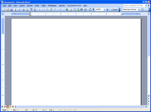
- Define the functional and data elements—After you construct a list of views, you need to know how objects, such as onscreen windows and controls, buttons, and icons, will be viewed onscreen. The type of input devices that your users will use will affect what functional and data elements you will have on the screen. An example of input devices in Microsoft Word is shown in Figure 7.1.
Figure 7.1. Microsoft Word has many types of input devices to manipulate it.
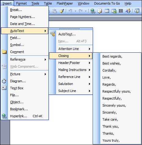
4. Determine the functional groups and hierarchy—Now that you know what your functional and data elements are, you can begin to group these features together, arrange containers, and establish hierarchical relationships between each group. Use the persona types as a guide for organizing your functional and data elements. A menu bar is one example of functional groups; there is a group name in the bar with the individual menu options underneath the name. Some features in the list are groups themselves that open a second-level feature list in the hierarchy, such as when you can add a closing salutation from the AutoText option within the Insert menu, as shown in Figure 7.2.
Figure 7.2. A menu example of functional groups and hierarchy.
5. Sketch the interaction framework—You can sketch rough drawings of the top level (“the big picture”) of the user interface design and write notes about the relationship between different objects in the interface. You don’t need to drill down into certain sections of the interface at this point; doing so can end up distracting you and your other team members.
6. Construct key path scenarios—This is where paper prototyping and storyboarding techniques that you learned from Chapter 4 come into play. Work with your team to develop scenarios of what users will see in the interface based on your personas, and then create storyboards to show the path of each interaction as the user completes a task, as shown in Figure 7.3. Each storyboard represents a screen and shows what the screen will look like as the user initiates an action, such as clicking a button.
Figure 7.3. A sample of a storyboard that shows a draft framework and scenarios.

Note that this process is also iterative. As you refine and finalize your key path scenarios, you can create paper prototypes based on those scenarios discussed in Chapter 4 so that you can determine whether your scenarios match up with direct user manipulation of the prototype. If they don’t, you will likely have to revisit one or more steps in this process to resolve problems revealed by the paper prototype feedback.
Interaction Design
When you create a persona-based interaction framework, Cooper and Reimann (2003) recommend that you suspend reality and believe that the operating system is human. That’s a sound strategy, because an interface that seems more human and is more responsive to human needs results in a happier user experience.
To help meet the goal of user interface design that is more human, you need to adhere to design imperatives by following principles and patterns of interaction and interface design.
Applying Design Imperatives
In Chapter 4, you learned about the four design imperatives. Keep the following design tips in mind as you develop your user interface (Cooper and Reimann, 2003):
- Ethical—Ethical design is considerate and helpful and actually improves human situations. In interface design, you can improve communication between your user interface and the people who use it, which leads to improved understanding and effectiveness.
- Purposeful—The goal of this entire book, as well as the reference books I’ve cited, is to create user interface design that has the purpose of serving your users well by making them stronger and more effective in their lives.
- Pragmatic—You must create and build a good user design for it to be of value. However, there are always other considerations requiring flexibility and communication between company departments for a design to see the “light of day” and experience success.
- Elegant—Elegant design should represent the simplest complete solution, possess internal coherence, and stimulate cognition and emotion to get the user involved. If your user interface is unnecessarily cumbersome and inconsistent, it’s unlikely that the user will be interested in using it, and your company will be left wondering why no one wants to use your product.
Principles
Principles are guidelines that address issues of behavior, form, and content (Cooper and Reimann, 2003). These principles are designed to minimize the work of the user as part of elegant design.
There are three levels of design principles that you have to design for:
- Conceptual-level principles—These define what a product is. In Chapters 5 and 6, as well as in this chapter, you learned about how to bring your project team and your users closer together to define a product that users will want to use.
- Interaction-level principles—These define how a product should behave, both generally and in specific situations. This chapter will discuss interaction-level principles for graphical user interfaces (GUIs), and Chapter 8, “Designing a Web Site,” will discuss interaction-level principles for Web sites.
- Interface-level principles—These define the interface look and feel. This chapter and Chapter 8 discuss these principles.
If your company has a style guide already established, it’s likely that you can use some of its principles to help guide you in creating your design principles. However, in most cases, companies don’t go into the level of detail that you and your project team need to develop user interfaces. (You may be able to augment your company’s style guide with principles you learned during the development process. In fact, if you keep this in mind as a secondary goal, you are more likely to create a user interface that is compatible with your company’s preferred “look.” A subsidiary benefit is increased acceptance by your superiors of a product that fits well into the company line.)
Note, too, that these principles are only guidelines and don’t provide a complete guide as to how to create your design behaviors. For example, you’ll use feedback from your users as another means to guide you and your team in the design process.
Patterns
As you develop your product, you will begin to create patterns that solve problems you encounter in the design, which you can then apply to problems in your current project. You can also address these problems in your development principles/styles guide as a means of educating and applying these patterns in other projects. Cooper and Reimann (2003) list three types of interaction design patterns:
- Postural—These help determine the product stance in relation to the user. You’ll learn more about software postures in the next section.
- Structural—These solve problems that relate to the management of data in the program, including how information displays and how users access and manipulate data and options in the program. For example, you have probably noticed that Microsoft has been working on organizational issues with successive versions of its Office software programs, such as Word.
- Behavioral—These solve specific interactional problems with individual data or functional objects, or groups of objects.
Software Postures
As you create your user interface design, your personas will give you a good idea of how they will use the program, and you can design an interface with a posture that reflects how your primary personas work. Note that your users will likely not use only one of these postures, but may use more than one, depending on the task they are performing.
There are four desktop-based GUI postures (Cooper and Reimann, 2003):
- Sovereign—The sovereign application is a full-screen program that keeps the user’s attention for long periods of time. For example, sovereign applications include programs in Microsoft Office, Microsoft Word (as shown in Figure 7.4), as well as graphics programs such as Adobe Photoshop and Illustrator.
Figure 7.4. An example of a sovereign posture.

This program uses the entire screen most of the time, so sovereign applications are designed for full-screen use. These applications use that space to add functions for manipulating objects. The Microsoft Word window is a good case in point, with a menu bar, toolbars, and a task pane on the right side of the screen. This results in rich feedback to the user as well as rich input mechanisms.
- Transient—The transient application is one that comes and goes when the user needs to perform a specific task, such as using the Windows Character Map to view a list of available characters in a font set. Transient programs don’t take up a lot of real estate and aren’t used very much.
Because transient applications aren’t used as often as sovereign applications, they should be simple to use and should communicate well to the user. You should minimize your use of scrollbars and other complex interaction features in the window and just add them when necessary. In the Character Map window, as shown in Figure 7.5, the user sees a visual presentation of the characters so she can see what she wants quickly and easily. This program contains a scrollbar to scroll down the list of characters. If the user needs help, she can click the Help button at the top of the window.
Figure 7.5. The Character Map window is an example of a transient posture.

- Daemonic—The daemonic application is one that doesn’t normally interact with the user. Such programs include driver programs that support your printer, monitor, and mouse. If you need access to these programs, operating systems provide “control panels” like the one you can access in Microsoft Windows. The Control Panel window in Windows provides a list of daemonic programs you can change, as shown in Figure 7.6.
Figure 7.6. The Control Panel window, which lets you configure daemonic programs.

Windows has also placed access to some of those daemonic programs in the system tray at the right side of the taskbar in the form of small icons next to the system clock. Some programs that include utilities (such as a driver for the trackball I use) also place icons in the taskbar so you can access those utilities when you install the program.
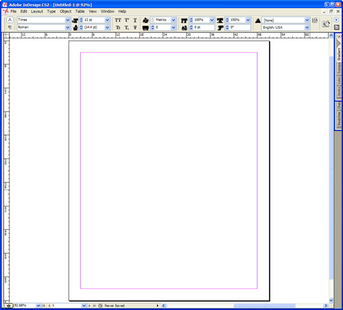
- Auxiliary—An auxiliary application is one that combines the characteristics of sovereign and transient applications. Microsoft has developed auxiliary programs with its Office suite of programs as well as Internet Explorer and Microsoft Outlook. Microsoft Word can also display an auxiliary posture. For example, you can have the task pane open on the right side, or you can close it. Adobe’s interfaces for its graphic design software like InDesign go Microsoft one better by having their transient programs in the forms of tabs at the right side of the window that you can click to open and close, as shown in Figure 7.7.
Figure 7.7. InDesign contains tabs at the right side of the window.
Interface Behaviors
GUI interfaces for desktop interfaces exhibit behaviors of two of the most commonly used means of accessing and viewing information: the mouse pointer and the window. These two features are universal in a GUI. You can find mice or mice equivalents on any computer, such as a touch pad on a laptop. In this section, you will learn about the behaviors of some of these features and some of the issues surrounding them—some by Cooper and Reimann (2003) and some from my own experiences.
Using the Mouse Pointer
A pointer is a GUI graphic feature, usually an arrow, that you manipulate directly using a mouse, which is a device that typically looks similar to, and has similar dimensions to, a bar of soap. The mouse pointer is your control device to manipulate different objects and control mechanisms (called widgets) in the GUI. You can also use alternative manipulation devices such as a trackball or touch pad instead of a mouse if you find that a mouse isn’t that comfortable. For example, I use a trackball to move the mouse pointer around my computer screen. Many notebooks have mouse pads built in.
You must be aware of mouse behaviors and how a GUI uses them, because your users expect your user interface to follow the same rules as all other programs in the GUI.
Moving Around
A mouse has a ball or laser guidance system on the bottom so that when you move the mouse around on your desk, the mouse pointer moves in the same direction that you move your mouse.
As you move around, the mouse pointer may change shape in response to a program’s requirements. In Microsoft Word, for example, when you move the mouse pointer over a document page, it changes to an I-shaped bar, as shown in Figure 7.8. This I-shaped bar indicates the insertion point where you can insert new text into your document. When you move the mouse pointer outside the document page, it reverts back to an arrow. Also, when a program is performing time-intensive operations, the mouse pointer might change to a busy cursor, often resembling an hourglass, or in the case of Windows Vista, a circle.
Figure 7.8. An I-shaped bar in Word.

Clicking and Buttons
Most computer mice come with two buttons—one on the left, and another on the right. By default, the left mouse button and right mouse button have different functions. Some button behaviors may be different from the typical default settings if a user or administrator has customized the computer’s interface.
Left Mouse Button
When you click the left mouse button, the operating system places a cursor (a bright and usually blinking movable indicator that marks a position where text can be added, changed, or deleted) in the precise location, initiates a task associated with the button or link, or moves the focus of the operating system onto what you’ve just clicked. For example, if you click the Save button in the Microsoft Word for Windows taskbar, Windows focuses on saving the document.
Some links require that you click the left mouse button twice in rapid succession, or double-click, to initiate the task associated with the link. For example, if you open the Control Panel window in Windows, you must double-click one of the icons in the list of functions (such as Display) to open the associated window. This is useful if you want a user to be more deliberate in starting a task and not starting a task by accident.
You can drag icons and open windows on your desktop to other locations by moving the mouse pointer over the icon or the window title bar, holding down the left mouse button, and then moving the icon or window to different locations on the screen. This function, called click and drag, also allows you to move icons to other icons, such as a document into another folder. In addition, you can use click and drag functionality to click and select blocks of objects, such as text in a Word document.
Right Mouse Button
Microsoft introduced right mouse button functionality in Windows. When you click an icon, a window, or an item in the taskbar with the right mouse button, called right-click, a pop-up menu appears that lets you perform specific functions. Those functions can be as simple as having the ability to minimize, maximize, or close the window, or you can perform more specific functions. For example, if you right-click in a Word document, a context menu appears with options specific to the menu, as shown in Figure 7.9.
Figure 7.9. A pop-up menu in Word that you access by clicking the right mouse button.

The right mouse button has become popular enough that the two Linux GUIs, GNOME and KDE, and even Mac OS X have adopted right-click functionality.
However, users may not know that right-clicking is available unless they’re already used to right-clicking on objects, or they click on the right mouse button by accident and wonder how they got to the menu or option they see. As you identify your users’ needs, you may want to refine those needs to determine if your users want to have right-click functionality and how to present that information so your users will know about this functionality.
Window Behaviors
No matter what GUI you use, you’ll find that windows have the same behaviors that you need to adhere to when you build your user interface.
Opening Windows
You can open a window in one of four ways:
- Click on an icon on the desktop that links to the program. If the icon is a document, the program that is associated with the document opens automatically.
- Double-click on an icon or link within a window.
- Click a menu option in a program. For example, click New from the File menu in Microsoft Word.
- Click on a button or icon in the taskbar or Dock.
You can have more than one window open at one time. However, when you do, you run the risk of having window “pollution,” where you have so many open windows at once that you can’t make sense of what’s going on and where. Many different windows can demand your attention, so it’s important to keep everything in one area if at all possible when you create your user interface so that your users don’t become confused.
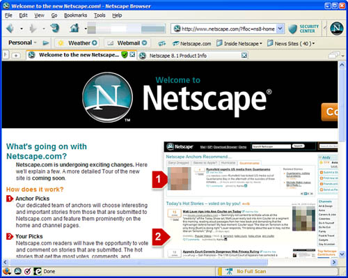
One way that GUIs keep different tasks within one window is the multiple-document interface, or MDI. MDI uses tabs to keep track of separate documents within a window. In one type of MDI interface, you can click on the tab to go directly to that document without moving to a different window. Two examples of a tabbed MDI interface are the multitabbed Web browser, such as Internet Explorer 7, which keeps different Web pages in different tabs, and worksheets within a spreadsheet such as Microsoft Excel. Another form of MDI was prevalent in older versions of Windows, where the documents were displayed as movable, resizable subwindows within the master program. MDI almost went away as more powerful computers made it easier to have several open windows in the same program, but it is starting to make a comeback, as shown with Internet Explorer 7 and other modern browsers such as Netscape 8, as shown in Figure 7.10.
Figure 7.10. Tabbed panes in the Netscape Internet browser.
Netscape and the “N” Logo are registered trademarks of Netscape Communications Corporation. Netscape content (c) 2007. Used with permission.
A window can also open a dialog box, which is a smaller window designed to have the user set settings and make decisions. For example, if you want to print a document in Microsoft Word, the Print dialog box appears so you can determine what printer to use, how many copies to print, and so on, as shown in Figure 7.11.
Figure 7.11. The Print dialog box in Word.

When you require the user to open a window, be sure that the window is for something that the user needs to do to complete the task. For example, you need to have the user specify the printer and print settings before he prints the document.
If you can have functionality appear within a primary window without making the user go to a secondary window, it is better to keep that functionality within the primary window. That will make your user’s job easier. For example, when I use Microsoft Word, I can change the font on the Format menu by clicking Font and then setting the font, the font size, and other font-related features (like the font color) in the Font dialog box. However, Word contains a toolbar within the Word window so that you can change the font from within the document window, as shown in Figure 7.12.
Figure 7.12. Word’s font lists in the toolbar.

One overarching rule applies to creating windows and dialog boxes: Be sure to provide only the information that the user needs in each window. Too many choices can overwhelm the user, or features can be buried within menus that users won’t even know about because they won’t know how to reach those features.
Maximizing, Minimizing, and Changing Window Sizes
You can maximize a window so that it fills your entire screen and has your full attention. For example, you may want to have a maximized window when you’re writing a document so that you can stay focused on the document and not on which window to use. The Maximize, Minimize, and Close buttons appear in the title bar. In Windows, these buttons are on the right side of the title bar, as shown in Figure 7.13.
Figure 7.13. The Minimize, Maximize, and Close buttons in a Windows title bar.
If a window is maximized, the Maximize button in the title bar changes to the Restore Down button so that you can change the size of the window. You can change the size of the window by moving the mouse pointer to the edge of the window, holding down the left mouse button, and dragging. If you click and drag from a vertical edge, the window width changes. If you click and drag from a horizontal edge, the window height changes. If you click and drag from the corner, the width and height change simultaneously.
However, the window size of a dialog box may or may not be changeable. You can also set your window so that a user can’t change its size if you feel that a window needs to be a certain size. In addition, by making the window modal, you can prevent users from switching to other windows when presented with a dialog box. This technique should be used sparingly, because UI designers often overuse modality at the expense of not allowing users to multitask within a program or between programs. During your usability tests, which you’ll learn about in Chapter 9, “Usability,” you’ll be able to learn what window behaviors your users like and don’t like in your interface.
Moving Windows Around
You can move windows around the screen so that they overlap each other; the metaphor that Xerox had when it originally developed the Alto GUI is that it wanted each window to represent an overlapping piece of paper. I don’t care for overlapping pieces of paper because I tend to ignore the paper that’s underneath the first sheet. A lot of people agree.
The taskbar was one way to get out from under the overlapping window problem. Another solution that Microsoft introduced was the ability to tile windows so that they appear side by side or one on top of the other. If you have four tiled windows, the windows appear in each corner. The success you have in tiling your windows depends on the screen size and resolution of your typical user’s monitor. For example, if you tile more than one window side by side on a 15-inch monitor with 800-by-600 pixel resolution, you won’t be able to see much in each window. Therefore, if your software application requires multiple windows to work properly, you should determine what screen size and resolution your monitors use and design your interface accordingly. You may decide to have separate windows, or an MDI approach as discussed earlier in this chapter.
Closing Windows
You close a window by clicking the Close button in the window title bar. However, you may also want to employ keyboard combination shortcuts to make it easier for users to close a window. For example, Windows uses Ctrl+W and Alt+F4 to close a file and open a program, respectively. See an example of the Word title bar menu in Figure 7.14. If your application will require a lot of keyboard use, you can include keyboard shortcuts in your user interface. They’re a nice gift to your users (especially users who have disabilities), who won’t have to take their hands away from the keyboard to perform tasks.
Figure 7.14. The Word title bar menu also shows the keyboard shortcut alternative.

Helping Users Find Information
You can give users several cues to help them find information. However, you must ensure that you use these cues appropriately and that they don’t overwhelm or confuse the user.
Visual Cues
As discussed in the “Interface Behaviors” section, your mouse pointer can change shape based on where it is in the window. There are also other visual cues that appear in the window. These not only include buttons and the window name in the title bar, but can also include menu options, button bars, icons, and more.
With so many visual cues available to you as you design your user interface, it’s important to adhere to the five rules of visual interfaces (Cooper and Reimann, 2003):
- Avoid visual noise and clutter—It’s easy to overwhelm users with too much functionality in one window or too many bright colors that distract them, inhibiting their ability to make sense of it all. What’s more, if some information that you provide is superfluous, the user will become frustrated.
- Use contrast, similarity, and layering to distinguish and organize elements—For example, make sure that buttons are lighter than the background of the window so that the users understand that they should pay attention to the buttons. You should also group related buttons together, such as buttons for saving and opening a file.
- Provide visual structure and flow at each level of organization—For example, if you tell Word to print a file, the Print dialog box is arranged like a grid so it’s easy to find what you need. The flow of information in your windows should match the user’s logical path, which is the way the eye moves. In Western countries, people read from left to right and from top to bottom.
- Use cohesive, consistent, and contextually appropriate imagery—If you have an icon and text in a button, the icon and text need to be consistent. For example, the Display icon should include an appropriate picture (such as a monitor) and the word Display underneath the picture.
- Integrate style and function comprehensively and purposefully—You need to be consistent when integrating your user interface style and function. If you don’t do this, you will confuse the user.
Audio Cues
Today, most computers come with built-in audio cards and speakers so that you can listen to multimedia files. Today’s GUIs also come with built-in sounds that you can use to alert your users to certain events. For example, if you have Outlook or Outlook Express in Microsoft Windows, you can set up Outlook to play the default Windows chime when you receive a new email message.
You should be cautious when using audio cues, such as the computer making a certain noise every time the user clicks a button. Users can quickly become annoyed with them if they happen often enough, and hard-of-hearing users won’t appreciate them. To compensate for the annoyance, users might mute the volume on their computer speakers, which could defeat the purpose of other audio cues that will be important. If you do plan to use audio cues, be sure to give users the ability to turn off audio.
Pop-Up Messages
Despite their visual appeal, icons may not convey information as well as they need to. Indeed, some icons can be rather esoteric or downright confusing. One way that GUIs help bridge the gap is through the use of pop-up messages, also known as ToolTips. For example, when you move the mouse pointer over a toolbar icon in Microsoft Word for Windows, a small box appears below the mouse pointer that describes what the icon is used for, as shown in Figure 7.15.
Figure 7.15. A pop-up message in Word.

The key to creating a worthy pop-up message is keeping the message as short as possible—only a few words at most—and as descriptive as possible. That’s a challenge, but you’re only trying to give your user a reminder of what the icon is, not an explanation of its entire process.
Search Engines
Search engines have become common with current versions of operating systems because so many people use the Web and are familiar with using them. Programs such as Microsoft Office 2003 have a search engine text box in the upper-right corner of the application window with text inviting the user to type a question in the box for help, as shown in Figure 7.16.
Figure 7.16. The help box in Microsoft Word.

Apple introduced the Sherlock search engine with Mac OS 8.5 so users could find information in files, folders, and on the Web. Google provides a freely downloadable program called Google Desktop that serves a similar function for Windows users. Windows Vista now sports search functionality in the Start menu. Depending on how your users employ the software, you may want to rely on these tools so your users can find information, or you may want to add search engine functionality from the window itself as Office does. Like Web engines, operating system search engines aren’t perfect, and their functions shouldn’t replace online help systems. See the next section for more details.
Communicating with the Users
Chapter 6 discussed the fact that many users are perpetual intermediates, meaning that they are interested in finding the answers to their problems as quickly as possible so they can move on and finish their task. If you don’t communicate effectively with your users through the interface, you’ll lose them.
Making Features Easy to Find
In addition to the methods for helping users find information as described in the previous section, your user interface needs to adhere to consistency and standards in user product design. Chances are that you or someone else in your department will be responsible for designing and implementing these standards. Standards are guidelines that start with the user interface standards for software, hardware, or Web sites prescribed by the company that designs them and progress to changes that you feel need to be made. After you have the final standards for your user interface design, you need to enforce those standards consistently so your users will be able to find the information you have in the same place.
However, the fact that you have standards ahead of time doesn’t mean that they won’t change during the development process. Those standards could also change depending on what your users think. That is why it’s so important to have usability testing, as I’ve described in previous chapters and in Chapter 9.
Online Help
Online help is a way to make information about using the software easily available to users. You can also include training modules and related information (such as a glossary) in the online help system. Most GUI software programs today have online help included with the system, and in most programs, you can access online help through the Help menu option in the menu bar. An online help system can make information more accessible and save your company money in printing costs—but only if you design the online help system correctly.
Users use online help primarily by searching for the term that they’re having problems with, such as printing. That search feature is usually one of three tabs in an online help window; the other two tabs are a table of contents and a searchable index. Many companies will simply transfer a user guide to an online help system, add some rudimentary search features, and release the online help system to the masses. This is a bad idea, because users don’t use online help the same way they read a user manual. Users look to online help to get answers quickly so they can move on.
Any useful online help system not only must be built to have robust search capabilities, but also have a robust index. If you plan to have an online help system, you need to develop the help system from scratch and test it for effectiveness and usefulness as you would the rest of your program. Your online help system may well be your first line of customer support. If you don’t develop your online help the right way, your company will have to spend more time and money training customer support personnel.
Assistants and Wizards
Assistants and wizards help you use the application more efficiently. Assistants provide hints or ask you to provide keywords so the agent can search for an answer. You may have heard of Clippy, the online assistant for Microsoft Office. Many users found it so obnoxious in Office 2000 and Windows XP that Microsoft made installing the Office Assistant (including Clippy) optional in Office 2003.
Figure 7.17. Clippy, the Microsoft Office assistant.

You may also have used wizards when you installed a program in a GUI. Wizards take you step by step through adding a program or feature in a GUI, such as when you create a home network. The wizard asks you questions at certain steps and then installs the software or configures the feature based on your information. You can also use wizards within a program. For example, Microsoft Office includes the mail merge wizard to automate a mail merging task.
The appropriateness of assistants or wizards depends on your situation. If you perform a user and task analysis, as discussed in Chapter 6, you’ll learn what tasks your users will do and whether you need to include additional help in the form of assistants or wizards.
Refining the Form and Behavior
After you develop the framework definition, you’re in the final stage of the Goal-Directed Design Process: refinement. It’s time to refine the form and behavior of your interface, which you do by following a three-step iterative process (Cooper and Reimann, 2003):
- Draft the look and feel—The designers on your team should begin to work on transferring the interfaces you created in the paper prototyping and storyboarding phase into full-resolution graphic screens that you can share with the rest of your team. Every primary view and dialog in the program should be developed so that your team can see what the interface will look like. You will likely have to go through several iterations of this step to nail down any lingering issues and put together a final design guide that your team can apply to the rest of the program views, dialogs, and other objects.
- Construct validation scenarios—You must construct validation scenarios with your program that follow up on your work with key path scenarios, because not everyone in your persona will use the interface the same way.
Validation scenarios come in three flavors. One is key path variants, which are paths that split from key pathways along the persona’s decision tree. For example, after the third step in the scenario, one user may decide to press Button B instead of Button A. You have to map what happens after the user presses Button B.
The second flavor is the necessary use scenario. Necessary use scenarios detail all actions that must be performed, yet are performed infrequently. For example, you need to show how the user will configure the software product.
The third flavor is edge cases, which detail scenarios in which users engage in optional and infrequent activities. When I played computer games, sometimes I would go off the beaten path and try to do other things, and sometimes the game would crash because the game wasn’t prepared for my character to do something unexpected. Your program may crash when the user does something along the edge case as I did with the game, but edge cases are lower on the list of priorities. Of top priority is your product’s ability to handle daily use and necessary cases, because if your product and interface can’t handle those, it will fail. - Finalize the design—Now you’re ready to finalize the design. You can create form and design specification sheets that include screen mockups and storyboards, as well as information about the personas you found, to share with other stakeholders in the company. You can also produce an interactive prototype through a programming language or on the Web, or you can create an online demonstration, to show stakeholders how the interface and the program work.
Case Study: Refining the Paper Prototype Test
Now it’s time to refine the paper prototype test. In Chapter 6, you asked the 10 respondents what they thought of the system affordances and constraints and how they would resolve those constraints.
If you and Evan were producing a paper prototype test for a new application, you would have more leeway about the types of visual and audio cues as well as help features within the system. You’re more constrained with an existing system, because you have to maintain existing application standards as much as possible unless the users you interview have specifically mentioned that this is a feature that possibly needs to be changed.
The current application provides one good example of a pop-up message when the user places the mouse pointer over the product name in the product availability page. This pop-up box provides brief information about the part, including the part number and the bike to which the part applies, as shown in Figure 7.18.
Figure 7.18. The pop-up box with the part name, part number, and bike information.

Therefore, if you want to add pop-up messages elsewhere in the system, such as when the user moves the mouse pointer over the new flag column in the product table to view the number of products remaining in the stores, the pop-up message box must adhere to the look and feel of other pop-up messages when you develop the product. You don’t need to duplicate the look and feel of pop-up messages for the paper prototype test, but be sure to have the additional text in the pop-up message piece of the test.
If you have an existing pop-up menu, you may want to add more information in that pop-up menu as a usability enhancement. For example, when you move the mouse pointer over the product in the product table, the product table will also include information about how many stores have each product. This additional functionality meets the users’ goals of getting as much information as possible as quickly as possible; therefore, you can add this additional message text as a surprise for your testers so you can get their reactions when they encounter it during the test.
The application also has several audio cues. Evan needs to be particularly mindful of these because he will be acting as the computer during the test. If the user does something to activate one of these audio cues during the paper prototype test, Evan will have to sound out those cues when appropriate during the test. For example, when the user does something wrong, Evan needs to give the system error noise (or a reasonable impression of it).
The application also includes online help text. When the user accesses online help about a new feature (such as the product availability page), you will need to show that the online help window appears. You don’t need to add the actual online help text—only show that the online help text will appear when the user accesses the help system.
In sum, you need to familiarize yourself with the application so that you can accurately replicate some of the features (such as audio cues) in the test.
The application is Web-based, so you and Evan also need to be aware of Web interaction within the interface. You’ll learn about applying Web interaction to your paper prototype test in the next chapter.
Summary
This chapter began by creating a list of requirements after you established personas in Chapter 6, and then designing a persona-based interaction framework. These are the third and fourth steps, respectively, of the Goal-Directed Design Process. Creating a list of requirements is a five-step process. Your requirements list needs to pay attention to real-world requirements that will affect your design, including business requirements, customer and partner requirements, and technical requirements. You learned about the six-step process for creating a persona-based interaction framework to construct key path scenarios so that you will understand what you want users to see in your interface.
Interaction design was covered next. You learned about how to apply design principles and patterns to the four good design imperatives of being ethical, purposeful, pragmatic, and elegant. You learned about conceptual, interaction, and interface-level principles that define what a product is, how it should behave, and the interface look and feel, respectively. You also learned about identifying postural, structural, and behavioral patterns that you can apply to problems as they come up in your project.
Next, you learned about the type of postures that programs take and how to design them to match the users’ work requirements. For example, you learned that the sovereign posture is for users who use a program for long periods of time. Sovereign postures include a number of tools in the user interface so that users can manipulate objects and controls.
A discussion about interface behavior followed. We discussed this behavior in the context of primary input and output devices for manipulating and viewing objects, respectively, in a desktop GUI: the mouse and the window. The “Using the Mouse Pointer” section discussed the rules for using the mouse to manipulate objects, including buttons, as well as mouse alternatives such as keyboard shortcuts. In the “Window Behaviors” section, you learned about the window manipulation rules, moving windows around, and using keyboard combination shortcuts as an alternative to closing windows.
The section on helping users find information followed. This section discussed various cues that you can employ to help people use the interface, including visual, audio, pop-up windows, and search engines. You learned about some of the drawbacks of these cues. For example, audio cues are unappreciated by users who are hard of hearing.
Next came the discussion of communicating with the users. You learned about features that make information and help easier to find, including consistently applied standards, a well-designed online help system that is designed to meet users’ expectations of finding information quickly, and the use of assistants and wizards to help get users up to speed and performing tasks more quickly and easily.
The chapter ended with a discussion of the fifth and final step in the Goal-Directed Design Process: refining the program and interface form and behavior, and then finalizing the design so that you can share the information with stakeholders. You learned that you will have to go through several iterations of drafting the look and feel, and then you construct the validation scenarios that show how different people in a persona use the interface. At last, you finalize the design and share it with different stakeholders in the company.
Review Questions
Now it’s time to review what you’ve learned in this chapter before you move on to Chapter 7. Ask yourself the following questions, and refer to Appendix A to double-check your answers.
1. Why do you need to plan for real-world requirements?
2. Why are paper prototyping and storyboarding important when constructing key path scenarios?
3. What are the three levels of design principles that guide you toward minimizing the work of the user?
4. Why is it important to create patterns?
5. What are the four desktop-based GUI postures?
6. What application characteristics make up an auxiliary application?
7. What happens when you click the right mouse button on an object?
8. Why should you avoid visual noise and clutter?
9. Why is it important to have a well-designed online help system?
10. What is the advantage of a pop-up menu over an icon?
11. What does the use of consistency standards in the design of your interface do for its users?
12. When should you use assistants and wizards?
13. Why should you construct validation scenarios?
14. How can you share the finalized design with stakeholders in your company?